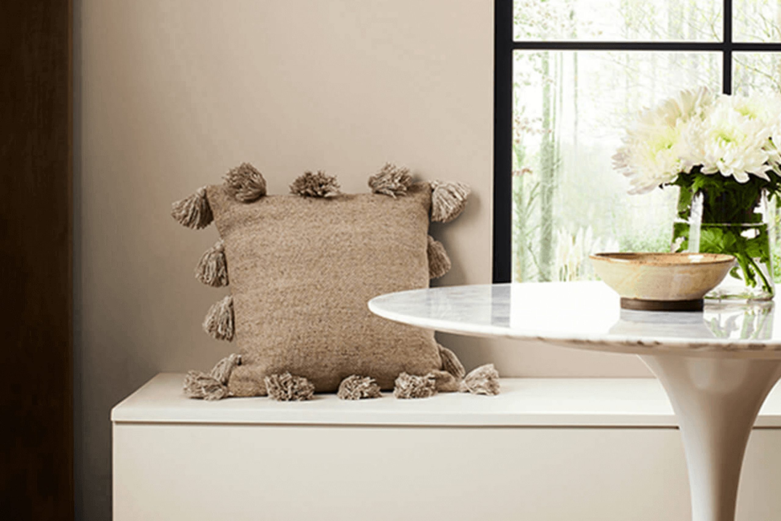
As I was looking through various color options for a project I’m working on, I stumbled upon SW 7524 Dhurrie Beige by Sherwin Williams. What drew me to this paint was its subtle warmth and versatility.
This color, with its sandy beige tones, seamlessly into a range of decorative styles and settings. From traditional to contemporary spaces, Dhurrie Beige is capable of adding a sense of calmness and coziness. Whether you plan to spruce up your living room or want a welcoming vibe in your entryway, Dhurrie Beige might just be the perfect choice.
It’s not just another neutral; it has a unique ability to blend with various textures and materials. This makes it effortless to incorporate into any redesign or fresh decorating project.
I decided to delve into the fine details and potential uses of this paint color, hoping that it might inspire others who are looking for that ideal beige.
What Color Is Dhurrie Beige SW 7524 by Sherwin Williams?
Dhurrie Beige by Sherwin Williams is a warm, inviting beige that offers a comforting presence in any space. This shade is reminiscent of natural clay or soft sand, making it a versatile choice for decorating. Its subtle warmth makes it easy to pair with a variety of colors, from bold and bright hues to other soft neutrals.
This color works exceptionally well in interior styles that emphasize comfort and simplicity, such as rustic, farmhouse, or Scandinavian designs. The natural and understated tone of Dhurrie Beige brings a sense of calm and coziness, perfect for creating a welcoming atmosphere.
When it comes to materials, Dhurrie Beige pairs beautifully with organic textures such as wood, linen, and cotton. These materials complement the earthy quality of the color, enhancing its natural appeal. Adding elements like jute rugs, woolen throws, and wooden furniture will create a harmonious look. Additionally, this color works well with matte finishes on walls or furniture, which help maintain the gentle ambiance of the room without adding shine.
In conclusion, Dhurrie Beige is a fantastic choice for those looking to create a warm, inviting space. Its ability to blend seamlessly with natural materials and textures makes it a go-to color for creating a cozy and charming home environment.
Is Dhurrie Beige SW 7524 by Sherwin Williams Warm or Cool color?
Dhurrie Beige by Sherwin Williams is a neutral color that brings warmth to any room without overpowering it. Its versatility allows it to fit well with various decor styles, from modern to rustic.
This shade of beige offers a clean, subtle backdrop that makes it easy to decorate around with furniture and accents in a wide range of colors. It’s particularly effective in making small spaces appear larger and more open, as light colors tend to visually expand the area they cover.
Dhurrie Beige is an ideal choice for common spaces like living rooms or kitchens where you want a welcoming feel, and it also works great in bedrooms for a cozy atmosphere. This color not only helps hide minor imperfections on walls but also provides a calm, soft environment that pairs well with wood finishes and metallic accents, creating a cohesive look in your home.
Undertones of Dhurrie Beige SW 7524 by Sherwin Williams
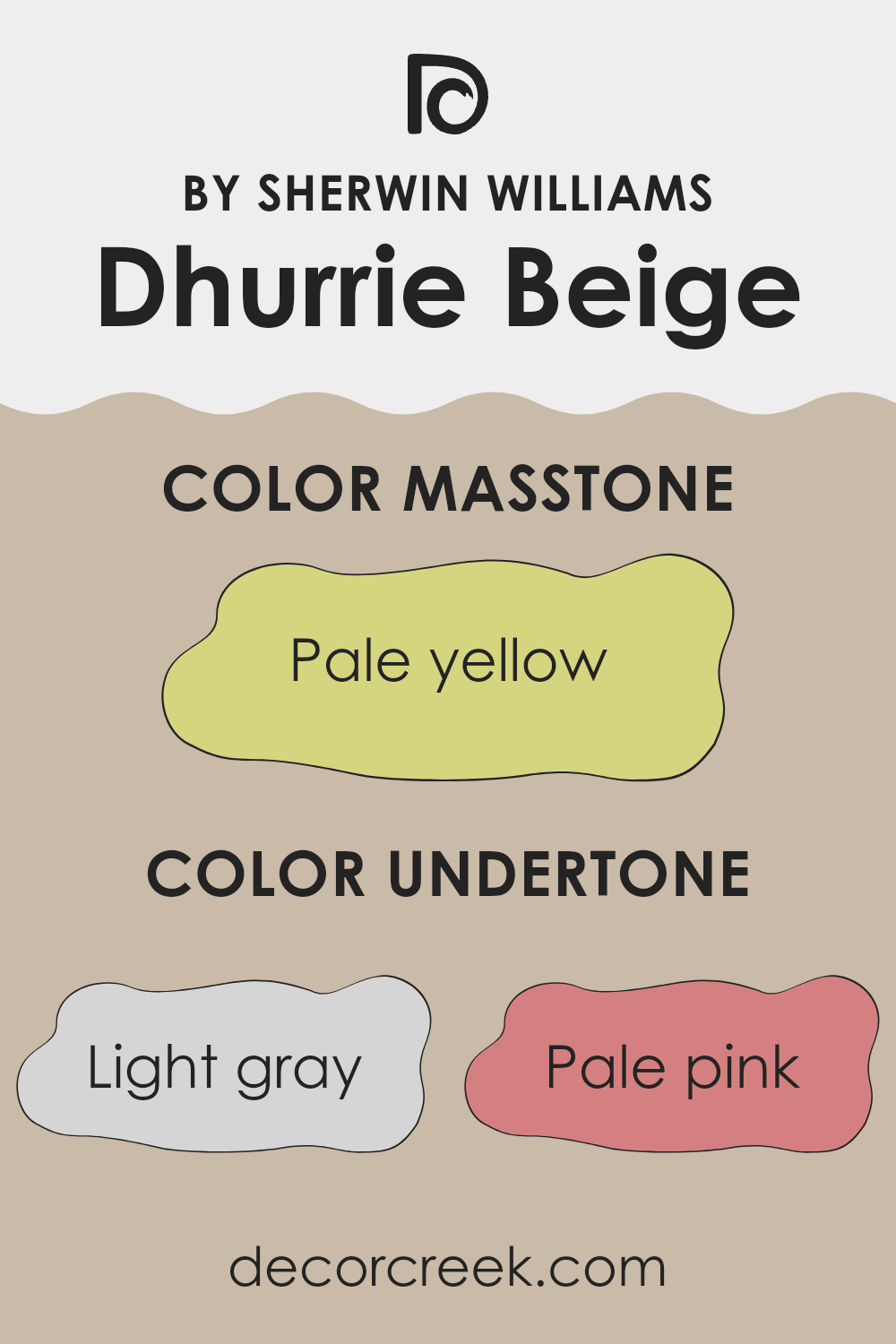
Dhurrie Beige is a versatile paint color that might look simple at first glance but actually carries a complex mix of undertones. These undertones, including light gray, pale pink, light purple, mint, light blue, grey, lilac, yellow, orange, light green, and olive, play a crucial role in how the color appears under different lighting conditions and in various environments.
Undertones are subtle colors that influence the main hue. They can bring warmth or coolness to a color and can even affect the mood of a room. For example, a beige with orange undertones might make a space feel warmer and more inviting, while beige with blue undertones can give a cooler, calming effect.
For Dhurrie Beige, these varied undertones mean it doesn’t just look beige. In daylight, the yellow or orange undertones can make the walls look more welcoming and bright. Under artificial light, the gray or blue undertones may become more pronounced, giving the room a more grounded, calm feel. This makes Dhurrie Beige a good choice for rooms needing a neutral backdrop that adapts to different times of day and types of lighting.
Moreover, when using this paint in your home, it’s important to consider the room’s natural and artificial light, as well as its furniture and decor. These elements can either enhance or subdue the various undertones, impacting the overall ambiance of your space. Therefore, Dhurrie Beige can suit many interior styles and preferences by offering a complex yet harmonious blend of underlying colors.
What is the Masstone of the Dhurrie Beige SW 7524 by Sherwin Williams?
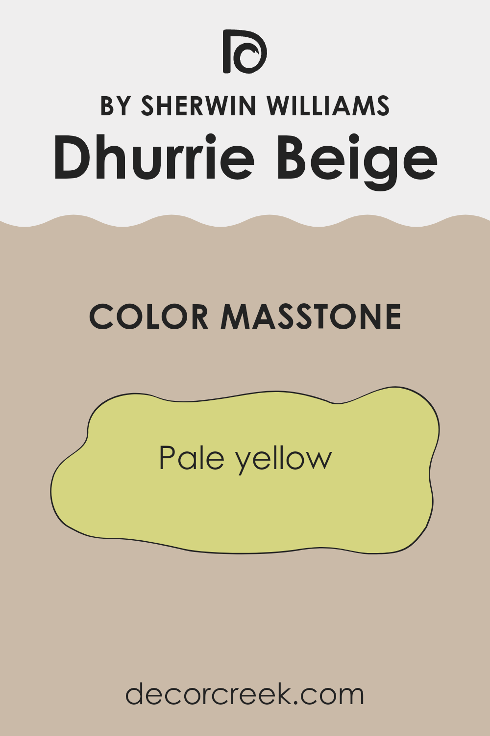
Dhurrie BeigeSW 7524 by Sherwin Williams is a pale yellow hue with a masstone that brings a gentle warmth to any space. With its soft and subtle character, this shade can make rooms feel cozy and inviting without overwhelming the senses.
The light yellow tone has a cheerful quality that brightens up spaces and pairs well with natural light, enhancing the openness of an area. It works especially well in living rooms and kitchens where a welcoming atmosphere is key.
This color is versatile too; it can act as a neutral backdrop for bolder colors or work in harmony with softer, pastel shades to create a balanced look. Additionally, its lightness helps small rooms appear bigger and more airy. Overall, Dhurrie BeigeSW 7524 is an excellent choice for anyone looking to add a touch of warmth and light to their home without going too bold.
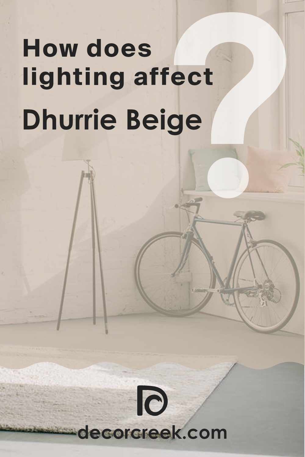
How Does Lighting Affect Dhurrie Beige SW 7524 by Sherwin Williams?
Lighting plays a crucial role in how we perceive colors. The same paint, such as Dhurrie Beige SW 7524 by Sherwin Williams, can look quite different depending on the light source. This color is a warm, creamy beige that can appear more muted or vibrant depending on the lighting conditions.
In natural light, this beige tends to look truer to its displayed swatch, showcasing its warmth and fullness under sunlight.
Sunlight is the most neutral light, as it’s evenly balanced in terms of the color spectrum, making the beige look fresh and lively.
Artificial light, on the other hand, varies. Incandescent bulbs, which emit a warmer, yellowish glow, will enhance the yellow and red tones in Dhurrie Beige, making it appear cozier and warmer.
Fluorescent lighting, however, leans towards a bluish tone and can make the same beige seem cooler and less inviting.
The orientation of a room also affects how Dhurrie Beige is perceived:
1. North-faced rooms: These receive less direct sunlight, often casting a cooler, bluer light which can make the beige look more subdued and slightly cooler in tone.
2. South-faced rooms: These benefit from abundant light most of the day, which can make the beige appear brighter and warmer, truly highlighting its creamy quality.
3. East-faced rooms: Morning light is warm and yellow, so Dhurrie Beige will feel most natural and welcoming in the morning, gradually moving towards a neutral tone as the day progresses.
4. West-faced rooms: Evening light is the warmest, which can make the paint look very warm and cozy towards the end of the day, particularly during sunsets.
Understanding how lighting affects color can help in choosing the right paint for a space based on its light exposure, ensuring the color looks good at any time of the day.
What is the LRV of Dhurrie Beige SW 7524 by Sherwin Williams?
LRV stands for Light Reflectance Value, which is a measure used to describe the percentage of light a paint color reflects or absorbs when light hits it. This value helps to determine how light or dark a color will appear on a wall.
A higher LRV means the color reflects more light, making it appear lighter, whereas a lower LRV means it absorbs more light, making the color appear darker. Understanding LRV can be quite useful when choosing paint colors, especially for improving the brightness of a room or setting a particular mood with color choices.
For Dhurrie Beige with an LRV of about 50, this color sits right in the middle of the scale. This means it neither reflects a lot of light nor absorbs too much, giving it a balanced, neutral appearance. In rooms with moderate to good lighting, Dhurrie Beige will maintain its true color without leaning too dark or too bright. This mid-range LRV makes it a versatile choice for many spaces, helping to create an environment that feels neither too stark nor too dim, making it adaptable to various lighting conditions and styles.

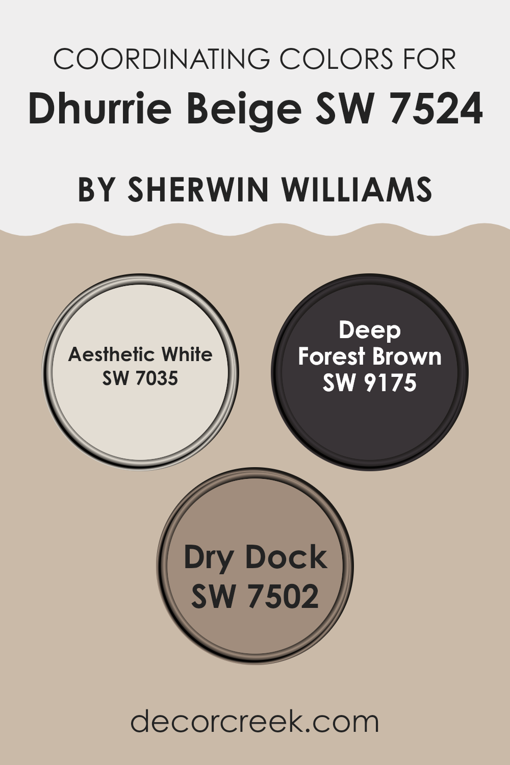
Coordinating Colors of Dhurrie Beige SW 7524 by Sherwin Williams
Coordinating colors are selected to complement a primary color, creating a balanced and harmonious color scheme. These colors work together to enhance the aesthetic appeal of a space without clashing. The main purpose behind coordinating colors is to create a visually appealing blend of hues that are pleasing to the eye. For instance, Dhurrie Beige can be paired with specific colors like Aesthetic White, Deep Forest Brown, and Dry Dock to achieve a cohesive look.
Aesthetic White is a soft, subtle off-white shade that brings a clean and airy feel to any room. It contrasts gently with deeper tones, making spaces feel more open and light-filled. Deep Forest Brown is a rich, dark brown that adds depth and warmth to interiors.
It’s excellent for creating a sense of coziness and comfort, pairing well with lighter tones like Dhurrie Beige. Lastly, Dry Dock offers a mid-tone gray-brown that serves as a versatile neutral. This color is particularly effective in providing a grounding effect, balancing out brighter or lighter colors in the palette. Together, these colors support each other, presenting a scheme that works harmoniously in various design settings.
You can see recommended paint colors below:
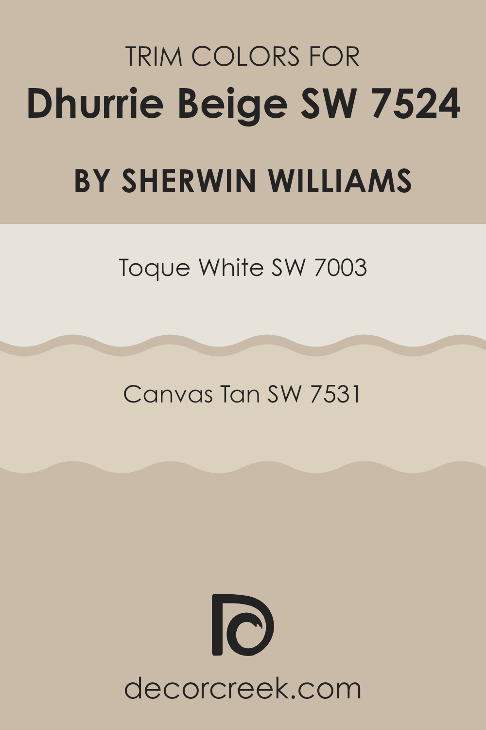
What are the Trim colors of Dhurrie Beige SW 7524 by Sherwin Williams?
Trim colors are selected to complement the main color on walls, enhancing the overall aesthetic of a room by defining door frames, window frames, and baseboards. Choosing the right trim color can make the wall color stand out and give the space a finished look. For Dhurrie Beige, a soft and warm neutral, trim colors like Toque White and Canvas Tan are excellent choices. They harmonize without overpowering the gentle hue of the walls, ensuring that everything looks well-coordinated and purposefully styled.
Toque White is a very light grayish white that brings a crisp and clean edge to the surroundings, making it an ideal trim color. It slightly contrasts with Dhurrie Beige, which helps in highlighting architectural features without clashing.
On the other hand, Canvas Tan is a mid-tone beige, a bit deeper than Dhurrie Beige, which can provide a subtle definition and continuity in spaces where a stark contrast isn’t desired. Using Canvas Tan as a trim color offers a seamless transition between the wall and the trim, enriching the warm tones of a room.
You can see recommended paint colors below:
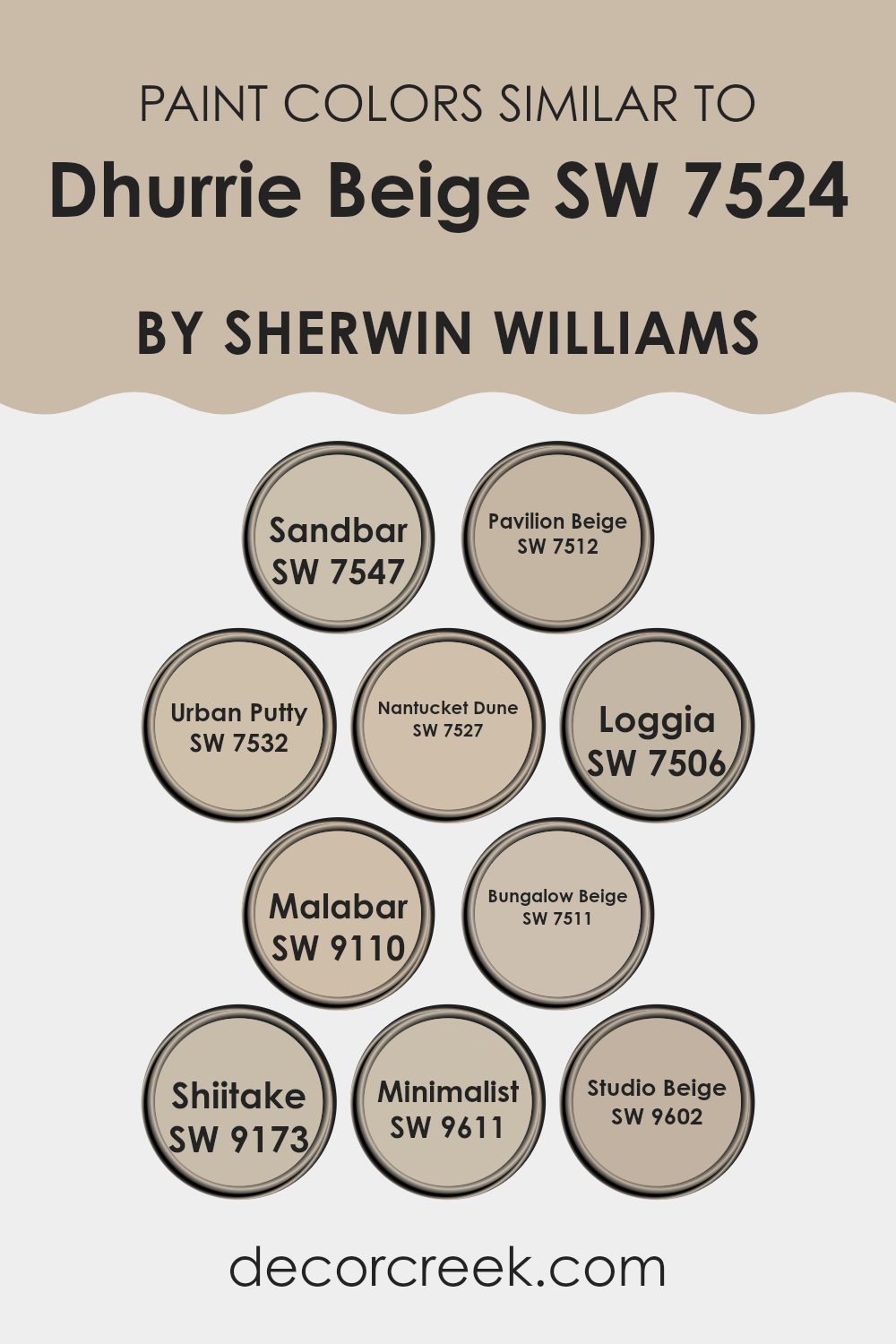
Colors Similar to Dhurrie Beige SW 7524 by Sherwin Williams
Using similar colors in your home decor is vital for creating a cohesive and harmonious environment. Colors like Sandbar (SW 7547) are perfect for this because its soft, earthy tone works well with other neutrals to provide a subtle yet warm background. Then there’s Pavilion Beige (SW 7512), a slightly richer hue that adds a touch of depth without overpowering smaller spaces.
Urban Putty (SW 7532) stands out as a versatile option that matches well with both dark and light furnishings, making it a favorite for balanced interiors. Nantucket Dune (SW 7527) lends itself beautifully to spaces aiming for a gentle, welcoming atmosphere without going too bright.
Continuing with Loggia (SW 7506), this color presents a muted, rustic feel, ideal for adding character in a subtle way. Malabar (SW 9110) moves toward a warmer spectrum, helping to create cozy corners where you can relax. Bungalow Beige (SW 7511) is a solid choice for those who prefer timeless charm, pairing well with various textures and materials.
The deeper tone of Shiitake (SW 9173) offers an excellent backdrop for artwork and vivid colors. Minimalist (SW 9611) is exactly what its name suggests; it’s clean and understated, perfect for modern homes focusing on simplicity. Lastly, Studio Beige (SW 9602) provides a contemporary feel with its crisp, yet inviting tone, suitable for studios and creative spaces. Each of these colors supports a comfortable, stylish home environment.
You can see recommended paint colors below:
- SW 7547 Sandbar
- SW 7512 Pavilion Beige
- SW 7532 Urban Putty
- SW 7527 Nantucket Dune
- SW 7506 Loggia
- SW 9110 Malabar
- SW 7511 Bungalow Beige
- SW 9173 Shiitake
- SW 9611 Minimalist
- SW 9602 Studio Beige
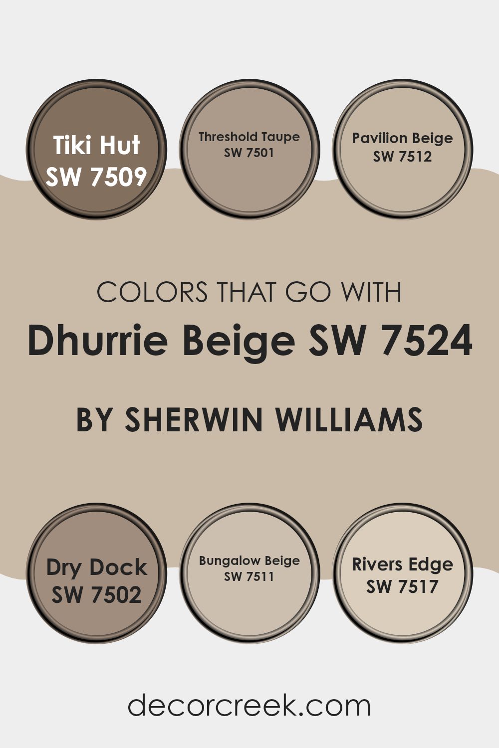
Colors that Go With Dhurrie Beige SW 7524 by Sherwin Williams
Choosing the right colors to complement Dhurrie Beige SW 7524 by Sherwin Williams is crucial for achieving a harmonious and appealing look in any space. These colors, like Tiki Hut, Threshold Taupe, Pavilion Beige, Dry Dock, Bungalow Beige, and River’s Edge, offer a versatile palette that can enhance the warmth and comfort of Dhurrie Beige, making it perfect for creating a cozy and welcoming environment. Each color has unique qualities that add depth and charm when paired with Dhurrie Beige, ranging from the deeper tones of Tiki Hut to the soothing shades of River’s Edge.
Tiki Hut SW 7509 is a rich, earthy brown that provides a strong foundation for any room, giving a sense of stability and warmth. Threshold Taupe SW 7501 offers a slightly lighter shade that bridges the gap between beige and gray, providing a subtle contrast that is both pleasing and calming.
Pavilion Beige SW 7512 is close to Dhurrie Beige but adds a touch of softness with its slightly more muted hue, ideal for layering natural textures. Dry Dock SW 7502 leans into gray territories, introducing a cooler counterpoint that can help balance warmer furnishings. Bungalow Beige SW 7511 is nearly akin to Dhurrie Beige but with a hint more saturation, perfect for adding a bit of richness to a monochromatic scheme.
Lastly, River’s Edge SW 7517 is a unique blend of beige with green undertones, offering a refreshing twist that can liven up any beige-dominated palette. Together, these colors create a cohesive yet diverse color scheme that enhances the beauty and versatility of Dhurrie Beige.
You can see recommended paint colors below:
- SW 7509 Tiki Hut
- SW 7501 Threshold Taupe
- SW 7512 Pavilion Beige
- SW 7502 Dry Dock
- SW 7511 Bungalow Beige
- SW 7517 Rivers Edge
How to Use Dhurrie Beige SW 7524 by Sherwin Williams In Your Home?
Dhurrie Beige SW 7524 by Sherwin Williams is a warm and inviting paint color that can make any room in your home feel cozy and welcoming. It’s a versatile shade that blends beautifully with other colors, making it an excellent choice for living rooms, bedrooms, and even kitchens.
When used in a living room, Dhurrie Beige creates a soft backdrop that makes your furniture and decor stand out. In a bedroom, it adds a gentle warmth that can help you relax and unwind. For those looking to refresh their kitchen, this beige can help brighten the space while maintaining a natural, earthy feel.
You can pair it with whites, blues, or even greens for a lovely contrast or keep it simple with other neutral shades for a harmonious look. Its ability to complement various styles, from rustic to modern, makes it a practical choice for any home improvement project.
Dhurrie Beige SW 7524 by Sherwin Williams vs Shiitake SW 9173 by Sherwin Williams
Dhurrie Beige and Shiitake by Sherwin Williams are both neutral colors but have distinct tones that set them apart. Dhurrie Beige leans towards a softer, lighter beige, offering a clean and simple backdrop that is versatile for various spaces–perfect for providing a bright and airy feel.
In contrast, Shiitake carries a richer, deeper taupe shade, which brings a warmer and cozier feel to a room. This color might suit spaces where you want a bit more warmth or a comforting atmosphere, such as living rooms or bedrooms.
While Dhurrie Beige reflects more light, making a space feel larger, Shiitake draws in warmth, making large rooms feel more intimate. Both colors are neutral enough to pair well with various decor styles and other colors, but the choice between them could hinge on the desired mood and the specific functional use of the room they will adorn.
You can see recommended paint color below:
Dhurrie Beige SW 7524 by Sherwin Williams vs Loggia SW 7506 by Sherwin Williams
Dhurrie Beige and Loggia by Sherwin Williams are both neutral colors, but they have distinct tones that set them apart. Dhurrie Beige is a soft, warm beige with a sandy look that creates a cozy and inviting atmosphere.
It’s lighter and can brighten up a room while keeping a natural, earthy feel. On the other hand, Loggia is a bit darker, leaning towards a grayish taupe. This color offers a slightly more muted and grounding effect, making it ideal for spaces where you want a subtle touch of sophistication without it being too bold.
Both colors work well in various settings, from living rooms to bedrooms, and complement a wide range of decor styles. While Dhurrie Beige brings in more light, Loggia offers depth, making each suitable for different purposes or preferences in creating pleasant interior spaces.
You can see recommended paint color below:
Dhurrie Beige SW 7524 by Sherwin Williams vs Minimalist SW 9611 by Sherwin Williams
Dhurrie Beige and Minimalist are two distinct colors from Sherwin Williams. Dhurrie Beige has a warmer tone, giving a cozy and inviting feel to any room. It pairs well with rich woods and other warm colors, making it ideal for living spaces or bedrooms that aim for a comfortable atmosphere.
Minimalist, on the other hand, is much cooler and crisper. This color has a clean and fresh look, which works beautifully in modern or minimalistic decor styles. It’s great for spaces that want to feel more open and airy.
Both colors offer their unique vibe, with Dhurrie Beige leaning towards a softer, warmer hue and Minimalist offering a sharper, more neutral presence. This makes Dhurrie Beige better for traditional settings, while Minimalist fits sleek, contemporary spaces. Depending on the mood you want to set and the furniture you have, either color can enhance your home beautifully.
You can see recommended paint color below:
Dhurrie Beige SW 7524 by Sherwin Williams vs Nantucket Dune SW 7527 by Sherwin Williams
Both Dhurrie Beige and Nantucket Dune are popular neutral paint colors from Sherwin Williams, each offering a subtle and inviting atmosphere to any room. Dhurrie Beige is a warm, sandy color with a light and airy feel, making it perfect for spaces where you want to create a cozy, welcoming environment. It pairs well with various decor styles and adds a soothing touch without being too bold.
On the other hand, Nantucket Dune is slightly darker and carries a hint of grey, giving it a more grounded presence. This color is excellent for rooms that aim for a more defined, yet still soft appearance. It works well in areas that receive less natural light, as it helps create a sense of warmth and depth.
Both colors stand out for their versatile ability to fit into many design schemes, yet each possesses unique qualities that might make one more suitable than the other depending on the lighting and the space’s intended mood. Whether you choose Dhurrie Beige for its light charm or Nantucket Dune for its richer tone, both colors provide a solid foundation for creating a stylish space.
You can see recommended paint color below:
- SW 7527 Nantucket Dune
Dhurrie Beige SW 7524 by Sherwin Williams vs Bungalow Beige SW 7511 by Sherwin Williams
Dhurrie Beige and Bungalow Beige, both by Sherwin Williams, are cozy and warm shades that beautifully pair with many different decors. Dhurrie Beige has a slightly greyish tone, making it a versatile neutral that works well in spaces that need a calm and subtle backdrop.
On the other hand, Bungalow Beige leans slightly towards a warmer, creamier tone. This makes it perfect for creating a welcoming and friendly atmosphere in a room. When comparing both, Dhurrie Beige offers a more modern feel due to its muted undertone, which is great for those looking to achieve a contemporary look.
Bungalow Beige, with its warmer hues, tends to give spaces a more traditional and homey vibe. Both colors are flexible for various lighting conditions, but Bungalow Beige will give off a slightly lighter and brighter presence in well-lit rooms. Choosing between them depends on the mood you’re aiming for in your space.
You can see recommended paint color below:
Dhurrie Beige SW 7524 by Sherwin Williams vs Urban Putty SW 7532 by Sherwin Williams
Dhurrie Beige and Urban Putty are both neutral paint colors from Sherwin Williams, but they have distinct tones that set them apart. Dhurrie Beige is a softer and lighter beige with a warm undertone.
It’s quite adaptable for rooms that want a cozy and inviting feel without becoming too bold. On the other hand, Urban Putty leans toward a darker, grayish-beige, offering a stronger presence in a space. This color works well in areas where you want a bit more depth and a neutral backdrop that still gives off a warm vibe.
Both colors are great for those looking to keep their walls in neutral tones, yet each serves a different purpose based on how light or dark you want your room to appear. Dhurrie Beige is better for creating a bright, airy feel, while Urban Putty is ideal for adding a touch of warmth to a more subdued look. In terms of styling, both colors are versatile and can match various decor styles, from modern to traditional.
You can see recommended paint color below:
- SW 7532 Urban Putty

Dhurrie Beige SW 7524 by Sherwin Williams vs Studio Beige SW 9602 by Sherwin Williams
Dhurrie Beige SW 7524 and Studio Beige SW 9602, both by Sherwin Williams, offer unique takes on the classic beige color. Dhurrie Beige presents a lighter, softer hue, making it an excellent choice for creating an airy and open feel in a room. Its gentle warmth works well in spaces that need a touch of coziness without being too overpowering.
On the other hand, Studio Beige leans towards a slightly darker, more muted tone. This color can give a room a grounded and calm atmosphere, making it ideal for areas where focus and stability are desired. The subdued nature of Studio Beige makes it versatile for pairing with both bold and neutral furnishings.
Together, these two beige shades provide options for varying interior moods. While Dhurrie Beige lights up a room, Studio Beige offers a more understated elegance. Their differences highlight the versatility of neutral tones in home decor, allowing you to choose the perfect warmth and depth for your space.
You can see recommended paint color below:
- SW 9602 Studio Beige
Dhurrie Beige SW 7524 by Sherwin Williams vs Malabar SW 9110 by Sherwin Williams
Dhurrie Beige and Malabar by Sherwin Williams are both neutral tones but carry unique traits. Dhurrie Beige is a light, sandy color that offers a warm, welcoming feel to any room. It’s quite versatile and pairs well with a broad range of colors, contributing to a cozy and pleasant environment. This makes it an excellent choice for living spaces, bedrooms, and areas where you want a comforting and unobtrusive backdrop.
On the other hand, Malabar is a richer and darker beige that carries more depth. This shade leans more toward a taupe or greige (gray + beige), giving it a slightly more pronounced presence in a room. It works well in spaces that you want to feel more grounded or defined, such as dining rooms or home offices.
While both colors share a foundation in beige, Dhurrie Beige is lighter and airier, making spaces feel more open, whereas Malabar, with its deeper tone, offers a sense of solidity and grounding, providing a subtle yet stronger character. Each has its style and can be matched with a variety of decor elements depending on the atmosphere you’re aiming to achieve.
You can see recommended paint color below:
- SW 9110 Malabar
Dhurrie Beige SW 7524 by Sherwin Williams vs Sandbar SW 7547 by Sherwin Williams
Dhurrie Beige and Sandbar, both from Sherwin Williams, are warm neutral paints but with distinct tones. Dhurrie Beige is a lighter, soft beige that subtly brightens up a space, making it feel open and airy. It’s perfect for creating a cozy, welcoming atmosphere in any room.
On the other hand, Sandbar is a shade darker with a richer, more pronounced beige tone that adds a bit more warmth to the walls it covers. This color works well in spaces where you want a bit more depth without overwhelming the senses with too dark a hue.
Both colors are versatile and pair well with various decor styles, but Dhurrie Beige leans towards a lighter, more relaxed vibe, while Sandbar offers a slightly more grounded, warm presence. Choosing between them depends on the desired mood and the natural light in your rooms.
You can see recommended paint color below:
Dhurrie Beige SW 7524 by Sherwin Williams vs Pavilion Beige SW 7512 by Sherwin Williams
Dhurrie Beige and Pavilion Beige are both warm neutral colors by Sherwin Williams, each creating a cozy and inviting atmosphere. Dhurrie Beige is a bit lighter, which makes it excellent for making smaller rooms appear more spacious and open. Its soft hue reflects more light, which can brighten up spaces without overwhelming them.
On the other hand, Pavilion Beige carries a slightly deeper tone, giving it a richer feel. This makes it ideal for adding a hint of warmth and elegance to any room. It pairs well with a wide range of decor, providing a solid foundation for various styles, from modern to traditional.
Both colors offer versatility but serve slightly different purposes due to their varying intensities. Dhurrie Beige is better suited for those looking to enhance the sense of space and light in a room, while Pavilion Beige is perfect for those wanting to add a cozy, grounding element to their design. Choosing between them depends largely on your specific aesthetic goal and the functional needs of your space.
You can see recommended paint color below:
Conclusion
After looking closely at SW 7524 Dhurrie Beige by Sherwin Williams, I’ve come to appreciate just how warm and welcoming this paint color can be. Dhurrie Beige is a soft, cozy beige that feels like a warm hug. It’s perfect for anyone wanting to make their room feel more inviting without using a color that’s too bright or bold.
This shade works really well in lots of different rooms. Whether it’s a living room where family gathers to talk and play games, or a bedroom that’s a comfy place to sleep, Dhurrie Beige adds a gentle touch of warmth. It’s nice because it’s not a complicated color; it’s simple and does its job of making a space feel like home.
One of the best things about Dhurrie Beige is how well it gets along with other colors. You can pair it with darker furniture or bright curtains, and it still looks great. This makes it very useful for someone who likes to change how their room looks from time to time.
All in all, SW 7524 Dhurrie Beige by Sherwin Williams is a fantastic choice if you’re looking for a paint that’s friendly, easy to live with, and makes your home feel extra cozy. It’s certainly a color I’d recommend to anyone wanting to add a little extra warmth to their environment.
Ever wished paint sampling was as easy as sticking a sticker? Guess what? Now it is! Discover Samplize's unique Peel & Stick samples.
Get paint samples

