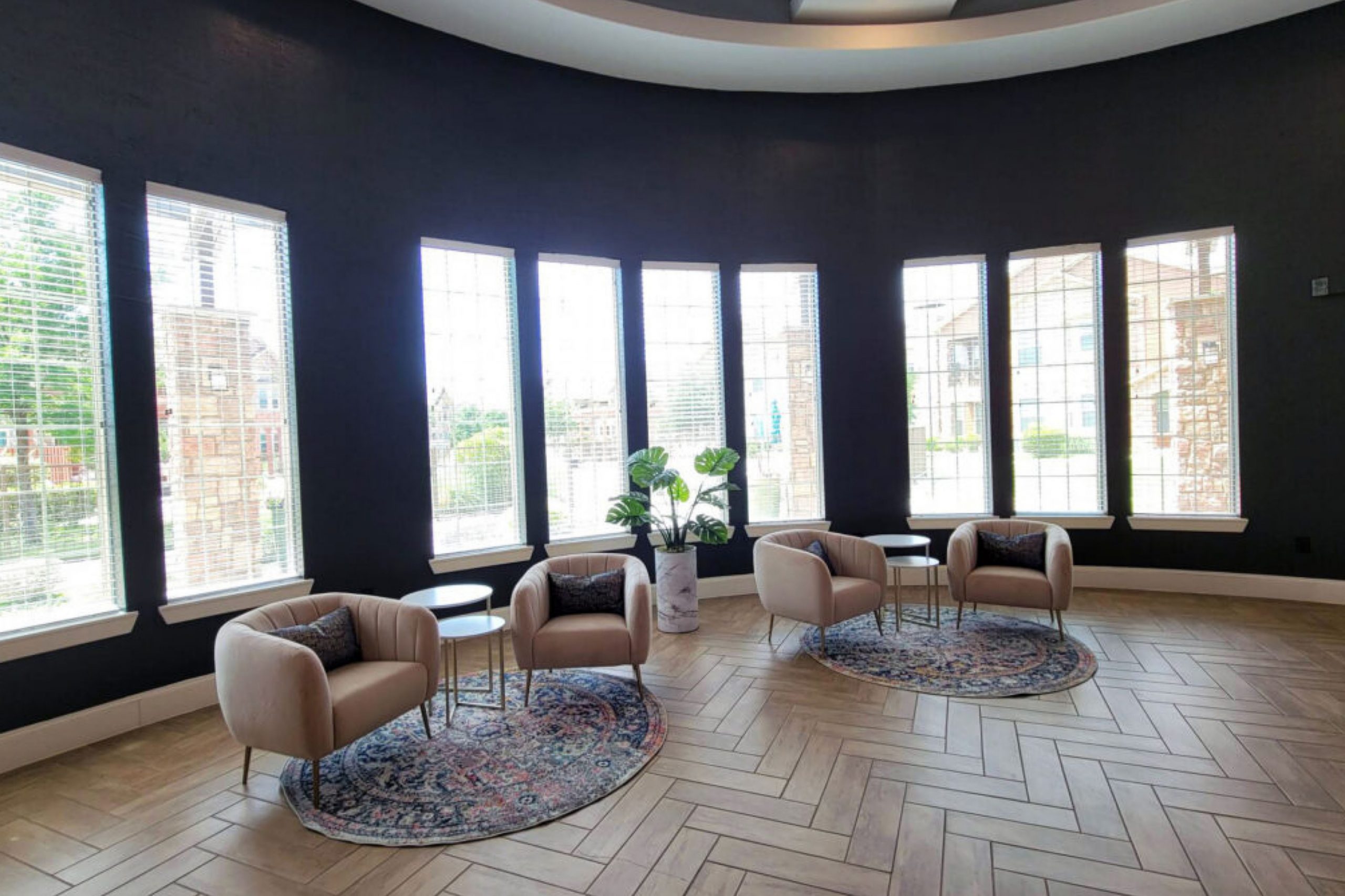
Imagine redecorating your space and stumbling upon SW 6993 Black of Night by Sherwin Williams. This shade is a profound, rich black that brings an elegant boldness to any room. As you decide on the perfect color for your next project, you might find yourself drawn to its deep, saturated tone which adds not just style but also a sense of depth to your walls.
This color is versatile, perfect whether you’re looking to create a striking feature wall or aiming for an all-over transformation in a larger space. The matte finish of Black of Night provides a modern look, which can seamlessly blend with varied textures and materials in your furnishings.
As you consider incorporating this color into your home, think about how it can enhance different lighting setups and how it could set off your existing decor.
Would it make your artwork pop? Could it give your room the dramatic backdrop it deserves?
These are worth considering as you plan your next design move.
What Color Is Black of Night SW 6993 by Sherwin Williams?
Black of Night is a deep, true black that carries a sense of depth and boldness. This color is perfect for creating a striking visual impact in any space. Due to its intensity, it works well as an accent wall or for highlighting architectural features such as trim, doors, or cabinets.
It can also be used to create a dramatic and stylish backdrop for rooms, lending a sense of drama and intimacy. This shade of black pairs excellently with a wide range of materials and textures. For a modern look, consider combining it with glossy finishes, metallic accents like brass or silver, and sleek materials such as glass and polished stone.
If you’re aiming for a warmer, more inviting atmosphere, Black of Night complements natural wood, soft leather, and textured fabrics like linen or wool. These combinations help to balance the boldness of the black with softer, more tactile elements.
In terms of interior styles, Black of Night is incredibly versatile. It fits seamlessly into minimalist designs where the focus is on form and color contrasts. In contemporary settings, it adds depth and grounds brighter colors and patterns without overwhelming them. This color also works beautifully in industrial and rustic designs, where it enhances raw materials and adds a refined touch to rugged spaces.

Is Black of Night SW 6993 by Sherwin Williams Warm or Cool color?
Black of Night SW 6993 is a deep, rich black paint from Sherwin Williams that brings a bold and strong presence to any room. This color is perfect for creating a striking contrast when used on walls, doors, or trim.
It can either create a cozy, intimate feel in a smaller space or make a dramatic statement in a larger area. When paired with bright whites or vibrant colors, Black of Night adds depth and interest, allowing other colors to pop and stand out. It’s also a great choice for furniture pieces, providing a modern, yet timeless look.
In homes, this color works well in many styles, from modern to traditional. It can be used in various rooms, including living rooms, bedrooms, or even bathrooms. Choose accessories and textiles in lighter shades to balance the darkness of the paint and keep the space feeling airy and open. Moreover, this shade can hide wear and tear, making it a practical choice for high-traffic areas.
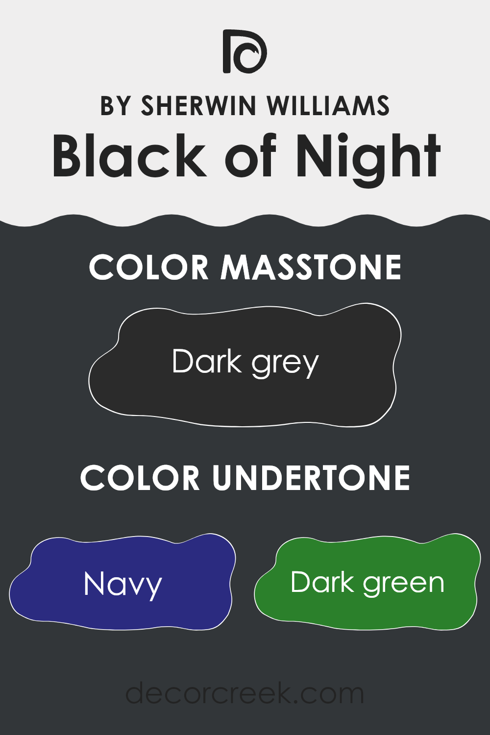
Undertones of Black of Night SW 6993 by Sherwin Williams
Black of Night is a deep, rich color that might seem close to pure black at first glance. However, it has a complexity due to the various undertones hidden within it. These undertones include shades like navy, dark green, brown, dark turquoise, purple, olive, and grey. Each of these subtle hues can affect how the color appears under different lighting conditions and next to different colors.
For example, in bright, natural light, the navy or dark turquoise might become more prominent, giving the color a cooler feel. In dimmer, artificial light, the brown or dark green might stand out more, lending a warmer tone to the room. These undertones can make Black of Night appear to shift its appearance subtly throughout the day.
When used on interior walls, the effect of Black of Night’s undertones is significant. The varying undertones can make the wall color interact interestingly with other elements in the room, such as furniture, curtains, and decorations. For instance, if accessorized with light-colored decorations or furniture, the darker undertones can provide a beautiful contrast, making the items stand out.
Additionally, these undertones ensure the color doesn’t overpower the space, instead giving the walls depth and dimension. This interplay is crucial for maintaining balance in interior design, as it prevents the color from making the room feel too closed in or compact.
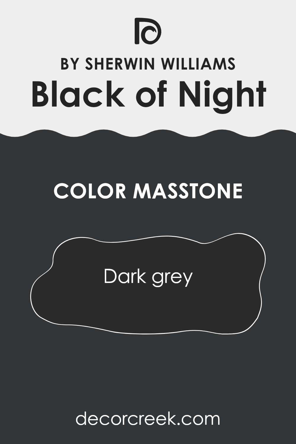
What is the Masstone of the Black of Night SW 6993 by Sherwin Williams?
Black of Night SW 6993 by Sherwin Williams showcases a masstone that is a dark grey, resembling the color code #2B2B2B. When used in homes, this dark grey tone offers a bold and strong visual impact, which can make spaces feel more defined and grounded.
This color works well for creating striking contrasts when paired with lighter or brighter colors, making it an excellent choice for accent walls or furniture pieces to pop against lighter backgrounds. Additionally, it can be used in smaller doses, like for trim or doors, adding depth to a room without overwhelming it.
Being a darker shade, it also has the practical benefit of hiding marks and smudges better than lighter shades, making it a practical choice for high-traffic areas or spaces like playrooms and kitchens. Overall, this color provides a versatile and dynamic option for home decorating that can complement various styles & decor.
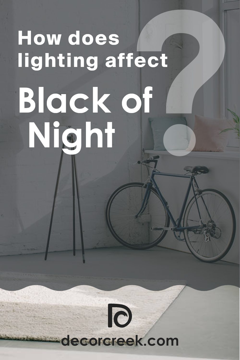
How Does Lighting Affect Black of Night SW 6993 by Sherwin Williams?
Lighting plays a crucial role in how we perceive colors. Different light sources and their intensities can dramatically change the appearance of a color. For example, a deep color like Black of NightSW 6993 might look different under various lighting conditions.
In artificial light, such as that from incandescent bulbs or LED lamps, Black of NightSW 6993 can appear warmer or take on a slightly lighter shade depending on the color temperature of the light. Warmer lights can make it look more cozy and less harsh, whereas cooler lights might give it a slightly bluish tint, making it seem cooler.
In natural light, the appearance of Black of NightSW 6993 can vary throughout the day. During bright midday, when sunlight is at its strongest, the color might look softer and more muted. Towards the evening, as natural light dims, the color can appear deeper and more intense.
The orientation of a room also affects how colors are perceived:
– North-faced rooms don’t get a lot of direct sunlight, which can make Black of NightSW 6993 appear darker and more pronounced, enhancing its depth and richness.
– South-faced rooms receive plentiful sunlight, making this deep shade lighter and more lively, lessening its intensity throughout the day.
– East-faced rooms get sunlight in the morning. Here, Black of NightSW 6993 can appear softer and warmer in the morning light, becoming cooler as the day progresses.
– West-faced rooms are lit during the afternoon and evening, allowing Black of NightSW 6993 to look warmer and more welcoming in the fading light of sunset.
Understanding these nuances in lighting can help in making informed decisions when choosing paint colors for different rooms, especially with strong and dark colors like Black of NightSW 6993.
What is the LRV of Black of Night SW 6993 by Sherwin Williams?
Light Reflectance Value (LRV) measures how much light a paint color reflects compared to how much it absorbs. In practical terms, LRV scales from zero, which is completely black, to a maximum value typically around 90, representing pure white. However, the actual scale can vary a little based on different measuring standards.
A higher LRV means the color is lighter and thus reflects more light, brightening a room and making it appear larger. Conversely, a lower LRV indicates that the color is darker and absorbs more light, which can make a space feel smaller and more enclosed.
The LRV of Black of Night, which is 3.644, suggests that it is a very dark color. In a room, this will mean that it absorbs most of the light, rather than reflecting it. This can have the effect of making walls painted with this color seem closer and the room feel more compact. In spaces with lots of natural light or ample lighting fixtures, this might not be much of a problem, and the color can add depth and a sense of coziness.
In poorly lit rooms, however, using a color with such a low LRV can make the space feel even darker and more confined. Lighting and room size should be carefully considered when using dark colors like this one.

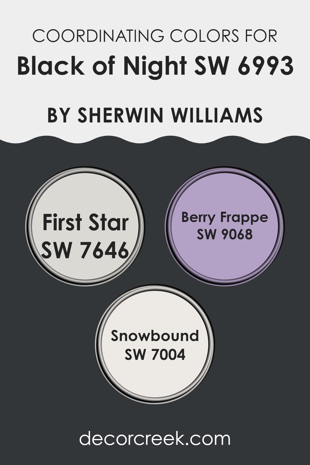
Coordinating Colors of Black of Night SW 6993 by Sherwin Williams
Coordinating colors are complementary shades that, when paired with a primary color, enhance the aesthetic of a space by creating balance and harmony. For instance, Black of Night (SW 6993) by Sherwin Williams can be stunningly complemented with a selection of coordinating colors that add different moods and contrasts to the interior design. These coordinating colors work by either contrasting with or uplifting the main color, making the space more dynamic and visually appealing.
One of the coordinating colors, First Star (SW 7646), is a soft, light gray that offers a subtle contrast to the deep hues of Black of Night. It’s perfect for creating a lighter, airier feel in spaces that need a gentle lift. Berry Frappe (SW 9068), in turn, is a playful and gentle pink tone that injects a warm, fresh vibe into a room, providing a lovely splash of color that’s neither overwhelming nor too bold.
Lastly, Snowbound (SW 7004) is a clean, bright white with a hint of warmth. It acts as a crisp, refreshing counterbalance to richer, darker shades, making it ideal for trims, ceilings, and accents where you want to add a sense of brightness without stark contrast.
You can see recommended paint colors below:
- SW 7646 First Star
- SW 9068 Berry Frappe
- SW 7004 Snowbound
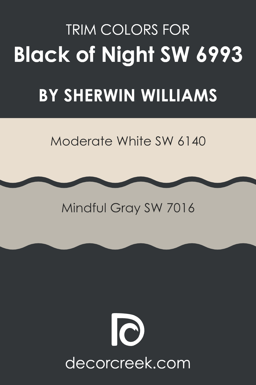
What are the Trim colors of Black of Night SW 6993 by Sherwin Williams?
Trim colors play a crucial role in interior and exterior design, providing a visual frame or border that enhances the main color on walls or structures. When used with a deep, intense shade like Black of Night by Sherwin Williams, trim colors such as Moderate White SW 6140 and Mindful Gray SW 7016 can create a striking contrast that outlines features distinctly, making the darker areas stand out and giving the space a clean, finished look.
The choice of trim color can also affect the perception of the primary color’s hue, changing how it is viewed depending on the surrounding tones. Moderate White SW 6140 is a soft, warm white with a soothing presence that can lend a light, fresh edge when used as a trim. This gentle contrast can subtly highlight the boldness of darker colors without competing for attention.
On the other hand, Mindful Gray SW 7016 offers a warmer, mid-tone gray that bridges the gap between white and black, providing a softer transition that can mitigate the starkness of a very dark shade. This gray carries a hint of warmth which helps in softening the overall look while maintaining a clean and distinguished boundary.
You can see recommended paint colors below:
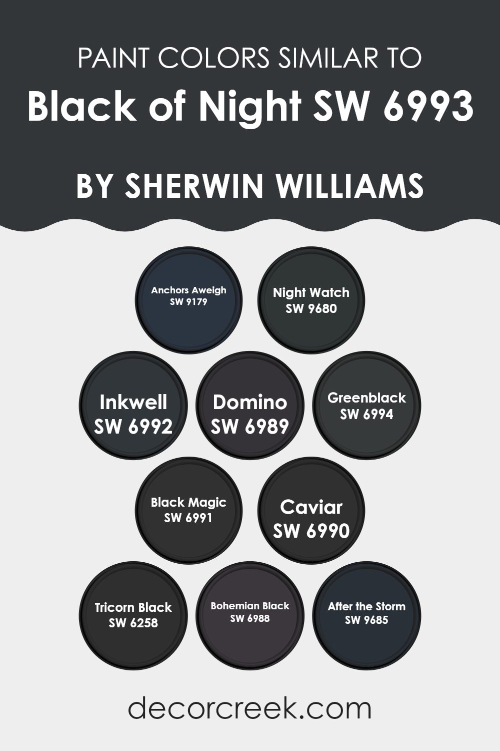
Colors Similar to Black of Night SW 6993 by Sherwin Williams
Similar colors play a crucial role in design by creating a harmonious and balanced appearance, lending visual continuity and fluidity to spaces without stark contrasts that might disrupt the flow of the environment. Colors like Anchors Aweigh provide a dark navy tone that pairs well with more neutral environments, while Night Watch carries a hint of deep green, breaking the monotony with a subtle hint of color. Inkwell is another key shade, with its deep blue-black hue that offers a muted alternative for spaces needing a touch of mystery without overwhelming darkness.
Domino presents a charcoal color with a warm undertone, perfect for adding depth to a room in a more understated manner. Greenblack, true to its name, merges black with undercurrents of green, giving spaces a unique vibe that stands out subtly against more traditional blacks.
For those in search of a true deep black, Black Magic serves as an essential, providing a solid, intense background that works in stark or minimalist designs. Caviar, with its rich, deep tone, verges on the edge of black and dark gray, providing a sophisticated twist that is versatile across multiple applications.
Tricorn Black stands out for its true black color that doesn’t shift under different lighting conditions, making it a reliable choice for designers. In a similar vein, Bohemian Black offers a slightly distressed look, ideal for creating moody atmospheres and dynamic interiors. After the Storm rounds out the selection with its stormy gray tones, perfect for adding a softer touch to spaces that require darkness without harshness.
You can see recommended paint colors below:
- SW 9179 Anchors Aweigh
- SW 9680 Night Watch
- SW 6992 Inkwell
- SW 6989 Domino
- SW 6994 Greenblack
- SW 6991 Black Magic
- SW 6990 Caviar
- SW 6258 Tricorn Black
- SW 6988 Bohemian Black
- SW 9685 After the Storm
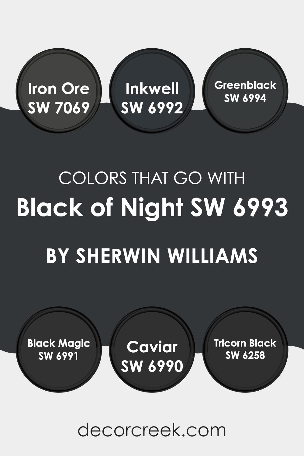
Colors that Go With Black of Night SW 6993 by Sherwin Williams
When you choose a color as deep and intense as Black of Night SW 6993 by Sherwin Williams, the accompanying colors are crucial because they help create a cohesive and balanced look. Matching it with the right shades can make or break the aesthetic of a room. For instance, colors like Iron Ore SW 7069 and Inkwell SW 6992 work beautifully with Black of Night due to their similarly dark tones, which provide a subtle variation in depth that enhances the richness of the space.
On the other hand, options such as Greenblack SW 6994 introduce a hint of color, adding an interesting twist without overwhelming the senses. Each color, while powerful alone, when paired thoughtfully, contributes to a harmonious yet distinctive palette. Among the shades that complement Black of Night, Black Magic SW 6991 and Caviar SW 6990 are almost as deep but with different undertones that offer a layered, multidimensional effect.
This subtle variety prevents a room from feeling flat or monotonous. Similarly, Tricorn Black SW 6258 is another excellent choice that, though close to black, has its unique character, ensuring that even predominantly dark rooms have depth and interest. These shades collectively produce an atmosphere that feels cohesive and visually striking, yet each retains a unique identity that prevents the decor from blending into obscurity.
You can see recommended paint colors below:
- SW 7069 Iron Ore
- SW 6992 Inkwell
- SW 6994 Greenblack
- SW 6991 Black Magic
- SW 6990 Caviar
- SW 6258 Tricorn Black
How to Use Black of Night SW 6993 by Sherwin Williams In Your Home?
Black of Night SW 6993 by Sherwin Williams is a deep, rich black paint with subtle hints of navy blue, giving it a unique twist. This color is perfect for those looking to add a dramatic touch to their home. In the living room, painting one accent wall with Black of Night can make the room look more striking and draw attention to features like artwork or a fireplace.
In bedrooms, using this color can create a cozy, enveloping effect, which is ideal for a peaceful sleeping environment. It can also be applied to furniture or cabinetry for a modern, stylish update. In small doses, like on the trim or the interior of a door, it adds a touch of contrast without overwhelming the space.
Pairing it with bright whites or soft grays can balance its intensity, ensuring that your space feels balanced and not too dark. Overall, Black of Night SW 6993 is a versatile color that can make a bold statement in any room.
Black of Night SW 6993 by Sherwin Williams vs Black Magic SW 6991 by Sherwin Williams
The colors Black of Night and Black Magic, both by Sherwin Williams, are unique shades of black that offer subtle differences. Black of Night is a deep, pure black that provides a strong and bold feel. It is perfect for creating a striking backdrop in a room, making other colors pop when paired with it.
On the other hand, Black Magic has a slightly softer tone, which could be described as a charcoal black. This color is excellent for those who prefer a less intense black but still want a color that holds presence and depth.
Both colors are versatile and can be used effectively in various design styles, from modern to traditional. Whether you choose Black of Night for its more intense hue or Black Magic for a softer approach, both add distinct character and style to any space.
You can see recommended paint color below:
- SW 6991 Black Magic
Black of Night SW 6993 by Sherwin Williams vs Tricorn Black SW 6258 by Sherwin Williams
Black of Night and Tricorn Black, both from Sherwin Williams, are sophisticated shades of black, each with unique qualities. Black of Night is a deep, pure black that provides a strong and bold statement. It absorbs light well, making it a solid choice for creating a sharp, defined look in a space.
On the other hand, Tricorn Black is a slightly softer black with hints of grey, which makes it slightly more nuanced than a pure black. This makes Tricorn Black easier to blend with other colors and materials in interior design.
Both colors are excellent for adding drama and elegance to any room, but the choice between them depends on how stark or subtle you want the black accents to be. Tricorn Black’s grey undertones make it more forgiving, while Black of Night’s deep black offers a more striking effect.
You can see recommended paint color below:
Black of Night SW 6993 by Sherwin Williams vs Greenblack SW 6994 by Sherwin Williams
Black of Night and Greenblack, both by Sherwin Williams, present subtle yet distinct differences. Black of Night is a pure, deep black color. It’s perfect for creating a strong, straightforward statement in a room, providing a bold backdrop that makes other colors pop.
On the other hand, Greenblack offers a unique twist with its black base that leans slightly towards green. This tint gives it a cooler tone, making it a bit more complex compared to the starkness of Black of Night. It can add depth to a space without overwhelming it with pure black.
Both colors are excellent choices for adding drama to any decor, but the choice between them depends on whether you prefer a clean, classic black or something with a slightly softer edge due to the green undertones. Greenblack might also seem a bit more natural and less formal because of its subtle color infusion.
You can see recommended paint color below:

Black of Night SW 6993 by Sherwin Williams vs After the Storm SW 9685 by Sherwin Williams
The color Black of Night is a deep, pure black that provides a strong and bold feel to any space. It’s the kind of color that makes other colors pop when used as a background or an accent wall. This is an ideal choice if you’re looking to make a dramatic statement in your decor.
On the other hand, After the Storm is a dark gray color with subtle blue undertones. It’s much softer compared to Black of Night. This color is great for creating a cozy and inviting atmosphere without going as intense as a true black. It works well in spaces where you want some depth and moodiness, but still want to keep the room feeling accessible and not too closed in.
Both colors are quite dark, but while Black of Night leans towards a stark, clear black, After the Storm offers a hint of color that softens its appearance, making it more flexible for different spaces and lighting conditions.
You can see recommended paint color below:
- SW 9685 After the Storm
Black of Night SW 6993 by Sherwin Williams vs Domino SW 6989 by Sherwin Williams
“Black of Night” and “Domino” by Sherwin-Williams are both dark shades, but they have distinct differences. “Black of Night” is a pure, deep black that absorbs most light, providing a strong, bold feel. It’s perfect for creating a dramatic effect or making other colors pop in contrast.
On the other hand, “Domino” is a softer black with hints of gray. This slight gray tone makes it less intense and more versatile for spaces that don’t aim for the stark contrast of a true black. It’s excellent for adding warmth and depth without overwhelming a room.
While both colors can make a space feel cozy, “Domino” does it in a gentler way, making it a good choice for those who prefer subtlety in their dark colors. Both colors work well for accents, trim, or full walls, depending on the mood you want to create.
You can see recommended paint color below:
Black of Night SW 6993 by Sherwin Williams vs Anchors Aweigh SW 9179 by Sherwin Williams
“Black of Night” and “Anchors Aweigh” are two dark shades from Sherwin Williams. “Black of Night” is a deep, true black that provides a strong, bold look. It is perfect for creating a striking contrast in a space, making it ideal for accent walls or trim.
On the other hand, “Anchors Aweigh” is a dark navy blue. While still dark, this color brings a hint of color into spaces, offering a softer alternative to black. It’s great for rooms where you want some darkness but with a touch of warmth.
Both colors are versatile and can be used effectively in various decor styles, especially in areas that benefit from a dramatic flair. Whether used in a bedroom, living room, or as an exterior finish, each color adds a distinct character to the environment. “Black of Night” might feel more conventional for a dramatic effect, while “Anchors Aweigh” offers a unique twist with its deep blue undertones.
You can see recommended paint color below:

Black of Night SW 6993 by Sherwin Williams vs Caviar SW 6990 by Sherwin Williams
Black of Night and Caviar are two dark shades offered by Sherwin Williams, both teetering on the edge of pure black. Black of Night is a true, deep black that provides a strong, bold backdrop in any space. It is perfect for creating a dramatic effect and gives a sense of depth to walls, making them feel more expansive.
On the other hand, Caviar, although close in darkness, carries a subtle brown undertone. This addition softens the black slightly and can introduce a warmer, more inviting quality compared to the cooler, starker Black of Night. Caviar is ideal for spaces where a touch of warmth is desired without deviating from a predominantly dark theme.
Both colors are versatile and can be used effectively in a variety of settings, from accent walls to cabinetry, depending on the atmosphere you want to achieve.
You can see recommended paint color below:
Black of Night SW 6993 by Sherwin Williams vs Night Watch SW 9680 by Sherwin Williams
Black of Night and Night Watch are two colors by Sherwin Williams, each providing a unique touch to decor styles. Black of Night is a true, deep black that offers a bold and powerful look. It pairs well with bright colors or metallics, making them stand out in any room.
On the other hand, Night Watch is a dark green that almost looks black. This color is slightly softer than pure black and brings in a hint of nature-like feel to spaces. It goes well with wooden furniture and natural fibers, adding a cozy yet upscale vibe to interiors.
Both colors are dark, but while Black of Night goes all in with the depth of black, Night Watch mixes black with green to offer a hint of color and a different kind of depth. Each can be used effectively to create a distinct atmosphere in a space, depending on what mood or style you’re aiming for.
You can see recommended paint color below:
- SW 9680 Night Watch

Black of Night SW 6993 by Sherwin Williams vs Inkwell SW 6992 by Sherwin Williams
Black of Night and Inkwell are two rich, dark shades by Sherwin Williams that are closely related but have subtle differences. Black of Night is a very deep, pure black that provides a strong and bold statement. It is ideal for creating dramatic effects in spaces, making it a go-to for accent walls or in areas where a stark contrast is desired.
On the other hand, Inkwell leans slightly towards navy blue under certain lighting conditions, though it is still predominantly black. This slight blue undertone gives it a unique character compared to the absolute blackness of Black of Night. It works well in situations where you want depth but with a hint of color to soften the intensity.
Both colors are striking choices for modern interiors and can effectively anchor a room with their dark tones. Depending on the ambiance you want to achieve, Black of Night offers a more classic black while Inkwell brings a nuanced richness with its undertone.
You can see recommended paint color below:
Black of Night SW 6993 by Sherwin Williams vs Bohemian Black SW 6988 by Sherwin Williams
Black of Night and Bohemian Black, both by Sherwin Williams, are two distinct shades of black that offer unique vibes for decorating spaces. Black of Night is a true, deep black that provides a strong and bold statement in any room. It’s ideal for creating a dramatic effect or contrast in spaces needing a touch of elegance without much complexity.
On the other hand, Bohemian Black carries a slightly softer tone, leaning towards a charcoal hue. This slight softness makes it more forgiving and versatile for combining with various color schemes and décor styles. It performs well in areas not just limited to accents but also as a primary wall color, giving a cozy yet powerful backdrop.
So, if you seek absolute depth and stark boldness, Black of Night is your go-to. For a gentler approach and adaptability, Bohemian Black stands out as the preferable choice. Each of these colors offers a different personality, opening up numerous possibilities for interior design.
You can see recommended paint color below:
- SW 6988 Bohemian Black
Conclusion
As someone who has always had an interest in finding just the right paint colors for my rooms, I was truly impressed by Sherwin Williams’ SW 6993 Black of Night. This paint color is a very deep black that has a magical feel to it. It’s not just dark; it’s rich and full of depth, almost like the sky on a clear, starry night.
Trying out the Black of Night paint in my own home, I noticed how it added a strong, bold feel to the walls without making the room feel too closed off. It goes really well with bright white trim for a sharp, clean contrast, or it can be paired with soft grays and other neutrals for a more subtle look.
Moreover, this color does a fantastic job at hiding marks and stains, which is a big bonus. It makes the upkeep easier, especially in rooms that get a lot of use. The overall quality of the paint from Sherwin Williams, from how smoothly it goes on the walls to how well it stays, is impressive.
In conclusion, SW 6993 Black of Night is an excellent choice if you’re looking to make a bold statement in a room. It’s deep, lovely, and practical, feeling both cozy and stylish. Whether you want to cover up a small area or paint a whole room, this color brings a striking and dramatic effect that really makes an impact.

Ever wished paint sampling was as easy as sticking a sticker? Guess what? Now it is! Discover Samplize's unique Peel & Stick samples.
Get paint samples

