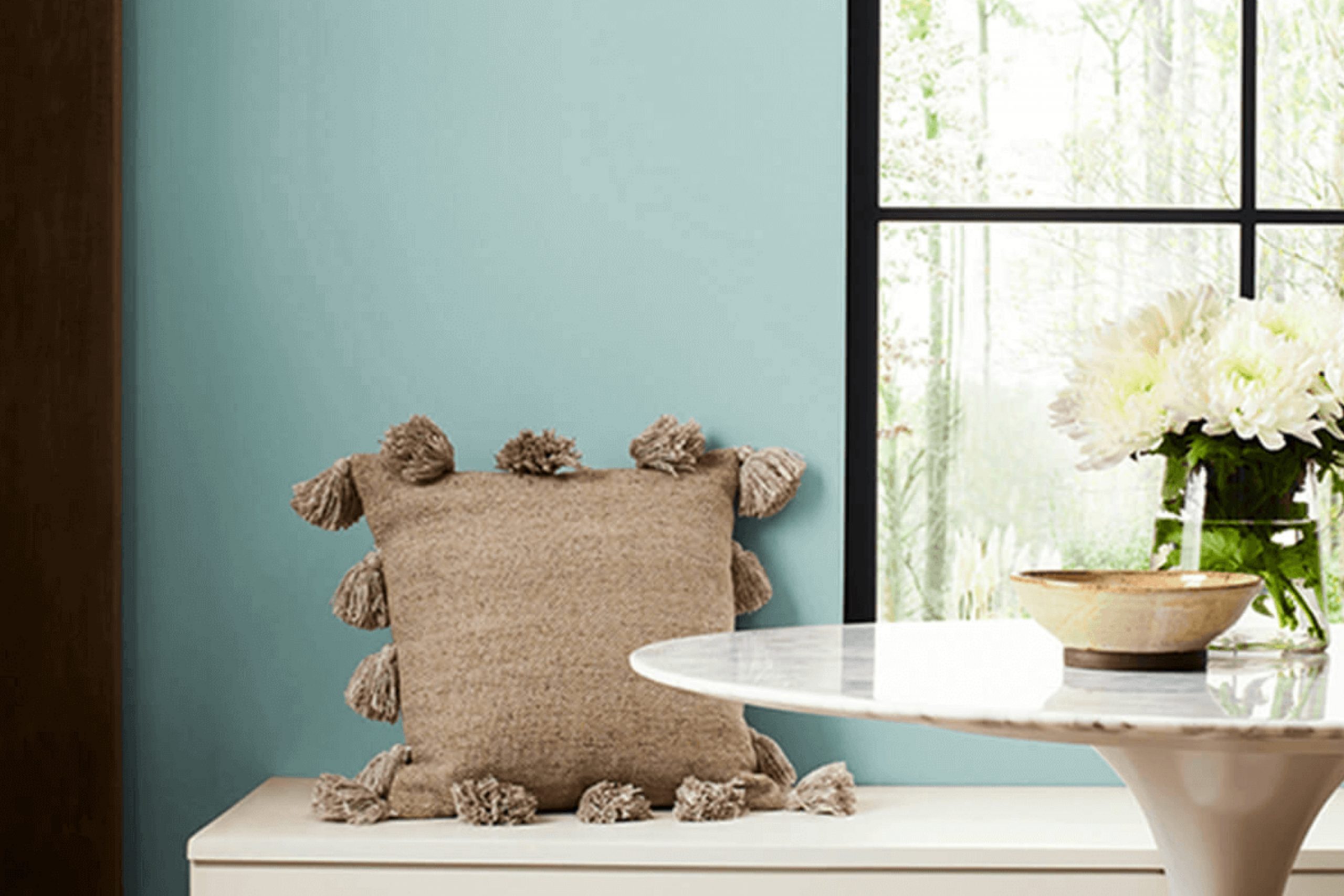
When you come across a color like Sherwin Williams’ SW 9051 Aquaverde, it’s like finding a secret oasis that instantly brings a sense of peace. Imagine stepping into a room and feeling the cool embrace of nature, balanced perfectly between green and blue.
Aquaverde gently captures the soothing qualities of water and the refreshing feel of leaves dancing in the breeze.
It’s unique, striking the right chord between freshness and sophistication, making it an ideal choice for creating a calm and relaxing space in your home.
This shade feels both inviting and fresh, perfect for those areas where you seek a calm retreat. It can transform a simple room into a serene sanctuary, where you can unwind and gather your thoughts. With Aquaverde, any space feels like a breath of fresh air.
It works beautifully with natural materials and neutral tones, adding a touch of elegance without taking over. In a world that’s often too fast and chaotic, having a color that promotes relaxation and harmony can make a significant difference.
Aquaverde is more than just a color; it’s an experience that brings you closer to nature’s gentle and refreshing beauty.
What Color Is Aquaverde SW 9051 by Sherwin Williams?
Aquaverde (SW 9051) by Sherwin Williams is a calming shade that blends soft blue with hints of green. It creates a fresh and airy atmosphere without being too bold or overpowering. This color is ideal for a variety of interior styles, such as coastal, modern, or minimalist settings.
Its subtle mix of hues brings a sense of freshness to any space, reminiscent of a gentle sea breeze or a clear sky.
In coastal interiors, this color enhances the airy feel and pairs well with white-washed wood, driftwood accents, and natural linens. Its cool tone complements nautical themes, making it a great choice for beach houses or rooms inspired by the ocean.
In modern or minimalist spaces, it serves as a soothing backdrop that allows furniture and décor to stand out. It’s particularly appealing when paired with sleek black or metallic accents, adding a touch of contrast.
Aquaverde also pairs beautifully with natural materials like light oak or birch, and it works well with textures like jute, wool, or cotton, adding depth and comfort to the room. To achieve a balanced look, consider combining it with earthy colors like sandy beige or soft gray, bringing out its refreshing qualities while maintaining warmth.
Is Aquaverde SW 9051 by Sherwin Williams Warm or Cool color?
Aquaverde SW 9051 by Sherwin Williams is a refreshing and versatile paint color that adds a touch of nature-inspired calmness to any home. This soft, muted green has a hint of blue, evoking the soothing presence of water and natural landscapes.
It’s a great choice for creating a peaceful atmosphere in living rooms, bedrooms, or bathrooms. Aquaverde complements a variety of design styles, from modern to farmhouse, and pairs well with neutral colors like beige or gray, as well as natural wood tones.
In a room, Aquaverde can make the space feel open and airy, while adding a cozy and inviting feel. It helps bring the outside in, which is beneficial for creating a balanced and restful environment. Whether it’s used on all the walls of a room or as an accent color, Aquaverde’s gentle hue provides a subtle splash of color that can refresh and rejuvenate any space.
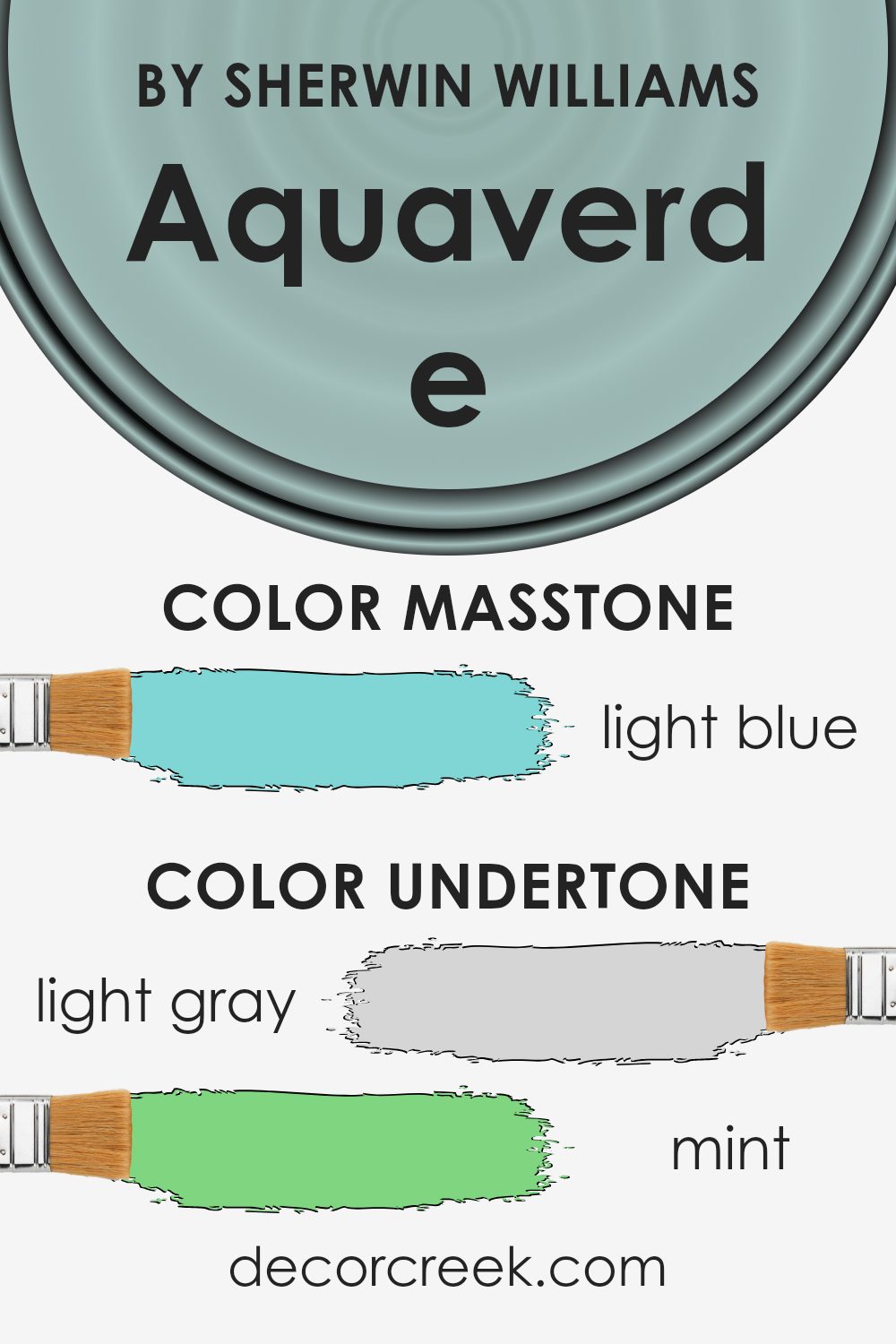
Undertones of Aquaverde SW 9051 by Sherwin Williams
Aquaverde by Sherwin Williams is a paint color that displays a complex blend of undertones. These undertones play a significant role in how the color is perceived. The primary undertones in Aquaverde include light gray, mint, lilac, pale yellow, light purple, and various shades of turquoise and blue. The presence of these tones means this color can look different based on the surroundings and lighting conditions.
For example, in natural light, the turquoise and mint undertones might show up more prominently, giving the color a fresh and airy feel. In contrast, under artificial light, the lilac and light purple undertones might become more apparent, adding a subtle warmth to the color.
The gray and darker turquoise tones provide a neutral base, helping the color blend well with a variety of other colors in the space.
On interior walls, these undertones can make Aquaverde feel both refreshing and soothing.
The mint and pale yellow contribute a hint of cheerfulness, while the light gray and blue offer a calm balance.
Undertones provide the depth and character in a paint color, allowing it to complement different styles and moods in a room, depending on the light and other design elements. This complexity makes the color versatile and adaptable to various interior designs.
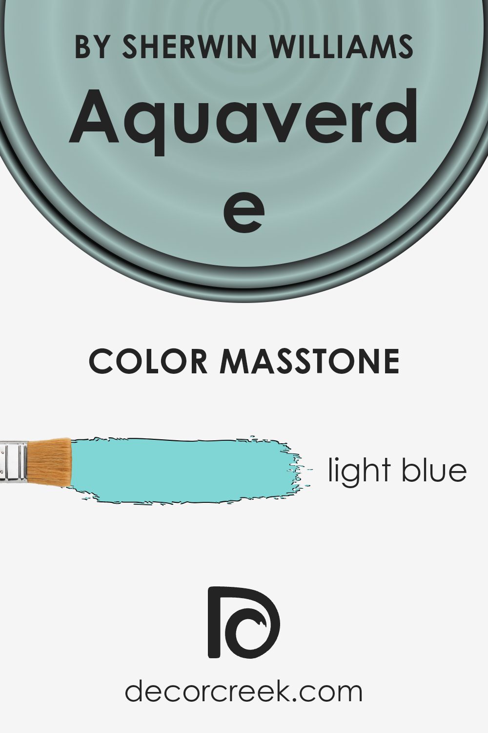
What is the Masstone of the Aquaverde SW 9051 by Sherwin Williams?
Aquaverde SW 9051 by Sherwin Williams is a light blue color, often associated with a gentle and calming atmosphere. This color can work well in various parts of a home because it brings a sense of openness and airiness to a space. Its softness helps make rooms feel larger and more inviting, which is especially beneficial in smaller or darker rooms.
The light blue shade can create a refreshing environment, making it ideal for bedrooms, bathrooms, or living areas where a peaceful mood is desired. Pairing this color with white or beige trim can enhance its bright and airy vibe.
Additionally, Aquaverde works well with both modern and traditional home styles, as it offers a subtle yet pleasant backdrop.
Whether used on walls or as an accent, this light blue provides a versatile foundation that can easily complement a variety of furniture and decor styles, offering flexibility in interior design.
How Does Lighting Affect Aquaverde SW 9051 by Sherwin Williams?
Lighting plays a crucial role in how we see colors. The way a color looks can change greatly depending on the type and direction of light in a room. Aquaverde SW 9051 by Sherwin Williams is no exception to this. Understanding how it behaves in different lighting conditions can help you decide where and how to use it in your home.
In natural light, colors are often perceived as more true to their actual appearance. Since natural light changes throughout the day, Aquaverde SW 9051 can look different from morning to evening. In artificial light, which depends on bulb type and strength, colors can either look warmer or cooler.
For example, incandescent bulbs tend to bring out warmer tones, while fluorescent bulbs might make colors look more muted or cooler.
In a north-facing room, the light tends to be cooler and can make colors like Aquaverde appear more muted or subdued. It’s perfect if you prefer a softer, quieter vibe, but it’s important to test it to make sure it doesn’t lean too gray or washed out.
Conversely, a south-facing room usually provides warmer and more consistent natural light throughout the day. This can enhance the brightness and clarity of Aquaverde, making it appear more vivid and lively. This setup often complements spaces meant for active gatherings.
East-facing rooms get warm, golden light in the morning, then cooler light in the afternoon. Aquaverde in these rooms might start the day looking bright and fresh, then take on a cooler tone later.
West-facing rooms often have the opposite pattern, with cooler light in the morning and warm, rich light in the evening. Here, Aquaverde might appear duller during the day but will glow warmly as the sun sets, lending a cozy atmosphere.
In all cases, it’s helpful to sample the color on your walls and observe it throughout the day in your specific space.
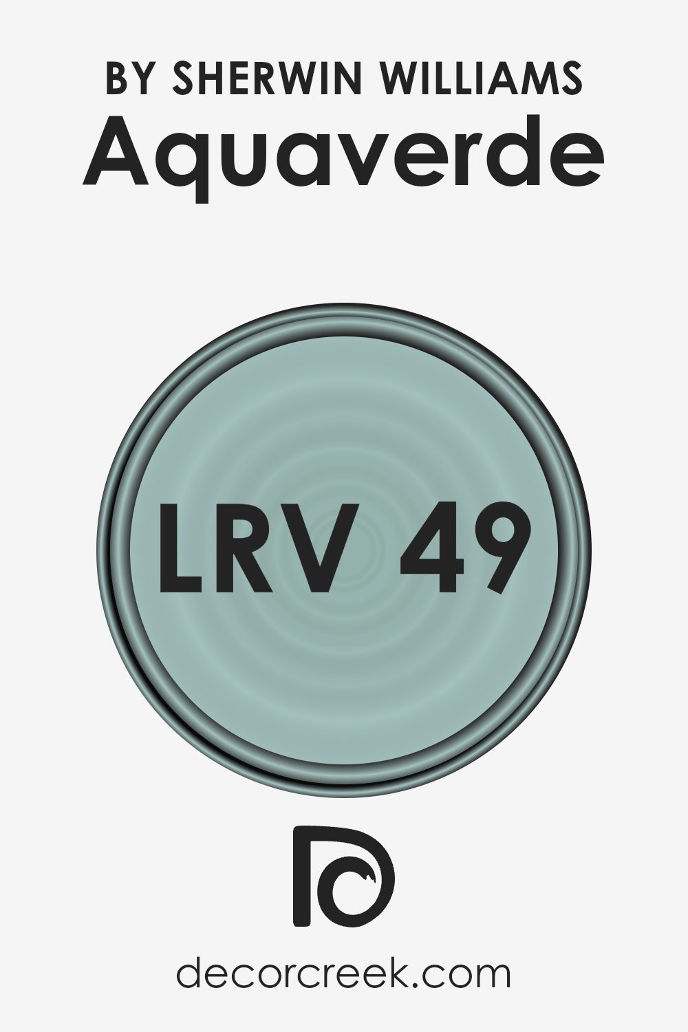
What is the LRV of Aquaverde SW 9051 by Sherwin Williams?
Light Reflectance Value, or LRV, is a measurement that represents the percentage of light a color reflects. On a scale where 0 means absolute black (which reflects no light) and 100 means pure white (which reflects all light), LRV helps us understand how light or dark a color will appear once applied to walls.
A higher LRV value, closer to 100, indicates that the color will reflect more light and thus appear brighter, making spaces feel larger and more open. Conversely, a lower LRV closer to 0 means the color will absorb more light, making it appear darker and creating a cozier atmosphere in a room.
For Aquaverde with an LRV of 48.932, it sits nearly in the middle of the scale. This means that this color has a balanced ability to reflect light. It will not make a room feel overwhelmingly bright, nor will it make it feel too dark. Aquaverde’s mid-range LRV means it can adapt well to various lighting conditions, making it a versatile choice for different room sizes and functions.
Depending on the lighting, the color might appear slightly brighter or darker, but its ability to reflect a moderate amount of light ensures that it maintains a welcoming and comfortable ambiance in a space.
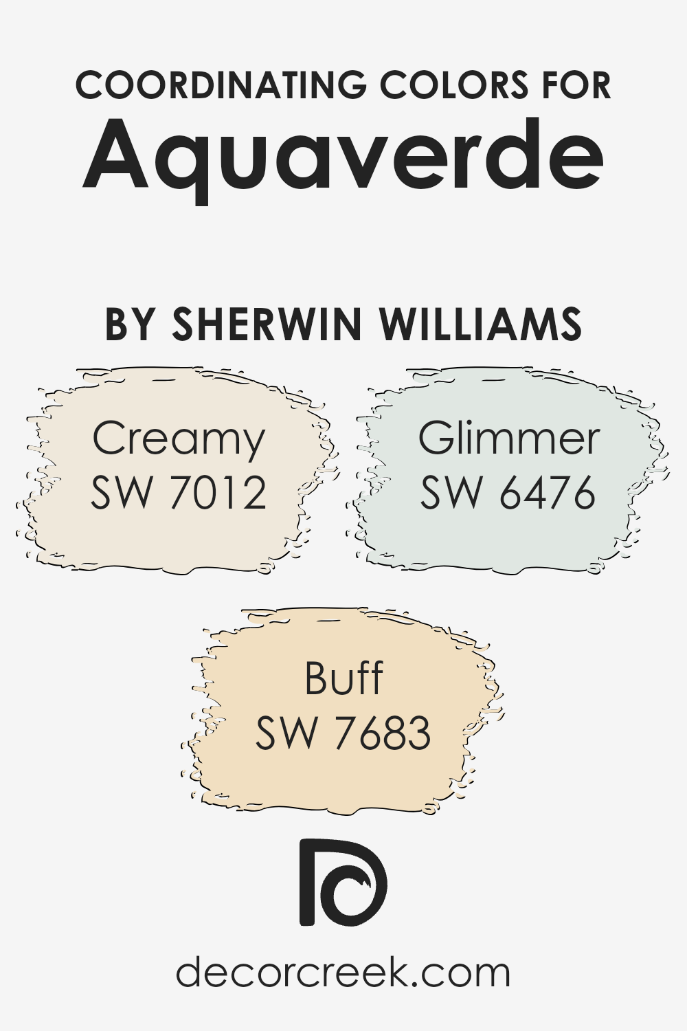
Coordinating Colors of Aquaverde SW 9051 by Sherwin Williams
Coordinating colors are hues that complement each other, creating a harmonious look when used together in a space. These colors enhance the main shade by balancing and adding depth to the overall palette, making it visually appealing.
When using Aquaverde (SW 9051) as the main color, it helps to pair it with colors that bring out its unique characteristics without overpowering it.
Coordinating colors, like Creamy (SW 7012), Buff (SW 7683), and Glimmer (SW 6476), work well with Aquaverde to create a balanced and inviting atmosphere.
Creamy (SW 7012) is a soft, warm off-white that adds a gentle touch of warmth to any room. It creates a cozy and welcoming background alongside Aquaverde.
Buff (SW 7683) is a warm, golden beige that adds a touch of earthiness, complementing the fresh vibes of Aquaverde and grounding the color scheme. Glimmer (SW 6476), a light and airy aqua, adds a refreshing burst of subtle color that blends smoothly with Aquaverde.
Together, these coordinating colors enhance each other and create a harmonious and inviting environment, making spaces feel comfortable and well-balanced.
You can see recommended paint colors below:
- SW 7012 Creamy
- SW 7683 Buff
- SW 6476 Glimmer
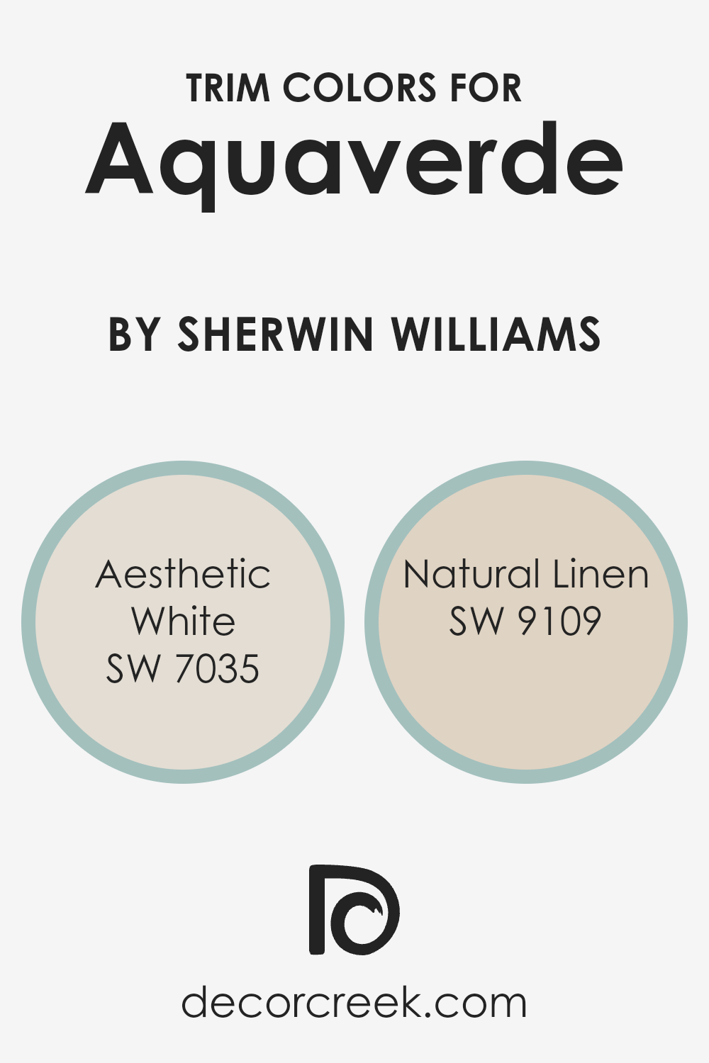
What are the Trim colors of Aquaverde SW 9051 by Sherwin Williams?
Trim colors are accent colors used on moldings, baseboards, window frames, and doors to create contrast and define spaces within a room or on a building’s exterior. For Aquaverde SW 9051 by Sherwin Williams, trim colors are important because they can complement or highlight its gentle green shade, giving the overall space a balanced appearance.
Choosing the right trim colors enhances the paint’s impact and emphasizes architectural features. Aesthetic White SW 7035 and Natural Linen SW 9109 can be excellent choices to pair with Aquaverde.
Aesthetic White, a soft and neutral off-white, provides a clean backdrop that accentuates the subtle green of Aquaverde, making spaces look fresh and airy. On the other hand, Natural Linen, a warm and earthy beige, adds a cozy and inviting feel, harmonizing beautifully with the green tones for a comforting and unified look.
Aesthetic White complements Aquaverde by adding a touch of elegance and simplicity while maintaining a crisp look.
It reflects light well, enhancing the brightness of a room without overshadowing the green hue. Natural Linen, with its beige undertones, brings warmth and depth, creating a cozy atmosphere that pairs well with the calming nature of Aquaverde.
This combination makes an ideal setting for spaces that aim to feel both inviting and naturally connected to larger design elements.
Using these trim colors ensures that the transition between wall color and architectural accents feels seamless while still catching the eye.
You can see recommended paint colors below:
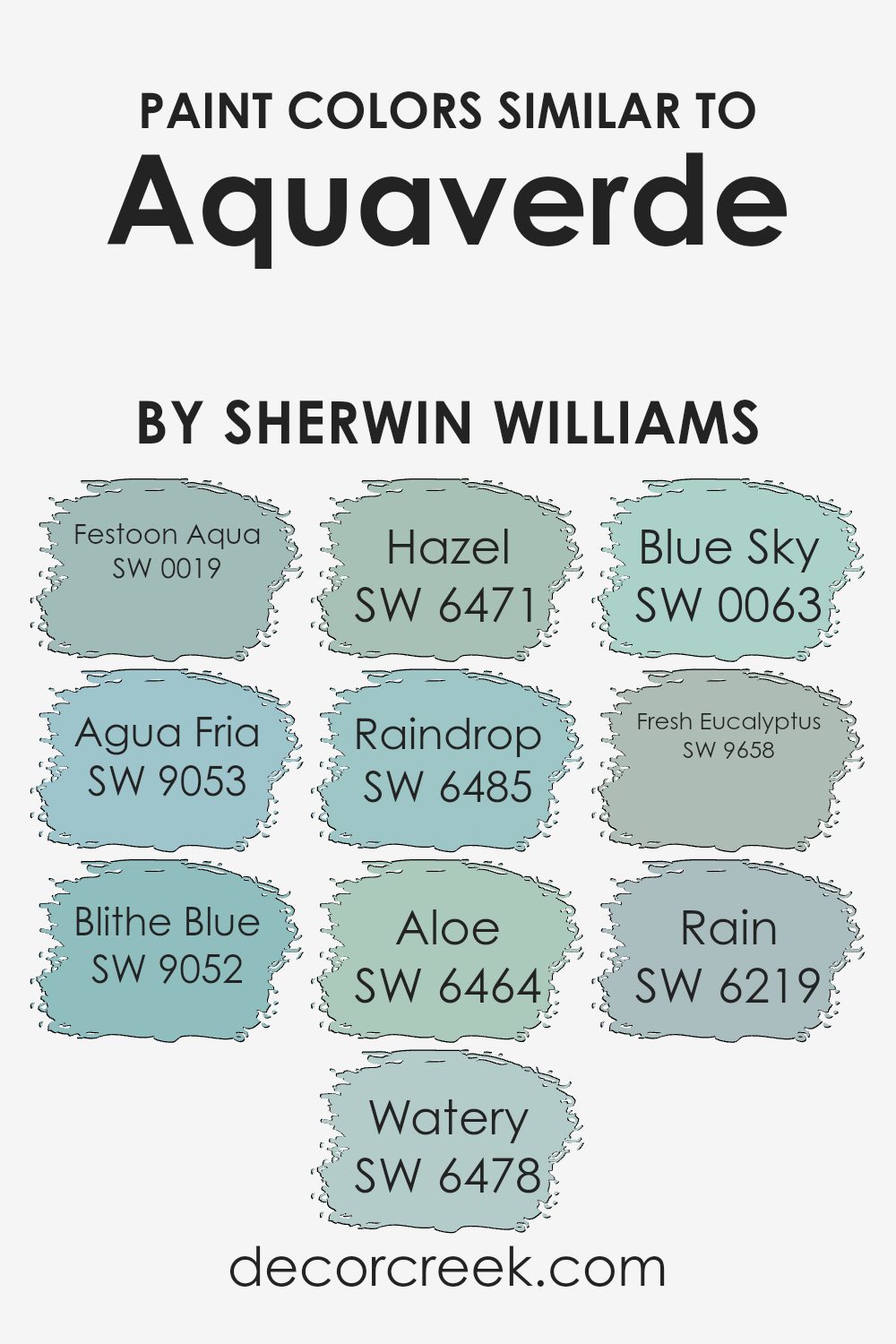
Colors Similar to Aquaverde SW 9051 by Sherwin Williams
Similar colors play an essential role in creating harmonious and visually appealing spaces. They belong to the same family and share undertones that complement each other. When used together, these colors create a cohesive look that is pleasing to the eye.
For example, Aquaverde by Sherwin-Williams is a gentle, soothing hue with a mix of green and blue tones. Complementary colors like Festoon Aqua bring a bit more energy with their vibrant aqua shade, while Agua Fria offers a cooler, more muted aqua.
Blithe Blue brings a light touch of calmness through its soft blue tones, and Watery adds a sense of freshness with its light blue-green blend.
Hazel, on the other hand, introduces a slightly warmer green that can bring life to a space.
Raindrop lightens things up with its airy sky-blue shade, while Aloe provides a hint of natural warmth with its pale green tone. Blue Sky evokes a clear, crisp atmosphere with its bright blue, resembling a sunny day. Fresh Eucalyptus combines a balanced green with subtle hints of blue for a refreshing vibe.
Lastly, Rain embodies a cool gray-blue that can ground a palette, tying together the varying shades to offer balance. Each of these colors interacts in a way that enhances and supports the others, resulting in a space that feels united and well-thought-out.
You can see recommended paint colors below:
- SW 0019 Festoon Aqua
- SW 9053 Agua Fria
- SW 9052 Blithe Blue
- SW 6478 Watery
- SW 6471 Hazel
- SW 6485 Raindrop
- SW 6464 Aloe
- SW 0063 Blue Sky
- SW 9658 Fresh Eucalyptus
- SW 6219 Rain
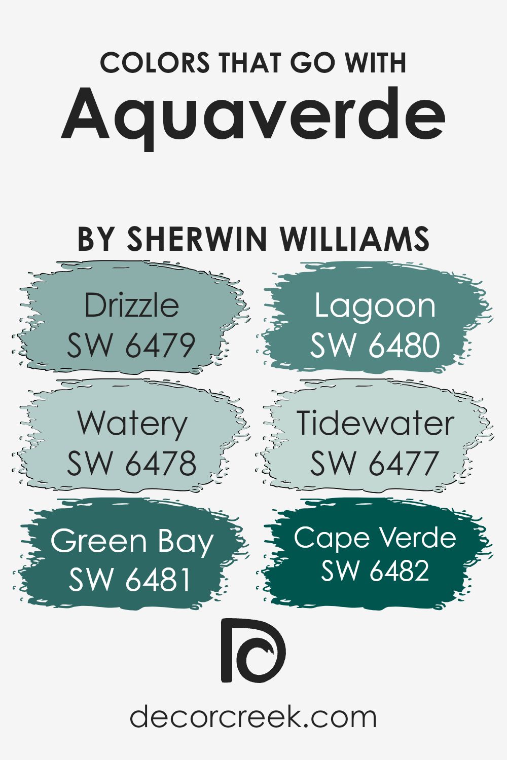
Colors that Go With Aquaverde SW 9051 by Sherwin Williams
Choosing colors that pair well with Aquaverde SW 9051 by Sherwin Williams brings harmony and balance to your space. Aquaverde is a soft blue-green, and selecting complementary colors creates a cohesive and welcoming environment.
These colors work as a team, making the room feel put together. For instance, SW 6479 Drizzle, a gentle grayish-blue, offers a calming effect, complementing Aquaverde’s pastel tones beautifully.
SW 6478 Watery, a refreshing light blue, enhances the crispness and airy feel when paired with Aquaverde.
Meanwhile, SW 6481 Green Bay, a deep, rich teal, adds depth and a bit of drama to the space without overwhelming it. SW 6480 Lagoon, with its vibrant teal hue, introduces energy and makes a bold statement when used with Aquaverde.
Then there’s SW 6477 Tidewater, a soft aqua that brightens the room and makes it feel inviting and cheerful. Finally, SW 6482 Cape Verde, a dark and bold shade of green, provides a striking contrast, adding emphasis and character to your design.
Each of these colors interacts with Aquaverde in a unique way, creating a balanced and visually appealing palette that makes the space both inviting and stylish
You can see recommended paint colors below:
- SW 6479 Drizzle
- SW 6478 Watery
- SW 6481 Green Bay
- SW 6480 Lagoon
- SW 6477 Tidewater
- SW 6482 Cape Verde
How to Use Aquaverde SW 9051 by Sherwin Williams In Your Home?
Aquaverde SW 9051 by Sherwin Williams is a beautiful green paint color that works well in many areas of the home. Its gentle, fresh tone can bring a soothing feel to a room without being too overpowering. In the living room, it can be used on all walls to create a calming atmosphere perfect for relaxation and conversation.
For a refreshing change in the kitchen, it pairs nicely with white or light wood cabinets, creating a bright and welcoming space.
In bedrooms, Aquaverde offers a peaceful environment that promotes rest and comfort. It also works as an accent color, providing a pop of interest on a single wall or as part of patterned designs.
Pairing it with neutral colors, like soft grays or creams, enhances its subtle charm. Aquaverde SW 9051 can effortlessly refresh any space, making it a versatile choice for home decorators.
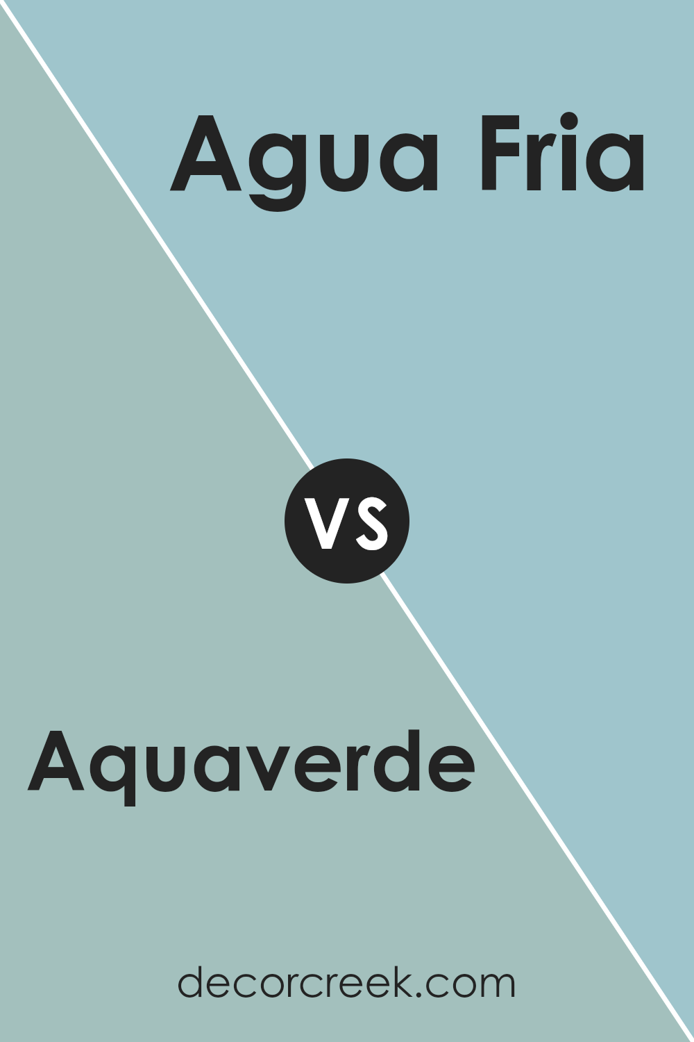
Aquaverde SW 9051 by Sherwin Williams vs Agua Fria SW 9053 by Sherwin Williams
Aquaverde (SW 9051) and Agua Fria (SW 9053) by Sherwin Williams are two shades of blue-green, each with its own unique charm. Aquaverde is a soft and soothing color that blends blue and green to create a calming effect, making it great for spaces where relaxation is important, like bedrooms or bathrooms.
It has a gentle, almost pastel-like quality that can make a room feel airy and open. In contrast, Agua Fria is a slightly darker and more muted shade. It leans more towards a deeper blue with a hint of green, providing a subtle, earthy vibe.
This makes it well-suited for spaces where a touch of moodiness or depth is desired, like living rooms or offices. Both colors can complement a variety of decor styles, but Aquaverde offers a light and breezy feel, while Agua Fria brings a touch of cozy sophistication.
You can see recommended paint color below:
- SW 9053 Agua Fria
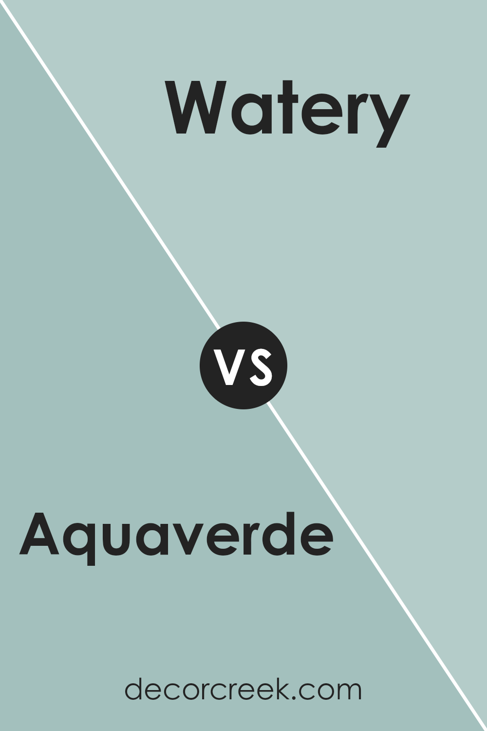
Aquaverde SW 9051 by Sherwin Williams vs Watery SW 6478 by Sherwin Williams
Aquaverde SW 9051 and Watery SW 6478 by Sherwin Williams are both soothing shades of blue-green, but they have distinct differences. Aquaverde is a deeper, darker color with more pronounced green undertones.
It offers a rich and calming vibe, suitable for spaces where you want a subdued and elegant atmosphere. In contrast, Watery is a lighter and softer shade, with more blue than green. It feels airy and refreshing, making it ideal for creating a light and open environment.
Both colors work well in various settings, but the choice between them depends on the mood you want to set. Aquaverde adds depth and can ground a room, while Watery brightens and enlarges spaces. Pair Aquaverde with dark furniture for a cozy look or combine Watery with light, natural materials for a breezy feel. In essence, Aquaverde is moodier, while Watery is more uplifting.
You can see recommended paint color below:
- SW 6478 Watery
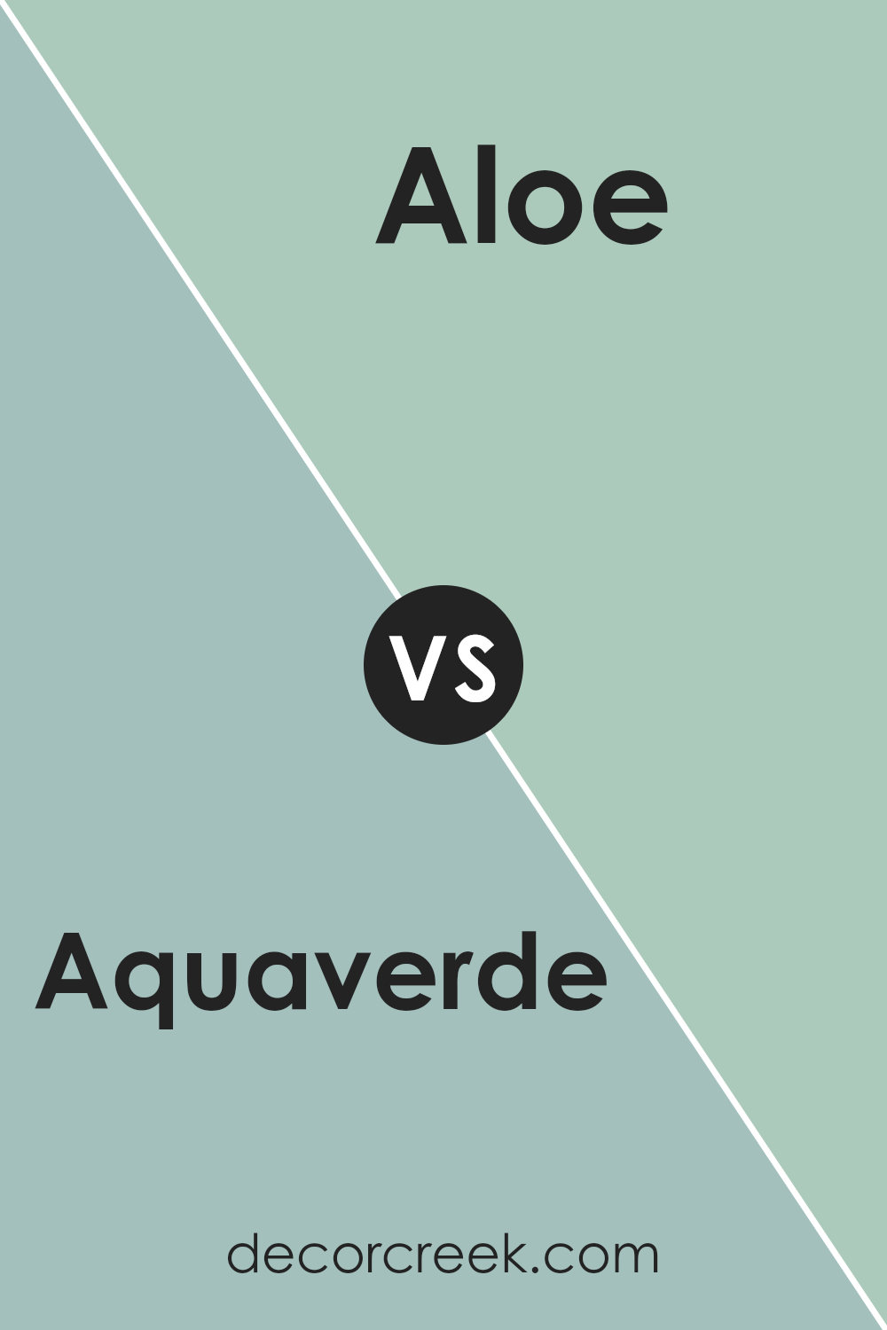
Aquaverde SW 9051 by Sherwin Williams vs Aloe SW 6464 by Sherwin Williams
Aquaverde SW 9051 and Aloe SW 6464 are two distinct colors by Sherwin Williams, yet they both come from the green family. Aquaverde is a soft, muted green with a hint of blue, creating a calming and cool vibe. In contrast, Aloe is a warmer green, with a bit of yellow, giving it a fresh and lively feel.
While Aquaverde’s subtle blue undertones provide a refreshing coolness suitable for spaces that aim for relaxation, Aloe’s yellow undertones add warmth, making it feel more inviting and energizing. Aquaverde can remind you of a tranquil ocean, while Aloe might evoke a sense of being in a sunlit garden.
Both colors work well in various spaces, but their different undertones create unique moods. Aquaverde’s coolness is perfect for bedrooms or bathrooms, while Aloe’s warmth can brighten up living rooms or kitchens. Depending on your desired atmosphere, either color can bring the perfect touch to your home.
You can see recommended paint color below:
Aquaverde SW 9051 by Sherwin Williams vs Rain SW 6219 by Sherwin Williams
Aquaverde SW 9051 by Sherwin Williams is a fresh, light green with a hint of blue, giving it a slightly minty appearance. It’s bright, cheerful, and reminiscent of springtime or a refreshing breeze. This color works well in spaces where you want to feel energized and uplifted.
Rain SW 6219 by Sherwin Williams, on the other hand, is a more subdued and calming blue-gray. It gives a room a relaxed feel, like a gentle rainfall on a cloudy day. This color is perfect for creating a peaceful atmosphere in a bedroom or a living room.
While Aquaverde brings a sense of vitality and freshness to a space, Rain offers calmness and a soothing effect. Aquaverde is great for spaces where you want to feel inspired and lively, while Rain is ideal for areas where you prefer a more peaceful and calming environment. Both colors have their distinct charm and can significantly influence the mood of a room.
You can see recommended paint color below:

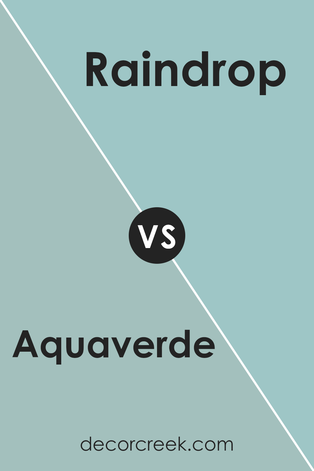
Aquaverde SW 9051 by Sherwin Williams vs Raindrop SW 6485 by Sherwin Williams
Aquaverde SW 9051 by Sherwin Williams is a soft and muted aqua color that brings a gentle and calming vibe to a space. It has a mix of blue and green tones, creating a balanced and soothing look. On the other hand, Raindrop SW 6485 is a brighter, more vibrant color with a stronger blue undertone.
While Aquaverde is more understated and subtle, Raindrop adds a touch of energy and freshness to a room. Both colors are reminiscent of nature, with Aquaverde giving the feel of a quiet, peaceful morning by the water and Raindrop evoking the brightness and clarity of a refreshing rain.
Though they share some similar qualities, Aquaverde’s muted nature makes it better for a relaxed setting, while Raindrop is perfect for adding a pop of lively color. Both colors are great choices, depending on whether you want a calm or invigorating atmosphere.
You can see recommended paint color below:
- SW 6485 Raindrop
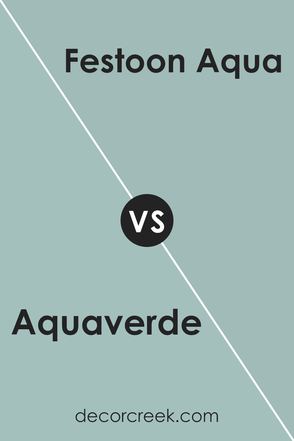
Aquaverde SW 9051 by Sherwin Williams vs Festoon Aqua SW 0019 by Sherwin Williams
Aquaverde and Festoon Aqua are two different but related shades of green. Aquaverde is a light, refreshing color with a hint of blue, making it feel like a gentle mix between green and aqua. It’s soft and calming, suitable for spaces where you want a relaxed atmosphere. It’s light enough to be subtle but still adds a touch of color to a room.
Festoon Aqua, on the other hand, is a bit deeper and richer. It has more intensity compared to Aquaverde, which means it can make a slightly bolder statement. This color leans more toward aqua with its stronger blue undertone, offering a vibrant yet still soothing experience.
Both colors bring a sense of freshness to a space, but Aquaverde is more understated, while Festoon Aqua adds a bit more color and vivacity. Depending on your preference, you can choose between the subtle touch of Aquaverde or the vibrant yet calm presence of Festoon Aqua.
You can see recommended paint color below:
- SW 0019 Festoon Aqua
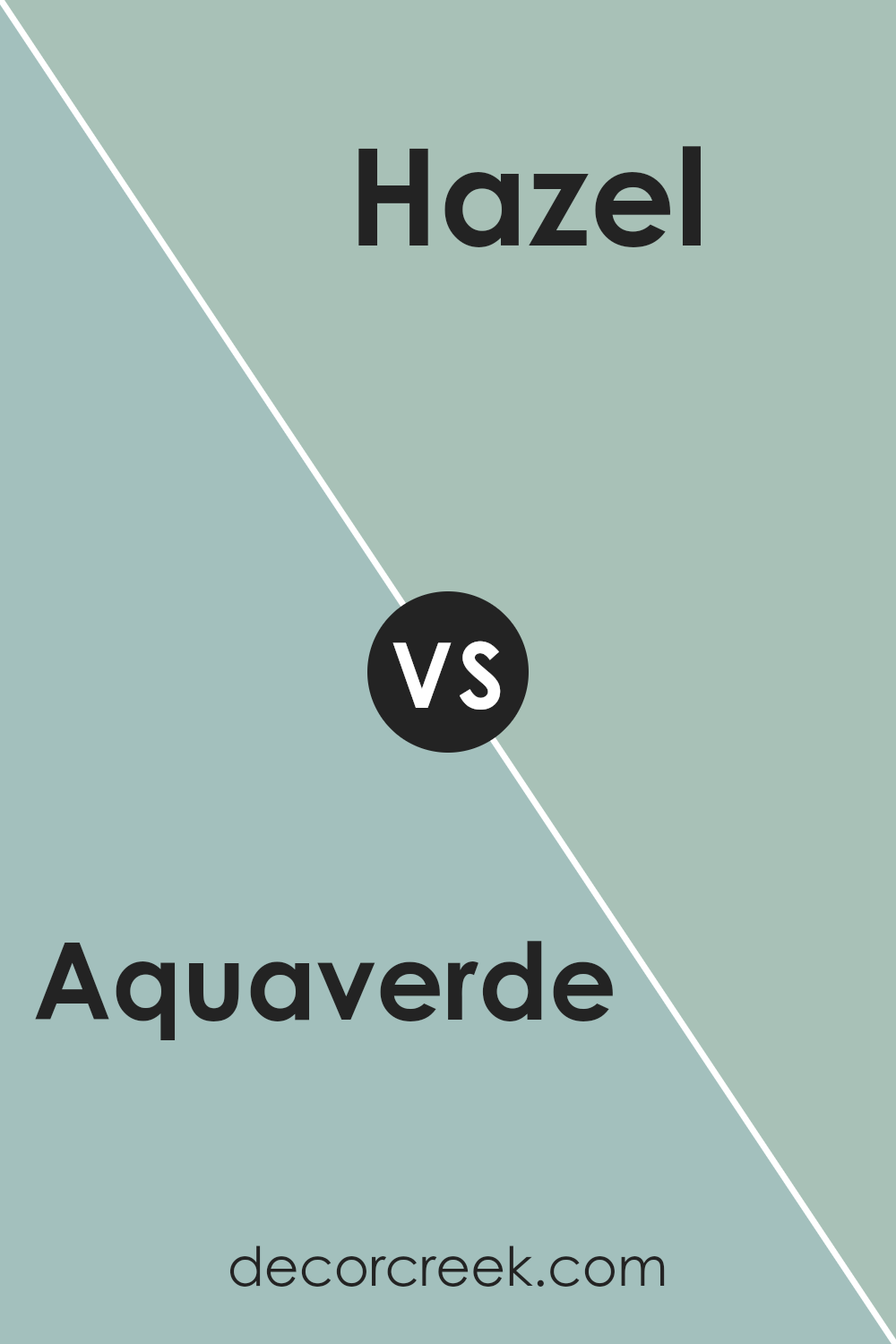
Aquaverde SW 9051 by Sherwin Williams vs Hazel SW 6471 by Sherwin Williams
Aquaverde SW 9051 and Hazel SW 6471, both from Sherwin Williams, offer soothing tones with distinct characteristics. Aquaverde SW 9051 is a gentle blend of blue and green, evoking a sense of calm reminiscent of tranquil waters, with its light and airy feel. It is a versatile shade, working well in spaces where peace and relaxation are desired, such as bedrooms or bathrooms.
On the other hand, Hazel SW 6471 is a deeper green with a subtle hint of blue, creating a cozy and earthy atmosphere. This color can ground a room, making it feel warm and inviting. It pairs beautifully with natural materials like wood and stone.
Both colors suit different moods and designs. Aquaverde is ideal for light, airy aesthetics, while Hazel offers depth and warmth. Choosing between them depends on whether you aim for a breezy or cozy environment in your space.
You can see recommended paint color below:
Aquaverde SW 9051 by Sherwin Williams vs Blue Sky SW 0063 by Sherwin Williams
Aquaverde SW 9051 by Sherwin Williams is a soft, muted green with hints of blue, bringing a fresh and calming vibe to any space. It’s a versatile color that works well in various settings, from rustic to modern. It’s ideal for rooms where you want a touch of nature without being overpowering.
On the other hand, Blue Sky SW 0063 is a bright, pure blue that evokes the open sky. It’s energetic and uplifting, perfect for areas where you want to create a sense of openness and cheerfulness. Its boldness can make a statement in a room without needing additional accents.
While Aquaverde leans more towards a soothing retreat, Blue Sky is more about vibrancy and openness. Choosing between the two depends on the atmosphere you want to create: calm and gentle with Aquaverde or lively and expansive with Blue Sky. Both colors are beautiful but serve different purposes.
You can see recommended paint color below:
Aquaverde SW 9051 by Sherwin Williams vs Blithe Blue SW 9052 by Sherwin Williams
Aquaverde SW 9051 and Blithe Blue SW 9052 are both beautiful colors by Sherwin Williams, but they offer different vibes. Aquaverde SW 9051 is a soft green with a hint of blue, creating a calm and soothing atmosphere. It’s perfect for spaces where you want a natural, fresh feeling, like a living room or a bathroom.
On the other hand, Blithe Blue SW 9052 leans more towards a true blue, giving a cooler and more refreshing look. This color works well in bedrooms or offices, where a peaceful and airy environment is welcome.
While Aquaverde can remind you of gentle seafoam, Blithe Blue resembles a clear sky.
Both colors can brighten up any space, but your choice would depend on whether you want a touch of earthiness with Aquaverde or more of a classic blue feel with Blithe Blue.
You can see recommended paint color below:
- SW 9052 Blithe Blue
Aquaverde SW 9051 by Sherwin Williams vs Fresh Eucalyptus SW 9658 by Sherwin Williams
Aquaverde SW 9051 and Fresh Eucalyptus SW 9658 by Sherwin Williams are two fresh and vibrant shades of green. Aquaverde is a soft, blue-leaning green that feels cool and refreshing, like a gentle sea breeze. It works well in spaces where you want a hint of color without it being overpowering.
Fresh Eucalyptus, on the other hand, is a bit warmer and richer, resembling the natural tones found in eucalyptus leaves. It has a soothing and grounding presence, making it ideal for spaces where comfort and relaxation are key.
Both colors have their unique appeal, but while Aquaverde offers a light and airy feel, Fresh Eucalyptus provides a touch of coziness with its warmer undertone.
Pairing these colors with whites or neutral shades can highlight each one’s unique character. They’re both excellent choices for creating a calm and inviting atmosphere in any room.
You can see recommended paint color below:
Conclusion
It’s a gentle green with hints of blue, reminding me of the calmness by the sea or a peaceful walk in a garden. Aquaverde feels refreshing and can brighten up a room without being too loud or boring.
When I imagine it on the walls, I see a room that feels both lively and relaxing. It’s like bringing a piece of nature inside. Whether in a kitchen, living room, or even a bedroom, this color feels right and welcoming. It can make a small room feel airy and a bigger room feel comforting.
The color works well with many other shades, so if you like decorations or furniture in different colors, Aquaverde would mix well with them too. Whether matched with whites, soft colors, or even darker ones, it holds its charm.
Using Aquaverde feels like choosing happiness and calmness together. It’s like playing in a meadow and feeling a gentle breeze.
This color can make a house feel more like home. Snowier days or sunnier ones, it feels like it fits all. And that’s the beauty of Aquaverde.
Ever wished paint sampling was as easy as sticking a sticker? Guess what? Now it is! Discover Samplize's unique Peel & Stick samples.
Get paint samples

