If you’re looking to refresh your space with a unique and soothing color, you might want to consider SW 0048 Bunglehouse Blue by Sherwin Williams. This shade is a deep, rich blue that has a cozy, inviting feel, making it an excellent choice for rooms where you want to relax and feel at ease. Whether you’re painting a bedroom, a living area, or even a kitchen, Bunglehouse Blue provides a sense of calm and sophistication without being too overwhelming.
As someone who enjoys updating their home’s look, I find this color versatile enough to pair with various decor styles, from modern and minimalistic to more traditional setups. It also works wonderfully as an accent wall, adding a focal point to any room without needing to redo the entire space.
Plus, depending on the lighting, Bunglehouse Blue can shift from a deep, serene blue to a more vibrant, dynamic hue, giving your room an ever-changing atmosphere throughout the day.
So, if you’re planning your next DIY project, Bunglehouse Blue might just be the perfect color to spruce up your home.
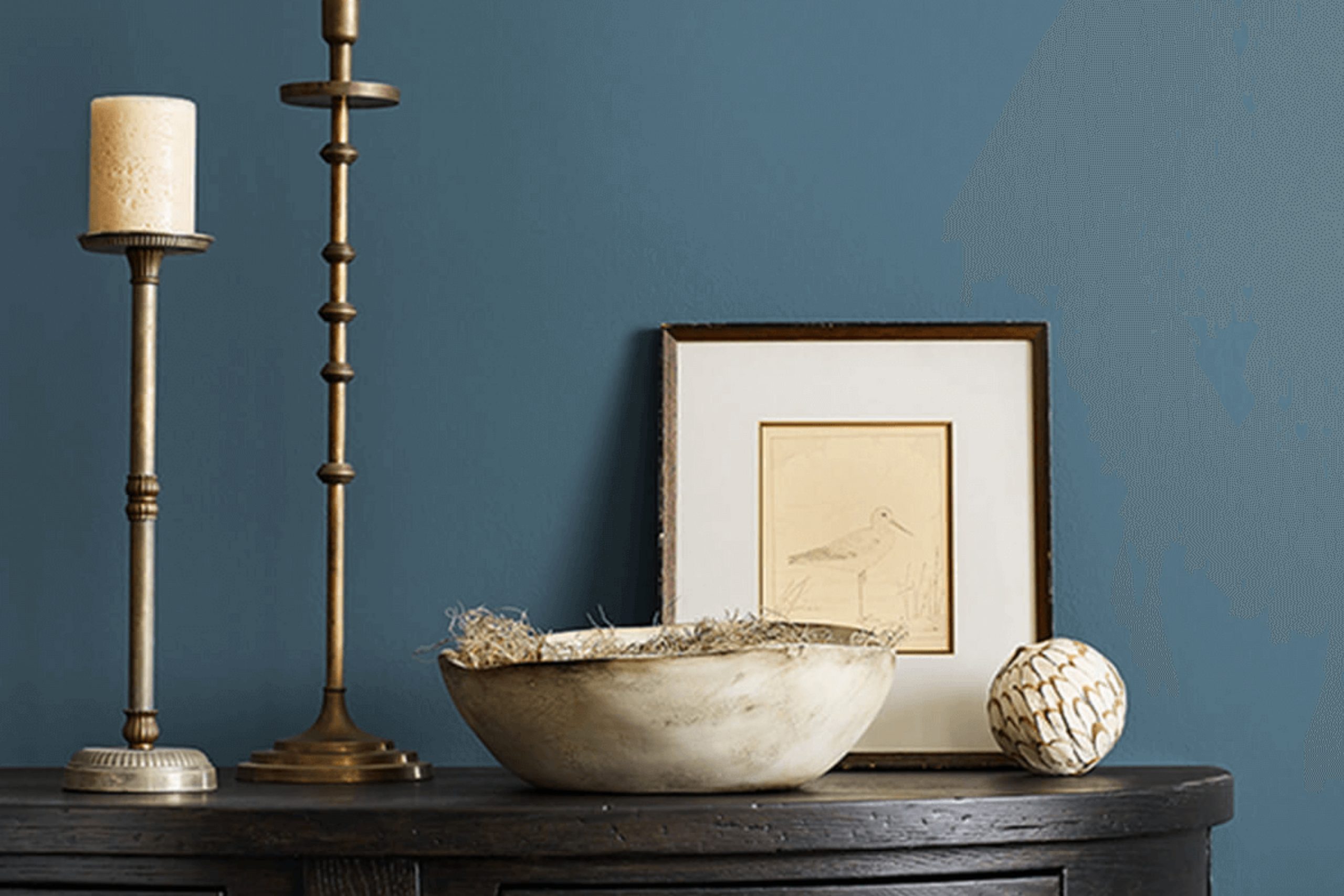
What Color Is Bunglehouse Blue SW 0048 by Sherwin Williams?
Bunglehouse Blue is a striking yet timeless shade of blue that offers a deep and rich hue, making it a perfect choice for adding a bold touch to any space without overwhelming it. This color has a balanced mix of blue with a slight grey undertone that gives it a unique depth, making it incredibly versatile and easy to pair with various decor styles and textures.
Bunglehouse Blue works exceptionally well in interior styles such as coastal, traditional, and modern. In a coastal setting, it can mimic the depths of the ocean, creating a thematic feel. When used in a traditional context, it adds a touch of elegance and depth, perfect for feature walls or cabinetry. In modern homes, it pairs beautifully with clean lines and minimalist aesthetics, providing a pop of color that is neither too loud nor too subtle.
As for materials, Bunglehouse Blue pairs well with natural wood, from light oak to rich walnut, enhancing the warmth of the wood tones. It also looks stunning when contrasted with metallic finishes like brass or copper, adding a touch of luxury and brightness to the space. Textures such as linen, cotton, and velvet in neutral shades like white, beige, or light gray also complement this color well, creating a balanced and inviting atmosphere.
Whether on a wall, in textiles, or on cabinetry, Bunglehouse Blue is adaptable and stylish.

Is Bunglehouse Blue SW 0048 by Sherwin Williams Warm or Cool color?
Bunglehouse Blue SW 0048 from Sherwin Williams is a unique and bold paint color that can really make a statement in any home. This deep, moody blue has a hint of gray, making it versatile yet striking. It’s perfect for creating a focal point in a room, whether it’s painted on an accent wall or used throughout a space.
This color pairs well with a variety of decor styles, from modern to traditional. It works especially well in rooms that need a touch of drama or where you want to highlight artwork or furniture. Because it’s a darker shade, it can make large spaces feel more cozy and intimate, while in smaller rooms, it can give the illusion of depth.
When paired with lighter colors like whites or creams, Bunglehouse Blue can stand out without feeling overpowering. It’s also stunning when matched with wood finishes or metallic accents, adding a touch of elegance to the overall look of the room. Whether you are looking for a dramatic change or a subtle background, this color can be a great choice.
Undertones of Bunglehouse Blue SW 0048 by Sherwin Williams
Bunglehouse Blue is a rich and complex color that brings a unique depth to any interior space. By understanding its undertones, we can better appreciate how it interacts with light and surrounding colors, and how it affects the atmosphere of a room.
This particular shade has a variety of undertones which range from navy and dark blue to lighter and softer shades like light turquoise and lilac. Each undertone plays a role in how the color is perceived. For instance, navy and dark blue add a depth that makes the wall seem more prominent and finely textured. On the other hand, lighter tones like light turquoise bring a subtle freshness to the space, softening the overall vibe.
When Bunglehouse Blue is painted on interior walls, these undertones interact with both natural and artificial light, shifting the color’s appearance throughout the day. During daylight, lighter undertones might become more dominant, making the walls appear vibrant and lively. In contrast, during the evening under artificial lighting, darker undertones could be more noticeable, giving the room a cozier and more enclosed feel.
This dynamic nature of Bunglehouse Blue makes it a versatile choice for various spaces, adapting its personality from bright and airy to deep and moody depending on the lighting and accompanying decor colors.
It’s perfect for adding character and interest to a room without overwhelming it with color. The selection of furniture and decorations also plays a crucial role in highlighting these undertones, either drawing them out or blending them into a harmonious whole.
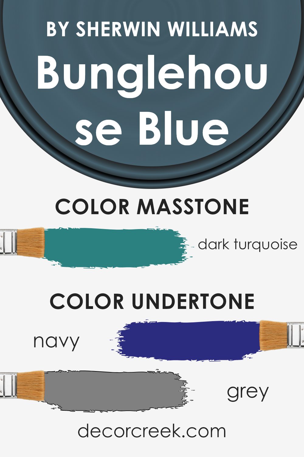
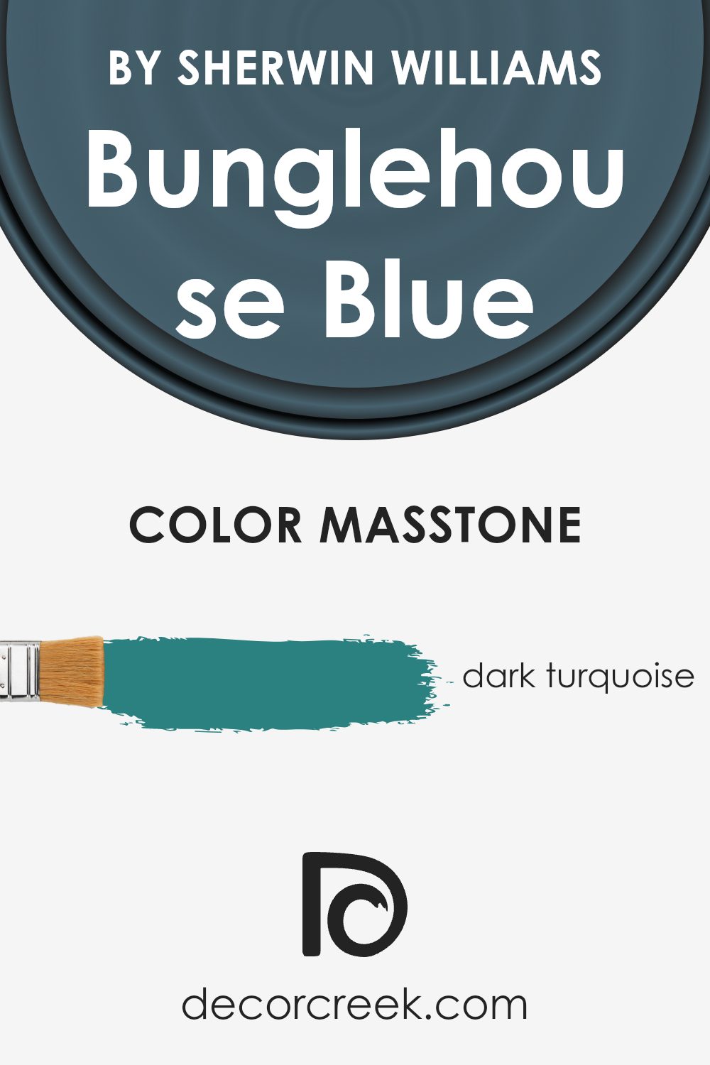
What is the Masstone of the Bunglehouse Blue SW 0048 by Sherwin Williams?
Bunglehouse Blue SW 0048 by Sherwin Williams is a unique shade with a dark turquoise masstone, highlighted by its deep blend of blue and green tones. This particular color has a vibrant yet soothing quality, making it a standout choice for home interiors. When used on walls, it provides a robust backdrop that pairs well with both bright accents and neutral tones. This versatility allows homeowners to create diverse looks, from a lively family room to a stylish bedroom.
The depth of Bunglehouse Blue also gives the illusion of space, making smaller rooms appear larger. Its rich saturation brings warmth to spaces that lack natural light, offering a cozy feel during the cooler months. Furthermore, because of its connection to natural elements like water and foliage, it works exceptionally well in bathrooms and kitchens, providing a refreshing splash of color.
Overall, this shade is an excellent choice for those looking to add a touch of personality and warmth to their living spaces.
How Does Lighting Affect Bunglehouse Blue SW 0048 by Sherwin Williams?
Lighting has a significant impact on how we perceive colors. The color of the light, whether natural (sunlight) or artificial (light bulbs), can enhance or alter the appearance of colors in a room. Bunglehouse Blue, a deep, rich blue shade created by Sherwin Williams, is an excellent example of how light influences color perception.
In artificial light, Bunglehouse Blue’s true character can vary depending on the type of bulb used. With warm, yellow-toned bulbs, this color will appear richer and slightly more muted, bringing forward a cozy feel. Yet, under cool, white bulbs, the blue becomes more vivid and striking, leaning towards a fresher look.
In natural light, the color’s appearance shifts throughout the day due to the sun’s position. In north-facing rooms, light is typically cooler and more consistent, which can make Bunglehouse Blue appear more profound and more vibrant. This offers an airy yet grounded feeling.
South-facing rooms benefit from abundant sunlight, which can wash out some deeper colors. But Bunglehouse Blue maintains its richness while appearing slightly lighter and more dynamic. This aspect makes it a great choice for spaces used all day.
In east-facing rooms, the morning light brings warmth that can make this color look bolder and more inviting in the mornings but darker in the afternoons and evenings. Conversely, in west-facing rooms, the situation is reversed. The color stays closer to its true shade during the afternoon when illuminated by the warmer, more intense light of a setting sun, lending a striking presence in the evening.
Overall, Bunglehouse Blue is a versatile color that reacts distinctively to different lighting conditions, making it a fantastic choice for various room orientations and light sources.

What is the LRV of Bunglehouse Blue SW 0048 by Sherwin Williams?
LRV stands for Light Reflectance Value, which essentially measures the percentage of light that a paint color reflects back into a room. This value ranges on a scale where lower numbers mean the color absorbs more light and looks darker, whereas higher numbers reflect more light and appear lighter.
This measurement helps in deciding how a paint color will feel in a space. For example, a room painted with a color with high LRV can feel brighter and more open, while one with low LRV might feel cozier and more enclosed.
In the case of the color with an LRV of 11.295, it is dark enough to absorb a significant amount of light, causing it to appear quite rich and intense on the walls. This lower LRV means that in rooms with little natural light, the color might make the space feel smaller or dimmer.
However, in well-lit or large areas, this darker hue can add a dramatic flair without overpowering the room, especially when balanced with lighter colors in the decor. Thus, the LRV of this paint is not just a number but a helpful guide in achieving the desired atmosphere in a room through color.

Coordinating Colors of Bunglehouse Blue SW 0048 by Sherwin Williams
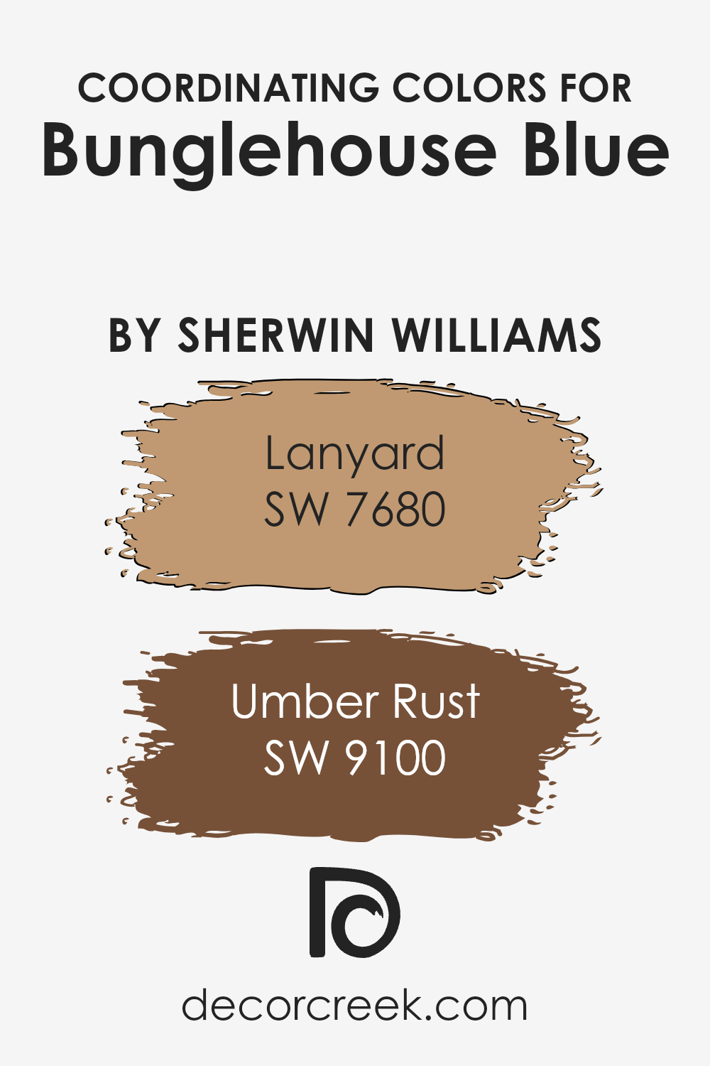
Coordinating colors work together to create a visually harmonious space, complementing the primary color in a design. In the case of Bunglehouse Blue from Sherwin Williams, two coordinating colors that pair beautifully with it are Lanyard and Umber Rust. These colors have been specifically selected to complement and enhance the dominant shade of Blue, ensuring a well-balanced and pleasing aesthetic.
Lanyard (SW 7680) is a shade of gray with deep undertones that provides a solid, grounding effect when used alongside Bunglehouse Blue. This color is perfect for adding a neutral, yet strong backdrop that allows the blue to stand out without overwhelming the space.
On the other hand, Umber Rust (SW 9100) offers a rich, warm terracotta color that brings warmth and a sense of earthiness to the palette. This warm hue works particularly well with Bunglehouse Blue by adding a natural, inviting contrast that is ideal for creating a cozy atmosphere in any room. Together, these colors create a dynamic and aesthetically pleasing environment, enhancing the overall look of the space.
You can see recommended paint colors below:
- SW 7680 Lanyard (CHECK A SAMPLE)
- SW 9100 Umber Rust (CHECK A SAMPLE)
What are the Trim colors of Bunglehouse Blue SW 0048 by Sherwin Williams?
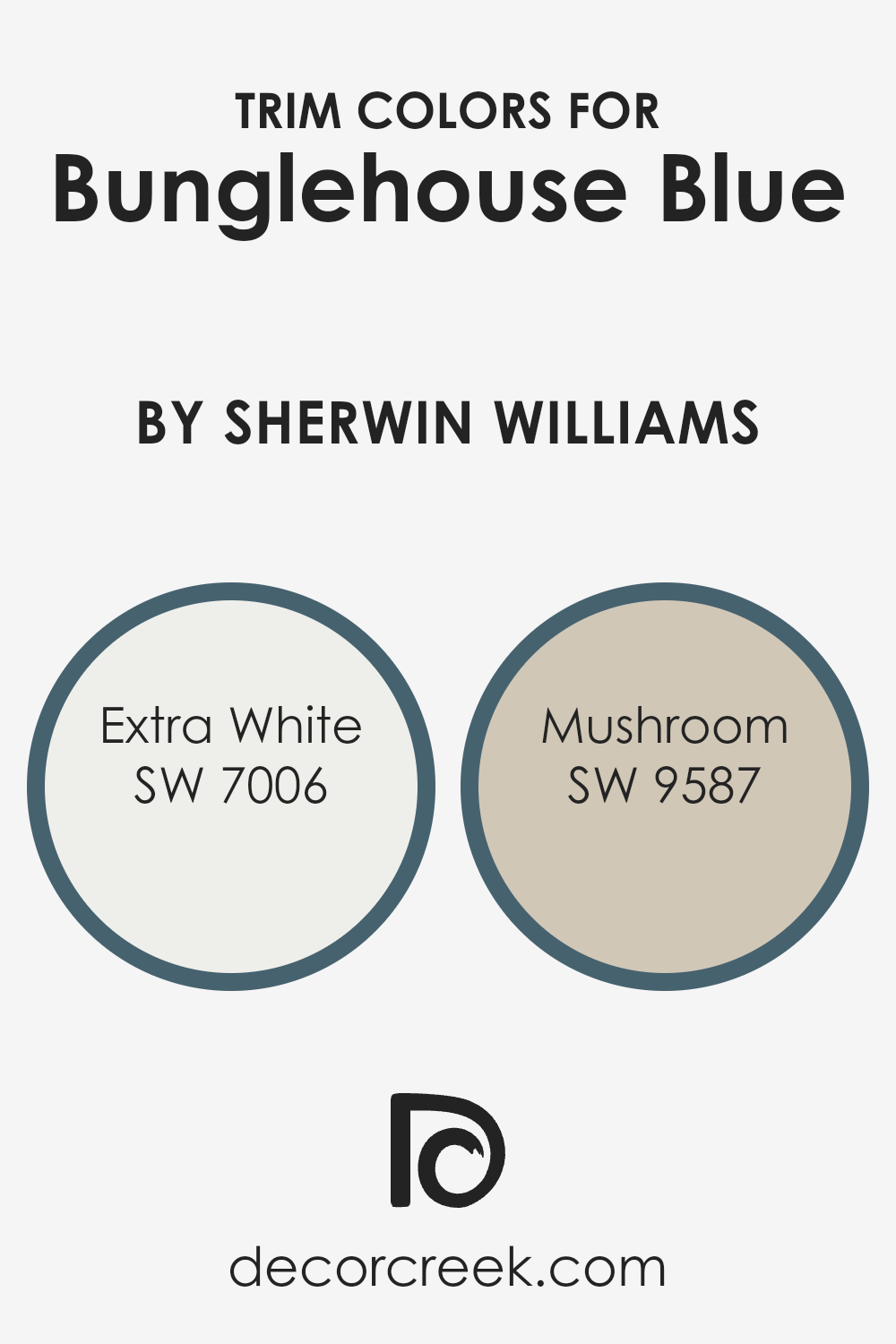
Trim colors refer to the hues selected for the architectural details of a room, such as baseboards, crown moldings, windows, and door frames. Choosing the right trim colors can enhance the aesthetic appeal of a wall color, like Bunglehouse Blue by Sherwin Williams, creating a pleasing contrast that defines and highlights spatial boundaries and architectural features. SW 7006 – Extra White and SW 9587 – Mushroom are two excellent choices for trim when paired with Bunglehouse Blue.
Extra White, as the name suggests, is a very clean and clear white color. It provides a sharp contrast that can make the rich tones of Bunglehouse Blue pop, giving a fresh and orderly appearance to the room. On the other hand, Mushroom offers a softer, earthy beige that complements the blue without creating too stark of a contrast.
This color combination results in a more subtle and warm feel, perfect for creating a cozy atmosphere in a space.
You can see recommended paint colors below:
- SW 7006 Extra White (CHECK A SAMPLE)
- SW 9587 Mushroom (CHECK A SAMPLE)
Colors Similar to Bunglehouse Blue SW 0048 by Sherwin Williams
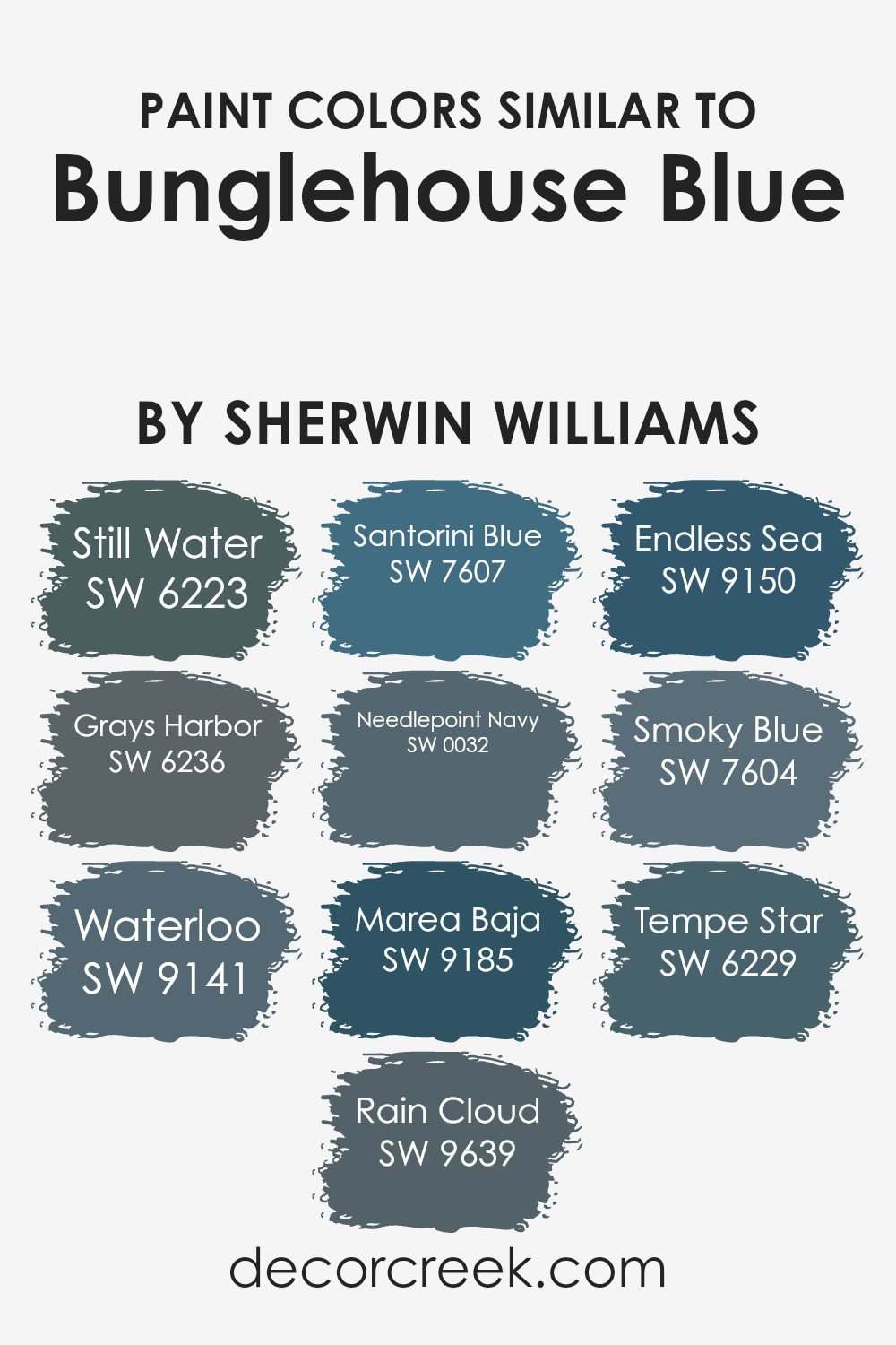
Choosing similar colors can enhance the aesthetics of a space by creating a harmonious and cohesive look. When colors like SW 6223 Still Water and SW 6236 Grays Harbor are used together, they provide a subtle contrast while maintaining a unified atmosphere because both share a cool, muted quality.
This technique of using closely related colors allows decorators to add depth and dimension without the distraction of stark color contrasts, ensuring that the focus remains on the overall ambiance of the room.
SW 9141 Waterloo and SW 9639 Rain Cloud both feature deep, moody blues that seamlessly complement the lighter and mid-tone blues like SW 7607 Santorini Blue. Using this range provides a rich palette that can create inviting spaces. SW 0032 Needlepoint Navy offers a classic, deep blue that anchors lighter shades like SW 9185 Marea Baja, which has a refreshing marine tone.
Adding depths, SW 9150 Endless Sea and SW 7604 Smoky Blue provide dusty variations of the hue, rounding out the edges of any design. Finally, SW 6229 Tempe Star finishes this spectrum by injecting a stately, almost charcoal-like blue, making it perfect for adding a touch of formality to casual blues.
You can see recommended paint colors below:
- SW 6223 Still Water (CHECK A SAMPLE)
- SW 6236 Grays Harbor (CHECK A SAMPLE)
- SW 9141 Waterloo (CHECK A SAMPLE)
- SW 9639 Rain Cloud (CHECK A SAMPLE)
- SW 7607 Santorini Blue (CHECK A SAMPLE)
- SW 0032 Needlepoint Navy (CHECK A SAMPLE)
- SW 9185 Marea Baja (CHECK A SAMPLE)
- SW 9150 Endless Sea (CHECK A SAMPLE)
- SW 7604 Smoky Blue (CHECK A SAMPLE)
- SW 6229 Tempe Star (CHECK A SAMPLE)
How to Use Bunglehouse Blue SW 0048 by Sherwin Williams In Your Home?
Bunglehouse Blue SW 0048 by Sherwin Williams is a unique and striking shade of blue that adds a fresh touch to any room. This color is versatile enough to be used in many areas of your home. In the living room, Bunglehouse Blue can create a friendly and welcoming atmosphere when applied to an accent wall. If you’re looking to update your kitchen, consider painting your cabinets with this vibrant blue to add a cheerful splash of color that stands out against a neutral backdrop.
For those thinking about bedroom colors, Bunglehouse Blue works well there too, offering a calm yet cheerful vibe that can make winding down easier at night. It pairs excellently with whites, grays, and even some yellows for a balanced look. When used in smaller spaces like a bathroom, this color can make the area feel more open and lively. Overall, Bunglehouse Blue is a great choice for anyone looking to add a bit of personality to their spaces through color.
Bunglehouse Blue SW 0048 by Sherwin Williams vs Santorini Blue SW 7607 by Sherwin Williams
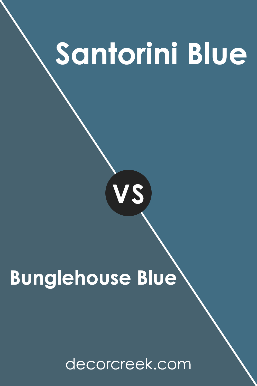
Bunglehouse Blue and Santorini Blue are both unique shades offered by Sherwin Williams, but they have distinct tones that set them apart. Bunglehouse Blue is a deep, rich blue with a hint of gray, making it a great choice for a more muted, subtle look. It’s especially fitting for spaces where you want a touch of color without overwhelming the room.
On the other hand, Santorini Blue is lighter and leans towards a more vibrant, refreshing blue that mimics the clear skies or a bright summer day. This makes it ideal for areas where you might want to add a lively splash of color that feels airy and uplifting. Both colors work well in different settings depending on the mood you’re aiming to create.
You can see recommended paint color below:
- SW 7607 Santorini Blue (CHECK A SAMPLE)
Bunglehouse Blue SW 0048 by Sherwin Williams vs Tempe Star SW 6229 by Sherwin Williams
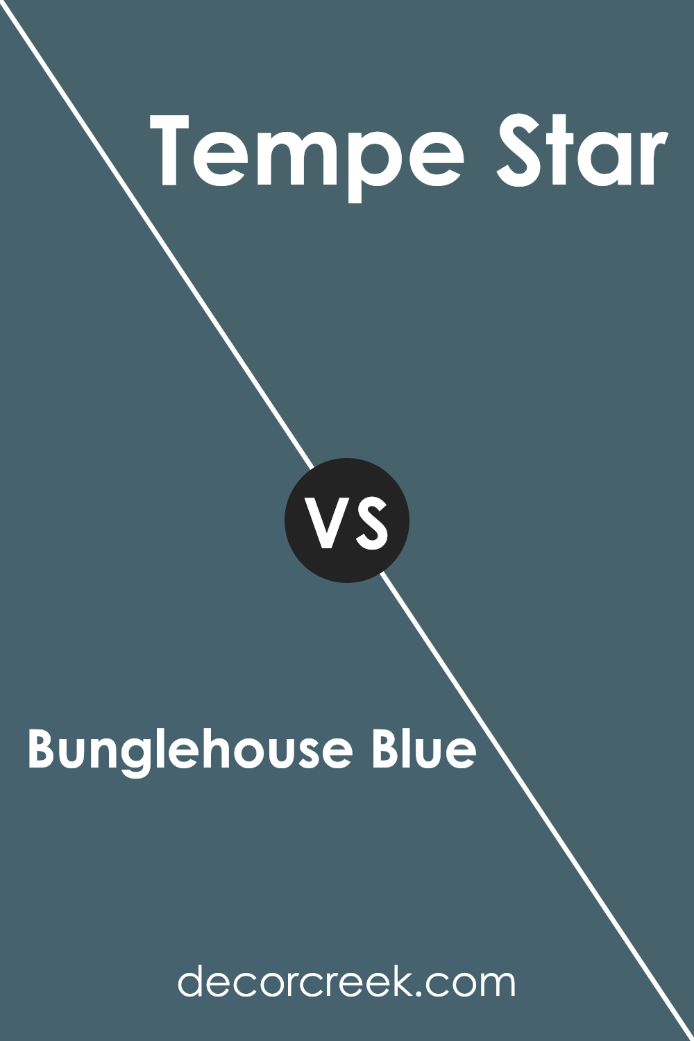
Bunglehouse Blue and Tempe Star are both shades of blue by Sherwin Williams, yet they have distinct vibes. Bunglehouse Blue is a deep, intense blue that has a classic feel, perfect for adding a bold touch to spaces. On the other hand, Tempe Star is slightly lighter and carries a more muted tone, making it ideal for creating a subtle and calming atmosphere in rooms.
Both colors offer a sense of calm, but Tempe Star’s softer hue makes it more adaptable to different spaces and decor styles, potentially making it easier to incorporate into various home styles. Conversely, the richness of Bunglehouse Blue works well as a statement color, particularly in areas where you want to add drama and depth.
Overall, your choice between the two would depend on the specific mood and style you’re aiming to achieve in your space.
You can see recommended paint color below:
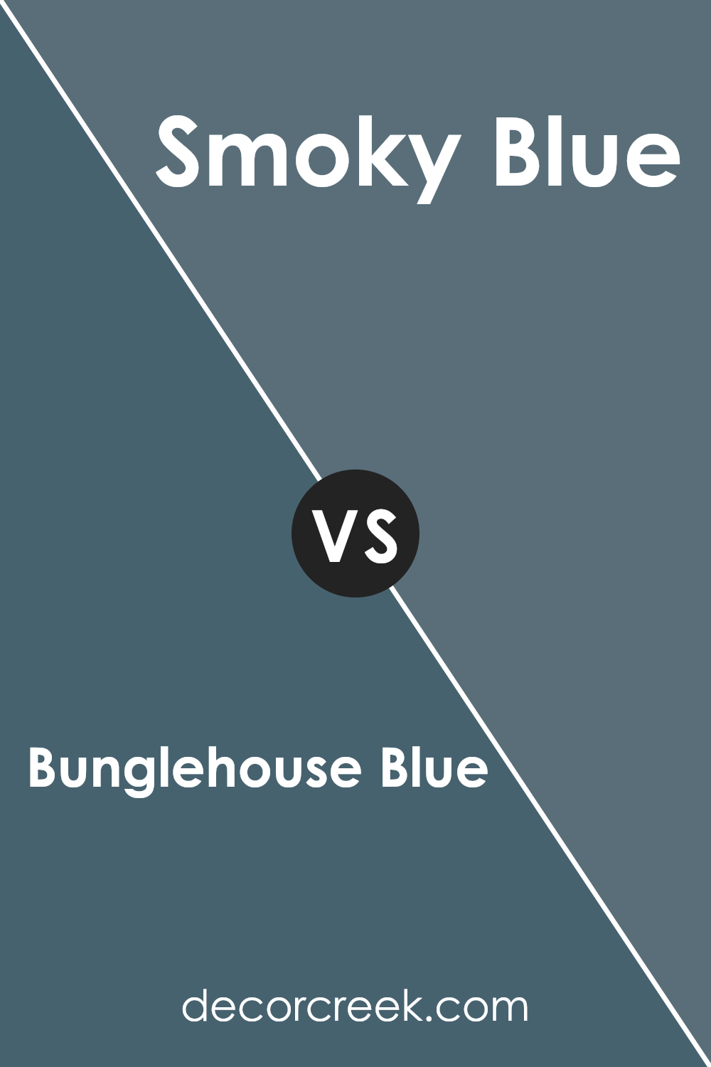
Bunglehouse Blue SW 0048 by Sherwin Williams vs Smoky Blue SW 7604 by Sherwin Williams
Bunglehouse Blue and Smoky Blue by Sherwin Williams are two distinct shades of blue that offer unique characteristics for any space. Bunglehouse Blue is a deep, saturated color that leans towards a navy tone. It can make a strong statement in a room, providing a bold backdrop that can either stand alone or support a nautical or rustic interior theme.
On the other hand, Smoky Blue is a lighter, more muted shade. It offers a softer look and is versatile enough to be used in a variety of settings, from bedrooms to living rooms. Smoky Blue can create a calm atmosphere, making it a good choice for those wanting to add a touch of color without overwhelming a space.
Both colors are great options but serve different moods and themes. Bunglehouse Blue is more striking and grounding, while Smoky Blue is gentle and flexible in its styling.
You can see recommended paint color below:
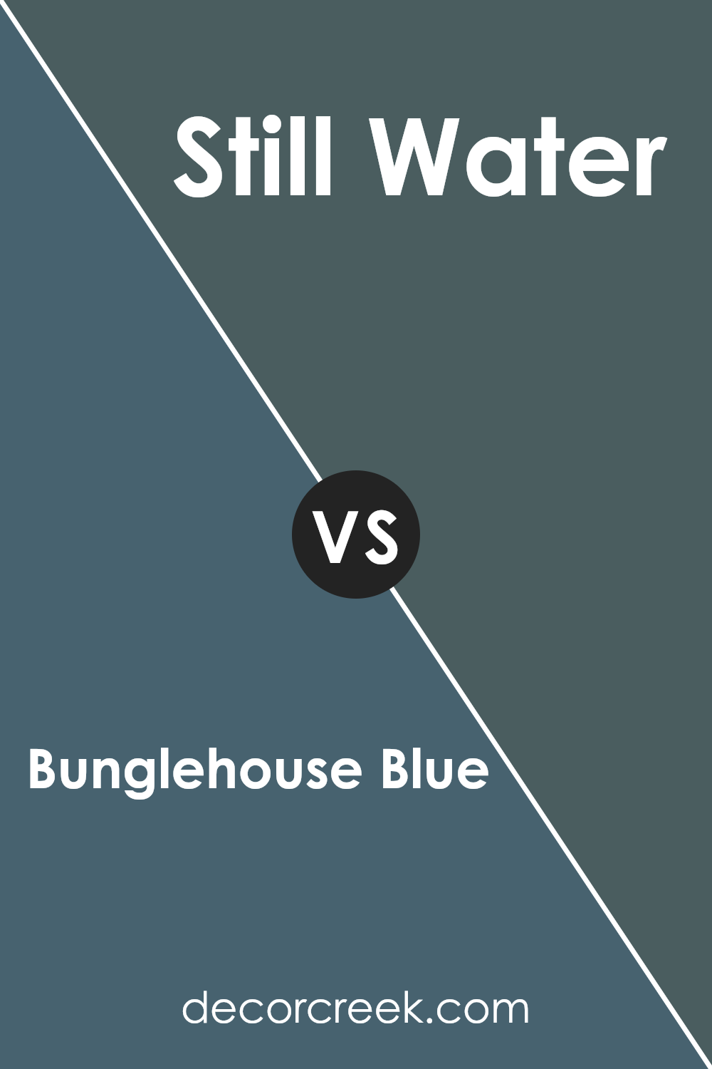
Bunglehouse Blue SW 0048 by Sherwin Williams vs Still Water SW 6223 by Sherwin Williams
Bunglehouse Blue and Still Water, both by Sherwin Williams, present unique shades of blue with distinct vibes. Bunglehouse Blue is a deep, almost navy color that gives off a strong and classic feel. This shade is perfect for creating a bold statement in spaces like an office or a dining room, making them feel more grounded and rich.
On the other hand, Still Water is a lighter and softer blue. It’s closer to a sky blue and works really well in creating a calm and welcoming atmosphere. This color is great for bedrooms or bathrooms where you want to keep things light and airy.
While both colors are blues, Bunglehouse Blue leans towards a more intense and dramatic look, whereas Still Water offers a gentler and cleaner appearance. Depending on the mood and style you want to achieve for your room, you can choose between these two to either add depth or to keep things cool and refreshing.
You can see recommended paint color below:
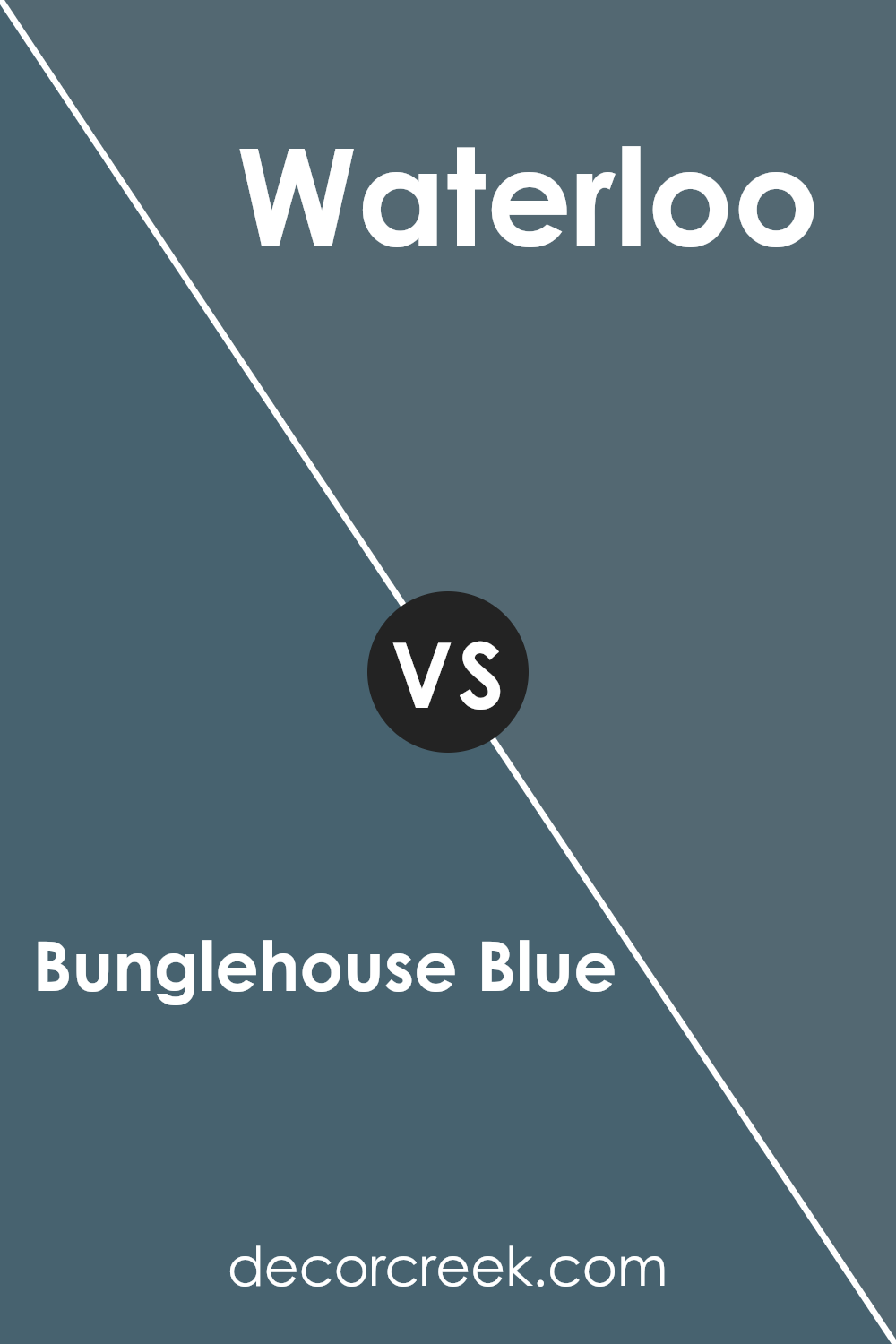
Bunglehouse Blue SW 0048 by Sherwin Williams vs Waterloo SW 9141 by Sherwin Williams
Bunglehouse Blue and Waterloo, both by Sherwin Williams, are unique shades that offer distinct vibes for any space. Bunglehouse Blue is a darker, more saturated hue that leans towards a navy tone. It provides a strong, bold look, ideal for creating a striking accent wall or for use in areas that benefit from a deeper color to make the space feel more inclusive and cozy.
On the other hand, Waterloo is a softer, lighter blue. It has a hint of grey, making it less intense and more versatile for larger areas. This color is perfect for bedrooms or living spaces where you want to maintain a calm and light atmosphere without the starkness that sometimes comes with pure grey or very pale blues.
Both colors are great choices depending on the mood and function you want to achieve in your room. Bunglehouse Blue suits dramatic, chic settings, while Waterloo is excellent for a gentle, soothing environment.
You can see recommended paint color below:
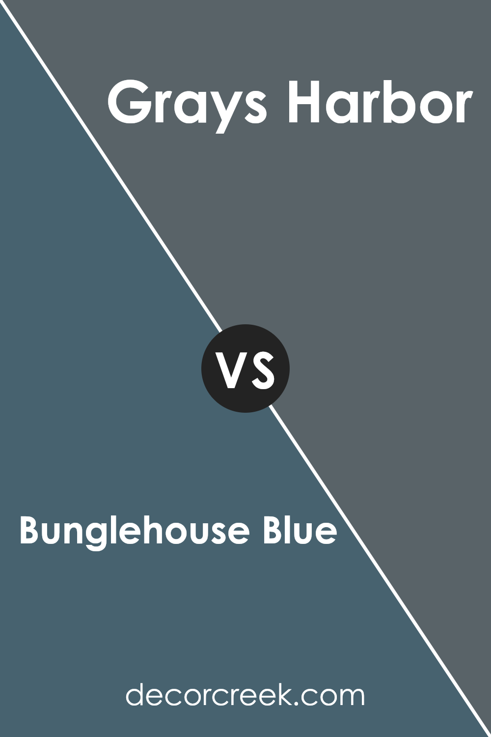
Bunglehouse Blue SW 0048 by Sherwin Williams vs Grays Harbor SW 6236 by Sherwin Williams
Bunglehouse Blue and Grays Harbor are two unique shades by Sherwin Williams. Bunglehouse Blue is a deeper, more vibrant blue with a hint of gray, creating a strong and prominent look. It’s an excellent choice for adding a bold splash of color to a space, ideal for creating a focal point in a room.
On the other hand, Grays Harbor is a softer, more muted color. This shade leans more towards a dark gray with blue undertones, providing a more subtle and neutral option.
It’s perfect for those who prefer a less dramatic look but still appreciate a touch of blue. Both colors are versatile and can suit various decorating styles, from modern to traditional, but the choice between them depends on the desired impact and mood in the space.
You can see recommended paint color below:
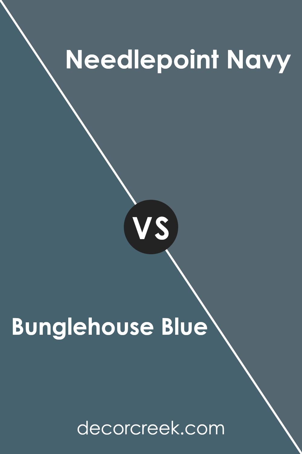
Bunglehouse Blue SW 0048 by Sherwin Williams vs Needlepoint Navy SW 0032 by Sherwin Williams
Bunglehouse Blue and Needlepoint Navy, both by Sherwin Williams, offer distinctive shades of blue that cater to different tastes and design needs. Bunglehouse Blue is a dark blue with gray undertones, giving it a subtle and muted appearance that works well in spaces where a calm and understated look is desired. It pairs well with soft neutrals and can be a great choice for a cozy living room or a bedroom, providing a calming effect.
On the other hand, Needlepoint Navy is deeper and more intense. It has the classic richness of a true navy blue, making it perfect for creating a bold statement. Ideal for accent walls, this color can anchor a room with its strong presence. Its deeper tone contrasts sharply with brighter colors and works especially well in sophisticated decor styles, adding a dramatic flair to any space.
Both colors are versatile, but while Bunglehouse Blue leans towards a softer, more muted ambiance, Needlepoint Navy offers a stronger and more vivid impact.
You can see recommended paint color below:
- SW 0032 Needlepoint Navy (CHECK A SAMPLE)
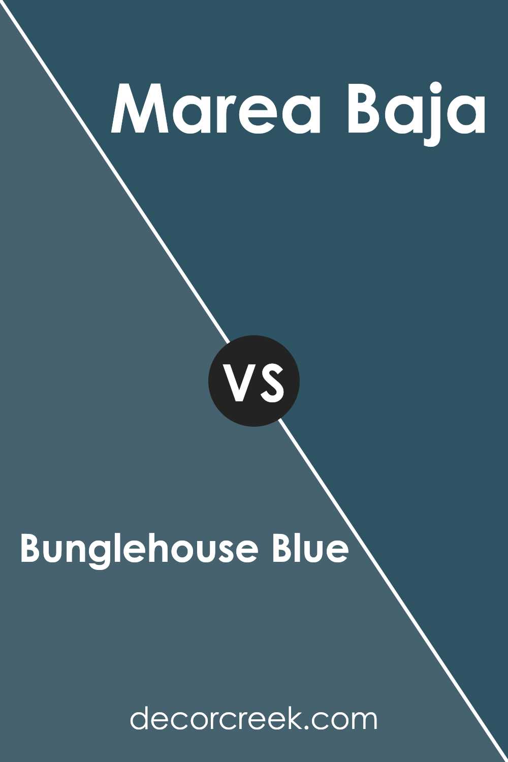
Bunglehouse Blue SW 0048 by Sherwin Williams vs Marea Baja SW 9185 by Sherwin Williams
Bunglehouse Blue and Marea Baja, both from Sherwin Williams, offer distinct shades of blue that can create different moods in a space. Bunglehouse Blue is a deep, rich blue with a slight gray undertone, making it a strong and classic choice for areas like living rooms or bedrooms. It pairs well with both bright colors for a lively palette, or with muted tones for a more subdued look.
Marea Baja, on the other hand, leans towards a teal blue, blending blue and green hues for a more refreshing and lively vibe. It’s a vibrant color that works beautifully in bathrooms and kitchens, bringing a fresh and uplifting feeling. This color can also complement wooden features or white trim nicely, highlighting its brighter qualities.
Both colors are versatile, but while Bunglehouse Blue offers depth and tradition, Marea Baja provides an energetic burst that can liven up any space. When choosing between them the desired mood and room function are key factors to consider.
You can see recommended paint color below:
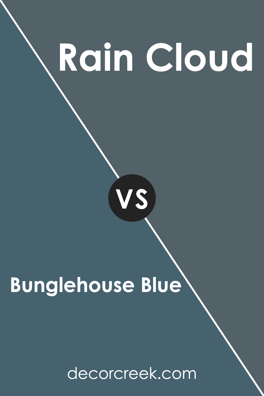
Bunglehouse Blue SW 0048 by Sherwin Williams vs Rain Cloud SW 9639 by Sherwin Williams
Bunglehouse Blue and Rain Cloud, both by Sherwin Williams, offer distinct vibes for any space. Bunglehouse Blue is a deep, rich blue with a hint of gray, making it a strong choice for an accent wall or a bold room theme. It lends a solid, comforting feel to a room, working well in spaces like studies or bedrooms where a touch of formality is appreciated.
In contrast, Rain Cloud is a lighter, softer gray with a subtle blue undertone that gives it a fresher, airier feel. This color is extremely versatile, great for creating a relaxed atmosphere in living areas or bathrooms. It pairs well with a wide range of decor, providing a soothing backdrop that isn’t overly bold.
When deciding between the two, consider the mood you want to set. Bunglehouse Blue sets a more striking, grounded tone, while Rain Cloud offers a gentle, open ambiance that can make small spaces seem larger. Each color has its charm and utility, depending on the environment and personal taste.
You can see recommended paint color below:
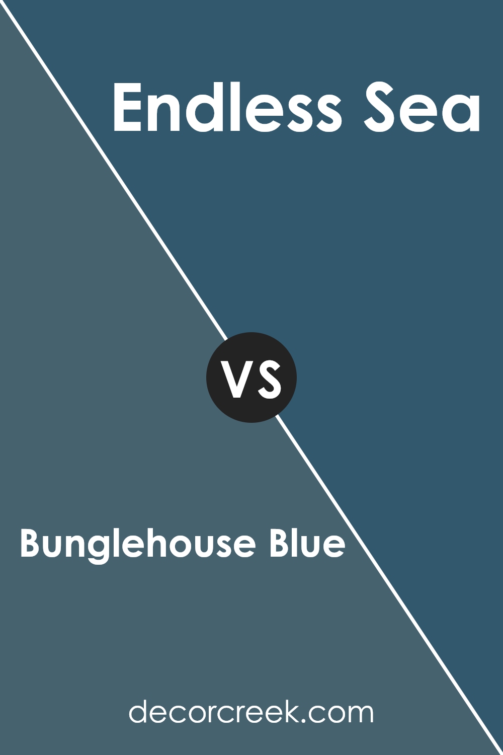
Bunglehouse Blue SW 0048 by Sherwin Williams vs Endless Sea SW 9150 by Sherwin Williams
Bunglehouse Blue and Endless Sea are two distinct shades by Sherwin Williams. Bunglehouse Blue is a deep, grayish-blue that has a subtle intensity, creating a grounded and calm atmosphere. It works well in spaces where you want a touch of refinement without overwhelming the room with darkness.
On the other hand, Endless Sea is a darker and more striking shade. It leans more towards a navy blue, offering a bold and dramatic feel. This color is excellent for making a strong statement in a space, ideal for accent walls or furniture pieces. Both colors are versatile but serve different purposes depending on the mood you want to achieve in your room.
While Bunglehouse Blue is more subdued, Endless Sea stands out more, providing a more profound visual impact.
You can see recommended paint color below:
Conclusion
In conclusion, SW 0048 Bunglehouse Blue by Sherwin Williams is a really interesting paint color. It’s not just a simple blue; it has a deep, rich tone that can make any room feel more special and cozy. This color is great for places like the living room or bedroom because it has a calming effect. It also works well on the outside of houses to give them a charming, classic look.
Many people love this color because it fits with different decorating styles. Whether you like things modern or more traditional, Bunglehouse Blue can fit right in. It’s a color that can grow with you as you change your style or move to new places.
Overall, I think Bunglehouse Blue is a great choice if you’re looking to make a change to your home. It’s a color that feels both warm and inviting, perfect for creating a welcoming space. Whether you’re painting a wall or adding some accent pieces, this color is definitely worth considering. So, if you’re looking for a new color for your space, Bunglehouse Blue might be the perfect pick!

Ever wished paint sampling was as easy as sticking a sticker? Guess what? Now it is! Discover Samplize's unique Peel & Stick samples.
Get paint samples


