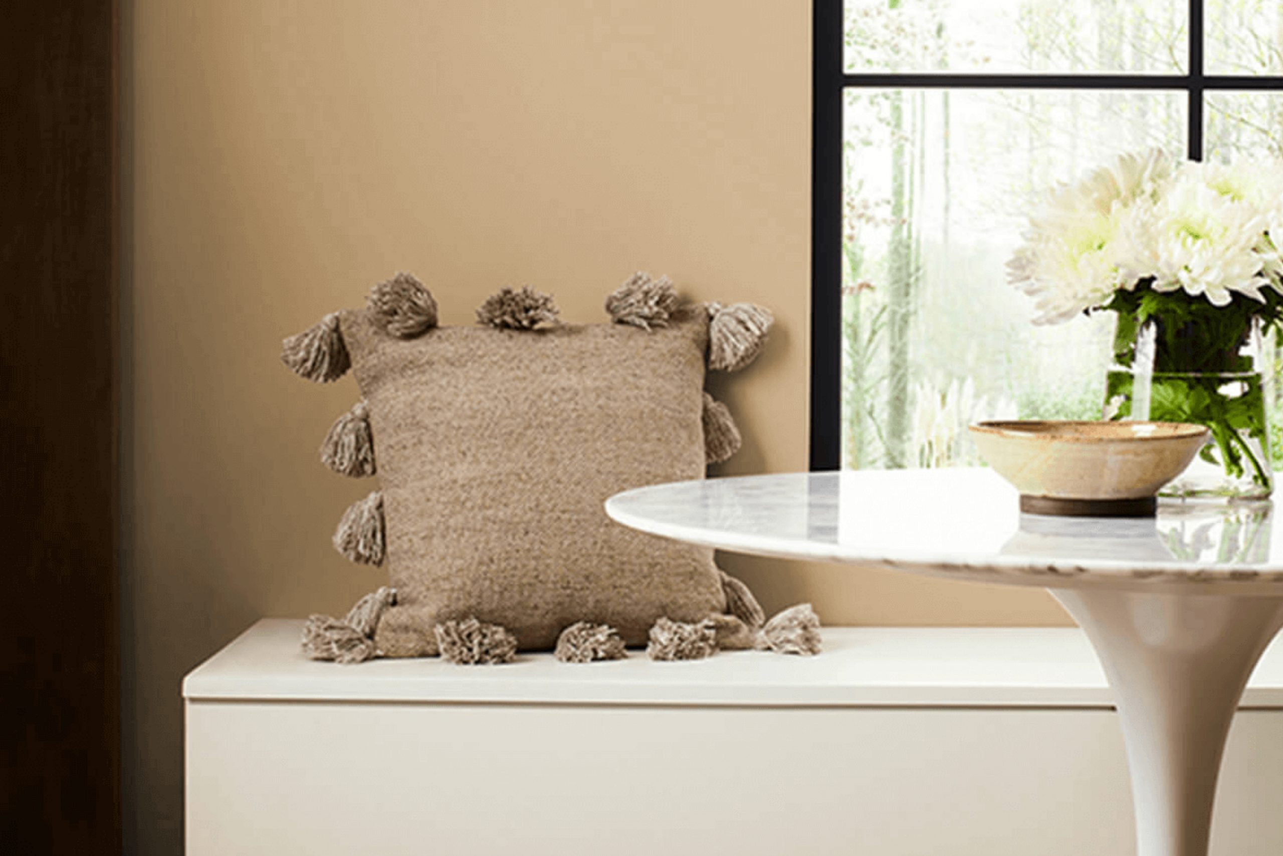
When you’re searching for a warm, inviting paint color that turns any room into a cozy haven, SW 6122 Camelback by Sherwin Williams might just be the perfect pick. This hue brings a gentle sense of warmth that makes areas feel more personal and welcoming.
With its subtle earthy tones, Camelback captures the essence of understated elegance and is flexible enough to complement various decor styles from traditional to contemporary. Whether you want to refresh your living room or add a soothing backdrop to your bedroom, Camelback has the potential to enrich your home’s aesthetic and atmosphere.
Picking the right paint color can be tricky, but with Camelback, you get a beautifully balanced shade that isn’t too overpowering but still adds character to any room.
Let me guide you through how Camelback could enhance your area and why it could be the color you are looking for.
What Color Is Camelback SW 6122 by Sherwin Williams?
Camelback by Sherwin Williams is a warm, mid-tone beige that exudes a cozy and inviting vibe. It’s a flexible color that can work beautifully in various interior design styles, particularly rustic, modern farmhouse, and traditional. The neutral quality of Camelback makes it an excellent backdrop for living rooms, bedrooms, and kitchens where a sense of warmth is desired.
When decorating with Camelback, consider pairing it with natural materials to enhance its warmth. Wood, whether light oak for a Scandi feel or dark walnut for a more traditional look, complements this hue nicely.
Textiles such as linen or cotton in whites or pastel colors also go well with Camelback, adding a soft, airy feel to the area. For a bit of contrast, incorporate materials with a rough texture like rattan or burlap, which provide a nice tactile quality against the smoothness of painted walls.
Leather, particularly in dark brown or caramel, works well with Camelback, offering a sturdy, enduring look that is perfect for creating a cozy reading nook or an inviting living room setup. Metal accents in brass or gold can add a touch of glamour to the down-to-earth color, making it suitable for rooms that aim for a chic yet understated aesthetic.
Is Camelback SW 6122 by Sherwin Williams Warm or Cool color?
Camelback by Sherwin Williams is a warm and inviting beige that can bring a cozy and relaxed feel to any room in a home. This shade of tan has a soothing quality without being too bold, making it easy to pair with a variety of decor styles and colors.
Its neutral tone can serve as a perfect base, allowing furniture and art to stand out without competing for attention. Camelback is particularly effective in living rooms and bedrooms where you want to create a comfortable and welcoming atmosphere.
It also reflects light gently, which can make small areas appear slightly larger and more open. Being a flexible color, it works well with natural materials like wood and leather, enhancing their natural hues. Overall, Camelback offers a peaceful backdrop for daily life, making it a practical choice for those looking to add warmth to their living areas.
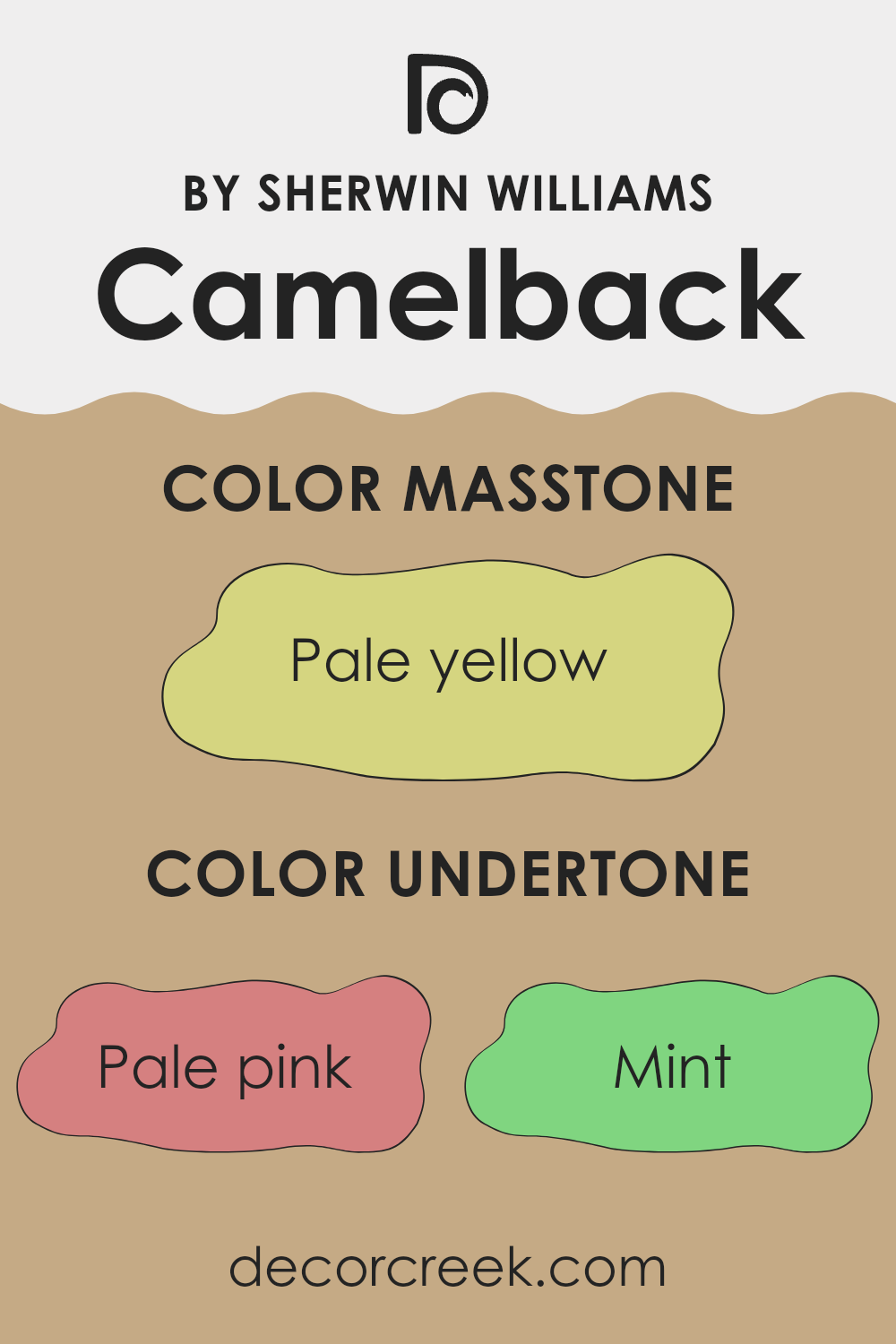
Undertones of Camelback SW 6122 by Sherwin Williams
Camelback is a unique color that can subtly change appearance based on its undertones, which include shades like pale pink, mint, grey, light gray, and light purple, among others. These undertones are faint colors mixed into the primary hue that can affect how it looks depending on the lighting and surrounding elements.
For instance, the presence of pale pink can warm up an area, making it feel more welcoming. On the other hand, undertones of grey or light gray can give a more neutral, balanced look that complements a variety of decor styles. Mint and light blue undertones can add a hint of freshness to the room, subtly influencing the atmosphere without overpowering it.
When using Camelback on interior walls, these undertones can really impact the mood and aesthetic of the room. In natural light, the color may lean towards its yellow or orange undertones, giving off a warm, cozy vibe perfect for living rooms or bedrooms. In artificial lighting, the grey or light purple undertones might become more pronounced, creating a more subdued and calm environment, ideal for rooms meant for relaxation or concentration.
Overall, the complexity of Camelback’s undertones allows it to be flexible and adaptive, making it a good choice for those looking to add depth and interest to their interiors without making dramatic changes.
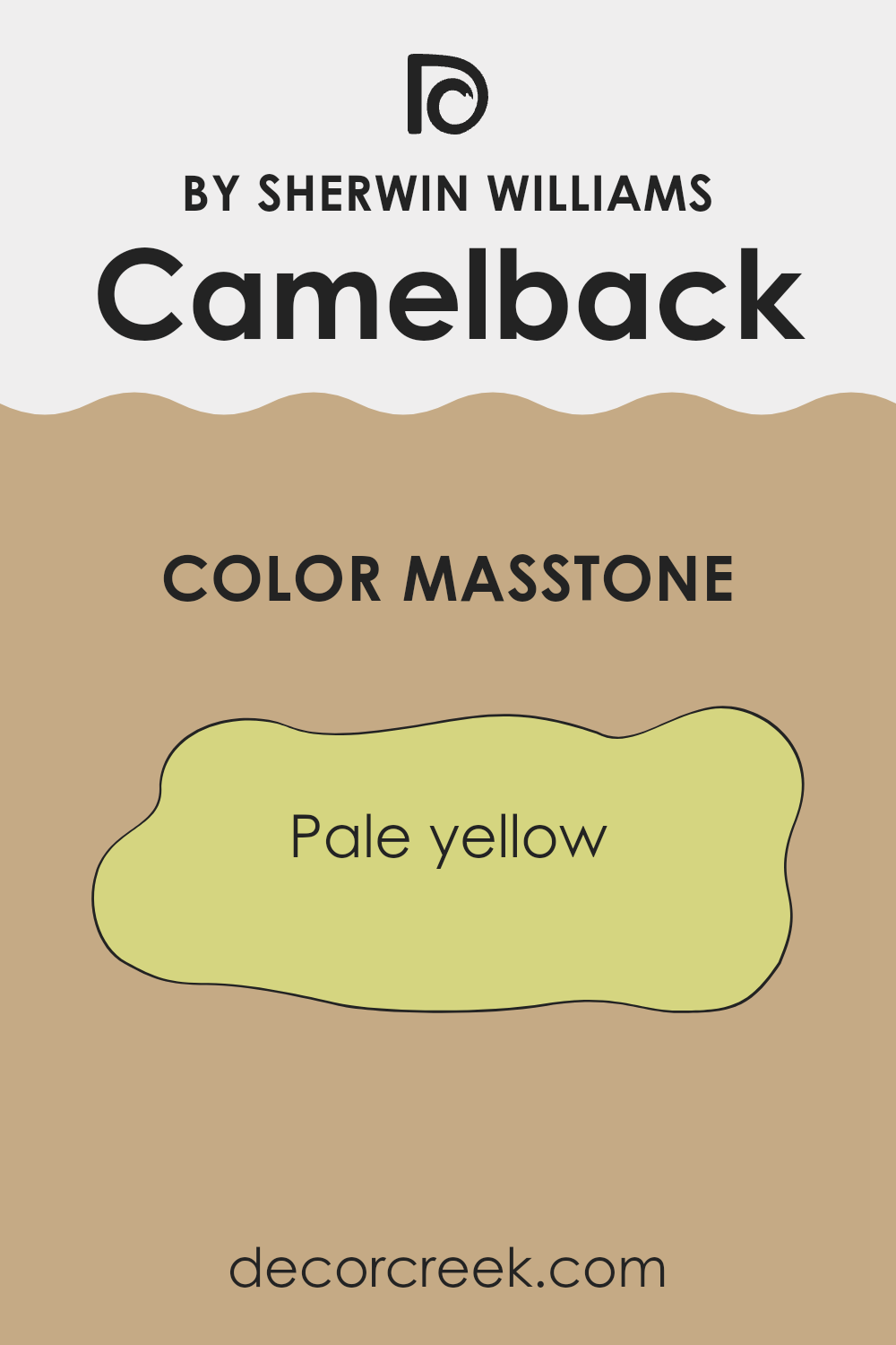
What is the Masstone of the Camelback SW 6122 by Sherwin Williams?
Camelback SW 6122 by Sherwin Williams has a masstone that appears as a pale yellow (#D5D580). This color brings a light and airy feel to any room, making it perfect for creating a comforting and inviting area at home.
Its soft yellow hue works well in living areas and bedrooms where you aim to have a relaxing atmosphere without overpowering the senses. Furthermore, this color pairs well with natural light, enhancing rooms to look more open and brighter. It also offers adaptability in home decor, matching easily with a variety of furniture finishes and textiles, from dark woods to light linens.
This flexibility makes it an excellent choice for those looking to refresh their interiors with a gentle pop of color. By using Camelback SW 6122, homeowners can achieve a friendly and warm environment, which is often sought after in daily living areas.
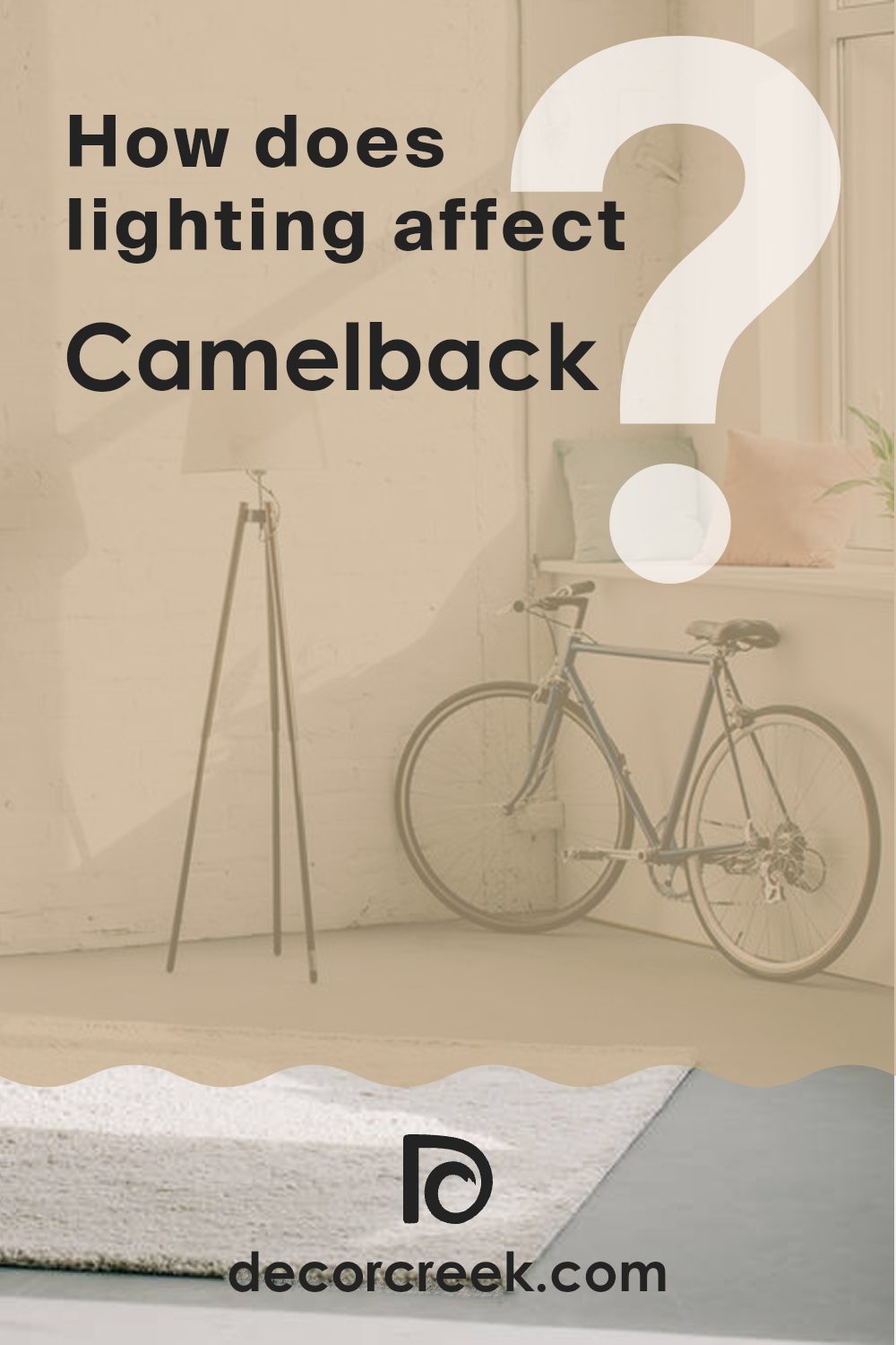
How Does Lighting Affect Camelback SW 6122 by Sherwin Williams?
Lighting plays a crucial role in how we perceive colors in an environment. The same paint color can appear different depending on the light source. For instance, the color Camelback by Sherwin Williams might look various shades throughout the day or under different lighting conditions.
In artificial light, colors can be influenced by the type of bulb used. Incandescent bulbs, which emit a warm glow, can make Camelback appear more muted and warmer, enhancing its beige undertones. Fluorescent lighting, which is cooler, might make the color look slightly paler and less warm.
Natural light brings out the truest color, but the direction of the room also affects how the color is displayed. In north-facing rooms, light is cooler and more consistent throughout the day. This cool light can make Camelback appear as a true neutral, showing more of its grey undertones without distorting its warmth too much.
South-facing rooms, on the other hand, benefit from abundant, warm light most of the day. This type of lighting can make Camelback look warmer and richer, enhancing its creamy texture. It tends to be more vibrant in a south-facing room, reflecting a pleasant, soft ambiance.
East-facing rooms receive light in the morning when it’s cooler and brighter. Camelback in this lighting can look fresh and lively in the morning, but may become shadowed and subdued in color as the day progresses and the natural light diminishes.
West-facing rooms get the evening light, which is warmer. Camelback can appear softer and cozier toward the evening as the sunlight becomes golden. During the midday, when lighting is minimal, the color again may look different, generally cooler and less vibrant.
Therefore, the impact of natural and artificial lighting conditions can significantly adjust the way Camelback paint is perceived in various rooms and at different times of the day.
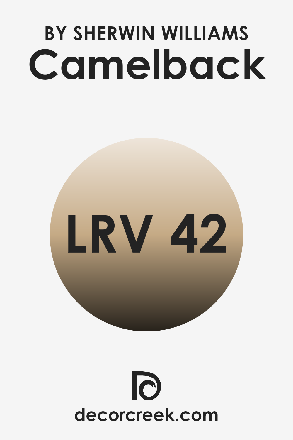
What is the LRV of Camelback SW 6122 by Sherwin Williams?
LRV stands for Light Reflectance Value, which is a measure used to describe the percentage of light a paint color reflects. Think of it as a scale for brightness when light hits the surface of your walls. A higher LRV means the color reflects more light, making a room feel brighter and more open, while a lower LRV means less light is reflected, and the room can appear darker and more enclosed.
This value helps in choosing the right paint color based on how much natural or artificial light your room receives, contributing to the overall feel of the area. With an LRV of 42.281, the paint color in discussion is on the mid-scale of light reflectance. It isn’t excessively bright, but it’s also not too dark.
Such a value means it holds a balanced character, capable of making a room feel cozy yet sufficiently illuminated under enough light. In a well-lit area, this color would look warm and inviting, while in a room with less natural light, it could appear slightly more subdued, encouraging a more intimate atmosphere. Thus, understanding this value is crucial in matching the color’s effect with the intended ambiance for your room.
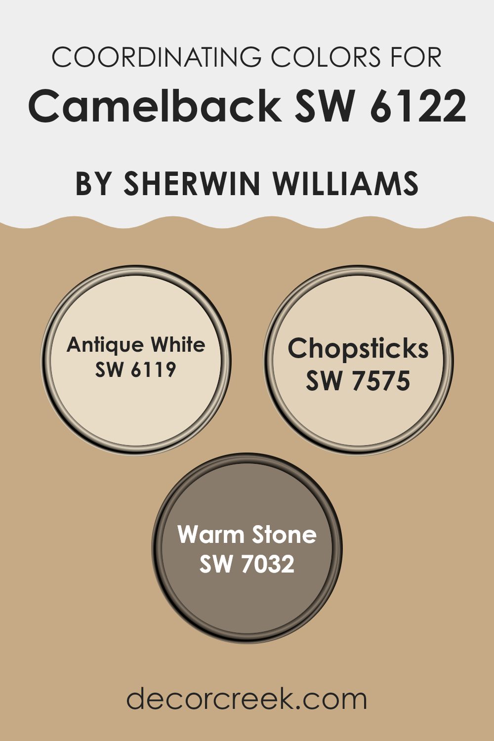
Coordinating Colors of Camelback SW 6122 by Sherwin Williams
Coordinating colors are those that harmonize with a primary color to enhance the overall aesthetics of a room, often creating a balanced and appealing look. When working with a base shade like Camelback from Sherwin Williams, selecting complementary colors is key to achieving a cohesive design. Colors such as Antique White, Chopsticks, and Warm Stone are excellent examples of coordinating shades that work well with Camelback to produce an inviting atmosphere.
Antique White is a softer, creamy hue that adds a light and airy feel to the room, contrasting beautifully with the richer tone of Camelback without overpowering it. It’s ideal for trim, ceilings, or as a main wall color in areas that receive plenty of natural light.
Chopsticks offers a slightly bolder, more earthen approach with its subdued, sandy color, providing a natural, grounding effect which is perfect for creating a cozy and warm environment. Warm Stone, on the other hand, is a deeper gray that complements the muted tones of Camelback, excellent for accent walls or furniture, and adds depth and interest to the area, ensuring the room feels well-rounded and dynamically styled. Together, these colors create a harmonious palette that enhances the beauty and comfort of any room.
You can see recommended paint colors below:
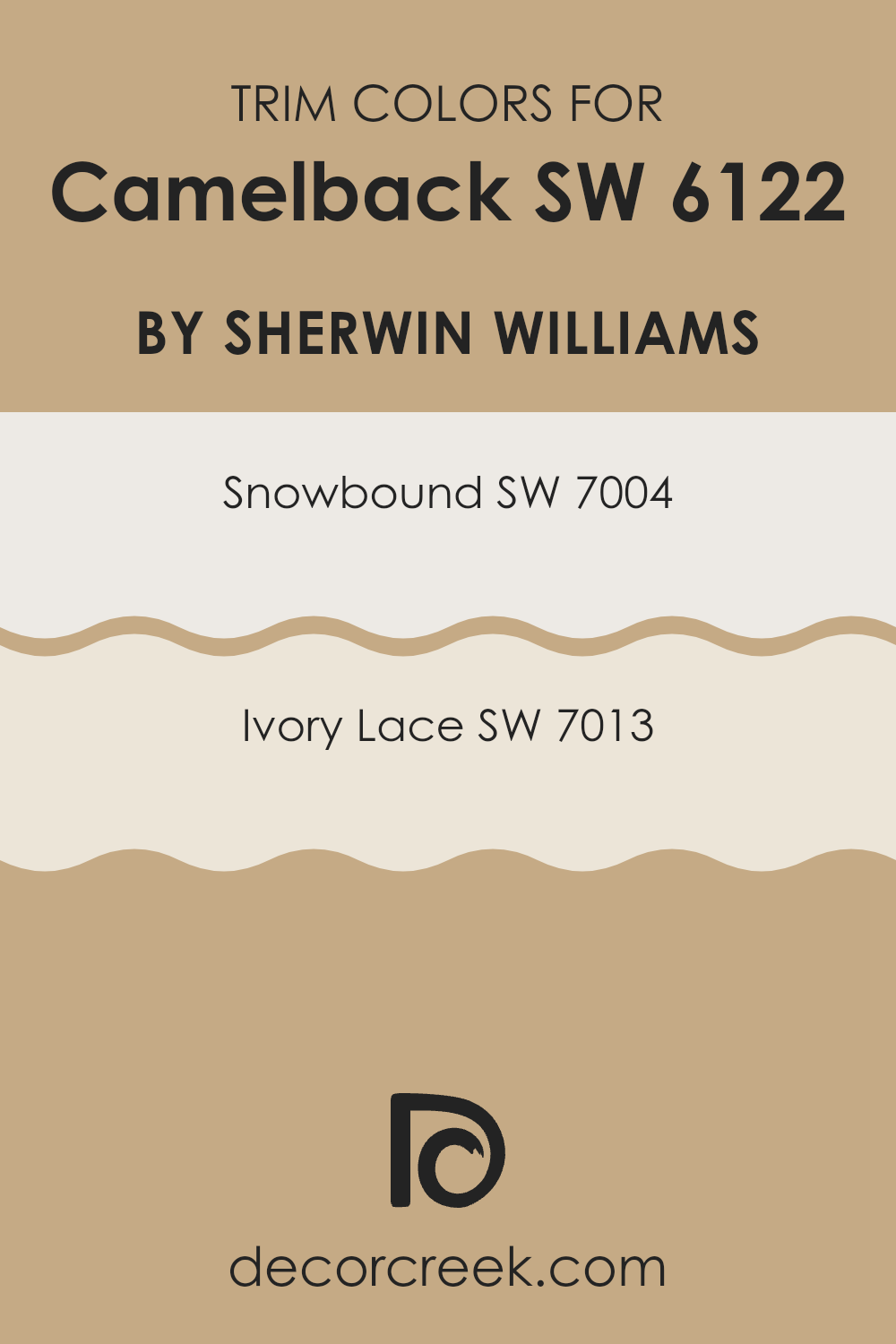
What are the Trim colors of Camelback SW 6122 by Sherwin Williams?
Trim colors are specifically chosen hues used to accentuate and outline architectural details, such as door frames, window casings, and baseboards, creating clear visual boundaries that enhance the overall appearance of a room.
When paired with wall colors like the warm, subtly complex Camelback by Sherwin Williams, the selection of the right trim color is vital to provide a balanced contrast that distinctly defines areas while harmoniously blending with the main color palette.
For example, using a trim color can make features stand out, adding depth and dimension to a room, and can help in creating a tidy and finished look. Snowbound (SW 7004) is a clean and bright off-white shade with a slight grey undertone, offering a fresh and crisp boundary that complements the richer tones of Camelback. This color is ideal for trims as it brings a light-reflecting quality that enlivens the wall color without overpowering it.
Ivory Lace (SW 7013), on the other hand, possesses a warmer hue with creamy undertones, providing a soft contrast that meshes well with Camelback, creating a more subtle transition between the surfaces. Both shades present a gentle and non-distracting frame to the walls, enhancing the overall aesthetics without competing for attention.
You can see recommended paint colors below:
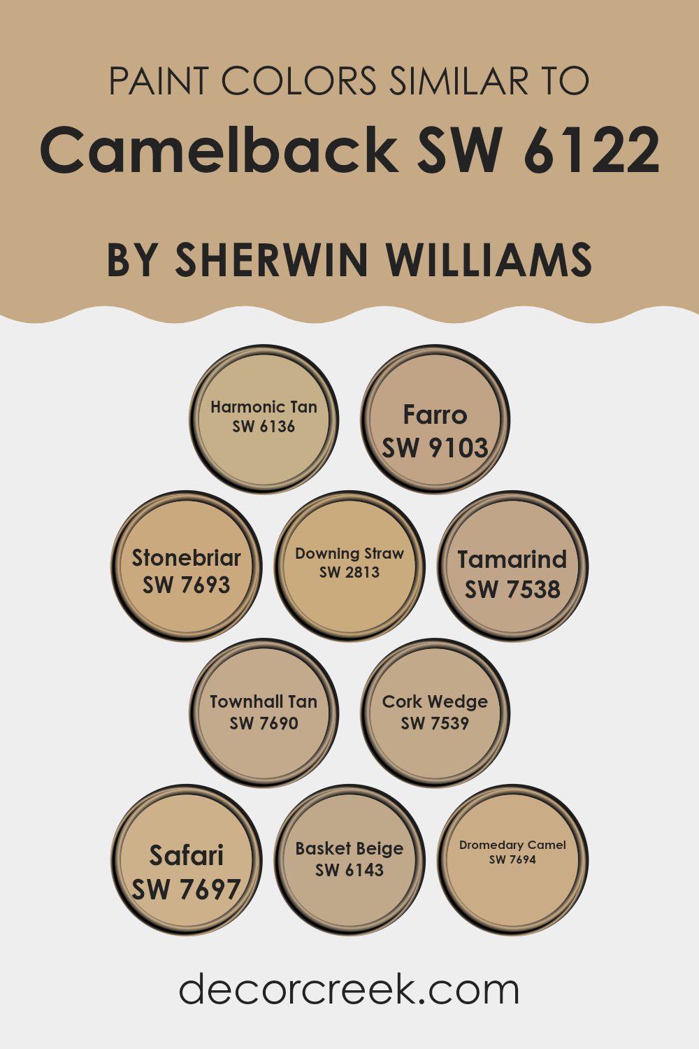
Colors Similar to Camelback SW 6122 by Sherwin Williams
Similar colors play a crucial role in design by creating a harmonious and cohesive look. They work well together because their close tones blend seamlessly, providing a subtle contrast that is pleasing to the eye. For example, the soft and understated tone of Harmonic Tan offers a gentle warmth, much like the cozy shade of Farro, which has an earthy, muted quality that pairs well in rooms seeking a natural feel.
Similarly, Stonebriar presents a sturdier, more defined essence, akin to the calming presence of Downing Straw, a shade with a soft, golden undertone that contributes to a welcoming atmosphere. Tamarind, deeper and more intense, adds richness to areas, whereas Townhall Tan brings a more balanced, neutral shade that is adaptable across various applications.
Cork Wedge, slightly lighter, provides a refreshing option with its subtle vitality. Safari, a robust hue, instills a sense of grounding, much like Basket Beige, which offers a lighter approach with its relaxed, comfortable vibe. Dromedary Camel, resembling the color of sandy deserts, pairs nicely with the other shades, adding depth and interest to the palette while maintaining a smooth flow throughout the design.
You can see recommended paint colors below:
- SW 6136 Harmonic Tan
- SW 9103 Farro
- SW 7693 Stonebriar
- SW 2813 Downing Straw
- SW 7538 Tamarind
- SW 7690 Townhall Tan
- SW 7539 Cork Wedge
- SW 7697 Safari
- SW 6143 Basket Beige
- SW 7694 Dromedary Camel
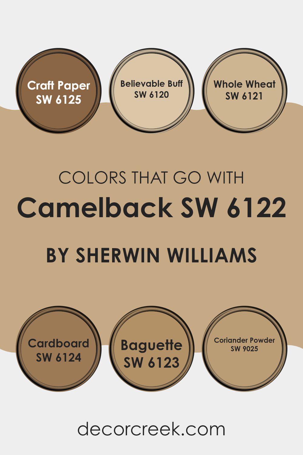
Colors that Go With Camelback SW 6122 by Sherwin Williams
When decorating with Camelback SW 6122 by Sherwin Williams, it’s important to choose harmonizing colors to create a cohesive and appealing look in your room. The hues that pair well with Camelback, like SW 6125 – Craft Paper and others, are essential because they help in setting a balanced and inviting atmosphere. Each complementary color has its unique way of enhancing the main shade, contributing to an overall aesthetic that feels unified and pleasant.
Starting with Craft Paper SW 6125, this color adds a deep yet muted brown tone that enriches the warmth of Camelback. It’s perfect for adding depth to a room without overpowering it with darkness. Believable Buff SW 6120 offers a lighter, more neutral option that seamlessly blends with Camelback, providing a subtle contrast that’s easy on the eyes.
Whole Wheat SW 6121 brings in a golden hue, imparting a sunny and cheerful feel that brightens areas beautifully. Cardboard SW 6124 has a slightly grayish-brown tint, excellent for those who prefer understated elegance. Baguette SW 6123, with its richer, more pronounced brown character, injects an earthy robustness that complements the softer tones of Camelback.
Lastly, Coriander Powder SW 9025 introduces a slightly exotic spice note, offering a unique twist that can refresh and liven up a design scheme. By selecting these complementary colors, you ensure that each room feels thoughtfully designed and visually appealing.
You can see recommended paint colors below:
- SW 6125 Craft Paper
- SW 6120 Believable Buff
- SW 6121 Whole Wheat
- SW 6124 Cardboard
- SW 6123 Baguette
- SW 9025 Coriander Powder
How to Use Camelback SW 6122 by Sherwin Williams In Your Home?
Camelback SW 6122 by Sherwin Williams is a warm, neutral paint color that can make any room feel cozy and inviting. Its tan and beige undertones create a subtle backdrop that complements a variety of decor styles, from traditional to modern. If you’re planning to freshen up your living room or bedroom, Camelback is an excellent choice as it pairs well with soft whites on trim and can highlight natural wood features such as hardwood floors or wooden furniture.
In the kitchen, this color works beautifully on the walls, providing a gentle contrast against white cabinets or acting as a soothing tone behind open shelving. It also suits bathrooms, where it adds warmth to the area without overpowering it, making your morning routines more pleasant.
Using Camelback in hallways can help brighten the area while maintaining a cozy feel, which makes transitioning from room to room seamless and visually appealing. Overall, it’s a flexible color that brings out a relaxed and warm atmosphere in any home setting.
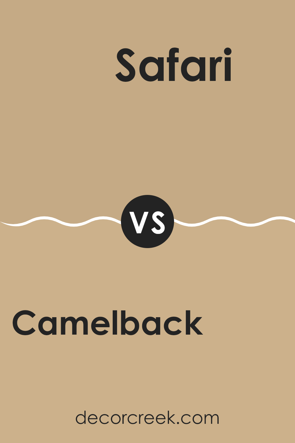
Camelback SW 6122 by Sherwin Williams vs Safari SW 7697 by Sherwin Williams
The color Camelback by Sherwin Williams is a soft and warm beige with a subtle hint of peach, making it very inviting and cozy for any room. It pairs well with both bright and dark colors, allowing for flexible design options.
On the other hand, Safari, another Sherwin Williams shade, leans more towards a rich, earthy brown with deep yellow undertones. It gives off a welcoming, homey feel and works beautifully in rooms that aim for a grounded, natural aesthetic.
While Camelback is lighter and can make an area feel more open and airy, Safari, being a deeper shade, adds a sense of warmth and snugness. Both colors can create a pleasant ambiance but will influence the mood and perception of the room differently due to their varying depths and undertones.
You can see recommended paint color below:
- SW 7697 Safari
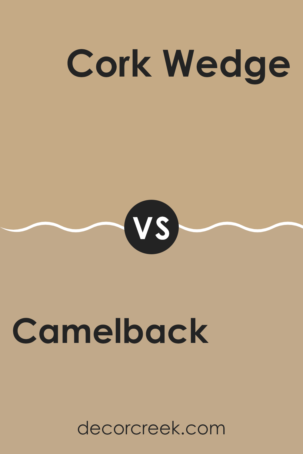
Camelback SW 6122 by Sherwin Williams vs Cork Wedge SW 7539 by Sherwin Williams
The color Camelback from Sherwin Williams is a warm, mid-tone beige with subtle brown undertones, making it adaptable for cozy yet light settings in a home. It pairs well with a variety of decor styles and brings a pleasing softness to any room without feeling too dark.
In contrast, Cork Wedge is a darker, richer shade than Camelback. This color has a more pronounced brown base, which adds depth and warmth to rooms. It’s excellent for areas where a stronger color presence is needed without overpowering the area.
While both shades are rooted in warm, earthy tones, Camelback offers a lighter touch, and Cork Wedge provides more depth, making each suitable for different interior moods and applications.
You can see recommended paint color below:
- SW 7539 Cork Wedge
Camelback SW 6122 by Sherwin Williams vs Tamarind SW 7538 by Sherwin Williams
Camelback and Tamarind, two colors from Sherwin Williams, offer distinct vibes for room decoration. Camelback is a soft, warm shade that blends beige and light brown, giving it a cozy and welcoming feel. It’s an excellent choice for living rooms or bedrooms where you want a subtle, soothing atmosphere.
This color pairs well with a variety of decor styles, especially those incorporating wooden furniture and natural textures. In contrast, Tamarind is a much darker, richer brown. It feels more grounded and strong, making it suitable for areas where you want to create a sense of steadfastness or formality, like in a study or dining room.
Tamarind works well with bold colors or as a counterpoint to brighter tones, helping to anchor an area visually. Both shades can warm up a room but in different ways: Camelback softly lights up a room, while Tamarind adds depth and drama.
You can see recommended paint color below:
- SW 7538 Tamarind
Camelback SW 6122 by Sherwin Williams vs Townhall Tan SW 7690 by Sherwin Williams
Camelback and Townhall Tan are two colors by Sherwin Williams that offer distinct yet subtle variations in the realm of earthy tones. Camelback leans towards a lighter, creamy shade with a gentle hint of yellow, providing a soft and welcoming feel to any room. It’s particularly good for areas where you want a warm backdrop without overpowering the surroundings.
On the other hand, Townhall Tan is noticeably darker and carries more depth. This color has a rich, sandy quality that resembles the color of wet beach sand. It offers a stronger presence due to its deeper tone, making it ideal for rooms where you want to add a bit of warmth and depth without resorting to bold or dark colors.
Both shades work well in various settings, but the choice between them would depend on the kind of warmth and depth you want to bring into your area. Camelback serves well in smaller, brighter rooms, while Townhall Tan suits larger rooms or where a more profound, cozy ambiance is desired.
You can see recommended paint color below:
Camelback SW 6122 by Sherwin Williams vs Basket Beige SW 6143 by Sherwin Williams
Camelback and Basket Beige are two appealing neutrals from Sherwin Williams that offer subtle differences in tone. Camelback has a lighter, more sandy feel reminiscent of a soft beige. This shade provides a fresh, airy feel to any room, making it appear more open and welcoming. It pairs well with a range of decor styles, from contemporary to rustic.
On the other hand, Basket Beige leans towards a slightly darker, warmer tone, evoking the hue of natural woven materials like wicker or rattan. This color adds a cozy warmth to rooms, making it ideal for areas where you want a more inviting atmosphere, such as living rooms or bedrooms.
Both colors work well with other neutral shades and act as an excellent backdrop for brighter tones. The choice between Camelback and Basket Beige would depend largely on the specific mood you wish to create in your area — either lighter and uplifting with Camelback, or warm and cozy with Basket Beige.
You can see recommended paint color below:
- SW 6143 Basket Beige
Camelback SW 6122 by Sherwin Williams vs Harmonic Tan SW 6136 by Sherwin Williams
Camelback and Harmonic Tan are two popular paint colors from Sherwin Williams. Camelback has a deeper, warm beige tone that gives a cozy and inviting feel to any room. It works well in areas where you want to create a comfortable, grounded atmosphere. The color pairs nicely with rich woods and other natural materials.
On the other hand, Harmonic Tan is lighter and leans more towards a neutral tan shade. This color is great for rooms that aim for a fresh, clean look. It reflects light well, making it a smart choice for smaller areas or those with less natural light. Harmonic Tan is adaptable, blending seamlessly with various decor styles and color palettes.
Both shades create pleasant environments but serve slightly different aesthetic purposes. Camelback’s richer tone is ideal for a traditional, warm look, while Harmonic Tan offers a more subtle backdrop, suitable for more modern and minimalistic designs.
You can see recommended paint color below:
Camelback SW 6122 by Sherwin Williams vs Farro SW 9103 by Sherwin Williams
The color Camelback by Sherwin Williams is a soft, muted shade of brown with peachy undertones, giving off a warm and welcoming vibe in any area. It creates a cozy, homely feel, well-suited for living rooms and bedrooms where you might seek a calm and soothing atmosphere.
On the other hand, Farro by Sherwin Williams is a darker, earthier tone compared to Camelback. It has a more pronounced gray influence, which makes it cooler and slightly more reserved. While still warm, Farro offers a stronger statement with its deeper, grainy hue, making it ideal for rooms that require a bit more depth and definition without overpowering the senses.
Both shades share warm undertones, yet they present distinct moods due to their intensity and saturation. Camelback is lighter and peachier, creating a softer environment, while Farro, being richer and grayer, provides a more grounded feel. These characteristics make them flexible for different settings and preferences, depending on the desired effect in the room.
You can see recommended paint color below:
- SW 9103 Farro
Camelback SW 6122 by Sherwin Williams vs Stonebriar SW 7693 by Sherwin Williams
Camelback and Stonebriar, both shades by Sherwin Williams, offer distinct tones that can significantly affect the ambiance of a room. Camelback is a softer, more muted beige with warm undertones.
It brings a cozy and inviting feel to areas, making it ideal for living rooms or bedrooms where comfort is key. In contrast, Stonebriar has a deeper, grayish-green hue that leans towards a more rustic and earthy feel. This color is excellent for rooms where you want to add a touch of nature-inspired solidity, like in dining rooms or studies.
While Camelback reflects more light due to its lighter and warmer tone, thus making rooms appear larger and brighter, Stonebriar, being darker, tends to absorb light, which can make an area feel more enclosed but grounded. Choosing between these shades depends on the mood you want to set and the natural light in your room. Together, they could complement each other well in a home, with Camelback in brighter areas and Stonebriar in smaller or accent areas.
You can see recommended paint color below:
- SW 7693 Stonebriar
Camelback SW 6122 by Sherwin Williams vs Dromedary Camel SW 7694 by Sherwin Williams
Camelback (SW 6122) and Dromedary Camel (SW 7694) are both neutral shades from Sherwin Williams but have distinct tones. Camelback is a lighter, softer beige that has a warm undertone. It is adaptable and works well in rooms needing a calming, gentle backdrop that isn’t too stark. This shade would be great in small areas or rooms that don’t get a lot of natural light, as it can help make them feel more open and airy.
On the other hand, Dromedary Camel is a deeper, richer beige with more golden undertones. This shade can add a touch of warmth to an area and pairs well with dark furniture or as a complement to a bolder accent wall. It’s more pronounced and can help create a cozy, welcoming atmosphere.
While both shades offer warmth, Camelback gives a lighter, subtle feel, whereas Dromedary Camel offers a stronger presence and more depth. Both are excellent choices for creating a natural, inviting room.
You can see recommended paint color below:
- SW 7694 Dromedary Camel
Camelback SW 6122 by Sherwin Williams vs Downing Straw SW 2813 by Sherwin Williams
Camelback by Sherwin Williams is a warm, mid-toned beige with soft brown undertones, creating a cozy and inviting atmosphere in any room. It’s adaptable and pairs beautifully with a variety of decor styles, making it easy to work with when aiming for a comfortable, homey feel.
On the other hand, Downing Straw by Sherwin Williams leans towards a creamy, softer beige. This shade has a slightly yellower tone compared to Camelback, which can add a touch of light and cheer to an area. Downing Straw works particularly well in rooms where you want to promote brightness without overpowering the senses with pure white.
Both shades offer a gentle and welcoming vibe, but Downing Straw is the lighter of the two, possibly making it a better choice for smaller or darker rooms to help them appear larger and more open. Conversely, Camelback, with its richer depth, might be better suited for larger areas or as a grounding shade to add warmth to a room.
You can see recommended paint color below:
- SW 2813 Downing Straw

After learning all about SW 6122 Camelback by Sherwin Williams, I’ve found that it’s a really warm and inviting color. This shade, which is like a soft brown with hints of yellow, reminds me a lot of a cozy camel’s coat. It makes any room feel more welcoming, just the way a living room or a bedroom should.
I tried imagining this color in different parts of a home, and it works beautifully almost anywhere. It’s especially good in places where you want to relax and feel at ease. Painting your walls with Camelback can make your surroundings look friendly and bright, just like a sunny day.
Another great thing about Camelback is that it goes well with lots of other colors. Whether you pair it with dark greens, deep blues, or even brighter shades like crisp whites, it always looks nice. This means you can use it in your home and not worry about it clashing with your furniture or decorations.
In conclusion, I think SW 6122 Camelback by Sherwin Williams is a fantastic choice if you’re looking for a paint color that makes your home look and feel warm, comfortable, and welcoming. It’s like giving your house a big, happy hug with color! Plus, it’s easy to match with many other shades, which makes decorating your home really fun and simple.
Ever wished paint sampling was as easy as sticking a sticker? Guess what? Now it is! Discover Samplize's unique Peel & Stick samples.
Get paint samples

