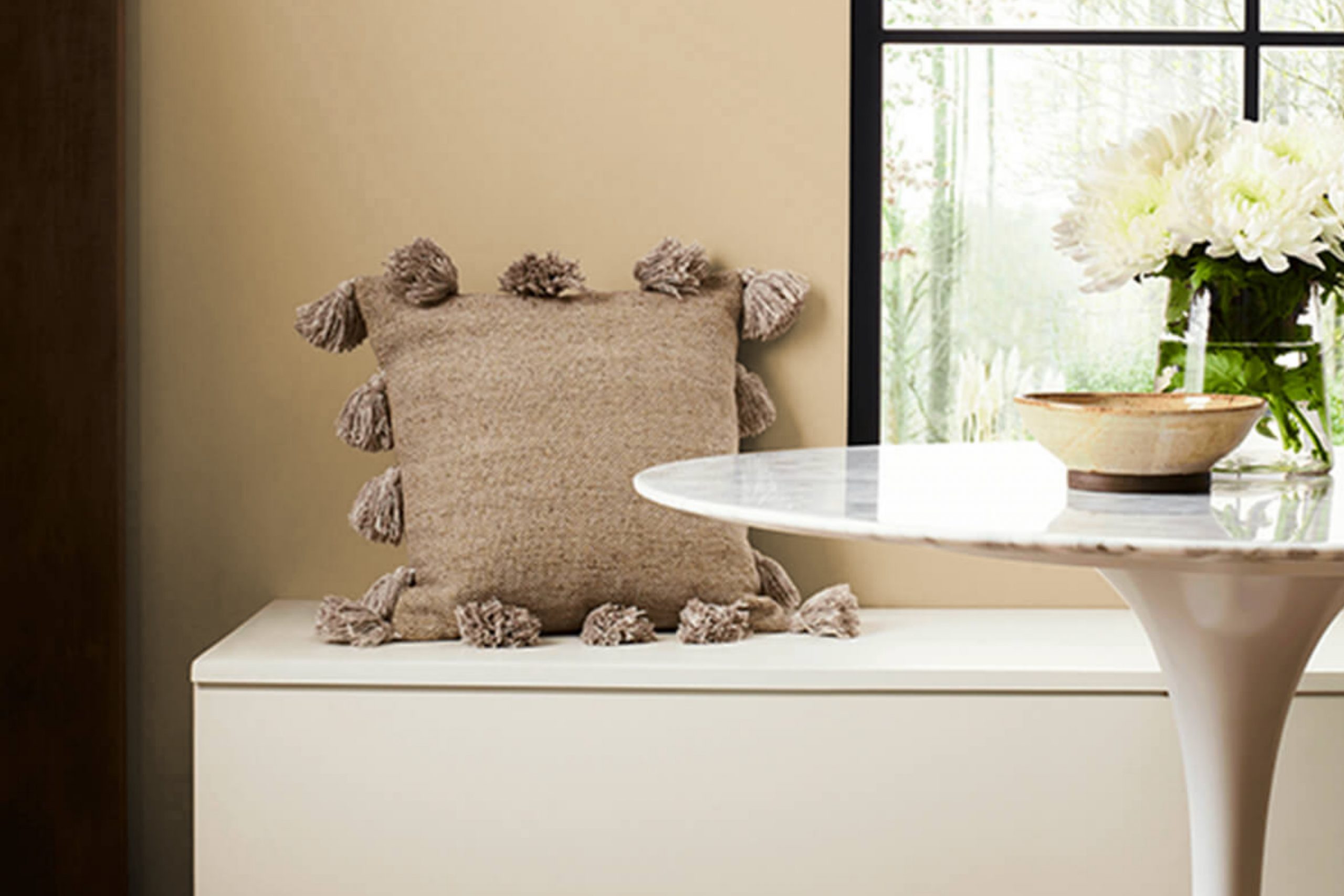
If you’re considering giving your room a warm, inviting update, then you might want to consider Sherwin Williams SW 6121 Whole Wheat. First off, let me tell you, this color is like a cozy hug for your walls. It’s not just any shade of beige; it has a subtle richness that adds a layer of warmth to any room without overpowering the senses.
I’ve always appreciated how a paint color can change the mood of a room, and Whole Wheat does just that. It blends seamlessly with a variety of decor styles, from rustic to modern minimalism, making it a flexible choice for your living room, bedroom, or even the kitchen. It carries an earthy vibe that pairs beautifully with natural elements like wood and stone.
Moreover, the beauty of Whole Wheat lies in its understated elegance; it doesn’t scream for attention yet quietly anchors the room. Pairing it with the right accents and furniture can really bring a room to life. Whether you’re aiming for a calm retreat or a friendly and welcoming communal area, this shade could be the perfect base to start with.
Let’s just say, it’s been a reliable choice for me in making several rooms feel just right.
What Color Is Whole Wheat SW 6121 by Sherwin Williams?
Whole Wheat by Sherwin Williams is a warm and cozy shade with golden undertones, making it a highly adaptable color for interiors. It’s a perfect blend of beige and tan that gives off a welcoming vibe, suitable for creating a relaxed and inviting atmosphere in any home.
This shade works wonderfully in styles where a sense of warmth is desired, such as rustic, farmhouse, and traditional decor. It provides a neutral backdrop that complements natural materials like wood, bringing out their rich textures and colors. Whole Wheat pairs elegantly with soft, plush textiles like wool or cotton, enhancing the cozy feel of a room.
For a harmonious look, combine Whole Wheat with colors like soft greens, blues, or even muted reds which will highlight its warmth without overpowering it. In rooms where you want a calm but cozy feel, using this color with creamy whites or soft grays creates a gentle contrast that’s easy on the eyes.
Overall, Whole Wheat is a great choice for anyone looking to create a cozy, inviting room with a natural feel. It’s straightforward to work with and can be dressed up or down depending on the accompanying decor and materials.
Is Whole Wheat SW 6121 by Sherwin Williams Warm or Cool color?
Whole Wheat by Sherwin Williams is a warm and inviting paint color that’s perfect for creating a cozy atmosphere in homes. This shade has a subtle richness that pairs well with various décor styles, from rustic to modern.
Because of its neutral tone, it serves as an excellent backdrop for both bold and muted furnishings. You can use it in living rooms or bedrooms where you want to foster a comfortable and welcoming vibe. This color reflects light beautifully, which can help to make smaller rooms appear larger and more open.
In well-lit areas, it emits a soft glow, adding a touch of warmth to the environment. In rooms with less natural light, it maintains its depth without making the room feel closed in. Whole Wheat is flexible, easily complementing wood finishes and different fabric textures, which makes it a great choice for those looking to create a harmonious interior without much hassle.
Undertones of Whole Wheat SW 6121 by Sherwin Williams
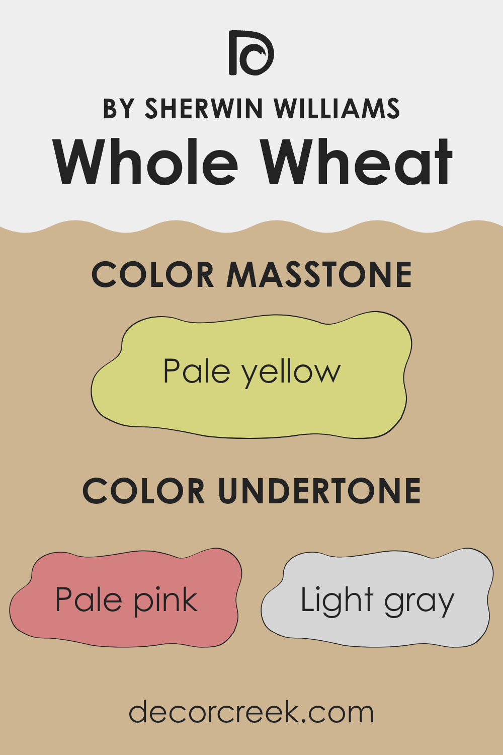
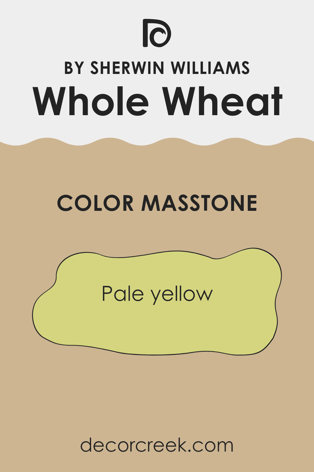
What is the Masstone of the Whole Wheat SW 6121 by Sherwin Williams?
Whole Wheat 6121 is a calming pale yellow color, similar to the shade (#D5D580). It has a gentle, soothing quality that makes it a great choice for creating a cozy and welcoming atmosphere in any room.
This shade of yellow can help rooms feel warmer and more inviting because it softly reflects light, enhancing the sense of area without being too bright or overpowering. This makes it a perfect option for common areas such as living rooms or kitchens where people gather, as it fosters a friendly and relaxed environment.
In smaller or darker rooms, pale yellow can make the area appear larger and brighter, giving the impression of more natural light. The color also works well in bedrooms, where its subtle warmth can help in creating a restful room conducive to sleep. Overall, Whole Wheat 6121 is adaptable, helping enhance the mood and aesthetics of a home easily.
How Does Lighting Affect Whole Wheat SW 6121 by Sherwin Williams?
Lighting plays a crucial role in how we perceive colors. The type of light and its intensity can dramatically alter the appearance of a paint color on your walls. For instance, a color like Whole Wheat, a warm and cozy shade, can look different depending on the light it’s exposed to.
In artificial light, such as that from LED bulbs or fluorescent tubes, Whole Wheat tends to appear warmer and richer. This is because artificial lights can enhance the yellow and red tones in the paint.
Therefore, rooms that use a lot of artificial lighting will make Whole Wheat look warmer and more inviting, an ideal choice for living rooms or dining areas where you want a cozy atmosphere. Under natural light, the impact on Whole Wheat can vary throughout the day and depending on the direction the room faces.
In rooms that face north, natural light tends to be cooler and less direct, making Whole Wheat appear slightly muted and more neutral. This subtle effect can be perfect for creating a calm and peaceful room, like a study or a bedroom.
In south-facing rooms, where light is abundant and warmer for most of the day, Whole Wheat will look vibrant and rich. The warmth of the sunlight enhances the welcoming qualities of the color, making it ideal for active areas like kitchens or family rooms.
East-facing rooms receive bright light in the morning, which can make Whole Wheat look very lively and bright in the morning but cooler and softer as the day progresses. This dynamic change can add interest to a room used mainly in the morning, like a breakfast nook.
Lastly, in west-facing rooms, the color will experience a reverse effect from east-facing rooms. Here, Whole Wheat will start softer in the morning and become warmer and more pronounced towards the evening. This can be perfect for rooms used more in the afternoon and evening, such as living rooms or home offices, adjusting the mood as the day goes on.
Understanding these effects of lighting can help in deciding where and how to use colors like Whole Wheat in your home to achieve the desired ambiance.

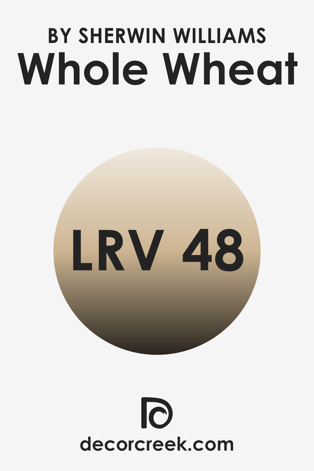
What is the LRV of Whole Wheat SW 6121 by Sherwin Williams?
LRV stands for Light Reflectance Value, which is a measurement used to indicate how much light a paint color reflects. It’s essentially a scale in percentage terms that tells you how light or dark a color will appear on your walls when exposed to natural or artificial light.
A higher LRV means the color reflects more light, making it appear lighter and potentially making a room feel more open and airy. Conversely, a lower LRV means the color absorbs more light, making it look darker and possibly creating a cozier or more enclosed feeling in a room.
For the color with an LRV of 48.069, such as Whole Wheat by Sherwin Williams, the effect can be considered moderately balanced in terms of light reflection. This mid-range LRV means that it doesn’t reflect light as much as lighter colors would, nor does it absorb light like darker shades.
This specific LRV allows the color to maintain some warmth and depth, making it adaptable enough to use in a variety of rooms without overpowering the ambiance. It’s an ideal choice for those who prefer a color that stands between too bright and too subdued.
decorcreek.com
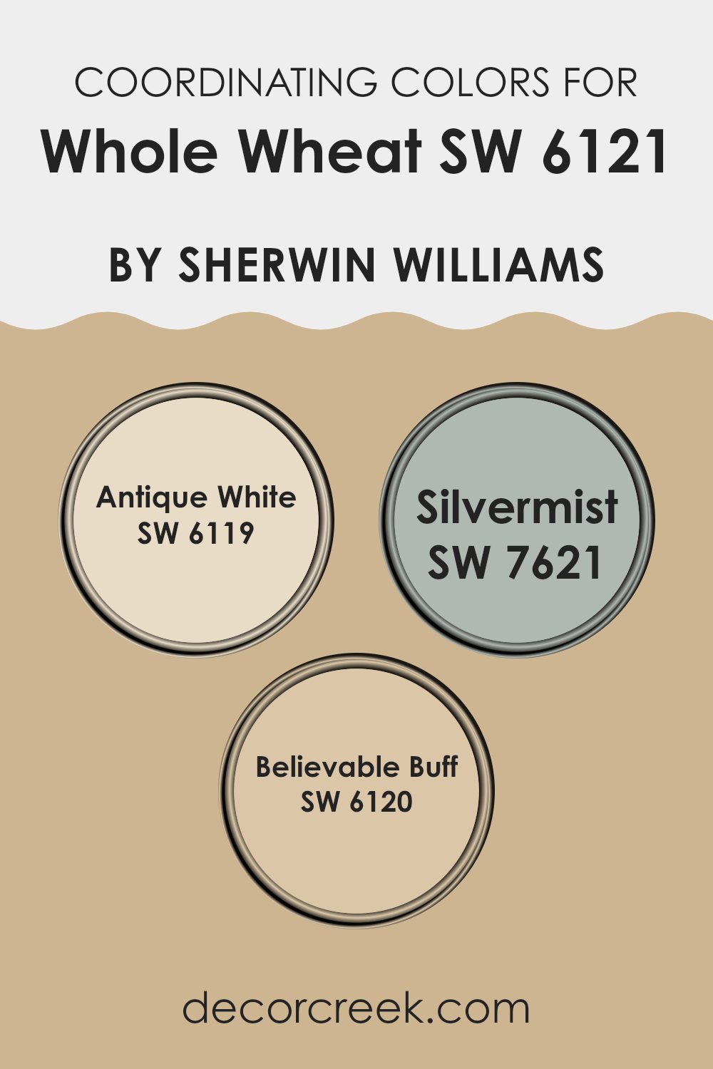
Coordinating Colors of Whole Wheat SW 6121 by Sherwin Williams
Coordinating colors work together to create a harmonious and balanced look in any room. For instance, when decorating with a warm, neutral shade like a wheat hue, choosing the right coordinating colors can enhance the overall aesthetic of the room without overpowering it. These complementary shades are especially chosen for their ability to support the main color, adding depth and contrast while maintaining a cohesive design.
Antique White is a soft, creamy hue that pairs beautifully with warmer tones, providing a subtle contrast and a light, airy feel to the environment. Silvermist is a gentle gray-blue that offers a cool counterpoint to the warmth of a wheat-colored base, bringing a calm and collected vibe that is perfect for rooms meant for relaxation or focus.
Believable Buff, on the other hand, is a gentle neutral with just enough warmth to enrich the primary wheat shade without diminishing its presence, perfect for creating a smooth, continuous look throughout the room. These shades work together effectively, allowing for a flexible color scheme that can suit various decorating styles and personal preferences.
You can see recommended paint colors below:
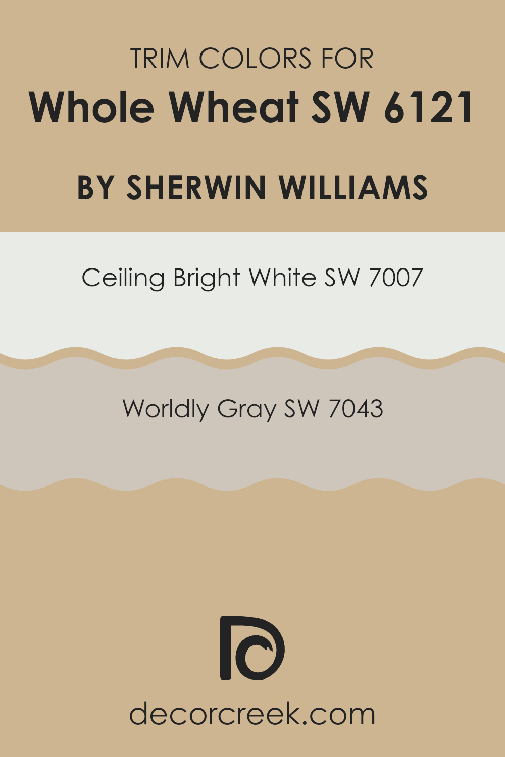
What are the Trim colors of Whole Wheat SW 6121 by Sherwin Williams?
Trim colors play a crucial role in defining the aesthetic and visual coherence of a room, with their ability to accentuate the architectural features and edges such as doors, window frames, and baseboards. When using a warm, inviting hue like Whole Wheat by Sherwin Williams, trim colors can enhance the richness of the main wall color and provide a crisp, clean contrast that highlights the overall decor.
For instance, selecting suitable trim colors like SW 7007 – Ceiling Bright White and SW 7043 – Worldly Gray can draw attention to the subtle nuances of the warmer wall tone while maintaining a balanced and unified look. Ceiling Bright White (SW 7007) by Sherwin Williams, as the name suggests, is a pristine white tone that offers a refreshing crispness, making it perfect for trims.
It lends a striking contrast that helps in making the walls appear more pronounced and structured. On the other hand, Worldly Gray (SW 7043) provides a softer, yet distinctly defined outline to rooms. It is a gentle gray that adds a hint of complexity and depth without overpowering the primary color. Using either of these colors as trims provides a neat visual framework that ties the entire room together, enhancing the visual impact of the wall color.
You can see recommended paint colors below:
Colors Similar to Whole Wheat SW 6121 by Sherwin Williams
Choosing similar colors is a smart way to create a cohesive and harmonious look in any room. Colors like Sawgrass Basket and Harmonic Tan offer subtle variations that coordinate splendidly, allowing for a seamless visual flow from room to room. These shades share a warm, earthy base that is comforting and welcoming.
Using colors like Lamb’s Wool and Quinoa enhances this effect, as they provide a gentle contrast while still maintaining the overall warmth of the decor. This is ideal for creating a unified interior without sharp contrasts that might disturb the soothing atmosphere.
For example, Row House Tan and Safari bring a slightly deeper hue to the palette, giving depth to a room without overpowering it with darker colors. On the other hand, Dromedary Camel offers a rich, sandy tone that pairs well with the lighter shades for a balanced look. Ecru and Macadamia, meanwhile, lean towards a softer, more muted expression of warmth, providing a perfect backdrop for various decor elements.
Crewel Tan stands out with its unique blend, capable of both complementing the warmer tones and adding a distinct character to any room. Together, these colors work synergistically to foster a welcoming, cohesive environment that feels both connected and beautifully curated.
You can see recommended paint colors below:
- SW 9121 Sawgrass Basket
- SW 6136 Harmonic Tan
- SW 9536 Lamb’s Wool
- SW 9102 Quinoa
- SW 7689 Row House Tan
- SW 7697 Safari
- SW 7694 Dromedary Camel
- SW 6135 Ecru
- SW 6142 Macadamia
- SW 0011 Crewel Tan
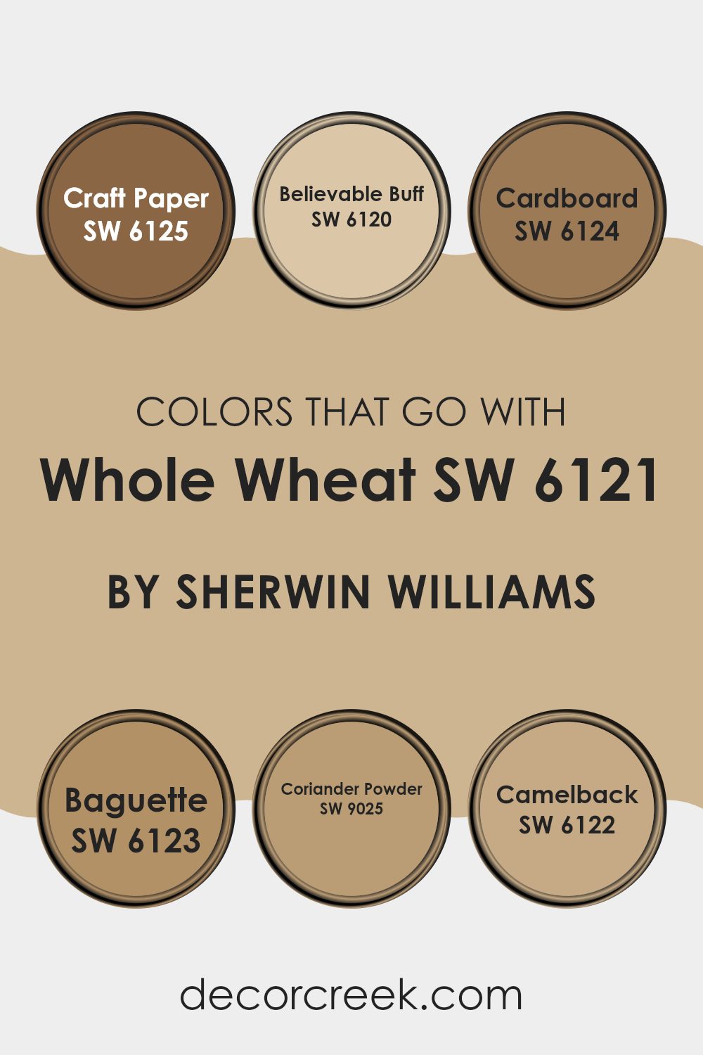
Colors that Go With Whole Wheat SW 6121 by Sherwin Williams
When choosing colors to complement Whole Wheat SW 6121 by Sherwin Williams, it’s crucial to select shades that harmonize to create a balanced and cohesive look. Whole Wheat is a warm, inviting hue, and pairing it with the right colors can enhance the overall aesthetic of any room.
For example, SW 6125 – Craft Paper provides a darker, earthier tone that works well with Whole Wheat for a grounded, natural ambiance. SW 6120 – Believable Buff is lighter and offers a subtle contrast, perfect for creating a soft, seamless transition between rooms.
Moving on, SW 6124 – Cardboard is a neutral option that shares similar earthy qualities with Whole Wheat, making it ideal for adding depth without overpowering. SW 6123 – Baguette introduces a slightly richer, more toasted color that enriches the warmth of a room. SW 9025 – Coriander Powder has a spice-inspired tone that adds a unique flair while staying within the warm neutral family.
Lastly, SW 6122 – Camelback offers a mid-tone beige, bridging the gap between the lighter and darker shades surrounding Whole Wheat. By integrating these colors, you can achieve a harmonious and pleasing palette that enhances the natural beauty and comfort of your home, making it feel welcoming and well-balanced.
You can see recommended paint colors below:
- SW 6125 Craft Paper
- SW 6120 Believable Buff
- SW 6124 Cardboard
- SW 6123 Baguette
- SW 9025 Coriander Powder
- SW 6122 Camelback
How to Use Whole Wheat SW 6121 by Sherwin Williams In Your Home?
Whole Wheat SW 6121 by Sherwin Williams is a warm and adaptable paint color, perfect for creating a cozy atmosphere in your home. This shade is a soft, golden brown that can make any room feel welcoming. It’s especially suitable for living rooms and kitchens where you spend a lot of time and want a comforting ambiance.
You can use Whole Wheat on all walls for a consistent look, or on a single accent wall to introduce a touch of warmth to a room dominated by cooler tones. When paired with white trim, it really pops, bringing out the yellow undertones of the color. It’s also a great backdrop for various types of furniture, from modern white pieces to more rustic wood elements.
For a harmonious color scheme, combine Whole Wheat with other earthy shades like greens or soft blues. Since it’s a neutral, furniture and decor in bolder colors, like deep reds or navy, also stand out beautifully against it. This color lets you play with different styles and textures, setting up a lively yet cozy living environment.
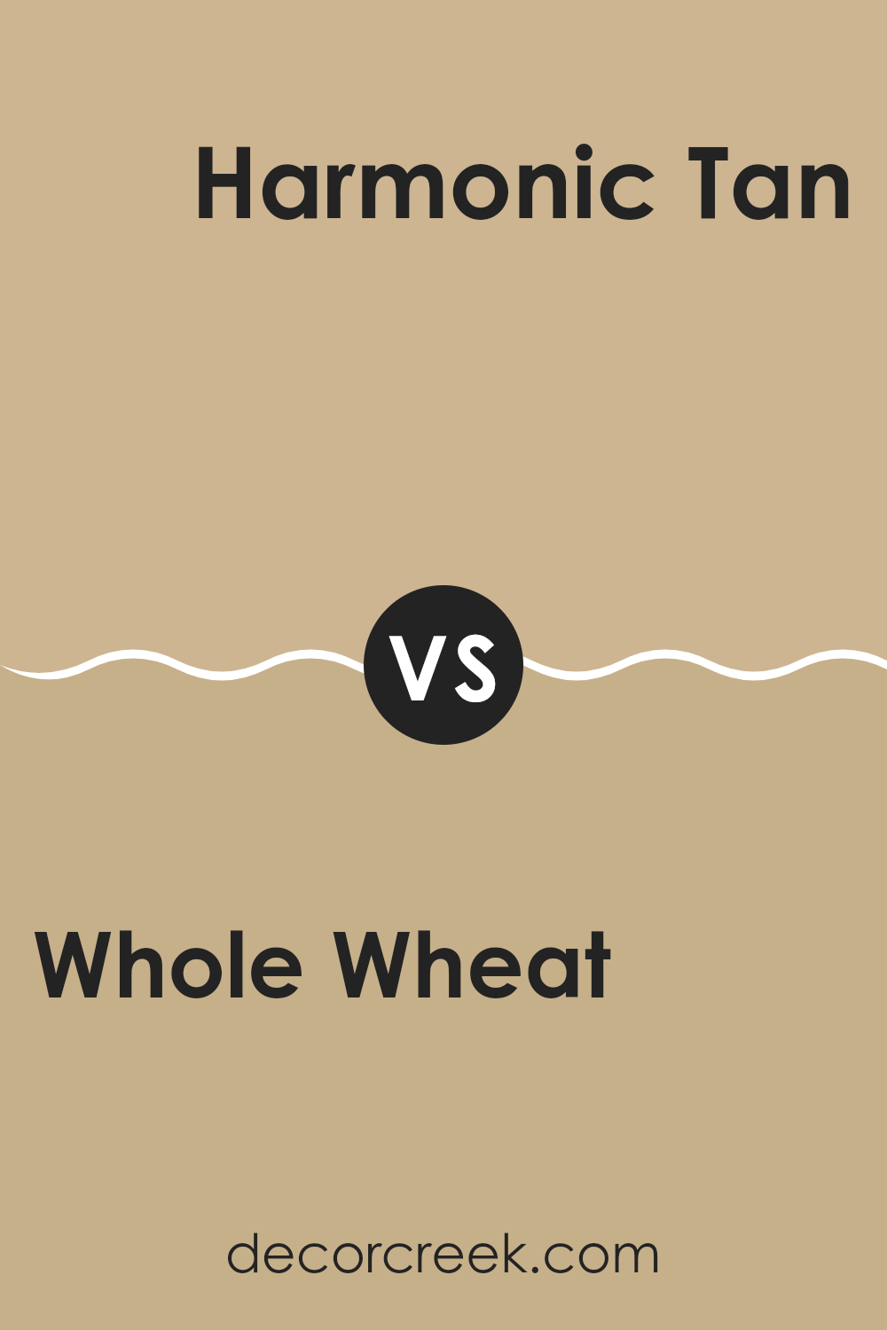
Whole Wheat SW 6121 by Sherwin Williams vs Harmonic Tan SW 6136 by Sherwin Williams
Whole Wheat and Harmonic Tan are both warm, inviting hues from Sherwin Williams that share a similar neutral palette, but they do have distinct differences. Whole Wheat has a richer, deeper tone that resembles the golden-brown color of its namesake.
It’s a solid choice if you want to create a cozy and welcoming atmosphere in a room. On the other hand, Harmonic Tan is lighter and has more beige undertones. This makes it a great option for rooms where you want to keep things light and airy without feeling too stark.
While Whole Wheat provides a comforting warmth, Harmonic Tan offers a softer backdrop, making it flexible for combining with other colors. Each color works well for creating a relaxed environment, but your choice will depend on the specific mood and brightness you want to achieve in your room.
You can see recommended paint color below:
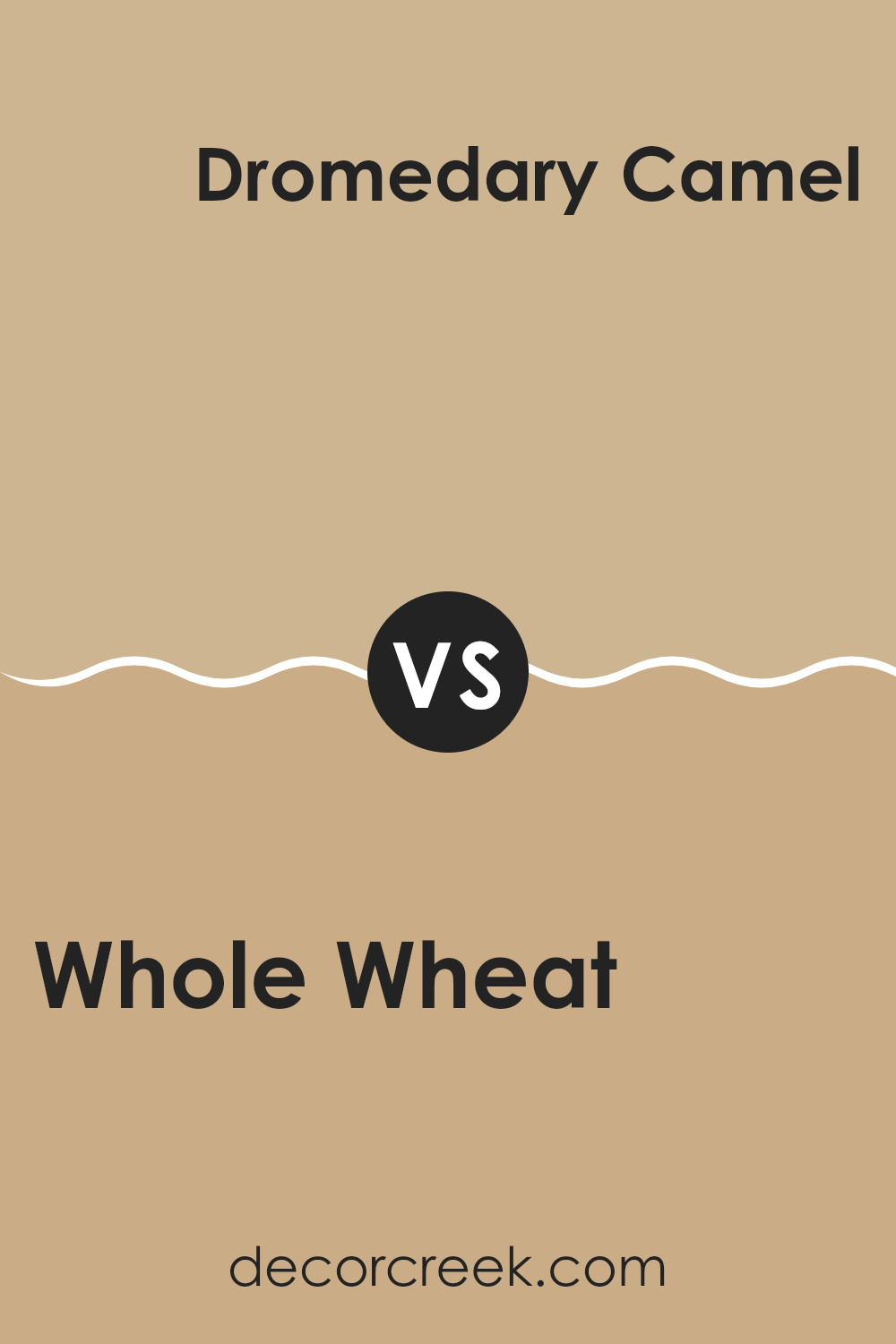
Whole Wheat SW 6121 by Sherwin Williams vs Dromedary Camel SW 7694 by Sherwin Williams
Whole Wheat and Dromedary Camel, both shades by Sherwin Williams, offer warm, inviting tones but have distinct differences. Whole Wheat is a softer, lighter beige, providing a gentle backdrop that easily complements various decor styles.
It’s subtle enough to use across larger areas like living rooms or hallways without overpowering the room. On the other hand, Dromedary Camel has a deeper, more pronounced golden-brown hue that brings a richer, cozier feel to any room.
This color works well in rooms where you want to add warmth or highlight architectural features like accent walls. Despite their differences, both colors create a welcoming atmosphere and pair well with a wide range of complementary shades, from muted to vibrant.
You can see recommended paint color below:
- SW 7694 Dromedary Camel
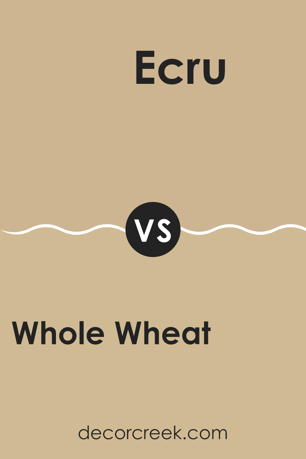
Whole Wheat SW 6121 by Sherwin Williams vs Ecru SW 6135 by Sherwin Williams
Whole Wheat and Ecru are both warm, neutral shades by Sherwin Williams, but they have subtle differences. Whole Wheat has a deeper, richer tone, resembling the golden-brown color of baked bread.
This makes it cozy and inviting, ideal for rooms where you want a touch of warmth without overpowering brightness. Ecru, on the other hand, is lighter and closer to an off-white with a hint of beige. It reflects light well, making rooms appear larger and airier.
Both colors are flexible and work well in many parts of a home, from living rooms to bedrooms. Whole Wheat pairs nicely with darker furniture and decor, enhancing the cozy feel, while Ecru works well with lighter, modern aesthetics, creating a soft, clean look. Choosing between them depends on the mood and lighting of the room.
You can see recommended paint color below:
- SW 6135 Ecru
Whole Wheat SW 6121 by Sherwin Williams vs Macadamia SW 6142 by Sherwin Williams
Whole Wheat and Macadamia by Sherwin Williams are two warm, inviting colors that are great for creating a cozy atmosphere in any room. Whole Wheat is a richer, deeper beige with golden undertones, which gives it a slightly more earthy and robust feel. This color works well in rooms where you want a solid, comforting presence that isn’t too bold or overpowering.
On the other hand, Macadamia is a lighter and softer tan shade. It has a touch of creamy quality, making it an excellent choice for a gentle and calm look. It’s ideal for rooms where you want to keep things light and airy while still adding some warmth.
Both colors pair nicely with a variety of decor styles and other shades, from bright and vibrant hues to more muted tones. Whether you are painting a living room, a bedroom, or a hallway, each of these colors offers a distinct yet balanced option.
You can see recommended paint color below:
Whole Wheat SW 6121 by Sherwin Williams vs Row House Tan SW 7689 by Sherwin Williams
Whole Wheat and Row House Tan by Sherwin Williams are two popular shades that blend well in many rooms. Whole Wheat is a softer, muted beige with warm undertones, perfect for creating a cozy and inviting atmosphere.
It works well in rooms that get plenty of natural light, highlighting its creamy quality. On the other hand, Row House Tan is a deeper, richer tan color. It has stronger brown elements, making it ideal for adding a bit of robustness to a room without overpowering it with darkness.
Both colors are flexible but serve slightly different purposes based on their tones and depths. While Whole Wheat is generally seen as more gentle and airy, Row House Tan offers a sense of grounding and strength, making it excellent for adding character and warmth.
You can see recommended paint color below:
- SW 7689 Row House Tan
Whole Wheat SW 6121 by Sherwin Williams vs Crewel Tan SW 0011 by Sherwin Williams
Whole Wheat and Crewel Tan, both colors by Sherwin Williams, have warm, earthy tones that can make any room feel cozy and welcoming. Whole Wheat is a deeper, richer shade. It resembles the golden brown color of freshly baked bread and can give a room a warm, homey feel, perfect for areas like the living room or a cozy nook.
On the other hand, Crewel Tan is lighter and softer. Think of the gentle hue of sand on a sunny beach. It’s a fantastic choice if you want to brighten up a room without going too bold. This color works well in rooms that get plenty of light and can be paired easily with both dark and light furniture.
Both colors are neutral, making them adaptable for various decorating styles. Whole Wheat adds a bit more warmth, while Crewel Tan offers a subtle, airy feel. These shades can certainly help you achieve a welcoming atmosphere in your home, whether you use them separately or together.
You can see recommended paint color below:
- SW 0011 Crewel Tan
Whole Wheat SW 6121 by Sherwin Williams vs Lamb’s Wool SW 9536 by Sherwin Williams
Whole Wheat and Lamb’s Wool by Sherwin Williams are both warm, inviting colors but they carry distinct vibes because of their tones. Whole Wheat has a deeper, richer beige tone that reminds you of a cozy, earthy feel.
It’s like the color of a wheat stalk in the sun, offering a comforting and natural ambiance to any room. This makes it fantastic for living areas where a soothing touch is desired. On the other hand, Lamb’s Wool is lighter, leaning towards a soft, creamy white. This color is more subtle and gives off a fresher, airy feel.
It’s great for making smaller rooms appear bigger and well-lit. Both colors work well in a variety of decorating styles, but while Whole Wheat adds depth and warmth with its more pronounced hue, Lamb’s Wool keeps things light and breezy. Depending on the atmosphere you want to create, both shades are flexible for home design.
You can see recommended paint color below:
Whole Wheat SW 6121 by Sherwin Williams vs Safari SW 7697 by Sherwin Williams
Whole Wheat and Safari, both by Sherwin Williams, are distinct yet complementary colors. Whole Wheat is a warm, soft beige with a welcoming feel, perfect for creating a cozy and comfortable room. It’s light enough to make rooms feel open yet warm enough to add a gentle, soothing ambiance.
On the other hand, Safari is a deeper, earthy taupe that leans toward a dusty brown. This color gives a more grounded and sturdy feeling, making it great for adding depth and stability to a room. While Whole Wheat brings a lighter, uplifting mood, Safari offers a stronger statement with its richer tone.
Both colors work well in a variety of settings, from living rooms and bedrooms to entryways. When used together, they provide a balanced and natural flow, with Whole Wheat brightening rooms and Safari anchoring them. These shades are ideal for someone looking to create a harmonious yet varied interior with a natural, earthy vibe.
You can see recommended paint color below:
- SW 7697 Safari

Whole Wheat SW 6121 by Sherwin Williams vs Quinoa SW 9102 by Sherwin Williams
Whole Wheat SW 6121 and Quinoa SW 9102 by Sherwin Williams are both warm, inviting colors but have distinct tones that set them apart. Whole Wheat has a deeper, richer beige color reminiscent of golden fields and pairs well in rooms aiming for a cozy and comforting atmosphere. It provides a stronger statement and is great for creating a snug, inviting feel.
On the other hand, Quinoa is lighter and closer to a soft, sandy shade. It’s subtler than Whole Wheat, offering a more neutral palette that makes a room feel open and bright. This color works well in smaller rooms or areas that get less natural light, as it can help make the room feel larger and fresher.
Both shades are adaptable and can easily blend with various decor styles, but the choice between them depends on the mood you want to set: richer and warmer with Whole Wheat or lighter and airier with Quinoa. These tones can also pair beautifully together to create a layered, warm atmosphere.
You can see recommended paint color below:
- SW 9102 Quinoa
Whole Wheat SW 6121 by Sherwin Williams vs Sawgrass Basket SW 9121 by Sherwin Williams
Whole Wheat by Sherwin Williams is a warm, neutral beige that provides a cozy and inviting atmosphere. It’s flexible enough to work in various settings such as living rooms, bedrooms, and kitchens, complementing many décor styles and elements with its subtle warmth.
On the other hand, Sawgrass Basket is also a neutral shade but leans toward a more distinct grayish-tan tone. This color is great for bringing a modern yet rustic charm to rooms. It’s slightly cooler compared to Whole Wheat, which makes it unique in setting a calm, understated look.
Both colors are excellent choices for those looking to create a welcoming room without using overly bold shades. Whole Wheat tends to add warmth and is well-suited for rooms with less natural light, whereas Sawgrass Basket can introduce a more contemporary feel with its cooler undertones. Each shade can effectively enhance the aesthetics of a room while maintaining a natural, earthy foundation.
You can see recommended paint color below:
After reading about SW 6121 Whole Wheat by Sherwin Williams, I really think it’s an excellent paint color choice for anyone looking to give their room a cozy, warm feel. Whole Wheat is a soft, golden brown shade that reminds me of a yummy slice of toast. It’s not too dark or too light, so it makes the room feel just right.
This color works well in many areas like the living room, kitchen, or even a bedroom because it brings a comforting vibe. It doesn’t call for attention but instead sets a calm mood, making it easy for you to relax and feel at home. When the sunlight or lamp light hits the walls, Whole Wheat looks even more beautiful and welcoming.
Putting this color on your walls can really make your furniture and other colors in the room stand out in a good way. It’s kind of like having a friendly color that makes everything else look better! Whether you have a modern style or something more traditional, Whole Wheat fits in nicely.
So, if you are thinking about changing up a room in your house, SW 6121 Whole Wheat is definitely a great color to consider. It makes the room warm, inviting, and just feels like a big, happy hug!

Ever wished paint sampling was as easy as sticking a sticker? Guess what? Now it is! Discover Samplize's unique Peel & Stick samples.
Get paint samples

