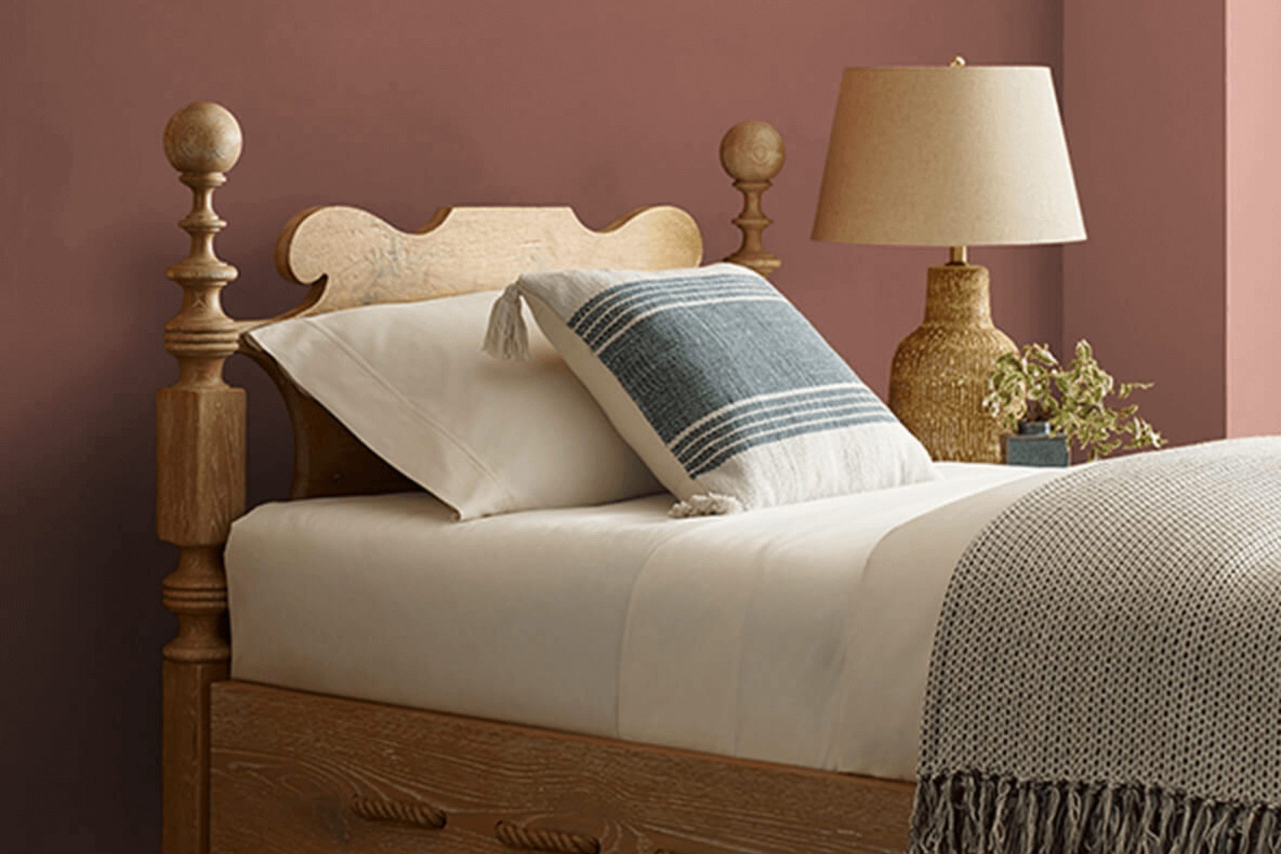
If you’re on the hunt for a paint color that truly feels like home, SW 6054 Canyon Clay by Sherwin-Williams might just be your next favorite. Imagine the warm, soothing hues of a clay pot, perfectly sun-drenched and radiating a cozy, welcoming vibe—that’s Canyon Clay.
It brings a sense of earthly warmth to any room, making areas feel grounded yet lively. As someone constantly tweaking my living area to reflect a calm and cozy atmosphere, finding Canyon Clay was like uncovering a hidden gem.
This shade offers just the right balance between boldness and subtlety, making it adaptable for living rooms, kitchens, or even exteriors.
Plus, its richness adds depth and character to walls without overpowering the senses. Pairing it with complementary colors or decor can truly turn a house into a home.
What Color Is Canyon Clay SW 6054 by Sherwin Williams?
Canyon Clay by Sherwin Williams is a warm, earthy hue with a perfect blend of red and brown, reminiscent of natural clay. This color radiates warmth and coziness, making it an excellent choice for those looking to create a nurturing and welcoming atmosphere in their home. The rich, deep tone works exceptionally well in a variety of interior styles, particularly rustic, southwestern, and modern designs.
For a rustic look, Canyon Clay pairs beautifully with natural materials such as unfinished wood, soft leather, and textured linens. Its grounding nature helps to tie these elements together, creating a cohesive and inviting area. In southwestern-inspired interiors, pairing it with turquoise and sage accents can brighten the area while maintaining an earthy feel.
In modern settings, Canyon Clay can act as an inviting accent wall color, harmonizing with sleek furnishings and metallic finishes like brass or copper for a touch of warmth. When matched with creamy whites or soft grays, it prevents the room from feeling too stark, adding a cozy layer to minimalist decor.
Additionally, Canyon Clay works well with a variety of textures, from rough, tactile fabrics like burlap and wool to smoother surfaces like ceramic and glass, enriching the sensory experience of a room. This adaptability makes it a practical choice for anyone looking to add depth and warmth to their living area.
Is Canyon Clay SW 6054 by Sherwin Williams Warm or Cool color?
Canyon Clay by Sherwin Williams is a warm, earthy hue that adds a cozy and welcoming touch to any room in the house. It’s an adaptable color that works well in many settings, whether you want to create a relaxed vibe in a living room or a more energetic atmosphere in a kitchen or dining area.
The reddish-brown tone of Canyon Clay can complement natural materials like wood and leather, making it a great choice for homes that feature these elements in their decor. Additionally, this color pairs nicely with neutral shades, such as creams and grays, which help balance its warmth.
For those looking to add a bit of character to their area without overpowering it, Canyon Clay is an excellent option. It provides a subtle splash of color that enriches the environment without dominating it.
Undertones of Canyon Clay SW 6054 by Sherwin Williams
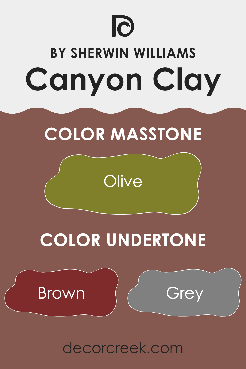
Canyon Clay is a unique paint color that carries a variety of undertones, which subtly influence how the color appears in different settings. The primary undertones for Canyon Clay include shades of brown, grey, purple, orange, and red, among others like pink, green, and yellow.
Undertones are subtle colors that lurk beneath the surface of the main color and can significantly affect how a color looks once applied to walls and how it reacts under various lighting conditions. For example, brown and orange undertones can make a color feel warmer, while grey or blue undertones might give a cooler feel.
On interior walls, the impact of Canyon Clay’s undertones becomes evident depending on the room’s lighting and surrounding colors. In natural light, the orange and red undertones might make the walls feel warm and inviting, perfect for living rooms or dining areas.
However, in artificial or dimmer lighting, the grey or purple undertones could become more dominant, providing a slightly muted, more subdued appearance. This characteristic makes it a flexible choice for many rooms as it adapts to different moods and settings.
Furthermore, Canyon Clay with its complex undertones can pair well with various decor elements. For instance, furnishings in dark green or navy might draw out the cooler undertones, while lighter, pale pink or yellow decor can enhance its warmth, creating a balanced aesthetic in the room.
This adaptability makes it quite popular for those wanting a color that can change subtly with different decor and lighting, always providing a fresh perspective on the walls.
What is the Masstone of the Canyon Clay SW 6054 by Sherwin Williams?
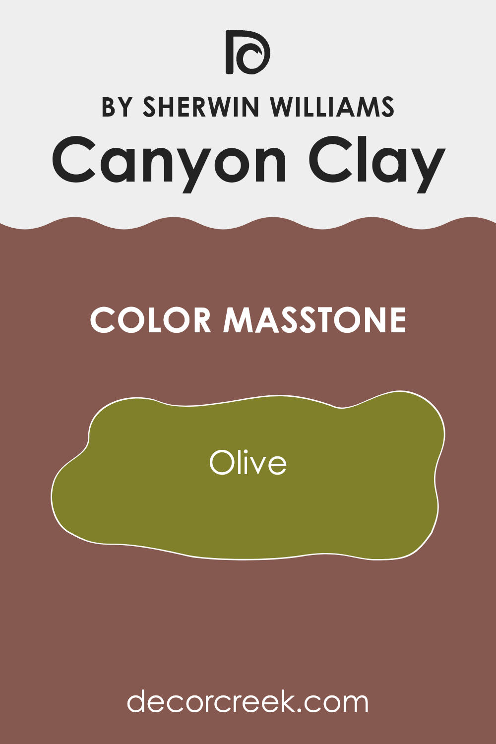
Canyon Clay SW 6054 by Sherwin Williams is a unique paint color with a masstone of Olive (#80802B). This deep olive base gives it a warm and earthy touch. When applied on walls, this color provides a cozy and welcoming feel to any room. Its rich, earthy undertone makes it perfect for areas where you want to add a sense of warmth and comfort, such as living rooms or bedrooms.
The olive base of Canyon Clay also helps in blending well with natural materials like wood, stone, and leather, making it a great choice for homes that feature a lot of these elements. Its flexibility means it pairs well with both dark and light furniture, offering a striking contrast against lighter hues and harmonizing beautifully with darker shades.
Canyon Clay works well in homes because it brings a touch of nature indoors, creating a calming atmosphere that makes areas feel more grounded and cozy. It’s an ideal choice for those looking to create a comforting and inviting home environment.
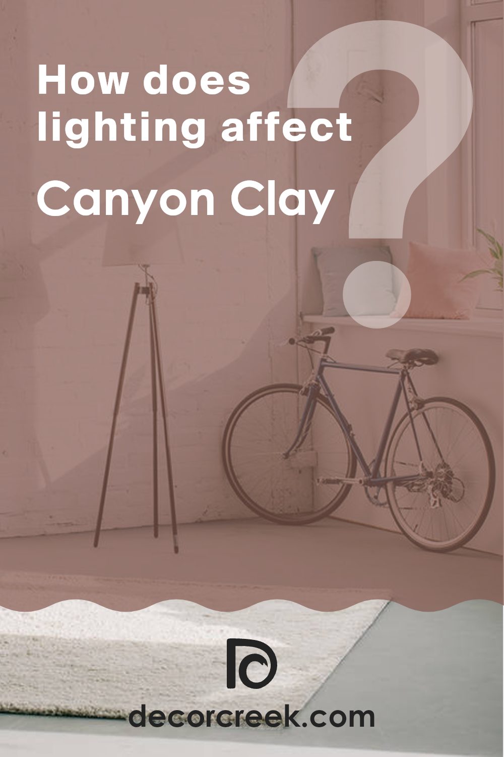
How Does Lighting Affect Canyon Clay SW 6054 by Sherwin Williams?
Lighting plays a crucial role in how we perceive colors. The type of light—whether natural or artificial—can dramatically change the appearance of a paint color on your walls. Understanding this can help you choose where and how to use certain colors effectively.
Take, for example, the color Canyon Clay by Sherwin Williams. It’s a warm, earthy hue that can vary significantly under different lighting conditions. In natural light, Canyon Clay tends to look more vibrant and softer, as daylight brings out the true richness of the color.
Artificial light, however, can alter its appearance. In warmer light, such as from incandescent bulbs, the color can appear more cozy and inviting, adding to the warmth. Fluorescent lighting might make it look less inviting, as it tends to cast a cooler tone over the walls.
The direction your room faces also affects how Canyon Clay will look. In rooms facing north, which receive less direct sunlight, the color may appear slightly muted and cooler, making it look more subdued. Southern exposure, however, bathes rooms in bright, warm light for most of the day, so Canyon Clay will look warmer and more dynamic here, potentially enhancing its welcoming feel.
In east-facing rooms, the morning light can make Canyon Clay look very warm and cheerful, perfect for starting the day. However, as the sunlight fades, the color can lose some of its vibrancy and appear more subdued. Conversely, in west-facing rooms, the color might not come to life until the afternoon and evening, when it can glow beautifully in the warm, late sunlight.
By considering the way lighting affects Canyon Clay, you can better decide where to use this color in your home to achieve the desired effect, ensuring it looks its best at all times.
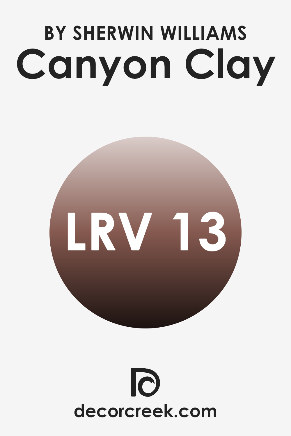
What is the LRV of Canyon Clay SW 6054 by Sherwin Williams?
Light Reflectance Value, or LRV, is a measure used to describe the percentage of light a paint color reflects or absorbs once it’s applied to a wall. This value can range from very low to very high, indicating how much light bounces back into the room.
A higher LRV means the color reflects more light, making a room feel brighter and more open. Conversely, a lower LRV means that the color absorbs more light, which can make a room appear cozier but also smaller and darker.
The LRV of Canyon Clay, which is 12.726, suggests it is a dark shade that absorbs much of the light that hits it. When used on walls, this color can create a sense of warmth and intimacy, making it ideal for areas where a cozy atmosphere is desired.
However, it’s important to consider that due to its low LRV, this color might make smaller rooms feel even smaller and could require additional lighting to keep the area from feeling too dim. It’s an excellent choice for larger rooms or areas with ample natural light where its richness can be fully appreciated without making the area feel closed in.
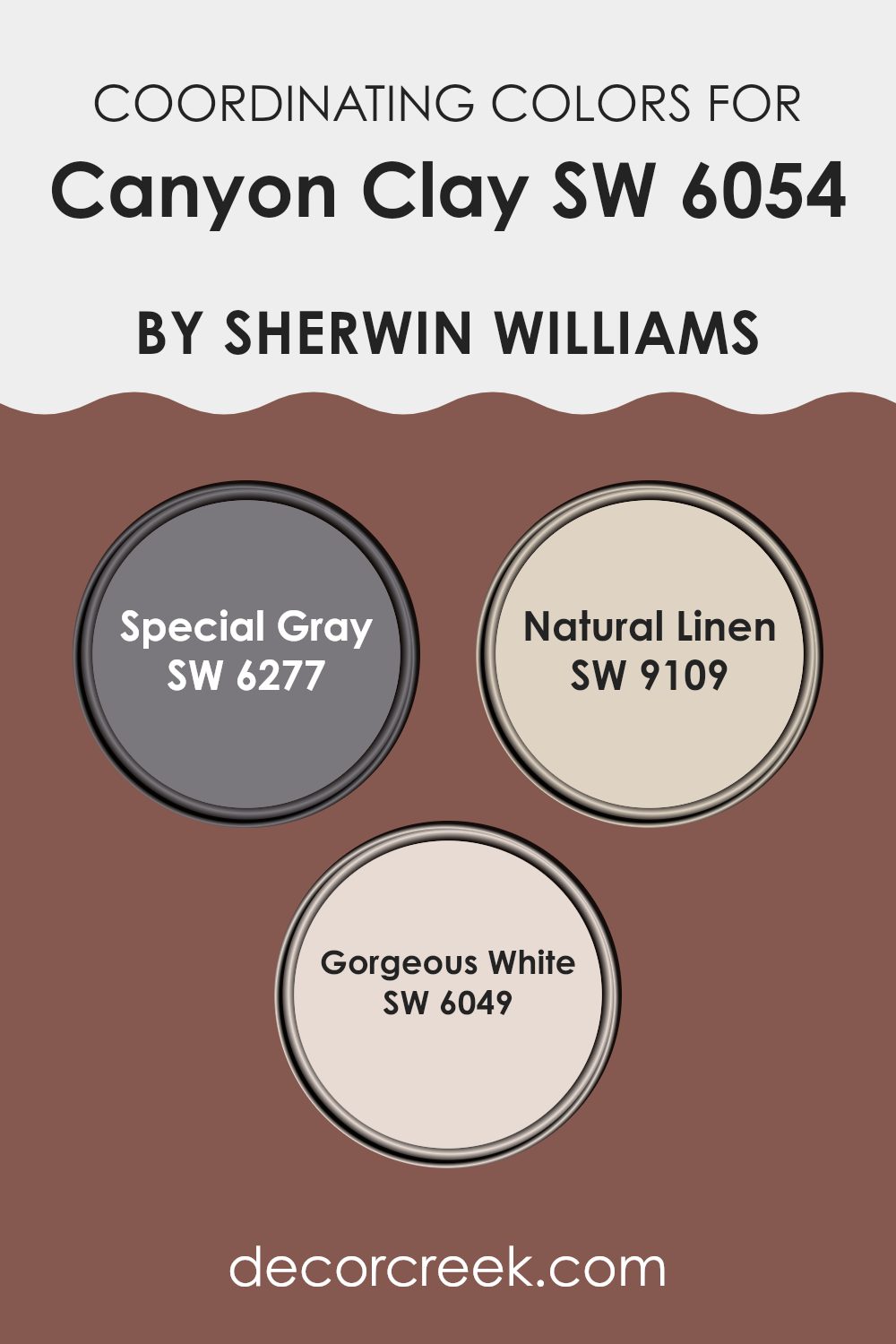
Coordinating Colors of Canyon Clay SW 6054 by Sherwin Williams
Coordinating colors are selected hues that harmonize with a primary paint color to enhance the overall aesthetics of a room. These colors complement the main color, adding depth and balance to an interior design. When these colors are used together, they create a unified look that can make various elements in a room appear cohesive. This technique is commonly used by designers to achieve a polished decor style that feels intentionally styled.
For instance, consider the color Special Gray (SW 6277), which is a dark, muted gray that can act as a strong grounding color when paired with a lighter or more vibrant color like Canyon Clay. This gray adds depth and can be a stunning backdrop in a room.
Natural Linen (SW 9109), on the other hand, is a soft, warm beige that offers a gentle contrast to richer hues. It works beautifully to soften the overall effect of a bolder color scheme, making the room feel welcoming and calm. Lastly, Gorgeous White (SW 6049) is a clean and bright white that serves as a crisp accent, perfect for trim and ceilings to complete a room’s look by providing a fresh and open feel.
You can see recommended paint colors below:
- SW 6277 Special Gray
- SW 9109 Natural Linen
- SW 6049 Gorgeous White
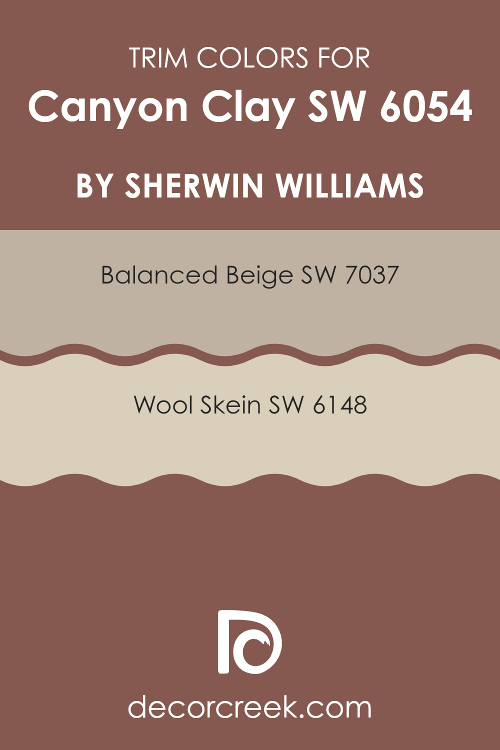
What are the Trim colors of Canyon Clay SW 6054 by Sherwin Williams?
Trim colors are used to accentuate and frame the main colors used on walls, complementing the overall theme and design of a room. When using a distinct hue like Canyon Clay by Sherwin Williams, choosing the right trim colors becomes crucial to effectively highlight the richness of the wall color while maintaining harmony within the area. Balanced Beige and Wool Skein are two excellent choices for trim colors as they can subtly enhance the warmth of Canyon Clay without overpowering it.
Balanced Beige is a flexible and warm beige color that naturally complements richer, earthy tones like Canyon Clay. It adds a gentle contrast, framing the boldness of the clay color in a way that blends smoothly with various decor styles.
Wool Skein, on the other hand, offers a lighter and softer beige tone which brings out the more subtle notes in Canyon Clay, providing a soothing transition between the more vivid wall color and other elements in the room. Together, these trim colors work effectively to create a cohesive and appealing aesthetic.
You can see recommended paint colors below:
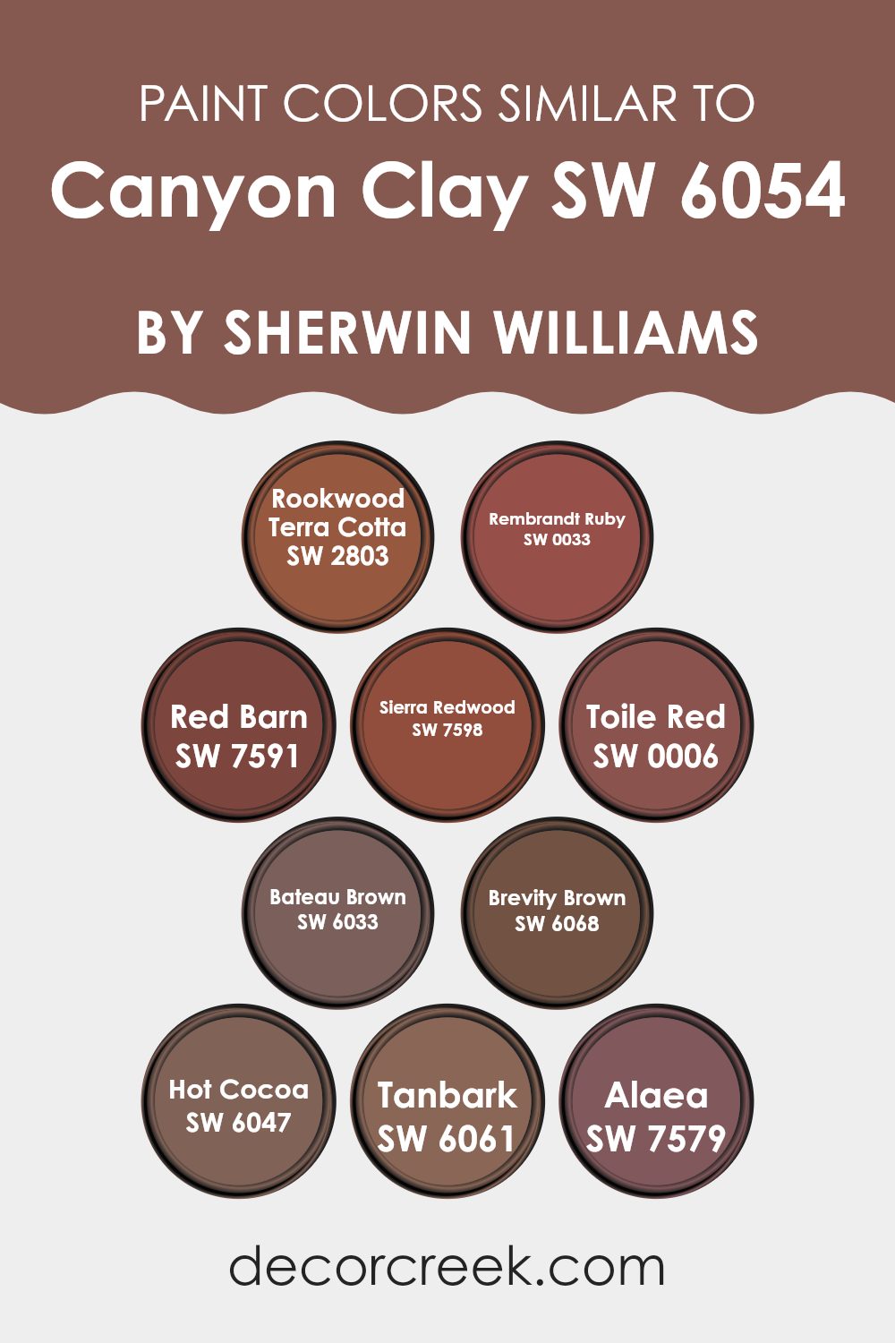
Colors Similar to Canyon Clay SW 6054 by Sherwin Williams
Using similar colors in a design or decorating scheme can create a harmonious and cohesive look, emphasizing subtle differences and nuances that bring depth and complexity to a room. Colors similar to Canyon Clay by Sherwin Williams serve this purpose beautifully, each adding their own unique note while maintaining the overall warmth and earthiness of the scheme.
SW 2803 – Rookwood Terra Cotta brings a sturdy, grounded feel with its deep, terracotta hue, perfect for adding a robust touch to any room. SW 0033 – Rembrandt Ruby introduces a slightly more vibrant, jewel-toned aspect, making areas feel warm and welcoming.
SW 7591 – Red Barn has a traditional, rustic charm that recreates the classic feel of an old barn in the countryside, deep and full of nostalgia. SW 7598 – Sierra Redwood is reminiscent of the majestic redwood trees, with a dark, rich red that adds an element of nature’s grandeur to the palette.
SW 0006 – Toile Red offers a more refined cherry-like shade, ideal for accents that need a splash of color without overpowering the senses. SW 6033 – Bateau Brown has a soft, muted brown that works well to ground color schemes with a gentle, understated refinement.
SW 6068 – Brevity Brown is a bit stronger, a more pronounced brown that adds weight and substance to the color story. SW 6047 – Hot Cocoa is exactly what you imagine, a comforting, warm brown that is soothing and familiar.
SW 6061 – Tanbark is a nuanced, tawny shade that integrates beautifully with other earth tones for a layered effect. Finally, SW 7579 – Alaea, inspired by the rich Hawaiian clay, rounds out this palette with its natural, fertile red, infused with subtle hints of brown and a touch of the exotic landscapes it represents. Each color, while similar, allows for an array of possibilities in design, creating a room that feels cohesive yet vibrant with variations that enrich the environment.
You can see recommended paint colors below:
- SW 2803 Rookwood Terra Cotta
- SW 0033 Rembrandt Ruby
- SW 7591 Red Barn
- SW 7598 Sierra Redwood
- SW 0006 Toile Red
- SW 6033 Bateau Brown
- SW 6068 Brevity Brown
- SW 6047 Hot Cocoa
- SW 6061 Tanbark
- SW 7579 Alaea
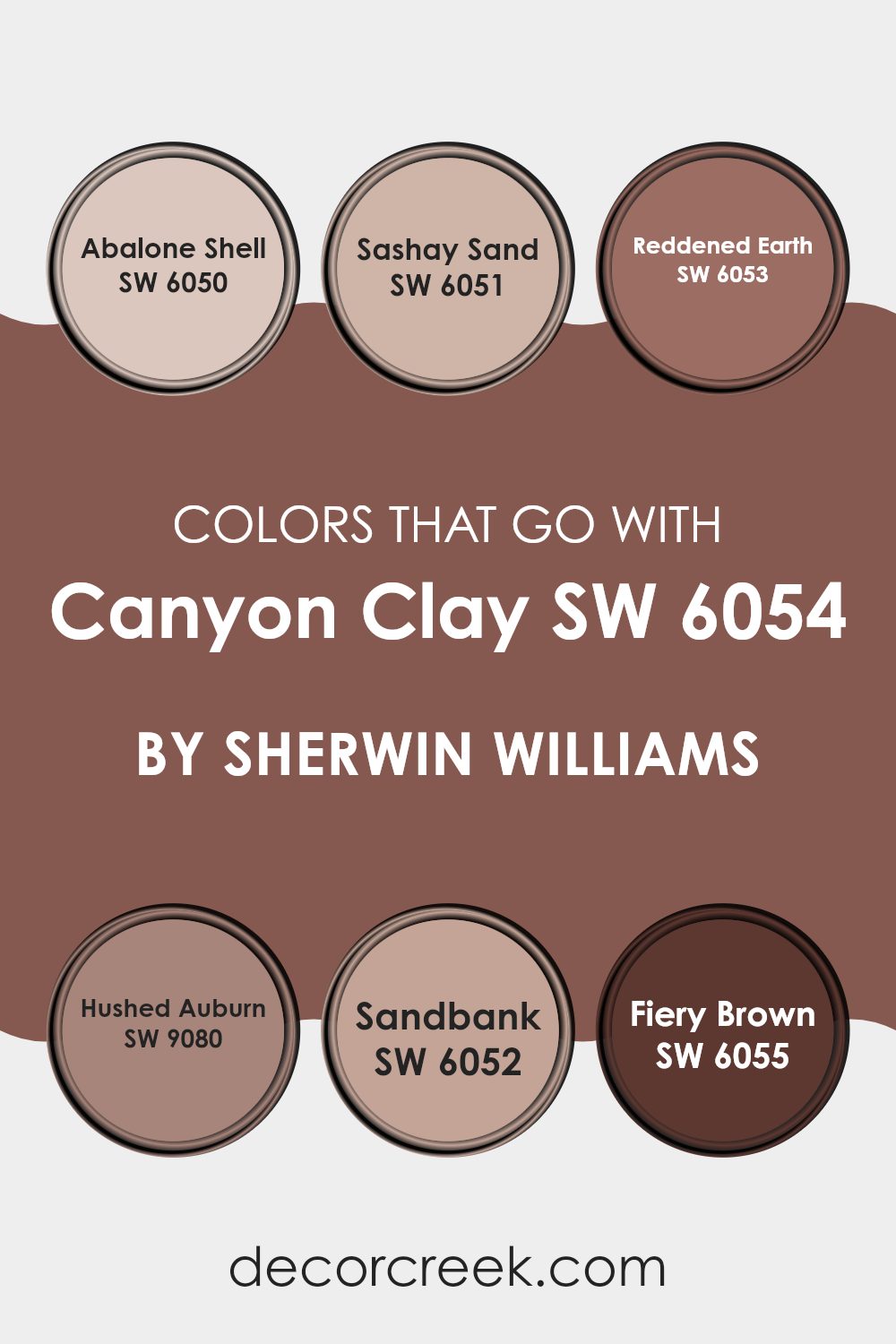
Colors that Go With Canyon Clay SW 6054 by Sherwin Williams
Choosing the right colors to complement Canyon Clay SW 6054 by Sherwin Williams is vital because the combination creates a harmonious atmosphere in any area. Canyon Clay, with its warm, earthy tones, serves as an excellent base for a color palette that can enhance the aesthetic of a room and make it more inviting. Matching the right colors can also influence the mood of the room, making it feel more cozy and welcoming.
For example, pairing Canyon Clay with Abalone Shell, a gentle grey, gives a subtle contrast that softens the overall look of the area without overpowering the warm undertone of Canyon Clay. Sashay Sand adds a pinch of soft beige, providing a light, airy feel that pairs well with the deeper tones of Canyon Clay, creating a balanced visual appeal.
Reddened Earth, similar in depth to Canyon Clay but with a richer, more intense hue, infuses additional warmth into the area, reinforcing a cozy, grounded atmosphere. If you want something a bit more striking, Hushed Auburn is a deep, muted red that complements the rusty tones in Canyon Clay, amplifying the richness of the room. Sandbank, another warm option, offers a muted, sandy color that works seamlessly with Canyon Clay to produce a cohesive and natural look.
Lastly, Fiery Brown, as the name suggests, is a deep, intense brown that adds depth and drama when used with Canyon Clay, perfect for creating a strong and distinguished appearance in any room. Together, these colors not only complement but also enhance the beauty and warmth of Canyon Clay, making any area more welcoming and aesthetically pleasing.
You can see recommended paint colors below:
- SW 6050 Abalone Shell
- SW 6051 Sashay Sand
- SW 6053 Reddened Earth
- SW 9080 Hushed Auburn
- SW 6052 Sandbank
- SW 6055 Fiery Brown
How to Use Canyon Clay SW 6054 by Sherwin Williams In Your Home?
Canyon Clay by Sherwin Williams is a warm, earthy paint color that brings a cozy and inviting feel to any room. If you want to create a welcoming atmosphere in your home, this shade is a great choice.
Perfect for a living room or dining area, it pairs well with both natural wood tones and various textures like soft fabrics and rustic metals. You can use it as an accent wall to add a splash of color without overpowering the area. It’s also ideal for a bedroom where you want to establish a comfortable vibe.
To complement Canyon Clay, consider furnishings and decor in neutral shades such as cream, beige, or light gray. This helps maintain a balanced look while letting the rich tone of Canyon Clay stand out. Whether you’re painting an entire room or just one wall, this color can truly make your living area feel warm and welcoming.
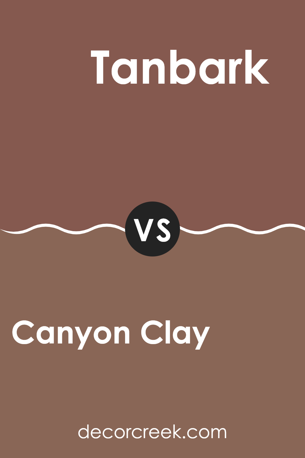
Canyon Clay SW 6054 by Sherwin Williams vs Tanbark SW 6061 by Sherwin Williams
Canyon Clay and Tanbark are two distinct colors from Sherwin Williams. Canyon Clay offers a warm, muted red tone, a bit like reddish-brown clay found in natural settings. It has a cozy feel, perfect for creating welcoming areas.
On the other hand, Tanbark leans towards a darker, richer brown. It mimics the deep color of bark or heavily shaded woodland areas. When comparing both, Canyon Clay is lighter and warmer, providing a subtle liveliness to rooms without overpowering them.
Tanbark, being darker, gives a grounding effect, adding depth and a sense of stability. Both colors are flexible and work well in areas that aim for a natural, earthy vibe but with different impacts. Canyon Clay brightens areas lightly, while Tanbark anchors them more firmly.
You can see recommended paint color below:
- SW 6061 Tanbark
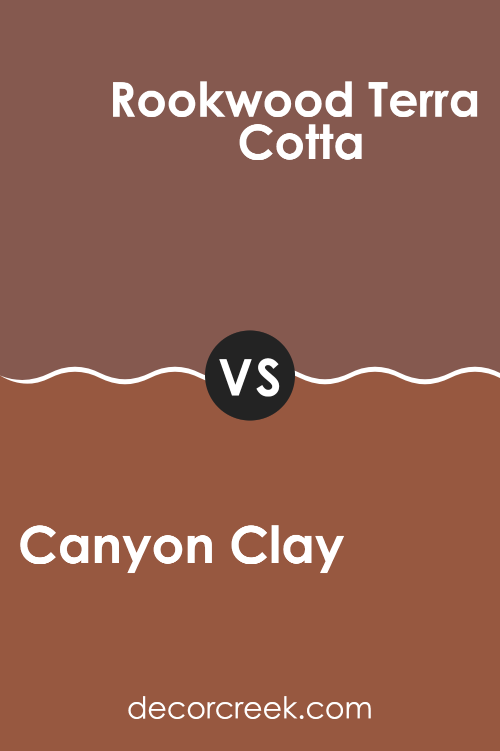
Canyon Clay SW 6054 by Sherwin Williams vs Rookwood Terra Cotta SW 2803 by Sherwin Williams
Canyon Clay and Rookwood Terra Cotta are both warm, earthy hues from Sherwin Williams, but they show distinct tones and moods. Canyon Clay is a soft, muted shade slightly reminiscent of a dusty pink with a reddish undertone, creating a cozy and inviting atmosphere. It’s ideal for areas where a gentle and soothing visual impact is desired without veering too far into brighter reds.
On the other hand, Rookwood Terra Cotta carries a deeper, more saturated feel, leaning towards a classic terracotta color. This richer shade brings a sense of earthiness and grounding, offering a stronger visual statement. It works well in areas that aim for a more bold and warm presence, providing a traditional look that stands out without being overpowering.
Together, these colors can complement each other beautifully in an area, with Canyon Clay providing a lighter backdrop and Rookwood Terra Cotta serving as an accent or focal point, allowing for a harmonious yet dynamic interplay in decor.
You can see recommended paint color below:
- SW 2803 Rookwood Terra Cotta
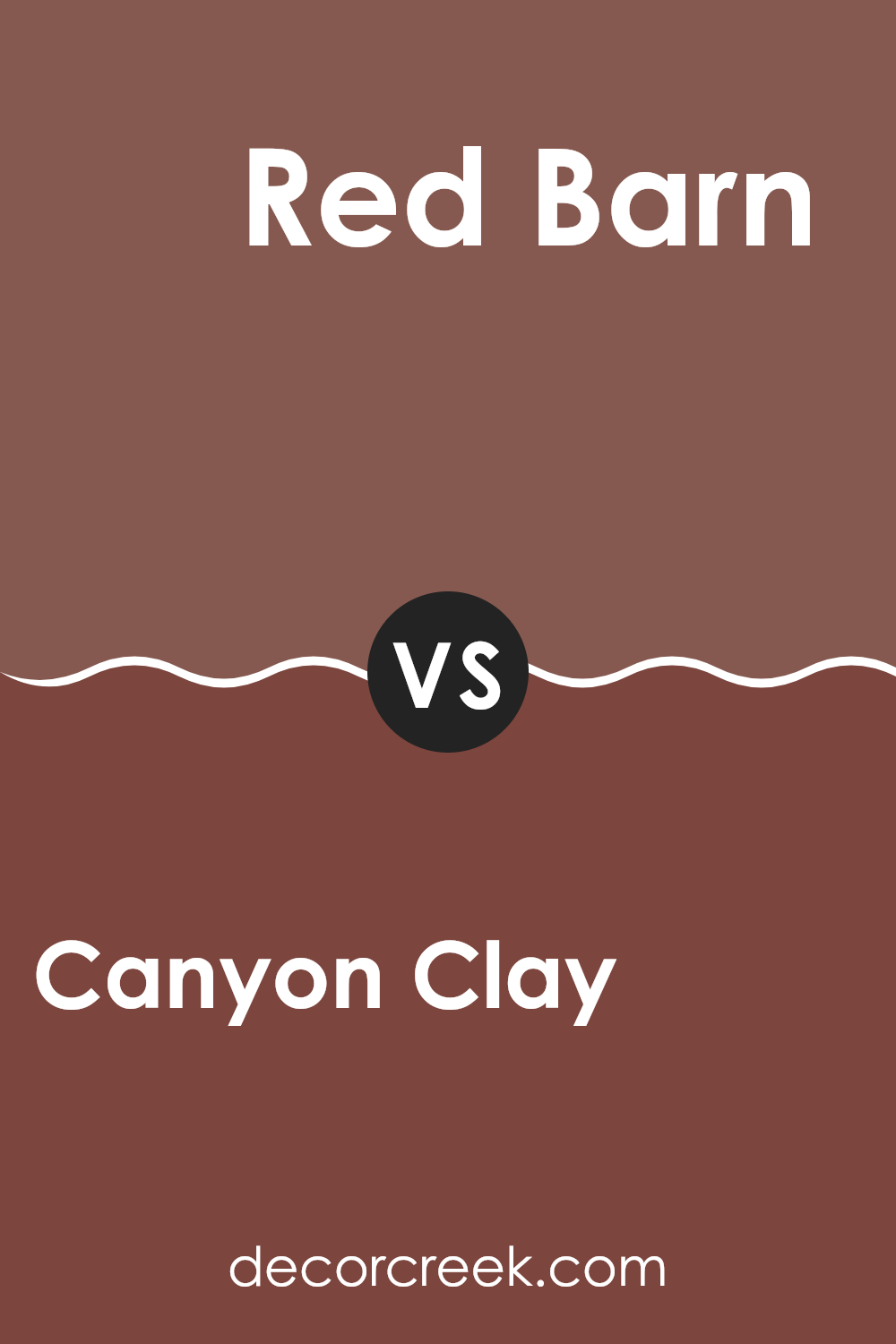
Canyon Clay SW 6054 by Sherwin Williams vs Red Barn SW 7591 by Sherwin Williams
Canyon Clay and Red Barn, both from Sherwin Williams, offer distinct yet harmonious tones for anyone looking to add warmth to their area. Canyon Clay presents as a soft, muted terra cotta color that subtly introduces a sense of calm and earthiness into a room. It has an understated, welcoming vibe that makes it an excellent choice for living areas or bedrooms where relaxation is key.
On the other hand, Red Barn is a bolder, deeper red that reflects the classic hue of old barns. This color adds a strong, energetic punch to any area and is particularly striking in an entryway or dining area, where it can create a vibrant and inviting atmosphere.
While both colors share a warmth, Red Barn’s vividness contrasts with Canyon Clay’s more restrained, soft appearance. Together, these colors can work well in a complementary way, especially in a home that leans toward a rustic or traditional style.
You can see recommended paint color below:
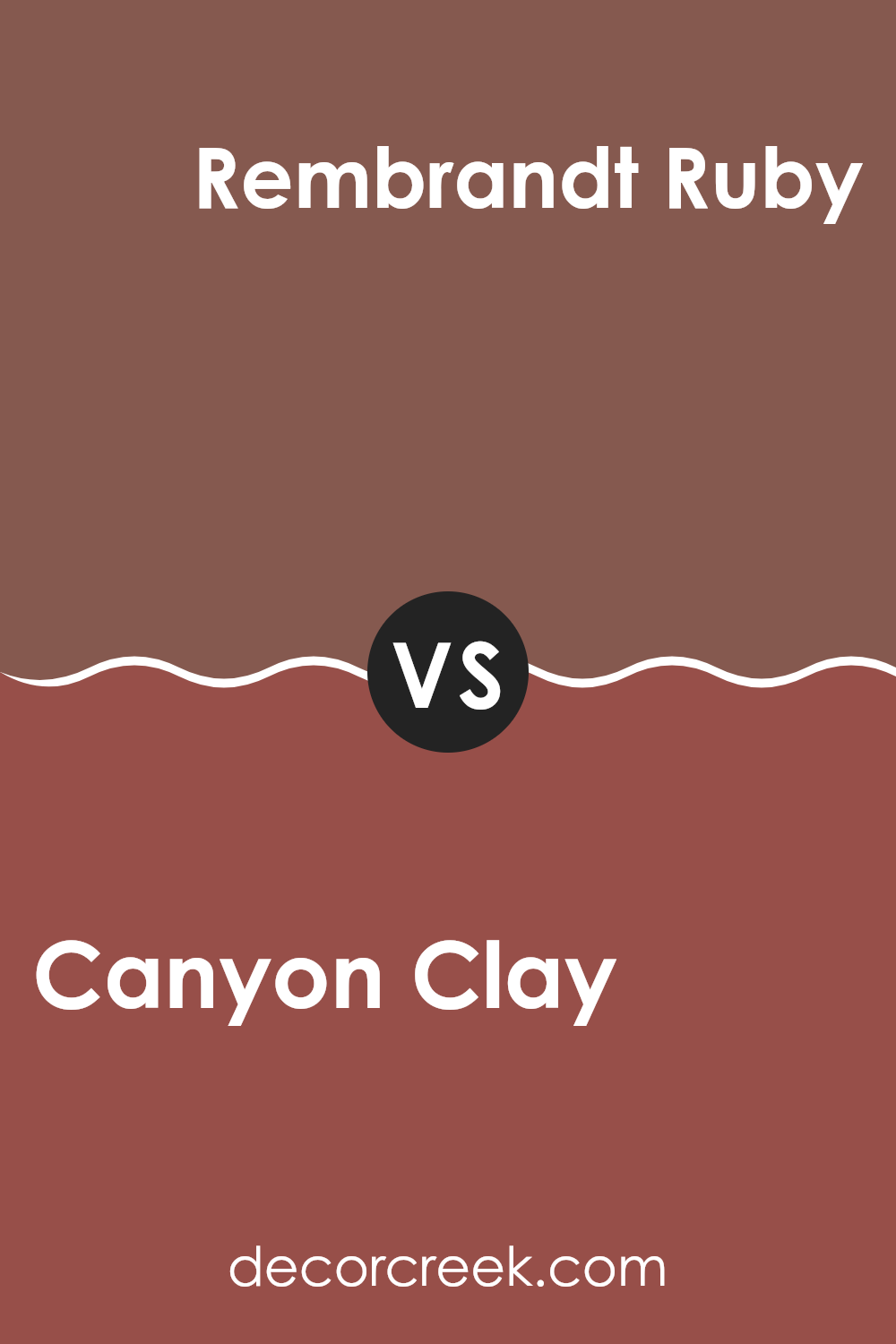
Canyon Clay SW 6054 by Sherwin Williams vs Rembrandt Ruby SW 0033 by Sherwin Williams
Canyon Clay and Rembrandt Ruby are both warm and inviting colors from Sherwin Williams, but they bring different vibes to an area. Canyon Clay is like a soft, muted terracotta. It radiates warmth and is subtle, which makes it flexible and easy to match with a variety of decor styles and colors.
On the other hand, Rembrandt Ruby is much deeper and resembles a dark, rich red wine color. This hue is bold and makes a strong statement, perfect for accent walls or areas where you want to add a touch of drama and luxury.
While Canyon Clay provides a gentle backdrop, Rembrandt Ruby demands attention and can give a room a major focal point. Both colors can warm up a room, but they do so in distinctly different ways.
You can see recommended paint color below:
- SW 0033 Rembrandt Ruby
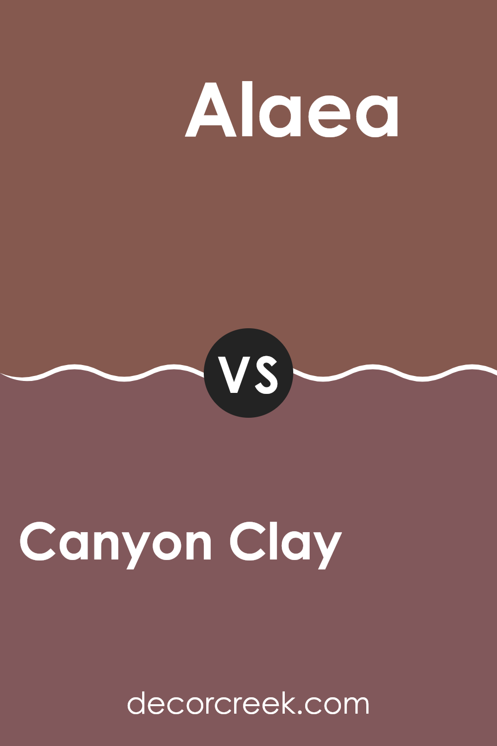
Canyon Clay SW 6054 by Sherwin Williams vs Alaea SW 7579 by Sherwin Williams
Canyon Clay and Alaea, both by Sherwin Williams, are two distinct shades that bring unique vibes to any area. Canyon Clay has a soft, earthy tone that feels warm and welcoming. It gently adds a soothing touch to any room, making it ideal for living areas or bedrooms where comfort is key.
On the other hand, Alaea is a deeper, more saturated hue that resembles the rich, red earth of Hawaiian cliffs. It offers a bold and cozy feel, perfect for making a statement in an area.
While Canyon Clay is subtler and blends into areas with a gentle warmth, Alaea stands out with confidence, adding depth and a pinch of drama. Both colors work beautifully in areas meant for relaxation and conversation, but the choice between the two depends on how much you want the color to play a leading role in your décor.
You can see recommended paint color below:
- SW 7579 Alaea
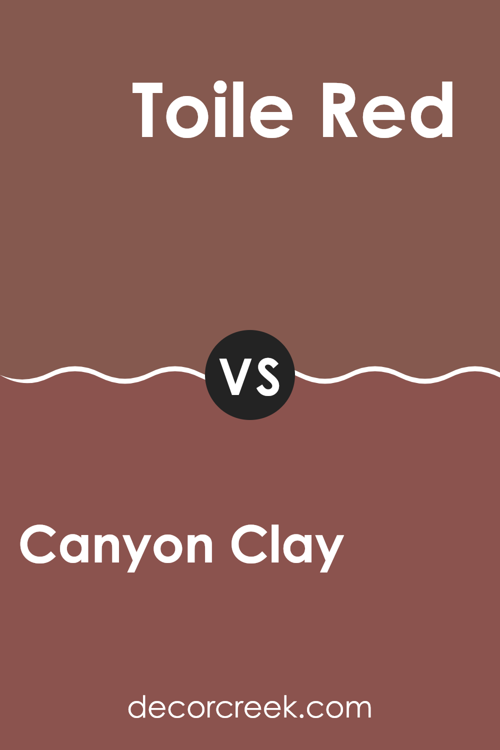
Canyon Clay SW 6054 by Sherwin Williams vs Toile Red SW 0006 by Sherwin Williams
Canyon Clay and Toile Red, both by Sherwin Williams, showcase distinct yet warm personalities. Canyon Clay is a muted, earthy shade reminiscent of natural terracotta. It presents a soft, welcoming vibe that can make any area feel cozy and understated. Its subtlety is perfect for living areas or bedrooms where a gentle, soothing atmosphere is desired.
In contrast, Toile Red has a deeper, more vibrant tone. It’s a bold red with a hint of rust, making it stand out and giving it a more classic feel. This color can add a striking touch to a room, ideal for accent walls or decor accents that attract attention.
Both colors bring warmth to interiors but serve different aesthetic roles. Canyon Clay is better for a low-key, natural look, while Toile Red is perfect for adding energy and drama into an area.
You can see recommended paint color below:
Canyon Clay SW 6054 by Sherwin Williams vs Sierra Redwood SW 7598 by Sherwin Williams
Canyon Clay and Sierra Redwood, both by Sherwin Williams, offer distinct yet warm tones for any area. Canyon Clay presents a muted terracotta-like hue, ideal for creating a cozy and welcoming atmosphere.
It’s softer and less intense, which makes it flexible for pairing with both dark and light colors. On the other hand, Sierra Redwood stands out with its deeper, bolder red tone, reminiscent of the reddish-brown bark of redwood trees.
This color brings a stronger presence to a room and is great for making a statement on an accent wall or used in an area that can handle a richer color palette. While both colors share a warm base, Canyon Clay leans toward an earthy softness, and Sierra Redwood offers a more robust and energizing vibe. They can both warm up a room but in slightly different ways.
You can see recommended paint color below:
Canyon Clay SW 6054 by Sherwin Williams vs Bateau Brown SW 6033 by Sherwin Williams
Canyon Clay and Bateau Brown, both by Sherwin Williams, offer unique yet distinctly warm tones for any area. Canyon Clay is a rich, vibrant shade with a reddish hue that adds a cozy, inviting feel. It’s the kind of color that makes a room feel warm and lively, perfect for areas where you want a splash of color with a rustic touch.
Bateau Brown, on the other hand, is a deeper, more subdued shade. Its chocolatey brown tone provides a grounding effect, making it ideal for areas where you prefer a more muted yet warm atmosphere. This color works well in larger areas or as an accent wall, offering a strong foundation when paired with lighter colors.
Both shades are from Sherwin Williams and reflect warmth, but while Canyon Clay leans toward a brighter, earthy feel, Bateau Brown offers depth and a sense of stability. Depending on your room’s purpose and size, either could enhance the environment with their distinctive qualities.
You can see recommended paint color below:
- SW 6033 Bateau Brown
Canyon Clay SW 6054 by Sherwin Williams vs Hot Cocoa SW 6047 by Sherwin Williams
Canyon Clay and Hot Cocoa are two warm, inviting paint colors from Sherwin Williams. Canyon Clay has a reddish-brown tone, reminiscent of natural clay found in earthy landscapes. This color gives off a cozy, welcoming vibe, perfect for living areas where you want to feel relaxed and at home.
On the other hand, Hot Cocoa shows a deeper, chocolatey brown. It gives a comforting richness, similar to the beverage it’s named after, making it ideal for creating a snug, intimate atmosphere in a room.
While Canyon Clay leans toward a more vibrant, earthy hue with a hint of rust, Hot Cocoa provides a darker, more muted backdrop. Both colors work well in areas that aim for a warm look, but Hot Cocoa might be better suited for areas requiring a more grounded, subdued feel. Together, these colors can complement each other well in an area that combines vibrancy and depth.
You can see recommended paint color below:
Canyon Clay SW 6054 by Sherwin Williams vs Brevity Brown SW 6068 by Sherwin Williams
Canyon Clay and Brevity Brown are two warm, rich colors by Sherwin Williams that create a cozy ambiance in any area. Canyon Clay is a dusty terracotta color with a rusty, red undertone, giving it an earthy feel that’s nurturing and welcoming. It’s great for adding a soft, natural touch to rooms, perfect for living areas or bedrooms where warmth is essential.
On the other hand, Brevity Brown is a deeper, chocolate brown shade that provides a strong sense of stability and grounding. It has a robust presence that can make large rooms feel more intimate and snug. This color works well in areas where you want to promote comfort, like dens or reading nooks.
Together, these colors can be used to create a harmonious blend or to set off contrasting vibes in your decorating scheme. Canyon Clay’s lighter, softer hue balances the depth and intensity of Brevity Brown, making them a flexible pair for a home that celebrates the warmth and comfort of earth tones.
You can see recommended paint color below:
- SW 6068 Brevity Brown
In conclusion, after looking at SW 6054 Canyon Clay by Sherwin Williams, I’ve learned quite a bit about this unique paint color. Canyon Clay is a warm and welcoming shade of reddish-brown that really makes any room feel cozy and inviting. It’s like the color of clay you might find on a fun hike in the mountains.
This color works well in a lot of different places in a home. You can use it in the living room to make it feel more comfy, or in the bedroom to create a snug, safe feeling. It’s also great for adding a splash of color without making things too bright or too dark.
Sherwin Williams made sure that this color can look good for a long time, so you don’t have to worry about it going out of style. It pairs nicely with many other colors, so you can have fun mixing and matching it with furniture and decorations.
Whether you’re painting a whole room or just one wall, Canyon Clay can really help bring a warm, happy vibe to your home. So, if you’re thinking of changing up a room or just want a new, cozy feel, Canyon Clay is definitely a color to consider!
Ever wished paint sampling was as easy as sticking a sticker? Guess what? Now it is! Discover Samplize's unique Peel & Stick samples.
Get paint samples

