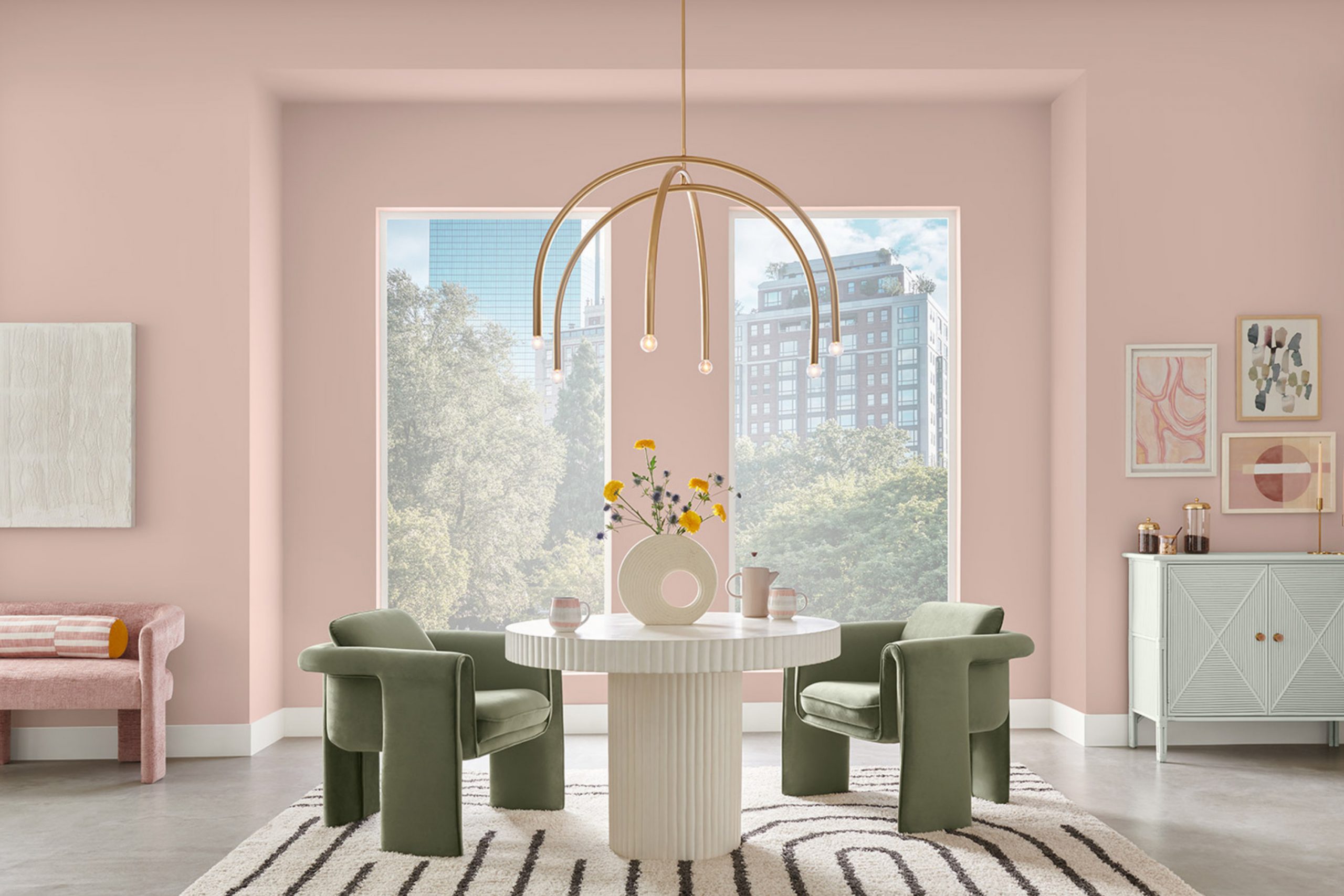
If you are looking for a paint color that adds a touch of elegance and warmth to any room, you might want to consider SW 6051 Sashay Sand by Sherwin Williams. This shade is a soft beige that brings a cozy, calming presence into your living room. It’s a flexible color that works beautifully in various parts of the house, whether you’re aiming to brighten up bedrooms or add a subtle charm to your living room.
As a person who appreciates colors that offer both beauty and functionality, I find Sashay Sand particularly appealing because it pairs well with numerous decor styles and colors. From contemporary to rustic, this neutral hue serves as an excellent backdrop, enhancing furnishings and artwork without overpowering them.
Choosing the right color for your home can sometimes feel overpowering, with so many options available. However, SW 6051 Sashay Sand provides a harmonious balance, striking just the right note of neutral elegance, making your decision a bit easier.
Whether you’re painting for the first time or simply refreshing an old room, this color might just be the perfect pick for crafting a cozy, inviting atmosphere in your home.
What Color Is Sashay Sand SW 6051 by Sherwin Williams?
Sashay Sand by Sherwin Williams is a warm, gentle beige that brings a cozy and inviting vibe to any room. Its softness makes it an ideal choice for creating a relaxed atmosphere in a home. This flexible color works beautifully in a variety of interior styles including modern farmhouse, traditional, and contemporary. The sandy undertone adds a natural, earthy feel that is both soothing and welcoming.
In terms of pairing, Sashay Sand combines well with a broad range of materials and textures. It looks fantastic with natural wood, helping to highlight its rich, organic grains. When paired with metal accents, like brass or copper, it offers a gentle contrast that is both modern and classic. Fabrics such as linen or cotton in light colors complement Sashay Sand, reinforcing a light and airy decor theme.
Ideal for common areas like living rooms and kitchens, Sashay Sand also works well in bedrooms, where its soft tone aids in creating a restful environment. It’s particularly effective on walls, as it acts as a subtle backdrop that allows other decor elements to shine. Whether you’re aiming for a breezy beach aesthetic or a minimalist design, Sashay Sand is a fantastic paint choice that harmonizes well with many design elements.

Is Sashay Sand SW 6051 by Sherwin Williams Warm or Cool color?
Sashay Sand is a warm and inviting shade of beige that adds a cozy feel to any room in your home. Produced by Sherwin Williams, this color is excellent for creating a calm and welcoming atmosphere. It’s particularly good for living rooms and bedrooms where you want a soothing backdrop that pairs well with almost any decor.
Because it’s a neutral color, Sashay Sand works well with both dark and light furniture, providing flexibility in choosing or changing decorative styles. This hue has a natural lightness that can make small areas appear larger and brighter, yet it still offers enough warmth to keep large rooms from feeling too cold or impersonal.
Moreover, its subtlety in tone means it can easily match with a range of other colors, from bold and vibrant to soft and pastel, making it a very flexible choice for many homes.
Undertones of Sashay Sand SW 6051 by Sherwin Williams
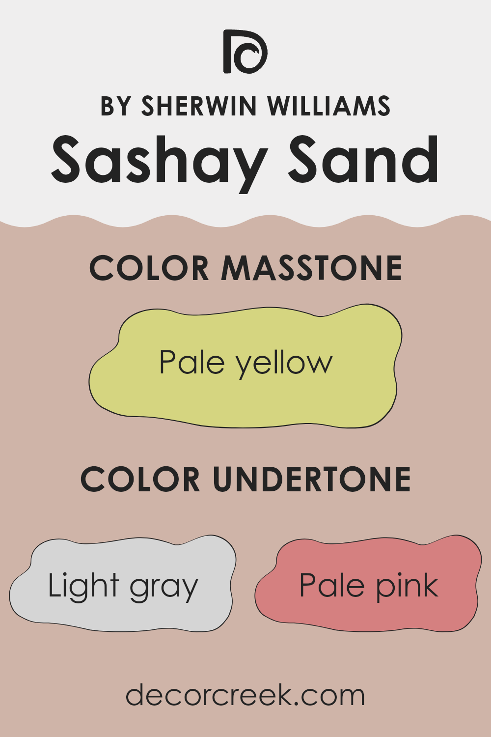
Sashay Sand is a flexible color with a rich blend of undertones that can subtly influence the ambiance of any room. This color, though primarily seen as a warm neutral, includes hints of light gray, pale pink, light purple, mint, light blue, grey, lilac, yellow, orange, light green, and olive. These undertones play a key role in how the color appears under different lighting conditions and next to other colors.
For example, when used on interior walls, the pale pink and lilac undertones might give a room a soft, cozy feel. This makes it a great option for bedrooms or living areas where a gentle, inviting atmosphere is desired. In contrast, the light gray and grey undertones can provide a more grounded, balanced look, perfect for modern living room or offices.
The impact of light can also not be overlooked. In natural light, the mint and light blue undertones might become more pronounced, giving the walls a fresher, more lively appearance. Artificial lighting, depending on whether it’s warm or cool, can emphasize different undertones, such as yellow and orange, making the walls seem warmer.
By choosing Sashay Sand for your walls, you subtly introduce these undertones, which interact with other elements in the room, from furniture to artwork, creating a dynamic room that reflects and adapts to varying conditions and decor. This adaptability makes Sashay Sand a popular choice for those looking to enhance their interiors without committing to a bold or dominating color.
What is the Masstone of the Sashay Sand SW 6051 by Sherwin Williams?
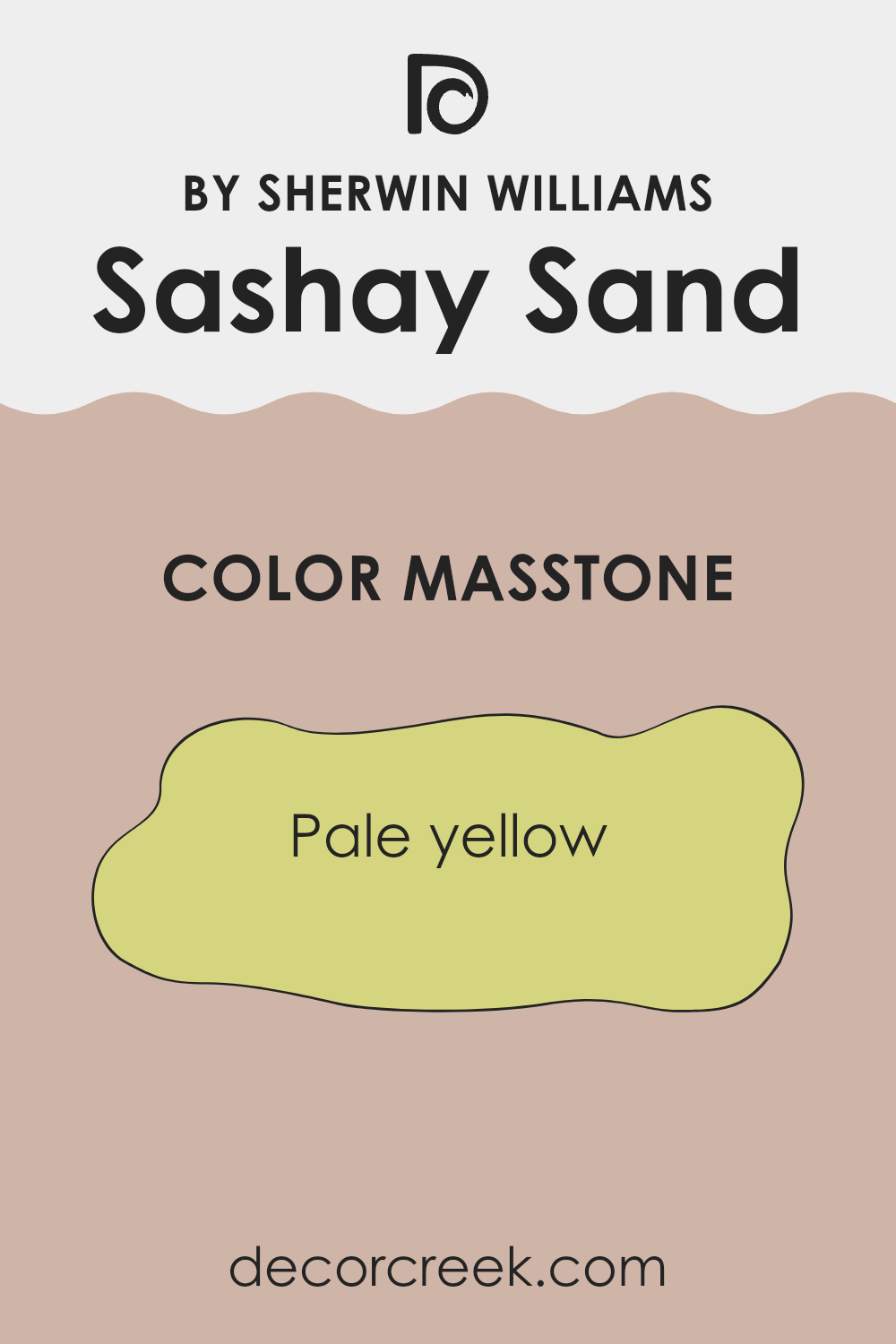
Sashay Sand has a masstone of pale yellow, which gives it a light and airy quality. This shade is quite flexible and works wonders when incorporated into home décor. Being pale yellow, it easily complements a wide range of colors, making it a great choice for anyone unsure about committing to a bold color scheme.
This gentle color does a brilliant job of brightening rooms, which is particularly useful in rooms that may not get a lot of natural light. Additionally, Sashay Sand instills a sense of warmth and coziness, inviting people to relax and feel at ease in their living environment.
This specific masstone of yellow doesn’t overpower a room, allowing homeowners to play around with various decor styles and color combinations without worrying about clashes. Whether it’s used on a feature wall, throughout a room, or just as an accent, its subtle hue provides a perfect backdrop for both modern and traditional designs, making it a go-to choice for those looking to refresh their home’s appearance.
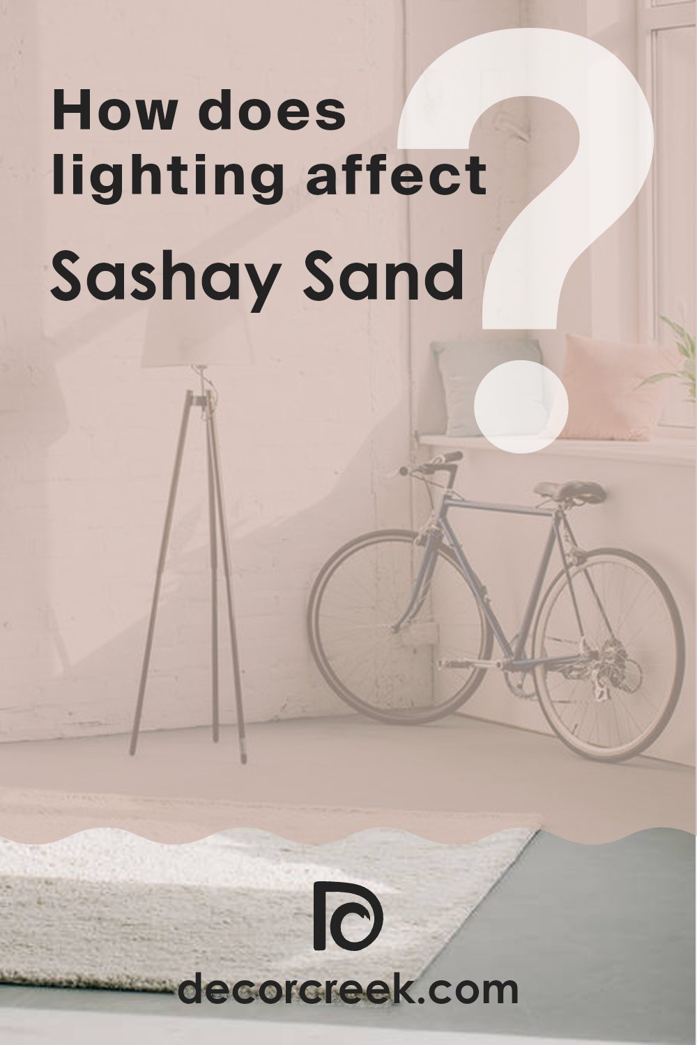
How Does Lighting Affect Sashay Sand SW 6051 by Sherwin Williams?
Lighting plays a crucial role in how colors appear in our areas. Colors can look vastly different depending on the type of light they’re under. Natural sunlight brings out the truest hue of a paint color, while artificial light can influence it significantly.
The color Sashay Sand by Sherwin Williams is a warm neutral shade that adapts variably under different lighting conditions. In artificial lighting, such as that from LED or incandescent bulbs, this color may appear slightly warmer, enhancing its cozy and welcoming feel. The yellow or orange tones of artificial lights can intensify the warmth of Sashay Sand, making a room feel snug and inviting.
Under natural light, Sashay Sand will display its true color. As the quality and angle of natural light change throughout the day, so too will the appearance of this color. In the morning and evening when the sunlight is warmer, the color might feel softer and richer, while during midday, when sunlight is brighter and bluer, it could look more muted and neutral.
The orientation of the room plays a role too. North-facing rooms generally receive less direct sunlight and the light can appear cooler, thus making Sashay Sand look a bit more subdued and less warm. In south-facing rooms, where light is more abundant and typically warmer, this color will feel brighter and more vibrant.
In east-facing rooms, Sashay Sand will be energized by the warm, bright morning light but will become calmer as the day progresses and the light diminishes. Conversely, west-facing rooms may start with a more muted appearance in the morning and gain warmth and depth as the sun sets, creating a cozy atmosphere by afternoon.
Understanding these effects of lighting can help in choosing the right paint color for your room, ensuring you achieve the mood and style you’re looking for.
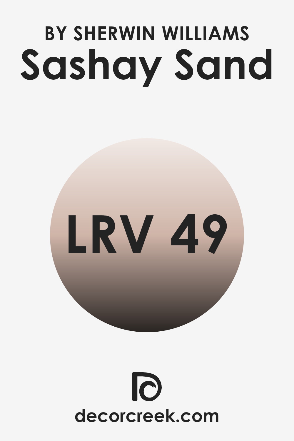
What is the LRV of Sashay Sand SW 6051 by Sherwin Williams?
LRV stands for Light Reflectance Value, which is a measurement that indicates how much light a color reflects or absorbs when painted on a surface. Think of it as a scale that tells you how bright or dark a paint color will appear once it’s on your walls. This scale ranges with values from zero, which absorbs all light and appears completely black, to the highest number near a hundred, reflecting all the light and appearing pure white.
This value helps in deciding how a paint color will feel in a room, particularly concerning how lit or dim the area will seem. Colors with a higher LRV make a room feel more open and airy because they reflect more light. Conversely, colors with a lower LRV can make a room feel cozier but smaller and darker because they absorb more light.
With an LRV of 48.769, the color referenced falls in the middle of the scale, meaning it does not lean heavily toward being overly bright or too dark. This moderate LRV makes it a flexible color choice, as it reflects a fair amount of light but still brings some depth and warmth to the room. In practical terms, this means the color can work well in rooms that need a balanced ambiance without the walls feeling too heavy or too light.
It’s an ideal choice for living areas or bedrooms where you want a calm and welcoming atmosphere without the starkness that may come with higher LRV shades and without the compact feel of darker colors.
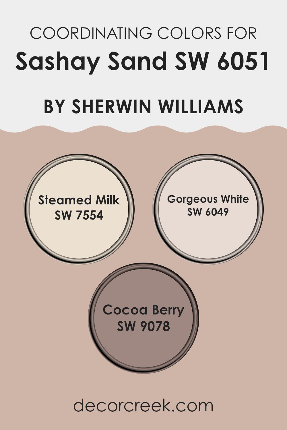
Coordinating Colors of Sashay Sand SW 6051 by Sherwin Williams
Coordinating colors are those that complement each other well, enhancing the overall aesthetic of a room without competing for attention. When you choose coordinating colors, such as SW 7554 – Steamed Milk, SW 6049 – Gorgeous White, and SW 9078 – Cocoa Berry, you’re selecting hues that share a harmonious relationship, often because they are balanced in tone or have compatible undertones. This tactic helps create a visually appealing environment that feels intentional and put-together.
For example, Steamed Milk is a warm, creamy shade that offers a soft backdrop, making it an excellent candidate for walls in a living or dining area. It’s gentle enough not to overpower, yet has enough warmth to provide a cozy atmosphere.
Gorgeous White, on the other hand, is a clean and bright white that brings a fresh and airy feel to any room. It works beautifully on trim or cabinets to give a crisp, clean finish to the room. Lastly, Cocoa Berry is a deep, rich berry color that adds a touch of drama and depth when used as an accent. Its luxurious tone is perfect for creating a focal point, whether that’s in furniture, an accent wall, or decorative accessories. Together, these colors create a balanced and appealing palette.
You can see recommended paint colors below:
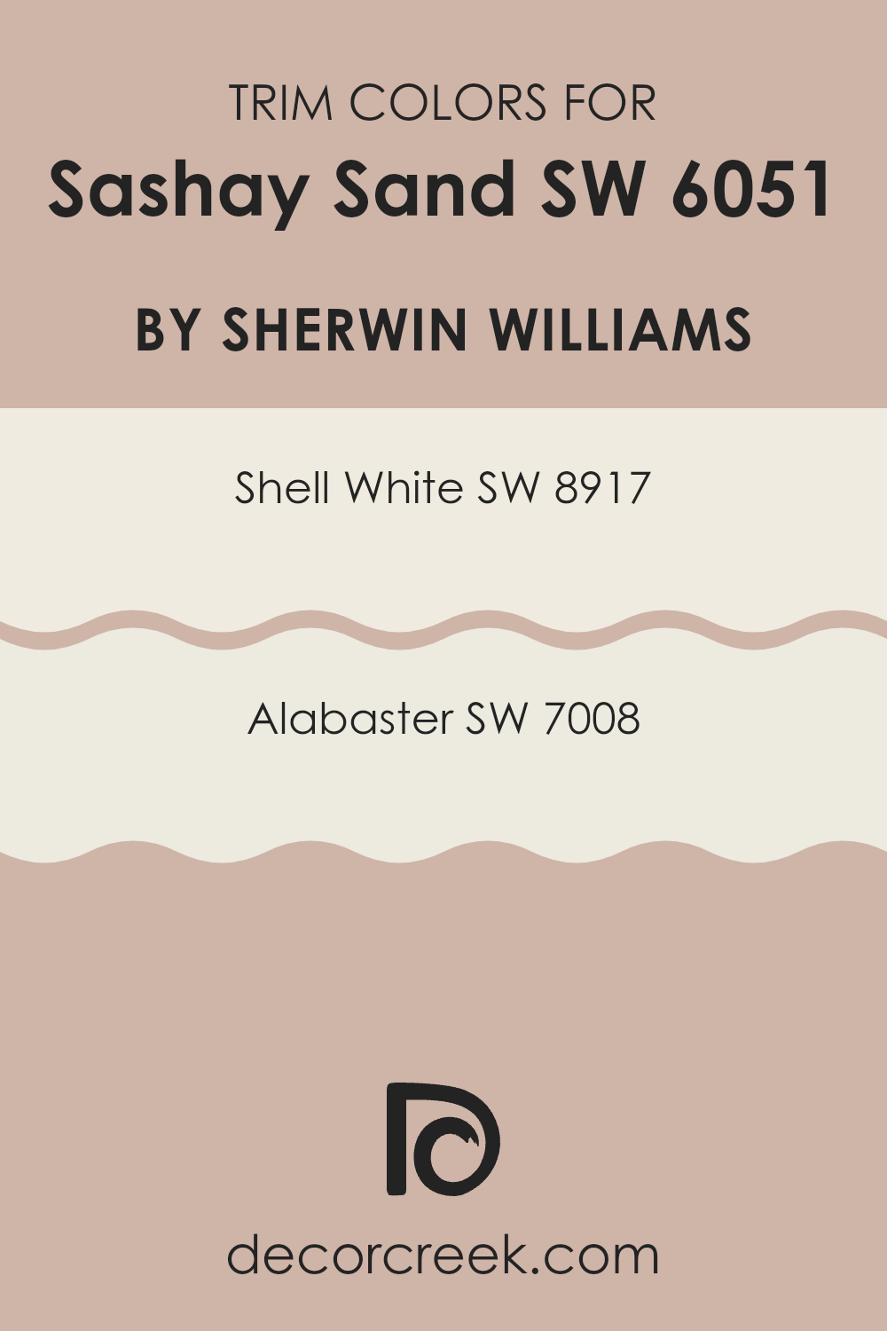
What are the Trim colors of Sashay Sand SW 6051 by Sherwin Williams?
Trim colors are specific shades used to create contrast or continuity on architectural elements such as door frames, window trims, and skirting boards. They serve a crucial role in defining the rooms and adding a clear, clean finish to the walls. For a warm and inviting color like Sashay Sand by Sherwin Williams, trim colors need to be well-chosen to either softly complement or strikingly contrast the main wall color.
Using lighter trim colors like Shell White and Alabaster can help frame the walls in a subtle way, enhancing the overall aesthetic without overpowering the main color. Shell White, SW 8917, is a gentle off-white that brings a calm and neutral background, perfectly toning down the bolder hues like Sashay Sand.
It allows for a smooth transition between colors, bringing a fresh and airy feel to any room. Alabaster, SW 7008, on the other hand, is a slightly warmer white that offers a hint of creaminess, adding a touch of warmth to the surroundings. This color is ideal for creating a soft yet inviting environment, ensuring that the trims meld beautifully with a warm-toned wall color like Sashay Sand.
You can see recommended paint colors below:
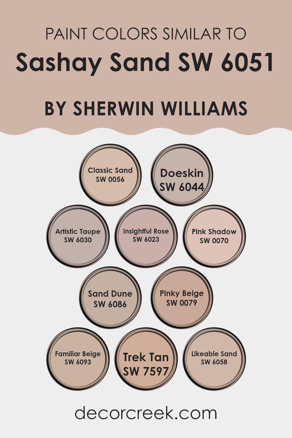
Colors Similar to Sashay Sand SW 6051 by Sherwin Williams
Similar colors play an essential role in interior design by creating a harmonious and cohesive look. When colors are similar in tone or shade, like the colors related to Sashay Sand by Sherwin Williams, they help in achieving a balanced and aesthetically pleasing environment.
This palette, which remains in the realm of warm neutrals, offers subtle variations that can enhance the dimensions of an area without overpowering it with contrast. Such similarity in colors ensures that each element in a room connects fluidly, thus providing a unified theme throughout the room.
For instance, Classic Sand is a light, sandy beige that radiates warmth, akin to a sun-lit beach, making it a flexible backdrop for various decor styles. Doeskin steps a bit darker, lending itself to a soft, velvety taupe that whispers understated elegance in any room.
Artistic Taupe introduces a hint of gray, giving a modern twist to the traditional neutral palette, while Insightful Rose adds a gentle blush, offering a subtle nod to color in predominantly neutral rooms. Pink Shadow, with its pale pink hue, brings a soft, almost ethereal quality to the set.
Sand Dune veers towards a darker, earthier tone, grounding areas with its robust color. Pinky Beige injects a livelier pinkish tone, ideal for invigorating a room with a soft, cheerful glow. Familiar Beige strikes a balance between beige and light brown, providing a solid foundation for both contemporary and classic interiors.
Trek Tan has an adventurous duskiness to it, great for adding depth without overt darkness. Lastly, Likeable Sand exudes approachability with its inviting, warm beige that works well in almost any room, establishing a soothing atmosphere.You can see recommended paint colors below:
- SW 0056 Classic Sand
- SW 6044 Doeskin
- SW 6030 Artistic Taupe
- SW 6023 Insightful Rose
- SW 0070 Pink Shadow
- SW 6086 Sand Dune
- SW 0079 Pinky Beige
- SW 6093 Familiar Beige
- SW 7597 Trek Tan
- SW 6058 Likeable Sand
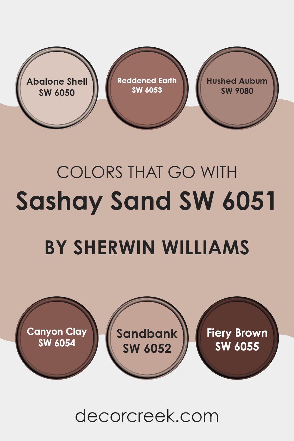
Colors that Go With Sashay Sand SW 6051 by Sherwin Williams
Choosing the right colors to complement Sashay Sand SW 6051 by Sherwin Williams is essential for creating a harmonious and welcoming atmosphere in any room. When paired with matching hues like SW 6050 – Abalone Shell or SW 6053 – Reddened Earth, it can make an area feel more inviting and warm.
For instance, Abalone Shell is a gentle gray with a subtle hint of beige, making it an excellent choice for a neutral background that is both relaxing and easy to match with brighter decor elements. Reddened Earth, on the other hand, has a deeper, terracotta tone that provides a stunning contrast against the lighter Sashay Sand, ideal for adding a touch of warmth to the environment.
Other fantastic color choices include SW 9080 – Hushed Auburn and SW 6054 – Canyon Clay. Hushed Auburn has a soft, brownish-red tone that resembles the quiet beauty of autumn leaves, perfect for creating a cozy nook or an accent wall that feels both comforting and grounded. Canyon Clay offers a muted terracotta color, reminiscent of traditional clay pots, which pairs beautifully with the sandy tones of Sashay Sand for a natural, earthy vibe.
Including colors like SW 6052 – Sandbank, a darker shade of tan, or SW 6055 – Fiery Brown, a bold, deep chocolate brown, can further enhance the depth and complexity of your color scheme. Both these colors add richness and a sense of stability to any room, complementing the lighter Sashay Sand in a way that creates a balanced visual appeal.
You can see recommended paint colors below:
- SW 6050 Abalone Shell
- SW 6053 Reddened Earth
- SW 9080 Hushed Auburn
- SW 6054 Canyon Clay
- SW 6052 Sandbank
- SW 6055 Fiery Brown
How to Use Sashay Sand SW 6051 by Sherwin Williams In Your Home?
Sashay Sand by Sherwin Williams is a warm, subtle beige paint that adds a cozy touch to any room. It’s a flexible shade that can brighten small areas or make large rooms feel more inviting. Its neutral tone makes it easy to match with other colors.
In a living room, Sashay Sand goes well with soft whites and rich browns, creating a welcoming room where everyone feels at home. In a bedroom, this color pairs well with soothing blues and greens, lending a calm and restful energy perfect for relaxation.
It’s also a great choice for bathrooms, providing a clean and fresh background that complements natural wood accents or white tiles. For those looking to refresh their kitchen, Sashay Sand can warm up the room without overpowering it, pairing nicely with darker cabinets or colorful backsplashes. This paint color provides a simple way to update your home without making a drastic change.
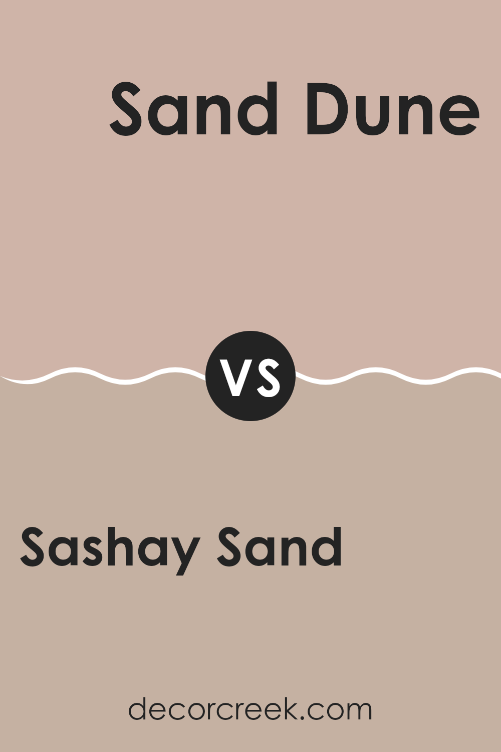
Sashay Sand SW 6051 by Sherwin Williams vs Sand Dune SW 6086 by Sherwin Williams
Sashay Sand and Sand Dune by Sherwin Williams are two neutral colors with subtle differences. Sashay Sand is a lighter, creamier shade, providing a soft, welcoming feel to any room. It pairs well with brighter colors, serving as a calm backdrop that allows other hues to stand out.
On the other hand, Sand Dune is a deeper beige, reminiscent of a sandy beach under the evening sky. It’s a bit warmer and richer than Sashay Sand, making it ideal for creating a cozy atmosphere.
Sand Dune works great in areas where you want a bit more warmth without overpowering with a darker color. Both colors offer a flexible palette for various decorating styles, from modern to country, but the choice between them hinges on the desired warmth and depth of the room.
You can see recommended paint color below:
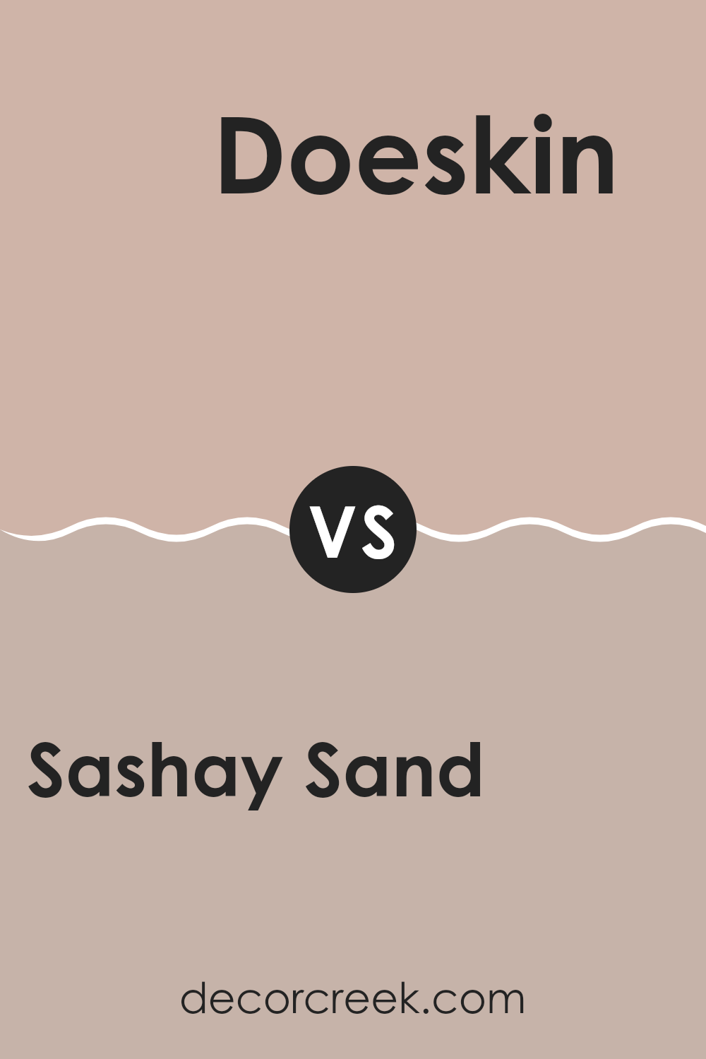
Sashay Sand SW 6051 by Sherwin Williams vs Doeskin SW 6044 by Sherwin Williams
The Sashay Sand color by Sherwin Williams is a light, warm beige with a subtle hint of peach. It feels soft and welcoming, making it a great choice for creating a cozy atmosphere in any room. It reflects light well, which makes areas appear larger and more open.
In contrast, the Doeskin color is a mid-tone taupe that leans slightly towards brown. This color is richer and darker than Sashay Sand, providing a stronger presence and warmth. Doeskin could be perfect for adding a bit of depth to a room without overpowering it with darkness.
While Sashay Sand is ideal for those who prefer a gentle and airy feel, Doeskin works well for someone looking for a bit more warmth and coziness. Both colors offer a neutral palette, but the choice between them depends on the desired impact and mood in the room.
You can see recommended paint color below:
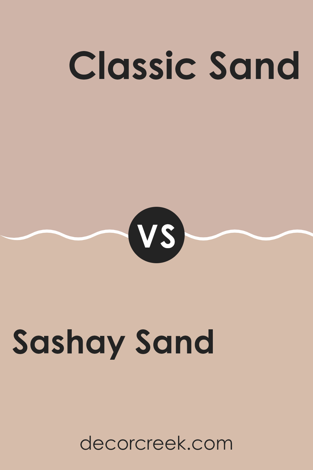
Sashay Sand SW 6051 by Sherwin Williams vs Classic Sand SW 0056 by Sherwin Williams
Sashay Sand and Classic Sand are both warm, neutral paint colors by Sherwin Williams, but they have some differences in tone and depth. Sashay Sand is a lighter, softer beige that has a gentle and airy feel to it.
It’s well-suited for areas where you want a subtle color that makes the room feel open and relaxed. On the other hand, Classic Sand is a bit deeper and richer. It has a hint of golden undertones, giving it a warm and welcoming vibe.
This color would work well in areas that you want to feel cozy yet still neutral. Both colors are flexible and can be used in various settings, from living rooms to bedrooms, depending on the mood you want to set. However, Classic Sand might be slightly more commanding due to its richer hue.
You can see recommended paint color below:
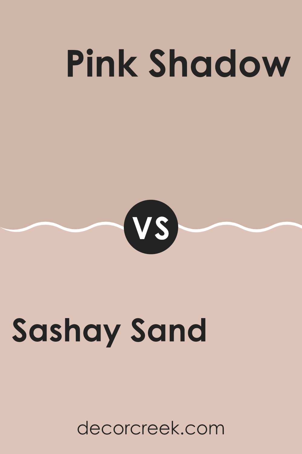
Sashay Sand SW 6051 by Sherwin Williams vs Pink Shadow SW 0070 by Sherwin Williams
Sashay Sand and Pink Shadow by Sherwin Williams are two distinct colors that can change the feel of a room. Sashay Sand has a soft beige tone, neutral and calm, making it a great background for many decor styles. This color is both warm and inviting, often used to create a cozy and relaxing atmosphere in homes.
On the other hand, Pink Shadow is a gentle pink that offers a subtle touch of warmth and cheerfulness. It’s a bit more playful than Sashay Sand and can add a soft, romantic vibe to a room. This shade is perfect for adding a hint of color without overpowering a room.
These two colors can work well together, with Pink Shadow providing a gentle pop of color against the more subdued Sashay Sand. Both share a softness and warmth that can make a home feel welcoming and comfortable.
You can see recommended paint color below:
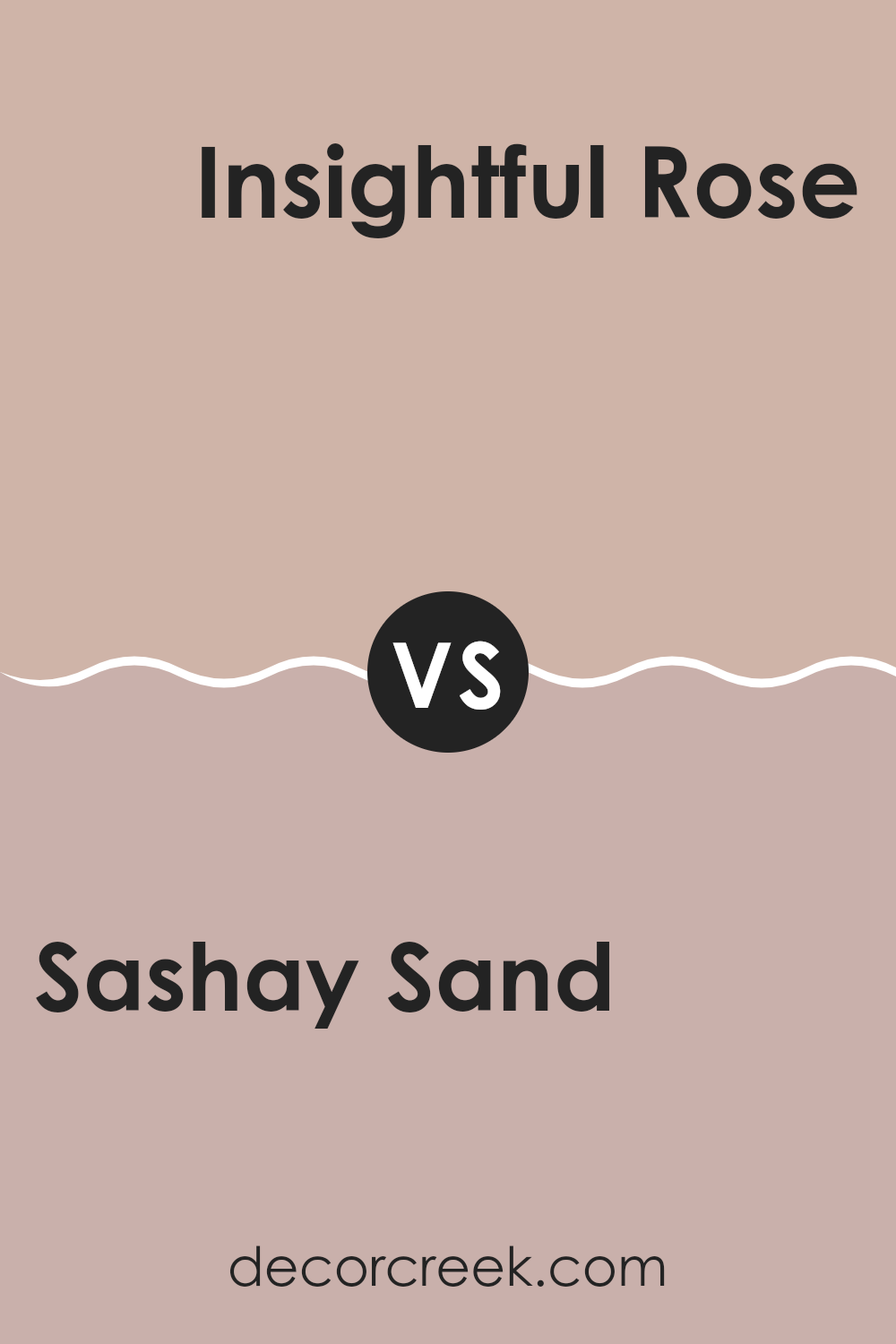
Sashay Sand SW 6051 by Sherwin Williams vs Insightful Rose SW 6023 by Sherwin Williams
Sashay Sand and Insightful Rose by Sherwin Williams are two distinct colors, each providing a unique appeal. Sashay Sand is a warm, neutral beige with a soft and welcoming presence, making it perfect for creating a cozy and inviting atmosphere. It pairs well with a variety of decors and works beautifully in areas that aim for a subtle, understated look.
On the other hand, Insightful Rose is a light pink shade that offers a gentle pop of color. This hue has a fresh, youthful vibe that can brighten up a room while still maintaining a soft and gentle appeal. It’s great for rooms where you want to add a touch of playfulness without overpowering the senses.
Both colors stand out for their ability to blend seamlessly with other shades, though they serve different aesthetic purposes. Sashay Sand is more about creating a calm, neutral backdrop, whereas Insightful Rose introduces a light, cheerful element to interiors. Their uses can vary from room to room depending on the mood you’re looking to achieve.
You can see recommended paint color below:
- SW 6023 Insightful Rose
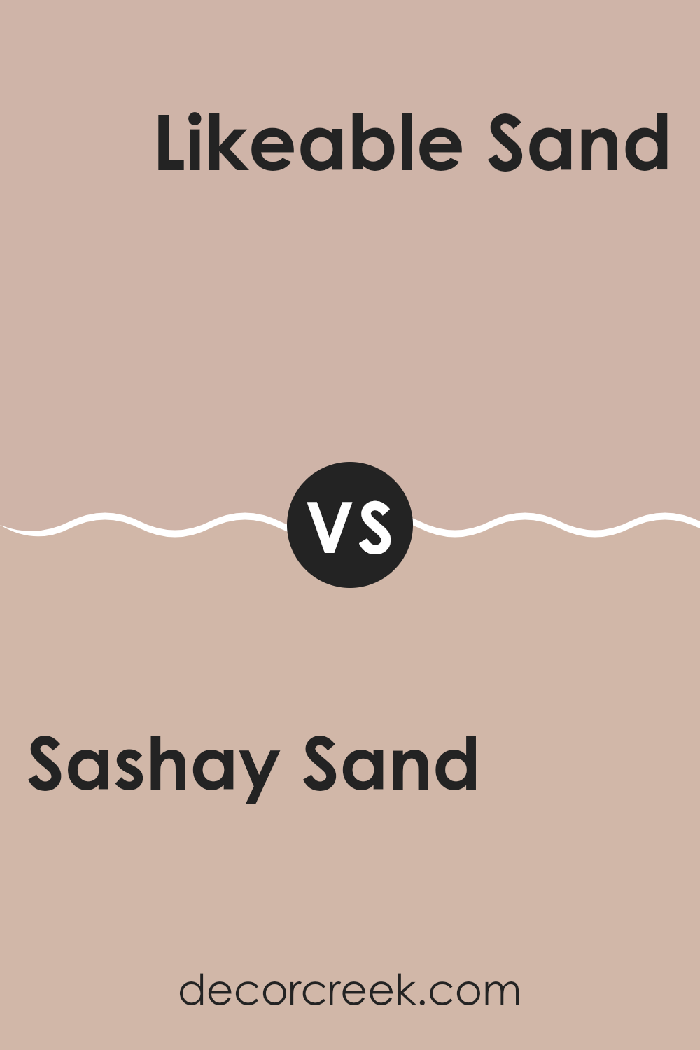
Sashay Sand SW 6051 by Sherwin Williams vs Likeable Sand SW 6058 by Sherwin Williams
Sashay Sand and Likeable Sand by Sherwin Williams are two neutral colors with subtle differences. Sashay Sand is a lighter, creamier beige that brings a soft and gentle warmth to areas, perfect for creating a calm and inviting atmosphere. It has a hint of peach undertone that makes it warm and cozy, ideal for living rooms or bedrooms where you want a soothing feel.
On the other hand, Likeable Sand is slightly darker and has a richer, more golden undertone. This color adds a bit of depth to the walls, making it a great choice for areas where you want a more defined look without going too bold. It works well in rooms with lots of natural light or rooms that you want to feel more anchored and cozy.
In summary, while both colors are warm and neutral, Sashay Sand offers a lighter touch, and Likeable Sand brings a bit more warmth and richness to the room.
You can see recommended paint color below:
- SW 6058 Likeable Sand
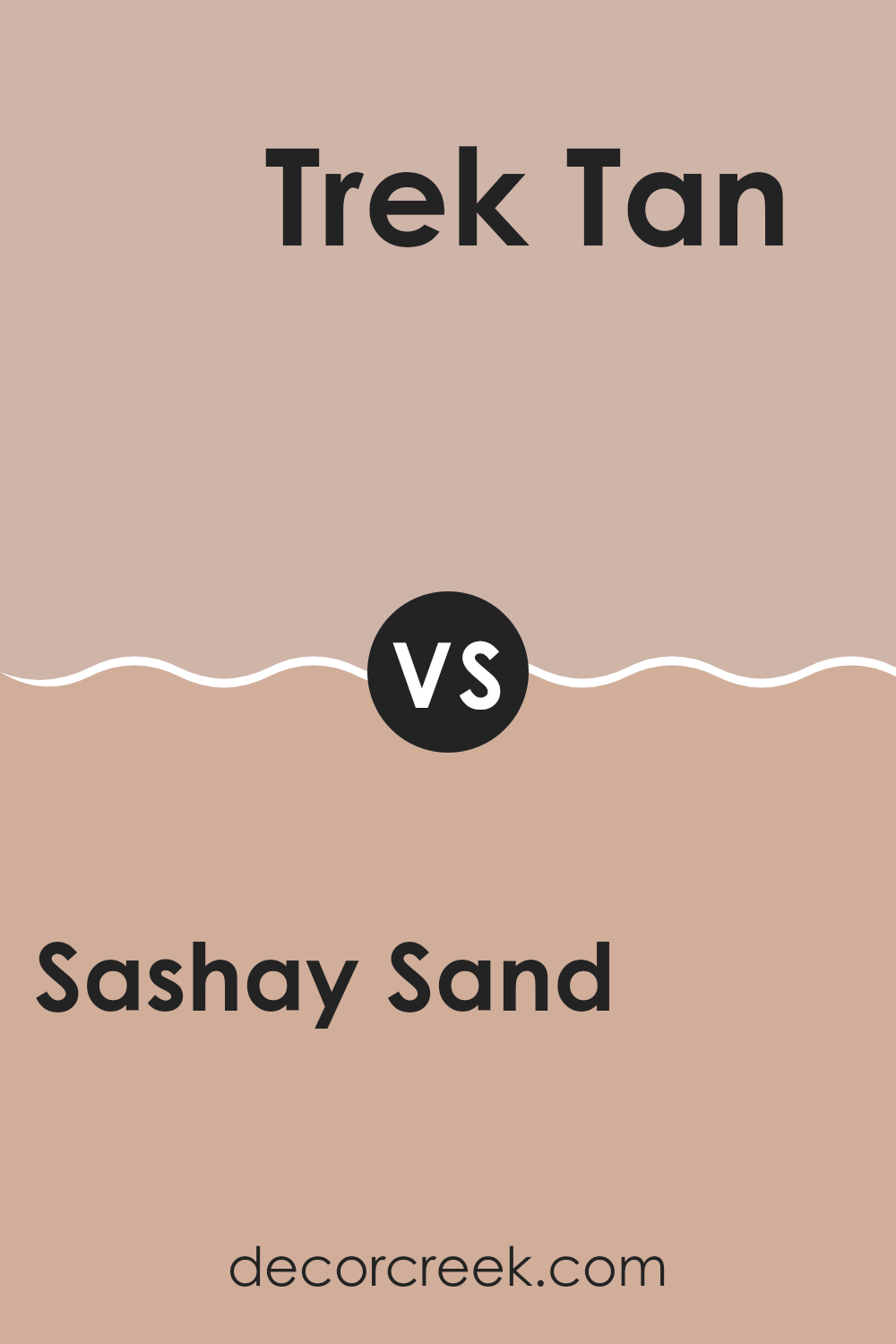
Sashay Sand SW 6051 by Sherwin Williams vs Trek Tan SW 7597 by Sherwin Williams
Sashay Sand and Trek Tan are both neutral colors from Sherwin Williams, but they have distinct tones that set them apart. Sashay Sand is a lighter, soft beige that gives a room a bright and airy feel. It works well in areas that aim for a calm and clean look, such as living rooms or bedrooms.
On the other hand, Trek Tan is a deeper, warmer beige that adds a cozier and slightly more robust atmosphere to a room. This color is excellent for areas where a more inviting, snug feel is desired, like dens or dining areas.
While both colors can blend nicely with various decor styles, Sashay Sand is better for achieving a gentle, open environment, and Trek Tan for a heartier, welcoming vibe. Together, they can also complement each other beautifully in a color scheme, offering balance between light and dark neutral tones.
You can see recommended paint color below:
- SW 7597 Trek Tan
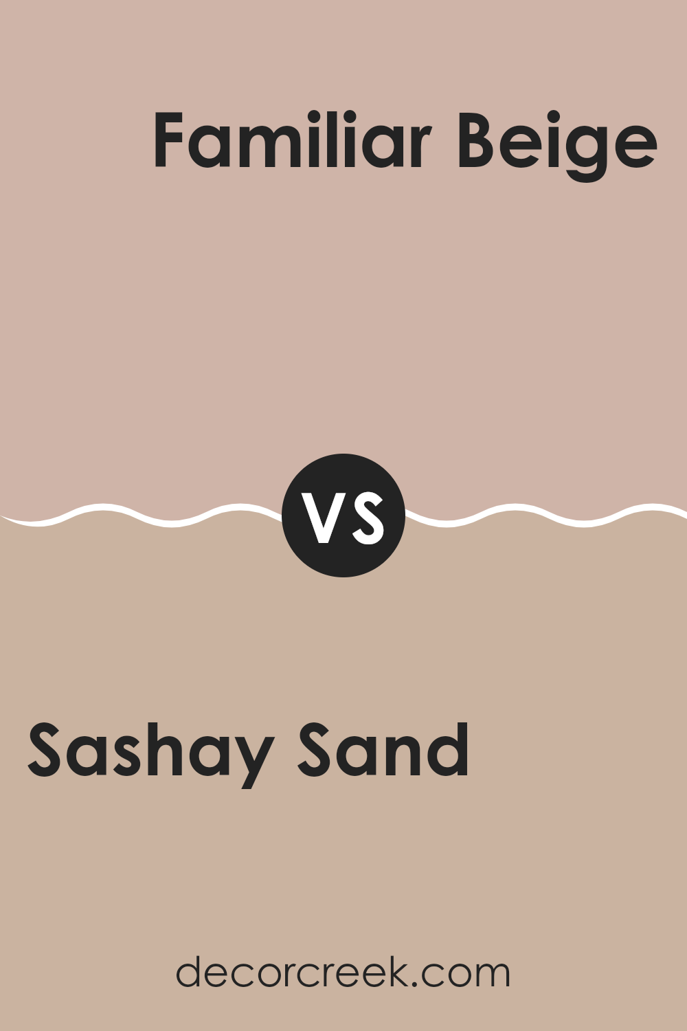
Sashay Sand SW 6051 by Sherwin Williams vs Familiar Beige SW 6093 by Sherwin Williams
The main color, Sashay Sand, is a soft and smooth light beige with subtle warm undertones, perfect for creating a cozy and welcoming room in any home. It’s light enough to make a room feel more open while still adding a touch of warmth.
In contrast, Familiar Beige is a slightly deeper shade of beige that leans a bit more towards a traditional beige tone. It has a richer and earthier feel, making it well-suited for areas where a more comforting and grounded atmosphere is desired, like living rooms or bedrooms.
Both colors are flexible and can easily complement various decor styles and color palettes. However, Sashay Sand might be preferred for smaller, brighter rooms due to its lighter tone, while Familiar Beige might be favored in larger areas or areas where a more substantial feel is wanted.
You can see recommended paint color below:
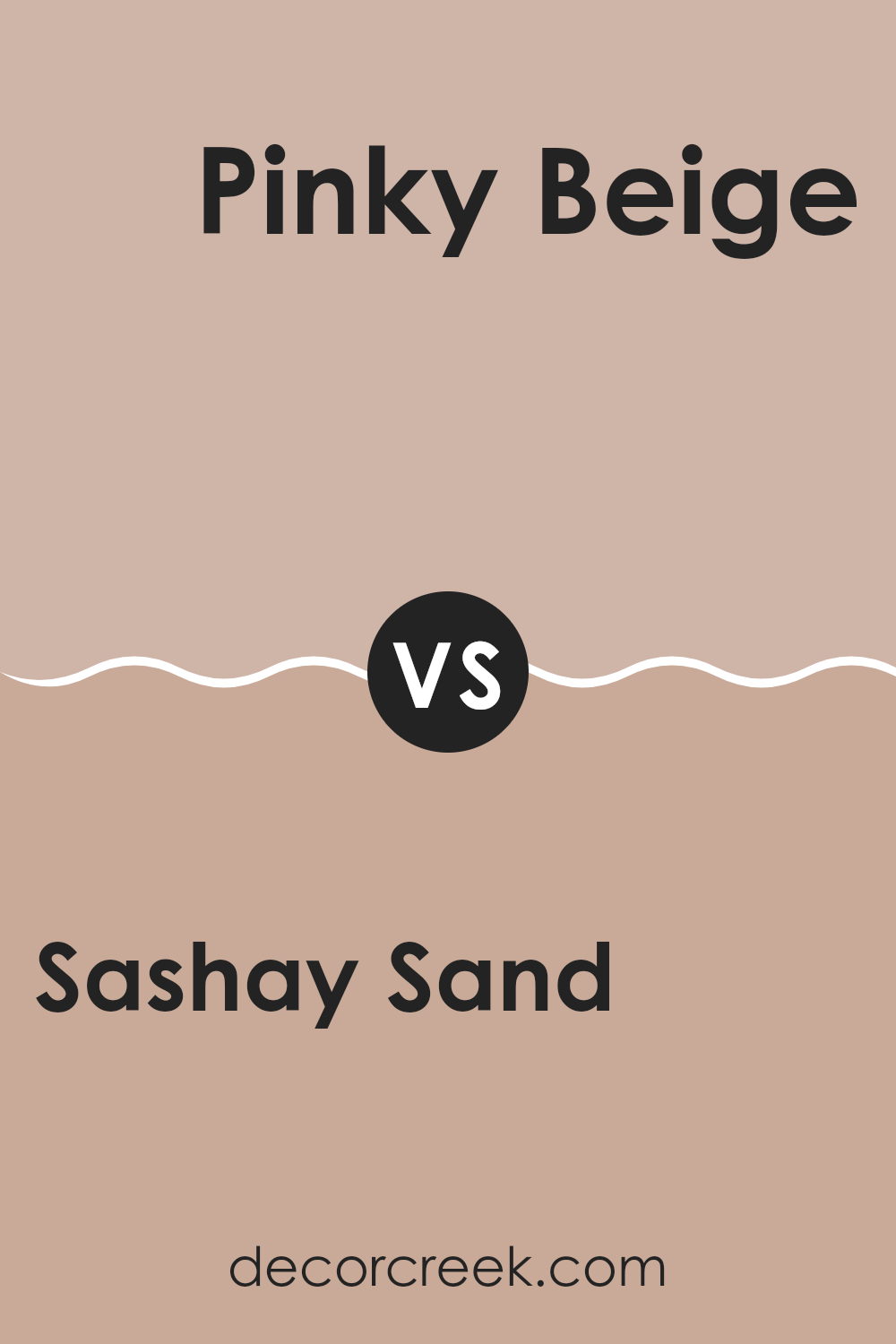
Sashay Sand SW 6051 by Sherwin Williams vs Pinky Beige SW 0079 by Sherwin Williams
The main color, Sashay Sand, and the second color, Pinky Beige, both by Sherwin Williams, share warm undertones but present distinct vibes to any room. Sashay Sand leans towards a soft, muted tan that gives off a more subtle and neutral feel, making it flexible for various room settings. It provides a calm, soothing backdrop that pairs well with many decor styles without overpowering the room.
On the other hand, Pinky Beige introduces a gentle hint of pink, adding a touch of warmth and softness. This color is slightly lighter and carries a cozy charm that can make a room feel more inviting. It’s great for areas where you want to add a little warmth without going too bold.
Both colors are excellent choices for creating a welcoming atmosphere in homes, but your preference might depend on the specific mood or style you want to achieve. If you prefer something that stays in the background, go for Sashay Sand. If you like a bit of warm color that’s still soft, Pinky Beige is the way to go.
You can see recommended paint color below:
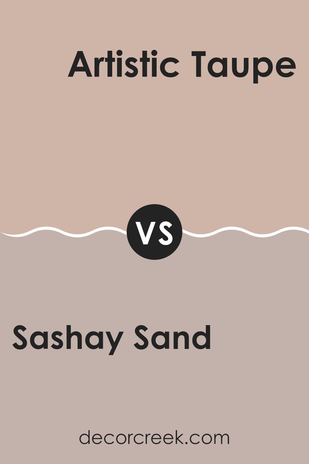
Sashay Sand SW 6051 by Sherwin Williams vs Artistic Taupe SW 6030 by Sherwin Williams
Sashay Sand and Artistic Taupe are two distinct neutral paint colors from Sherwin Williams. Sashay Sand has a lighter and warmer tone, it resembles the sandy beaches on a sunny day. This color brightens up rooms and is flexible enough to work in various room settings like living rooms or bedrooms.
On the other hand, Artistic Taupe has a deeper, richer hue, closer to traditional taupe. It carries a cooler undertone, which feels more muted and grounding. This makes it ideal for areas where you want a more grounded or cozy feel, such as dens or home offices.
While Sashay Sand reflects more light, making rooms appear larger and more open, Artistic Taupe offers a sense of calm and can help to make larger areas feel more intimate. Both colors are neutral, making them easy to pair with a wide range of other colors and decor styles, but their different tones can significantly influence the mood and perception of a room.
You can see recommended paint color below:
- SW 6030 Artistic Taupe
In wrapping up, SW 6051 Sashay Sand by Sherwin Williams is a paint color that stands out for being both subtle and warm. It’s a great choice if you want to make any room feel cozy and welcoming. This color works really well in areas where you want to relax, like your living room or bedroom.
Plus, it goes well with so many other colors, whether they’re bright or low-key, which means you can use it no matter what your style is. When I tried it in my home, I noticed it changed the mood to something calmer and more comfortable.
It’s not just a plain beige; there’s something special about Sashay Sand that makes the walls look soft and smooth. So, if you’re thinking about repainting and you want something that everyone in your house will like, Sashay Sand could be the perfect pick. It’s a color that makes every room shine without trying too hard.

Ever wished paint sampling was as easy as sticking a sticker? Guess what? Now it is! Discover Samplize's unique Peel & Stick samples.
Get paint samples

