Color is a language that transcends words, resonating with our emotions and setting the tone for our daily experiences. The hues we choose for our surroundings have the potential to elevate our lives, infusing them with beauty, calm, or vibrancy, depending on our preference.
A color that embodies such versatility is SW 6516 Down Pour from Sherwin-Williams, a shade that possesses remarkable depth and sophistication.
This article will delve into the characteristics, applications, and combinations of SW 6516 Down Pour, shedding light on how this elegant color can enrich your interior and exterior spaces.
What Color Is SW 6516 Down Pour?
SW 6516 Down Pour is a moody and rich color that falls within the blue-green spectrum, carrying a deep and contemplative allure. Evocative of the sky on a stormy day or the deep sea’s mysterious depths, SW Down Pour strikes a balance between tranquility and dramatic intensity. Its depth and complexity ensure that it never falls flat or appears monotonous, even when used in large quantities.
This hue bears the calm of blue and the balance of green, creating a unique medley that offers sophistication and tranquility. Imagine the moment when rain first touches the earth, the scent of damp soil filling the air—that sense of serenity and renewal is encapsulated within SW 6516 Down Pour.
It’s a color that whispers rather than shouts, providing a backdrop that enhances without overwhelming.
Ever wished paint sampling was as easy as sticking a sticker? Guess what? Now it is! Discover Samplize's unique Peel & Stick samples.
Get paint samples

Is It a Warm Or Cool Color?
SW 6516 Down Pour is a cool color. Cool colors, ranging from blues to greens, are known for their soothing and calming properties. They bring to mind images of water and sky, promoting relaxation and tranquility. As such, Down Pour, with its subtle blue-green undertone, imparts a serene and calming feel to any space it adorns.
Undertones of SW 6516 Down Pour
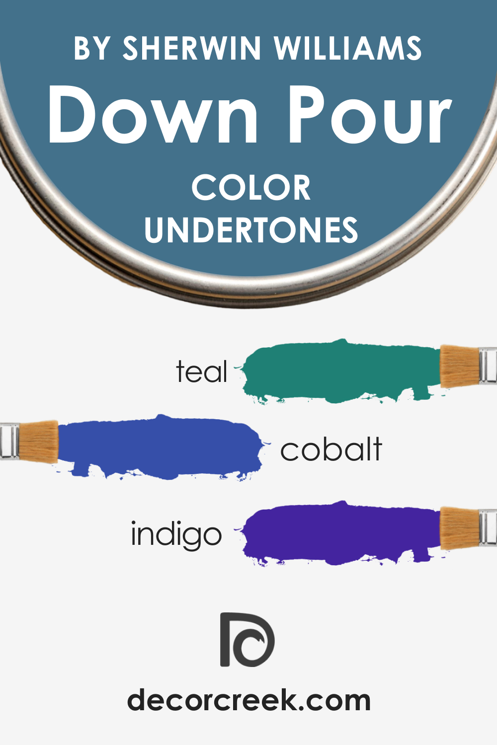
Understanding the undertones of color is crucial, as these subtle hues can significantly affect how the primary color appears, especially in relation to other colors and under varying light conditions. SW 6516 Down Pour has three key undertones:
- Colbalt: This is the most noticeable undertone in SW Down Pour, lending it its characteristic coolness and tranquility. It brings a calm, soothing vibe to the color, making it ideal for spaces where peace and relaxation are desired.
- Teal: A hint of green lends a refreshing and harmonious feel to SW Down Pour. It ties the color to nature, further enhancing its calming and revitalizing qualities.
- Indigo: The undertone gives SW Down Pour a muted, sophisticated depth. This contributes to the color’s versatility, allowing it to fit well within both vibrant and subdued color schemes.
These undertones affect how we perceive the color, with variations in lighting and surrounding hues potentially emphasizing one undertone over the others. For example, in a room with a lot of natural light, the green undertone might become more pronounced, while artificial light might bring out the blue undertone more.
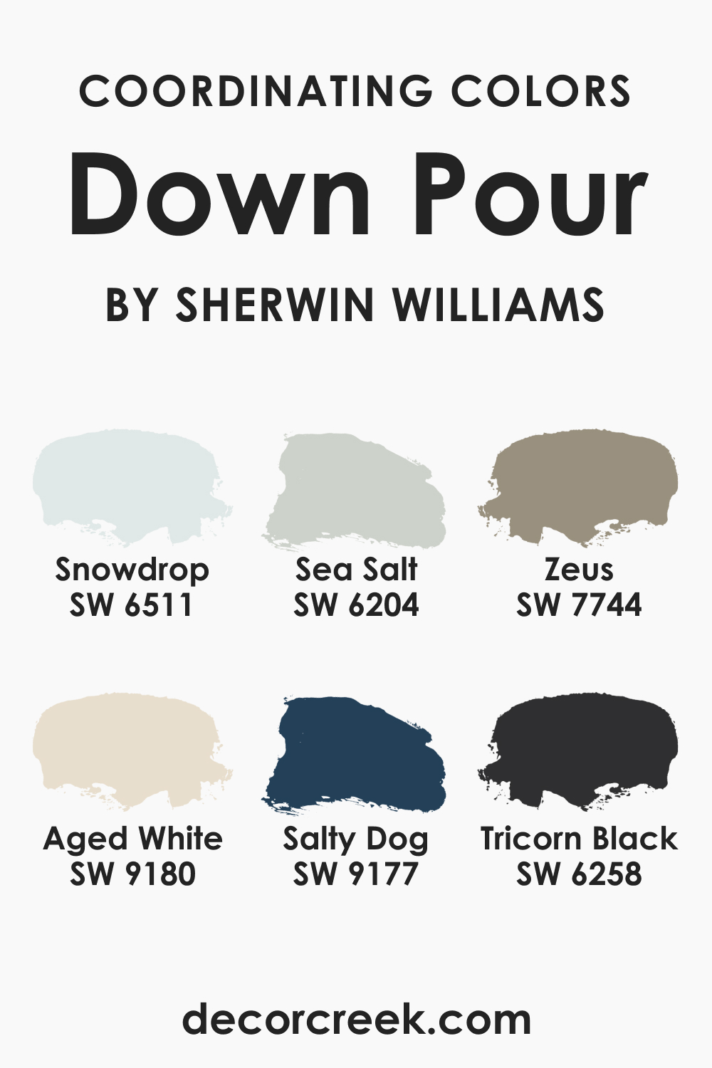
Coordinating Colors of SW 6516 Down Pour
Coordinating colors are hues that harmonize well with a particular color, creating a visually pleasing palette. They can be used for accents, trims, or adjacent walls, providing balance and cohesion to the overall color scheme. Here are the coordinating colors for SW 6516 Down Pour:
- SW 6511 Snow Drop : A soft, icy blue that offers a light and fresh contrast to the deeper SW Down Pour. It evokes the feeling of a crisp winter morning, providing a calming effect.
- SW 9180 Aged White : This is a creamy, warm white that pairs beautifully with SW Down Pour, softening its intensity and adding a touch of classic elegance to the space.
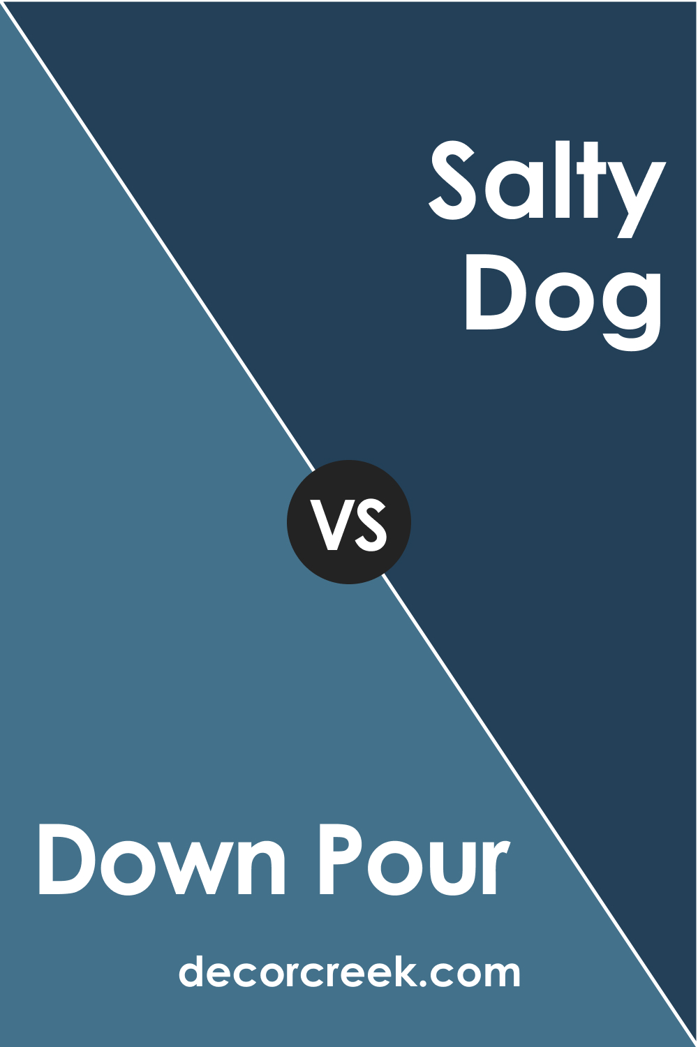
- SW 9177 Salty Dog : A deeper, nautical blue that can add a dynamic, rich contrast when paired with SW Down Pour. This duo echoes the interplay of sea and stormy sky, creating a vibrant and captivating ambiance.
Additional colors that work well with SW Down Pour include:
- SW 6204 Sea Salt : This is a light, muted green with a touch of gray, lending a quiet sophistication and airy freshness to Down Pour’s depth.
- SW 6258 Tricorn Black : An intense, deep black that creates a bold, dramatic contrast with Down Pour. This duo brings a modern, edgy feel to any space.
- SW 7744 Zeus : A soft, subdued blue that adds a soothing, harmonious touch to the palette, perfectly complementing Down Pour’s cool vibe.
How Does Lighting Affect SW 6516 Down Pour?
Lighting has a profound effect on how we perceive color, and SW 6516 Down Pour is no exception. In bright, natural light, SW Down Pour appears lighter and leans more towards its blue and green undertones, creating a vibrant yet soothing atmosphere.
However, in a room with limited natural light or under artificial light, the color appears darker, and the gray undertone becomes more prominent, creating a moody, intimate ambiance. It’s always recommended to test a color sample in the intended space and observe how it changes under different lighting conditions throughout the day.
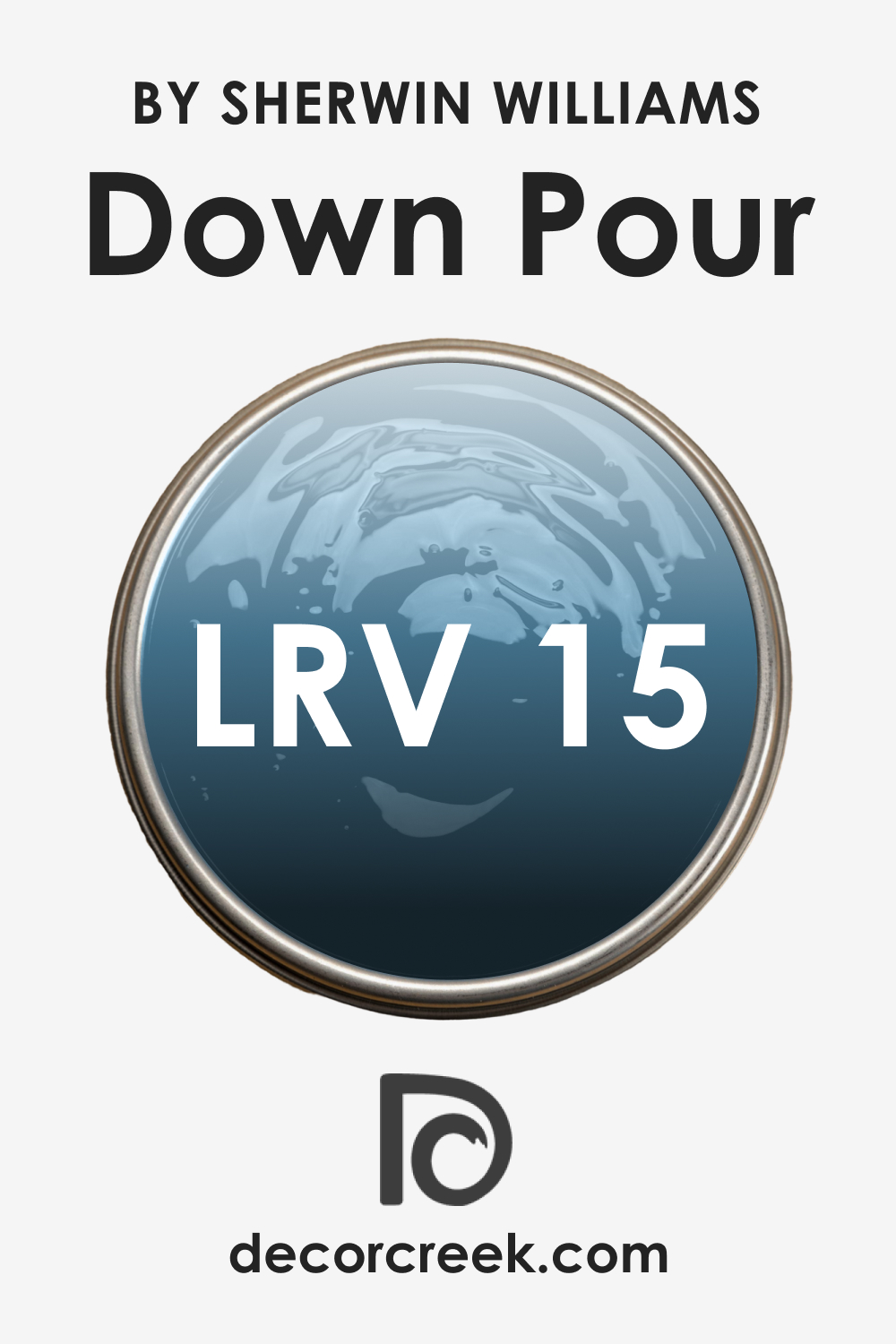
LRV of SW 6516 Down Pour
The Light Reflectance Value (LRV) of color is a measurement of how much light it reflects. The LRV scale ranges from 0, representing absolute black, to 100, representing pure white. With an LRV of 15, SW 6516 Down Pour is on the lower end of the scale, indicating that it is a relatively dark color that absorbs more light than it reflects. This attribute contributes to the color’s depth and moodiness, making it a stunning choice for creating cozy, intimate spaces.
However, the low LRV also means that SW Down Pour might make a small room feel even smaller if used on all walls. In such scenarios, it’s advisable to use this blue hue sparingly, as an accent color, or on a feature wall. Alternatively, it can be paired with lighter colors, especially on ceilings and trims, to balance its intensity and prevent it from overwhelming the space.
Despite its low LRV, SW Down Pour is far from being gloomy or oppressive. Its complex undertones and depth ensure that it retains its elegance and appeal under various lighting conditions. It’s a color that can create both drama and serenity, depending on how and where it’s used.
LRV – what does it mean? Read This Before Finding Your Perfect Paint Color
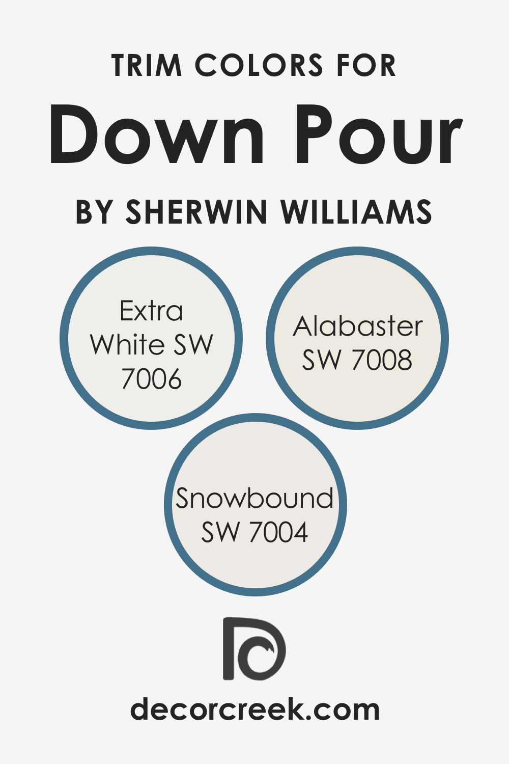
Trim Colors of SW 6516 Down Pour
Trim colors are used on molding, doors, and windows to provide a subtle, often contrasting, border that highlights architectural details and adds depth to the space. For SW 6516 Down Pour, the following shades of white from Sherwin-Williams make excellent trim colors:
- SW 7006 Extra White : This is a pure, bright white that creates a crisp, clean contrast with Down Pour, highlighting its depth and complexity.
- SW 7008 Alabaster : A slightly warm, creamy white that softens the intensity of Down Pour while maintaining a sophisticated contrast.
- SW 7004 Snowbound : This is a cooler, grayish white that harmonizes beautifully with Down Pour’s undertones, enhancing its cool, tranquil vibe.
Choosing the right trim color can greatly enhance the overall aesthetic of your space. It can either blend in with the wall color for a seamless look or contrast it to create an interesting interplay of hues. The trim color also impacts how the wall color is perceived, making it appear lighter or darker, cooler or warmer.
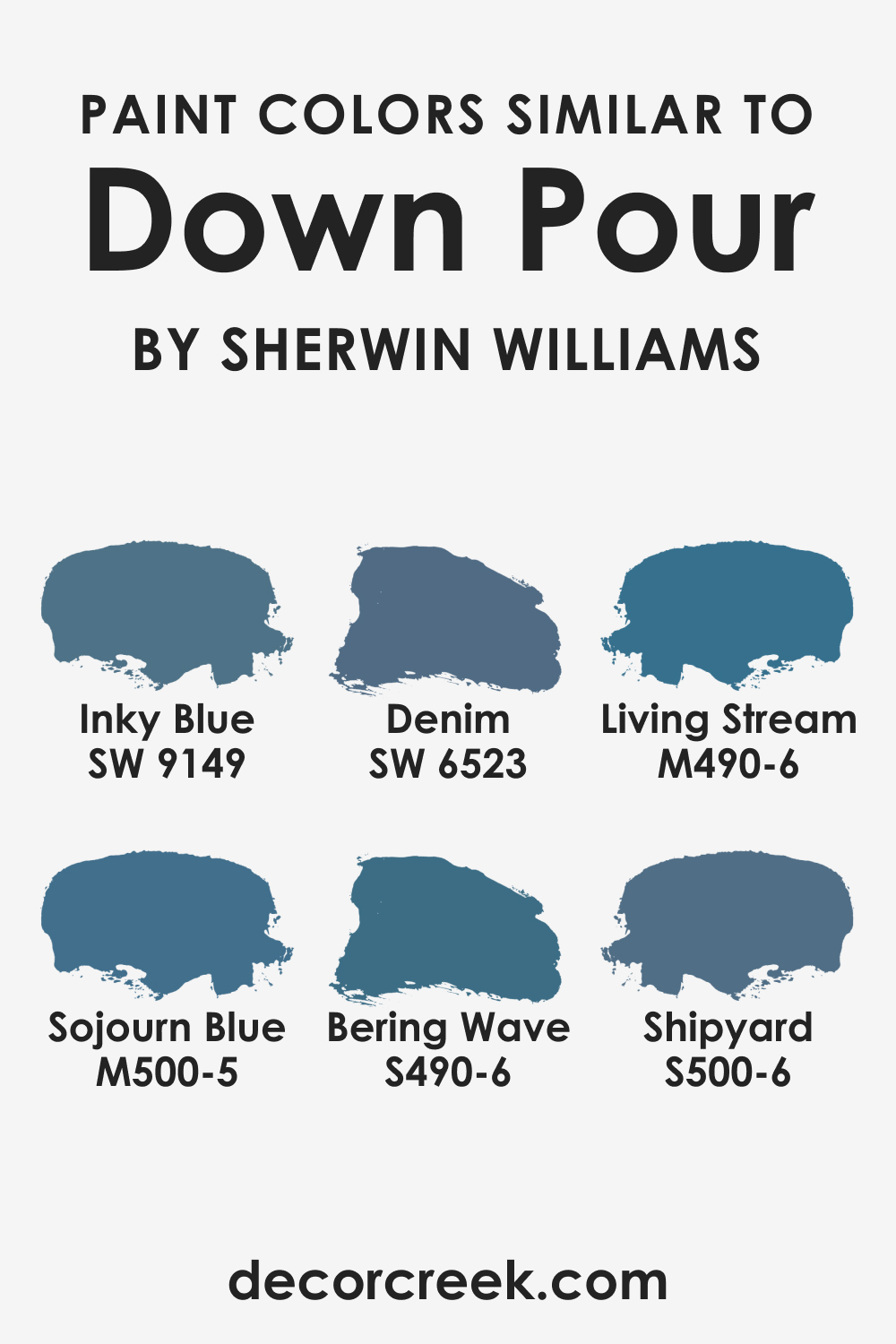
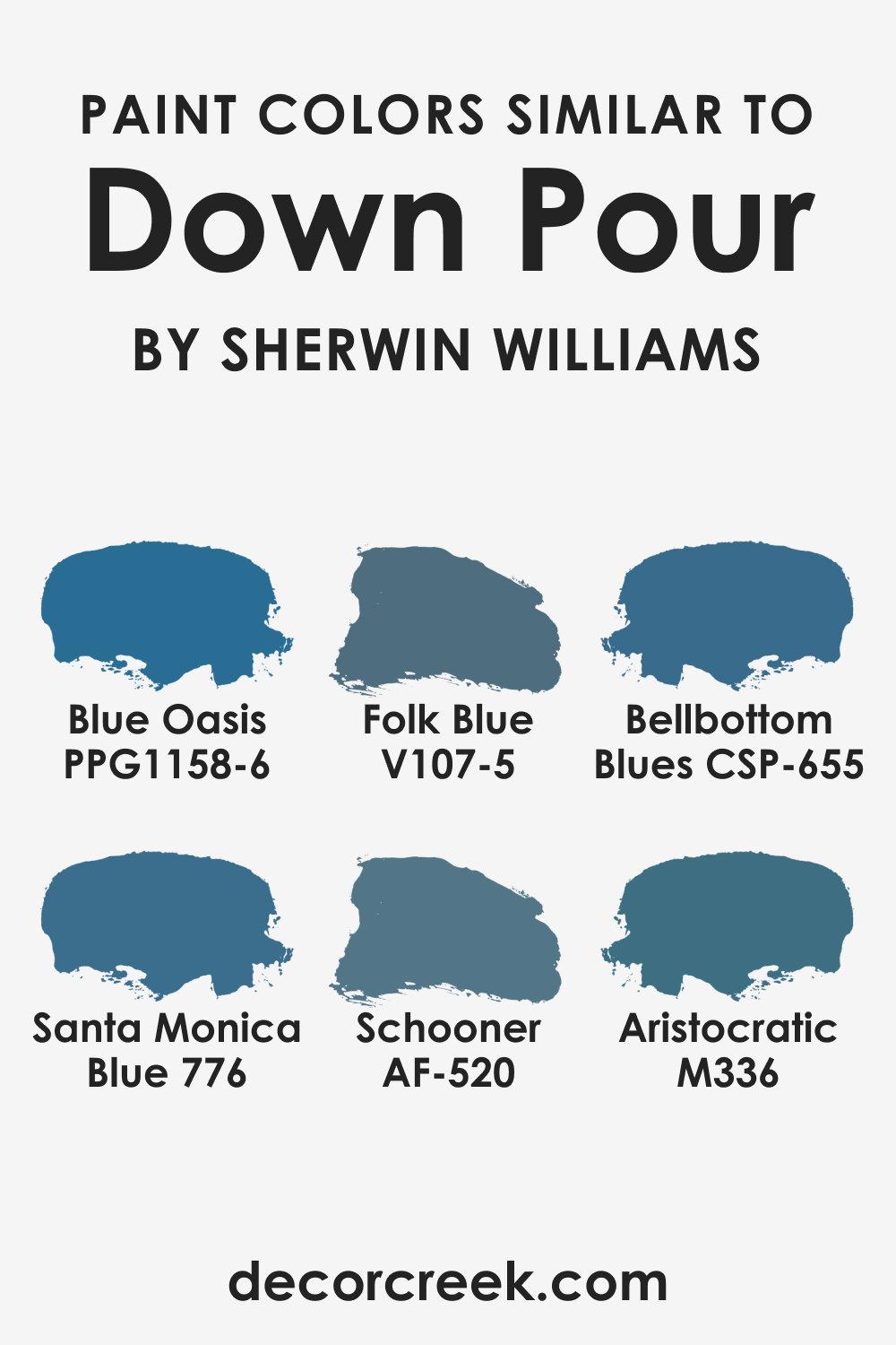
Colors Similar to SW 6516 Down Pour
The following are similar colors from the Sherwin-Williams palette that carry the same moody, sophisticated vibe as SW Down Pour, albeit with slight variations in undertones:
- Inky Blue (SW 9149)
- Denim (SW 6523)
- Behr Sojourn Blue (M500-5)
- Behr Living Stream (M490-6)
- Behr Bering Wave (S490-6)
- Behr Shipyard (S500-6)
- BM Santa Monica Blue (776)
- BM Bellbottom Blues (CSP-655)
- BM Schooner (AF-520)
- PPG Blue Oasis (PPG1158-6)
- Valspar Folk Blue (V107-5)
- Valspar Aristocratic (M336)
These similar colors provide alternatives to SW Down Pour, catering to different tastes and moods. While they share its fundamental qualities, each has its unique charm and appeal.
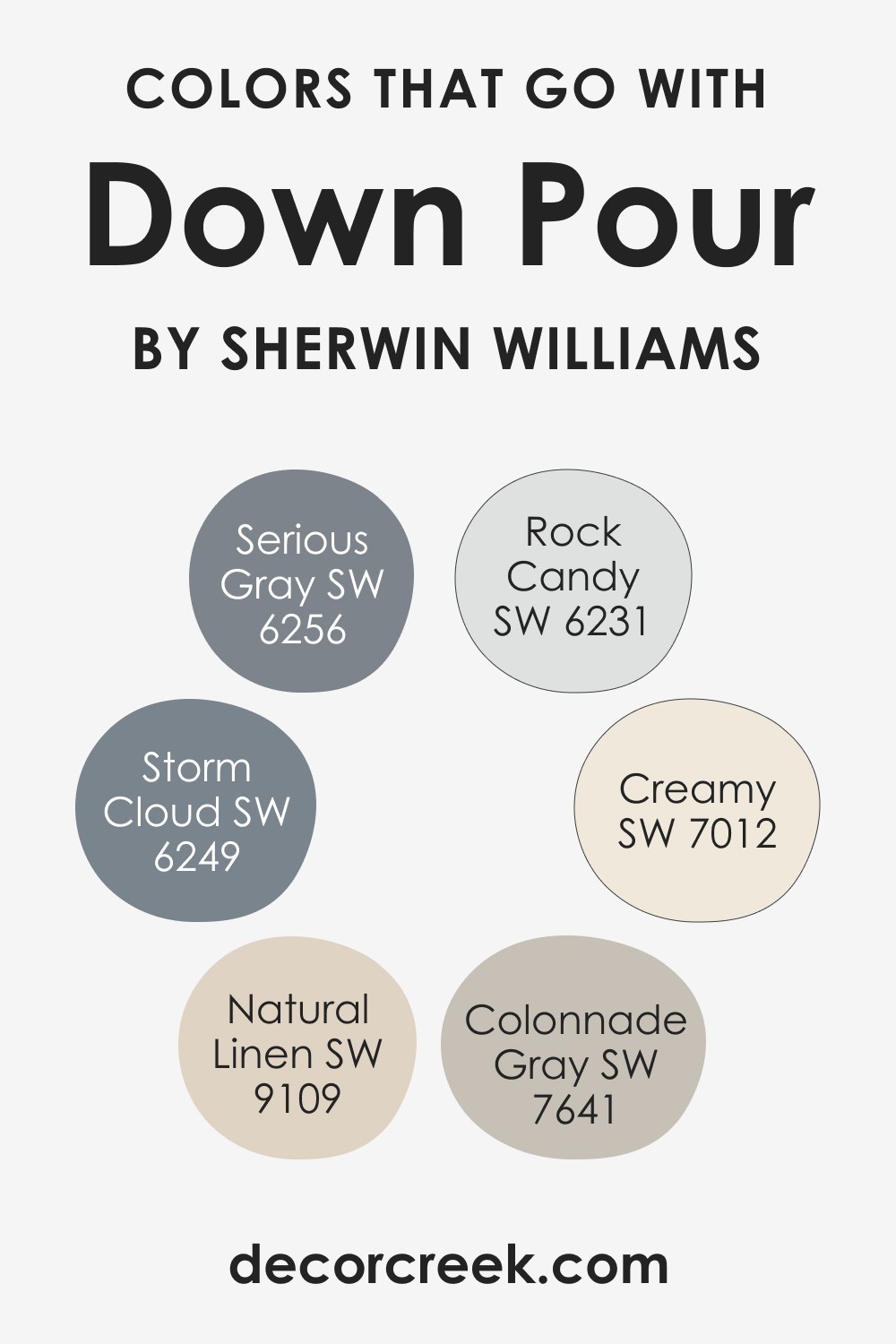
Colors That Go With SW 6516 Down Pour
Here are six colors that pair wonderfully with SW Down Pour, creating visually appealing color schemes:
- SW 7012 Creamy : A soft, warm white that provides a gentle contrast to Down Pour, adding warmth and balance to the color scheme.
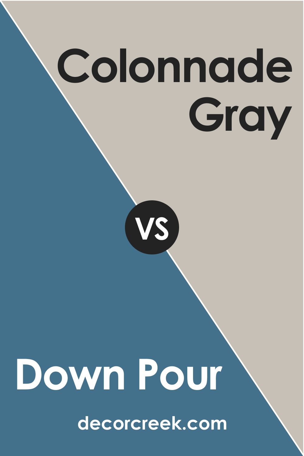
- SW 7641 Colonnade Gray : A neutral, sophisticated gray that harmonizes with Down Pour’s undertones, enhancing its depth and elegance.
- SW 9109 Natural Linen : A light, muted beige that adds a touch of earthy warmth to the palette, balancing Down Pour’s coolness.
- SW 6249 Storm Cloud : A dark, stormy blue that shares Down Pour’s moody vibe but with a stronger blue undertone, creating a dynamic contrast.
- SW 6231 Rock Candy : A soft, cool gray that complements Down Pour’s tranquility, contributing to a serene, harmonious palette.
- SW 6256 Serious Gray : A deep, sophisticated gray that echoes Down Pour’s intensity and depth, adding a modern, edgy feel to the color scheme.
The right combination of colors can elevate the aesthetic of any space, creating harmony, contrast, or drama as desired. It’s essential to choose colors that not only look good together but also create the desired mood and ambiance in the room.
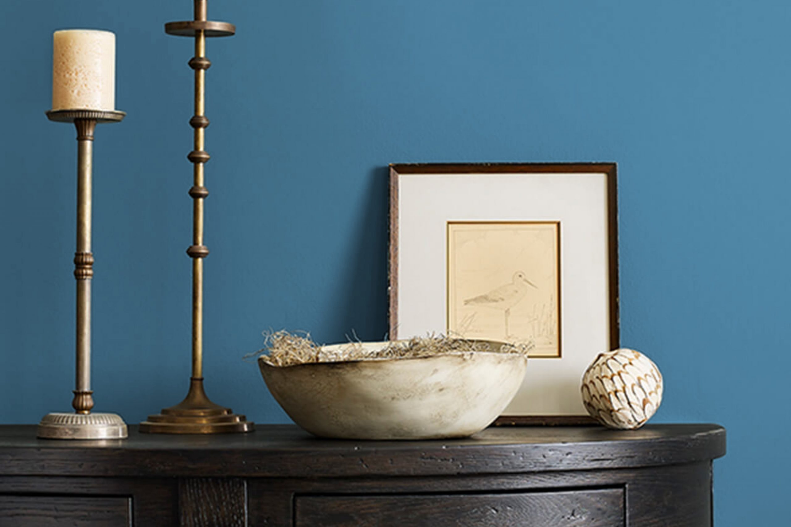
How to Use SW 6516 Down Pour In Your Home?
SW 6516 Down Pour’s versatility lends itself to various applications within the home. Its sophistication and depth make it a suitable choice for both traditional and contemporary interior design styles. Let’s explore some room-specific applications of SW Down Pour.
SW 6516 Down Pour in the Bedrooms
SW Down Pour in the bedroom creates a serene and calming atmosphere conducive to rest and relaxation. Use it on an accent wall behind the bed to create a focal point, or pair it with lighter hues on the bedding and furnishings to prevent the room from feeling too heavy or gloomy.
It pairs well with earthy, organic materials such as wooden furniture and linen textiles, further enhancing the room’s cozy, tranquil vibe.

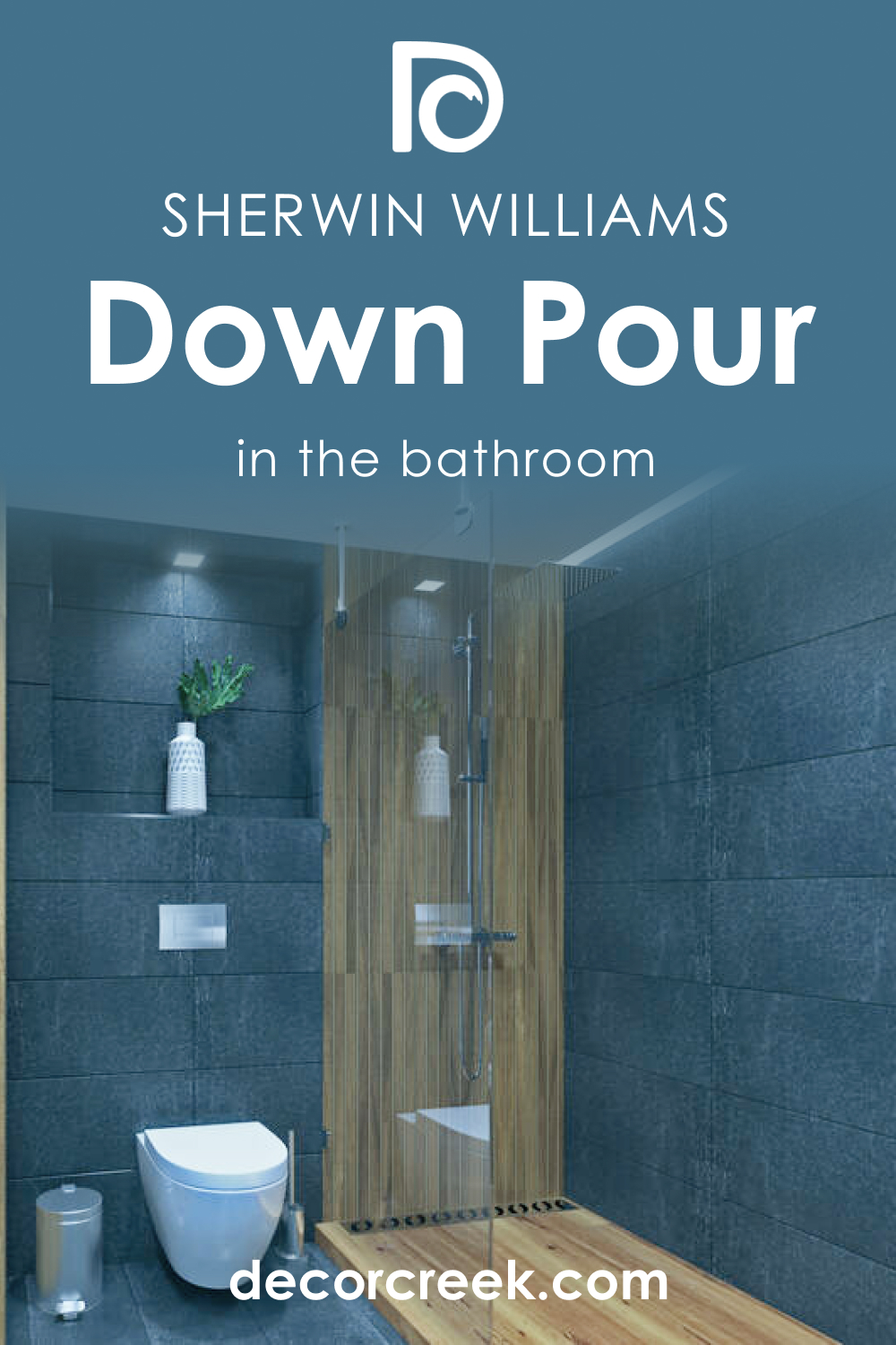
SW 6516 Down Pour in the Bathrooms
In the bathroom, SW Down Pour adds a touch of elegance and depth. It’s particularly effective in powder rooms, creating a dramatic, moody ambiance. Pair it with bright white fixtures and metallic accents to create a stunning contrast and add a touch of luxury.
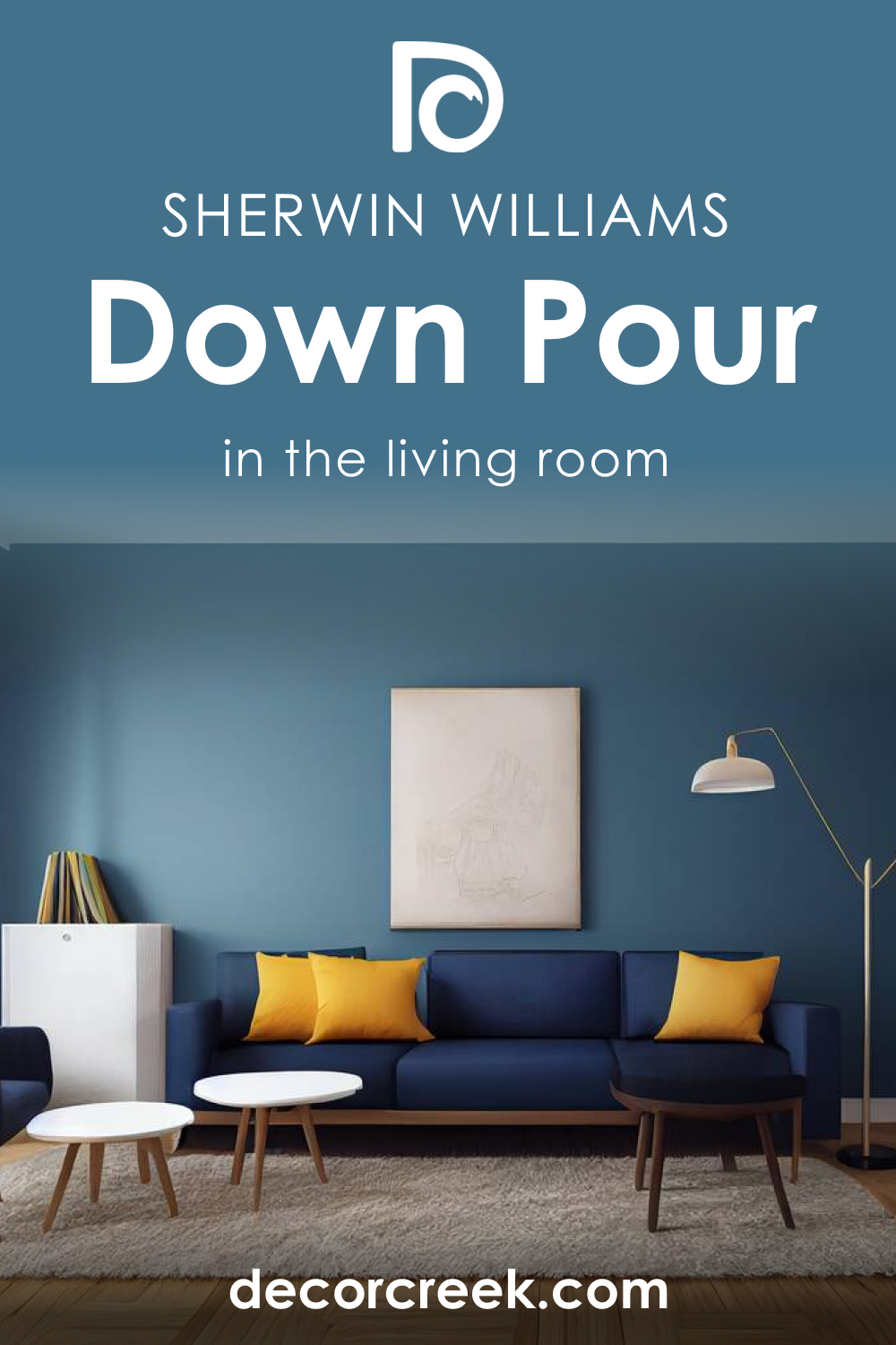
SW 6516 Down Pour in the Living Rooms
In the living room, SW Down Pour can serve as a sophisticated backdrop for your furniture and decorative items. Use it on a feature wall or to highlight architectural details such as a fireplace. Pair it with warm neutrals and soft textiles to create a welcoming, cozy space. Alternatively, for a more modern, edgy feel, contrast it with bold, vibrant accents.
SW 6516 Down Pour in the Kitchens
SW Down Pour in the kitchen can add a touch of sophistication and drama. Use it on the walls or on the lower cabinets, paired with lighter upper cabinets and countertops to prevent the space from feeling too dark. It harmonizes beautifully with stainless steel appliances and wooden elements.

SW 6516 Down Pour for the Exterior
SW Down Pour is an excellent choice for exteriors as well, providing a striking, elegant curb appeal. Use it on the main body of the house, contrasting it with bright white trims for a classic look, or pair it with darker, moody hues for a contemporary, monochromatic aesthetic.

Comparing SW 6516 Down Pour With Other Colors
Here you can see how this gorgeous and rich blue looks compared to several other colors. This will help you better recognize its unique features and understand how undertones of colors may work.
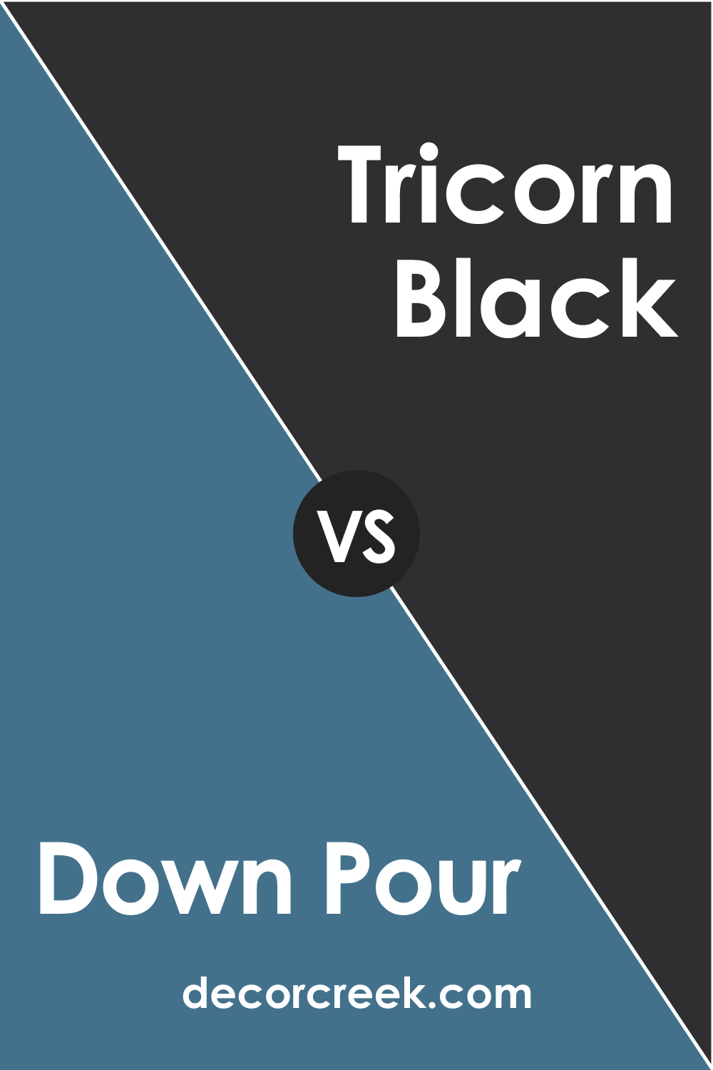
SW 6516 Down Pour vs. SW 6258 Tricorn Black
Compared to SW Tricorn Black , SW Down Pour has a softer, less stark appearance. Its blue-green undertones add a touch of tranquility and depth that pure black lacks, making it less intimidating and more versatile for home interiors.
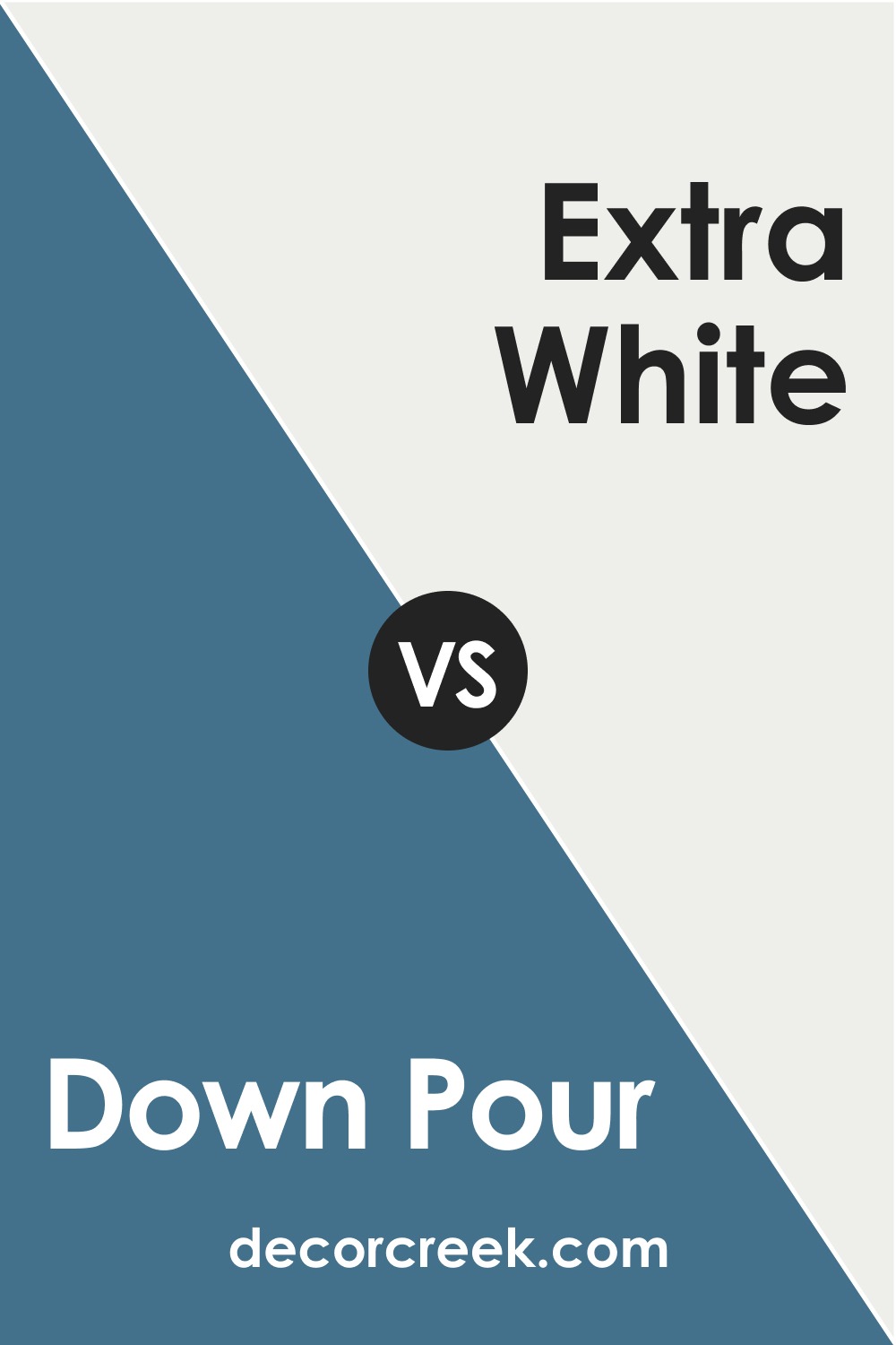
SW 6516 Down Pour vs. SW 7006 Extra White
In contrast to SW Extra White , SW Down Pour is deep, rich, and moody. However, this contrast is what makes these two colors complement each other beautifully, with SW Extra White providing a bright, clean counterpoint to SW Down Pour’s depth and intensity.
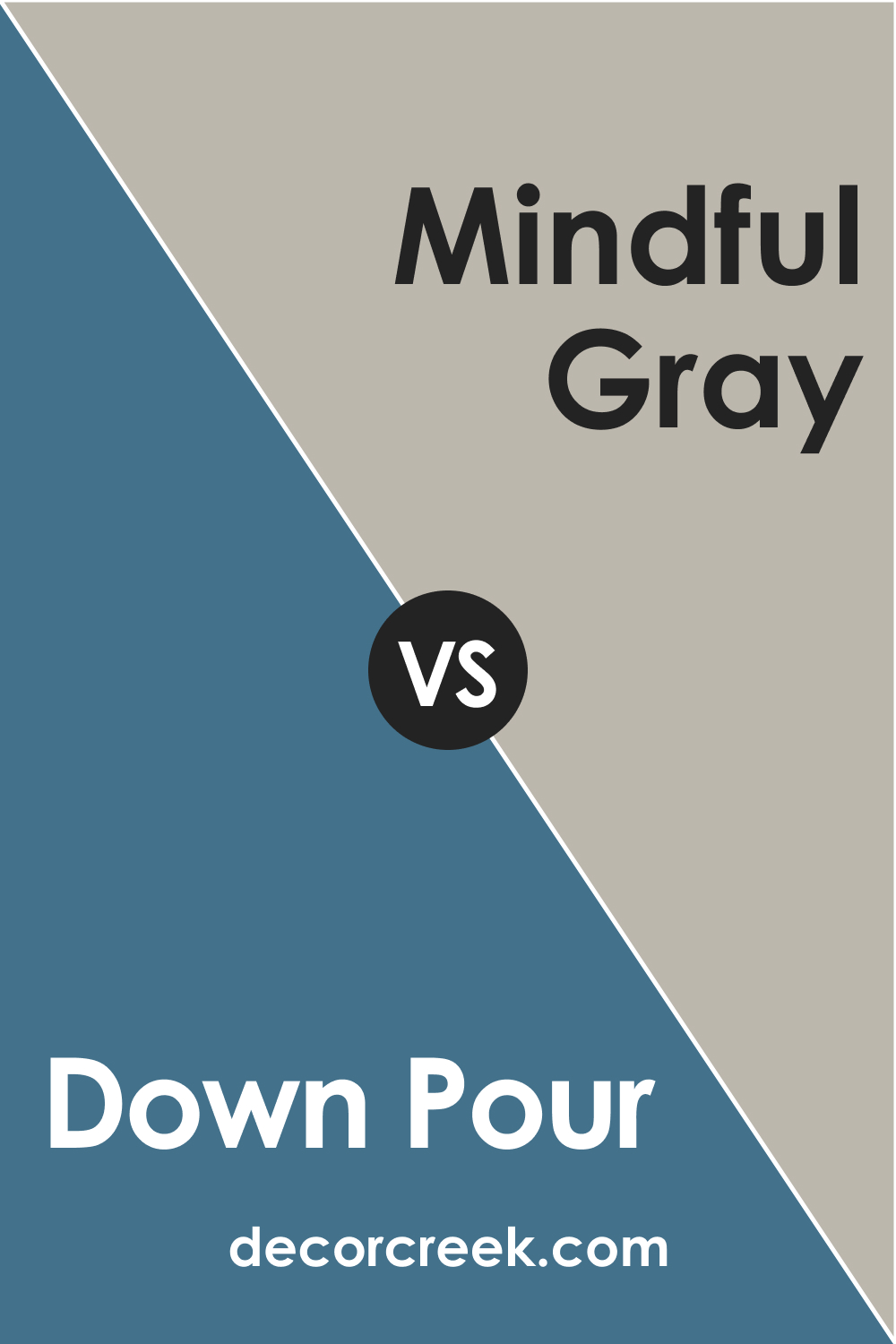
SW 6516 Down Pour vs. SW 7016 Mindful Gray
While Mindful Gray is a balanced, warm gray, SW Down Pour leans towards cool with its blue-green undertones. Both colors are muted and sophisticated, but SW Down Pour offers a more dramatic, moody vibe.
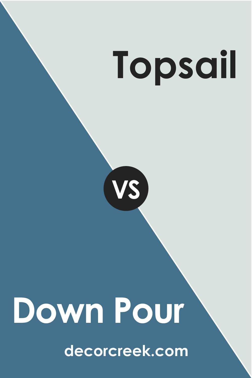
SW 6516 Down Pour vs. SW 6217 Topsail
SW Topsail is a softer, more muted shade than SW Down Pour. It’s greener and less intense, providing a more laid-back, breezy feel compared to SW Down Pour’s deeper, more contemplative vibe.
SW 6516 Down Pour vs. SW 9177 Salty Dog
SW Salty Dog is a more traditional blue compared to SW Down Pour. It’s more vibrant and nautical, while Down Pour is deeper and moodier with its green and gray undertones.
SW 6516 Down Pour vs. SW 7641 Colonnade Gray
Compared to SW Colonnade Gray , SW Down Pour is cooler and deeper, with more pronounced blue-green undertones. The former is a neutral gray that serves as a versatile backdrop, while Down Pour makes a bold, dramatic statement.
Conclusion
In conclusion, SW 6516 Down Pour is a sophisticated, versatile color that offers a multitude of applications within the home. Its unique blend of blue, green, and gray undertones creates a tranquil yet dramatic ambiance, making it an appealing choice for those seeking depth, moodiness, and sophistication in their color palette.
Ever wished paint sampling was as easy as sticking a sticker? Guess what? Now it is! Discover Samplize's unique Peel & Stick samples.
Get paint samples
Frequently Asked Questions
⭐What color undertones does SW 6516 Down Pour have?
SW 6516 Down Pour is a rich, moody color with cool undertones. It has a blend of blue and green undertones with a hint of gray that contributes to its depth and complexity.
⭐What are the best-coordinating colors for SW 6516 Down Pour?
Down Pour pairs beautifully with a variety of colors. For a classic, clean contrast, consider SW 7006 Extra White or SW 7008 Alabaster. For a more dynamic, vibrant contrast, SW 9177 Salty Dog or SW 6258 Tricorn Black would be excellent choices. It also harmonizes well with softer, muted shades like SW 6204 Sea Salt and SW 7744 Zeus.
⭐How does the light affect the appearance of SW 6516 Down Pour?
Like all colors, Down Pour can appear different under varying lighting conditions. In bright, natural light, it tends to reveal more of its blue and green undertones. In dimmer light or under artificial lighting, it appears darker, and the gray undertone becomes more prominent.
⭐What is the Light Reflectance Value (LRV) of SW 6516 Down Pour, and what does it mean?
The LRV of Down Pour is 15, which is on the lower end of the scale. LRV measures how much light a color reflects. With an LRV of 15, Down Pour is a relatively dark color that absorbs more light than it reflects, contributing to its depth and moodiness.
⭐Where can I use SW 6516 Down Pour in my home?
SW 6516 Down Pour is a versatile color that can be used in a variety of spaces. It works beautifully in bedrooms, living rooms, bathrooms, and even on kitchen cabinets for a dramatic effect. It's also suitable for exterior use, providing a sophisticated curb appeal. When using this dark color, consider the size and light conditions of the room to ensure it enhances the space rather than overwhelming it.


