It’s a shade that feels like a breath of fresh air, a gentle whisper that invites simplicity into any space.
The blend of soft undertones and light blue hues creates a serene atmosphere, perfect for starting anew or adding a touch of peace to your surroundings.
This color has a unique ability to make a room feel open and inviting without overwhelming the senses. It’s versatile, working equally well in living rooms, bedrooms, or even kitchens. It sets the stage for modern and classic decor, allowing various styles to come together beautifully.
Whether you’re considering a complete makeover or just freshening up a single wall, this shade provides a quiet confidence that complements your personal style.
Using Clean Slate in your home is like giving your mind a clean slate too. It encourages relaxation and offers a blank canvas for creativity and self-expression. Its soft, muted tone harmonizes with both bold accents and other neutral shades, making it easy to incorporate into your current design.
Just a glimpse of this color could inspire renewed thinking and bring an understated elegance to your environment.
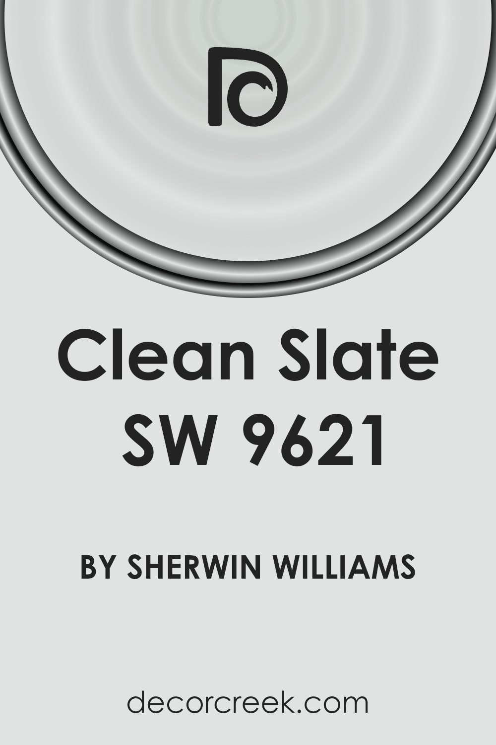
What Color Is Clean Slate SW 9621 by Sherwin Williams?
Clean Slate by Sherwin Williams is a calming, muted gray with a subtle hint of blue. This color brings a refreshing feel, making spaces look modern and fresh. It is versatile and blends effortlessly into various interior styles.
In a minimalist setting, Clean Slate shines by providing a soft, neutral backdrop that enhances simplicity and balance. Its cool undertones make it a great choice for Scandinavian interiors, complementing light wood and simple, functional furniture.
This color also works well in contemporary spaces, where it pairs beautifully with metals like silver and chrome, adding a touch of elegance without overpowering the room.
For materials, Clean Slate looks great next to natural fibers like cotton and linen, which amplify its soothing vibe. Textured materials such as jute or sisal rugs create a nice contrast, bringing warmth to the overall look. In more industrial or urban styles, concrete and exposed brick pair effectively with this hue, highlighting their raw texture.
Additionally, it complements warm materials, like walnut or dark oak, which can prevent the space from feeling too cool. Clean Slate is also an excellent backdrop for artwork, as it allows vibrant colors to really stand out, making your pieces pop.
With its versatility, this color can create a peaceful and stylish atmosphere in any room.
Is Clean Slate SW 9621 by Sherwin Williams Warm or Cool color?
Clean Slate (SW 9621) by Sherwin Williams is a soft, neutral color that brings a calming presence to any room. This shade is a light, muted gray with subtle blue undertones, making it versatile and easy to pair with various decor styles.
Its neutral quality allows it to work well in different spaces, whether it’s a living room, bedroom, or kitchen.
One of the main benefits of using Clean Slate in your home is its ability to create a sense of openness and light. It reflects natural light beautifully, helping to make rooms feel larger and more inviting. This color also serves as a perfect backdrop for other colors, allowing you to incorporate bold or vibrant accents without overwhelming the space.
Additionally, Clean Slate complements a wide range of materials, from wood finishes to metal accents, offering flexibility for homeowners looking to refresh their interiors. Overall, it’s a universally appealing choice for modern home design.
Undertones of Clean Slate SW 9621 by Sherwin Williams
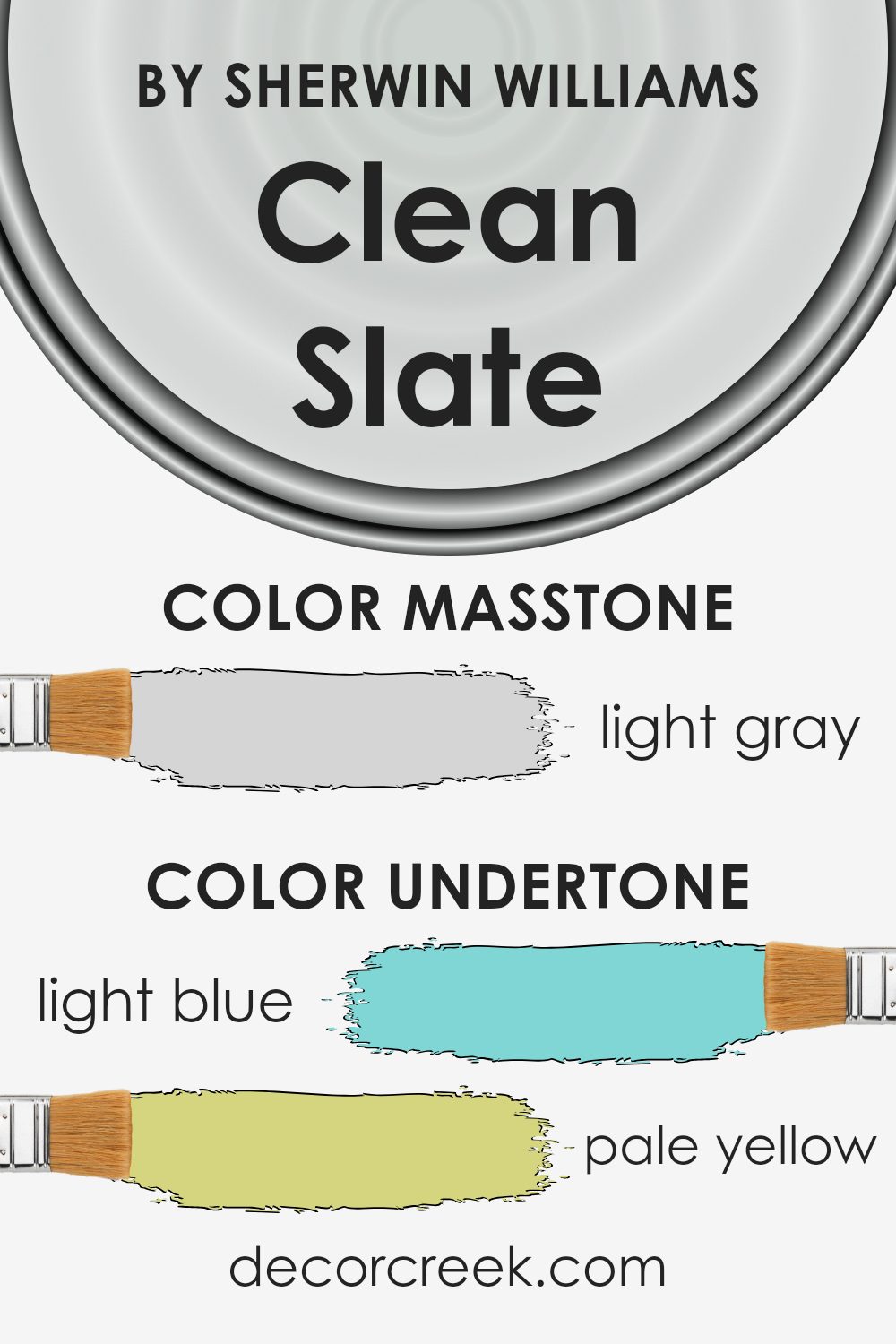
Clean Slate by Sherwin Williams is a versatile color that carries a range of subtle undertones. The undertones include light blue, pale yellow, light purple, mint, lilac, pale pink, and grey. Each of these undertones can influence how the color appears on interior walls, depending on lighting and surrounding decor.
Undertones are the hint of colors that lie beneath the primary color we see. They play a big role in how a paint color looks in different spaces and under different lighting conditions.
For example, a room with a lot of natural light might make the blue undertone more noticeable, giving the walls a cooler look. In contrast, under artificial light, the yellow or pink undertones might stand out more, creating a warmer atmosphere.
Clean Slate’s undertones give it a unique versatility. The light blue and mint make it feel fresh and calming, while the pale yellow and pink bring warmth. The lilac and light purple add a soft, gentle touch, and the grey provides balance and neutrality.
When used on interior walls, these undertones can help create a space that feels both lively and peaceful, easily adapting to different styles and moods.
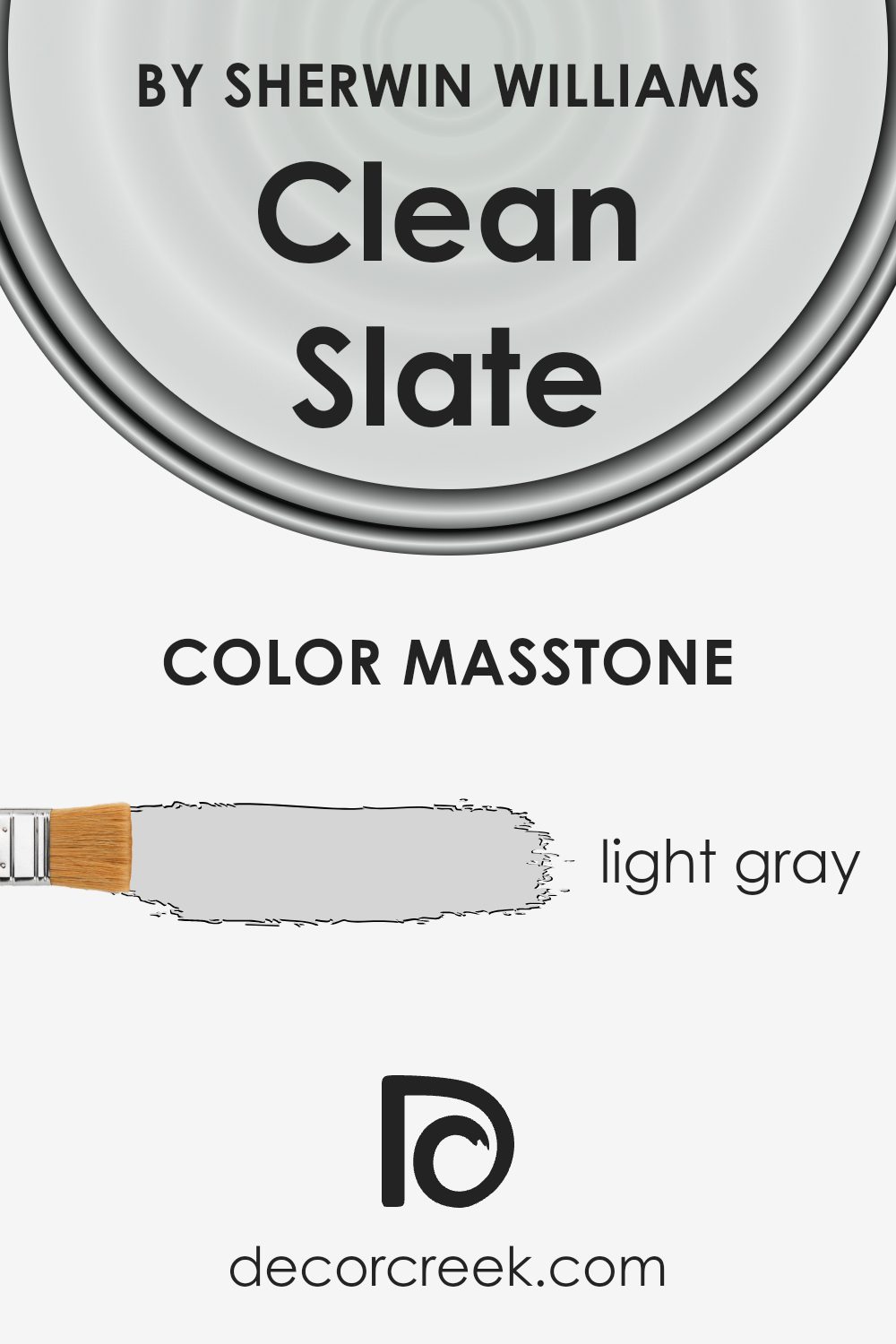
What is the Masstone of the Clean Slate SW 9621 by Sherwin Williams?
Clean Slate (SW 9621) by Sherwin Williams is a light gray hue that brings a fresh and modern feel to any home. Its masstone, or the color you see when looking straight at it, is a gentle light gray (#D5D5D5).
This color creates a soft, airy atmosphere in rooms, making spaces feel open and welcoming. Because it is a neutral color, Clean Slate can blend well with various other colors and styles. It complements both warm and cool tones, which means it can work with different types of furniture and decor.
This versatility makes it a popular choice for living rooms, bedrooms, and kitchens. It doesn’t overwhelm a space, allowing your decor or accent pieces to stand out while providing a subtle yet stylish backdrop. The light gray shade reflects natural and artificial light nicely, which can make small rooms appear larger and brighter.
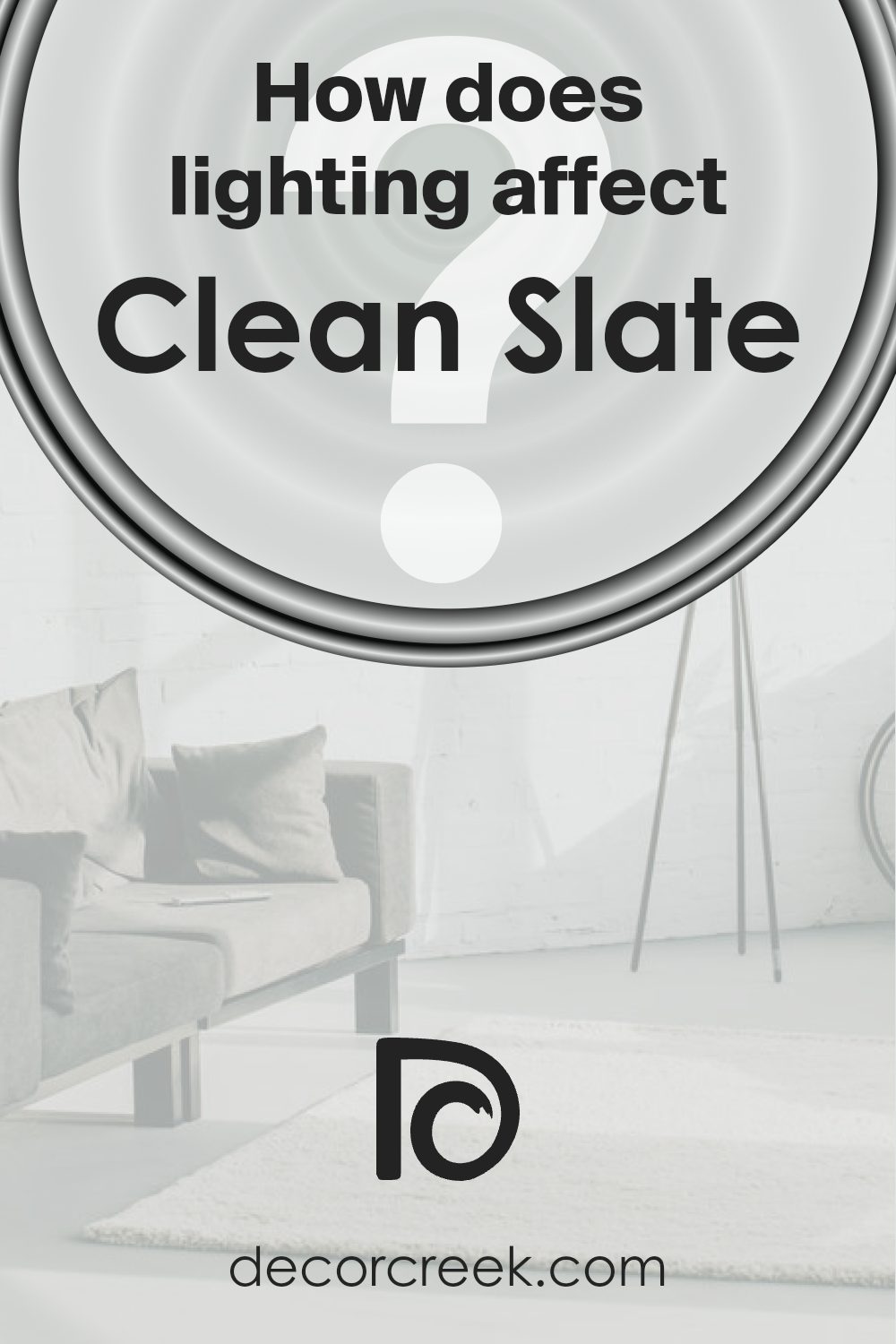
How Does Lighting Affect Clean Slate SW 9621 by Sherwin Williams?
Lighting plays a crucial role in how we perceive colors. Different types of light can make a color appear warmer, cooler, darker, or lighter. Natural light changes throughout the day, influencing how a color might look in a room. Meanwhile, artificial lighting depends on the bulb used, whether it’s incandescent, fluorescent, or LED, each affecting color perception in unique ways.
Sherwin Williams’ Clean Slate is a soft blue-grey hue. In artificial light, this color can change depending on the type of bulb. Incandescent lighting, which has a warm tone, might bring out more warmth in Clean Slate, giving it a slight cozy feel.
Fluorescent lighting can sometimes make it look cooler and more muted. LED lights can vary; warm LEDs can enhance its blue undertones, while cooler LEDs can make it look greyer.
In natural light, Clean Slate will behave differently depending on the room’s orientation. In north-facing rooms, which typically receive cooler and dimmer light, Clean Slate can appear more muted and cooler, emphasizing its grey undertone. This can give the room a calming atmosphere, though it might feel more subdued.
In south-facing rooms, which get more direct sunlight, Clean Slate can look brighter and slightly warmer. The natural light can bring out the subtle blue hues, making the space feel lively and fresh.
East-facing rooms get warm, soft light in the morning and cooler light later in the day. Clean Slate will look bright and welcoming in the morning but might take on a cooler tone in the afternoon and evening.
West-facing rooms, by contrast, gain light that is warmer and richer in the late afternoon and evening. This can enhance the color’s blue undertones, making it feel cozy as the sun sets.
Overall, Clean Slate’s versatility makes it suitable for various lighting conditions, but understanding its response to light can help in achieving the desired effect in different spaces.
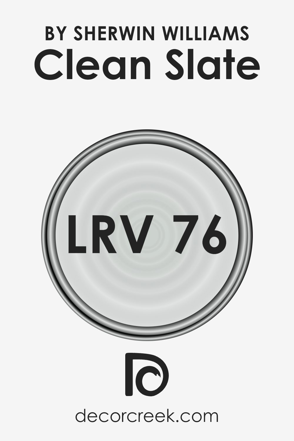
What is the LRV of Clean Slate SW 9621 by Sherwin Williams?
LRV, or Light Reflectance Value, is a measurement that tells us how much light a color reflects. On the scale, 0 represents absolute black, which absorbs all light, while 100 represents pure white, which reflects all light. When a color has a higher LRV, like 76.354, it reflects a lot of light.
This means that when you paint a room with a color like Clean Slate, the room can feel brighter and more open, especially in spaces that receive natural light. High LRV colors are often chosen for areas that might benefit from a feeling of spaciousness or lightness.
For Clean Slate with its LRV of 76.354, this light reflectance means it will contribute to creating a bright and airy atmosphere in a room. The color will reflect a significant amount of light, helping to enhance the overall illumination in the space, making it a good choice for rooms that might otherwise feel dark or small.
With this hue, you can expect it to maintain its true color under various lighting conditions while adding cheerfulness and vibrancy. It’s a practical choice for creating a welcoming and lively environment.
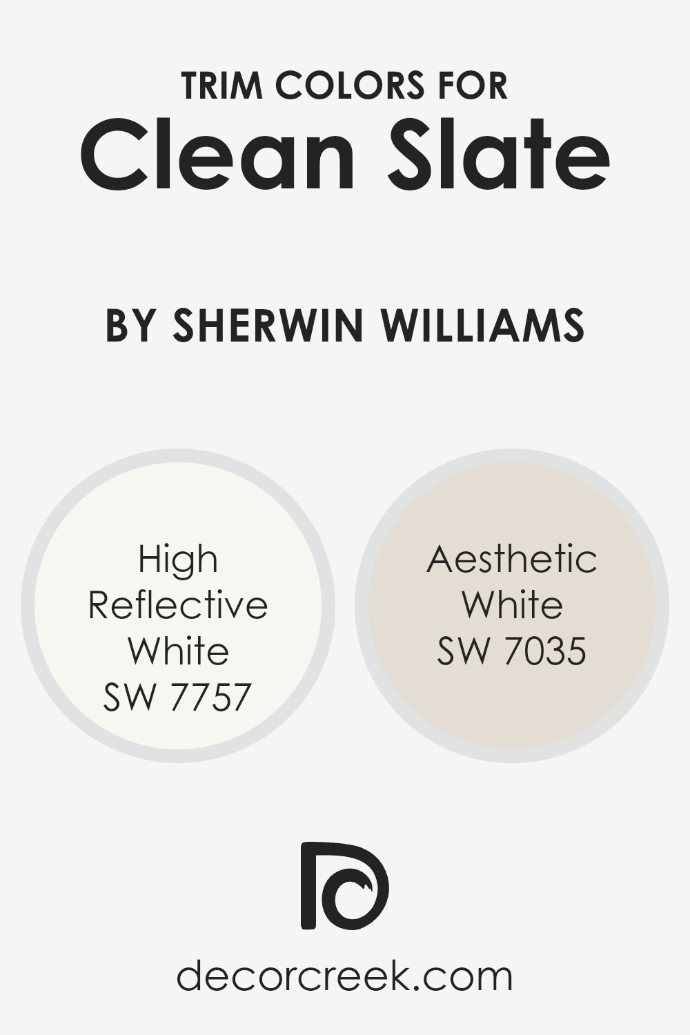
What are the Trim colors of Clean Slate SW 9621 by Sherwin Williams?
Trim colors are the paint colors used on the molding or frameworks that border walls, doors, and windows to create a polished look in a room or building. Typically, trim colors contrast or complement the wall color. When using SW 9621 Clean Slate by Sherwin Williams on walls, choosing the right trim color is key to achieving a balanced and harmonious look.
Using trim colors such as SW 7757 High Reflective White provides a crisp, clean contrast to Clean Slate, highlighting the walls and opening up the space visually. High Reflective White is known for its classic, bright hue that can make a space feel fresh and bright, enhancing natural and artificial light in a room.
Alternatively, a subtler option like SW 7035 Aesthetic White offers a soft and warm contrast to Clean Slate. This shade adds a creamy, understated edge without overwhelming the senses.
Aesthetic White is a versatile neutral that adds a touch of elegance without being too stark or too dull. Both these trim colors are essential for framing and accentuating Clean Slate, allowing it to fully express its qualities while ensuring that the overall color scheme remains cohesive and appealing.
You can see recommended paint colors below:
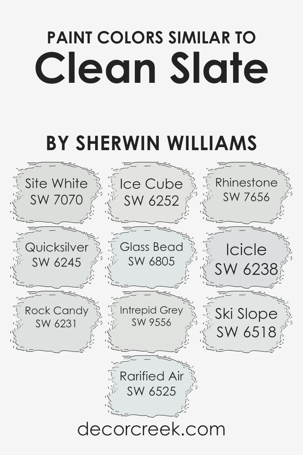
Colors Similar to Clean Slate SW 9621 by Sherwin Williams
Color selection plays a crucial role in creating a visually harmonious space, especially when working with shades similar to Clean Slate by Sherwin-Williams. These colors blend effortlessly, providing subtle variations that enhance any room’s aesthetic appeal. Site White, for instance, offers a soft and warm neutral tone that complements most decors.
On the other hand, Quicksilver is a light gray with a hint of blue, adding a crisp, clean feel. Rock Candy is an off-white with just enough coolness to make it sophisticated without feeling stark. Rarified Air introduces a whisper of sky-blue, perfect for bringing a touch of cool airiness.
Ice Cube is a cool-toned white that creates a fresh setting, while Glass Bead brings in a whisper of lavender, adding a hint of color while remaining understated. Intrepid Grey stands strong with its subtle mix of gray and a touch of warmth, providing a grounding backdrop.
Rhinestone feels crisp and light, creating an elegant atmosphere without overshadowing. Icicle is a pale blue that gives an icy freshness, perfect for brightening up spaces. Finally, Ski Slope, a soft, cool blue, captures the essence of frosty landscapes.
Together, these colors coordinate beautifully, offering a range of options to complement the base tone of Clean Slate.
You can see recommended paint colors below:
- SW 7070 Site White
- SW 6245 Quicksilver
- SW 6231 Rock Candy
- SW 6525 Rarified Air
- SW 6252 Ice Cube
- SW 6805 Glass Bead
- SW 9556 Intrepid Grey
- SW 7656 Rhinestone
- SW 6238 Icicle
- SW 6518 Ski Slope
How to Use Clean Slate SW 9621 by Sherwin Williams In Your Home?
Clean Slate SW 9621 by Sherwin-Williams is a versatile and soft color that can be a great choice for many areas in your home. It’s a gentle, muted blue-gray that creates a calm and inviting atmosphere. In a living room, it can serve as a neutral backdrop, allowing your furniture and decor pieces to stand out without overwhelming the space.
In a bedroom, Clean Slate can contribute to a soothing environment, making it easier to relax and unwind after a long day.
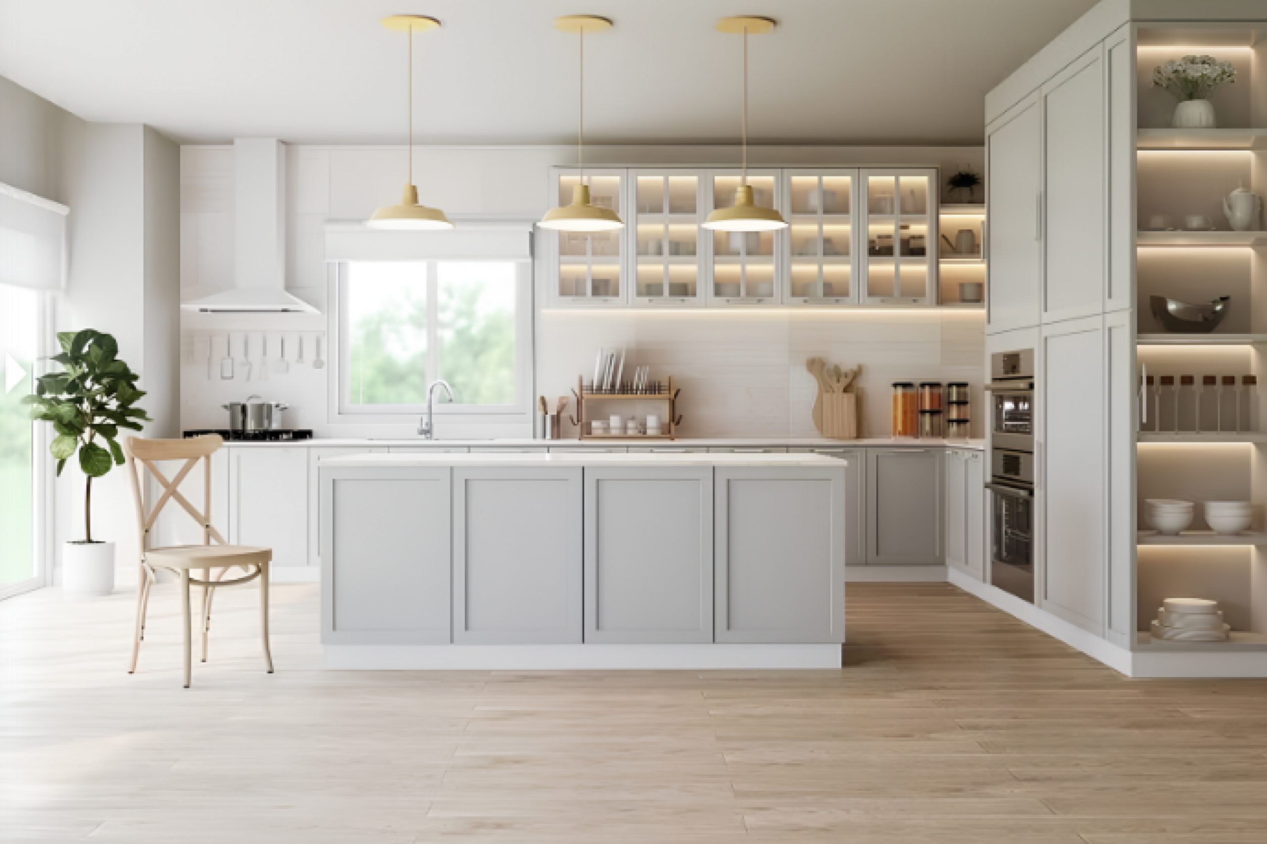
In kitchens, this color can add a touch of cool elegance, especially when paired with white cabinets or wood accents. Bathrooms painted in Clean Slate offer a spa-like feel, perfect for creating a refreshing space where you can start your day.
The color works well with a variety of materials, from metallic finishes to natural fabrics, making it a flexible choice for many design styles.
Clean Slate SW 9621 by Sherwin Williams vs Rock Candy SW 6231 by Sherwin Williams
Clean Slate SW 9621 by Sherwin Williams and Rock Candy SW 6231 are both calm and versatile colors, but they have distinct differences. Clean Slate is a soft, muted gray with warm undertones.
It offers a subtle and neutral backdrop that complements a variety of design styles, working well in both modern and traditional settings. Its warmth makes it inviting and comfortable, ideal for living rooms or bedrooms.
On the other hand, Rock Candy is a cool and crisp light gray with blue undertones. This color brings a fresh, airy feel to a space, making it perfect for bathrooms, kitchens, or anywhere you want to enhance natural light. Its cooler tone can add a touch of modernity and is well-suited for creating a minimalist look.
In summary, Clean Slate offers warmth and softness, while Rock Candy provides a cooler, more refreshing ambiance. Both colors can serve as perfect neutrals, adaptable to different spaces and moods.
You can see recommended paint color below:
Clean Slate SW 9621 by Sherwin Williams vs Site White SW 7070 by Sherwin Williams
Clean Slate SW 9621 is a soft, neutral gray color from Sherwin Williams. It offers a muted tone that can serve as a versatile background in various spaces. Its gentle gray hue works well with both warm and cool accents, making it easy to integrate into different color schemes.
On the other hand, Site White SW 7070 is a lighter, brighter shade. It leans more toward an off-white with slight gray undertones. This color can be great for adding brightness to a space without being stark white. Site White feels fresh and airy, ideal for areas where you want a clean and light atmosphere.
Both colors are neutral and understated, making them versatile choices. Clean Slate is more of a true gray with a softer, cozy feel, whereas Site White offers a lighter and crisper appearance. Depending on the desired ambiance, either color could be a great choice for creating a relaxed and timeless look in a room.
You can see recommended paint color below:
Clean Slate SW 9621 by Sherwin Williams vs Quicksilver SW 6245 by Sherwin Williams
Clean Slate SW 9621 and Quicksilver SW 6245 are both from Sherwin Williams, but they have different vibes. Clean Slate is a warm, light gray with subtle beige undertones. It creates a cozy and inviting feel, making it great for living rooms or bedrooms where you want a soft atmosphere.
On the other hand, Quicksilver is a cooler, more classic light gray with blue undertones. This color works well in spaces where a calm and fresh look is desired, like bathrooms or kitchens. It can provide a sense of openness and airiness.
While Clean Slate has a touch more warmth, Quicksilver offers a crisp and clean appearance. Choosing between the two depends on whether you prefer the warm and snug feel of Clean Slate or the cool and refreshing tone of Quicksilver. Both can pair well with various accents, but their undertones will guide the final mood of the room.
You can see recommended paint color below:
Clean Slate SW 9621 by Sherwin Williams vs Glass Bead SW 6805 by Sherwin Williams
Clean Slate SW 9621 and Glass Bead SW 6805 by Sherwin Williams are distinctly different colors that can complement various spaces. Clean Slate is a soft and calming gray. It’s a versatile neutral that works well in both modern and traditional settings, offering a subtle backdrop that pairs nicely with bolder accents.
On the other hand, Glass Bead SW 6805 is a lively and cheerful light purple. It brings a sense of playfulness and creativity to a room. This color is great for adding personality and can make spaces feel more energetic.
While Clean Slate provides a calming and muted foundation, Glass Bead adds a pop of color and interest. Together, they offer a balanced mix of calmness with a touch of liveliness, making them ideal for spaces where you want a neutral base with some colorful highlights. Both colors can be used to create a unique and inviting atmosphere.
You can see recommended paint color below:
- SW 6805 Glass Bead
Clean Slate SW 9621 by Sherwin Williams vs Icicle SW 6238 by Sherwin Williams
Clean Slate SW 9621 by Sherwin Williams is a soft and muted gray with a touch of warmth. It’s versatile and works well in almost any room, creating a calm and neutral backdrop. Clean Slate brings a sense of balance and clarity, making it ideal for living rooms, bedrooms, and home offices.
On the other hand, Icicle SW 6238 by Sherwin Williams is a cool, light blue-gray. It has an icy undertone, giving it a crisp and refreshing vibe. Icicle is perfect for spaces where you want to evoke a sense of openness and freshness, such as bathrooms and kitchens.
While both colors belong to the gray family, Clean Slate leans warm and grounding, whereas Icicle leans cool and airy. Choosing between them depends on whether you prefer a cozy and warm atmosphere or a bright and breezy look. Both can blend well with various styles and accents.
You can see recommended paint color below:

Clean Slate SW 9621 by Sherwin Williams vs Ice Cube SW 6252 by Sherwin Williams
Clean Slate SW 9621 and Ice Cube SW 6252 are both soft, neutral paint colors by Sherwin Williams, but they have different undertones and vibes. Clean Slate is a light gray with a hint of warmth, making it feel inviting and cozy. It’s versatile and works well in both modern and traditional spaces.
On the other hand, Ice Cube is a cool, crisp gray with blue undertones that give it a fresh, airy feel. It’s perfect for creating a clean and contemporary look. Ice Cube can make a room feel bright and spacious, reflecting more light than Clean Slate.
While Clean Slate offers a warmer, softer atmosphere, Ice Cube tends to provide a cooler, more open ambiance. Choosing between the two depends on whether you prefer the warmth and comfort of Clean Slate or the cool, sleek look of Ice Cube. Both colors are excellent for those seeking a neutral palette with character.
You can see recommended paint color below:
Clean Slate SW 9621 by Sherwin Williams vs Ski Slope SW 6518 by Sherwin Williams
Clean Slate (SW 9621) by Sherwin Williams is a soft, muted gray with a hint of warmth, making it a versatile choice for many spaces. It provides a balanced backdrop that is neither too stark nor overly warm, allowing it to pair seamlessly with a wide range of colors and styles.
The gentle tone of Clean Slate creates a calming and neutral environment.
In contrast, Ski Slope (SW 6518) is a light, cool blue that suggests a crisp, refreshing feel reminiscent of a snowy landscape. This color evokes a sense of openness and airiness, making it ideal for spaces where you want to add a touch of freshness and vitality. While Clean Slate is more understated and neutral, Ski Slope introduces a subtle pop of color without being overpowering.
Together, these colors can complement each other beautifully—Clean Slate offering warmth and neutrality, while Ski Slope adds a refreshing, cool contrast.
You can see recommended paint color below:
- SW 6518 Ski Slope
Clean Slate SW 9621 by Sherwin Williams vs Intrepid Grey SW 9556 by Sherwin Williams
Clean Slate SW 9621 by Sherwin Williams is a soft, muted gray with a hint of warmth, making it versatile for a variety of spaces. It provides a calm and neutral backdrop that can complement both modern and traditional décor. This color works well in living rooms, bedrooms, and kitchens, offering a fresh, clean look.
On the other hand, Intrepid Grey SW 9556 is a darker, more dramatic gray. It has a bolder presence and can add depth and richness to a room. Intrepid Grey is ideal for creating a cozy atmosphere in spaces like dens or home offices. Its deeper tone can also serve as an accent wall in a larger, lighter room.
While Clean Slate is light and airy, making it suitable for brightening spaces, Intrepid Grey adds a sense of coziness and intimacy. Both colors have their unique appeal and can be chosen based on the mood and style you want to achieve.
You can see recommended paint color below:
Clean Slate SW 9621 by Sherwin Williams vs Rhinestone SW 7656 by Sherwin Williams
Clean Slate SW 9621 and Rhinestone SW 7656 by Sherwin Williams are both soft, neutral colors, but they have distinct differences. Clean Slate is a light silver-gray with subtle blue undertones. It feels crisp and modern, making spaces look fresh and expansive. It’s a versatile color that works well with both warm and cool palettes, adding a contemporary touch to any room.
Rhinestone, on the other hand, is a very light gray with a touch more warmth compared to Clean Slate. It can sometimes appear almost white in bright lighting conditions.
This makes Rhinestone an excellent choice for those who want a bright and airy feel without the starkness of pure white. It pairs well with bold colors as accents, allowing the room to pop without overwhelming the senses.
Both colors are excellent for creating a calm and inviting atmosphere but choose Clean Slate for a cooler look and Rhinestone for a slightly warmer vibe.
You can see recommended paint color below:
Clean Slate SW 9621 by Sherwin Williams vs Rarified Air SW 6525 by Sherwin Williams
Clean Slate SW 9621 by Sherwin Williams and Rarified Air SW 6525 by Sherwin Williams are two distinct colors that offer different vibes for any space. Clean Slate is a soft, muted gray with subtle blue undertones, which gives a modern and neutral feel. It’s a versatile color that works well as a backdrop, complementing various styles and decor.
On the other hand, Rarified Air is a light and airy blue, providing a fresh and calming atmosphere. It’s great for spaces where you want a touch of color without being overwhelming. This color can open up a room, making it feel more spacious and breezy.
While Clean Slate is more grounded with its gentle gray tone, Rarified Air introduces a crisp, pastel element. Together, they can create a harmonious look when paired, with Clean Slate offering stability and Rarified Air adding a hint of freshness.
You can see recommended paint color below:
Conclusion
After spending some time with the color SW 9621 Clean Slate by Sherwin Williams, I feel it’s a fresh and calming color choice. This shade reminds me of a clear blue sky or a quiet lake. It’s gentle on the eyes and makes me think of peaceful days. I believe it can make any room feel more open and friendly.
Clean Slate is like starting a new chapter. Imagine your room as a storybook. This color is the first page that says, “Today is a brand-new day.” Whether it’s used in a bedroom, a living room, or even a kitchen, it adds a splash of freshness to any area. It’s perfect if you want a color that never shouts but always feels welcoming.
Think about a place where you can rest and dream. That’s what Clean Slate can bring into your home. It helps make things tidy and soft. It’s not too bold, but it’s also not plain. It’s the right mix that adds a gentle touch to where you live, making it feel more like a home.
In the end, if you’re looking for a simple and happy change, SW 9621 Clean Slate might just be the right choice. It’s a color that can make you smile each time you see it.
Ever wished paint sampling was as easy as sticking a sticker? Guess what? Now it is! Discover Samplize's unique Peel & Stick samples.
Get paint samples

