This subtle shade immediately caught my attention with its ability to create a feeling of openness and lightness. It’s a soft, understated color that doesn’t overwhelm a room but instead provides a clean and modern backdrop that can work well with a variety of design styles.
In my home, I wanted a color that would enhance natural light and create a calming atmosphere. Site White seemed like the perfect choice because of its gentle gray undertones, which add a touch of warmth without being too stark. It’s remarkable how versatile this hue is—whether you have a traditional or contemporary space, Site White manages to complement both with ease.
Using it throughout my house has allowed me to create a cohesive look, offering a consistent base that connects various rooms seamlessly. It’s amazing how this color can make spaces feel both larger and more intimate at the same time.
Now, every time I walk into my home, I feel a sense of serenity and freshness, thanks to the subtle elegance of Site White.

What Color Is Site White SW 7070 by Sherwin Williams?
Site White by Sherwin Williams is a soft, off-white color with a hint of warmth that makes it versatile for various interior styles. Its neutral tone is perfect for creating a clean and fresh look in any room. Site White works especially well in modern and contemporary spaces, where simplicity and minimalism are key.
It also suits Scandinavian interiors due to its ability to brighten spaces and provide a subtle backdrop for natural materials and textures.
This color pairs beautifully with wooden features, such as oak or walnut, as the warmth of the wood complements the subtle undertones of Site White. For textiles, consider using linen or cotton fabrics in neutral or earthy shades to enhance the cozy and inviting atmosphere. Site White also works well with matte finishes, as opposed to high-gloss, which can add a sophisticated contrast.
In terms of metals, brushed nickel or muted brass can harmonize with the understated elegance of Site White.
If you’re looking to add a splash of color, muted blues or soft greens can create a refreshing contrast without overpowering the space. Site White’s versatility allows it to act as a subtle canvas, making other design elements stand out beautifully.
Is Site White SW 7070 by Sherwin Williams Warm or Cool color?
Site White by Sherwin Williams, marked as SW 7070, is a versatile paint choice that works well in various home settings. This soft, neutral color features a light gray tone with subtle warmth. It’s a great choice if you’re looking for a color that isn’t stark white but still offers a clean and fresh look.
Site White has the ability to create a sense of spaciousness, making rooms feel more open and airy. It reflects light beautifully, which can enhance natural light in your home.
This color pairs well with a variety of other shades. You can use it alongside bolder colors for contrast, or with other neutrals for a harmonious look. It complements both modern and traditional decor. Because of its understated nature, Site White is suitable for larger areas like living rooms or hallways, as well as smaller spaces like bathrooms and home offices, providing a cohesive and inviting atmosphere.
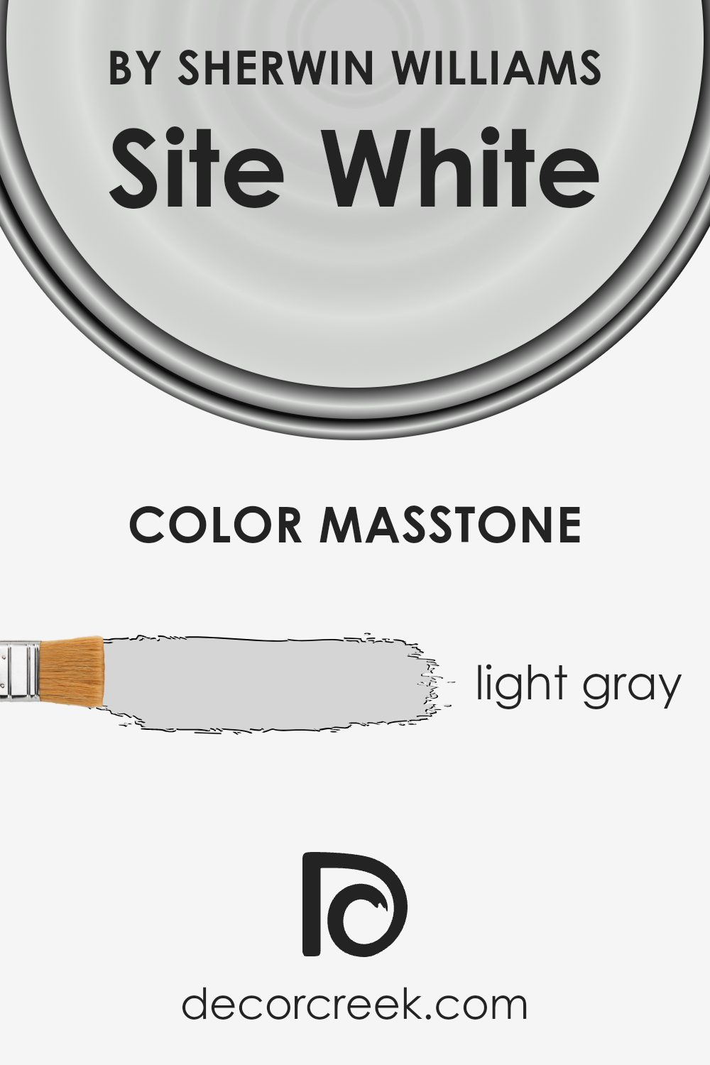
What is the Masstone of the Site White SW 7070 by Sherwin Williams?
Site White (SW 7070) by Sherwin Williams is a soft light gray color. Its masstone, which is light gray (#D5D5D5), gives it a soft and neutral appearance that works well in various home settings. This shade of gray is versatile and can make a room feel open and airy. Because it reflects light well, it can help brighten up spaces without overwhelming them with color.
In living rooms or bedrooms, Site White offers a calm and clean backdrop, allowing furniture and decor to stand out. It pairs well with both bold and subtle colors, making it a great choice for walls if you want flexibility in decorating.
In kitchens, it can create a crisp and modern look, especially when paired with stainless steel appliances or white cabinets. Overall, its gentle tone can give any room a modern and fresh feel, enhancing the space without being too bold.
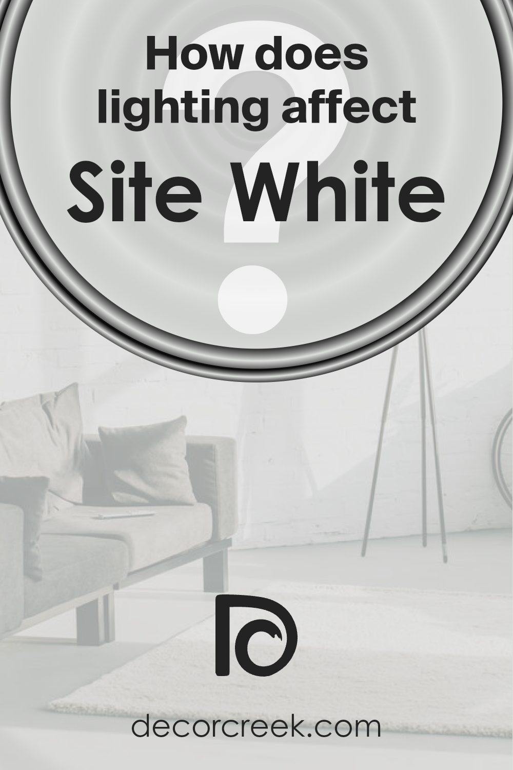
How Does Lighting Affect Site White SW 7070 by Sherwin Williams?
Lighting plays a crucial role in how we perceive colors. The color “Site White” (SW 7070) by Sherwin Williams can look quite different depending on the type of light and its intensity. This color is a soft neutral with subtle undertones that can change based on the lighting conditions.
In natural light, Site White tends to show its true hue. In north-facing rooms, where the light is cooler and indirect, this color might appear slightly grayish or even pale blue because of the cooler light. The lack of direct sunlight means it remains subdued and does not become overly bright or warm.
In south-facing rooms, which receive bright and direct sunlight most of the day, Site White can appear warmer. The abundant sunlight enhances the warmer undertones, making the space feel bright and inviting. This natural light can highlight any creamy or soft warm tints within the color.
East-facing rooms receive bright, warm light in the morning and cooler light in the afternoon. In these rooms, Site White can appear warmer in the mornings and take on cooler tones as the day progresses. This change during the day can make the room feel dynamic and interesting.
In contrast, west-facing rooms benefit from warm, golden light in the late afternoon and early evening. In these spaces, Site White can feel richly warm and comforting later in the day. The light can create striking contrasts and highlights, showing off the color beautifully.
Under artificial lighting, which varies widely in warmth—from the coolness of fluorescent lighting to the warmth of incandescent bulbs—Site White’s appearance can also shift. Cool artificial light can accentuate its cooler tones, making it appear more blue, while warm artificial light can bring out its creamier side.
To get the best results with Site White, consider the lighting situation and test the color at different times of the day in your specific room.
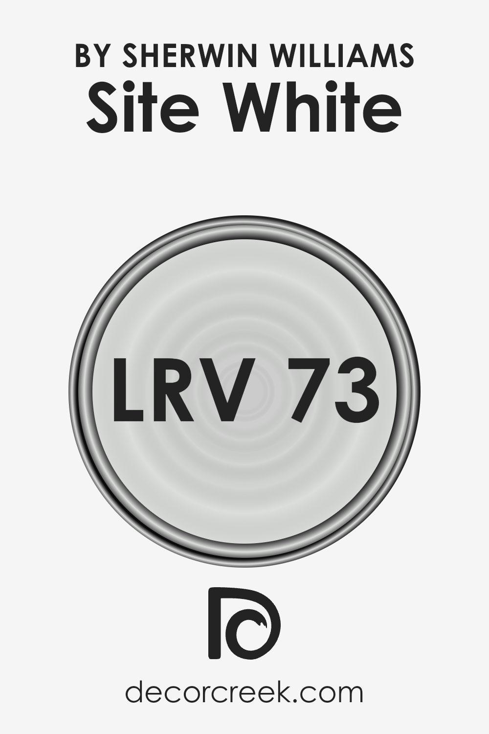
What is the LRV of Site White SW 7070 by Sherwin Williams?
Light Reflectance Value (LRV) is a measurement used in the paint industry to determine how much light a color reflects and how much it absorbs. It is measured on a scale from 0 to 100, where 0 indicates absolute black (which absorbs all light) and 100 represents pure white (which reflects all light). LRV is important for understanding how a paint color will look in real life.
A higher LRV means that the color will reflect more light, making it appear lighter and more open in a space. Conversely, a lower LRV will make a color appear darker because it absorbs more light.
Site White has an LRV of 72.956, meaning it falls on the higher end of the LRV scale. This indicates that it is a light color that will reflect a substantial amount of light. As a result, when applied on walls, it will make rooms feel brighter and more expansive. Rooms with little natural light will benefit from this color because it can help improve the overall brightness of the space.
For spaces that are already well-lit, Site White will enhance the light and maintain an airy feel. This makes it a versatile choice for various design needs, as it pairs well with different lighting conditions and can adapt to diverse spaces.
Coordinating Colors of Site White SW 7070 by Sherwin Williams
Coordinating colors are shades that complement each other, creating a harmonious and balanced look when used together in a space. These colors work well together because they share certain undertones, making them visually pleasing when combined in a room’s design.
For example, Site White is a versatile and neutral shade often used as a base color, allowing other colors to pop without clashing. It serves as a subtle backdrop that highlights the beauty of its coordinating colors without overwhelming the senses.
Pure White is a clean and crisp white that adds brightness and clarity to any space. It pairs beautifully with Site White by providing a sharp, refreshing contrast that enhances the overall look. Cadet is a muted blue with gray undertones that brings a cool and calming vibe, perfect for creating a peaceful atmosphere. It works well with Site White, adding depth without being too bold. Gray Screen, on the other hand, is a soft gray that offers a modern edge.
It complements Site White by adding a touch of sophistication and balance. Together, these colors create a cohesive and inviting environment, whether used in a bedroom, living room, or any space where a calm and modern feel is desired.
You can see recommended paint colors below:
- SW 7005 Pure White
- SW 9143 Cadet
- SW 7071 Gray Screen

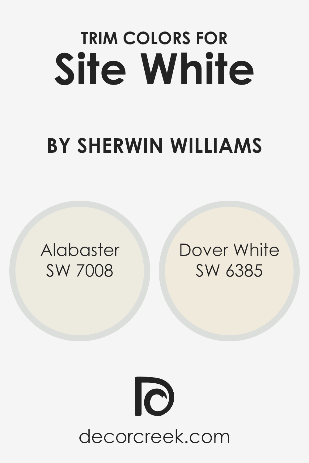
What are the Trim colors of Site White SW 7070 by Sherwin Williams?
Trim colors are choices used for painting the edges and minor details of walls, doors, and windows in a room. These colors are significant because they can accentuate the main color of a room, providing contrast and depth, and highlighting architectural details. When used with the base color Site White SW 7070 by Sherwin Williams, they enhance the soft, clean look and create a more polished and cohesive feel throughout the space.
Alabaster SW 7008 is a warm white with a slight hint of cream that adds a gentle brightness to any room without being too stark. It pairs well with Site White by complementing its light, subtle tone, providing a cozy and inviting ambiance.
On the other hand, Dover White SW 6385 is a creamy, soft white that exudes warmth and comfort. It has a slightly richer tone compared to Alabaster, bringing a bit more softness and warmth, which works beautifully with the neutral yet soothing Site White as the primary wall color.
Using Dover White for trim can make the room feel welcoming and pleasant, perfect for creating cozy living spaces. Overall, these trim colors play a crucial role in enhancing the aesthetic appeal of Site White SW 7070, offering a well-rounded and harmonious look.
You can see recommended paint colors below:
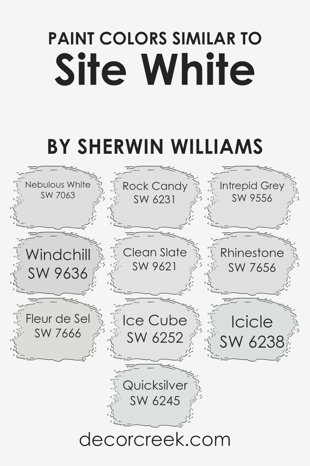
Colors Similar to Site White SW 7070 by Sherwin Williams
Similar colors are important in design because they help create a harmonious look, making spaces feel cohesive and balanced. When decorating with similar hues, you often achieve a sense of unity and flow throughout your home. For example, colors like Nebulous White and Windchill complement each other by offering a light and airy vibe, where Nebulous White has a slightly warmer tint while Windchill adds a crisp, cool undertone.
Fleur de Sel and Quicksilver provide subtle contrasts; Fleur de Sel is a soft gray with a hint of warmth, whereas Quicksilver brings in a gentle touch of blue-gray.
Rock Candy and Clean Slate offer gentle variations; Rock Candy is a delicate icy gray, while Clean Slate introduces a slightly deeper gray tint, making it a great choice for grounding a room’s color scheme. Ice Cube and Intrepid Grey work beautifully to add dimension; Ice Cube is a soft, pale gray and Intrepid Grey provides a darker, bolder contrast.
Finally, Rhinestone and Icicle offer light and fresh choices; Rhinestone has a very slight blue tint that adds a calm feeling, while Icicle is cooler and crisp, providing a fresh accent in any room. By using these colors, you create a peaceful, coherent environment in your space.You can see recommended paint colors below:
- SW 7063 Nebulous White
- SW 9636 Windchill
- SW 7666 Fleur de Sel
- SW 6245 Quicksilver
- SW 6231 Rock Candy
- SW 9621 Clean Slate
- SW 6252 Ice Cube
- SW 9556 Intrepid Grey
- SW 7656 Rhinestone
- SW 6238 Icicle
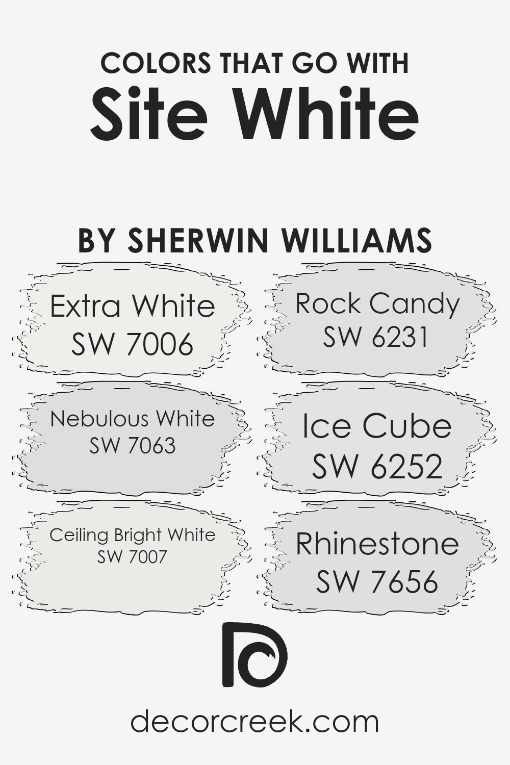
Colors that Go With Site White SW 7070 by Sherwin Williams
Choosing colors that go well with Site White SW 7070 by Sherwin Williams is important because it helps create a harmonious look in a room. Site White is a neutral shade that serves as a great backdrop, allowing other colors to stand out while maintaining a soft, cohesive feel. Using complementary colors can make a space feel more inviting and comfortable.
For example, SW 7006 Extra White is a crisp, clean white that pairs beautifully with Site White, adding brightness and clarity to a room. Likewise, SW 7063 Nebulous White, with its gentle gray undertones, adds depth and richness without overpowering the calm vibe of Site White.
SW 7007 Ceiling Bright White offers a pristine look with slightly warmer undertones, making it great for ceilings and trims to pair with Site White’s subtlety. SW 6231 Rock Candy, with its delicate hint of blue, introduces a refreshing note that complements the neutral warmth of Site White. Meanwhile, SW 6252 Ice Cube, a cool blue-gray, provides a soothing contrast that adds interest without disrupting the balance.
Finally, SW 7656 Rhinestone, with its silvery undertones, works well to introduce an elegant touch, creating a polished yet understated appearance when used alongside Site White. Together, these colors create a pleasant and inviting atmosphere.
You can see recommended paint colors below:
- SW 7006 Extra White
- SW 7063 Nebulous White
- SW 7007 Ceiling Bright White
- SW 6231 Rock Candy
- SW 6252 Ice Cube
- SW 7656 Rhinestone
How to Use Site White SW 7070 by Sherwin Williams In Your Home?
Site White SW 7070 by Sherwin Williams is a versatile paint color that’s well-suited for many areas in your home. It’s a soft, warm white that works well in various lighting conditions.
If you’re looking to refresh your living room, dining area, or bedroom, Site White can provide a crisp, clean backdrop that complements a range of decor styles, from modern to traditional. In smaller rooms or spaces with limited natural light, this color can help make the area appear larger and more open.
It’s also a great choice for ceilings to create a seamless look with your walls.
You can pair it with bolder colors or accent pieces for contrast, or keep everything in similar tones for a monochromatic look.
Site White’s subtle warmth makes it a cozy option for kitchens and bathrooms as well. It’s a timeless color that can make your home feel bright and inviting.
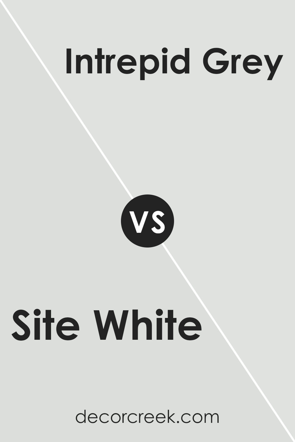
Site White SW 7070 by Sherwin Williams vs Intrepid Grey SW 9556 by Sherwin Williams
Site White (SW 7070) by Sherwin Williams is a soft and versatile white with a hint of gray, giving spaces a clean and crisp look. It brightens areas without feeling too stark or cold, making it a great choice for a neutral backdrop. This color works well in both modern and traditional settings, allowing other design elements to stand out.
On the other hand, Intrepid Grey (SW 9556) is a medium-dark gray with a cooler undertone. It provides a more dramatic and grounded feel compared to Site White. This shade of gray is perfect for adding depth and can be used to create a cozy or sophisticated atmosphere in a room.
Both colors complement a variety of decor styles, but Site White is better for brightening and enlarging spaces, while Intrepid Grey adds warmth and richness. Pairing them can create a balanced look, with Site White lightening up Intrepid Grey’s bolder presence.
You can see recommended paint color below:
Site White SW 7070 by Sherwin Williams vs Rock Candy SW 6231 by Sherwin Williams
Site White (SW 7070) and Rock Candy (SW 6231) by Sherwin Williams are both soft, gentle colors that can brighten up a space. Site White is a warm, off-white shade. It offers a cozy and inviting feel, making it a versatile choice for walls or ceilings. The warmth in Site White makes it suitable for living rooms, bedrooms, or dining areas, where you want a comfortable atmosphere.
On the other hand, Rock Candy is a cool, very light gray with blue undertones. It provides a fresh, crisp look, which is great for modern or coastal-themed rooms.
Rock Candy works well in spaces where you want a sense of openness, like bathrooms or kitchens. While Site White adds warmth, Rock Candy brings a touch of coolness, making it ideal for spaces needing a subtle contrast. Both colors are neutral, allowing them to blend seamlessly with various decor styles and accents.
You can see recommended paint color below:
Site White SW 7070 by Sherwin Williams vs Fleur de Sel SW 7666 by Sherwin Williams
Site White (SW 7070) and Fleur de Sel (SW 7666) by Sherwin Williams are both neutral paint colors, but they have different undertones and appearances. Site White is a soft and clean white with subtle warmth, making it a versatile choice for various spaces. It provides a fresh backdrop that suits both modern and traditional styles, making rooms feel open and airy.
Fleur de Sel, on the other hand, is a light gray with a hint of green. This gives it a cooler feel compared to Site White. It brings a slightly more sophisticated touch to a space and works well in rooms where you want a muted yet interesting backdrop.
While both colors offer neutrality, Site White leans towards a warmer spectrum, and Fleur de Sel provides a cooler, more contemporary look. Both can enhance a space without overpowering it, each offering a distinct but subtle charm.
You can see recommended paint color below:
Site White SW 7070 by Sherwin Williams vs Rhinestone SW 7656 by Sherwin Williams
Site White SW 7070 and Rhinestone SW 7656 by Sherwin Williams are both subtle, neutral shades, but they each have unique characteristics. Site White is a warm white with a hint of gray, which makes it feel cozy without being too stark or cold. It’s versatile and works well in living rooms, kitchens, and bedrooms, pairing nicely with various color palettes.
On the other hand, Rhinestone is a cool, clean white with a slight blue undertone. This gives Rhinestone a crisp, modern feel, making it perfect for spaces where you want a fresh, bright look, like bathrooms or contemporary kitchens.
While Site White adds warmth and comfort, Rhinestone offers a refreshing and airy vibe. Both colors are great for different settings and can serve different moods, depending on the overall design and purpose of a room.
You can see recommended paint color below:
Site White SW 7070 by Sherwin Williams vs Ice Cube SW 6252 by Sherwin Williams
Site White SW 7070 and Ice Cube SW 6252 by Sherwin Williams are two popular paint colors that offer distinct looks. Site White is a soft, neutral color with a warm undertone, making it versatile and easy to pair with other colors in a room.
It works well in spaces where you want a calm and cozy feel. On the other hand, Ice Cube is a cool white with hints of gray, creating a crisp and modern look. This color is great for rooms with lots of natural light, as it can enhance a fresh and airy atmosphere. While both are shades of white, Site White leans towards a warmer spectrum, and Ice Cube offers a cooler tone.
Choosing between them often depends on the mood you want to set and the existing lighting in your space. Both colors are elegant choices for any room.
You can see recommended paint color below:
Site White SW 7070 by Sherwin Williams vs Clean Slate SW 9621 by Sherwin Williams
Site White SW 7070 by Sherwin Williams is a soft, neutral white with subtle gray undertones. It is a versatile color that works well in both traditional and modern settings, lending a clean and fresh look to any space. Site White can brighten up a room without being too stark or cold.
On the other hand, Clean Slate SW 9621 is a more intense hue with rich blue-gray tones. While Site White is gentle and unobtrusive, Clean Slate adds more depth and personality to walls. It provides a bolder, more dramatic look that can create a cozy, intimate atmosphere.
In summary, if you are looking for a light, airy feel, Site White is an excellent choice. For added character and a moodier ambiance, Clean Slate is a great option. Both colors offer unique advantages, so your choice will depend on the mood and style you want to achieve.
You can see recommended paint color below:
- SW 9621 Clean Slate
Site White SW 7070 by Sherwin Williams vs Nebulous White SW 7063 by Sherwin Williams
Site White SW 7070 and Nebulous White SW 7063 are two popular paint colors by Sherwin Williams. Site White SW 7070 is a soft, clean white with a slight gray undertone, making it a versatile choice for a variety of spaces. It offers a crisp, modern look without feeling too stark or cold. It reflects light well, enhancing the brightness of a room.
On the other hand, Nebulous White SW 7063 is a subtle off-white that leans more into gray, giving it a slightly warmer and darker feel compared to Site White. It is ideal for creating a cozy and inviting atmosphere while maintaining a neutral backdrop. This color works well in spaces where a pure white might feel too clinical but a darker color is not desired.
Both colors offer a neutral base but differ in their undertones and lightness, allowing homeowners to choose based on the mood they want to set.
You can see recommended paint color below:
Site White SW 7070 by Sherwin Williams vs Quicksilver SW 6245 by Sherwin Williams
Site White SW 7070 and Quicksilver SW 6245 by Sherwin Williams are two popular paint colors with distinct characteristics. Site White is a very light gray with subtle warmth, making it a versatile choice for spaces that need a neutral backdrop. It works well in both modern and traditional settings, providing a clean and airy feel without appearing too stark or cold.
Quicksilver, on the other hand, is a soft, cool gray with bluish undertones. This color can bring a sense of calmness and freshness to a room, making it perfect for bedrooms or bathrooms where a restful atmosphere is desired.
While Site White leans warmer and blends effortlessly with various decor styles, Quicksilver introduces a gentle touch of color that can complement coastal or contemporary designs. Together, these two colors can be used to create a balanced and visually appealing contrast in a home.
You can see recommended paint color below:
Site White SW 7070 by Sherwin Williams vs Windchill SW 9636 by Sherwin Williams
Site White and Windchill are two colors by Sherwin Williams that offer distinct vibes. Site White is a neutral, soft white with a hint of warmth. It works well as a versatile backdrop, making it suitable for various rooms and styles. It feels calm and inviting, ideal for creating a comfortable space.
Windchill, on the other hand, is a light gray with cool undertones. It has a more modern feel and can add a slight touch of sophistication to a room. Windchill is great for spaces where a subtle, clean look is desired without the starkness of pure white.
When comparing them, Site White feels more like a gentle warm hug, while Windchill is crisp and refreshing. Both are subtle, but the undertones make a big difference. Site White is cozier, whereas Windchill has a cooler, more contemporary edge. Choosing between them depends on whether you want warmth or a sleek, modern environment.
You can see recommended paint color below:
- SW 9636 Windchill

Site White SW 7070 by Sherwin Williams vs Icicle SW 6238 by Sherwin Williams
Site White (SW 7070) and Icicle (SW 6238) are both soft, neutral colors by Sherwin Williams, but they have different undertones and vibes. Site White is a warm white with a hint of beige, giving it a cozy and welcoming feel.
It’s versatile and might work well in areas where you want warmth without overpowering other colors. Icicle, on the other hand, is a cooler, light gray with blue undertones. It can give a space a crisp and airy feeling. While Site White adds warmth, Icicle provides a fresh contrast.
When placed together, Site White might soften the room, making it feel snug, whereas Icicle can add a touch of cool elegance. Depending on your lighting and surrounding decor, one might bring out the subtle tones of the other, making either a great choice depending on the desired atmosphere.
You can see recommended paint color below:

In conclusion, SW 7070 Site White by Sherwin Williams is a fantastic paint choice because it’s simple and clean. It works really well in different rooms at home. Whether you paint your bedroom, living room, or kitchen, it makes everything look fresh and bright. This color is like a blank canvas, which means you can add different colors around it easily.
You can add colorful pillows, curtains, or decorations, and they will all look great next to this shade.
One of the best things about Site White is how it makes a room look bigger by spreading light everywhere. It doesn’t make your room look too busy, so it’s great if you want a neat and tidy look. Even if the room is small, using this color can help make it feel larger than it actually is. It’s a popular choice because it works with almost anything, and you don’t have to worry about it going out of style.
If you want a calm and inviting home, Site White is perfect. It’s like a friend who gets along with everyone! If you’re picking paint for your home this one is definitely a great pick. It’s simple, pretty, and friendly to all the other colors around it.
So, you can have fun decorating, and feel happy with how your home looks.

Ever wished paint sampling was as easy as sticking a sticker? Guess what? Now it is! Discover Samplize's unique Peel & Stick samples.
Get paint samples

