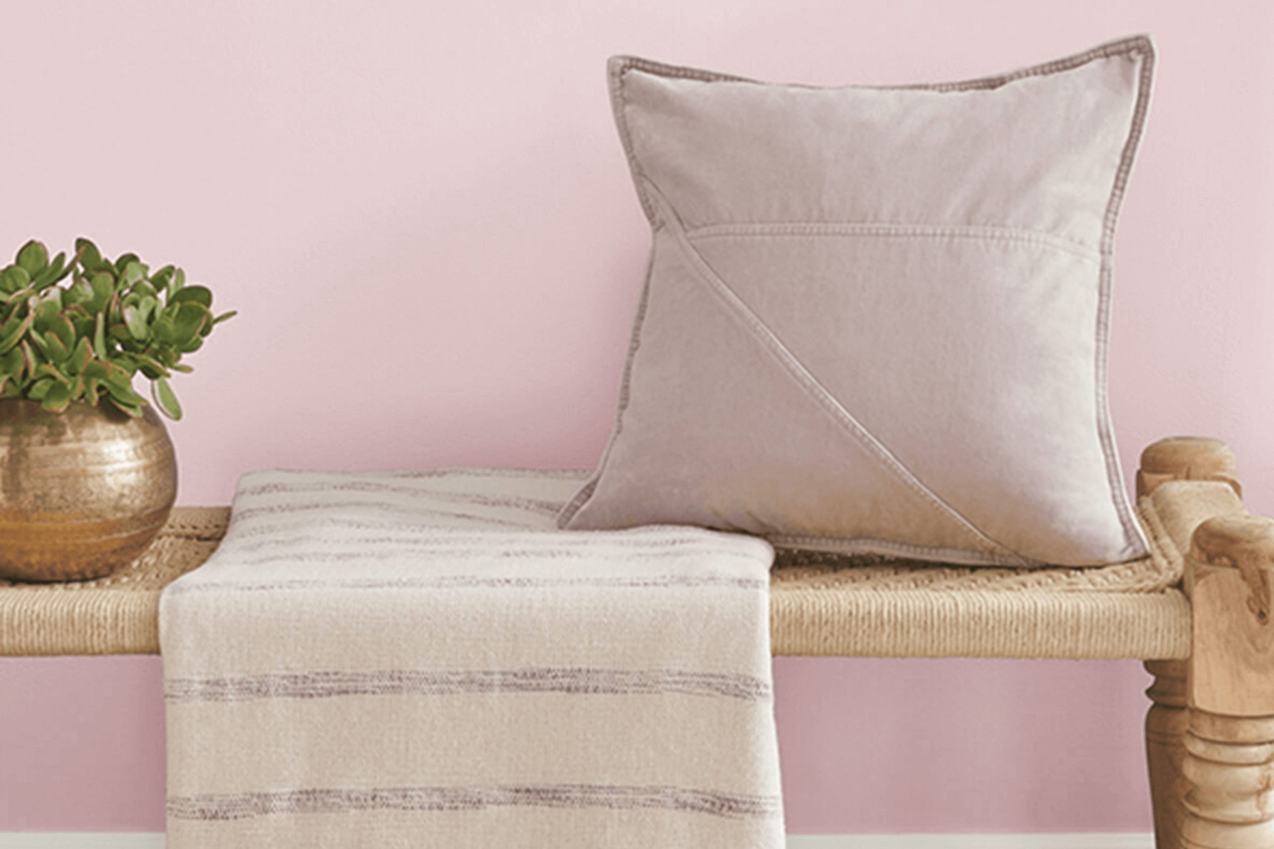
Choosing the right paint color for your home can feel like a huge decision. Let me introduce you to SW 6295 Demure by Sherwin Williams. If you’re searching for a hue that lends a subtle elegance without overpowering a room , Demure might be what you need. This color has a soft, understated charm that fills your room with a calming warmth, making it a great choice for bedrooms or other areas where you want a peaceful atmosphere.
At first glance, Demure appears as a gentle blend of grey with hints of mauve, creating a unique neutral that works wonderfully in various lighting conditions. Whether your home gets a lot of natural light or relies on softer, artificial lights, this color adjusts beautifully, providing a consistently inviting vibe.
It’s also incredibly adaptable, pairing well with a wide range of decor styles and color palettes. From contemporary to traditional, it’s a color that doesn’t clash but instead complements. If you’re looking to refresh an area or paint a new one, Demure offers a blend of modern refinement and classic appeal.
So, whether you are revamping your living room or setting up a quiet home office, Demure can be the backdrop that lets your personal style shine.
What Color Is Demure SW 6295 by Sherwin Williams?
Demure by Sherwin Williams is a soft, muted pink that gives off a gentle warmth, making it perfect for creating a cozy and inviting atmosphere in any room. The subtlety of this color allows it to blend smoothly with various decors, adding just a hint of color without feeling too intense.
This shade works exceptionally well in interior styles that focus on comfort and softness, such as contemporary, Scandinavian, or shabby chic. It’s particularly effective in bedrooms, living rooms, and nurseries where its gentle hue helps support a calm and welcoming environment.
When pairing Demure with materials and textures, consider those that complement its soft nature. Natural wood, whether light or dark, can balance the sweetness of the pink with earthy tones. Linen and cotton fabrics in white or light pastel colors add to the airy feel, while incorporating elements of brushed brass or gold can introduce a subtle touch of glamour. Soft, plush textures like velvet or faux fur also work beautifully with this color, adding a rich feel to the decor.
Overall, Demure is a flexible color that brings warmth and softness, working well with many materials and supporting a wide range of interior styles with its understated charm.
Is Demure SW 6295 by Sherwin Williams Warm or Cool color?
Demure SW 6295 by Sherwin Williams is a soft and subtle shade of gray that brings a gentle and calm atmosphere to any room. This color has a hint of warmth, making it flexible and easy to match with various decor styles and furniture.
It’s perfect for those looking to create a peaceful and welcoming room in their home. The color is not too bold, making it ideal for larger areas like living rooms or bedrooms, where you want a soothing feel without feeling too strong compared to darker tones.
It also works well in smaller rooms, like bathrooms or hallways, because it can make them appear larger and more open. Demure SW 6295 pairs well with both light and dark colors, allowing for freedom in design choices. Overall, this shade is great for anyone who wants a pleasant and understated backdrop in their home.
Undertones of Demure SW 6295 by Sherwin Williams
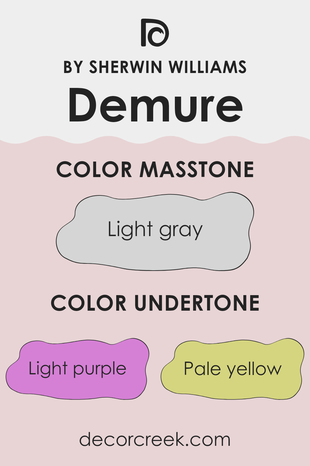
Demure SW 6295 is a flexible color with a complex mix of undertones that can subtly influence how the hue is perceived depending on the lighting and surrounding colors. The undertones in this paint include light purple, pale yellow, light blue, pale pink, lilac, mint, and grey. Each of these undertones contributes to how the color appears in different environments and can shift its overall feel.
Undertones are subtle colors that sit beneath the surface of the main color. They play an important role in how we perceive a color; they can make it appear cooler or warmer and can either blend with or contrast against other elements in a room. For example, a color with a grey undertone may look more muted and subdued, which works well for creating a calm atmosphere. On the other hand, a color with a mint undertone can bring in a fresher and more lively feel.
For Demure SW 6295, these undertones mean that the color can look different in each room. Under bright sunlight, the pale yellow or light blue may become more noticeable, giving the walls a cheerful glow. In softer light, the light purple or lilac undertones may stand out, adding a gentle, soothing vibe to the room. The varied undertones make this color highly adaptable and suitable for many different rooms and styles, allowing it to complement a wide range of decor choices and personal tastes beautifully.
What is the Masstone of the Demure SW 6295 by Sherwin Williams?
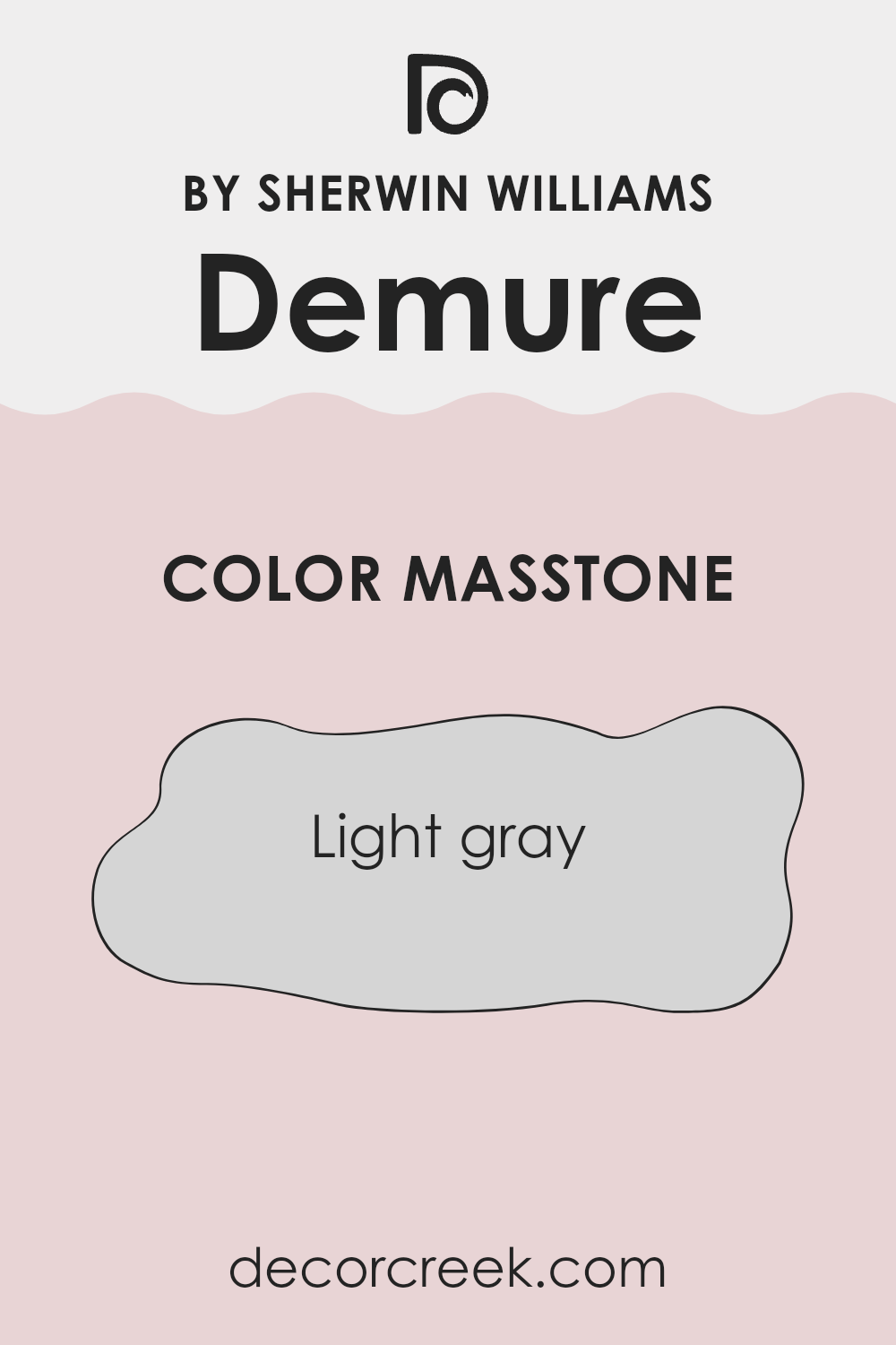
Demure SW 6295 by Sherwin Williams has a masstone of light gray, specifically color code #D5D5D5. This shade of gray is flexible and subtle, making it a popular choice for various rooms in a home. Its light tone helps make rooms appear brighter and more open, which is especially helpful in smaller or darker areas that could benefit from a sense of added openness.
Additionally, light gray walls provide a neutral backdrop that works well with many different decor styles and color palettes. Whether paired with vibrant colors for a lively contrast or matched with other neutrals for a more muted look, this color remains easy to work with.
It also performs well in high-traffic areas of the home, such as living rooms or hallways, as it can disguise minor wear and smudges better than pure white while still keeping a clean and finished appearance.
How Does Lighting Affect Demure SW 6295 by Sherwin Williams?
Lighting plays a crucial role in how we perceive colors, as it can significantly alter their appearance. This interaction is important to consider when choosing paint colors for different rooms. The hue known as Demure by Sherwin Williams is an excellent example of how lighting conditions can influence color perception.
In artificial light, such as that from incandescent bulbs, Demure tends to appear warmer and slightly more muted. LED or fluorescent lighting, which can be cooler, might make the color look sharper and a bit more vibrant. These variations occur because artificial lights can have different color temperatures, influencing how a color is displayed on walls and other surfaces.
Natural light brings its own effects. In rooms facing north, which generally receive less direct sunlight, Demure may appear slightly cooler and more shadowed, giving it a more subtle and gentle look. This can be ideal for creating a calm and peaceful atmosphere in areas like bedrooms or study zones.
In south-facing rooms, where light is abundant and often warmer, Demure can reveal its warmer undertones, making the room feel cozy and welcoming. The ample sunlight can make the color look richer and more intense during the day.
East-facing rooms receive strong light in the morning, which can make Demure look bright and lively when the sun rises. As the day progresses and the natural light diminishes, the color may become softer and more understated, offering a changing mood throughout the day.
West-facing rooms experience the opposite effect, with softer lighting in the morning that shifts to brighter and warmer tones by the evening. This changing light can make Demure shift from a gentle presence in the morning to a more noticeable and expressive color later in the day.
Overall, the effect of lighting on colors like Demure highlights the importance of considering both the room’s orientation and the type of light it receives when deciding on paint colors. This thoughtful approach helps ensure the chosen hue looks beautiful under different lighting conditions.
decorcreek.com
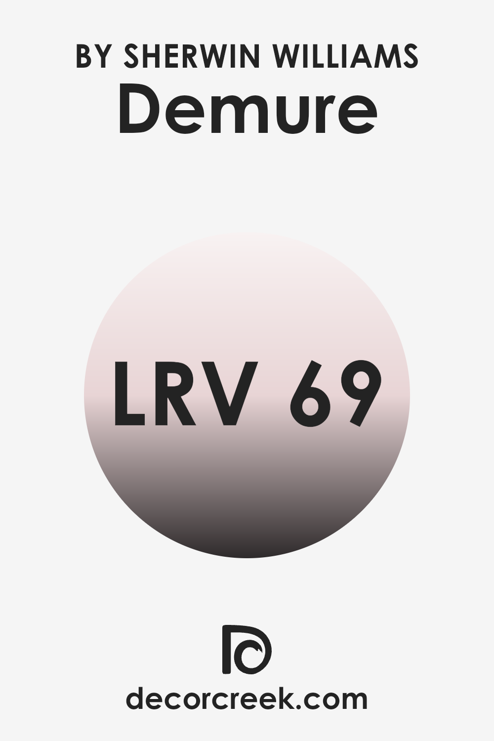
What is the LRV of Demure SW 6295 by Sherwin Williams?
LRV stands for Light Reflectance Value, which is a measure that indicates how much light a paint color reflects or absorbs when applied to a surface. It’s basically a percentage scale where a higher number means the color reflects more light, making it appear lighter, while a lower number means it reflects less light, making it look darker.
This measurement helps in selecting colors for rooms based on how bright or dim you want the room to look. Lighter colors can make small rooms feel larger and more open, while darker colors can add a sense of depth or coziness to larger rooms.
The LRV of the color Demure by Sherwin Williams is 68.9, which means it’s fairly light. This lightness allows it to reflect a good amount of light, making it a suitable option for rooms that you want to keep bright and airy. This would be an excellent choice for a living room or bedroom that doesn’t receive a lot of natural sunlight. Since it has a higher LRV, it won’t absorb a lot of light, thus not making the room feel smaller or cramped. It’s also a good choice for covering larger areas without the risk of the color feeling too strong.
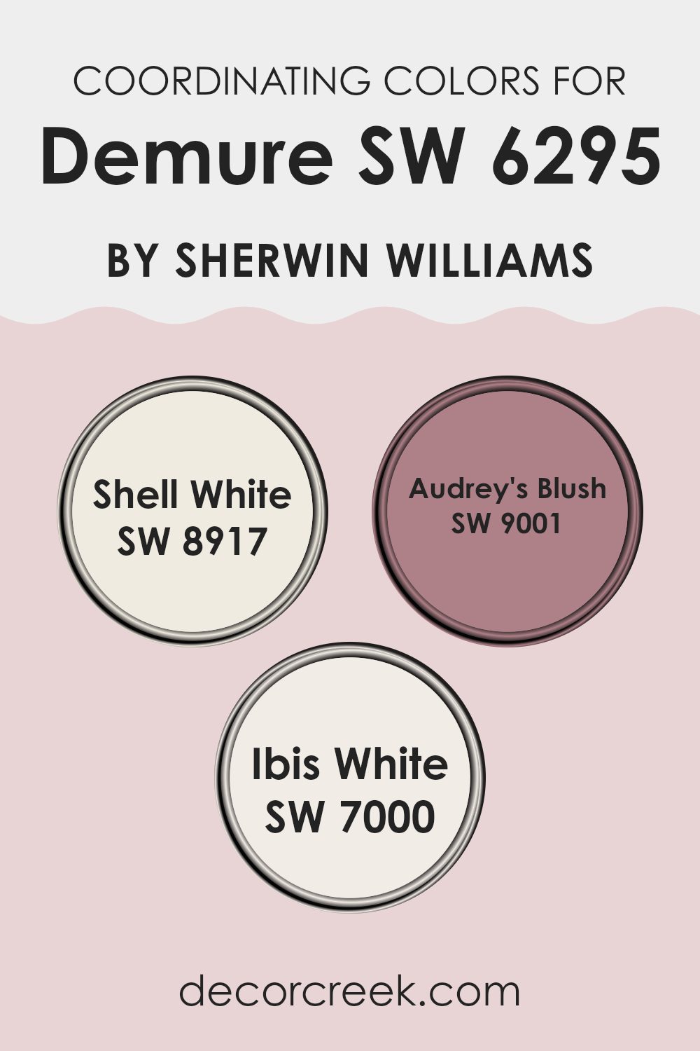
Coordinating Colors of Demure SW 6295 by Sherwin Williams
Coordinating colors are complementary shades that work well together to create a harmonious look in a room. When you choose coordinating colors for a color like Demure, these are typically selected to either contrast with or support the primary color, depending on the desired effect. For instance, colors like Shell White, Audrey’s Blush, and Ibis White each play a unique role when paired with a base color like Demure.
Shell White is a clean and subtle off-white that provides a neutral backdrop, allowing more vibrant colors to stand out while offering a sense of calmness and simplicity in your interior. It works well in applications where you want other colors to take center stage but still need a balanced undertone to keep everything visually grounded.
Audrey’s Blush is a softer, delicate pink with a subtle charm that offers a gentle contrast to more muted tones, adding a touch of warmth and personality into rooms without feeling too strong. Meanwhile, Ibis White has a crisp and fresh appeal and is brighter than Shell White. It helps bring in light and clarity to rooms that need extra brightness, working well in areas that benefit from a clearer white to balance darker or richer colors. Each of these shades supports and complements Demure by creating a cohesive color scheme that can improve the overall look of any room.
You can see recommended paint colors below:
- SW 8917 Shell White
- SW 9001 Audrey’s Blush
- SW 7000 Ibis White
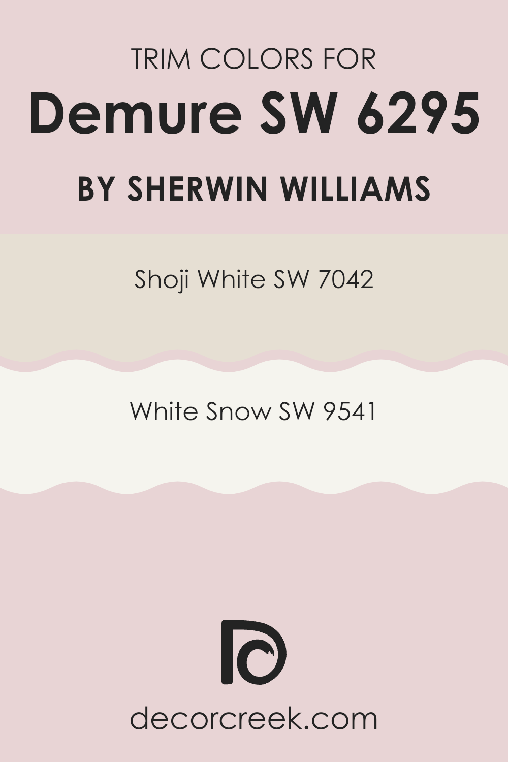
What are the Trim colors of Demure SW 6295 by Sherwin Williams?
Trim colors are essential accents in interior design that outline and define architectural details like door frames, window frames, and baseboards, improving the overall aesthetic of a room. When paired with a main wall color such as Demure SW 6295 by Sherwin Williams, which is a gentle, subtle hue, choosing the right trim color can significantly influence the room’s personality and cohesiveness. The right trim colors not only highlight the architecture of the room but also create a pleasing contrast that can make the wall colors stand out more effectively.
For example, using Shoji White SW 7042 as a trim color offers a warm, soft white that gently complements the softness of Demure without feeling too heavy, providing a light and airy feel to the room.
On the other hand, White Snow SW 9541 presents a crisp, brighter white that brings a fresh and clean contrast, making the soft tones of Demure stand out beautifully and giving the room a more pronounced, neatly defined look. By selecting either Shoji White or White Snow as trim colors, you improve the visual appeal of the room while maintaining a harmonious atmosphere.
You can see recommended paint colors below:
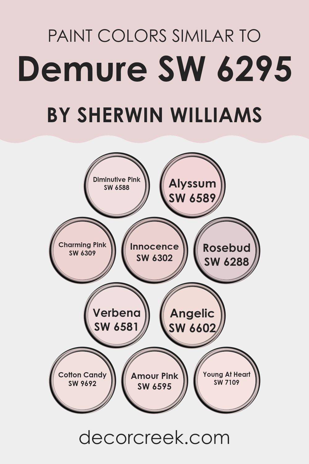
Colors Similar to Demure SW 6295 by Sherwin Williams
Similar colors play a critical role in creating a cohesive and harmonious visual experience, particularly in interior design and painting. They work by being close enough on the color wheel to create a certain uniformity without becoming monotonous, allowing each color to complement and subtly contrast with the others. For instance, Diminutive Pink is a gentle hue, ideal for softly brightening a room without feeling too strong, while Alyssum, with its hint of lilac, adds a touch of mild freshness.
Charming Pink offers a slightly deeper tone, which can bring a warm and inviting feel to rooms, pairing beautifully with Innocence, a lighter, soothing shade that provides a sense of calm. Rosebud moves into the spectrum with a more pronounced pink that can add a vibrant touch without straying too far from the core color theme.
Verbena introduces a cheerful, slightly more vivid alternative, energizing the palette. Angelic gives off a subtle, almost ethereal feel, excellent for creating a soft, clean look. Cotton Candy adds a playful, sweet character, ideal for areas needing a spark of light-heartedness. Amour Pink is noticeably richer, great for highlighting features without clashing with softer adjacent colors. Finally, Young At Heart has an uplifting, youthful vibe that works well in dynamic, creative rooms. Together, these colors support each other, improving the overall aesthetic while offering individual charm and personality.
You can see recommended paint colors below:
- SW 6588 Diminutive Pink
- SW 6589 Alyssum
- SW 6309 Charming Pink
- SW 6302 Innocence
- SW 6288 Rosebud
- SW 6581 Verbena
- SW 6602 Angelic
- SW 9692 Cotton Candy
- SW 6595 Amour Pink
- SW 7109 Young At Heart
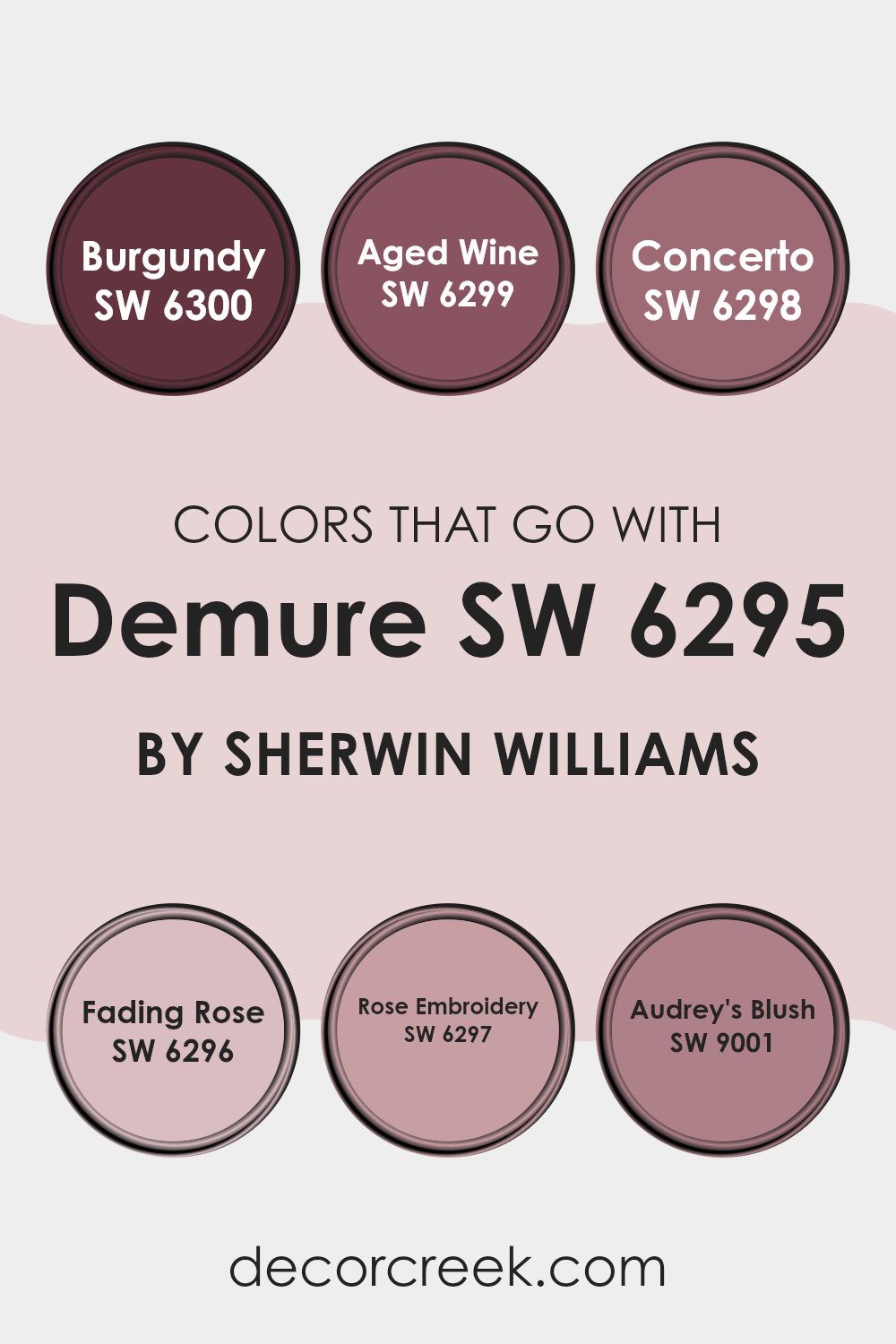
Colors that Go With Demure SW 6295 by Sherwin Williams
Choosing the right colors to complement Demure SW 6295 by Sherwin Williams is essential for creating a harmonious and visually appealing room. These complementary colors, including SW 6300 – Burgundy, SW 6299 – Aged Wine, SW 6298 – Concerto, SW 6296 – Fading Rose, SW 6297 – Rose Embroidery, and SW 9001 – Audrey’s Blush, work together to improve the overall look and mood of a room. When used alongside Demure SW 6295, these colors add depth and variety, allowing for a more dynamic and inviting environment. The selection and combination of these colors affect the feeling of the room, shaping how people perceive and interact with it.
Each of these colors has its own charm. SW 6300 – Burgundy is a deep, rich red that provides a strong foundation in any color scheme, offering a bold backdrop or striking focal point. SW 6299 – Aged Wine has a mature, muted red tone that brings a subtle, vintage feel, perfect for creating a cozy nook.
SW 6298 – Concerto, with its deeper purple hue, adds a sense of mystery and interest, ideal for accent walls or decorative elements. SW 6296 – Fading Rose is a lighter, dusty pink that gives off softness and warmth, great for balancing darker shades or softening a room. SW 6297 – Rose Embroidery is slightly brighter with a hint of floral inspiration, adding a fresh and lively vibe to the setting. Finally, SW 9001 – Audrey’s Blush offers a gentle pink that feels youthful and fresh, perfect for lighter rooms or adding a touch of sweetness. Together, these colors create a palette that supports a wide range of design themes, from bold and dramatic to soft and subtle, while effectively complementing the base tone of Demure SW 6295.
You can see recommended paint colors below:
- SW 6300 Burgundy
- SW 6299 Aged Wine
- SW 6298 Concerto
- SW 6296 Fading Rose
- SW 6297 Rose Embroidery
- SW 9001 Audrey’s Blush
How to Use Demure SW 6295 by Sherwin Williams In Your Home?
Demure by Sherwin Williams is a gentle blush pink paint that offers a soft and inviting touch to any room. Ideal for creating a cozy and welcoming atmosphere, this color works wonderfully in bedrooms to promote a calm feeling. You can also consider it for living rooms or a reading nook where its soothing presence can make relaxation easy.
Pairing Demure with neutral tones like whites and beiges can create a subtle yet inviting palette. For a fresh look, coordinate it with light grays or muted greens, which complement its warmth perfectly. If you’re looking to add a hint of romance without going too bold, this color is perfect for a feature wall behind a bed or in a dining area.
Applying Demure on furniture or in smaller details like trim or cabinetry provides an understated, refined touch without feeling too strong. Its adaptability makes it a fantastic choice for anyone looking to refresh their home with a gentle pop of color.
Demure SW 6295 by Sherwin Williams vs Diminutive Pink SW 6588 by Sherwin Williams
“Demure” by Sherwin Williams is a soft, muted pink that has a calm and gentle presence, making it perfect for creating a relaxing atmosphere in rooms like bedrooms or living areas. Its subtle undertones provide a warm, inviting feel without overpowering the room.
On the other hand, “Diminutive Pink” is a brighter and more youthful pink. It’s lighter than Demure and brings a fresh, cheerful vibe to any room. This color can make small rooms appear more open and lively.
Both colors offer a pink palette but cater to different moods and styles. Demure is more understated for a cozy feel, whereas Diminutive Pink is better suited for energizing a room and making it feel lively. Depending on the mood you want to create, each color has its own charm and purpose.
You can see recommended paint color below:
- SW 6588 Diminutive Pink
Demure SW 6295 by Sherwin Williams vs Young At Heart SW 7109 by Sherwin Williams
When looking at Demure and Young At Heart by Sherwin Williams, we see a noticeable difference in mood and style between these two colors. Demure is a soft, understated gray with a slight mauve undertone that provides a calm, soothing vibe to any room.
This color is flexible and works well in areas where you want a gentle, relaxing feel. On the other hand, Young At Heart is a bright and cheerful pink. It’s a vivid, energetic color that makes rooms feel lively and fun.
This shade is perfect for rooms that need a pop of color to brighten them up, such as children’s rooms or creative rooms. Both colors offer distinct moods and can serve different purposes in home decorating, with Demure leaning toward a subtle, muted look, and Young At Heart bringing a sense of joy and vibrancy.
You can see recommended paint color below:
- SW 7109 Young At Heart
Demure SW 6295 by Sherwin Williams vs Cotton Candy SW 9692 by Sherwin Williams
Demure is a soft, muted pink that provides a calm and gentle feel. It can be described as a pastel tone that resembles the light color sometimes seen at a peaceful sunrise. This color is subtle and quietly elegant, making it great for creating a peaceful and comfortable room. It’s flexible enough to be used in bedrooms or living rooms, pairing well with stronger colors or soft neutrals.
On the other hand, Cotton Candy is a brighter and more playful shade of pink. It’s a fun color that brings a light and airy vibe to any room, reminiscent of the sweet treat it’s named after. This shade is perfect for areas where excitement and a touch of whimsy are desired, like children’s rooms or creative areas. Cotton Candy is more vivid compared to Demure, creating a lively and cheerful atmosphere.
Both Demure and Cotton Candy offer unique tones of pink, but each sets a very different mood due to their intensity and depth.
You can see recommended paint color below:
Demure SW 6295 by Sherwin Williams vs Innocence SW 6302 by Sherwin Williams
Demure and Innocence are two subtle, gentle shades offered by Sherwin Williams, each providing its own feel. Demure is a muted pink with a soft, velvety quality, lending a cozy and warm presence to rooms, particularly suited for bedrooms or living areas where a soothing touch is desired.
In contrast, Innocence is slightly lighter, carrying a fresh and airy vibe with its pale lavender tones. This color works wonderfully in areas meant to feel open and light, such as bathrooms or small nooks. While both colors are soft and low-key, Demure adds a hint of warmth, making rooms feel more enclosed and intimate.
Meanwhile, Innocence brings a sense of openness and lightness, making it ideal for creating a more expansive feel. Perfect for different needs, these colors define interiors in distinct ways while keeping an understated charm.
You can see recommended paint color below:
Demure SW 6295 by Sherwin Williams vs Alyssum SW 6589 by Sherwin Williams
“Demure” and “Alyssum” by Sherwin Williams are two distinct paint colors, each offering its unique vibe. “Demure” presents a soft, muted pink hue, almost like a gentle blush on a fair cheek. It’s a very subtle and understated color, which makes it perfect for creating a calming and cozy atmosphere in rooms like bedrooms or a reading nook.
On the other hand, “Alyssum” is a brighter, more vibrant pink. It has a cheerful and energetic quality, making it a great choice for areas where you want to add a pop of color without feeling too strong, like in a bathroom or as an accent wall in a child’s room.
The two colors, though both pink, offer different levels of warmth and mood, allowing you to choose based on the specific ambience you want to achieve in your room. Thus, whether you prefer a whisper of color with “Demure” or something more lively with “Alyssum,” both colors offer their unique charm to brighten and beautify any home interior.
You can see recommended paint color below:
Demure SW 6295 by Sherwin Williams vs Angelic SW 6602 by Sherwin Williams
Demure SW 6295 and Angelic SW 6602 from Sherwin Williams are both soft, subtle colors, but they bring different moods to a room. Demure is a light purple with gray undertones, offering a gentle and calm feel, ideal for creating a soothing environment.
It’s perfect for rooms where you want a touch of color without feeling too strong or heavy. On the other hand, Angelic is a soft pink that gives off a warm and welcoming vibe. It’s great for adding a bit of cheer and brightness to a room.
While both colors are light and pastel, Demure leans toward a cooler palette, making it great for a modern look, whereas Angelic, with its warmer tones, suits a more traditional or cozy setting. Each color works well in bedrooms, living rooms, or nurseries depending on the atmosphere you want to achieve.
You can see recommended paint color below:
- SW 6602 Angelic
Demure SW 6295 by Sherwin Williams vs Charming Pink SW 6309 by Sherwin Williams
Demure SW 6295 by Sherwin Williams is a subtle, soft gray with slight purple undertones, providing a calm and gentle ambiance perfect for creating a peaceful room. This color works well in rooms meant for relaxation like bedrooms or living areas due to its quiet and understated nature.
On the other hand, Charming Pink SW 6309, also by Sherwin Williams, is a light and airy pink that brings a fresh and cheerful feel to a room. This color is ideal for adding a touch of brightness without being too bold, making it great for nurseries, bathrooms, or any area that could use a hint of softness.
Both colors are light and can help make a small room seem larger, but they give off different vibes. Demure aligns more with quieter, more reserved designs, while Charming Pink leans toward a playful and inviting atmosphere. Together, they could complement each other well in a room that aims for balance between cheerfulness and calm.
You can see recommended paint color below:
Demure SW 6295 by Sherwin Williams vs Rosebud SW 6288 by Sherwin Williams
Demure SW 6295 and Rosebud SW 6288, both by Sherwin Williams, each offer a unique visual flair. Demure presents as a soft, grayish-purple, providing a quiet and gentle backdrop that can easily blend with a variety of decor styles and colors. Its subtle tone makes it an excellent choice for those seeking a calm and understated aesthetic.
On the other hand, Rosebud is a deeper, rosy pink. This color has more warmth and presence, creating a cheery and inviting atmosphere. It’s ideal for rooms where you want to add a pop of color without feeling too strong. This lively shade can especially enhance areas like living rooms or bedrooms by adding a touch of playfulness and warmth.
Together, these colors can be used to design a room with contrasting yet harmonious elements, allowing for a balance of warmth and calm in the area. Each color stands out on its own but also pairs beautifully with the other, depending on the mood and style you’re aiming to achieve.
You can see recommended paint color below:
- SW 6288 Rosebud
Demure SW 6295 by Sherwin Williams vs Amour Pink SW 6595 by Sherwin Williams
Demure and Amour Pink are two distinct shades offered by Sherwin Williams. Demure is a soft, muted purple with cool undertones. It’s perfect for rooms where you want a touch of color without feeling too strong or intense. It gives off a calm and pleasant vibe, making it ideal for bedrooms or quiet sitting areas.
On the other hand, Amour Pink is a bright and lively pink. This color is bolder and stands out more, making it a great choice for areas where you want to add a pop of cheerfulness and energy. It’s especially good for playrooms or to add a vibrant touch to accent walls in otherwise neutral interiors.
Overall, Demure is more subdued and blends into a room for a gentle effect, while Amour Pink is vivid and eye-catching, perfect for injecting personality into an interior.
You can see recommended paint color below:
- SW 6595 Amour Pink
Demure SW 6295 by Sherwin Williams vs Verbena SW 6581 by Sherwin Williams
Demure and Verbena by Sherwin Williams are two distinct colors with unique visual impacts. Demure is a soft, muted pink with a touch of gray, creating a subtle and gentle atmosphere. It works well in rooms meant for relaxation, as its understated quality doesn’t feel too strong but instead adds a quiet sense of warmth and coziness to a room.
On the other hand, Verbena is a vivid, punchy lavender that brings much more energy to a room. Its brightness can add a playful, cheerful vibe, making it perfect for areas where you’d like to bring some liveliness, such as a child’s room or a creative area.
The contrast between the two can be striking—Demure is more reserved and blends into its surroundings, providing a calm and comforting feel, whereas Verbena stands out, making a statement with its bolder, more vibrant hue. Depending on your decorating goals, each color offers unique possibilities and can strongly influence the mood and style of a room.
You can see recommended paint color below:
- SW 6581 Verbena
After reading all about SW 6295 Demure by Sherwin Williams, I’ve learned quite a bit about this unique paint color. Demure is not just any ordinary shade; it has a special charm. This color is calm and isn’t too loud, making it really inviting and perfect for places where you want to relax, like a bedroom or a cozy reading corner.
It’s great to see how Demure can blend well with various decorations, whether your room has a modern look or more of a classic feel. Also, it’s neat that this color can look different depending on the light in the room, sometimes seeming more gray and other times showing off its warmer, beige tones.
Using Demure could be a good choice if you’re thinking of giving your room a fresh coat of paint without making it too bright or too dull. It’s like picking a soft melody over loud music; it’s gentle but still makes its presence felt. If I was choosing paint, I would definitely consider Demure because it acts almost like a peaceful background, letting other colors or special items in the room stand out.
So, if anyone asks me about SW 6295 Demure, I’d say it’s a great pick for creating a calm and welcoming room without trying too hard. It’s like the paint quietly does its magic!
Ever wished paint sampling was as easy as sticking a sticker? Guess what? Now it is! Discover Samplize's unique Peel & Stick samples.
Get paint samples

