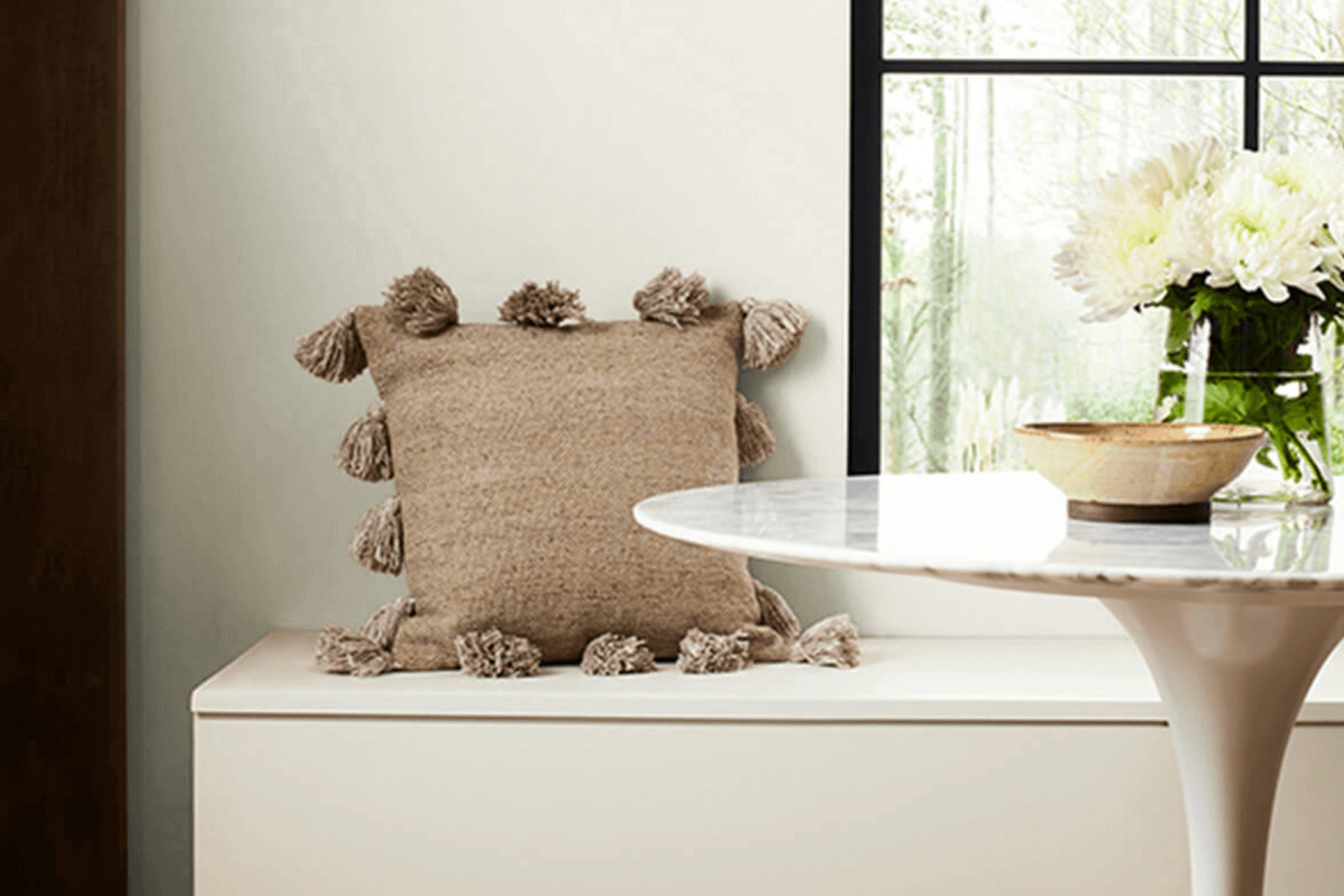
When you think about creating a calm and cozy space, SW 7049 Nuance by Sherwin Williams is a color that stands out. It’s soft and subtle, with just the right blend of warmth. Imagine a shade that gently whispers rather than shouts, bringing a relaxed feel to any room.
I find it perfectly balances between a warm beige and a cool gray, making it a versatile choice for different styles and tastes.
Nuance offers flexibility; whether you’re updating your living room, bedroom, or even a study, this color can create a welcoming atmosphere that invites comfort and ease. It pairs beautifully with natural elements like wood and stone, accentuating their textures without overpowering them. Whether you prefer a minimalist approach or a space filled with rich textures and layers, this shade can harmonize with your existing decor effortlessly.
The subtlety of Nuance makes it an excellent option for those looking to build a space that’s both modern and timeless. You can incorporate bolder colors or keep things neutral, depending on your mood and style.
This color allows you to personalize your space while maintaining a sense of refined simplicity. With Nuance, you can achieve an inviting ambiance that feels both fresh and timeless, creating a home that truly reflects your personality.
What Color Is Nuance SW 7049 by Sherwin Williams?
Nuance SW 7049 by Sherwin Williams is a soft, light greige, combining both gray and beige tones. This makes it a versatile and neutral shade that feels warm and inviting, yet clean and modern.
It can adapt to various lighting conditions, sometimes appearing more gray or beige depending on the surrounding elements. This muted color works best in interiors that aim for a calm and cozy atmosphere.
Nuance is particularly well-suited for contemporary, modern, and transitional styles. It acts as a great backdrop, allowing furniture and decor to stand out without being overpowering. In a contemporary setting, pairing it with sleek, metallic finishes such as stainless steel or chrome can highlight its modern aspect. In contrast, pairing it with natural wood or wicker materials will enhance a cozy feel, perfect for a transitional or rustic style.
Textures play an essential role in emphasizing Nuance’s versatility. Pair it with soft textiles like linen or cotton to maintain a relaxed vibe. Additionally, using earth-toned accent pieces can create a harmonious and balanced look.
Nuance’s adaptability makes it an excellent choice for various rooms, including living rooms, bedrooms, and even kitchens, offering a neutral canvas that feels both comforting and stylish.
Is Nuance SW 7049 by Sherwin Williams Warm or Cool color?
NuanceSW 7049 by Sherwin Williams is a soft, light greige that combines gray and beige tones. This color works wonderfully in homes because it creates a warm and inviting atmosphere without being overpowering.
It pairs well with various other colors, making it a versatile choice for different rooms. In living rooms, it can make the space feel cozy and welcoming, providing a neutral backdrop that allows furniture and decor to stand out.
In bedrooms, this shade promotes relaxation and comfort, helping to create a calming environment. It also works well in kitchens and bathrooms, adding a hint of warmth without clashing with other colors or fixtures. The subtlety of NuanceSW 7049 enables it to blend seamlessly with both modern and traditional styles, providing flexibility for homeowners who may want to change up their decor over time.
Its gentle undertones make it a great choice for those looking for a neutral paint color that also adds a touch of warmth to their home.
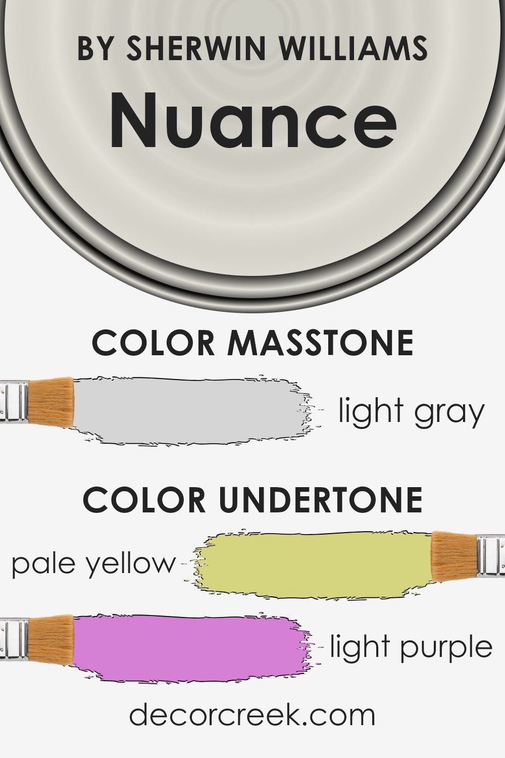
Undertones of Nuance SW 7049 by Sherwin Williams
Nuance SW 7049 by Sherwin Williams is a versatile paint color with subtle undertones that can significantly affect how it appears in different spaces. The primary undertones include pale yellow, light purple, light blue, pale pink, mint, lilac, and grey.
Each of these undertones plays a role in determining how the color is perceived when applied to interior walls.
The pale yellow undertone can add a warm, inviting feel, making a room feel cozy and welcoming. Light purple and lilac bring a hint of softness and sophistication without being overwhelming. The light blue undertone adds a touch of coolness, which can make spaces feel more open and airy. Pale pink adds a gentle warmth that can make a room feel comforting.
Mint contributes a fresh, lively element, creating a sense of balance with the other colors. The grey undertone ensures that the overall hue remains neutral, making it adaptable to various settings.
These undertones affect how the paint looks depending on the lighting and surrounding décor. In natural light, warm and cool tones may both emerge, while artificial lighting might emphasize either the warmer or cooler undertones. This flexibility makes the paint a great choice for creating a harmonious atmosphere in any room.
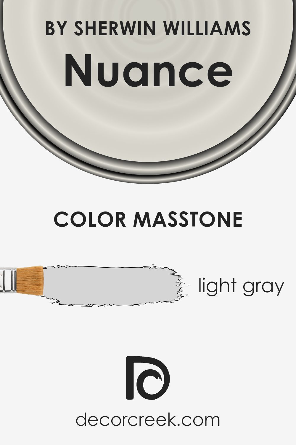
What is the Masstone of the Nuance SW 7049 by Sherwin Williams?
Nuance SW 7049 by Sherwin Williams is a light gray color with a masstone of #D5D5D5. This soft, neutral shade can make spaces in a home feel airy and open. Its lightness helps reflect natural light, which can brighten up rooms and make them feel larger.
This color is versatile and pairs well with both warm and cool tones, making it a good choice for walls in living rooms, bedrooms, and kitchens. It provides a subtle backdrop that complements various décor styles, from modern to traditional.
Light gray is often chosen for its ability to create a calming atmosphere, which can be especially beneficial in busy or high-traffic areas. The muted tone doesn’t overpower a room but instead creates a sense of cohesion and simplicity. Whether used on its own or as part of a larger color scheme, this light gray can enhance the overall look and feel of a home.
How Does Lighting Affect Nuance SW 7049 by Sherwin Williams?
Lighting plays a crucial role in how we perceive colors, as different types of light can change how a color appears in a space. Sherwin Williams’ Nuance (SW 7049) is a soft, warm gray that can look different depending on the lighting conditions and the room’s orientation.
In natural light, especially during the day, Nuance can look quite different depending on the direction the room faces. In north-facing rooms, the light tends to be cooler and more consistent throughout the day, which can bring out the cooler undertones in Nuance, making it look more like a true gray.
This can sometimes make the room feel a little darker or more muted, as north-facing rooms generally receive less direct sunlight.
In contrast, south-facing rooms get plenty of natural light throughout the day, often with a warmer hue. In these spaces, Nuance can appear lighter and slightly warmer, as the warm sunlight brings out its beige undertones. This makes south-facing rooms feel bright and inviting.
East-facing rooms get warm, bright light in the morning, which can make Nuance appear warm and welcoming. However, as the day goes on and the direct sunlight fades, the color may seem cooler and more subdued. West-facing rooms receive warm, golden light in the late afternoon and evening, which can intensify the warmth in Nuance during those times.
Artificial lighting also significantly affects how Nuance appears. Under incandescent or warm LED lights, the color will lean towards its warmer side, highlighting its beige tones. Conversely, cool LED or fluorescent lights can bring out its gray tones, making the space feel more modern and possibly cooler.
Understanding how lighting affects Nuance can help you choose the right space and time of day for this versatile hue, ensuring it complements your decor.
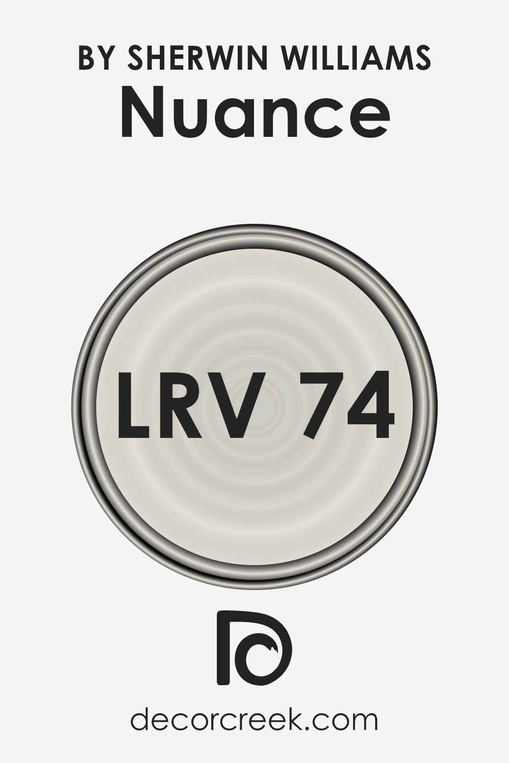
What is the LRV of Nuance SW 7049 by Sherwin Williams?
Light Reflectance Value, or LRV, is a measure of how much light a color reflects. It is expressed as a number between 0 and 100, where 0 means the color absorbs all light (pure black), and 100 means it reflects all light (pure white). Understanding LRV is important when picking paint colors because it influences how light or dark a room will seem. A high LRV means the color will reflect more light, making the space feel brighter and more open.
Conversely, a low LRV will absorb more light, which can make a room feel cozier or smaller. LRV is particularly essential in rooms with little natural light, where higher LRV colors can help make the area feel less dim.
For Nuance with an LRV of 74.277, it indicates that this color reflects a significant amount of light. This makes it a good choice if you want to brighten up a room or make it feel more spacious. Because it is a lighter color, Nuance will keep spaces feeling open and airy. It is versatile and can fit well in various settings, complementing both natural light during the day and artificial lighting at night.
With its high LRV, Nuance is particularly effective in rooms that do not get much sunlight, as it will help maximize the light that is available, ensuring the space does not feel dark or closed in.
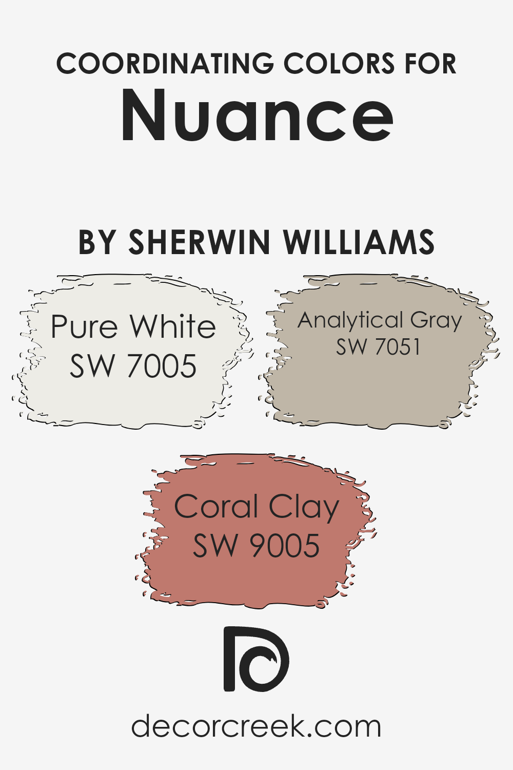
Coordinating Colors of Nuance SW 7049 by Sherwin Williams
Coordinating colors are hues that work well together to create a harmonious and balanced look in a space. These colors complement each other and can enhance the overall aesthetic when used in a room. When choosing coordinating colors for a paint like Nuance by Sherwin Williams, it’s important to consider tones that will blend seamlessly with its soft, warm neutral base. The color Pure White (SW 7005), for example, is a crisp, clean shade that adds a bright and airy feel without overwhelming the existing color scheme.
It serves as a perfect backdrop, allowing other colors to stand out while maintaining a fresh look.
Coral Clay (SW 9005) introduces a splash of warm, earthy tones that add a touch of coziness and energy. It’s a versatile shade that brings warmth without clashing with the calmness of Nuance. On the other hand, Analytical Gray (SW 7051) provides a subtle, cool contrast that pairs perfectly with Nuance, offering depth and sophistication.
Its gentle, neutral quality makes it an ideal choice for unifying the overall palette without competing for attention. These thoughtfully chosen colors work together to create a cohesive, inviting space.
You can see recommended paint colors below:
- SW 7005 Pure White
- SW 9005 Coral Clay
- SW 7051 Analytical Gray
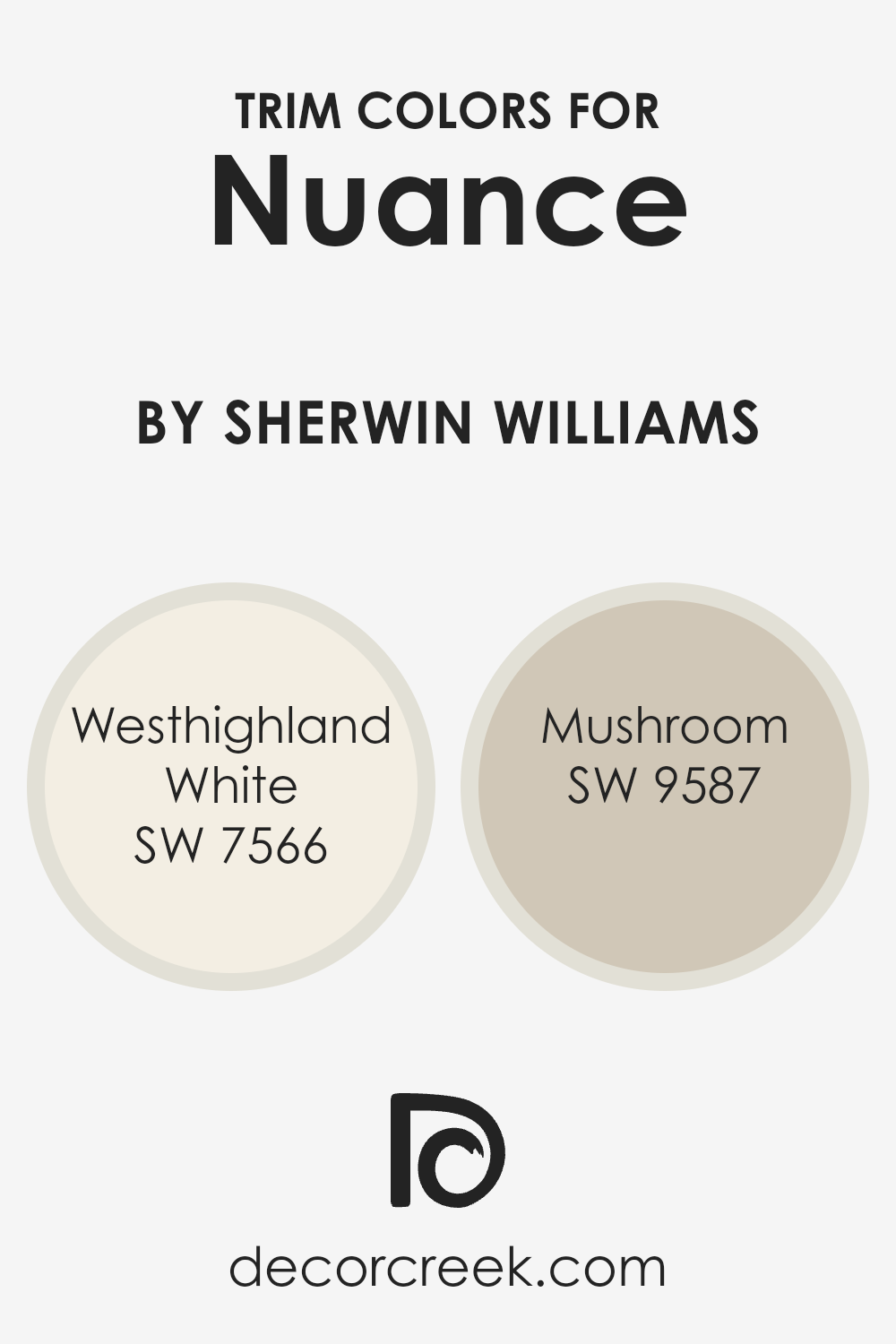
What are the Trim colors of Nuance SW 7049 by Sherwin Williams?
Trim colors are essential in interior design as they highlight and define architectural details such as doors, windows, and baseboards. They play a significant role in complementing or contrasting primary wall colors to create a cohesive look. When using Nuance SW 7049 by Sherwin Williams as the main wall color, incorporating trim colors like Westhighland White SW 7566 and Mushroom SW 9587 can add visual interest and depth to a space.
Nuance is a soft and gentle hue, so choosing the right trim colors is key to enhancing its subtlety and elegance.
Westhighland White is a warm, creamy white that offers a smooth and inviting touch to any room. It pairs beautifully with the soft undertones of Nuance, adding a bright and clean finish to the overall color scheme. Meanwhile, Mushroom presents a warm, earthy tone that can bring a cozy and grounded feel when used as a trim.
It creates a delicate contrast against Nuance, providing subtle definition without overpowering the space. Together, these trim colors work harmoniously to enhance the gentle ambiance that Nuance brings to a room.
You can see recommended paint colors below:
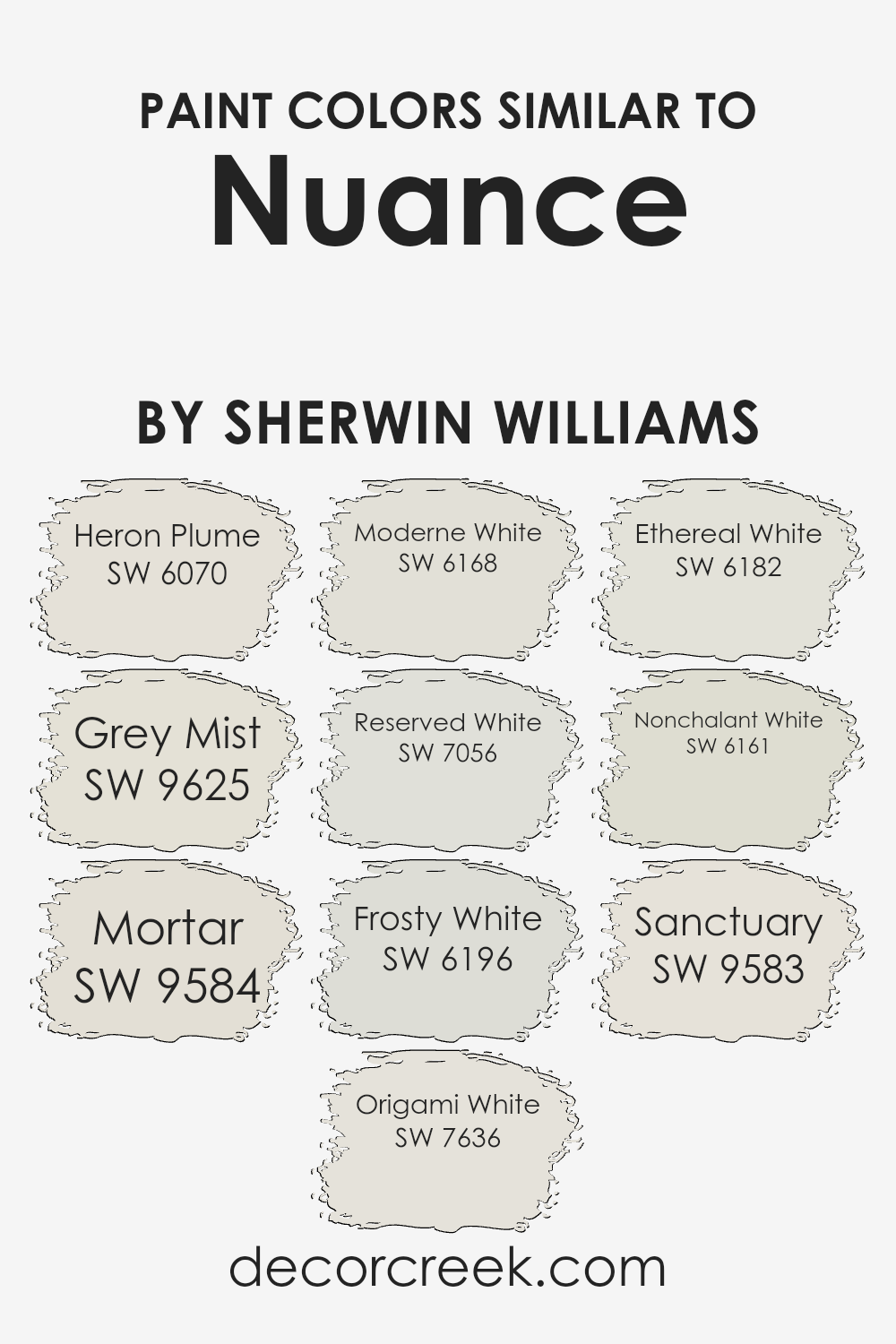
Colors Similar to Nuance SW 7049 by Sherwin Williams
Similar colors play an important role in creating a harmonious and balanced look in any space. When you have colors that are closely related, like those similar to Nuance by Sherwin Williams, they provide a seamless flow across a room. These colors work well together because they share common undertones, which helps in maintaining a cohesive and soothing environment.
For example, SW 6070 Heron Plume is a soft and warm hue that brings a gentle glow to walls, while SW 9625 Grey Mist offers a subtle hint of gray, lending a clean and airy feel. SW 9584 Mortar introduces a slightly darker tone, adding depth without being overpowering.
SW 7636 Origami White is a versatile shade that imparts a crisp and fresh look, comparable to the light touch of SW 6168 Moderne White, which offers a slightly warmer finish. For those who prefer a cooler white, SW 7056 Reserved White is an excellent choice, bringing a touch of elegance. SW 6196 Frosty White pairs nicely too, adding a hint of blue that keeps things fresh.
SW 6182 Ethereal White presents a soft backdrop, while SW 6161 Nonchalant White is muted with a whisper of beige, creating a calming atmosphere. Lastly, SW 9583 Sanctuary wraps up the palette with its gentle, inviting embrace, perfect for any comforting space.
You can see recommended paint colors below:
- SW 6070 Heron Plume
- SW 9625 Grey Mist
- SW 9584 Mortar
- SW 7636 Origami White
- SW 6168 Moderne White
- SW 7056 Reserved White
- SW 6196 Frosty White
- SW 6182 Ethereal White
- SW 6161 Nonchalant White
- SW 9583 Sanctuary
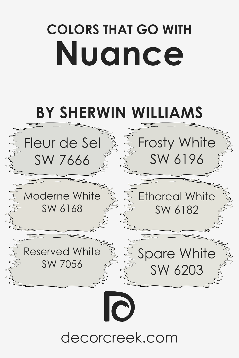
Colors that Go With Nuance SW 7049 by Sherwin Williams
Choosing colors that complement Nuance SW 7049 by Sherwin Williams is essential as they can enhance the overall feel of a space, creating balance and harmony. Nuance is a versatile, light gray with warm undertones, which makes it pair well with a range of whites and off-whites.
For instance, SW 7666 – Fleur de Sel is a soft, subtle gray with a hint of green that pairs beautifully with Nuance, adding a touch of coolness that makes a room feel fresh and airy. Similarly, SW 6168 – Moderne White is an inviting cream that when paired with Nuance, adds warmth and a touch of classic elegance to any setting.
A choice like SW 7056 – Reserved White, a light cool gray, offers a slightly more muted look while helping to highlight the warmer tones in Nuance. SW 6196 – Frosty White is a crisp, clean shade that can brighten a space, providing contrast that helps Nuance stand out without being overpowering. SW 6182 – Ethereal White, with its gentle taupe undertone, creates a soft, comforting ambiance when used alongside Nuance, adding depth and dimension.
Lastly, SW 6203 – Spare White is a gentle gray that blends seamlessly with Nuance, creating a unified aesthetic that feels both modern and timeless. These colors together can form a cohesive palette that makes any space welcoming and stylish.
You can see recommended paint colors below:
- SW 7666 Fleur de Sel
- SW 6168 Moderne White
- SW 7056 Reserved White
- SW 6196 Frosty White
- SW 6182 Ethereal White
- SW 6203 Spare White
How to Use Nuance SW 7049 by Sherwin Williams In Your Home?
Nuance SW 7049 by Sherwin Williams is a soft, subtle shade that can bring warmth and comfort to a home. This color is versatile and can work well in various rooms, creating a cozy atmosphere. In a living room, Nuance can help make the space feel inviting and pleasant, pairing nicely with both light and dark furniture. It also works well in bedrooms, promoting relaxation and a calm environment.
For those who love a harmonious and unified look, painting an open-plan area, such as a living room and kitchen, in Nuance can help tie the spaces together. This color can also be a great choice for bathrooms, as it offers a fresh and clean look while remaining gentle and soothing.
Nuance SW 7049 pairs beautifully with natural elements like wood and greenery, enhancing the calming feel of a room. Overall, it’s an adaptable color choice for anyone looking to create a peaceful home.
Nuance SW 7049 by Sherwin Williams vs Grey Mist SW 9625 by Sherwin Williams
Nuance (SW 7049) from Sherwin Williams is a warm, soft gray with a slight hint of beige, giving it a cozy feel. It acts as a versatile neutral, perfect for making spaces feel welcoming without being too bold. This color works well in living rooms, bedrooms, and any area where a calm environment is desired.
Grey Mist (SW 9625), on the other hand, is a cooler gray with a touch of blue, making it feel fresher and more modern. It’s ideal for spaces where you want a clean, crisp look. Grey Mist can add a sense of openness and is a good choice for kitchens, bathrooms, or any area where you need a little more brightness.
Both colors are great neutrals, but Nuance offers warmth, whereas Grey Mist provides a cooler, airy atmosphere. Your choice between them would depend on the mood you want the room to have.
You can see recommended paint color below:
Nuance SW 7049 by Sherwin Williams vs Mortar SW 9584 by Sherwin Williams
Nuance SW 7049 by Sherwin Williams and Mortar SW 9584 by Sherwin Williams are two distinct colors with their own characteristics. Nuance is a soft, warm gray that leans towards beige, making it a versatile choice for various spaces in your home. Its subtle warmth can create a cozy and inviting atmosphere, perfect for living areas or bedrooms.
On the other hand, Mortar is a deeper, more neutral gray. It has a slightly cool undertone, giving it a more grounded and stable appearance. This makes Mortar a great choice for areas where you want a more dramatic yet balanced look, such as an accent wall or an office.
While Nuance adds lightness and softness, Mortar brings depth and sophistication. Together, they can be used to create contrasting yet harmonious spaces by combining the warmth of Nuance with the solidity of Mortar.
You can see recommended paint color below:
Nuance SW 7049 by Sherwin Williams vs Heron Plume SW 6070 by Sherwin Williams
Nuance (SW 7049) by Sherwin Williams is a soft, warm gray that creates a calming background in any room. It’s neutral, making it versatile for various spaces and can pair well with both cool and warm accent colors. On the other hand, Heron Plume (SW 6070) is a light, creamy greige that leans more toward beige with a touch of gray.
It’s slightly warmer and lighter than Nuance, offering a cozy and inviting feel. While Nuance can sometimes appear a bit cooler depending on the lighting, Heron Plume consistently maintains its warm undertones.
Both colors work well in different settings, but Nuance might suit modern spaces looking for a sleek, subtle look, while Heron Plume could add warmth to traditional or rustic interiors. In essence, choosing between them depends on the atmosphere and warmth you’d like to bring to the space.
You can see recommended paint color below:
Nuance SW 7049 by Sherwin Williams vs Origami White SW 7636 by Sherwin Williams
Nuance SW 7049 by Sherwin Williams is a soft, warm gray with subtle beige undertones. It has a cozy, neutral feel that can complement a variety of spaces by providing a gentle backdrop. Its muted tone makes it versatile, ideal for both modern and traditional settings, as it doesn’t overwhelm or dominate a space.
Origami White SW 7636 by Sherwin Williams, on the other hand, is a light, creamy white with a touch of gray. It offers a fresh and clean look, adding brightness to a room without being stark or cold. Origami White works well in spaces that require a light and airy atmosphere.
When compared, Nuance adds warmth with its gray-beige mix, creating a more subdued ambiance, while Origami White brings in more light and freshness. Depending on the feel you want for a room, choose Nuance for warmth and subtlety or Origami White for brightness and a soft, clean look.
You can see recommended paint color below:
Nuance SW 7049 by Sherwin Williams vs Reserved White SW 7056 by Sherwin Williams
Nuance SW 7049 and Reserved White SW 7056 by Sherwin Williams are both versatile neutrals, but they offer distinct vibes. Nuance is a soft, warm taupe with a hint of gray. It gives a cozy and inviting feel, making it a great choice for living spaces where warmth is desired. Its neutral tone makes it a flexible backdrop that pairs well with a variety of furniture styles and accent colors.
Reserved White, on the other hand, is a cooler, light gray with a touch of warmth. It’s crisp and clean, lending a more modern and fresh look to a room. This color is ideal for creating a bright and airy atmosphere, especially in spaces with plenty of natural light. It works beautifully in minimalistic and contemporary settings.
Both colors are subtle enough to be used throughout a home, each bringing their unique quality—one warmth, the other brightness.
You can see recommended paint color below:
Nuance SW 7049 by Sherwin Williams vs Frosty White SW 6196 by Sherwin Williams
Nuance (SW 7049) by Sherwin Williams is a warm, versatile greige color that pairs well with a range of other shades. It’s soothing and can create a cozy atmosphere, combining the calmness of gray with the warmth of beige. This makes it a popular choice for living rooms and bedrooms where a relaxed ambiance is desired.
On the other hand, Frosty White (SW 6196) is a crisp and clean white with just a hint of coolness. It brings a bright, airy feel to spaces, making rooms seem larger and more open. This color works well in kitchens and bathrooms, or as a trim color to contrast against bolder wall shades.
When you pair Nuance with Frosty White, you get a balanced, neutral palette. Nuance adds warmth and depth, while Frosty White offers a fresh, light touch, making them work well together in a harmonious setup.
You can see recommended paint color below:
- SW 6196 Frosty White
Nuance SW 7049 by Sherwin Williams vs Ethereal White SW 6182 by Sherwin Williams
Nuance SW 7049 by Sherwin Williams is a soft, versatile color with a warm gray undertone. It has a neutral appeal, making it a great choice for walls where you want a calm and inviting atmosphere.
On the other hand, Ethereal White SW 6182 by Sherwin Williams leans more towards a light, airy white with a subtle hint of gray. Ethereal White is slightly cooler compared to the warmth of Nuance, giving spaces a brighter and more expansive feel.
Both colors offer charm and neutrality, but they are used differently based on the desired room ambiance. Nuance is ideal for creating a cozy, intimate environment, while Ethereal White is perfect for achieving a clean, fresh look.
Depending on lighting and furnishings, these colors can either complement or contrast each other beautifully, adding versatility to any design scheme. Whether used separately or together, they bring a pleasant, understated elegance to any space.
You can see recommended paint color below:
Nuance SW 7049 by Sherwin Williams vs Moderne White SW 6168 by Sherwin Williams
Nuance (SW 7049) and Moderne White (SW 6168) by Sherwin Williams are both soft, neutral shades, but each brings a distinct feel to a space. Nuance is a warm, light gray with subtle beige undertones, making it versatile and compatible with many other colors. It’s perfect for those looking for a neutral background that adds warmth without being too bold.
On the other hand, Moderne White is a cleaner, crisp white. It has a slight hint of warmth but remains closer to a true white, offering a fresh and airy feel. It’s a great choice for spaces where you want to create a bright, open atmosphere.
While both colors are neutral, Nuance adds a touch more warmth and depth, ideal for cozy settings. Moderne White, however, is excellent for modern or minimalist designs where brightness and simplicity are desired. Both can pair well with bold accents or remain subtle supporters in a room’s color scheme.
You can see recommended paint color below:
- SW 6168 Moderne White
Nuance SW 7049 by Sherwin Williams vs Nonchalant White SW 6161 by Sherwin Williams
Nuance SW 7049 by Sherwin Williams is a soft, warm gray that creates a cozy and versatile backdrop. It’s a subtle color that works well in a variety of settings, providing a gentle, neutral vibe without being stark.
In contrast, Nonchalant White SW 6161 is a very light, muted gray with a hint of green, giving it an airy and slightly fresh feel. This white is perfect for those looking for a barely-there color that adds a bit of character without overpowering the space.
While Nuance brings warmth and depth, Nonchalant White offers a lighter, more open feel. Both colors are neutral, making them adaptable to different styles and complementary with various accent colors. Nuance might suit spaces needing warmth and coziness, whereas Nonchalant White is ideal for brightening and enlarging a room’s appearance. Both options offer understated elegance, allowing other design elements to shine.
You can see recommended paint color below:
- SW 6161 Nonchalant White
Nuance SW 7049 by Sherwin Williams vs Sanctuary SW 9583 by Sherwin Williams
Nuance (SW 7049) by Sherwin Williams is a light and soft greige, which is a mix of gray and beige. It offers a neutral and warm tone, making it versatile for various spaces. Its subtlety helps it blend well with other colors without being overpowering, providing an understated backdrop.
On the other hand, Sanctuary (SW 9583) also from Sherwin Williams, is a deeper and richer shade. It carries a green undertone, giving it a slightly earthy feel. Sanctuary is more vibrant compared to Nuance, making it a bolder choice for someone looking to make a statement.
While Nuance is about subtlety and blending, Sanctuary offers depth and a touch of drama. Both colors can create a welcoming environment, but Nuance is best for a soft, neutral look, while Sanctuary is ideal for adding some color and richness to a room. The choice between them depends on whether you’re aiming for a lighter or more pronounced color impact.
You can see recommended paint color below:
Conclusion
After spending some time with SW 7049 Nuance by Sherwin Williams, I can say it’s a paint color that brings a nice feeling to any room. Imagine a gentle shade that’s not too loud, but also not too quiet. This color is kind of like a soft whisper that can make a room feel warm and inviting.
When you use Nuance, it’s like putting on a comfy sweater. Its gentle tone helps make any room feel cozy. It’s also very friendly with other colors, meaning it can play nicely with many types of furniture or decorations you might have.
One of the best things about Nuance is that it doesn’t steal the spotlight. Instead, it lets everything else in the room shine while making sure everything looks put together. You can paint it in the living room, kitchen, or even your bedroom. It’s the kind of color that fits in easily, making it really handy for any area.
Using SW 7049 Nuance is like choosing a favorite pair of shoes that go with everything. You can always count on it to keep things feeling just right. It’s a color that makes it easy to feel comfortable and happy in your own home.
Ever wished paint sampling was as easy as sticking a sticker? Guess what? Now it is! Discover Samplize's unique Peel & Stick samples.
Get paint samples

