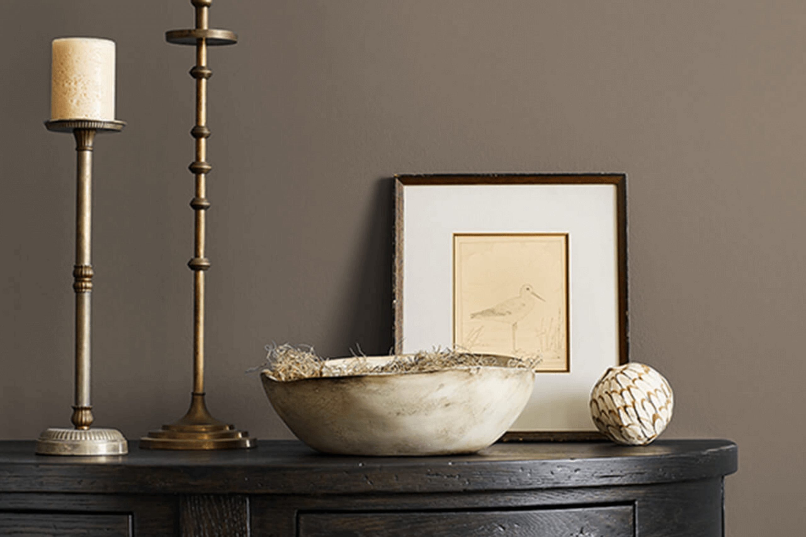
If you’re thinking about refreshing your space with a new look, let’s talk about a color that might just be what you need. Sherwin Williams’ SW 7026, also known as Griffin, is an intriguing shade that can add a subtle yet distinct touch to any room. It lives somewhere between a deep gray and a soft black, offering versatility that works beautifully in various settings, whether it’s a cozy bedroom or a sleek office space.
When you use Griffin, you’ll notice it carries a certain elegance that complements both modern and traditional decor. It’s dark enough to make a statement without overwhelming a space, creating a perfect backdrop for your furniture and artwork to truly shine.
What I appreciate most about Griffin is its ability to adapt. It can evoke a sense of calmness in a reading nook or bring a grounding energy to a lively kitchen.
Choosing the right paint color can be a bit tricky, but Griffin offers a soothing presence with its rich depth. It can seamlessly blend with different textures and materials, enhancing the overall aesthetic of your interiors.
So, if you’re looking for a color that brings both character and tranquility to your environment, Griffin might just be the way to go.
What Color Is Griffin SW 7026 by Sherwin Williams?
The color Griffin by Sherwin Williams is a deep, smoky gray that provides a strong yet neutral base for various interior design styles. This versatile shade acts as a solid foundation, pairing well with a wide range of materials and textures, making it an excellent choice for those looking to create a harmonious yet impactful aesthetic in their living space.
Griffin works especially well in modern and contemporary interiors, where its clean and subtle tones enhance minimalist designs. It also fits beautifully in industrial settings, where the color can complement exposed brick, metal fixtures, and reclaimed wood, adding depth and character to the design.
For a cozy and inviting atmosphere, Griffin can be paired with softer textures like plush wool, fleece, or rich velvet in lighter shades to create a soothing contrast. In spaces that use a lot of natural materials, such as stone or wood, Griffin helps to ground the design and makes natural features pop without overwhelming the senses.
In terms of pairing with other colors, Griffin goes well with crisp whites, soft creams, and vibrant blues or greens, offering many decorating possibilities. Whether used for accent walls, cabinetry, or as the main color theme, Griffin helps create a cohesive and stylish environment.
Is Griffin SW 7026 by Sherwin Williams Warm or Cool color?
Griffin SW 7026, by Sherwin Williams, is a strong, adaptable shade of gray that can work wonders in various home spaces. This color is dark enough to add depth to a room without overpowering it, making it ideal for creating a cozy and inviting atmosphere.
When used on walls, Griffin SW 7026 provides a neutral backdrop that can complement both bright and subdued décor elements, allowing homeowners to mix and match their furnishings without worrying about clashing colors.
Additionally, this shade is practical in busy areas of the house, as it tends to hide marks and smudges better than lighter colors, requiring less frequent touch-ups. It pairs nicely with whites and other neutrals, enhancing natural light in a space, or works well with pops of color for a more dynamic look. Griffin SW 7026 is particularly effective in bedrooms, living rooms, and home offices, offering a subtle, yet impactful, visual anchor.
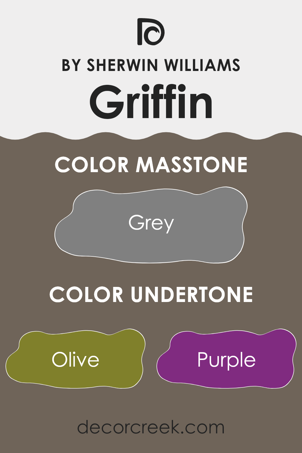
Undertones of Griffin SW 7026 by Sherwin Williams
Griffin SW 7026 is a unique paint color that can dramatically influence the ambiance of a room depending on its lighting and surrounding elements. This color, which could be described as a deep, nuanced gray, comes with a complex array of undertones that add depth and dimension to its appearance.
Understanding undertones plays a crucial role in how we perceive a color. Even though the primary color might be gray, the subtle hints behind the main color, also known as undertones, can make the color appear cooler or warmer.
In the case of Griffin SW 7026, the undertones range from Olive to Light Gray, including more charismatic colors like Orange or Fuchsia, which gear its base color towards a more dynamic or mellow look depending on the setting.
In interior walls, these undertones mean that Griffin SW 7026 can look different in various rooms and lightings.
For instance, in a room with ample natural light, the paint might lean slightly towards any lighter undertones such as Mint or Pale Yellow, giving the room a fresher appearance. Conversely, in a dimly lit room, darker undertones like Navy or Dark Grey could appear more prominent, and the wall color might seem richer and more intense.
Ultimately, when using Griffin SW 7026 on interior walls, it’s essential to consider these undertones and how they might interact with furnishings, floorings, and other elements in the space. This insight will help achieve the desired mood and style for your room.
What is the Masstone of the Griffin SW 7026 by Sherwin Williams?
GriffinSW 7026, a paint color by Sherwin Williams, offers a masstone of grey (#808080). This shade of grey provides a solid, neutral background that works well in various home environments. Since it’s neither too dark nor too light, it offers a balanced backdrop that helps other colors pop. For example, in a living room, furniture and decor in both bright and subdued shades contrast nicely against this grey, making the space more appealing.
This grey also has the advantage of bringing a calm and steady look to spaces that get either a lot of sunlight or very little. Whether it’s a sunny kitchen or a dim hallway, this masstone maintains its integrity without swinging too dramatically towards either a darker or lighter appearance.
It is also versatile, fitting seamlessly with modern or traditional styles, making it easy to incorporate into most home design choices. This adaptability makes it a go-to choice for homeowners looking to repaint without worrying about frequent style updates.
How Does Lighting Affect Griffin SW 7026 by Sherwin Williams?
Lighting has a significant impact on how colors are perceived, making it crucial to consider light sources when choosing paint for a room. GriffinSW 7026 by Sherwin Williams is a versatile color that can look different depending on the lighting conditions.
In natural light, the color’s true tone is more apparent. Natural sunlight provides the clearest representation of GriffinSW 7026, revealing its deep, rich hue.
In spaces with ample daylight, this color will consistently show its true color throughout the day, though the intensity may vary.
In artificial lighting, the type of bulb used can affect how GriffinSW 7026 is viewed.
Incandescent bulbs, which emit a warm light, tend to bring out more of the brown and warm undertones in the paint, making the room feel cozier. Fluorescent lighting, on the other hand, may cast a cooler glow, highlighting gray undertones and giving the color a more stern appearance.
The orientation of a room in relation to the sun can also influence how GriffinSW 7026 is perceived:
– North-facing rooms do not get a lot of direct sunlight, which can make this color appear more gray and less lively. In such rooms, the color might feel cooler and more reserved.
– South-facing rooms receive more intense, direct sunlight, which can make the paint appear lighter and more vibrant, enhancing its warm tones.
– East-facing rooms get bright morning light. This means GriffinSW 7026 will look warmly inviting in the morning but could lose some of its vibrancy as the day progresses and the light dims.
– West-facing rooms are the opposite, with subdued tones in the morning that become warmer and more intense by evening as they catch the setting sun.
Overall, GriffinSW 7026’s appearance can shift dramatically based on the room’s lighting, affecting both the mood and the perceived size of the room. Of course, experimenting with different lighting setups can help achieve a desired effect with this color.
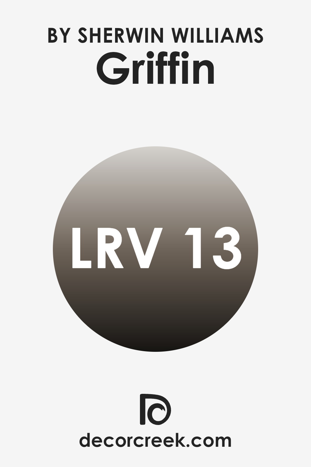
What is the LRV of Griffin SW 7026 by Sherwin Williams?
LRV stands for Light Reflectance Value, which is a measure of the amount of visible and usable light that a paint color reflects when it’s on the walls. It’s recorded on a scale from zero, which absorbs all light, to a higher value that reflects more light. This value is crucial because it helps determine how light or dark a color will look once applied to a wall.
A higher LRV means the color will appear lighter and can make spaces feel more open and airy, while a lower LRV means it will absorb more light, making the color appear deeper and the space more enclosed.
With an LRV of 13.116, the color Griffin by Sherwin Williams is on the darker side, meaning it will absorb more light than it reflects. This quality makes it a bold choice that adds depth and character to a room.
In spaces with less natural light, this color can make the room feel cozy and intimate. However, in well-lit areas, it can offer a strong visual contrast to brighter and lighter hues, providing an attractive and balanced aesthetic. When choosing colors like Griffin with a lower LRV, good lighting becomes more crucial to prevent the space from feeling too dark.
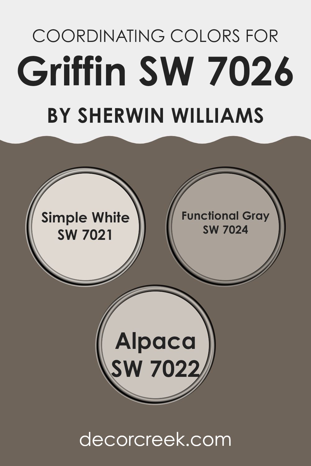
Coordinating Colors of Griffin SW 7026 by Sherwin Williams
Coordinating colors are chosen to complement a main color, enhancing the overall aesthetic of a space. When decorating with a primary color like a deep gray, finding the right accompanying shades can make all the difference in achieving a balanced and appealing look. Coordinating colors work because they share certain qualities with the main color that allow them to coexist harmoniously, often sitting close to each other on the color wheel, or being of similar saturation and lightness.
For instance, when pairing with a strong color such as a dark gray, a gentle off-white like Simple White serves as a crisp, clean contrast that can help create a fresh, bright feel in a room. By using it on trim or ceiling, it can provide a sense of spaciousness and light.
Functional Gray is a versatile shade that aligns well with darker grays, providing a subtle variation that helps differentiate spaces or elements within a single room without clashing. Meanwhile, Alpaca is a softer, warm taupe that offers a soothing balance, perfect for textiles or accent walls to soften the overall appearance and bring warmth into the room’s scheme. Each of these colors supports the primary hue, ensuring that the design feels cohesive and thoughtfully put together.
You can see recommended paint colors below:
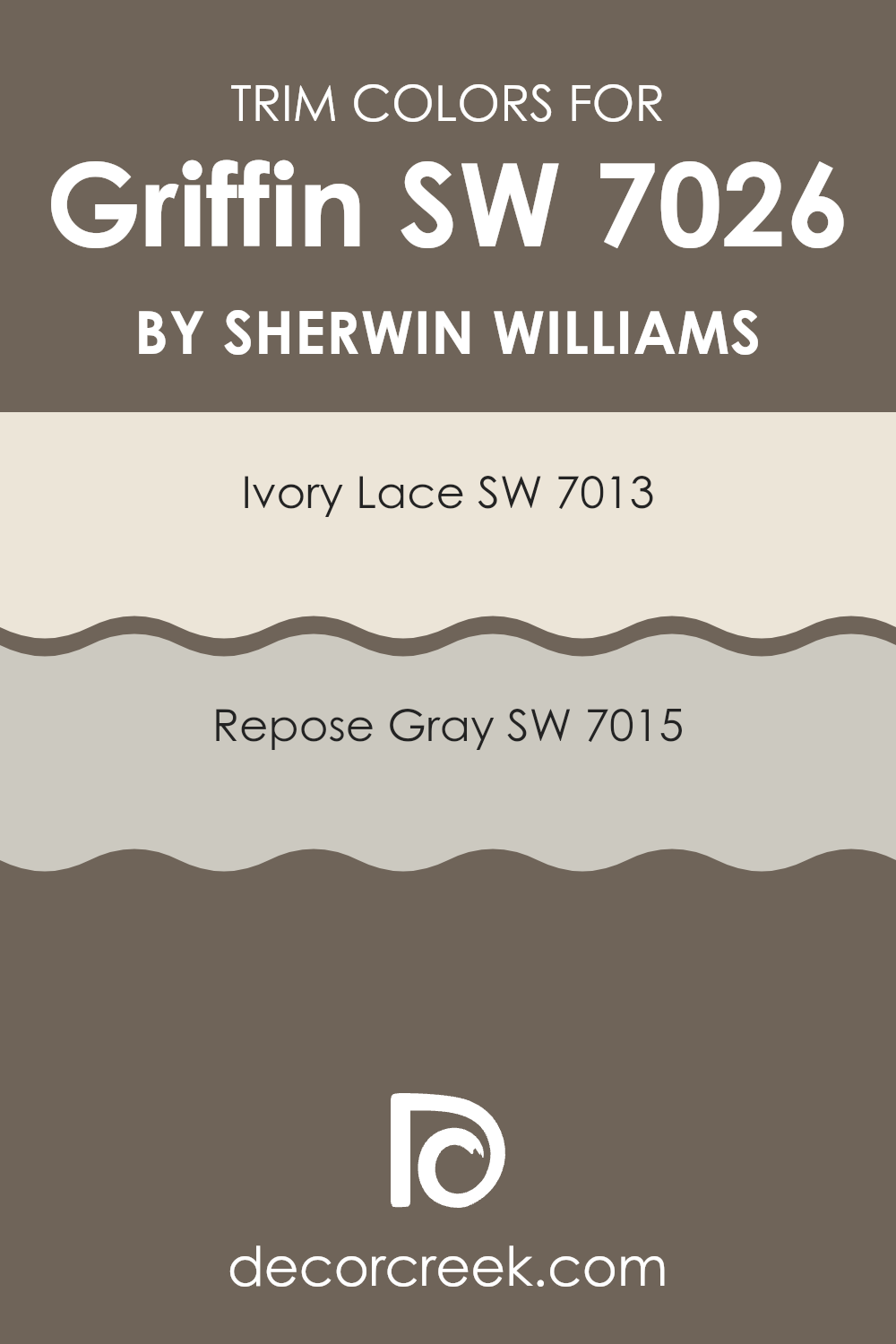
What are the Trim colors of Griffin SW 7026 by Sherwin Williams?
Trim colors play a crucial role in enhancing the visual appeal of your home. When using Griffin SW 7026 by Sherwin Williams, a robust and inviting shade, selecting the right trim colors can highlight its richness and depth. SW 7013 – Ivory Lace and SW 7015 – Repose Gray are both excellent choices for trim colors. These trim options can create a harmonious balance, accentuating the main color, and bringing out the architectural details of your space without overwhelming the base tone of Griffin SW 7026.
SW 7013 – Ivory Lace is a delicate off-white color that adds a light and airy feel when used as a trim. It’s perfect for a gentle contrast that can make the primary color pop while keeping the overall look soft and welcoming.
On the other hand, SW 7015 – Repose Gray offers a slightly bolder approach as a trim color. It is a neutral gray that provides a subtle, contemporary appeal, and works well in offering a modern twist against the more traditional Griffin SW 7026. Both of these trim colors can effectively complement the primary color, enhancing the overall aesthetic of your space.
You can see recommended paint colors below:
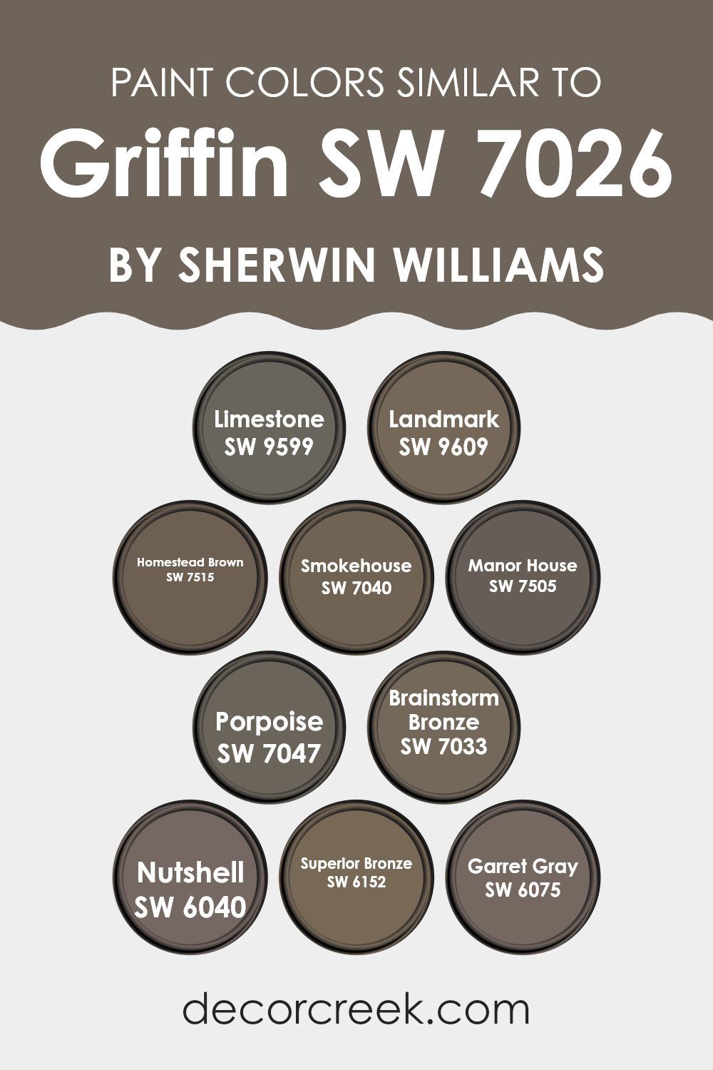
Colors Similar to Griffin SW 7026 by Sherwin Williams
Choosing similar colors in home decor creates a harmonious atmosphere by subtly blending different shades that complement each other. This technique ensures that the environment feels cohesive and thoughtfully designed, providing a visual comfort that is both pleasing and relaxing to inhabit. When we look at colors similar to SW 7026 by Sherwin-Williams, we find a palette that can enrich a space without overwhelming with contrast.
For instance, SW 9599 – Limestone, offers a gentle, muted gray that resembles the color of natural stone, bringing a light and airy feel to rooms. On the other hand, SW 9609 – Landmark, gives off a slightly deeper gray, adding a touch of depth while maintaining a soft backdrop.
Moving towards the richer tones, SW 7515 – Homestead Brown exudes warmth with its dusky, earthy brown, ideal for creating a cozy environment. Similarly, SW 7040 – Smokehouse presents a smoky gray with a hint of brown, perfect for adding a subtle, grounding effect.
Continuing along this theme, SW 7505 – Manor House showcases a robust dark brown that can anchor a space while still aligning with lighter hues. SW 7047 – Porpoise stands out as a versatile gray with a touch of brown, providing flexibility in color pairing for different settings.
SW 7033 – Brainstorm Bronze introduces a deeper, bronze-toned brown that enriches spaces with its boldness without overshadowing other design elements.
SW 6040 – Nutshell presents a darker, walnut-like shade that’s great for accentuating details. SW 6152 – Superior Bronze is akin to Brainstorm Bronze but with a more pronounced presence, making it ideal for statement walls. Lastly, SW 6075 – Garret Gray offers a muted taupe-like gray that works exceptionally well in achieving a modern yet understated look.
You can see recommended paint colors below:
- SW 9599 Limestone
- SW 9609 Landmark
- SW 7515 Homestead Brown
- SW 7040 Smokehouse
- SW 7505 Manor House
- SW 7047 Porpoise
- SW 7033 Brainstorm Bronze
- SW 6040 Nutshell
- SW 6152 Superior Bronze
- SW 6075 Garret Gray
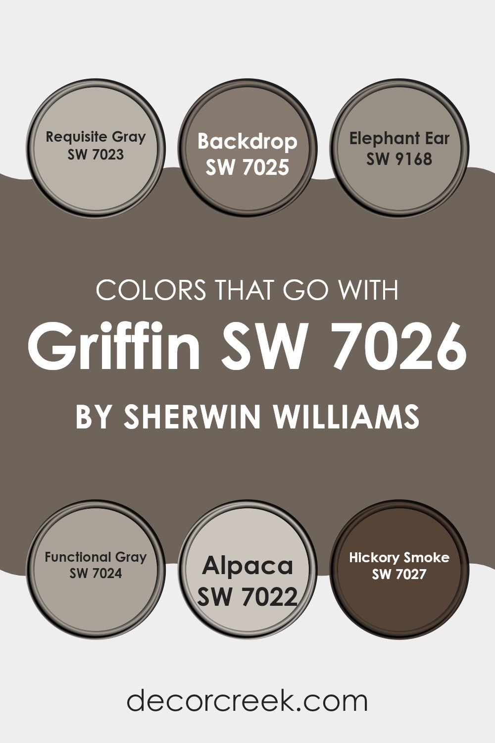
Colors that Go With Griffin SW 7026 by Sherwin Williams
Choosing the right colors to pair with Griffin SW 7026 by Sherwin Williams is crucial because it ensures that the overall design of a space feels harmonious and aesthetically pleasing. Griffin SW 7026 is a deep gray that can act as a strong foundation for a variety of color schemes. When paired with colors like Requisite Gray, Backdrop, Elephant Ear, Functional Gray, Alpaca, and Hickory Smoke, it creates a cohesive and engaging palette that can enhance the visual appeal of any room.
Requisite Gray is a lighter gray that offers a fresh contrast to the depth of Griffin, bringing a lighter touch to spaces that might feel too dark. Backdrop, on the other hand, is a warm, deep brown that compliments Griffin by adding a sense of warmth and earthiness.
Elephant Ear is another warm tone but with a deeper, more muted feel than Backdrop, perfect for creating a cozy and inviting atmosphere. Functional Gray provides a more neutral medium gray tone that bridges the gap between the lighter and darker shades in the palette, helping to smooth the transition among colors. Alpaca adds a unique twist with its slightly taupe undertone, offering a soft, warm alternative that pairs well with the richer tones.
Finally, Hickory Smoke is a dark gray that harmonizes with Griffin, reinforcing the robust aesthetic while maintaining a refined appearance. Together, these colors work to create spaces that are balanced, visually interesting, and well-coordinated, enhancing both the function and style of the room.
You can see recommended paint colors below:
- SW 7023 Requisite Gray
- SW 7025 Backdrop
- SW 9168 Elephant Ear
- SW 7024 Functional Gray
- SW 7022 Alpaca
- SW 7027 Hickory Smoke
How to Use Griffin SW 7026 by Sherwin Williams In Your Home?
Griffin SW 7026 by Sherwin Williams is a versatile gray paint color that can add a modern touch to any room in your house. It’s a deep, rich gray that works well in various lighting conditions, making it a reliable choice for both well-lit and darker rooms. If you’re looking to update your living room, Griffin can create a cozy atmosphere that highlights your furniture and decor. In the kitchen, pairing this shade with white cabinets can give a clean and balanced look.
For bedrooms, Griffin provides a calm backdrop, ideal for relaxing and winding down. It pairs nicely with bright colors like blues and pinks for a child’s room, or with muted tones like creams and light woods for a more adult space.
Using this color in a bathroom can give it a fresh, contemporary feel, especially when matched with modern fixtures and fittings. In summary, Griffin SW 7026 is a sound choice for someone wanting to refresh their home with a new coat of paint that’s stylish yet understated.
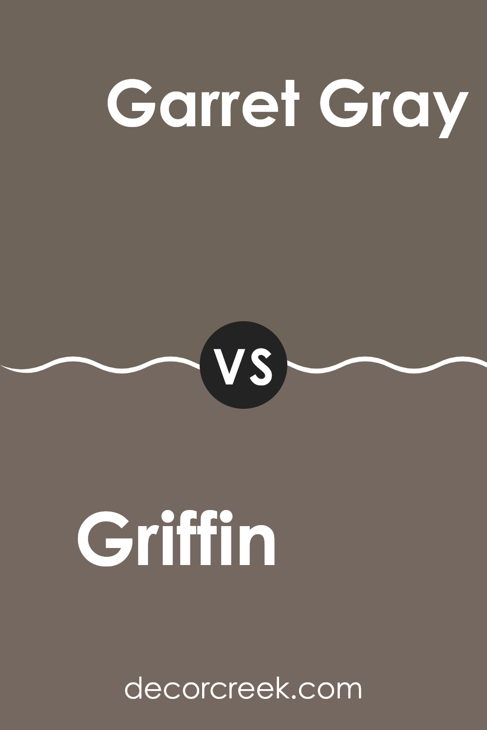
Griffin SW 7026 by Sherwin Williams vs Garret Gray SW 6075 by Sherwin Williams
Griffin SW 7026 and Garret Gray SW 6075 are both shades of gray from Sherwin Williams that set a calm and neutral backdrop for any room. Griffin has a deep, dark gray tone that gives a bold feel without overpowering.
It’s perfect for creating a cozy and inviting space. On the other hand, Garret Gray is lighter, with a warm undertone that makes it ideal for spaces where you want to add a bit of warmth. It works well in areas that receive a lot of light, enhancing the airy feel of the room.
Both colors are versatile and can be used in various styles of decor, from modern to traditional. Choosing between them depends on how light or moody you want the room to feel.
You can see recommended paint color below:
- SW 6075 Garret Gray
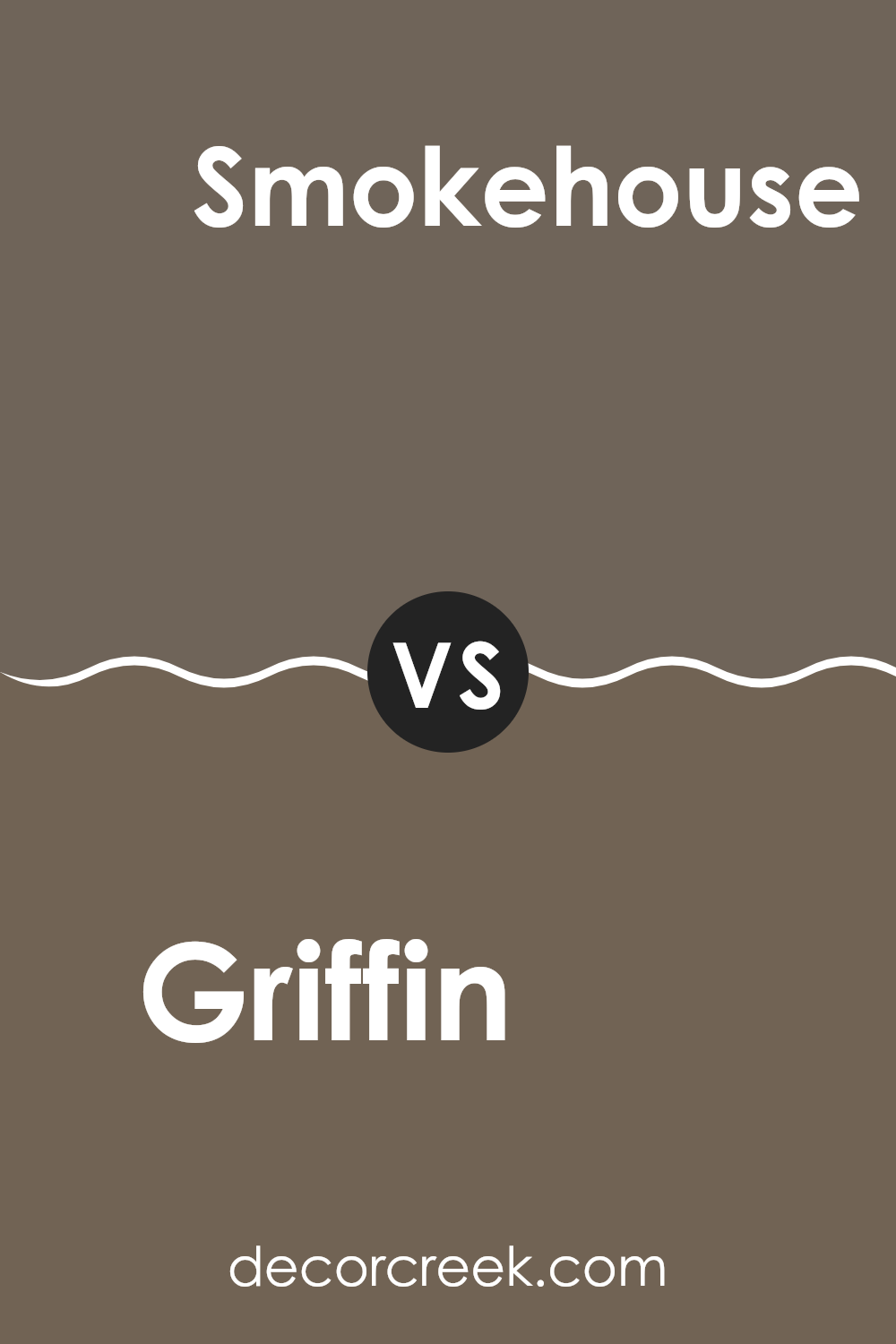
Griffin SW 7026 by Sherwin Williams vs Smokehouse SW 7040 by Sherwin Williams
Griffin and Smokehouse are two paint colors from Sherwin Williams. Griffin is a deep, dark gray with subtle brown undertones, giving it a warm and cozy feel, perfect for creating a snug and inviting space. It’s ideal for living rooms or bedrooms where you want a comforting and secure atmosphere.
On the other hand, Smokehouse is a slightly lighter gray compared to Griffin. It has more blue undertones, making it cooler and more neutral. This color is great for spaces where you want a clean and modern look, like kitchens or bathrooms.
Both colors offer a stylish and contemporary feel, but while Griffin adds warmth to a room, Smokehouse provides a crisp and fresh ambiance. They are versatile and can easily pair with various decor styles and other colors.
You can see recommended paint color below:
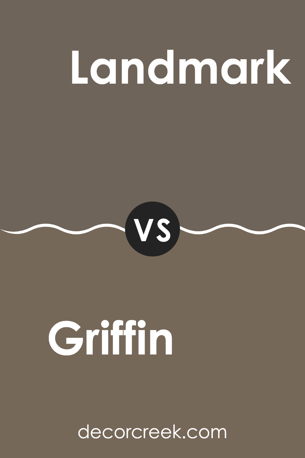
Griffin SW 7026 by Sherwin Williams vs Landmark SW 9609 by Sherwin Williams
Griffin SW 7026 by Sherwin Williams is a deep, dark gray with subtle blue undertones, giving it a strong, grounded feel. It works well in spaces where you want to create a sense of calm and solidity without being too bold.
On the other hand, Landmark SW 9609 is a lighter gray that leans slightly towards taupe. This color is more neutral and versatile, ideal for rooms that need a softer background that pairs easily with various decor styles and colors.
When comparing these two, Griffin is darker and cooler, making it a great choice for accent walls or furniture, while Landmark, being lighter and warmer, is better suited for larger areas like walls in a living room or bedroom. The contrast between the two can be used effectively to add depth and interest to your space.
You can see recommended paint color below:
Griffin SW 7026 by Sherwin Williams vs Nutshell SW 6040 by Sherwin Williams
Griffin and Nutshell, both by Sherwin Williams, are distinct shades that can influence the mood of any room. Griffin is a deep, neutral gray with hints of warm undertones, making it a robust choice for spaces that you want to feel grounded and calm.
It pairs well with both bright colors and other neutrals to create a balanced look. On the other hand, Nutshell is a softer, lighter brown, which offers a cozy and welcoming feel and is perfect for creating a snug and comfortable atmosphere. This color works nicely in living rooms or bedrooms where a softer, more inviting color is desirable.
While Griffin might suggest a somewhat formal and strong foundation due to its darker tone, Nutshell tends to set a more relaxed and lighter mood, excellent for more casual interiors. Together, these colors can work well if you’re aiming for a balanced palette with both cool and warm tones.
You can see recommended paint color below:
- SW 6040 Nutshell

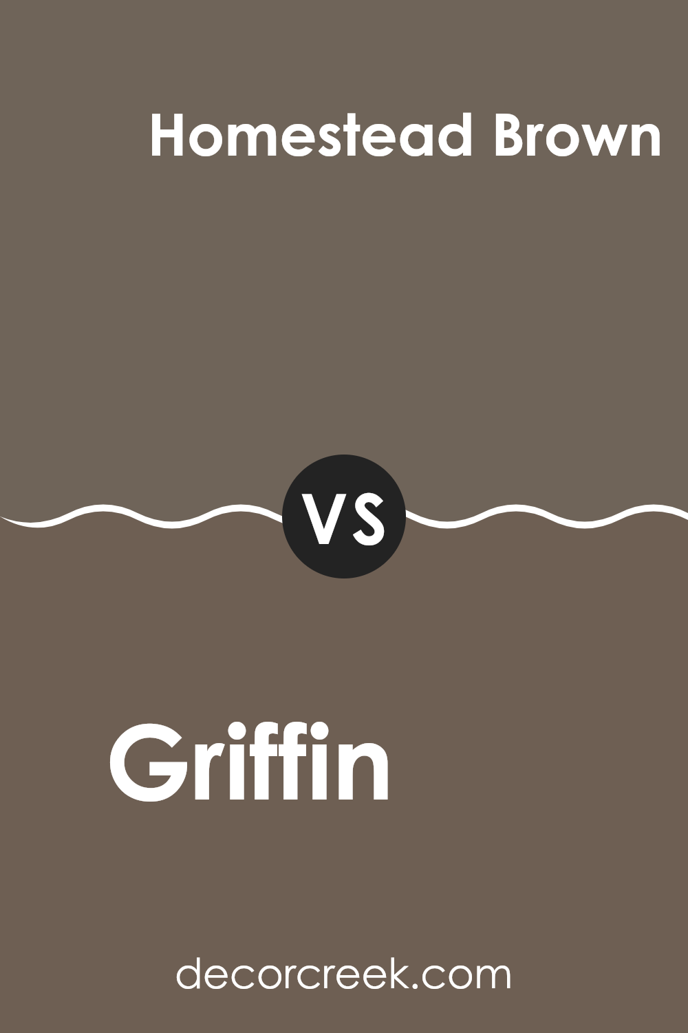
Griffin SW 7026 by Sherwin Williams vs Homestead Brown SW 7515 by Sherwin Williams
Griffin SW 7026 and Homestead Brown SW 7515 by Sherwin Williams are both warm, neutral colors, but they differ in tone and depth. Griffin is a medium to dark gray with slight brown undertones, making it a versatile color that can blend well with a variety of decor styles.
It’s particularly effective in adding a grounding, calm feel to spaces. Meanwhile, Homestead Brown is a deeper, richer brown that offers a cozy and welcoming vibe. This color works well in areas where you want to create a snug and comfortable atmosphere, such as living rooms or bedrooms.
While Griffin provides more of a subtle, muted backdrop, Homestead Brown stands out with a stronger, earthier presence. Both colors can work beautifully together as they both carry warm undertones, helping to create a cohesive and inviting space.
You can see recommended paint color below:
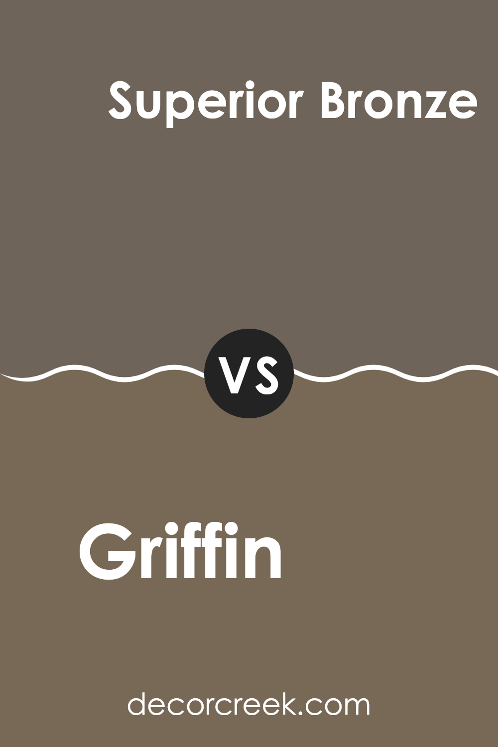
Griffin SW 7026 by Sherwin Williams vs Superior Bronze SW 6152 by Sherwin Williams
Griffin and Superior Bronze are two paint colors from Sherwin Williams that offer distinct vibes for any room. Griffin is a deep, neutral gray with a calm and muted feel, making it an excellent choice for spaces where you want a modern yet understated look. It pairs well with various decor styles and helps other colors pop without overwhelming them.
On the other hand, Superior Bronze has a warmer tone, leaning towards a medium to dark tan shade. It gives off a cozy and welcoming vibe, perfect for creating a homely atmosphere in living spaces. This color works well in areas with natural light, enhancing the space with its earthy essence.
Both colors are versatile and can be used in numerous settings, whether in a home or an office. While Griffin provides a cooler backdrop, Superior Bronze offers a hint of warmth, making each unique in its way. Choosing between them depends on the ambiance you want to achieve and which tones you prefer in your environment.
You can see recommended paint color below:
- SW 6152 Superior Bronze
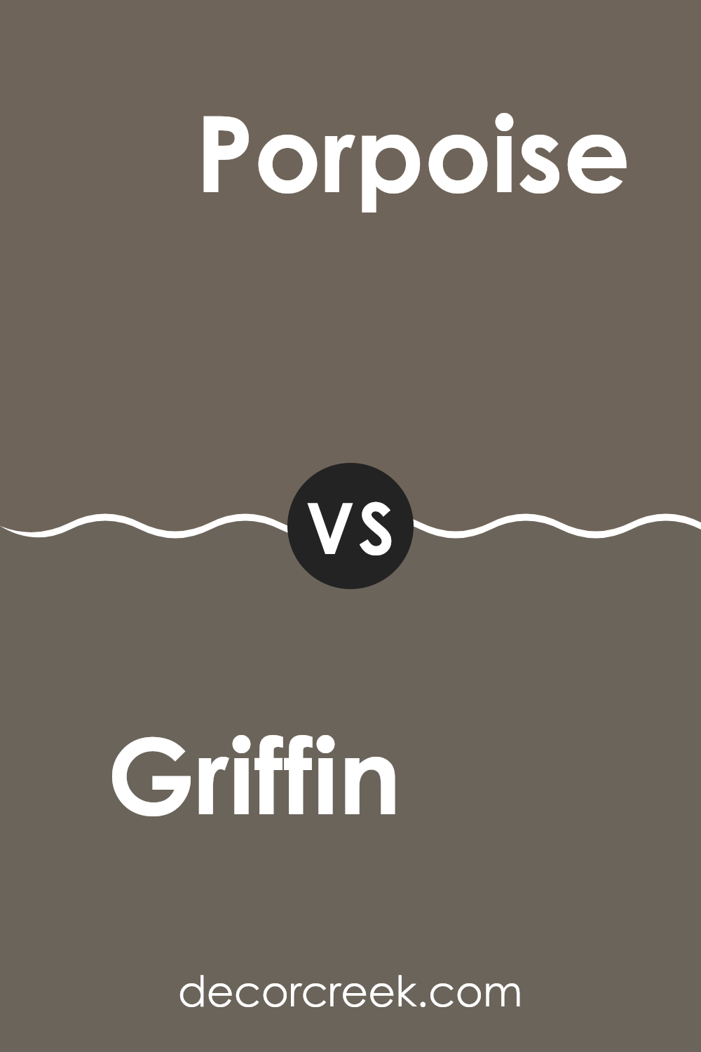
Griffin SW 7026 by Sherwin Williams vs Porpoise SW 7047 by Sherwin Williams
Griffin SW 7026 and Porpoise SW 7047, both by Sherwin Williams, are neutral shades that bring a subtle depth to any space. Griffin is a darker, charcoal-like color with deep, warm undertones that create a cozy and welcoming feel.
It works well in areas where you want to add some drama or anchor lighter elements. On the other hand, Porpoise is a lighter, softer gray with hints of beige, making it a versatile choice that can lighten up a room while keeping it grounded.
While Griffin offers a more striking and bold look, Porpoise provides a gentle, calming backdrop suitable for various settings. These colors can complement each other nicely in a space, with Porpoise acting as a lighter balance to the more imposing Griffin.
You can see recommended paint color below:
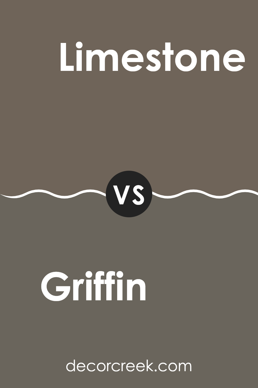
Griffin SW 7026 by Sherwin Williams vs Limestone SW 9599 by Sherwin Williams
Griffin and Limestone are both paint colors from Sherwin Williams, offering unique shades for various spaces. Griffin is a deep, dark gray with a hint of warmth, making it a solid choice for those looking to create a cozy and inviting atmosphere in rooms like living areas or bedrooms. It pairs well with brighter colors and wood finishes, providing a grounding effect that allows other elements to stand out.
On the other hand, Limestone is a much lighter gray with subtle beige undertones. This color is great for smaller spaces or rooms with less natural light, as its lighter hue helps to make spaces feel larger and more open. Limestone works well in kitchens and bathrooms, offering a clean and fresh look that complements modern fixtures and fittings.
Each of these colors offers its own unique feel, with Griffin being more suited for bold, dramatic themes and Limestone serving well in creating a light, airy environment. Whether one chooses Griffin or Limestone depends on the desired effect and room functionality.
You can see recommended paint color below:
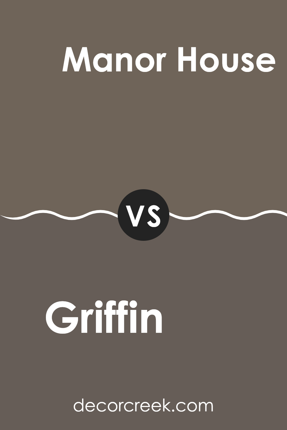
Griffin SW 7026 by Sherwin Williams vs Manor House SW 7505 by Sherwin Williams
Griffin SW 7026 and Manor House SW 7505 are both tones by Sherwin Williams. Griffin is a dark, slate gray that has a subtle warm undertone, making it very versatile and suitable for various spaces. It’s a color that pairs well with brighter shades, helping other colors to pop without overwhelming the room.
On the other hand, Manor House is a rich, warm gray with a noticeably deeper and more pronounced brown undertone. This color provides a cozy, welcoming feel to any space. It’s particularly great in areas where you want a solid, grounding effect but with a bit of warmth.
While both shades are gray, Griffin offers a cooler approach, which could be perfect for a modern look, while Manor House leans towards a classical, warmer tone, ideal for traditional or rustic settings. Both are robust choices but serve slightly different aesthetic goals depending on what atmosphere you’re looking to create.
You can see recommended paint color below:
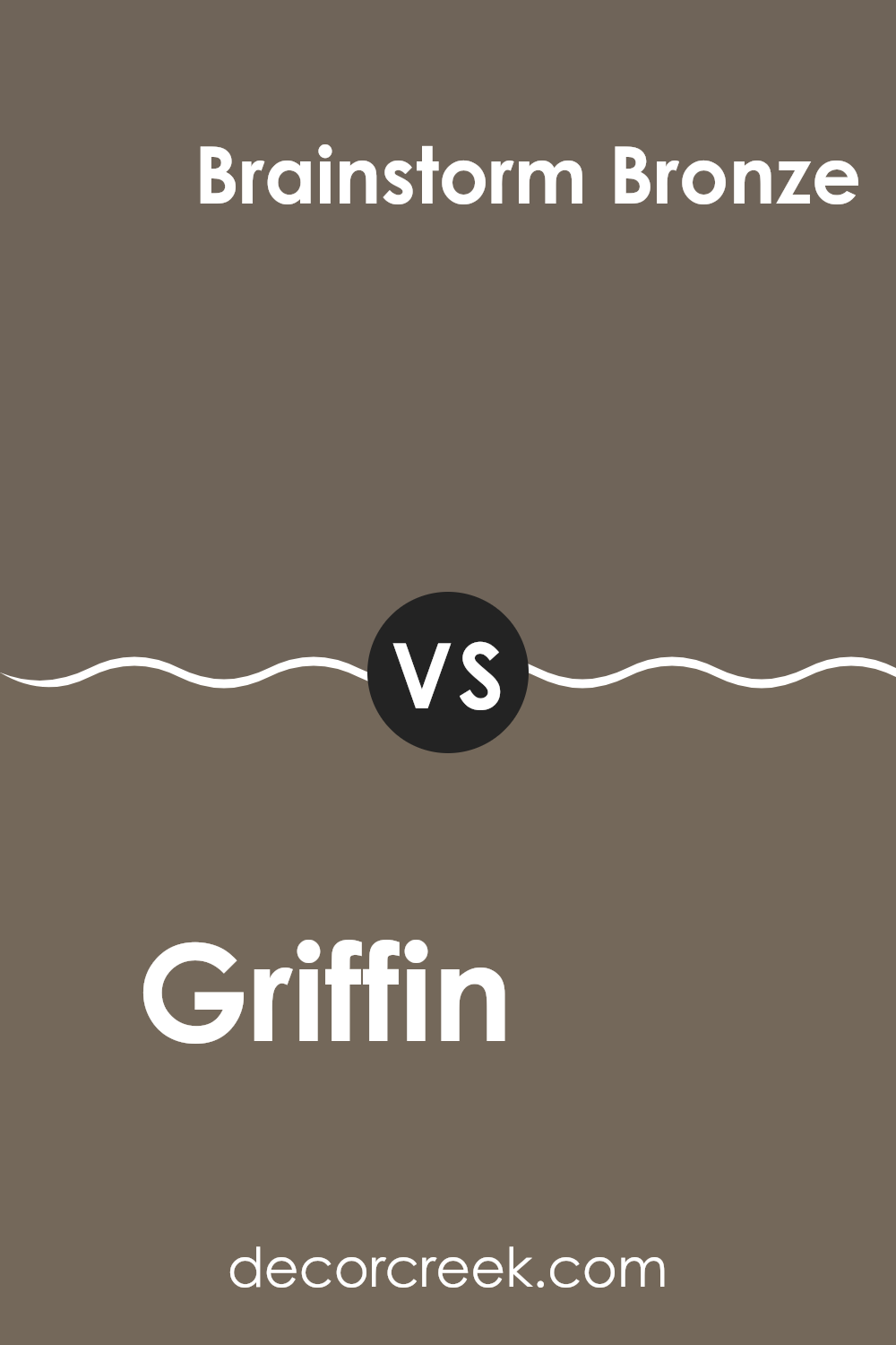
Griffin SW 7026 by Sherwin Williams vs Brainstorm Bronze SW 7033 by Sherwin Williams
Griffin and Brainstorm Bronze are two distinct colors offered by Sherwin Williams. Griffin is a deep, subtle gray with a strong presence, making it a solid choice for spaces that aim for a grounded and calm atmosphere. It’s versatile enough to work in a variety of settings, from living rooms to offices, providing a neutral backdrop that complements a wide range of decor styles.
On the other hand, Brainstorm Bronze has a warmer tone, leaning towards a rich taupe with bronze undertones. This color is cozy and inviting, perfect for creating a welcoming vibe in a space. It pairs well with natural materials like wood and leather, enhancing the warmth of the room.
Both colors provide unique atmospheres: Griffin setting a more muted, neutral stage, while Brainstorm Bronze adds warmth and richness to an area. When deciding between the two, consider the mood you want to set and the elements you’ll pair with them.
You can see recommended paint color below:
Conclusion
It’s a unique color that can make a room feel cozy and welcoming, which is great for places like the living room or a bedroom. What’s really neat about Griffin is that it’s not just plain gray; it has hints of warm tones that can make a big room feel more like a snug space without making it seem small.
Griffin is a smart choice for anyone looking to paint their home. It works well with lots of other colors, so you can use it with your favorite bright or soft colors to make your room look nice. Whether it’s for a modern look or something more classic, this color can handle it all. Plus, it’s not a color that will go out of style quickly, so you won’t need to repaint any time soon. That’s a big bonus!
All in all, picking SW 7026 Griffin can be a fantastic choice if you want a color that makes your home look and feel warm and welcoming. It’s a color that you and your friends or family will likely enjoy.
If you’re thinking about changing up your room or starting fresh in a new space, I think Griffin could be an excellent choice to consider.
Ever wished paint sampling was as easy as sticking a sticker? Guess what? Now it is! Discover Samplize's unique Peel & Stick samples.
Get paint samples

