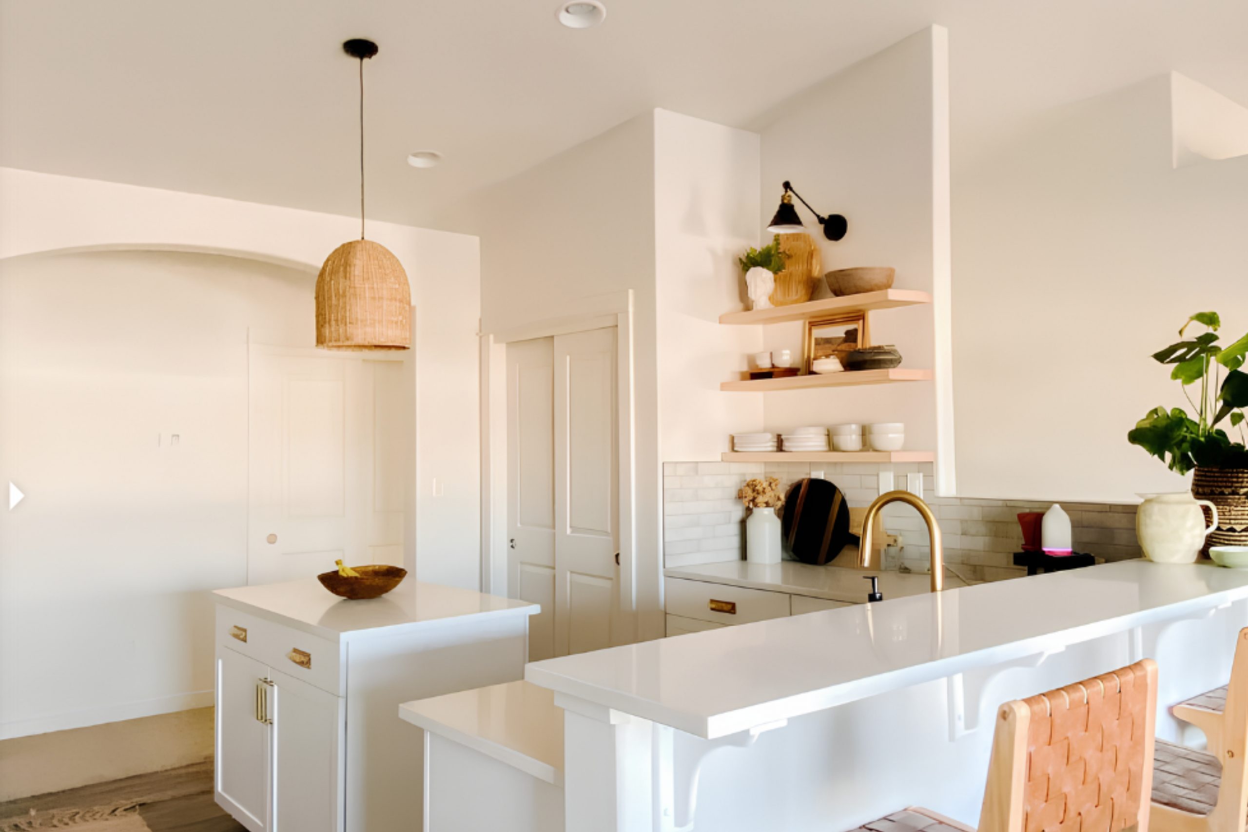
This color, with its soft, muted tones, invites you into a world of subtle elegance and warmth. It’s as if it whispers stories of delicate grace and understated charm. As you spend more time with Fragile Beauty, you notice how it plays with light, gently shifting throughout the day, adding depth and interest to any space.
The warmth of the color has a way of welcoming you, making you feel at home and at ease. It’s versatile, too, working beautifully in various settings, whether you’re aiming for a cozy living area, a soothing bedroom, or an inviting kitchen.
You might find it blending seamlessly with both modern and classic styles, offering a perfect backdrop for personal expression.
In rooms painted with Fragile Beauty, you may sense an air of sophistication without pretension. It creates a peaceful retreat from the chaos of the outside world.
This color seems to capture the essence of nature’s simple elegance, reminding you of soft, sunlit petals or tranquil, sandy shores. As you grow more accustomed to its presence, you discover how it enhances your surroundings, supporting relaxation and thoughtful reflection.
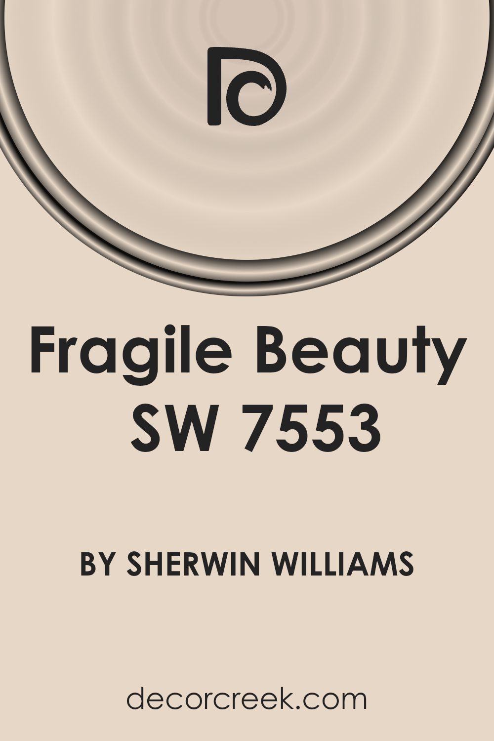
What Color Is Fragile Beauty SW 7553 by Sherwin Williams?
Fragile Beauty by Sherwin Williams is a gentle and soft pink with hints of warmth, creating a cozy and inviting atmosphere. Its subtlety brings a sense of calm and comfort to a room without overwhelming it. The color is versatile, making it an excellent choice for various interior styles.
In a modern minimalist setting, Fragile Beauty stands out by adding a touch of warmth to the clean lines and simple designs. It pairs beautifully with materials like white marble, light oak wood, and brushed metals. For a more traditional or classic interior, this soft pink complements rich mahogany or cherry wood furniture, adding a touch of lightness to darker pieces.
In a shabby chic or cottage style, Fragile Beauty works well with distressed wood, vintage fabrics, and floral patterns, enhancing the cozy, lived-in feel of these styles. This color also beautifully pairs with textures like linen, cotton, and velvet, providing a contrast between the softness of the color and the texture of the materials.
In coastal-themed interiors, this shade can mimic the soft colors of seashells and warm sand, blending effortlessly with light wicker furniture and nautical accents. Fragile Beauty is a warm, adaptable hue that lends a tender touch to any room.
Is Fragile Beauty SW 7553 by Sherwin Williams Warm or Cool color?
Fragile Beauty SW 7553 is a soft and subtle color by Sherwin Williams that brings a sense of calm and warmth to any home. This gentle shade is a mix of beige and light pink undertones, making it a versatile choice for different spaces.
In living rooms, Fragile Beauty adds a cozy and inviting feel, perfect for family gatherings or quiet evenings. In bedrooms, it creates a soothing environment that helps with relaxation and rest. The color works well with natural light, giving rooms a bright and airy appearance.
It can be paired with neutral furnishings for a harmonious look or accented with darker colors for contrast.
Fragile Beauty also complements various textures and materials, such as wood and soft fabrics, enhancing the overall comfort of a space. Whether used on all walls or as an accent, this color brings a gentle charm to interiors, making homes feel welcoming and peaceful.
Undertones of Fragile Beauty SW 7553 by Sherwin Williams
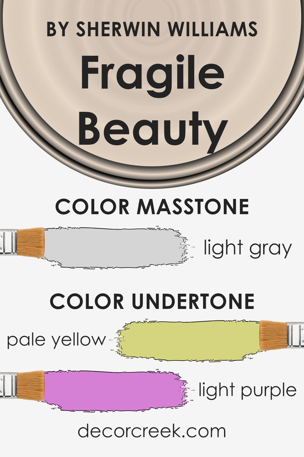
Fragile Beauty SW 7553 by Sherwin Williams is a unique color with a mix of several undertones. These undertones include pale yellow, light purple, light blue, pale pink, mint, lilac, and grey. Each of these subtle hues contributes to how we perceive the color.
Undertones are the underlying colors that can influence the look and feel of the main color. They can change how a color appears in different lighting conditions or when placed next to other colors. For example, a paint color with a blue undertone might appear cooler, while one with a yellow undertone might seem warmer.
For Fragile Beauty SW 7553, the pale yellow undertone adds a hint of warmth, bringing a soft glow to a room. The light purple and lilac tones introduce a gentle, soothing quality, perfect for creating a calming environment. Light blue and mint add a fresh touch, enhancing a sense of openness. Meanwhile, the pale pink offers a touch of warmth and charm, while the grey tone provides balance and depth.
When used on interior walls, these undertones work together to produce a subtle, harmonious look. They can make a space feel welcoming and adaptable, complementing various home decor styles and changing with different light sources throughout the day.
What is the Masstone of the Fragile Beauty SW 7553 by Sherwin Williams?
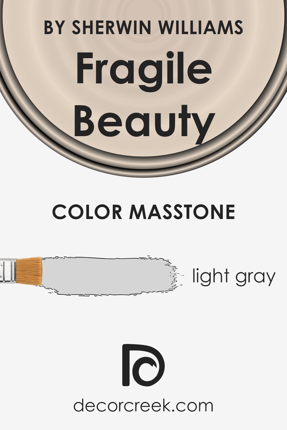
Fragile Beauty by Sherwin Williams is a light gray with a hex value of #D5D5D5. This subtle shade brings a gentle, airy feel to spaces. Its light, neutral tone makes it versatile for various rooms in a home. Being a soft gray, it reflects natural light beautifully, helping to create an open and airy atmosphere in small or dark spaces. This color can make a room feel larger and more inviting, providing a perfect backdrop for both minimalistic and more vibrant decor.
In living rooms or bedrooms, Fragile Beauty pairs well with both warm and cool accents. It can be complemented by white trims for a crisp, clean look or paired with wood tones for a warmer, more natural finish.
In kitchens and bathrooms, this shade works well with stainless steel or matte black fixtures, highlighting a modern, clean design. Overall, this light gray offers a calming and flexible option for home interiors.
How Does Lighting Affect Fragile Beauty SW 7553 by Sherwin Williams?
Lighting plays a significant role in how we perceive color. The type and direction of light can change how a paint color appears once it’s applied to a wall. Fragile Beauty (SW 7553) by Sherwin Williams is a color that can look quite different depending on the lighting conditions.
In artificial light, the color may alter based on the type of bulb used. Fluorescent lights can give Fragile Beauty a cooler tone, making it appear more muted than it might in natural light. Incandescent bulbs, which are warmer, might enhance its softer, warmer undertones, bringing out a cozier feel.
Natural light is more dynamic as it changes throughout the day. In a north-facing room, which receives cool and indirect light, Fragile Beauty might look somewhat subdued and take on cooler tones. The lack of direct sunlight can make colors look a bit grayer, so Fragile Beauty may appear less vibrant.
In a south-facing room, natural light is warm and abundant for most of the day. Here, Fragile Beauty would likely look brighter and warmer, as the direct sunlight enhances its natural tones. This direction can help the color appear more vivid and lively.
East-facing rooms get a lot of warm, direct sunlight in the morning, which means that Fragile Beauty may look more energized and warm in the early hours. As the day progresses, the light cools, and the color might lose some of its warmth as the evening approaches.
West-facing rooms, on the other hand, get warm light in the afternoon and evening. Fragile Beauty might appear cooler in the morning and then take on a warmer tone as the sun sets, echoing the rich light that fills the room.
Understanding how lighting affects your paint choice can help you achieve the desired look and feel for your space.

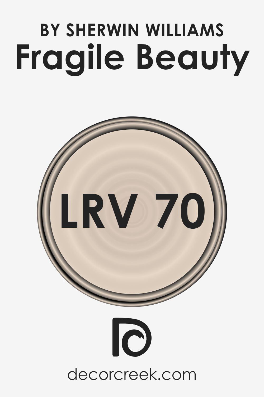
What is the LRV of Fragile Beauty SW 7553 by Sherwin Williams?
LRV stands for Light Reflectance Value, which is a measure of how much light a color reflects or absorbs, on a scale from 0 to 100. A color with a low LRV will absorb more light, making it darker and seemingly more intense. Conversely, a color with a high LRV reflects more light, making it appear lighter and more vibrant.
LRV can be an essential factor when picking paint colors because it helps predict how bright or dark a space will appear once painted. If you’re working with a room that lacks natural light, choosing a color with a higher LRV can help brighten the space.
For the color Fragile Beauty by Sherwin Williams, which has an LRV of 69.951, this means it reflects quite a bit of light. This high LRV makes the color appear luminous and light on the walls, potentially enlarging the room and giving it an airy feel.
It’s an excellent choice for smaller spaces or areas where you want to maximize the perceived light. Rooms painted with this color will likely feel open and inviting, as its high reflective quality helps disperse light throughout the space.
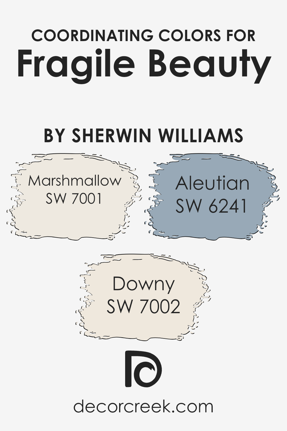
Coordinating Colors of Fragile Beauty SW 7553 by Sherwin Williams
Coordinating colors are shades that complement each other well, providing a harmonious and balanced look when used together in a space. When you pair coordinating colors with a main color like Fragile Beauty from Sherwin Williams, you create an environment where all the colors work together to enhance the overall aesthetic.
This approach makes rooms feel cohesive and visually appealing. By carefully selecting coordinating colors, you can highlight different elements within a space, such as trim, walls, and furniture, creating distinct areas that don’t clash but rather flow seamlessly from one to the next.
Fragile Beauty can be beautifully matched with Marshmallow, Downy, and Aleutian to create a well-rounded color palette. Marshmallow is a delicate, soft white that adds a light and airy touch, making it perfect for smaller rooms or spaces where you want to maximize light.
Downy offers a subtle hint of warmth with its creamy off-white shade, adding coziness without overwhelming a room.
On the cooler end, Aleutian provides a calming blue-gray that pairs well with more neutral tones, offering a peaceful balance. Together, these colors work with Fragile Beauty to craft a setting that is visually interesting yet calming, offering a versatile backdrop for various styles and accents.
You can see recommended paint colors below:
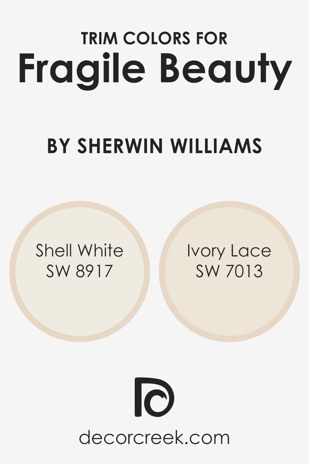
What are the Trim colors of Fragile Beauty SW 7553 by Sherwin Williams?
Trim colors are the final touches that can define a room’s character, acting almost like a frame for the walls. When paired with the gentle, earthy vibe of Fragile Beauty by Sherwin Williams, the right trim colors can enhance its calm, understated elegance. These colors emphasize architecture and details like door frames, molding, and baseboards, adding layers of depth and interest.
Trim colors highlight spaces and offer a seamless transition from one area to another, enhancing the overall experience of a room. Using the right trim can make a significant impact on how colors in a space work together, creating harmony and cohesion that ties everything beautifully.
Shell White and Ivory Lace are excellent choices for trim alongside Fragile Beauty. Shell White is a soft, creamy white with a hint of warmth that complements warm, earthy tones, offering a gentle contrast that enhances the room’s light and adds a touch of coziness.
Ivory Lace is another lovely choice, characterized by its clean, neutral shade that provides a light, airy feel.
This color can highlight architectural details without being too bold or overwhelming. Both colors work brilliantly with Fragile Beauty to create an inviting and visually appealing space, bringing out the best in the main wall color.
You can see recommended paint colors below:
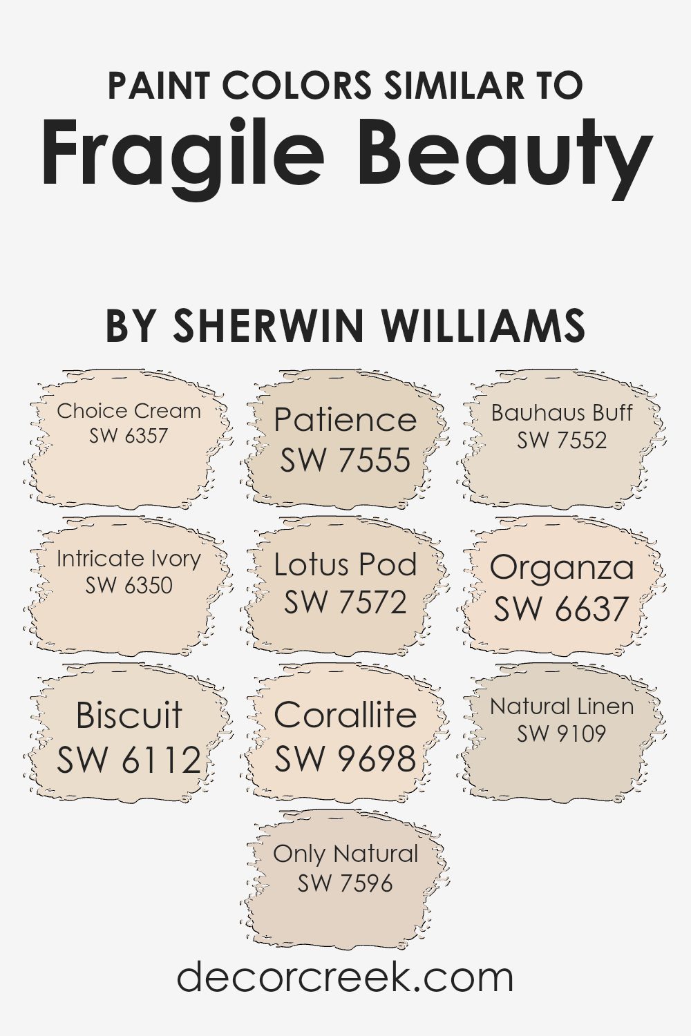
Colors Similar to Fragile Beauty SW 7553 by Sherwin Williams
Similar colors to Fragile Beauty by Sherwin Williams play a crucial role in creating a harmonious and cohesive space. They are essential because they can enhance the overall aesthetic and emotional feel of a room by offering subtle variation and visual interest without overwhelming the senses.
These colors work well together because they share underlying tones and hues, allowing them to blend seamlessly. They can either warm up a space or cool it down, depending on the predominant shade, which makes them versatile for different settings.
SW 6357 – Choice Cream is a soft and gentle yellow with a hint of warmth, ideal for brightening up a room. SW 6350 – Intricate Ivory offers a creamy, neutral backdrop that complements a variety of decor styles.
SW 6112 – Biscuit presents a warm beige tone that brings a cozy, welcoming feeling. SW 7596 – Only Natural adds a touch of earthy richness with its subtle, muted brown.
SW 7555 – Patience is a gentle off-white that creates a calm and airy atmosphere. SW 7572 – Lotus Pod introduces a light brownish-orange that adds a natural, earthy touch. SW 9698 – Corallite offers a warm, inviting coral shade with hints of pink. SW 7552 – Bauhaus Buff features a soft, muted yellow, perfect for a subtle sunny effect. SW 6637 – Organza provides a warm peach tone that’s both gentle and inviting. Finally, SW 9109 – Natural Linen is a light, neutral beige that offers timeless elegance to any space.
You can see recommended paint colors below:
- SW 6357 Choice Cream
- SW 6350 Intricate Ivory
- SW 6112 Biscuit
- SW 7596 Only Natural
- SW 7555 Patience
- SW 7572 Lotus Pod
- SW 9698 Corallite
- SW 7552 Bauhaus Buff
- SW 6637 Organza
- SW 9109 Natural Linen
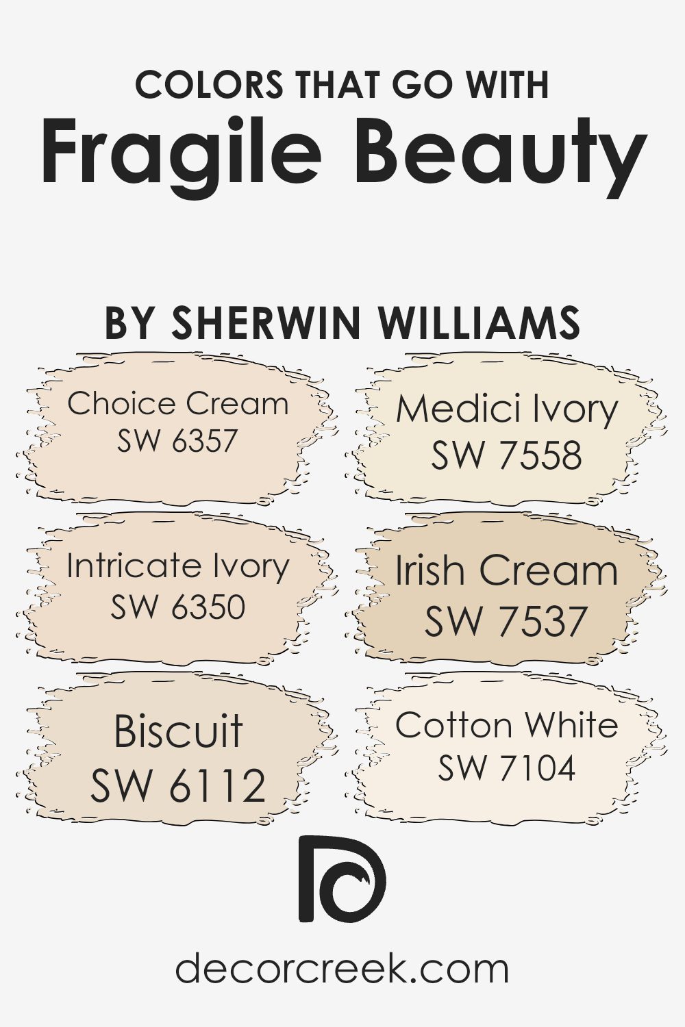
Colors that Go With Fragile Beauty SW 7553 by Sherwin Williams
Choosing colors that complement Sherwin Williams’ Fragile Beauty SW 7553 enhances the space’s overall feel and harmony. Each hue adds a unique touch, creating a balanced and inviting environment. SW 6357 – Choice Cream brings warmth with its soft, buttery tone, making it perfect for cozy settings. It pairs well with the delicate Fragile Beauty, creating a gentle contrast that adds depth to any room. SW 6350 – Intricate Ivory introduces a refined neutral vibe, blending seamlessly with Fragile Beauty to provide an elegant and soothing backdrop.
SW 6112 – Biscuit adds a hint of beige, offering a comforting, earthy feel that ties in beautifully with Fragile Beauty’s understated elegance. Its versatile nature makes it a wonderful choice for adding a bit of warmth without stealing focus.
SW 7558 – Medici Ivory carries a hint of yellow, which brightens a space while keeping the ambiance relaxed. This color’s subtle glow enhances Fragile Beauty’s softer notes. SW 7537 – Irish Cream, with its creamy richness, complements Fragile Beauty by adding a cozy undertone to the palette. Lastly, SW 7104 – Cotton White introduces a crisp, clean finish.
This clean white helps highlight Fragile Beauty, ensuring the space feels bright and open. Together, these colors create a harmonious and inviting atmosphere.
You can see recommended paint colors below:
- SW 6357 Choice Cream
- SW 6350 Intricate Ivory
- SW 6112 Biscuit
- SW 7558 Medici Ivory
- SW 7537 Irish Cream
- SW 7104 Cotton White
How to Use Fragile Beauty SW 7553 by Sherwin Williams In Your Home?
Fragile Beauty SW 7553 by Sherwin Williams is a soft, muted color that brings warmth and comfort to any room. This gentle hue is perfect for creating a cozy and inviting atmosphere in your home. It works well in living rooms or bedrooms, where you want a relaxing and peaceful space.
Pair it with light or neutral furniture to maintain a harmonious look, and add accents of soft grays or whites to enhance its subtle charm.
In a kitchen or dining area, Fragile Beauty can add a touch of warmth without being overwhelming, making it a great backdrop for social gatherings. You might also consider using it in a hallway or entryway to create a welcoming first impression. This versatile shade compliments various styles, whether your taste is modern, traditional, or somewhere in between. It’s a great choice for those who want to create a soothing environment throughout their home.
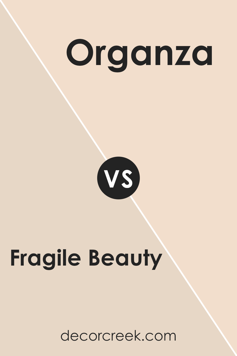
Fragile Beauty SW 7553 by Sherwin Williams vs Organza SW 6637 by Sherwin Williams
Fragile Beauty SW 7553 and Organza SW 6637 are soft, pastel colors that bring a gentle touch to any space. Fragile Beauty is a warm, light neutral with a slight hint of pink or peach, giving it a comfortable and inviting feel. It’s versatile and pairs well with many other colors, making it a popular choice for walls when you want a calm background.
Organza, on the other hand, is a lovely, light peachy-pink hue. It feels fresh and lively, bringing a cheerful vibe to a room without being overpowering. It’s great for adding a subtle pop of color that still maintains a softness.
While Fragile Beauty can create a soothing backdrop, Organza adds a bit more energy and brightness. Both colors work well in various settings, but your choice depends on the atmosphere you want to create: cozy and neutral with Fragile Beauty, or light and playful with Organza.
You can see recommended paint color below:
- SW 6637 Organza
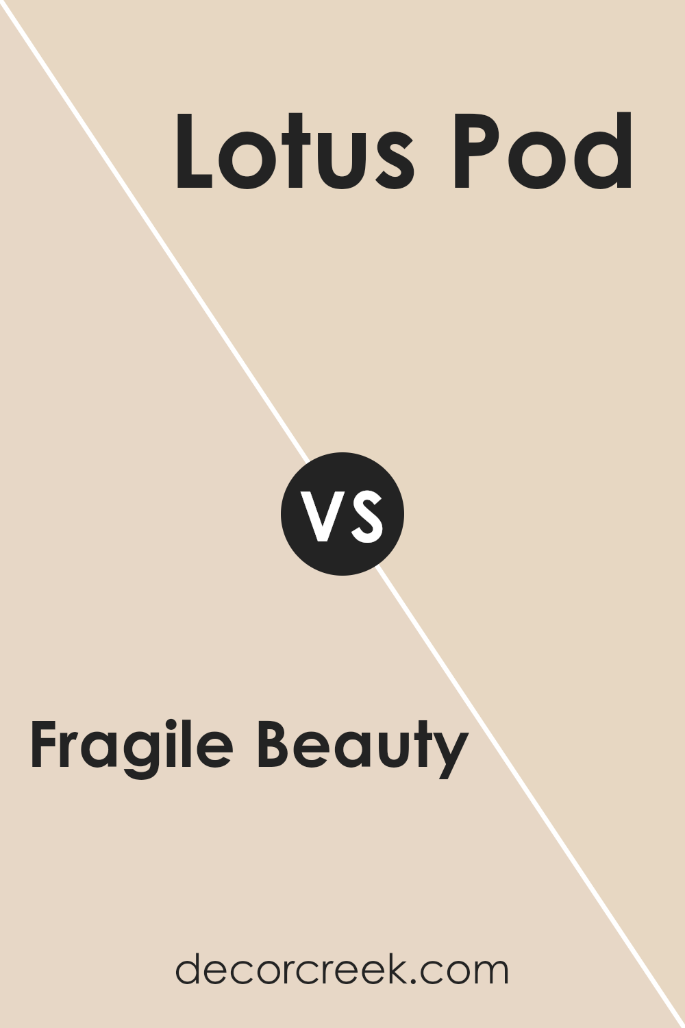
Fragile Beauty SW 7553 by Sherwin Williams vs Lotus Pod SW 7572 by Sherwin Williams
Fragile Beauty SW 7553 and Lotus Pod SW 7572 by Sherwin Williams are both warm, inviting colors but have distinct qualities. Fragile Beauty is a soft, muted pink that creates a gentle, calming atmosphere. It’s ideal for spaces where you want a soothing and delicate vibe.
On the other hand, Lotus Pod is a warm, earthy beige with subtle hints of gray. This color is versatile and adds a cozy, grounded feeling to a room. While Fragile Beauty is more feminine and airy, Lotus Pod offers a neutral backdrop that’s more understated.
Together, these colors can complement each other beautifully, with Fragile Beauty adding a touch of softness and Lotus Pod providing a stable, balanced foundation. Whether used individually or together, they both work well in creating comfortable, welcoming spaces.
You can see recommended paint color below:
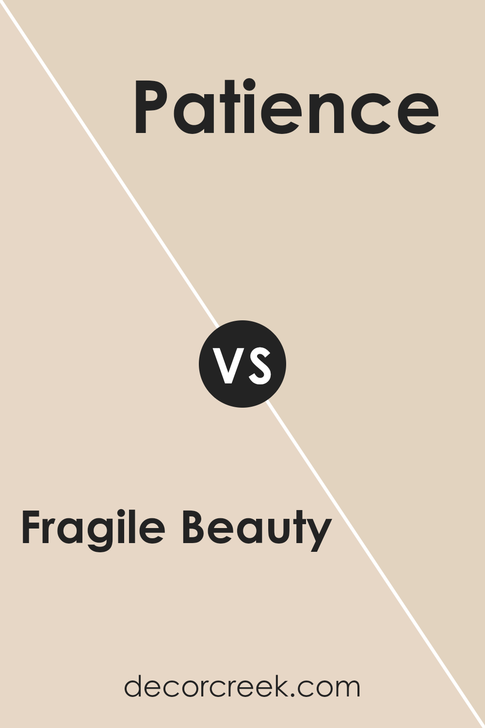
Fragile Beauty SW 7553 by Sherwin Williams vs Patience SW 7555 by Sherwin Williams
Fragile Beauty SW 7553 is a soft, warm neutral color by Sherwin Williams that exudes a gentle and inviting vibe. It sits comfortably as a backdrop color, creating a cozy and welcoming atmosphere in any room. Its subtle warmth makes it versatile, pairing easily with a variety of other colors and decor styles.
On the other hand, Patience SW 7555 is a lighter and cooler shade. It has a more understated appearance, bringing a sense of calm and quiet to spaces. While Fragile Beauty leans towards warmth, Patience carries a hint of coolness, which can create a refreshing and airy feel.
When comparing the two, Fragile Beauty feels more snug and intimate, while Patience offers a breezy and relaxed atmosphere. Both colors are suitable for creating serene environments, but they offer slightly different moods based on their undertones—one warm and the other cool.
You can see recommended paint color below:
Fragile Beauty SW 7553 by Sherwin Williams vs Natural Linen SW 9109 by Sherwin Williams
Fragile Beauty and Natural Linen, both by Sherwin Williams, offer distinct yet subtle charm for interior spaces. Fragile Beauty has a warm, peachy tone that brings a gentle vibrancy to a room, adding a touch of warmth without being overpowering. It feels light and welcoming, making it ideal for spaces like living rooms or bedrooms where a cozy atmosphere is desired.
In contrast, Natural Linen is a soft, muted beige with a slight taupe undertone. It presents a more neutral and calming effect, suitable for creating a serene environment. Its understated character makes it versatile and easy to pair with other colors and decor elements.
While Fragile Beauty adds a hint of color and brightness, Natural Linen excels in its ability to blend seamlessly into any setting, offering a timeless backdrop. Choosing between these two depends on whether one desires a warmer, more vibrant space or a calm, neutral environment.
You can see recommended paint color below:
Fragile Beauty SW 7553 by Sherwin Williams vs Bauhaus Buff SW 7552 by Sherwin Williams
Fragile Beauty (SW 7553) and Bauhaus Buff (SW 7552) are two warm, neutral colors from Sherwin Williams that offer different vibes. Fragile Beauty is a soft, muted pink-beige, which gives spaces a gentle and calming feel. It’s perfect for creating a cozy, inviting atmosphere in living rooms or bedrooms. The subtle hue adds warmth without being overpowering.
On the other hand, Bauhaus Buff is a warm, light beige with a slightly more yellow undertone compared to Fragile Beauty. It feels a bit sunnier and can brighten up a room while maintaining a neutral palette. Bauhaus Buff works well in kitchens or bathrooms where a fresh, clean look is desired.
Both colors are versatile and can be paired easily with other shades. Whether you choose the soft, rosy tones of Fragile Beauty or the cheerful, warm hue of Bauhaus Buff, both can create inviting spaces that feel comfortable and welcoming.
You can see recommended paint color below:
Fragile Beauty SW 7553 by Sherwin Williams vs Choice Cream SW 6357 by Sherwin Williams
Fragile Beauty SW 7553 and Choice Cream SW 6357 by Sherwin Williams are both soft, warm colors, but they differ in their undertones and feel. Fragile Beauty is a gentle pinkish shade with a touch of peach, lending a romantic and delicate vibe to spaces. It’s perfect for creating a cozy, inviting atmosphere in bedrooms or living rooms, adding a subtle hint of color without overwhelming the senses.
On the other hand, Choice Cream SW 6357 is a creamy, buttery yellow that exudes warmth and sunshine. It’s a slightly more vibrant option compared to Fragile Beauty, bringing a cheerful and uplifting feel to any room. This shade works well in kitchens or entryways where you want to add some brightness and warmth.
Both colors are versatile and can be paired with various other shades, but Fragile Beauty leans towards a more subtle, soft look, while Choice Cream offers a lively, sunny touch.
You can see recommended paint color below:
Fragile Beauty SW 7553 by Sherwin Williams vs Only Natural SW 7596 by Sherwin Williams
Fragile Beauty SW 7553 by Sherwin Williams is a gentle and soft pink with warm undertones. This color adds a light and airy feel to a space, creating a cozy and welcoming atmosphere. It is subtle, making it an excellent choice for bedrooms or living rooms where a calm vibe is desired.
In contrast, Only Natural SW 7596 is a rich, earthy shade of terracotta. It exudes warmth and comfort with its rusty orange-brown tone. This color can make a space feel grounded and inviting. It’s ideal for adding a touch of nature-inspired warmth to dining areas or feature walls.
While Fragile Beauty brings a sense of lightness, Only Natural offers depth and warmth. Together, they create a balanced palette—Fragile Beauty providing a soft background, and Only Natural offering bold accents. These colors harmonize well, enhancing any home with warmth and gentle elegance.
You can see recommended paint color below:
Fragile Beauty SW 7553 by Sherwin Williams vs Biscuit SW 6112 by Sherwin Williams
Fragile Beauty (SW 7553) and Biscuit (SW 6112) by Sherwin Williams are both warm, neutral tones, but they offer different vibes. Fragile Beauty is a softer, more muted color with a hint of pink, giving it an inviting and gentle feel. It can add a touch of warmth without being overpowering, making spaces feel cozy and welcoming.
On the other hand, Biscuit is a light, creamy beige with a stronger yellow undertone. It feels brighter and sunnier, creating an uplifting and airy atmosphere. Biscuit works well in spaces where you want more light and openness, playing well with natural light.
While Fragile Beauty can add a subtle, comforting warmth, Biscuit can brighten a room effortlessly. Both colors are versatile and can be paired with various accents and furnishings, but they bring distinctly different moods to a room. Fragile Beauty leans towards a soft, comforting ambiance, while Biscuit feels more cheerful and light.
You can see recommended paint color below:
Fragile Beauty SW 7553 by Sherwin Williams vs Corallite SW 9698 by Sherwin Williams
Fragile Beauty is a soft and gentle shade that has a calming effect. It tends to be a pale, muted pink that can bring a warm and cozy feel to a room. This color works well in spaces where you want a subtle touch of color without it being too overpowering.
On the other hand, Corallite is a more vibrant and energetic hue. It leans towards a lively coral or peach tone. This color is perfect for making a bold statement and can add a cheerful and bright vibe to any area.
While Fragile Beauty creates a sense of quiet peace, Corallite injects energy and liveliness into a space. These two colors, when paired together, offer a nice balance between calmness and vibrancy. Depending on the desired mood of a room, either Fragile Beauty or Corallite can be a great choice to fit the ambiance you are aiming for.
You can see recommended paint color below:
- SW 9698 Corallite
Fragile Beauty SW 7553 by Sherwin Williams vs Intricate Ivory SW 6350 by Sherwin Williams
Fragile Beauty SW 7553 and Intricate Ivory SW 6350 by Sherwin Williams are two light and subtle colors that can enhance any space. Fragile Beauty is a gentle, warm beige with a slight pink undertone, creating a soft and inviting atmosphere.
It is perfect for spaces where you want a touch of warmth without overwhelming the senses. In contrast, Intricate Ivory is a creamy, soft ivory with a hint of warmth, but it stays closer to a neutral off-white shade. This makes Intricate Ivory versatile for larger areas where a subtle background color is desired.
Both colors are soothing and easy on the eyes, yet Intricate Ivory might lend itself more to being an understated backdrop due to its closer affinity to white. When used together, Fragile Beauty might highlight specific areas, while Intricate Ivory maintains a calm base, creating a harmonious balance in the room.
You can see recommended paint color below:
After reading about SW 7553 Fragile Beauty by Sherwin Williams, I feel like I have a new friend in the world of colors. Fragile Beauty isn’t just a paint color; it’s like a cozy sweater for your walls. It’s gentle, warm, and feels inviting, like a hug from your favorite teddy bear. This color reminds me of soft sands on a sunny beach or maybe creamy hot chocolate on a chilly day.
When you look at this shade, it’s like your room smiles at you. This paint can make any room feel comfy and welcoming. I imagine it in a living room where families gather to tell stories or in a bedroom where dreams happen.
The special part is that Fragile Beauty works well with so many other colors. It’s as if it’s saying, “Hey, I can be friends with everyone!” So, whether you pair it with bold reds or gentle greens, it knows how to balance and play nice.
In my eyes, Fragile Beauty is more than just a pretty color. It’s a feeling. It can turn a house into a home.
Every brushstroke seems to whisper calm and happiness, making everyday moments special. After learning about it, I can see how Fragile Beauty is like a quiet hero in the paint world – always ready to make things better without making a fuss. It really shows how paint can do magic!
Ever wished paint sampling was as easy as sticking a sticker? Guess what? Now it is! Discover Samplize's unique Peel & Stick samples.
Get paint samples

