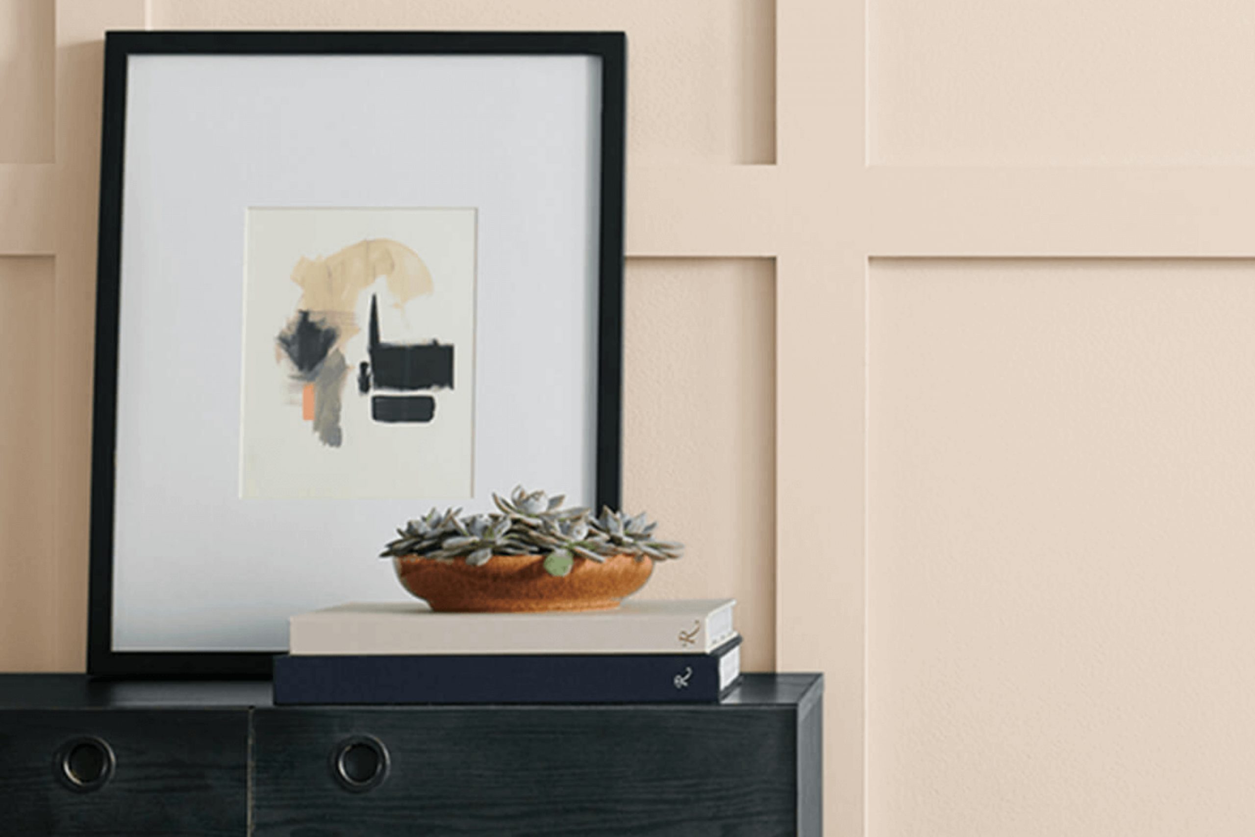
When I think about SW 7596 Only Natural by Sherwin Williams, I feel a sense of calm come over me. This color has a way of turning any space into a warm and inviting haven. It’s the kind of shade that whispers comfort and serenity without overwhelming the senses. As soon as I brought it into my home, it was like opening a window to a breath of fresh air.
The hue is a gentle blend of earthy tones, combining the subtlety of a soft beige with the warmth of a light brown. It doesn’t shout for attention but rather sits quietly, bringing a sense of balance and peace. When the sun hits it just right, the color unfolds like a cozy blanket, wrapping the room in a gentle glow.
What I appreciate most about Only Natural is its versatility. Whether in living rooms, bedrooms, or kitchens, it creates a backdrop that is both timeless and contemporary. It allows for endless creativity with decor and furnishings, seamlessly complementing both vibrant patterns and simple designs.
This is a shade that doesn’t dictate, but rather suggests, allowing your personality and style to shine through in any space.
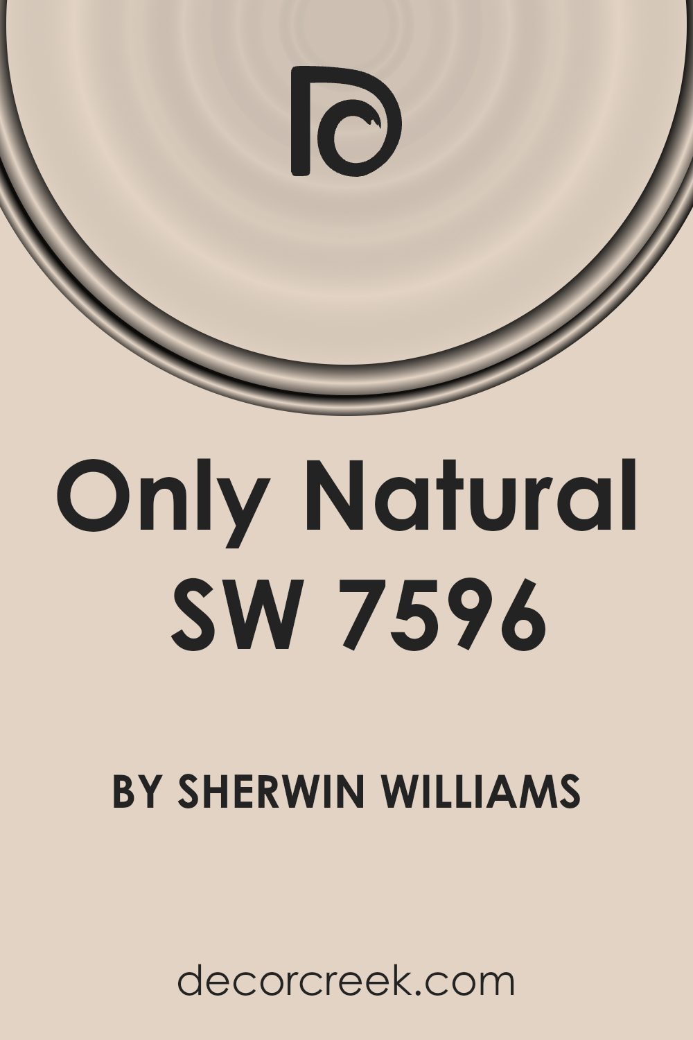
What Color Is Only Natural SW 7596 by Sherwin Williams?
The color Only Natural (SW 7596) by Sherwin Williams is a soothing and earthy beige tone. This soft, warm hue brings a sense of calm and comfort to any space. Its neutral quality makes it versatile, fitting well into various interior styles.
In a minimalist setting, Only Natural provides a gentle background that enhances simplicity and uncluttered spaces. For more traditional or rustic interiors, this color works wonderfully with natural wood tones and organic elements, highlighting their warm, inviting characteristics.
Only Natural pairs beautifully with materials like wood, giving any room a cozy, grounded feel. It complements textures such as linen and cotton, adding a layer of warmth and softness to the overall design. In modern or contemporary interiors, this hue serves as a great backdrop for clean lines and sleek finishes, such as glass and metal.
For a cozy living room, use Only Natural on the walls and add a mix of textured cushions and throws. In the kitchen, consider using it for the cabinetry, alongside stone countertops for an elegant look. The color also suits bedrooms, creating a restful ambiance when paired with plush textiles and soft lighting. Only Natural’s versatile and understated nature makes it a valuable choice for any interior space.
Is Only Natural SW 7596 by Sherwin Williams Warm or Cool color?
Only Natural SW 7596 by Sherwin Williams is a warm, neutral shade that adds a cozy and inviting atmosphere to any room. Its soft, earthy undertones create a sense of comfort and relaxation, making it a great choice for living spaces, bedrooms, and even kitchens.
This color works well with a variety of other colors, allowing it to fit into different styles of decoration. You can pair it with whites and beiges for a clean, modern look, or combine it with deeper colors like greens and browns for a more traditional feel.
Only Natural is perfect for homes where you want a timeless, neutral backdrop that doesn’t clash with furniture or other decor elements. Its subtle warmth helps in making large rooms feel more intimate and small rooms feel cozy. Whether your style is contemporary or classic, this color adapts well, providing a simple yet effective foundation for your home’s color palette.
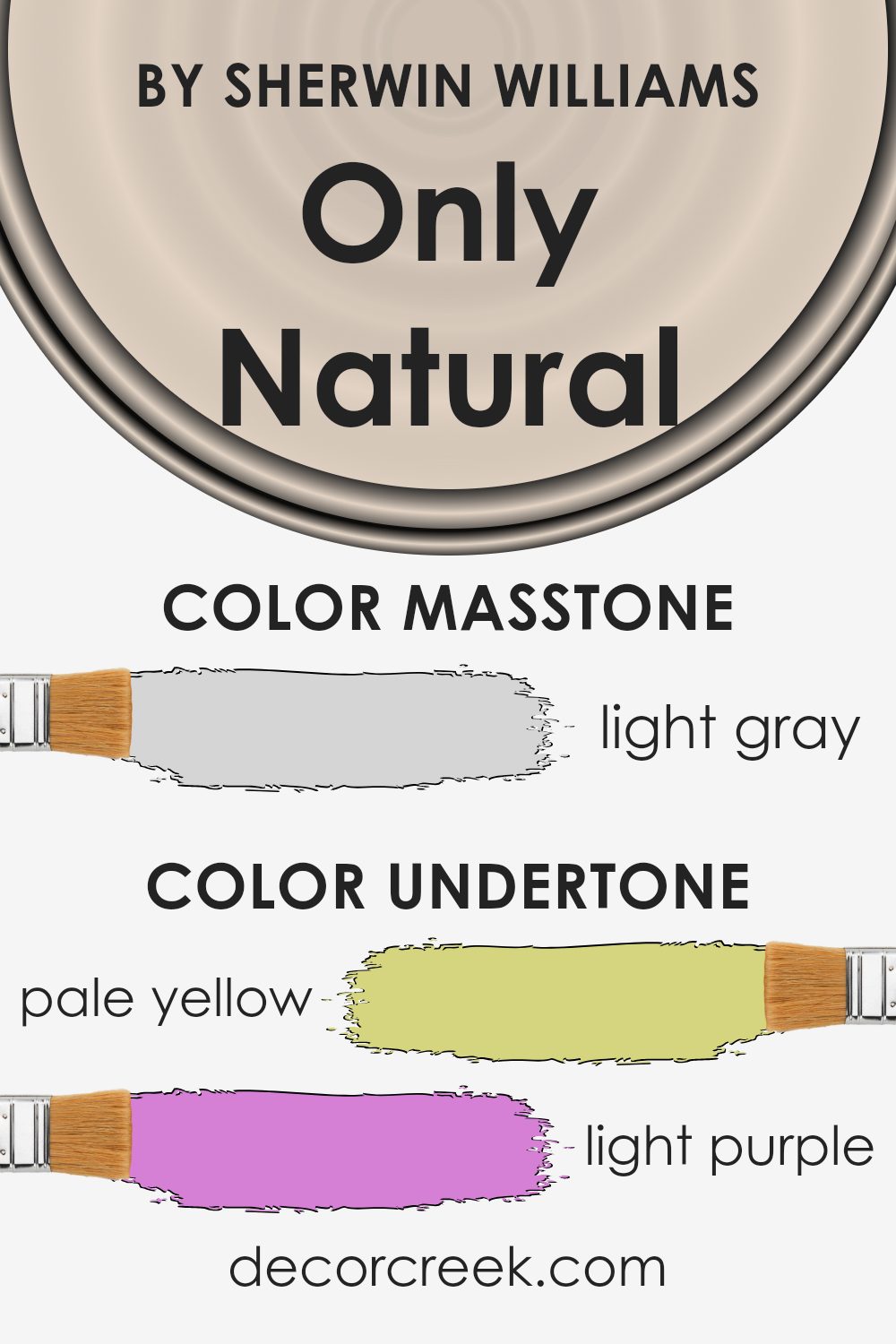
Undertones of Only Natural SW 7596 by Sherwin Williams
When we look at a paint color, it might seem straightforward at first. However, many paints have undertones that influence how we perceive them. These undertones can subtly change the appearance of a color based on the lighting and surrounding colors in a room.
For the paint color “Only Natural” by Sherwin Williams, several undertones come into play. Pale yellow, light purple, light blue, pale pink, mint, lilac, and grey all contribute to the overall hue. These undertones can shift how the paint looks depending on the light and time of day.
For example, a room with lots of natural sunlight might bring out the warmer, yellow or pink tones, making the walls feel cozy and inviting. In contrast, in a room with cooler, artificial lighting, the lilac or grey might dominate, giving the space a more neutral or cool feel.
These undertones also interact with the colors of furniture, floors, and decor. A room with blue furnishings might make the blue undertones more apparent, while green plants might highlight the mint. Thus, understanding the undertones helps you anticipate how the color will look in your home, allowing for harmonious and complementary design choices.
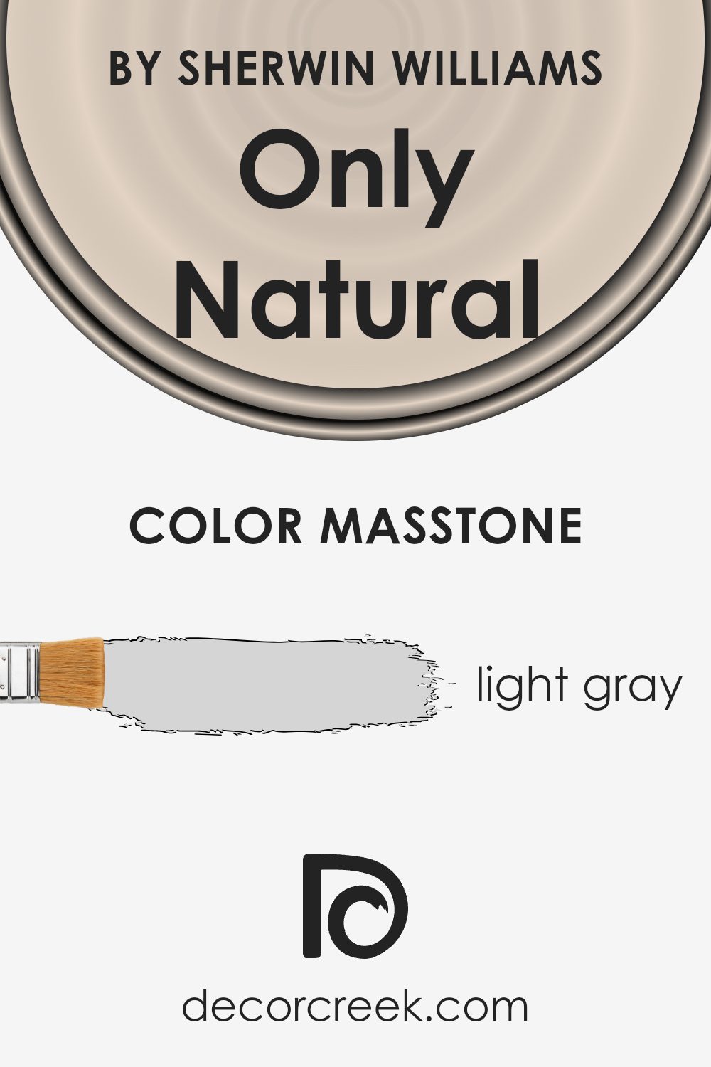
What is the Masstone of the Only Natural SW 7596 by Sherwin Williams?
Only Natural (SW 7596) by Sherwin Williams is a soft, light gray color that is versatile for home use. Its masstone, #D5D5D5, gives it a neutral and calming presence in any room. This subtle shade works well as a backdrop in living rooms, bedrooms, and kitchens. It pairs beautifully with both warm and cool colors, allowing homeowners to easily change decorations or furniture without worrying about clashing hues.
In rooms with a lot of natural light, Only Natural can brighten up the space, giving it a fresh and open feel. In rooms with less light, it maintains a warm and cozy atmosphere. Because it is a neutral shade, it won’t overpower other design elements, making it perfect for creating a balanced and harmonious environment.
This versatility ensures that the color remains timeless and can adapt to various styles, whether modern or classic.
How Does Lighting Affect Only Natural SW 7596 by Sherwin Williams?
Lighting plays a crucial role in how we perceive color. The type and direction of light can significantly change how a color looks. For example, the color “Only Natural” (SW 7596) by Sherwin Williams can appear differently depending on whether it is seen in natural light or artificial light.
Under natural light, colors tend to show their most authentic tones. In artificial lighting, however, the color might change slightly due to the color temperature of the light bulbs being used. Warm bulbs (like incandescent lights) might make “Only Natural” appear warmer, with more yellow or soft beige tones. In contrast, cool bulbs (like some LEDs) might make the color appear a bit grayer or muted.
Now, let’s consider how “Only Natural” would look in rooms facing different directions:
- 1. North-facing rooms: These rooms receive cooler and less direct sunlight. Colors can appear more subdued, and “Only Natural” might look a bit cooler, taking on grayish or muted tones. It’s less likely to show its warmer aspects in these rooms.
- 2.South-facing rooms: These rooms are generally bright throughout the day, which can make colors appear more vibrant. “Only Natural” in a south-facing room would likely show its true warm beige tone more prominently, as the abundant light brings out the warmth in the color.
- 3.East-facing rooms:Morning light in these rooms is warm and yellowish, which can enhance the warm qualities of “Only Natural” early in the day. However, as the day progresses and the light fades, the color might seem more muted.
- 4.West-facing rooms: These get the warmest light in the afternoon and early evening. In these rooms, “Only Natural” can look rich and inviting later in the day when the warm sunlight brings out its depth.
Understanding these variations helps in choosing the right lighting or direction to achieve the desired effect with “Only Natural.”

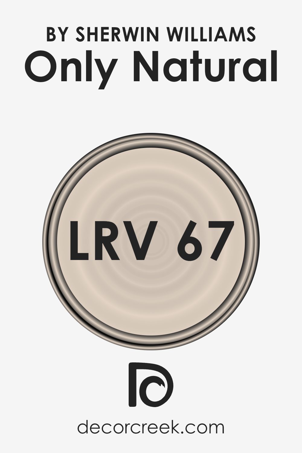
What is the LRV of Only Natural SW 7596 by Sherwin Williams?
The term “LRV” stands for Light Reflectance Value, which is a measurement that tells us how much light a color reflects. It’s a scale that goes from 0 to 100, where 0 means the color absorbs all light (true black), and 100 means it reflects all light (pure white).
LRV is important when picking paint colors because it helps us understand how light or dark a color will look on our walls. A higher LRV means the color will reflect more light, making a room feel brighter and more open. On the other hand, paint colors with a lower LRV will absorb more light, making the space feel more intimate and cozy.
For the color “Only Natural” by Sherwin Williams, which has an LRV of 66.579, this tells us that the color will reflect a fair amount of light while still having some depth. With this LRV, “Only Natural” will brighten up a room and make it feel more spacious, yet it’s not so high that it makes the walls look stark or washed out.
It strikes a nice balance, giving a room warmth and lightness without overpowering with brightness. This makes it a great color choice for spaces where you want a balance of warmth and openness, such as living rooms or bedrooms.
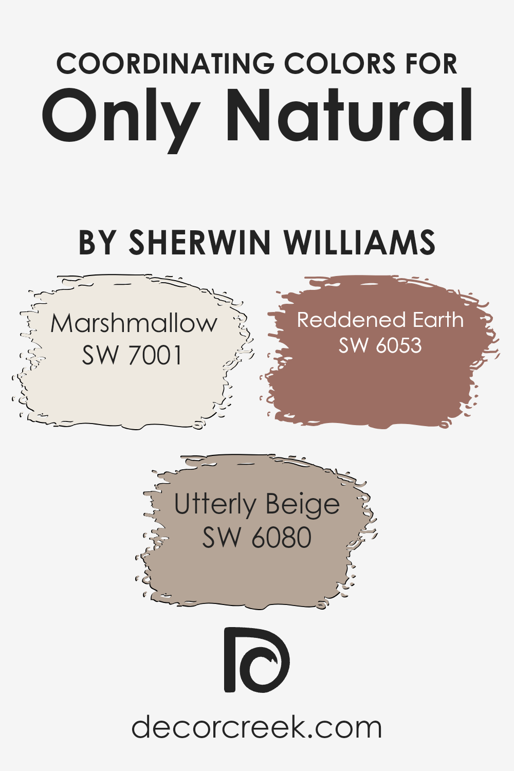
Coordinating Colors of Only Natural SW 7596 by Sherwin Williams
Coordinating colors are hues that work well together, creating a pleasing and harmonious look. These colors are selected to complement a base color, enhancing the overall style and feel of a space. For the shade Only Natural by Sherwin Williams, great coordinating colors include Marshmallow, Utterly Beige, and Reddened Earth. These colors help balance and bring out the essence of Only Natural in a room.
Marshmallow, a soft and warm white, adds an airy and gentle touch. It creates a bright and clean backdrop, allowing the deeper tones to stand out without overpowering the space. Utterly Beige is a neutral with a subtle warmth, which perfectly complements the natural tones of Only Natural, adding a layer of coziness and comfort.
Reddened Earth brings a rich and earthy quality, infusing spaces with a grounded and inviting feel. When these colors are used together, they create an inviting environment that feels both warm and balanced, making a space feel harmonious and connected.
You can see recommended paint colors below:
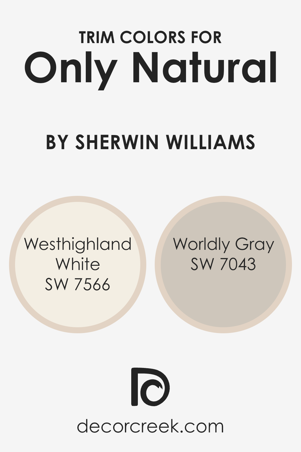
What are the Trim colors of Only Natural SW 7596 by Sherwin Williams?
Trim colors are the hues used to highlight or frame the main color on walls, doors, and windows, adding definition and visual interest. Choosing the right trim color can bring out the best in your primary wall color. For example, when using a color like Only Natural by Sherwin Williams, trim colors can enhance its warm and earthy undertones, contributing to a harmonious room.
Trim colors such as Westhighland White and Worldly Gray are excellent choices for this purpose. A suitable trim color can provide contrast or a subtle match, influencing the overall look and feel of a space. It’s essential not only to choose a primary wall color that you love, but also to pair it with trim colors that complement and support your design vision.
Westhighland White by Sherwin Williams is a soft, creamy white that offers a gentle brightness without being too stark or cold. It’s an excellent choice for those who want a warm and inviting appearance. On the other hand, Worldly Gray is a pleasant and versatile gray with subtle warmth, making it a great companion to both warm and cool tones.
Using Worldly Gray as a trim color can create a calming contrast with many wall colors, like Only Natural. Together, these trim colors highlight the subtle nuances in your primary color, giving the room a polished appearance. This careful consideration ensures each room looks cohesive and thoughtfully designed.
You can see recommended paint colors below:
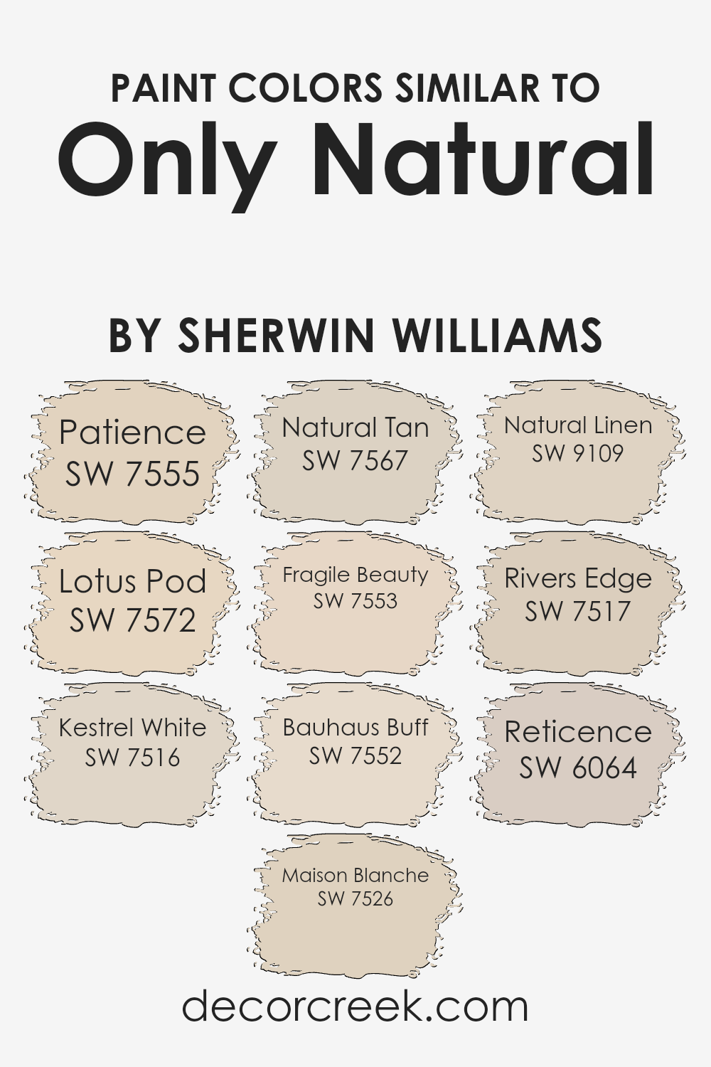
Colors Similar to Only Natural SW 7596 by Sherwin Williams
Colors play a crucial role in creating a harmonious and unified look in any space. Similar colors to Sherwin Williams’ Only Natural, such as SW 7555 Patience, work together to evoke a sense of warmth and comfort. Patience is a gentle beige that provides a soothing backdrop. SW 7572 Lotus Pod offers a slightly deeper tone with its warm, earthy feel, making it perfect for adding a touch of coziness.
SW 7516 Kestrel White is a soft, creamy white that maintains brightness while complementing warmer hues. Maison Blanche, known as SW 7526, introduces a pale, sandy tone, ideal for spaces looking for a subtle lift.
Natural Tan, with its light and understated vibe, acts as a neutral base, while SW 7553 Fragile Beauty, with its pink undertones, adds a delicate touch to any room. Meanwhile, Bauhaus Buff (SW 7552) presents a more grounded, beige tone, which works well with more subtle color palettes.
SW 9109 Natural Linen provides a versatile, warm neutral, mixing beige and soft cream tones. SW 7517 Rivers Edge combines earthy and muted notes for a calming environment. Lastly, Reticence (SW 6064) introduces a light, muted mauve, adding a slight touch of color while remaining easy on the eyes. Together, these similar colors bring warmth and cohesion to various settings.
You can see recommended paint colors below:
- SW 7555 Patience
- SW 7572 Lotus Pod
- SW 7516 Kestrel White
- SW 7526 Maison Blanche
- SW 7567 Natural Tan
- SW 7553 Fragile Beauty
- SW 7552 Bauhaus Buff
- SW 9109 Natural Linen
- SW 7517 Rivers Edge
- SW 6064 Reticence
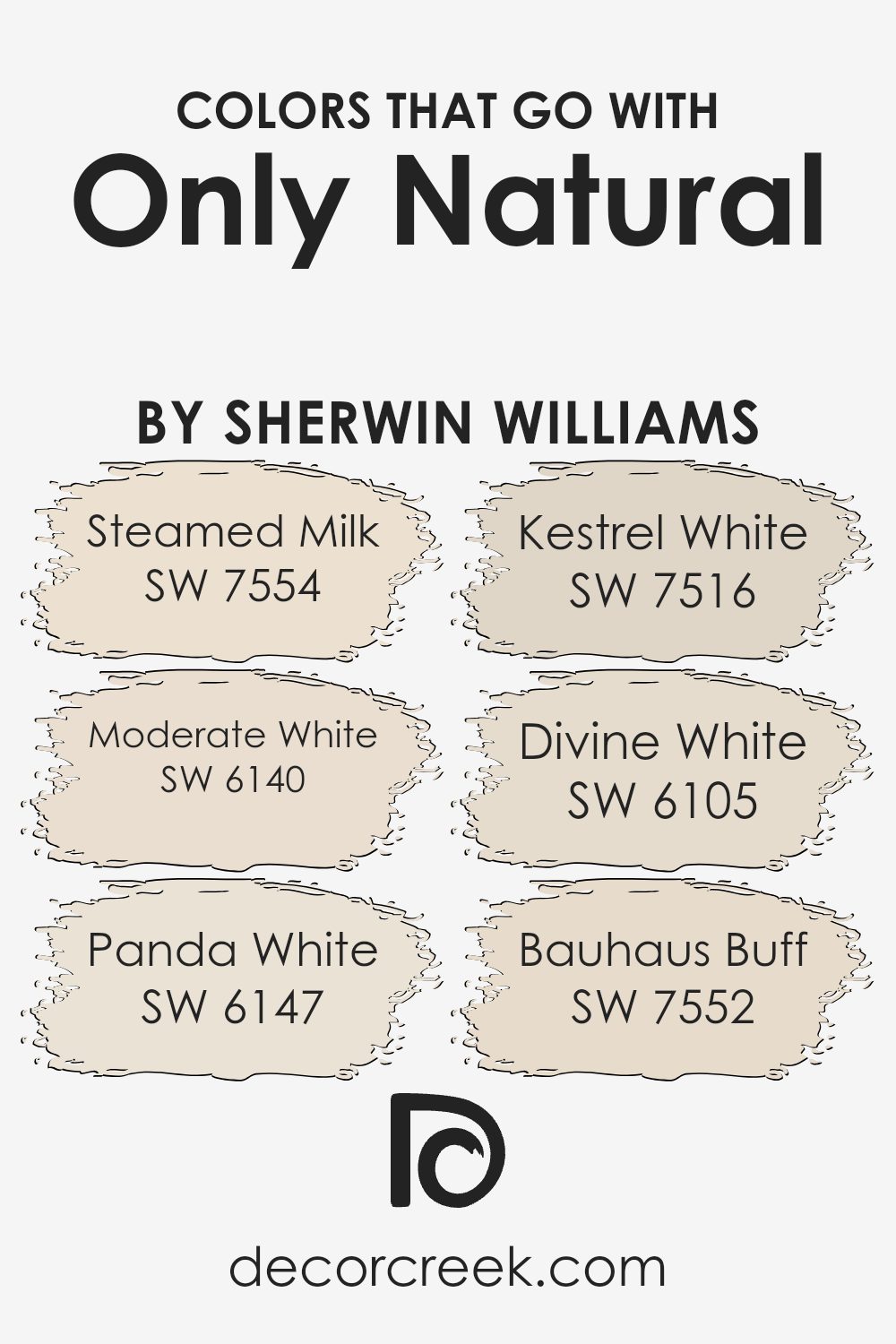
Colors that Go With Only Natural SW 7596 by Sherwin Williams
When selecting colors that complement Only Natural SW 7596 by Sherwin Williams, it’s important to choose shades that enhance its warm, earthy tone. These coordinating colors help create a cohesive and inviting space where each paint hue plays off the other.
SW 7554 – Steamed Milk is a soft and creamy shade that provides a gentle backdrop, making it an excellent match for the warm tones in Only Natural. Meanwhile, SW 6140 – Moderate White offers a slightly warmer, muted white with a hint of beige, which blends nicely with the natural look of Only Natural, creating harmony without being overpowering.
SW 6147 – Panda White is another versatile choice, adding subtle warmth and depth, making spaces feel cozy yet open. SW 7516 – Kestrel White, with its slight gray undertone, adds a touch of elegance and complements the natural tones of Only Natural beautifully. SW 6105 – Divine White is a great buffer that provides a light, neutral touch, making it easy to pair with other colors.
Lastly, SW 7552 – Bauhaus Buff, with its warm, inviting hue, brings out the natural beauty in Only Natural, making spaces feel lively yet grounded. Together, these colors enhance the overall aesthetic and create a balanced atmosphere.
You can see recommended paint colors below:
- SW 7554 Steamed Milk
- SW 6140 Moderate White
- SW 6147 Panda White
- SW 7516 Kestrel White
- SW 6105 Divine White
- SW 7552 Bauhaus Buff
How to Use Only Natural SW 7596 by Sherwin Williams In Your Home?
Only Natural SW 7596 by Sherwin Williams is a warm and inviting paint color, perfect for creating a cozy atmosphere in your home. It is a soft beige with subtle peach undertones, making it a versatile choice for many spaces.
You can use it in living rooms to add warmth and comfort, complementing neutral furniture and decor. It works well in bedrooms too, providing a calming backdrop that pairs beautifully with earthy tones and natural materials like wood and linen.
In the kitchen, Only Natural can add a homey feel, blending nicely with both modern and traditional styles. It also works in hallways and entryways, giving these transitional spaces a welcoming touch. If you want a cohesive look throughout your home, consider using Only Natural as the main wall color and accenting it with deeper shades or brighter hues in accessories and furnishings. It’s a great way to create a unified and warm environment.
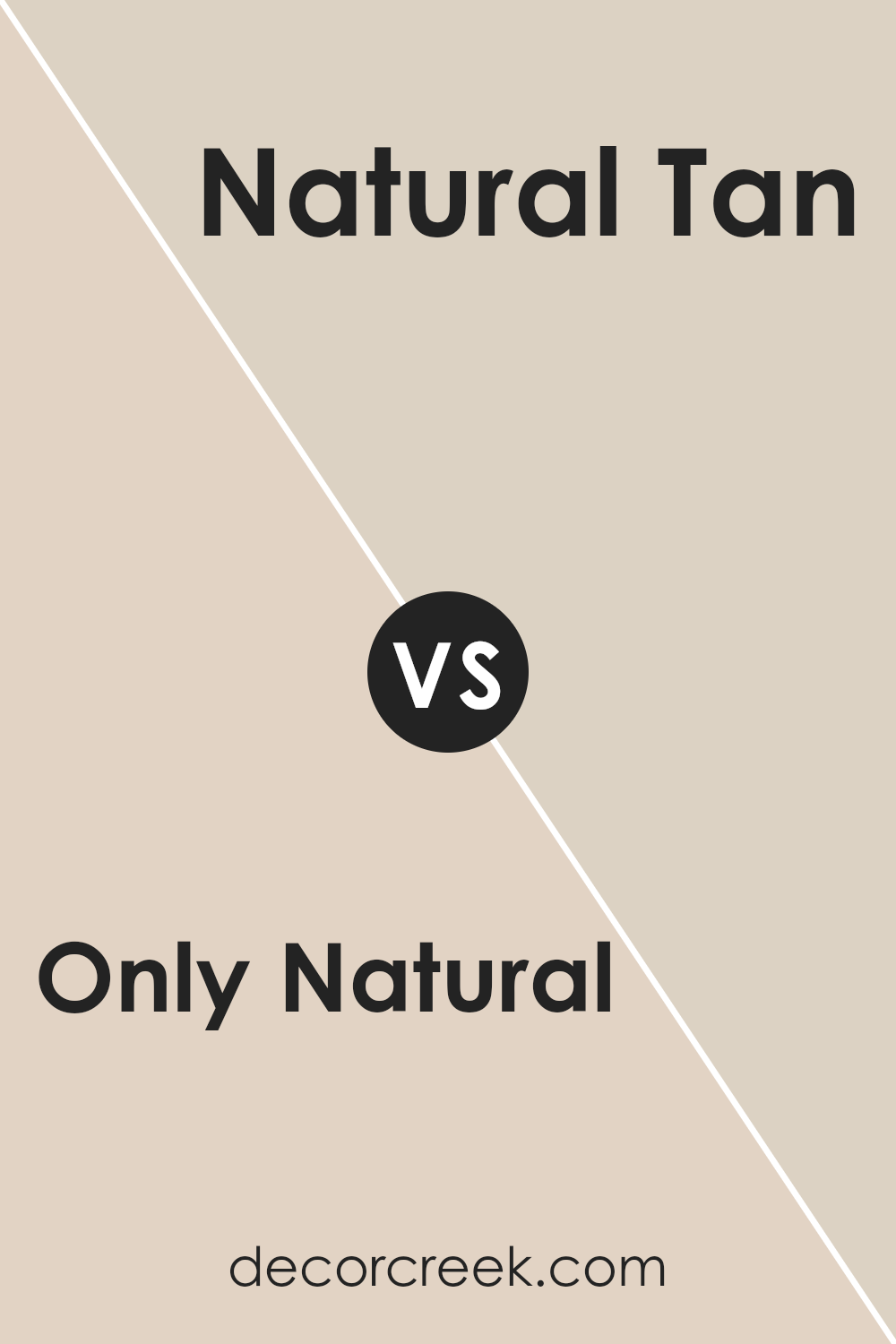
Only Natural SW 7596 by Sherwin Williams vs Natural Tan SW 7567 by Sherwin Williams
“Only Natural” SW 7596 and “Natural Tan” SW 7567 from Sherwin Williams are both earthy, warm neutrals, but they have distinct differences. “Only Natural” SW 7596 is a rich, creamy beige with a hint of pink undertone. It creates a cozy and inviting atmosphere, making it ideal for living rooms or bedrooms where you want a soft, warm ambiance.
On the other hand, “Natural Tan” SW 7567 is a true tan color with more neutral undertones. It offers a balanced and subtle backdrop that works well in various settings. This shade is versatile, making it suitable for open spaces like hallways or kitchens. It pairs well with both cool and warm colors, providing an adaptable design foundation.
While both colors belong to the neutral family, “Only Natural” adds a touch of warmth, while “Natural Tan” leans towards a more muted, classic look.
You can see recommended paint color below:
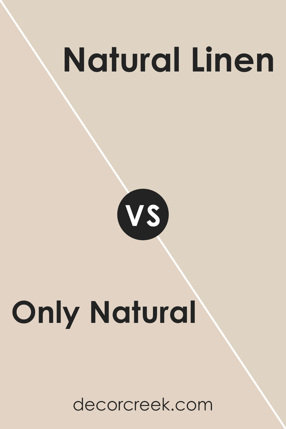
Only Natural SW 7596 by Sherwin Williams vs Natural Linen SW 9109 by Sherwin Williams
Only Natural SW 7596 and Natural Linen SW 9109 by Sherwin Williams are two warm, neutral colors with distinct characteristics. Only Natural is a deeper, earthy tone with a hint of red, making it feel cozy and grounded. It’s a versatile choice that can make a space feel intimate.
In contrast, Natural Linen has a lighter, softer appearance with beige undertones, providing a more open and airy feel. It pairs well with various colors and styles, making it an adaptable option for many rooms. When placed together, Only Natural can create a focal point or accent, while Natural Linen serves as a gentle background.
Both colors bring a sense of warmth to a space, but Only Natural offers more depth, and Natural Linen provides a subtle, neutral backdrop. Choosing between them depends on whether you want a bolder, earthy look or a light, neutral setting.
You can see recommended paint color below:
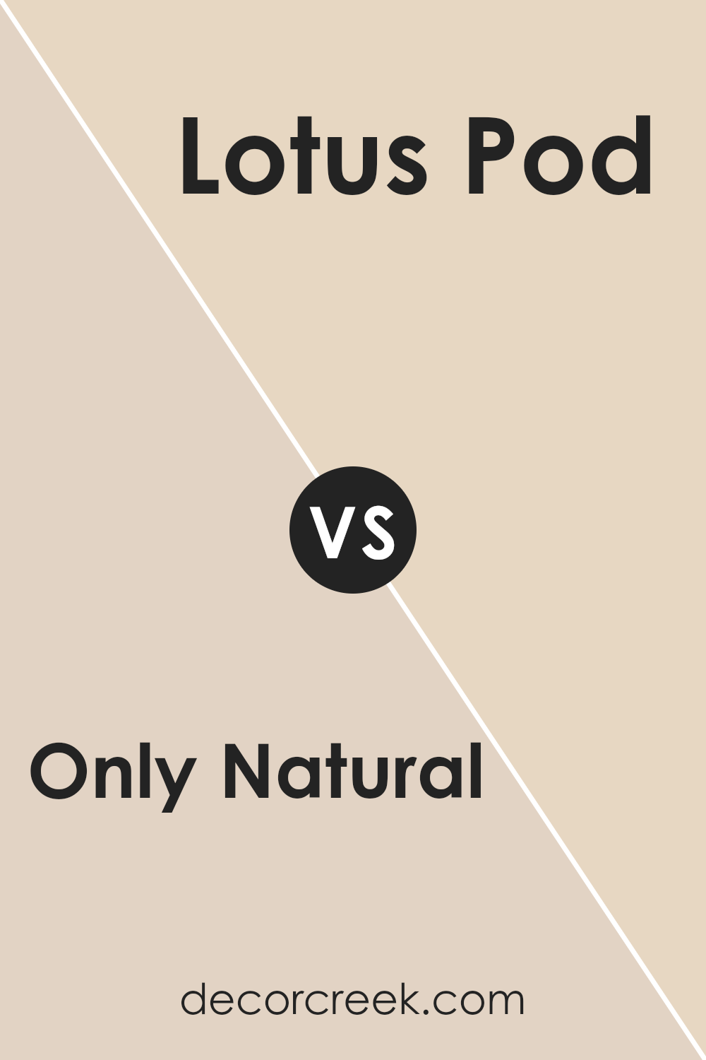
Only Natural SW 7596 by Sherwin Williams vs Lotus Pod SW 7572 by Sherwin Williams
“Only Natural” and “Lotus Pod” are two soft, warm colors by Sherwin Williams. “Only Natural” is a gentle, earthy beige. It’s like the soft color of sand or clay, giving off a warm and inviting vibe. It’s easy on the eyes and matches well with many other colors, making it a versatile choice for different spaces.
On the other hand, “Lotus Pod” is a bit darker and has a deeper beige tone. It feels a bit richer and more grounded than “Only Natural.” While still warm, “Lotus Pod” has a slightly stronger presence in a room, giving it a cozy and snug atmosphere.
Both colors have a natural, earthy feel but serve slightly different purposes. “Only Natural” is lighter and more open, making spaces feel larger, while “Lotus Pod” adds depth and warmth, making areas more intimate and comfortable. They each have their charm and can be chosen based on the mood you want to create.
You can see recommended paint color below:
- SW 7572 Lotus Pod
Only Natural SW 7596 by Sherwin Williams vs Rivers Edge SW 7517 by Sherwin Williams
“Only Natural” SW 7596 and “Rivers Edge” SW 7517 are both earthy hues by Sherwin Williams, but they offer different vibes. “Only Natural” is a warm, sandy beige that brings to mind a cozy, inviting atmosphere. It feels like the color of soft sand on a sunny day, making spaces feel welcoming and relaxed.
On the other hand, “Rivers Edge” has more brown undertones, leaning toward a deeper, richer shade. It may remind you of the banks of a peaceful stream, with its muted, calm brown. This color can add a bit of depth and warmth to a room without being too overpowering.
While “Only Natural” is lighter and more neutral, ideal for making a space feel open and airy, “Rivers Edge” provides a bit more color depth and works well in rooms where you want a snug, grounded feeling. Both colors, however, keep a natural theme, perfect for a warm home environment.
You can see recommended paint color below:
- SW 7517 Rivers Edge
Only Natural SW 7596 by Sherwin Williams vs Maison Blanche SW 7526 by Sherwin Williams
“Only Natural SW 7596” by Sherwin Williams is a warm, earthy beige that evokes a sense of calm and comfort. It draws on the hues of nature, resembling soft sunlight over a sandy landscape, making it a versatile backdrop for various interior styles. In contrast, “Maison Blanche SW 7526” is a lighter, creamy shade with subtle hints of yellow.
Maison Blanche exudes a more classic and timeless feel, often associated with traditional elegance. While both colors fall within the neutral family, “Only Natural” offers a deeper, more grounding effect, ideal for cozy spaces. “Maison Blanche” provides a brighter, airier atmosphere, perfect for spaces seeking a touch of warmth without being overwhelming.
Both colors work well together, with “Only Natural” serving as a complementary, grounding accent to the lighter “Maison Blanche,” crafting a harmonious pairing in living spaces.
You can see recommended paint color below:
Only Natural SW 7596 by Sherwin Williams vs Kestrel White SW 7516 by Sherwin Williams
“Only Natural” and “Kestrel White” are two colors from Sherwin Williams that present distinct vibes. “Only Natural” is a warm, earthy shade with brown undertones that brings a sense of coziness and groundedness to a room.
It’s perfect for creating a welcoming and comfortable atmosphere. On the other hand, “Kestrel White” is a soft, muted white with a hint of warmth. It provides a clean, fresh look, ideal for brightening up a space without being stark or cold.
When used together, “Only Natural” can act as a grounding element, while “Kestrel White” can lighten and balance the overall look. The warmth in both colors ensures they complement each other harmoniously. “Only Natural” might be better suited for accent walls or cozy spaces like living rooms, whereas “Kestrel White” could be used throughout a home to maintain brightness and a sense of openness.
You can see recommended paint color below:
Only Natural SW 7596 by Sherwin Williams vs Patience SW 7555 by Sherwin Williams
“Only Natural” (SW 7596) and “Patience” (SW 7555) by Sherwin Williams are two distinct yet harmonious shades. “Only Natural” is a warm and earthy color, reminiscent of sandy landscapes, offering a grounded and cozy feel. It pairs well with wood tones and natural textures, making it ideal for living areas or bedrooms to create a welcoming space.
On the other hand, “Patience” is a soft, off-white with a hint of warmth. Its light and airy nature provides a neutral backdrop that can open up and brighten any room. It is versatile and can be used in any room to make spaces feel larger and more open.
When combined, these two colors complement each other beautifully. “Only Natural” adds depth and interest, while “Patience” brings balance and lightness. Together, they can create a balanced and inviting atmosphere in any home.
You can see recommended paint color below:
Only Natural SW 7596 by Sherwin Williams vs Bauhaus Buff SW 7552 by Sherwin Williams
“Only Natural” and “Bauhaus Buff” by Sherwin Williams both belong to the warm, neutral palette, but they offer distinct vibes. “Only Natural” is a soft, earthy brown with hints of gray, creating a cozy and grounded feel. It’s versatile and can work well in spaces where you want a homely and natural ambiance.
On the other hand, “Bauhaus Buff” is a lighter, warmer beige with golden undertones. It feels bright and inviting, making it a good choice for spaces where you want a light and airy atmosphere. It’s excellent for complementing sunlit rooms.
When choosing between the two, consider the amount of natural light in the space. “Only Natural” suits rooms needing warmth without brightness, while “Bauhaus Buff” helps enhance light, making rooms feel bigger. Both colors offer a neutral backdrop, but their different undertones and lightness will change the room’s overall feel.
You can see recommended paint color below:
Only Natural SW 7596 by Sherwin Williams vs Fragile Beauty SW 7553 by Sherwin Williams
“Only Natural” (SW 7596) and “Fragile Beauty” (SW 7553) by Sherwin Williams are both delightful colors that bring different vibes to a space. “Only Natural” is a warm, earthy shade, like a mix of beige and light tan. It has a cozy and inviting feel, making spaces feel comfortable and grounded. It’s a great neutral that can work well in any room, providing a subtle backdrop that doesn’t overpower.
On the other hand, “Fragile Beauty” is a softer, light cream color with hints of peach or pink. This shade adds a touch of warmth and brightness, giving rooms a gentle, airy feel. It’s perfect for spaces where you want a bit more light and softness, without strong undertones.
Both colors are versatile and can be used in different settings. Where “Only Natural” adds depth and warmth, “Fragile Beauty” brings light and softness. Depending on your space and how you want it to feel, either color can be a wonderful choice.
You can see recommended paint color below:
- SW 7553 Fragile Beauty
Only Natural SW 7596 by Sherwin Williams vs Reticence SW 6064 by Sherwin Williams
“Only Natural” and “Reticence” by Sherwin Williams are two distinct colors that offer unique atmospheres. “Only Natural” is a warm, earthy tone that leans towards beige with a hint of peach. It exudes a sense of coziness and comfort, making it perfect for living spaces and areas where you want to create a welcoming environment.
On the other hand, “Reticence” is a softer, muted hue with a slight pink undertone. It has a calming effect, suitable for bedrooms or spaces where you want a more relaxed and subtle ambiance. While “Only Natural” has a slightly bolder presence due to its warmth, “Reticence” is more understated and gentle.
Both colors are versatile and can be paired with various accents, but “Only Natural” might work better with deeper, contrasting shades, whereas “Reticence” pairs well with light pastels or neutrals, allowing it to maintain its soothing quality.
You can see recommended paint color below:
- SW 6064 Reticence
As I think about SW 7596 Only Natural by Sherwin Williams, I can see why this paint color is special. It’s like bringing a little bit of nature into your home. The color feels warm and calm, like a hug from the sun on a cool day. It can make any room feel cozy and welcoming, whether it’s the living room where you hang out with family or the kitchen where you have yummy meals.
When I imagine using SW 7596 Only Natural, I think about how it would look in the different places I love. It’s the kind of color that goes well with lots of other colors, like the green of plants or the brown of wooden furniture. It’s nice because it’s not too bright or too dark, just right for a comfortable home.
Choosing this paint feels like choosing a gentle background that lets other things shine. It’s like having a friend who’s always there, making you feel good without taking over the room. That’s why I like it. It’s simple, warm, and makes rooms feel nice and friendly.
If I were to paint with it, I’d feel like I’m bringing peace and comfort into my world, making it a place I’d love to be.
Ever wished paint sampling was as easy as sticking a sticker? Guess what? Now it is! Discover Samplize's unique Peel & Stick samples.
Get paint samples

