SW 7555 Patience by Sherwin Williams is a shade that instantly made a calming impression on me. As soon as I saw it, the soft and muted tones spoke of simplicity and warmth. It’s a color that doesn’t shout for attention yet brings a sense of peace and stability to any space. I found myself drawn to the soothing aura it provides, like a gentle whisper in a loud room.
The gentle nature of Patience reminds me of quiet moments at home, where everything just feels right. It’s the kind of color that wraps around you, making a room feel more inviting and comforting. I could easily imagine using it to create a serene living space or a peaceful bedroom, where unwinding at the end of a long day feels effortless.
Choosing colors for your home can be overwhelming, but Patience offers an easy decision. It stands out by providing a backdrop that complements a variety of styles, from modern to traditional, without taking center stage.
In my experience, having a color like Patience on your walls creates an environment that encourages relaxation and reflection, allowing the mind to rest and recharge. It’s a subtle reminder of the beauty in simplicity, inviting you to slow down and enjoy the quiet moments.
What Color Is Patience SW 7555 by Sherwin Williams?
Patience SW 7555 by Sherwin Williams is a soft and inviting off-white color with subtle undertones that can add warmth and comfort to any space. Its versatile hue makes it a popular choice for different interior styles, complementing modern, traditional, and farmhouse aesthetics.
In modern interiors, this color can be used on walls to create a neutral backdrop that allows for bold furniture and décor to stand out. In a traditional setting, its warm tones can highlight intricate moldings and classic furniture pieces. For a farmhouse look, Patience can pair well with rustic wood elements and vintage-inspired accessories, adding to the cozy atmosphere.
When it comes to materials, this shade pairs beautifully with natural wood, whether it’s light oak or deep walnut. It also works well with textured fabrics such as linen and cotton, which can enhance its soft and inviting feel. Adding metal accents in brushed nickel or aged brass can provide a bit of contrast and interest.
Patience SW 7555 is ideal for those who want a neutral yet warm appearance in their homes, offering a timeless and versatile option that balances perfectly with various materials and textures, creating spaces that feel comfortable and inviting.
Is Patience SW 7555 by Sherwin Williams Warm or Cool color?
Patience (SW 7555) by Sherwin Williams is a versatile color that brings a subtle and calming feel to any home. This soft, warm beige has a gentle undertone, making it a perfect backdrop for a variety of design styles.
Its neutral tone works well with both bold and muted colors, giving homeowners the flexibility to mix and match with ease. Whether used in living rooms, bedrooms, or hallways, Patience creates a cozy and inviting atmosphere.
It reflects light beautifully, making spaces feel open and airy. This color pairs nicely with natural materials like wood and stone, enhancing its warm qualities. For a more modern look, it can be combined with clean lines and minimalistic décor.
Patience is ideal for those looking to achieve a balanced and harmonious look in their home. It effortlessly ties together various design elements, making any room feel complete and comfortable.
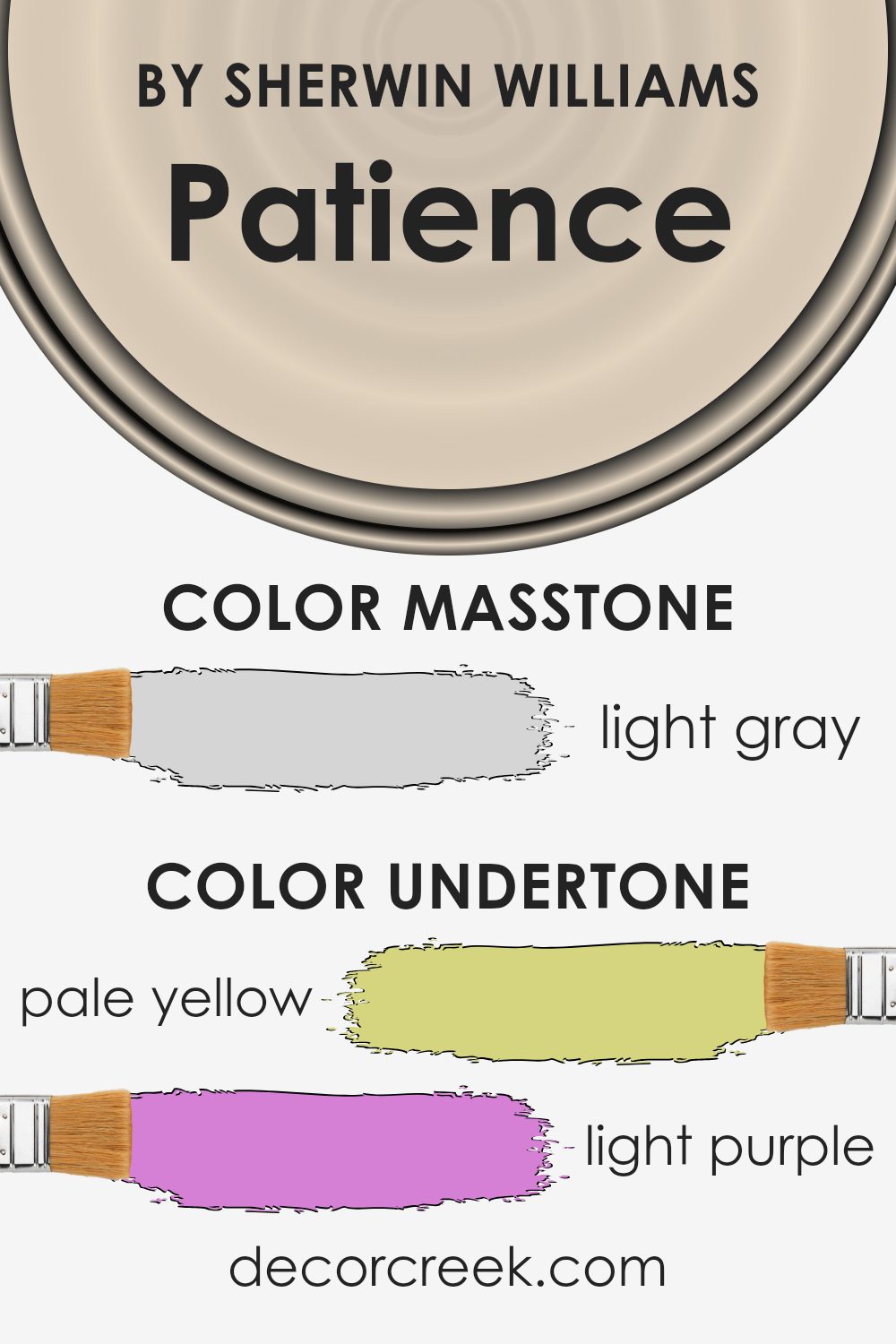
Undertones of Patience SW 7555 by Sherwin Williams
Patience by Sherwin Williams is a soft and subtle shade that brings a gentle ambiance to any space. Its primary color is a warm off-white, but what makes it unique are its undertones.
These undertones include hints of pale yellow, light purple, light blue, pale pink, mint, lilac, and grey. These subtle shades can slightly shift how the main color appears, depending on the lighting and the surrounding colors in a room.
For instance, in a room with lots of natural sunlight, the pale yellow or mint undertones might become more noticeable, adding a hint of warmth or freshness to the walls. In dimmer or cooler lighting, the grey or light purple undertones may come forward, giving the paint a more subdued and calming feel. The pale pink or lilac shades can offer a touch of softness, creating a cozy and inviting atmosphere.
The presence of these undertones means that Patience can complement a variety of design styles. Whether paired with warm wooden furniture or cool metal décor, this paint color can subtly shift to maintain harmony within a room.
It’s versatile and adaptable, making it a popular choice for those seeking a neutral yet dynamic background in their home.
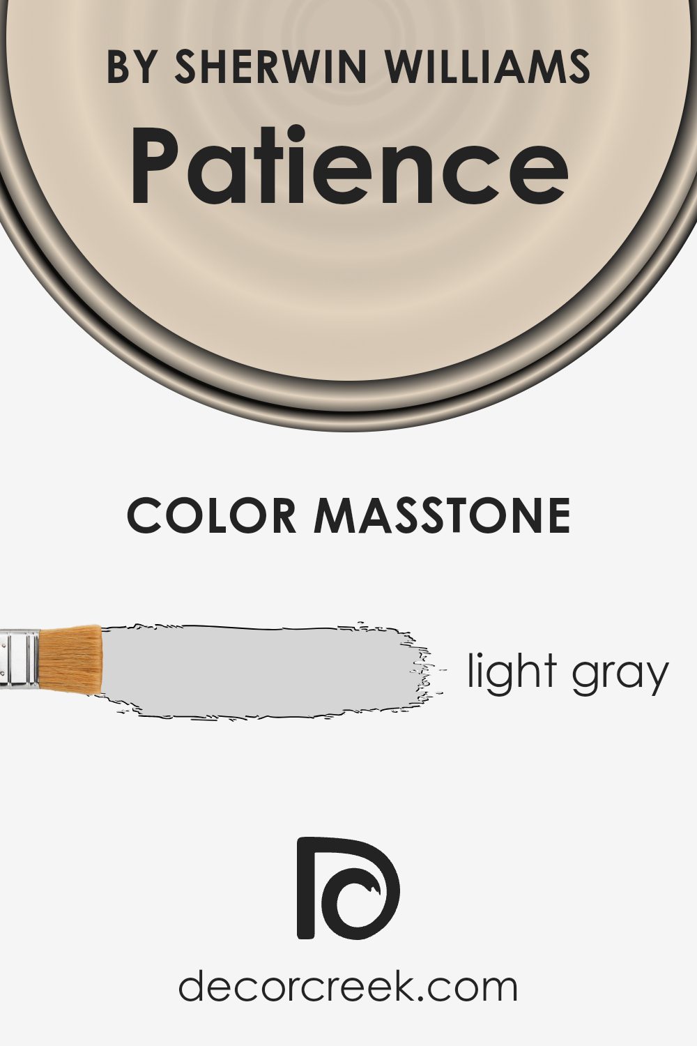
What is the Masstone of the Patience SW 7555 by Sherwin Williams?
Patience (SW 7555) by Sherwin Williams is a light gray color, described by its masstone as #D5D5D5. This shade is subtle and versatile, making it a popular choice for home interiors.
The light gray tone provides a neutral backdrop that pairs well with various color schemes and design styles. It can make spaces feel open and airy, giving a sense of calmness without being overwhelming. When used on walls, Patience can enhance natural light, making rooms appear brighter and more inviting.
It complements both warm and cool accents, allowing for flexibility in decorating with furniture and accessories. Because of its understated presence, it enables other design elements to stand out, creating a balanced and harmonious space. Whether in living rooms, bedrooms, or kitchens, this light gray hue offers a timeless appeal that works in any setting, making it a great choice for renewing spaces without drastic changes.
How Does Lighting Affect Patience SW 7555 by Sherwin Williams?
Lighting plays a crucial role in how we perceive colors. Different types of light can change the appearance of a color. For instance, natural light, which varies in temperature throughout the day, can make colors look different at sunrise, midday, and sunset. Artificial light, such as incandescent, fluorescent, or LED bulbs, also affects how we see colors due to their unique light spectra.
Take the color Patience SW 7555 by Sherwin Williams, a soft and neutral tone. In artificial light, especially warm lighting like incandescent bulbs, this color may appear warmer, taking on a soft, creamy hue. Under cool, fluorescent lighting, it might look slightly cooler or more muted.
LED lighting varies depending on its temperature setting—it can make Patience either warmer or cooler, depending on whether the bulb emits a warm or cool white light.
In terms of natural light, Patience SW 7555 changes subtly based on which direction the room faces. In north-facing rooms, which receive cooler, indirect light, Patience can seem a bit cooler and muted. It may appear slightly grayish due to the lack of direct sunlight.
In contrast, south-facing rooms receive plenty of direct sunlight throughout the day, so Patience will appear brighter and warmer. Sunlight enhances its soft, neutral qualities, making it feel more inviting.
East-facing rooms get direct sunlight in the morning, so Patience may look brighter and more vibrant in the morning, then mellow out to a softer tone as the day progresses. In west-facing rooms, the afternoon and evening light is rich and golden.
Here, Patience can develop a warm glow in the late afternoon, bringing out any underlying warm tones the color might have.
Understanding how lighting conditions can affect paint colors like Patience helps ensure the space meets your intended aesthetic throughout the day.

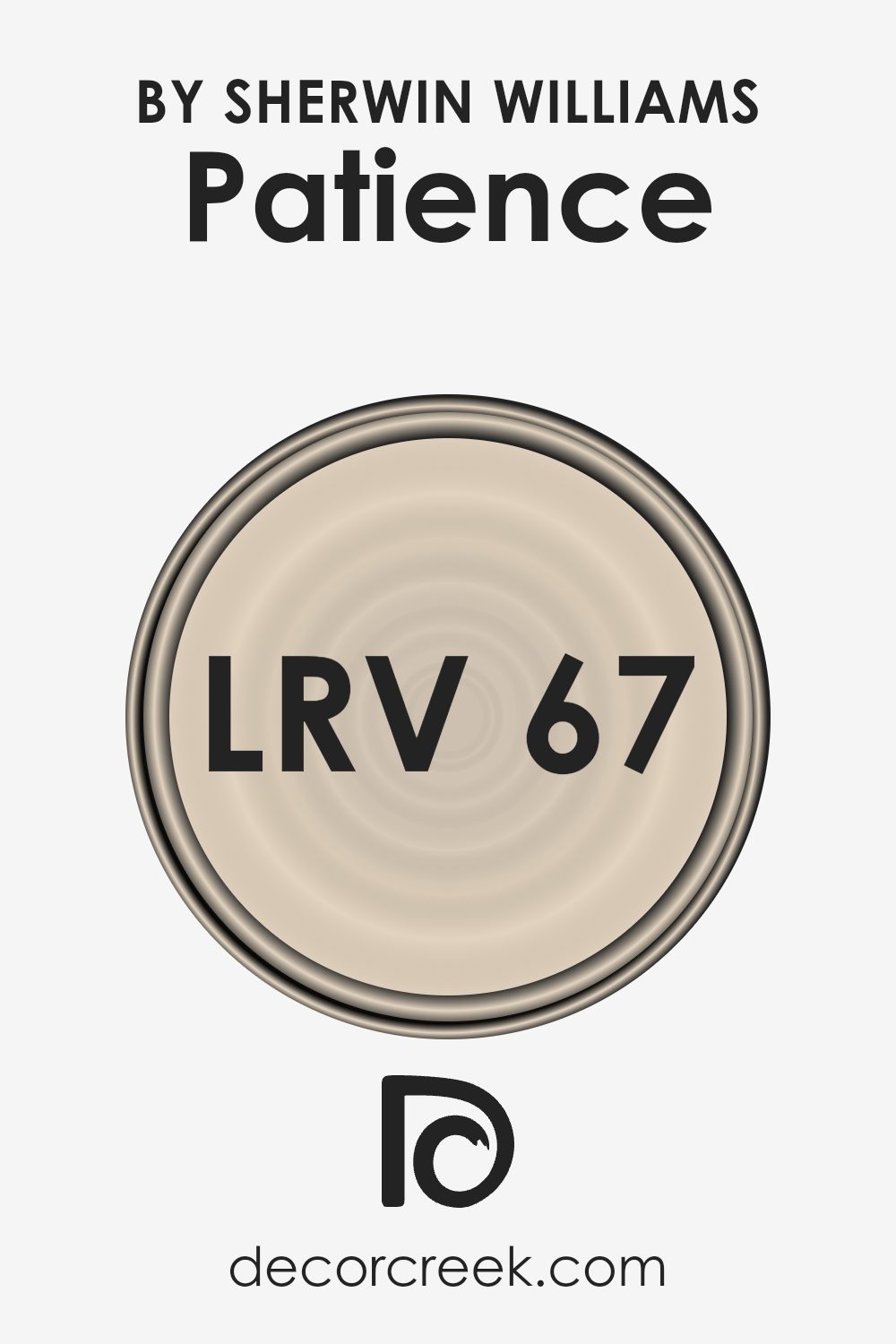
What is the LRV of Patience SW 7555 by Sherwin Williams?
Light Reflectance Value, or LRV, measures the amount of visible light a color will reflect. It helps determine how light or dark a color will appear once it’s on your walls. LRV values range from 0 (absolute black, which absorbs all light) to 100 (pure white, which reflects all light).
Colors with a higher LRV are lighter and reflect more light, making spaces feel more open and airy. In contrast, colors with a low LRV are darker and absorb more light, which can make rooms feel smaller or cozier. When choosing paint colors, considering the LRV can help you understand how the color will interact with light in your room.
Patience by Sherwin Williams has an LRV of 66.659, which means it reflects a good amount of light. This makes it a fairly light color that can help brighten a room, making it feel more spacious. Patience is warm and inviting, reflecting enough light to keep spaces from feeling too closed in.
It’s a versatile choice because it can work well in rooms that get a lot of natural light, enhancing the brightness, as well as in rooms with less light, where it can help prevent the space from feeling too dark. Overall, the LRV of Patience allows it to create a welcoming and light-filled atmosphere in a variety of settings.
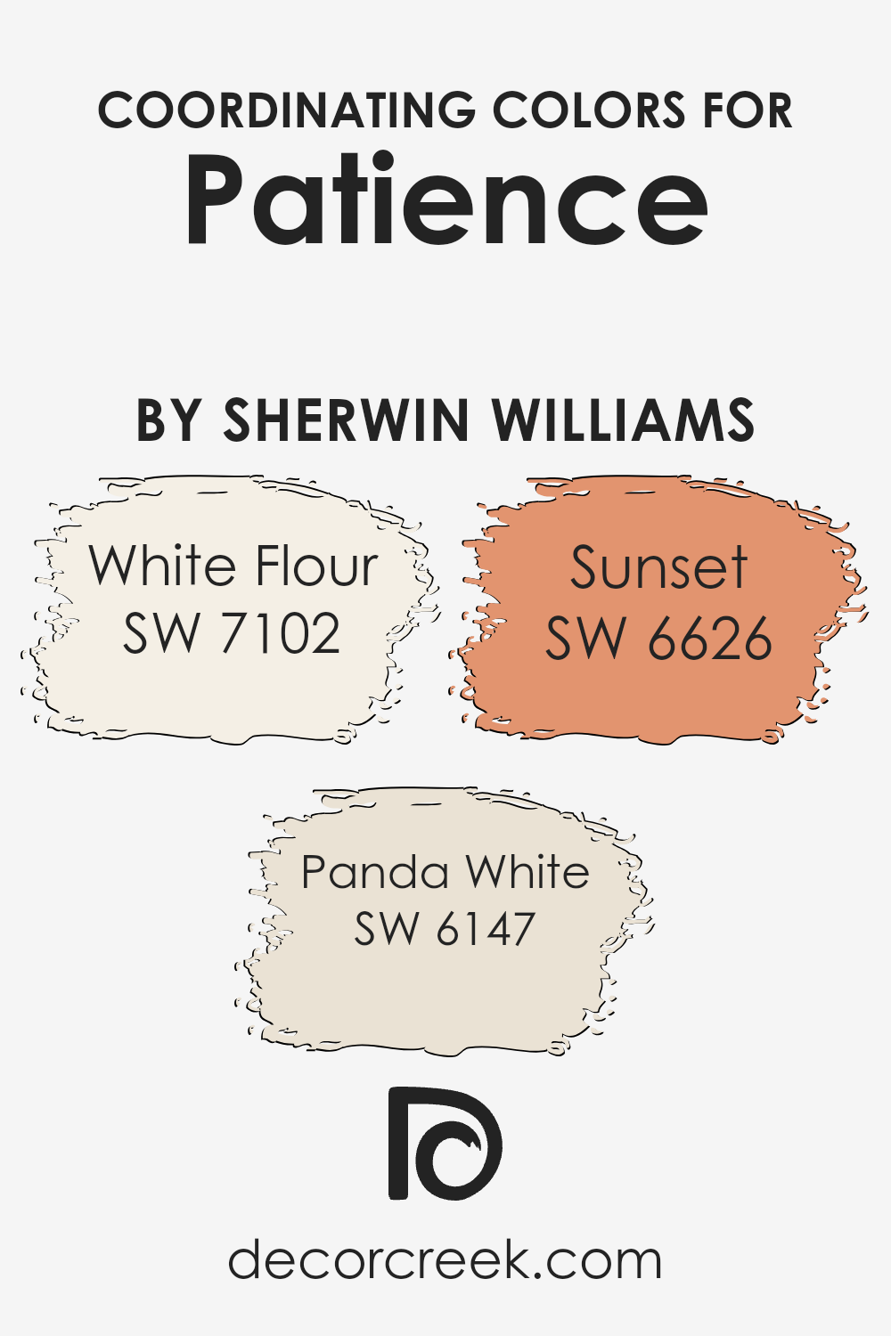
Coordinating Colors of Patience SW 7555 by Sherwin Williams
Coordinating colors are colors that complement a primary color and can be used together in a design or space to create a pleasing and harmonious look. When it comes to Patience (SW 7555) by Sherwin Williams, coordinating colors such as White Flour, Panda White, and Sunset enhance its soft, neutral palette.
Patience is a calm, light shade that adapts well to different styles and rooms, making it versatile for both modern and traditional settings. By using coordinating colors, you can add depth and interest to a space while maintaining a cohesive appearance.
White Flour (SW 7102) is a warm and creamy white that works beautifully with Patience. It adds a gentle brightness without overpowering the soft undertones of its partner color. Panda White (SW 6147), with its subtle warmth, acts as a bridge, bringing together the lightness of White Flour with a touch of earthy tone.
This color enhances the cozy feelings of a room while maintaining an elegant simplicity. On the other hand, Sunset (SW 6626) introduces a pop of vibrant energy. With its rich, warm orange-red hue, Sunset adds an inviting and lively flair, offering a striking contrast that enlivens the gentler tones of Patience and its other coordinating colors.
You can see recommended paint colors below:
- SW 7102 White Flour
- SW 6147 Panda White
- SW 6626 Sunset
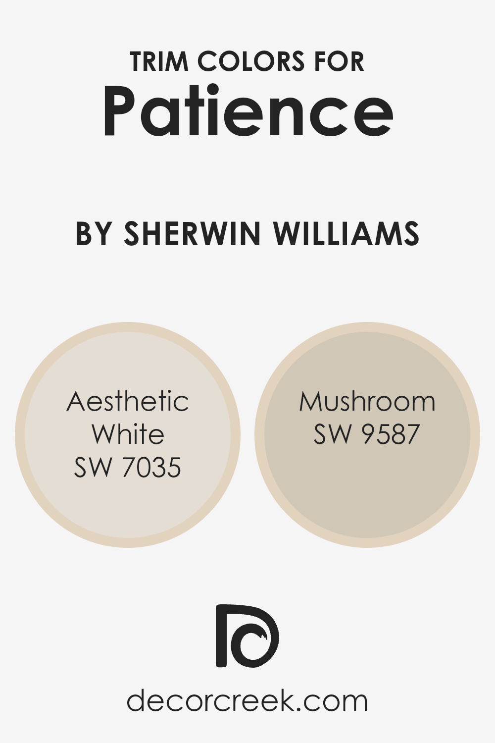
What are the Trim colors of Patience SW 7555 by Sherwin Williams?
Trim colors are the shades used to frame or accentuate the primary wall color, making them stand out, and giving rooms a polished look. By using specific trim colors like SW 7035 Aesthetic White and SW 9587 Mushroom, you can enhance the appearance of your space when combined with the main color SW 7555 Patience. This main color, with its soft, gentle tone, is beautifully complemented by these trims that add depth and definition to walls.
Aesthetic White, for instance, is a soft off-white with a warm undertone that can subtly highlight the wall color, providing a gentle contrast without being stark or harsh. Meanwhile, Mushroom offers a warm, earthy tone that blends seamlessly with the soothing nuances of Patience, creating a harmonious fusion.
Using these trim colors is important because they help establish boundaries and enhance the architectural features of a room. By choosing the right trim colors, you can manipulate how the dimensions of a room are perceived, making spaces appear larger, warmer, or more inviting. Aesthetic White’s warm neutrality helps it blend easily with different decorative styles, ensuring it doesn’t overshadow the primary color.
It’s a versatile option for highlighting baseboards, window frames, or molding. Mushroom, with its natural, subdued color, makes a statement without shouting, offering an understated elegance that ensures the trim complements rather than competes with the main color. Together, these trim colors can help create a cozy, well-defined space with SW 7555 Patience playing the central role.
You can see recommended paint colors below:
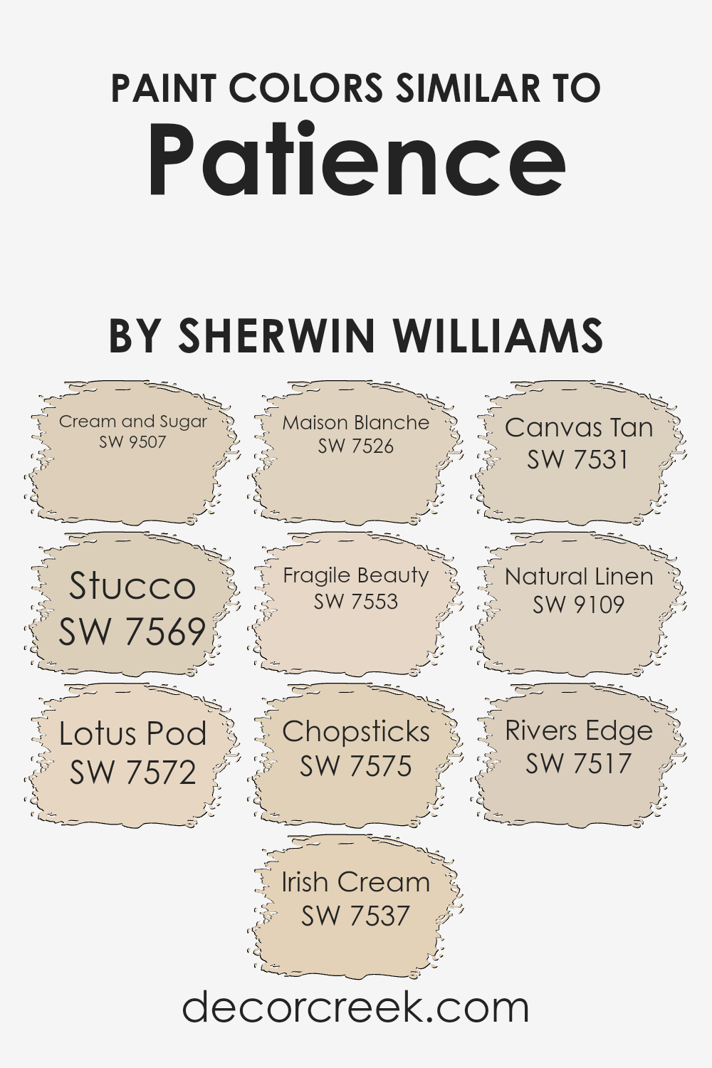
Colors Similar to Patience SW 7555 by Sherwin Williams
Similar colors are essential in design because they help create a harmonious and cohesive look. Colors like SW 9507 Cream and Sugar and SW 7553 Fragile Beauty bring a soft warmth to a space, providing a welcoming atmosphere that is both calming and inviting. These colors blend seamlessly because they share undertones, creating a smooth transition that delights the eye.
For instance, SW 7569 Stucco and SW 7537 Irish Cream are both subtle and understated, offering a gentle backdrop that allows for versatility in home decor. Similarly, SW 7572 Lotus Pod and SW 7526 Maison Blanche both have beige tones, adding depth and sophistication without overwhelming the senses.
Each color tells its own subtle story: SW 7575 Chopsticks carries a hint of earthy warmth, while SW 7531 Canvas Tan is neutral and versatile, perfect for any room. SW 9109 Natural Linen and SW 7517 Rivers Edge add a touch of soft elegance with their gentle, muted shades.
These similar colors are like pieces of a puzzle; when used together, they create a cohesive and balanced palette. They work well in combination because they complement each other, giving your space a unified and polished feel that stands the test of time.
You can see recommended paint colors below:
- SW 9507 Cream and Sugar
- SW 7569 Stucco
- SW 7572 Lotus Pod
- SW 7537 Irish Cream
- SW 7526 Maison Blanche
- SW 7553 Fragile Beauty
- SW 7575 Chopsticks
- SW 7531 Canvas Tan
- SW 9109 Natural Linen
- SW 7517 Rivers Edge
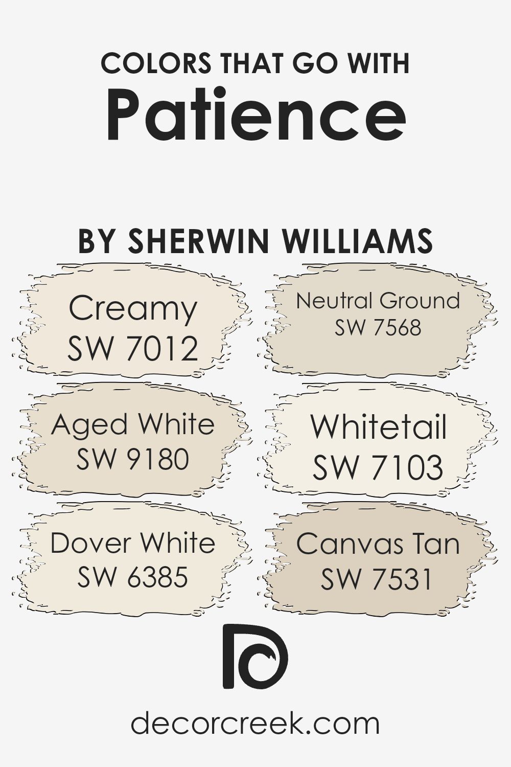
Colors that Go With Patience SW 7555 by Sherwin Williams
Choosing the right colors to pair with Patience SW 7555 by Sherwin Williams can create a harmonious and inviting space. Patience is a soft, warm shade that serves as a neutral backdrop, allowing other colors to shine. When you pair it with SW 7012 – Creamy, you get a gentle contrast that adds warmth and coziness. Creamy is a versatile, soft off-white shade that brings a light, airy feel.
On the other hand, SW 9180 – Aged White offers a subtle depth which complements Patience by adding a touch of timeless elegance. Aged White has an understated, classic look that enhances the overall feel of your space without overwhelming it.
Pairing Patience with SW 6385 – Dover White gives a fresh, clean vibe. Dover White is a bright, inviting white that enhances brightness and openness. SW 7568 – Neutral Ground adds an earthy touch, grounding the space with its balanced nature. Neutral Ground is a gentle beige that works well with Patience to bring warmth.
Then, there’s SW 7103 – Whitetail, a soft, muted white that offers quiet sophistication. Lastly, SW 7531 – Canvas Tan is a warm, earthy shade that pairs beautifully, adding a sense of depth and comfort. These colors work together to create a space that feels balanced, comfortable, and welcoming.
You can see recommended paint colors below:
- SW 7012 Creamy
- SW 9180 Aged White
- SW 6385 Dover White
- SW 7568 Neutral Ground
- SW 7103 Whitetail
- SW 7531 Canvas Tan
How to Use Patience SW 7555 by Sherwin Williams In Your Home?
Patience by Sherwin Williams, color code SW 7555, is a soft and understated shade of off-white with warm undertones. This versatile paint color can be used throughout the home to create a calm and welcoming atmosphere.
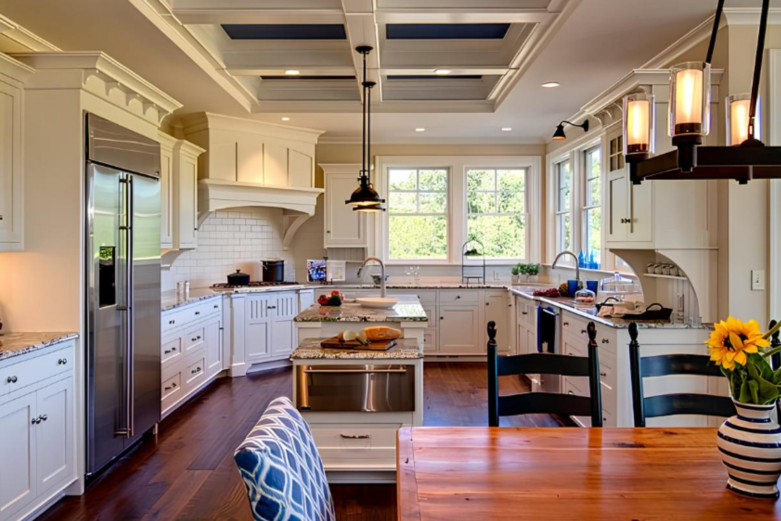
In living rooms, Patience provides a neutral backdrop that complements both modern and traditional decor styles, making it easy to switch out furniture and accessories without clashing. In bedrooms, it promotes a restful environment that encourages relaxation. Patience works well in kitchens, too, where its warm tone adds a touch of coziness without overwhelming the space.
Pair Patience with accents in earth tones, pastels, or even bold colors to add personality to your rooms. Its ability to reflect light subtly brightens up darker areas in the house, making it suitable for hallways or smaller rooms.
Overall, Patience SW 7555 is a great choice for anyone looking to create a balanced and inviting interior.
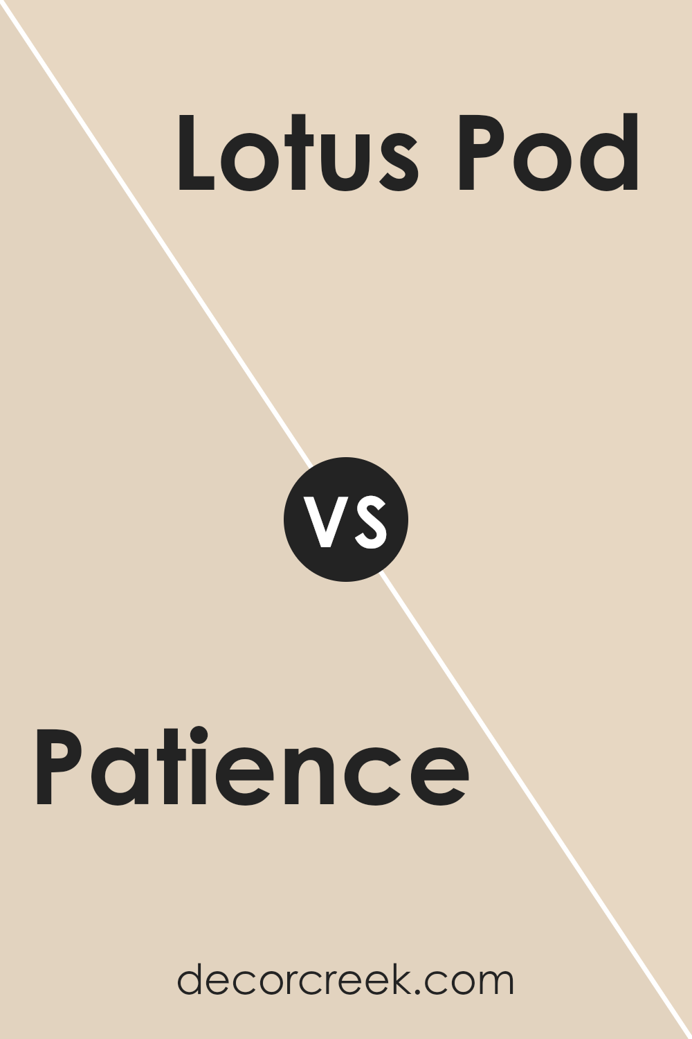
Patience SW 7555 by Sherwin Williams vs Lotus Pod SW 7572 by Sherwin Williams
Patience SW 7555 by Sherwin Williams is a soft, creamy off-white color that brings warmth and a gentle feel to a space. It is versatile and can function as a neutral backdrop in various settings. The color is subtle and allows other design elements to shine while providing a cozy, inviting atmosphere.
Lotus Pod SW 7572, on the other hand, is a warm beige with earthy undertones. It feels richer and deeper compared to Patience, offering a more grounded and natural vibe. Lotus Pod is a great choice if you want to add a bit more depth to your walls while still keeping a neutral palette.
Both colors are easy to work with and complement a wide range of accent colors. Patience is perfect for creating a light and airy space, while Lotus Pod adds warmth and a touch of earthiness. They both bring comfort, but with different tones.
You can see recommended paint color below:
- SW 7572 Lotus Pod
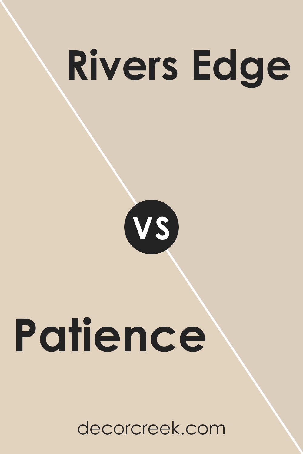
Patience SW 7555 by Sherwin Williams vs Rivers Edge SW 7517 by Sherwin Williams
Patience SW 7555 and Rivers Edge SW 7517 are two distinct colors from Sherwin Williams, each bringing its own personality to a space. Patience is a soft, warm beige, offering a gentle and welcoming atmosphere, making it ideal for areas where you want to create a cozy and inviting feel. It’s a versatile color that can act as a neutral backdrop, allowing other design elements to stand out.
Rivers Edge, on the other hand, is a deeper, earthy brown tone. It adds a richer and more grounded feel to a room. This color can create a sense of warmth and stability, making it perfect for enhancing an area with a rustic or traditional theme.
While both colors have warm undertones, Patience is lighter and more understated, whereas Rivers Edge makes a bolder statement. Depending on the mood you wish to evoke, either color could serve as an excellent choice to enhance your home’s aesthetic.
You can see recommended paint color below:
- SW 7517 Rivers Edge
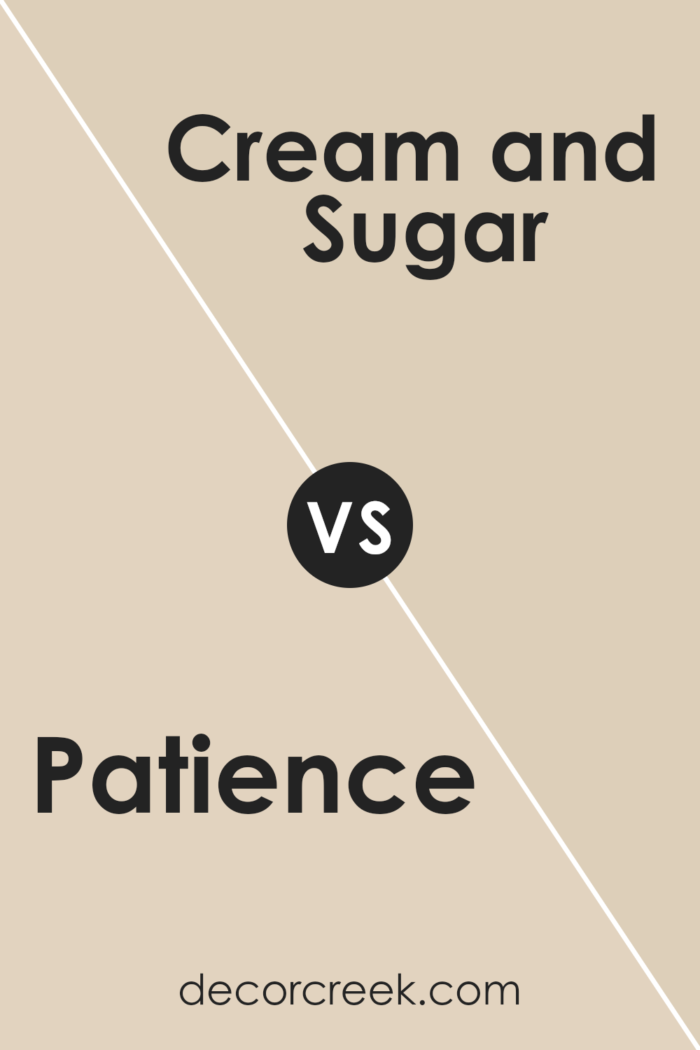
Patience SW 7555 by Sherwin Williams vs Cream and Sugar SW 9507 by Sherwin Williams
Patience SW 7555 and Cream and Sugar SW 9507 by Sherwin Williams are both soft, warm neutrals but have distinct characteristics. Patience SW 7555 is a light beige with a hint of warmth, making it a versatile choice for creating a cozy and inviting atmosphere. It pairs well with both bold and subtle colors, fitting easily into various design styles.
On the other hand, Cream and Sugar SW 9507 is a lighter and softer off-white with gentle cream tones. It has an airy feel, making spaces look brighter and more open. It’s a great backdrop for almost any color, allowing other elements in the room to stand out without overwhelming the senses.
While both colors offer warmth, Patience is richer, creating a cozy vibe, whereas Cream and Sugar offers a light and fresh feel. Your choice depends on whether you want a warmer or airier look for your space.
You can see recommended paint color below:
Patience SW 7555 by Sherwin Williams vs Maison Blanche SW 7526 by Sherwin Williams
Patience SW 7555 and Maison Blanche SW 7526 are two soft, neutral paint colors by Sherwin Williams. Patience SW 7555 is a warm, creamy beige with subtle hints of yellow, making it feel cozy and inviting. It is a versatile color that blends well with various design styles and can make a room feel warm without being overpowering.
Maison Blanche SW 7526, on the other hand, is a lighter shade with more of a taupe undertone. While it also exudes warmth, it leans more towards a neutral gray-beige, giving it a slightly cooler vibe compared to Patience. Maison Blanche can add a touch of elegance to spaces, working well with both traditional and modern decor.
When comparing the two, Patience feels warmer and richer, while Maison Blanche provides a cleaner and more understated look. Both colors can beautifully complement other shades and materials in a room, but the choice depends on the mood and style you aim to achieve.
You can see recommended paint color below:
Patience SW 7555 by Sherwin Williams vs Stucco SW 7569 by Sherwin Williams
Patience SW 7555 and Stucco SW 7569 by Sherwin Williams are both warm, neutral tones, but they offer different vibes. Patience is a soft beige with a hint of warmth, making it a versatile choice for creating a cozy, inviting atmosphere in any room. It pairs well with both light and dark colors, making it flexible for various décor styles.
Stucco, on the other hand, is a slightly deeper beige with more noticeable earthy undertones. This gives it a rich and grounded feel. Stucco can add a touch of warmth and depth to spaces, making it ideal for areas where you want a bit more color than a simple off-white but still retain a neutral backdrop.
While both colors are great for adding warmth, Patience is perfect if you want a lighter, more airy feel, whereas Stucco is better for a more grounded, rustic look. Both can enhance different spaces without being overpowering.
You can see recommended paint color below:
- SW 7569 Stucco
Patience SW 7555 by Sherwin Williams vs Fragile Beauty SW 7553 by Sherwin Williams
Patience SW 7555 by Sherwin Williams is a soft, warm beige that exudes a sense of comfort and calmness. It’s a versatile color that works well in both modern and traditional settings, providing a neutral backdrop that allows other design elements to stand out. Patience can make a room feel cozy and welcoming, without overpowering the space.
On the other hand, Fragile Beauty SW 7553 by Sherwin Williams is a slightly darker and richer color compared to Patience. It has a more pronounced depth, adding a touch of warmth and elegance to a room. This color tends to create a more intimate and inviting atmosphere, making it a great choice for spaces where you want to feel especially comfortable and relaxed.
Both colors are great for creating a warm and inviting home environment. Patience offers a lighter, more understated option, while Fragile Beauty provides a deeper, more pronounced hue.
You can see recommended paint color below:
- SW 7553 Fragile Beauty
Patience SW 7555 by Sherwin Williams vs Chopsticks SW 7575 by Sherwin Williams
Patience (SW 7555) by Sherwin Williams is a warm, soft beige that exudes a calm and inviting feel. It’s a versatile color that works well in various spaces, providing a neutral backdrop that complements many other shades. Its subtle warmth makes it a good choice for creating cozy and welcoming environments, whether in living rooms, bedrooms, or hallways.
On the other hand, Chopsticks (SW 7575) by Sherwin Williams is a deeper, richer tan color. It has more depth and intensity compared to Patience, making it a bold choice for those who want a more pronounced earth tone. Chopsticks brings a sense of comfort and stability to a room, pairing nicely with both lighter and darker accent colors.
While both colors offer warmth and flexibility, Patience is softer and more understated, whereas Chopsticks provides a stronger, more defined look. Both are excellent choices depending on the desired mood and style of your space.
You can see recommended paint color below:
Patience SW 7555 by Sherwin Williams vs Irish Cream SW 7537 by Sherwin Williams
Patience SW 7555 by Sherwin Williams is a soft, pale beige that exudes a gentle warmth, creating a welcoming and cozy atmosphere. It has a subtle tone that makes it versatile and easy to pair with other colors or decor. This color can brighten a space while still maintaining a calm and understated presence.
On the other hand, Irish Cream SW 7537 by Sherwin Williams is a deeper, creamier beige that leans a bit more towards a warm, buttery hue. It brings a richer and more comforting feel to a room, offering more depth and coziness than Patience.
When placed side by side, Patience appears lighter and airier, while Irish Cream gives off a more substantial, warm vibe. Both colors provide a neutral backdrop, but Patience is better suited for creating a light and breezy space, whereas Irish Cream offers warmth and richness, perfect for creating an inviting and relaxing environment.
You can see recommended paint color below:
- SW 7537 Irish Cream
Patience SW 7555 by Sherwin Williams vs Natural Linen SW 9109 by Sherwin Williams
Patience (SW 7555) and Natural Linen (SW 9109) by Sherwin Williams are both soft, neutral colors, but they offer different feelings and uses. Patience is a warm, creamy beige that brings a welcoming and cozy feeling to spaces. It has a slight yellow undertone, making it feel sunny and cheerful. This color works well in living rooms or bedrooms where you want a relaxed and inviting atmosphere.
On the other hand, Natural Linen is also a warm beige but has a slight gray undertone, making it feel more muted and subtle. It brings a sense of calm and understated elegance to a room. Natural Linen is versatile and suits almost any space, from kitchens to bathrooms, adding a touch of warmth without overwhelming.
Both colors are great for creating a harmonious environment, but Patience adds a bit more warmth and cheerfulness, while Natural Linen offers a more laid-back and neutral vibe.
You can see recommended paint color below:
Patience SW 7555 by Sherwin Williams vs Canvas Tan SW 7531 by Sherwin Williams
Patience SW 7555 and Canvas Tan SW 7531 by Sherwin Williams each bring their own feel to a room. Patience is a soft off-white with warm undertones. It’s gentle and has a hint of peach, which can create a cozy atmosphere. It’s subtle and works well with a variety of colors, making it versatile for different spaces.
On the other hand, Canvas Tan is a warm beige. It’s slightly darker than Patience and has earthy undertones, which can add depth and texture to a room. Canvas Tan offers a natural, grounded feel and pairs nicely with both light and dark colors.
Together, these colors can complement each other in a layered, inviting space. Patience can be used as a light, airy backdrop, while Canvas Tan can add warmth and coziness. Both colors are neutral, making them easy choices for those looking to create a calm, welcoming environment.
You can see recommended paint color below:
In conclusion, I find SW 7555 Patience by Sherwin Williams to be a delightful color choice. It is a calming and gentle color that makes any room feel cozy and warm. I like how it works well with so many other colors, making it easy to pair with furniture and decorations. You can use it in the living room, bedroom, or even the kitchen, and it still looks nice.
What I really appreciate about this color is how it brings a soft touch to any area. Whether the room is full of natural light or has just a little, Patience always seems to look great. It feels like a hug from a favorite blanket — just right and comforting.
When I think about picking a color for a room, I want something that helps everyone feel welcome and relaxed, and Patience does just that. It’s a color that doesn’t shout or make too much noise, but instead, gently whispers and soothes.
So, if someone asked me for a color that works easily and adds a splash of calmness, I would definitely recommend SW 7555 Patience. It’s a bit like magic on the walls, bringing everything together in a gentle way. I really like it and think others will too!

Ever wished paint sampling was as easy as sticking a sticker? Guess what? Now it is! Discover Samplize's unique Peel & Stick samples.
Get paint samples

