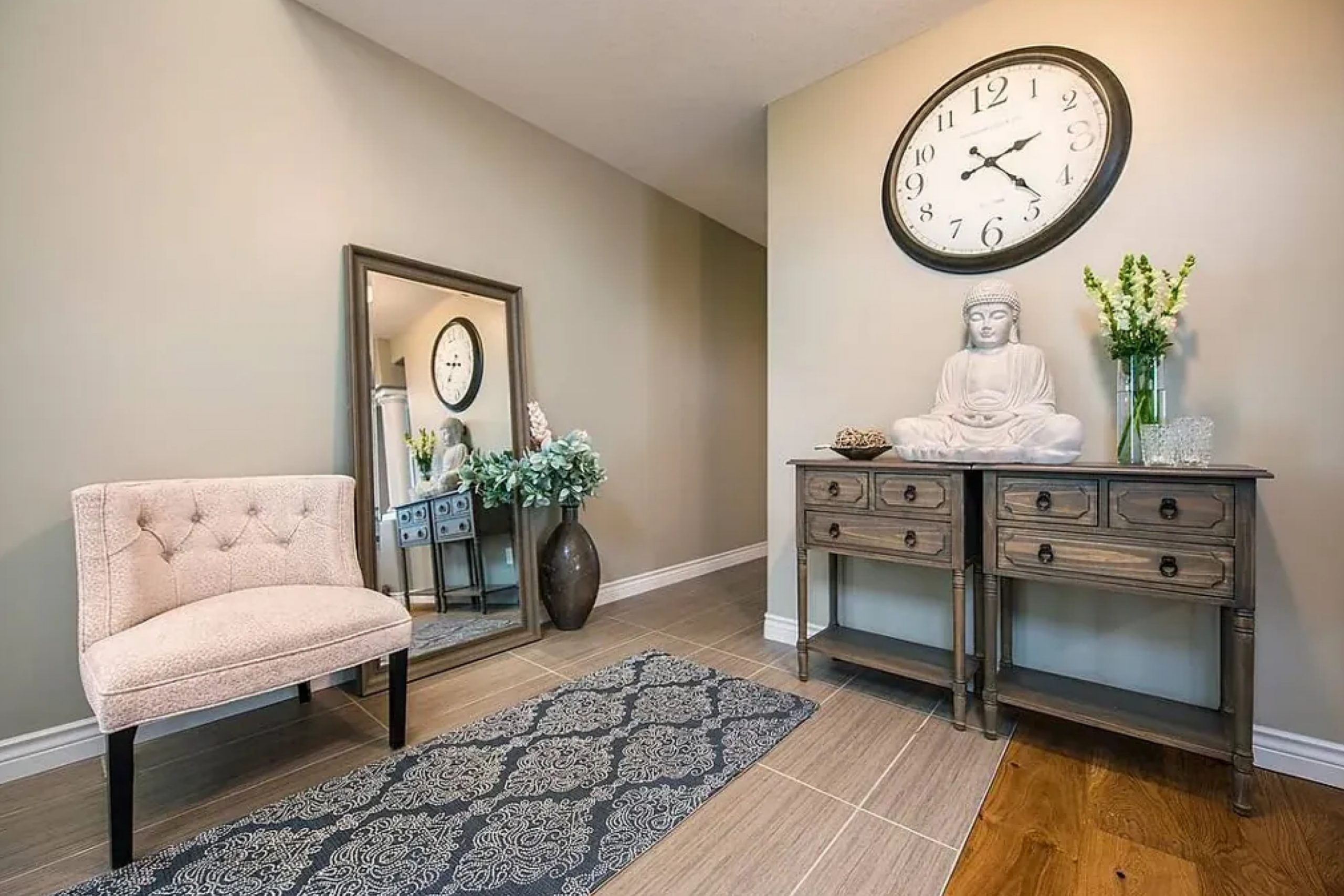
When you come across Gateway Gray SW 7644 by Sherwin Williams, it’s like being introduced to a calm and sophisticated friend. This shade sits elegantly between light and dark, making it a versatile choice for any room in your home. It creates a soothing atmosphere, perfect for a living room where you might want to unwind after a long day, or a bedroom where relaxation is key.
Gateway Gray isn’t just another bland gray. It has hidden depths that give it character — a subtle warmth that cozies up your space while remaining neutral enough to pair with a variety of colors. Whether your style leans towards classic or contemporary, this shade offers a backdrop that complements both wood tones and metallic accents.
When using Gateway Gray, you might notice how its classic neutrality effortlessly ties a room together, offering a sense of balance and harmony. Natural light brings out its softer qualities, while artificial lighting might highlight its more robust personality. It truly is a shade that adapts to its surroundings, making your home feel both modern and welcoming.
Gateway Gray shows how elegant simplicity can enhance your space with minimal effort.
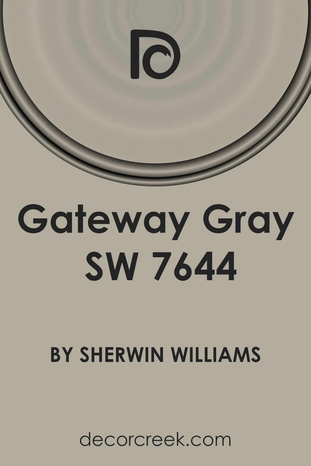
What Color Is Gateway Gray SW 7644 by Sherwin Williams?
Gateway Gray (SW 7644) by Sherwin-Williams is a medium-toned gray with warm undertones, making it a versatile choice for many spaces. This shade exudes a sense of calm and neutrality, making it an excellent backdrop for various interior styles. Its warm undertone ensures it fits well in both modern and traditional settings, bringing warmth without overpowering the space.
In a modern minimalist interior, Gateway Gray offers a clean, sleek look when paired with metallic finishes and glass. It works beautifully with natural materials like light to medium wood tones, adding a touch of elegance without being too stark. In a more rustic setting, the color pairs well with natural stone and weathered wood, complementing earthy textures. Soft textiles such as plush rugs and linen curtains in neutral tones will enhance the room’s coziness.
It also suits transitional styles, bringing a harmonious balance between classic and contemporary. Consider combining it with accent pieces in deep blues or dark greens for a striking contrast. Additionally, Gateway Gray is versatile enough to work in both small and large spaces, making it perfect for living rooms, bedrooms, and even offices.
Its adaptable nature ensures it blends seamlessly with various decor elements and personal styles.
Is Gateway Gray SW 7644 by Sherwin Williams Warm or Cool color?
Gateway Gray by Sherwin Williams is a versatile paint color that can add depth and warmth to any room. This shade is a blend of gray and beige, making it a perfect neutral choice. It adapts well to different lighting, sometimes appearing more gray or more beige depending on the time of day and the light in the room.
In living rooms, Gateway Gray creates a cozy and inviting atmosphere, working well with various types of furniture and decor styles. It helps to create a balanced backdrop, allowing other colors and textures in the room to stand out.
In bedrooms, this color can promote a calming environment, making it easier to relax and unwind. It pairs nicely with both dark and light accent colors, providing flexibility in design choices.
Overall, Gateway Gray is a great choice for those looking to refresh their home without making bold statements. It provides a modern yet timeless look that can suit any style or mood.
Undertones of Gateway Gray SW 7644 by Sherwin Williams
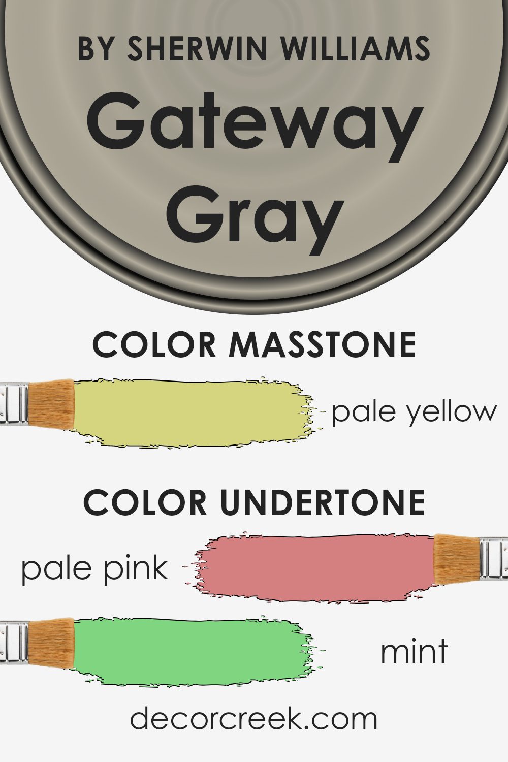
Gateway Gray by Sherwin Williams is a complex color with a variety of undertones that influence how it appears. When you paint a wall with this color, the surrounding lighting and room decor can bring out different shades hidden within it. This particular gray isn’t just straightforward but has subtle hints that can change its appearance.
The pale pink undertones can add a soft, warm glow, especially in rooms with warm lighting. This can make the gray feel more inviting. Conversely, mint and light green undertones can bring a fresh, cool touch, making a space feel crisper under cooler lighting. Grey and light gray undertones maintain the neutral aspect of the paint, allowing it to blend well with various color schemes without clashing.
The light purple and lilac undertones introduce a hint of elegance and can add a subtle charm, making a room feel cozy and comfortable. Light blue hints can create a calm atmosphere, as blue is generally associated with tranquility.
Moreover, undertones like yellow and orange can add warmth and energy to a room, while olive hues provide a grounding effect. These various shades mean Gateway Gray adapts beautifully to different environments, creating unique moods depending on its context.
What is the Masstone of the Gateway Gray SW 7644 by Sherwin Williams?
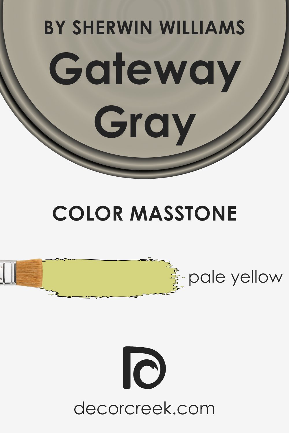
Gateway Gray (SW 7644) by Sherwin Williams is a versatile color with a unique undertone that can change the feel of a room. The masstone, which is a pale yellow (#D5D580), adds warmth to the gray, making it feel inviting and cozy.
In homes, this warm undertone helps balance the coolness typically associated with gray colors, making spaces feel more welcoming. It’s particularly effective in living rooms or bedrooms where people often want to relax and feel comfortable.
Because of its subtle yellow undertone, Gateway Gray pairs well with both light and dark colors. It can complement light woods and soft furnishings, creating a harmonious look, or be used with darker accents for contrast. It also adapts well to different lighting conditions; in natural light, it might appear more gray, while in artificial lighting, the warmth is more pronounced. This adaptability makes it a great choice for various rooms and styles.
How Does Lighting Affect Gateway Gray SW 7644 by Sherwin Williams?
Lighting plays a crucial role in how colors appear in a space. Different lighting conditions can change the appearance of a color, making it look lighter, darker, warmer, or cooler. One specific color, Gateway Gray (SW 7644) by Sherwin Williams, changes depending on the type of light it is exposed to.
In natural light, Gateway Gray can look different based on the direction of the room it is in. Natural light varies in color and intensity throughout the day and also depends on the orientation of the room.
In north-facing rooms, the light is generally cooler and softer. This means that Gateway Gray might show more of its blue undertones, making it appear cooler and a bit more muted than it would in other lighting situations. The lack of direct sunlight means the color can seem a bit darker.
In south-facing rooms, there usually is more intense and warm sunlight throughout the day. This warm light can bring out the warmer tones in Gateway Gray, making the color look a bit softer and warmer. In these rooms, the color may appear more inviting due to the abundant sunlight.
East-facing rooms get bright, cool morning light. Gateway Gray might appear cooler and a bit sharper in the morning, but as the day goes on and the light fades, the color can look softer and darker.
West-facing rooms have warmer light in the afternoon and evening. This warm, setting sunlight can bring out the warmth in Gateway Gray, making it appear richer and more saturated as the day progresses.
In artificial light, the type of bulb used can significantly impact how Gateway Gray looks. LED lights with a cooler temperature will highlight its cooler tones, while warm incandescent bulbs will enhance any warmer nuances. This adaptability makes Gateway Gray a versatile color choice, but it’s important to consider lighting when selecting paint for your space.
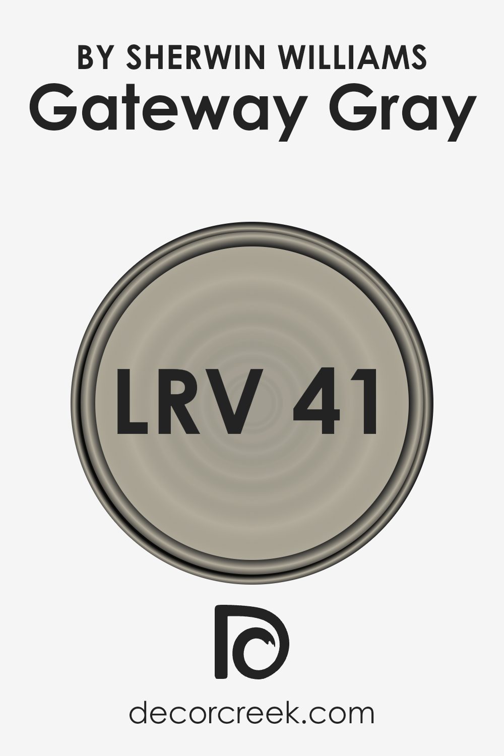
What is the LRV of Gateway Gray SW 7644 by Sherwin Williams?
LRV, or Light Reflectance Value, is a measure of how much light a paint color will reflect. It is an important factor to consider when selecting paint because it affects how the color will look in different lighting conditions and how bright or dark a room will feel. LRV is measured on a scale from 0 to 100, with 0 being absolute black (absorbing all light) and 100 being pure white (reflecting all light).
A color with an LRV in the middle range will neither absorb nor reflect too much light, making it a versatile choice. The LRV can help you predict if a color will feel too dark or too washed out in your space, taking into account factors like the amount of natural light in the room and the orientation of the windows.
For Gateway Gray with an LRV of 41.282, this means it falls in the mid-range of the scale, leaning toward the darker side. This value indicates that Gateway Gray is a medium-toned color that will absorb a fair amount of light and reflect a moderate amount. In rooms with abundant natural light, it will balance the light well without overpowering the space or making it feel too dark.
, in a room with limited light, the color might come across as darker, making the room appear cozier but possibly smaller. Understanding the LRV helps to determine the best use for this color, ensuring it complements the lighting conditions of the room effectively.
Coordinating Colors of Gateway Gray SW 7644 by Sherwin Williams
Coordinating colors are hues that work well together to create a balanced and visually appealing space. These colors are selected based on how well they complement a main color, in this case, Gateway Gray by Sherwin Williams. Using coordinating colors helps maintain harmony within a room, giving a seamless flow from one element to the next. By choosing shades that complement Gateway Gray, you can create a cohesive look that feels intentional and stylistic rather than random or mismatched.
Among the coordinating colors, Aesthetic White (SW 7035) is a soft and warm off-white with subtle beige undertones, making it a versatile backdrop that doesn’t overpower. Shoji White (SW 7042) has a delicate, creamy quality with a hint of gray, which adds warmth to spaces without making them feel heavy.
Virtual Taupe (SW 7039) is a deeper, richer neutral that brings depth and contrast, pairing well with lighter hues to add a touch of warmth and coziness. Together, these colors with Gateway Gray help create an inviting and stylish environment. Coordinating colors like these can make designing a space a seamless process, ensuring every shade pairs nicely with its neighbors.
You can see recommended paint colors below:

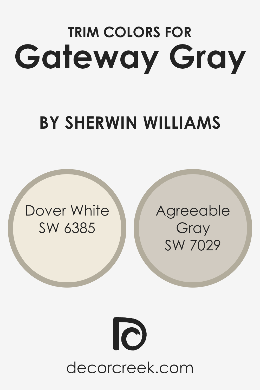
What are the Trim colors of Gateway Gray SW 7644 by Sherwin Williams?
Trim colors are used in interior and exterior design to highlight the edges between walls, ceilings, and floors or to accent windows, doors, and other architectural details. They help define spaces and add a finishing touch to any room or structure. When paired with Gateway Gray SW 7644, trim colors like Dover White and Agreeable Gray from Sherwin Williams can create a harmonious and balanced look.
Gateway Gray is a deep and rich gray shade that adds depth and warmth to a space. The choice of trim color is essential because it sets the primary tone for these accents and can either complement or contrast the main color, influencing the overall mood and aesthetic of a room.
Dover White is a soft, warm white that provides a classic and clean look when used as a trim color. It’s an excellent choice for adding brightness and a sense of space while enhancing the rich tones of Gateway Gray. On the other hand, Agreeable Gray is a versatile, light gray with a hint of beige that offers a more subtle contrast.
When used as a trim, Agreeable Gray can add an understated elegance to the deeper shades of Gateway Gray, creating a cohesive yet distinct look that balances light and shadow. Both Dover White and Agreeable Gray work well with Gateway Gray, offering different moods and styles to suit personal preferences.
You can see recommended paint colors below:
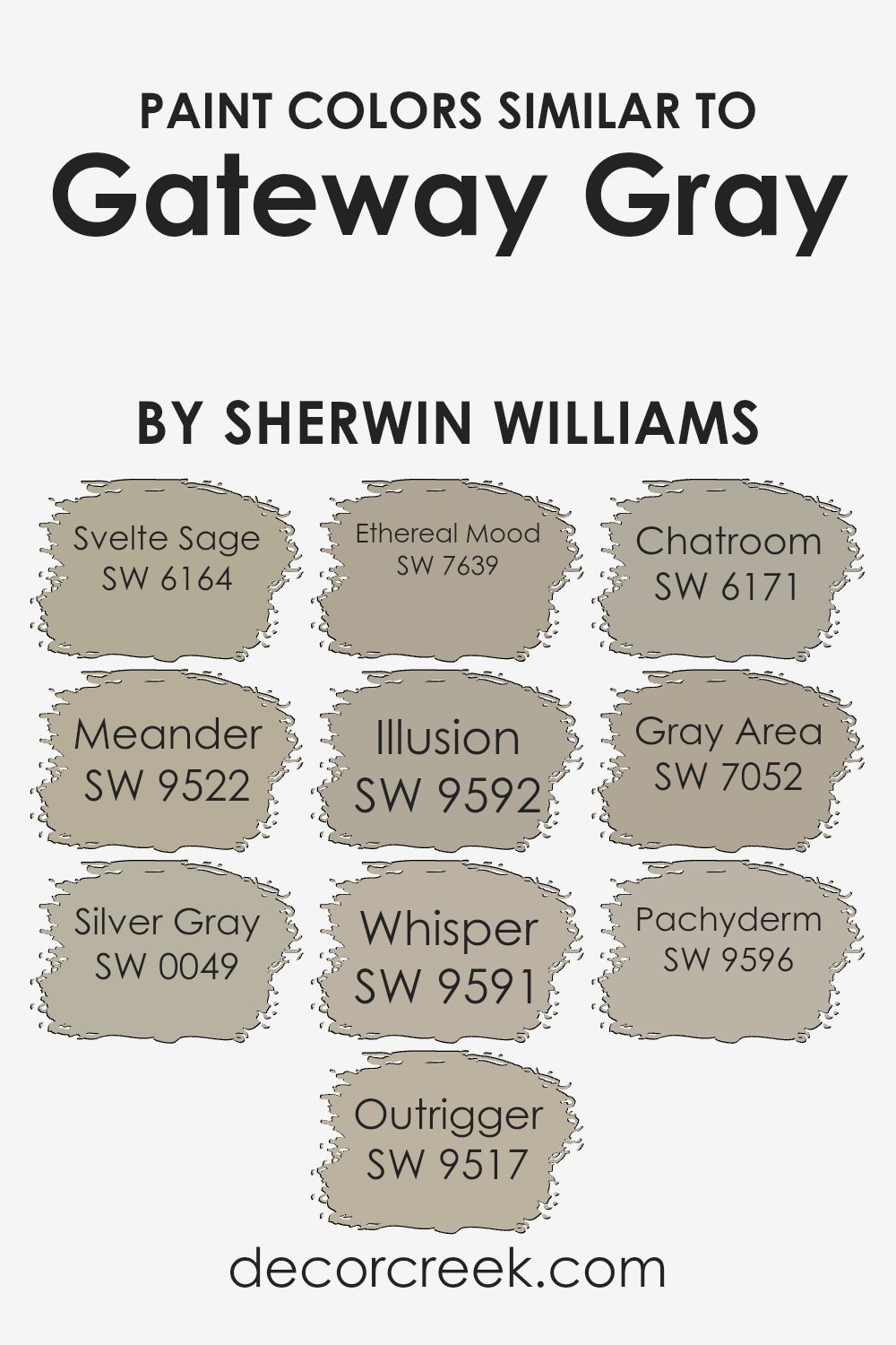
Colors Similar to Gateway Gray SW 7644 by Sherwin Williams
When selecting colors close to Gateway Gray by Sherwin Williams, the goal is to harmonize and create a cohesive look in any space. These similar colors help to achieve a balanced and unified feel in a room, as they share undertones or complementary hues that enhance the primary shade. SW 6164 Svelte Sage, for instance, brings a hint of green, adding a touch of nature-inspired warmth.
SW 9522 Meander is a gentle, soft hue that’s perfect for creating a calm and inviting atmosphere. The coolness of SW 0049 Silver Gray introduces a subtle elegance with its light, silvery undertone. Utilizing SW 9517 Outrigger provides another layer of depth with its refined neutral tone.
SW 7639 Ethereal Mood feels light and airy, providing a slightly misty ambiance. For a delicate addition, consider SW 9592 Illusion, which is a whisper-soft hue ideal for creating a light-hearted feel. SW 9591 Whisper stays true to its name, offering a very light, hushed tone that enhances the serenity of an area. SW 6171 Chatroom leans slightly more toward a greenish-gray, subtly connecting spaces with an easy-going vibe.
The deeper tone of SW 7052 Gray Area adds a touch of modern sophistication, while SW 9596 Pachyderm delivers a classic and grounding gray, ideal for anchoring various designs. Using these colors alongside Gateway Gray can create a living space that is both inviting and harmonious.
You can see recommended paint colors below:
- SW 6164 Svelte Sage
- SW 9522 Meander
- SW 0049 Silver Gray
- SW 9517 Outrigger
- SW 7639 Ethereal Mood
- SW 9592 Illusion
- SW 9591 Whisper
- SW 6171 Chatroom
- SW 7052 Gray Area
- SW 9596 Pachyderm
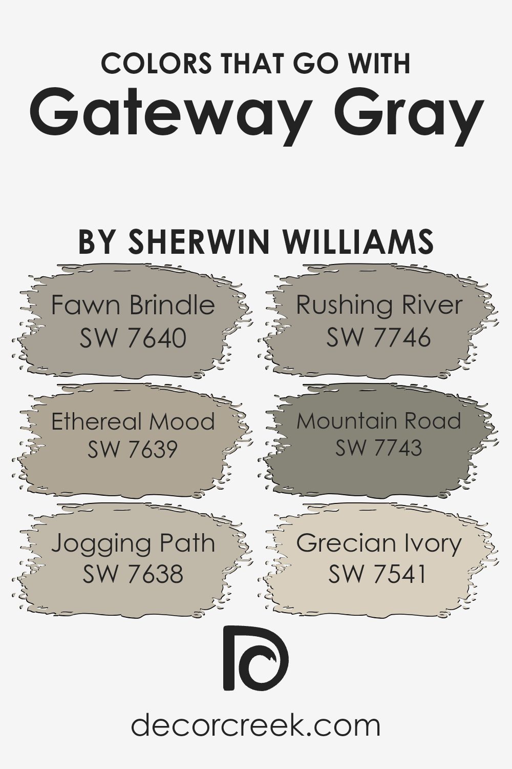
Colors that Go With Gateway Gray SW 7644 by Sherwin Williams
Colors that complement Gateway Gray SW 7644 by Sherwin Williams create a harmonious and balanced environment. Together, they enhance the look and ambiance of a room, offering subtle elegance and warmth. For example, SW 7640 – Fawn Brindle has a warm taupe undertone that pairs well with the gentle neutrality of Gateway Gray, adding depth without overwhelming the space.
On the other hand, SW 7639 – Ethereal Mood brings a lighter, more airy touch with its soft gray hue. It’s perfect for brightening up spaces while maintaining a cohesive look.
SW 7638 – Jogging Path introduces a natural earthiness that works wonderfully as an accent or complementing shade, creating an inviting atmosphere. For a richer tone, SW 7746 – Rushing River provides a deep and robust green that adds a touch of nature and intrigue to the palette. SW 7743 – Mountain Road, meanwhile, grounds the scheme with its darker gray-green shade, which brings a sense of stability and calm.
Finally, SW 7541 – Grecian Ivory introduces a soft, creamy hue that offsets the darker tones beautifully, adding warmth and softness. Together, these colors work in harmony, enhancing the aesthetic appeal of any space where Gateway Gray SW 7644 is used.
You can see recommended paint colors below:
- SW 7640 Fawn Brindle
- SW 7639 Ethereal Mood
- SW 7638 Jogging Path
- SW 7746 Rushing River
- SW 7743 Mountain Road
- SW 7541 Grecian Ivory
How to Use Gateway Gray SW 7644 by Sherwin Williams In Your Home?
Gateway Gray SW 7644 by Sherwin Williams is a versatile paint color that can add a touch of elegance to any room. This warm, neutral gray works well in a variety of settings, making it a popular choice for many homes.
If you’re looking to refresh your living room, Gateway Gray can provide a cozy and inviting backdrop for your furniture and decor. Its subtle undertones blend well with both modern and traditional styles, allowing for easy coordination with different color schemes.
In the bedroom, Gateway Gray creates a calm and relaxing environment, perfect for winding down after a long day. It pairs nicely with soft whites and pastels for a soothing look. This shade is also a great option for open floor plans, providing a cohesive flow from room to room. Whether used on all walls or as an accent, Gateway Gray offers a timeless and flexible option for your home decor.
Gateway Gray SW 7644 by Sherwin Williams vs Silver Gray SW 0049 by Sherwin Williams
Gateway Gray SW 7644 and Silver Gray SW 0049 by Sherwin Williams are two different shades from the gray color family. Gateway Gray is a deeper, more mid-toned gray that has warm undertones, giving it a cozy and inviting feel. It’s a versatile color that works well with many decor styles, adding depth to a space without being overpowering.
On the other hand, Silver Gray is lighter and has cooler undertones. This hue feels airy and more reflective, creating a brighter atmosphere. It’s ideal for spaces where a fresh, clean look is desired. Silver Gray can make a room feel more open and is great for smaller spaces or areas with less natural light.
When choosing between these colors, consider the mood you want to create. Gateway Gray adds warmth and comfort, while Silver Gray brings lightness and a softer touch. Both offer unique vibes for any room.
You can see recommended paint color below:
Gateway Gray SW 7644 by Sherwin Williams vs Meander SW 9522 by Sherwin Williams
Gateway Gray SW 7644 and Meander SW 9522 are both neutral colors from Sherwin Williams, but they each bring their own feel to a space. Gateway Gray is a calm and balanced gray with subtle warmth, making it versatile and suitable for a wide range of room styles. It works well in living rooms, bedrooms, or any area where a neutral backdrop is desired.
In contrast, Meander is a softer, lighter shade with a gentle hint of coolness. It tends to appear more airy and open, making it ideal for smaller spaces or rooms where you want to maintain a light and fresh atmosphere.
While Gateway Gray offers a stable and grounding effect, Meander brings a sense of openness and light. Both are excellent choices depending on whether you prefer a more cozy feel or a light and breezy look.
You can see recommended paint color below:
Gateway Gray SW 7644 by Sherwin Williams vs Chatroom SW 6171 by Sherwin Williams
Gateway Gray SW 7644 by Sherwin Williams and Chatroom SW 6171 by Sherwin Williams are both neutral paint colors, but they have distinct characteristics. Gateway Gray is a mid-tone gray with a balanced undertone, making it suitable for various spaces. Its neutral shade provides a modern and clean look without leaning too cold or warm.
On the other hand, Chatroom SW 6171 is a soft greenish-gray. It has a hint of green that brings a bit of warmth and earthiness, making it feel a bit more inviting than a straightforward gray. This color is great for spaces where you want a touch of nature without going for a full green.
Both colors work well in different settings. Gateway Gray is versatile and pairs nicely with both cool and warm accents, while Chatroom adds a subtle hint of color, making it ideal for creating a cozy and refreshing atmosphere.
You can see recommended paint color below:
Gateway Gray SW 7644 by Sherwin Williams vs Pachyderm SW 9596 by Sherwin Williams
Gateway Gray SW 7644 and Pachyderm SW 9596 are two distinct colors by Sherwin Williams. Gateway Gray is a versatile neutral that leans towards a cool, bluish-gray tone. It can fit in both traditional and modern spaces, offering a calm backdrop without overpowering a room. It pairs well with whites and darker grays, providing a balanced look.
In contrast, Pachyderm is a warmer gray with subtle brown undertones. This makes it feel earthier and more inviting compared to the cooler Gateway Gray. Pachyderm works beautifully in spaces where warmth and coziness are desired, complementing natural materials like wood or beige tones.
Both colors are neutral, but each has its own character. Gateway Gray offers a cool, clean feel, while Pachyderm provides warmth and a hint of earthiness. Choosing between them depends on the mood and style you want to create in your space.
You can see recommended paint color below:
- SW 9596 Pachyderm
Gateway Gray SW 7644 by Sherwin Williams vs Ethereal Mood SW 7639 by Sherwin Williams
Gateway Gray SW 7644 and Ethereal Mood SW 7639 by Sherwin Williams are both calming, neutral tones, but they have their differences. Gateway Gray is a soft, medium gray that leans slightly warm, making it a versatile choice for various spaces. It can serve as a backdrop that pairs well with both brighter colors and other neutrals.
On the other hand, Ethereal Mood is a warm gray with more beige undertones, giving it a cozy and inviting feel. This makes it especially suitable for living rooms or bedrooms where a comfortable atmosphere is desired. While Gateway Gray is more straightforward in its neutrality, Ethereal Mood’s beige tones add a layer of warmth, offering a slightly different vibe.
When choosing between them, consider the lighting in your space. Ethereal Mood might bring a warm touch in rooms with lots of light, while Gateway Gray offers a balanced tone that complements modern or minimalist designs.
You can see recommended paint color below:
Gateway Gray SW 7644 by Sherwin Williams vs Whisper SW 9591 by Sherwin Williams
Gateway Gray and Whisper are two distinct colors from Sherwin Williams. Gateway Gray, with its subtle undertones, is a warm and versatile shade that fits well in various interior settings. It can act as a neutral backdrop, allowing other colors in a room to stand out. On the other hand, Whisper is a very soft, light hue, creating a gentle and airy atmosphere.
It works well in spaces where you want a fresh, clean look. While Gateway Gray adds depth and warmth, Whisper brings brightness and openness. These two colors can complement each other in a space when used thoughtfully, with Gateway Gray adding contrast to the softness of Whisper. They offer a nice balance, allowing for creative combinations in home design.
Whether you prefer the richness of Gateway Gray or the lightness of Whisper, both colors have their own unique appeal and can enhance the overall vibe of a room.
You can see recommended paint color below:
- SW 9591 Whisper
Gateway Gray SW 7644 by Sherwin Williams vs Gray Area SW 7052 by Sherwin Williams
Gateway Gray SW 7644 and Gray Area SW 7052 are two popular gray shades by Sherwin Williams. Gateway Gray is a warmer, medium-toned gray with subtle taupe undertones. It creates a cozy and inviting atmosphere, making it ideal for living rooms and bedrooms.
In contrast, Gray Area is a cooler gray with slight blue undertones, lending a more modern and sleek feel to a space. This makes Gray Area suitable for contemporary kitchens or bathrooms where a crisp look is desired. When choosing between the two, consider the natural light in your space. Gateway Gray can add warmth and coziness, while Gray Area offers a fresher and more airy vibe.
Both colors serve as versatile backdrops that pair well with a variety of accent colors and decor styles, but their warmth or coolness can dramatically change the mood of a room. Consider your existing furnishings and the atmosphere you want to create.
You can see recommended paint color below:
- SW 7052 Gray Area
Gateway Gray SW 7644 by Sherwin Williams vs Illusion SW 9592 by Sherwin Williams
Gateway Gray SW 7644 by Sherwin Williams is a versatile and neutral shade of gray. It’s a medium-toned color that offers a balanced look without leaning too much toward warm or cool undertones. This makes it a popular choice for living rooms, kitchens, and anywhere a calm and composed backdrop is desired.
On the other hand, Illusion SW 9592 by Sherwin Williams presents a soft, muted hue with a hint of lavender. It’s lighter and more playful compared to Gateway Gray. Illusion is ideal for spaces where you want a touch of color but still want to maintain a light and airy feel, such as bedrooms or bathrooms.
While Gateway Gray provides a solid and steady foundation, Illusion offers a gentle and subtle pop of color. Together, they create a cohesive and stylish look, with Gateway Gray providing grounding and Illusion adding a delicate touch of color.
You can see recommended paint color below:
Gateway Gray SW 7644 by Sherwin Williams vs Svelte Sage SW 6164 by Sherwin Williams
Gateway Gray SW 7644 and Svelte Sage SW 6164 are both colors from Sherwin Williams, but they offer different vibes. Gateway Gray is a cool, neutral gray that offers a modern, clean look. It’s versatile and works well with many other colors, making it ideal for spaces where you want a subtle backdrop that doesn’t overwhelm other design elements.
On the other hand, Svelte Sage is a soft green with warm undertones. It brings a touch of nature and can make a room feel cozy and inviting. This color is more about bringing a gentle hint of color to a space, offering a calming effect without being too bold.
While Gateway Gray might suit contemporary or minimalist designs, Svelte Sage is great for those who love a hint of earthiness and warmth. Both colors are understated and can work in various settings, but they set different moods.
You can see recommended paint color below:
Gateway Gray SW 7644 by Sherwin Williams vs Outrigger SW 9517 by Sherwin Williams
Gateway Gray SW 7644 by Sherwin Williams is a muted, neutral gray shade that creates a calm and balanced look. It’s versatile and works well in many settings, adding a touch of elegance without being overwhelming. This color is great for living rooms, bedrooms, or any space where you want a sense of comfort and harmony.
On the other hand, Outrigger SW 9517 is a bolder, more dynamic color. It has warmer undertones compared to Gateway Gray, which makes it stand out more. It is suitable for accent walls, furniture, or any area where you want to add a pop of color and energy.
Both colors can complement each other when used together, with Gateway Gray providing a soothing backdrop and Outrigger adding vibrancy. When choosing between them, consider the mood you want in your space: subtle and calm with Gateway Gray or lively and warm with Outrigger.
You can see recommended paint color below:
Conclusion
It’s like a magical shade of gray that can make any room in my house look nice and cozy. Gateway Gray has a warm feel to it, which means it can make a room feel inviting and pleasant.
This color works well in any kind of room, whether it’s the living room where I watch TV, the kitchen where my family eats, or even my bedroom where I sleep. It’s not too bright and not too dull, which makes it just right for everyone to enjoy.
When I imagine having my walls painted in Gateway Gray, I think about how everything else in the room would look with it. Furniture, curtains, and even pictures on the walls can all look really nice with this gray color. It’s like the paint helps everything look better together.
What’s cool about Gateway Gray is that it doesn’t feel too boring or too cold, and it can make things in the room pop with its neutral tone. If someone asked me which paint color to use that will make a room look really nice and cozy, I would definitely say SW 7644 Gateway Gray by Sherwin Williams. It’s a friendly and calm color that can make anyone feel at home.
Ever wished paint sampling was as easy as sticking a sticker? Guess what? Now it is! Discover Samplize's unique Peel & Stick samples.
Get paint samples

