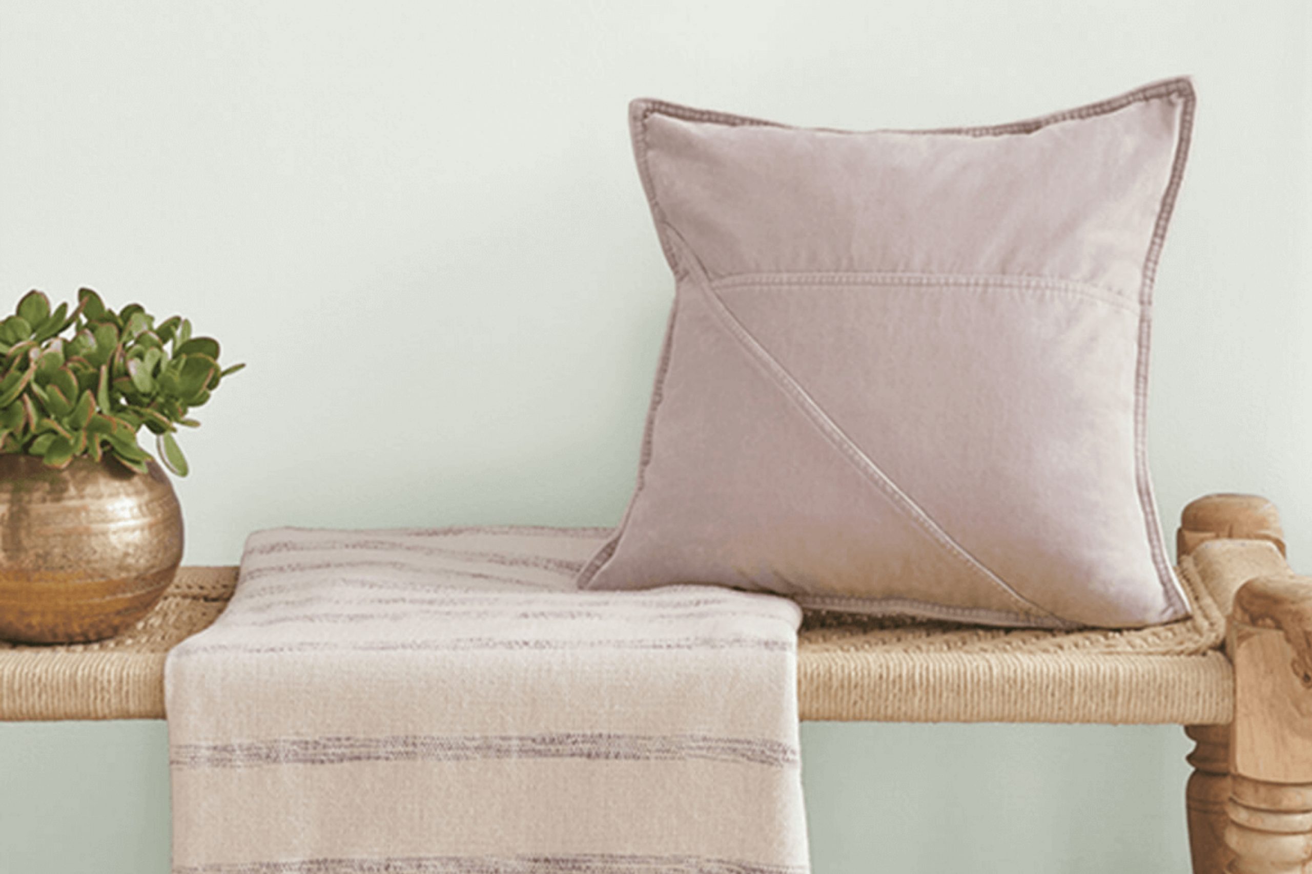
As soon as I started experimenting with Sherwin Williams’s SW 9676 Green Glimpse, I noticed how unique this shade of green really is. It provides a calm and refreshing presence that is just right for anyone looking to add a touch of serenity to their living space without overpowering it.
This color, subtle yet distinct, carries a natural vibrancy that reminds me of early spring leaves or a quiet, mossy forest path. It’s soft enough to use in large areas, like living room walls or a bedroom, yet has just enough depth to make smaller spaces, like a bathroom or a study nook, feel cozy and inviting.
Using Green Glimpse in your home could be a delightful way to bring in a bit of nature’s peace and vitality. It pairs beautifully with soft whites and neutral tones, enhancing wooden features and natural fibers without clashing with existing decors. For furniture, it accents wooden pieces wonderfully, bringing out their natural beauty.
Whether you’re painting a wall, a piece of furniture, or adding accents to your decor, Green Glimpse offers a gentle nudge towards a more serene and lively environment. It’s a color that, in my experience, manages to be both soothing and refreshing, making it a versatile choice for many home decor projects.
What Color Is Green Glimpse SW 9676 by Sherwin Williams?
Green Glimpse by Sherwin Williams is a vibrant and refreshing shade of green that brings a touch of nature into any space. This lively color has a brightness to it that can lighten up a room while offering a sense of calmness. Its vivid hue makes it suitable for adding a pop of color without overwhelming the senses.
This particular shade fits brilliantly in modern and contemporary interior styles due to its clean and crisp appeal. It works especially well in spaces that aim for a minimalistic yet upbeat ambiance, such as kitchens, bathrooms, and living areas.
Moreover, its natural green tone makes it an excellent choice for eco-friendly or botanical-themed designs, where it can be paired with natural elements to foster a connection with the outdoors.
Green Glimpse pairs beautifully with natural materials and textures. Wood, whether light or dark, complements its freshness and can help bring out the color’s vibrancy. When used in furnishings, fabrics like cotton and linen in neutral colors provide a soft contrast to the bold green, making the space feel balanced and grounded.
Metals like brass or copper can also add a touch of luxury to this green backdrop, creating a striking yet harmonious interior.

Is Green Glimpse SW 9676 by Sherwin Williams Warm or Cool color?
Green Glimpse is a soothing green paint by Sherwin Williams that brings a fresh and lively atmosphere to any room. This shade is light enough to make small spaces appear bigger while still adding a noticeable pop of color.
It works well in various areas of a home, such as kitchens and living rooms, where it introduces a vibrant yet calming feel. When paired with natural materials like wood or with white trim, it creates a clean and inviting environment.
This hue is also versatile in its ability to match with many decor styles, whether you’re going for a modern or a more classic look. Additionally, it’s a great choice for those who enjoy changing up their decor with the seasons, as it complements both bright summer accessories and richer fall tones. Overall, Green Glimpse injects a cheerful energy into homes without overwhelming the senses.
Undertones of Green Glimpse SW 9676 by Sherwin Williams
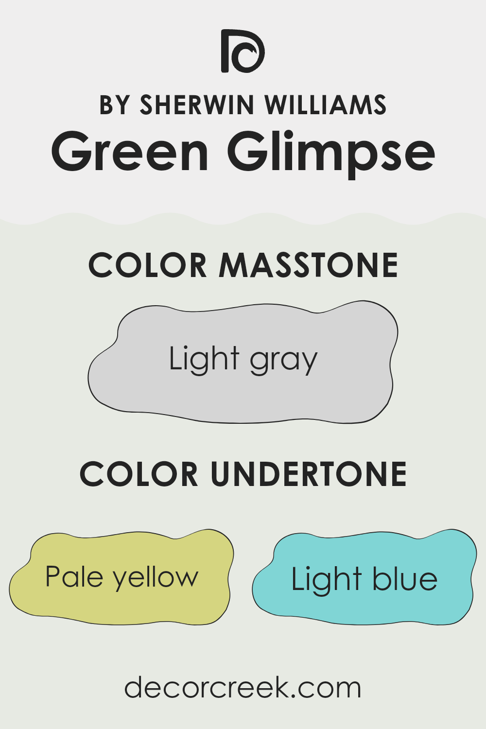
Green Glimpse is a versatile paint color that can look different depending on the lighting and surrounding hues. This variability comes from its mix of undertones, which include pale yellow, light blue, light purple, mint, pale pink, lilac, and grey.
Undertones are subtle colors that influence the main hue and can change how we perceive the color in different environments. For instance, pale yellow can make the green seem warmer and more welcoming, while light blue might give it a cooler feel. This can affect the mood and visual temperature of a room.
When used on interior walls, the impact of these undertones can be quite significant. In natural light, the pale yellow or mint undertones might become more pronounced, making the room feel more lively and fresh. In artificial lighting, the grey or light purple undertones might stand out, giving the space a more muted or cozy atmosphere.
Choosing furnishings and decor that complement or contrast these undertones can also affect the overall appearance of the room. Soft furnishings in lilac or pale pink can harmonize with Green Glimpse for a gentle look, while bold contrasts like light blue can add dynamism to the space.
Overall, understanding the undertones in Green Glimpse can help in making informed decisions about decorating and using the space effectively to achieve a desired ambiance.
What is the Masstone of the Green Glimpse SW 9676 by Sherwin Williams?
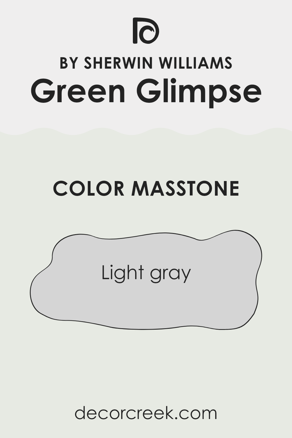
Green Glimpse SW 9676 by Sherwin Williams has a masstone of Light Gray, identified by the color code #D5D5D5. This light gray shade brings a soft and neutral look to any room, making it easy to match with a wide range of decor styles and colors.
Since the masstone isn’t overpowering, it can make small spaces appear larger and more open, which is ideal for rooms that don’t get a lot of natural light. This versatile color also has a calming effect, providing a subtle backdrop that can make your home feel more comfortable and welcoming.
Whether used in a bedroom, living room, or kitchen, Light Gray offers a clean and fresh look that doesn’t go out of style. It works well with other neutral tones as well as bolder colors, giving homeowners the flexibility to use it in various design schemes.
How Does Lighting Affect Green Glimpse SW 9676 by Sherwin Williams?
Lighting plays a vital role in how we perceive colors, significantly impacting their appearance and mood-setting capabilities. Different types of light can change the way colors look. For example, Green Glimpse, a color by Sherwin Williams, can appear differently depending on whether it’s under artificial light or natural light, and the orientation of the room also affects its appearance.
In artificial light, Green Glimpse might look more intense and vibrant. This is because most artificial lighting, like LED or fluorescent lights, can enhance certain tones within the paint. In a room lit with warm-toned lights, this green might appear cozier and richer, providing a welcoming atmosphere.
Natural light, on the other hand, brings out the truest form of any paint color. In rooms that face north, which typically receive less direct sunlight, Green Glimpse could look more muted and subtle. This softer appearance makes it ideal for spaces where you want a calm and less intense color feel, such as bedrooms or study rooms.
South-facing rooms get a lot of direct sunlight throughout the day, which can make colors look brighter and more vivid. Here, Green Glimpse might appear lively and fresh, making it a great choice for living spaces or kitchens where a vibrant, cheerful ambiance is desired.
Rooms that face east will be bright in the mornings as they catch the first light of the day. In these rooms, Green Glimpse might start the day looking bright and cheerful but become more shadowed and muted as the day goes on.
West-facing rooms experience the opposite effect, with dimmer mornings and bright, warm lighting in the afternoons and evenings. In such rooms, this color will change from a cooler muted tone in the morning to a warmer, welcoming color by the evening.
Overall, how Green Glimpse looks can depend greatly on the room’s exposure and light sources, highlighting its versatility in various settings.
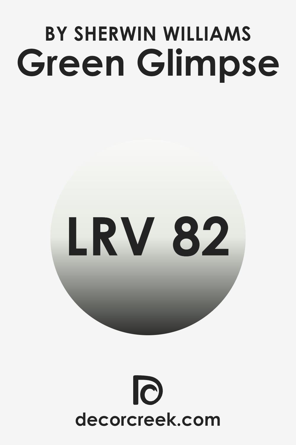
What is the LRV of Green Glimpse SW 9676 by Sherwin Williams?
LRV stands for Light Reflectance Value, which is a measure of how much light a paint color reflects back into a room. It is rated on a scale from zero, being the darkest, absorbing most light, to one hundred, the brightest, reflecting most light.
A higher LRV typically makes a room feel brighter and more open because it reflects more light. This is particularly useful in spaces that are naturally darker or smaller, as a higher LRV can make them appear larger and more inviting. The LRV of Green Glimpse, which is 81.684, means it’s a very light green shade that will reflect a significant amount of light.
This makes it a great choice for rooms that might not have a lot of natural sunlight. Since it reflects much of the light that hits it, this color can help boost the brightness of such spaces effectively. Additionally, such a high LRV can help in reducing the need for artificial lighting during the day, contributing to energy savings while creating a pleasant, well-lit environment.
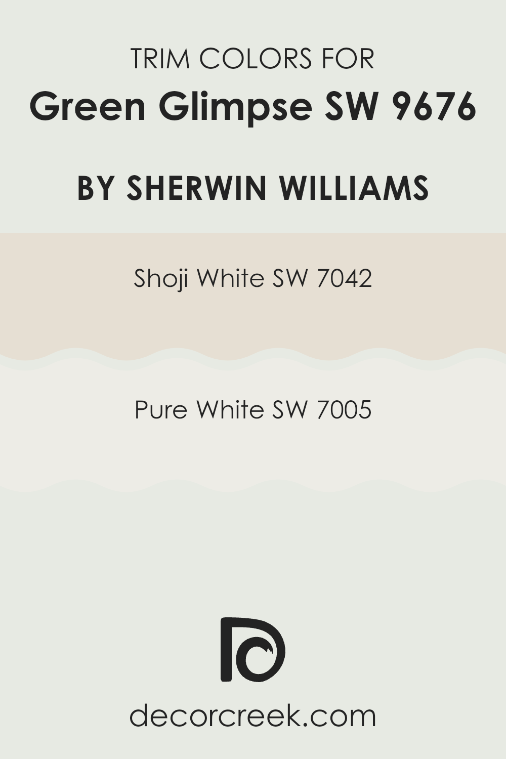
What are the Trim colors of Green Glimpse SW 9676 by Sherwin Williams?
Trim colors, such as SW 7042 – Shoji White and SW 7005 – Pure White by Sherwin Williams, play a crucial role in defining the visual aesthetics of a room. These colors are used on elements like door frames, window sills, baseboards, and moldings, effectively framing the main wall colors and enhancing architectural details.
The choice of trim color can either subtly complement the overall palette or create a bold contrast, making the room features more pronounced and appealing. For example, pairing a lively color like Green Glimpse with a neutral trim can ground the color scheme, ensuring the walls stand out without feeling overwhelming.
SW 7042 – Shoji White is a soft, warm white with a subtle beige undertone that provides a cozy and welcoming feel when used as a trim. It blends well with richer and darker colors, softening their impact and adding a touch of lightness to the space.
On the other hand, SW 7005 – Pure White is a crisp, clean white that offers a sharp contrast, making it ideal for creating a fresh and bright look. This shade works particularly well with vibrant colors, accentuating their intensity and drawing attention to the colors and features of the room.
You can see recommended paint colors below:
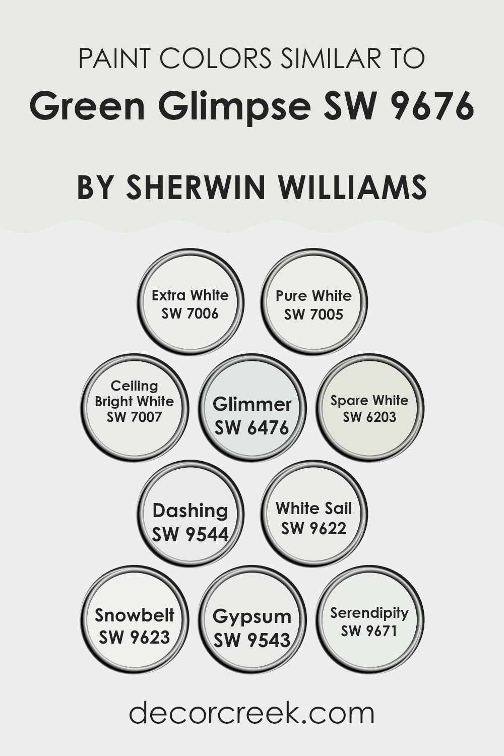
Colors Similar to Green Glimpse SW 9676 by Sherwin Williams
Using similar colors in a design can create a subtle yet effective visual impact that enhances the overall aesthetic without overwhelming the senses. When colors like those close to Green Glimpse by Sherwin Williams are used, they help in achieving a cohesive look while providing just enough contrast to make each element stand out. Similar colors work together to offer a streamlined visual experience that is pleasing to the eye, making spaces appear larger and more open.
For instance, Extra White is a fresh, clean white that brings a crisp brightness to spaces, making it a perfect base or accent to more subdued tones. Right alongside, Pure White has a slightly warmer undertone, providing a soft, inviting feel that pairs well with cooler colors.
Ceiling Bright White is ideal for ceilings but also works on trim, adding a subtle differentiation that lifts the visual height of a room. Glimmer is a soft, pale grayish-blue that brings a light, airy quality to interiors, complementing more vibrant greens elegantly. Spare White offers a muted, understated backdrop that allows furniture and art to shine, useful in modern and minimalist designs.
Dashing is slightly more pronounced with its greenish undertone, lending a dash of personality without dominating a space. White Sail is another pale option, bordering on the edges of off-white, giving a gentle nod to beach-inspired themes.
Snowbelt introduces a touch of softness, its light gray quality making it versatile for various applications without being stark. Gypsum shares this versatility with a whisper of warmth, making spaces feel cozy and lived-in. Lastly, Serendipity provides a hint of muted lavender, perfect for adding a unique but subtle twist to rooms looking for a touch of distinction without the boldness of brighter colors. These shades make designing with a monochromatic or analogous color scheme straightforward and effective, allowing for a variety of combinations that maintain harmony and balance.
You can see recommended paint colors below:
- SW 7006 Extra White
- SW 7005 Pure White
- SW 7007 Ceiling Bright White
- SW 6476 Glimmer
- SW 6203 Spare White
- SW 9544 Dashing
- SW 9622 White Sail
- SW 9623 Snowbelt
- SW 9543 Gypsum
- SW 9671 Serendipity
How to Use Green Glimpse SW 9676 by Sherwin Williams In Your Home?
Green Glimpse by Sherwin Williams is a fresh and lively shade of green that brings a touch of nature into your home. This color is perfect for those who want to add some cheer and vibrancy to their living spaces. You can use Green Glimpse in several ways around your house.
For example, painting an accent wall with this color in your living room or bedroom can make the space more dynamic and inviting. It’s also a great choice for the bathroom or kitchen, where it can help create a clean and refreshing atmosphere.
If you’re not ready to paint a whole room, consider using Green Glimpse for smaller projects like painting a piece of furniture or some shelves. This can introduce a pop of color without overwhelming the space. In addition, pairing it with neutral colors such as whites, grays, or natural wood tones can balance its brightness, making your home both energetic and comfortable to live in.
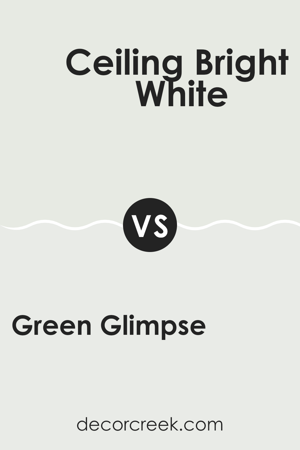
Green Glimpse SW 9676 by Sherwin Williams vs Ceiling Bright White SW 7007 by Sherwin Williams
Green Glimpse is a vibrant green color that brings a sense of freshness and liveliness to any space. It’s bright and cheerful, perfect for adding a pop of color in a room that needs a little lift. On the other hand, Ceiling Bright White is a pure, clean white that helps to make a room appear larger and more open. It reflects light very well, which can brighten up darker spaces effectively.
Using Green Glimpse can add personality and a touch of nature’s vibes to your environment, making it ideal for a creative space or a playful children’s room. Ceiling Bright White, however, is great for achieving a crisp, clean look and works well in any setting needing a neutral backdrop that won’t clash with other colors.
In summary, Green Glimpse offers a lively burst of color, suitable for energetic spaces, while Ceiling Bright White serves as a versatile background, perfect for highlighting other design elements.
You can see recommended paint color below:
Green Glimpse SW 9676 by Sherwin Williams vs Glimmer SW 6476 by Sherwin Williams
Green Glimpse is a soft, muted green shade with a hint of gray, giving it a calm and understated look. It’s perfect for creating a gentle and soothing atmosphere in any room. This color is versatile, working well in spaces that aim for a natural feel without overwhelming the senses.
On the other hand, Glimmer is a much lighter color, leaning towards a pale, silvery green with a touch of blue. This tint gives it a refreshing and airy quality, making it ideal for small areas or rooms that need to feel more open and bright. It reflects light well, contributing to a more spacious feeling.
While Green Glimpse offers more depth and can anchor a space with its richer hue, Glimmer provides a subtle lift, enhancing spaces with its brightness. Both colors complement each other nicely but serve different purposes depending on the mood and size of the space you are decorating.
You can see recommended paint color below:
Green Glimpse SW 9676 by Sherwin Williams vs Pure White SW 7005 by Sherwin Williams
Green Glimpse is a vibrant green with a fresh vibe that can add a pop of color to any space. It brings to mind the lushness of spring foliage and works well in areas where you want a touch of nature’s vitality. On the other hand, Pure White is as straightforward as it gets with whites.
It’s a clean and crisp color that can make any room feel brighter and more spacious. Pure White serves as an excellent backdrop for any decor style, allowing other colors, like Green Glimpse, to stand out more prominently.
When used together, Green Glimpse provides a striking contrast against the stark simplicity of Pure White, making it an ideal combination for creating visually appealing and refreshing spaces.
You can see recommended paint color below:
Green Glimpse SW 9676 by Sherwin Williams vs White Sail SW 9622 by Sherwin Williams
Green Glimpse and White Sail are two contrasting colors that bring different moods to any space. Green Glimpse is a soft, subtle green that adds a touch of nature to the surroundings. It suggests growth and renewal, making it a perfect choice for a calm, refreshing environment.
On the other hand, White Sail is a clean, bright white that offers a sense of clarity and openness. It can make spaces appear larger and more inviting by reflecting light. Together, these colors can create a balanced and light atmosphere in a room.
Green Glimpse could be used for accent walls or decor elements, while White Sail works well for ceilings, trims, or an entire room to provide a crisp background. Both colors are versatile and can easily match various decor styles, from modern to traditional.
You can see recommended paint color below:
Green Glimpse SW 9676 by Sherwin Williams vs Serendipity SW 9671 by Sherwin Williams
Green Glimpse is a vibrant and fresh shade that gives off a lively vibe. It’s a color that makes you think of new leaves in spring or a grassy field under clear skies. This color can make rooms feel more energetic and cheerful, perfect for spaces where you spend a lot of daytime hours like kitchens or playrooms.
On the other hand, Serendipity is a much softer shade. It’s a gentle blue that might remind you of a calm sea or a cloudless morning. Because it’s so soothing, this color works great in bedrooms or bathrooms – places where you go to relax and get away from the hustle and bustle.
When you compare them, Green Glimpse stands out with its boldness and energy, while Serendipity offers a calm, peaceful feeling. Both are beautiful, depending on what mood you want to set in your space.
You can see recommended paint color below:
- SW 9671 Serendipity
Green Glimpse SW 9676 by Sherwin Williams vs Spare White SW 6203 by Sherwin Williams
Green Glimpse is a vibrant shade with a fresh and lively feel, evoking the sense of being in a lush, verdant environment. It’s a color full of energy, perfect for spaces where you want to bring the outdoors inside, creating a bright and welcoming atmosphere.
In contrast, Spare White is a soft and neutral white tone. It serves as an excellent backdrop for various design styles, providing a calming and unobtrusive base that allows other colors to stand out more sharply.
Spare White can make small spaces appear bigger and more open while giving rooms a clean and organized look. When used together, Green Glimpse can add a pop of nature-inspired vibrancy to a room dominantly painted with Spare White, making spaces feel dynamic yet harmonized.
You can see recommended paint color below:
Green Glimpse SW 9676 by Sherwin Williams vs Snowbelt SW 9623 by Sherwin Williams
Green Glimpse and Snowbelt are two distinct colors offered by Sherwin Williams. Green Glimpse is a soft, muted green with a slight hint of gray, making it a subtle yet fresh choice for any space. This color can add a touch of nature-inspired calm to a room without overwhelming it with brightness.
On the other hand, Snowbelt is a light gray color with cool undertones. It serves as a neutral backdrop, providing a clean and modern look. It’s perfect for spaces where you want to achieve a bright and airy feel.
When comparing these two, Green Glimpse brings a gentle pop of color, whereas Snowbelt leans towards a minimalist aesthetic, often used to make small rooms appear larger and more open. Both colors work well in a range of decorating styles, from contemporary to traditional, depending on the accompanying decor and other paired colors.
You can see recommended paint color below:

Green Glimpse SW 9676 by Sherwin Williams vs Extra White SW 7006 by Sherwin Williams
Green Glimpse is a light and soothing shade of green that brightens up a space with a natural and refreshing vibe. It’s a color that reminds you of early spring leaves or a subtle hint of mint, making it ideal for creating a relaxed, cozy atmosphere in a room.
On the other hand, Extra White is a very pure and bright white color. As a classic shade of white, it offers a clean and sharp look, providing a perfect backdrop that makes other colors stand out more. It’s great for making small spaces appear larger and brighter or giving any room a fresh, tidy feel.
These two colors from Sherwin Williams work well together, with Extra White effectively highlighting the calmness of Green Glimpse. Using them in combination can give a room a fresh, airy feel, especially in settings that aim for a natural and minimalistic style.
You can see recommended paint color below:
Green Glimpse SW 9676 by Sherwin Williams vs Gypsum SW 9543 by Sherwin Williams
Green Glimpse is a vibrant, fresh green shade that brings to mind lush gardens and spring leaves. It’s a color that pops and can add a lively, cheerful touch to a space. It stands out in a room and works well when you want to bring the outdoors inside with a natural, uplifting feel.
On the other hand, Gypsum is a soft, pale gray that gives a clean and calm look. It’s the kind of color that blends into the background, offering a neutral backdrop that is easy on the eyes. Gypsum works well in spaces where you want a subtle, refined look without making too strong a statement.
These two colors, when used together, could provide a nice contrast – the softness of Gypsum balancing the energy of Green Glimpse. It’s great for someone looking to have a space that feels both alive and peaceful.
You can see recommended paint color below:
Green Glimpse SW 9676 by Sherwin Williams vs Dashing SW 9544 by Sherwin Williams
Green Glimpse and Dashing are two distinct colors by Sherwin Williams. Green Glimpse is a soft, pale green that brings a light and airy feel to spaces. It’s a gentle color that works well in areas where you want a touch of nature without overwhelming green hues. This color pairs nicely with white trim or soft pastels for a gentle, calming effect in a room.
On the other hand, Dashing is a deeper blue with a vibrant personality. It’s the kind of color that stands out and can make a bold statement in a space. Dashing is perfect for adding a splash of energy to a room, whether it’s on an accent wall or throughout the room for a more dramatic look.
It coordinates well with neutral tones, making it versatile for different decorating styles. Both colors offer unique vibes — Green Glimpse pulling in the calmness of a light green, and Dashing adding punch with its vivid blue tone. The choice between the two would depend on the mood you’re aiming to achieve in your space.
You can see recommended paint color below:
Conclusion
Using this kind of green in a room can make it feel more cheerful and alive. It’s not too bright, so it won’t hurt your eyes, but it does bring a lot of energy and positivity to a room. This is great for places like a living room or a bedroom where you spend a lot of time, because it can lift your mood.
Overall, SW 9676 Green Glimpse is a perfect pick if you want to make your home more inviting and full of life without making it too wild or bright. It’s like bringing a little piece of nature inside your house, which is pretty cool, especially if you like the outdoors.
So, if you or someone you know wants to refresh a room or their whole house, suggest this lively yet soothing green. It could really make a nice difference!

Ever wished paint sampling was as easy as sticking a sticker? Guess what? Now it is! Discover Samplize's unique Peel & Stick samples.
Get paint samples

