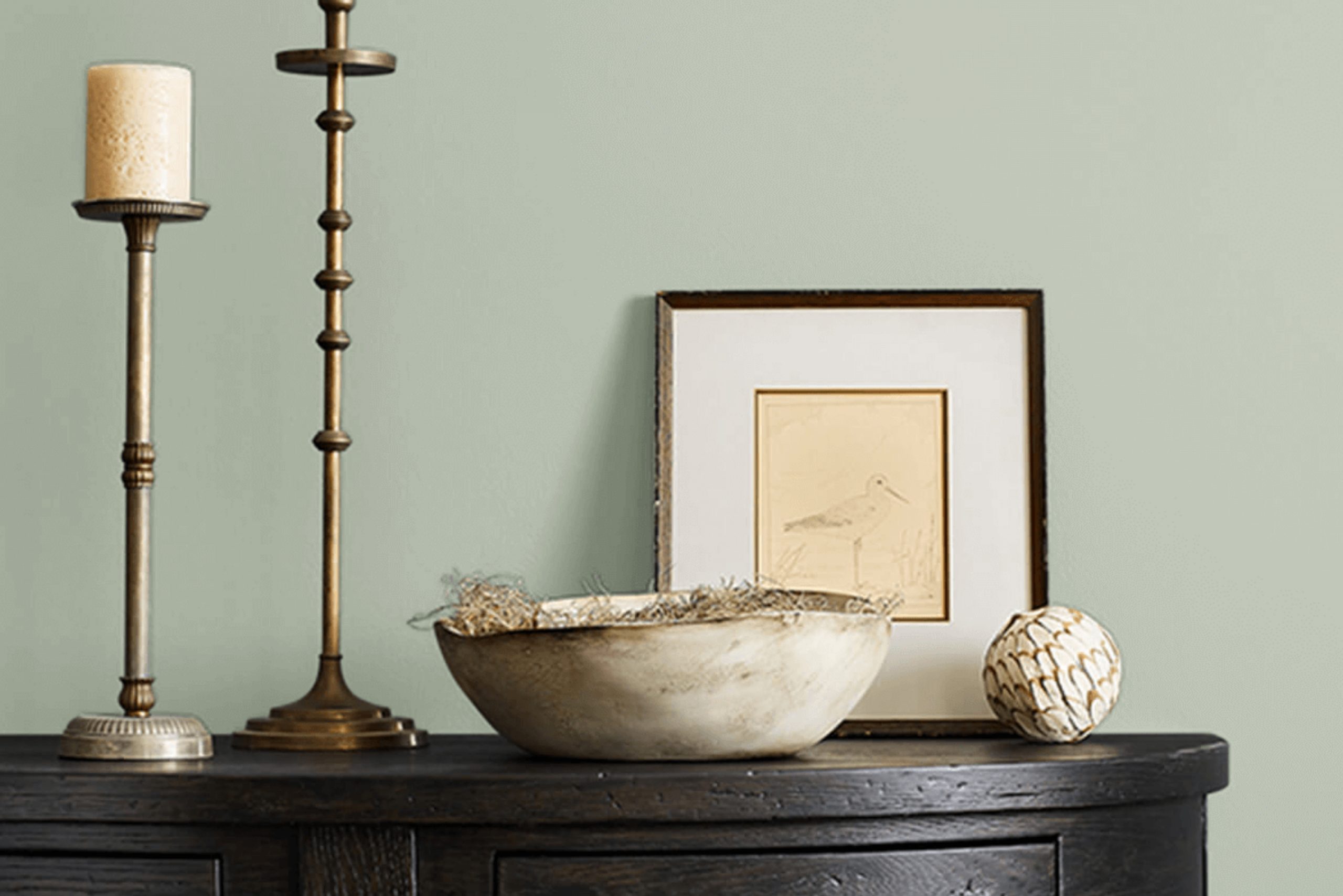
Imagine walking into a room and instantly feeling a sense of calm and warmth wash over you. That’s the charm of SW 9652 Hazel Gaze by Sherwin Williams. When you first paint your walls with this nuanced hue, the perfect mix of earthy tones gives off a vibe that’s both welcoming and grounded.
It’s not just any shade; it’s a versatile color that pairs well with natural elements and light, creating an inviting environment no matter the style or space.
If you’re thinking of giving your home a fresh, new look, Hazel Gaze might just be the color you need. It has this unique ability to blend seamlessly with both modern and rustic decor, enhancing textures and furniture without overwhelming them.
Whether you’re looking to update your living room, bedroom, or a different area, Hazel Gaze provides a beautiful backdrop that complements a wide range of palettes and designs. So, grab a paintbrush – it’s time to bring a new energy into your home with Hazel Gaze.
What Color Is Hazel Gaze SW 9652 by Sherwin Williams?
Hazel Gaze by Sherwin Williams is a rich and warm shade that perfectly balances between brown and green. This unique color adds a cozy, earthy feel to any room, making it ideal for creating a welcoming atmosphere. Its earth-toned hue has a hint of gray, which gives it a versatile and modern appeal.
This color is particularly well-suited for rustic and traditional interior styles. In a rustic setting, Hazel Gaze pairs beautifully with natural materials like wood, stone, and linen, enhancing the homey and inviting ambiance of the space. Textures such as burlap, wool, and knitted throws complement its warmth, creating a layered, cozy look.
In traditional interiors, Hazel Gaze works well with elegant and timeless materials like leather and polished wood, providing a backdrop that highlights classic details and craftsmanship. It’s also an excellent choice for Colonial or Craftsman style homes, where its natural undertones can tie together various elements of woodwork and furniture.
Hazel Gaze is a flexible color that adapts seamlessly to different decor elements and materials. Whether combined with soft fabrics for a gentle look, or paired with bold textures for a more striking approach, it maintains a balanced and inviting aesthetic. This color is ideal for living rooms, bedrooms, and study areas, where its soothing qualities can be fully appreciated.
Is Hazel Gaze SW 9652 by Sherwin Williams Warm or Cool color?
Hazel Gaze by Sherwin Williams is a warm and inviting color that works well in homes because of how cozy it makes rooms feel. This shade of beige has a slight hint of green, which adds a natural touch that can make spaces feel more welcoming.
It’s a great choice for living rooms or bedrooms because it pairs well with different styles of decor. Whether you have classic wooden furniture or modern metal accents, Hazel Gaze provides a balanced backdrop that enhances other colors and materials in your space. In homes with lots of natural light, this color can appear even warmer, making the room look sunlit and cheerful.
It’s also versatile enough to work in smaller spaces like bathrooms or hallways, where it can help the areas seem larger and more open. Overall, Hazel Gaze is a practical and pleasant choice for adding a touch of warmth to your home.
Undertones of Hazel Gaze SW 9652 by Sherwin Williams
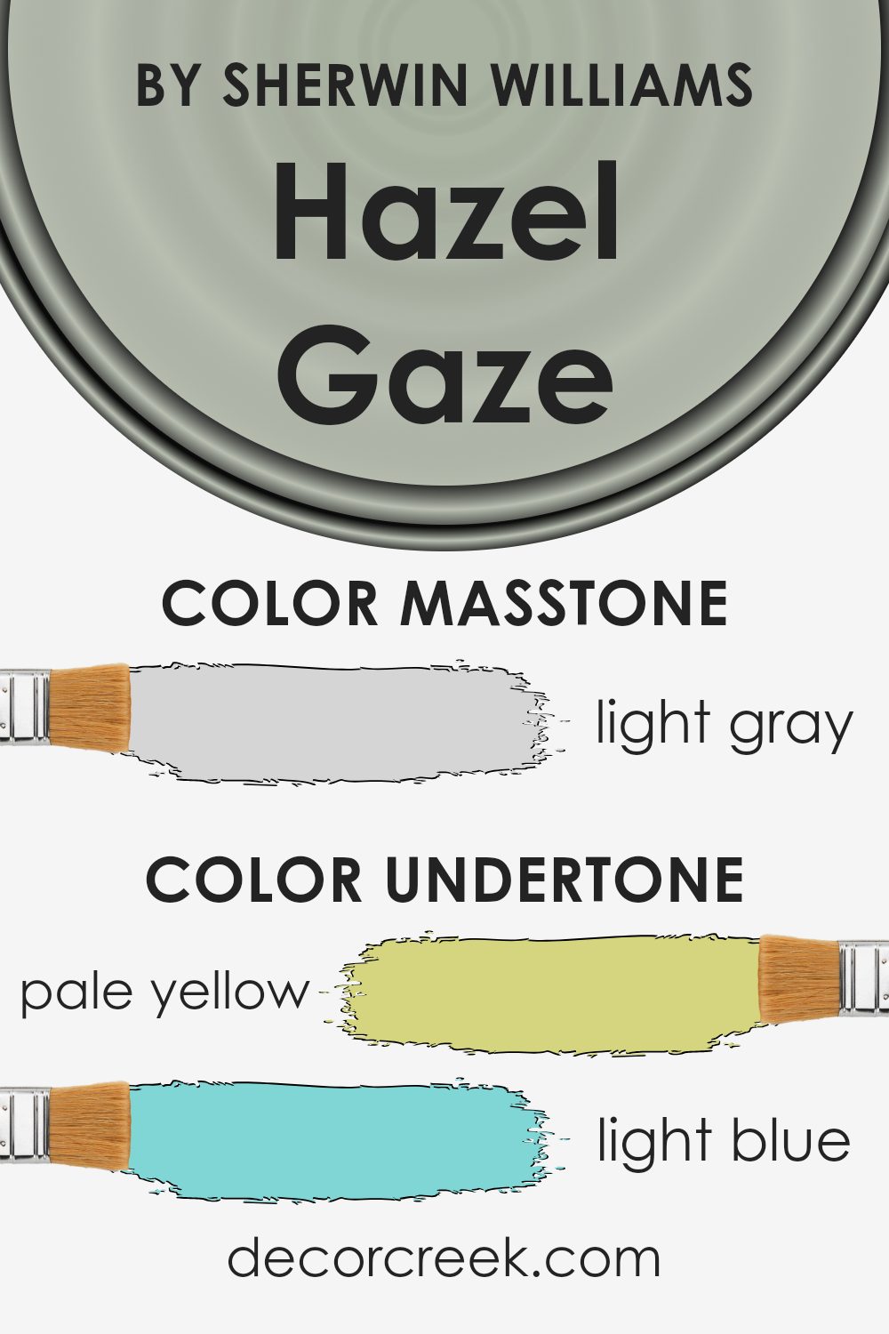
The color Hazel Gaze has an interesting blend of undertones that subtly influence its final appearance. Undertones are secondary colors that reside beneath the primary surface hue, affecting how it looks in various lighting conditions and contexts. For instance, a pale yellow undertone can make a color feel warmer, while a light blue undertone might give it a cooler feel.
For Hazel Gaze, the presence of pale yellow gives it a soft, inviting warmth, making it ideal for living spaces where a cozy atmosphere is desired. Light blue and lilac undertones bring a slight coolness, balancing the warmth to ensure the color remains neutral and versatile.
The subtlety of light purple and mint adds depth, preventing the color from appearing too flat on large surfaces. When used on interior walls, the pale pink undertone enriches the color with a hint of softness, perfect for creating a gentle, welcoming vibe in a room. Grey helps stabilize the color, ensuring it doesn’t overwhelm the space and complements various types of furniture and decor.
Overall, the undertones in Hazel Gaze work together to create a balanced, adaptable color that looks elegant in many different types of rooms. The way these undertones play with light and surrounding colors really impacts the overall feel of the space, making it a popular choice for creating a cozy, harmonious home environment.
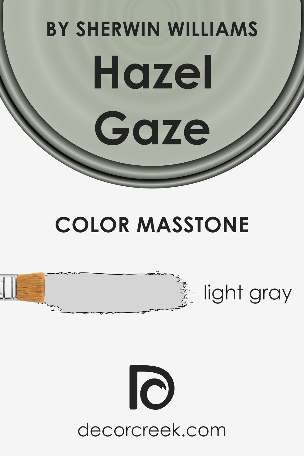
What is the Masstone of the Hazel Gaze SW 9652 by Sherwin Williams?
Hazel Gaze by Sherwin Williams is a light gray color with a masstone of Light Gray (#D5D5D5). This particular shade of gray is gentle and soft, making it a great choice for creating a calm and inviting atmosphere in homes.
Because it is a light gray, it has the ability to make smaller rooms appear more spacious and airy. This color works well in various lighting conditions, maintaining its true gray tone without leaning too heavily into other color spectrums, which can often happen with grays.
It’s very versatile and can be used in any room, from kitchens to bedrooms, as it pairs easily with both bright and dark colors, allowing for a wide range of decorating styles. Whether you want a sleek, modern look or a cozy, traditional feel, Hazel Gaze provides a neutral backdrop that complements many different types of furniture and accessories. This makes it a practical choice for those looking to refresh their homes without making drastic changes.
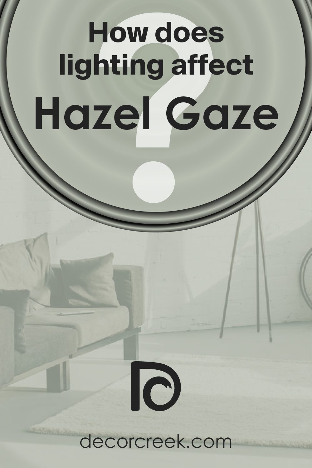
How Does Lighting Affect Hazel Gaze SW 9652 by Sherwin Williams?
Lighting plays a crucial role in how we perceive colors, as it can significantly alter their appearance. The color in question is a versatile shade that shows how lighting conditions can change its look. Understanding these changes can help in deciding where to apply this shade for the best effect.
In artificial light, such as LED or fluorescent lights, this color can appear slightly different depending on the type of bulb. Warm lighting can make it look richer and more vibrant, bringing out deeper, cozy undertones. In contrast, cooler light might highlight its greyer aspects, making it appear more muted.
Natural light has a vibrant effect on colors and can significantly impact how they look throughout the day. A room with lots of natural light will show the truest version of the color, particularly vivid during midday when the sunlight is brightest.
For rooms facing different directions:
– North-facing rooms receive less direct sunlight, which can make colors appear slightly cooler and bluish. Here, the color may seem more subdued, with its grey tones becoming more pronounced, making it soothing yet slightly dimmer.
– South-facing rooms are bathed in plentiful light for most of the day, which can enhance the warmth and depth of the color, making it look more lively and warm.
– East-facing rooms get bright light in the morning, which can make this color look very warm and inviting in the early hours, but it will grow cooler as the day progresses.
– West-facing rooms experience the opposite effect; the color may appear duller in the morning but gain warmth and vibrancy with the setting sun’s golden tones in the afternoon.
Placement in different rooms based on their orientation can take advantage of natural light’s effects to enhance this shade, making spaces feel more welcoming or cozier based on the room’s purpose and the mood you want to create.
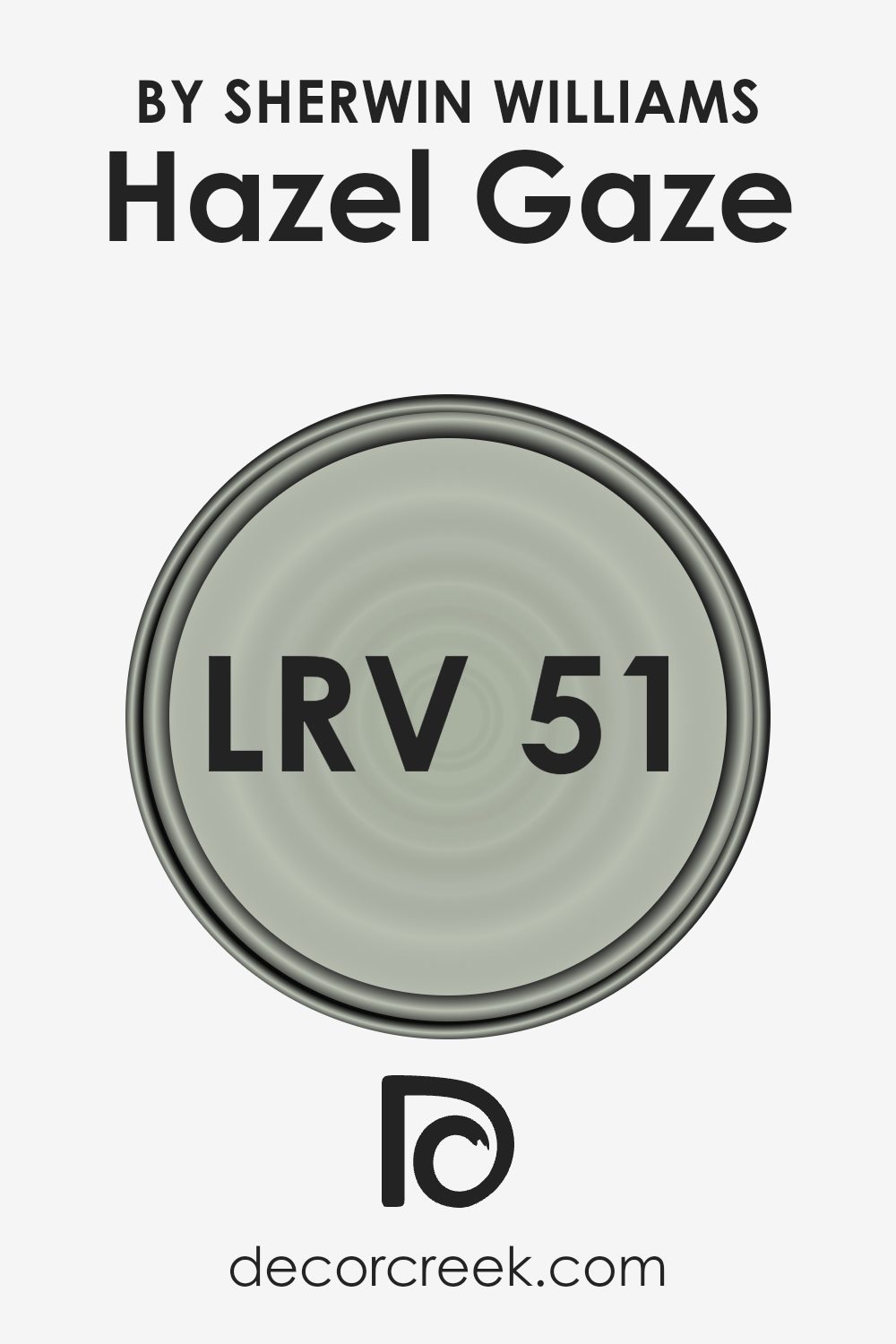
What is the LRV of Hazel Gaze SW 9652 by Sherwin Williams?
LRV stands for Light Reflectance Value, a measure used to describe the percentage of light a paint color reflects. This scale ranges from 1 to 99, where the higher number means the paint reflects more light and appears brighter.
LRV helps to understand how a color will look in a space depending on the light conditions. Light colors typically have a high LRV and make a room feel larger and more open, while darker colors have a lower LRV and can make a space feel cozier but smaller.
The LRV of 50.531 for the particular color Hazel Gaze suggests that it is midway on the scale, reflecting a moderate amount of light. This means it is quite versatile — not too dark, not too light. In rooms with ample natural lighting, Hazel Gaze can appear lighter and more vibrant, whereas in less well-lit spaces, it may appear slightly darker and more subdued.
This balanced LRV makes it a practical choice for many spaces, adapting somewhat to changing light conditions without dramatically altering its perceived hue.
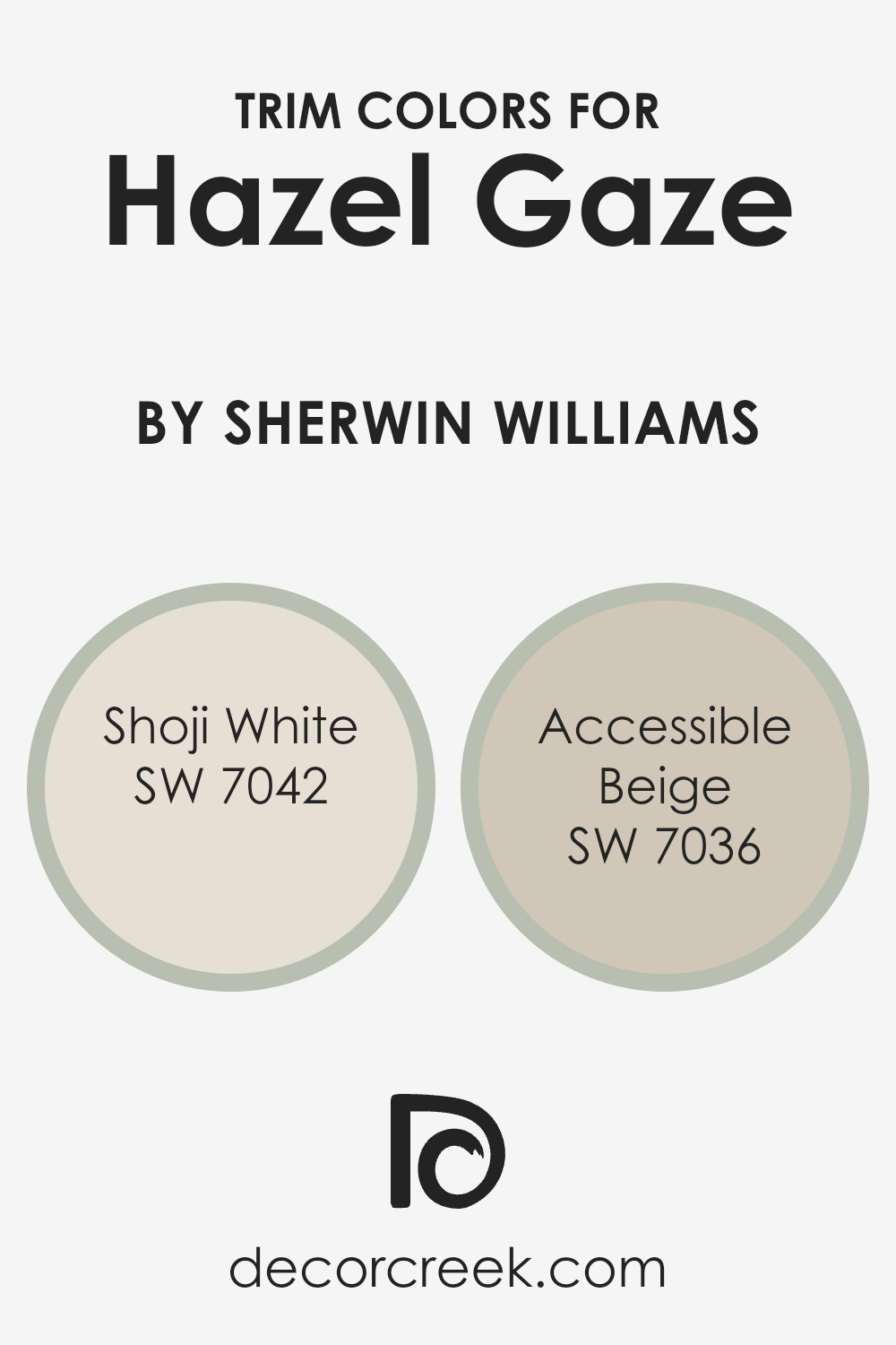
What are the Trim colors of Hazel Gaze SW 9652 by Sherwin Williams?
Trim colors are essentially the complementary shades used on features like door casings, moldings, and baseboards, to enhance the main wall colors of a room. When combined with a distinct hue like Hazel Gaze by Sherwin Williams, choosing the right trim colors can significantly impact the overall aesthetic of a space.
Colors such as Shoji White and Accessible Beige are excellent choices for trims as they subtly frame the walls, contributing to a harmonious look without overpowering the primary color.
Shoji White is a gentle off-white with a warm undertone that provides a clean and inviting contrast to the stronger tones of Hazel Gaze. This color is soft and light, making it perfect for trims because it adds a fresh and airy feel to the environment. Accessible Beige, on the other hand, is a soft beige with a grayish undertone that offers a neutral but contrasting boundary to more vivid wall colors.
It’s particularly useful for bringing a balanced, calming effect to a space, working well next to deeper or more vivid hues. Together, these trim colors can create a neatly defined space that highlights the beauty of Hazel Gaze while keeping the atmosphere cozy and welcoming.
You can see recommended paint colors below:
Colors Similar to Hazel Gaze SW 9652 by Sherwin Williams
Selecting similar colors for a space is essential for creating a harmonious and balanced visual environment. When colors like those similar to Hazel Gaze by Sherwin Williams are used, they can subtly tie different elements and spaces together, giving a cohesive look without being too matchy-matchy.
Similar colors work by sharing common hues, which allows them to complement each other effectively, enhancing the overall aesthetic appeal of a room without overwhelming the senses. These colors also help in smoothly transitioning the visual flow from one room to another, providing a gentle progression that is pleasing to the eye.
Quietude is a soft, muted green with a tranquil feel, perfect for creating a peaceful atmosphere. Comfort Gray, as the name suggests, offers a soothing gray tone with a hint of green, ideal for a restful ambiance. Austere Gray presents a more reserved, subtle gray that pairs nicely with bolder colors or can stand alone for a refined look.
Contented offers a gentle blend of green and gray, giving a fresh and airy vibe to the space. Softened Green brings a touch of warmth to spaces, thanks to its understated green hue. Soft Sage is a light green that exudes calm and is excellent for bringing a touch of nature indoors.
Silvermist stands out with its blend of blue and gray, offering a cool freshness reminiscent of a misty morning. Oyster Bay is a unique mix of green and gray, providing a more vibrant touch while still being subdued. Holly Glen is a lively green that brightens spaces with its more pronounced tone.
Finally, Forever Green offers a lush, enduring green shade that adds depth and comfort to any room. Each of these colors provides a unique yet complementary choice for decorating in a harmonious, visually appealing manner.
You can see recommended paint colors below:
- SW 6212 Quietude
- SW 6205 Comfort Gray
- SW 6184 Austere Gray
- SW 6191 Contented
- SW 6177 Softened Green
- SW 9647 Soft Sage
- SW 7621 Silvermist
- SW 6206 Oyster Bay
- SW 9678 Holly Glen
- SW 9653 Forever Green

How to Use Hazel Gaze SW 9652 by Sherwin Williams In Your Home?
Hazel Gaze by Sherwin Williams is a warm and welcoming paint color that can make your home feel cozy and inviting. It’s like a soft hug for your walls, giving rooms a gentle background that works well with many decorating styles. If you’re thinking about refreshing your living room, dining area, or even a bedroom, Hazel Gaze can be a great choice.
For those who enjoy natural elements like wood or stone, this color complements them perfectly, making these materials stand out in your space. It’s also peaceful enough for places where you relax, such as your bedroom or a reading nook.
Pairing Hazel Gaze with neutral colors like creams, grays, or light browns can keep your rooms looking balanced and tasteful. If you like to add a bit more life, you can integrate splashes of deep greens or blues through decorations such as cushions, rugs, or art.
This can give your home a fresh and harmonious look without overwhelming the senses. Whether you want a subtle background or a base to display other colors, Hazel Gaze can work well for almost any space in your home.
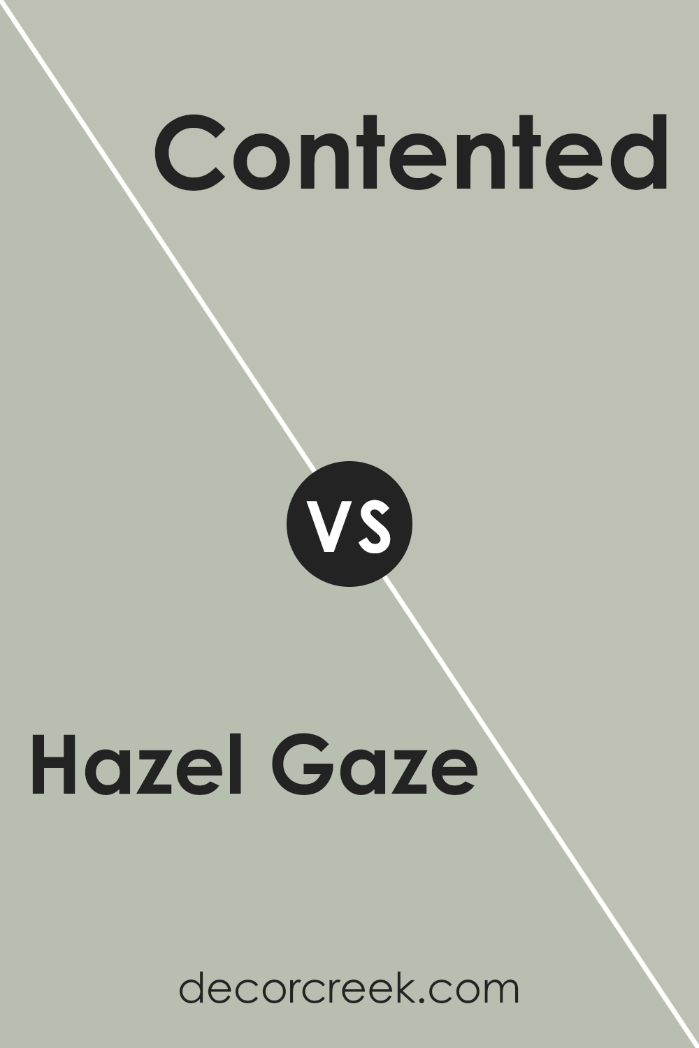
Hazel Gaze SW 9652 by Sherwin Williams vs Contented SW 6191 by Sherwin Williams
Hazel Gaze is a warm and inviting brown with hints of green, giving it a natural, earthy feel. It’s the kind of color that makes a room feel cozy and comfortable, perfect for creating a relaxing vibe in living spaces or bedrooms.
Contented, on the other hand, is a soft, grey-green hue that offers a subtle and calming presence. It works well in areas where you want a touch of color without overwhelming the space. It’s gentle and muted, making it ideal for both large areas and accents.
Both Hazel Gaze and Contented have their unique appeal. Hazel Gaze brings warmth and a sense of the outdoors inside, while Contented offers a lighter, soothing backdrop that’s easy on the eyes. Each can set a different mood and would pair well with a variety of decor styles and other colors.
You can see recommended paint color below:
- SW 6191 Contented
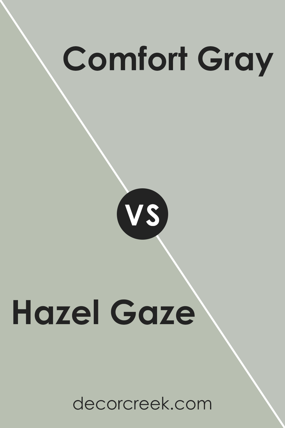
Hazel Gaze SW 9652 by Sherwin Williams vs Comfort Gray SW 6205 by Sherwin Williams
Hazel Gaze and Comfort Gray are two distinct shades offered by Sherwin Williams. Hazel Gaze is a deeper, richer color, somewhat akin to a mix between brown and green, providing a warm and inviting feel to any room.
It resembles the natural hues of a forest, bringing an earthy and comforting atmosphere wherever applied. On the other hand, Comfort Gray is much lighter and leans towards a soft, pale gray with greenish undertones. It offers a clean and airy feel, making it ideal for spaces where you want to create a light and open environment.
These colors contrast in their depth and mood: Hazel Gaze feels hearty and grounded while Comfort Gray is fresh and uplifting. Both are versatile, but Hazel Gaze works well in traditional and cozy settings, whereas Comfort Gray is perfect for more minimalistic or modern spaces. Choosing between them depends on the feeling you want to evoke in your space.
You can see recommended paint color below:
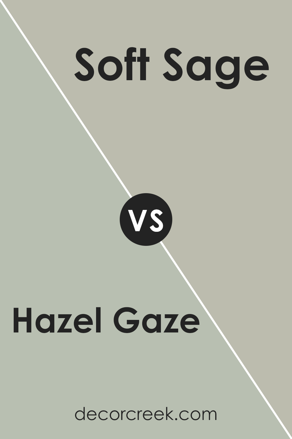
Hazel Gaze SW 9652 by Sherwin Williams vs Soft Sage SW 9647 by Sherwin Williams
The main color, Hazel Gaze, is a warm, inviting brown with a subtle hint of orange, reminiscent of autumn leaves or a cozy, earthy setting. It’s great for creating a welcoming atmosphere in living rooms or bedrooms.
In contrast, Soft Sage has a gentle, soft green tone, evoking feelings of freshness and calmness, similar to a light spring morning. This color works well in areas where you want a touch of nature, like bathrooms or kitchens.
When comparing these colors, Hazel Gaze adds warmth to a space, making it feel more intimate and cozy. On the other hand, Soft Sage offers a refreshing and calming effect, bringing a light, airy feel to any room. Both colors can create beautiful, natural environments, but their impacts are distinctly different: one enriches the area with warmth, while the other provides a breath of fresh air.
You can see recommended paint color below:
Hazel Gaze SW 9652 by Sherwin Williams vs Softened Green SW 6177 by Sherwin Williams
Hazel Gaze and Softened Green are both paint colors from Sherwin Williams, but they offer distinctly different vibes for a room. Hazel Gaze is a warm, inviting brown with a touch of orange, creating a cozy and comfortable feeling in any space.
It’s a rich color that works well in living areas or bedrooms where you want a snug, welcoming atmosphere. On the other hand, Softened Green is a gentle, muted green with gray undertones. This color is more understated and versatile, providing a calm, relaxed feel. It’s great for spaces where you want a touch of nature-inspired freshness without overwhelming the senses.
While Hazel Gaze adds warmth and depth, Softened Green offers a lighter, airier touch that can make small rooms appear larger. Both colors can complement a variety of decor styles and personal tastes.
You can see recommended paint color below:

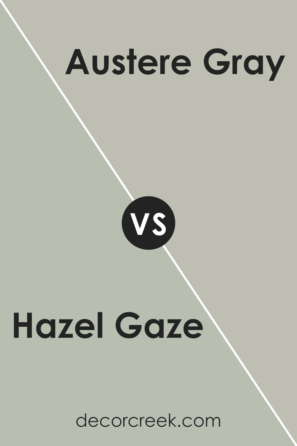
Hazel Gaze SW 9652 by Sherwin Williams vs Austere Gray SW 6184 by Sherwin Williams
Hazel Gaze is a warm, brownish-orange shade that adds a cozy and inviting touch to any room. It has a natural earthy tone, reminiscent of autumn leaves, which can make a space feel comfortable and welcoming. This color works well in living areas or bedrooms where a soft, soothing presence is desired.
On the other hand, Austere Gray is a soft, gentle gray with a slight green undertone. It’s subtle enough to serve as a neutral backdrop for brighter colors, yet distinct enough to stand on its own. Austere Gray is perfect for creating a calm, understated look in spaces like bathrooms or offices where you want a hint of color without overwhelming the senses.
When comparing the two, Hazel Gaze provides warmth and can make a room feel more enclosed and cozy, while Austere Gray gives off a cleaner, more open vibe that can make a space feel larger and more airy. Both colors offer their unique charms and can be used effectively depending on the desired mood and function of the room.
You can see recommended paint color below:
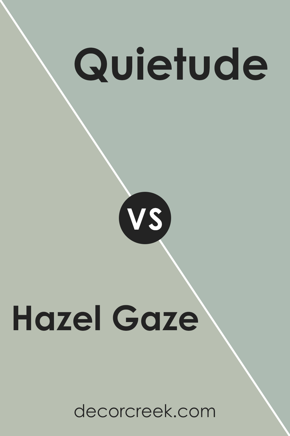
Hazel Gaze SW 9652 by Sherwin Williams vs Quietude SW 6212 by Sherwin Williams
Hazel Gaze and Quietude, both by Sherwin Williams, offer unique tones that cater to different aesthetic preferences and atmospheres for room decor. Hazel Gaze is a deep, warm brown that brings a cozy and comforting vibe to any space. Its richness makes it ideal for creating a snug, inviting environment, possibly best for living rooms or bedrooms where you want a sense of warmth.
On the other hand, Quietude is a soft, muted green with a hint of blue, presenting a fresh and calming feel. This color is lighter and has a breezy quality, making it perfect for bathrooms, bedrooms, or spaces intended to have a refreshing and light atmosphere. It pairs well with natural light and can make small rooms appear larger and more open.
While Hazel Gaze adds a traditional, warm touch, Quietude offers a lighter, fresher look, each enhancing spaces in distinctly different ways.
You can see recommended paint color below:
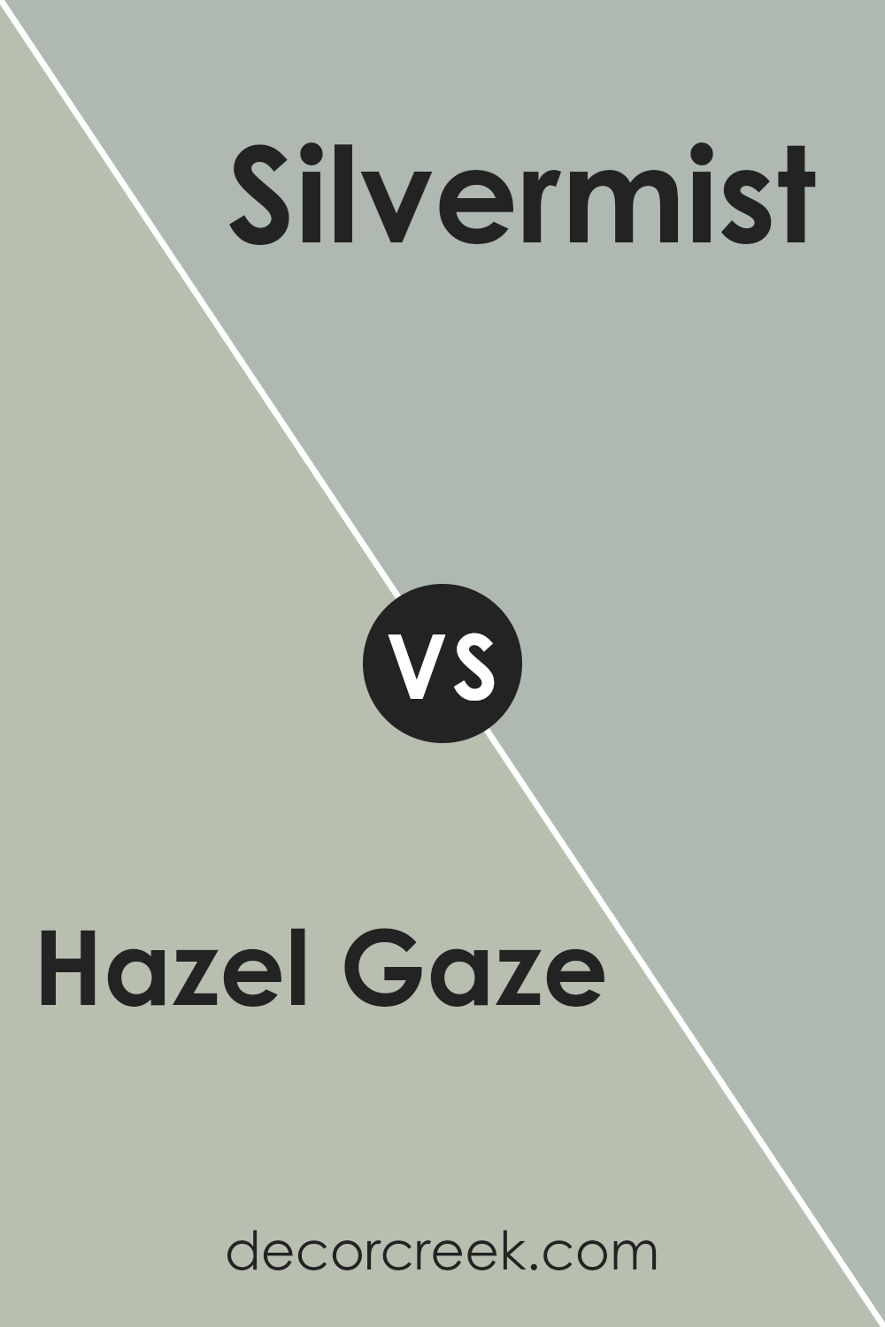
Hazel Gaze SW 9652 by Sherwin Williams vs Silvermist SW 7621 by Sherwin Williams
Hazel Gaze and Silvermist by Sherwin Williams offer distinct visual experiences. Hazel Gaze is a warm and inviting brown with hints of green, creating a cozy and earthy feel. It’s perfect for spaces where comfort is a priority, like living rooms or bedrooms.
On the other hand, Silvermist stands out with its cool gray tone, blended with a touch of blue. This color is ideal for creating a calm and soothing atmosphere, suitable for bathrooms or kitchens.
Hazel Gaze tends to add warmth, making a room feel more intimate and welcoming, while Silvermist offers a fresh and clean look, often making spaces appear more spacious and open. Together, these colors could work well in a single home, providing a nice balance between warmth and coolness.
You can see recommended paint color below:
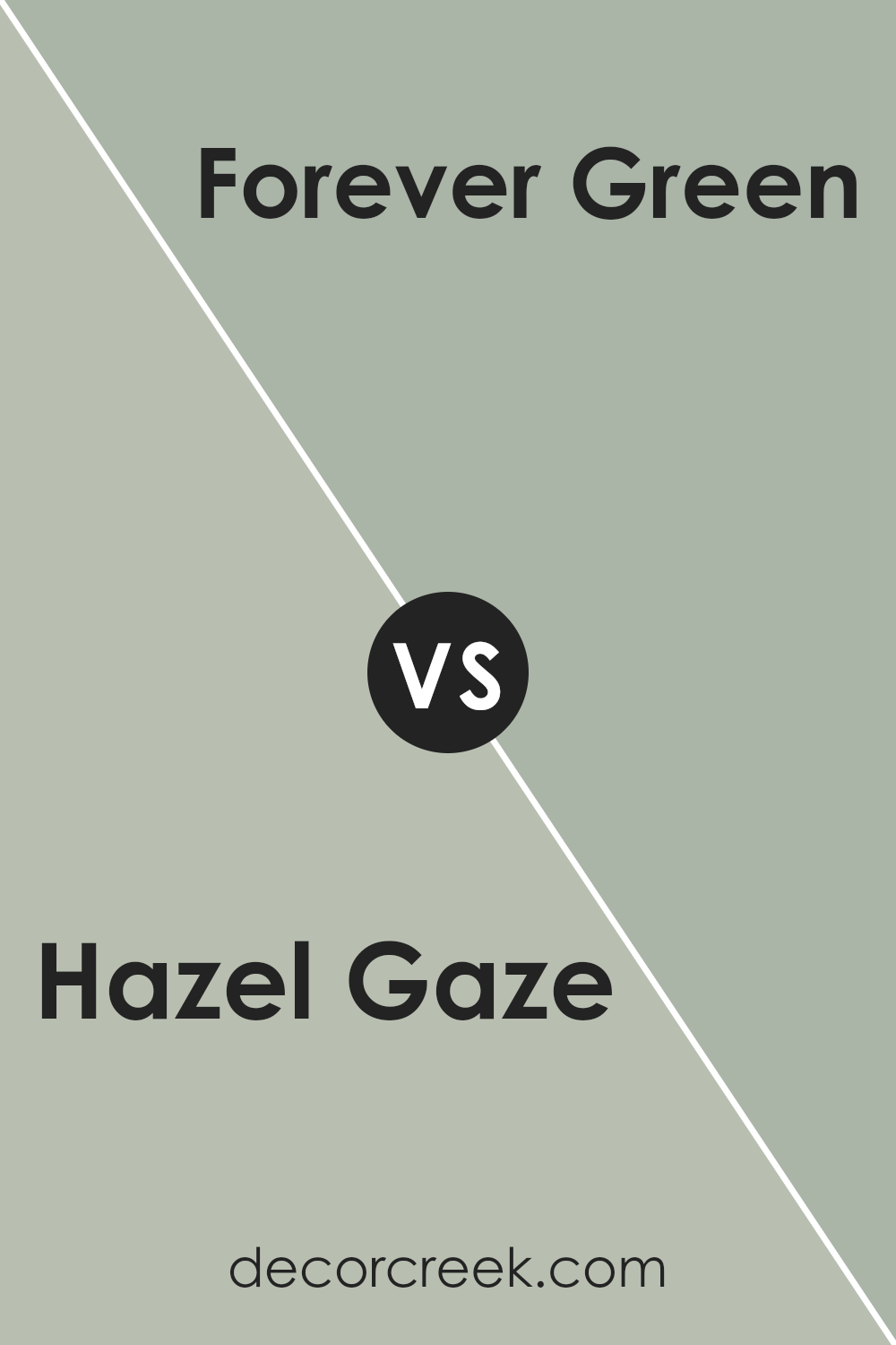
Hazel Gaze SW 9652 by Sherwin Williams vs Forever Green SW 9653 by Sherwin Williams
**Hazel Gaze** and **Forever Green** are two distinct paint colors from Sherwin-Williams. Hazel Gaze is a warm, inviting shade that blends brown and green tones, giving it a natural, earthy feel. This color works well in spaces where you want a cozy atmosphere, like living rooms or bedrooms. It pairs nicely with natural materials such as wood or wicker.
On the other hand, Forever Green is a vibrant, fresh color that leans more towards a true green. This makes it perfect for adding a pop of color in a room. Its bright and cheerful hue can liven up small spaces like bathrooms or personal offices. It complements white trim or fixtures, enhancing its lively character.
In summary, Hazel Gaze offers a subtle, warm tone that is versatile for many settings, promoting a relaxed vibe. Forever Green is more energizing, suitable for creating focal points or revitalizing a space. Both offer unique possibilities depending on the mood you want to create.
You can see recommended paint color below:
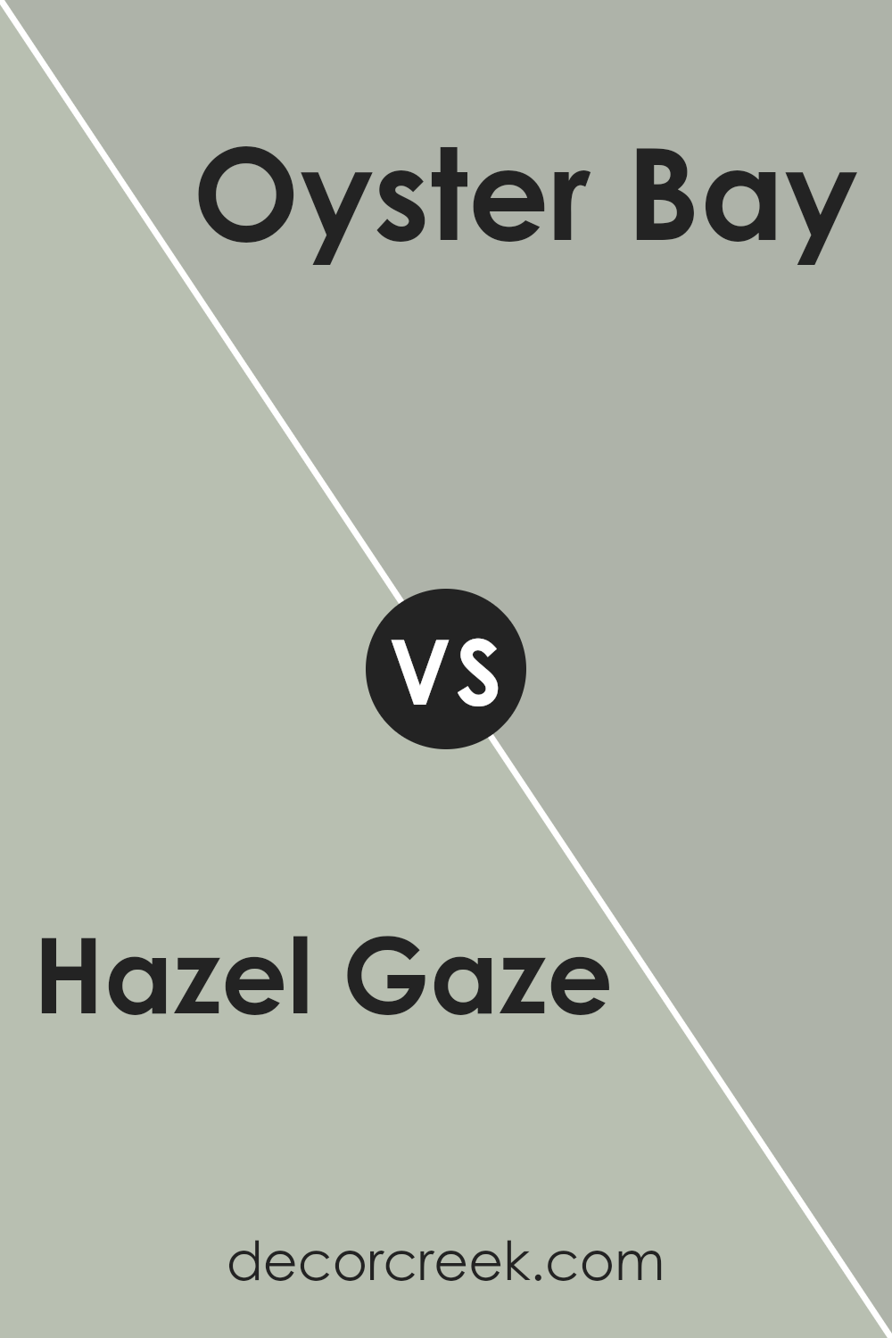
Hazel Gaze SW 9652 by Sherwin Williams vs Oyster Bay SW 6206 by Sherwin Williams
Hazel Gaze and Oyster Bay by Sherwin Williams are two contrasting shades that each bring their unique vibe to a space. Hazel Gaze is a rich, warm brown with a hint of coziness that helps make any room feel welcoming and comfortably stylish.
This color works well if you want to create a snug and inviting atmosphere. On the other hand, Oyster Bay is a cooler, muted green with subtle blue undertones. This shade is perfect for those looking to add a fresh, calm feel to their environment without making the space feel too chilly. It pairs beautifully with a light decor to give a room a balanced, airy feeling.
Both colors hold their own character and can dramatically change a space depending on what mood you aim to achieve, whether it’s the warmth of Hazel Gaze or the freshness of Oyster Bay.
You can see recommended paint color below:
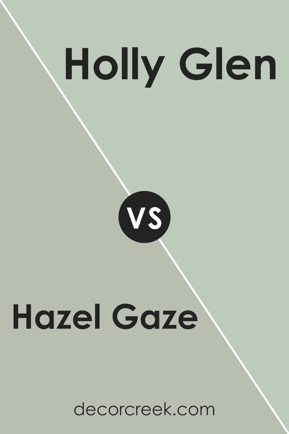
Hazel Gaze SW 9652 by Sherwin Williams vs Holly Glen SW 9678 by Sherwin Williams
**Hazel Gaze** and **Holly Glen** are both warm, inviting colors by Sherwin Williams but they have distinct tones that set them apart. Hazel Gaze is a rich, deep taupe that has a cozy and grounding effect. It’s a versatile color that adds a touch of warmth to any room without overwhelming it. It pairs well with both light and dark furniture, making it a good choice for living rooms or bedrooms.
On the other hand, Holly Glen is lighter, leaning towards a soft olive green. This color is fresh and natural, reminiscent of a peaceful, leafy forest. It’s perfect for spaces where you want to introduce a subtle hint of nature and freshness. Holly Glen works beautifully in spaces with lots of natural light or as an accent wall in a neutral room.
Altogether, while Hazel Gaze offers depth and warmth with its taupe shade, Holly Glen brings in a light, natural feel with its hint of green. Both colors create different moods and can complement a variety of decor styles.
You can see recommended paint color below:
- SW 9678 Holly Glen
Conclusion
This color is a mix of grey and beige, sometimes called “greige,” and is very calming to look at. It reminds me of a warm, cozy blanket or a gentle hug. This color is not too bright or too dark, making it perfect for any room in your house, like the living room or bedroom.
Hazel Gaze is easy to match with different decorations, whether you want to use bright colors like blues and greens or stick to more neutral tones like browns and whites. It can make your home feel very welcoming and put together. People often use this color because it’s very comforting and nice to look at. It’s like having a friendly color that can go anywhere in your home.
So if someone asks me what I think about Hazel Gaze, I would say it’s a really good choice if you want your home to feel warm and cozy. It looks modern yet simple, which is why it can make any room look nicer.
Whether you have a big house or a small apartment, this color can definitely make your home look its best.
Ever wished paint sampling was as easy as sticking a sticker? Guess what? Now it is! Discover Samplize's unique Peel & Stick samples.
Get paint samples

