I’ve been repainting my home office and was on the hunt for the perfect gray. While searching, I came across Sherwin Williams’ SW 9570 Ironclad. What struck me first about Ironclad was its unique balance of depth and versatility, which isn’t always easy to find in a gray. This color has a robust yet neutral base that seems to subtly shift with the lighting, offering a cozy anchoring effect in rooms both large and small.
Ironclad doesn’t lean too heavily towards blue or brown, making it an excellent choice for those of you looking to create a sophisticated yet understated backdrop. It pairs wonderfully with white trim for a crisp and clean look but also holds its own with darker woods, adding a layer of rustic charm without overwhelming the space.
Whether you’re redoing a bedroom, updating your living area, or just adding a fresh coat of paint to brighten up your workspace, Ironclad could be just what you need.
Its adaptability to different styles and decors makes it a solid choice for anyone looking to refresh their walls.
What Color Is Ironclad SW 9570 by Sherwin Williams?
Ironclad by Sherwin Williams is a robust gray shade with slight blue undertones, offering a strong and reliable feel for your space. This color leans towards cooler shades and works especially well in modern and industrial home decor styles. Ironclad is perfect for creating a subtle statement in your room without overpowering other design elements.
In terms of interior styles, Ironclad fits exceptionally well in minimalist settings where simplicity and functionality are key. It’s also a great choice for Scandinavian interiors, where light, muted colors are often complemented by cozy textures and natural materials. Additionally, this color is suitable for contemporary spaces, adding a sleek, clean look to the environment.
When it comes to pairing with materials and textures, Ironclad goes beautifully with exposed brick for an edgy, industrial vibe. It also matches well with polished metals like stainless steel or brushed nickel, enhancing modern aesthetics. For a softer approach, combine it with natural wood textures—from light to dark tones—to add warmth to the room.
Textiles in light grays or blues can also complement this color, maintaining a harmonious but interesting color palette in your space.
Is Ironclad SW 9570 by Sherwin Williams Warm or Cool color?
Ironclad by Sherwin Williams is a strong and striking gray color that brings a bold and solid presence to a room. Ideal for those looking to add a touch of modernity and strength to their space, this color has a deep and moody hue which makes it great for feature walls or accent areas.
This specific shade can help to give the feeling of stability and assurance in a home. Due to its deep tone, it pairs well with brighter colors or softer neutrals. This creates a balanced look, making the room appear both cozy and stylish. You can use it in living rooms to craft a dramatic backdrop for entertainment or in bedrooms to set a calm and grounded mood.
Moreover, Ironclad works beautifully in spaces with lots of natural light, as this helps to offset its darker tones, preventing the room from feeling too enclosed. In homes with minimal light, using it on smaller surfaces can help avoid overpowering the space. Overall, Ironclad is a great choice for adding depth and character to a home.
Undertones of Ironclad SW 9570 by Sherwin Williams
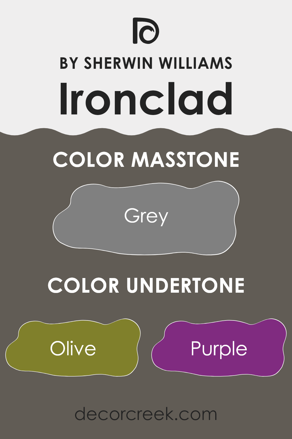
IroncladSW 9570 by Sherwin Williams is a complex color with a blend of various undertones that can subtly influence the mood and appearance of a room. Drawing on undertones like olive, purple, dark turquoise, and brown, this color can offer a rich depth that adapts differently depending on lighting and surrounding colors.
Undertones are secondary colors that are not immediately noticeable but affect the overall hue of the paint once applied. For instance, in a room with abundant natural light, the purple or dark turquoise undertones of IroncladSW 9570 might become more apparent, giving the walls a cooler feel.
Conversely, in a space with warmer, artificial lighting, the brown and olive undertones might stand out, providing a warmer and more inviting atmosphere.
When used on interior walls, IroncladSW 9570 can create diverse impacts. In a living room, the complexity of its undertones can enhance furnishings, bringing out hidden colors in the decor. In a bedroom, the darker undertones can help in creating a cozy, enveloping environment, ideal for relaxation.
The variety of undertones in IroncladSW 9570 also means it pairs well with many different decor styles and colors, from natural wood furniture, which might highlight its brown and olive undertones, to metal accents that could draw out its cooler grey or turquoise shades. This versatility makes it a practical choice for those wanting a color that easily adapts to various decorating changes over time.
What is the Masstone of the Ironclad SW 9570 by Sherwin Williams?
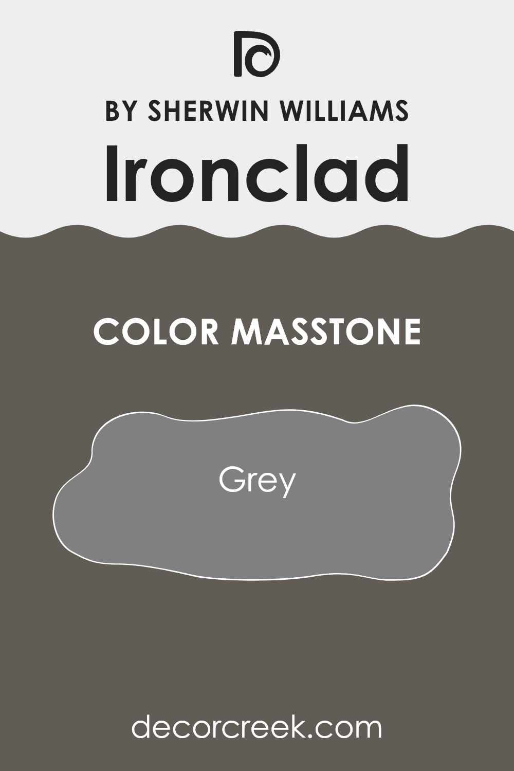
The IroncladSW 9570 by Sherwin Williams has a masstone of grey, which gives this color a very neutral and versatile base. This particular shade of grey can work well in various parts of a home because it is balanced, neither too dark nor too light.
This makes it easy to match with different decor styles and colors. Whether you want to paint a living room, bedroom, or even a kitchen, this grey can create a clean and calm atmosphere. It can also act as a background, allowing other colors in furniture and decorations to stand out.
Additionally, grey is known for its ability to hide marks and smudges, which can be especially useful in high-traffic areas of a home. Overall, its neutral hue helps in creating a space that feels both comfortable and stylish without being overly dramatic.
How Does Lighting Affect Ironclad SW 9570 by Sherwin Williams?
Lighting plays a crucial role in how we perceive colors. The appearance of a color can change dramatically under different lighting conditions. This is because light sources vary in their “color temperature,” which means they can emit light that ranges from warm to cool tones. Understanding this can help you predict how a paint color might look in a room throughout the day or under various artificial lights.
Taking the color Ironclad SW 9570 by Sherwin Williams as an example, this is a rich and deep color that can appear differently depending on the lighting. In natural light, this color will show its truest form. The quality and angle of natural light, however, will affect its appearance.
For rooms that face north, which generally receive less direct sunlight and have cooler light, IroncladSW 9570 might appear slightly more muted and darker. The subdued lighting can enhance the depth of the color, making it feel more intense.
In south-facing rooms, which are bathed in plentiful sunlight for most of the day, this color will be brighter and more vibrant. The warmer and brighter light brings out the warmth in the color, making the room feel more lively.
For rooms facing east, morning light, which is generally softer and cooler, will make IroncladSW 9570 look vibrant and fresh in the morning but darker as the day progresses and the natural light diminishes.
Conversely, in west-facing rooms, the color might look more subdued in the morning but will gain vibrancy in the afternoon and evening as it catches the warmer, golden hues of the setting sun.
Artificial lighting also plays a role. Under warm artificial lighting, such as that from incandescent bulbs, the color will look warmer and richer. Cooler artificial light, like that from some LEDs or fluorescent lights, may make the color appear slightly bluer and starker.
Thus, the effect of lighting on this Sherwin Williams color, like any color, depends markedly on both the direction of the room and the type of light it receives, showcasing its dynamic range from dark and muted to lively and vibrant depending on the conditions.
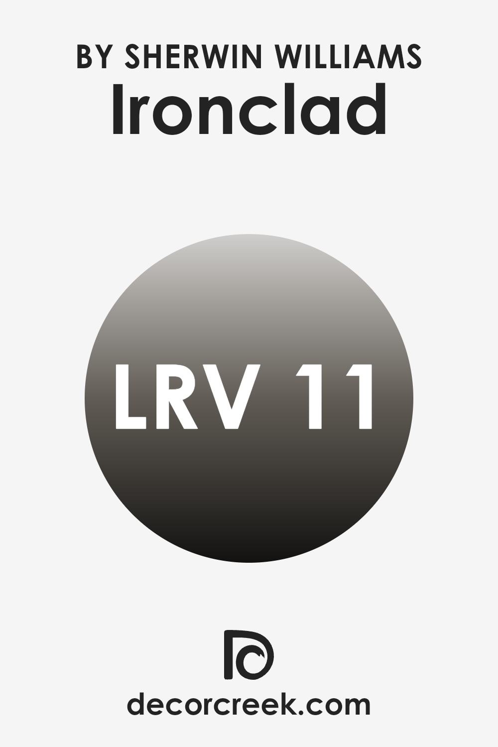
What is the LRV of Ironclad SW 9570 by Sherwin Williams?
LRV stands for Light Reflectance Value, which measures the amount of light a paint color reflects compared to how much it absorbs. This value is expressed on a scale where a lower number means a color absorbs more light, making it darker, and a higher number means it reflects more light, making it lighter.
LRV is important because it helps you understand how a paint color will look under different lighting conditions. For example, a room painted with a color that has a high LRV will generally look brighter and more open, because it reflects more light around the room.
In the case of Ironclad, which has an LRV of 10.876, the color is quite dark. This means it absorbs a lot of light, rather than reflecting it. When used on walls, this color can make a space feel smaller or cozier, because it pulls the walls in visually. It’s a good choice for larger spaces where you want to create a more intimate atmosphere.
However, in a small room, using a dark color like this one might make the space feel a bit cramped or overwhelming.
It’s important to consider both the size of the room and the amount of natural and artificial light it receives when deciding if this LRV and color choice is a good fit.
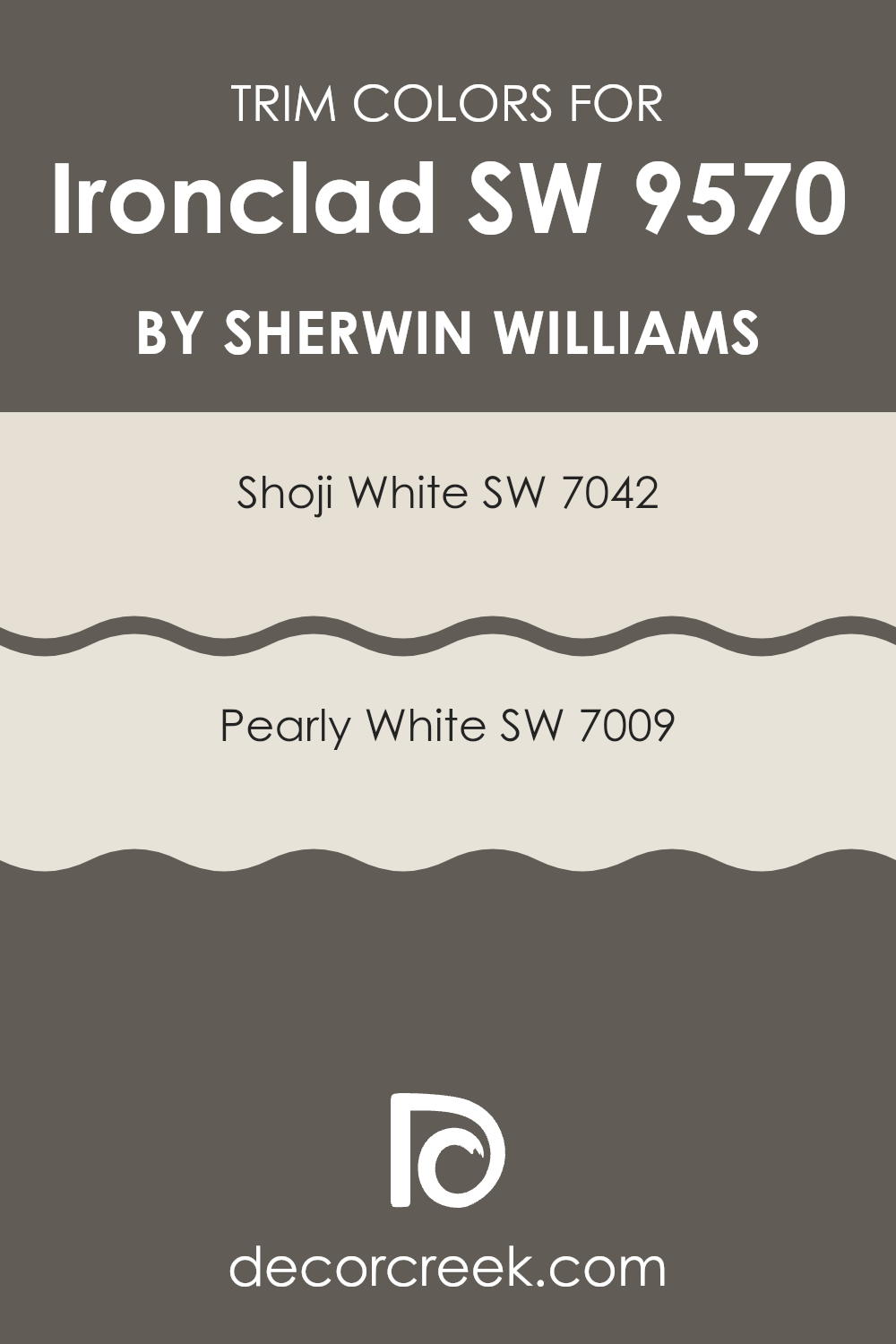
What are the Trim colors of Ironclad SW 9570 by Sherwin Williams?
Trim colors are essential accents in painting that highlight architectural details and frame the sections of walls, windows, doors, and other elements of a home or building. Choosing the right trim color can enhance the appearance of a space by providing contrast or harmony to the main color scheme.
For a color like Ironclad SW 9570 by Sherwin Williams, which is a strong and distinct shade, using lighter trim colors such as Shoji White SW 7042 and Pearly White SW 7009 can create a pleasing balance and make the features in a room stand out effectively.
Shoji White SW 7042 is a soft, warm white with a subtle hint of grey, making it a versatile choice that pairs beautifully with darker hues, adding a gentle contrast without overwhelming the senses. Pearly White SW 7009, on the other hand, offers a slightly creamier tone that radiates warmth and can help soften the impact of more intense colors like Ironclad, providing a smooth transition between colors and contributing to a coherent overall look. Both of these trim colors support the main wall color by framing it in a way that enhances the room’s aesthetic.
You can see recommended paint colors below:
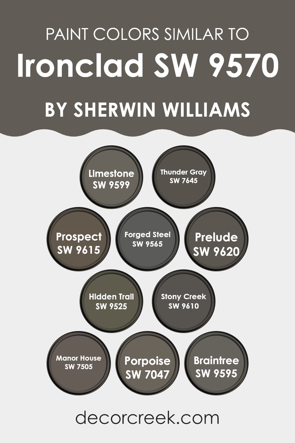
Colors Similar to Ironclad SW 9570 by Sherwin Williams
Similar colors play a crucial role in creating a cohesive and visually appealing space. By using shades that are close on the color spectrum, like those similar to Ironclad SW 9570 by Sherwin Williams, you can achieve a harmonious look that flows effortlessly from one area to another.
Colors such as SW 9599 – Limestone, a gentle gray with a hint of warmth, and SW 7645 – Thunder Gray, a deeper, moodier gray, demonstrate how varying intensities of the same hue can add depth and interest. SW 9615 – Prospect offers a fresh, earthy gray that blends well with natural elements, while SW 9565 – Forged Steel has a starker, more defined presence that can anchor a space.
Continuing with shades that complement Ironclad, SW 9620 – Prelude is a soft, muted tone that works well in peaceful settings. SW 9525 – Hidden Trail adds a dustier, subtle color that is perfect for areas needing gentle neutral touches. SW 9610 – Stony Creek and SW 7505 – Manor House both provide a robust backdrop, with the latter being slightly richer and perfect for creating a focal point.
SW 7047 – Porpoise, a versatile greige, bridges the gap between gray and beige, offering flexibility in various decor styles. Lastly, SW 9595 – Braintree, a shadowy, slate gray, completes the set by lending itself to elegant yet understated projects. These colors work cohesively to produce a refined and inviting palette suitable for many design objectives.
You can see recommended paint colors below:
- SW 9599 Limestone
- SW 7645 Thunder Gray
- SW 9615 Prospect
- SW 9565 Forged Steel
- SW 9620 Prelude
- SW 9525 Hidden Trail
- SW 9610 Stony Creek
- SW 7505 Manor House
- SW 7047 Porpoise
- SW 9595 Braintree
How to Use Ironclad SW 9570 by Sherwin Williams In Your Home?
Ironclad SW 9570 by Sherwin Williams is a versatile paint that can help update various parts of your home. It’s ideal for giving old furniture a fresh look or changing the color of your walls to create a new mood in your rooms. This paint is known for its durability, making it a good choice for areas that get a lot of use, like kitchen cabinets or hallways.
Applying this paint is straightforward. First, make sure the surface you want to paint is clean and smooth. Then, apply a primer if necessary, especially if you’re painting over a darker color. Once the primer is dry, you can start applying Ironclad SW 9570. It usually requires a couple of coats to get a nice, even finish.
This paint not only makes your space look nicer but also protects surfaces, keeping them looking good for years. Whether updating a single piece of furniture or an entire room, this product offers good value with its quality finish and lasting protection.
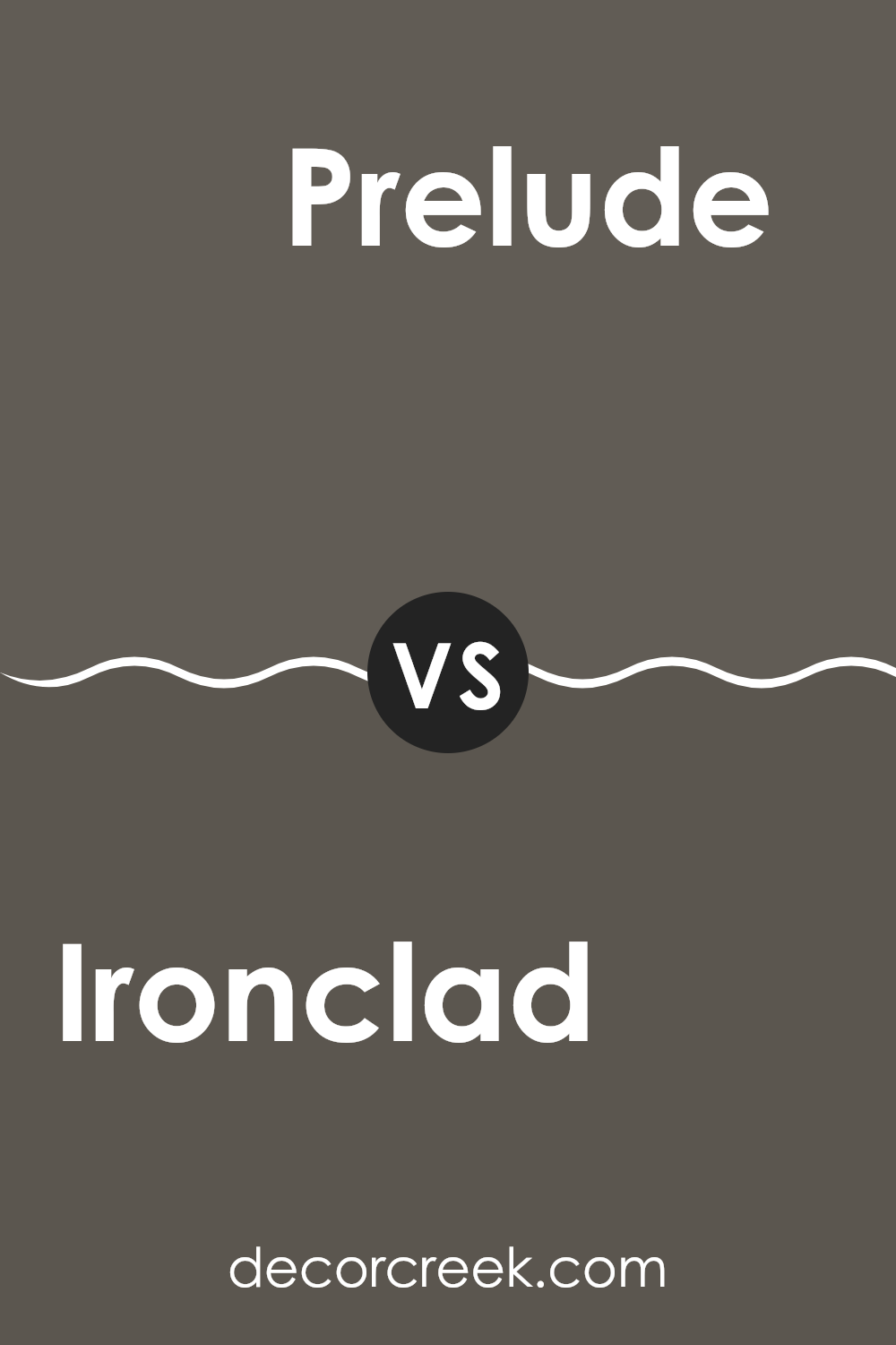
Ironclad SW 9570 by Sherwin Williams vs Prelude SW 9620 by Sherwin Williams
Ironclad and Prelude by Sherwin Williams are two distinct shades with different vibes. Ironclad is a deep, dark gray that gives a strong and bold look. It’s perfect for creating a dramatic feel in a space, making walls look prominent and commanding. This color is suitable for modern, minimalist, or even industrial styles, adding a touch of seriousness and formality.
On the other hand, Prelude is a much lighter gray, almost soft silver, offering a fresher and more open feel. It’s great for smaller rooms or spaces where you want to give an impression of more light and space. Prelude works well in areas that aim for a clean and airy atmosphere, making it ideal for a relaxed and welcoming environment.
Both colors have their unique charm, with Ironclad leaning towards a more striking, imposing look and Prelude providing a more gentle and light presence.
You can see recommended paint color below:
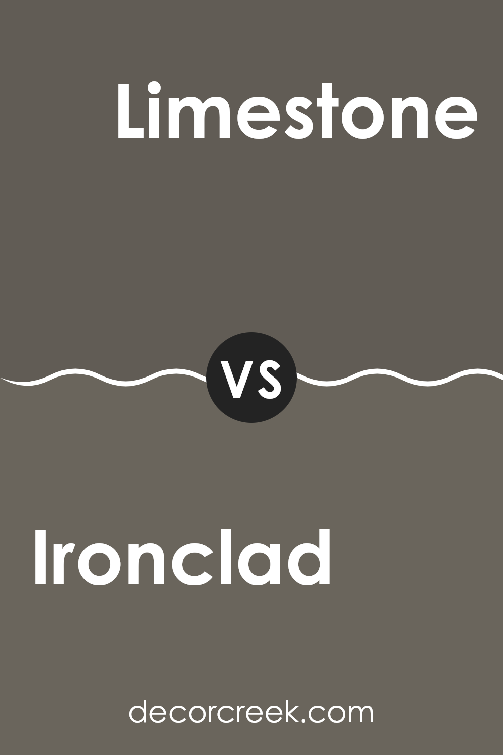
Ironclad SW 9570 by Sherwin Williams vs Limestone SW 9599 by Sherwin Williams
Ironclad and Limestone by Sherwin Williams are two distinct colors, each setting a unique mood. Ironclad is a deep, rich gray that has the power to make a strong statement. Its boldness makes it ideal for a feature wall or accents in a room that aims to convey strength and stability. Despite its intensity, it can also blend well with various decor styles, lending a grounded feel.
On the other hand, Limestone is much lighter, offering a soft, warm gray that feels soothing and welcoming. This color is versatile and works beautifully in spaces that seek to create a relaxed, airy feeling. It’s particularly effective in smaller rooms or spaces with limited natural light, as it helps to make the area seem more expansive and bright.
Both colors offer their charm, whether you’re looking for something striking or subtle, but they cater to different tastes and design needs.
You can see recommended paint color below:
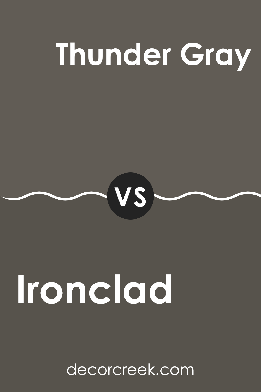
Ironclad SW 9570 by Sherwin Williams vs Thunder Gray SW 7645 by Sherwin Williams
Ironclad and Thunder Gray, both from Sherwin Williams, offer unique shades for those looking to refresh their space. Ironclad is a darker, more intense color, resembling the hue of wet pavement or a moody, overcast sky, giving it a solid and strong feel. It’s perfect for making a bold statement, especially in areas like an accent wall or for exterior trim.
On the other hand, Thunder Gray is lighter than Ironclad but still holds a lot of depth. This color mirrors a stormy sky but with a slightly warmer tone. It offers a cozy atmosphere, making it ideal for living rooms or bedrooms where a sense of calm and comfort is desired.
Both colors have their own distinct personality, with Ironclad being dramatically bold and Thunder Gray providing a softer yet equally impactful aesthetic. The choice between them would depend on the vibe you’re aiming for in your space.
You can see recommended paint color below:
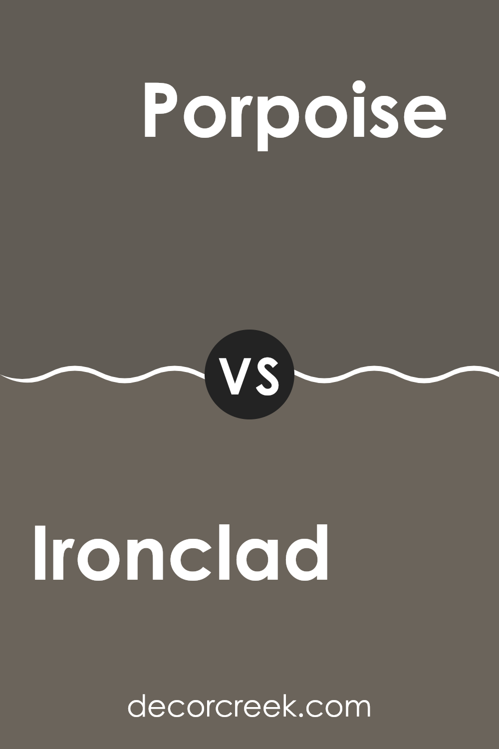
Ironclad SW 9570 by Sherwin Williams vs Porpoise SW 7047 by Sherwin Williams
Ironclad and Porpoise are two distinct colors by Sherwin Williams, each offering a unique vibe to spaces. Ironclad is a deep, dark gray that leans towards a charcoal tone. It offers a strong and grounding presence, making it a great choice for accent walls or exterior trims. This color pairs well with brighter tones to create a balanced look.
Porpoise, on the other hand, is a lighter shade of gray. It’s softer and warmer compared to Ironclad, lending a friendlier and more welcoming feel to rooms. It works beautifully in spaces that aim for a light, airy feel, such as living rooms or bedrooms.
Porpoise is versatile, too, blending well with other neutrals or serving as a subtle backdrop to more vibrant colors.
Both colors have their unique appeals and can be used effectively in various home decors based on the atmosphere you want to achieve. Whether you go dark with Ironclad or light with Porpoise, each offers a stylish and modern feel.
You can see recommended paint color below:
Ironclad SW 9570 by Sherwin Williams vs Forged Steel SW 9565 by Sherwin Williams
Ironclad SW 9570 and Forged Steel SW 9565, both from Sherwin Williams, offer distinct shades that could suit different tastes and spaces. Ironclad presents a deeper, more pronounced gray that carries a strong presence. This color has a sturdier, more robust appearance, making it ideal for accent walls or areas where a bold statement is desired.
On the other hand, Forged Steel is a lighter shade of gray. It has a softer look that can be very versatile for various rooms, providing a clean and fresh backdrop. This color can open up a space, making it appear larger and more airy, which is perfect for small rooms or spaces with limited natural light.
Together, these colors can work well in a single area, where Ironclad could be used as a focal accent and Forged Steel as a complementary background. Both colors offer unique possibilities but cater to different aesthetic needs and spatial functions.
You can see recommended paint color below:
Ironclad SW 9570 by Sherwin Williams vs Manor House SW 7505 by Sherwin Williams
“Ironclad” and “Manor House” by Sherwin Williams are two distinct shades that could complement a variety of spaces. Ironclad is a deep, almost charcoal gray that carries a strong presence due to its darker tone. This color could be perfect for creating drama or adding depth to an area. It works well in both modern homes and places aiming for a minimalist style, as it pairs nicely with lighter colors and various textures.
On the other hand, “Manor House” is a warmer, mid-tone gray. It’s much lighter than Ironclad and offers a more welcoming and gentle mood to rooms. This color suits almost any decor style, from classic to contemporary, bringing a clean, put-together look without being too bold.
Both colors hold their unique charm and usability, making them ideal for specific purposes within home design. Whether looking for impact and depth or a genteel and clean backdrop, Ironclad and Manor House provide sturdy choices.
You can see recommended paint color below:
Ironclad SW 9570 by Sherwin Williams vs Stony Creek SW 9610 by Sherwin Williams
Ironclad SW 9570 and Stony Creek SW 9610, both from Sherwin Williams, are quite distinct in their tones and the ambiance they bring to a space. Ironclad is a deep, rich gray with a strong presence, ideal for creating a bold statement in areas like living rooms or on cabinetry. Its darker undertone adds a sense of stability and strength to interiors.
On the other hand, Stony Creek is a lighter gray that leans more towards neutral. It is softer and more adaptable, making it a great choice for making spaces feel open and airy. It glows particularly well in natural light, which can make small rooms appear larger and more inviting.
Although both colors share a gray base, the intensity and depth of Ironclad provide a more grounded feel, while Stony Creek offers a light, refreshing touch. Depending on your decorating goals, Ironclad works well for dramatic, eye-catching projects, whereas Stony Creek suits subtle, minimalistic designs.
You can see recommended paint color below:
Ironclad SW 9570 by Sherwin Williams vs Hidden Trail SW 9525 by Sherwin Williams
Ironclad SW 9570 is a dark, cool gray that carries with it a strong and robust feeling, perfect for creating a bold statement in spaces that benefit from a modern, solid appearance. It can bring an industrial look to interiors and goes well with a variety of decor styles, ranging from contemporary to traditional.
On the other hand, Hidden Trail SW 9525 is a softer shade, leaning towards a mid-tone taupe. This color offers a more neutral and welcoming warmth, making it ideal for cozy living areas or bedrooms. It blends seamlessly with natural materials like wood and stone, enhancing settings with a comfortable, inviting vibe.
When comparing these two shades, Ironclad is considerably darker and cooler, giving a more striking and less forgiving color impact. Hidden Trail, in contrast, is lighter and warmer, providing a gentler, more adaptable backdrop that can suit a wider range of design choices and personal styles.
You can see recommended paint color below:
Ironclad SW 9570 by Sherwin Williams vs Braintree SW 9595 by Sherwin Williams
Ironclad SW 9570 and Braintree SW 9595, both from Sherwin Williams, present interesting choices for anyone looking to paint. Ironclad is a deep, solid gray with a hint of warmth, making it perfect for a strong, grounding effect in a room. It’s a color that stands out for being both bold and versatile, working well in spaces that aim for a modern look without being too stark.
On the other hand, Braintree SW 9595 is lighter and carries a softer tone. This color leans towards a neutral beige, offering a more subtle and welcoming feel compared to Ironclad. It’s an excellent choice for creating a cozy and inviting atmosphere in any part of the home.
Both colors have their unique appeal and can be used effectively depending on the mood and style you want to achieve. While Ironclad gives a more pronounced, bold statement, Braintree allows for softer, more gentle room environments.
You can see recommended paint color below:
Ironclad SW 9570 by Sherwin Williams vs Prospect SW 9615 by Sherwin Williams
Ironclad and Prospect, both from Sherwin Williams, offer distinct tones for any decorating style. Ironclad is a deep, nearly black gray that provides a strong, moody feel to a room. It can make a dramatic backdrop in spaces, allowing other colors to stand out.
In contrast, Prospect is a lighter and softer gray that gives a clean and airy feel, perfect for making small areas appear more spacious. It carries a subtle warmth that is welcoming, ideal for living spaces or bedrooms aiming for a gentle, relaxed vibe.
When used together, Ironclad can ground a room, while Prospect can soften edges and corners, offering a balanced visual experience. Both colors work well in modern or traditional settings, depending on how they are styled.
You can see recommended paint color below:
In conclusion, after trying out SW 9570 Ironclad by Sherwin Williams, I can say it’s a great choice if you’re looking to change the way a room looks with a fresh coat of paint. The color is strong and dark, making it perfect for anyone wanting to add a bold touch to their home. It works well in places where you want some drama, like a bedroom wall behind your bed or a cozy reading nook.
Using this paint was an easy process. It spreads smoothly, covers old colors well, and dries quickly too. It also doesn’t smell too strong, which is something I really appreciate. Plus, cleaning up afterwards was simple since it didn’t make a big mess.
This color makes the room feel warm and inviting. It pairs nicely with both light and bright colors, giving you lots of decorating options. Whether you have lots of furniture or just a few key pieces, this color pulls everything together beautifully.
Overall, SW 9570 Ironclad by Sherwin Williams is a reliable, striking choice for anyone looking to make a change in their home. It’s not just a new coat of paint; it’s a way to make your rooms feel new and exciting.

Ever wished paint sampling was as easy as sticking a sticker? Guess what? Now it is! Discover Samplize's unique Peel & Stick samples.
Get paint samples

