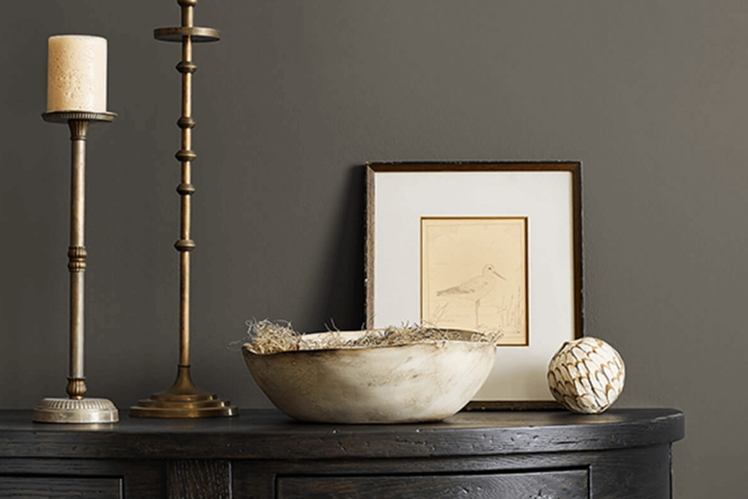
If you’re considering changing up the mood in your home with some new paint, SW 7645 Thunder Gray by Sherwin Williams might just be the perfect shade for you. As someone who enjoys refreshing their living space, I found SW 7645 Thunder Gray to be a dynamic yet soothing choice, especially for those looking to create a serene atmosphere in busy areas of the home like the living room or bedroom.
Thunder Gray isn’t just another gray; it holds a unique balance between a cool and warm tone, making it adaptable to both vibrant and muted color themes. Its versatility extends to various lighting conditions too, showcasing different shades throughout the day. It pairs beautifully with soft creams and bold blues alike, thus lending itself to a wide array of decor styles.
As you consider giving your walls a makeover, think about the effect you want to achieve. SW 7645 Thunder Gray can act as a sophisticated neutral backdrop that allows your furniture and decor pieces to shine, or it can stand as a statement color that quietly but confidently defines a space.
Whether you’re updating a single room or revamping your entire home, this shade could provide the ambiance you’re striving for, melding seamlessly with both contemporary and traditional styles.
What Color Is Thunder Gray SW 7645 by Sherwin Williams?
Thunder Gray by Sherwin Williams is a deep, moody gray with a hint of blue that adds a modern and cozy feel to any room. This versatile shade can act as a bold backdrop or a subtle accent, depending on how it’s used. In terms of interior styles, Thunder Gray pairs exceptionally well with minimalist, industrial, and contemporary designs, thanks to its clean and straightforward hue.
When it comes to materials, this color complements natural wood beautifully, bringing out the rich tones of the wood. It also looks striking with metal finishes like stainless steel or brushed nickel, adding to the modern aesthetic.
Textures such as velvet or silk in lighter shades can create a pleasing contrast, making the room feel warm and inviting. For a more layered look, combining Thunder Gray with textured wallpapers or chunky knit throws can add depth and interest to the space.
Overall, Thunder Gray is a functional and stylish choice that works well in many areas of the home, from living rooms to bedrooms, offering flexibility in design while maintaining a cozy, inviting atmosphere.
Is Thunder Gray SW 7645 by Sherwin Williams Warm or Cool color?
Thunder Gray by Sherwin Williams is a popular paint color that brings a classy and calm vibe to any room in a house. It’s a medium gray shade that has a slightly cool undertone, making it incredibly versatile and able to blend well with various decor styles and color schemes. This color is particularly effective in areas like living rooms or bedrooms where you want a peaceful, quiet atmosphere but still maintain a bit of modern flair.
Since Thunder Gray isn’t too dark or too light, it’s a great choice for smaller spaces, helping them appear more spacious. It also works well in larger areas, providing a solid, neutral background that allows furniture and artwork to really stand out. This shade pairs beautifully with brighter colors, natural wood tones, and metallic accents, offering many options for personalization in a home.
Using Thunder Gray on walls can help hide everyday wear and tear better than lighter colors, making it a practical choice for busy households.
Undertones of Thunder Gray SW 7645 by Sherwin Williams
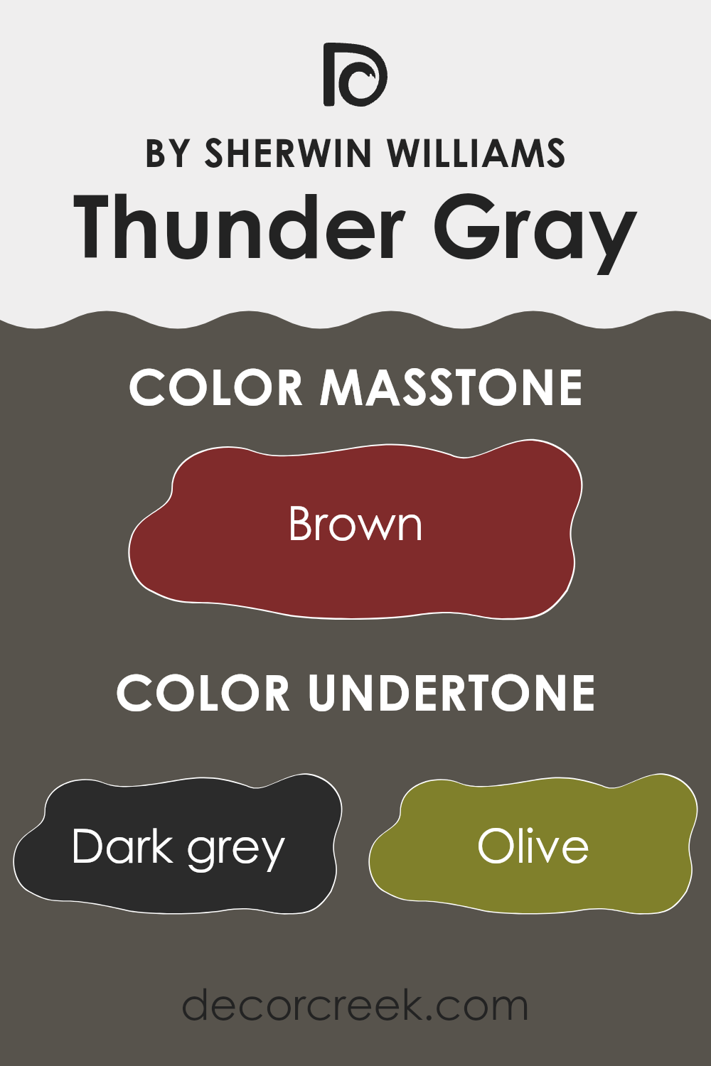
Thunder Gray (SW 7645) by Sherwin Williams is a complex paint color with a base that may appear simply as a deep gray at first glance. However, the color harbors multiple subtle undertones that can significantly influence its appearance under different lighting conditions and when paired with various decor elements. These undertones include dark grey, olive, dark green, purple, navy, grey, dark turquoise, red, orange, pink, and pale pink.
Undertones in paint colors are secondary shades that affect the primary color’s hue. They can enhance or mute how a color looks, depending on surrounding elements such as natural light, furnishings, and adjacent colors.
For example, in a room with ample sunlight, the olive and dark green undertones of Thunder Gray might become slightly more prominent, giving the walls a cooler, more nature-infused feel. In contrast, in artificial light, the purple or navy undertones could emerge, providing a richer, more muted hue.
When Thunder Gray is used on interior walls, its various undertones contribute to making the space versatile and dynamic.
Depending on the room’s lighting and accessories, it can appear either warmly inviting or subtly majestic. This variability makes it an excellent choice for those wishing to add depth and interest to their rooms without committing to a loud or overly vibrant color.
Moreover, the presence of multiple undertones allows this color to adapt seamlessly with different styles and palettes, from modern to traditional, making it a practical choice for many homeowners.
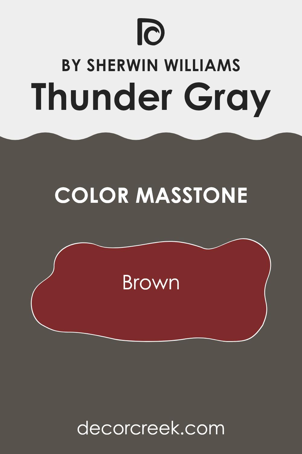
What is the Masstone of the Thunder Gray SW 7645 by Sherwin Williams?
Thunder Gray, a color offered by Sherwin Williams, carries the masstone of Brown (#802B2B). This shade presents a deep, rich brown tone, almost like a dark chocolate. Its warm undertone makes it a versatile choice for home interiors.
In spaces like living rooms or bedrooms, this color adds depth, making the room feel cozy and grounded. Its neutrality allows it to blend well with various decor styles, whether traditional or modern. The deep brown quality of Thunder Gray also helps in hiding marks and smudges, making it a practical choice for busy areas or homes with kids and pets.
When used on exterior walls, it provides a sturdy, timeless look. The warm, earthy vibe of this color works well with natural elements like wood or stone, enhancing the home’s aesthetic and adding a welcoming feel.
How Does Lighting Affect Thunder Gray SW 7645 by Sherwin Williams?
Lighting plays a crucial role in how colors appear in different environments. The color of your walls can look quite different depending on the light they are exposed to. For example, a shade like Thunder Gray can show a range of tones from deep charcoal to a softer, lighter gray, influenced by the lighting conditions.
In artificial light, colors can vary significantly depending on the type of bulbs used. Warm lights, such as incandescent and some LEDs, can make Thunder Gray appear warmer and more welcoming, pulling out the browner tones in the color.
On the other hand, fluorescent or cool LED lights often highlight the blue undertones, making the color appear sharper and more modern.
In natural light, Thunder Gray also shifts in appearance throughout the day and depending on the orientation of the room. Rooms that face north often have cooler, more consistent light. This can make Thunder Gray look more austere and pronounced, especially in its bluish-gray aspects. This makes it ideal for spaces where you want a more formal or bold look.
South-facing rooms get plenty of warm, bright sunlight, which can soften the appearance of Thunder Gray, making it look warmer and more inviting throughout the day. This can be perfect for living spaces where a friendly and welcoming atmosphere is desired.
In east-facing rooms, the morning light can make Thunder Gray look very lively and vibrant, particularly in the morning when the light is golden. As the day progresses, the intensity decreases, and the color returns to a more balanced gray by the afternoon.
West-facing rooms experience the opposite effect, with Thunder Gray possibly appearing muted during the morning and then gaining intensity as it’s bathed in the warm, golden tones of the setting sun. This can create a dynamic mood in the room, shifting from calm in the morning to more dramatic in the evening.
Understanding these effects can help you choose the right room and conditions for using Thunder Gray to achieve the desired effect in your home.

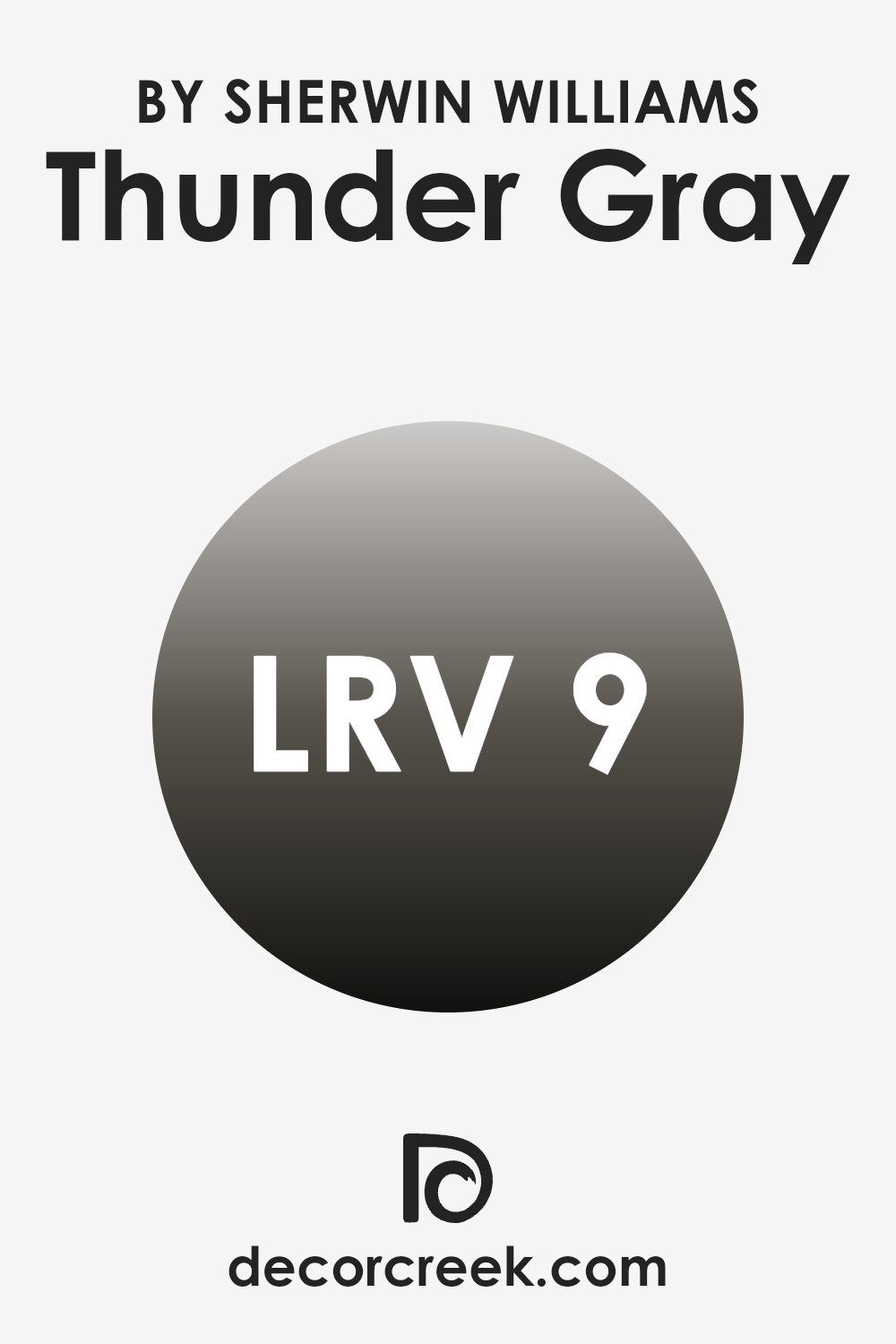
What is the LRV of Thunder Gray SW 7645 by Sherwin Williams?
LRV stands for Light Reflectance Value, a measure indicating the amount of visible and usable light that a paint color reflects back into a room. Essentially, LRV scales from zero, the darkest, absorbing all light, to the highest value near the top of the scale, which reflects most of the light.
This scaling helps determine how a paint will feel in a space. For instance, a higher value can make a room feel brighter and more open, while a lower value can render a space cozier or smaller in appearance.
In the case of Thunder Gray, with an LRV of 8.811, it’s quite a dark shade. This low LRV means it will absorb more light than it reflects, making it ideal for creating a more intimate and enveloping atmosphere. In rooms with less natural light or smaller spaces, it might make the area feel more enclosed. Conversely, in well-lit or larger rooms, using a color like this can add depth and dramatic flair, preventing the space from feeling too vast or bare.
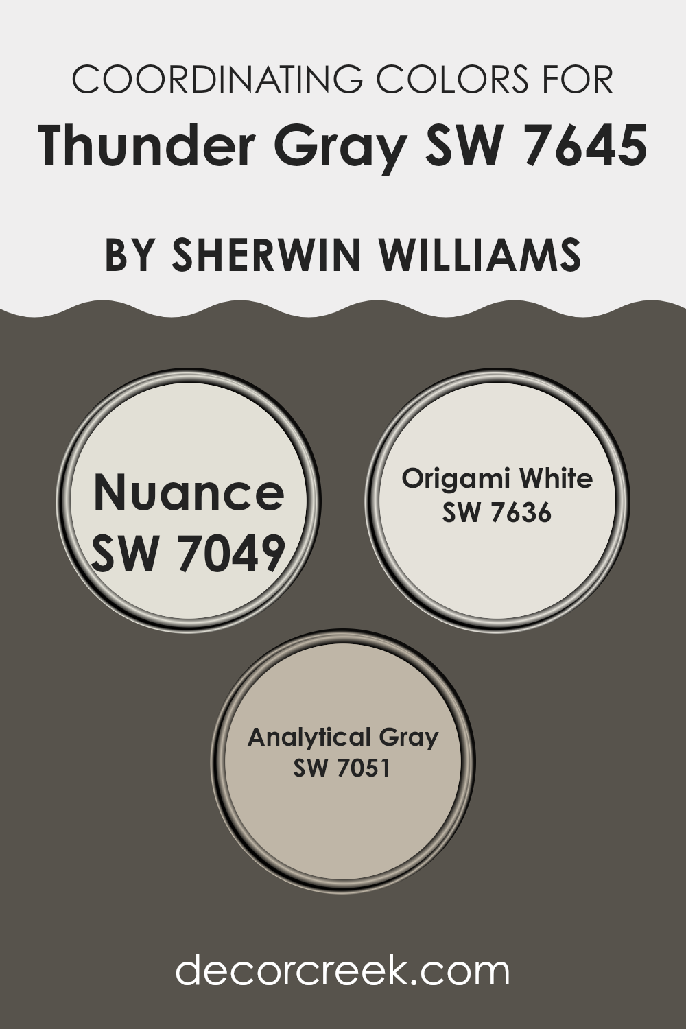
Coordinating Colors of Thunder Gray SW 7645 by Sherwin Williams
Coordinating colors work by complementing each other to enhance the overall aesthetic of a space. In the case of Thunder Gray by Sherwin-Williams, coordinating colors such as Nuance, Origami White, and Analytical Gray have been selected to harmonize with its deeper, neutral tones. These coordinating colors support the main hue by providing balance, contrast, or a unifying theme that makes the design coherent and pleasing to the eye.
Nuance is a subtle shade that provides a soft backdrop, complementing bolder colors without competing for attention. It’s ideal for creating a calm and undistracted atmosphere. Origami White is a light and airy color that brings a sense of openness and brightness to spaces, making it perfect for areas that you want to feel more expansive.
Analytical Gray offers a balanced, medium tone that bridges the lighter Origami White and the darker Thunder Gray, ensuring that the color scheme flows smoothly without sharp contrasts, which can be vital for spaces aiming to have a harmonious and cohesive look. Together, these colors can create an environment that feels well-coordinated and thoughtfully designed.
You can see recommended paint colors below:
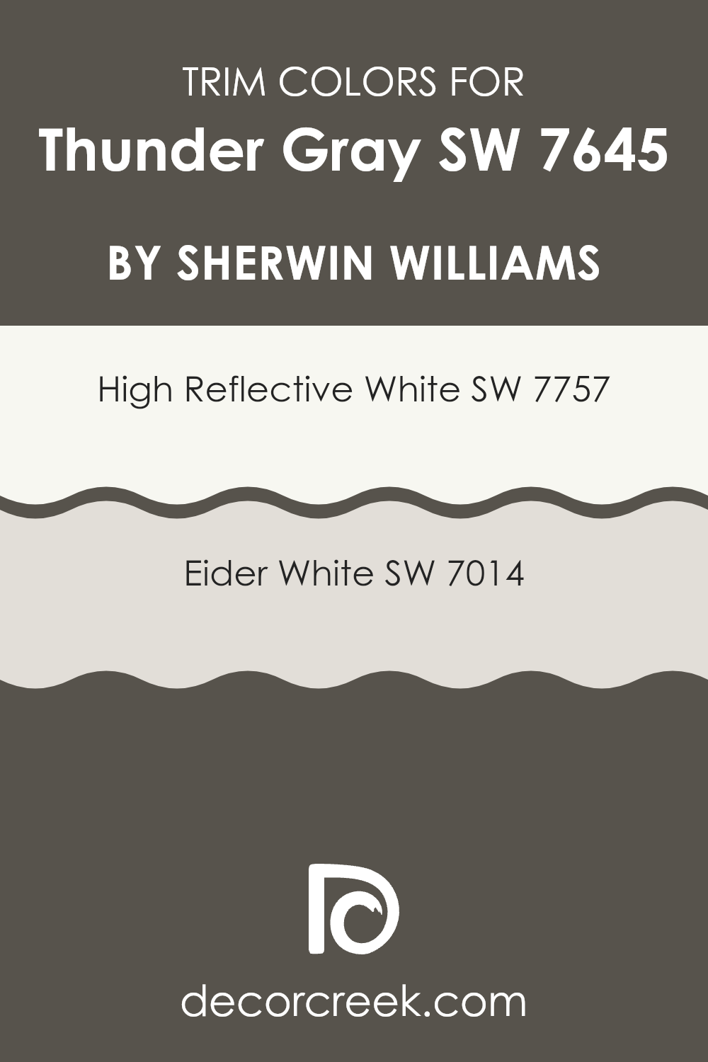
What are the Trim colors of Thunder Gray SW 7645 by Sherwin Williams?
Trim colors are used to enhance the architectural details and edges of walls, doors, windows, and moldings, providing a visual frame that complements the main wall color. For Thunder Gray by Sherwin Williams, which is a deep, versatile gray shade, selecting the right trim colors is crucial to create a sharp, clean look that properly highlights this rich color.
High Reflective White and Eider White are two excellent choices for trim, as they both offer a contrast that emphasizes the boldness of Thunder Gray while maintaining a harmonious balance that’s pleasing to the eye.
High Reflective White, as its name suggests, is a very bright, almost pure white color. This shade is ideal for use as a trim color because it reflects light, which can make spaces appear larger and more open, thus providing a striking contrast against the darker Thunder Gray.
On the other hand, Eider White is a softer, warmer white with subtle gray undertones that offers a gentler contrast.
Using Eider White for trim creates a more subtle distinction from Thunder Gray, which can be preferable in living spaces where a softer visual transition is desired.
You can see recommended paint colors below:
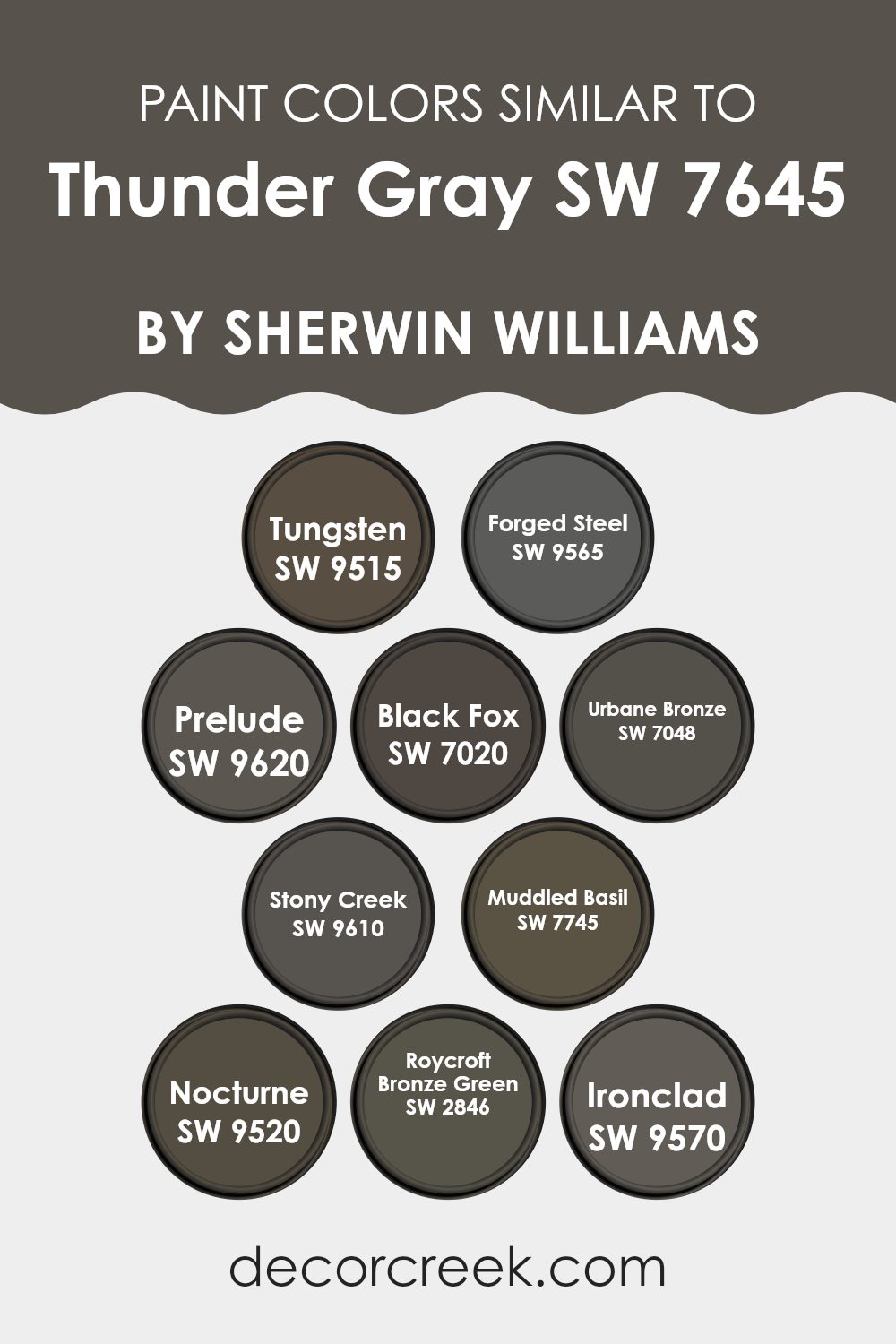
Colors Similar to Thunder Gray SW 7645 by Sherwin Williams
Similar colors play a crucial role in design, creating a cohesive look that is visually harmonious and pleasing. When colors are close in shade or tone, such as those similar to Thunder Gray by Sherwin Williams, they allow for a more subtle and refined aesthetic in any space. These shades work together by enhancing the atmosphere without overwhelming the senses, making them perfect for achieving a balanced and inviting environment.
For example, Tungsten is a deep, muted graphite color that offers a strong, yet understated backdrop in a room, akin to the sturdiness of the metal it’s named after. Forged Steel, another robust option, carries a slightly lighter tone than Tungsten, suggesting the sheen of steel without its typical coldness, thus adding a warm element to spaces.
Moving to a softer spectrum, Prelude is a gentle gray that whispers elegance and is perfect for creating a calm, cohesive space. The darker Black Fox intensifies the mood with its deep charcoal tone, providing a solid grounding effect. Urbane Bronze speaks more loudly, with its rich, deep brown tone that hints at an organic, nature-inspired vibe.
Then, Stony Creek offers a unique blend of gray and green, reminiscent of river rocks and lush landscapes, perfect for adding a touch of nature. Muddled Basil, which sways more towards green, gives a lively yet earthy feel, ideal for spaces that aim for a natural but cozy atmosphere. Nocturne steps in as a dramatic and deep blue that echoes the quiet of night skies, providing a profound depth to any application.
Roycroft Bronze Green aligns closely with historical richness, reflecting an aged bronze, ideal for traditional or heritage-rich spaces. Lastly, Ironclad is a dark, nearly black gray that offers boldness and solidity, anchoring any room with its powerful presence. All these colors, while maintaining their personalities, seamlessly complement and enhance the traits of Thunder Gray, allowing for versatile application across different room settings and design tastes.
You can see recommended paint colors below:
- SW 9515 Tungsten
- SW 9565 Forged Steel
- SW 9620 Prelude
- SW 7020 Black Fox
- SW 7048 Urbane Bronze
- SW 9610 Stony Creek
- SW 7745 Muddled Basil
- SW 9520 Nocturne
- SW 2846 Roycroft Bronze Green
- SW 9570 Ironclad
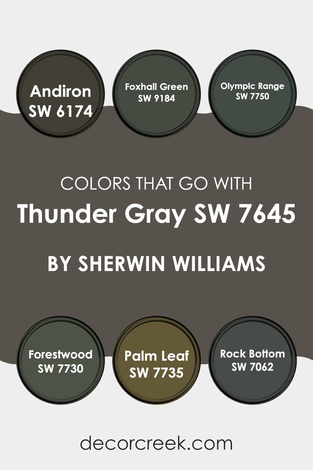
Colors that Go With Thunder Gray SW 7645 by Sherwin Williams
Selecting the right colors to complement Thunder Gray SW 7645 by Sherwin Williams is crucial because it ensures a cohesive and appealing look in your space. This deep, muted gray serves as a versatile base, allowing other hues like Andiron, Foxhall Green, Olympic Range, Forestwood, Palm Leaf, and Rock Bottom to enhance the overall ambiance without overwhelming it.
Essentially, these complementary colors work by either creating a subtle contrast that draws the eye or by harmonizing to produce a consistently toned environment.
Andiron SW 6174 is a dark gray that borders on black, providing a grounding effect that pairs well with the lighter tones of Thunder Gray. It’s ideal for adding depth to a room. In contrast, Foxhall Green SW 9184 offers a gentle, earthy green that softens the starker contrast of Thunder Gray, perfect for bringing a touch of nature indoors.
Olympic Range SW 7750, a lush, deep green, gives a rich, outdoorsy feel that complements Thunder Gray’s neutrality beautifully. Similarly, Forestwood SW 7730 is a dark green which helps in creating a woodsy, cozy atmosphere when used alongside Thunder Gray. Palm Leaf SW 7735 is slightly lighter and brighter, injecting a vibrant yet balanced energy into the space.
Lastly, Rock Bottom SW 7062 is a deep charcoal gray that reinforces the sturdy feel of the room, making it feel solid and securely styled. Pairing these colors with Thunder Gray allows for either a soft blend or a dynamic contrast, giving you flexibility in designing a space that feels both balanced and inviting.
You can see recommended paint colors below:
- SW 6174 Andiron
- SW 9184 Foxhall Green
- SW 7750 Olympic Range
- SW 7730 Forestwood
- SW 7735 Palm Leaf
- SW 7062 Rock Bottom
How to Use Thunder Gray SW 7645 by Sherwin Williams In Your Home?
Thunder Gray by Sherwin Williams is a rich and bold color choice for modern homes. Its deep gray tone has a timeless appeal, making it versatile enough for various spaces. You can use Thunder Gray in a living room or a reading nook to add depth and character. Because of its strong presence, it works well on a feature wall, perhaps behind a television or a fireplace. This shade pairs beautifully with lighter grays, crisp whites, or even vibrant colors for a striking contrast.
In a bedroom, Thunder Gray can create a cozy and inviting atmosphere. Consider using it on the wall behind your bed to make your sleeping area stand out. Complement it with soft bedding and subtle lighting to achieve a comfortable space.
Kitchens can also benefit from Thunder Gray, especially on cabinets or an island, providing a chic and clean look. Finish with metallic fixtures like brass or stainless steel for a sleek, modern feel. Overall, Thunder Gray is a stylish choice that can fit beautifully into various home design schemes.
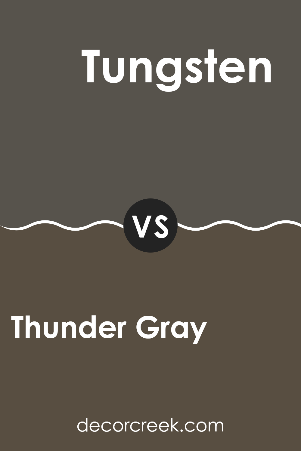
Thunder Gray SW 7645 by Sherwin Williams vs Tungsten SW 9515 by Sherwin Williams
Thunder Gray and Tungsten are two colors offered by Sherwin Williams, each bringing its own unique shade to the palette. Thunder Gray is a deep, dark gray with a slightly warm tone. It gives off a strong presence due to its depth, making it a great choice for accent walls or furniture pieces.
On the other hand, Tungsten is a lighter, softer gray with a cooler undertone. It’s more subtle and versatile, making it easier to use across larger areas like living rooms or bedrooms without overwhelming the space.
While Thunder Gray adds drama and boldness, Tungsten provides a calm and soothing feel, making it ideal for creating a relaxed environment. The choice between them would depend on the desired impact and mood for the room.
You can see recommended paint color below:
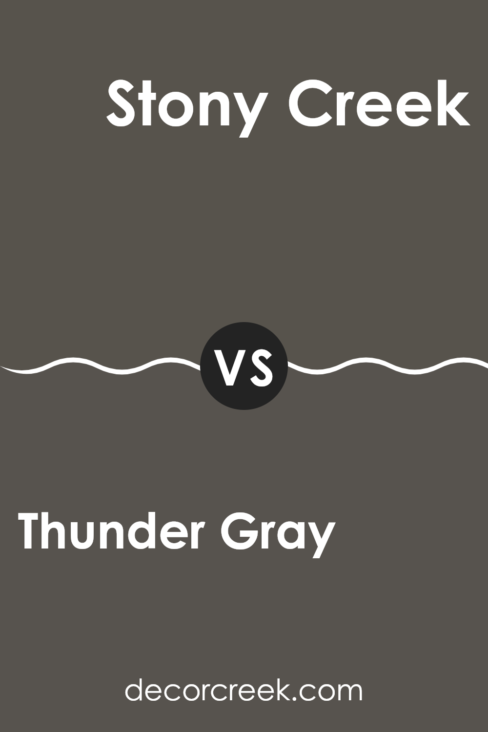
Thunder Gray SW 7645 by Sherwin Williams vs Stony Creek SW 9610 by Sherwin Williams
Thunder Gray and Stony Creek are two colors by Sherwin Williams with distinct tones. Thunder Gray is a deep, dark gray with a strong presence. It sets a bold and sturdy mood in any space, making it ideal for creating a focused or cozy atmosphere.
On the other hand, Stony Creek is a lighter, softer gray that leans slightly toward green. This color feels more relaxed and gentle, perfect for spaces where you want a calming effect without being too stark.
While Thunder Gray can make a room feel more enclosed and intimate, Stony Creek offers a breath of freshness, opening up the area in a subtle way. Both colors work well in a modern decor scheme, but their impacts are very different due to their varying darkness and undertones.
You can see recommended paint color below:
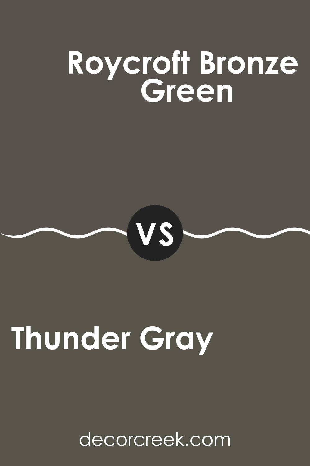
Thunder Gray SW 7645 by Sherwin Williams vs Roycroft Bronze Green SW 2846 by Sherwin Williams
Thunder Gray is a deep, cool gray that adds a subtle but strong feel to spaces, working well in both modern and traditional settings. It’s versatile, matching well with various decor styles and colors.
In contrast, Roycroft Bronze Green offers a dark, earthy tone which leans more towards green with a rustic vibe. This color is perfect for those wanting to add a touch of nature and depth to their room, providing a grounded and calm atmosphere without being too overpowering.
Both colors have their unique appeal, with Thunder Gray providing a more neutral backdrop, while Roycroft Bronze Green stands out more and can work as a feature color in a room to introduce an organic, natural feel.
You can see recommended paint color below:
- SW 2846 Roycroft Bronze Green
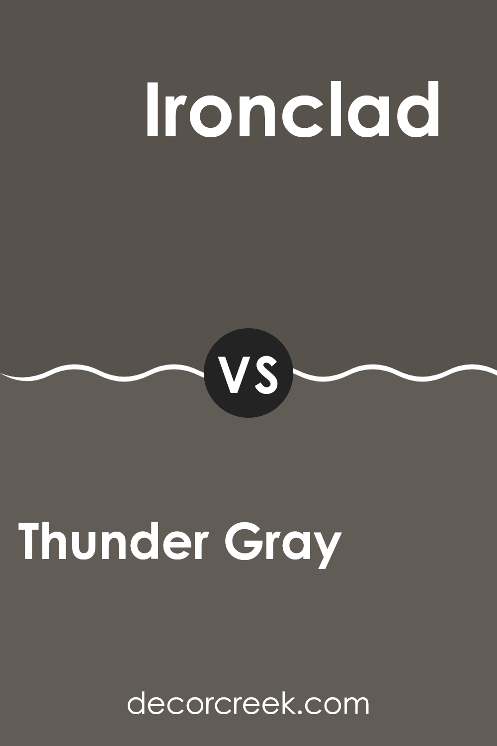
Thunder Gray SW 7645 by Sherwin Williams vs Ironclad SW 9570 by Sherwin Williams
Thunder Gray and Ironclad, both by Sherwin Williams, offer distinct shades for different decorating needs. Thunder Gray presents a versatile medium gray tone, making it a perfect choice for spaces where a neutral, balanced backdrop is desired. It works well in areas like living rooms or bedrooms where you want a calm but contemporary feel.
On the other hand, Ironclad is a much darker gray, almost tipping into charcoal territory. This color is ideal when you’re looking to add a bold or dramatic touch to a space, suitable for accent walls or cabinets for those who prefer a more striking appearance.
While Thunder Gray provides a lighter, airier vibe, Ironclad offers depth and a strong presence, enabling distinctive design contrasts. Both colors, being in the gray family, maintain a modern look but serve different aesthetic purposes depending on the intensity of gray you’re aiming for in your room.
You can see recommended paint color below:
- SW 9570 Ironclad
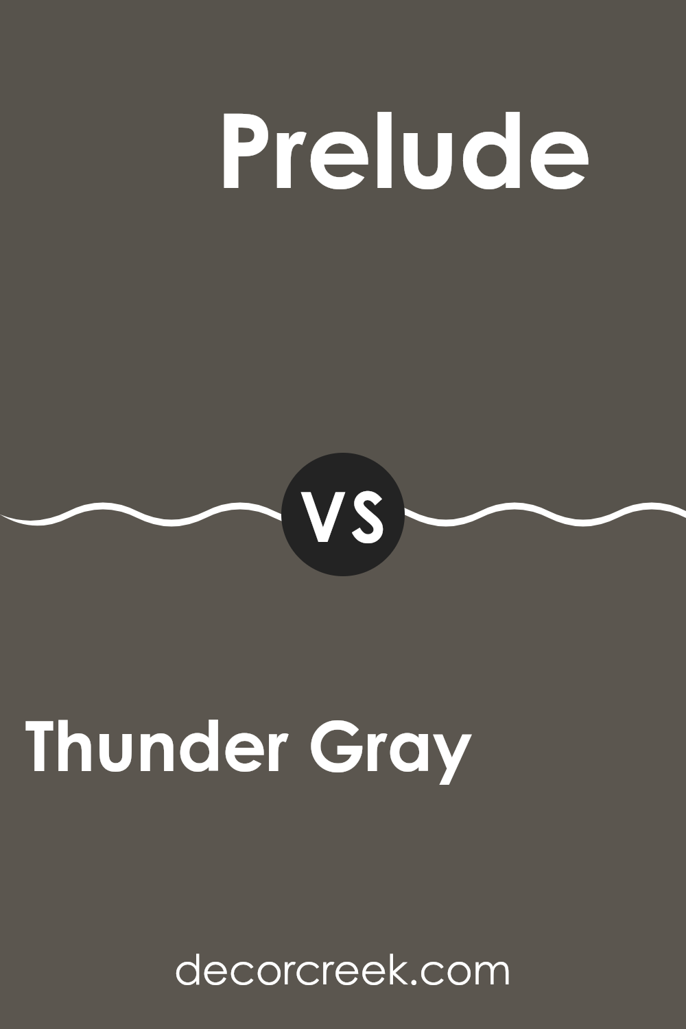
Thunder Gray SW 7645 by Sherwin Williams vs Prelude SW 9620 by Sherwin Williams
Thunder Gray and Prelude, both from Sherwin Williams, offer distinctly different vibes for any room. Thunder Gray is a deep, almost charcoal hue with a strong presence, perfect for creating a bold statement in spaces like living rooms or bedrooms. It’s a substantial color that can make furniture and decor pop, especially when paired with lighter tones.
On the other hand, Prelude is much lighter, sitting on the edge between gray and lavender. It’s a soft, gentle color that works beautifully in spaces intended to have a calm and airy feel, such as bathrooms or nurseries. Prelude is versatile enough to be matched with both dark and light furnishings, giving decorators a lot of flexibility.
Both colors provide unique opportunities depending on the mood you want to set in your space, with Thunder Gray leaning towards a more powerful, anchoring effect and Prelude offering a gentler, more open atmosphere.
You can see recommended paint color below:
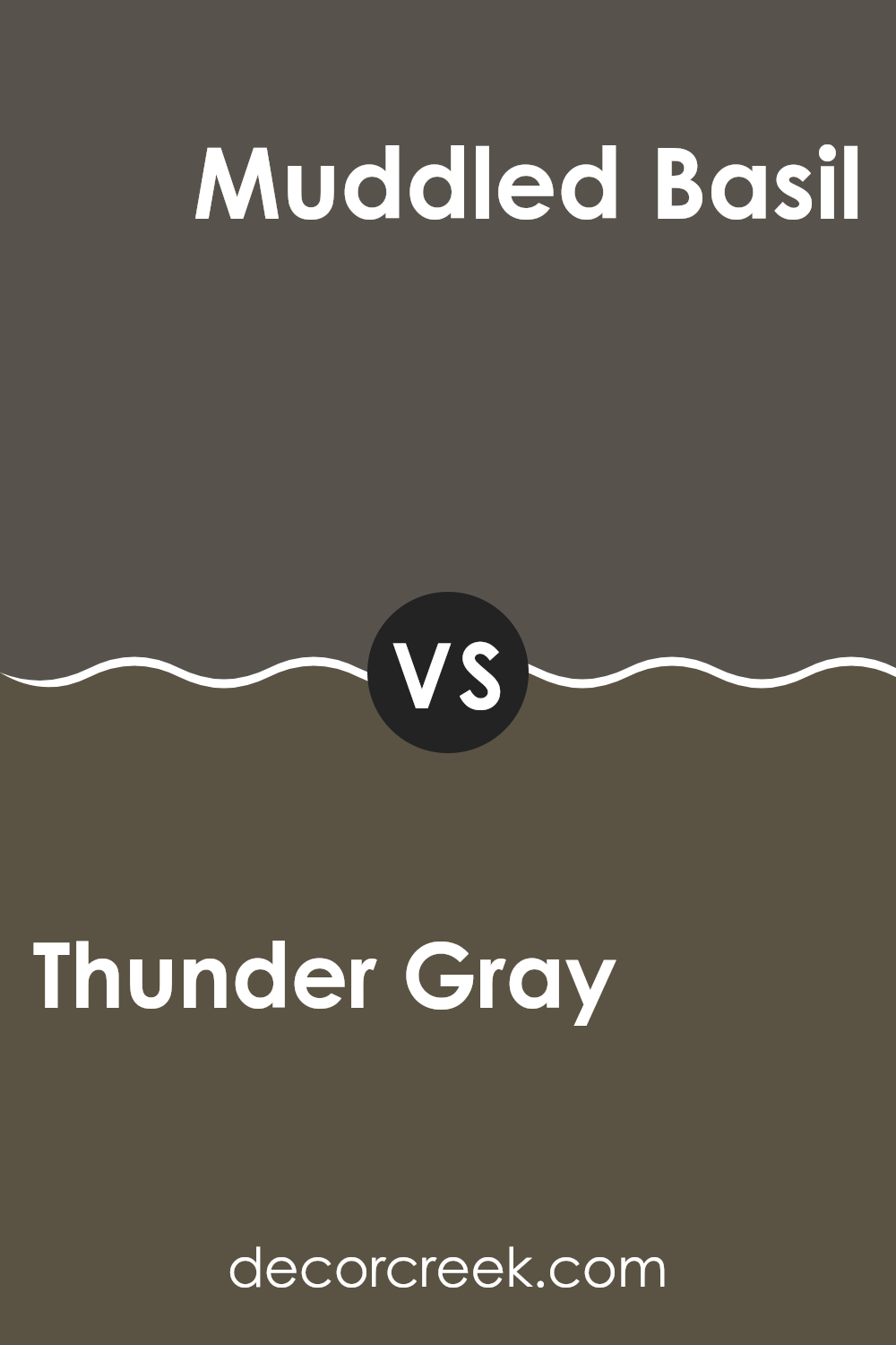
Thunder Gray SW 7645 by Sherwin Williams vs Muddled Basil SW 7745 by Sherwin Williams
Thunder Gray and Muddled Basil by Sherwin Williams are two distinct colors that can set a very different mood in a space. Thunder Gray is a deep, moody gray with a strong presence, which makes it perfect for creating a bold yet cozy atmosphere.
It works well in areas where you might want an air of formality, like dining rooms or home offices. On the other hand, Muddled Basil is a darker shade of green that brings a touch of nature indoors. It has an earthy vibe, making it great for spaces where you want to add a calming, natural feel, like kitchens or living rooms.
Although both colors are dark, Thunder Gray leans towards a cooler tone, while Muddled Basil moves towards a warmer, green-infused palette. They could complement each other in a space that balances cool and warm undertones, providing a rich, inviting environment.
You can see recommended paint color below:
- SW 7745 Muddled Basil
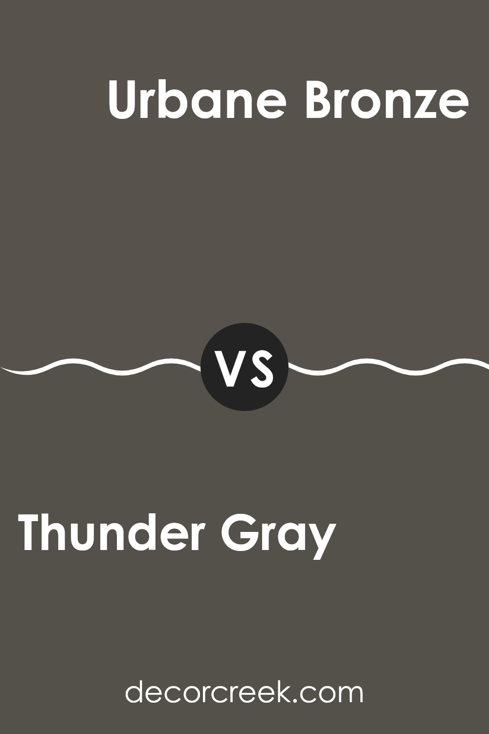
Thunder Gray SW 7645 by Sherwin Williams vs Urbane Bronze SW 7048 by Sherwin Williams
Thunder Gray and Urbane Bronze are both paints by Sherwin Williams. Thunder Gray has a deep, dark gray tone, leaning slightly towards a slate color, making it a strong choice for an accent wall or furniture. It exudes a quiet strength and can set a calm, steady mood in a room. Its neutral shade pairs well with many colors, providing flexibility in decor choices.
Urbane Bronze, on the other hand, features a richer, deeper brown with gray undertones. This color is bolder and more pronounced, offering a bold statement when used in interior spaces. It works exceptionally well in creating a cozy, warm atmosphere, making spaces feel more grounded and secure.
Both colors are versatile and can complement a variety of decor styles. While Thunder Gray offers a cooler, more subdued backdrop, Urbane Bronze provides warmth and a sense of intimacy, ideal for spaces where you want to feel sheltered and comfortable.
You can see recommended paint color below:
Thunder Gray SW 7645 by Sherwin Williams vs Nocturne SW 9520 by Sherwin Williams
Thunder Gray and Nocturne, both by Sherwin Williams, are two distinct shades of gray that serve different design purposes. Thunder Gray is a deep, warm gray with a slightly brownish undertone, making it a great choice for a cozy and welcoming feel in spaces.
It pairs well with warm wood tones and rich fabrics. On the other hand, Nocturne is a darker, cooler gray that leans towards a soft black. This color is ideal for creating dramatic and moody atmospheres, perfect for accent walls or rooms where you want to make a bold statement.
Nocturne works well with metallic accents and can give a modern look to any room. In summary, while both colors are grays, Thunder Gray offers a warmer, more inviting vibe, whereas Nocturne provides a deeper, more striking effect.
You can see recommended paint color below:
Thunder Gray SW 7645 by Sherwin Williams vs Forged Steel SW 9565 by Sherwin Williams
Thunder Gray and Forged Steel are two shades of gray from Sherwin Williams that have their own unique characteristics. Thunder Gray has a medium depth, blending a touch of brown which gives it a warm, welcoming feel. It’s great for creating a cozy atmosphere in spaces like living rooms or bedrooms.
On the other hand, Forged Steel is darker and cooler, leaning more towards a charcoal gray. This color has a more modern vibe, suitable for creating bold, striking contrasts in a space, particularly useful in contemporary settings or as an accent wall to draw attention.
When comparing the two, Thunder Gray offers a softer, more gentle appearance, making it easier to pair with a variety of decor elements. Forged Steel, being bolder and more dramatic, works well in a setting that aims to make a stronger statement through its design choices. Both colors are versatile, but your choice will depend on the mood and style you want to introduce to your space.
You can see recommended paint color below:
Thunder Gray SW 7645 by Sherwin Williams vs Black Fox SW 7020 by Sherwin Williams
Thunder Gray and Black Fox are two unique shades from Sherwin Williams. Thunder Gray is a deep, cool gray that has subtle blue undertones. It’s a versatile color that works well in various spaces, providing a strong but neutral backdrop. It can give a room a grounded feeling without making it feel too dark.
Black Fox, on the other hand, is much darker and leans towards a charcoal color with a hint of brown. It’s almost like a soft black that can bring a cozy and warm feel to a room, despite its darkness. This color is perfect for creating a dramatic and cozy atmosphere, especially in spaces where you want depth without the starkness of pure black.
When comparing the two, Thunder Gray is lighter and cooler, making it easier to pair with a wider range of colors. Black Fox offers a bolder statement and can be used to create more contrast, especially when combined with lighter colors. Both colors offer unique possibilities for decorating and can be used effectively to make a space feel more grounded and inviting.
You can see recommended paint color below:
In conclusion, SW 7645 Thunder Gray by Sherwin Williams is a fantastic paint color choice for anyone wanting to give their room a fresh, modern look. This gray color is like a soft blanket; it’s not too dark or too light, making it just right for almost any room, whether it’s your living room or bedroom. I’ve noticed it works really well with lots of other colors, so you can add your favorite decorations and they’ll look great!
Thunder Gray makes the room feel cozy and welcoming, like a warm hug. When I painted my study this color, it gave the room a calm feel which made me enjoy spending time there doing my homework or reading. For anyone who’s thinking about picking a new color for their room, I would recommend Thunder Gray because it’s easy to like and lives up with different styles and tastes.
So, if you’re ready to give a room in your house a new look, Thunder Gray could be the perfect choice for you. It’s easy to see why it would make anyone feel happy and comfortable in their home.
Ever wished paint sampling was as easy as sticking a sticker? Guess what? Now it is! Discover Samplize's unique Peel & Stick samples.
Get paint samples

