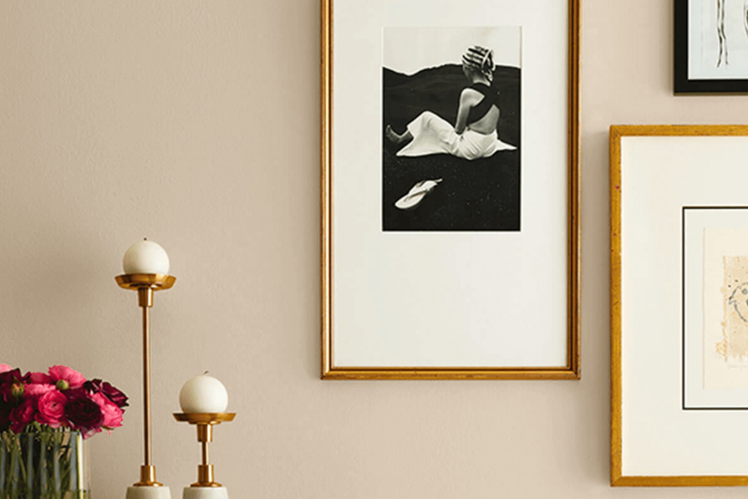
As you set out to freshen up your room, consider SW 9110 Malabar from Sherwin Williams. This paint color resonates with warmth and comfort, serving as a gentle backdrop for any area looking for a touch of calmness without overpowering sensibilities. The soft, sandy hue of Malabar offers a subtle adaptability, making it a perfect candidate for living areas, bedrooms, or even offices where calmness aids concentration and productivity.
Using Malabar on your walls can seamlessly blend with a variety of decor styles, from traditional to more contemporary schemes. It pairs well with rich wood tones, adding depth and warmth to the environment, and also complements well with brighter colors for a lively contrast. If you’re planning to refresh your furnishings or introduce new art, Malabar provides a soothing canvas that will not clash with bolder designs or textures.
This color does not shout for attention but rather, gently whispers, allowing the other elements in your room to stand out while it quietly supports the overall aesthetic.
If you’re looking for a color that supports a wide range of decorating possibilities while providing your room with a relaxed vibe, SW 9110 Malabar should definitely be on your radar.
What Color Is Malabar SW 9110 by Sherwin Williams?
Malabar by Sherwin Williams is a warm and creamy beige color that exudes comfort and simplicity. Its gentle hue acts as a flexible backdrop for various interior styles, particularly fitting well in traditional, rustic, and contemporary rooms. The warmth in this color makes it accessible and inviting, which is ideal for creating a cozy atmosphere in living rooms or bedrooms.
This shade coordinates excellently with natural materials like wood, adding a sense of earthiness to a room. When paired with dark wood furniture, the color highlights the richness of the wood while maintaining a light and airy ambiance.
Malabar also works beautifully with softer textures like linen or cotton, enhancing its comforting feel. The neutrality of this beige allows it to flawlessly complement bolder colors and patterns without overpowering them, making it a perfect choice for accent walls.
Its flexibility means it can fit into various decor styles by acting as a calm base, allowing other elements of the decor to stand out. This color is particularly effective in rooms where you want to foster a relaxed and welcoming environment, like a family room or a casual dining area.
Is Malabar SW 9110 by Sherwin Williams Warm or Cool color?
Malabar SW 9110, a paint color available from Sherwin Williams, offers a unique warmth and neutrality making it highly suitable for home interiors. Its subtle earthy tones help to create a cozy and inviting atmosphere in any room.
This color’s adaptability allows it to blend seamlessly with various decor styles, from modern to traditional. Whether used for living room walls or as an accent in the kitchen, Malabar can complement dark or light furniture, enhancing wood grains and textile textures. It’s especially effective in rooms that need a touch of warmth to counterbalance cool lighting or materials.
Additionally, the color is forgiving when it comes to marks or smudges, which makes it a practical choice for busy households. Its calming effect is ideal for bedrooms and study areas where a relaxed environment is beneficial. Overall, Malabar is a go-to color for those looking to create a welcoming home atmosphere without overpowering the senses.
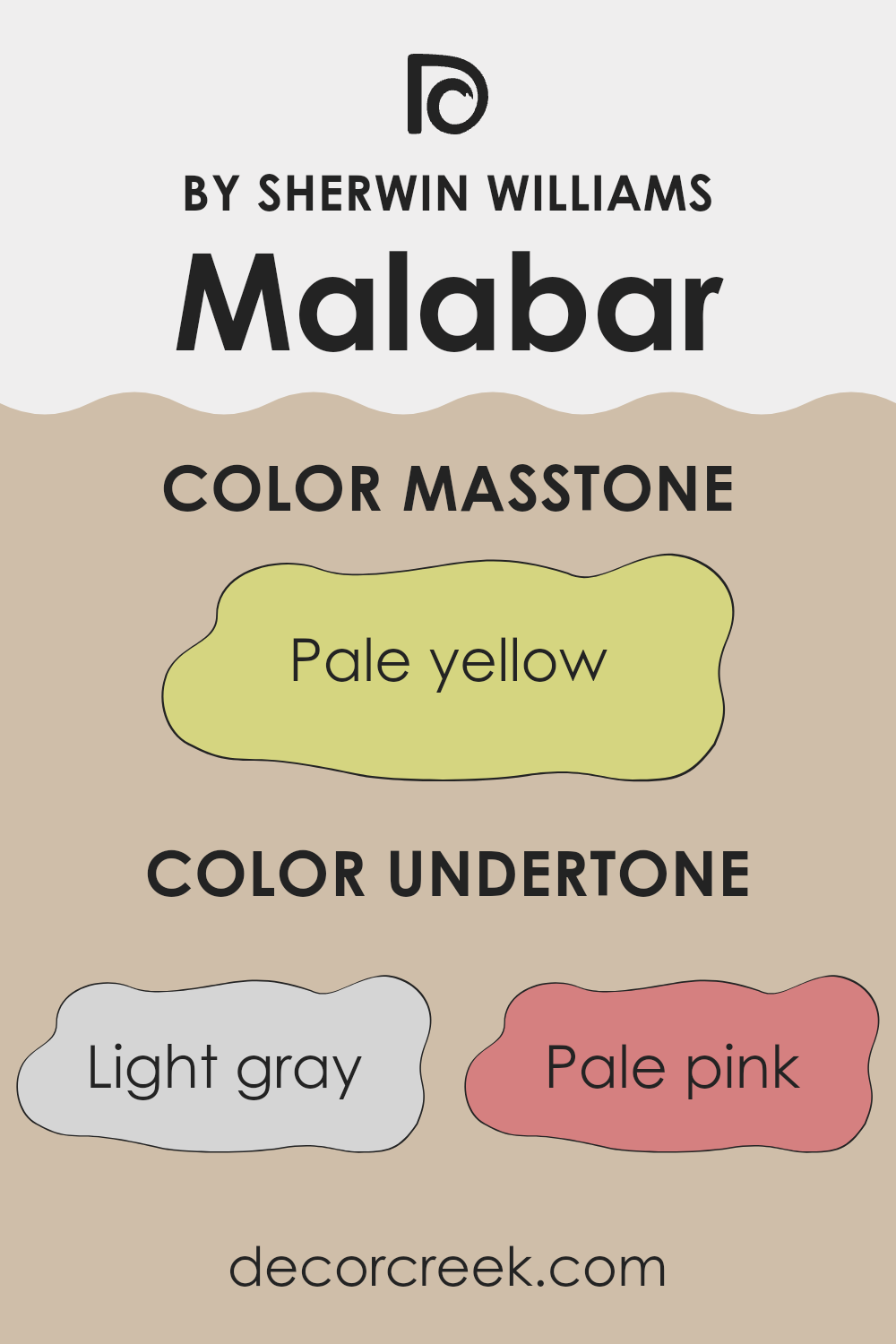
Undertones of Malabar SW 9110 by Sherwin Williams
Malabar, a paint color, contains multiple undertones which can subtly change how it appears under different lighting conditions and in different surroundings. Undertones are the underlying hints of color that, while not immediately obvious, impact the overall hue that our eyes perceive. Understanding these undertones can help in selecting colors that complement the room and lighting of an area.
This particular color has various undertones including light gray, pale pink, light purple, and more. Each undertone brings a unique dimension to the color. For instance, light gray can give it a cooler feel, making it a good match for modern and minimalistic interiors. Pale pink adds a touch of warmth, making a room feel more welcoming. Light purple offers a subtle hint of vibrancy, without overpowering the senses.
When used on interior walls, the effect of these undertones can significantly influence the ambience of a room. In natural light, the pale pink and light blue can make an area feel airy and fresh. Under artificial lighting, the deeper tones like gray and lilac might become more pronounced, providing a grounding effect. This makes Malabar a flexible choice, as it can adapt to different settings and lighting, altering its mood accordingly.
Choosing this paint color for your walls can therefore help achieve a desired atmosphere, whether you’re looking for something calming and understated or slightly more dynamic and lively. It all comes down to how these undertones play with other elements in your room, such as furniture, flooring, and natural light.
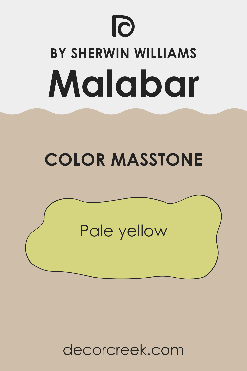
What is the Masstone of the Malabar SW 9110 by Sherwin Williams?
The masstone of Pale Yellow (#D5D580) brings a subtle warmth to any room, making it feel welcoming and bright. This color is excellent for areas that you want to feel calm and cheerful without overpowering the senses.
Since it is a pale yellow, it’s adaptable and pairs well with many other colors, allowing for various decorating styles. It works particularly well in living areas and kitchens where a touch of light can make the room feel larger and more open.
The soft yellow hue also reflects natural light beautifully, enhancing the overall brightness of your home during the day. It’s an ideal choice if you are looking for a color that gently perks up an area without making it feel too bold or intense. Using this pale yellow can help create a cozy, sunny atmosphere in the home, perfect for creating a pleasant and inviting environment.
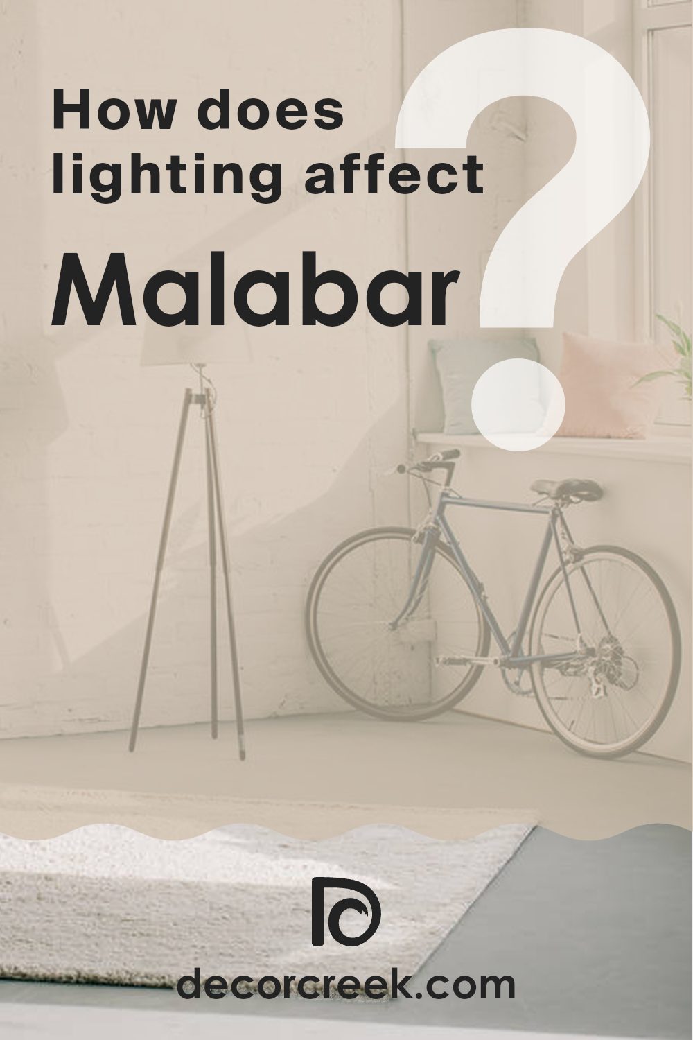
How Does Lighting Affect Malabar SW 9110 by Sherwin Williams?
Lighting plays a crucial role in how we perceive colors in our surroundings. The type of light and its intensity can cause colors to appear differently. For example, natural sunlight tends to bring out the brightness and true hue of colors, while artificial light can alter how we perceive these hues.
Consider the paint color Malabar, a warm, creamy shade. In natural light, Malabar shines brightly, revealing its rich, cozy undertones. This makes it excellent for rooms that receive a lot of sunlight, as it enhances the welcoming feel of the area.
In artificial light, the perception of Malabar can change depending on the type of bulb used. Warm white bulbs enhance its creamy and warm characteristics, making it appear more inviting. Cool white bulbs, on the other hand, might make it look a bit starker and less warm, which could affect the mood of the area.
The orientation of the room also affects how Malabar looks:
- North-faced rooms often get less direct sunlight. Here, Malabar might appear slightly muted and less vibrant, giving a subtle and soft look which is calm and measured.
- South-faced rooms receive more intense sunlight, making Malabar look brighter and more vivid. This can make the area feel lively and warm throughout the day.
- East-faced rooms get sunlight in the morning. Early light brings out the warmth in Malabar, making the area feel sunny and cheerful in the morning, but cooler and subdued as the day progresses.
- West-faced rooms capture evening light. Malabar will look softer during the day and become warmly lit and vibrant in the evening as the sun sets.
Ultimately, the effect of lighting on the color Malabar can greatly impact the atmosphere and functionality of a room, making thoughtful lighting choices essential for achieving the desired ambiance.
decorcreek.com
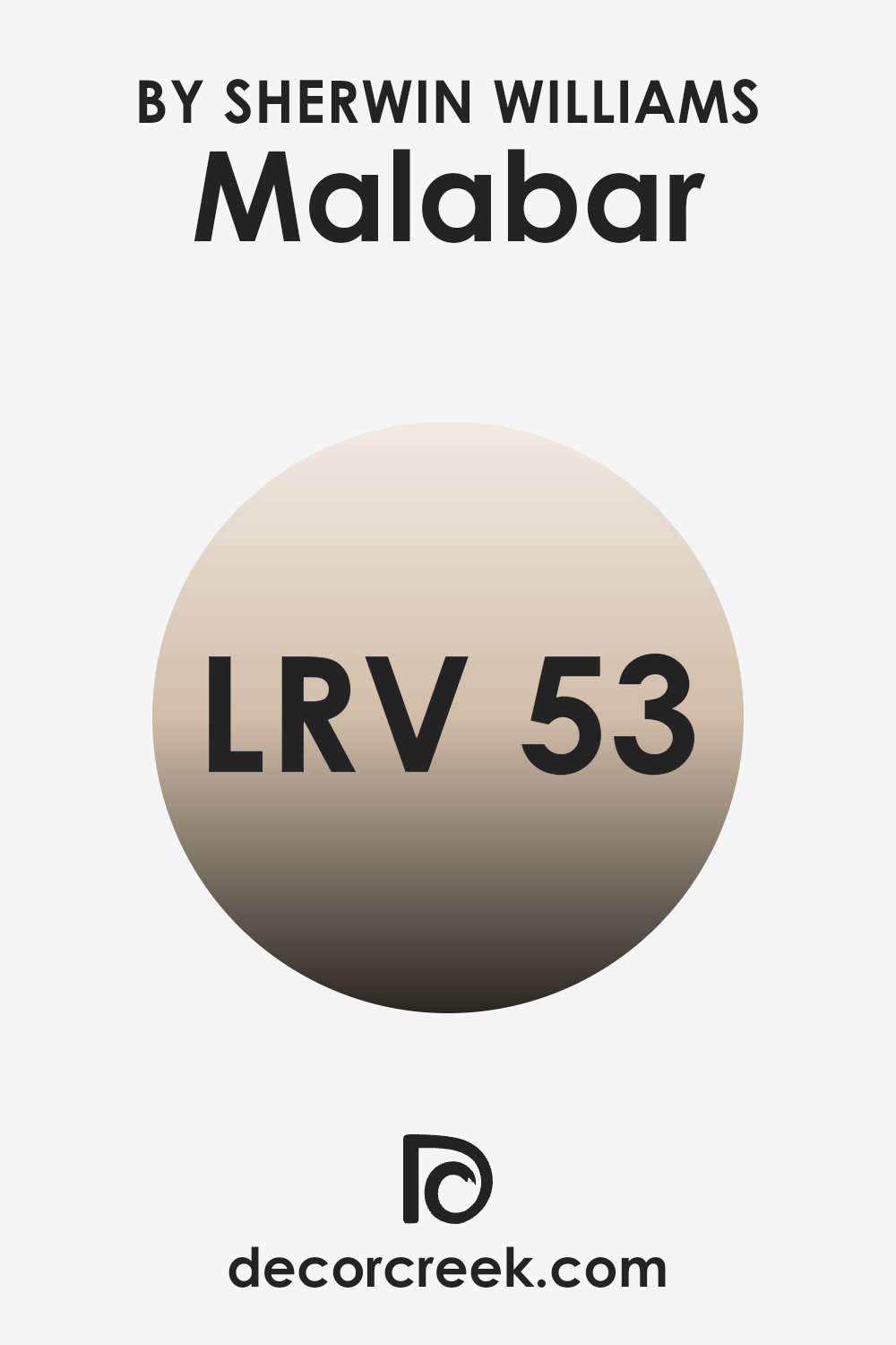
What is the LRV of Malabar SW 9110 by Sherwin Williams?
LRV stands for Light Reflectance Value, which is a measure used to determine how much light a paint color reflects back into a room as opposed to absorbing it. This scale runs from a low of 1, where almost no light is reflected, up to a high near 99, indicating the paint color reflects nearly all light.
A higher LRV can make a room feel brighter and bigger, as more light bounces around the area, whereas a lower LRV can make a room feel more enclosed and cozy because more light is absorbed. In the case of the color with an LRV of 53.11, this occupies a middle ground on the scale.
It means that the color reflects over half of the light that hits it, which can help to enhance the brightness of a room without being too stark or too dark. This level of reflectance makes it adaptable for various lighting conditions, contributing to a balance between warmth and brightness on the walls. This can be particularly beneficial in rooms that receive moderate amounts of natural light, helping to keep the area feeling naturally lit throughout the day.
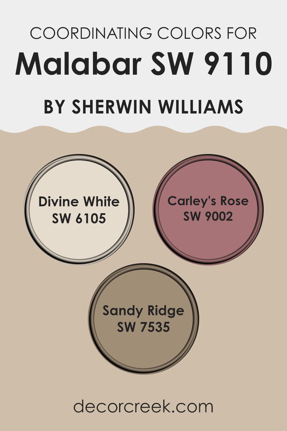
Coordinating Colors of Malabar SW 9110 by Sherwin Williams
Coordinating colors are hues that complement each other when used together in décor, enhancing the overall aesthetic of a room without clashing. When carefully selected, coordinating colors can create a harmonious and balanced visual experience. For example, colors such as Divine White, Carley’s Rose, and Sandy Ridge pair well with the warm, soft tones of a color like Malabar to produce an inviting atmosphere.
Divine White is a gentle, creamy shade that offers a subtle contrast to richer hues, making it a perfect background that allows bolder colors to stand out. It’s ideal for trim or for large areas that you’d like to keep light and airy. Carley’s Rose is a delicate and slightly muted pink that provides a touch of sweetness and warmth, excellent for adding a gentle pop of color in a mainly neutral palette.
On the other hand, Sandy Ridge is a soft earthy tan that can help ground a room’s color scheme, offering a neutral but warm presence that supports bolder colors or works beautifully on its own for an understated elegance. Together, these colors support Malabar by creating a cohesive look that feels both welcoming and balanced.
You can see recommended paint colors below:
- SW 6105 Divine White
- SW 9002 Carley’s Rose
- SW 7535 Sandy Ridge
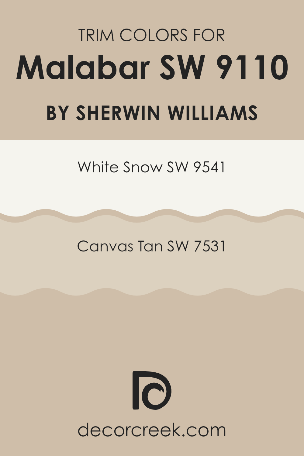
What are the Trim colors of Malabar SW 9110 by Sherwin Williams?
Trim colors are used to accentuate and define architectural details and transitions in walls, doorframes, window sills, and molding, offering an aesthetic contrast or complement to the main wall color. They help to highlight the unique features of a room and can be crucial in tying the color scheme together.
For a color like Malabar (SW 9110) by Sherwin-Williams, selecting an appropriate trim color can enhance its overall appearance by framing it with a contrasting or harmonious shade. Using the wrong trim color can make a wall color look dull or overly stark, but the right choice can make the design look well-thought-out and appealing.
White Snow (SW 9541) is a clean, bright, and fresh white that brings a crisp definition to trim, making it an excellent choice to pair with deeper or muted wall colors like Malabar. It offers a clear delineation between the wall and trim, ensuring that the architectural details stand out.
On the other hand, Canvas Tan (SW 7531) is a soft, warm beige that provides a subtle, soothing contrast when used as a trim color. This shade works well to create a gentle transition between the wall and the trim, lending a cohesive and balanced look to the overall design.
You can see recommended paint colors below:
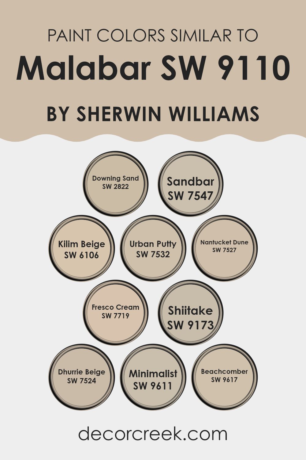
Colors Similar to Malabar SW 9110 by Sherwin Williams
In interior design, selecting similar colors can create a harmonious and cohesive look that is visually pleasing and subtly elegant. These colors, by blending seamlessly with each other, help to form a smooth visual flow throughout a room.
For instance, the shades like Downing Sand and Sandbar by Sherwin Williams are perfect examples of how closely related hues can complement each other to enhance the aesthetic of a room without overpowering it with contrast. Downing Sand is a soft, warm beige that gives a gentle, inviting tone to any area, while Sandbar, a slightly deeper tan, adds a touch of earthiness that works well in rooms seeking a bit of grounding.
Meanwhile, Kilim Beige brings a slightly more saturated hue that pairs wonderfully with the lighter and darker tones of beige like Urban Putty and Nantucket Dune, which provide mid-toned, adaptable backdrops useful in a variety of decorating styles.
Urban Putty, a warm gray with beige undertones, is adaptable, matching well with various decor elements, whereas Nantucket Dune offers a whisper of greige, ideal for creating a subtle depth. Fresco Cream, on the lighter end, has a creamy brightness, bringing a soft glow to interiors, contrasting mildly with the mushroom-like tones of Shiitake which adds a deeper, earthy quality.
Dhurrie Beige is another useful neutral, straddling the line between beige and gray, perfect for more nuanced color schemes. Finally, within the range of similar shades, Minimalist acts as a bridge between whites and beiges, offering a barely-there hint of color, while Beachcomber introduces a soft, muted yellow, contributing a quiet warmth that’s neither too bold nor too pale. These similar colors, by providing slight variations in hue and saturation, allow for a fluid and adaptable color scheme that can accommodate various design preferences while maintaining a unified look.
You can see recommended paint colors below:
- SW 2822 Downing Sand
- SW 7547 Sandbar
- SW 6106 Kilim Beige
- SW 7532 Urban Putty
- SW 7527 Nantucket Dune
- SW 7719 Fresco Cream
- SW 9173 Shiitake
- SW 7524 Dhurrie Beige
- SW 9611 Minimalist
- SW 9617 Beachcomber
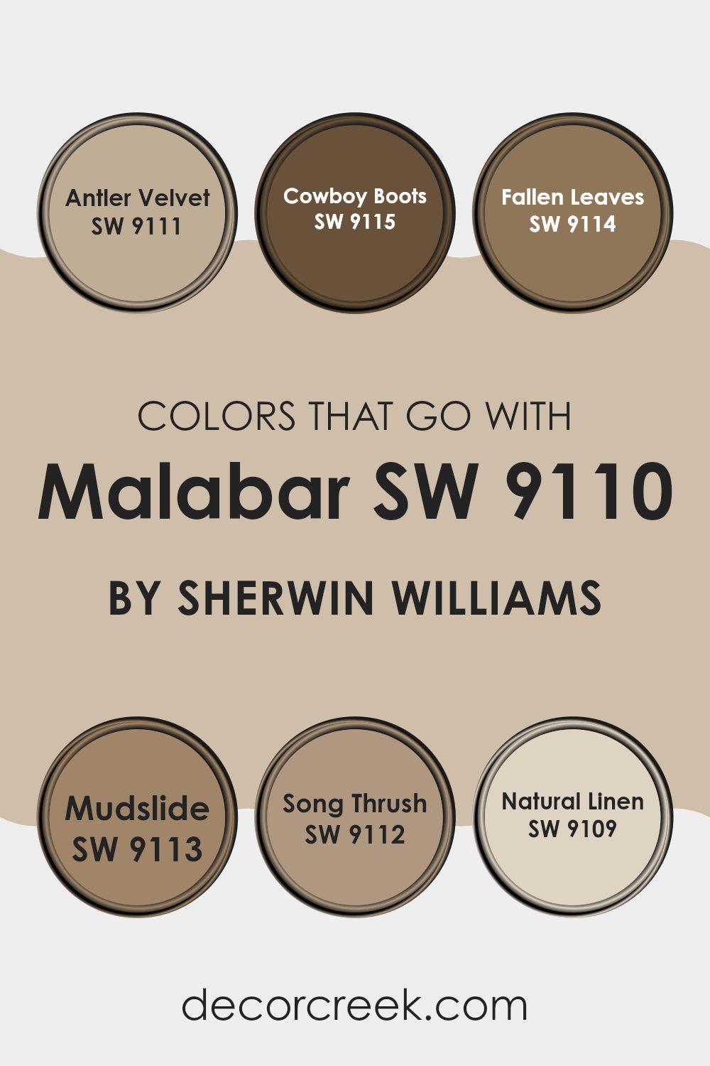
Colors that Go With Malabar SW 9110 by Sherwin Williams
Choosing complementary colors for Malabar SW 9110 by Sherwin Williams is essential in achieving a harmonious interior design scheme. These colors help create a cohesive look that enhances the warm undertones of Malabar, making rooms feel inviting and well-coordinated.
Matching colors such as Antler Velvet, Cowboy Boots, Fallen Leaves, Mudslide, Song Thrush, and Natural Linen not only enrich the environment but also provide adaptability in design choices, whether for walls, trims, or accents. From a practical standpoint, these colors support various design aesthetics, from rustic to contemporary, and adjust seamlessly to different lighting conditions, enhancing the overall atmosphere of any room.
Antler Velvet is a soft gray shade that adds a subtle clarity to rooms, making them feel light yet grounded. Cowboy Boots has a deep, rich brown tone that provides a sharp contrast to lighter hues, ideal for creating a focal point in a room.
Fallen Leaves brings a cozy, autumn-like warmth with its reddish-brown tone, perfect for rooms meant to feel snug and welcoming. Mudslide offers a deeper, chocolate brown that works well in adding depth and intensity to décor. Song Thrush is a gentle beige, excellent for creating a soft, neutral background that allows other colors to stand out. Lastly, Natural Linen is a light, airy beige that gives a clean and crisp look, making it a fantastic choice for a fresh and light feeling in a room.
You can see recommended paint colors below:
- SW 9111 Antler Velvet
- SW 9115 Cowboy Boots
- SW 9114 Fallen Leaves
- SW 9113 Mudslide
- SW 9112 Song Thrush
- SW 9109 Natural Linen
How to Use Malabar SW 9110 by Sherwin Williams In Your Home?
Malabar SW 9110 by Sherwin Williams is a popular paint color with a warm, earthy tone that can make any room feel cozy and welcoming. This shade of beige has hints of gray, making it adaptable enough to work in various rooms whether you’re aiming for a classic or modern look.
It’s a great choice for living rooms or bedrooms where a soft, neutral background is needed. Malabar also helps in brightening up darker areas without being too stark, providing a calm and pleasant atmosphere.
In the kitchen, pairing it with darker cabinets can create a nice contrast, while in a bathroom, using it on walls can complement natural stone or wood elements. It’s also a good choice for hallways or entryways as it hides everyday marks and scuffs well. Overall, Malabar is a great base color that allows for flexibility in decorating with different styles and accessories. It can help create a seamless look throughout the home, making your room feel unified and thoughtfully designed.
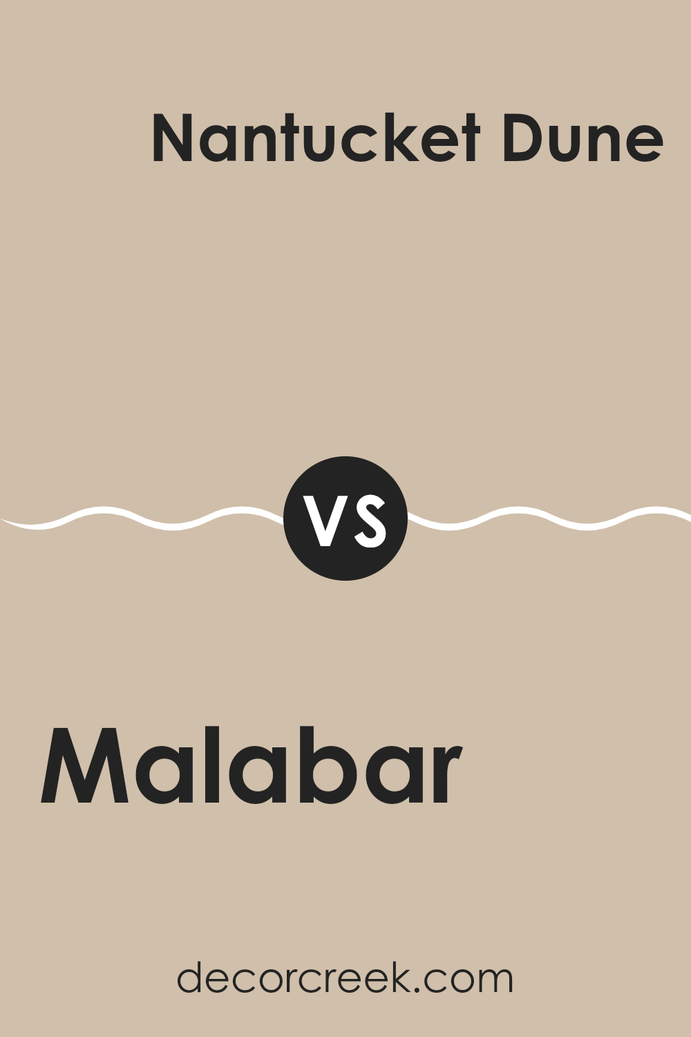
Malabar SW 9110 by Sherwin Williams vs Nantucket Dune SW 7527 by Sherwin Williams
Malabar and Nantucket Dune are two colors from Sherwin Williams that offer subtle yet distinct shades. Malabar has a deeper, earthy tone, leaning towards a warm taupe. It has the quality of blending seamlessly into rooms to create a soothing and homey atmosphere.
On the other hand, Nantucket Dune is lighter and more sand-like, offering a touch of brightness to areas without overpowering them. While Malabar provides depth and warmth to a room, Nantucket Dune reflects more natural light and can make smaller areas appear larger.
Both colors are adaptable and can complement various decor styles, but the choice between them depends on the desired effect—whether you’re aiming for a cozier feel with Malabar or a lighter, airier vibe with Nantucket Dune.
You can see recommended paint color below:
- SW 7527 Nantucket Dune
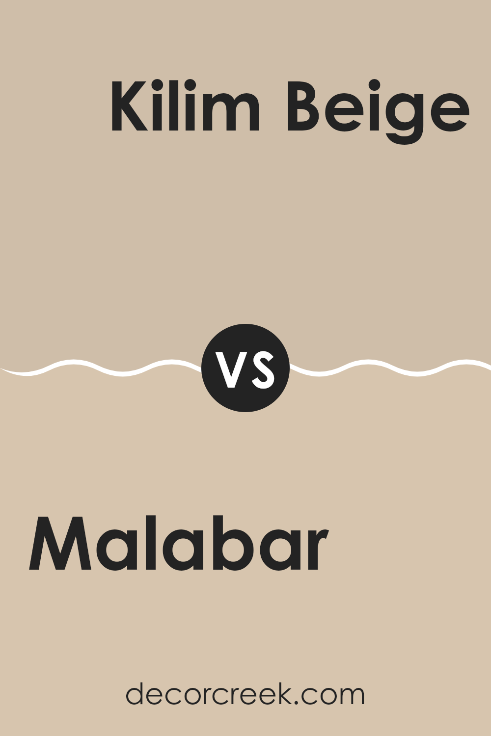
Malabar SW 9110 by Sherwin Williams vs Kilim Beige SW 6106 by Sherwin Williams
Malabar and Kilim Beige are both neutral colors offered by Sherwin Williams, but they present unique tones. Malabar has a grayish, taupe undertone that makes it a bit cooler and more muted. It suits rooms where a subtle, calming background is needed, blending nicely with modern and minimalistic decor.
On the other hand, Kilim Beige carries a warmer, more inviting beige tone that gives a soft and cozy feel. It’s perfect for living areas or bedrooms where a friendly, welcoming atmosphere is desired.
Kilim Beige often pairs well with a wide range of colors, providing a flexible backdrop that can enhance traditional and contemporary designs alike. While both colors provide a neutral palette, the choice between Malabar’s cooler hue and Kilim Beige’s warmer tone can define the mood and style of a room.
You can see recommended paint color below:
Malabar SW 9110 by Sherwin Williams vs Dhurrie Beige SW 7524 by Sherwin Williams
Malabar and Dhurrie Beige by Sherwin Williams are both warm, neutral colors, but they have distinct tones that set them apart. Malabar is a deeper, richer beige with a hint of gray, creating a cozy and welcoming feel in a room.
It pairs well with both bright and dark colors, making it quite adaptable for decorating. On the other hand, Dhurrie Beige is lighter and leans more towards a classic beige, giving off a clean and airy vibe that’s perfect for making smaller areas appear more spacious. It’s great for creating a relaxed environment and works well with soft pastels and other neutral shades.
Both colors are practical choices for those looking to create a warm, neutral backdrop in their living areas, but the choice between a cozier, deeper tone and a lighter, refreshing one depends on your specific style and the room’s lighting.
You can see recommended paint color below:
Malabar SW 9110 by Sherwin Williams vs Urban Putty SW 7532 by Sherwin Williams
Malabar and Urban Putty by Sherwin Williams are both neutral colors, but they have different tones that create distinct moods in a room. Malabar is a deeper, warmer beige that provides a cozy and inviting feeling, making it perfect for living rooms or bedrooms where comfort is key. It has a slightly pinkish undertone that adds a gentle warmth to the area.
On the other hand, Urban Putty is a lighter shade of taupe. It’s more subdued compared to Malabar and has gray undertones, giving it a cooler feel. This color works well in rooms that aim for a minimalistic and modern look, like kitchens and bathrooms, as it offers a clean and calm backdrop.
Both colors are adaptable and can easily be paired with different materials and styles. However, the choice between them would depend on the kind of warmth and feel you want for the area.
You can see recommended paint color below:
- SW 7532 Urban Putty
Malabar SW 9110 by Sherwin Williams vs Shiitake SW 9173 by Sherwin Williams
Malabar and Shiitake, both from Sherwin Williams, offer subtle yet distinct tones for different decorating needs. Malabar is a soft, neutral beige that adds a light and airy feel to a room. It’s great for areas where you want a hint of warmth without overpowering other design elements.
On the other hand, Shiitake leans towards a richer, deeper gray-brown hue. This color provides more depth and can serve as a strong foundation for a variety of color schemes. It tends to make rooms feel more grounded and cozy compared to the lighter Malabar.
Both colors are adaptable, but while Malabar offers a gentle backdrop, Shiitake makes a more pronounced statement. The choice between them depends on the mood and functionality you want to achieve in your room.
You can see recommended paint color below:
Malabar SW 9110 by Sherwin Williams vs Fresco Cream SW 7719 by Sherwin Williams
Malabar and Fresco Cream are two distinct colors by Sherwin Williams, each with its unique character. Malabar is a deeper, muted shade, something between taupe and gray with hints of green. This color gives a rich backdrop, making it ideal for rooms where you want a calm, soothing vibe without it being too dark. It pairs well with earthy accents and natural materials like wood and stone, enhancing an organic, grounded feel in any area.
On the other hand, Fresco Cream lives up to its name with a creamy, warm undertone. It’s a lot lighter than Malabar and carries a gentle yellow hue that brings to mind softness and light. This color is excellent for areas where you want to add brightness and a sense of airiness. Kitchens, bathrooms, and living areas can feel more welcoming and cozy with Fresco Cream on the walls.
While Malabar sets a moodier tone, Fresco Cream opens up a room. Choosing between them depends on the atmosphere you want to achieve in your area.
You can see recommended paint color below:
- SW 7719 Fresco Cream
Malabar SW 9110 by Sherwin Williams vs Beachcomber SW 9617 by Sherwin Williams
Malabar SW 9110 is a muted pink-beige shade that brings a warm, cozy feel to any room. It’s light enough to make areas look larger and has a homely vibe which makes it perfect for living areas and bedrooms where comfort is key.
In comparison, Beachcomber SW 9617 leans more towards neutral gray with hints of beige, giving it a soft, adaptable appearance. This color works well in rooms that need a clean and calm backdrop, supporting various decor styles from modern to traditional.
Both Malabar and Beachcomber are subtle and low-key, but Malabar offers a touch more warmth due to its pink undertones while Beachcomber can feel cooler and more understated due to its gray influences. Depending on the atmosphere you want to create, either could be a good fit; Malabar for a welcoming, snug environment and Beachcomber for a neat, tidy look.
You can see recommended paint color below:
Malabar SW 9110 by Sherwin Williams vs Minimalist SW 9611 by Sherwin Williams
Malabar and Minimalist are two distinct colors from Sherwin Williams. Malabar is a soft, warm gray with earthy undertones, making it cozy and inviting. This color works well in rooms where you want a touch of warmth without overpowering the area with too strong a hue. It pairs nicely with natural materials like wood and stone.
On the other hand, Minimalist is a much lighter and cleaner shade of gray. This color is great for creating a bright and airy feel in a room. It reflects more light, making areas appear larger and more open. This makes it a fantastic choice for smaller rooms or rooms with limited natural light.
In conclusion, while both colors belong to the gray family, Malabar offers a warmer, cozier feel, ideal for adding a subtle richness to a room. Minimalist is perfect for enhancing openness and light, suitable for smaller or darker areas looking to appear more spacious.
You can see recommended paint color below:
Malabar SW 9110 by Sherwin Williams vs Downing Sand SW 2822 by Sherwin Williams
Malabar SW 9110 and Downing Sand SW 2822, both from Sherwin Williams, present subtle nuances in their warm, neutral tones. Malabar leans towards a deeper, more muted taupe with soft gray undertones, giving it a slightly earthier feel. This color works well in rooms that need a cozy, welcoming vibe, complementing dark woods and natural textures beautifully.
On the other hand, Downing Sand is lighter and creamier, with a gentle yellow undertone that adds a touch of brightness. It’s perfect for making smaller areas feel more open and airy, or for adding a light, sunny feel to any room. This color pairs well with a wider range of hues, from bold accents to soft pastels, making it quite adaptable for various decorating styles.
Both colors offer a fresh, clean backdrop, but the choice between them depends on the specific mood or ambiance you want to achieve in your area.
You can see recommended paint color below:
Malabar SW 9110 by Sherwin Williams vs Sandbar SW 7547 by Sherwin Williams
Malabar and Sandbar are two warm, neutral paint colors from Sherwin Williams. Both offer a cozy and inviting atmosphere, but they have distinct tones that set them apart.
Malabar is a deeper, grayish-brown shade. It gives off a strong sense of warmth, making it ideal for rooms where you want a cozy, enveloping feel, like living areas or bedrooms. Its richer hue pairs well with a variety of decor styles, from rustic to modern.
In contrast, Sandbar leans towards a lighter, creamy beige color. It’s much softer and can help brighten up an area while still keeping things warm. This color works very well in smaller rooms or in areas with less natural light, as it can help make the room feel larger and more open.
Overall, while both colors share a warm base, Malabar offers a moodier, more grounding vibe, while Sandbar brings a lighter, fresher feel. Choosing between them depends on the particular mood and area you’re working with.
You can see recommended paint color below:
After looking at SW 9110 Malabar by Sherwin Williams, I can honestly say it’s a great paint color to use in your home. This color is like a soft, light brown shade that reminds me of sweet milk chocolate. It’s cozy and warm, making any room feel like a calm and welcoming place. People often use this color in living areas or bedrooms because it makes them feel snug and relaxing.
The nice thing about Malabar is that it goes well with a lot of other colors. You can pair it with darker browns or even lighter shades like white. It helps to create a peaceful vibe in your home where you and your family can relax. Whether you’re reading a book, watching TV, or just hanging out, Malabar makes the room a pleasant spot to do all these things.
Also, the paint from Sherwin Williams is known to be good quality. It covers the walls nicely and lasts a long time. You won’t have to worry about painting again soon because it stays looking good.
So if you’re thinking about giving your room a new look, SW 9110 Malabar is a lovely choice to make your area feel warm and cozy without being too bright or too dark. It’s just right for making a home feel more like a special spot for your family.
Ever wished paint sampling was as easy as sticking a sticker? Guess what? Now it is! Discover Samplize's unique Peel & Stick samples.
Get paint samples

