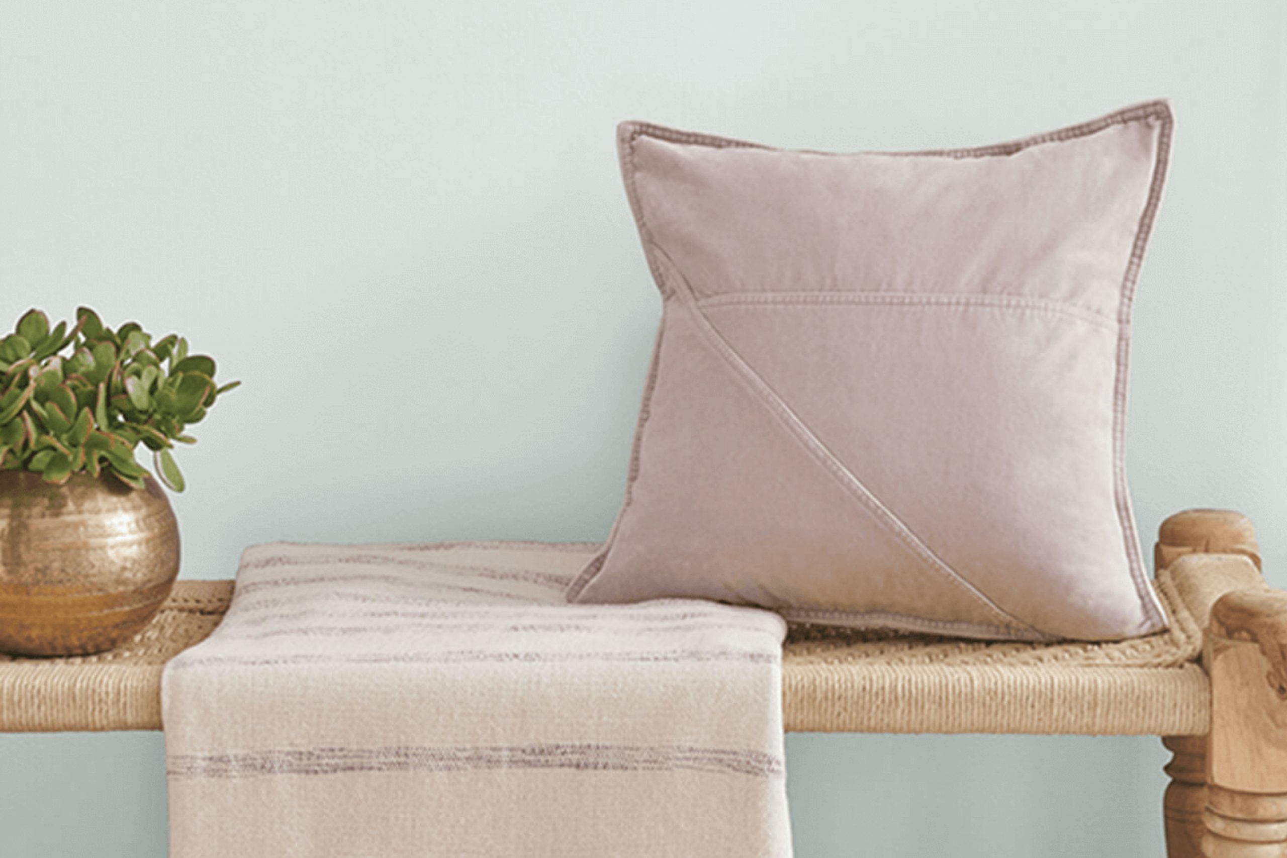
If you’re looking for a fresh paint color that fits easily into nearly any room in your home, SW 9631 Mantra by Sherwin Williams might be just the right pick. I recently decided to update a client’s living room and stumbled upon this subtle yet impressive hue. What stands out about SW 9631 Mantra is how easily it fits into different styles and parts of the home. It neither overpowers nor fades into the background, striking a perfect balance that enhances the room’s aesthetics without demanding constant attention.
This paint color is part of a palette inspired by minerals and fog, offering a soft, muted look that feels just right in rooms where you want a calm, settled mood. My experience using it on the walls was that it pairs wonderfully with both modern and traditional decor, bridging styles with its understated elegance.
Whether you’re updating an office, bedroom, or dining area, Mantra provides a fresh, clean look that feels contemporary and soothing at the same time. By choosing SW 9631 Mantra, you’ll find yourself with a backdrop that supports various furnishings and art pieces without clashing.
It’s ideal if you enjoy switching up your decor frequently, as it offers a consistent base that will complement a wide range of colors and textures.
What Color Is Mantra SW 9631 by Sherwin Williams?
The color Mantra by Sherwin Williams is a soft, muted shade of gray with a slight lavender undertone. This subtle color brings a calm and gentle mood to any room, making it easy to use in many different design styles. It is particularly effective in achieving a minimalist, modern aesthetic, due to its clean and uncomplicated nature.
Mantra works exceptionally well in contemporary interior styles, including Scandinavian and modern minimalist, where the focus is on simplicity and light. Its softness lets it blend easily with clean lines and simple decor, enhancing the feeling of openness and light in the room.
In terms of materials, this color pairs beautifully with natural wood tones, from light beech to rich walnut, adding warmth to the cool gray. It also looks stunning when matched with metallic finishes like matte silver or brushed nickel, providing a subtle contrast that is both modern and inviting. Textures like linen, cotton, and soft wool in neutral colors complement Mantra, adding depth and interest to the decor while maintaining a cohesive look.
This color’s usability extends to different areas of a home, from bedrooms, where its calming effect is ideal, to living rooms and kitchens, where its neutrality provides a perfect backdrop for both vibrant and subdued accents.
Is Mantra SW 9631 by Sherwin Williams Warm or Cool color?
Mantra SW 9631 by Sherwin Williams is a soft, balanced color — perfect for anyone wanting to give their home a fresh and welcoming feel. Its soft, neutral gray shade makes it easy to pair with a wide range of colors and decor styles. Whether you’re painting a bedroom, living room, or even a kitchen, Mantra can help create a harmonious atmosphere because of its subtle warmth.
This color works exceptionally well in homes because it acts almost like a chameleon. It can look slightly different depending on the lighting, sometimes appearing more as a cool tone and other times showing a bit of warmth. This flexibility makes it a great choice for any room, adapting easily to various lighting conditions throughout the day.
Mantra also has a calming effect, helping rooms feel more open and airy. It’s a great color for places where you want to relax or for rooms with little natural light, since it stays gentle and easy on the eyes.
Undertones of Mantra SW 9631 by Sherwin Williams
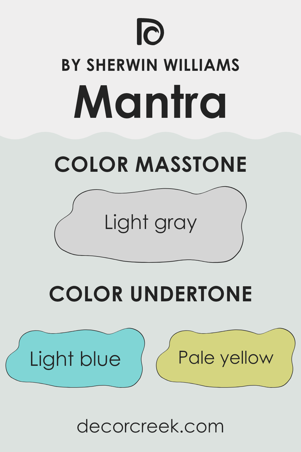
The paint color MantraSW 9631 by Sherwin Williams is a unique shade that may look simple at first glance but has complex undertones that influence its appearance in various lighting conditions and settings. These undertones include light blue, pale yellow, light purple, mint, lilac, pale pink, and grey.
Undertones are subtle colors that lie beneath the surface of the main color. They can greatly impact how we perceive the primary color, especially under different types of light or when placed next to other colors. Depending on the lighting, a color with grey undertones might look cooler, while a color with yellow undertones might appear warmer.
In the context of interior walls, the undertones of this paint can affect the mood and feel of a room. For example, light blue and mint undertones can give a fresh, calm feeling, making it ideal for a bedroom or bathroom. On the other hand, lilac and light purple can add a subtle touch of warmth and creativity, suitable for a living room or study.
Moreover, the combination of these undertones can help the paint adapt to different furniture and decor styles. Whether your room has natural light or relies on artificial lighting, the complex mixture of undertones in MantraSW 9631 will interact uniquely, ensuring the walls always offer something interesting to the eye. This play of undertones helps create a balanced and harmonious look throughout the room.
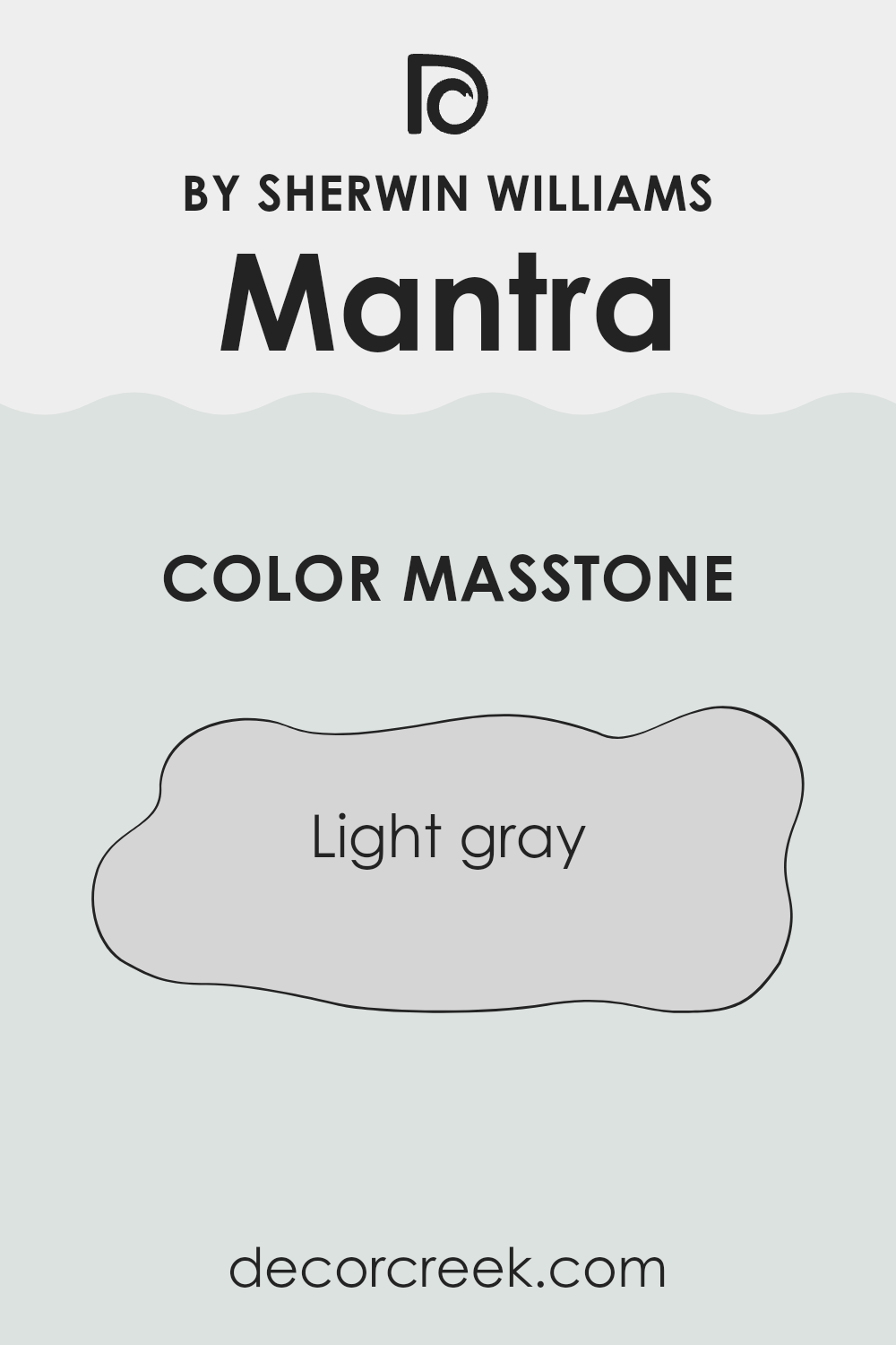
What is the Masstone of the Mantra SW 9631 by Sherwin Williams?
The color MantraSW 9631 by Sherwin Williams has a masstone of light gray, identified as #D5D5D5. This light gray shade is easy to use and fits well in many areas of the home. Its lightness gives a fresh and clean look, helping small rooms feel larger and more open.
This is particularly useful in areas like apartments or smaller rooms. The neutrality of light gray allows it to easily blend with different decor styles and colors, meaning you can add bold colors or keep things muted, and it will still look good.
It’s also practical for high-traffic areas since it can hide small marks or dirt better than a stark white. Additionally, this light gray offers a calm background, making it ideal for bedrooms or study areas where you want a peaceful atmosphere without the room feeling too cold or stark.
How Does Lighting Affect Mantra SW 9631 by Sherwin Williams?
Lighting plays a crucial role in how we perceive colors. Depending on the type of light, a color can appear differently. Natural light shifts throughout the day in brightness and temperature, affecting how a color looks. Mantra, a soft and subtle gray-tone from Sherwin Williams, exhibits varying shades under different lighting conditions.
In natural light, the truest color of Mantra is visible. In a room with plenty of sunlight, like one facing south, Mantra will show its bright side, making the room feel airy and open. The warm light enhances the color, softening it and preventing it from looking too cool or stark, giving the room a pleasant atmosphere.
North-facing rooms, however, get less direct sunlight and more of a cooler, bluish light, which can make colors appear slightly darker and more muted. Under these conditions, Mantra takes on a deeper, softer look that can make the room seem more compact and cooler in tone.
Rooms facing east receive the morning light, which is usually bright and warm. Here, Mantra will appear softer in the morning, providing a calming effect, which might be especially enjoyable in bedrooms or breakfast nooks to start the day gently.
Conversely, west-facing rooms capture the late afternoon and evening light that can introduce a golden hue. This might make Mantra appear warmer towards the end of the day, aligning with a cozy setting as the sun sets.
Artificial light, such as LED or incandescent bulbs, also affects how Mantra is seen. LEDs, which have a bluish tint, can make Mantra appear cooler, which might make a room feel more formal or stark. Incandescent bulbs, with their warm yellow glow, make Mantra appear cozier and more inviting — a great fit for living rooms or dining areas where you want a warmer feel.
Understanding these lighting effects can help in deciding where to paint Mantra to best suit the room’s function and ambiance.
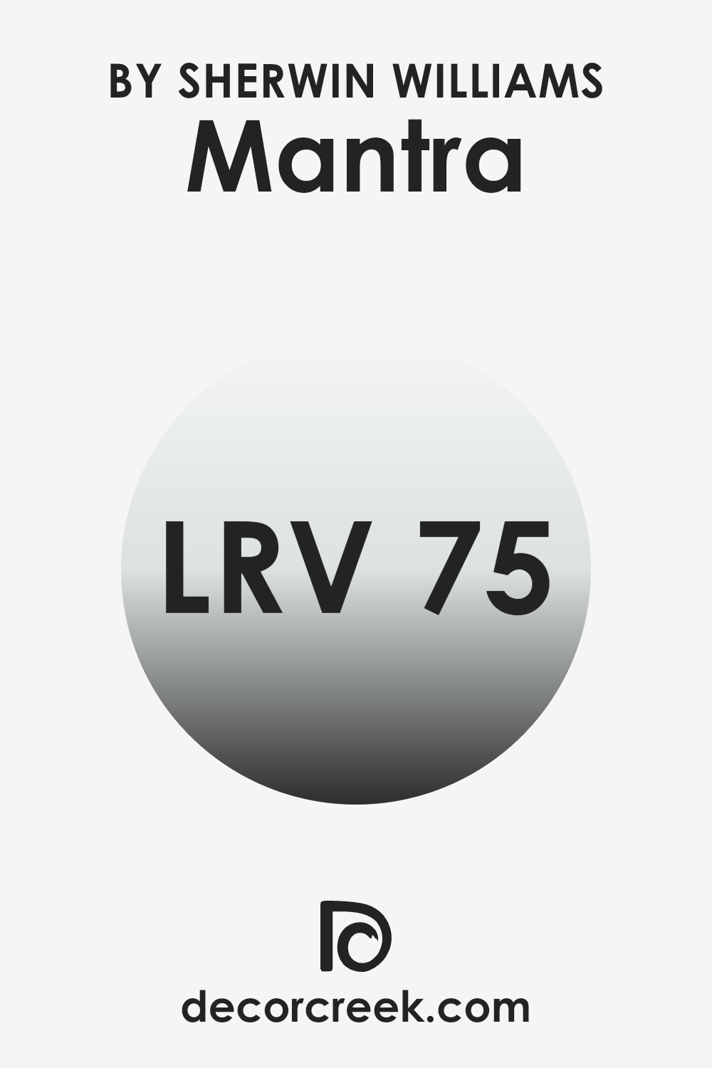
What is the LRV of Mantra SW 9631 by Sherwin Williams?
LRV stands for Light Reflectance Value, a measure indicating the amount of light a paint color reflects or absorbs when light hits it. Measured on a scale where lower values mean the color absorbs more light and higher values reflect more light. This value is crucial when choosing paint because it affects how light or dark a color appears on your walls.
A color with a high LRV makes a room feel brighter and more open because it reflects more light. Conversely, colors with low LRV can make a room feel cozier, but also smaller and darker since they absorb more light.
For the color with an LRV of 75.045, it falls into the higher range of the scale, meaning it reflects a good amount of light. In practical terms, this can make a room painted in this color feel airy and more spacious. The light reflection can also help in reducing the need for artificial lighting during the day, which can be beneficial in saving energy.
However, if the room gets plenty of natural light, using a high LRV color might sometimes make it feel too bright. This value suggests that the paint would be a good choice for making smaller or darker rooms appear larger and more inviting.
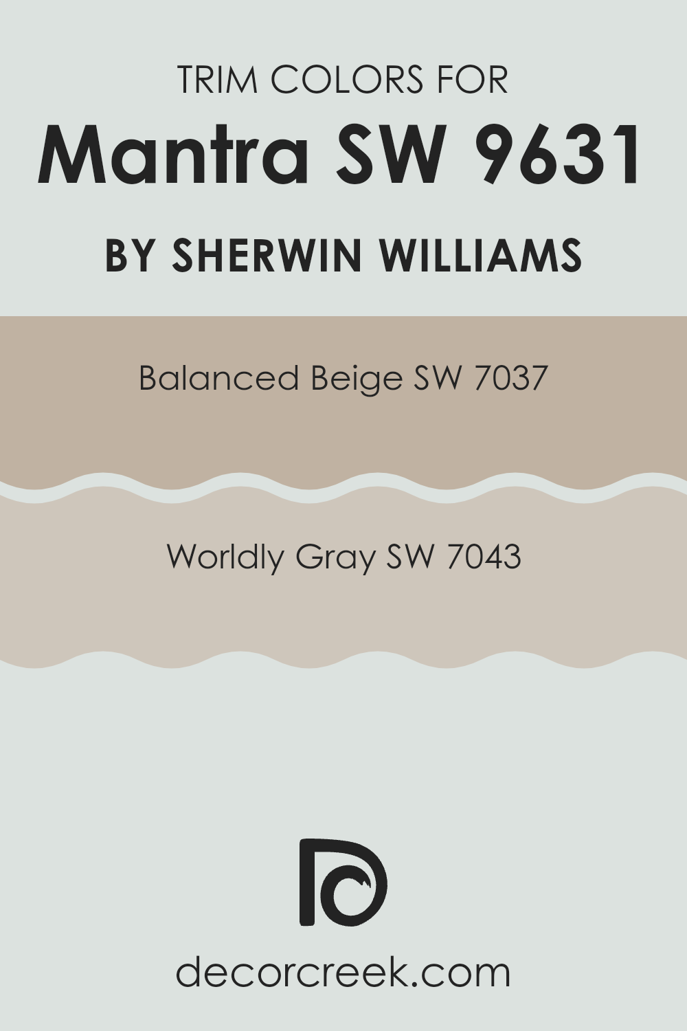
What are the Trim colors of Mantra SW 9631 by Sherwin Williams?
Trim colors play an essential role in accentuating the architectural details of a room, such as door frames, moldings, and baseboards. By using contrasting or complementary trim colors, you can enhance the overall look of the room and highlight details that might otherwise be overlooked.
For example, choosing Balanced Beige SW 7037 as a trim color alongside a neutral wall shade like Mantra from Sherwin Williams can create a soft contrast that brings out the room’s details without making it feel too bold.
Similarly, Worldly Gray SW 7043 offers a slightly darker but still harmonious option for trim, providing a gentle yet defined contrast that highlights the room’s structure.
Balanced Beige SW 7037 is a warm, welcoming color that adds a light, airy feel to the trim, making it a popular choice for creating a cozy and inviting atmosphere.
The hue blends easily with many other colors, offering a soft, neutral canvas that supports different decor styles. On the other hand, Worldly Gray SW 7043 is a medium gray that provides a modern and clean look.
This color is ideal for contemporary rooms, offering a crisp border that frames the walls nicely and gives the design a finished, polished feel. Both shades are practical choices that bring just the right amount of interest without pulling attention away from the main color.
You can see recommended paint colors below:
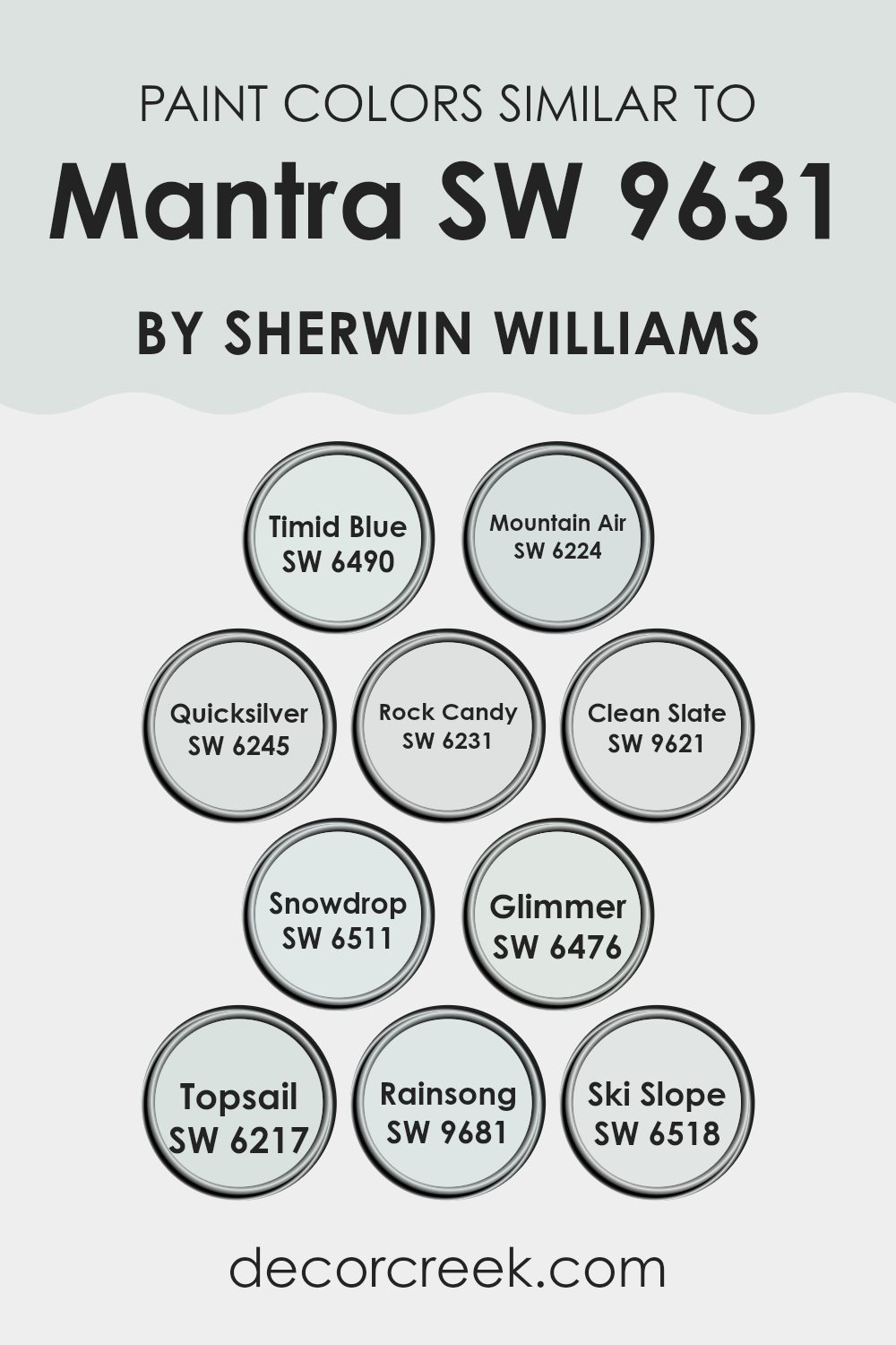
Colors Similar to Mantra SW 9631 by Sherwin Williams
Selecting similar colors when decorating can make the whole room feel more pulled together and visually balanced. Using colors like Mantra and its similar shades helps in achieving a harmonious and cohesive look. Such colors blend effortlessly with each other because they share similar tones or undercurrents. These similarities allow the colors to complement rather than compete with each other, creating a soothing and cohesive environment.
For example, Timid Blue provides a subtle hint of soft blue that is gentle to the eyes, perfect for creating a calming effect in an area meant for relaxation. Mountain Air has a fresh and airy quality that can lighten a room’s atmosphere instantly.
Quicksilver is a muted silver that works well as a neutral base, offering versatility in decor choices. Rock Candy introduces a light grey that can serve as a soft backdrop, making it great for minimalist designs. Clean Slate shows off a slightly deeper grey providing a contrasting but still harmonious blend with lighter tones. Snowdrop is a gentle white with a fresh, clean feel — perfect for brightening up any room. Glimmer offers a hint of shine to its light green hue, adding a touch of quiet luster. Topsail brings a breezy quality with its pale blue, reminiscent of a calm sea.
Rainsong stands out with a deeper, mist-like quality that adds depth. Ski Slope, on the other hand, offers a cool white that creates a crisp, fresh look — great for making a room feel more open. Using these similar shades helps everything feel connected and intentional, adding to the overall visual harmony.
You can see recommended paint colors below:
- SW 6490 Timid Blue
- SW 6224 Mountain Air
- SW 6245 Quicksilver
- SW 6231 Rock Candy
- SW 9621 Clean Slate
- SW 6511 Snowdrop
- SW 6476 Glimmer
- SW 6217 Topsail
- SW 9681 Rainsong
- SW 6518 Ski Slope
How to Use Mantra SW 9631 by Sherwin Williams In Your Home?
Mantra SW 9631 by Sherwin Williams is a soft, adaptable paint color that works beautifully in many parts of the home. This shade can create a peaceful and welcoming atmosphere, making it perfect for living rooms and bedrooms. Its neutral tone serves as an excellent base, allowing you to decorate with various colors and styles of furniture without the walls clashing with your choices.
If you’re thinking about refreshing your kitchen or bathroom, Mantra can also be a great choice. This color pairs well with both wooden finishes and modern materials, helping the room feel fresh and clean. Furthermore, its calming effect is perfect for creating a relaxing bathroom environment, where you can relax in the bath after a long day.
Another idea is to use Mantra in your home office. A neutral wall color like this can help to keep you focused and free from distractions, boosting your productivity.
This color pairs well with both wooden finishes and modern materials, helping the room feel fresh and clean.
Mantra SW 9631 by Sherwin Williams vs Topsail SW 6217 by Sherwin Williams
Mantra and Topsail from Sherwin Williams each bring soft, unique tones that work well in a variety of rooms.Mantra is a soft, muted gray that can create a calm, soothing backdrop in any room. It pairs well with both bright colors and neutrals, which makes it easy to decorate with in many different styles.
On the other hand, Topsail is a lighter shade, tending towards a pale blue or aquamarine, which gives it a breezy and fresh feel. It’s particularly good for bathrooms and bedrooms where you want to instill a sense of freshness and calmness.
Both colors are quite understated and are excellent choices for creating a relaxing environment. However, while Mantra leans more toward a classic gray, Topsail brings in a hint of soft color that can make smaller rooms feel brighter and more open.
You can see recommended paint color below:
Mantra SW 9631 by Sherwin Williams vs Mountain Air SW 6224 by Sherwin Williams
Mantra is a soft, muted gray with subtle blue undertones that creates a calm and soothing backdrop for any room. This color works beautifully with both bright and neutral shades, making it a great choice for living rooms or bedrooms where you want a calm, peaceful feel.
On the other hand, Mountain Air is a lighter, airy color with a crisp feel to it. It leans more towards a fresh, pale blue that resembles a clear sky on a sunny day. This color works well in rooms where you want to add a bit of brightness, helping the area feel more open and spacious.
Together, these colors complement each other beautifully. Mantra offers depth and grounding, while Mountain Air brings in lightness and a refreshing vibe. This combination can create a layered visual interest in your home, balancing cool tones that are both inviting and relaxing.
You can see recommended paint color below:
Mantra SW 9631 by Sherwin Williams vs Timid Blue SW 6490 by Sherwin Williams
Mantra by Sherwin Williams is a subtle, muted shade that leans toward gray with a hint of taupe — an easy, understated choice that works well in any room. It gives a calm and neutral backdrop, suitable for complementing various decor styles.
In contrast, Timid Blue is a soft, pastel blue that brings a light and airy feel to any room. This color is more suggestive of clear skies and has a refreshing vibe, which can make a room feel more open and cheerful.
While Mantra is more neutral and blends seamlessly with other colors, Timid Blue stands out a bit more and adds a gentle pop of color. Both colors are excellent for creating a relaxed atmosphere, but your choice would depend on whether you prefer the discreet elegance of a neutral or the cheerful lightness of a pale blue.
You can see recommended paint color below:
- SW 6490 Timid Blue
Mantra SW 9631 by Sherwin Williams vs Snowdrop SW 6511 by Sherwin Williams
Mantra and Snowdrop, both from Sherwin Williams, provide distinct vibes for different decorating needs. Mantra, a deeper, subtle gray, brings a grounding and calming effect — perfect for cozy, welcoming rooms like living areas or bedrooms. This color can serve as a strong base, setting off brighter decor or furniture.
On the other hand, Snowdrop is a lively, very light aqua that has a freshness to it, ideal for bathrooms or kitchens where a clean, airy feeling is desirable.It pairs well with both light and dark accents, helping smaller rooms feel more open and bright.
When placed side by side, Mantra acts as a neutral foundation, while Snowdrop provides a hint of playful energy. Both colors can work beautifully together across a house, maintaining a balanced, modern look with just the right amount of contrast.
You can see recommended paint color below:
- SW 6511 Snowdrop
Mantra SW 9631 by Sherwin Williams vs Quicksilver SW 6245 by Sherwin Williams
Mantra and Quicksilver, both from Sherwin Williams, are quite different in their appearances. Mantra is a soft, neutral gray with a hint of blue, which gives it a calm and soothing presence. This color is easy to work with and fits nicely in bedrooms or living rooms where you want a relaxed, comfortable feel. It pairs nicely with bolder colors or works beautifully on its own for a minimalistic look.
On the other hand, Quicksilver is a lighter and cooler gray that leans slightly towards silver, providing a crisper look. It gives any room a brighter feel, which makes it a great choice for kitchens and bathrooms where a fresh, airy look is welcome. Quicksilver also fits nicely into modern decor and can help smaller rooms feel more open.
Both colors reflect light differently, with Quicksilver giving off a more luminous effect while Mantra offers a deeper, more muted reflection. Depending on the lighting and the room, each one can noticeably shift the mood and overall look of the interior.
You can see recommended paint color below:
Mantra SW 9631 by Sherwin Williams vs Rainsong SW 9681 by Sherwin Williams
The color Mantra from Sherwin Williams is a subtle and light gray shade that gives off a soft, muted feel. It’s perfect for rooms where you want a calm, understated elegance. This color works nicely with many decor styles, which makes it easy to use in different parts of the home.
On the other hand, Rainsong by Sherwin Williams is also a gray, but it carries a slightly different tone. Rainsong is darker and has hints of blue, creating a cooler ambiance in comparison to Mantra. This color is great for adding a little more depth and character to a room without making it feel too intense or heavy.
Both colors work well in modern homes and can complement each other nicely. Mantra could be used in brighter, more open rooms, while Rainsong works well on accent walls or in smaller areas, adding richness and variety to the home’s overall palette.
You can see recommended paint color below:
Mantra SW 9631 by Sherwin Williams vs Glimmer SW 6476 by Sherwin Williams
The main color, Mantra, and the second color, Glimmer, by Sherwin Williams, offer distinct tones that can significantly affect the mood and style of a room. Mantra is a soft, muted gray with hints of blue and green.
It’s subtle and can be used in rooms to create a peaceful and calm atmosphere. Meanwhile, Glimmer is a light, airy aqua that is brighter and gives off a fresh, uplifting vibe. This makes it perfect for rooms where you want to bring in a bit of lightness and cheer.
When comparing these two, Mantra gives off a more muted, calm look — a great choice if you want something refined without drawing too much attention. On the other hand, Glimmer works well when you want to make a room feel more open and bright. Both colors have their own charm and can be used effectively depending on the mood you want to create in the room.
You can see recommended paint color below:
Mantra SW 9631 by Sherwin Williams vs Ski Slope SW 6518 by Sherwin Williams
Mantra is a soft, muted neutral gray that provides a calm and soothing feel to any room. It pairs well with both vibrant and subdued shades, so it’s easy to use across different decor styles. Mantra serves as an excellent backdrop that allows other elements in the room to stand out.
In contrast, Ski Slope is a cooler, lighter gray with hints of blue. It has a fresh, airy vibe that can make small rooms feel larger and brighter. Ski Slope is ideal for creating a crisp, clean look in a room, especially in places like bathrooms or kitchens where a brighter environment is preferred.
Both Mantra and Ski Slope bring their own character to a room, each serving a different purpose depending on their tones and the mood you want to create.
You can see recommended paint color below:
- SW 6518 Ski Slope
Mantra SW 9631 by Sherwin Williams vs Clean Slate SW 9621 by Sherwin Williams
The main color, Mantra by Sherwin Williams, is a soft, pale gray with a hint of lavender. This color is very light and brings a gentle, calming feel to any room. It’s ideal for creating a peaceful and understated atmosphere in areas such as bedrooms or living rooms where relaxation is a priority.
On the other hand, Clean Slate, also by Sherwin Williams, is a darker shade presenting a cool, deep gray with blue undertones. This color offers a stronger visual impact and can add a sense of depth and definition when applied to walls. It works well in high-traffic areas or as an accent wall to make certain features of a room stand out.
Both colors belong to the gray family but cater to different aesthetic needs and moods. While Mantra brings a lighter, airy feel, Clean Slate provides depth and a marshaling tone, making them suitable for various design preferences.
You can see recommended paint color below:
Mantra SW 9631 by Sherwin Williams vs Rock Candy SW 6231 by Sherwin Williams
Mantra by Sherwin Williams is a subtle, muted gray that offers a calm, understated backdrop for any room. It has a hint of blue-green undertone, giving it a fresh feel that works well with many different décor styles. On the other hand, Rock Candy by Sherwin Williams is a brighter and lighter gray.
It almost leans toward a soft white with just a hint of cool gray, making it ideal for rooms where you want to boost natural light. When comparing the two, Mantra is deeper and more noticeable, while Rock Candy is more neutral and can easily blend into the background.
Both colors are suitable for modern homes, but Mantra provides a bit more character and presence, whereas Rock Candy is perfect for creating a clean, airy feel. They can work nicely together, with Rock Candy serving as a light contrast to the richer tones of Mantra.
You can see recommended paint color below:
As I wrap up my thoughts on SW 9631 Mantra by Sherwin Williams, I see why it’s so popular. This paint color is not just another shade; it’s like a quiet friend that makes any room feel calm and cozy. From living rooms to bedrooms, this color fits right in without shouting for attention. What makes Mantra special is how it changes with the light, looking a bit different from morning to night, which keeps things interesting.
For anyone thinking about giving their room a new look, Mantra is a smart pick. It’s like the comfy jeans of paint colors—easy to match with almost anything and always making you feel at home. Whether you want a background that lets your furniture and art stand out, or just a lovely color that makes you feel good, Mantra can do that.
After using it in my own home, I feel it makes rooms feel bigger and brighter without trying too hard. It’s smooth, and soft, and doesn’t get too dark or too light. That’s a big win in my book.
So, for anyone looking for a paint color that’s easy to live with and always looks nice, I’d say go for Mantra by Sherwin Williams. You’ll see how it makes your home feel just right.
Ever wished paint sampling was as easy as sticking a sticker? Guess what? Now it is! Discover Samplize's unique Peel & Stick samples.
Get paint samples

