Selecting the right paint color for your home can often feel stressful with so many options available. If you’re considering Sherwin Williams SW 6533 Mild Blue, here are some essential insights to help you make a well-informed decision. As someone who has spent a lot of time analyzing and comparing paint shades, I’ll guide you through what makes Mild Blue different from other colors.
Firstly, understand that SW 6533 Mild Blue is a unique shade that offers a soothing and gentle feel to any room. Its subtle undertones can significantly impact the ambiance, depending on the lighting and surrounding colors. It’s crucial to test this color in different areas of your room at various times of the day. This way, you can see how the shifting natural light affects its appearance.
In my experience, pairing accessories and furniture with Mild Blue is enjoyable yet challenging. The right combinations can highlight its beauty, whereas mismatched elements might clash. Pay attention to color temperatures and themes in your existing decor to ensure a harmonious blend.
By sharing these tips, I hope to simplify your painting process and help you feel confident in your choice if you go with SW 6533 Mild Blue.
Is Mild Blue SW 6533 Right for My Home?
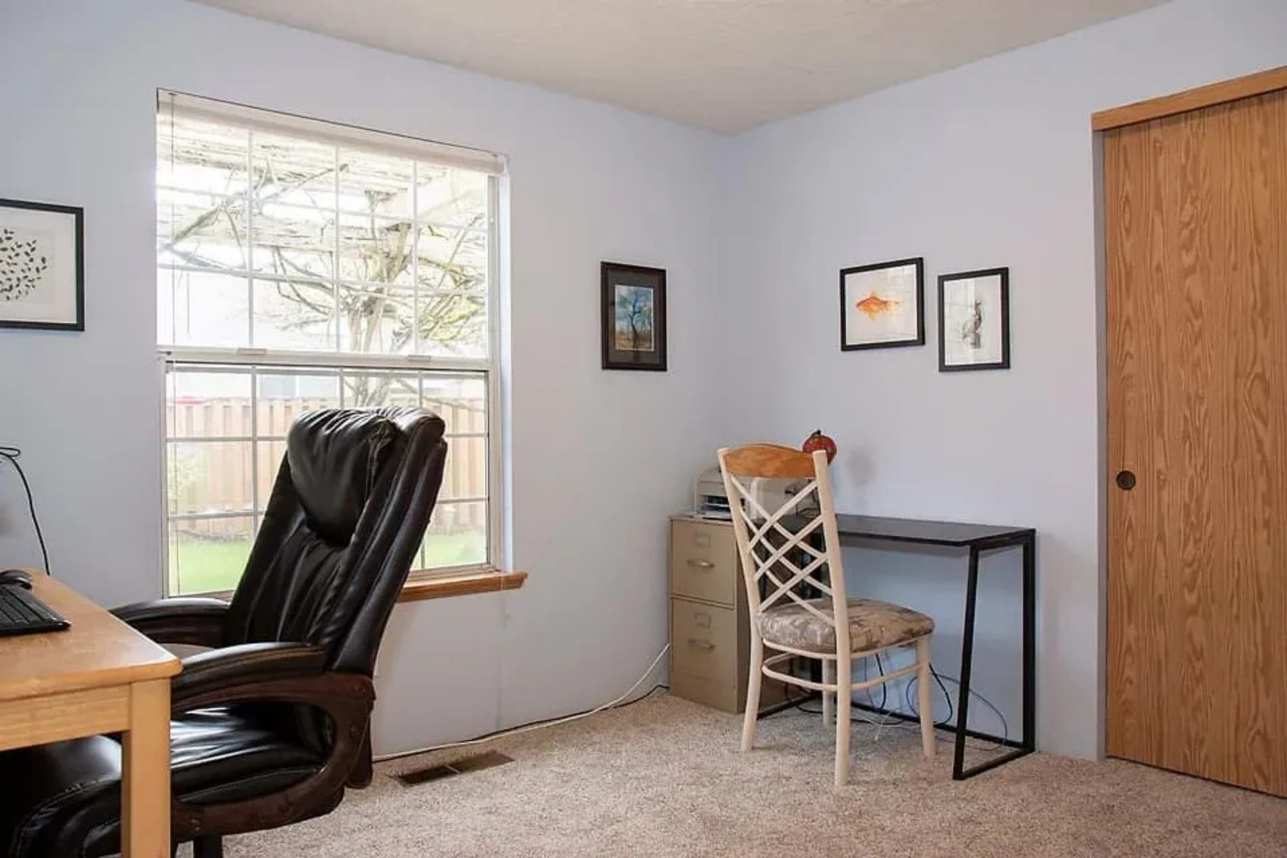
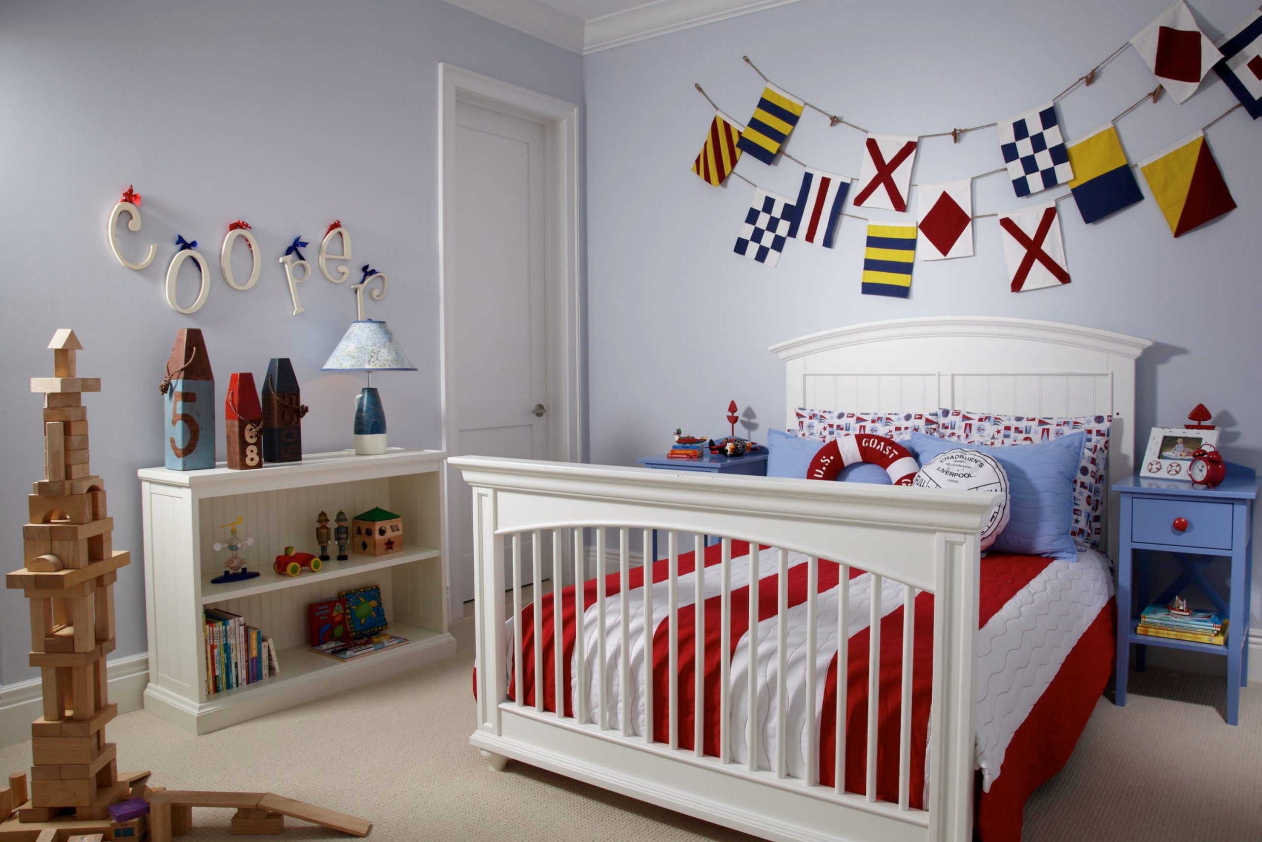
I recently came across a wonderful paint color called Mild Blue by Sherwin Williams. It’s a gentle, soft blue that has a hint of warmth, which makes it incredibly adaptable for decorating any room. In terms of interior styles, it’s perfect for creating a cozy, inviting atmosphere in rooms designed with Scandinavian or modern minimalism in mind. It also fits beautifully in cottages or beach-style homes.
What I love about this color is how well it goes with different materials and textures. Mild Blue pairs particularly well with natural wood, from light pine to rich walnut, highlighting the earthiness with a subtle contrast.
It also looks fantastic with white trim or furniture, which helps to make the blue stand out and keeps the room looking bright and airy. For textiles, I would suggest using linens and soft cottons to keep the feel relaxed and comfortable.
I’ve used this color in a bedroom with plush throws and textured pillows, and it created a wonderfully cozy retreat. Besides, it’s also a great choice for bathrooms or kitchens, where it can make the room feel clean and fresh. Overall, it’s a lovely, flexible color that brings a fresh feeling wherever it’s used.
decorcreek.com
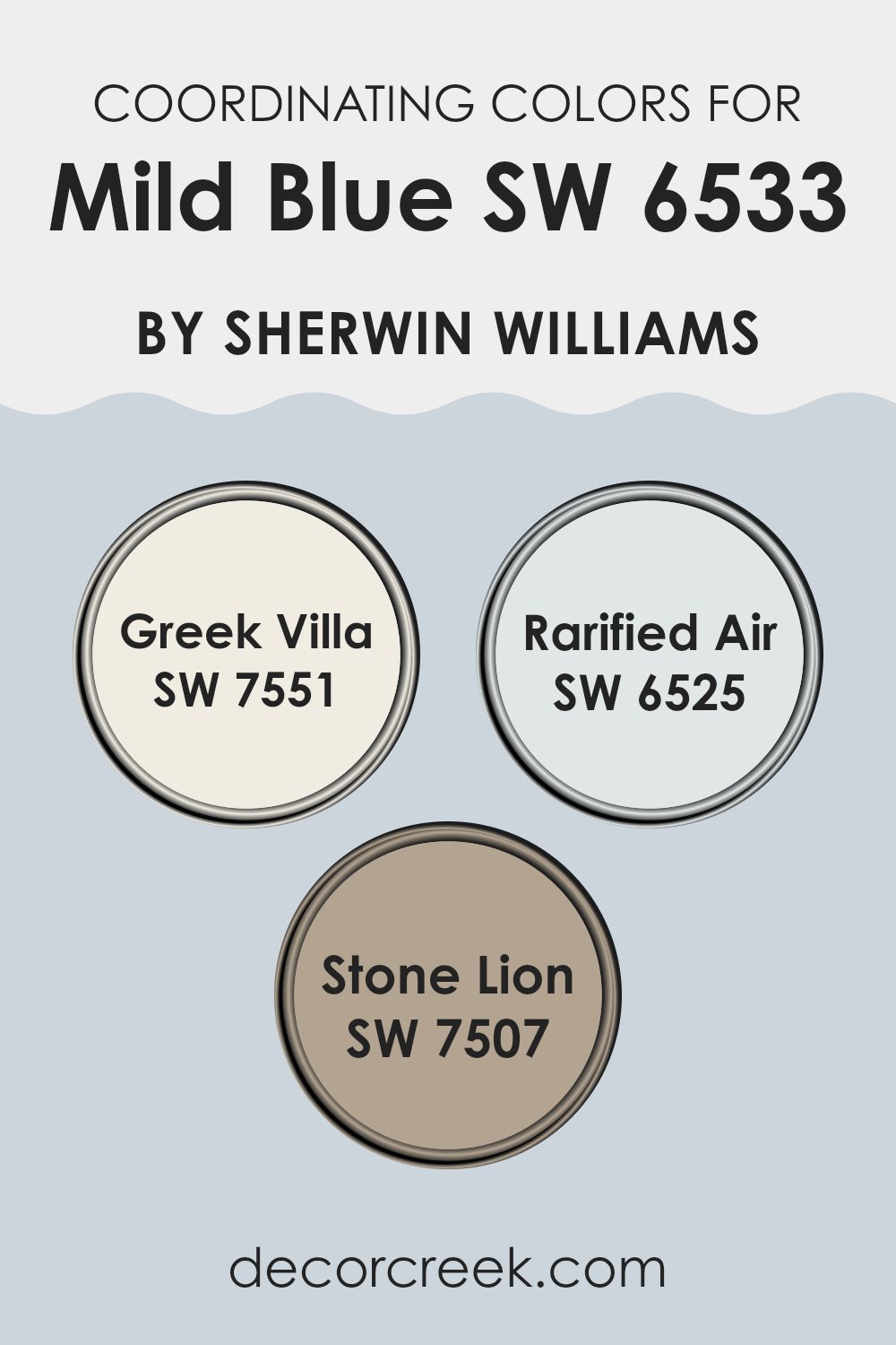
Best Coordinating Colors to use with Mild Blue SW 6533 by Sherwin Williams this year.
Coordinating colors work together to create a harmonious and appealing color scheme in any room, enhancing the primary color choice without overpowering it. In the case of a soft hue like Mild Blue from Sherwin Williams, suitable coordinating colors are essential to complement its gentle tones. Colors such as Greek Villa, Rarified Air, and Stone Lion are great choices that will achieve this balance.
Greek Villa is a soft, warm white that provides a clean backdrop, highlighting the freshness of Mild Blue while adding a subtle warmth to the overall ambiance. Rarified Air is a light and airy shade, slightly cooler than Mild Blue, that can help to maintain a light and breezy atmosphere in the room.
Lastly, Stone Lion is a deeper, earthy tone that offers a striking contrast without clashing, anchoring the lighter shades and adding depth and interest to the room. These colors collectively work to create an environment that feels cohesive and thoughtfully designed.
You can see recommended paint colors below:
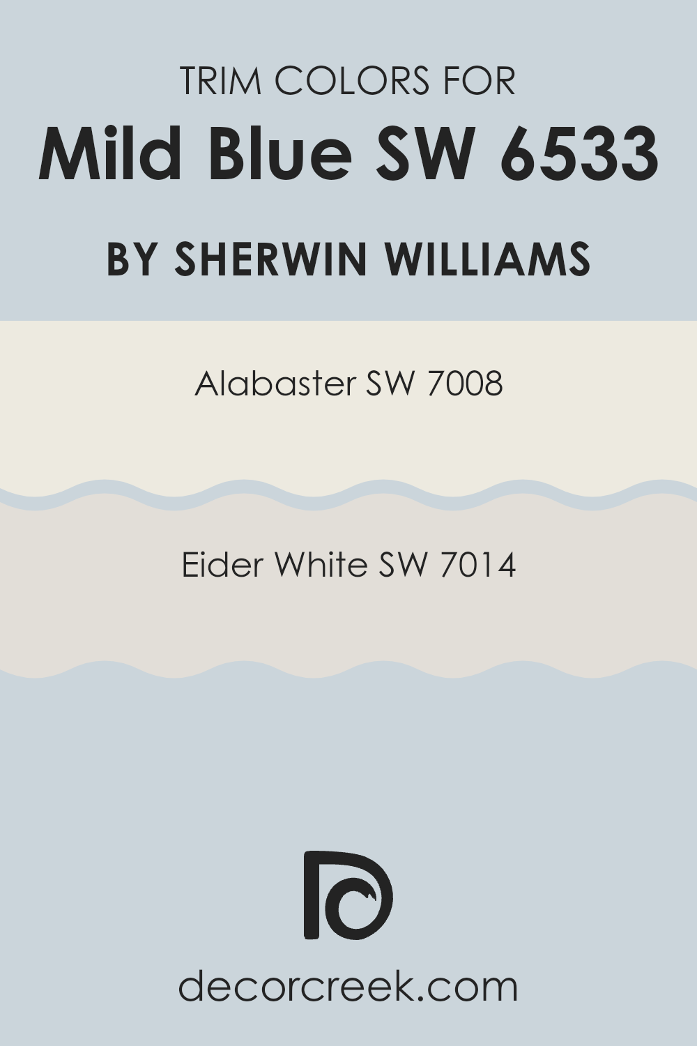
Trendy Trim Colors of Mild Blue SW 6533 by Sherwin Williams to use this year.
Trim colors are chosen to complement the main wall colors in a home, like Mild Blue by Sherwin Williams, to enhance the aesthetics and highlight architectural details. Using contrasting trim colors can accentuate moldings, window frames, and doors, making them stand out against the more dominant wall color. For example, a lighter trim color like Alabaster or Eider White can help create a clean and defined border around the edges of a room painted in Mild Blue, drawing attention to the shapes and features of the room.
Sherwin Williams’ Alabaster SW 7008 is a warm and creamy white that offers a soft contrast when paired with cooler tones such as Mild Blue. Its gentle shade is perfect for creating a subtle yet striking definition around room features without overpowering the primary color.
Eider White SW 7014, on the other hand, has a slightly grayer tone, providing a softer transition between the wall color and the trim. This color is ideal for those who prefer a hint of contrast that is not too stark but still noticeable, bringing a gentle lift to the overall room atmosphere.
You can see recommended paint colors below:
- SW 7008 Alabaster
- SW 7014 Eider White
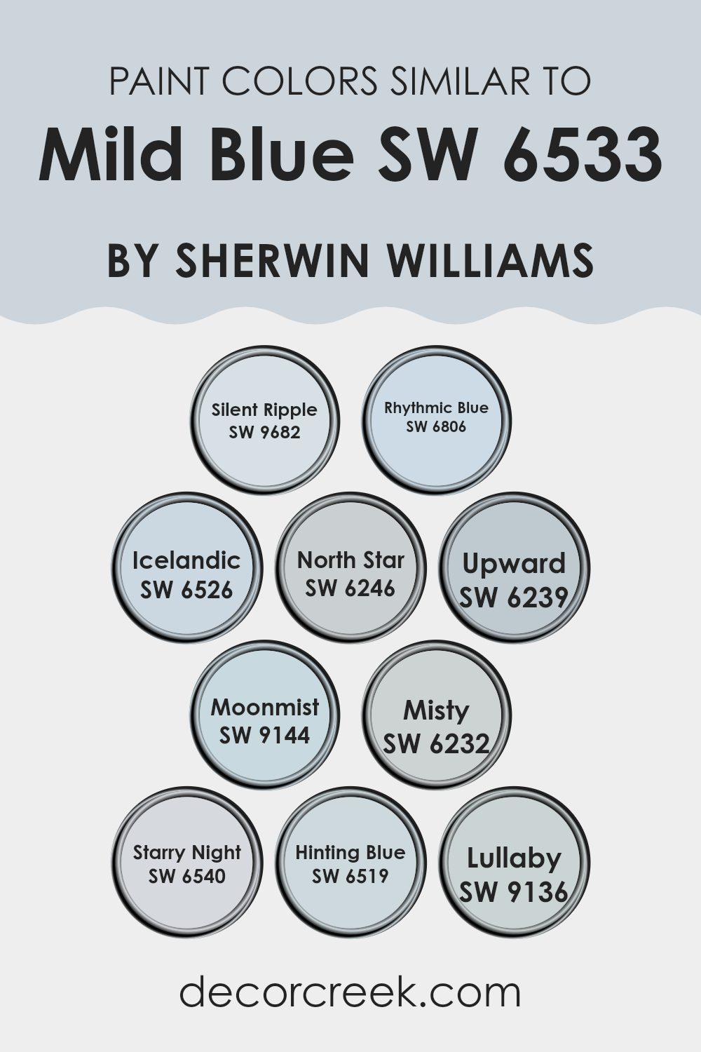
Evergreen Colors Similar to Mild Blue SW 6533 by Sherwin Williams
Choosing similar colors is essential in design for creating a cohesive and harmonious look. Colors that share a common hue or saturation level pair well together and give a room a unified appearance. For instance, Silent Ripple is a gentle color that evokes the quiet movement of water and complements Mild Blue beautifully. Rhythmic Blue, slightly deeper, brings a subtly vibrant energy that pairs beautifully with milder blues. Icelandic, a cool, airy shade, draws on the softness of cloudy skies, blending naturally with similar hues.
Additionally, colors like North Star offer a hint of gray, working as a perfect neutral base that enhances the depth and variation of blues. Upward, another soothing shade, employs a light touch of blue to brighten any room with a hint of freshness. Moonmist carries a dusky blue tone, full of gentle mystery, ideal for peaceful settings.
Misty, true to its name, introduces a soft, ethereal quality that highlights the beauty of similar colors. Starry Night, richer and deeper, makes a bold statement yet remains in harmony with its lighter counterparts. Hinting Blue provides a subtle touch of color, whereas Lullaby offers a soothing whisper of blue, promising a restful ambiance. Each of these colors, in its own way, maintains balance and blends smoothly with others in the spectrum, enhancing the overall aesthetic without overpowering it.
You can see recommended paint colors below:
- SW 9682 Silent Ripple
- SW 6806 Rhythmic Blue
- SW 6526 Icelandic
- SW 6246 North Star
- SW 6239 Upward
- SW 9144 Moonmist
- SW 6232 Misty
- SW 6540 Starry Night
- SW 6519 Hinting Blue
- SW 9136 Lullaby
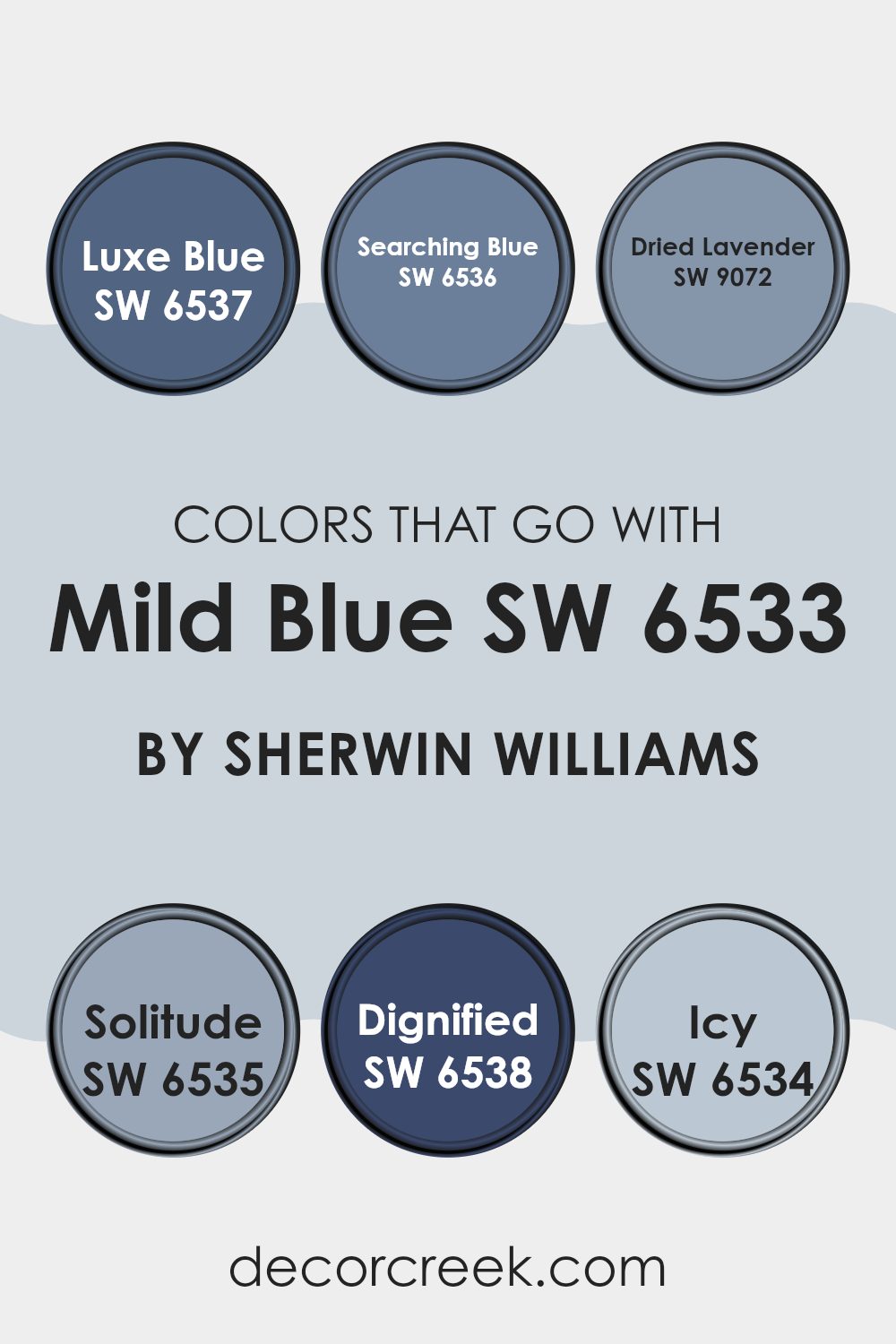
Colors that Go With Mild Blue SW 6533 by Sherwin Williams
Choosing complementary colors for Mild Blue SW 6533 by Sherwin Williams is essential because they can enhance the main color, bringing harmony and balance to any room. When paired thoughtfully, these colors can create visually appealing environments that are pleasing to the eye.
Colors like Luxe Blue and Searching Blue offer slight variations that can add depth or provide a monochromatic look. Luxe Blue is a deeper, more intense shade, ideal for creating a strong focal point or adding contrast. Searching Blue is similar but has a subtler, softer hue which works well for a gentle, understated presence.
Other colors such as Dried Lavender and Solitude offer a chance to introduce a different hue while maintaining harmony. Dried Lavender adds a touch of purple that can make the room feel more dynamic without overpowering the soothing quality of Mild Blue.
Solitude, on the other hand, is a light, airy blue that can brighten the atmosphere, making a room feel more open and relaxed. Additionally, Dignified and Icy both provide unique touches; Dignified is a robust, commanding color that can anchor a room, while Icy offers a crisp, clean feel that can refresh any room. Together, these color choices can create a cohesive and inviting environment.
You can see recommended paint colors below:
- SW 6537 Luxe Blue
- SW 6536 Searching Blue
- SW 9072 Dried Lavender
- SW 6535 Solitude
- SW 6538 Dignified
- SW 6534 Icy
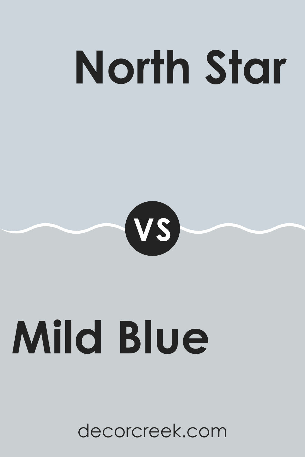
Mild Blue SW 6533 by Sherwin Williams vs North Star SW 6246 by Sherwin Williams
Mild Blue and North Star, both by Sherwin Williams, offer distinct shades for different decorating needs. Mild Blue is a vibrant yet soft blue that can make a room feel fresh and lively. This particular shade pairs well in rooms that benefit from a cheerful and welcoming tone, such as kitchens or children’s rooms.
On the other hand, North Star is a much subtler color. It leans more toward a neutral gray with just a hint of blue, making it adaptable for use in many areas of a home. It’s particularly effective in creating a calm, understated look that works beautifully in bedrooms and living rooms.
While Mild Blue brings more energy and brightness to a room, North Star offers a quiet backdrop that complements various design elements. Choosing between them depends on whether you want a color that stands out or one that blends naturally with other decor.
You can see recommended paint color below:
- SW 6246 North Star
Mild Blue SW 6533 by Sherwin Williams vs Hinting Blue SW 6519 by Sherwin Williams
Mild Blue and Hinting Blue, both from Sherwin Williams, are subtly different shades that can impact the mood of a room in their own unique ways. Mild Blue is a soft, gentle blue with a slightly muted tone that makes it perfect for creating a calm and inviting atmosphere. It’s a flexible color that works well in various rooms, helping to keep the environment peaceful without feeling too cold.
On the other hand, Hinting Blue is lighter and has a fresher feel. It carries a hint of gray which gives it a crisp, clean appearance, making it ideal for modern rooms that aim for a bright and airy look. This color can make small rooms appear larger and more open, adding a touch of freshness without being too bold.
Choosing between them depends on the desired effect: for a cozier feel, go with Mild Blue; for a brighter, more open room, choose Hinting Blue. Both colors offer subtle beauty that can enhance any room.
You can see recommended paint color below:
Mild Blue SW 6533 by Sherwin Williams vs Moonmist SW 9144 by Sherwin Williams
Mild Blue and Moonmist are two different paint colors by Sherwin Williams that offer unique vibes for any room. Mild Blue is a gentle, soft blue with a calming effect, perfect for creating a peaceful atmosphere in rooms like bedrooms or bathrooms. It’s light enough to make small rooms appear bigger and has a fresh, clean feel.
On the other hand, Moonmist is a cooler, grayish tone that also brings a sense of calm but with a more muted, understated quality. It’s adaptable, working well in both modern and traditional settings, and is great for areas where you want a neutral background that still offers a hint of color.
Both colors are light and airy, but Mild Blue leans toward a clearer blue, while Moonmist has a touch of gray, making it more subdued. Each color provides a different mood, with Mild Blue being slightly warmer and Moonmist presenting a cooler tone. Either choice would work well depending on the effect you want to achieve in your room.
You can see recommended paint color below:
Mild Blue SW 6533 by Sherwin Williams vs Starry Night SW 6540 by Sherwin Williams
Mild Blue and Starry Night, both by Sherwin Williams, offer distinct vibes for any room. Mild Blue is soft and has a light, airy feel, perfect for creating a relaxed environment.
It’s a subtle color that works well in rooms meant for calm, like bedrooms or bathrooms. On the other hand, Starry Night is a much deeper and vibrant shade.
This color adds a bold touch and is great for making a statement, whether as an accent wall or in a room used for entertainment. While Mild Blue is gentle and understated, Starry Night stands out and can bring energy to a room. Choosing between them depends on the mood you’re going for—calm and gentle or bold and lively.
You can see recommended paint color below:
- SW 6540 Starry Night
Mild Blue SW 6533 by Sherwin Williams vs Upward SW 6239 by Sherwin Williams
Mild Blue and Upward, both from Sherwin Williams, offer distinct vibes for any room. Mild Blue is a soft, soothing color that leans toward a cheerful sky blue.
It’s light enough to make small rooms feel larger and airy. On the other hand, Upward is a cooler shade, almost like a gentle gray with hints of blue. This color is great for a modern look and works well in rooms that aim for a subtle, more understated charm.
While Mild Blue adds a bright and fresh feel, making it perfect for a lively living room or a kid’s bedroom, Upward suits areas where you want calmness, like a home office or a bedroom. Both colors pair well with whites and grays for a clean, minimal look. Choosing between them depends on whether you want the warmth and light of Mild Blue or the cooler, soothing tones of Upward.
You can see recommended paint color below:
Mild Blue SW 6533 by Sherwin Williams vs Silent Ripple SW 9682 by Sherwin Williams
Mild Blue and Silent Ripple, both by Sherwin Williams, offer distinct vibes for any room. Mild Blue is a soft, gentle blue with a refreshing feel, ideal for creating a calming atmosphere. It’s light enough to keep rooms feeling airy yet has enough depth to add character.
On the other hand, Silent Ripple is a deeper, muted color that leans toward gray. This color is great for adding a subtle touch of elegance without overpowering a room. It’s adaptable, working well in various settings from bedrooms to offices, providing a backdrop that complements various decor styles.
Both colors are unique, yet they share an understated elegance. While Mild Blue brings more brightness to a room, Silent Ripple offers a more grounded, cozy feel. Choosing between them depends on the mood you want to set and the existing elements in your room.
You can see recommended paint color below:
Mild Blue SW 6533 by Sherwin Williams vs Lullaby SW 9136 by Sherwin Williams
“Mild Blue” and “Lullaby” by Sherwin Williams are two distinct colors that can really enhance the atmosphere of a room. “Mild Blue” has a fresh vibe, giving off the feeling of a clear sky on a sunny day.
It’s bright enough to add some life to a room but subtle enough not to overpower it. On the other hand, “Lullaby” is softer and leans toward a dusty lavender tone. This color is more muted and gentle, making it perfect for creating a relaxing setting in areas like bedrooms or bathrooms.
Both colors bring their unique touch to interior decor, with “Mild Blue” being more vibrant and refreshing, while “Lullaby” offers a sense of quiet and softness. When deciding between the two, consider the mood you want to set in the room.
You can see recommended paint color below:
- SW 9136 Lullaby
Mild Blue SW 6533 by Sherwin Williams vs Misty SW 6232 by Sherwin Williams
Mild Blue and Misty, both from Sherwin Williams, are subtle and refreshing paint colors but have distinct tones. Mild Blue is a soft, light blue with a calm and gentle feel, making it a great choice for creating a relaxed atmosphere in rooms. It pairs nicely with white trim or furniture for a crisp, clean look.
On the other hand, Misty is a lighter shade that leans more toward a neutral gray with hints of blue. It’s very adaptable and works well in rooms where you want to keep things light and airy without being too plain. Misty can help small rooms appear bigger and is perfect for modern decor.
Both colors are excellent choices for a peaceful vibe, yet they serve different moods and themes. Mild Blue is visibly bluer, suitable for a more noticeable color statement, whereas Misty is subtle, blending easily with various surroundings and decor styles.
You can see recommended paint color below:
- SW 6232 Misty
Mild Blue SW 6533 by Sherwin Williams vs Icelandic SW 6526 by Sherwin Williams
Mild Blue and Icelandic, both by Sherwin Williams, are unique yet subtly distinct shades. Mild Blue is a soft, pastel blue with a calming feel, ideal for creating a relaxed atmosphere in rooms like bedrooms or bathrooms.
It’s like the gentle sky on a clear, sunny morning. On the other hand, Icelandic has a slightly cooler tone, reminiscent of a crisp, winter sky. It’s a touch lighter than Mild Blue, making it perfect for rooms that aim for a fresh, airy vibe.
Both colors are adaptable, but Icelandic might give a more open feel due to its lighter and crisper nature, while Mild Blue provides a warmer, cozier touch. Each color suits well in rooms aiming for a clean, inviting look with a hint of color.
You can see recommended paint color below:
Mild Blue SW 6533 by Sherwin Williams vs Rhythmic Blue SW 6806 by Sherwin Williams
Mild Blue and Rhythmic Blue are both colors by Sherwin Williams that offer unique shades of blue. Mild Blue is a soft, subtle color that gives a light and airy feel to any room. This shade works well in rooms where you want a touch of calmness without the color being too bright or overpowering. It’s particularly good for creating a relaxed atmosphere.
On the other hand, Rhythmic Blue is a bolder shade, with a more vibrant and dynamic tone. This color is great for adding a splash of energy to an area. It stands out more than Mild Blue and is a perfect choice if you want to make a statement in a room.
Both colors can help refresh a room but fulfill different design needs based on how lively or subdued you want your room to feel. Whether you go for the gentle touch of Mild Blue or the lively impact of Rhythmic Blue depends on the mood and function of your room.
You can see recommended paint color below:
In conclusion, SW 6533 Mild Blue by Sherwin Williams is a paint color that can make any room feel calm like a clear sky on a sunny day. It has a light blue tone that’s gentle on the eyes, making it perfect for places where you want to relax, such as bedrooms or living rooms. This color is like a quiet friend that makes everything around it look better without making a big fuss.
When I used this color in my own home, it was amazing to see how it changed the mood of my rooms. It wasn’t too bright or too dark; it was just right. Whether you want to paint a whole room or just one wall, SW 6533 Mild Blue is a good choice because it pairs well with many other colors. It’s especially good with whites, grays, and even some fun colors like yellow or pink.
So, if you’re thinking about adding a new color to your home, SW 6533 Mild Blue is a reliable and beautiful option. It’s kind of like the perfect pair of jeans; it goes with anything, never goes out of fashion, and always looks great. I really think it’s a color that can make your home look and feel lovely and peaceful.
decorcreek.com
Ever wished paint sampling was as easy as sticking a sticker? Guess what? Now it is! Discover Samplize's unique Peel & Stick samples.
Get paint samples

