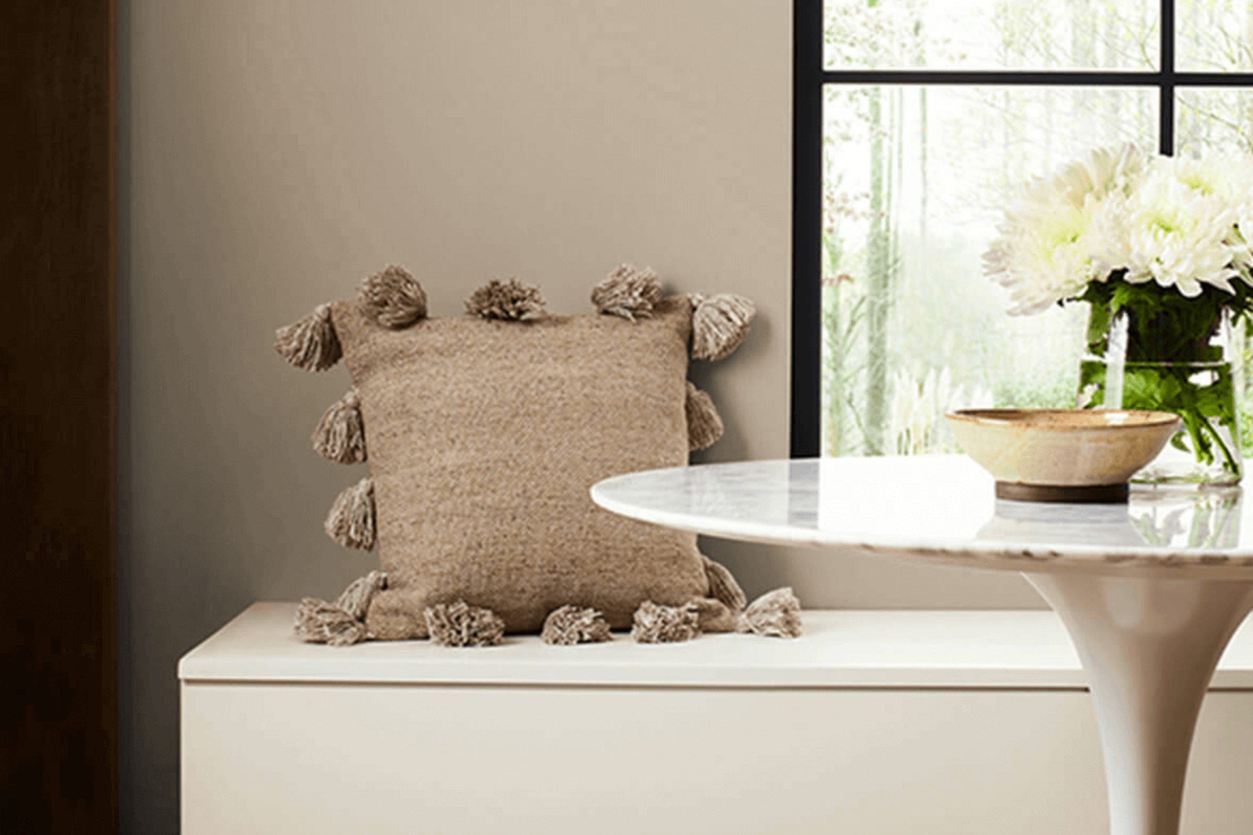
When searching for the perfect paint color for my client’s kitchen walls, I came across Sherwin Williams’ SW 7507 Stone Lion. The shade is a balanced beige that retains warmth without overpowering a space. It’s ideal for anyone looking to create a cozy yet sophisticated atmosphere in their home.
In my experience, selecting a neutral paint color can be surprisingly tricky. Many beiges either lean too yellow or too gray, disrupting the harmony you might aim to achieve. However, Stone Lion manages to strike just the right balance, offering a calming presence that complements various decor styles and color schemes.
Stone Lion works excellently in rooms with natural light, enhancing the space’s overall feel without demanding too much attention. This gentle neutrality of Stone Lion makes it versatile enough to be paired with soft pastels or bolder hues, depending on the look you’re aiming for
Additionally, its adaptability extends to various rooms, proving effective in both private spaces like bedrooms and social areas such as dining rooms and kitchens. I’ll offer some insight on how to best utilize the subtle beauty of SW 7507 Stone Lion in your home, ensuring you can achieve an inviting and polished look with ease.
What Color Is Stone Lion SW 7507 by Sherwin Williams?
Stone Lion by Sherwin Williams is a warm, neutral beige color with subtle gray undertones, making it a versatile choice for various decorating schemes. It creates a cozy and inviting atmosphere in any room, providing a perfect backdrop for both vibrant and muted hues.
This color shines in traditional and modern farmhouse styles, where its earthy, natural tone complements organic materials beautifully. In a living room or dining space, Stone Lion pairs well with rich wood textures, such as oak or walnut, enhancing their natural grains and warmth. It’s also an excellent match for natural stone elements like marble or slate, bringing a grounded feel to the decor.
In terms of fabrics, Stone Lion works well with soft linens or chunky knits, adding to the comfort and coziness of a space. For a touch of luxury, pair it with velvet cushions or drapes. Metal accents in copper or bronze can add a touch of rustic charm as well.
Ultimately, whether you’re designing a space with a comforting, homey feel or looking for a neutral base to let your other decor elements shine, Stone Lion is a reliable and attractive choice that harmonizes effortlessly with a wide range of materials and textures.
Is Stone Lion SW 7507 by Sherwin Williams Warm or Cool color?
Stone Lion by Sherwin Williams is a warm neutral paint color that brings a cozy and inviting atmosphere to any room. Its subtle brown tones make it flexible for various uses around the home, whether it’s creating a welcoming living room or a calm bedroom.
This color works well with natural light, enhancing a space with a soft, sunlight feel which keeps rooms feeling airy and fresh, even on cloudy days. Stone Lion pairs nicely with both darker and lighter colors, allowing for versatile design options. It can act as a base color for more vibrant accents or furnishings, or blend smoothly with other neutrals for a more muted, harmonious look.
It’s especially effective in spaces where you want to add warmth without overwhelming with too strong a color, making it a good choice for both large spaces and smaller rooms that could feel cramped with darker shades. The subtle warmth of Stone Lion can help make a home feel more inviting and put together.
Undertones of Stone Lion SW 7507 by Sherwin Williams
Stone Lion by Sherwin Williams is a versatile paint color widely appreciated for its ability to adapt to different settings and lighting conditions. This adaptability comes from its complex array of undertones.
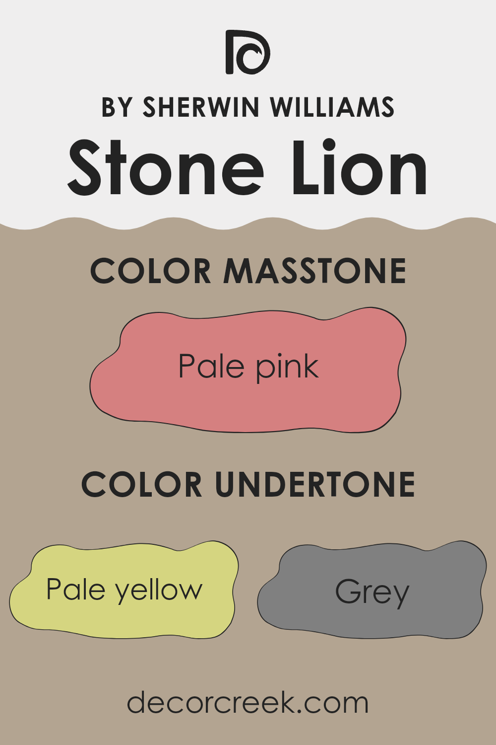
Undertones are subtle colors that lie beneath the surface of the main color, affecting how it appears under various lighting conditions and when paired with different décor elements. Stone Lion has a broad spectrum of undertones ranging from pale yellow to light blue, which means it can look slightly different in every room, depending on the light and surrounding colors.
In an interior setting, the implications of these undertones are significant. For instance, in a room with a lot of natural light, the pale yellow or light orange undertones of Stone Lion might become more pronounced, giving the room a warm and cozy glow. In contrast, in a room with less natural light, the grey or light gray undertones might dominate, making the space feel more grounded and subdued.
Moreover, when pairing this color with furniture and decorations, these undertones offer a wide latitude of aesthetic harmony. Pale yellow or light green undertones might complement natural wooden textures or plants well, while the lilac or light purple undertones could pair beautifully with soft textiles and art.
Therefore, while Stone Lion itself is a neutral color, its undertones enrich its capacity to create different moods and styles in a space, making it a smart choice for those who appreciate a color that can dynamically respond to its environment.
What is the Masstone of the Stone Lion SW 7507 by Sherwin Williams?
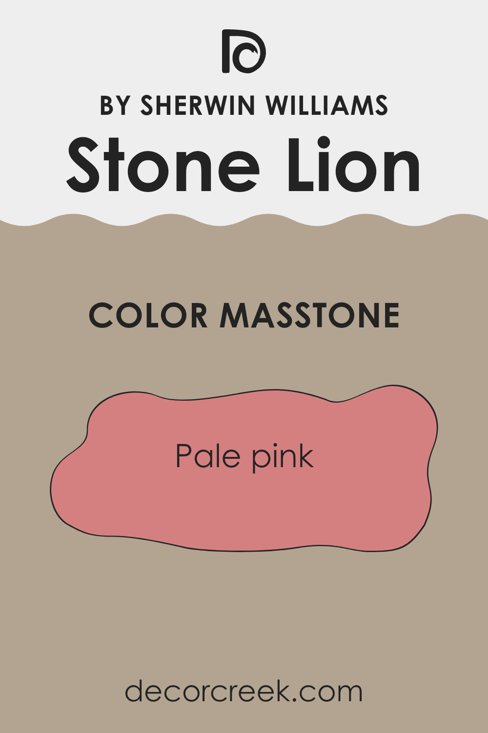
Stone Lion SW 7507 by Sherwin Williams, with its masstone being Pale Pink (#D58080), offers a gentle and soothing hue that creates a welcoming atmosphere in any home. This shade of pink isn’t overpowering but subtle, providing a soft backdrop that enhances the aesthetic of spaces. Its light tone can make rooms feel larger and more open, bringing in a sense of freshness and calm.
When applied to walls, this color works beautifully in bedrooms and living areas where you seek a touch of warmth without the intensity of bolder colors. It pairs well with natural light, making spaces feel airy during the day.
Stone Lion also complements a wide range of decor, from modern to rustic, allowing for versatility in styling your home. Its universal appeal helps in maintaining a timeless look, making it a practical choice for many homeowners looking to add a splash of color that isn’t too demanding but still adds character to their living spaces.
How Does Lighting Affect Stone Lion SW 7507 by Sherwin Williams?
Lighting has a significant impact on how colors appear in any environment. The perception of color can change drastically under different light sources. For example, natural daylight generally provides the truest representation of color, while artificial light can shift how colors are viewed.
Stone Lion, a warm and neutral shade, reacts uniquely to various lighting conditions. Under artificial light, such as incandescent bulbs, this color tends to look warmer.
This makes it a cozy choice for living spaces and bedrooms where soft, yellow-toned lighting is often used. However, if fluorescent lighting is utilized, Stone Lion might appear slightly duller, as these lights can emit a cooler tone.
In rooms with ample natural light, Stone Lion reveals its true color best. However, the direction the room faces can affect the lighting and thus the appearance of the color.
- – North-facing rooms: These rooms get less direct sunlight, which can make colors appear a bit cooler and more muted. In north-facing rooms, Stone Lion might look slightly more shadowed and less vivid, giving a calm and gentle feel.
- – South-facing rooms: These spaces receive more intense and warmer sunlight throughout the day, which can enhance the warmth of Stone Lion, making it appear more vibrant and inviting.
- – East-facing rooms: Lighting in these rooms is brightest in the morning, with a cooler light. Stone Lion will appear softer and slightly brighter in the morning but will revert to a truer, muted tone as the day progresses toward evening.
- – West-facing rooms: Similar to east-facing rooms but in reverse, west-facing rooms see the boldest light in the late afternoon. The color can look particularly warm and welcoming during this time, fading into softer tones in the morning hours.
By understanding how different lighting affects this particular shade, you can make more informed choices about using it in your decorating, ensuring that you achieve the desired mood and feel in each room.
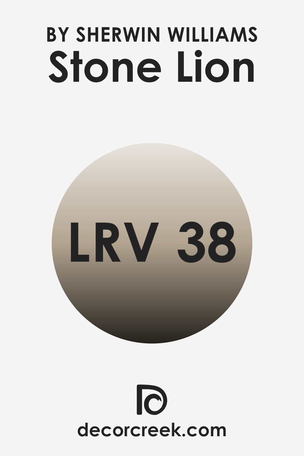
What is the LRV of Stone Lion SW 7507 by Sherwin Williams?
LRV, or Light Reflectance Value, measures the percentage of light a paint color reflects back into a room. Think of it as a scale that tells you how light or dark a color will look on a wall. The LRV scale goes from 0 to one hundred, where lower numbers mean the color is darker and absorbs more light, making a room feel cozier or smaller. In contrast, higher numbers suggest the color is lighter and reflects more light, which can make a space appear more open and airy.
For example, the LRV for the color Stone Lion is 38.208, which is on the darker half of the scale but not extremely dark. This means it has a moderate ability to reflect light. In practical terms, this makes it a versatile choice that can add warmth and depth to a space without making it feel too enclosed.
Because of its mid-range LRV, Stone Lion can work well in rooms that get a fair amount of natural light, enhancing the room’s cozy feel without darkening it excessively. However, in a very dim room, this color might make the space feel smaller or dimmer.
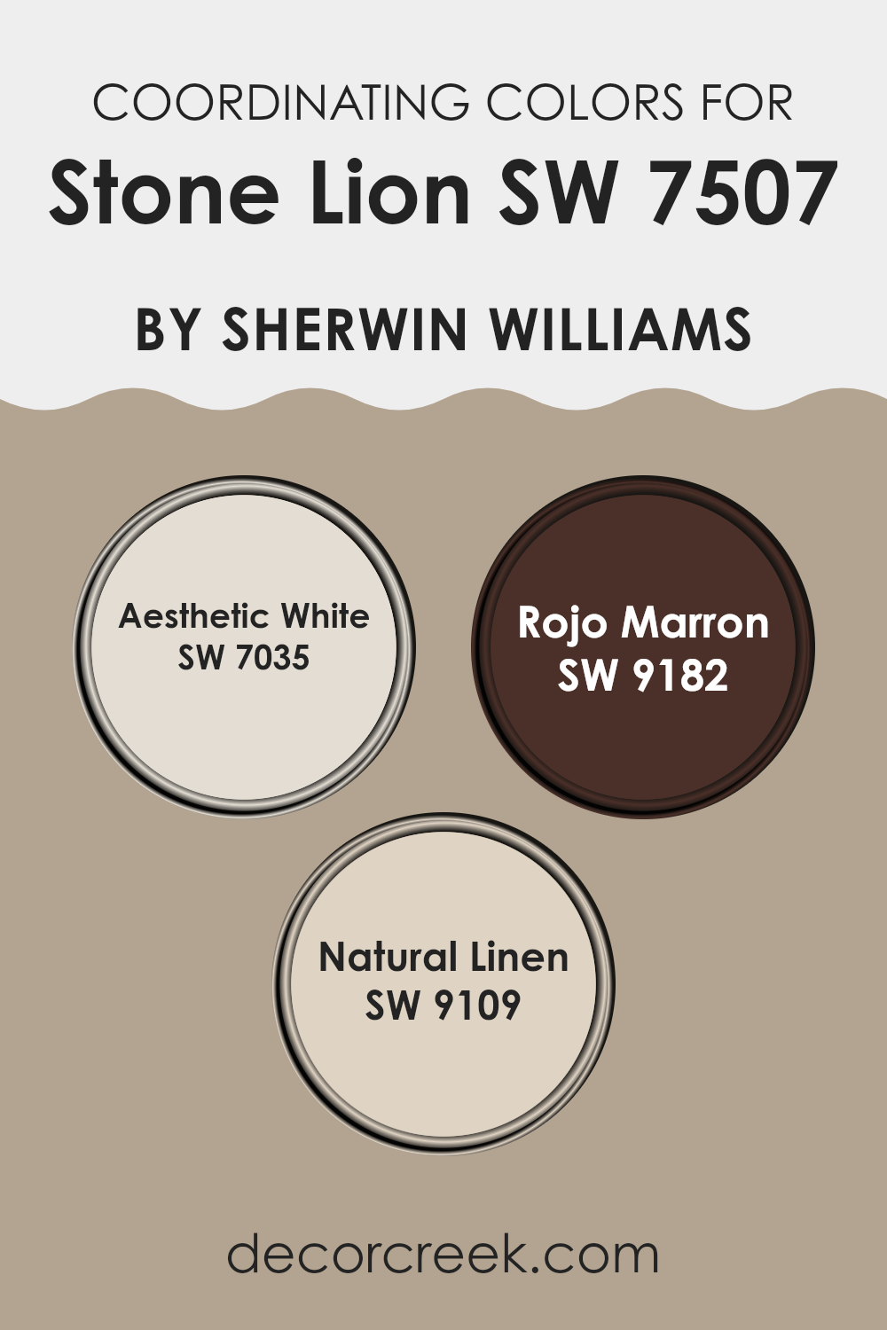
Coordinating Colors of Stone Lion SW 7507 by Sherwin Williams
Coordinating colors are chosen to complement a base color, enhancing the overall aesthetic of a space by creating balance and harmony. For instance, Stone Lion by Sherwin Williams can be paired with a set of coordinating colors to bring out its unique tones and adapt to different moods and settings. These colors work together to provide contrast, highlight, or blend seamlessly with the main shade, depending on their use in decor elements like walls, trim, furniture, or accessories.
Aesthetic White (SW 7035) is a soft, subtle white that provides a clean backdrop, making it ideal for offsetting the deeper tones of Stone Lion. It lightens up space and offers a fresh breath to any room, especially useful in areas where natural light is limited.
Rojo Marron (SW 9182) stands out with its deep, rich brown-red hue, adding warmth and a touch of drama, perfect for an accent wall or richly upholstered furniture. Natural Linen (SW 9109) has a warm, inviting beige tone that complements the earthiness of Stone Lion, suggesting comfort and coziness, making it a superb choice for larger areas or textiles. These coordinating colors harmonize well, providing versatile options for decorating that can adapt to various interior styles and personal tastes.
You can see recommended paint colors below:
- SW 7035 Aesthetic White
- SW 9182 Rojo Marron
- SW 9109 Natural Linen
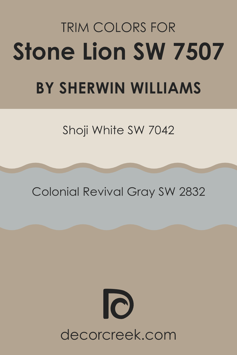
What are the Trim colors of Stone Lion SW 7507 by Sherwin Williams?
Trim colors are specific shades used to accentuate or complement the main color on walls, for example, Stone Lion by Sherwin Williams, by highlighting architectural details such as door frames, moldings, and baseboards.
Choosing the right trim color is crucial as it can enhance the overall aesthetic of a room, create a sense of cohesion, and define the spaces between different architectural elements. For Stone Lion, a warm and neutral tone, selecting the right trim colors could make the features of a home stand out or blend harmoniously, depending on the desired effect.
Shoji White SW 7042 is a soft, airy white that has a warm undertone, making it an excellent choice for trim with Stone Lion as it can help in keeping the space light and fresh without creating a stark contrast. On the other hand, Colonial Revival Gray SW 2832 offers a slightly deeper, mid-tone gray that provides a subtle contrast against the richer tone of Stone Lion, allowing for a more grounded and cohesive look. Both colors offer unique ways to frame the main wall color, enhancing the room’s character and design continuity.
You can see recommended paint colors below:
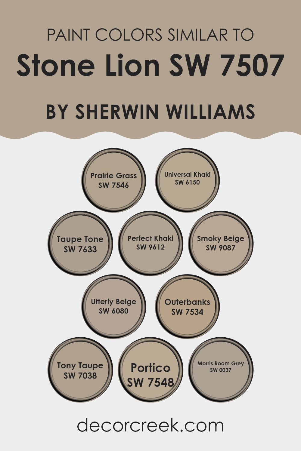
Colors Similar to Stone Lion SW 7507 by Sherwin Williams
Using similar colors in decor can create a unified and harmonious look in any space. These nuances, while subtle, can significantly enhance the warmth and welcoming feel of rooms. Colors like Prairie Grass SW 7546, Universal Khaki SW 6150, and Taupe Tone SW 7633 exhibit slight variations of the same earthy tones, offering versatility and a seamless blend from one room to another without sharp contrasts.
Perfect Khaki SW 9612 and Smoky Beige SW 9087 provide a slightly richer depth, making them ideal for accent walls or pairing with furniture to add an understated yet stylish flair. Meanwhile, shades like Utterly Beige SW 6080 and Outerbanks SW 7534 lend themselves well to creating soft backgrounds that allow art and furnishings to stand out.
Further, colors such as Tony Taupe SW 7038, Portico SW 7548, and Morris Room Grey SW 0037 deepen the palette, acting as excellent counterparts for those looking to introduce a bit of strength to their color schemes without overwhelming the senses.
These shades, though close in spectrum, carry distinct undertones that ensure each room has its personality while maintaining a cohesive look throughout the home. By selecting similar colors, one can easily achieve a smooth visual flow that enhances the overall aesthetic of their living spaces.
You can see recommended paint colors below:
- SW 7546 Prairie Grass
- SW 6150 Universal Khaki
- SW 7633 Taupe Tone
- SW 9612 Perfect Khaki
- SW 9087 Smoky Beige
- SW 6080 Utterly Beige
- SW 7534 Outerbanks
- SW 7038 Tony Taupe
- SW 7548 Portico
- SW 0037 Morris Room Grey
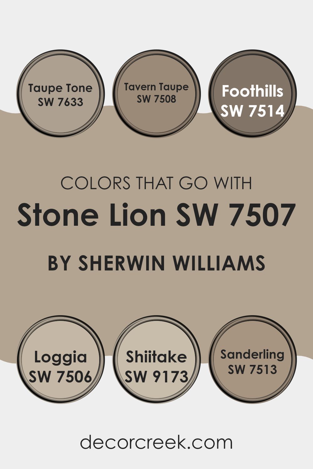
Colors that Go With Stone Lion SW 7507 by Sherwin Williams
Choosing complementary colors for a base shade like Stone Lion SW 7507 by Sherwin Williams is important because it helps create a balanced and harmonious look in any space. With the right color pairings, you can achieve a cohesive interior design that enhances the room’s aesthetics and sets the desired mood.
For example, colors like Taupe Tone SW 7633, Tavern Taupe SW 7508, and Foothills SW 7514 work well with Stone Lion because they belong to a similar warm earthy palette, which makes the transition between walls and furnishings seamless and visually appealing.
Taupe Tone is a gentle gray with a touch of warmth that can make spaces feel inviting without overwhelming them with color. On the other hand, Tavern Taupe offers a deeper and richer shade that provides a perfect backdrop for highlighting decor elements and furniture pieces.
Foothills is slightly darker, offering a strong presence in a room, which can be perfect for accent walls or cozy nooks. Similarly, Loggia SW 7506 brings a lighter, sandy touch that brightens rooms while maintaining an earthy feel.
Shiitake SW 9173 presents itself as a soft mushroom color, excellent for those who prefer subtle yet present neutral tones in their environment. Lastly, Sanderling SW 7513 adds a hint of beige, light and airy, ideal for creating more open and relaxing spaces. Together, these colors complement Stone Lion in creating a warm, welcoming, and cohesive environment.
You can see recommended paint colors below:
- SW 7633 Taupe Tone
- SW 7508 Tavern Taupe
- SW 7514 Foothills
- SW 7506 Loggia
- SW 9173 Shiitake
- SW 7513 Sanderling
How to Use Stone Lion SW 7507 by Sherwin Williams In Your Home?
Stone Lion SW 7507 by Sherwin Williams is a warm, neutral paint color that can add a cozy and welcoming vibe to any room in your home. This shade is versatile, making it a great choice for large areas like living rooms or hallways, as it creates a gentle backdrop that complements various decor styles and furniture colors.
You can use Stone Lion in your kitchen or dining area to bring warmth, making these spaces more inviting. It pairs well with both light and dark furniture, enhancing wood tones especially well. For a cohesive look, consider using it in your entryway or on accent walls. It’s also a good option for bedrooms, where its soothing tone can help create a relaxed atmosphere, conducive to rest.
In addition to walls, Stone Lion can be used on cabinets or trim, offering a subtle contrast to lighter wall colors. Whether you’re giving a fresh coat to an old room or starting anew, this color can truly make your house feel like a home.
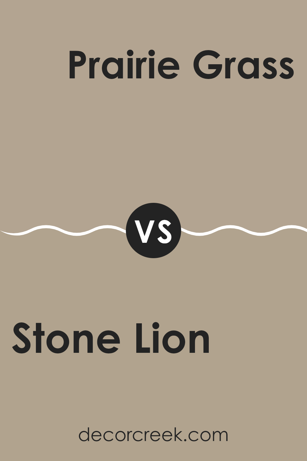
Stone Lion SW 7507 by Sherwin Williams vs Prairie Grass SW 7546 by Sherwin Williams
Stone Lion and Prairie Grass are two unique paint colors from Sherwin Williams. Stone Lion is a warm, subtle beige with an inviting earthy tone. It creates a cozy atmosphere, making it perfect for living rooms and hallways where you want a soft, neutral backdrop.
On the other hand, Prairie Grass has a richer, deeper tone, resembling a muted green or khaki. It’s ideal for those looking to add a bit of nature-inspired color to their space without going too bold. Prairie Grass works well in bedrooms or studies where a calm but more colorful environment is desired.
Both colors pair well with a variety of décor styles, from modern to rustic, but they serve different moods and preferences in interior design. While Stone Lion keeps things light and minimal, Prairie Grass offers a touch of depth and color richness.
You can see recommended paint color below:
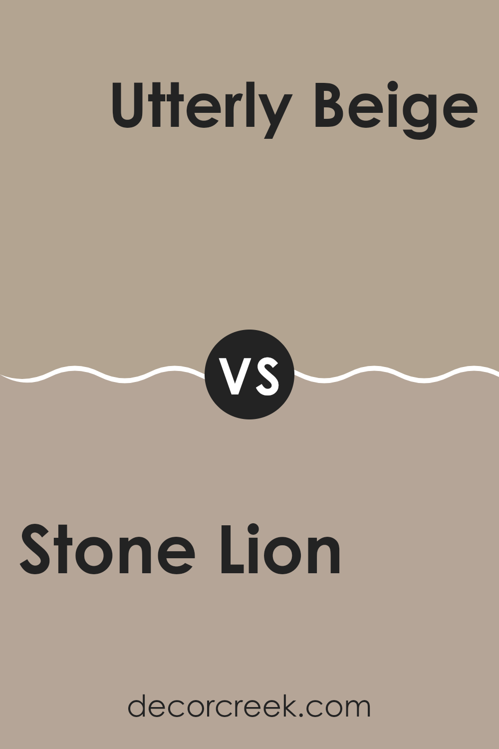
Stone Lion SW 7507 by Sherwin Williams vs Utterly Beige SW 6080 by Sherwin Williams
Stone Lion and Utterly Beige are two neutral shades by Sherwin Williams that offer subtle differences for your decorating needs. Stone Lion is a warm, sandy beige that provides a cozy and welcoming feel to any room. It’s slightly darker and can help make a large space feel more intimate and grounded.
On the other hand, Utterly Beige has a lighter tone that brightens spaces more effectively. It leans towards a softer, more muted beige, making it great for smaller rooms or areas where you want to enhance natural light.
Both colors are versatile and can easily match various decor styles and furniture choices. Whether you choose Stone Lion for its soothing depth or Utterly Beige for its light and airy vibe, both will help create a comfortable and stylish environment.
You can see recommended paint color below:
Stone Lion SW 7507 by Sherwin Williams vs Universal Khaki SW 6150 by Sherwin Williams
Stone Lion and Universal Khaki are both neutral shades from Sherwin Williams, ideal for creating warm, inviting spaces. Stone Lion has a slightly lighter and warmer tone, which resembles the color of sand. It can brighten up a room while maintaining a cozy atmosphere. This shade works well in spaces that need a soft, subtle touch without feeling too stark.
On the other hand, Universal Khaki is a bit deeper and leans more towards a grayish-green base compared to Stone Lion. This color gives rooms a more grounded, earthy feel and is perfect for those who prefer a hint of richness to their walls without going too dark. Universal Khaki can add depth and character to larger spaces, making them feel more put together.
Both colors are versatile and can be used in a variety of decor styles, from modern to traditional, but the choice between them depends on the desired warmth and depth of color in the space.
You can see recommended paint color below:
- SW 6150 Universal Khaki
Stone Lion SW 7507 by Sherwin Williams vs Outerbanks SW 7534 by Sherwin Williams
Stone Lion and Outer Banks are both warm, neutral paint colors from Sherwin Williams, but they offer distinct vibes to a space due to their differing undertones and depth. Stone Lion is a lighter beige with a soft, welcoming feel.
It has a subtle yellow undertone that makes it warm and light, perfect for making small spaces appear larger and brighter. On the other hand, Outer Banks is a darker taupe that leans more towards a muted brown.
This color gives off a cozier, more enclosed feeling, making it ideal for larger rooms or accent walls where a stronger presence is desired. Both colors work well in various interior styles but serve different purposes depending on the atmosphere you want to create — Stone Lion for airy and bright spaces, and Outer Banks for more defined, cozy areas.
You can see recommended paint color below:
- SW 7534 Outerbanks
Stone Lion SW 7507 by Sherwin Williams vs Morris Room Grey SW 0037 by Sherwin Williams
Stone Lion and Morris Room Grey are two shades offered by Sherwin Williams that present nuanced variations of gray and beige. Stone Lion is a warmer hue, leaning more towards a soft beige with undertones that might hint at gray depending on the lighting.
This color beams a cozy, welcoming vibe that can make any room feel homey and relaxed. On the other hand, Morris Room Grey is a true gray that brings a more neutral, balanced feel to spaces. Its undertones are cooler, making it an excellent choice for those aiming for a more understated, calm aesthetic without the warmth of beige.
Both colors work well in various settings, but your choice might depend on the atmosphere you’re aiming to create—warm and inviting with Stone Lion or cool and collected with Morris Room Grey.
You can see recommended paint color below:
Stone Lion SW 7507 by Sherwin Williams vs Perfect Khaki SW 9612 by Sherwin Williams
Stone Lion and Perfect Khaki are both neutral colors from Sherwin Williams and share a similar warm beige base with subtle differences. Stone Lion leans slightly towards a cooler, grayish tone, making it a versatile choice for spaces where you want a hint of sophistication without overwhelming the senses.
It pairs well with various decor styles and adds a crisp, clean look to the environment. On the other hand, Perfect Khaki has a deeper, richer hue which can make a room feel more enclosed and cozy. This shade works great in spaces where you want a bit of warmth and comfort, such as living rooms or bedrooms.
To sum up, Stone Lion offers a lighter, more neutral palette, while Perfect Khaki provides a warmer and more comforting feel. Your choice between them would depend on the atmosphere you’re trying to create.
You can see recommended paint color below:
Stone Lion SW 7507 by Sherwin Williams vs Smoky Beige SW 9087 by Sherwin Williams
Stone Lion and Smoky Beige are two neutral colors by Sherwin Williams that offer subtle yet distinct tones for interior spaces. Stone Lion has a warm, sandy quality that makes it versatile for rooms needing a cozy and inviting atmosphere.
It’s a bit lighter and can reflect more light, brightening up a small or dimly lit room effectively. On the other hand, Smoky Beige brings a deeper, slightly grayer tone that lends itself to a more grounded, earthy feel.
It can work well in spaces that aim for a more anchored and mature look. Both colors go well with a wide range of decor styles and are excellent choices for those looking to create a neutral backdrop that allows furniture and artwork to stand out. Whether you choose Stone Lion for its light warmth or Smoky Beige for its richer depth, both paints offer a beautiful and practical foundation for decorating any room.
You can see recommended paint color below:
- SW 9087 Smoky Beige

Stone Lion SW 7507 by Sherwin Williams vs Taupe Tone SW 7633 by Sherwin Williams
Stone Lion and Taupe Tone, both by Sherwin Williams, are nuanced neutrals that add warmth and subtlety to spaces. Stone Lion has a robust, earthy appeal, leaning slightly towards a beige-brown. This color is ideal for creating a cozy atmosphere, making rooms feel welcoming and grounded. It works particularly well in living areas and bedrooms where a soft, soothing backdrop is desired.
On the other hand, Taupe Tone is lighter and more muted, with a hint of gray. This color is great for those who prefer a softer look that still carries depth. Because of its cool undertones, Taupe Tone is excellent for spaces that aim for a minimalist or modern feel, providing a clean and calm aesthetic.
Both colors offer a versatile palette that can be easily paired with a variety of decor styles, but the choice between them depends on the desired warmth and depth of the room. Stone Lion brings more warmth, whereas Taupe Tone offers a cooler, more restrained charm.
You can see recommended paint color below:
Stone Lion SW 7507 by Sherwin Williams vs Tony Taupe SW 7038 by Sherwin Williams
Stone Lion and Tony Taupe, both from Sherwin Williams, are warm, neutral colors that offer a cozy feel to any room. Stone Lion is a lighter shade, closer to a sandy beige, which makes it ideal for smaller spaces as it helps them appear more open and airy.
This color pairs well with a wide range of hues and serves as a perfect background for bright accents. Meanwhile, Tony Taupe is a deeper, richer hue akin to a shadowy beige or light brown. Its depth adds warmth to larger spaces without making them feel too enclosed.
Both colors are versatile and can complement various decor styles, whether you’re aiming for a casual look or something a bit more formal. Their understated elegance ensures that they can fit seamlessly into existing color schemes, either as primary colors or as accents. In summary, while both colors share a neutral base, Stone Lion is lighter and more open, and Tony Taupe offers depth and warmth.
You can see recommended paint color below:
Stone Lion SW 7507 by Sherwin Williams vs Portico SW 7548 by Sherwin Williams
Stone Lion and Portico are two warm neutral paint colors from Sherwin Williams, each offering a unique feel for spaces. Stone Lion has a deeper, richer tone, leaning towards a sandy brown. This makes it great for creating a cozy and inviting atmosphere in rooms.
In contrast, Portico is lighter and has more of a beige or light gray look. It’s a fantastic choice for brightening up a space and giving it a fresh, airy feel. Both colors work beautifully in different settings. For example, Stone Lion might be more suited for parts of the home where you want to encourage relaxation, like a living room or bedroom.
On the other hand, Portico could be perfect for kitchens or bathrooms, where a lighter color can help the areas appear larger and more open. Each color adds a touch of warmth while maintaining a neutral palette that’s easy to accessorize with different decor styles.
You can see recommended paint color below:
- SW 7548 Portico
Conclusion
Stone Lion isn’t just any ordinary color; it’s a warm, welcoming shade of brown that can make any room feel cozy and comfortable. It’s like the color of a nice, warm hug!
The article did a great job explaining where the color fits best in a home. It looks lovely in living rooms, bedrooms, and even kitchens. The best part is that it works well with many other colors. This makes it super easy to use when you want to decorate your room with different colors and styles of furniture.
I also learned that Stone Lion is not just pretty but also practical. It holds up well in busy areas, so if you have lots of people in your house, this color can handle it. It can hide scuffs and marks better than lighter colors, which means walls look nice longer.
Overall, this article has made me see SW 7507 Stone Lion in a new light. It’s not just paint; it’s a way to make your home feel warm, inviting, and a bit more special. I’m really excited to think about using this color in my own home one day!
Ever wished paint sampling was as easy as sticking a sticker? Guess what? Now it is! Discover Samplize's unique Peel & Stick samples.
Get paint samples

