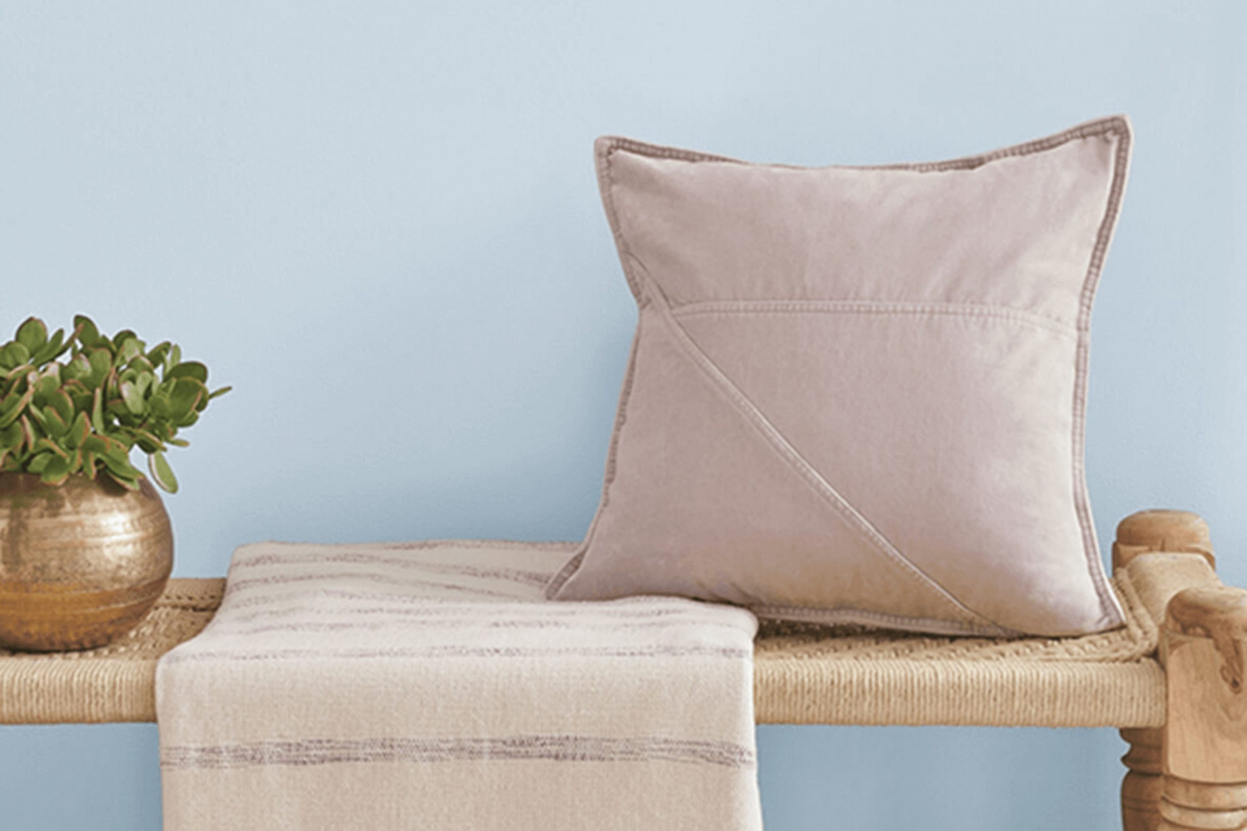
If you’re considering a new shade for your room, let me introduce you to SW 6526 Icelandic by Sherwin Williams. This color is a soft, soothing blue with just a hint of gray, making it a perfect pick for anyone looking to refresh their area with a calm, airy vibe. Its subtle tone blends effortlessly with a variety of decor styles, from modern minimalist to cozy traditional.
Choosing the right paint can often feel intense because there are so many options. I found that Icelandic stands out due to its adaptable nature and the peaceful atmosphere it can create in a room. Whether you want to paint your bedroom, bathroom, or living room, this color can effectively enhance the area’s aesthetic without overpowering your existing furnishings and accents.
Moreover, the color’s light-reflecting properties can help to make a small room seem larger, bringing a breath of fresh air into compact rooms. It pairs beautifully with crisp whites for trim and can also handle contrasting bold colors if you’re into a vibrant palette.
So, if you’re aiming to give your room a touch of calmness with a modern twist, I think Icelandic may just be the color you’re looking for.
What Color Is Icelandic SW 6526 by Sherwin Williams?
Icelandic by Sherwin Williams is a light, breezy blue color with hints of gray. This shade is perfect for creating a clean and airy atmosphere in any room. Its subtle gray undertone makes it a flexible color that works well in a variety of decorating styles, especially in coastal and Scandinavian designs due to its fresh, calming vibe.
Icelandic pairs beautifully with natural materials like light woods, wicker, and linen, enhancing its airy feel. It also complements crisp whites and soft neutrals, allowing for a seamless flow in color schemes. When matched with metallic accents such as silver or brushed nickel, Icelandic adds a modern touch, keeping the area looking fresh and current.
In terms of interior styles, Icelandic is ideally suited for casual and minimalist rooms. Its muted tone provides a gentle backdrop for furniture and artwork to stand out. For a coastal style, combining it with sandy beiges and soft blues can mimic the beachy environment, making a home feel like a seaside retreat. In a minimalist home, its light tone helps keep areas feeling open and uncluttered. This color not only enhances the visual appeal but can also help in brightening up darker rooms, making them feel more inviting and comfortable.

Is Icelandic SW 6526 by Sherwin Williams Warm or Cool color?
Icelandic SW 6526 by Sherwin Williams is a soft, gentle blue that brings a fresh and airy feel to any room. This shade can cool down an area while still keeping it light and inviting, making it perfect for bedrooms or bathrooms where a calm atmosphere is desirable.
It pairs wonderfully with white trim, enhancing its clean appearance. Because it’s such a subtle color, it also works well in living areas, especially when matched with natural light, which emphasizes its gentle tones.
Use this color in smaller, possibly darker rooms too, as it helps to make them look more open and bright. It’s adaptable enough to be used on all walls or just as an accent, depending on the room’s existing decor and the ambiance you want to create. Overall, Icelandic is a great choice if you’re looking for a color that’s easy on the eyes and flexible for various decorating styles.
Undertones of Icelandic SW 6526 by Sherwin Williams
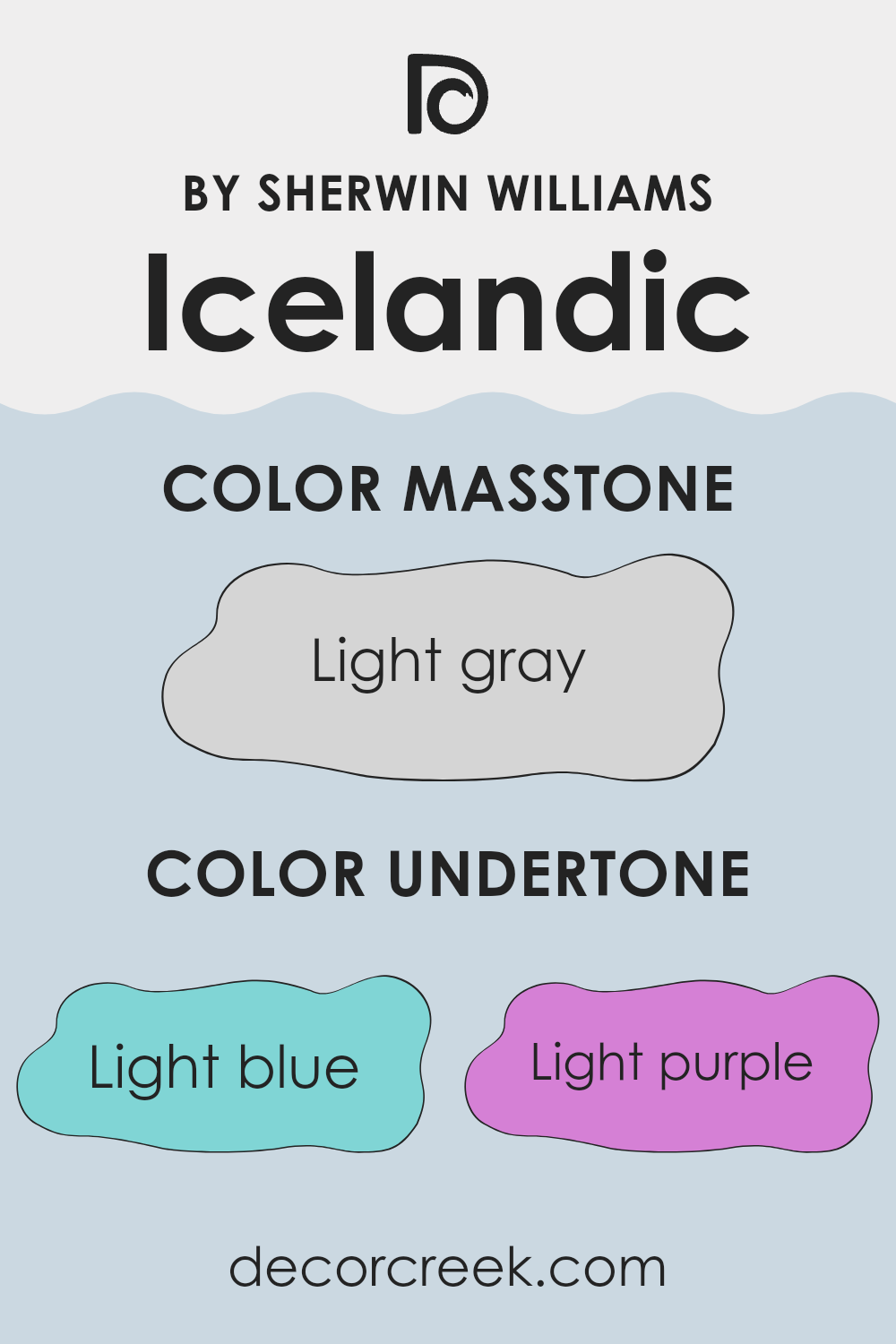
Icelandic is a flexible paint color that comes alive with its complex undertones. Seeing different undertones in a color means that under various lighting conditions, the color might appear slightly different. For instance, in bright sunlight, the pale yellow undertone could make a room feel a bit warmer, while in dimmer light, the grey undertone might make the area feel cooler.
In the case of Icelandic, its light blue and lilac undertones can bring a fresh, airy feel to a room, making it ideal for creating a relaxed atmosphere in rooms like bedrooms or bathrooms. When used on interior walls, these cooler undertones can make a small area appear more open and airy.
Meanwhile, the pale yellow and mint undertones can add a subtle touch of warmth and life, ideal for living areas where a cozy and welcoming atmosphere is desired. On the other hand, the pale pink undertone adds a hint of softness to the color, which can be especially appealing in a nursery or powder room, providing a gentle backdrop. The presence of a grey undertone in Icelandic ensures that despite its complexity, the color maintains a certain neutrality, making it adaptable to complement various decor styles and furniture colors.
This neutrality can be particularly useful in areas of the home that are subject to frequent redecorating or where vibrant art pieces or furniture need to stand out without clashing. Understanding these undertones helps in making informed decisions about paint colors, ensuring they complement the intended mood and function of each room.
What is the Masstone of the Icelandic SW 6526 by Sherwin Williams?
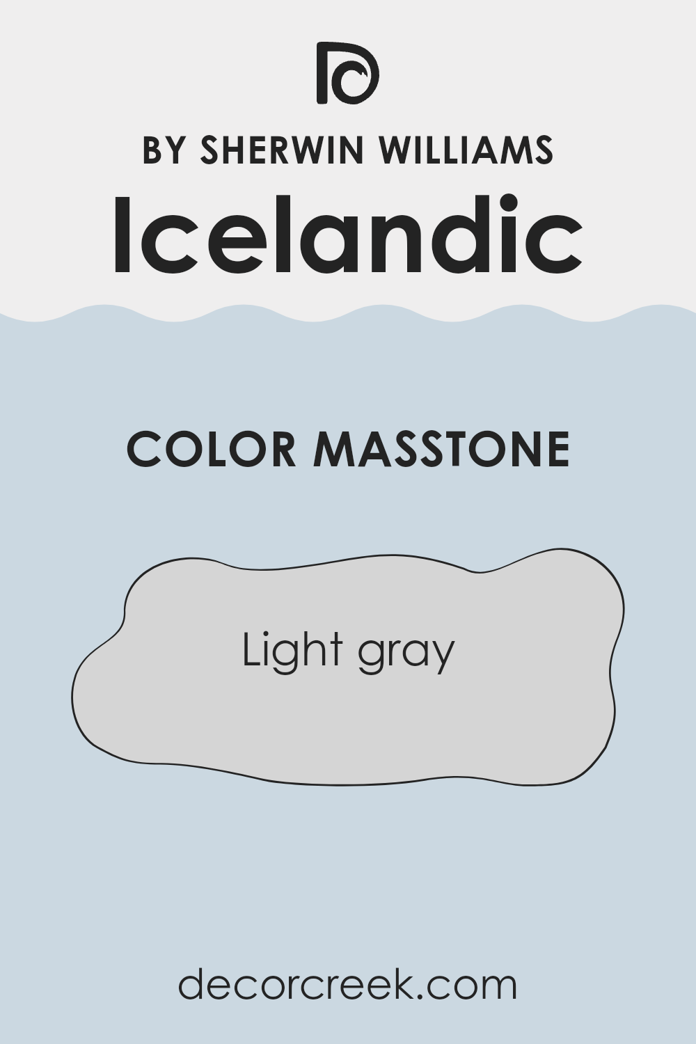
Icelandic SW 6526 by Sherwin Williams is a light gray color that brings a fresh, clean look to any room. Its masstone, which is the pure color before it gets lightened or darkened, is quite neutral, making it very adaptable for various home styles. This specific shade of gray can easily blend with different decor elements, from furniture to curtains, without clashing.
The neutrality of light gray means it works well in small areas, making them appear bigger and brighter, as well as in larger rooms, adding a sense of cleanliness and order. Since it doesn’t lean too heavily towards warm or cool tones, it’s also great for balancing out rooms that get a lot of sunlight, as well as those that might lack natural light.
Overall, Icelandic is a practical choice for anyone looking to give their home a modest yet stylish update. It fits well in many different parts of the home, from living rooms to bedrooms, offering a modern but unobtrusive backdrop.
How Does Lighting Affect Icelandic SW 6526 by Sherwin Williams?
Lighting plays a critical role in how we perceive colors. The type of light—whether it’s natural sunlight or artificial light—can make a significant difference in how a paint color appears on your walls. A specific hue might look different depending on the time of day or the kind of bulb used in an area.
For example, let’s consider a color like Icelandic SW 6526 by Sherwin Williams. This is a light and breezy blue that can change its appearance depending on the lighting conditions. In natural light, this shade of blue appears bright and airy, making it perfect for creating a relaxed feel in a room. Under artificial light, such as LED or fluorescent bulbs, the color might look slightly more muted, with a softer tone that still maintains its light blue charm.
In areas facing different directions, the appearance of Icelandic SW 6526 will vary throughout the day:
- North-facing areas: These receive less direct sunlight, meaning colors can appear cooler and slightly more shadowed. Icelandic SW 6526 will look more subdued and may take on a cooler tone in these rooms.
- South-facing areas: With more exposure to direct sunlight, the color will show its truest form. It will be vibrant and bright, particularly in the middle of the day, making it an excellent choice for rooms where you want a fresh and cheerful vibe.
- East-facing areas: These get plenty of morning light. Icelandic SW 6526 will look especially lively in the morning but might appear softer and more muted as the day progresses and the natural light diminishes.
- West-facing areas: Here, the afternoon and evening light can bring out the best in this color, giving it a warm, glowing appearance during the sunset hours.
In conclusion, the color Icelandic SW 6526 by Sherwin Williams is adaptable and changes its mood depending on the lighting. Understanding these nuances can help in deciding which rooms would best suit this shade, making the most of its dynamic nature.

decorcreek.com
What is the LRV of Icelandic SW 6526 by Sherwin Williams?
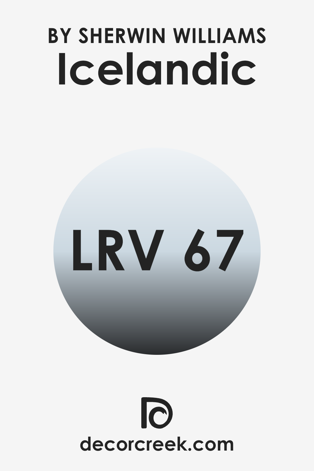
LRV stands for Light Reflectance Value, which measures the percentage of light a paint color reflects back into an area. This value is crucial as it influences how light or dark a color appears once it’s applied to the walls. A color with a high LRV means it reflects more light around the area, making it appear brighter and more open.
Conversely, a paint color with a low LRV absorbs more light, which can make an area look smaller and cozier. Understanding this measure can help you choose the right paint color to achieve the desired atmosphere in any room. Regarding the specific color with an LRV of 67.482, this means it is on the lighter side of the scale, reflecting a good amount of light without being overly bright.
This property makes it an excellent choice for dark rooms or areas with limited natural light, as it can help make the room feel more airy and spacious. Additionally, the soft quality of the color can add a fresh and calm feel, making it ideal for places where you want to relax and rejuvenate, like bedrooms or living areas.
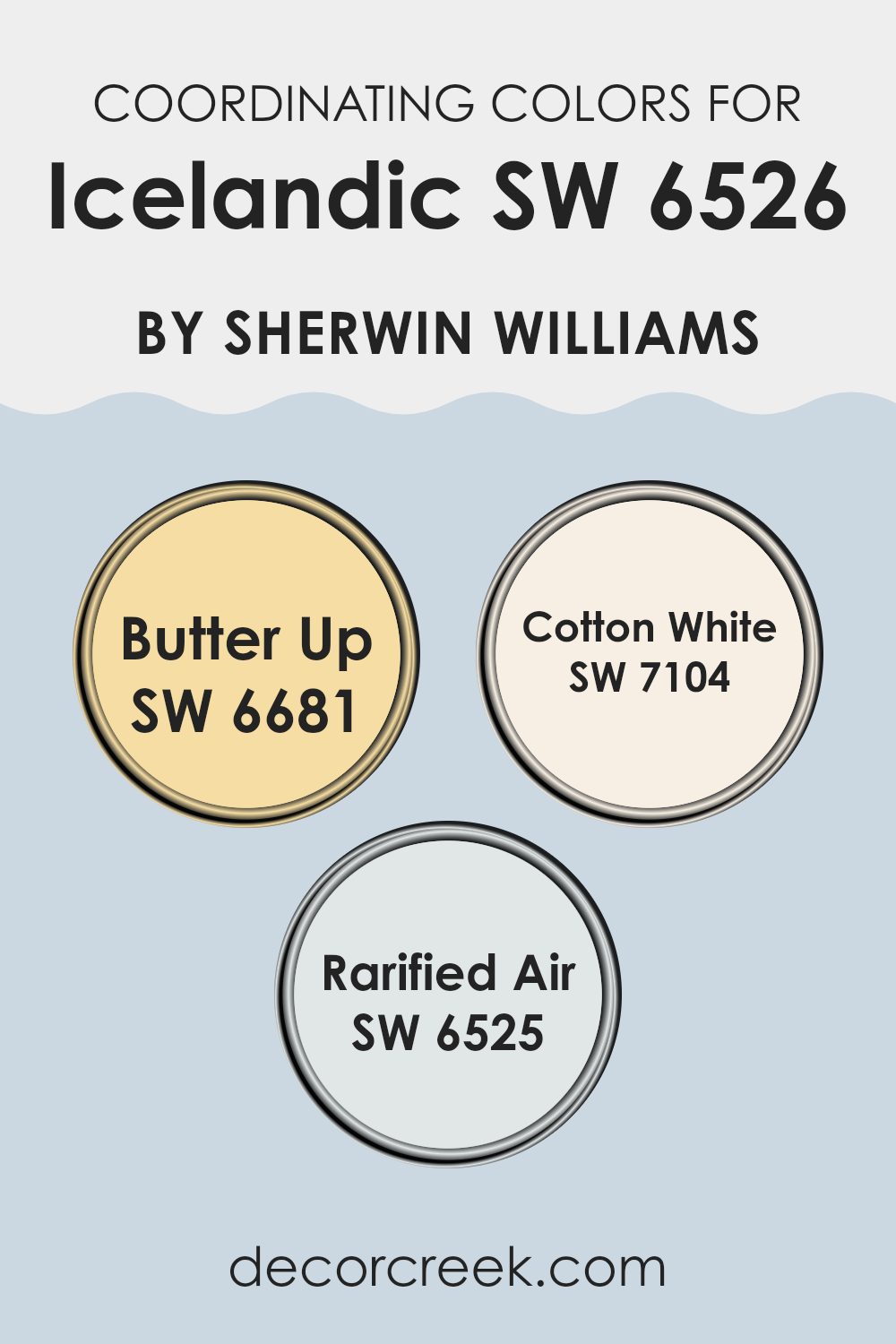
Coordinating Colors of Icelandic SW 6526 by Sherwin Williams
Coordinating colors are designed to complement a main hue by adhering to a color scheme that enhances overall aesthetic harmony, ensuring that no color stands out as jarring or out of place. To partner with a shade like Icelandic by Sherwin Williams, specific colors like Butter Up, Cotton White, and Rarified Air are suggestions that offer pleasing visual combinations. These choices each contribute differently to affect the mood and visual balance in a room, creating an appealing ensemble when used together.
Butter Up is a gentle, warm yellow that provides a cheerful burst of brightness, making it ideal for adding a touch of sunlight to any area. This color works well to inject light and a sense of airiness when used in combination with cooler tones. On the other hand, Cotton White is a clean and crisp white that acts as a flexible backdrop, offering a fresh and calming canvas that can be accented with various decor elements easily.
It’s the perfect candidate for walls if you’re looking for a neutral yet bright foundation. Lastly, Rarified Air is a soft, light blue with a subtle luminosity—nicely balancing out the warmth of Butter Up and the neutrality of Cotton White. Its soothing presence works beautifully to create a relaxed mood in a home.
You can see recommended paint colors below:
What are the Trim colors of Icelandic SW 6526 by Sherwin Williams?
Trim colors are used to accentuate key features and details in a room, such as door frames, window sills, and moldings. By selecting complementary trim colors, homeowners can enhance the aesthetic appeal of their walls and overall interior design. In the case of a light, airy hue like Icelandic SW 6526 by Sherwin Williams, using trim colors like Balanced Beige SW 7037 and Canvas Tan SW 7531 can subtly highlight these features without creating an intense contrast.
These trim colors work well to frame the light blue of Icelandic, providing a gentle and pleasing differentiation that draws the eye naturally.Balanced Beige SW 7037 is a warm, welcoming color that offers a gentle depth to areas that require a soft transition from the more pronounced tones of a primary color.
This shade pairs nicely against cooler tones, providing a natural, understated border that defines rooms elegantly. Canvas Tan SW 7531, on the other hand, is a lighter, neutral color, slightly brighter than Balanced Beige, which works excellently in rooms looking for a crisp, clean look. It complements Icelandic by providing just enough contrast to highlight intricate trim work and architectural details effectively.
You can see recommended paint colors below:

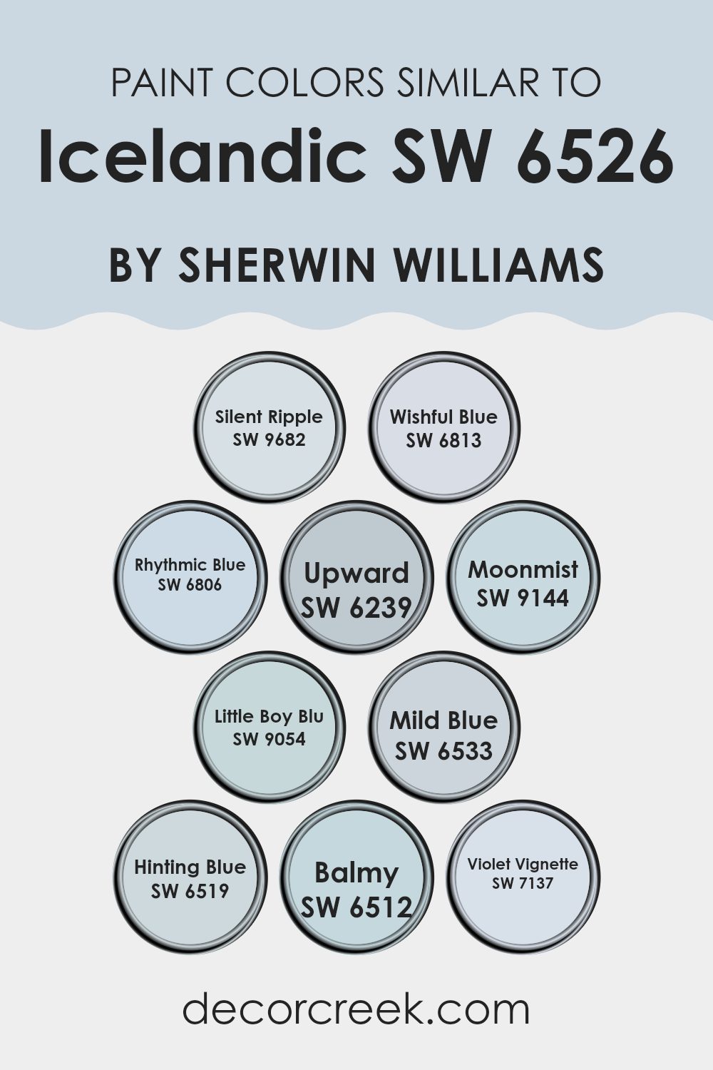
Colors Similar to Icelandic SW 6526 by Sherwin Williams
Choosing similar colors is crucial when aiming for a harmonious and cohesive look in interior design or artwork. Colors close to one another on the color wheel create a smooth visual experience, making the area feel connected and comfortable. Such similarities are seen in colors related to Icelandic by Sherwin Williams, where various shades of blue and hints of violet combine subtly to produce soothing environments.
For instance, Silent Ripple is a gentle gray with an understated touch of blue, perfect for creating a restful mood. Wishful Blue, a slightly brighter tone, injects a cheerful yet calm vibe into a room. Rhythmic Blue has a deeper hue, providing a grounding effect when used in an area. Upward is a light sky blue that lightens and opens up any room, while Moonmist offers a misty blue that adds a dreamy quality.
Little Boy Blu is fresh and bright, suitable for vibrant yet peaceful settings. Mild Blue, true to its name, provides a soft backdrop, easy to pair with bolder colors. Hinting Blue is even subtler, almost acting as a neutral. Balmy brings a breezy, warm touch to the palette, and Violet Vignette rounds out the selection with its gentle purple tone, adding a hint of mystery and depth without being too intense. Each of these colors works well with the others, ensuring effortless compatibility for a stylish and unified look.
You can see recommended paint colors below:
- SW 9682 Silent Ripple
- SW 6813 Wishful Blue
- SW 6806 Rhythmic Blue
- SW 6239 Upward
- SW 9144 Moonmist
- SW 9054 Little Boy Blu
- SW 6533 Mild Blue
- SW 6519 Hinting Blue
- SW 6512 Balmy
- SW 7137 Violet Vignette
Colors that Go With Icelandic SW 6526 by Sherwin Williams
Choosing the right colors that complement Icelandic SW 6526 by Sherwin Williams is crucial for creating a harmonious and appealing area. Colors such as Indigo, Scanda, Bluesy Note, Cosmos, Blissful Blue, and Revel Blue not only enhance the cool and calm feel of Icelandic but also allow for creative freedom in design. These colors, ranging from deep blues to soft, light hues, work together to balance the vibrant yet subtle tone of Icelandic, ensuring that it stands out as a statement shade without being too intense in the room.
For instance, Indigo is a deep blue that brings a bold touch to interiors, perfect for accentuating features or creating a focal wall. Scanda is lighter, offering a fresh, almost playful lift to the mood. Bluesy Note, a slightly muted blue, bridges the gap between bold and light, providing a stable yet dynamic complement.
Cosmos offers a quirky splash of blue that adds a unique twist, while Blissful Blue calms with its gentle tones, perfect for a restful setting. Lastly, Revel Blue rounds out the palette with a vibrant pop, ensuring that the overall look is lively but still coherent. Each of these colors supports and uplifts the primary shade, resulting in a beautifully balanced palette that enriches the environment.
You can see recommended paint colors below:
- SW 6531 Indigo
- SW 6529 Scanda
- SW 9064 Bluesy Note
- SW 6528 Cosmos
- SW 6527 Blissful Blue
- SW 6530 Revel Blue

How to Use Icelandic SW 6526 by Sherwin Williams In Your Home?
Icelandic SW 6526 by Sherwin Williams is a gentle blue-gray paint color that refreshes any area with its calm, soothing tones. Ideal for creating a relaxed atmosphere, it’s perfect for rooms like bedrooms or bathrooms where you want a soft background. You can also use Icelandic in living areas or kitchens for a clean and airy feel.
This paint works well with white trim or furniture, which makes the blue pop nicely and adds a nice contrast. Additionally, consider using it in smaller areas like a laundry room or closet to brighten them up and make them appear larger.
This color pairs beautifully with light woods, metallic accents like silver or chrome, and also looks great with soft pastel colors if you’re looking to create a more layered look in your decorating. Overall, Icelandic is an adaptable paint color that can help make any room in your home look and feel more inviting and pleasant.
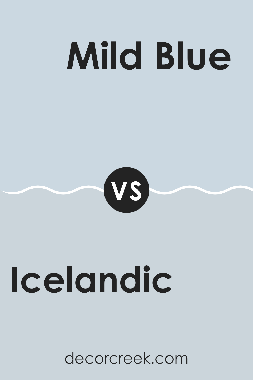
Icelandic SW 6526 by Sherwin Williams vs Mild Blue SW 6533 by Sherwin Williams
Icelandic and Mild Blue, both from Sherwin Williams, are two soothing shades in the blue color family, yet they convey different moods and visual impacts. Icelandic is a deeper, steel blue that tends to carry a stronger presence in an area, making it ideal for creating a focal point in a room. It pairs well with bright whites and grays, giving a clean and defined look.
On the other hand, Mild Blue is lighter and airier, providing a more relaxed feel. This color works exceptionally well in areas intended for rest, such as bedrooms or bathrooms, where it adds a gentle touch of color without being too intense. It’s a great choice if you’re aiming for a light, breezy interior.
Both colors offer their own unique benefits depending on the mood you’re aiming to achieve. Icelandic might be more suited for a bold statement, while Mild Blue could be perfect for a softer, more calming influence.
You can see recommended paint color below:
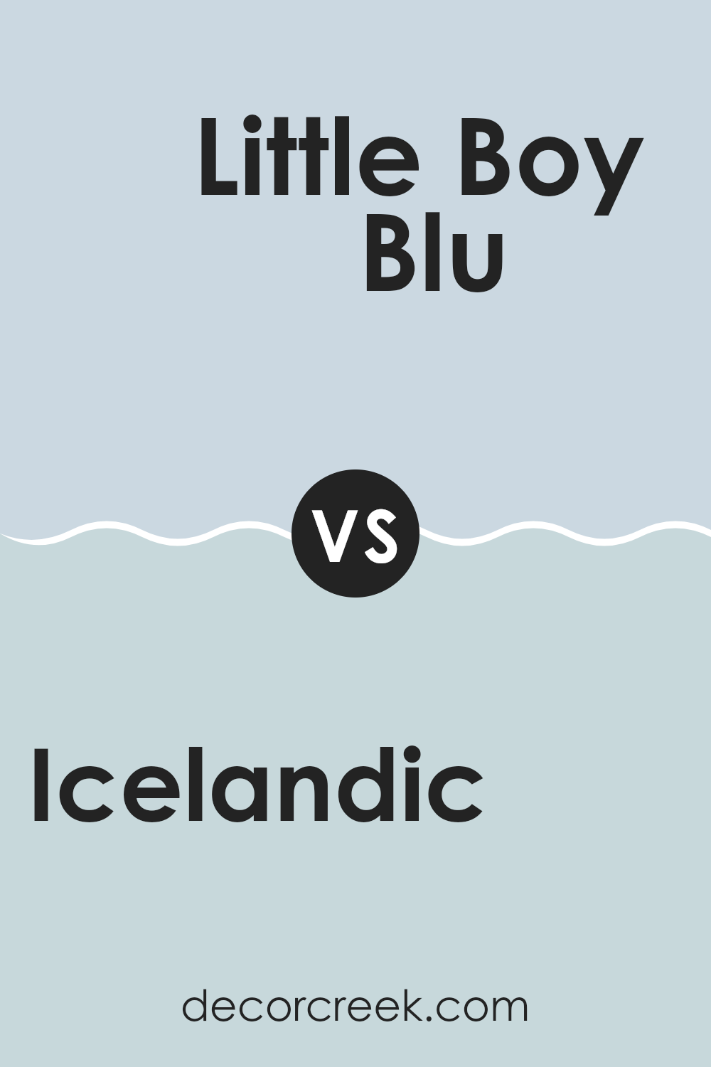
Icelandic SW 6526 by Sherwin Williams vs Little Boy Blu SW 9054 by Sherwin Williams
Icelandic and Little Boy Blu, both by Sherwin Williams, present subtle yet distinct tones suitable for creating calm environments. Icelandic is a deeper blue with a hint of gray; this color offers a calming effect that is cozy and inviting, perfect for areas intended for relaxation or focus.
In contrast, Little Boy Blu is lighter and leans towards a true sky blue, imparting a fresher, more youthful vibe. This color works well in rooms aimed at stimulating creativity and can make smaller areas feel more open.
Although both shades are blues, Icelandic provides a muted, subtle backdrop, ideal for a mature setting, while Little Boy Blu offers a brighter, livelier mood suited more for children’s rooms or informal living areas. Together, these colors could be used to great effect in a home, separating adult zones from those designed for kids.
You can see recommended paint color below:
- SW 9054 Little Boy Blu
Icelandic SW 6526 by Sherwin Williams vs Hinting Blue SW 6519 by Sherwin Williams
Icelandic and Hinting Blue are two colors by Sherwin Williams that offer subtle yet noticeably different tones. Icelandic is a deeper shade that leans towards a muted teal. It gives off a calm and cool vibe, making it perfect for areas where you want a touch of color without being too intense.
In contrast, Hinting Blue is lighter and airier. It’s closer to a soft sky blue, making rooms feel open and bright. This color can help smaller areas appear larger and more inviting.
Both colors work well in various settings, like bedrooms or living areas, and pair nicely with whites and grays. However, Icelandic might be better suited for those looking for a bit more depth and moodiness in their decor, while Hinting Blue is ideal for creating a breezy and fresh look. The choice between them depends on the mood you’re aiming to achieve in your area.
You can see recommended paint color below:
Icelandic SW 6526 by Sherwin Williams vs Upward SW 6239 by Sherwin Williams
The main color, Icelandic, is a soft, cool blue that gives off a refreshing feel, much like the calmness of a clear sky. It’s an adaptable shade that can brighten up areas with a fresh and airy vibe. On the other hand, Upward, is a slightly lighter blue with a subtle hint of gray. This color can make small rooms appear bigger and more open because of its light and minimalistic quality.
Both colors are from Sherwin Williams and share a peaceful blue base, but Icelandic is a touch richer and deeper, making it a good choice for a focal point in a room.
Upward, being lighter, works well for creating a gentle background hue that complements bolder colors or decorative elements in an area. Whether you’re looking to paint a cozy corner or refresh an entire room, either of these colors could be a great pick depending on the feel you’re going for.
You can see recommended paint color below:
Icelandic SW 6526 by Sherwin Williams vs Silent Ripple SW 9682 by Sherwin Williams
The color Icelandic SW 6526 by Sherwin Williams is a vibrant shade of blue that brings to mind a clear sky on a sunny day. It has a freshness that can brighten up any area, making it feel lively and inviting.
On the other hand, Silent Ripple SW 9682 is a much subtler color, leaning towards a soft beige with hints of gray. It’s a very neutral shade that works well in areas where you want a calming, understated look that still offers warmth and coziness.
Both colors offer their unique appeal depending on what atmosphere you’re aiming for in your room. While Icelandic is great for adding a pop of cheerful color, Silent Ripple is perfect for creating a gentle, soothing backdrop in any part of your home. Deciding between the two would depend on the mood you want to set: bright and cheerful or soft and quiet.
You can see recommended paint color below:
Icelandic SW 6526 by Sherwin Williams vs Rhythmic Blue SW 6806 by Sherwin Williams
Icelandic (SW 6526) and Rhythmic Blue (SW 6806), both by Sherwin Williams, offer distinct blue tones for different decorating moods. Icelandic is a light, almost pastel blue with a calming, soft presence that makes it perfect for creating a relaxed atmosphere in areas like bedrooms or bathrooms.
It’s gentle and airy, giving rooms a fresh, open feel. On the other hand, Rhythmic Blue is a much deeper and vibrant shade. It’s a true blue that stands out boldly and can add a dramatic flair to an area.
This color is great for an accent wall or places where you want to make a strong visual impact. Both colors work well in various settings but serve very different purposes with their tones.
You can see recommended paint color below:
Icelandic SW 6526 by Sherwin Williams vs Violet Vignette SW 7137 by Sherwin Williams
Icelandic SW 6526 is a soft, light blue color that feels fresh and clean. It can brighten up an area and works well in different parts of a home, giving a calm and gentle atmosphere. This color could be a good choice for bedrooms or bathrooms where you want a peaceful vibe.
Violet Vignette SW 7137, on the other hand, is a deeper, rich purple shade that adds a bit of drama and warmth to any room. It’s a strong color that makes a statement and might be best suited for areas like living rooms or dining rooms where you want a touch of elegance and warmth.
While Icelandic is light and airy, Violet Vignette is bold and cozy. Both colors have their unique appeal and can be used effectively depending on the mood you want to create in your area. They offer different feelings: Icelandic is more about creating a light, open feel, whereas Violet Vignette is about setting a more enveloping, inviting tone.
You can see recommended paint color below:
- SW 7137 Violet Vignette

Icelandic SW 6526 by Sherwin Williams vs Wishful Blue SW 6813 by Sherwin Williams
Icelandic is a soft, soothing blue with a hint of gray that creates a calm and gentle atmosphere. It’s perfect for creating a peaceful vibe in any room, making it ideal for areas where you want to relax, such as bedrooms or bathrooms.
Wishful Blue, on the other hand, is a brighter and more vibrant shade. This color has a breezy, airy quality that feels refreshing and light. It’s great for adding a cheerful touch to areas like kitchens or playrooms where you want a pop of color that’s still soothing.
Both Icelandic and Wishful Blue offer unique feelings to an area: Icelandic is more understated and muted, making it an adaptable backdrop, while Wishful Blue stands out more, drawing attention and bringing a lively feeling to a room. Depending on the mood you want to create and the function of the area, you might choose the muted comfort of Icelandic or the cheerful brightness of Wishful Blue.
You can see recommended paint color below:
- SW 6813 Wishful Blue
Icelandic SW 6526 by Sherwin Williams vs Moonmist SW 9144 by Sherwin Williams
Icelandic SW 6526 and Moonmist SW 9144, both by Sherwin Williams, offer distinctly different moods for any area. Icelandic is a richer, more vibrant blue that can bring a lively splash of color to a room.
It’s bold and stands out, perfect for someone looking to make a statement. On the other hand, Moonmist is a much softer, lighter gray that borders on pale green. It’s subtle and doesn’t overpower an area, making it ideal for creating a calm and gentle atmosphere.
This contrast means that Icelandic tends to draw more attention and can dominate a design, while Moonmist works well as a background, complementing other colors and elements in the decor. Both colors have their unique appeal, depending on what you’re looking for in room aesthetics.
You can see recommended paint color below:
Icelandic SW 6526 by Sherwin Williams vs Balmy SW 6512 by Sherwin Williams
Both Icelandic and Balmy by Sherwin Williams are appealing colors, but each serves a different mood and setting. Icelandic is a deeper blue with a hint of green, bringing to mind the ocean’s depths. This color is perfect for creating a bold statement in any area and works well when you want to add a touch of drama.
On the other hand, Balmy is a much lighter shade of blue that subtly leans towards green. It’s softer and more soothing, making it ideal for areas where you want to relax, like a bedroom or a bathroom. It reflects light beautifully, making smaller areas appear larger and more open.
While Icelandic is dramatic and a bit more intense, Balmy is gentle and calming. Depending on what feel you’re going for in an area, either color could be the perfect choice. They both add character and mood to a room, whether you’re looking for something striking or soothing.
You can see recommended paint color below:
- SW 6512 Balmy
In conclusion, the color SW 6526 Icelandic by Sherwin Williams is really interesting! It’s a soft, calm blue that reminds me of the sky on a clear day or the surface of a quiet, frozen lake. This color has a magical way of making an area feel fresh and open, just like a breath of crisp, cool air.
Using this color in a room can make it feel more relaxing and peaceful. It’s really nice for places where you want to rest or calm down, like bedrooms or bathrooms. Also, it works well with other colors. You can pair it with light grays, whites, or even some bolder colors like yellows or greens, and it will still look great.
Icelandic is a color that can make your home feel more inviting. It’s not just pretty but also has a kind of gentleness that can make you and your visitors feel more at ease. Whether you want to paint an entire room with it or just use it for one wall or a piece of furniture, it brings a touch of calm beauty to any area. So, if you’re thinking of adding a new color to your home, Icelandic might be the perfect choice to make your room look nicer and feel cozier.

Ever wished paint sampling was as easy as sticking a sticker? Guess what? Now it is! Discover Samplize's unique Peel & Stick samples.
Get paint samples

