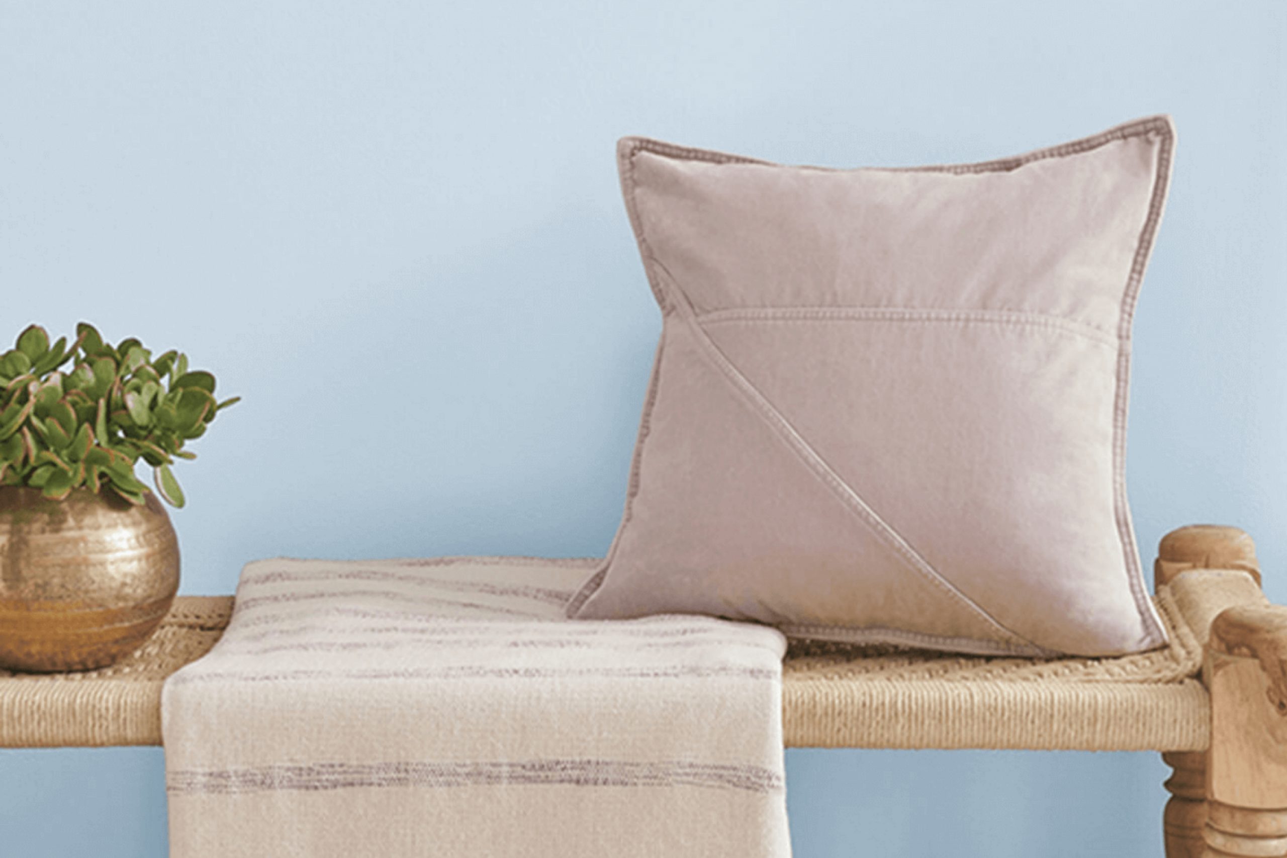
Think about walking into a room bathed in the soothing hues of SW 6806 Rhythmic Blue by Sherwin Williams. As you look around, the color envelops the space with a calm yet invigorating energy that gently relaxes your mind while bringing a fresh vibrancy to the surroundings. My experience with Rhythmic Blue was like breathing in a breath of fresh, cool air — it has a unique way of transforming a space without overwhelming it.
As I decided to repaint a room, choosing the right shade felt daunting amidst the vast sea of options. However, when I came across Rhythmic Blue, it struck the perfect balance between a lively aura and soothing serenity. This color is not just blue; it’s a narrative in itself, telling stories of quiet afternoons and the tranquility of early mornings.
In this article, I’ll share how Rhythmic Blue can be more than just a color choice for your walls. It’s a backdrop for daily life, enhancing furniture tones, lighting, and decor elements in a way that ties a room together.
Whether you’re looking to refresh a single room or revamp your entire home, let me show you why SW 6806 Rhythmic Blue could be the ideal choice for bringing new energy into your living spaces.
What Color Is Rhythmic Blue SW 6806 by Sherwin Williams?
Rhythmic Blue, a vibrant shade of blue with a noticeable punch, exudes a cheerful and inviting vibe. This color is perfect for adding a burst of energy to any space. It works wonderfully in active, communal areas like living rooms or kitchens, where it brings a lively atmosphere.
This shade pairs well with various interior styles, particularly modern and coastal designs. In modern settings, Rhythmic Blue can be used on a feature wall or for accent pieces to add a pop of color against neutral tones like white, gray, or black. In coastal themes, it mirrors the colors of the sea and sky, creating a fresh, airy feel that complements light woods and sandy beiges.
When it comes to materials, Rhythmic Blue goes great with natural textures like linen, cotton, and wool, adding a touch of warmth to its coolness. It also looks stunning with metallic finishes such as brushed silver or chrome, which provide a modern twist and enhance the vibrancy of the blue.
For a soft, grounded approach, pair it with wooden elements which will harmonize the coolness of the blue with warm, natural tones, reinforcing a comforting and welcoming environment. This color is adaptable, perfect for infusing any space with a lively yet balanced charm.
Is Rhythmic Blue SW 6806 by Sherwin Williams Warm or Cool color?
Rhythmic Blue by Sherwin Williams is a vibrant and appealing shade that brings a lively feel to any home. When used in interior spaces, this color can make rooms look more inviting and energetic. It’s especially great for spaces like living rooms or bedrooms where you want to add a touch of brightness without overpowering the room.
One of the benefits of using Rhythmic Blue is how it can make a room seem larger and more open. Lighter blue tones naturally give a sense of more space, which is perfect for smaller rooms or apartments. This color also pairs well with many other shades, such as whites, grays, and even some yellows, allowing for versatile design options.
Moreover, the freshness of this blue can help to uplift moods, making it an excellent choice for areas where you spend a lot of time or receive guests. Overall, Rhythmic Blue is a practical and pretty choice that works well in many different home styles.
Undertones of Rhythmic Blue SW 6806 by Sherwin Williams
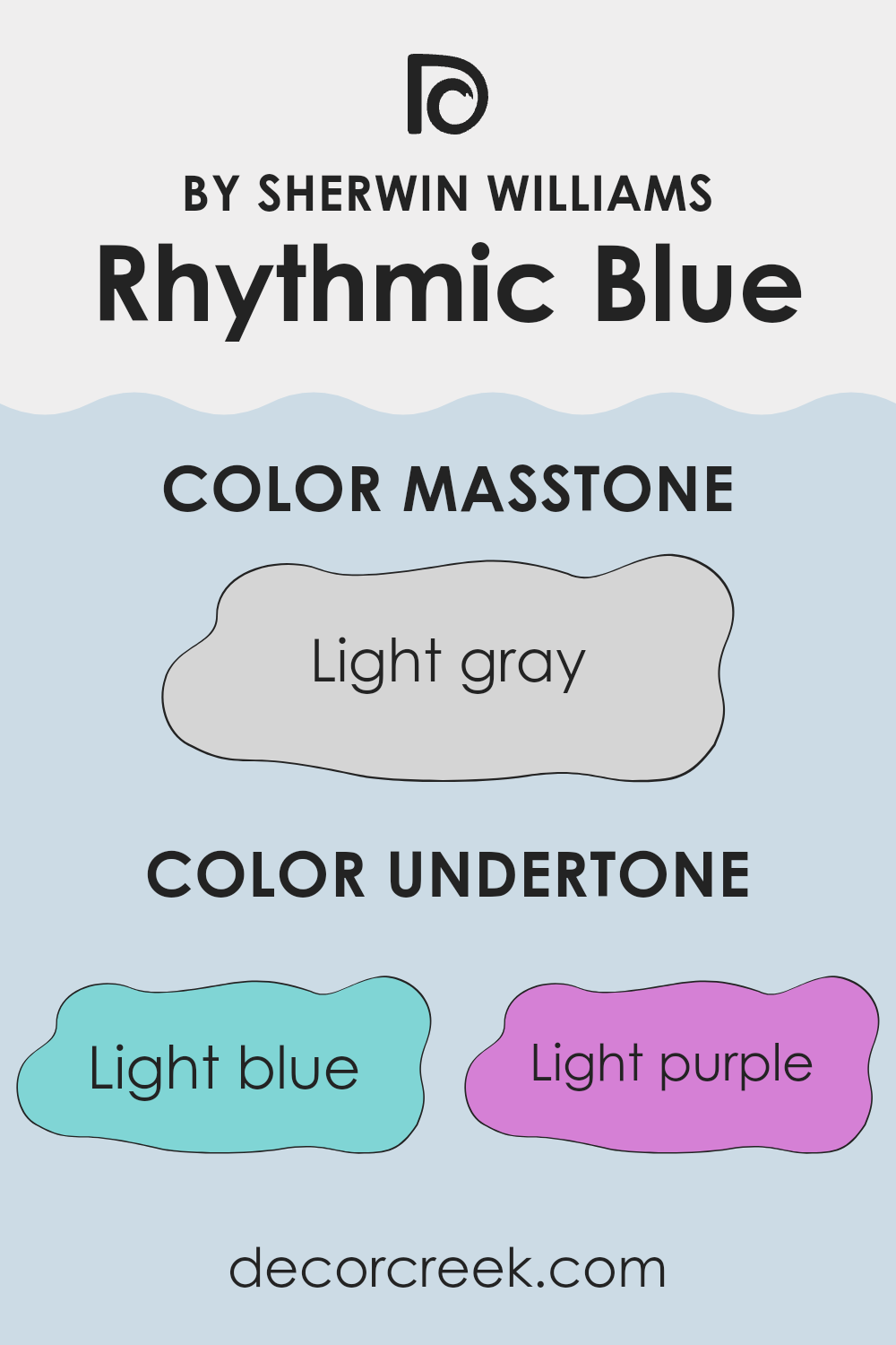
Rhythmic Blue by Sherwin Williams is an interesting paint color due to the mix of its various undertones. Undertones are subtle hues that are mixed into a primary color and affect how the color appears under different lighting conditions. This shade of blue has undertones that range between light blue, light purple, pale yellow, lilac, mint, pale pink, and grey. These undertones can change the appearance of the color depending on the room’s lighting and surrounding colors.
When used on interior walls, Rhythmic Blue’s undertones play a significant role in its overall look. For instance, in a room with lots of natural light, the pale yellow and mint undertones might make the color appear brighter and more vibrant. In contrast, in a space with less light or during the evening when lit by artificial lights, the grey and lilac undertones could make the color look deeper and richer.
The mix of light purple and pale pink undertones adds a subtle warmth to the color, making a room feel welcoming without being overpowering. Similarly, the light blue and mint undertones give it a refreshing feel, which can be soothing in spaces like bedrooms or bathrooms.
Depending on the colors of furniture and decor, Rhythmic Blue can adapt slightly, showing off different aspects of its personality, thanks to its diverse undertones—this makes it a versatile choice for many homes.
What is the Masstone of the Rhythmic Blue SW 6806 by Sherwin Williams?
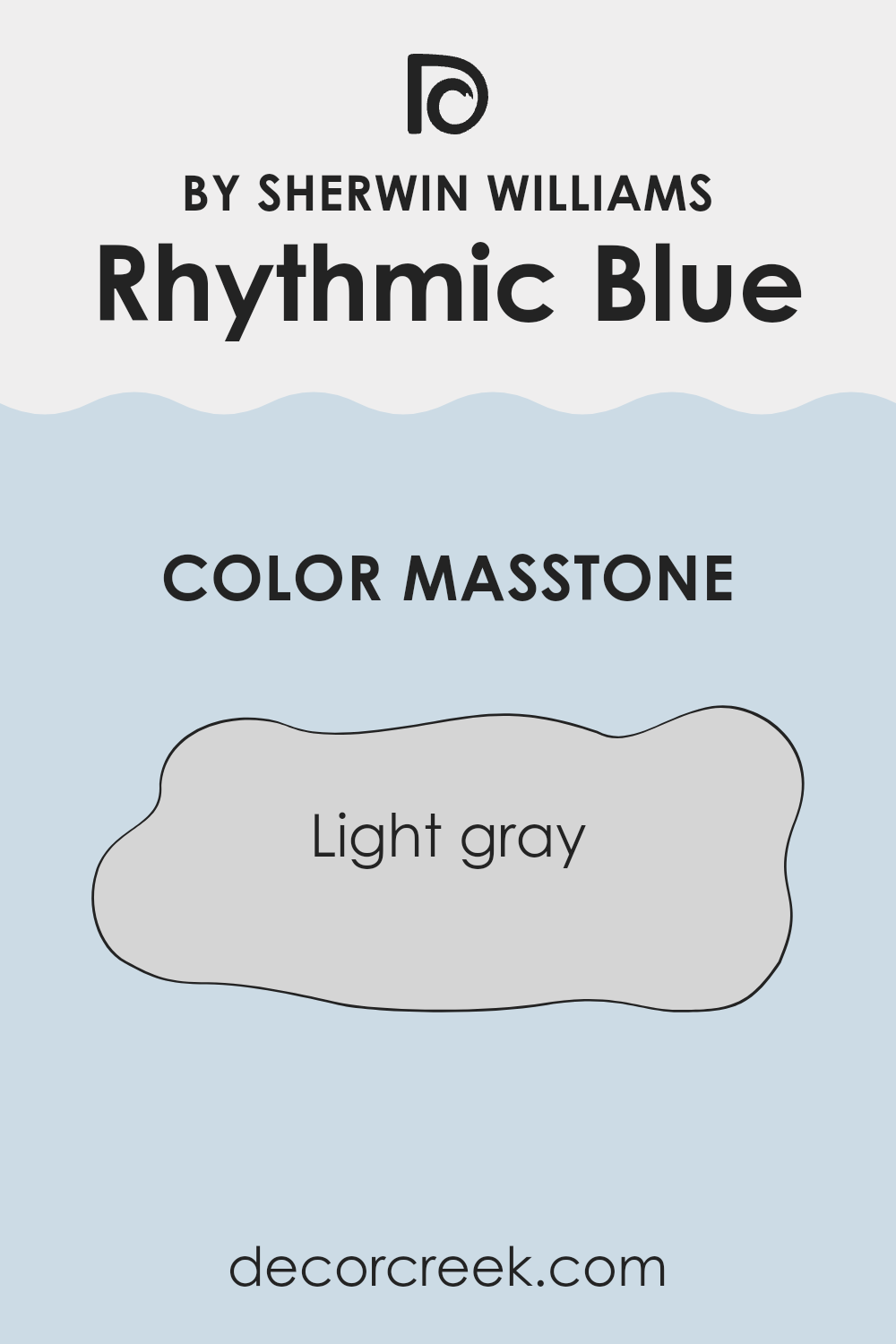
Rhythmic BlueSW 6806 by Sherwin Williams has a masstone of light gray, a soothing and versatile shade that offers a clean and subtle backdrop for any room. This color can make spaces feel larger and more open because of its light and airy quality.
It’s particularly useful in smaller rooms or areas with limited natural light. The neutrality of Rhythmic BlueSW 6806 ensures that it can blend effortlessly with a wide range of decor styles and color palettes, from bright and bold to more muted and understated collections.
Additionally, this light gray shade is practical for homeowners as it tends to hide minor imperfections on walls better than darker colors might. It’s an excellent choice for living areas, bedrooms, and even bathrooms, providing a fresh, modern look that adapts easily to changing trends in interior design.
How Does Lighting Affect Rhythmic Blue SW 6806 by Sherwin Williams?
Lighting significantly impacts how we perceive colors. Different light sources can make a color appear dramatically different, highlighting why considering the type of light in a room is crucial when choosing a paint shade.
Take Rhythmic Blue, a vibrant blue hue. In artificial light, this shade often looks deeper and more intense, as most artificial lights provide a warm glow that can slightly modify the color’s undertones. In rooms lit with LED bulbs or fluorescent lights that mimic daylight, Rhythmic Blue might maintain a truer shade, looking crisp and lively.
In natural light, Rhythmic Blue’s appearance can change depending on the time of the day and the room’s orientation regarding the sun. For example, in north-facing rooms, which receive less direct sunlight, Rhythmic Blue might appear somewhat muted, more of a subtle blue with a slightly gray cast, giving the room a cozy, calm atmosphere throughout the day.
In south-facing rooms, Rhythmic Blue will generally be at its brightest and most true to color in middle of the day. South-facing exposures get more direct sunlight, which can make this blue look vibrant and full of life; it amplifies the hue’s cheerful aspects.
East-facing rooms see the sun at its mildest in the mornings, where Rhythmic Blue will appear bright and cheerful. As the day progresses and the room transitions to softer, indirect light, the color can shift to show more of its depth and complexity.
Conversely, west-facing rooms might show Rhythmic Blue in a cooler, more shadowy light in the morning but become dynamic and bright in the afternoon to evening as they catch the warmer, setting sun.
Understanding how Rhythmic Blue interacts with light from different directions helps in planning the look and feel of a space to achieve the desired effect with your color choice.
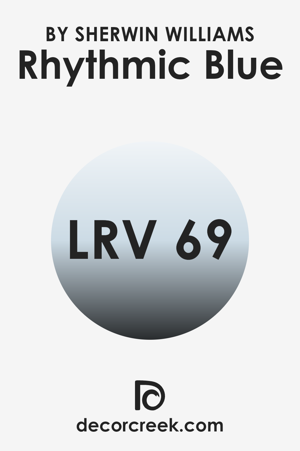
What is the LRV of Rhythmic Blue SW 6806 by Sherwin Williams?
LRV stands for Light Reflectance Value, which measures the percentage of light a paint color reflects back into a room from 0 to 100. A higher LRV number means the color reflects more light and can make a room feel brighter and more open.
A lower LRV can create a cozier atmosphere by absorbing more light. LRV is a useful tool for deciding on paint colors for your home because it helps you understand how light or dark your walls might appear in different lighting conditions.
For the shade Rhythmic Blue, which has an LRV of 68.923, we see that it reflects a good amount of light. This means it likely appears lighter and more vibrant on walls, especially in well-lit rooms. This attribute can help in making spaces feel lively and airy. Since it is on the higher end of the scale, it’s less likely to darken a room but still brings with it a dash of deeper color that offers a refreshing contrast to very light shades.
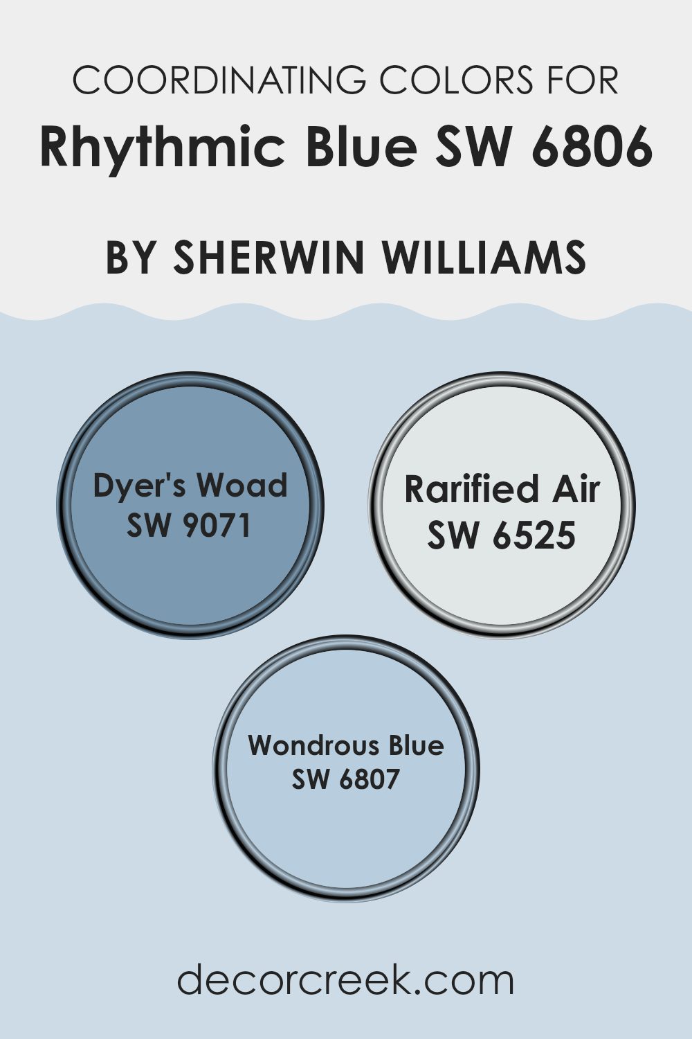
Coordinating Colors of Rhythmic Blue SW 6806 by Sherwin Williams
Coordinating colors are hues that complement or enhance each other, creating a balanced and harmonious look when used together in décor. These colors can enhance different aspects of a main color, giving depth and variety to an interior design scheme. For instance, when decorating with a color like Sherwin Williams Rhythmic Blue, choosing coordinating colors that align with its tone and mood can lead to a pleasing aesthetic.
Dyer’s Woad, an intense shade of deep blue, adds a dash of drama when paired with lighter hues. It’s great for creating a visual impact without overwhelming the senses. Rarified Air is a much lighter blue, almost with a sky-like clarity, which can lighten an atmosphere and add a breath of freshness to a space.
Meanwhile, Wondrous Blue is a vibrant mid-tone blue that carries a cheerful energy. This shade is versatile, blending well with both dark and light colors, making it perfect for adding a lively but balanced touch to a room colored with Rhythmic Blue. Together, these coordinating colors form a palette that’s cohesive, yet provides enough contrast to draw the eye and give character to a space.
You can see recommended paint colors below:
- SW 9071 Dyer’s Woad
- SW 6525 Rarified Air
- SW 6807 Wondrous Blue
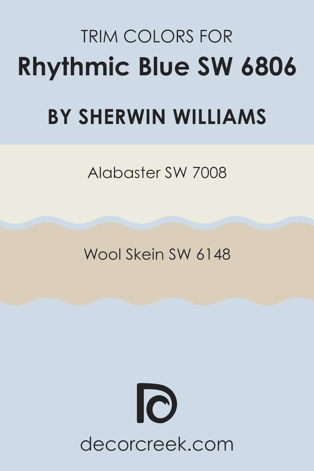
What are the Trim colors of Rhythmic Blue SW 6806 by Sherwin Williams?
Trim colors are used to enhance the main color on the walls by providing contrast or complementing the primary shade, as they are typically applied to window trims, door frames, and skirting boards. In the case of Rhythmic Blue by Sherwin Williams, selecting appropriate trim colors like Alabaster or Wool Skein can significantly influence the overall look and feel of the room.
Alabaster as a trim color, with its soft and creamy white hue, provides a bright contrast that can make the Rhythmic Blue appear more vivid and distinct. It’s a great choice for creating a fresh and clean outline around windows and doors.
On the other hand, Wool Skein, which carries subtle sandy tones, offers a warmer and more subtle contrast, blending more smoothly with Rhythmic Blue to achieve a cozy and inviting atmosphere. This color works exceptionally well in spaces where a softer, more seamless transition between wall and trim is desired.
You can see recommended paint colors below:
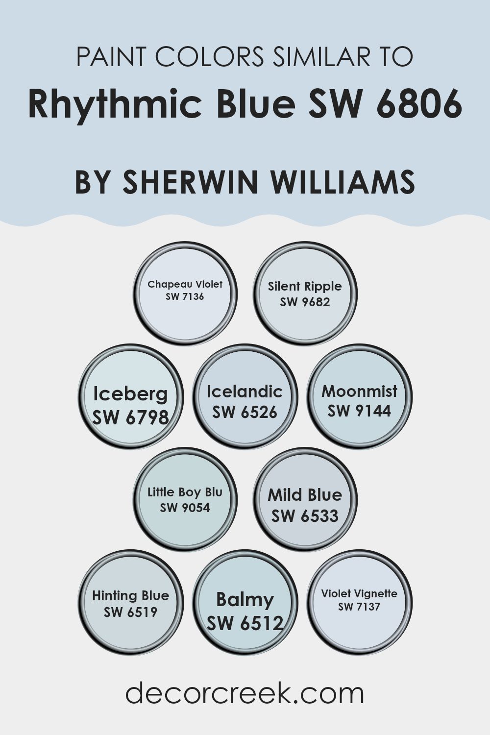
Colors Similar to Rhythmic Blue SW 6806 by Sherwin Williams
In interior design and visual arts, using similar colors can create a harmonious and cohesive look. These colors, though unique, share common undertones or intensity, making them easy to blend seamlessly on walls, in textiles, and in decor items. For instance, Chapeau Violet possesses a muted purple hue that gently complements cooler tones.
Silent Ripple is subtly reminiscent of a soft, muted teal which echoes the calmness found in adjacent blue shades. Iceberg, another shade close to the rest, has a light blue touch that resembles the chilly hues often seen in a winter morning sky.
Continuing with Icelandic, this color channels a clearer blue, much like the pristine skies of Iceland. Moonmist offers a fade into a lighter, almost misty blue that works well in creating a soothing environment.
Little Boy Blu has a lively yet understated blue tone that brightens spaces without overwhelming them. The Mild Blue shade offers just a hint more intensity without stepping too far from its related colors.
Hinting Blue and Balmy both play up the softness, yet each maintains an identity that, while subtle, still stands out. Lastly, Violet Vignette complements Chapeau Violet by reinforcing the presence of a deeper, yet still soft, purple undertone, rounding out a spectrum of similar colors that together, offer variety and visual comfort.
You can see recommended paint colors below:
- SW 7136 Chapeau Violet
- SW 9682 Silent Ripple
- SW 6798 Iceberg
- SW 6526 Icelandic
- SW 9144 Moonmist
- SW 9054 Little Boy Blu
- SW 6533 Mild Blue
- SW 6519 Hinting Blue
- SW 6512 Balmy
- SW 7137 Violet Vignette
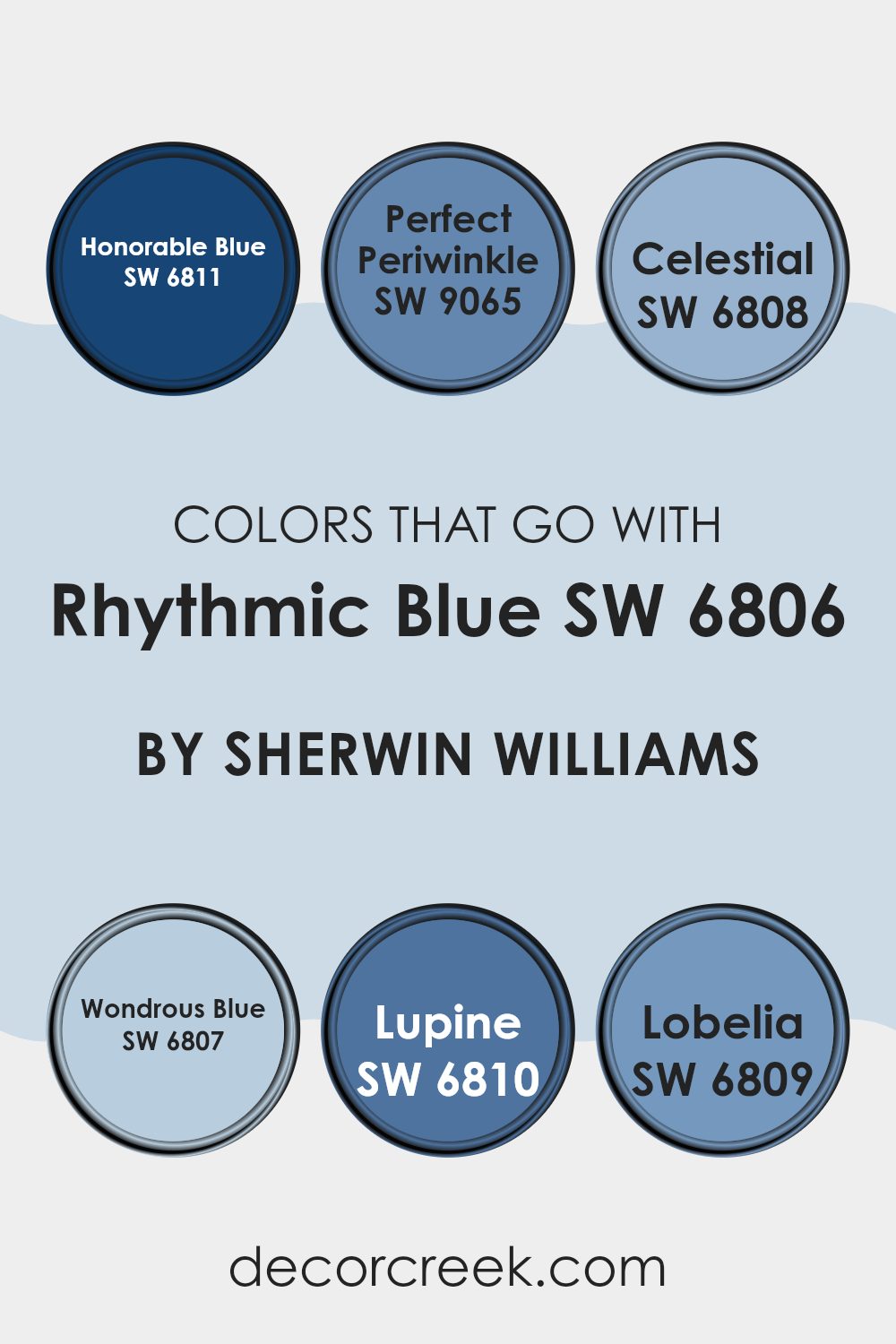
Colors that Go With Rhythmic Blue SW 6806 by Sherwin Williams
Choosing the right colors to pair with Rhythmic Blue SW 6806 by Sherwin Williams can enhance the aesthetic appeal and mood of any space. Using complementary colors like Honorable Blue, Perfect Periwinkle, Celestial, Wondrous Blue, Lupine, and Lobelia allows for the creation of a harmonious and visually engaging environment. These colors blend well with Rhythmic Blue, each adding its own unique vibe while maintaining a cohesive look.
Honorable Blue is a deep, rich blue that adds a bold contrast against the lighter tones of Rhythmic Blue, making spaces feel more grounded. Perfect Periwinkle is a gentle mix of blue and violet that brings a light, airy feel to interiors, softening the overall effect when used alongside Rhythmic Blue.
Celestial is a sky-blue hue that evokes a sense of openness and freshness, ideal for creating a breezy and relaxed atmosphere. Wondrous Blue offers a slightly aquatic feel, reminiscent of clear skies on a sunny day, perfect for enhancing areas needing a touch of calm.
Lupine has a touch of purple, giving it a playful yet cozy appeal that works well in creative or restful spaces. Lastly, Lobelia features a vibrant blue tone that injects energy and vivacity, making it a great choice for accent features or focal points in a room. Together, these colors support and complement Rhythmic Blue, ensuring any room looks its best.
You can see recommended paint colors below:
- SW 6811 Honorable Blue
- SW 9065 Perfect Periwinkle
- SW 6808 Celestial
- SW 6807 Wondrous Blue
- SW 6810 Lupine
- SW 6809 Lobelia
How to Use Rhythmic Blue SW 6806 by Sherwin Williams In Your Home?
Rhythmic Blue SW 6806 by Sherwin Williams is a rich and vibrant shade of blue that brings a fresh and lively feel to any space. This color is perfect for those looking to add a splash of energy and cheerfulness to their home. It works wonderfully in a living room or dining area, creating a welcoming atmosphere for guests and family gatherings.
If you want a more soothing environment in your bedroom or bathroom, you might consider using Rhythmic Blue as an accent wall, paired with lighter colors like soft whites or gentle grays for balance.
This shade also works well in a kitchen, either on the walls or as a color choice for cabinets, adding a modern twist to your cooking space. For those who enjoy a bit of creativity, Rhythmic Blue can be paired with fun, contrasting colors like yellows or greens to create a vibrant, eye-catching look. Applying this color in your home can really freshen up the space and make it more pleasant and lively.
Rhythmic Blue SW 6806 by Sherwin Williams vs Hinting Blue SW 6519 by Sherwin Williams
Rhythmic Blue and Hinting Blue, both by Sherwin Williams, offer unique shades for any space. Rhythmic Blue is a bold, vibrant color that brings a lively feel to rooms.
It has a deep tone that can make small spaces feel cozier or add a punch of character to larger areas. On the other hand, Hinting Blue presents a much lighter, airier blue. It’s soft and subtle, making it ideal for creating a relaxed, calming vibe in a room.
While Rhythmic Blue stands out and commands attention, Hinting Blue blends smoothly into a design, offering a gentle hint of color. Both colors work well in various settings, but your choice depends on whether you want a stronger presence or a light touch in your decor.
You can see recommended paint color below:
- SW 6519 Hinting Blue
Rhythmic Blue SW 6806 by Sherwin Williams vs Balmy SW 6512 by Sherwin Williams
Rhythmic Blue and Balmy, both by Sherwin Williams, offer distinct vibes for any space. Rhythmic Blue is a deep, vibrant shade that adds a punch of energy to rooms. Perfect for a bold accent wall, it’s both fun and confident without overpowering.
On the other hand, Balmy is a much softer, lighter blue with a hint of gray. This color is great for creating a relaxed, soothing atmosphere in spaces like bedrooms or bathrooms.
It’s subtle enough to use on all walls and pairs nicely with brighter or darker decor. While Rhythmic Blue is more about making a statement, Balmy provides a gentle background, making it versatile for various styling preferences.
You can see recommended paint color below:
- SW 6512 Balmy
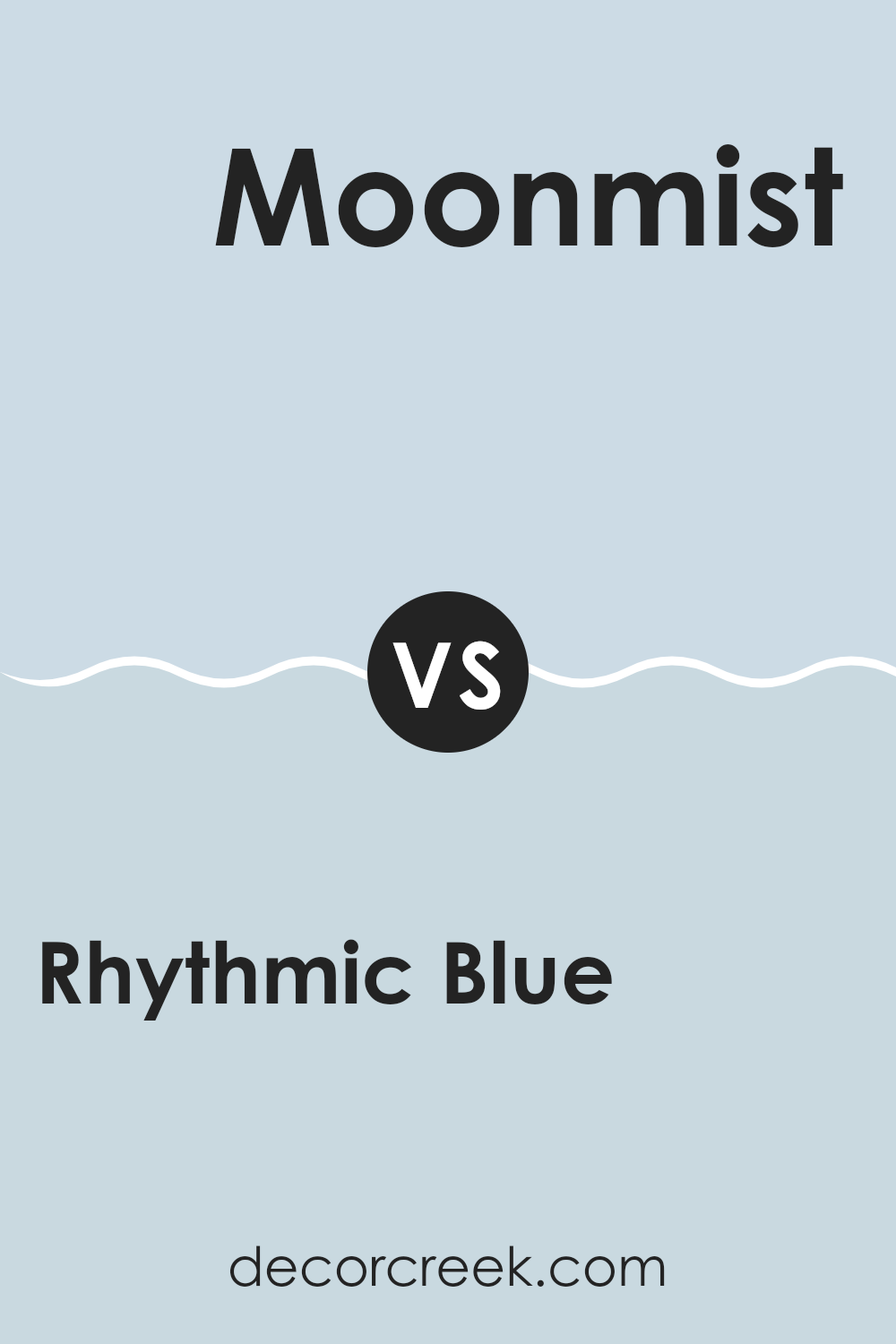
Rhythmic Blue SW 6806 by Sherwin Williams vs Moonmist SW 9144 by Sherwin Williams
Rhythmic Blue and Moonmist, both from Sherwin Williams, offer contrasting shades that cater to different tastes and spaces. Rhythmic Blue is a strong, vibrant color that adds a lively touch to any room.
It has a deep, rich tone that stands out and makes a bold statement. On the other hand, Moonmist is much lighter and softer. This color provides a fresh and airy feel, making it perfect for creating a relaxed atmosphere.
While Rhythmic Blue is ideal for accent walls or areas where you want to draw attention, Moonmist works well in spaces where you aim to create a calm and light environment. Both colors are versatile but serve distinct purposes based on their depth and intensity.
You can see recommended paint color below:
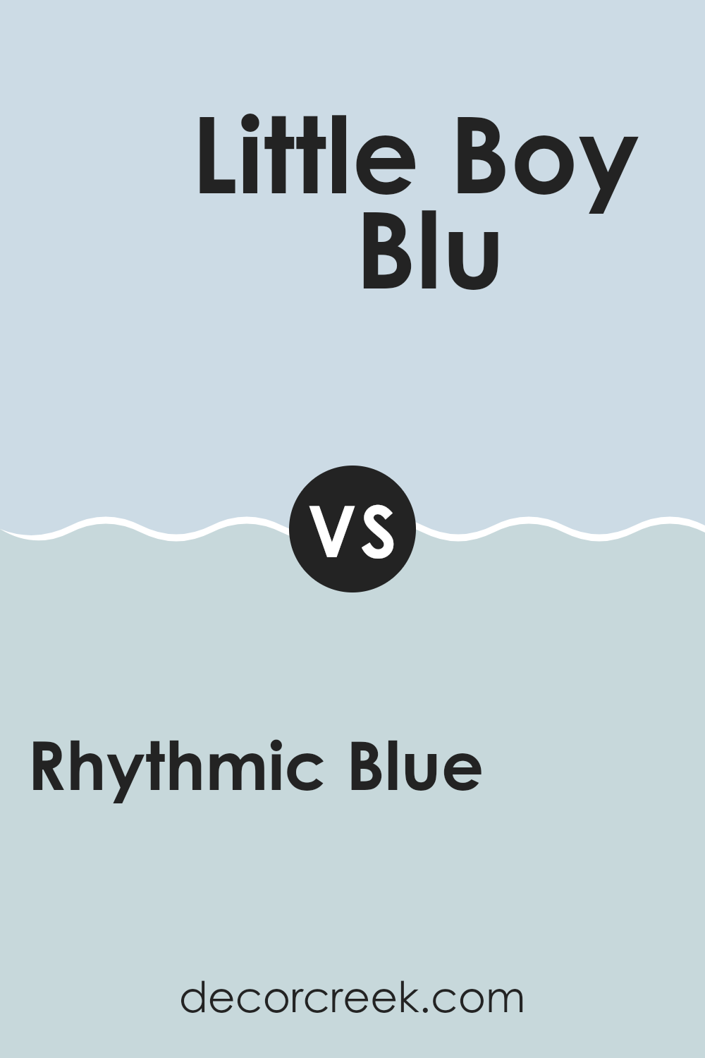
Rhythmic Blue SW 6806 by Sherwin Williams vs Little Boy Blu SW 9054 by Sherwin Williams
Rhythmic Blue and Little Boy Blu by Sherwin Williams are both shades of blue, but they differ in tone and depth. Rhythmic Blue is a rich, deep blue with a vibrant quality that can make it a strong statement color in a room.
It tends to add a bold touch and works well in spaces where you want to add some drama or intensity. On the other hand, Little Boy Blu is a lighter, more muted blue. It has a soft, gentle appearance that makes it ideal for creating a calm and pleasant atmosphere.
This color is perfect for bedrooms or bathrooms where you want a relaxing vibe. Both colors can be versatile and pair well with various decor styles, but Rhythmic Blue leans towards a more dynamic look, while Little Boy Blu offers a subdued, gentle appeal.
You can see recommended paint color below:
- SW 9054 Little Boy Blu
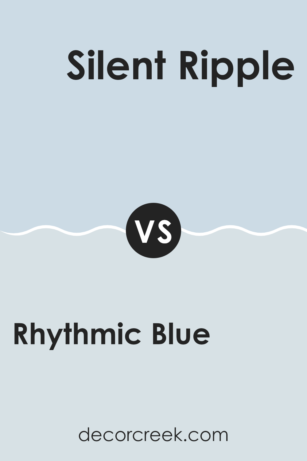
Rhythmic Blue SW 6806 by Sherwin Williams vs Silent Ripple SW 9682 by Sherwin Williams
Rhythmic Blue and Silent Ripple are two distinct colors from Sherwin Williams that offer subtle yet unique vibes for any space. Rhythmic Blue is a vibrant shade that leans towards a lively, bright blue, making it perfect for spaces where you want to add some cheerfulness and energy.
It reflects light well, brightening up rooms effectively. On the other hand, Silent Ripple is a softer, more muted color. This hue gives off a gentle, relaxing feel due to its understated quality, which makes it great for creating a calm and peaceful atmosphere in areas like bedrooms or studies.
Both colors are versatile but serve different purposes based on the mood you’re aiming to achieve in your decorating project. Silent Ripple works better for a soft, subtle look while Rhythmic Blue is ideal for making a stronger, more dynamic statement.
You can see recommended paint color below:
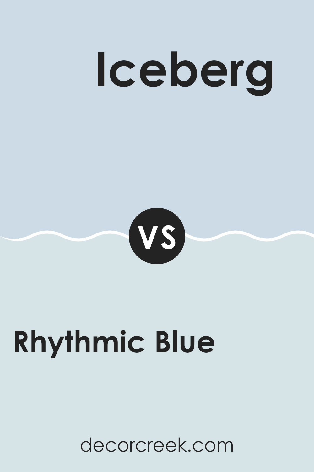
Rhythmic Blue SW 6806 by Sherwin Williams vs Iceberg SW 6798 by Sherwin Williams
Rhythmic Blue is a bold and lively color that definitely brings energy into any room. It’s a deep blue that makes a strong statement and can give a space a modern, fresh look. On the other hand, Iceberg is much lighter and softer.
This color is closer to a sky blue and adds a light, airy feel to interiors. It’s gentle and calming, making it perfect for creating a relaxed environment. When used together, Rhythmic Blue can act as a great accent to Iceberg, providing a beautiful contrast that adds depth and interest to the decor.
Rhythmic Blue is more suited for a focal point or feature wall, whereas Iceberg works well for the rest of the space to keep it feeling open and bright. Each color has its own charm, but together they can create a balanced and lively atmosphere.
You can see recommended paint color below:
- SW 6798 Iceberg
Rhythmic Blue SW 6806 by Sherwin Williams vs Icelandic SW 6526 by Sherwin Williams
Rhythmic Blue and Icelandic are both colors by Sherwin Williams that offer distinct vibes for any space. Rhythmic Blue is a deep, bold blue that brings a strong and calm feel to a room. It’s perfect for creating a focal point because of its rich shade.
On the other hand, Icelandic is a light, airy blue with a hint of gray. This color is much softer and can make a space feel open and relaxed. It’s great for achieving a fresh, clean look, especially in smaller rooms or spaces with lots of natural light.
Comparing the two, Rhythmic Blue makes more of a statement and suits accent walls or areas where you want depth and focus. Icelandic, being gentler, is better suited for larger areas, providing a subtle, soothing background that’s easy on the eyes. Each has its unique appeal depending on what atmosphere you are looking to create.
You can see recommended paint color below:
- SW 6526 Icelandic
Rhythmic Blue SW 6806 by Sherwin Williams vs Mild Blue SW 6533 by Sherwin Williams
Rhythmic Blue and Mild Blue, both by Sherwin Williams, offer distinct yet subtly different tones that could influence the ambiance of any space. Rhythmic Blue is a vibrant and strong shade that carries more intensity and a hint of deeper ocean-like qualities. It’s perfect when you want a room to have a bit of drama and a pop of color.
Mild Blue, on the other hand, is softer and cleaner, providing a lighter and airier feel. It comes across as more laid-back and is excellent for creating a relaxed atmosphere in a room. Its subtle touch is good when you want a space to feel more open and calming.
Both colors are great for walls in spaces where you spend a lot of time as they are gentle to the eyes. Depending if you’re going for a lively vibe or a calm nook, your choice between Rhythmic Blue and Mild Blue can set the mood you’re aiming for in your home or workspace.
You can see recommended paint color below:
Rhythmic Blue SW 6806 by Sherwin Williams vs Chapeau Violet SW 7136 by Sherwin Williams
Rhythmic Blue and Chapeau Violet are two very distinct colors from Sherwin Williams. Rhythmic Blue is a lively and fresh shade of blue that adds a vibrant touch to any space. It’s bright enough to make a room feel airy and more open, but also has a soothing quality that’s not too overpowering. This color works great in areas where you want a refreshing vibe without going too bold.
On the other hand, Chapeau Violet is a deeper, more muted purple. This color brings a sense of depth and richness to a room, making it ideal for spaces where you want to add a touch of elegance without resorting to a traditional dark color like black or navy. Chapeau Violet is versatile enough to work well in a bedroom, living room, or even as an accent wall.
When comparing the two, Rhythmic Blue is more about brightness and freshness, while Chapeau Violet leans towards a richer, more subdued look. Both colors have their unique charm and can significantly enhance the aesthetic of a room depending on what atmosphere you’re aiming for.
You can see recommended paint color below:
- SW 7136 Chapeau Violet
Rhythmic Blue SW 6806 by Sherwin Williams vs Violet Vignette SW 7137 by Sherwin Williams
Rhythmic Blue and Violet Vignette, both by Sherwin Williams, offer distinct vibes for any space. Rhythmic Blue is a peaceful and soft blue shade that brings a sense of calm to any room. It reflects the sky on a clear day, making it perfect for creating a relaxing atmosphere.
On the other hand, Violet Vignette is a deeper, muted purple that adds a touch of mystery and depth to spaces. It’s great for adding a bit of drama without overwhelming the senses. Both colors can significantly impact a room’s mood, but their effects are quite different.
Rhythmic Blue is ideal for a soothing environment, while Violet Vignette is better suited for those looking to make a more substantial, yet refined statement in their decor. Depending on what you’re going for in a space—whether it’s calm, ground, or a bit of intrigue—one of these colors could be the perfect choice.
You can see recommended paint color below:
- SW 7137 Violet Vignette
Wrapping up my thoughts on SW 6806 Rhythmic Blue by Sherwin Williams, I have to say, I’m really impressed! This paint color is so pretty—it’s like looking at the sky on a clear, sunny day. What I love most about Rhythmic Blue is how it makes any room feel calm and happy. Whether you’re painting a bedroom, living room, or even a bathroom, this color adds a beautiful touch without being too bold.
I also found out that Rhythmic Blue goes well with many other colors. You can pair it with light colors like white or grey, and it still looks amazing. And if you want something a bit different, you can mix it with brighter colors like yellow or pink to make the room more fun.
For anyone thinking about giving their room a new look, Rhythmic Blue is a great choice. It’s easy on the eyes, makes a room feel open and light, and it’s just really beautiful. It’s not just a paint color—it’s a way to make your room feel new and lovely.
I definitely recommend giving it a try if you want to change up your room without doing anything too crazy!
Ever wished paint sampling was as easy as sticking a sticker? Guess what? Now it is! Discover Samplize's unique Peel & Stick samples.
Get paint samples

