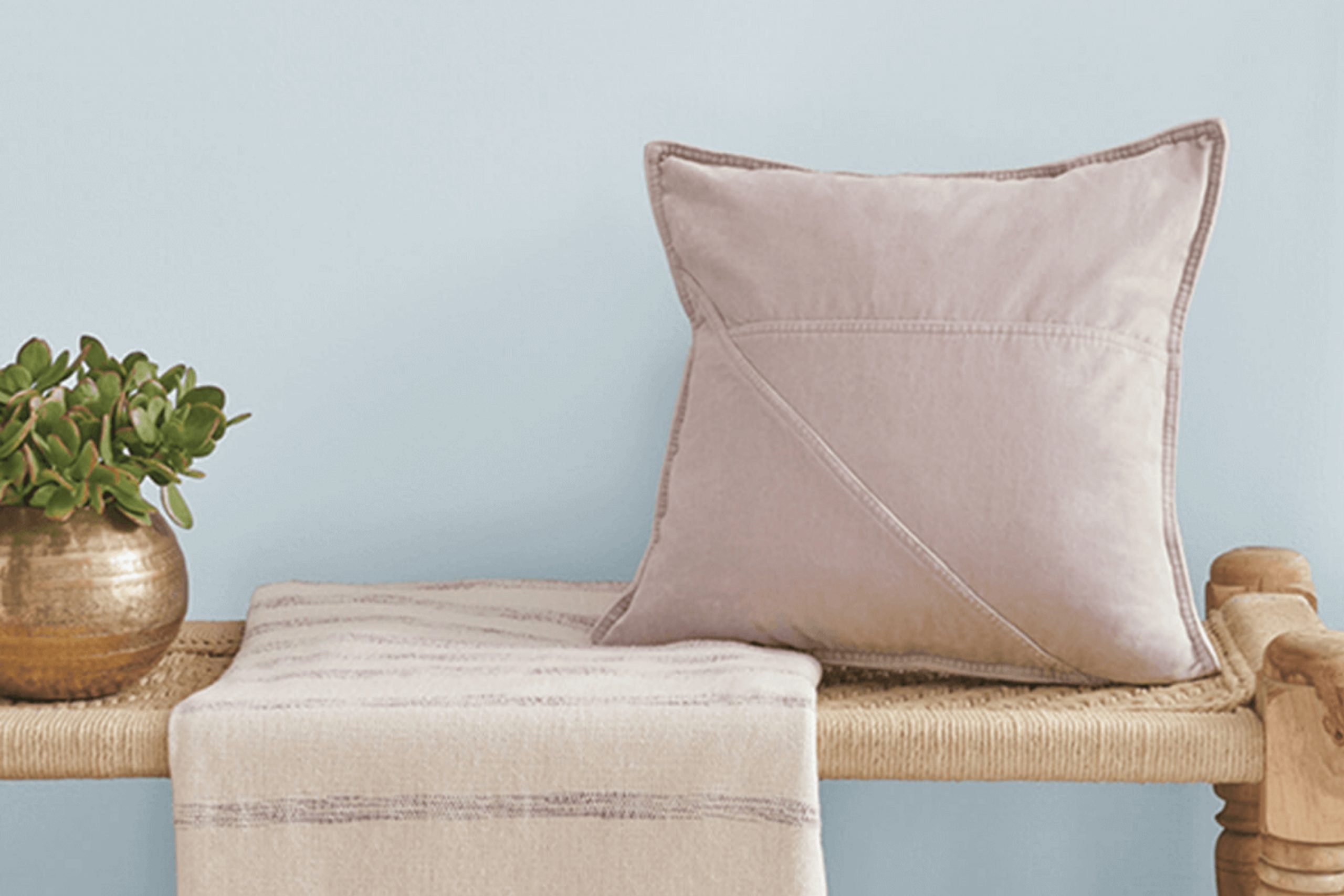
I recently painted a room with SW 6519 Hinting Blue by Sherwin Williams, and I must say, it’s quite the soothing shade. This particular blue has a lightness that brightens the room while offering a sense of calm. Whenever I walk in now, it feels airier and more open, as if the walls themselves have drawn in a deep, refreshing breath.
Choosing the right paint can often feel challenging with all the options out there, but Hinting Blue struck a perfect balance for my needs. It’s subtle without being dull, and vibrant without being overpowering. The color pairs beautifully with white trim and dark wood furniture, creating a balance that works well whether you’re going for a modern look or something more traditional.
If you’re considering a new color for your next room makeover, I recommend trying Hinting Blue. It has renewed my room into a peaceful retreat where I can relax and unwind at the end of a busy day.
Plus, it’s adaptable enough to suit different decors and lighting, making it a reliable choice for any room.
What Color Is Hinting Blue SW 6519 by Sherwin Williams?
Hinting Blue by Sherwin Williams is a soft, gentle shade that works like a whisper of color in a room. With its subtle blue tone, it is perfect for creating a light and airy feel. This color is adaptable and works especially well in modern farmhouses, coastal or Scandinavian interiors, where the emphasis is on clean, fresh designs.
This light blue shade pairs beautifully with natural materials and textures. It looks amazing with white painted wood, lightweight cotton and linen fabrics, and natural wood finishes like oak or pine, which accentuate its airy vibe. Add in some materials like rattan or wicker to enhance the beachy or rustic look depending on the setting.
For those looking to create a coordinated color scheme, Hinting Blue goes well with grey tones, soft whites, and even pastel yellows or greens. These combinations can help bring out the color’s subtle qualities without overpowering the room.
Hinting Blue is perfect for common areas and bedrooms alike, where its calming presence helps to establish a relaxed atmosphere. It’s a great base color that allows for flexible décor options, from bold art pieces to subtle earthy elements. This makes it a popular choice for decorators looking to create a harmonious and inviting home environment.
Is Hinting Blue SW 6519 by Sherwin Williams Warm or Cool color?
Hinting Blue SW 6519 by Sherwin Williams is a light, gentle blue shade that adds a fresh and airy feel to any room. It works particularly well in small rooms or areas with limited natural light, as its subtle brightness makes rooms appear larger and more open.
This color has a calm and soothing effect, making it an excellent choice for bedrooms and bathrooms where a relaxing atmosphere is desired. Moreover, Hinting Blue is highly adaptable and pairs nicely with a wide range of decor styles and colors. It looks beautiful with whites and grays for a crisp, clean look, or can be combined with bold colors like orange or red for a more dynamic and lively room.
This makes it a great choice for anyone looking to refresh their home without making major changes. Because of its light tone, it also works well as a background color, allowing furniture and artwork to stand out. Overall, Hinting Blue is a practical and charming color that can help create a pleasant and inviting home environment.
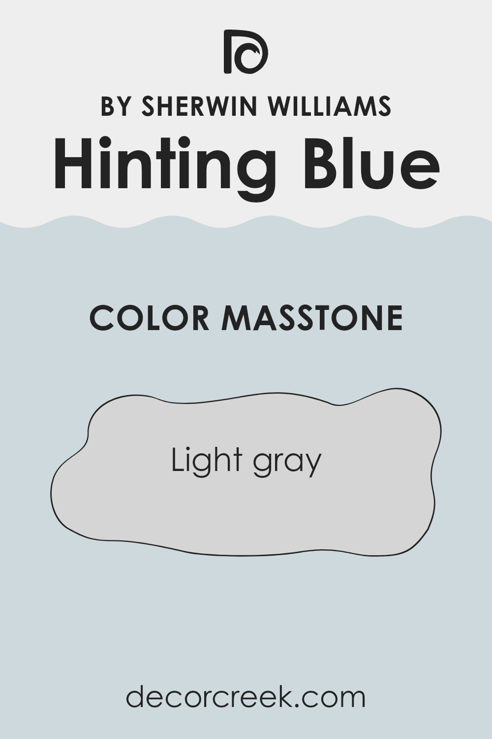
What is the Masstone of the Hinting Blue SW 6519 by Sherwin Williams?
Hinting Blue SW 6519 by Sherwin Williams is mainly a light gray color, with the RGB code #D5D5D5. When you put this color on the walls of a home, it creates a very clean and open feeling in the room. This light gray shade is truly adaptable, meaning it can work well in many different rooms, no matter their style or the furniture you have.
Whether your home is modern, traditional, or something in between, this color can fit right in. Additionally, light gray walls are great for letting other elements in your room stand out. For example, colorful paintings, vibrant curtains, or bold furniture pieces can really pop against a light gray backdrop.
This color is also helpful in making small rooms look bigger and more airy because light colors reflect more light around a room. So, using this shade can help make your home feel more open and inviting.
How Does Lighting Affect Hinting Blue SW 6519 by Sherwin Williams?
Lighting plays a crucial role in how we perceive colors. Different sources and angles of light can significantly alter the appearance of a paint color on walls. For example, Hinting Blue is a subtle shade that reacts uniquely under various lighting conditions due to its blue undertones.
In artificial light, such as that from LED or incandescent bulbs, Hinting Blue tends to look slightly warmer, which softens its coolness and adds a cozy feel to a room. The type of bulb can affect the color; warmer bulbs make it appear softer and more muted, whereas cooler bulbs emphasize its blue undertones, keeping it crisp and lively.
In natural light, the color is influenced by the direction of the room and the quality of sunlight received. In north-facing rooms, light is cooler and more consistent throughout the day. This can make Hinting Blue appear true to its color or slightly darker, maintaining a calm and steady look.
South-facing rooms, on the other hand, get plentiful sunlight, making this color look lighter and sometimes a bit washed out during the day, especially at peak brightness. However, the color warms up beautifully under this lighting, shifting slightly away from its blue roots.
East-facing rooms receive light in the morning when it is warm and golden. Hinting Blue will appear brighter and more refreshing in the morning, gradually transitioning to a cooler tone as the day progresses. West-facing rooms see the intense afternoon and evening light, which can enhance the color’s richness, making it appear dynamic and vibrant as it responds to the changing intensity of the sun.
Each of these varying effects highlights unique aspects of Hinting Blue, making it adaptable and appealing under different types of light. This flexibility makes it a popular choice for varied room orientations and lighting conditions.
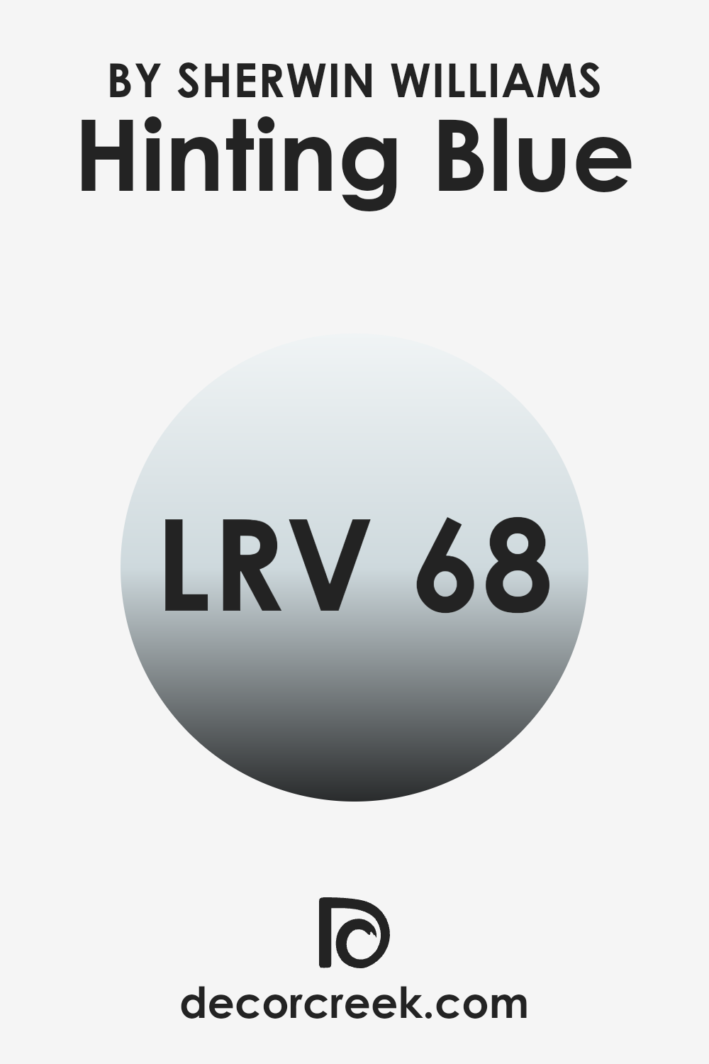
What is the LRV of Hinting Blue SW 6519 by Sherwin Williams?
LRV stands for Light Reflectance Value, which measures the percentage of light a paint color reflects from or absorbs into a painted surface. Essentially, it’s an indicator of how light or dark a color will appear once applied to your walls. Higher LRVs indicate lighter colors that reflect more light, making them ideal for making small rooms feel larger or darker areas feel brighter.
Conversely, lower LRVs mean the color is darker and absorbs more light, which can make rooms feel cozier but smaller. The LRV of Hinting Blue, at approximately 68, places it on the lighter end of the spectrum.
This means that when used on walls, Hinting Blue will reflect a good amount of light, brightening up the room. This quality makes it an excellent choice for areas that may not receive much natural light, such as north-facing rooms or bathrooms without windows. Its light-reflecting nature helps make these rooms appear more airy and open.
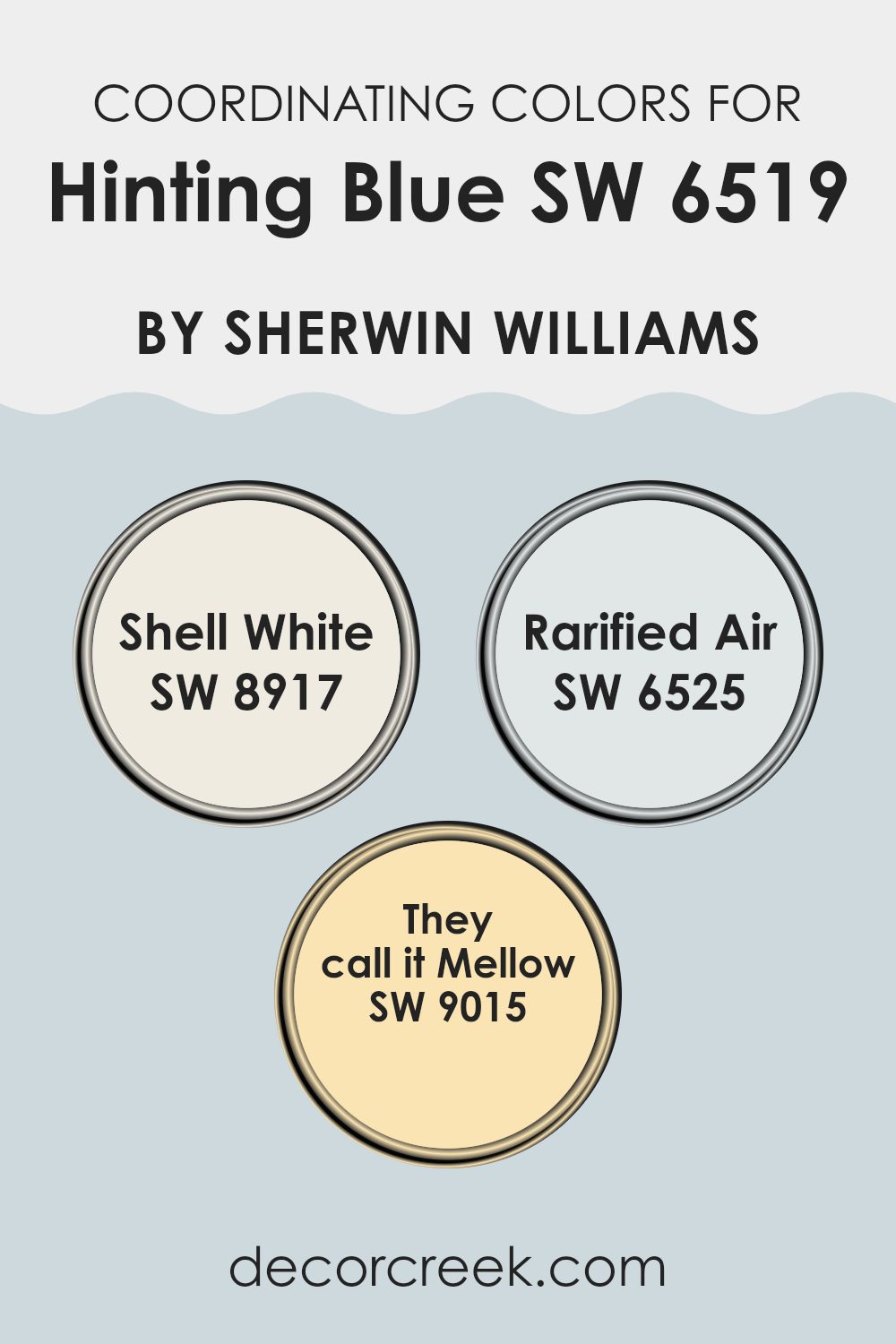
Coordinating Colors of Hinting Blue SW 6519 by Sherwin Williams
Coordinating colors are hues that work harmoniously together to enhance the overall aesthetic of a room, creating a balanced and pleasing color scheme. When used alongside Hinting Blue SW 6519 by Sherwin Williams, the colors Shell White SW 8917, Rarified Air SW 6525, and They Call It Mellow SW 9015 provide a beautiful palette that complements its cool, gentle tone.
These specific hues have been chosen because they either share undertones, contrast with, or add depth to Hinting Blue, making it easy to create a cohesive look in any room. Shell White SW 8917 is a clean and soft white shade that provides a subtle contrast to the more vibrant and cooler tones of Hinting Blue.
It works well as a main color in a room or as an accent, offering freshness and brightness without overpowering the senses. On the other hand, Rarified Air SW 6525 provides a light and airy touch that enhances rooms with a sense of polish without relying on intense saturation. This shade pairs beautifully with Hinting Blue for a relaxed and open atmosphere.
Lastly, They Call It Mellow SW 9015 is a warm and gentle yellow that provides a soft, inviting complement to the cooler blues, ensuring a balanced and welcoming color environment. This combination of hues allows for flexibility in decorating, whether aiming for a calm retreat or a cheerful room.
You can see recommended paint colors below:
- SW 8917 Shell White
- SW 6525 Rarified Air
- SW 9015 They call it Mellow
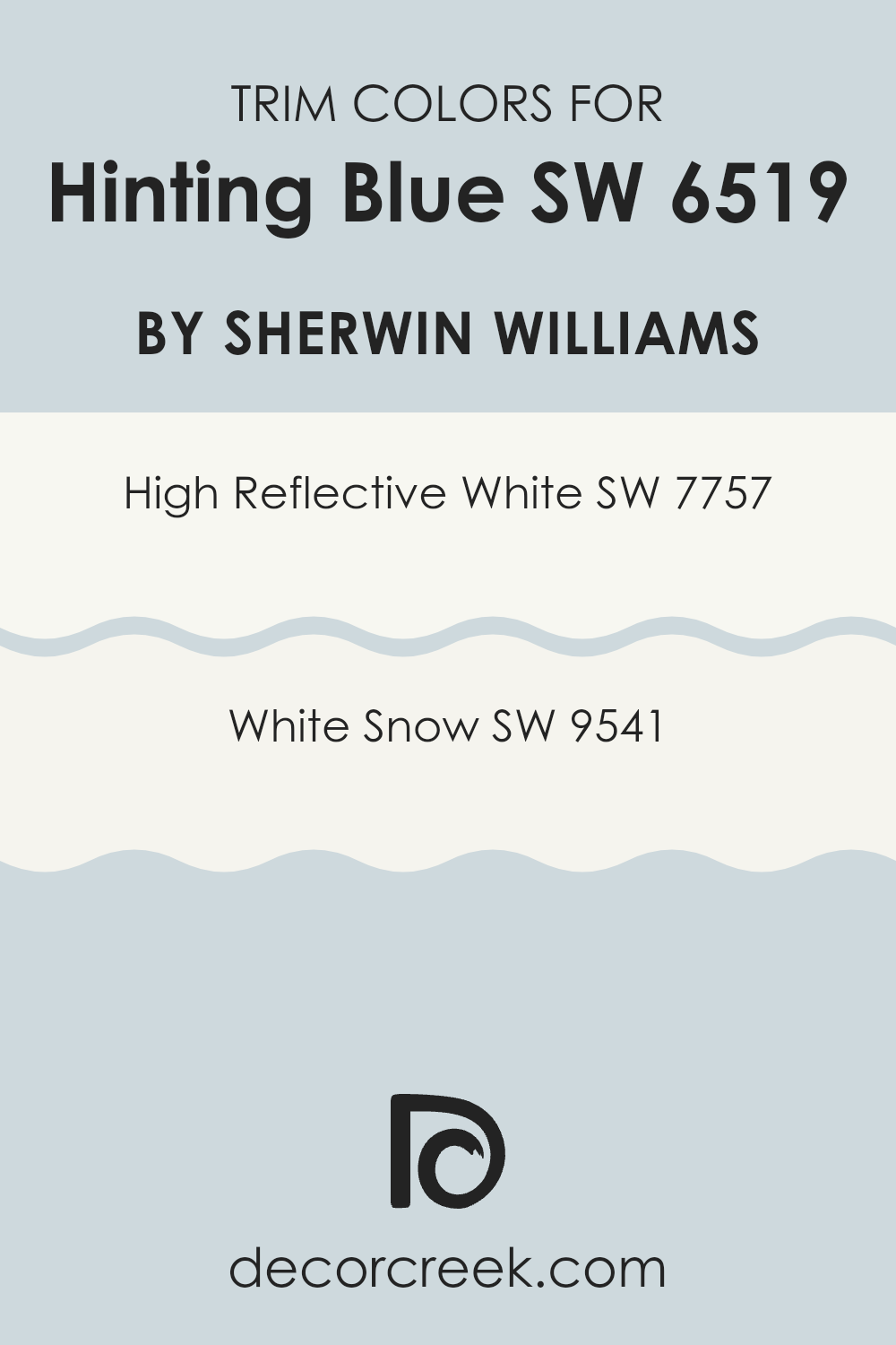
What are the Trim colors of Hinting Blue SW 6519 by Sherwin Williams?
Trim colors, such as SW 7757 – High Reflective White and SW 9541 – White Snow, play a crucial role in complementing the main wall color, in this case, Hinting Blue by Sherwin Williams. Choosing the right trim color helps in defining the areas between different architectural elements like doors, windows, and ceilings, enhancing the overall aesthetic appeal.
The contrast between the trim and the wall color can make the colors stand out more vividly, making rooms appear well-defined and neatly finished. High Reflective White (SW 7757) is an exceptionally bright white that brings out a clean and crisp look when paired with other colors.
It reflects light beautifully, making any room appear more open and brighter. On the other hand, White Snow (SW 9541) offers a softer white tone that provides a gentle, refined contrast without overpowering the primary color. It works particularly well in areas that aim for a subtle yet distinct separation between the walls and trim, promoting a smooth visual flow.
You can see recommended paint colors below:
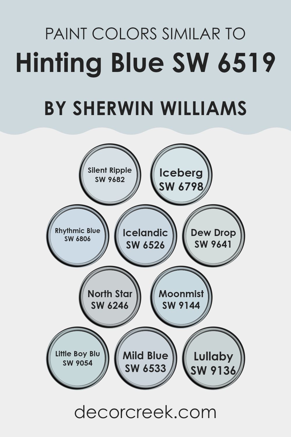
Colors Similar to Hinting Blue SW 6519 by Sherwin Williams
Choosing similar colors for a room can create a sense of harmony and flow, making the area feel cohesive and thoughtfully designed. Colors that closely resemble one another have the ability to unify a room while providing subtle differentiation that adds depth and visual interest without overpowering the senses.
For instance, Silent Ripple is a muted tone that adds a soft background, much like the quiet movement of water, making it calming and easy on the eyes. Iceberg, by comparison, introduces a slightly cooler hue, reminiscent of a clear, frosty morning, providing a crisp backdrop perfect for modern interiors.
Rhythmic Blue has a rhythmic quality in its subdued vibrancy, bringing in a dash of energy without overpowering softer elements. Icelandic channels the airy feel of a clear sky, working well in light-filled rooms. Dew Drop, with its gentle touch, is like early morning dew, offering a fresh and clean look.
North Star serves as a neutral guide—its stable and understated tone works beautifully to balance stronger features in a room. Moonmist evokes the ethereal feel of a night sky shrouded in mist, adding a mysterious allure. Little Boy Blu is cheerful and light, perfect for creating a playful yet relaxed atmosphere.
Mild Blue, true to its name, is soft and unobtrusive, making it ideal for peaceful rooms. Lastly, Lullaby exudes a soothing presence, akin to the comforting melody of a soft lullaby, ideal for restful settings. These shades work beautifully together to create environments that are both inviting and delightful to experience.
You can see recommended paint colors below:
- SW 9682 Silent Ripple
- SW 6798 Iceberg
- SW 6806 Rhythmic Blue
- SW 6526 Icelandic
- SW 9641 Dew Drop
- SW 6246 North Star
- SW 9144 Moonmist
- SW 9054 Little Boy Blu
- SW 6533 Mild Blue
- SW 9136 Lullaby
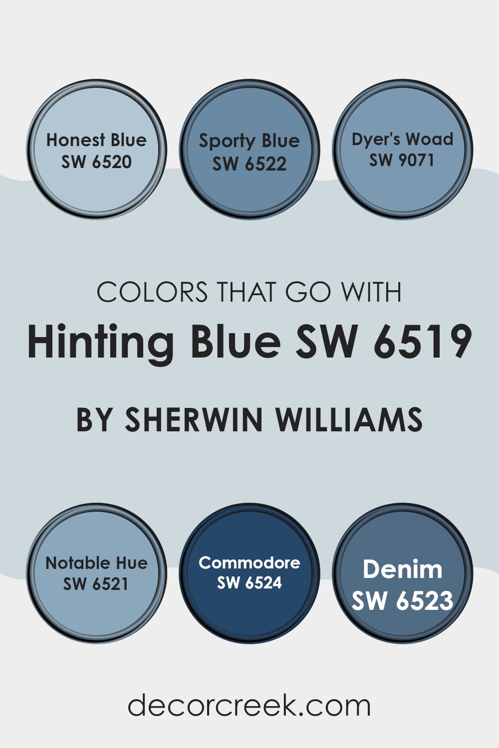
Colors that Go With Hinting Blue SW 6519 by Sherwin Williams
Choosing the right colors that complement Hinting Blue SW 6519 by Sherwin Williams is essential as they help create a harmonious and appealing environment. When shades are thoughtfully paired, they not only enhance the aesthetics of a room but also influence the mood and character of the area. For instance, combining it with tones like Honest Blue, Sporty Blue, or Dyer’s Woad can bring out different facets of Hinting Blue, making it adaptable for various settings.
Honest Blue SW 6520 is a calm hue that adds a neutral, gentle backdrop, enhancing the lighter tones of Hinting Blue. Sporty Blue SW 6522 is bolder and more vibrant, providing a dynamic contrast that can make rooms feel more energized and fresh. Dyer’s Woad SW 9071, with its deeper blue tone, offers a richer and more defined presence that pairs beautifully with the softness of Hinting Blue.
This combination creates a layered effect that feels cohesive and inviting. Progressive shades like Notable Hue SW 6521 provide a less intense yet equally engaging palette that supports the light freshness of Hinting Blue.
Commodore SW 6524 and Denim SW 6523 add a stronger impact; while Commodore presents a deep, refined blue, Denim gives a relaxed, approachable feel that complements Hinting Blue wonderfully. Incorporating these colors allows for diverse design expressions, ensuring that rooms feel both vibrant and balanced while maintaining a polished and welcoming atmosphere.
You can see recommended paint colors below:
- SW 6520 Honest Blue
- SW 6522 Sporty Blue
- SW 9071 Dyer’s Woad
- SW 6521 Notable Hue
- SW 6524 Commodore
- SW 6523 Denim
How to Use Hinting Blue SW 6519 by Sherwin Williams In Your Home?
Hinting Blue is a soft shade of blue that can bring a fresh and light feeling to any room in your home. This color is soft enough not to overwhelm the room and can easily blend with different styles and furnishings.
It’s perfect for creating a relaxing and airy atmosphere in places like your bedroom or bathroom, where you might want to feel calm and relaxed. You can use Hinting Blue on all walls in a smaller room to make it seem larger and brighter. It also works well as an accent wall in a living room or dining area, adding a gentle splash of color without going too bold.
For those who like DIY projects, painting old furniture in Hinting Blue can refresh its look. Pairing this color with whites or light grays can keep your room feeling open and light, while combining it with darker colors like navy or deep gray can create a more grounded and cozy feel.
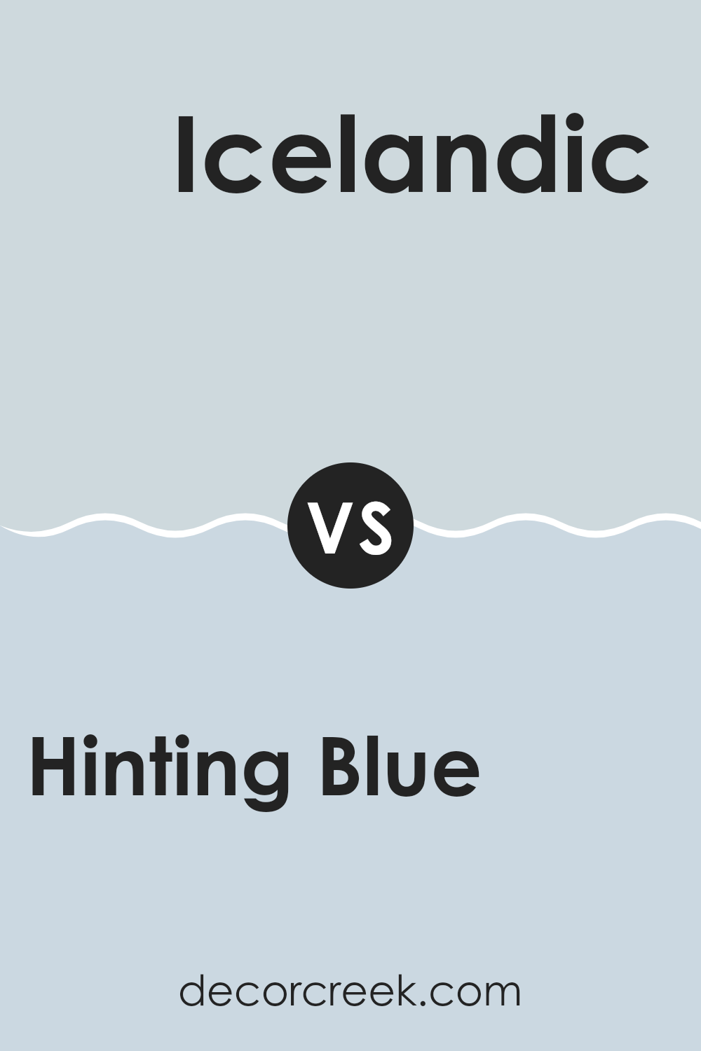
Hinting Blue SW 6519 by Sherwin Williams vs Icelandic SW 6526 by Sherwin Williams
Hinting Blue and Icelandic, both by Sherwin Williams, offer distinct shades of blue suited for different decorating needs. Hinting Blue is a soft, subtle hue with touches of gray, giving it a calm and gentle character that’s perfect for creating a peaceful ambiance in areas like bedrooms or bathrooms.
In contrast, Icelandic is a brighter, livelier blue that reflects more light and introduces a refreshing burst of energy—ideal for more active areas such as kitchens or playrooms.
Both shades work beautifully in various rooms, but the choice depends on the atmosphere you want to create. Hinting Blue provides a muted, relaxing backdrop, while Icelandic delivers a cheerful, uplifting touch that enlivens a room.
You can see recommended paint color below:
- SW 6526 Icelandic
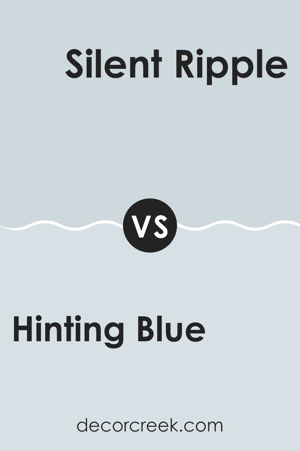
Hinting Blue SW 6519 by Sherwin Williams vs Silent Ripple SW 9682 by Sherwin Williams
Hinting Blue and Silent Ripple, both by Sherwin Williams, offer distinct moods while maintaining a harmonious blue base. Hinting Blue is a soft, delicate shade with a touch of gray, creating a gentle and soothing feel that’s perfect for crafting a relaxed atmosphere in bedrooms or bathrooms.
Silent Ripple, on the other hand, is a deeper and more muted tone that leans toward teal. It brings depth and character to a room, adding just the right amount of drama without becoming too bold.
While Hinting Blue feels lighter and helps smaller rooms appear more open and airy, Silent Ripple provides a cozier, more grounded effect, making it ideal for accent walls or statement areas. Both shades adapt beautifully to modern and traditional interiors, depending on how they’re paired with furniture, lighting, and textures.
You can see recommended paint color below:
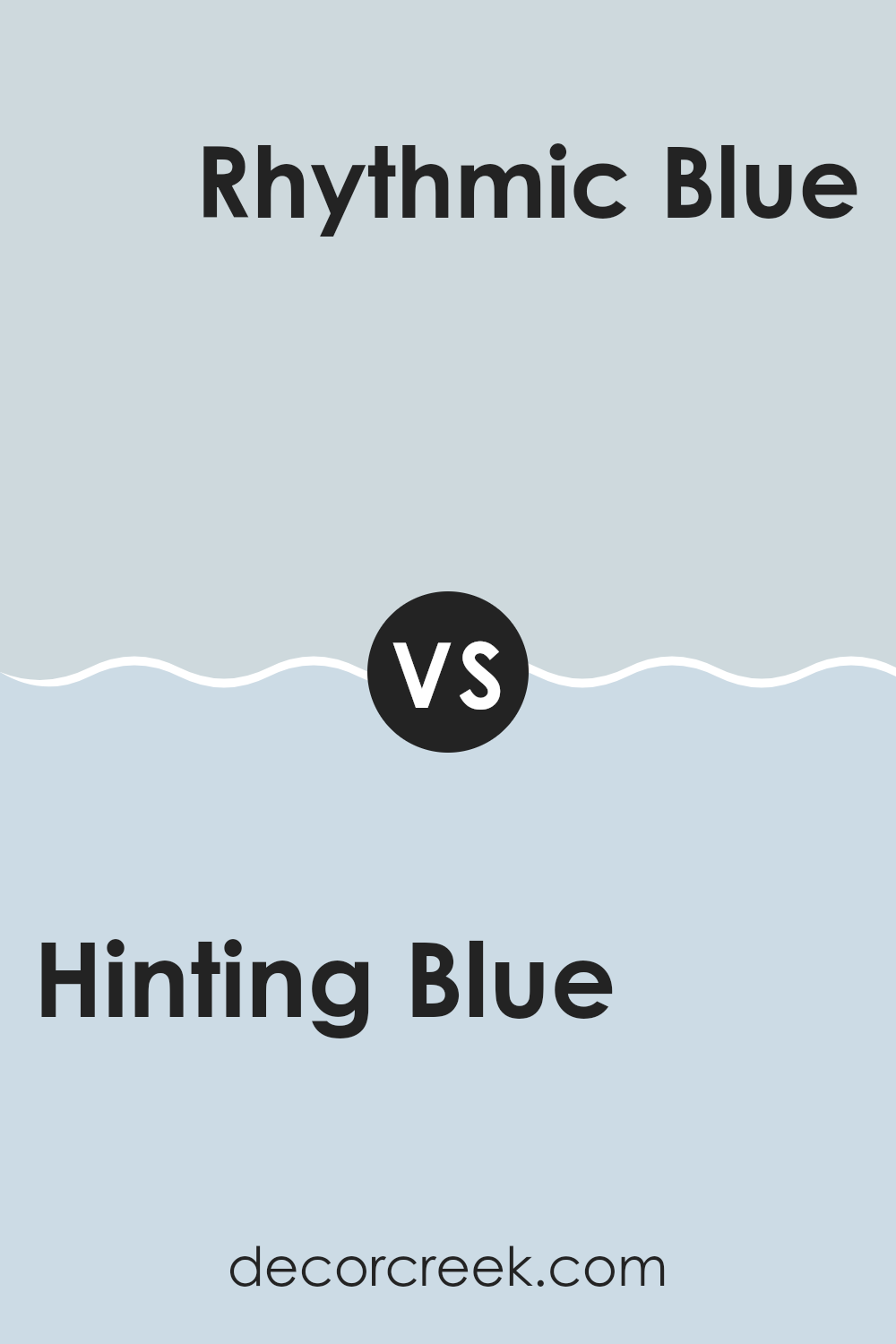
Hinting Blue SW 6519 by Sherwin Williams vs Rhythmic Blue SW 6806 by Sherwin Williams
Hinting Blue and Rhythmic Blue by Sherwin Williams offer different vibes for decorators. Hinting Blue is a soft, light blue with a touch of gray. This color is subtle and airy, making it perfect for a calm and simple look in rooms like bedrooms or bathrooms, where you want to create a gentle and relaxed atmosphere.
Rhythmic Blue, on the other hand, is a much deeper and vibrant shade. It’s a bold blue that stands out more, adding a lively pop of color to areas. This makes it ideal for rooms where you want a more dynamic and cheerful energy, like a kids’ playroom or a creative area.
Both colors have their unique appeal, but they cater to different tastes and uses around the home. Whether you prefer the softness of Hinting Blue or the energy of Rhythmic Blue depends on what kind of mood you’re aiming to set in your area.
You can see recommended paint color below:
Hinting Blue SW 6519 by Sherwin Williams vs Lullaby SW 9136 by Sherwin Williams
Hinting Blue and Lullaby by Sherwin Williams are two distinct shades that both offer a calming vibe but differ in their color tones. Hinting Blue is a soft, muted blue with a slight gray undertone, making it an excellent choice for creating a gentle and relaxing atmosphere in any room. This color is subtle and pairs well with both bright and neutral tones, allowing for flexible design options.
On the other hand, Lullaby is a paler, more delicate color, leaning towards a very light blue with hints of gray. This color is even milder than Hinting Blue, providing a lighter and airy feel that works wonderfully in small areas or rooms where you want to promote a sense of openness and light.
Both colors are great for anyone wanting to keep things low-key and peaceful in their environment. Whether choosing between the softly stated Hinting Blue or the more whisper-like Lullaby, each shade offers a unique way to gently beautify an area.
You can see recommended paint color below:
- SW 9136 Lullaby
Hinting Blue SW 6519 by Sherwin Williams vs Iceberg SW 6798 by Sherwin Williams
Hinting Blue and Iceberg are two soothing colors by Sherwin Williams, each bringing its own unique vibe to an area. Hinting Blue is a soft, muted blue with a grayish tone, making it subtle yet appealing for any room looking for a gentle touch of color. It works well in areas that need a calm, soothing presence without overpowering other design elements.
On the other hand, Iceberg is a lighter, brighter blue with a crisp, clean feel to it. This color is great for making smaller areas appear larger and more open due to its airy quality. It’s particularly effective in bathrooms or kitchens, where you want a fresh, clean look.
Both colors are adaptable, but while Hinting Blue adds a hint of coziness and warmth due to its grayer undertone, Iceberg offers a more vibrant and refreshing feel. Depending on the mood you want to set, each color has its benefits for various types of areas.
You can see recommended paint color below:
- SW 6798 Iceberg
Hinting Blue SW 6519 by Sherwin Williams vs Dew Drop SW 9641 by Sherwin Williams
Hinting Blue and Dew Drop, both by Sherwin Williams, offer distinct vibes for your area. Hinting Blue has a soft, subtle quality with a slight gray undertone that makes it adaptable for use in various rooms, particularly good for creating a light yet cozy feel. It’s quite neutral, making it easy to match with a variety of decor styles and other colors.
On the other hand, Dew Drop is lighter and leans towards a refreshing pale green, giving a breath of fresh air to any area. This color can make small rooms appear more open and is ideal for a calming effect in a busy home environment.
While Hinting Blue offers a more conventional blue tone for conservative designs, Dew Drop brings an airy and light feeling that’s perfect for modern areas aiming for a minimalistic and clean look. Both colors are great choices, but your preference might depend on the specific atmosphere you want to achieve.
You can see recommended paint color below:
Hinting Blue SW 6519 by Sherwin Williams vs Little Boy Blu SW 9054 by Sherwin Williams
Hinting Blue and Little Boy Blu by Sherwin Williams are both appealing blues but have distinct tones. Hinting Blue comes off as a subtle, soft blue with a hint of gray. It’s a muted shade that works well in areas where you want a calm and gentle atmosphere without being too bold.
On the other hand, Little Boy Blu is a brighter and more vibrant blue. It has a more lively feel to it, making it a great choice for rooms where you want to add some cheer and energy. This difference makes Little Boy Blu a bit more eye-catching compared to the more reserved Hinting Blue.
Although both colors are blue, their varying intensities can influence the mood and feel of a room significantly. Whether you prefer the softness of Hinting Blue or the brightness of Little Boy Blu depends on the ambiance you are aiming to create in your area.
You can see recommended paint color below:
- SW 9054 Little Boy Blu
Hinting Blue SW 6519 by Sherwin Williams vs Moonmist SW 9144 by Sherwin Williams
Hinting Blue and Moonmist are both colors by Sherwin Williams, each offering its own unique vibe. Hinting Blue is a soft, subtle blue with gray tones that gives a clean and calm feel to any room, making it perfect for creating a relaxed atmosphere. It’s light enough to make small areas appear bigger while still adding a touch of color.
On the other hand, Moonmist is a pale, dusty green with cool undercurrents. This color is ideal for those looking to add a natural, earthy touch to their decor. It’s gentle and unobtrusive, making it easy to pair with a wide range of other shades.
In comparison, while both colors are light and airy, Hinting Blue leans more towards a traditional blue palette, providing a cooler sensation, whereas Moonmist offers a hint of green for a more grounded and organic feel. Both are great for creating a soothing environment, but your choice might depend on whether you prefer the crispness of blue or the softer, nature-inspired feel of green.
You can see recommended paint color below:
Hinting Blue SW 6519 by Sherwin Williams vs Mild Blue SW 6533 by Sherwin Williams
Hinting Blue and Mild Blue by Sherwin Williams are two distinct shades that offer subtle variations for different decorating tastes. Hinting Blue has a light, airy quality that gives it a refreshing presence in any area. This makes it particularly suitable for creating a relaxed, clean atmosphere. It leans slightly towards a soft, understated gray, giving it an adaptable quality that works well in rooms that aim for a gentle, soothing vibe without being too bold.
On the other hand, Mild Blue has a slightly richer tone, which leans more towards a traditional blue. This color would be a great choice for someone looking to add a bit more color to their area without overpowering it with brightness. It’s a good middle ground for rooms like bedrooms or bathrooms where you want a peaceful feel but with a bit more character.
Both colors pair well with a variety of decor styles and can complement furniture and accents in neutral tones, woods, and metals. They’re both light enough to help small areas appear bigger and can be used to create a clean, fresh backdrop for everyday living.
You can see recommended paint color below:
Hinting Blue SW 6519 by Sherwin Williams vs North Star SW 6246 by Sherwin Williams
Hinting Blue and North Star, both colors by Sherwin Williams, offer subtle yet distinct vibes for any area. Hinting Blue is a soft, light blue with a touch of gray that gives it a calm, understated feel. It’s perfect for creating a soothing atmosphere in rooms like bedrooms or bathrooms.
On the other hand, North Star is a cooler, more muted gray with hints of blue. This color is great for those who prefer a more neutral palette that still retains a touch of color warmth.
While both shades are fairly light and can help make a small area appear larger and brighter, North Star leans towards a more neutral gray, making it adaptable for pairing with a wider range of decor styles and colors. Hinting Blue, with its clearer blue tone, might be seen as slightly more playful and airy.
You can see recommended paint color below:
Concluding my thoughts on SW 6519 Hinting Blue by Sherwin Williams, I find it to be a wonderful paint color for anyone looking to freshen up a room. This shade of blue feels like a gentle sky on a clear day, bringing a light and airy feel to any area it’s used in. It’s soft enough to make small areas appear bigger and cozy enough to give larger rooms a friendly touch.
Hinting Blue pairs well with various colors. Whether you put it next to whites, grays, or even more earthy tones, it holds its own, adding a clean and inviting vibe. You can use it in a kid’s room for a calming effect, or in a living area to create a welcoming zone for family and friends.
For those considering a new color for their home, SW 6519 Hinting Blue offers a beautiful backdrop that’s easy to work with. Whether you’re repainting a single room or updating the whole house, this color could be a great choice. It’s not just a paint; it’s a simple way to make your home feel refreshed and pleasant. I definitely recommend giving Hinting Blue a try if you want to liven up your living area without making things too bright or bold.
Ever wished paint sampling was as easy as sticking a sticker? Guess what? Now it is! Discover Samplize's unique Peel & Stick samples.
Get paint samples

