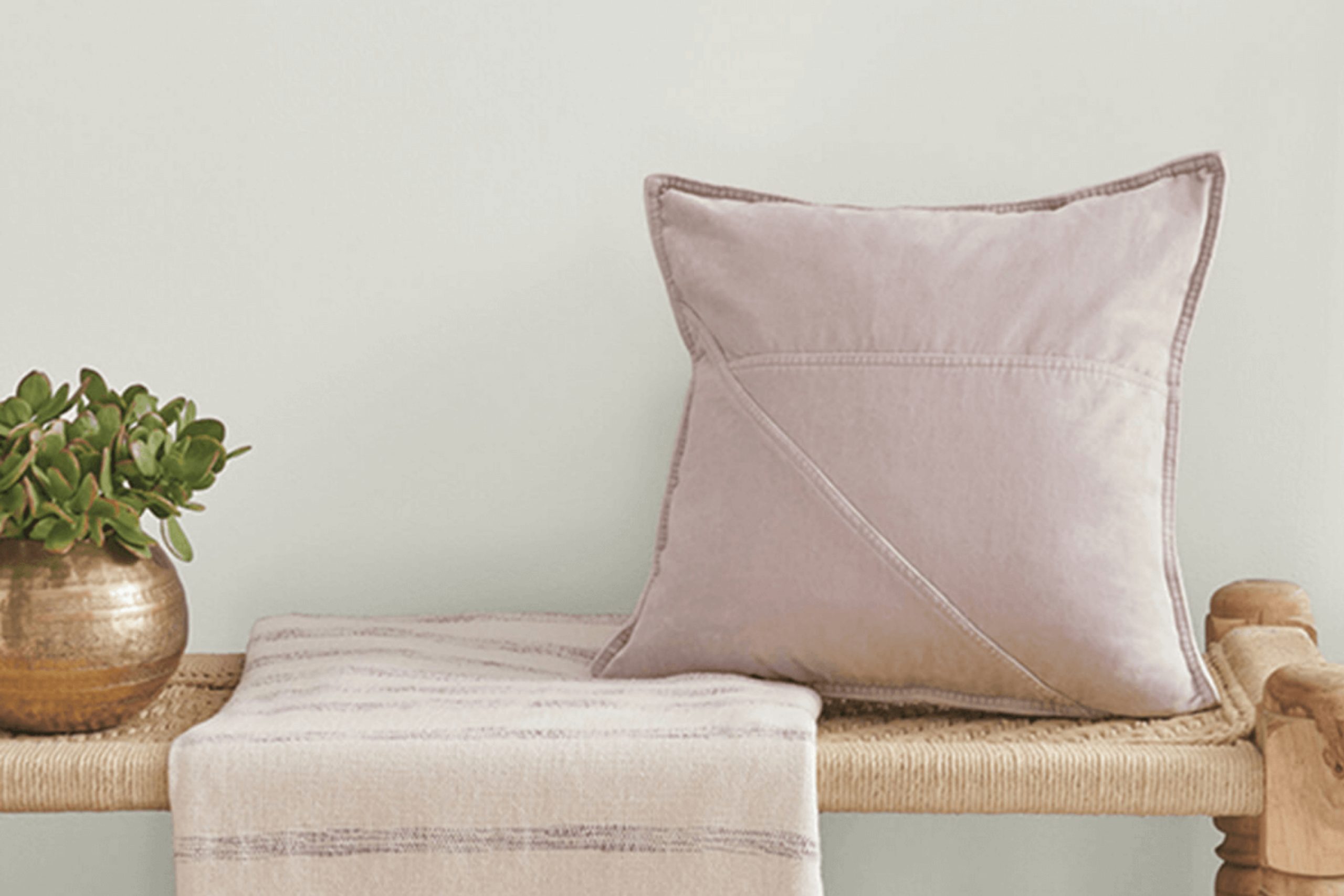
Choosing the right paint color can be challenging when you’re trying to set a specific mood or match a unique vibe in your home. It was a relief when I came across SW 9627 Pacific Fog by Sherwin Williams, a color with a smooth, serene quality that seems to subtly shift with the changing light. Walking through the different rooms in my home, I realized how versatile this shade could be—equally fitting for creating a peaceful backdrop in a cozy bedroom as it was in a bustling kitchen.
The neutral, soothing palette of Pacific Fog offered a breath of fresh air without overwhelming the senses. Its balanced blend of gray and blue mimics the calming effect of a foggy seashore at dawn. As someone looking to refresh my living space without committing to a bold or trendy color, I found Pacific Fog to be the perfect solution.
The paint’s adaptability extends beyond just color—it also pairs beautifully with diverse styles and materials, from modern metals and crisp whites to warm woods and soft textiles.
If you’re aiming for a subtle yet impactful change in your décor, consider giving Pacific Fog a chance. It has the potential to create that serene ambiance that many of us seek in our personal spaces.
What Color Is Pacific Fog SW 9627 by Sherwin Williams?
The color Pacific Fog is a gentle, soothing shade of gray that adds a subtle yet impactful presence to any room. It has a fresh, airy quality that makes it incredibly versatile and adaptive to various decorating styles. This color works well in modern and minimalist interiors due to its understated elegance, but it’s just as successful in rustic or industrial settings where its calm demeanor balances more textured materials.
In terms of materials, Pacific Fog pairs beautifully with natural wood, helping to highlight its warm tones. When combined with metal accents, such as stainless steel or brushed nickel, it creates a clean, contemporary look.
For a softer, cozier feel, incorporating fabrics like linen or cotton in this color can make a space more inviting. It also works exceptionally well with natural stone, such as marble or slate, enhancing these materials’ textual interest without overpowering them. Pacific Fog is ideal for living rooms, bedrooms, or kitchens where its gentle hue provides a perfect backdrop for daily life.
It is effective at making small spaces appear larger and more open, thanks to its light-reflecting qualities. This color maintains a vibrant and fresh look under different lighting conditions, from natural sunlight to softer, artificial lights, making it a practical choice for any interior.
Is Pacific Fog SW 9627 by Sherwin Williams Warm or Cool color?
Pacific Fog by Sherwin Williams is a unique paint color that brings a fresh and airy feel to any room. This shade, with its subtle balance of gray and soft blue, mimics the calmness of a foggy seaside morning. It’s perfect for creating a relaxed environment in homes, working especially well in spaces like bedrooms and living rooms where comfort is key. The lightness of Pacific Fog makes small rooms appear bigger and brighter, as it reflects natural light beautifully.
Moreover, this color is versatile enough to pair with a variety of decor styles and colors. Furniture in natural wood tones or white really stands out against it, while bolder colors like mustard or navy create an appealing contrast.
Since it is not too overwhelming, Pacific Fog also works well as a background for art and other decorative elements, allowing each piece to pop without clashing. This makes it a practical choice for those looking to add a touch of calm without overwhelming their space.
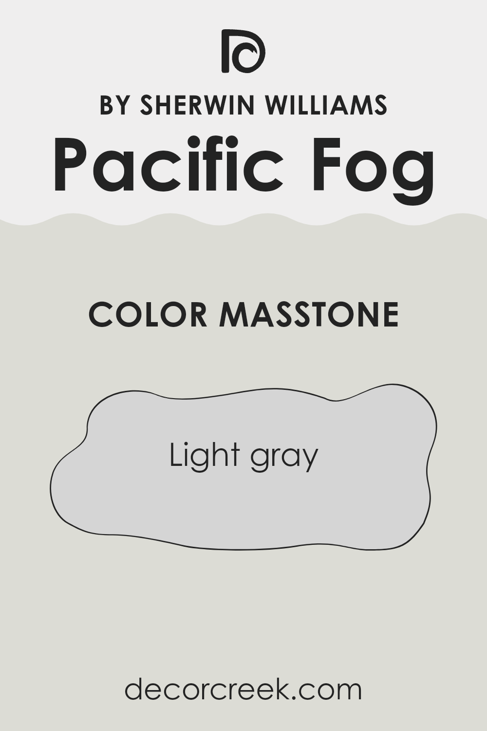
What is the Masstone of the Pacific Fog SW 9627 by Sherwin Williams?
Pacific FogSW 9627 by Sherwin Williams is a pleasant light gray color with a masstone similar to #D5D5D5. This soothing shade works well in homes by creating a clean and uncluttered look. Its neutral tone allows it to blend seamlessly with various decor styles and colors, making it a versatile choice for any room.
Whether applied in a bustling kitchen or a quiet bedroom, this color maintains a fresh, airy feel that makes spaces appear larger and more open. It’s an ideal backdrop for showcasing artwork, furniture, or vibrant accent pieces, as it doesn’t overshadow other elements in the room.
This light gray is especially effective in spaces with limited natural light, as it helps brighten the area without being too stark or cold. Overall, Pacific Fog offers a simple yet effective way to refresh your home environment, providing a neat and subtle canvas that is both functional and stylish.
How Does Lighting Affect Pacific Fog SW 9627 by Sherwin Williams?
Lighting plays a crucial role in how we perceive colors, as it can significantly alter their appearance. The color in question, Pacific Fog by Sherwin Williams, is a versatile shade that behaves differently under various lighting conditions and in rooms with different orientations.
In artificial light, this color tends to appear warmer and more inviting. The inherent cool tones of Pacific Fog can be softened by the yellow or warm white hues of indoor lighting, making the space feel cozy.
Conversely, under natural light, this color often reveals its true character, showcasing a refreshing neutrality that reflects the ever-changing outdoor light, making it adaptable to different styles and furnishings.
When placed in north-facing rooms, Pacific Fog can appear slightly cooler and grayer, as these rooms receive less direct sunlight, offering a consistent but somewhat muted light throughout the day. This can create a calm and collected atmosphere, ideal for bedrooms or study areas.
In south-facing rooms, the abundance of sunlight can warm up the color, highlighting its subtle undertones and making the space feel bright and lively. This is great for living rooms or kitchens where a welcoming environment is desired.
For east-facing rooms, the color interacts interestingly with the morning light, which tends to be cooler and bluer. Here, Pacific Fog can look crisp and vibrant, especially in the morning when the light is brightest, making it a great choice for breakfast nooks or bathrooms to start the day with a clear, clean palette.
In west-facing rooms, the color is influenced by the warmer, orange-tinted light of late afternoon and evening. This lighting situation can bring out a pleasant complexity in Pacific Fog, allowing spaces like dining rooms or living areas to feel inviting as the day winds down.
Overall, this color’s versatility in various light settings and orientations makes it a dependable choice for different spaces and moods.
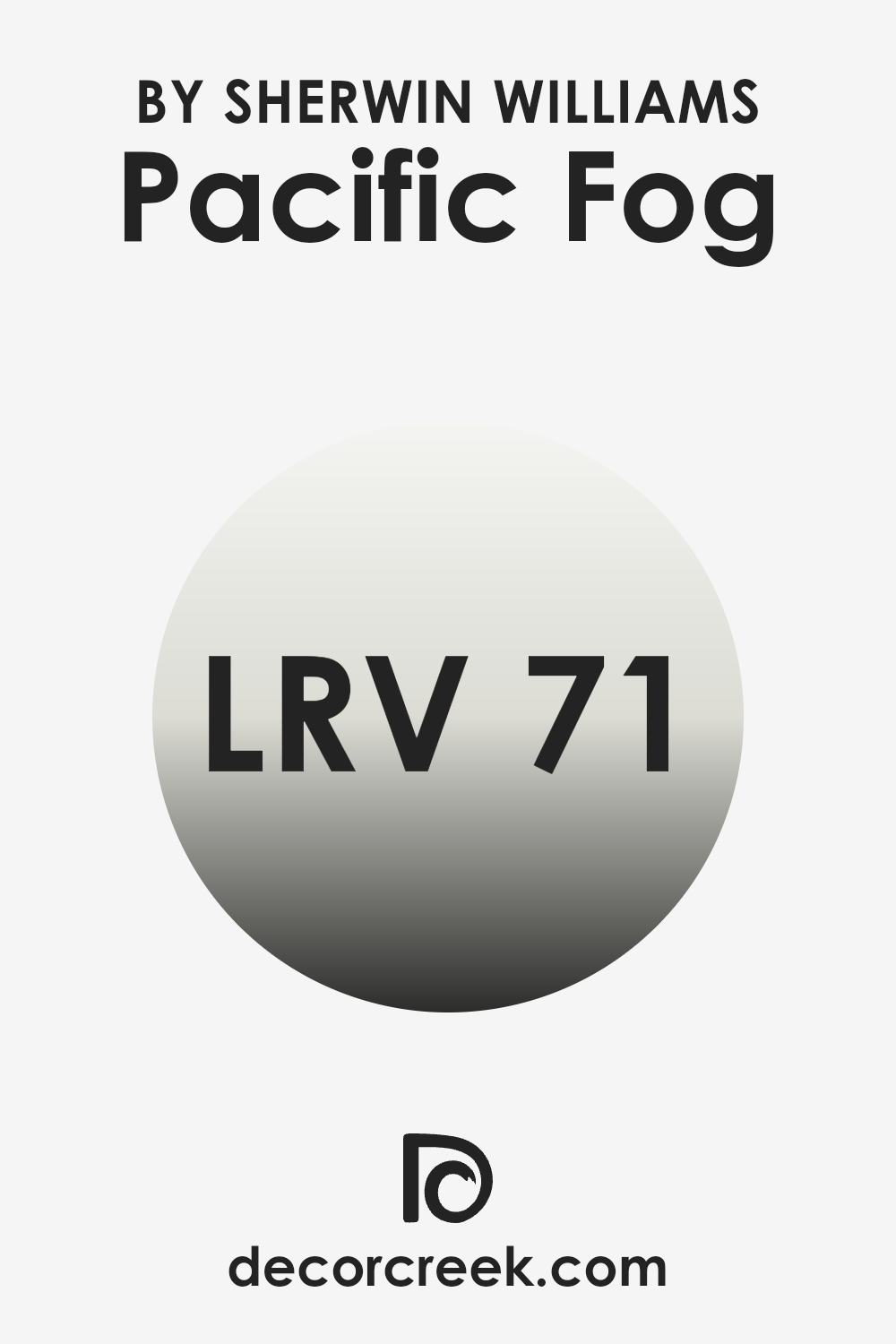
What is the LRV of Pacific Fog SW 9627 by Sherwin Williams?
LRV stands for Light Reflectance Value, which is a measure of the amount of visible light a paint color reflects when it is applied to a surface. This number, expressed on a scale from zero to one hundred, helps to determine how light or dark a color will appear once it’s on your walls.
A higher LRV means the color reflects more light, making spaces appear more open and brighter. Conversely, a lower LRV indicates that the color absorbs more light, which can make a room feel cozier or smaller.
The LRV for SW 9627 Pacific Fog is 71.315, which means it’s quite a light and reflective shade. Because of its high LRV, this color is effective in making spaces look more luminous and spacious. It can be a great choice for smaller rooms or areas with limited natural light since it will make the most of the available illumination by reflecting it back into the room. This characteristic also helps in reducing the need for artificial lighting, potentially conserving energy. Thus, choosing a color with a high LRV like this one can significantly affect the feel and functionality of a space.
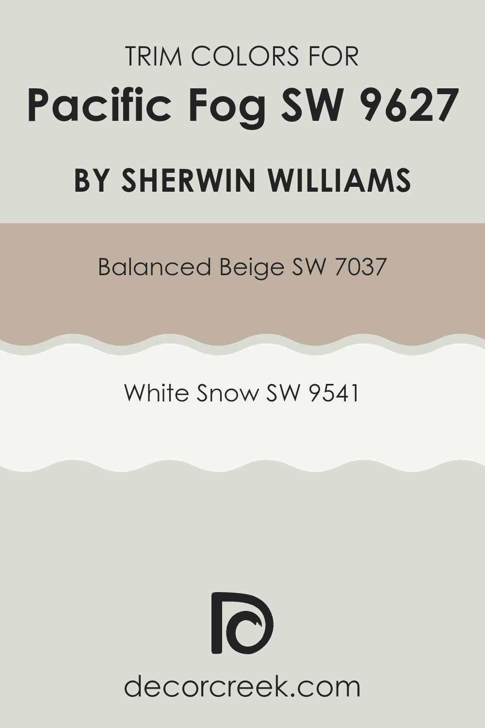
What are the Trim colors of Pacific Fog SW 9627 by Sherwin Williams?
Trim colors are used to highlight and accentuate the details of a home’s architecture, such as window frames, doors, and skirtings, providing a visual frame that complements the main wall color. For Pacific Fog by Sherwin Williams, employing trim colors like Balanced Beige and White Snow can effectively enhance the walls’ subtle hues by creating a sharp, clean contrast that neatly delineates the space and adds a touch of elegance without overwhelming the primary color.
Balanced Beige is a warm and neutral shade that offers a gentle contrast against the cooler tone of Pacific Fog, creating a welcoming and harmonious look. White Snow, on the other hand, is a crisp and bright white that provides a more striking outline to the architectural features, injecting freshness and clarity that makes the wall color stand out beautifully.
Choosing the right trim color can significantly affect the overall aesthetic and mood of the room, making the selection of either Balanced Beige or White Snow a purposeful decision for those looking to subtly or distinctly frame their space.
You can see recommended paint colors below:
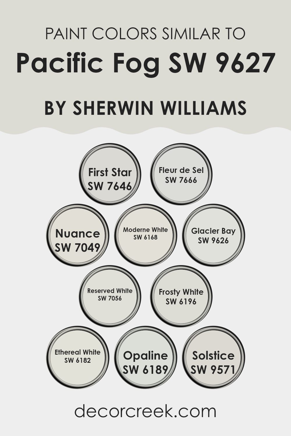
Colors Similar to Pacific Fog SW 9627 by Sherwin Williams
Similar colors play an essential role in creating cohesive and visually appealing spaces. When different hues are subtly varied yet closely aligned, like the hues similar to the shade Pacific Fog, they can unify a room without creating monotonous visual effects. Such colors help create depth and dimension, maintaining interest and continuity in the design. They are particularly useful in achieving a harmonious and coherent atmosphere, ideal for spaces where the aim is to have a calming, unified look.
Consider shades like First Star and Fleur de Sel, both offering a slightly lighter and airy feel, great for invigorating smaller spaces without overwhelming the senses. Nuance and Moderne White add a touch of warmth, perfect for bringing a cozy feel to living areas and bedrooms.
Glacier Bay and Reserved White are akin to a gentle whisper of color, offering a fresh and clean backdrop that works well in any lighting condition. For those looking to keep things minimal yet distinct, Frosty White and Ethereal White provide a crisp, clean feel, enhancing other decor elements effortlessly.
Lastly, Opaline and Solstice offer subtle variations that lean towards a soft, nurturing atmosphere, suitable for areas promoting rest or gentle reflection. These similar colors, while each unique, work collectively to support the overall aesthetic without overpowering individual elements in a room.
You can see recommended paint colors below:
- SW 7646 First Star
- SW 7666 Fleur de Sel
- SW 7049 Nuance
- SW 6168 Moderne White
- SW 9626 Glacier Bay
- SW 7056 Reserved White
- SW 6196 Frosty White
- SW 6182 Ethereal White
- SW 6189 Opaline
- SW 9571 Solstice
How to Use Pacific Fog SW 9627 by Sherwin Williams In Your Home?
Pacific Fog SW 9627 by Sherwin Williams is a versatile paint color that can add a fresh and stylish look to any room in your house. Its soft gray shade works well in spaces where you want a calm, subtle backdrop. It pairs beautifully with whites for a crisp and clean look, or you can match it with darker colors like navy or black for a striking contrast.
Pacific Fog is perfect for living rooms or bedrooms, creating a peaceful atmosphere. It’s also great in bathrooms or kitchens, where it complements both wood and metal accents. Additionally, its neutral tone makes it an excellent choice for hallways and entry areas, as it can help these smaller spaces feel more open and airy.
When decorating, you can use this color on walls or as an accent in trims or doors. It also looks good with various fabrics and furniture styles, giving you lots of flexibility in designing your space.
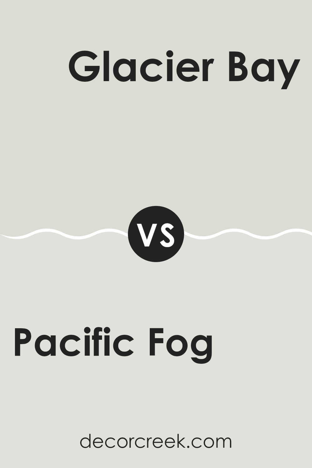
Pacific Fog SW 9627 by Sherwin Williams vs Glacier Bay SW 9626 by Sherwin Williams
Pacific Fog and Glacier Bay, both by Sherwin Williams, present subtle yet distinct tones. Pacific Fog is a muted gray, offering a neutral backdrop that’s versatile for various spaces. It’s a calm and soft shade, great for creating a cozy atmosphere in rooms.
On the other hand, Glacier Bay has a lighter, airier feel, standing out with a slight bluish tint. This cooler tone radiates a fresh and clean look, making it ideal for bathrooms and kitchens to give a sense of cleanliness and openness.
Between the two, Pacific Fog provides a warmer touch that’s excellent for inviting settings like living rooms or bedrooms, while Glacier Bay works well where you want to reflect more light and space. Together, these colors could complement each other in a home, offering balanced environments through their warm and cool hues.
You can see recommended paint color below:
Pacific Fog SW 9627 by Sherwin Williams vs Frosty White SW 6196 by Sherwin Williams
Pacific Fog and Frosty White, both by Sherwin Williams, offer unique tones for versatile use in home decor. Pacific Fog is a deeper tone that resembles the cool, subtle hues of a misty ocean view. It brings a grounded, calm feel to a space, and works well in areas where a cozy, inviting atmosphere is desired.
In contrast, Frosty White is much lighter, providing a clean, crisp backdrop. This color reflects more light, making it a great choice for smaller rooms or spaces that you want to appear more open and airy.
While Pacific Fog adds depth and warmth, Frosty White offers a sense of freshness and openness. Together, they could complement each other well in a space where balance between coziness and brightness is sought.
You can see recommended paint color below:
Pacific Fog SW 9627 by Sherwin Williams vs Opaline SW 6189 by Sherwin Williams
Pacific Fog and Opaline, both by Sherwin Williams, offer unique appeal in their subtle tones. Pacific Fog presents as a deeper, more muted gray with a hint of blue. This makes it a great choice for someone looking to create a calm and grounding atmosphere in spaces like bedrooms or offices.
On the other hand, Opaline is a soft, pale green with a gentle vibrancy that can lighten up a room subtly without overwhelming it. It works well in areas that benefit from a touch of brightness, such as kitchens or bathrooms.
While both colors provide a neutral base, Pacific Fog leans towards a cooler palette, making it ideal for a modern look. Opaline, with its hint of green, brings a touch of nature and freshness, offering a more relaxed and light feel. Choosing between them depends on the desired mood and the specific room’s function.
You can see recommended paint color below:
- SW 6189 Opaline
Pacific Fog SW 9627 by Sherwin Williams vs Solstice SW 9571 by Sherwin Williams
Pacific Fog is a gentle gray with a subtle blue undertone, creating a calm and neutral backdrop. It’s a versatile color that works well in various spaces, providing a clean and understated look. On the other hand, Solstice is slightly brighter and has a touch of lavender, giving it a warmer feel compared to Pacific Fog.
This warmth makes Solstice ideal for rooms where a cozy, welcoming atmosphere is desired. While both colors share a softness in their hues, Pacific Fog leans more towards a classic gray, making it easier to pair with different decor styles and colors.
Solstice, with its unique undertone, offers a hint of personality and warmth, making it suitable for spaces intended to have a more inviting feel. Both are great choices, but your preference might depend on the mood you want to set in the room and the other colors you plan to use.
You can see recommended paint color below:
- SW 9571 Solstice
Pacific Fog SW 9627 by Sherwin Williams vs Moderne White SW 6168 by Sherwin Williams
Pacific Fog and Moderne White, both by Sherwin Williams, are two distinct shades that cater to different aesthetic preferences. Pacific Fog is a deeper, gray hue with a hint of blue, offering a calming yet substantial presence in any space. It’s ideal for creating a cozy atmosphere and works well in living rooms or bedrooms where a touch of depth is desired without overwhelming the area.
On the other hand, Moderne White is a much lighter color, leaning towards off-white with subtle warm undertones. This color is perfect for spaces aiming to achieve a bright and airy feel. It’s particularly effective in smaller rooms or areas with limited natural light, as it helps to make spaces appear larger and more open.
Together, these colors could complement each other beautifully in a home, with Moderne White providing a crisp background and Pacific Fog adding character and visual interest.
You can see recommended paint color below:
Pacific Fog SW 9627 by Sherwin Williams vs First Star SW 7646 by Sherwin Williams
Pacific Fog and First Star, both by Sherwin Williams, are subtle yet distinct colors. Pacific Fog is a deeper, warm gray that resembles a thick mist hovering over the ocean at dawn. This shade brings a cozy and grounding atmosphere, making it ideal for living spaces or bedrooms where a calm, restful environment is desired.
In contrast, First Star is a much lighter gray, almost verging on the edge of white. It’s perfect for opening up a room and giving it a fresh, airy feel. You might prefer First Star in smaller or darker rooms because it reflects more light, making spaces appear larger.
Together, these colors provide versatile options for various design needs, whether layering grays for a harmonious look or using First Star as a neutral backdrop to make other colors in a room stand out.
You can see recommended paint color below:
Pacific Fog SW 9627 by Sherwin Williams vs Ethereal White SW 6182 by Sherwin Williams
Pacific Fog is a soothing neutral gray with subtle cool undertones, offering a calm backdrop that is versatile and easy to work with in any space. Its quiet presence makes it ideal for both contemporary and traditional interiors.
On the other hand, Ethereal White is a soft, warm white that gives off a gentle and welcoming vibe. This color is particularly effective in spaces that aim to achieve a cozy and airy feel, as it reflects light beautifully, making rooms look larger and more open.
When comparing the two, Pacific Fog acts as a deeper, more grounding color, providing a solid foundation in a room, whereas Ethereal White is lighter and can be used to brighten up a space. Both colors work well together, with the subtle gray of Pacific Fog beautifully complementing the warm, inviting tones of Ethereal White. This pairing can create a balanced and harmonious look that is perfect for creating a peaceful and approachable atmosphere in your home.
You can see recommended paint color below:

Pacific Fog SW 9627 by Sherwin Williams vs Reserved White SW 7056 by Sherwin Williams
Pacific Fog and Reserved White are two subtly different shades offered by Sherwin Williams. Pacific Fog is a deeper, gray shade which gives a cozy and inviting feel to a space. This makes it a great choice for larger areas or furniture, providing a warming effect despite its cooler undertones.
On the other hand, Reserved White is much lighter, almost leaning towards a pure white but with a soft touch of gray. This color is perfect for brightening up a room and making it feel more spacious and airy. It works especially well in smaller rooms or on trims and ceilings to give a clean and fresh look without starkness.
When used together, these two colors can complement each other beautifully. Pacific Fog can act as a strong foundation or accent, while Reserved White can highlight and balance the darker tones in Pacific Fog. This combination can suit various decorating styles, from modern to traditional, depending on how they’re applied.
You can see recommended paint color below:
Pacific Fog SW 9627 by Sherwin Williams vs Fleur de Sel SW 7666 by Sherwin Williams
Pacific Fog and Fleur de Sel are two soothing colors by Sherwin Williams, each bringing its own unique feel to a space. Pacific Fog is a deep, muted blue with a grey undertone, perfect for creating a cozy and calming atmosphere in any room. It’s dark enough to make a statement yet neutral enough to act as a subtle backdrop for bold furnishings.
On the other hand, Fleur de Sel is a much lighter shade, veering towards a soft, almost ethereal grey. This color is excellent for opening up smaller spaces or adding a gentle, airy vibe to any area. It reflects more light, making it a good choice for areas like kitchens or bathrooms that you want to feel clean and spacious.
When put together, these two colors can complement each other well, with Fleur de Sel offering a light contrast to the deeper tone of Pacific Fog. This combination can be particularly effective for a balanced and harmonious look.
You can see recommended paint color below:
Pacific Fog SW 9627 by Sherwin Williams vs Nuance SW 7049 by Sherwin Williams
Pacific Fog and Nuance are two shades by Sherwin Williams that offer subtle yet distinct differences. Pacific Fog is a deep, muted gray with a bluish tinge which gives it a somewhat cooler tone, apt for creating a calm and collected ambience in a space. This color is versatile enough to work well in various rooms, whether you want to add depth to a living room or a soothing backdrop in a bedroom.
On the other hand, Nuance is a lighter gray that leans towards a warm taupe. It’s an inviting color that brings a soft, gentle feel to interiors, making rooms look airy and brighter. Nuance is especially effective in smaller spaces or areas with less natural light, as it can help make those areas appear larger and more welcoming.
Both colors are neutral and can pair well with a variety of decor styles and other colors, but the choice between Pacific Fog and Nuance largely depends on the mood you want to set and the specific characteristics of the space being painted.
You can see recommended paint color below:
Conclusion
After taking a good look at SW 9627 Pacific Fog by Sherwin Williams, I’ve learned that it is a very calm and gentle color. This paint can make rooms feel cozy, sort of like being wrapped in a soft blanket. It’s not too dark and not too light, which makes it great for all kinds of rooms, whether it’s a bedroom, a living room, or even a kitchen.
Pacific Fog is a color that doesn’t shout for attention but still makes any room look fresh and inviting. I found that it works well with lots of other colors. You can pair it with soft whites for a clean look, or with blues and greens to make it feel more like nature. This means that whatever your favorite colors are, you can probably find a way to use Pacific Fog with them.
This color also helps hide little marks or dirt on the walls because it’s not super bright. So, it’s good for places that might get a bit messy, like a kid’s playroom.
In conclusion, if you’re looking for a paint that gives a room a nice, calm feeling and works well with different decorations, SW 9627 Pacific Fog by Sherwin Williams could be a great choice. It makes the room feel just right – not too bright and not too dark – which is pretty cool.
Ever wished paint sampling was as easy as sticking a sticker? Guess what? Now it is! Discover Samplize's unique Peel & Stick samples.
Get paint samples

