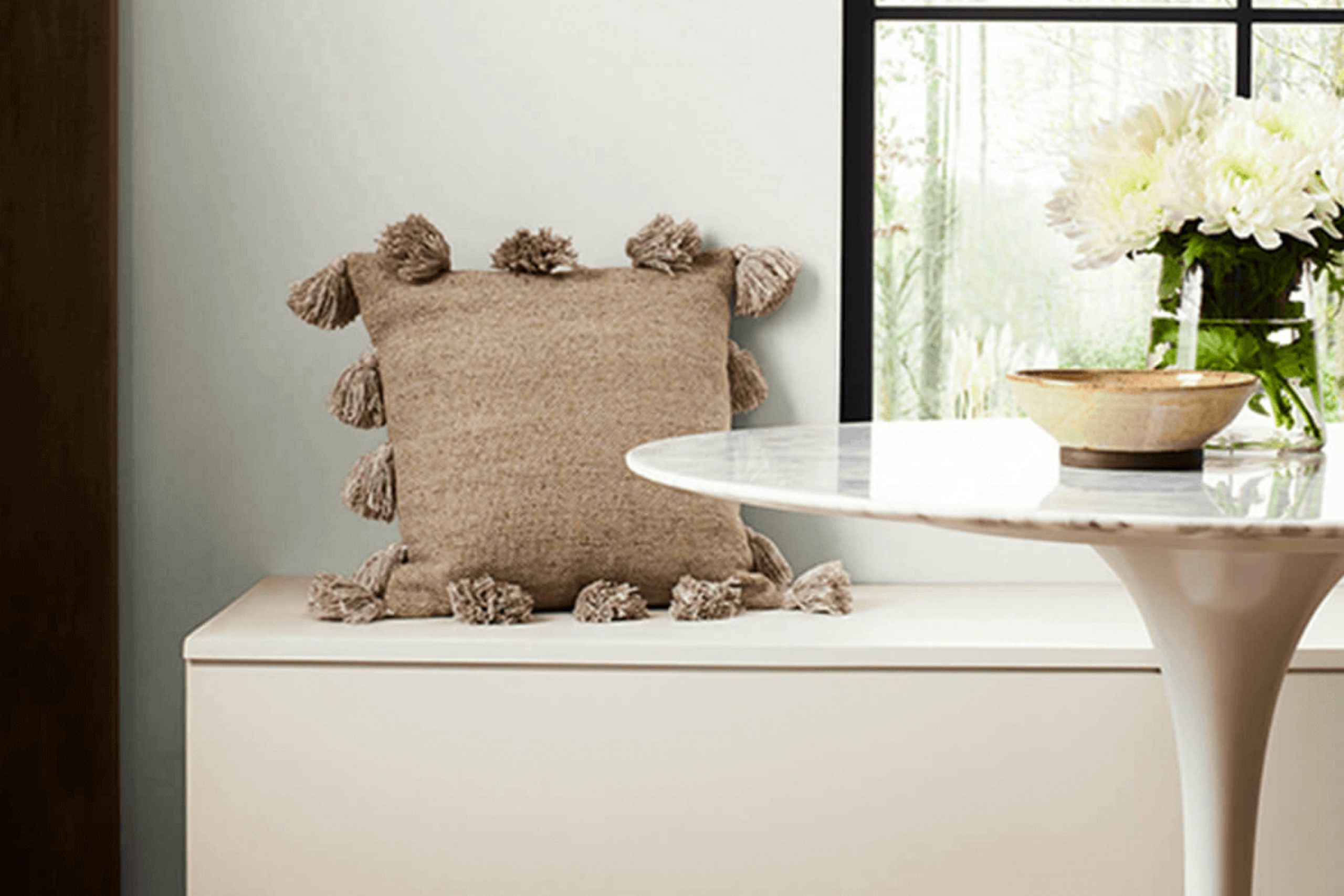
When I painted my living room walls with SW 6196 Frosty White by Sherwin Williams, I immediately felt how it brightened and freshened up the space.
The soft, neutral tone created a calming and inviting atmosphere, perfect for both relaxation and social gatherings. There’s something about this shade that makes it adaptable to any style, whether you prefer modern or traditional décor.
Frosty White has a unique way of enhancing natural light, making small rooms feel larger and more open.
It’s a versatile backdrop that pairs beautifully with a variety of colors, whether you’re thinking of adding bold accents or keeping things minimalist and clean. Incorporating Frosty White into my home made me see how such a subtle hue can have a significant impact on the overall vibe of a space.
Whether you’re planning a complete makeover or simply want to refresh a room, Frosty White offers a fresh start and a blank canvas for creativity.
Its understated elegance is ideal for anyone seeking simplicity without sacrificing warmth and style.
What Color Is Frosty White SW 6196 by Sherwin Williams?
Frosty White by Sherwin Williams is a gentle, soft white with a hint of gray, providing a clean and calm appearance. This shade is versatile, making it a great choice for many interior styles. Its subtle cool undertones work well in modern, minimalist, and Scandinavian designs, where it can enhance the simplicity and elegance of the space.
In a modern setting, it creates a fresh backdrop, allowing furniture and decor to stand out. Frosty White pairs beautifully with materials like light wood, offering a natural, airy feel that complements its understated hue.
It also goes well with brushed metals like stainless steel or chrome, adding a touch of sleekness to kitchens or bathrooms.
For textiles, consider using soft linens or cotton in neutral tones to maintain a light and airy atmosphere.
This color is particularly effective in rooms with plenty of natural light, where its brightness can fill the space with a welcoming glow.
But it also works well in dimmer rooms, providing a crisp, clean look. Whether used on walls or as a trim, Frosty White offers a sense of freshness and can easily blend with other colors, allowing for great flexibility in interior design.
Is Frosty White SW 6196 by Sherwin Williams Warm or Cool color?
Frosty White SW 6196 by Sherwin Williams is a versatile paint color that works well in many home settings. Its subtle, gentle hue helps create a calm and inviting atmosphere.
Unlike stark whites, Frosty White has a soft, warm undertone that makes it easy on the eyes, providing a welcoming feel to any space.
This color is especially effective in rooms that receive a lot of natural light, as it reflects the light beautifully, making spaces appear larger and more open. It pairs well with both modern and traditional decor, acting as a neutral backdrop that allows other colors and textures to stand out.
Frosty White SW 6196 can be a great choice for walls, ceilings, or even trim, providing a clean and fresh look throughout the home.
Its adaptability makes it a popular choice for living rooms, bedrooms, and kitchens, offering a timeless appeal that doesn’t feel cold or sterile.
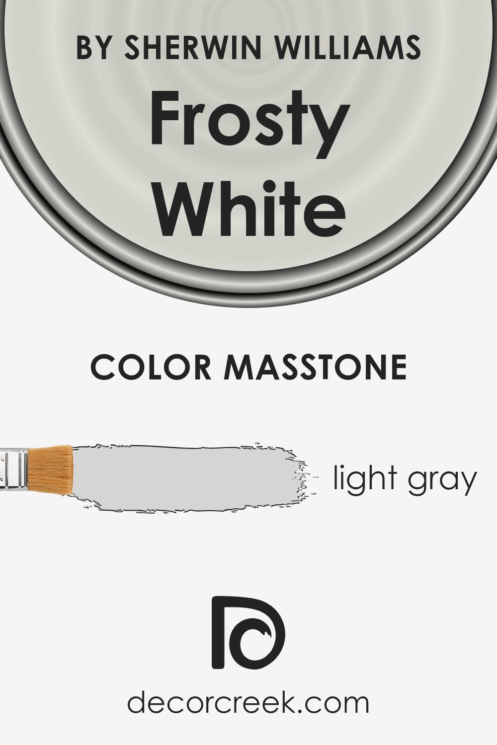
What is the Masstone of the Frosty White SW 6196 by Sherwin Williams?
Frosty White by Sherwin Williams is a light gray color (#D5D5D5) that works well in homes because of its subtle and versatile character.
The light gray masstone makes it a flexible choice for various spaces, harmonizing easily with other colors and materials.
Its muted tone creates a calming environment, making it an excellent option for living rooms and bedrooms where a restful atmosphere is desired. The soft gray hue is neutral enough to complement a wide range of decor styles, from modern to traditional.
This color enhances natural light, making rooms feel more spacious and open. It can also highlight architectural details without overwhelming the space.
Furniture and artwork stand out against this gentle backdrop, allowing homeowners to personalize their spaces confidently. Frosty White’s adaptability and understated elegance make it a practical choice for home interiors, providing a fresh, clean look that can easily fit into any design scheme.
How Does Lighting Affect Frosty White SW 6196 by Sherwin Williams?
Lighting plays a crucial role in how we perceive colors, and this is certainly true for paint colors in your home.
Sherwin Williams’ Frosty White (SW 6196) is a versatile white paint, but its appearance can change significantly depending on lighting conditions. In natural light, Frosty White can look different based on the direction the room faces. In north-facing rooms, which generally get cooler light, Frosty White might appear slightly grayer or cooler since the light tends to have a bluish tint.
This can make the room feel more crisp and clean but might not give the warm glow some people desire.
In south-facing rooms, where the light is warm and abundant for most of the day, Frosty White will likely look warmer and more inviting. The strong sunlight enhances the warmth of the color, making it a great choice if you want a cozy and bright atmosphere.
East-facing rooms benefit from warm, direct sunlight in the morning and cooler light later in the day. Frosty White in these rooms may start the day looking warm and creamy, transitioning to a slightly cooler hue as the sun moves.
This dynamic can make mornings feel fresh and afternoons more subdued.
West-facing rooms get the opposite effect, with cooler light in the morning and warm, golden light in the evening. In these spaces, Frosty White will appear cooler during early hours but will warm up significantly as the sun sets, creating a comforting vibe as the day ends.
Under artificial lighting, Frosty White can vary based on bulb types. Incandescent lights tend to warm up the paint, bringing out its softer, almost creamy qualities.
Conversely, LEDs or fluorescent lights can make it seem cooler or more neutral. Thus, considering both natural and artificial lighting is important when choosing frost white for a space.
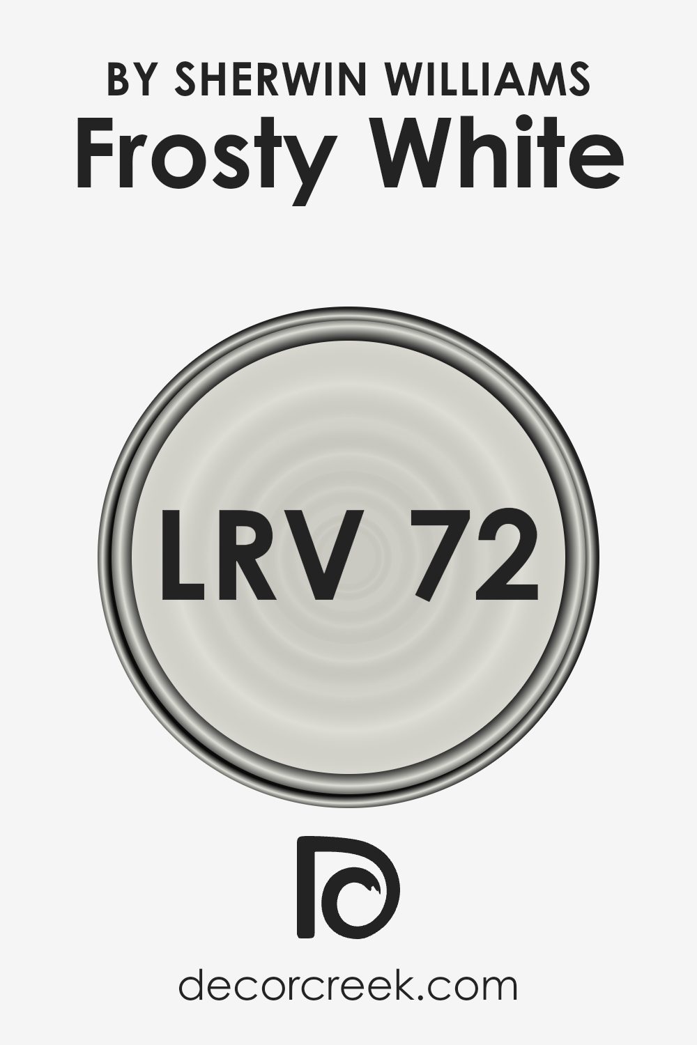
What is the LRV of Frosty White SW 6196 by Sherwin Williams?
LRV, or Light Reflectance Value, is a scale that measures how much light a color reflects. It ranges from 0, which is completely black and absorbs all light, to 100, which is completely white and reflects all light.
Colors with a high LRV are lighter and can make a room feel more open and spacious because they reflect more light back into the space. On the other hand, darker colors with lower LRV values tend to absorb more light and can make a room feel smaller and more intimate.
This is important when choosing paint colors, as the LRV can affect both the mood and perception of the size of a room.
For the color “Frosty White” by Sherwin Williams, the LRV is 72.027. This means it’s on the lighter side of the scale, reflecting a good amount of light. When used on walls, Frosty White can help brighten up a space by bouncing light around the room, making it feel more open and airy.
It’s a versatile color that can be used to create a fresh and clean atmosphere. Because it reflects a lot of light, it can also help to balance out rooms that might not get a lot of natural sunlight, helping them feel brighter during the day.
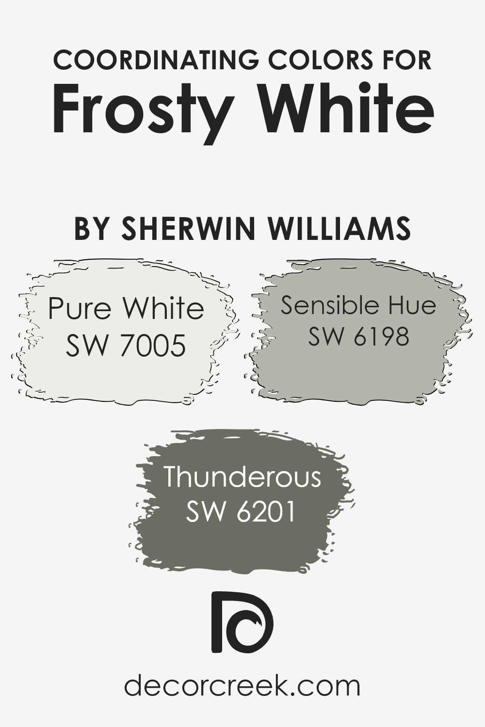
Coordinating Colors of Frosty White SW 6196 by Sherwin Williams
Coordinating colors are hues that complement each other, creating a harmonious and visually appealing palette.
They work together to enhance the main color, in this case, Frosty White, by Sherwin Williams, providing a balanced and cohesive look.
These colors are chosen based on their ability to match and accentuate the primary color without overpowering it. The combination of coordinating colors can influence the mood and style of a space, making it more inviting and aesthetically pleasing.
A great choice for coordinating with Frosty White is SW 7005 – Pure White.
This crisp and clean white provides a fresh backdrop that highlights the softness of Frosty White. Another excellent match is SW 6201 – Thunderous, a deep, warm gray that adds depth and contrast without feeling overwhelming.
Finally, SW 6198 – Sensible Hue, a muted gray-green, brings a touch of calmness and a hint of nature to the palette.
Together, these colors create a balanced environment, with Pure White adding brightness, Thunderous offering richness, and Sensible Hue contributing subtle color. By using these coordinating colors, you can achieve a well-rounded and attractive space.
You can see recommended paint colors below:
- SW 7005 Pure White
- SW 6201 Thunderous
- SW 6198 Sensible Hue
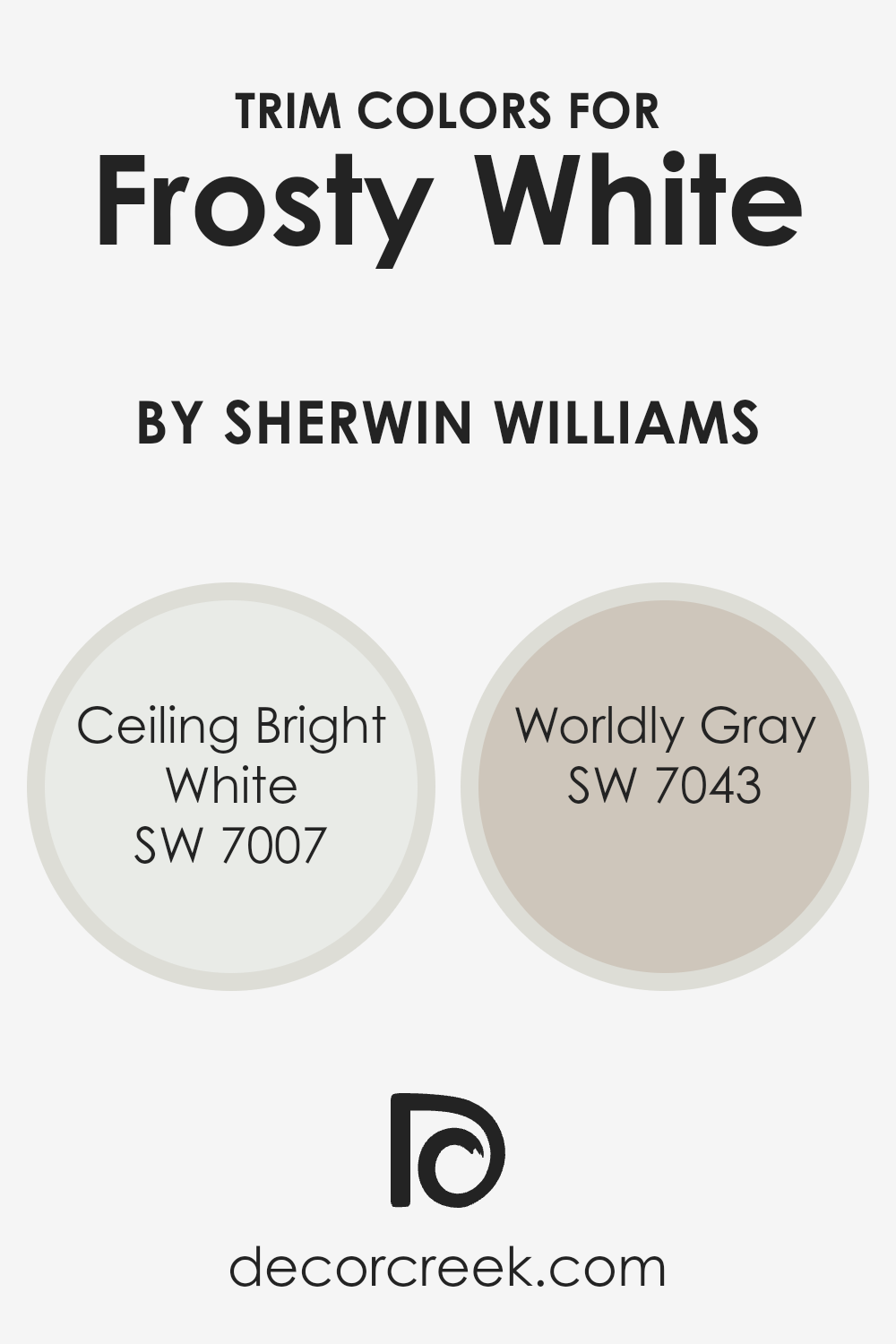
What are the Trim colors of Frosty White SW 6196 by Sherwin Williams?
Trim colors are the shades used for painting the edges and frames of spaces like doors, windows, and baseboards to give a room a refined look.
They play a crucial role in emphasizing the central room color by providing a clean and crisp border. When using Frosty White by Sherwin Williams, trim colors help in creating a balanced and complete aesthetic by enhancing the room’s appeal.
Trim colors like Ceiling Bright White and Worldly Gray can complement Frosty White, providing a nice contrast or blending seamlessly depending on their usage. These trim colors can make the room look larger by highlighting architectural details and adding definition to the space.
Ceiling Bright White is a pure and crisp white that reflects light well, making it an excellent choice for trim.
It can highlight the soft, warm tones of Frosty White beautifully, creating a fresh and airy feel. On the other hand, Worldly Gray is a versatile neutral with a warm undertone that provides depth and sophistication without overpowering the main color.
When used as a trim, it can add a subtle contrast that enriches Frosty White’s gentle beauty, giving the room an inviting yet refined atmosphere. By using these colors for trim, one can achieve a harmonious balance and enhance the overall look of the room.
You can see recommended paint colors below:
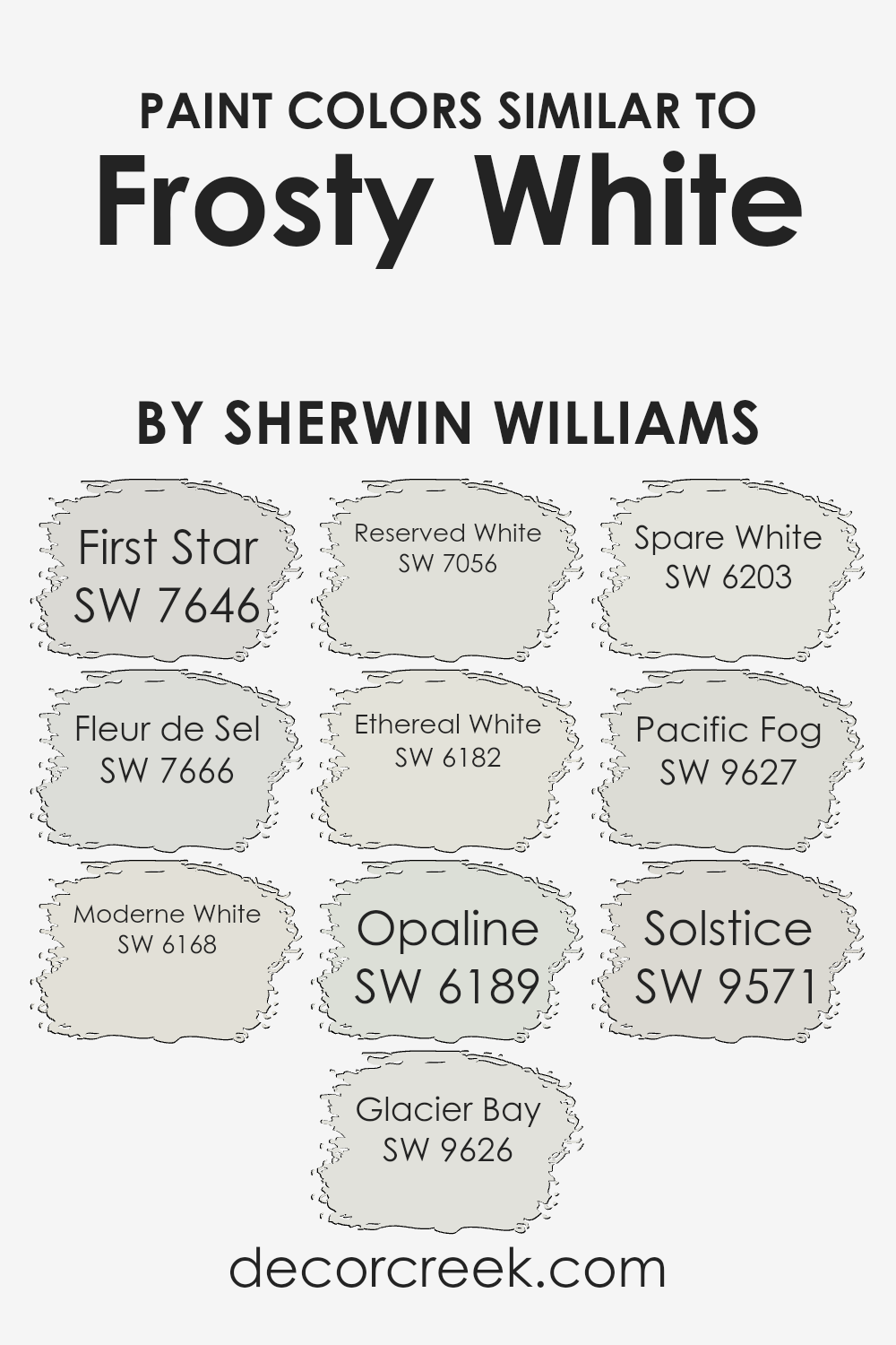
Colors Similar to Frosty White SW 6196 by Sherwin Williams
Similar colors are important in design because they create harmony and a subtle flow within a space.
By using colors that are close to each other on the color wheel, such as those similar to Frosty White by Sherwin Williams, you achieve a seamless visual experience that feels balanced and cohesive. This approach is gentle on the eyes and makes spaces feel more unified.
For example, First Star is a soft gray that lends a crisp and clean effect, while Fleur de Sel offers a calming gray with a whisper of green.
Moderne White provides a creamy warmth that works as a gentle backdrop, whereas Glacier Bay is a cool off-white reminiscent of faded ice.
Reserved White stands out with its refined and muted creaminess, offering a blend of neutral tones. Ethereal White has a fresh, light quality, similar to morning mist, and Opaline gives an airy feel with its light green undertones. Spare White is another shade that completes this palette, known for its soft, neutral character.
Pacific Fog introduces a hint of depth and mistiness, while Solstice incorporates a delicate hint of warmth, perfect for inviting spaces. Together, these colors offer a range of subtleties that work well in creating an inviting, comfortable, and aesthetically pleasing environment.
You can see recommended paint colors below:
- SW 7646 First Star
- SW 7666 Fleur de Sel
- SW 6168 Moderne White
- SW 9626 Glacier Bay
- SW 7056 Reserved White
- SW 6182 Ethereal White
- SW 6189 Opaline
- SW 6203 Spare White
- SW 9627 Pacific Fog
- SW 9571 Solstice
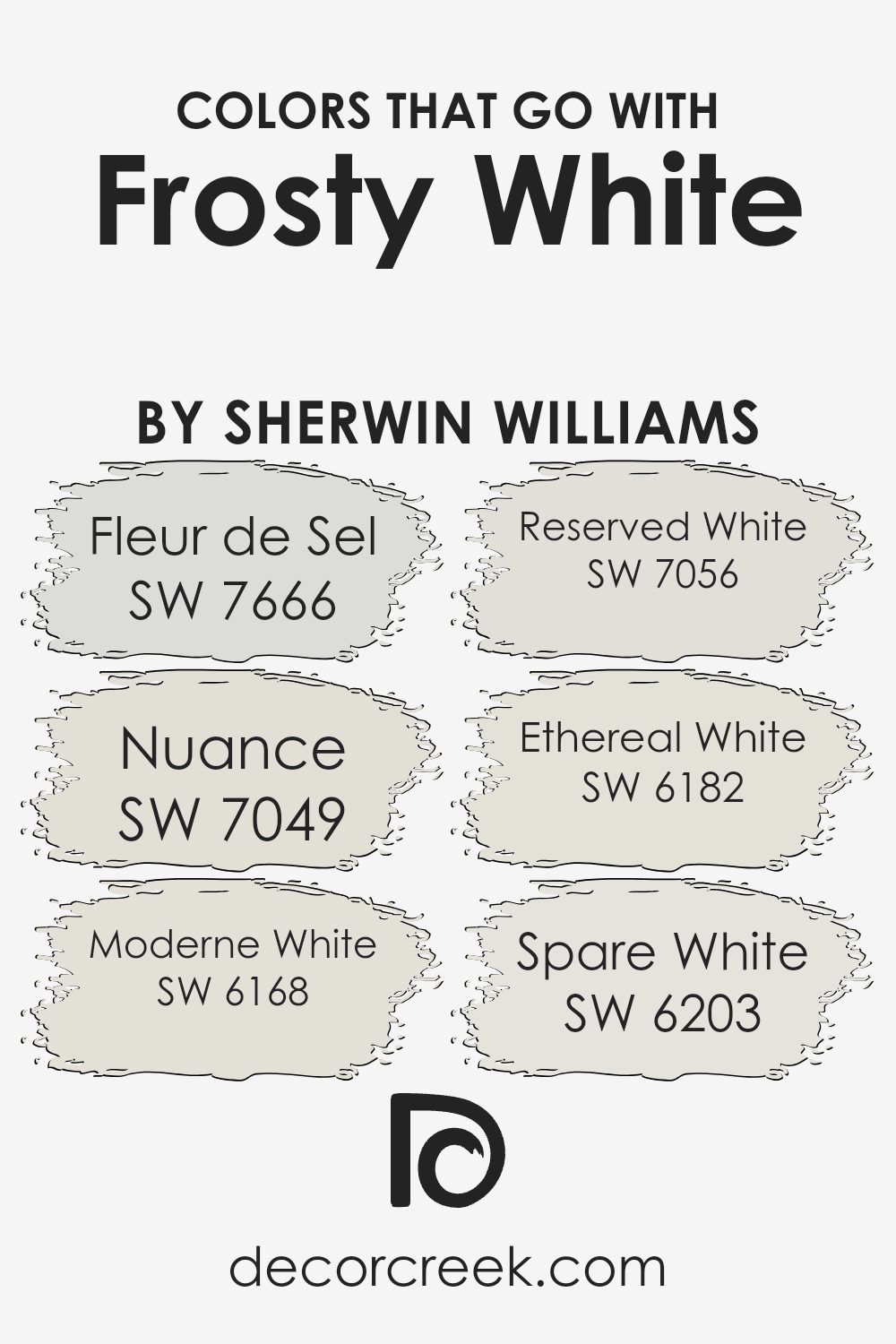
Colors that Go With Frosty White SW 6196 by Sherwin Williams
Choosing colors that complement Sherwin Williams’ Frosty White SW 6196 is essential because they can create a harmonious and balanced look in your space.
Pairing this cool, crisp white with other soft, muted shades helps maintain an overall light and airy feel. Frosty White has a way of bringing out the best in subtle, neutral colors, allowing them to gently enhance the mood without overwhelming the senses.
Fleur de Sel SW 7666 is a delicate gray with a hint of warmth, creating a cozy and inviting backdrop. Nuance SW 7049 offers a subtle beige tint, perfect for adding a touch of warmth while still keeping things light.
Moderne White SW 6168 has an understated elegance with a creamy undertone that pairs beautifully with the freshness of Frosty White. Reserved White SW 7056 is slightly off-white but with a cool touch, providing contrast and depth in a subtle manner.
Ethereal White SW 6182 leans towards a muted, misty hue that effortlessly blends with Frosty White, enhancing a gentle, breezy ambiance.
Lastly, Spare White SW 6203 is a serene shade that highlights simplicity and works well with the clean slate Frosty White provides. These coordinating colors together shape a calm and cohesive atmosphere.
You can see recommended paint colors below:
- SW 7666 Fleur de Sel
- SW 7049 Nuance
- SW 6168 Moderne White
- SW 7056 Reserved White
- SW 6182 Ethereal White
- SW 6203 Spare White
How to Use Frosty White SW 6196 by Sherwin Williams In Your Home?
Frosty White (SW 6196) by Sherwin Williams is a soft, neutral color that works well in various parts of the home. Its light, subtle tone can make rooms feel more open and airy.
In living rooms, Frosty White provides a clean backdrop for colorful furniture or artwork. The walls won’t overpower the room, letting you play with different decor styles and shades. In the kitchen, this color helps to create a bright and inviting space, especially when paired with stainless steel appliances or wooden cabinets.
For bedrooms, Frosty White can contribute to a calming atmosphere, promoting rest and relaxation. Bathrooms painted in this shade can appear fresh and clean, often looking larger and more welcoming.
Whether you’re using it on the walls or simply as an accent color, Frosty White blends well with both warm and cool tones, making it a versatile choice that fits many design preferences.
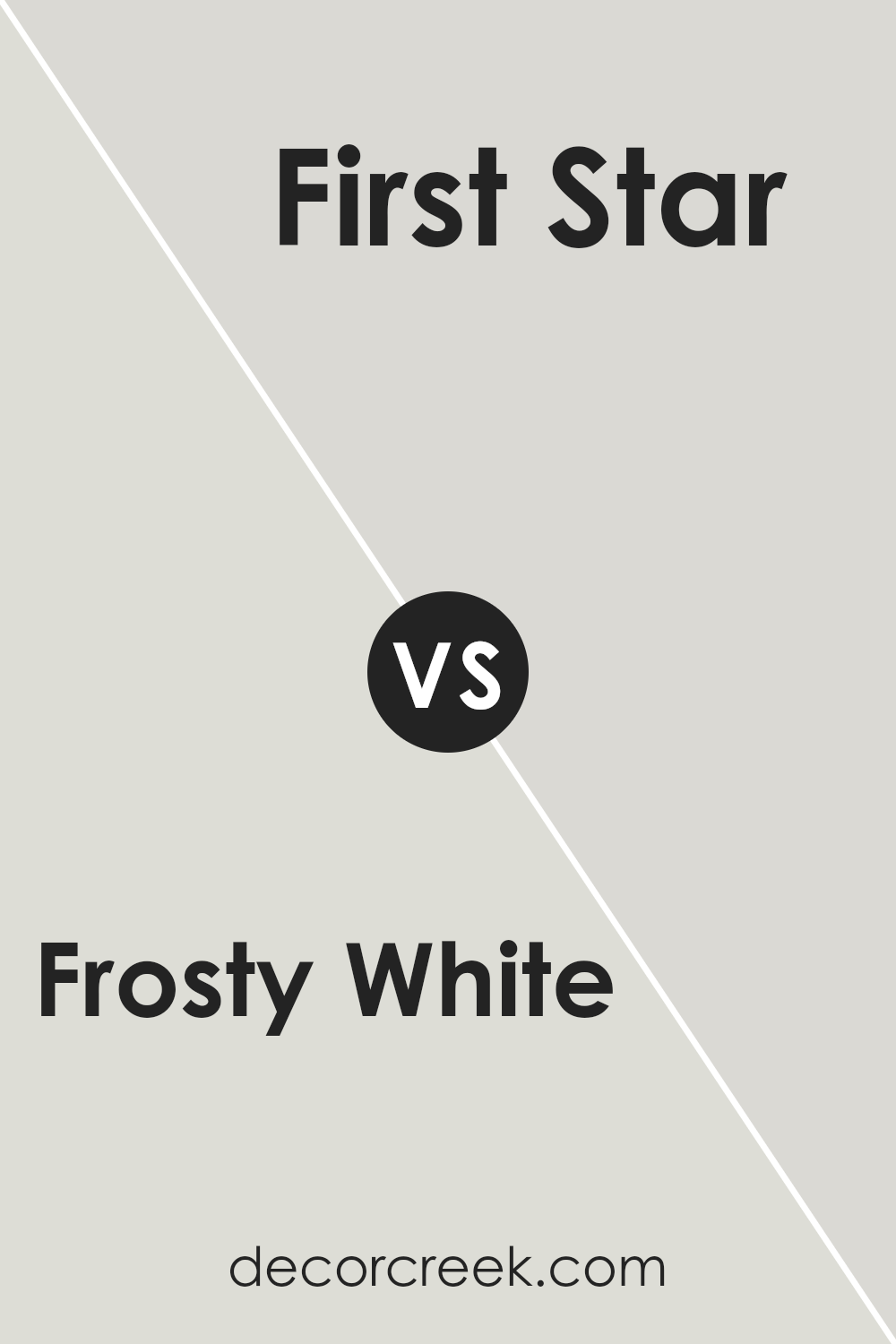
Frosty White SW 6196 by Sherwin Williams vs First Star SW 7646 by Sherwin Williams
Frosty White SW 6196 and First Star SW 7646 by Sherwin Williams are both soft and versatile colors, but they offer different vibes.
Frosty White is a warm off-white that provides a cozy and inviting look. It’s soft on the eyes and works well in spaces where you want warmth and comfort. This color is great for kitchens, living rooms, or any area where you want a gentle, welcoming feel.
On the other hand, First Star is a light gray that gives a room a clean and modern look. It’s more neutral compared to Frosty White, offering a cooler tone that can make a space feel fresh and airy.
First Star works well in contemporary settings and pairs nicely with other neutral colors or bold accents. While Frosty White adds a touch of warmth, First Star brings a sense of calm and simplicity, making it ideal for bedrooms or bathrooms.
You can see recommended paint color below:
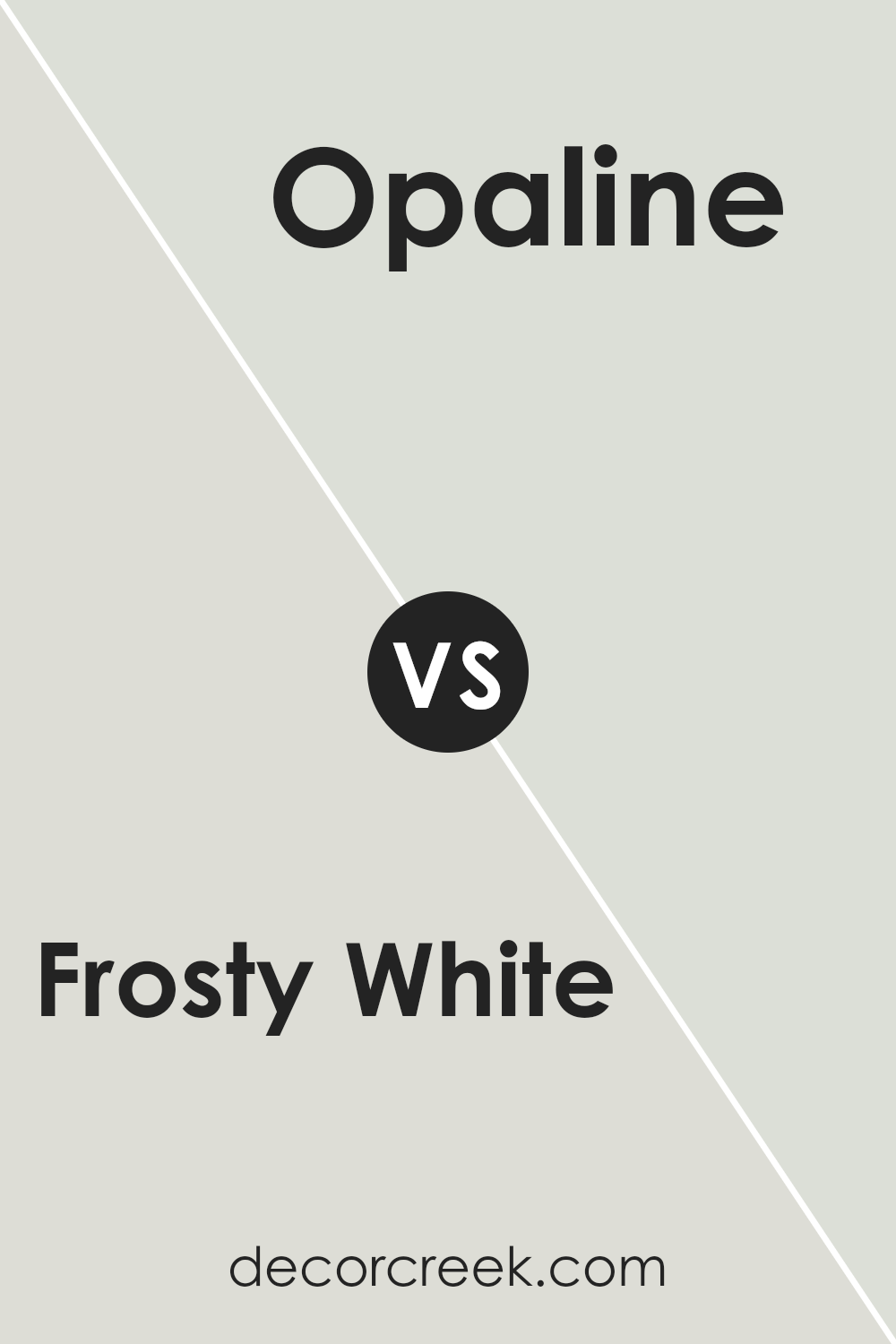
Frosty White SW 6196 by Sherwin Williams vs Opaline SW 6189 by Sherwin Williams
Frosty White SW 6196 and Opaline SW 6189 by Sherwin Williams are two light and neutral paint colors that are great for creating calm spaces.
Frosty White is a soft white with a hint of coolness, making it feel fresh and clean. It’s perfect for brightening up a room without feeling too stark or clinical. This color works well in spaces where you want a crisp and airy feeling.
Opaline, on the other hand, is a light, muted green with a hint of gray. It adds a subtle touch of color, without being overpowering.
It’s great for areas where you want a touch of warmth and earthiness, giving a room a slightly more inviting and cozy vibe compared to the coolness of Frosty White.
Together, these two colors can complement each other. Frosty White can act as a backdrop, while Opaline adds gentle color, creating balance and harmony in a room.
You can see recommended paint color below:
- SW 6189 Opaline
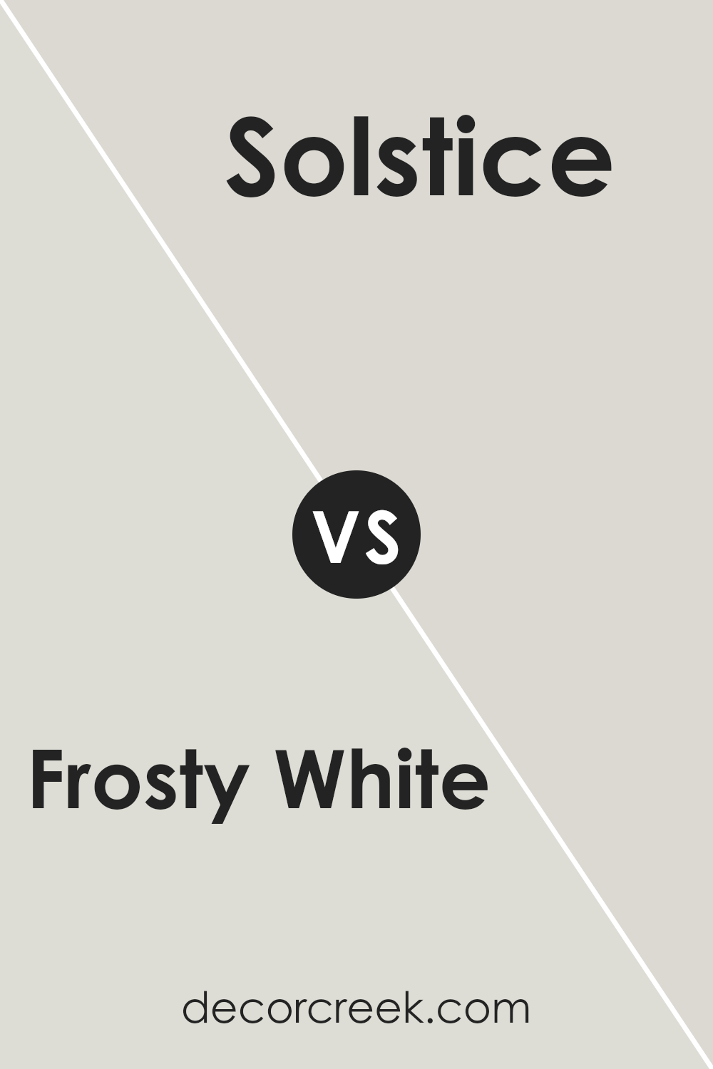
Frosty White SW 6196 by Sherwin Williams vs Solstice SW 9571 by Sherwin Williams
Frosty White (SW 6196) and Solstice (SW 9571) are two different shades from Sherwin Williams that each offer unique qualities.
Frosty White is a light, cool white with subtle gray undertones, making it a versatile choice for creating a clean and neutral backdrop. It works well in spaces where you want a crisp, timeless look.
Solstice, on the other hand, is a warm beige with soft yellow and brown tones. It brings a sense of warmth and coziness, making it suitable for areas where you want a welcoming and inviting atmosphere.
While Frosty White suits modern and minimalistic designs, Solstice can complement traditional and rustic styles.
Together, these colors could be used to create contrast in a room, with Frosty White on the walls and Solstice as an accent color, perhaps on trim or furniture, to add depth and interest to the space.
You can see recommended paint color below:
- SW 9571 Solstice
Frosty White SW 6196 by Sherwin Williams vs Ethereal White SW 6182 by Sherwin Williams
Frosty White SW 6196 and Ethereal White SW 6182 by Sherwin Williams are both soft, neutral colors, but they have subtle differences.
Frosty White is a cool, crisp white with slight grey undertones, giving it a clean and fresh appearance. It’s ideal for modern spaces where a bright, airy feel is desired.
On the other hand, Ethereal White is a warmer, softer color with creamy undertones. It gives a cozy and inviting feeling, making it suitable for spaces that aim for warmth and comfort. While Frosty White may complement cooler color schemes, Ethereal White pairs well with warmer palettes due to its subtle warmth.
Both colors are versatile and can be used in various settings, but choosing between them depends on whether you prefer a cooler, more modern look (Frosty White) or a warmer, more inviting atmosphere (Ethereal White).
You can see recommended paint color below:
Frosty White SW 6196 by Sherwin Williams vs Reserved White SW 7056 by Sherwin Williams
Frosty White SW 6196 and Reserved White SW 7056 are both neutral colors by Sherwin Williams, but they have distinct appearances.
Frosty White is a light, cool-toned white with a hint of gray, giving it a crisp and fresh look. It can make spaces feel clean and bright, ideal for modern, minimalist interiors or for creating a calm atmosphere.
Reserved White is slightly warmer, with beige undertones that add a touch of coziness. It works well in rooms where you want a soft, inviting feel. While Frosty White suits spaces needing clarity and simplicity, Reserved White adds warmth and subtlety.
Both colors work well as backgrounds, allowing other colors and textures to stand out. Choosing between them depends on whether you prefer a cooler, crisper look or something warmer and more inviting.
They can complement various design styles, offering versatility in home decor.
You can see recommended paint color below:
Frosty White SW 6196 by Sherwin Williams vs Spare White SW 6203 by Sherwin Williams
Frosty White SW 6196 and Spare White SW 6203 by Sherwin Williams are both soft, neutral colors that can bring a sense of calm and cleanliness to a space.
Frosty White is a slightly warmer white with subtle gray undertones, giving it a cozy feel without being too stark. This makes it a versatile backdrop for various styles, from traditional to modern.
On the other hand, Spare White leans a bit cooler with its faint hints of green. This cooler tone can add a crisp, fresh look to a room, making it feel open and airy. While both colors are light and understated, Frosty White’s warmth may pair better with warm-toned woods and fabrics, whereas Spare White’s coolness complements blues and grays beautifully.
Both are excellent for creating a peaceful atmosphere, but the choice between them may depend on the other colors and materials in the space.
You can see recommended paint color below:
Frosty White SW 6196 by Sherwin Williams vs Fleur de Sel SW 7666 by Sherwin Williams
Frosty White and Fleur de Sel are two soft, neutral shades. Frosty White is a light, cool-toned white that can make spaces feel open and airy.
It reflects plenty of light, making it a great choice for areas where you want a clean, fresh look without starkness. Fleur de Sel, on the other hand, is a subtle greige—gray beige—that has more warmth than Frosty White.
This can give a room a cozier and slightly darker feel compared to a pure white. While Frosty White is more crisp, Fleur de Sel can add more depth while still keeping a neutral base.
Both colors pair well with a wide variety of other shades, but Frosty White might be the go-to for a brighter, more minimalist style.
Meanwhile, Fleur de Sel could be the choice if you prefer a touch of softness and warmth without moving into strong color territory.
You can see recommended paint color below:
Frosty White SW 6196 by Sherwin Williams vs Moderne White SW 6168 by Sherwin Williams
Frosty White SW 6196 and Moderne White SW 6168 by Sherwin Williams are both soft and versatile whites, but they differ in tone and feel. Frosty White has a cooler undertone, giving it a crisp and clean appearance.
It works well in spaces with lots of natural light and pairs nicely with cooler colors, making it ideal for modern settings. On the other hand, Moderne White has a warmer undertone. This color feels a bit more cozy and inviting, which can add warmth to a room. It pairs well with warm-toned furnishings and gives a subtle softness to any space.
While both colors are neutral, Frosty White leans toward a more contemporary look with its cooler hue, whereas Moderne White brings a touch of warmth, offering a classic and timeless feel.
Your choice between the two will depend on the overall mood and style you want for your space.
You can see recommended paint color below:
Frosty White SW 6196 by Sherwin Williams vs Glacier Bay SW 9626 by Sherwin Williams
Frosty White SW 6196 and Glacier Bay SW 9626 by Sherwin Williams are two soft, light shades, but they have distinct vibes. Frosty White is a warm, creamy white that feels cozy and inviting.
It works well to make a room feel warm without being too intense. It’s a versatile color that pairs beautifully with both bright and muted tones.
On the other hand, Glacier Bay is a cooler, slightly bluish white. It gives off a crisp and airy feeling, perfect for creating a fresh and clean atmosphere.
This color works well in spaces where you want a bit of contrast against warmer tones or wood elements.
When you compare the two, Frosty White adds warmth and comfort, while Glacier Bay offers a refreshing and clean look. Choosing between them depends on the mood and tone you want for your space.
If you want warmth, go with Frosty White; for a cool and calm effect, pick Glacier Bay.
You can see recommended paint color below:
- SW 9626 Glacier Bay
Frosty White SW 6196 by Sherwin Williams vs Pacific Fog SW 9627 by Sherwin Williams
Frosty White SW 6196 by Sherwin Williams and Pacific Fog SW 9627 by Sherwin Williams are two distinct, elegant shades.
Frosty White is a soft off-white with subtle hints of gray, offering a clean and crisp look. It provides a neutral backdrop, making it versatile for various styles and spaces.
Its light tone helps to brighten rooms and create a sense of spaciousness. In contrast, Pacific Fog is a darker, muted gray with a touch of warmth. It adds depth and coziness to a space, making it perfect for creating a more intimate atmosphere.
While Frosty White suits areas where a fresh and airy feel is desired, Pacific Fog works well in rooms where a more grounded and calming effect is needed.
Together, these colors can complement each other beautifully, with Frosty White providing a bright base and Pacific Fog adding accents or defining specific areas.
You can see recommended paint color below:
- SW 9627 Pacific Fog
Conclusion
After taking a closer look at Sherwin Williams’ SW 6196 Frosty White, I can honestly say this paint color is a friendly choice for any room.
This shade is like a soft, gentle whisper of white that isn’t too bright, making it nice and calming for spaces in your home. It’s a little bit like snow that’s just fallen and is still untouched, creating a peaceful feeling.
One of the cool things about Frosty White is that it works well with lots of other colors. You can match it with bold colors if you want to create some contrast, or pair it with soft pastels for a more delicate look.
It’s like the perfect white crayon—it goes with everything without taking over.
This color is especially nice if you want a clean, fresh look. Painting your room Frosty White can make it feel bigger and more open, kind of like when you clean up a messy room and suddenly there’s a lot more room to play.
In the end, Frosty White offers a nice balance—it’s simple yet gives any wall a fresh look. If you’re searching for a color that’s easygoing and friendly to use in most parts of the house, Frosty White gets lots of thumbs up from me!

Ever wished paint sampling was as easy as sticking a sticker? Guess what? Now it is! Discover Samplize's unique Peel & Stick samples.
Get paint samples

