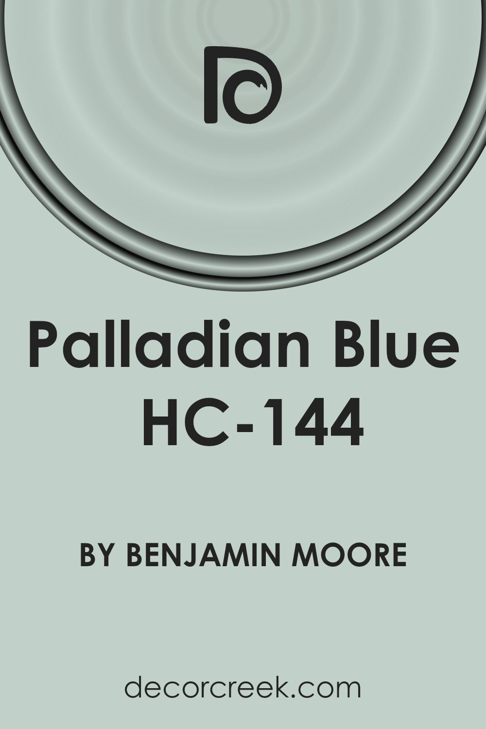
HC-144, also known as Palladian Blue, is a serene, airy shade from the Historical Color collection by Benjamin Moore. This paint color, inspired by the beautiful, light-filled architecture of the Palladian-style, brings calmness and clarity to any space it adorns. Often associated with the tranquility of the sky and the freshness of the sea, Palladian Blue offers a perfect balance between a soothing atmosphere and vibrant energy, making it a favorite among homeowners and designers alike.
Palladian Blue’s versatility allows it to fit seamlessly into a variety of décor styles, from coastal chic to modern minimalist. Its ability to pair well with both neutral tones and bold patterns means it can easily become the foundation of a room’s color scheme or a subtle accent that complements existing décor.
Whether you’re updating a bedroom to create a peaceful retreat or giving a living space a bright, welcoming vibe, HC-144 Palladian Blue provides a timeless elegance that enhances the beauty of your home.
As you consider different hues for your next project, keep in mind the unique charm that Palladian Blue brings. Its gentle, refreshing presence can breathe life into any room, making it feel both expansive and intimate. A testament to its enduring appeal, Palladian Blue remains a go-to choice for anyone seeking to add a touch of sophistication and natural harmony to their living spaces.
What Color Is Palladian Blue HC-144 by Benjamin Moore?
Palladian Blue by Benjamin Moore is a soothing shade that strikes a beautiful balance between blue and green. This color has a soft, airy quality that makes any room feel more tranquil and spacious. It’s light enough to serve as a neutral backdrop but has enough depth to add character to your space. This versatile hue fits into various interior styles, especially coastal, traditional, and modern.
In coastal-themed interiors, Palladian Blue mirrors the calmness of the sea and sky, creating a serene retreat. Pair it with crisp whites, sandy beiges, and natural textures like linen and jute to enhance this beachy vibe. In traditional settings, this color adds a fresh twist, especially when teamed with rich woods, gold accents, and luxurious fabrics like velvet or silk for a touch of elegance.
For those leaning towards a modern aesthetic, combining Palladian Blue with sleek furniture, metallic finishes, and minimalistic décor creates a refreshing and contemporary space.
The beauty of Palladian Blue lies in its ability to pair well with various materials and textures. Wood tones, from light to dark, complement its warmth. Metal accents in silver, gold, or bronze highlight its subtle sophistication.
In terms of fabrics, it pairs beautifully with both smooth and textured materials, adding depth and interest to the decor. Whether it’s the main color or an accent, Palladian Blue brings a breath of fresh air into your home.
Is Palladian Blue HC-144 by Benjamin Moore Warm or Cool color?
Palladian Blue is a popular paint color choice from Benjamin Moore that has a way of brightening any room it graces. This shade of blue is light and airy, with a hint of green, creating a calm and soothing atmosphere. It’s inspired by the clear, fresh skies of a perfect spring day, making it a favorite for homeowners looking to bring a sense of serenity into their living spaces.
When used in homes, this color has a remarkably versatile nature. It works well in almost any room, from kitchens and bathrooms to bedrooms and living areas. The lightness of Palladian Blue allows it to reflect natural light beautifully, making spaces appear larger and more open. This quality is especially beneficial in smaller rooms or areas with limited light, helping to create an illusion of more space.
Furthermore, it pairs wonderfully with a wide range of decor styles and colors, from bright whites and soft neutrals to bold and dark hues, offering a balanced backdrop that can support various design themes. Whether aiming for a coastal vibe, a modern look, or a traditional feel, Palladian Blue provides a fresh and welcoming foundation. Its ability to induce a peaceful aura makes it a go-to color for anyone looking to create a tranquil home environment.
Undertones of Palladian Blue HC-144 by Benjamin Moore
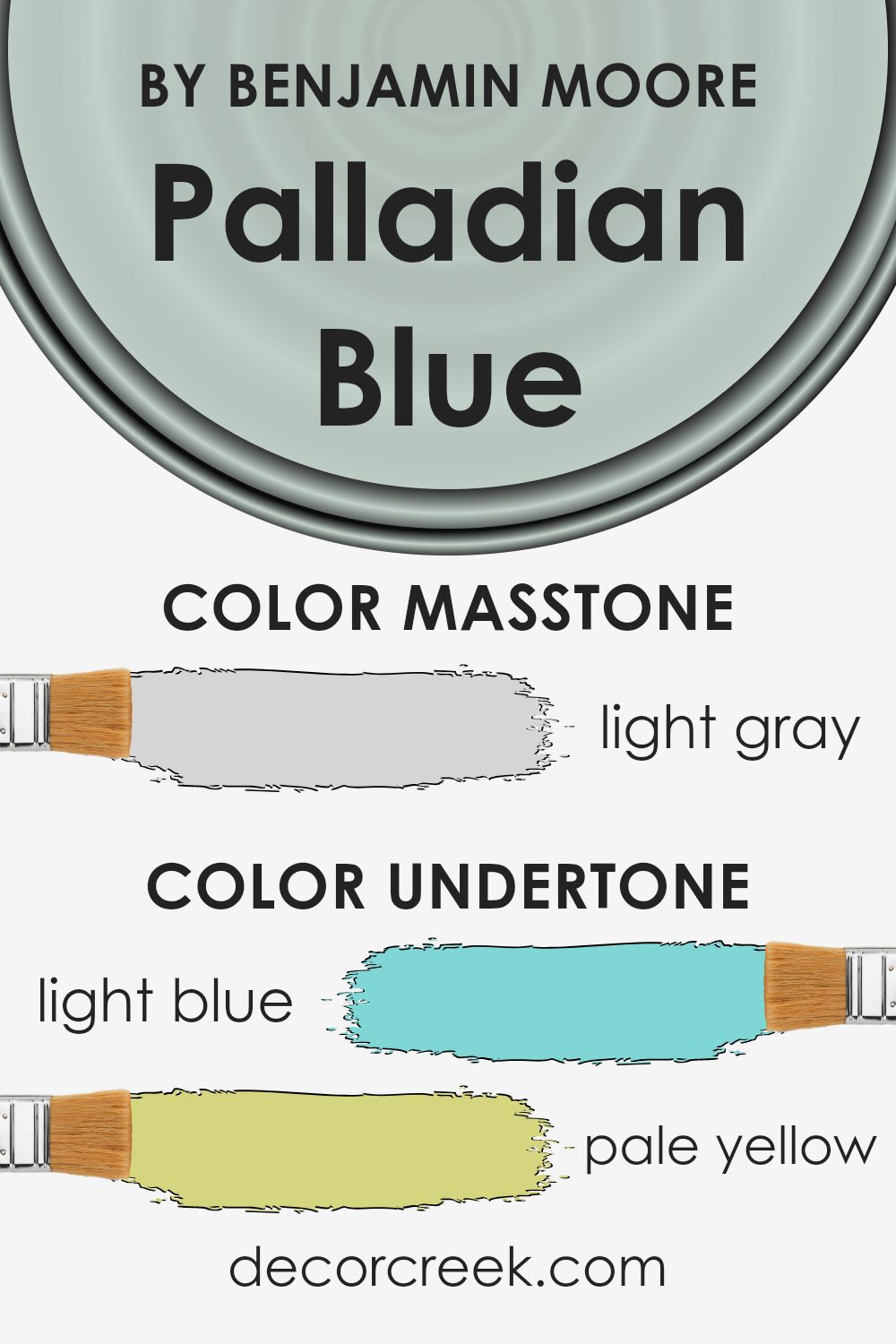
Palladian Blue by Benjamin Moore is not just a simple blue paint; it’s a mix that plays tricks on your eyes because of its undertones. When we talk about undertones, we mean the subtle colors that lie beneath the main color. These undertones can change how we see the main color, depending on the light and what’s around it.
This blue has undertones like light blue, pale yellow, light purple, mint, lilac, pale pink, and grey. Each of these adds a layer of complexity to the color. For example, in bright sunlight, you might notice the light blue or mint undertones, making the room feel cool and refreshing. On a cloudy day, the grey or pale yellow might stand out, giving the space a softer, more soothing vibe.
When you put this blue on interior walls, these undertones really come into play. They can make a room feel more spacious and open or bring a sense of calm. The light purple and lilac undertones add a hint of luxury and creativity, perfect for sparking imagination in a study or bedroom. The pale pink can make a space feel welcoming and warm, ideal for a living room.
In summary, the undertones in Palladian Blue make it a versatile color that can change mood depending on the light and surroundings. It’s not just blue; it’s a dynamic background that can shift the atmosphere of a room just slightly, making it a popular choice for those looking to add depth and character to their walls without overwhelming them with color.
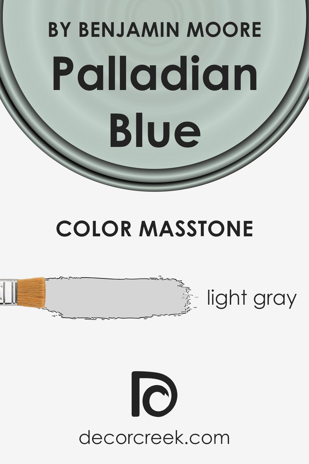
What is the Masstone of the Palladian Blue HC-144 by Benjamin Moore?
Palladian Blue HC-144 by Benjamin Moore, with its masstone of Light Gray (#D5D5D5), brings a serene and airy feeling to any home. This specific shade of light gray adds a subtle depth, making the space feel larger and more open. It’s an ideal choice for rooms aiming for a fresh and modern look, as its gentle tone pairs well with a wide range of decor styles and colors.
Whether it’s used in a bedroom to create a calm sanctuary or applied in a living room for a bright and welcoming vibe, this color adds a sense of tranquility without overpowering the space. Its light gray masstone ensures that it doesn’t dominate the room but rather complements other elements present. Furthermore, its versatility makes it suitable for various lighting conditions, adapting gracefully, and enhancing the overall aesthetic appeal of a home.
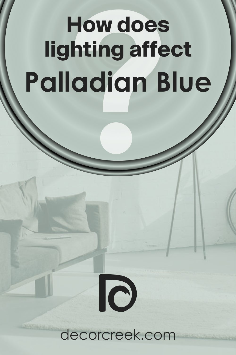
How Does Lighting Affect Palladian Blue HC-144 by Benjamin Moore?
Lighting plays a crucial role in how we see colors, and it can significantly affect the appearance of any paint color in a room, including Palladian Blue by Benjamin Moore. This specific color, a soothing, light blue with a hint of green, can shift in appearance depending on the type and direction of light it’s exposed to.
In artificial light, colors can look different depending on the bulbs used. Soft, warm lights can make Palladian Blue appear more muted and warmer, bringing out more of its green undertones. Meanwhile, cool, white lights can make the color appear brighter and more true to its daylight appearance, enhancing its serene blue qualities.
In natural light, Palladian Blue can look vastly different throughout the day and will vary based on the room’s orientation. In north-facing rooms, which often receive cooler, indirect light, this color can appear more subdued and might lean slightly towards its cooler, bluish tones, creating a calm and refreshing look. This makes it great for rooms where a sense of tranquility is desired.
South-facing rooms bathe in warm, bright light for most of the day, which can make Palladian Blue look lighter and more airy. The natural brightness brings out the color’s vibrancy without overpowering, giving the room a cheerful and inviting atmosphere.
East-facing rooms get bright light in the morning followed by cooler, indirect light for the rest of the day. In the morning, Palladian Blue will look bright and lively, but as the day progresses, it may take on a softer, more serene quality.
Conversely, in west-facing rooms, the color will experience the opposite effect. It starts softer in the morning and then, as the sun sets, the color warms up and becomes more dynamic, which can add a cozy and warm feel to the space during the late afternoon and evening.
Understanding how lighting affects colors like Palladian Blue can help in choosing the right paint for your space, ensuring the color matches your vision throughout the day and under different lighting conditions.
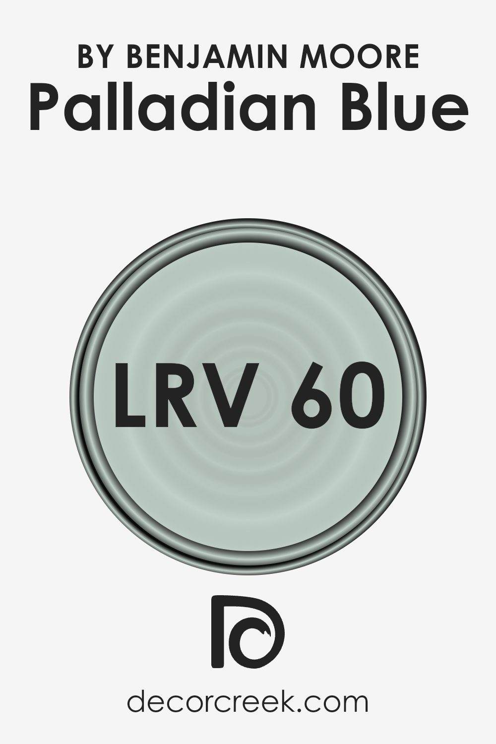
What is the LRV of Palladian Blue HC-144 by Benjamin Moore?
LRV stands for Light Reflectance Value, which is a measure of the percentage of light a paint color reflects from or absorbs into a painted surface. In simpler terms, it tells you how light or dark a color will look once it’s on your walls. An LRV can range from 1 to 100, where 1 absorbs most light, appearing very dark, and 100 reflects most light, appearing very bright.
This scale helps in choosing paint colors for your space by understanding how light or dark they can make a room feel. A higher LRV means a lighter room, as more light will bounce around, while a lower LRV can make a space feel cozier but possibly smaller or darker, because it absorbs more light.
Looking at the LRV of 60.4 for Palladian Blue, this means it is on the lighter side of the scale, hinting that it’s a color that will reflect a decent amount of light without being overly bright. This LRV is particularly effective in spaces where you want to balance a fresh, airy feel without the starkness that can come with a very high LRV color.
In rooms with less natural light, Palladian Blue will help in making the space feel lighter and more open. Conversely, in well-lit areas, it will look vibrant without being overwhelming, creating a serene and inviting atmosphere. Its ability to reflect light moderately makes it a versatile choice for many spaces, influencing how colors and light interplay in your environment.
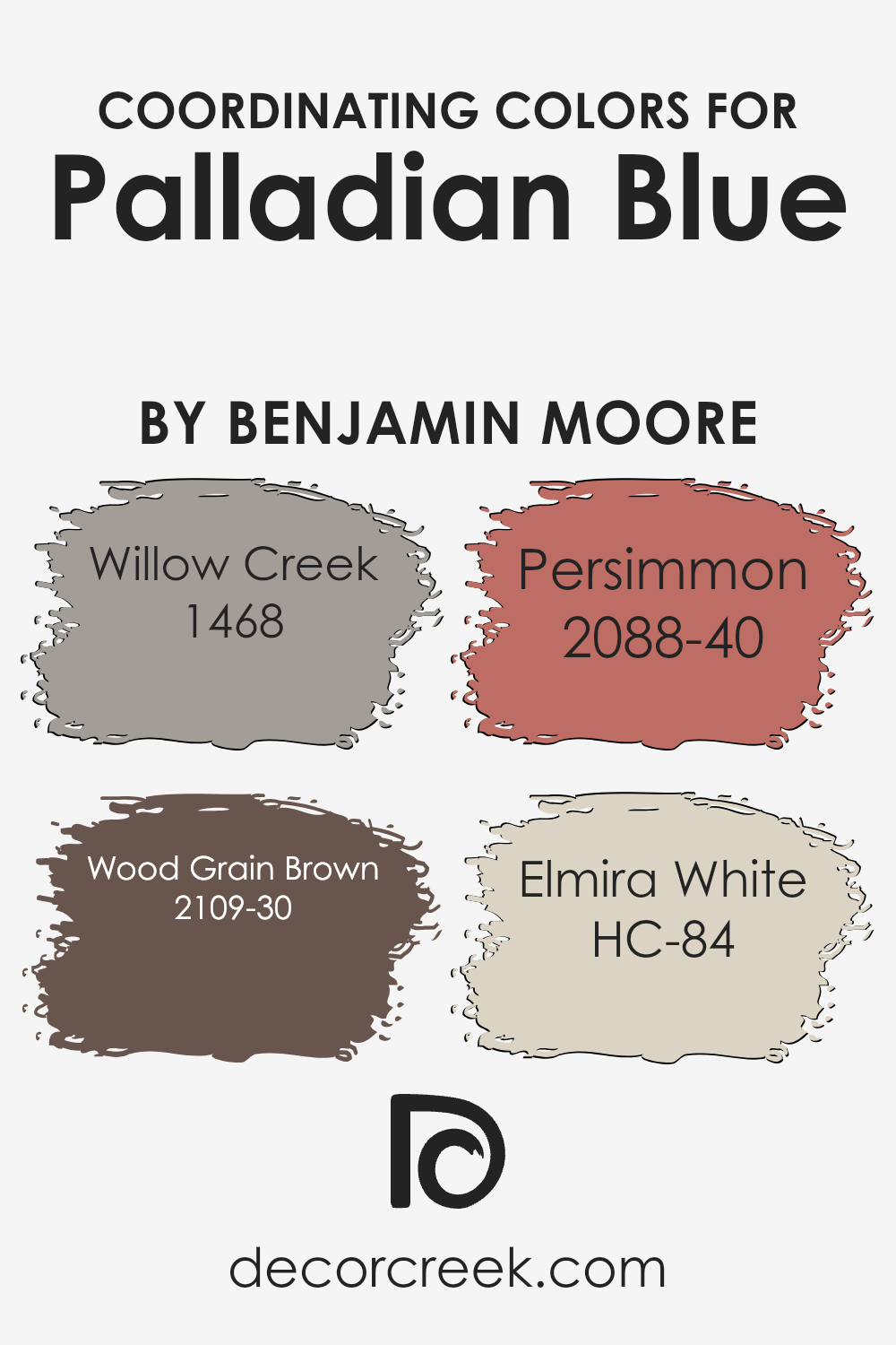
Coordinating Colors of Palladian Blue HC-144 by Benjamin Moore
Coordinating colors are those that pair well together in interior design, creating an appealing and balanced look in any space. These colors can range from similar shades that complement each other to contrasting tones that create a vibrant and dynamic atmosphere. The key to using coordinating colors effectively is understanding how they interact with each other and with the room’s lighting, furnishings, and overall mood.
For instance, Willow Creek (1468) is a muted gray with subtle green undertones, offering a serene backdrop that works well with softer hues like blue. Wood Grain Brown (2109-30) brings a rich, earthy warmth to the palette, introducing a natural depth that contrasts beautifully with cooler tones.
Persimmon (2088-40) adds a bright pop of color, its bold orange hue energizing the space and drawing the eye. Lastly, Elmira White (HC-84) serves as a versatile neutral, its creamy, soft white base providing a light and airy feel that enhances the freshness of the overall color scheme.
By combining these colors thoughtfully, one can achieve a harmonious and inviting space that feels cohesive and thoughtfully designed.
You can see recommended paint colors below:
- 1468 Willow Creek
- 2109-30 Wood Grain Brown
- 2088-40 Persimmon
- HC-84 Elmira White
What are the Trim colors of Palladian Blue HC-144 by Benjamin Moore?
Trim colors play a crucial role in accentuating the beauty and character of wall colors, acting as a visual frame that enhances the overall appearance. For a serene and refreshing shade like Palladian Blue by Benjamin Moore, choosing the right trim colors is important because it can either elevate the room’s elegance or maintain its soft, welcoming vibe. Trim colors like Ballet White (OC-9) and Super White (OC-152) by Benjamin Moore are excellent choices to pair with Palladian Blue. These colors create a smooth transition between the wall color and the trim, highlighting architectural features without creating a stark contrast, ensuring the space feels cohesive and harmoniously balanced.
Ballet White (OC-9) is a soft, creamy off-white that provides a gentle complement to Palladian Blue, offering a subtle contrast that enhances the room’s soothing qualities without overwhelming the senses. It’s like a warm, soft hug for your walls, wrapping the space in coziness while still maintaining a crisp and clean look.
On the other hand, Super White (OC-152) is a bright, clean white with a hint of sharpness, perfect for bringing out the vibrant yet tranquil nature of Palladian Blue. It adds a fresh, crisp edge to the space, making it feel more spacious and brightly lit. Together, these trim colors ensure that the unique charm of Palladian Blue shines through, creating an inviting and aesthetically pleasing environment.
You can see recommended paint colors below:

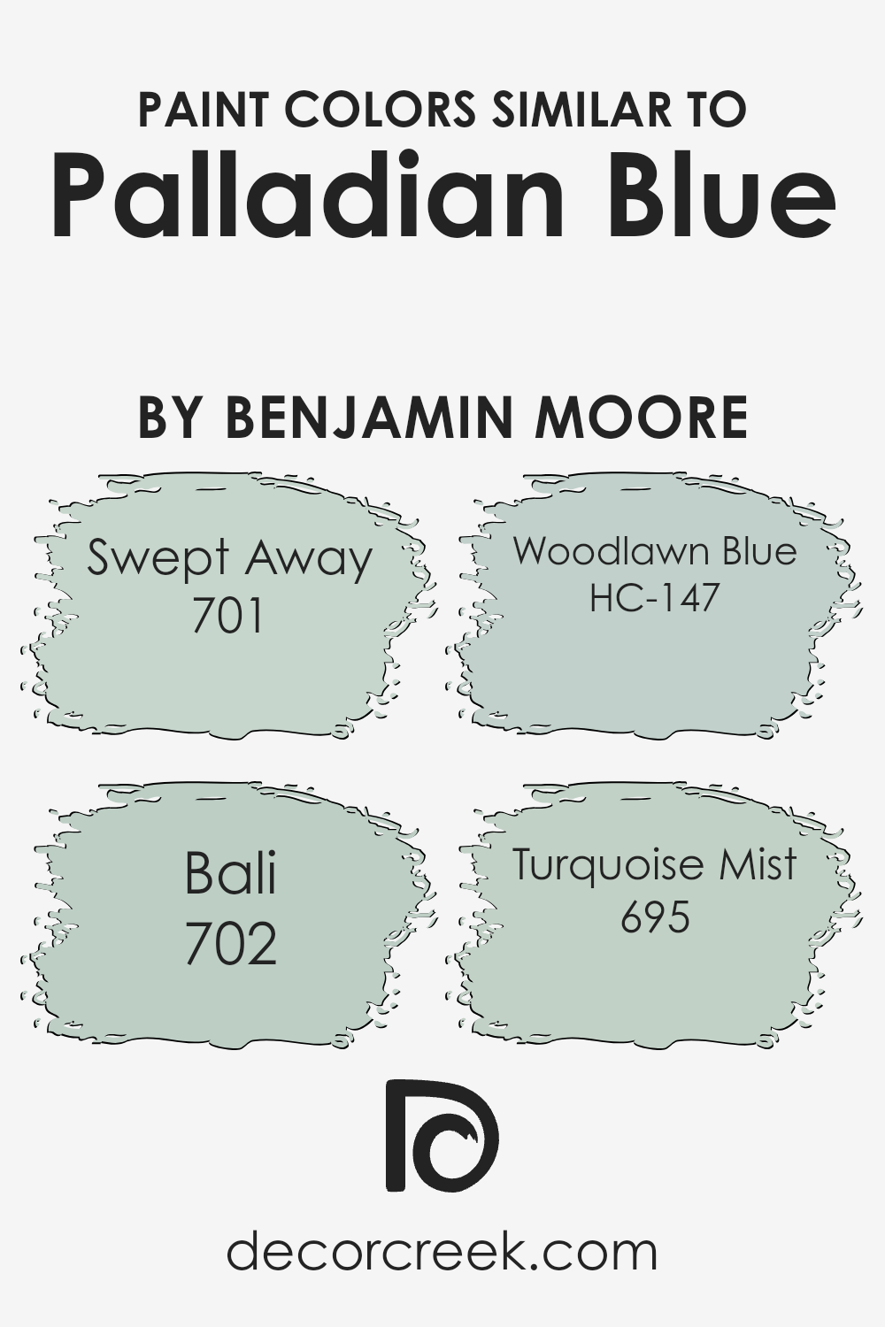
Colors Similar to Palladian Blue HC-144 by Benjamin Moore
Choosing similar colors is a smart way to create a cohesive and harmonious look in any space. Similar colors, like those akin to Palladian Blue by Benjamin Moore, work together because they share a common hue, making them blend seamlessly. These colors typically vary in brightness and saturation but maintain enough similarity to complement each other beautifully.
By incorporating shades like Swept Away, Bali, Woodlawn Blue, and Turquoise Mist, one can effortlessly craft a serene and inviting atmosphere. The magic lies in the subtle differences between these shades, allowing for depth and interest without overwhelming the senses.
Swept Away is a gentle, airy blue that evokes a sense of calm and spaciousness, perfect for creating a light and breezy feel in a room. Bali, on the other hand, brings a touch of the exotic with its slightly deeper tone, reminiscent of sea and sky, offering a solid backdrop that still feels peaceful.
Woodlawn Blue is a soft, muted hue that strikes a lovely balance between green and blue, lending a fresh and tranquil vibe to any area. Lastly, Turquoise Mist, with its hint of green, infuses spaces with a vibrant yet soothing energy, making it ideal for adding a splash of gentle color. Together, these similar colors provide the perfect palette for a cohesive design scheme that’s both inviting and visually appealing.
You can see recommended paint colors below:
- 701 Swept Away
- 702 Bali
- HC-147 Woodlawn Blue
- 695 Turquoise Mist
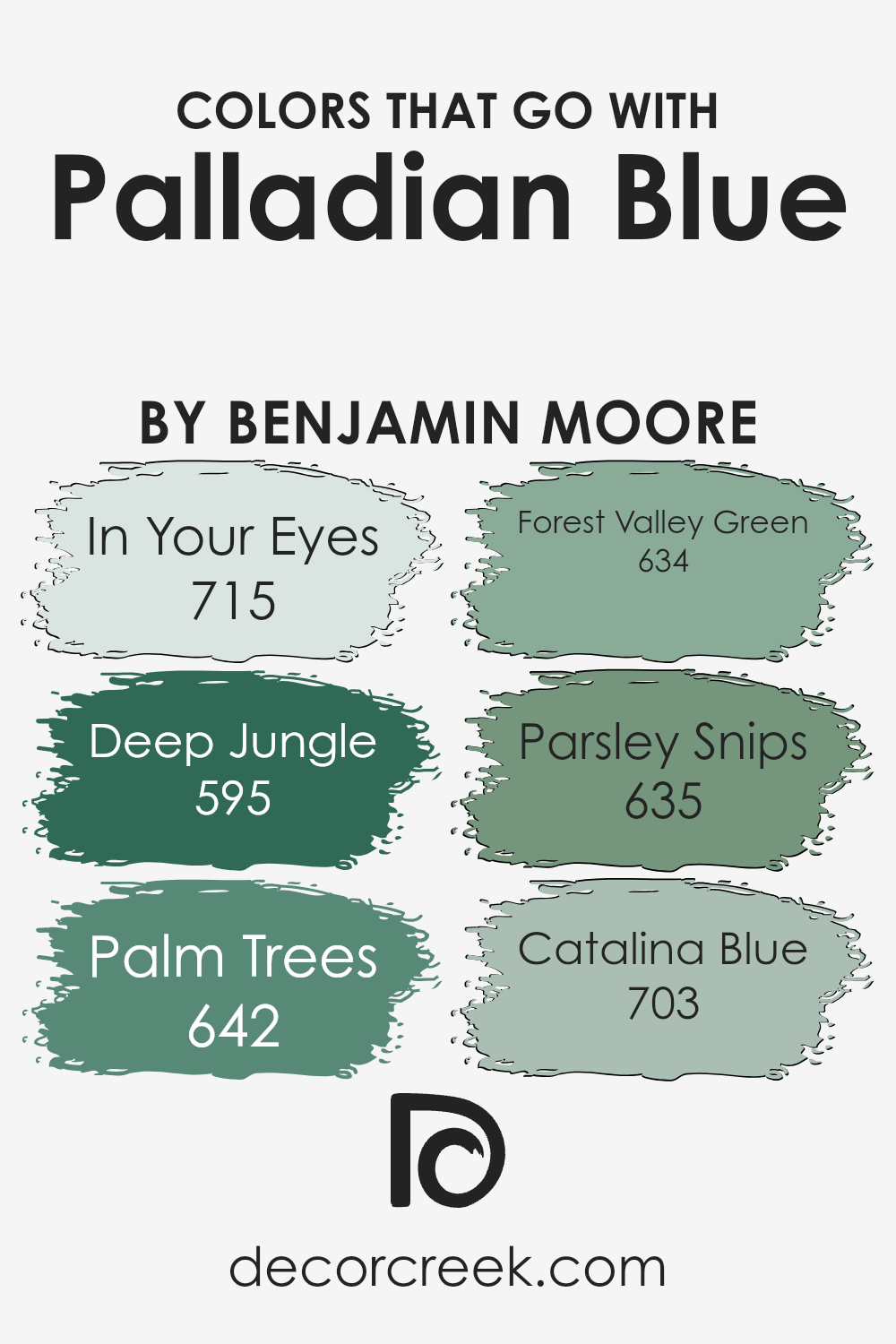
Colors that Go With Palladian Blue HC-144 by Benjamin Moore
Choosing the right colors to complement Palladian Blue HC-144 by Benjamin Moore is crucial because it ensures that the overall aesthetic is harmonious and pleasing to the eye. Palladian Blue is a serene and calming hue that can act as a neutral backdrop or a statement shade, depending on what it’s paired with.
When combined with the right colors, it can enhance the ambiance of a room, creating a cohesive look that ties together different elements and textures. The key to achieving this balance is to select colors that either contrast beautifully or blend smoothly with Palladian Blue, thus enriching its natural beauty without overwhelming it.
Among the colors that go well with Palladian Blue HC-144, ‘In Your Eyes 715’ offers a subtle contrast, being a lighter, more ethereal shade of blue. It brings a sense of airiness and openness to the space, making it feel more expansive. ‘Deep Jungle 595,’ on the other hand, introduces a rich, deep green that grounds the lightness of Palladian Blue, adding depth and sophistication.
‘Palm Trees 642’ is another green hue but with a brighter, more vibrant personality, infusing energy and vitality into the mix. Moving on to ‘Forest Valley Green 634,’ this color deepens the connection to nature, providing a lush, organic feel that complements the tranquility of Palladian Blue.
‘Parsley Snips 635’ offers a fresh, crisp green, lighter than Forest Valley, which refreshes the palette and introduces a spring-like vibe. Lastly, ‘Catalina Blue 703’ presents a bold, statement blue that echoes the strength of the ocean, providing a dramatic contrast that makes Palladian Blue pop. Together, these colors work in harmony to create a diverse and dynamic palette that accentuates the best qualities of Palladian Blue HC-144, making any space more inviting and aesthetically pleasing.
You can see recommended paint colors below:
- 715 In Your Eyes
- 595 Deep Jungle
- 642 Palm Trees
- 634 Forest Valley Green
- 635 Parsley Snips
- 703 Catalina Blue
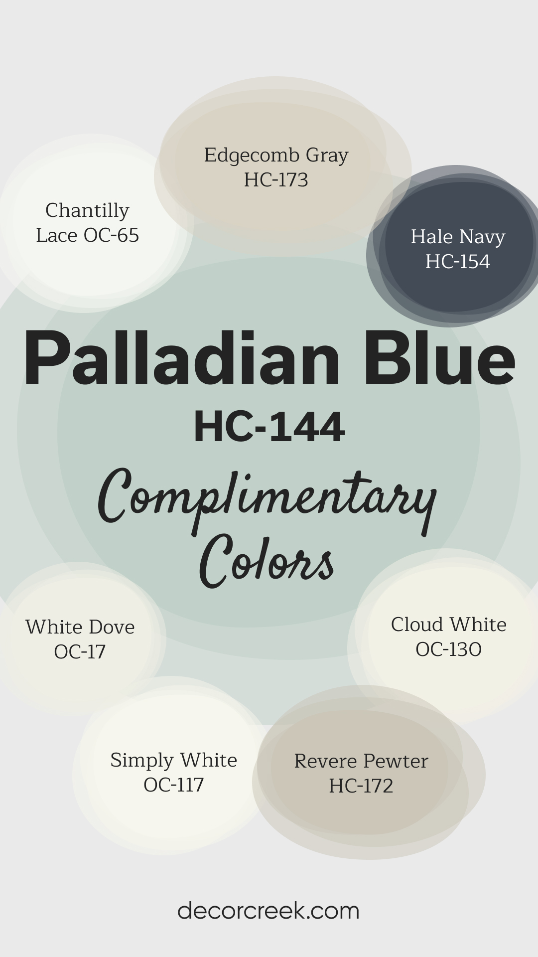
Complimentary Colors for Palladian Blue HC-144 Paint Color by Benjamin Moore
Palladian Blue by Benjamin Moore is a serene blue-green shade that instantly brings a sense of calm and relaxation to any room. Its light, airy feel makes it perfect for pairing with crisp whites like White Dove, Chantilly Lace, Cloud White, or Simply White, creating a fresh and open atmosphere.
These combinations work well in spaces where you want to emphasize brightness and simplicity. For a more balanced, layered look, Edgecomb Gray and Revere Pewter add warmth and subtle depth. If you’re looking to introduce a dramatic touch, Hale Navy offers a bold contrast, complementing the softness of Palladian Blue while adding sophistication.
This carefully curated palette allows for endless design possibilities, making it ideal for both modern and classic interiors.
How to Use Palladian Blue HC-144 by Benjamin Moore In Your Home?
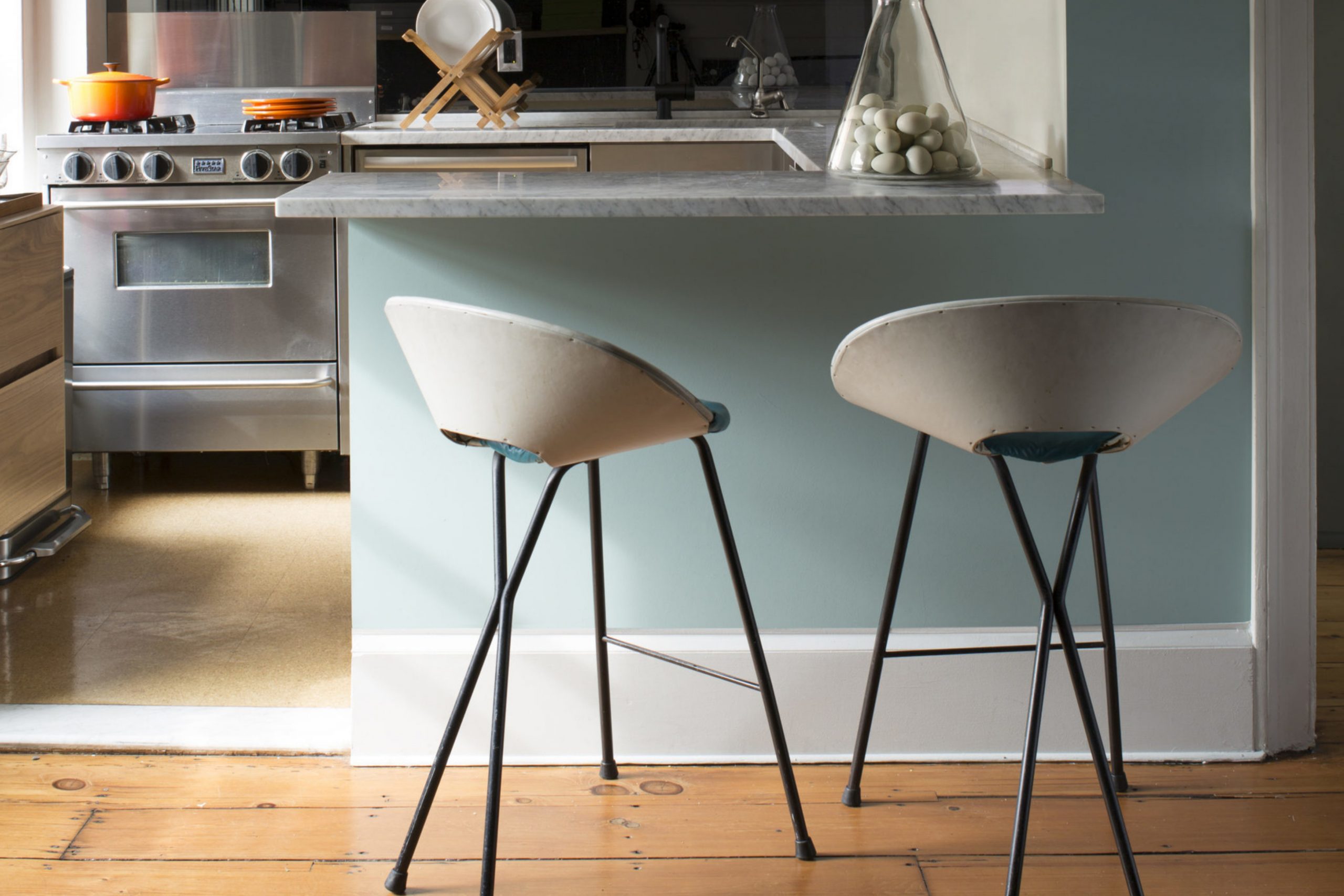
Palladian Blue HC-144 by Benjamin Moore is a popular paint color known for its soothing and peaceful vibe. It’s a soft, light blue with a hint of green, giving it a refreshing feel that’s perfect for creating a serene environment in your home. You can use Palladian Blue in various rooms to add a touch of calm elegance. For instance, painting your bathroom with this color can turn it into a spa-like retreat where you can relax and unwind. In the bedroom, it helps create a tranquil backdrop for a good night’s sleep.
If you want to add a subtle pop of color to your living room or kitchen, consider using Palladian Blue for an accent wall. It pairs beautifully with whites, creams, and wooden textures, offering flexibility in your decor options. Since it’s not overwhelming, you can also paint bookshelves or cabinets in this hue for a refreshing update. Palladian Blue is a versatile choice that brings a calming atmosphere to any space, making your home feel more inviting and cozy.
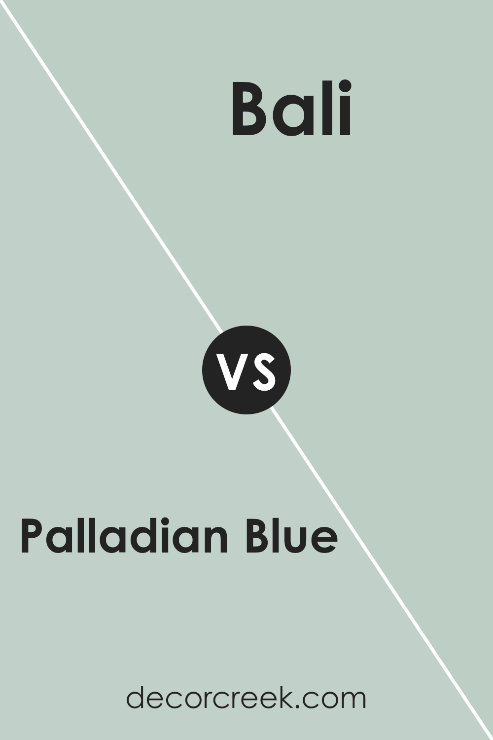
Palladian Blue HC-144 by Benjamin Moore vs Bali 702 by Benjamin Moore
Palladian Blue is a soft, light blue with a hint of green, giving it a tranquil feel reminiscent of a clear sky on a sunny day. It’s perfect for creating a serene and welcoming atmosphere in any room. On the other hand, Bali is a more pronounced, vibrant shade of blue with a subtle green undertone, offering a bolder and more energetic vibe.
While Palladian Blue brings a gentle, calming effect, Bali packs more punch, making a statement without overpowering. Both colors are from Benjamin Moore, known for their quality paint. Palladian Blue works well in spaces designed for relaxation and thoughtfulness, like bedrooms and bathrooms.
Bali, being more vivid, is great for areas where you want to add personality and vibrancy, such as an accent wall in a living room or a creative space. Each color has its charm, offering different moods and atmospheres depending on the room they’re used in.
You can see recommended paint color below:
- 702 Bali
Palladian Blue HC-144 by Benjamin Moore vs Swept Away 701 by Benjamin Moore
Comparing Palladian Blue and Swept Away from Benjamin Moore brings us to look at two beautiful, calming colors that are quite different in their vibes. Palladian Blue is a soft, light blue that hints at a gentle sea breeze or the clear sky on a sunny day. It’s a tranquil color that pairs well with various shades, bringing a restful feeling to any space.
On the other hand, Swept Away is a bit more complex. It’s a muted color that leans towards a soft, grayish-blue, echoing the subtle tones of an early morning mist over the ocean. While it still offers a sense of calm, its depth adds a layer of sophistication and serenity to rooms.
Both colors are fantastic choices for creating a soothing atmosphere, but while Palladian Blue adds a brighter, more open feel, Swept Away provides a more enclosed, cozy vibe. Whether one chooses the uplifting lightness of Palladian Blue or the moody calm of Swept Away depends on the desired ambiance and decorative vision for the room.
You can see recommended paint color below:
- 701 Swept Away

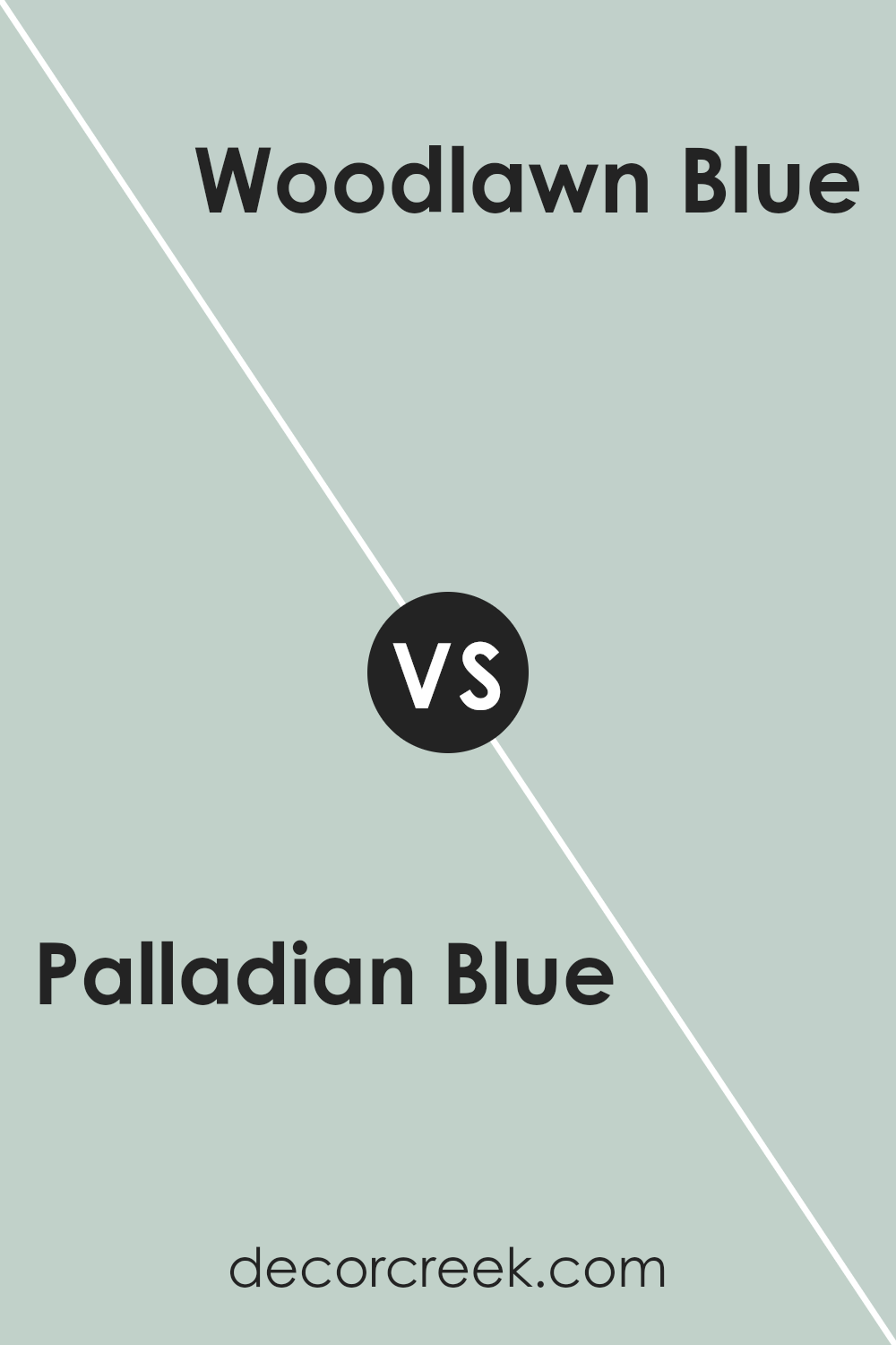
Palladian Blue HC-144 by Benjamin Moore vs Woodlawn Blue HC-147 by Benjamin Moore
Palladian Blue and Woodlawn Blue, both by Benjamin Moore, are like close cousins in the color world. Picture Palladian Blue as a breath of fresh air, a light, soothing teal that leans a bit towards green. It’s the kind of color you’d choose for a serene bedroom or a peaceful home office, aiming to create a calm atmosphere.
On the flip side, Woodlawn Blue takes the tranquility of Palladian and nudges it towards the sky, adding a touch more blue to the mix. This gives it a slightly cooler feel, making it excellent for spaces where you want a touch of airy freshness without going too cold.
Both colors share a laid-back vibe, perfect for creating relaxing environments. However, Palladian Blue’s hint of green makes it a tad warmer, ideal for spaces where you want a cozy yet light ambiance. Woodlawn Blue, with its extra blue, offers a crisply cool but still inviting tone, great for brightening up a room without overpowering it. So, depending on whether you want your room to have a warmer, greenish tint or a cooler, bluish vibe, you’d pick one over the other.
You can see recommended paint color below:
Palladian Blue HC-144 by Benjamin Moore vs Turquoise Mist 695 by Benjamin Moore
Palladian Blue and Turquoise Mist are two shades offered by Benjamin Moore that bring different vibes to a space. Palladian Blue is a gentle color, leaning towards a soft, airy light blue with a hint of green, creating a serene and calming atmosphere. It’s reminiscent of a clear sky on a sunny day, making any room feel bigger and more inviting.
On the other hand, Turquoise Mist has a slightly more energetic presence. This color has more vibrancy to it due to its turquoise foundation, blending blue and green in a way that’s more noticeable and lively. It gives spaces a refreshing and cheerful boost, closely mimicking the revitalizing quality of natural waters.
While both colors share a blue-green base, Palladian Blue brings a quiet calm to interiors, perfect for a peaceful retreat, whereas Turquoise Mist adds a splash of spiritedness, making it great for spaces where you desire a bit of dynamism and joy. Picking between the two depends on the mood you want to set: a tranquil haven with Palladian Blue or a bright, spirited area with Turquoise Mist.
You can see recommended paint color below:
- 695 Turquoise Mist
Conclusion
In conclusion, Palladian Blue by Benjamin Moore is a versatile and refreshing shade that brings a sense of calm and openness to any space it’s used in. Its ability to blend seamlessly with various decor styles and its soothing nature makes it a popular choice for those looking to add a serene touch to their homes.
Whether it’s used in a bedroom to create a peaceful retreat or in a living area for a bright and airy feel, this color consistently provides a subtle elegance that enhances the aesthetic appeal of interiors without overwhelming them.
Moreover, the adaptability of Palladian Blue extends beyond residential spaces, proving to be an effective color choice for offices and other professional settings. Its understated beauty fosters a conducive environment for productivity and creativity, making it a top pick for designers and homeowners alike. Overall, its timeless appeal ensures that it remains a go-to option for creating inviting and stylish spaces.

Ever wished paint sampling was as easy as sticking a sticker? Guess what? Now it is! Discover Samplize's unique Peel & Stick samples.
Get paint samples

