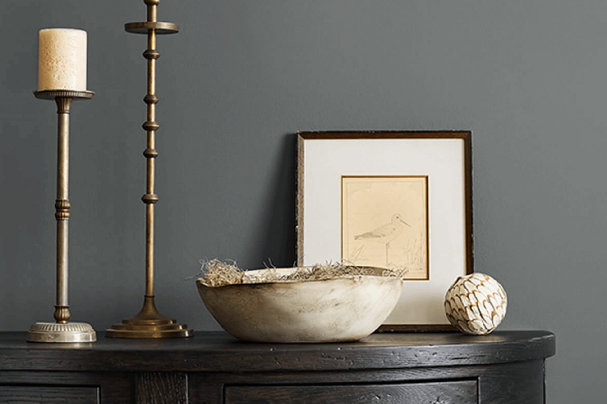
When choosing the right paint for a room in your home, you’re probably looking for a color that truly reflects your style while creating an inviting atmosphere. Enter SW 2848 Roycroft Pewter by Sherwin Williams, a rich gray that exudes a sense of sophistication and understated elegance.
This particular shade of gray works marvelously across various spaces, whether it’s giving a sleek finish to your kitchen cabinets or adding a layer of calm to your bedroom walls. What strikes me most about Roycroft Pewter is its versatility. It pairs beautifully with both warm and cool tones, allowing you to mix and match decor elements freely.
I’ll guide you through how Roycroft Pewter can transform any room without overwhelming it, suggesting which color combinations enhance its quiet charm. Whether you’re sprucing up a small space or redoing a larger area, this color could very well be the seamless backdrop you are searching for.
Through its balanced hue, Roycroft Pewter manages to strike a unique blend of coziness and refined style, making it a go-to choice for your decorating needs.
What Color Is Roycroft Pewter SW 2848 by Sherwin Williams?
Roycroft Pewter is a robust grey tone with subtle hints of green, making it a unique choice for adding depth and warmth to any room. This color is adaptable and strikes a pretty balance between neutral and statement, thanks to its earthy undertones. It also works well in various lighting conditions, maintaining its complex character without becoming too overpowering.
This versatile shade pairs exceptionally well with natural materials like wood, enhancing its grain and texture. It’s also complementary to metal finishes such as copper and brushed nickel, adding a touch of rustic charm to the overall ambiance.
When it comes to textiles, Roycroft Pewter looks stunning with rich velvets and simple linens, allowing it to fit seamlessly in both luxurious and understated settings.
Ideal for interior styles such as modern farmhouse, traditional, and transitional, Roycroft Pewter can create a cozy backdrop in a living room or a calming vibe in a bedroom. It brings out a sense of warmth in spaces designed for comfort and conversation. Incorporating this color with off-whites or creamy shades can help create a balanced environment that’s inviting and feels like home.
Whether you aim for a minimalist approach or a layered, texture-rich design, Roycroft Pewter is a stylish and adaptable choice.
Is Roycroft Pewter SW 2848 by Sherwin Williams Warm or Cool color?
Roycroft Pewter is a popular paint color choice for many homeowners looking to create a cozy and inviting atmosphere in their homes. This color, a deep, warm gray, provides a solid base that pairs well with a variety of decor styles and color schemes. Because of its neutral tone, it works great in living rooms, bedrooms, and even kitchens, adding a touch of warmth without overpowering the space.
The flexibility of Roycroft Pewter makes it perfect for large areas and accent walls alike. It tends to look excellent with natural light, bringing out the richer tones in the paint during the day while maintaining a comforting presence at night under artificial lighting.
Additionally, this color complements wood finishes, metals, and textiles, making it easy to incorporate into existing designs or as a starting point for a new room makeover. Its ability to blend with other colors and materials helps create a harmonious environment in any home.
Undertones of Roycroft Pewter SW 2848 by Sherwin Williams
Roycroft Pewter is a unique paint color that appears primarily as a deep, muted shade, but its complexity reveals various undertones depending on the lighting and surrounding colors. Understanding the undertones in any paint color is crucial because they subtly influence how the color looks in different settings.
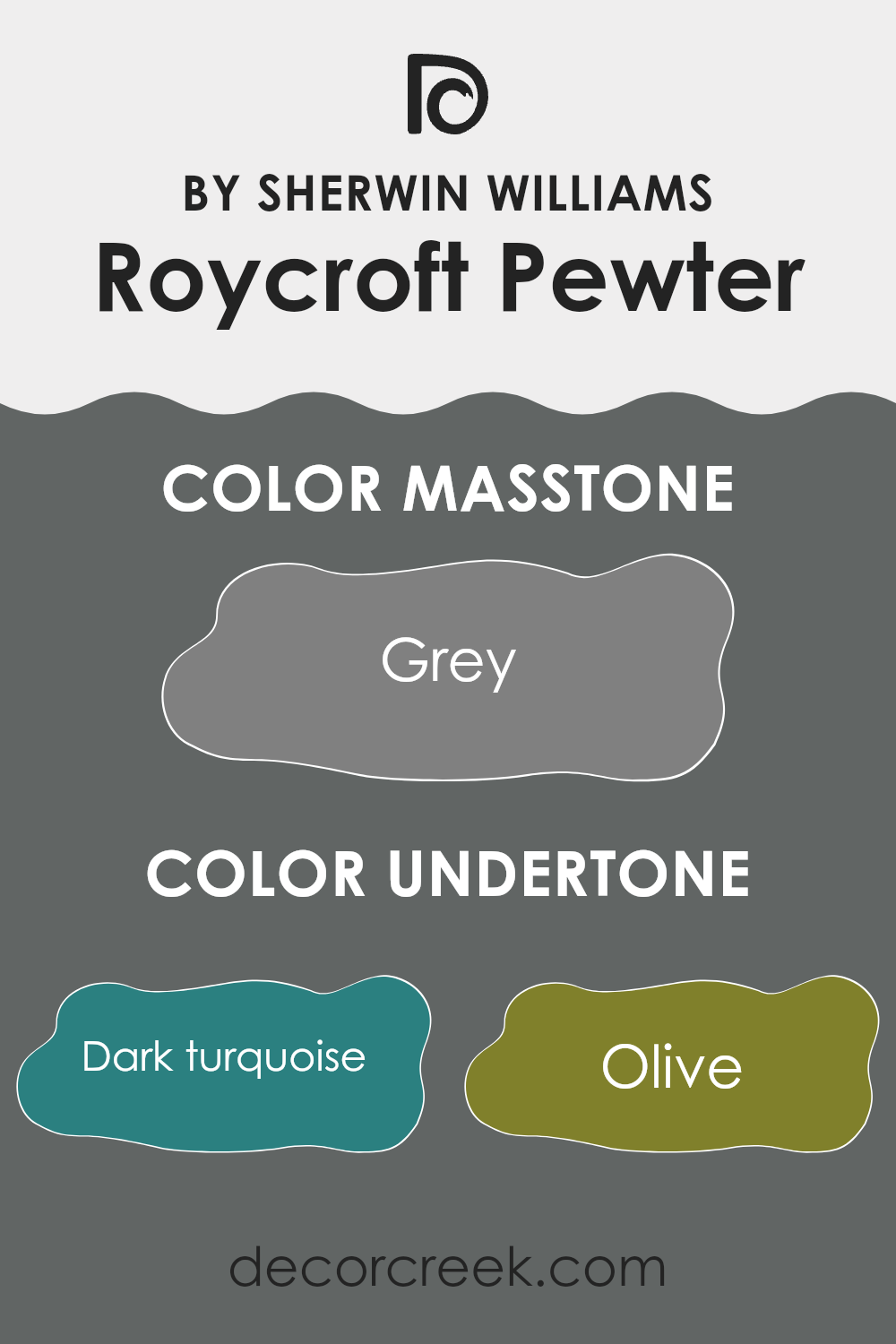
Undertones are the colors hidden beneath the surface of the paint. In the case of this color, undertones include shades like dark turquoise, olive, and purple, along with others like navy, brown, and dark grey. These undertones might not be immediately obvious, but they play a critical role in the color’s overall appearance.
For instance, in a room with lots of natural light, the lighter undertones such as mint or pale pink might make the color feel softer and lighter. Conversely, in a space with limited light, the darker undertones like dark green or navy might become more pronounced, giving the paint a richer, more intense look.
When applied to interior walls, the multi-dimensional nature of Roycroft Pewter can create varied effects. In a bright, airy room, the color can appear almost vibrant, as lighter undertones come forward. In rooms with less light or during the evening, it can provide a strong visual anchor, with its darker elements becoming more noticeable.
This adaptability makes it a practical choice for those who want a color that adjusts with changing light and decor, offering a blend of subtle color shifts throughout the day. This ability to interact dynamically with light and other colors in the room allows for a versatile backdrop in any interior space.
What is the Masstone of the Roycroft Pewter SW 2848 by Sherwin Williams?
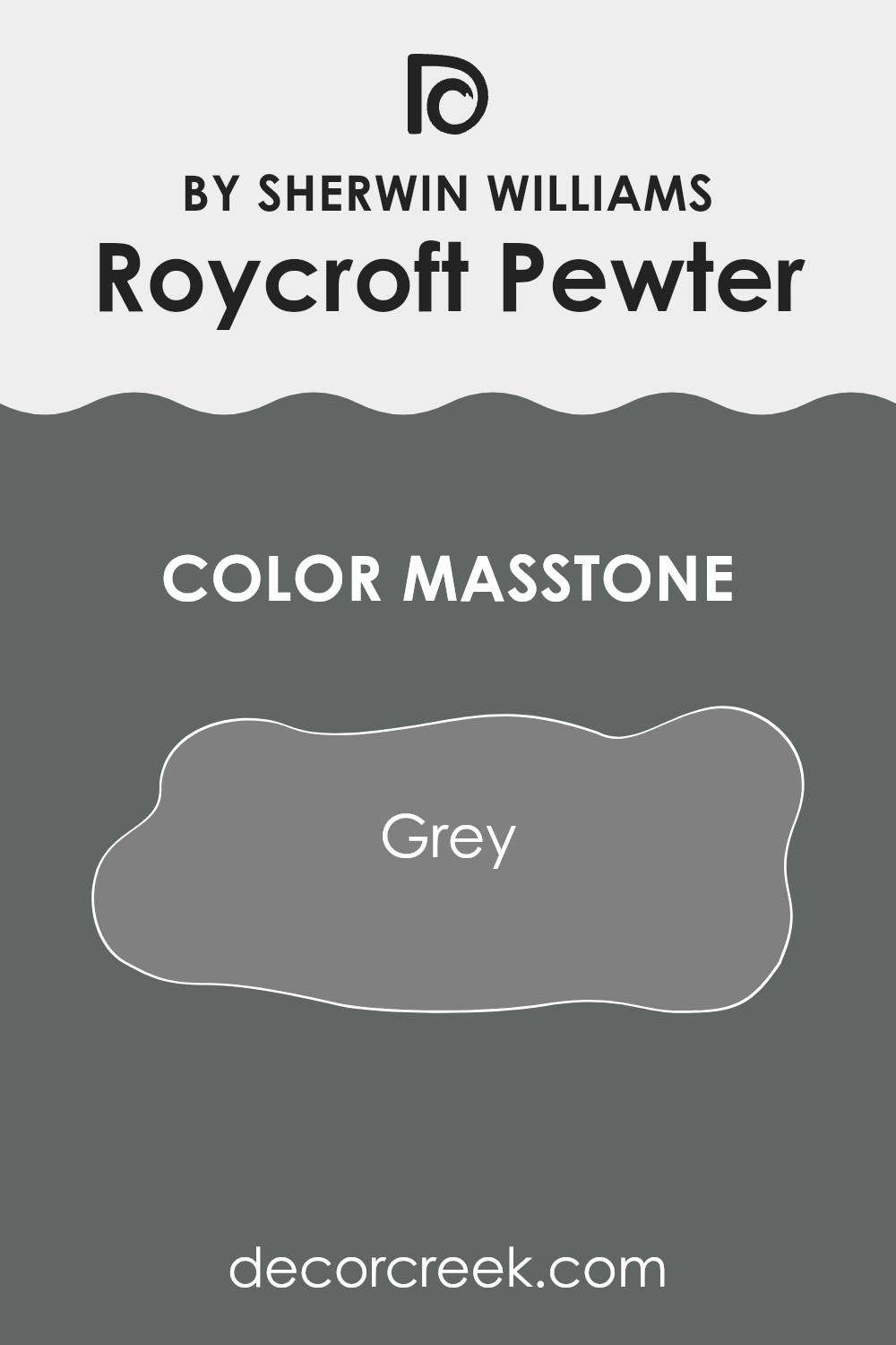
Roycroft Pewter SW 2848 by Sherwin Williams has a masstone of Grey (#808080), a balanced shade that brings a calm and steady vibe to any room. This mid-tone grey works well because it’s neither too dark nor too light, making it incredibly versatile for different spaces and lighting conditions.
In a home, this hue can act as a solid, neutral backdrop compatible with many decor styles and colors, from bright and bold to soft and subtle. It’s great for living rooms as it adds a clean, pulled-together look without being distracting.
In bedrooms, it offers a peaceful and steady base, allowing for relaxation. Its adaptability also extends to being used in kitchens and bathrooms, where it complements a wide variety of cabinetry and tile work. Overall, the neutral quality of this shade of grey means it can be a good choice for large spaces or connecting areas, promoting a cohesive feel throughout the home.
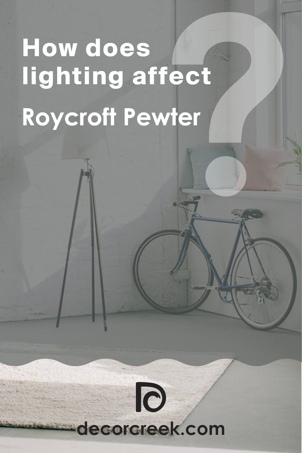
How Does Lighting Affect Roycroft Pewter SW 2848 by Sherwin Williams?
Lighting plays a crucial role in how we perceive colors in a space. The color of light can drastically change how a paint shade appears on your walls.
Taking the shade Roycroft Pewter as an example, this is a deep, rich gray that can look very different depending on the light it’s exposed to. In artificial light, such as from incandescent bulbs, this color will appear warmer and slightly softer because these lights typically cast a yellow hue. This can make the gray look more inviting and less stark.
In natural light, the appearance of Roycroft Pewter will vary through the day and depend on the direction your room faces. In rooms that face north, which often get less direct sunlight, this color can appear as a true deep gray, maintaining a steady and muted tone throughout the day. This consistent lighting won’t distort its natural grayness.
In a south-facing room, where sunlight is more direct and abundant, Roycroft Pewter can lighten up significantly, exposing its underlying warm tones. This makes the room feel brighter and the color more dynamic.
East-facing rooms receive strong light in the morning, when the sun rises. Here, Roycroft Pewter might look somewhat bright and lively in the morning but will turn into a true, deeper gray as the sunlight fades. This shift can bring out a lovely variation throughout the day.
West-facing rooms experience the strongest sunlight in the late afternoon, which can cause Roycroft Pewter to cast more shadows and appear darker, especially towards the end of the day.
To summarize, lighting can change the whole feel of a paint color in a room. The paint shade Roycroft Pewter shows a wide range of tones from warm to true gray based on different lighting conditions and the direction the room faces. When choosing colors for your space, considering lighting will greatly affect your satisfaction with the final look.
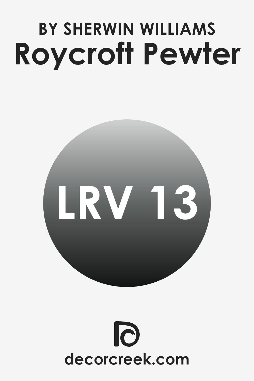
What is the LRV of Roycroft Pewter SW 2848 by Sherwin Williams?
Light Reflectance Value (LRV) measures the percentage of light a paint color reflects from or absorbs into a painted surface. Basically, it’s an indicator of how bright or dark a color will look once applied to the walls.
A higher LRV means the color reflects more light, making a room feel brighter and more open, while a lower LRV suggests that a color will absorb more light, potentially making a space appear cozier but smaller. For the color with an LRV of 12.834, such as Roycroft Pewter, it tends to be on the darker end of the spectrum.
This means it won’t reflect much light, contributing to a denser and richer appearance on the walls. In rooms with less natural light or smaller spaces, this can make the area feel more enclosed. However, in well-lit, spacious rooms, the color can add a solid, grounding effect, enhancing the overall ambiance without making the room feel too tight.
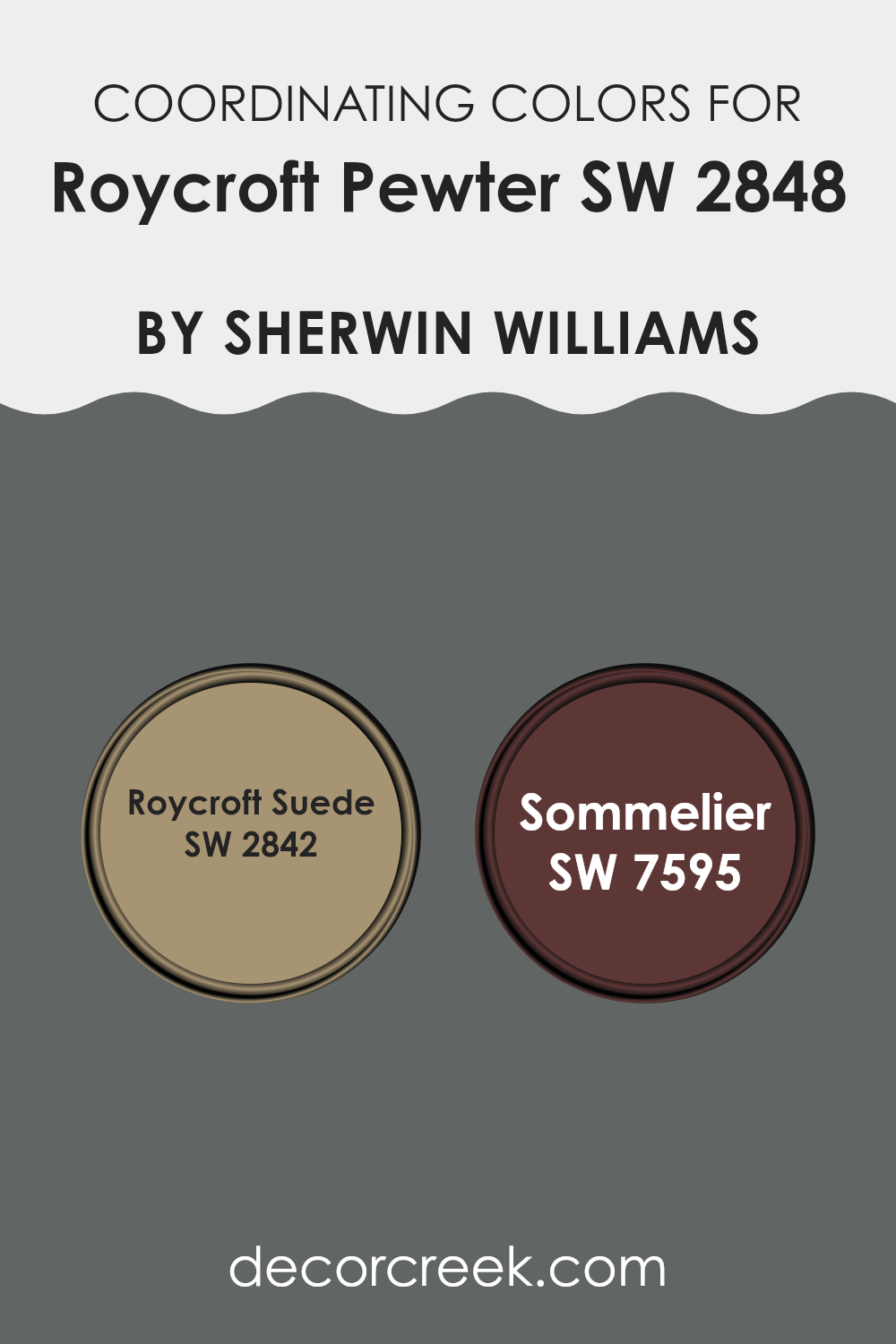
Coordinating Colors of Roycroft Pewter SW 2848 by Sherwin Williams
Coordinating colors are selected to work harmoniously with a main color, enhancing the overall aesthetic of a space without overpowering it. In the case of Roycroft Pewter, a deep, muted gray with a hint of warmth, coordinating colors like Roycroft Suede and Sommelier are ideal as they share underlying tones that complement the main hue. This technique of picking coordinating shades ensures a cohesive and appealing look, making it easier to design rooms with a balanced color scheme.
Roycroft Suede is a rich, earthy brown with a subtle warmth that recalls the feel of well-worn leather, making it an excellent partner to the cooler gray of Roycroft Pewter. This color can add a natural depth to a room, enhancing the space with a calm and inviting atmosphere.
On the other hand, Sommelier, a robust and deep red, offers a striking contrast that can bring vitality and a touch of drama when paired with the more subdued Roycroft Pewter. It serves well as an accent color, perfect for highlighting features or drawing attention to specific areas within a room.
You can see recommended paint colors below:
- SW 2842 Roycroft Suede
- SW 7595 Sommelier
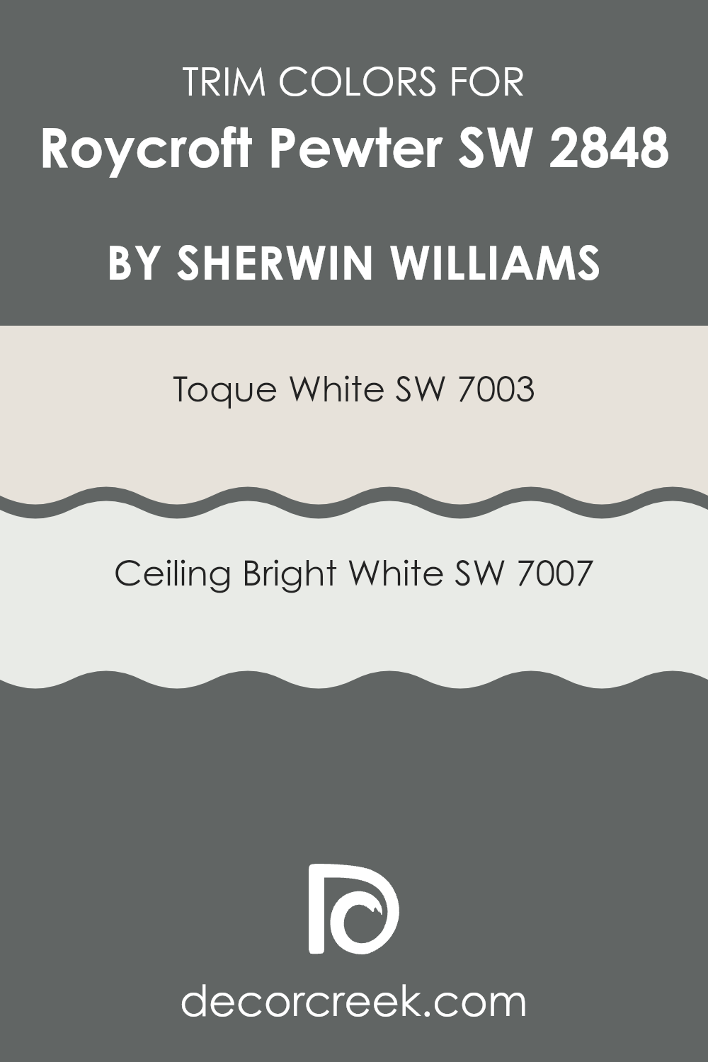
What are the Trim colors of Roycroft Pewter SW 2848 by Sherwin Williams?
Trim colors, such as Sherwin Williams’ Toque White SW 7003 and Ceiling Bright White SW 7007, play a crucial role in enhancing the overall appearance of a space. When coordinated with a base color like Roycroft Pewter (SW 2848), they help define and accentuate architectural details, creating a refined contrast that highlights the unique features of a room.
Choosing the right trim color can make a noticeable impact on how the primary color is perceived, ensuring that features such as crown moldings, door frames, and baseboards stand out in a pleasing way, adding depth and character to the decor.
Sherwin Williams’ Toque White SW 7003 is a soft and light shade that adds a gentle warmth to the spaces it decorates, making it a versatile choice for trim that can subtly complement the deeper tones of Roycroft Pewter. On the other hand, Ceiling Bright White SW 7007 is a clean and pure white that provides a stark contrast, which can be particularly striking against richer hues. This contrast not only draws the eye but also creates clean lines and a fresh look, helping to define the spatial perception of the room.
You can see recommended paint colors below:
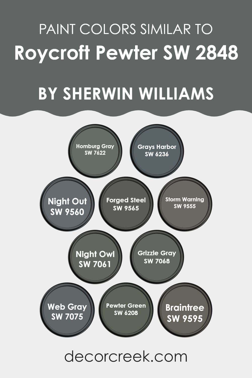
Colors Similar to Roycroft Pewter SW 2848 by Sherwin Williams
Similar colors play a crucial role in interior design by creating a harmonious atmosphere that is pleasing to the eye. Colors that are similar in tone and shade can be utilized to enhance the aesthetic uniformity of a space, making it feel more cohesive and well-organized. For example, colors like Homburg Gray and Grays Harbor offer subtle variations in darkness, providing a sophisticated yet understated background that can make lighter elements pop.
Night Out and Forged Steel add depth with their nearly black hues, perfect for accent walls or furniture, contributing to a grounded, cozy feel. On the lighter side, Storm Warning and Night Owl balance between gray and blue, reminiscent of a stormy sky, which can create a calm, collected ambiance.
Additionally, darker shades like Grizzle Gray and Web Gray are ideal for adding contrast against lighter grays without overwhelming the space with too much boldness. Pewter Green stands out with its unique blend of gray and green, bringing a touch of nature indoors, which pairs well with wood and natural textiles.
Lastly, Braintree offers a muted blue, excellent for achieving a soft, fresh look that’s easy on the eyes. Each of these colors can work beautifully on their own or in combination, allowing for a versatile palette that can adapt to various design styles and personal tastes.
You can see recommended paint colors below:
- SW 7622 Homburg Gray
- SW 6236 Grays Harbor
- SW 9560 Night Out
- SW 9565 Forged Steel
- SW 9555 Storm Warning
- SW 7061 Night Owl
- SW 7068 Grizzle Gray
- SW 7075 Web Gray
- SW 6208 Pewter Green
- SW 9595 Braintree
How to Use Roycroft Pewter SW 2848 by Sherwin Williams In Your Home?
Roycroft Pewter SW 2848 by Sherwin Williams is a distinctive gray paint that brings a calm and balanced feel to any room. Its neutral tone makes it highly versatile, fitting well in various spaces from kitchens to bedrooms, and even living rooms. This color pairs beautifully with both bright colors and other neutrals, providing a backdrop that allows furniture and artwork to stand out.
When using Roycroft Pewter in your home, consider painting entire walls for a cozy, inviting atmosphere, or use it for accent walls to highlight specific areas without overwhelming the space. It’s also an excellent choice for painting cabinets or shelves, adding a subtle, yet stylish impact.
Additionally, this color works well in spaces that get a lot of natural light, as the sunlight softens and enhances the gray, creating a warm and welcoming environment. This paint is a straightforward way to refresh your home’s look while keeping things calm and pleasant.
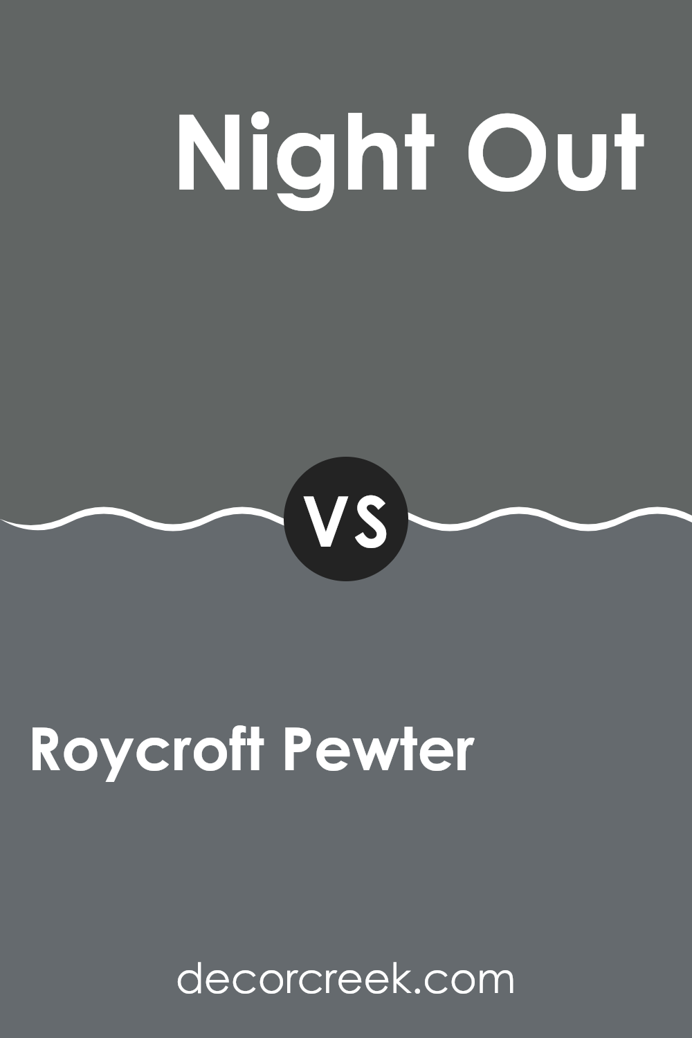
Roycroft Pewter SW 2848 by Sherwin Williams vs Night Out SW 9560 by Sherwin Williams
Roycroft Pewter is a rich, deep gray with undertones that can appear almost greenish in some lighting. It’s a solid, straightforward shade that works well in various spaces, lending a grounded and mature atmosphere. This color is versatile, pairing nicely with both bright and muted colors to create a balanced look.
On the other hand, Night Out is a darker, inky shade, tilting more towards a charcoal black. This color provides a dramatic feel and is perfect for accent walls or rooms where a strong, bold impact is desired. When used in interior spaces, Night Out can make them feel cozier and more enclosed, making it an excellent choice for large rooms that need a touch of coziness.
Both colors offer distinct vibes – Roycroft Pewter exudes a more traditional, calm feel, whereas Night Out leans into a more dramatic and impactful mood, suitable for making a statement in a space.
You can see recommended paint color below:
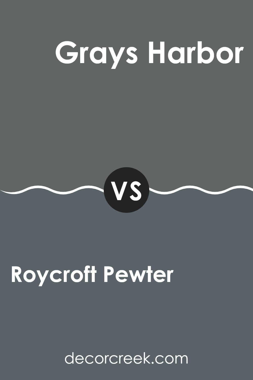
Roycroft Pewter SW 2848 by Sherwin Williams vs Grays Harbor SW 6236 by Sherwin Williams
Roycroft Pewter and Grays Harbor are two distinct shades offered by Sherwin Williams. Roycroft Pewter presents as a deeper gray with a warm undertone, making it cozy and inviting, ideal for spaces where you want a soothing yet rich atmosphere.
Grays Harbor, on the other hand, leans towards a darker, almost charcoal gray. This shade has a cooler undertone, giving it a more formal and slightly more modern feel compared to Roycroft Pewter.
When choosing between these two for a room, consider the amount of natural light and the mood you want to set. Roycroft Pewter works well in areas where a soft, warm look is desired. Grays Harbor is perfect for creating a striking statement, particularly in spaces that benefit from a bold, crisp appearance. Both colors are versatile, but the choice largely depends on the desired impact and the existing decor of the space.
You can see recommended paint color below:
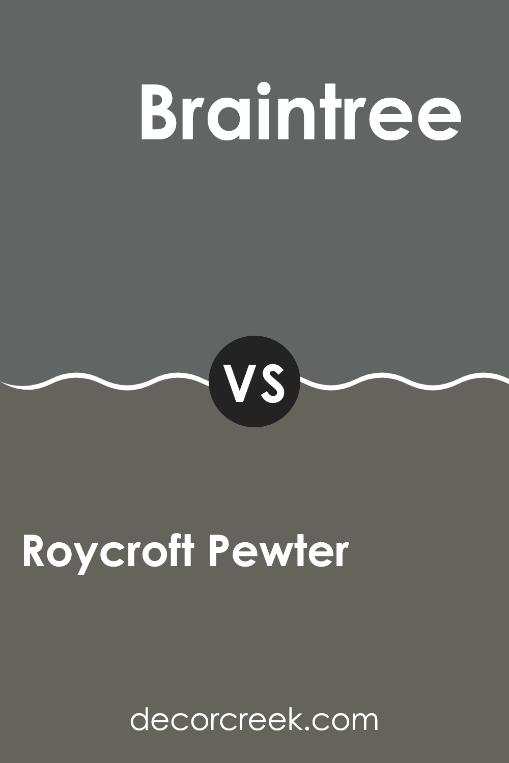
Roycroft Pewter SW 2848 by Sherwin Williams vs Braintree SW 9595 by Sherwin Williams
Roycroft Pewter and Braintree are two paint colors from Sherwin Williams that both change up the feel of a space in unique ways. Roycroft Pewter is a deep, warm gray that has an inviting quality, making it ideal for cozy places like a living room or bedroom.
It pairs well with lighter shades, allowing it to really stand out. In contrast, Braintree is a much lighter gray, offering a fresh, airy feel which is perfect for making smaller rooms appear bigger and brighter. It’s especially great for kitchens and bathrooms, where the lighter tone helps to reflect more light.
Both colors provide a neutral base, allowing for various decor styles and color accents. However, the warmth of Roycroft Pewter creates a more enveloped feel, while the lightness of Braintree gives a cleaner, crisp look.
You can see recommended paint color below:
Roycroft Pewter SW 2848 by Sherwin Williams vs Forged Steel SW 9565 by Sherwin Williams
Roycroft Pewter and Forged Steel are both shades produced by Sherwin Williams that share a sleek, modern vibe but have distinct differences. Roycroft Pewter is a deeper gray with subtle warm undertones which makes it feel inviting and cozy but still very polished. It works well in spaces that benefit from a rich, grounded appearance, such as living rooms or bedrooms.
On the other hand, Forged Steel is a cooler gray that leans towards a more metallic, sharp tone. This color resembles the look of actual steel, hence its name, giving it a crisper and more pronounced character. Its cooler tones make it ideal for contemporary spaces or areas where you want a more modern feel, such as kitchens or minimalist styled spaces.
In summary, while both colors are neutral, Roycroft Pewter offers warmth and depth, whereas Forged Steel provides a cleaner, more industrial edge. This makes each color suitable for different uses according to the room’s desired atmosphere and style.
You can see recommended paint color below:
Roycroft Pewter SW 2848 by Sherwin Williams vs Grizzle Gray SW 7068 by Sherwin Williams
Roycroft Pewter and Grizzle Gray, both by Sherwin Williams, have distinctive gray tones that cater to different tastes and design needs. Roycroft Pewter presents a deeper, warmer tone, making it a great choice for those looking to create a cozy and inviting atmosphere.
It carries subtle brown undertones which enrich its complexity and allow it to pair well with natural materials like wood and leather. On the other hand, Grizzle Gray stands out as a cooler gray. It has a more neutral, balanced look, making it versatile for various settings.
This color works exceptionally well in modern and minimalist spaces, providing a clean, crisp backdrop that highlights other design elements. The visual difference between the two lies in their warmth and mood: Roycroft Pewter offers a heartier, more grounded feel, while Grizzle Gray leans towards a sleek, contemporary vibe, perfect for those who prefer a more modern aesthetic.
You can see recommended paint color below:
Roycroft Pewter SW 2848 by Sherwin Williams vs Storm Warning SW 9555 by Sherwin Williams
Both Roycroft Pewter and Storm Warning are shades from Sherwin Williams, but they bring different vibes to the table. Roycroft Pewter is a dark, warm gray that feels cozy and grounding. It’s great for creating a snug, inviting space in areas like living rooms or bedrooms.
On the other hand, Storm Warning is significantly darker, leaning more towards a charcoal color. This shade is cooler and can add a bold, strong touch to a space, making it ideal for accents or statement walls in a more modern setting.
While Roycroft Pewter pairs well with warmer hues, bringing a relaxed feel, Storm Warning works best with cool tones or as a contrast to light colors, offering a sharp, stylish look. Each color provides a unique atmosphere, so your choice would depend on the mood you’re aiming to create in your room.
You can see recommended paint color below:
Roycroft Pewter SW 2848 by Sherwin Williams vs Pewter Green SW 6208 by Sherwin Williams
The main color, Roycroft Pewter, is a warm, dark gray tone with subtle brown undertones. This color gives off a cozy and welcoming feel, making it great for spaces where you want to relax and feel at home, like living rooms and bedrooms.
Pewter Green, on the other hand, is a deep, greenish-gray hue that leans more towards the green spectrum than Roycroft Pewter. This shade is rich and earthy, adding a grounding and refreshing touch to rooms. It works well in areas where you want to bring elements of nature indoors, such as bathrooms or kitchens.
Both colors are fairly muted, but while Roycroft Pewter warms up a space with its brownish undertones, Pewter Green introduces a cooler, nature-inspired vibe. Each color offers a unique way to beautify a room, depending on the atmosphere you want to achieve.
You can see recommended paint color below:
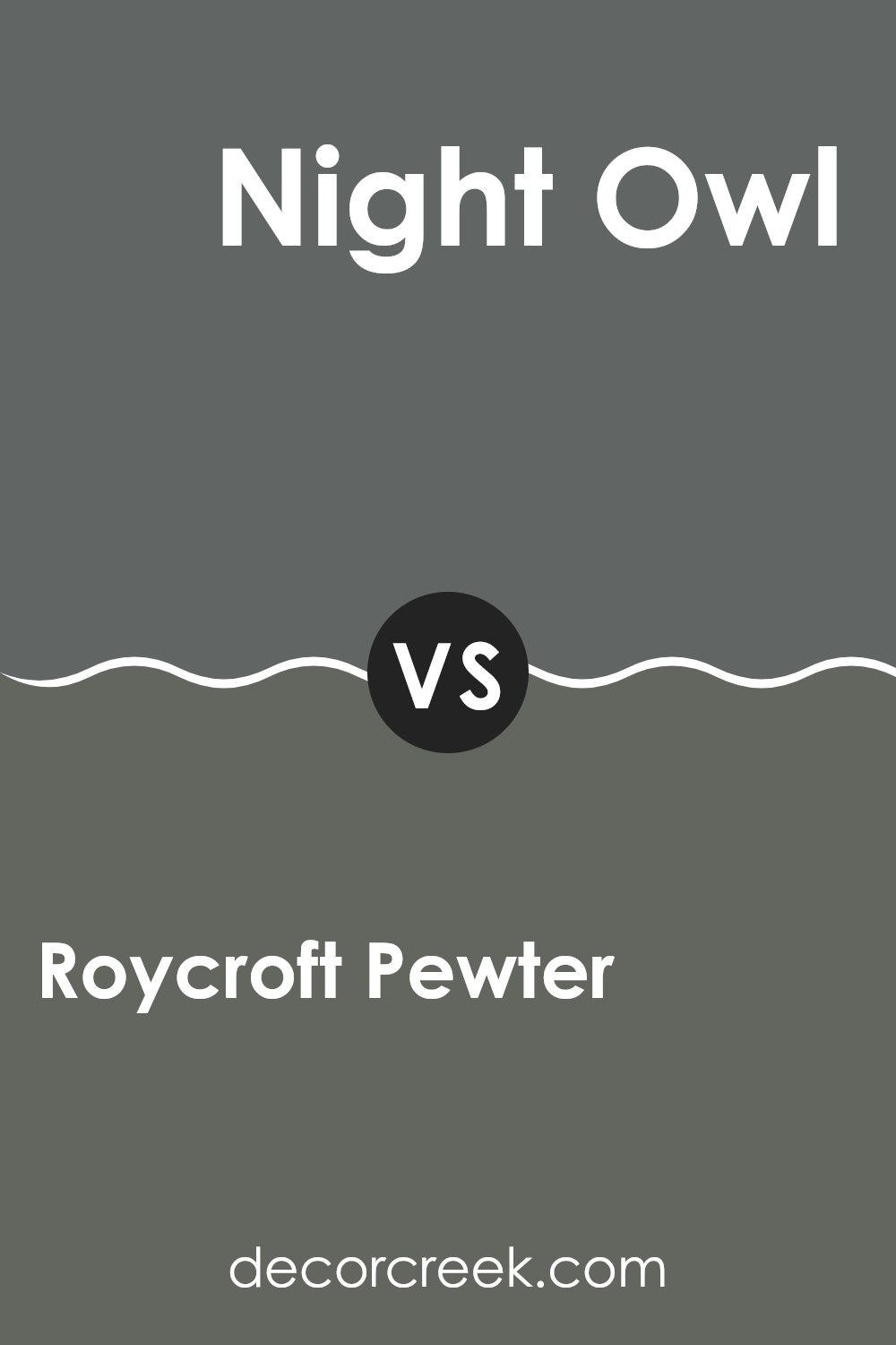
Roycroft Pewter SW 2848 by Sherwin Williams vs Night Owl SW 7061 by Sherwin Williams
Roycroft Pewter and Night Owl, both from Sherwin Williams, are unique shades that cater to different design needs. Roycroft Pewter is a deep, warm grey with subtle brown undertones, giving it a cozy, inviting feel perfect for spaces where you want a sense of warmth without sacrificing the neatness of grey. It works well in living areas and bedrooms where you want softness with a touch of formality.
On the other hand, Night Owl is a cooler, darker grey with blue undertones that give it a sharper, more modern look. This color is ideal for creating a bold statement in a space, making it excellent for accents or rooms like home offices or kitchens where you need a clean, streamlined appearance.
Both colors offer distinct vibes. Roycroft Pewter leans towards a traditional, homey feel, while Night Owl is more contemporary and crisp. The choice between them depends on the room, lighting, and the mood you’re aiming for.
You can see recommended paint color below:
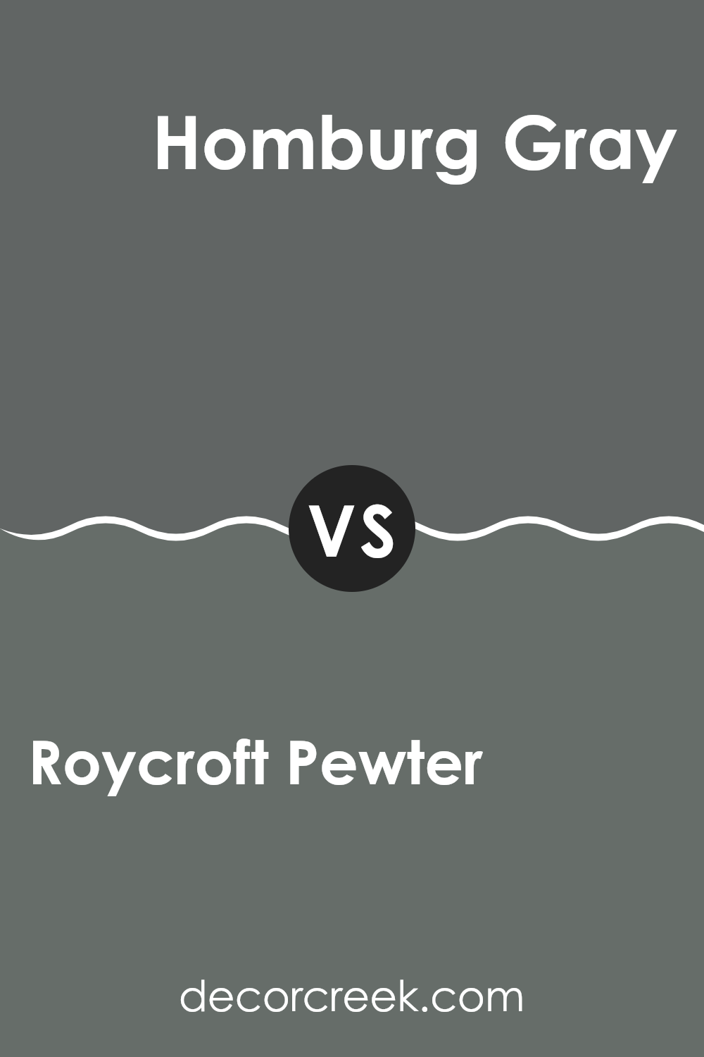
Roycroft Pewter SW 2848 by Sherwin Williams vs Homburg Gray SW 7622 by Sherwin Williams
Roycroft Pewter and Homburg Gray are two distinct gray shades offered by Sherwin Williams, each bringing its unique atmosphere to a space. Roycroft Pewter is a deep, warm gray with subtle brown undertones that give off a cozy and inviting vibe, making it ideal for living rooms or bedrooms where comfort is key.
In contrast, Homburg Gray is a cooler tone, slightly lighter, with blue undertones that bring about a sharp, clean look. This makes it well-suited for modern spaces or offices that aim for a crisp, professional appearance.
When placed side by side, the warmth of Roycroft Pewter provides a more welcoming touch, whereas the cooler, slightly more detached feel of Homburg Gray offers an air of formality. The choice between the two would largely depend on the mood you wish to achieve in your space: warm and cozy or cool and sharp. Each color works well with a variety of decor styles and adds a distinct character to interiors.
You can see recommended paint color below:
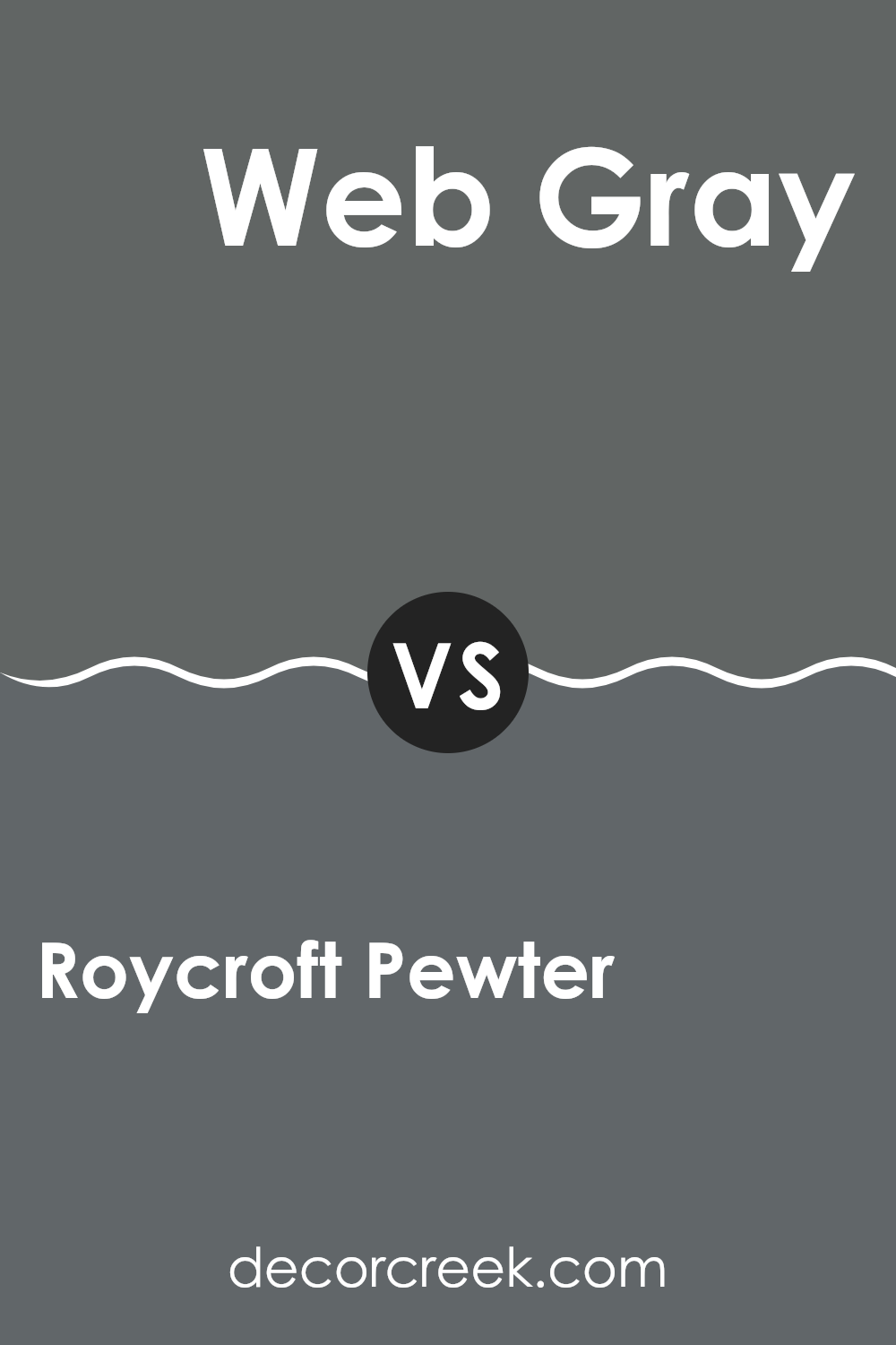
Roycroft Pewter SW 2848 by Sherwin Williams vs Web Gray SW 7075 by Sherwin Williams
Roycroft Pewter and Web Gray are both gray shades from Sherwin Williams, but they bring different tones to a space. Roycroft Pewter is a warm gray with a rich depth, making it cozy and welcoming, perfect for living rooms or bedrooms.
It adds a soft, comforting feel to the walls, balancing between a classic and a modern look. On the other hand, Web Gray is a cooler, darker gray that looks great in spaces that benefit from a bolder, more pronounced color.
It’s ideal for accent walls or cabinets, especially in modern or masculine designs. Web Gray can make white trims and modern decor pop, contrasting sharply with lighter colors. In summary, Roycroft Pewter suits spaces where warmth and subtlety are desired, while Web Gray is better for making strong, stylish statements.
You can see recommended paint color below:
Conclusion
As I wrap up my thoughts on SW 2848 Roycroft Pewter by Sherwin Williams, I can’t help but feel convinced about the practicality and beauty of this paint color. Roycroft Pewter is not just a simple gray shade; it has a unique charm that can make any room look pretty and polished. This color is a fantastic choice if someone wants to make their house feel cozy and welcoming without making it too dark or too light.
This color works well in lots of different spaces. Whether it’s painted on living room walls, used in a bedroom, or even in a kitchen, Roycroft Pewter adds a calm and neat look. It matches well with many other colors, making it easy for anyone to use when they decorate their room.
So, if someone asks me about a color to choose for giving their house a fresh look, I’ll suggest Roycroft Pewter. It’s simple to match with furniture, and it’s nice to look at, making any room feel just right.
Definitely, this color is a keeper for anyone looking to paint their home in a color that makes them feel relaxed and at home.
Ever wished paint sampling was as easy as sticking a sticker? Guess what? Now it is! Discover Samplize's unique Peel & Stick samples.
Get paint samples

