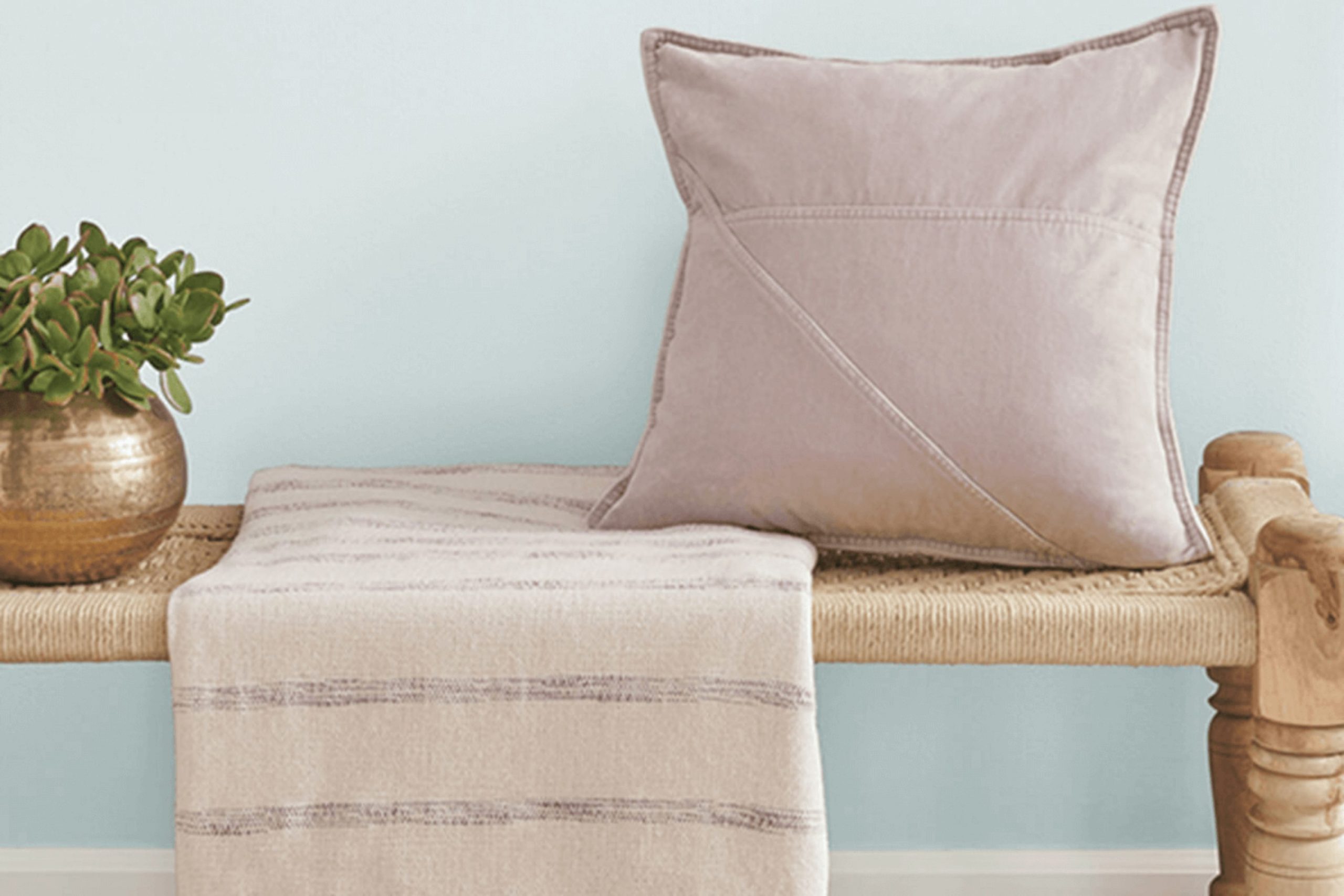
Looking for a fresh color to brighten up your interior? Let me introduce you to SW 9681 Rainsong by Sherwin Williams. This shade is a calming mix that draws on the comforting feel of a misty morning. The color shifts between a soft blue and a cozy gray, creating a perfect backdrop for both relaxation and focus in any room of your home.
What I particularly appreciate about Rainsong is its adaptability. It fits beautifully in areas meant for peace and calm, like bedrooms or reading nooks, yet it carries enough depth to stand out in a busy kitchen or living room. Combined with natural elements and soft lighting, this color creates a welcoming atmosphere that enhances your existing decor without feeling too intense.
If you’re considering a new paint color, Rainsong could be the refreshing change you’re searching for.
Its unique tone works well with different styles and preferences, making it a lovely choice for anyone hoping to give their home a soft yet noticeable update.
What Color Is Rainsong SW 9681 by Sherwin Williams?
The color Rainsong by Sherwin Williams is a soft grey with gentle blue undertones. It’s a flexible shade that works well in different settings, creating a calm and welcoming atmosphere. This color is especially effective in achieving a light and airy feel in a room, making it appear more open and inviting.
Rainsong is ideal for interior styles such as modern minimalist, coastal, or Scandinavian because of its clean and understated look. It pairs beautifully with natural materials like light woods, which highlight its earthy undertones, and with crisp white trims, which provide a fresh contrast. Textures like linen, wool, and cotton in soft furnishings complement this color nicely, adding warmth and comfort to the room.
For those looking to create a cohesive look, Rainsong works perfectly with metals like silver or brushed nickel, which reflect its cool undertones. This color also pairs well with stone elements — think marble or granite countertops in a kitchen or bathroom. Additionally, using this color with glass features, such as light fixtures or tabletops, can add a refined touch while keeping a relaxed feel.
Overall, Rainsong is an adaptable choice that can create a peaceful backdrop for everyday living, suitable for many areas of the home including bedrooms, kitchens, and living areas.
decorcreek.com
Is Rainsong SW 9681 by Sherwin Williams Warm or Cool color?
The color Rainsong by Sherwin Williams is a calming shade that offers a fresh and clean look, ideal for any room in the house. It’s a flexible color that blends well with many decor styles.
Whether you’re painting your kitchen, living room, or bedroom, this color can make your interior feel newly refreshed. It’s especially good in areas with plenty of natural light, but it also works well in rooms that could use a little extra brightness.
Because it has a neutral yet lively appeal, it pairs easily with both bold and soft colors. This makes it great for those looking to add a touch of nature-inspired calm without overpowering the room.
Homes using this color on their walls enjoy an airy, open atmosphere, which is perfect for creating a welcoming environment. Whether used as an accent or a main theme, Rainsong sets a warm tone throughout the home.
Undertones of Rainsong SW 9681 by Sherwin Williams
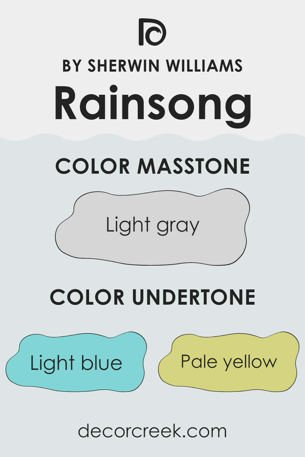
Understanding undertones in paint colors like Rainsong can make a big difference in how the color appears in different settings. Undertones are subtle hues that influence the base color and can change its appearance under different lighting conditions. For Rainsong, the undertones include shades like light blue, pale yellow, light purple, mint, lilac, pale pink, and grey.
These undertones can affect the overall feel of the paint. For instance, light blue and mint can give a fresher, cooler look, making a room seem more airy. Pale yellow can add a hint of warmth, ideal for rooms needing a soft, cozy atmosphere.
Light purple and lilac bring a gentle touch, potentially softening the overall mood of a room, while pale pink can provide a soft, welcoming glow. Grey undertones ensure that the color remains neutral, balancing both cooler and warmer tones.
When applied to interior walls, Rainsong’s appearance can shift based on these mixed undertones. The variety allows it to adjust naturally with the room’s lighting, decoration, and furniture. In bright, natural light, the cooler tones might stand out more, potentially making the wall feel crisp.
In artificial, warmer light, the yellow and pink undertones might become more noticeable, offering a cozy and inviting atmosphere. This ability to interact with light and surrounding elements makes Rainsong a flexible choice for any room, complementing different styles and décor without overpowering the room with color.
decorcreek.com
What is the Masstone of the Rainsong SW 9681 by Sherwin Williams?
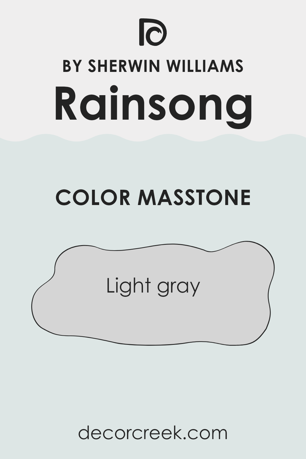
The masstone of Rainsong, which is light gray (#D5D5D5), makes it a flexible color for home interiors. Being a neutral shade, light gray works well in many areas of a house because it doesn’t feel too intense.
It’s soft enough to serve as a background color that allows other elements in the room, like furniture and decorations, to stand out. This light gray can make small rooms feel bigger and brighter since it reflects more light compared to darker colors. In larger rooms, it helps create a cohesive look, tying together different areas and furnishings naturally.
Additionally, light gray keeps a clean and tidy appearance, helping to hide small smudges or stains, which can be especially useful in busy areas or homes with kids and pets. It’s also easy to pair with different color palettes, whether you want to add warm accents or cooler tones, making it a practical choice for those wanting to keep their decorating options open.
decorcreek.com
How Does Lighting Affect Rainsong SW 9681 by Sherwin Williams?
Lighting plays a major role in how we see colors, often influencing the mood and atmosphere of a room. The way a color looks can change noticeably under different lighting conditions because each type of light highlights different undertones.
Taking the color Rainsong by Sherwin Williams, for example, the way it appears can vary depending on whether it’s under artificial light or natural light. Artificial lighting, such as LED or fluorescent bulbs, can change the look of the color.
Under fluorescent lights, which usually give off a cooler tone, Rainsong might appear slightly more blue or green. In contrast, under warm LED lights, the same color could look cozier and softer, with more yellow undertones showing through.
Natural light exposes this color to the full spectrum of sunlight throughout the day, which can make Rainsong appear different at different times. In north-facing rooms that receive less direct sunlight, this color might look more muted and shadowy. The cooler, indirect light can highlight the gray tones in Rainsong, making it appear softer and calming.
On the other hand, in south-facing rooms that get a lot of bright, direct sunlight, Rainsong can appear much lighter and more lively. The sunlight can bring out the brighter undertones of the color, making the room feel fresh and cheerful.
East-facing rooms receive bright light in the morning, which can make Rainsong look vivid and cheerful early in the day but cooler and grayer as the hours pass. Meanwhile, west-facing rooms can show this color in a richer light with a golden glow in the evening, making the color appear warmer and more inviting.
Overall, the appearance of Rainsong by Sherwin Williams changes noticeably based on the room’s orientation and the type of light it receives, affecting the overall mood and style of the room.
decorcreek.com
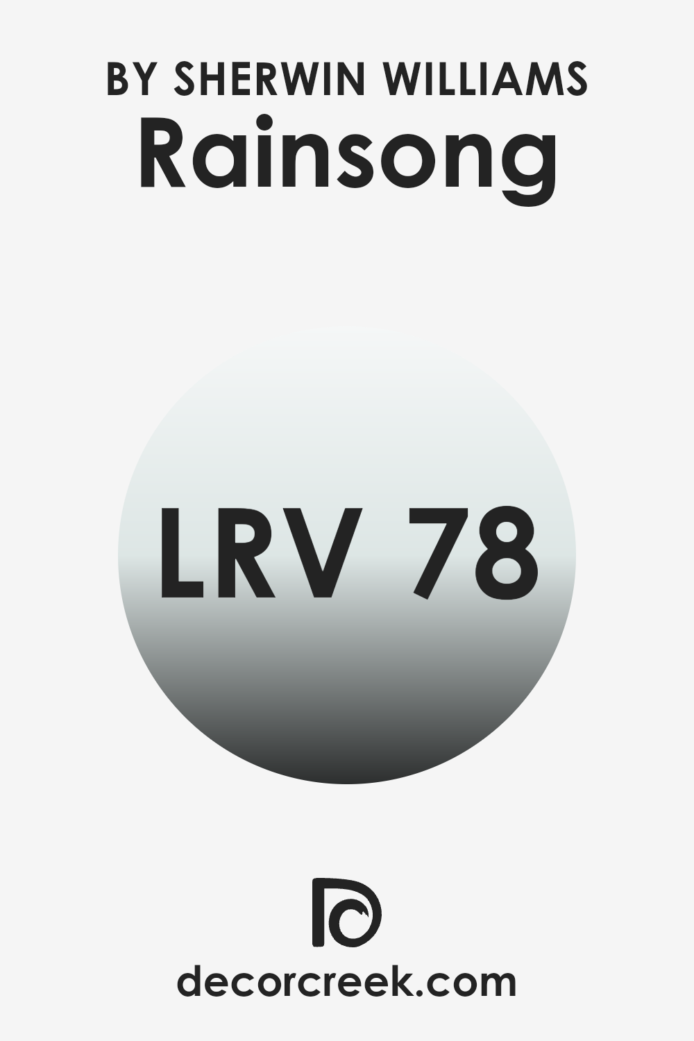
What is the LRV of Rainsong SW 9681 by Sherwin Williams?
LRV stands for Light Reflectance Value, which measures the amount of visible light that a paint color reflects when it’s on your wall. On a scale from zero to 100, zero absorbs all the light, making it look very dark, while 100 reflects all the light, making it look very bright.
This value helps you understand how light or dark a color will appear once it’s applied to your walls. It’s important because it can affect how big or cozy a room feels. Light colors can make small rooms feel larger, while dark colors can make large rooms feel more enclosed.
The LRV of this specific color, Rainsong, is 77.767, which means it is quite light and will reflect a lot of light back into the room. This can make your room feel airy and open, especially if it’s a smaller room.
If you’re painting a larger room, using a color with a high LRV like this one can help maintain a feeling of openness. Additionally, it can be helpful in darker rooms that need to maximize available natural light, as this color won’t absorb much light but instead reflect it, improving the overall brightness of the area.
decorcreek.com
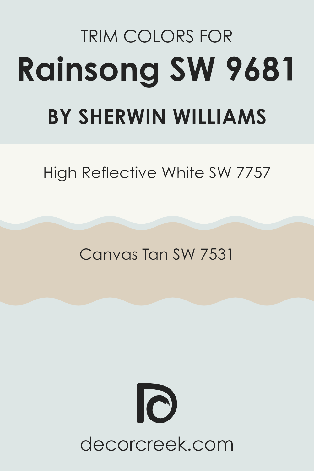
What are the Trim colors of Rainsong SW 9681 by Sherwin Williams?
Trim colors are selected shades that are used to highlight the architectural features of a home, such as door frames, window frames, and baseboards. Choosing the right trim color can improve the overall look of a room and create attractive contrasts that make wall colors stand out.
The Rainsong SW 9681 by Sherwin Williams, a beautiful shade, needs effective trim colors to highlight its unique character. The chosen trim colors, SW 7757 – High Reflective White and SW 7531 – Canvas Tan, work wonderfully for this purpose because they provide balanced contrast without feeling too strong against the main color tone.
High Reflective White SW 7757 is a crisp, clean white that creates a strong contrast, helping define the edges and lines within a room. This color is especially useful for making the main wall color stand out, adding clarity and brightness to the area. Meanwhile, Canvas Tan SW 7531 is a soft, warm beige that creates a gentle transition between the wall color and the trim.
This color adds a feeling of warmth to the room, helping the environment stay cozy and welcoming without creating a sharp contrast that could take away from the calming feel of the main shade. Each color helps softly highlight the main tone, making it feel more lively and visually appealing.
You can see recommended paint colors below:
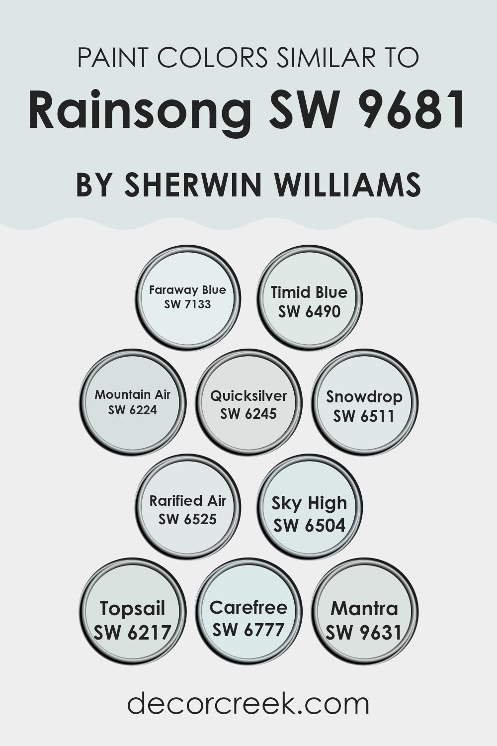
Colors Similar to Rainsong SW 9681 by Sherwin Williams
Similar colors are important in design and decoration because they create harmony and a feeling of continuity in a room. These shades blend naturally with one another, helping a room feel cohesive and calming.
For example, using a palette of closely related colors can help highlight features without creating a harsh visual contrast, which is especially useful in rooms meant for relaxation or focus. Such tones create a soft yet effective visual flow, guiding the eye gently from one area to another without sharp interruptions.
For example, Faraway Blue and Timid Blue offer soft, gentle blues that bring to mind a clear sky. Likewise, Mountain Air and Quicksilver are muted shades leaning toward a light grey that reflects the feeling of an early morning mist. Snowdrop provides a soft, airy look, like the first touch of snow, while Rarified Air carries a hint of the blue sky after rainfall.
Sky High and Topsail both bring the feeling of being high above the clouds, with Sky High appearing slightly lighter. Carefree is a cheerful blue that suggests a relaxed atmosphere, while Mantra is a muted blue-grey with a calming feel. Each color supports the others, creating a backdrop that feels both beautiful and visually balanced.
You can see recommended paint colors below:
- SW 7133 Faraway Blue
- SW 6490 Timid Blue
- SW 6224 Mountain Air
- SW 6245 Quicksilver
- SW 6511 Snowdrop
- SW 6525 Rarified Air
- SW 6504 Sky High
- SW 6217 Topsail
- SW 6777 Carefree
- SW 9631 Mantra
How to Use Rainsong SW 9681 by Sherwin Williams In Your Home?
Rainsong SW 9681 by Sherwin Williams is a flexible shade of green that brings a fresh touch to any room. It’s a wonderful choice for adding a bit of nature-inspired calm to your home. Whether you’re thinking about repainting your living room, bathroom, or kitchen, this color can add a lively yet relaxing feeling to the walls.
It pairs beautifully with light woods and natural materials such as stone or bamboo, making it perfect for creating a welcoming atmosphere. If you want to add some energy to a room without going too bold, Rainsong is an excellent choice.
It works well as a main wall color or as an accent if you’re not ready to commit to painting an entire room. You can also use it in smaller touches, like on a bookshelf or inside the back of a cupboard, to add little pops of color. This shade’s flexibility makes it easy to use in many decorating styles, from modern to rustic.
Rainsong SW 9681 by Sherwin Williams vs Snowdrop SW 6511 by Sherwin Williams
Rainsong and Snowdrop by Sherwin Williams are two different paint colors with their own unique character. Rainsong is a soft gray with a hint of blue, giving it a calming feel without appearing too strong. It’s flexible and neutral, making it ideal for rooms where you want a peaceful backdrop that works well with different decor styles and colors.
In contrast, Snowdrop is a crisp, clean white that brings a feeling of freshness and simplicity. It’s perfect for making a room feel brighter and more open. This white can help highlight other colors or work on its own for a clean, minimal look.
Together, these colors can work beautifully in a home. Use Rainsong for larger areas or accent walls, and add highlights with Snowdrop on trim, doors, or even ceilings. This combination can create an airy yet grounded atmosphere that works well in many living areas.
You can see recommended paint color below:
- SW 6511 Snowdrop
Rainsong SW 9681 by Sherwin Williams vs Mountain Air SW 6224 by Sherwin Williams
Rainsong and Mountain Air, both by Sherwin Williams, are subtly different shades that can influence the mood of a room. Rainsong is a deeper gray with a hint of blue. This color can add a feeling of warmth and calm to rooms like living rooms or bedrooms, where a bit of depth improves the atmosphere without feeling too strong.
On the other hand, Mountain Air is a lighter, almost airy blue with a fresh and open feel. It’s perfect for creating a bright and open mood, ideal for bathrooms or small rooms that benefit from a lighter color to appear more spacious.
When comparing the two, Rainsong provides a richer, cozier feeling, making it suitable for larger, well-lit rooms, while Mountain Air brings a light and airy touch that can help smaller or darker rooms feel more open and refreshed.
You can see recommended paint color below:
Rainsong SW 9681 by Sherwin Williams vs Faraway Blue SW 7133 by Sherwin Williams
“Rainsong” and “Faraway Blue” are both colors by Sherwin Williams, but they offer clearly different shades to work with. “Rainsong” is a soft, subtle gray with a hint of blue, creating a neutral backdrop that’s very flexible for many rooms.
It’s light enough to make rooms feel more open while still having enough depth to add a cozy feeling. Meanwhile, “Faraway Blue” is a much lighter and clearer shade with more of a sky-blue appearance. It brings a cheerful and airy feeling to a room, making it perfect for creating a fresh and light atmosphere.
Comparing the two, “Rainsong” feels more grounded and muted, while “Faraway Blue” tends to brighten rooms with its clearer, uplifting tone. Both can be used beautifully depending on whether you want a more balanced feeling or a brighter touch of lightness in your room.
You can see recommended paint color below:
- SW 7133 Faraway Blue
Rainsong SW 9681 by Sherwin Williams vs Rarified Air SW 6525 by Sherwin Williams
Rainsong by Sherwin Williams is a soft, muted green with gentle gray undertones that give it a calming feel in a room. This color is flexible, fitting well in both modern and traditional interiors because of its understated beauty. It stays neutral while still adding a touch of nature-inspired freshness to the room.
In comparison, Rarified Air by Sherwin Williams is a very light and airy blue that feels clean and refreshing. Its pale tone makes it an excellent choice for creating a bright, breezy feeling in any room, especially helpful in smaller or darker areas to make them appear more open and airy.
While both colors bring a soft and gentle mood to a room, Rainsong leans toward a warmer, cozier feeling because of its green and gray blend. Rarified Air, meanwhile, uses its crisp light blue tone to bring in a fresh feeling that feels closer to an open sky. Depending on the atmosphere you want to create, each color brings its own charm to home interiors.
You can see recommended paint color below:
Rainsong SW 9681 by Sherwin Williams vs Topsail SW 6217 by Sherwin Williams
The two colors, Rainsong and Topsail by Sherwin Williams, offer different tones that can shape the atmosphere of any room. Rainsong presents a deep, grayish-blue that resembles a stormy sky, adding a dramatic and slightly moody feeling to interiors. This color can make rooms feel more intimate yet eye-catching, ideal for creating a focal point or accent walls.
On the other hand, Topsail is much lighter, leaning toward a soft, airy blue with hints of green. It brings a fresh and clean look, helping rooms appear brighter and more open. This color works especially well in smaller or dimly lit rooms, creating the illusion of extra light and openness.
When used together, these colors can complement each other beautifully. Rainsong can be used for a bold statement wall, while Topsail can serve as a fresh backdrop for the rest of the room, creating a lovely balance between depth and lightness.
You can see recommended paint color below:
Rainsong SW 9681 by Sherwin Williams vs Timid Blue SW 6490 by Sherwin Williams
The main color, Rainsong, is a soft, muted gray with hints of blue. This gentle hue is ideal for creating a calm and relaxing atmosphere in any room, providing a neutral backdrop that pairs well with many decor styles and colors. It has a cool undertone, giving it a fresh yet quiet presence.
On the other hand, Timid Blue is a much lighter shade, offering a pale, airy blue that brings a feeling of gentle calm. This color is perfect for adding a touch of brightness to a room, making small areas feel larger and more open. Timid Blue reflects more natural light compared to the deeper tone of Rainsong, bringing a bright and cheerful feeling into interiors.
Overall, while both colors create a peaceful atmosphere, Rainsong works better as a neutral base or accent wall, while Timid Blue suits rooms that need a soft splash of color without feeling too intense. They pair beautifully together in layered color palettes for a balanced and harmonious look.
You can see recommended paint color below:
- SW 6490 Timid Blue
Rainsong SW 9681 by Sherwin Williams vs Mantra SW 9631 by Sherwin Williams
Rainsong and Mantra are two paint colors by Sherwin Williams that show subtle differences in mood and tone. Rainsong appears as a light, airy gray with a hint of cool blue undertones, making it feel fresh and calming in a room. It’s perfect for creating a relaxing environment, reflecting a minimalist and clean style.
Mantra, on the other hand, leans slightly warmer even though it is also a gray. It carries a soft touch of taupe that gives it a cozy and welcoming feeling. This color is flexible, fitting well in rooms that aim for a gentle and inviting atmosphere without feeling too sharp.
When comparing the two, Rainsong offers a cooler and cleaner feeling, which may be ideal for modern or coastal interiors. Mantra’s warmer undertones create a more classic look that can help a room feel more intimate and comfortable. Both colors provide a neutral backdrop, but the choice between them depends on the mood you want to create and the lighting in your room.
You can see recommended paint color below:
Rainsong SW 9681 by Sherwin Williams vs Carefree SW 6777 by Sherwin Williams
Rainsong by Sherwin-Williams is a subtle, soft gray with a slight blue undertone, giving it a calm and gentle appearance that works well in many rooms. This color is flexible and tends to blend naturally with different decor styles, making it a dependable choice for those wanting to create a peaceful and airy atmosphere.
On the other hand, Carefree by Sherwin-Williams is a bright, clear sky blue that adds a cheerful and lively touch to any room. This shade is more expressive and energetic compared to Rainsong, making it a wonderful option for areas where a pop of brightness is wanted, such as a child’s room or a sunny kitchen.
While both colors come from the same brand, they create different moods: Rainsong is more about blending softly into the background and creating a calm, neutral setting, while Carefree stands out more and creates a brighter and happier atmosphere.
You can see recommended paint color below:
- SW 6777 Carefree
Rainsong SW 9681 by Sherwin Williams vs Quicksilver SW 6245 by Sherwin Williams
Rainsong and Quicksilver, both by Sherwin Williams, are unique yet subtle shades perfect for modern interiors. Rainsong offers a gentle, soft gray tone with a hint of blue. This color brings a calm and light feeling to rooms, making them appear airy and more open. It works well in areas with plenty of natural light or in rooms where a peaceful atmosphere is desired.
On the other hand, Quicksilver is a cooler, mid-tone gray that leans slightly toward blue. This color is a bit darker than Rainsong and gives a clean, crisp appearance to any room. It’s an excellent choice for both walls and accents, as it pairs nicely with brighter colors and bold décor.
Both colors reflect light well, helping improve a room’s natural brightness, but Rainsong may work better in smaller or less brightly lit rooms because of its lighter tone. Quicksilver, meanwhile, stands out more in interiors where a distinct yet balanced backdrop is needed. Together, these colors offer flexible options for decorating, whether you’re looking for a main theme or an accent shade.
You can see recommended paint color below:
Rainsong SW 9681 by Sherwin Williams vs Sky High SW 6504 by Sherwin Williams
Rainsong and Sky High, both by Sherwin Williams, create different moods for a room. Rainsong is a neutral shade with hints of green, giving a calm and subtle backdrop that works beautifully in almost any room. It brings a peaceful and understated feeling and is flexible enough to pair with many decor styles, from modern to rustic.
On the other hand, Sky High is a light and airy blue that adds a fresh feeling to any area. This color is especially nice for creating a bright and open atmosphere. It can make small rooms appear larger and is perfect for bedrooms or bathrooms where a light and clean look is wanted.
When comparing the two, Rainsong works best for those wanting a gentle, earthy tone that blends naturally with other colors, while Sky High is ideal for anyone hoping to bring a brighter yet soft blue into their room to create a cheerful and welcoming atmosphere.
You can see recommended paint color below:
As I wrap up my thoughts on SW 9681 Rainsong by Sherwin Williams, I have to say, this color feels like a gentle hug for your room. It’s a soft green shade that adds a cozy touch while keeping things light and open. Whether you’re painting a bedroom, a living room, or even a small corner of your home, Rainsong brings a calm and cheerful feeling that’s easy to love.
What stands out to me most about this color is how well it works with other elements. It doesn’t clash with furniture and decorations you may already have. Instead, it blends naturally with them to make the room look even more beautiful. It’s especially lovely when paired with whites or light woods, creating a fresh and clean look that always feels inviting.
It’s also dependable — you won’t have to worry about the room feeling too dark or too bright, no matter the lighting conditions. During the day, Rainsong reflects natural light beautifully, helping the room feel airy. At night, it adds to a cozy atmosphere that’s perfect for relaxing with a good book or a warm cup of cocoa.
All in all, using SW 9681 Rainsong by Sherwin Williams could be an excellent choice if you’re hoping to give a room a fresh look without making it feel too bold. This color simply makes any room feel comfortable, welcoming, and beautifully balanced.
decorcreek.com
Ever wished paint sampling was as easy as sticking a sticker? Guess what? Now it is! Discover Samplize's unique Peel & Stick samples.
Get paint samples

