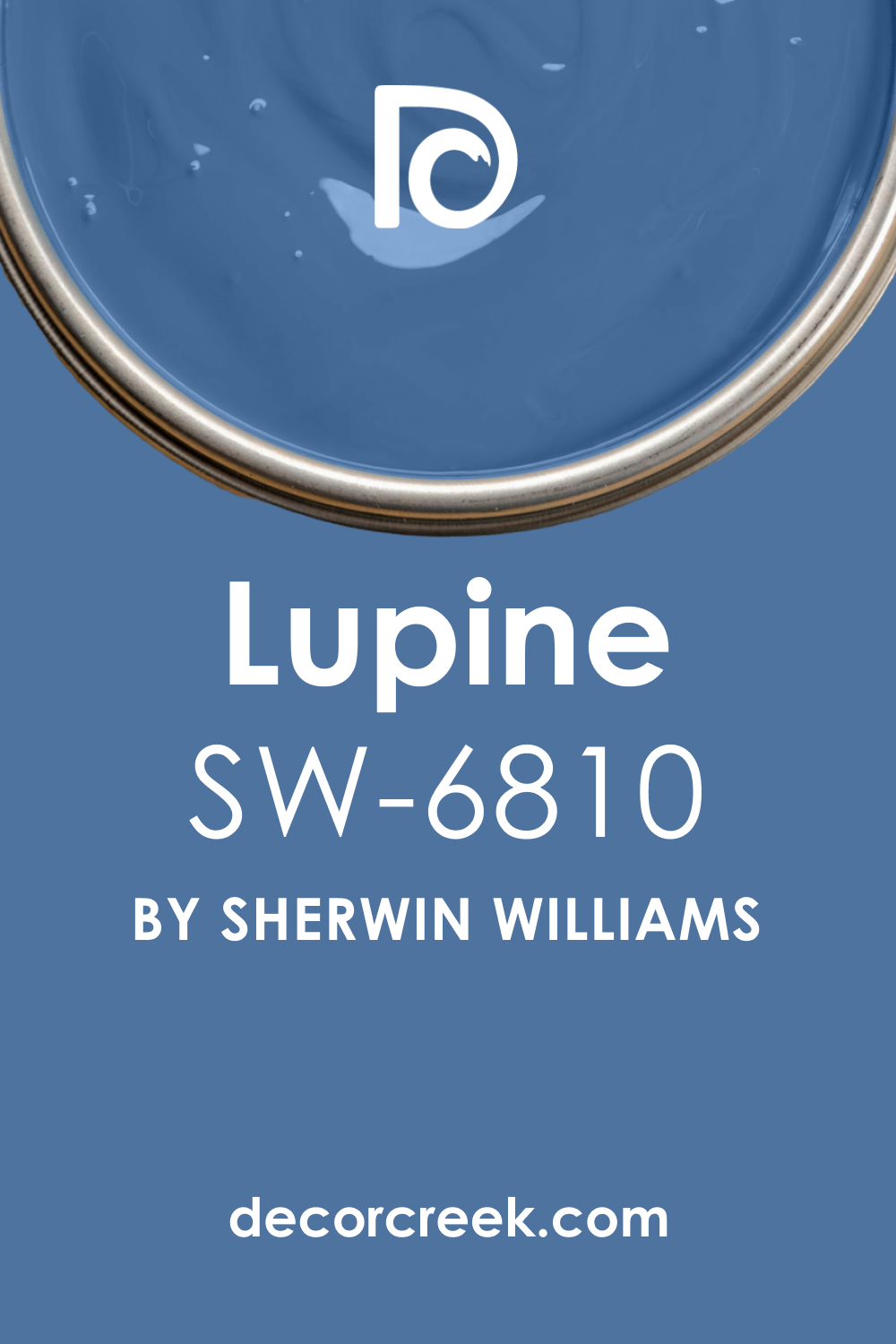
Every color has a story to tell and an emotion to evoke, and Sherwin-Williams’ Lupine (SW 6810) is no exception. This intriguing color has made a name for itself in the world of interior design due to its versatility and ability to convey a sense of tranquility.
This article delves into the nuances of SW 6810 Lupine, from its undertones to how light impacts its perception, and offers insights into how to incorporate this color into your home best.
What Color Is SW 6810 Lupine?
SW Lupine is a beautifully complex color that resides in the realm of blues but carries a subtle hint of green, situating it somewhere between a steel blue and a soft teal. This shade draws inspiration from the striking hues of nature, evoking thoughts of serene landscapes and peaceful, calm waters.
SW Lupine can be described as sophisticated yet earthy, and its compelling richness can make it the centerpiece of a room’s color scheme or a perfect accent to complement a variety of other hues.
In certain lighting conditions, SW Lupine can take on a more teal-oriented appearance, adding an extra layer of depth to its blue foundation. This flexible characteristic enables it to shift and adapt to different environments, enhancing its compatibility with various interior design styles and color schemes.
Regardless of its surroundings, SW Lupine consistently conveys a sense of tranquility and balance, reinforcing its desirability in residential and commercial interiors alike.
Ever wished paint sampling was as easy as sticking a sticker? Guess what? Now it is! Discover Samplize's unique Peel & Stick samples.
Get paint samples

Is It a Warm Or Cool Color?
SW 6810 Lupine is a cool color. Its blue-green composition inherently leans towards the cooler end of the color spectrum. Cool colors are often associated with calmness and serenity, and Lupine perfectly embodies these characteristics. It’s these qualities that make it a versatile choice for a multitude of spaces, creating soothing atmospheres that invite relaxation and contemplation.
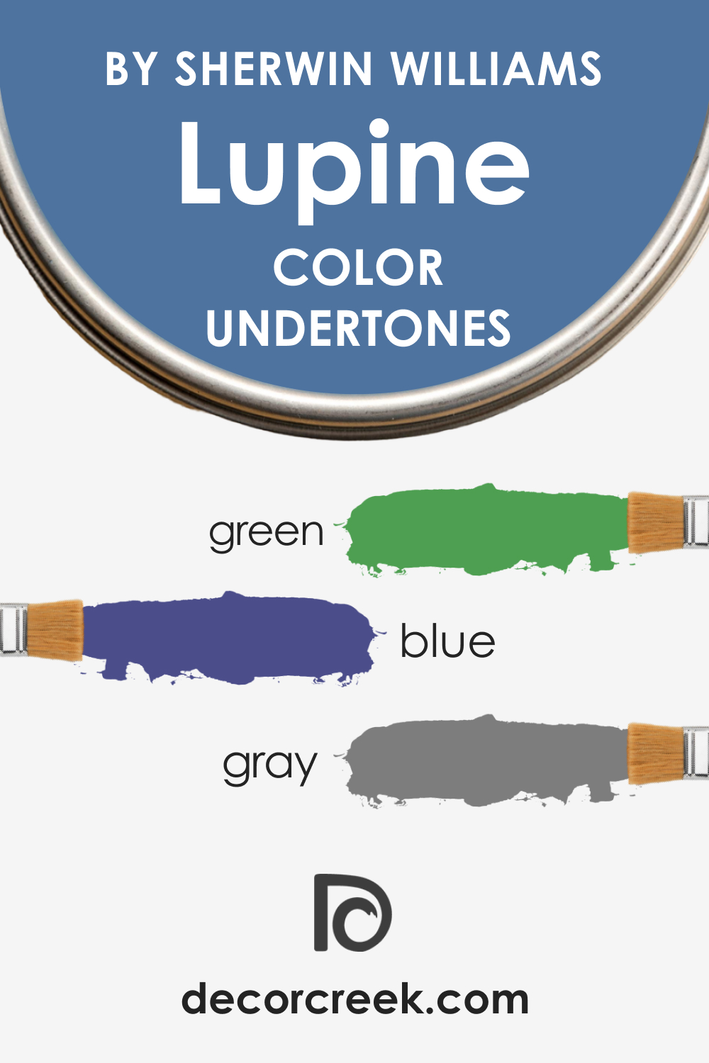
Undertones of SW 6810 Lupine
Knowing undertones allows you to tell in advance how paint colors will read in your home. SW Lupine can be considered a complex color due to the multiple undertones it has:
- Blue Undertone: The most prominent undertone in Lupine is blue, which provides the color with its soothing and tranquil nature.
- Green Undertone: Green undertones subtly exist within Lupine, bringing a hint of nature and earthiness to its overall look.
- Gray Undertone: A slight gray undertone is also present in SW Lupine, contributing to its muted sophistication and enhancing its versatility.
Undertones are critical in determining how color interacts with its surroundings. They can shift the overall appearance of the color based on the lighting conditions and other colors present in the room, creating dynamic interactions that can either harmonize or contrast with the other elements of a space.
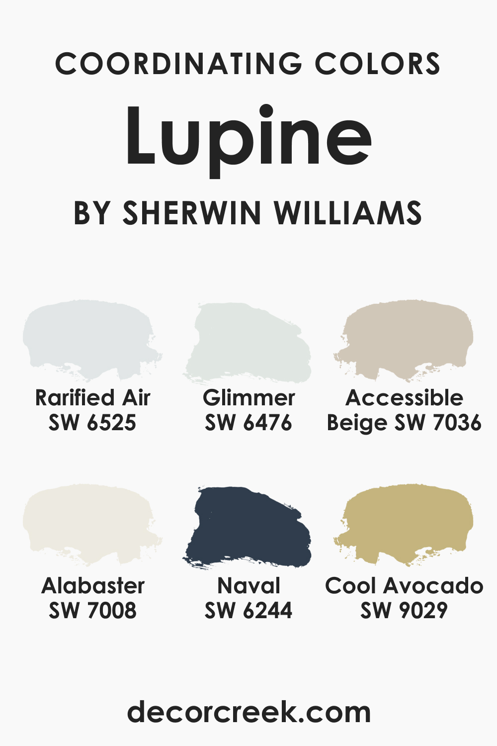
Coordinating Colors of SW 6810 Lupine
Coordinating colors are colors that work well together to create a harmonious and balanced look in your design or decor. When you’re coordinating colors, you’re essentially curating a palette that will be used throughout a space or in a design to achieve a particular aesthetic or mood.
Coordinating colors are typically used to ensure that everything in a room—from the walls to the furniture to the accessories—works together cohesively.
But for such a complex color as SW Lupine, it can be difficult to choose the correct coordinating colors! This is why we have prepared several options for you to check out:
- SW 6525 Rarified Air : This soft, delicate blue is a stunning contrast to SW Lupine, brightening up the space while maintaining a serene atmosphere.
- SW 7008 Alabaster : This warm and neutral white provides a beautiful contrast to Lupine’s cool tones, bringing balance and depth to the color scheme.
- SW 9029 Cool Avocado : This light, cool-toned green pairs wonderfully with Lupine, enhancing its green undertones and enriching the overall color scheme.
- SW 6244 Naval : A deeper shade of blue that accentuates the cool tones of Lupine while creating a dynamic contrast.
- SW 6476 Glimmer : This very light shade of blue-green mirrors the undertones in Lupine, tying together the color scheme beautifully.
- SW 7036 Accessible Beige : This neutral and flexible beige acts as a grounding color, bringing out the depth in Lupine and offering a soft contrast.
Coordinating colors are crucial in creating a cohesive and harmonious color scheme. They can accentuate the main color, provide contrast, or offer a seamless blend of similar hues, depending on the overall design goal. When chosen correctly, coordinating colors can enhance the aesthetic appeal of a space and convey the desired mood or atmosphere.
How Does Lighting Affect SW 6810 Lupine?
Lighting plays a pivotal role in how we perceive Lupine. In natural light, the blue undertones are accentuated, making SW Lupine appear more vibrant and lively. However, under artificial light, Lupine can take on a slightly more muted hue, with its green undertones becoming more noticeable.
The shift between these different perceptions is part of what makes SW Lupine such an intriguing and adaptable color. Therefore, it’s essential to consider the type and amount of light in space when deciding to use the Lupine color.
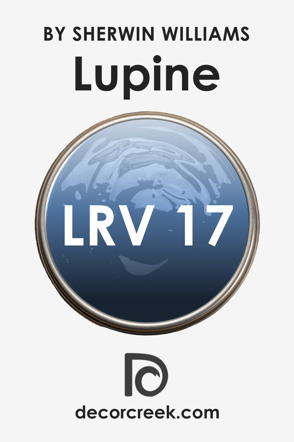
LRV of SW 6810 Lupine
The Light Reflectance Value (LRV) of SW 6810 Lupine is 17, indicating it is a relatively dark color. LRV is a scale from 0 (absolute black) to 100 (pure white) that measures how much light a color reflects and how much it absorbs.
With an LRV of 17, SW Lupine absorbs a significant amount of light and can therefore create a more intimate, cozy feeling in a room. It’s worth noting that while SW Lupine is quite dark, it’s not overly intense, making it a versatile choice that can work in various settings without overwhelming the space.
LRV – what does it mean? Read This Before Finding Your Perfect Paint Color
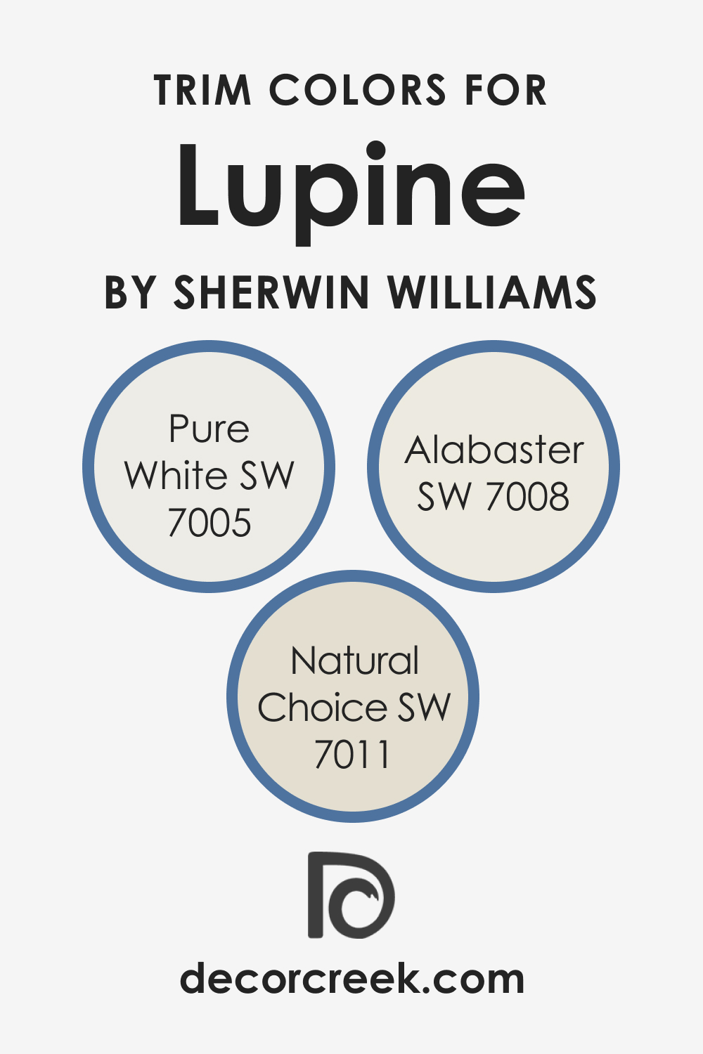
Trim Colors of SW 6810 Lupine
Trim colors, often used for doorways, windowsills, and moldings, provide a boundary and contrast to the main wall color. They can highlight architectural details, add depth to a room, and tie together the overall color scheme.
When selecting trim colors, it’s essential to consider how they interact with the main color – in this case, SW Lupine – to ensure they complement rather than detract from it. Here are several trim colors that work best with SW Lupine:
- SW 7008 Alabaster : As a neutral, warm white, Alabaster provides a subtle contrast to the cool tones of SW Lupine and helps to soften its appearance.
- SW 7011 Natural Choice : This warm, soft white pairs perfectly with SW Lupine, offering a gentle contrast that highlights the rich depth of the color.
- SW 7005 Pure White : This pure, clean white provides a stark contrast to SW Lupine, accentuating its depth and richness.
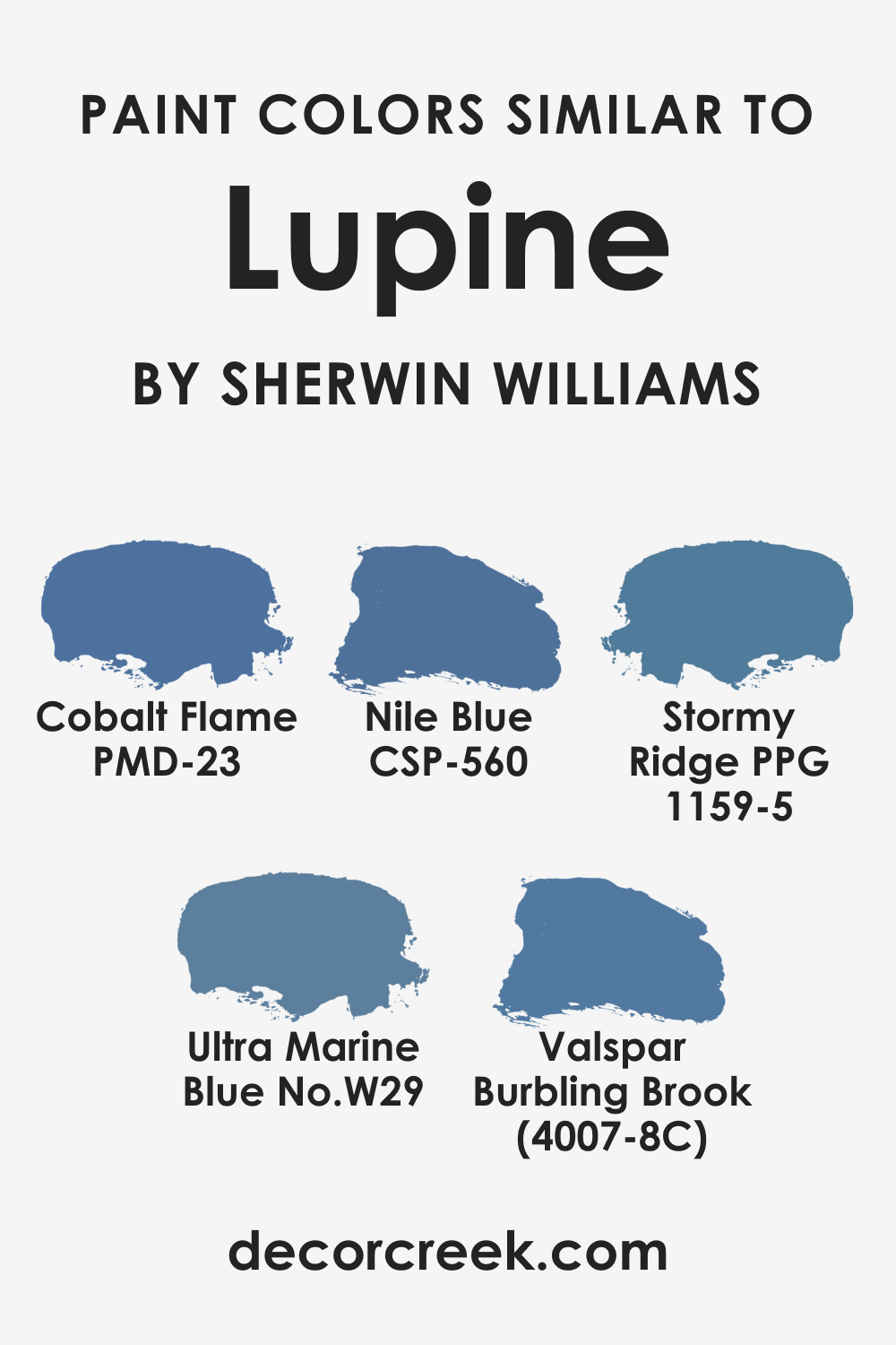
Colors Similar to SW Lupine
If you are unsatisfied with how SW Lupine works in your home, consider a few alternative colors. For example, you might want to check out these color suggestions that look nearly the same:
- Behr Cobalt Flame
- BM Nile Blue VSP-560
- PPG Stormy Ridge
- Farrow & Ball Ultra Marine Blue
- Valspar Burbling Brook
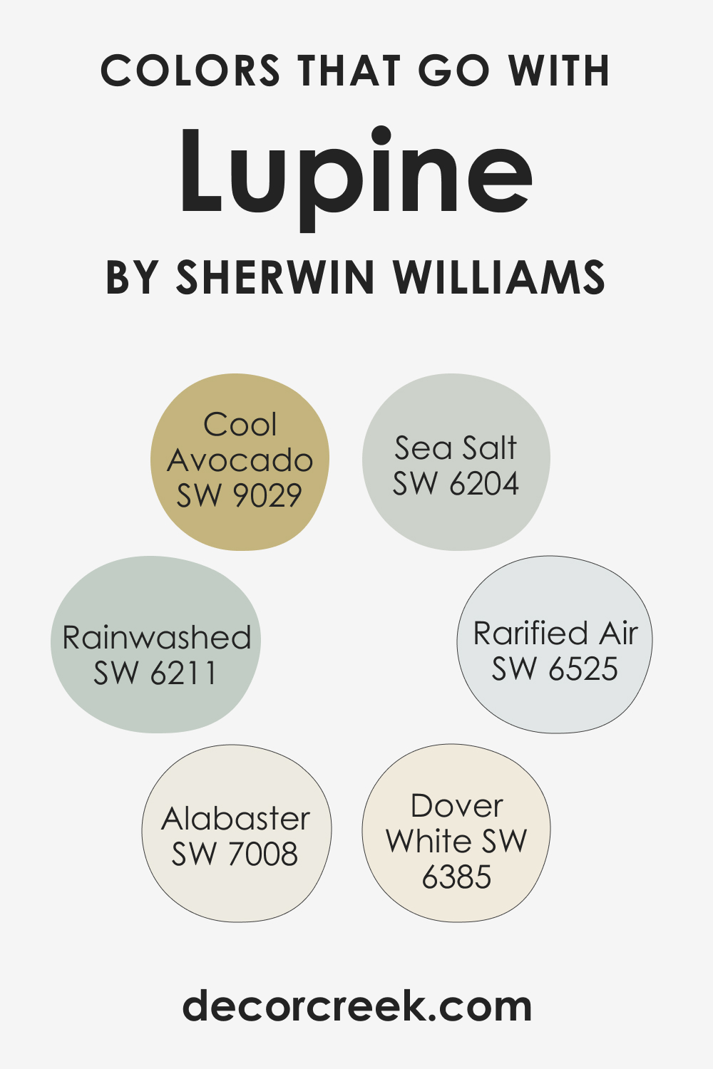
Colors That Go With SW 6810 Lupine
To achieve a well-balanced look in your home, it’s essential to combine colors that work well altogether. For SW Lupine, we recommend you the following color options:
- SW 6525 Rarified Air : A soft blue that enhances Lupine’s tranquil feel.
- SW 7008 Alabaster : A warm white contrasting beautifully with SW Lupine’s cool tones.
- SW 9029 Cool Avocado : A cool-toned green that highlights the green undertones in SW Lupine.
- SW 6211 Rainwashed : A light, airy blue that provides a gentle contrast to SW Lupine’s richness.
- SW 6204 Sea Salt : A mix of green and gray that pairs wonderfully with SW Lupine.
- SW 6385 Dover White : A creamy, warm white that offers a subtle contrast to SW Lupine’s cool tones.
In the realm of color coordination, it’s important to choose colors that harmonize well with one another to create a cohesive look. The selected colors can either complement SW Lupine, highlighting its unique attributes, or they can contrast with it, providing a striking balance and depth to your color scheme.
How to Use SW 6810 Lupine In Your Home?
SW Lupine’s tranquil and versatile nature allows it to fit into various rooms and interior design styles. Whether you’re going for a coastal, contemporary, or traditional style, SW Lupine can adapt and add a unique touch to the atmosphere.
Its calming qualities make it suitable for spaces where relaxation is key, such as bedrooms and bathrooms, while its sophistication makes it a great choice for formal dining rooms or offices.
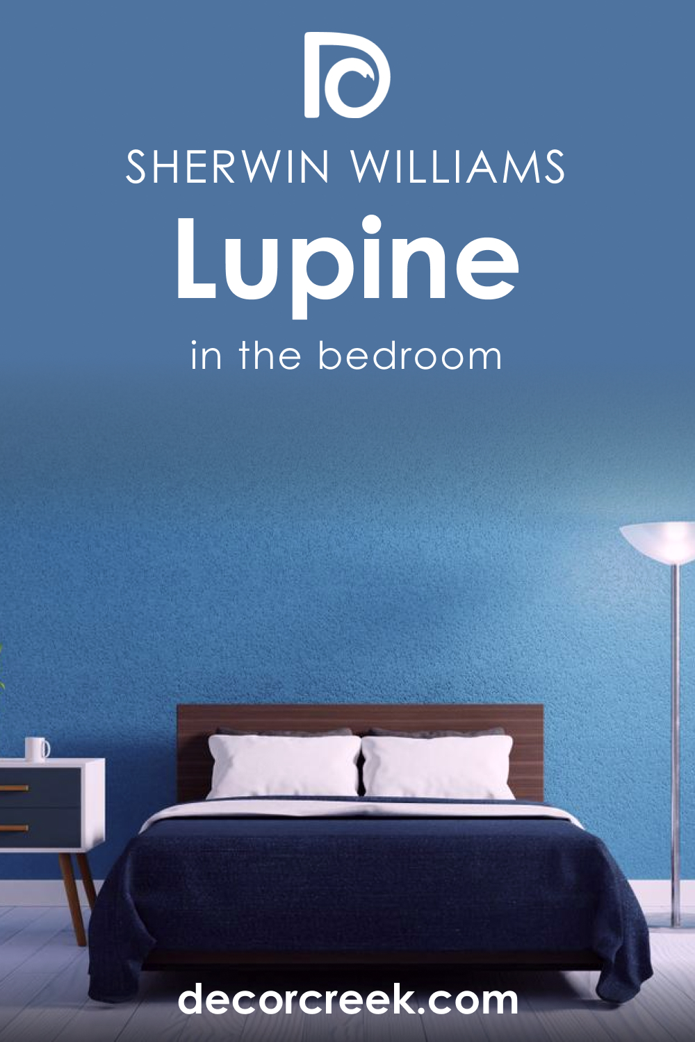
How to Use SW 6810 Lupine in the Bedroom?
In the bedroom, SW Lupine can create a serene, peaceful atmosphere perfect for unwinding after a long day. Its cool tones can provide a sense of calm, aiding in relaxation and restful sleep.
You might choose to paint all the walls in SW Lupine for a fully immersive experience or use it on an accent wall behind your bed to create a focal point. Pair SW Lupine with soft whites for your linens and furniture to create a soothing contrast.
Lupine can also work well in a child’s bedroom, providing a calming backdrop that isn’t overly stimulating. Pair it with bright, playful accents to create a balanced, joyful space. No matter how you use SW Lupine in a bedroom, it contributes to a soothing, restful environment.
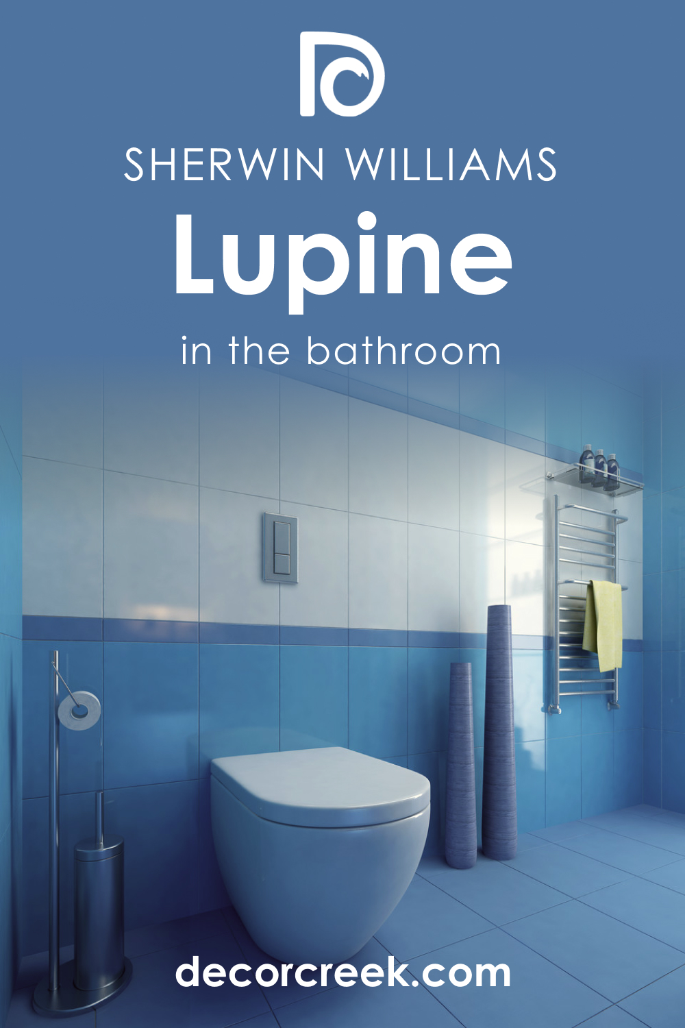
How to Use SW 6810 Lupine in the Bathroom?
SW Lupine’s tranquil and cool nature makes it a perfect fit for bathrooms. It evokes a sense of freshness and cleanliness, which aligns with the primary function of the room. In a larger bathroom, it can add depth and interest without overwhelming the space. For smaller bathrooms, using SW Lupine on an accent wall or in a half-wall design can incorporate its rich color without making the room feel smaller.
Consider pairing SW Lupine with crisp white bathroom fixtures for a fresh, clean look. The addition of natural elements, such as wood or stone, can also enhance Lupine’s earthiness, creating a bathroom that feels like a personal spa retreat.
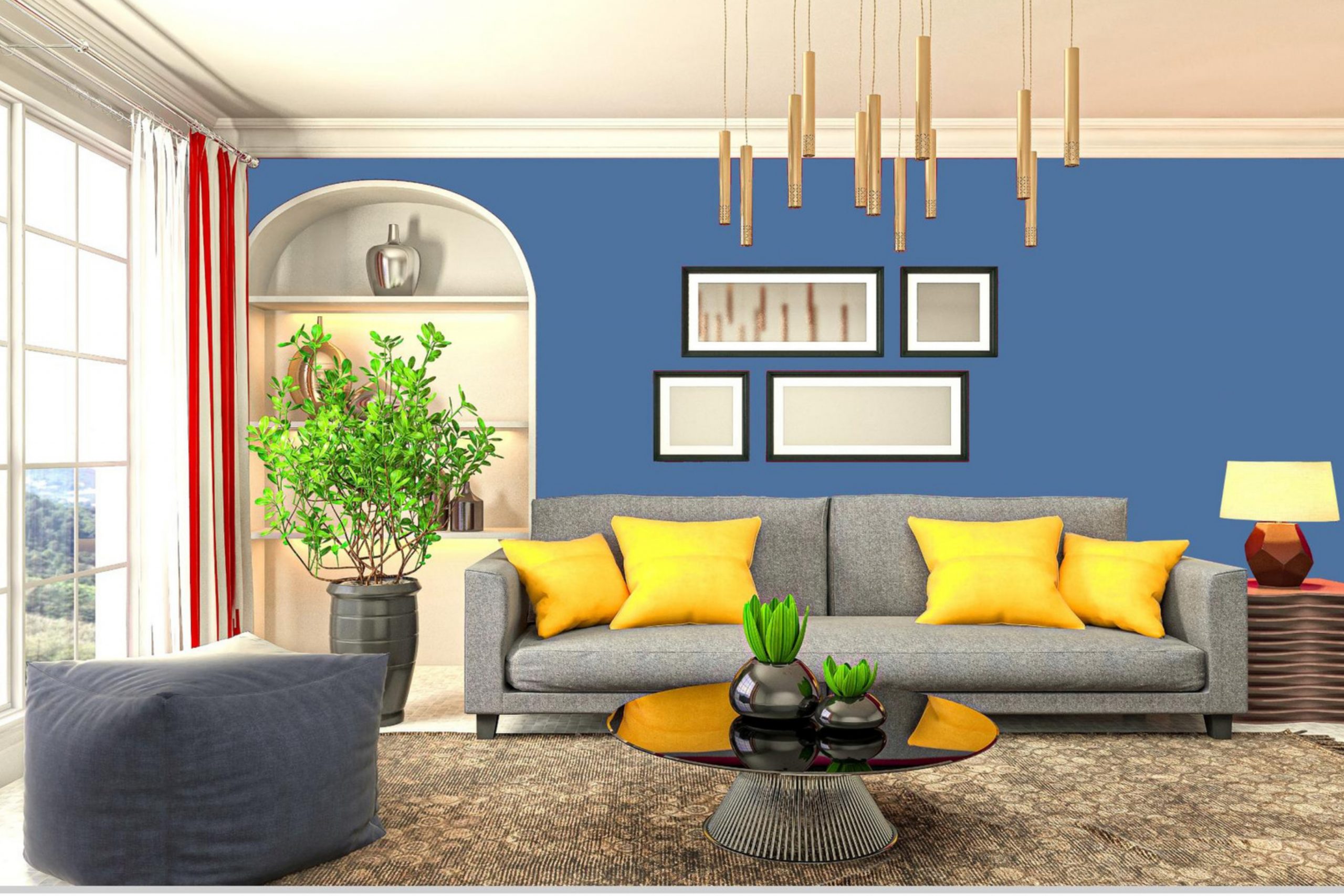
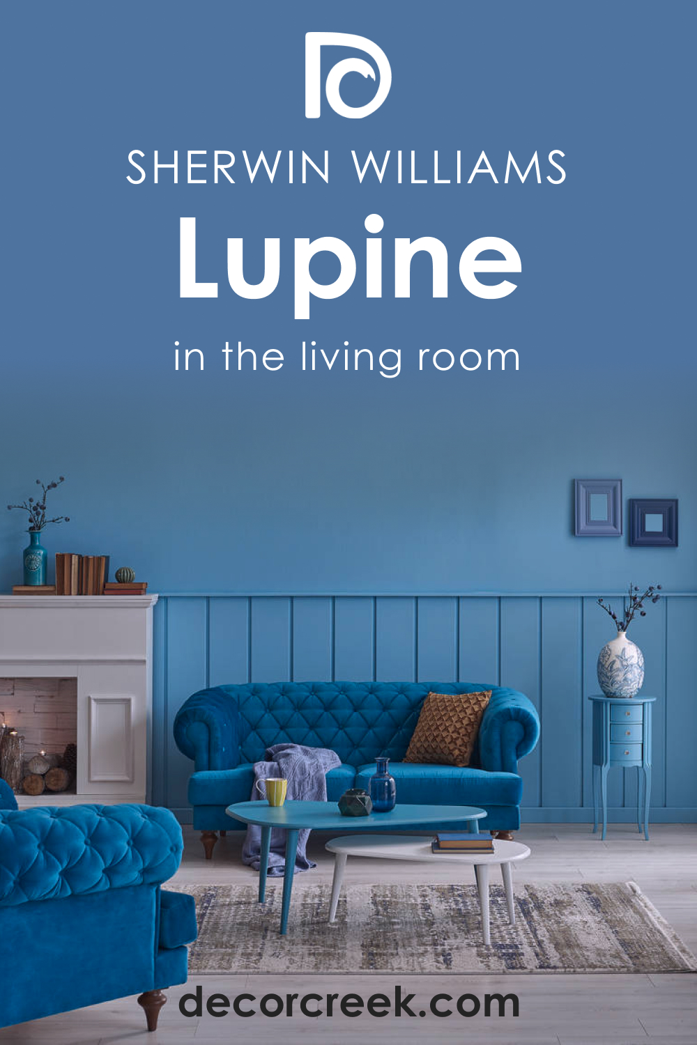
How to Use SW 6810 Lupine in the Living Room?
SW Lupine in the living room can set the stage for relaxation and conversation. Its calming vibe can help to reduce stress and encourage relaxation, making it an ideal color choice for a space centered around connection and comfort. You could choose to paint all the walls in it for a calming monochromatic look or use it on an accent wall to provide a point of interest.
Pair SW Lupine with neutral furniture to create a soothing, harmonious space. Add pops of bright, warm colors like coral or sunny yellow in throw pillows or accessories for an exciting contrast that livens up the room.
How to Use SW 6810 Lupine for an Exterior?
SW Lupine can also be a captivating choice for home exteriors, providing a unique and sophisticated look. The blue-green hue of this color stands out against natural elements, such as greenery and skies, making your home a noticeable landmark.
Pair SW Lupine with white trim to provide a crisp, clean contrast highlighting your home’s architectural details. If your home has stone or brick elements, Lupine can complement these features, enhancing their natural beauty.

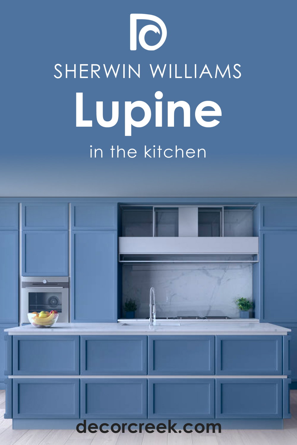
How to Use SW 6810 Lupine for the Kitchen?
Using Lupine in the kitchen can create a cool, calming backdrop for the heart of your home. Whether on the walls or as an accent on an island or lower cabinets, Lupine adds a sophisticated touch to any kitchen.
Paired with white upper cabinets, Lupine can ground the space and add a splash of color. The blue-green tones can also beautifully complement stainless steel appliances, contributing to a sleek and modern look.
Comparing SW 6810 Lupine With Other Colors
Here you can read how SW Lupine looks compared to several other colors. This will help you better see the unique features of this hue and fully appreciate the nuances of this unique shade.
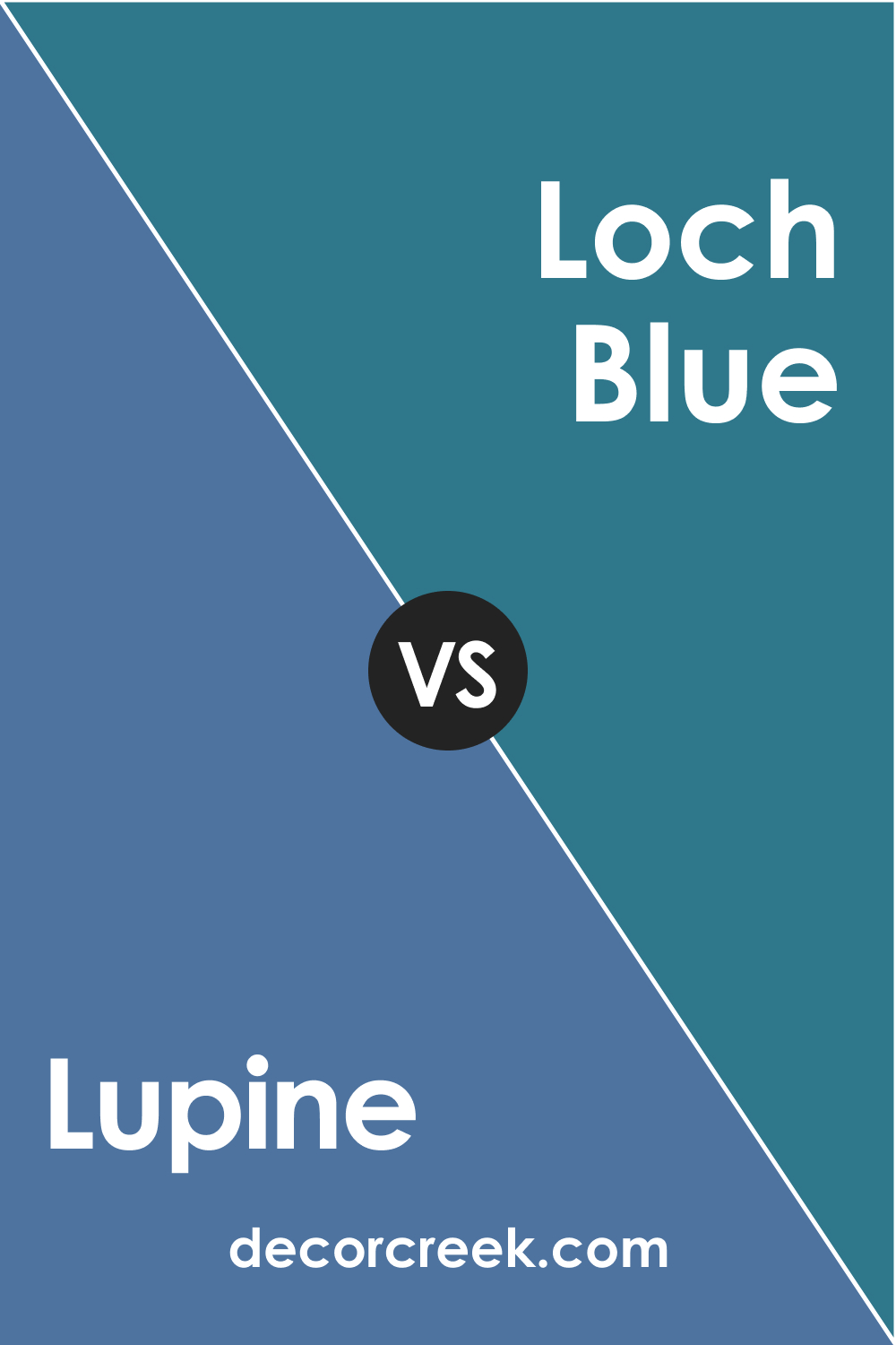
SW 6810 Lupine vs SW 6502 Loch Blue
SW Loch Blue is a darker, more intense blue than Lupine, with less of a green undertone. It makes a room feel more cozy and intimate, while Lupine creates a lighter, more relaxed atmosphere.
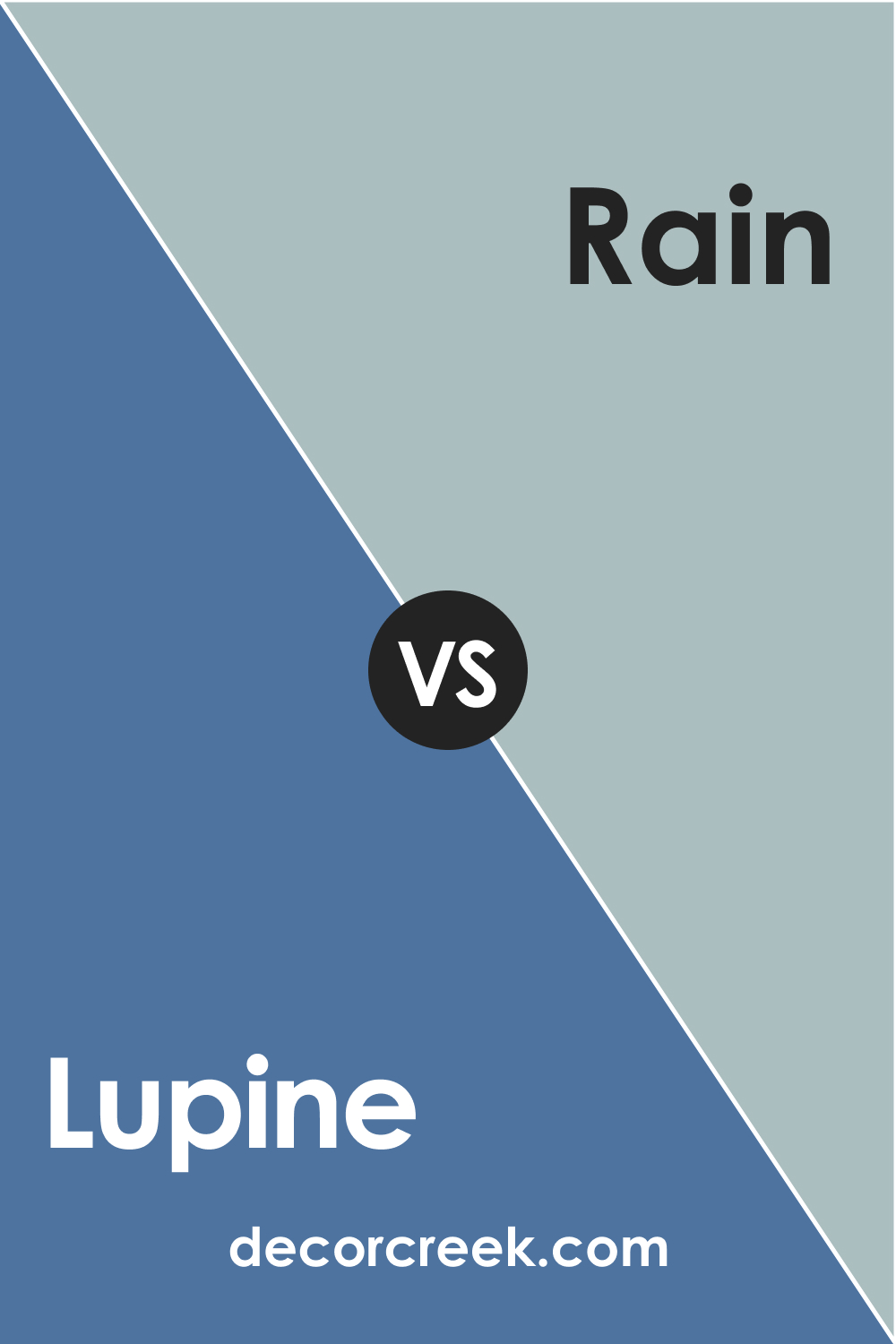
SW 6810 Lupine vs SW 6219 Rain
SW Rain is softer , more muted blue-green than Lupine. It’s a more subtle choice, ideal for those who want a hint of color without overwhelming the space.
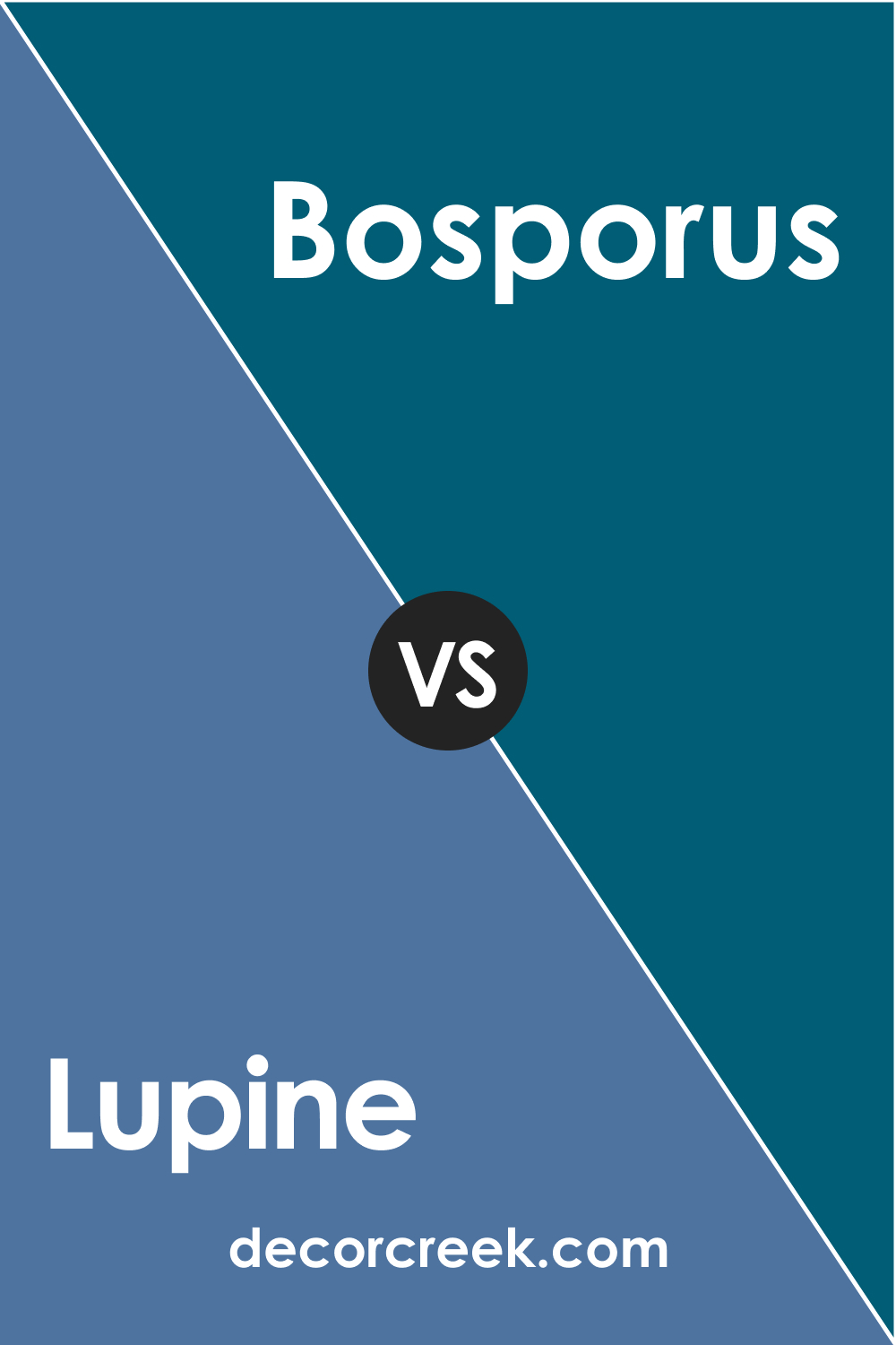
SW 6810 Lupine vs SW 6503 Bosporus
Of these colors, SW Bosporus is a deeper, more saturated version of SW Lupine with similar undertones. It can create a dramatic effect, while SW Lupine is more versatile and understated.
SW 6810 Lupine vs SW 6486 Reflecting Pool
If you compare these two, you will see that SW Reflecting Pool is a lighter, brighter shade of blue-green that can open up a room and make it feel more airy, while SW Lupine brings a sense of depth and richness.
SW 6810 Lupine vs SW 6217 Topsail
SW Topsail is a more subdued version of SW Lupine’s blue-green palette with gray undertones. It can create a more neutral backdrop, while Lupine adds a splash of color.
Conclusion
SW 6810 Lupine is a sophisticated, tranquil color that adds depth and interest to any space. Its flexibility and adaptability make it a great choice for various rooms and design styles, from coastal to contemporary.
Whether used as a main color or an accent, Lupine brings a touch of nature and tranquility into your home, creating spaces that are not only beautiful but also soothing and inviting.

Ever wished paint sampling was as easy as sticking a sticker? Guess what? Now it is! Discover Samplize's unique Peel & Stick samples.
Get paint samples
Frequently Asked Questions
✅What type of color is SW 6810 Lupine?
SW 6810 Lupine is a muted, medium-dark lavender color with cool, blue undertones. It's a unique shade that can add a touch of sophistication and tranquility to any space.
✅Is SW 6810 Lupine a warm or cool color?
SW Lupine is a cool color. It has blue undertones, which give it a calming and soothing effect. It can bring balance to a room that has a lot of warm colors.
✅What are the best-coordinating colors for SW 6810 Lupine?
SW 6810 Lupine coordinates well with lighter, neutral shades such as SW 6525 Rarified Air and SW 7008 Alabaster. For a bolder contrast, consider pairing it with colors like SW 9029 Cool Avocado.
✅How does lighting affect the appearance of SW 6810 Lupine?
Lighting can significantly affect how SW Lupine appears. In natural light, the color appears as a clear, medium-dark lavender. However, under artificial lighting, the color can appear darker, and the blue undertones become more noticeable.
✅What are the best rooms to use SW 6810 Lupine in?
SW Lupine is a versatile color that works well in many rooms. It's particularly effective in bedrooms and bathrooms, where its calming qualities are most beneficial. However, it can also work well in living rooms, kitchens, and even exteriors for a distinctive and stylish look.


