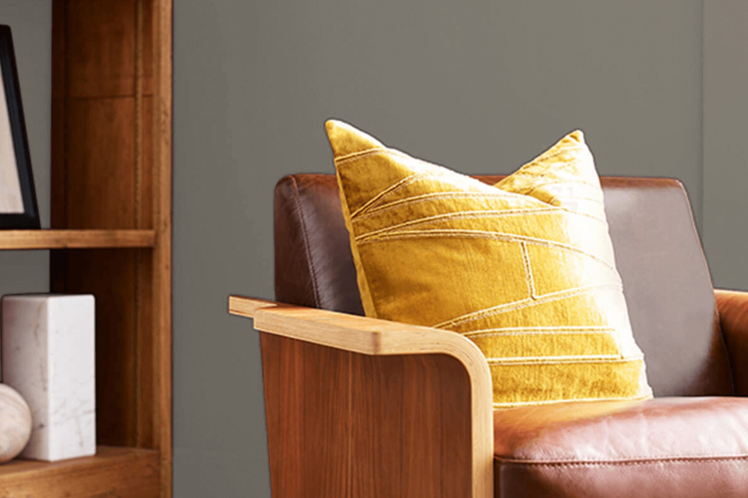
If you’re considering a paint color that brings warmth and a sense of heritage to your space, you might want to check out SW 9594 Settlement by Sherwin Williams. Officially added to their vast array of color choices, Settlement stands out with its earthy, muted tones that suggest a connection to the historic and the rustic.
It’s the kind of color that subtly fills a room without overwhelming it, making it an excellent choice for anyone looking to create a cozy, inviting atmosphere in their home or office. When using SW 9594 Settlement, you’ll notice how well it plays with natural light, changing subtly with the day’s progression, giving your room an ever-evolving look.
It pairs beautifully with both traditional and modern decor, making it versatile for various projects. Whether you’re painting a whole room, an accent wall, or just some furniture, Settlement could be the ideal backdrop, providing a grounding, soft presence that ties different design elements together.
So, if you’re planning your next project and looking for a paint that complements without dominating, this shade might be worth a try.
What Color Is Settlement SW 9594 by Sherwin Williams?
Settlement by Sherwin Williams is a rich, deep green hue with subtle earthy undertones that bring a sense of calm and grounding to any space. It’s a versatile color that works well in various interior styles, particularly in rustic, traditional, or bohemian settings. This shade beautifully complements natural materials like wood, leather, and linen, enhancing the cozy, welcoming vibe of a room.
In rustic interiors, Settlement can be used on walls to create a warm, cabin-like feel, pairing exceptionally well with exposed wood beams and stone elements. For a more traditional look, this color fits perfectly with rich wood finishes on furniture and detailed trim, offering a classic, elegant backdrop.
In bohemian-style rooms, Settlement helps highlight eclectic mixes of colorful textiles and unique furniture pieces, especially when combined with bright accessories and indoor plants. Textiles like wool or chunky knits and materials like terracotta or unglazed ceramics also pair beautifully with this green, reinforcing its earthy quality.
Settlement is excellent for creating a cozy, grounded atmosphere in any living space, providing a backdrop that complements a variety of textures and materials. Whether you’re looking to create a soothing bedroom retreat or a lively living room, this color is a robust choice that adapts well to different decor styles and personal tastes.
Is Settlement SW 9594 by Sherwin Williams Warm or Cool color?
SettlementSW 9594 by Sherwin Williams is a warm, inviting beige that can really warm up a room. Since it’s not too dark or too light, it fits well in various spaces, no matter their size or how much light they get during the day. This makes it a versatile choice for homes, perfect for living rooms, bedrooms, or even kitchens.
The beauty of this color lies in its subtle, soft look, which pairs well with many other colors. Whether you’re combining it with bold colors like navy or soft tones like dusty pink, it helps to balance things out. This color also works great with wood furniture and accents, enhancing their natural beauty without overpowering them.
Using this particular shade of beige can make your home feel warm and cozy, creating a welcoming atmosphere for family and guests. It’s a practical choice because it tends to hide small marks or scuffs better than lighter shades, which is helpful for maintaining a clean look in high-traffic areas.
Undertones of Settlement SW 9594 by Sherwin Williams
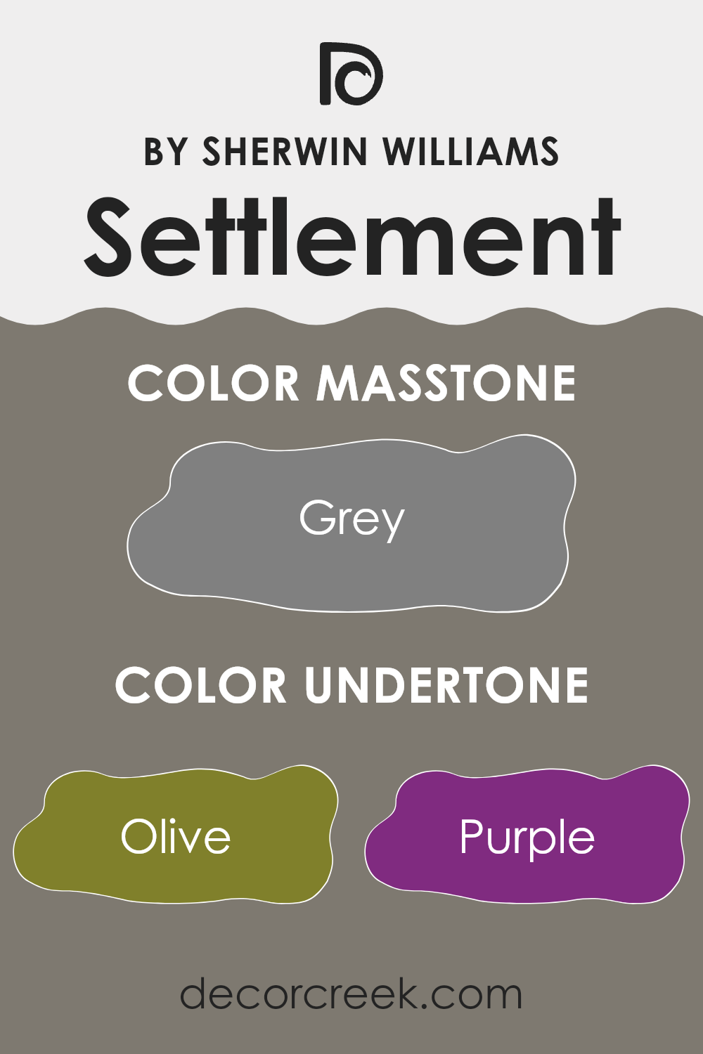
SettlementSW 9594, a unique paint color by Sherwin Williams, is influenced by various undertones that shift its appearance under different lighting conditions and when paired with diverse decor styles. Specifically, this color includes nuances such as olive, purple, and dark turquoise, which collectively bring depth and complexity to the shade.
Undertones, like secret ingredients, subtly influence the main color, altering how it is perceived. For example, olive undertones can evoke a natural, earthy feel, making a room feel grounded. On the other hand, purple undertones might add a hint of mystery and richness, enhancing the sophistication of a space without overt brightness.
When applied to interior walls, SettlementSW 9594’s blend of undertones like pale pink, mint, and lilac can softly play off against natural lighting and furniture colors, thus impacting the mood and visual temperature of a room. Darker undertones such as dark green or navy may make the paint appear cooler, ideal for creating a focused or cozy atmosphere.
On the practical side, pale yellow and light green undertones contribute a fresh vibrancy, making the space appear lively and welcoming. The darker undertones like dark gray and brown provide a solid base that ensures the color remains anchored and not overwhelmingly bright.
Using SettlementSW 9594 on your walls could bring a nuanced spectrum of effects, from calming and subtle to dynamic and profound, depending on the interplay of its complex undertones and your home’s natural and artificial lighting. This makes it versatile and suitable for various rooms and styles, from modern minimalistic to traditional.
What is the Masstone of the Settlement SW 9594 by Sherwin Williams?
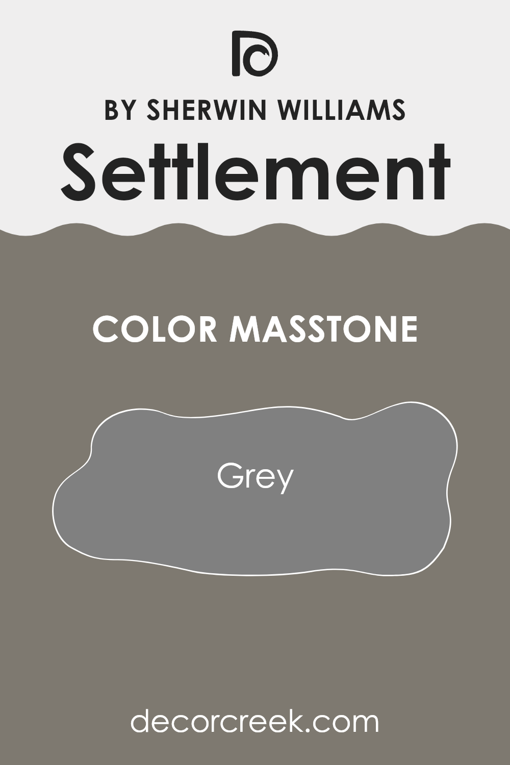
Settlement SW 9594 by Sherwin Williams has a masstone of grey (#808080), a color known for its versatility and calm appeal. This particular shade of grey works well in homes because it offers a neutral backdrop that can pair easily with various decor styles and colors.
Since it doesn’t overpower other hues, homeowners can use it in living rooms, bedrooms, and kitchens to create a cohesive look throughout their space. Grey also has the advantage of making spaces appear more spacious and clean, lending a tidy feeling to rooms which is often appreciated in areas of rest or where guests are entertained.
Its adaptability means it can fit into modern, minimalist, traditional, or rustic interior designs, making it a reliable choice for many. As lighting in rooms changes throughout the day, grey maintains its balance without shifting dramatically, ensuring a steady and pleasant atmosphere.
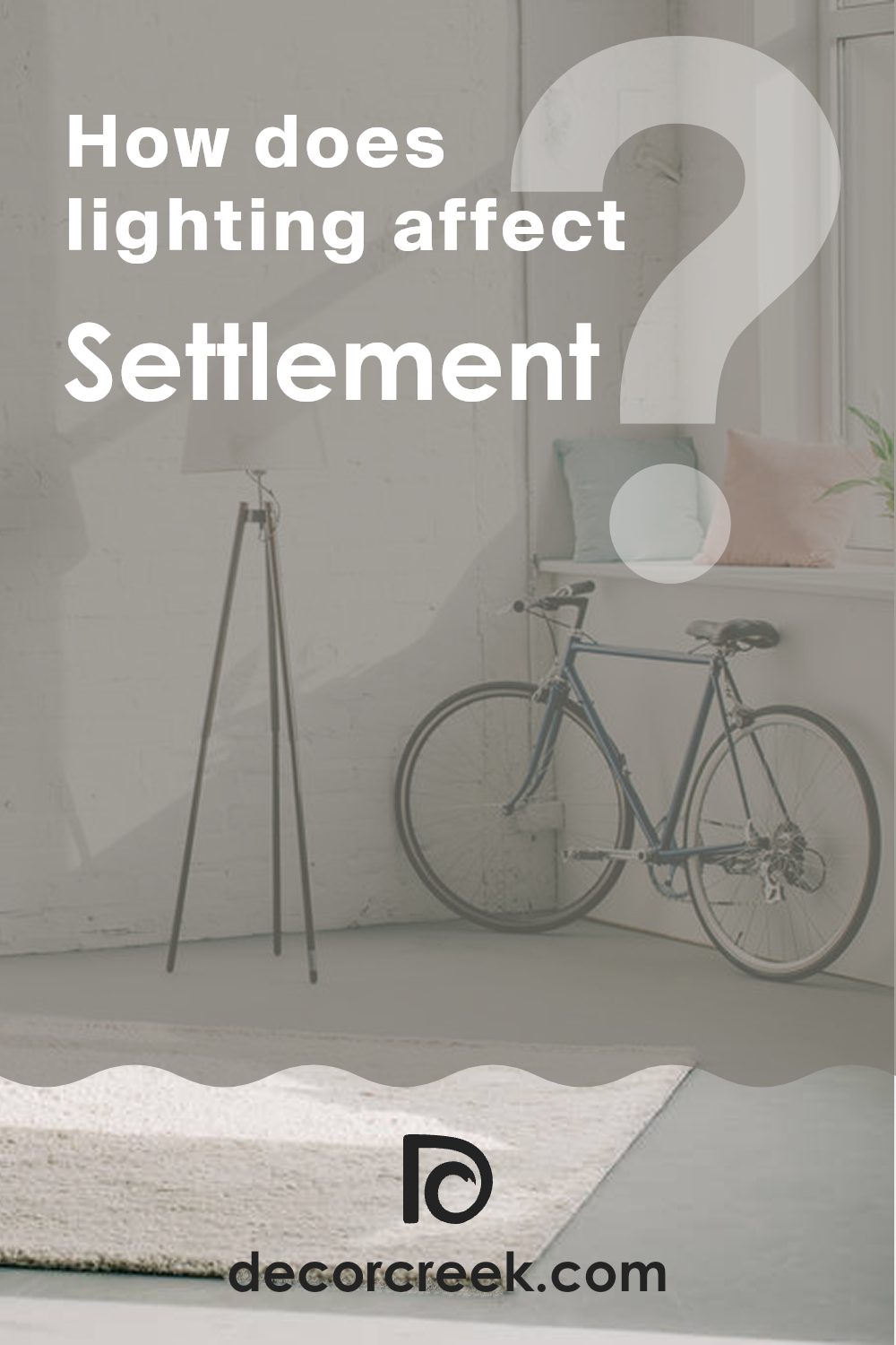
How Does Lighting Affect Settlement SW 9594 by Sherwin Williams?
Lighting plays a crucial role in how we perceive the color of objects, including paint on our walls. Colors can look dramatically different depending on whether they are under natural or artificial light due to the color temperature and intensity of the light source.
Taking a specific color like Settlement, a shade from Sherwin Williams, we can examine how it reacts under different lighting conditions. In artificial light, such as that provided by LED or incandescent bulbs, Settlement tends to appear slightly warmer. This is because most indoor lighting has a yellowish tone that can make the colors look cozier and richer.
Under natural sunlight, Settlement displays its true color, which might look more vibrant and lively. Sunlight has a broader spectrum and brings out the subtle undertones in the paint.
When considering how Settlement appears in rooms with different facing directions, each room can have a distinct feel purely because of how the light interacts with the color. In north-facing rooms, light is typically cooler and softer, making Settlement look more subdued and slightly muted.
These rooms don’t get a lot of direct sunlight, so the color may seem consistent throughout the day but can feel cooler.
South-facing rooms, on the other hand, receive a wealth of sunlight, which can make Settlement look lighter and more vibrant. The paint color can truly shine in these rooms, displaying a bright and inviting hue throughout most of the day.
East-facing rooms get morning sunlight, which is warm and bright. Here, Settlement will feel warm and cheerful in the morning, gradually becoming softer as the day progresses. Conversely, in west-facing rooms, the color will start off more neutral during the morning and then pick up warmth in the evening with the setting sun, providing a cozier feel by dusk.
Thus, the effect of lighting on color like Settlement is substantial and can highly influence the ambiance and mood in a space. It’s important to consider the quality of light when choosing paint colors for different rooms to ensure you achieve the desired effect at all times of the day.
What is the LRV of Settlement SW 9594 by Sherwin Williams?
LRV stands for Light Reflectance Value, which is a measure of how much light a color reflects or absorbs. This value is typically on a scale from zero to 1-hundred, with higher numbers reflecting more light and lower numbers absorbing more.
LRV is crucial when choosing paint colors because it helps predict how light or dark a color will look on your walls depending on the amount of natural or artificial light your room receives. For instance, a higher LRV can make a room feel brighter and more open, while a lower LRV can give a cozy and more enclosed feel.
The color in question, with an LRV of 19.253, is on the darker side since it reflects less than twenty percent of the light. This means it will absorb more light and can make a room feel smaller or more intimate. If you’re considering using this color in a space, it’s important to make sure there is ample lighting to balance the darkness of the paint. Without sufficient light, the space might feel too dark and cramped, especially in smaller or naturally darker rooms. In well-lit areas, however, this color can add depth and character to the space, making it feel warm and inviting.

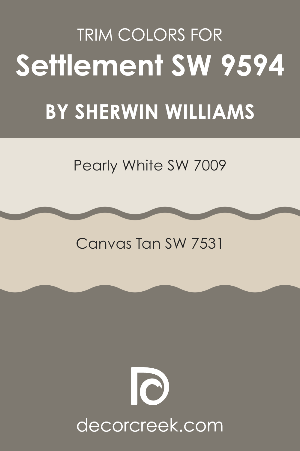
What are the Trim colors of Settlement SW 9594 by Sherwin Williams?
Trim colors are specific shades used to accentuate or highlight the architectural details and edges of a space, such as door frames, baseboards, molding, and window casings. These colors are critical as they help in defining the overall aesthetic and flow of a room, balancing or contrasting with the principal wall colors to create a visually appealing, coherent look.
For instance, using a trim color like SW 7009 – Pearly White can offer a clean and neutral framing to brighter or darker wall colors, enhancing their pull without competing for attention. Similarly, SW 7531 – Canvas Tan works seamlessly to offer a warm, inviting boundary around a room or against a lighter main wall tone, effectively making the space feel well-rounded and cohesive.
SW 7009 – Pearly White is a gentle white with a slight touch of warmth, making it versatile for use in a variety of settings. This color gives a crisp, fresh look that can help other colors in the room stand out. On the other hand, SW 7531 – Canvas Tan is a warm beige that offers a soft, neutral background ideal for creating a subtle yet inviting environment.
Its earthy tones bring a cozy atmosphere, making it an excellent choice for a space seeking a calm, connected vibe. Both these trim colors serve well when combined with a main color like Settlement, enhancing the room’s overall character and ensuring a polished, finished appearance.
You can see recommended paint colors below:
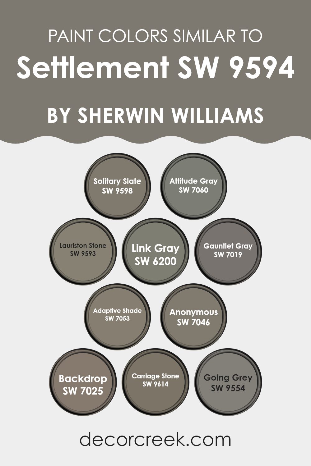
Colors Similar to Settlement SW 9594 by Sherwin Williams
Similar colors play a crucial role in creating a harmonious and balanced aesthetic in any space. When colors are closely related on the color palette, such as the earthy, neutral grays and muted tones similar to SW 9594 – Settlement by Sherwin Williams, they can help create a cohesive look that is pleasing to the eye.
These colors can effectively work together because they share common undertones which make them blend seamlessly, eliminating any harsh contrasts. This subtle variation among similar colors can enhance the depth and texture of a room without overpowering it with too much variation.
For instance, SW 9598 – Solitary Slate offers a sturdy, reliable shade of gray that sets a solid foundation for any room. In close relation, SW 7060 – Attitude Gray provides a slightly deeper hue that brings a robust and grounded feeling. SW 9593 – Lauriston Stone, on the other hand, presents a softer approach with its warm and light gray tone which is excellent for brightening up spaces.
SW 6200 – Link Gray adds a touch of sophistication without being overbearing. SW 7019 – Gauntlet Gray and SW 7053 – Adaptive Shade both offer adaptable and neutral backgrounds that are perfect for accentuating any decor style.
SW 7046 – Anonymous shows a more muted palette, providing flexibility in both residential and commercial spaces. SW 7025 – Backdrop, true to its name is perfect for setting a calm, understated scene. SW 9614 – Carriage Stone carries a slightly weathered look that is rich and inviting. Last in this array, SW 9554 – Going Grey, is perfect for those looking for a contemporary twist to the traditional gray shades. Together, these colors help achieve a unified and stylish decor theme, making any room look well put together.
You can see recommended paint colors below:
- SW 9598 Solitary Slate
- SW 7060 Attitude Gray
- SW 9593 Lauriston Stone
- SW 6200 Link Gray
- SW 7019 Gauntlet Gray
- SW 7053 Adaptive Shade
- SW 7046 Anonymous
- SW 7025 Backdrop
- SW 9614 Carriage Stone
- SW 9554 Going Grey
How to Use Settlement SW 9594 by Sherwin Williams In Your Home?
Settlement SW 9594 by Sherwin Williams is a paint color that is both warm and welcoming. This shade can breathe new life into any room in your home. If you’re thinking about freshening up your living room, Settlement can make the space feel cozy and inviting. It’s great for places where you want a hint of comfort without overpowering the room.
In the bedroom, applying this color can create a soothing backdrop, perfect for relaxing after a long day. It’s soft enough to act as a base color, which means you can easily add decorations like artwork or colorful pillows without the fear of clashing.
For the kitchen, Settlement works well on cabinets or walls, adding a gentle warmth that makes the space feel homey. It pairs beautifully with natural wood or stone finishes, enhancing the overall look. Overall, Settlement by Sherwin Williams offers a pleasant and flexible color choice for creating a welcoming atmosphere in your home.
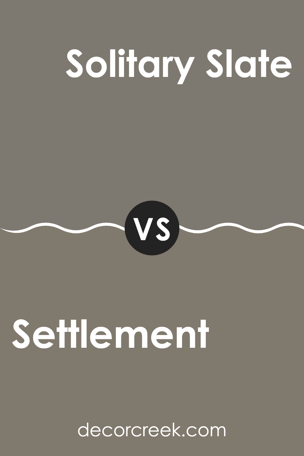
Settlement SW 9594 by Sherwin Williams vs Solitary Slate SW 9598 by Sherwin Williams
Settlement and Solitary Slate are two distinct shades offered by Sherwin Williams. Settlement is a warmer tone, with a beige-brown that brings a cozy and welcoming feel to any space.
It’s the kind of color that fits well in rooms aiming for a friendly and inviting atmosphere, such as living rooms or family areas. In contrast, Solitary Slate is a cooler, muted gray that has a more modern vibe.
This color is perfect for those who prefer a minimalist or contemporary look, and it works especially well in spaces like home offices or bathrooms where you want a clean, calm setting. Both colors offer their unique appeal, whether you’re looking for warmth and coziness with the Settlement or a sleek, stylish look with Solitary Slate.
You can see recommended paint color below:
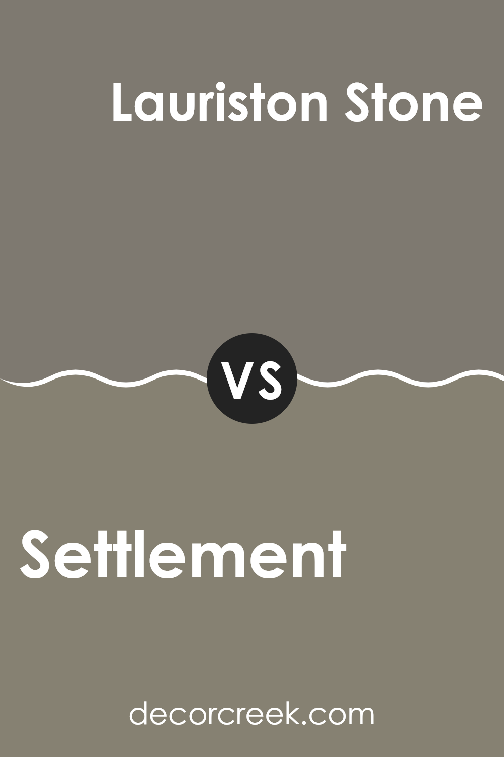
Settlement SW 9594 by Sherwin Williams vs Lauriston Stone SW 9593 by Sherwin Williams
Settlement SW 9594 by Sherwin Williams is a warm and cozy shade, much like a dark beige with hints of brown. It’s the kind of color that makes a space feel welcoming and snug, perfect for rooms where you want to relax or gather with family.
On the other hand, Lauriston Stone SW 9593, also by Sherwin Williams, is slightly lighter, resembling a soft gray with beige undertones. This color has a fresh, clean appeal that can brighten up a room while still keeping things calm and neutral.
Both colors are quite versatile and work well in various decor styles, but while Settlement adds a touch of warmth and depth, Lauriston Stone offers a lighter, airier feel, potentially making small spaces appear larger. These colors can easily complement each other in different parts of a home for a seamless look.
You can see recommended paint color below:
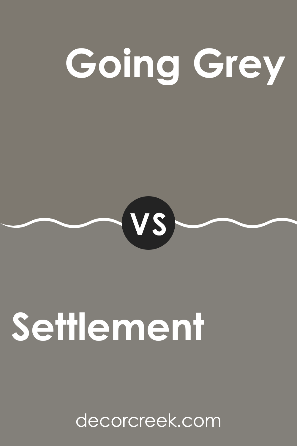
Settlement SW 9594 by Sherwin Williams vs Going Grey SW 9554 by Sherwin Williams
Settlement and Going Grey by Sherwin Williams are two distinct shades that can set quite different moods in a space. Settlement is a rich, deep brown with subtle hints of red, creating a warm and welcoming atmosphere. This color is ideal for cozy, inviting spaces such as living rooms or dining areas where a sense of comfort is desired.
On the other hand, Going Grey is a light, airy gray that feels modern and fresh. It’s a versatile color that works well in a variety of settings, helping to brighten up a room and give it a clean, sleek look. Going Grey can be particularly effective in smaller spaces or rooms that lack natural light, as it can help make them appear more spacious and open.
When comparing the two, Settlement offers a traditional warmth, while Going Grey provides a contemporary coolness, each bringing its own unique vibe to interiors.
You can see recommended paint color below:
- SW 9554 Going Grey
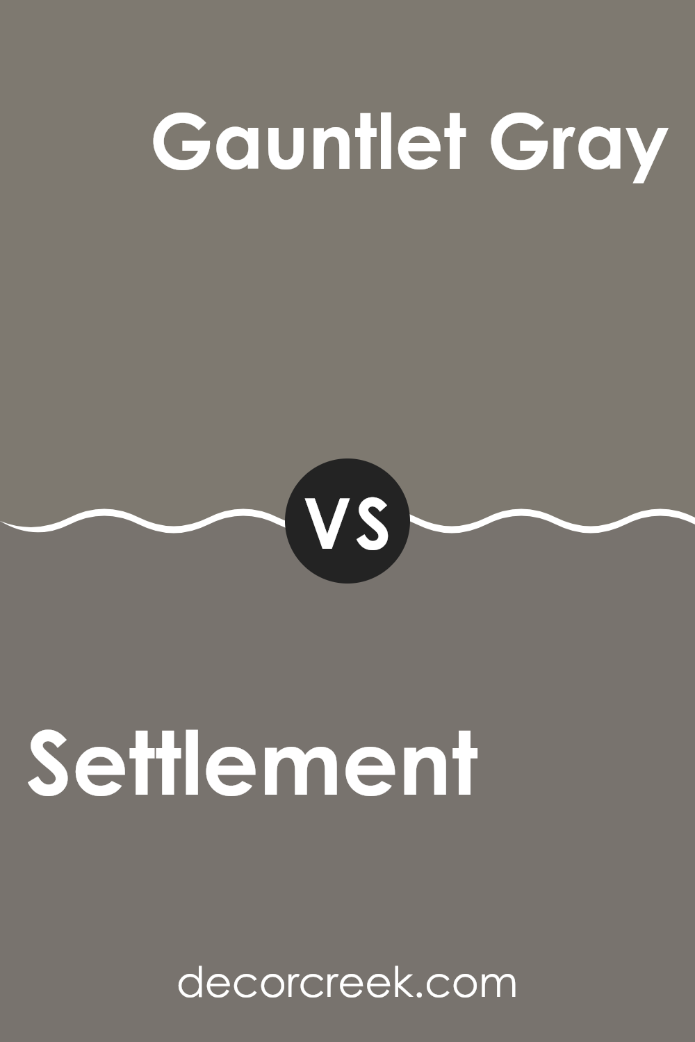
Settlement SW 9594 by Sherwin Williams vs Gauntlet Gray SW 7019 by Sherwin Williams
Settlement and Gauntlet Gray are both offered by Sherwin Williams, showcasing distinct yet complementary gray hues. Settlement presents as a light, fresh gray, giving a room an airy and open feel; it works particularly well in spaces aiming for a minimalistic and clean look.
In contrast, Gauntlet Gray is much darker, delivering a strong, bold presence that can anchor a room or accentuate trim and other architectural features.
While Settlement tends to blend seamlessly with various decors, enhancing natural light and space, Gauntlet Gray commands attention and pairs well with brighter or lighter colors, providing striking contrasts. Together, these colors can be used to create a balanced, modern ambiance in any home, with Gauntlet Gray grounding the space and Settlement offering a gentle backdrop.
You can see recommended paint color below:
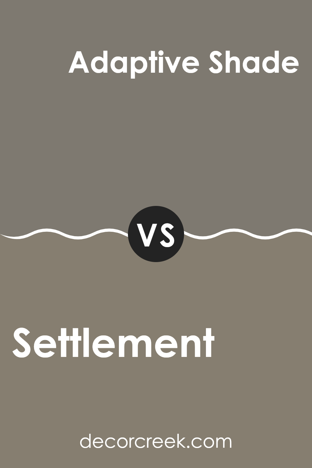
Settlement SW 9594 by Sherwin Williams vs Adaptive Shade SW 7053 by Sherwin Williams
Settlement SW 9594 by Sherwin Williams is a rich and deep brown with a warm undertone. It creates a cozy and inviting atmosphere, perfect for spaces where you want to feel snug and relaxed, like living rooms or bedrooms. This color works well with natural materials like wood and leather, enhancing their natural beauty.
On the other hand, Adaptive Shade SW 7053 by Sherwin Williams is a versatile gray that leans slightly towards blue. It’s a cooler color compared to Settlement, making it ideal for creating a fresh and modern look. Adaptive Shade is great for spaces that need a bright and airy feel, such as kitchens, bathrooms, and home offices.
Both Settlement and Adaptive Shade provide unique environments: Settlement offers warmth and comfort, while Adaptive Shade gives a cleaner and more contemporary feel. Yet, they both maintain an understated elegance that can blend well with various decor styles and elements.
You can see recommended paint color below:
Settlement SW 9594 by Sherwin Williams vs Backdrop SW 7025 by Sherwin Williams
Settlement SW 9594 by Sherwin Williams is a warm, creamy beige color that creates a cozy and inviting atmosphere in any room. It has a soft, neutral palette that makes it easy to pair with a variety of furnishings and decor, providing a subtle backdrop that doesn’t overpower. This color is ideal for living spaces or bedrooms where a calm, understated look is desired.
On the other hand, Backdrop SW 7025 by Sherwin Williams is a deeper, cooler gray that offers a modern, clean look. It’s a versatile color that works well in both traditional and contemporary settings. Backdrop can make small spaces appear larger and is great for creating a crisp, neutral canvas that highlights other colors or design elements in the room.
Both colors are neutral, yet they provide different vibes due to their underlying tones. Settlement brings warmth to a space, while Backdrop offers a more refined, clear presence, making both excellent choices depending on the desired effect and room function.
You can see recommended paint color below:
Settlement SW 9594 by Sherwin Williams vs Anonymous SW 7046 by Sherwin Williams
Settlement SW 9594 by Sherwin Williams is a warm and welcoming beige that brings a cozy vibe to any space. It’s a soft and light color that reflects natural light well, making rooms feel more spacious and inviting. Its earthy undertones help create a comfortable and relaxed atmosphere, ideal for living rooms or bedrooms.
On the other hand, Anonymous SW 7046, also by Sherwin Williams, is a cooler, medium gray shade. This color provides a neutral backdrop that is versatile and easy to pair with various decor styles. Although it’s a darker shade compared to Settlement, it still maintains a neutral feel, making it suitable for modern and minimalistic spaces.
The gray tone of Anonymous is great for adding a bit of depth to a room without overwhelming it with color.
Both colors offer unique benefits: Settlement warms up the room while Anonymous provides a subtle, modern feel. They can be used in different areas depending on the mood or style you want to achieve.
You can see recommended paint color below:
Settlement SW 9594 by Sherwin Williams vs Carriage Stone SW 9614 by Sherwin Williams
Settlement SW 9594 by Sherwin Williams is a rich and earthy shade with deep brown undertones, offering a cozy and warm feel that makes any room feel welcoming. It’s like the color of dark soil or thick tree bark, bringing in a sense of nature and solidity. This color works well in spaces where you want to promote comfort and warmth, such as living rooms or bedrooms.
On the other hand, Carriage Stone SW 9614 is lighter and leans towards a softer gray with a very subtle hint of brown. This color is ideal for creating a modern and clean look, adding a gentle, neutral backdrop that pairs well with more vibrant colors. It’s perfect for areas where you want to enhance natural light, such as kitchens or modern living spaces.
Both colors offer their unique charm, with Settlement providing a deeper, cozier approach, and Carriage Stone giving off a lighter, airier feel. Depending on your style and the atmosphere you want to create, each has its merits in different spaces and styles.
You can see recommended paint color below:
Settlement SW 9594 by Sherwin Williams vs Link Gray SW 6200 by Sherwin Williams
Settlement SW 9594 and Link Gray SW 6200 are both colors by Sherwin Williams, each offering a unique feel for interior spaces. Settlement presents a deeper, beige undertone that offers a warm and welcoming vibe, making it ideal for cozy living areas or bedrooms. This color adds a gentle richness to the walls it covers, providing a subtle backdrop that pairs well with various decor styles from classic to modern.
On the other hand, Link Gray is a lighter, cooler gray that carries a minimalistic and clean look. It suits areas that aim for a modern and straightforward aesthetic, perfect for creating a calm and focused atmosphere in spaces like home offices or kitchens. Its neutral tone makes it easy to match with a wide range of furniture colors and textures.
Both colors are versatile and can effectively enhance the mood and style of a room, but the choice between a warmer beige or a cooler gray depends on the desired ambiance and functional use of the space.
You can see recommended paint color below:
- SW 6200 Link Gray
Settlement SW 9594 by Sherwin Williams vs Attitude Gray SW 7060 by Sherwin Williams
Settlement and Attitude Gray by Sherwin Williams are two distinct colors that offer unique tones for interior spaces. Settlement is a deeper, warm brown hue that provides a cozy and welcoming sensation to rooms.
Its earthy base makes it a perfect choice for living areas or bedrooms where a sense of comfort is desired. On the other hand, Attitude Gray presents a cool, neutral gray shade that brings a modern and clean look.
This color works well in spaces that aim for a contemporary feel, suitable for offices or kitchens. While Settlement adds a hint of traditional warmth, Attitude Gray offers a sleek, minimalist vibe. Both colors work well with various decor styles and can harmonize with different color palettes, depending on the desired effect in the space.
You can see recommended paint color below:
Concluding my thoughts on SW 9594 Settlement by Sherwin Williams, I’ve learned a lot about what makes this paint color special. It’s a unique color that can add a warm and cozy feel to any room in your house. Whether it’s for a living room that needs a touch of comfort or a bedroom that could use some soothing vibes, this color seems to fit just right.
This color isn’t just about looking good; it’s also practical. It works well with many different styles and decoration choices, which makes it a great choice for almost any home. It’s like a friendly color that gets along with every other color and design out there!
Finally, trying out a paint color like SW 9594 Settlement can really change how you feel about a room. It’s like when you put on your favorite sweater and feel instantly better; this color can help do the same for rooms in homes. If you’re thinking of giving a room a new look, this color might be the perfect place to start.
It’s definitely made me interested in seeing how colors can play a big role in bringing a room to life!
Ever wished paint sampling was as easy as sticking a sticker? Guess what? Now it is! Discover Samplize's unique Peel & Stick samples.
Get paint samples

