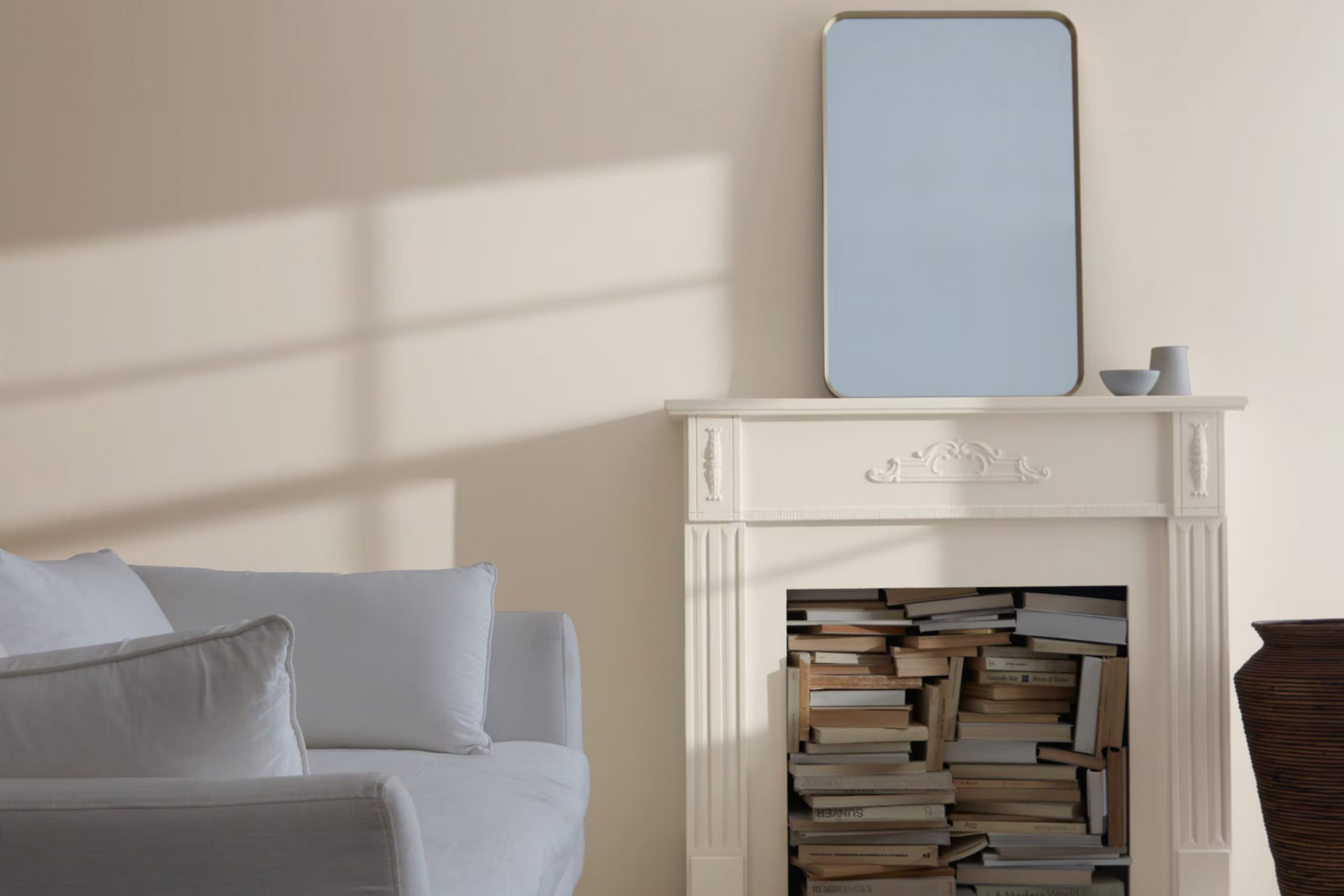
I couldn’t help but be drawn to 861 Shale by Benjamin Moore when I was looking for the perfect paint color for my living room. It’s a shade that sits wonderfully between gray and beige, giving it that sought-after flexibility to fit with different styles and furnishings.
My biggest concern was to choose a color that would keep the room feeling fresh yet inviting, without leaning too much into fleeting trends. The subtle warmth of Shale turned out to be just right. It has a softness that plays well under both natural and artificial light, shifting moodily throughout the day.
I’ve noticed that it complements wood finishes exceptionally well and brings a calm quality to my home that I absolutely love. If you’re in search of a color that provides a neutral backdrop but with more character than plain beige or gray, Shale might be the perfect pick for you.
It’s a choice that feels at once modern and enduring, gently enriching the room without overpowering it.
What Color Is Shale 861 by Benjamin Moore?
Shale 861 by Benjamin Moore is a rich, muted gray shade that strikes a fine balance between warm and cool tones, making it incredibly adaptable for a variety of rooms and styles.
This inviting hue sets a calm, grounded atmosphere, perfect for both residential and commercial interiors. Its subtlety allows it to work exceptionally well in a range of design setups from modern minimalist to classic traditional.
Shale 861 is particularly effective in creating a cozy, welcoming environment. You could use it in living rooms, bedrooms, or study areas where the gentle neutrality of the color supports relaxation and focus. For a seamless look, consider painting the walls and trim in the same color but different finishes; this technique adds texture without overpowering the room with too much contrast.
When it comes to pairing materials, Shale 861 complements natural wood tones beautifully, from pale beech to rich walnut, which enhances its warm undertones. Leather, especially in darker tones, also pairs well by adding a touch of luxury and comfort.
Linen and cotton fabrics in soft whites or contrasting bold colors can break up the monotony, introducing vibrancy and lightness to rooms with Shale 861 as the backdrop. This color also matches well with metallic finishes like brass or copper, offering a touch of modern glamour to the palette.
In terms of interior styles, Shale 861 works best in contemporary, Scandi, and rustic interiors. Its flexibility can help balance brighter elements in eclectic decors or complement the streamlined aesthetic of modern designs.
Is Shale 861 by Benjamin Moore Warm or Cool color?
Benjamin Moore’s Shale 861 is a unique shade that effortlessly fits into most home decor styles, influencing a room’s atmosphere significantly. This color can be seen as a blend between gray and beige, making it an adaptable choice for walls, as it pairs well with a wide range of colors.
Its neutrality allows it to act as a perfect backdrop; it won’t clash with vibrant furnishings but will instead complement them. This makes it an excellent option for anyone wanting to refresh their home without committing to bold, overpowering colors.
Shale 861’s adaptability extends to various rooms too. In a living room or family room, it provides a calming background for relaxation. In a bedroom, it creates a soft, cozy feel that can make the room more inviting. Even in bathrooms or kitchens, where the environment can often feel cold and hard, Shale 861 adds a hint of warmth. Thus, choosing this color can truly renew the feel of a home, making rooms more pleasant to be in.
Undertones of Shale 861 by Benjamin Moore
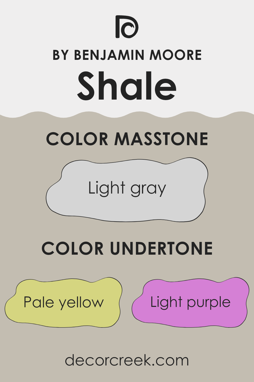
Shale861 by Benjamin Moore is an adaptable shade, subtly influenced by a mix of undertones that affect its appearance under different lighting conditions and surroundings. Undertones are secondary colors that are not immediately apparent but can significantly impact how the main color is perceived.
In the case of Shale861, the undertones include pale yellow, light purple, light blue, pale pink, mint, lilac, and grey. These undertones can make the paint seem warmer, cooler, lighter, or darker depending on the setting. For example, in a room filled with natural light, the pale yellow and light blue undertones may make the walls appear brighter and fresher. In contrast, in a dimly lit room, the grey and lilac can create a more muted and calm feel.
When painting interior walls with Shale861, these undertones can play a key role in decor choices. For instance, in a bedroom, the softness of the light purple and pale pink can encourage a relaxing atmosphere. In a study or office, the mint and grey undertones can help the room feel crisp and focused.
Overall, the mix of undertones in Shale861 allows it to adjust to various interior styles and uses, making it a flexible option for many homes. The choice of complementary colors and furnishings can greatly enhance these effects, making the walls an ideal background or a focal feature, depending on the look you want.
What is the Masstone of the Shale 861 by Benjamin Moore?
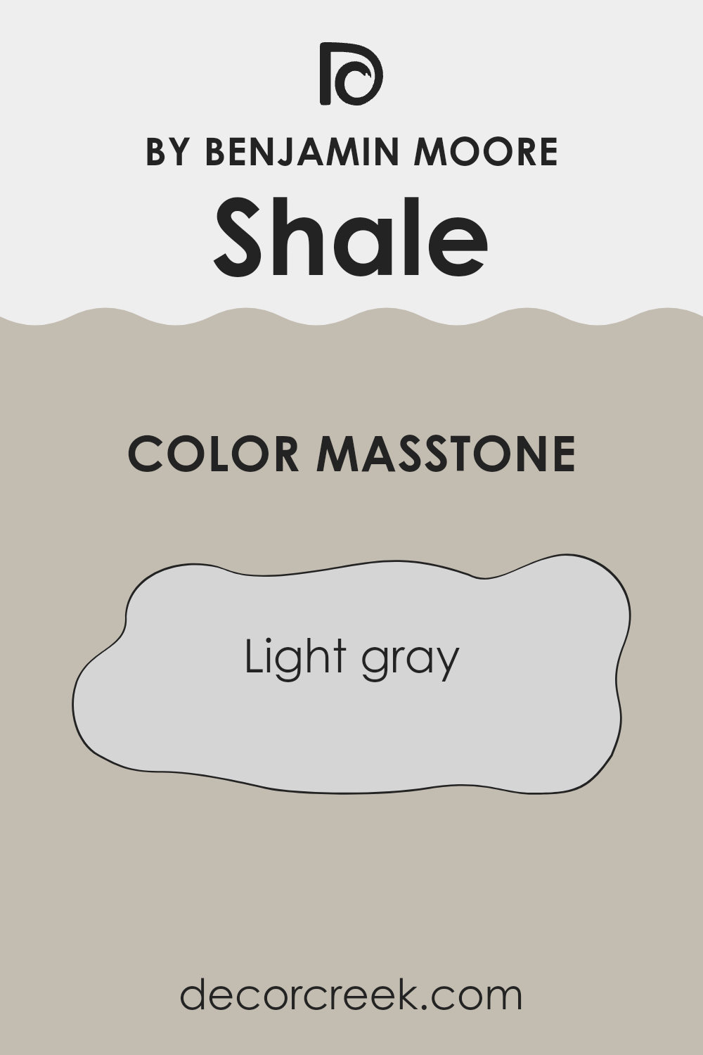
Shale861 by Benjamin Moore is a light gray color, specifically with the masstone of #D5D5D5. This soft shade of gray acts as an adaptable background in any home, making it easy to combine with other colors whether you’re decorating with bright hues or sticking to a more muted palette.
Since it’s such a neutral color, it also does a great job at making rooms seem larger and more open. This is especially helpful in smaller rooms or apartments where you want to create a sense of more openness. Additionally, this light gray is gentle on the eyes, which means it can help create a relaxed atmosphere in places like bedrooms or living rooms where comfort is key.
It’s also very practical for areas that get a lot of use, such as kitchens and bathrooms, because it hides minor dirt and smudges better than a pure white or very light colors might. Overall, Shale861 is a great choice for anyone looking for a flexible and forgiving color that maintains a clean, modern look in their home.
How Does Lighting Affect Shale 861 by Benjamin Moore?
Lighting has a powerful impact on how colors are perceived, and this can be seen clearly with the color Shale from Benjamin Moore, a complex shade that can look quite different depending on the light it is viewed under.
In artificial light, Shale tends to take on a warmer tone because most indoor lighting, like incandescent bulbs, has a yellow cast. This makes Shale appear more inviting and cozy, a perfect choice for living rooms and bedrooms where you want a warm, comfortable feel.
In natural light, the true color of Shale becomes evident. Under the bright, clear light of the sun, it might appear slightly bluer or cooler. This makes it well suited for rooms with ample sunlight where a fresh, clean look is desired.
The orientation of a room also strongly affects how Shale is perceived:
- In north-facing rooms that often have cooler, indirect light, Shale will likely appear as a softer, more muted shade, leaning slightly toward its grey undertones.
- In south-facing rooms, which enjoy plentiful sunlight throughout the day, this color will reveal its richness and depth, showing warm tones that make the room feel welcoming.
- In east-facing rooms, there is bright light in the morning and softer light as the day progresses. Here, Shale will start the day looking vibrant and gradually shift toward a softer tone.
- West-facing rooms experience the opposite of east-facing rooms. Shale will appear more neutral during the day but will warm up in the evening as the sun sets.
These variations make Shale a highly flexible color choice, allowing it to adjust to different rooms and lighting conditions while consistently providing a pleasing aesthetic. This flexibility is a strong advantage, making it a smart choice for many rooms and uses.
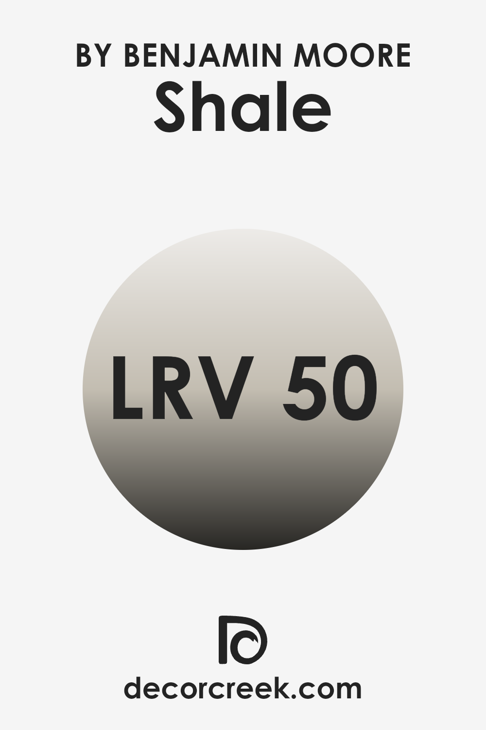
What is the LRV of Shale 861 by Benjamin Moore?
LRV stands for Light Reflectance Value, which is a measure that tells us how much light a paint color reflects. Think of it as a scale where higher values mean the color reflects more light. This is helpful in deciding how a paint color will look in your room.
If a room doesn’t get much natural light, a paint with a high LRV can make the room feel brighter and more open because it reflects more light around the room. On the other hand, colors with a lower LRV can make a room feel cozier because they absorb more light.
The LRV of Shale, which is 50.47, sits right around the middle of the scale. This means it neither reflects light very strongly nor absorbs it heavily. This middle ground makes Shale an adaptable color option for many rooms.
In a well-lit room, it can add a sense of warmth and presence without darkening the room, while in a dimly lit room, it won’t appear too dull. The balanced LRV of Shale means it can adjust well to different lighting situations, keeping the color consistent throughout the day as natural light changes.
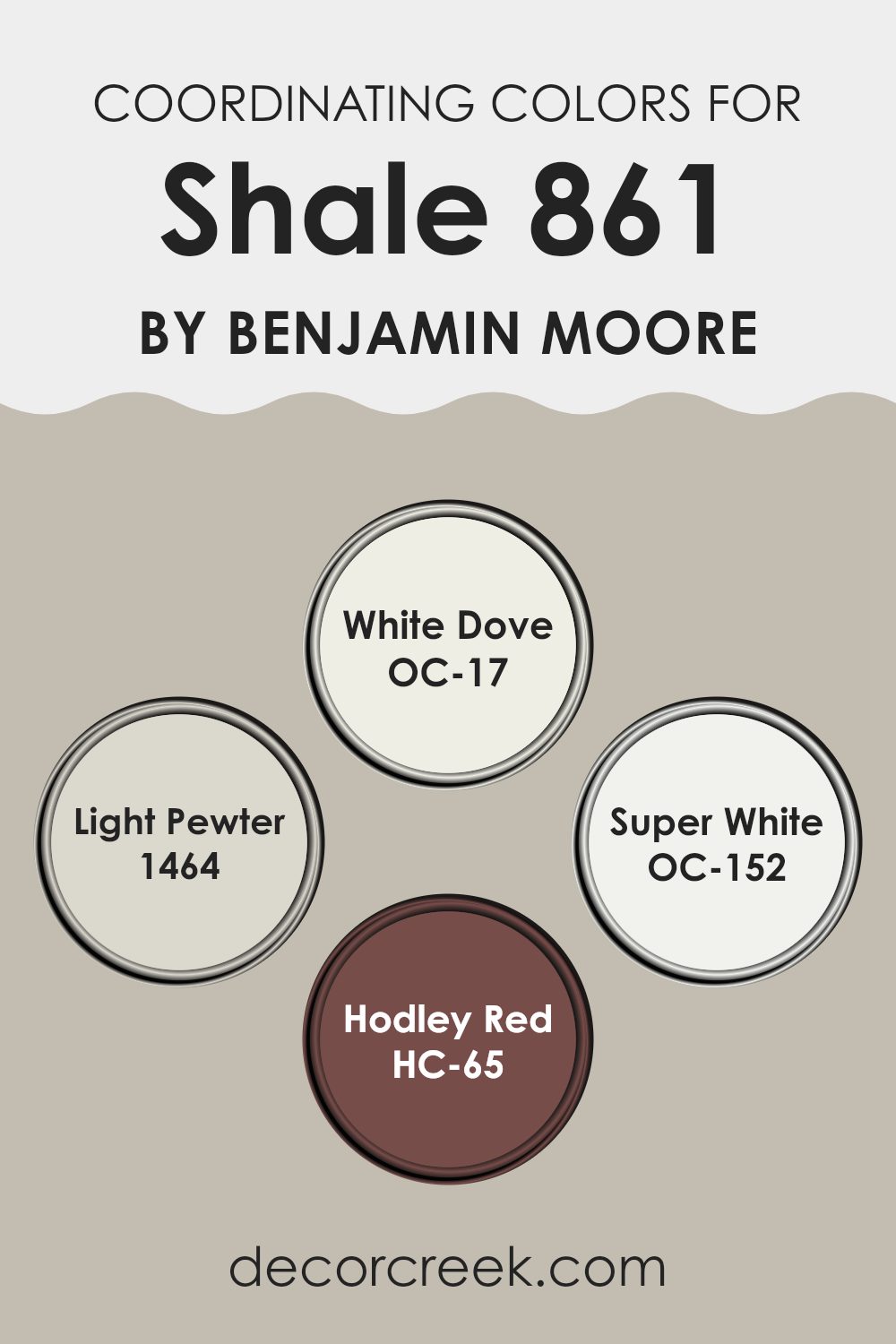
Coordinating Colors of Shale 861 by Benjamin Moore
Coordinating colors are selected hues that work harmoniously together to enhance the overall aesthetic of a room. The concept is based on how different colors interact visually and create a pleasing or balanced effect when used in combination. By choosing coordinating colors, you can ensure that the colors in a room support each other, preventing any one hue from dominating or clashing with others.
For instance, OC-17 White Dove is a soft, warm white that offers a clean backdrop, making it adaptable for any room. It pairs perfectly with bolder shades, bringing out their vibrancy while maintaining a gentle harmony. Light Pewter 1464, on the other hand, is a light gray with warm undertones that serve as an ideal neutral, providing a subtle contrast without overpowering other colors.
OC-152 Super White is a crisp, pure white, ideal for trim and ceilings, as it creates a sharp contrast that can help other colors pop. Lastly, HC-65 Hadley Red is a deep, rich red that brings warmth and depth. It can be used as an accent color to add interest and focus in a room, pairing well with neutrals like those mentioned to balance its intensity.
You can see recommended paint colors below:
- OC-17 White Dove
- 1464 Light Pewter
- OC-152 Super White
- HC-65 Hodley Red
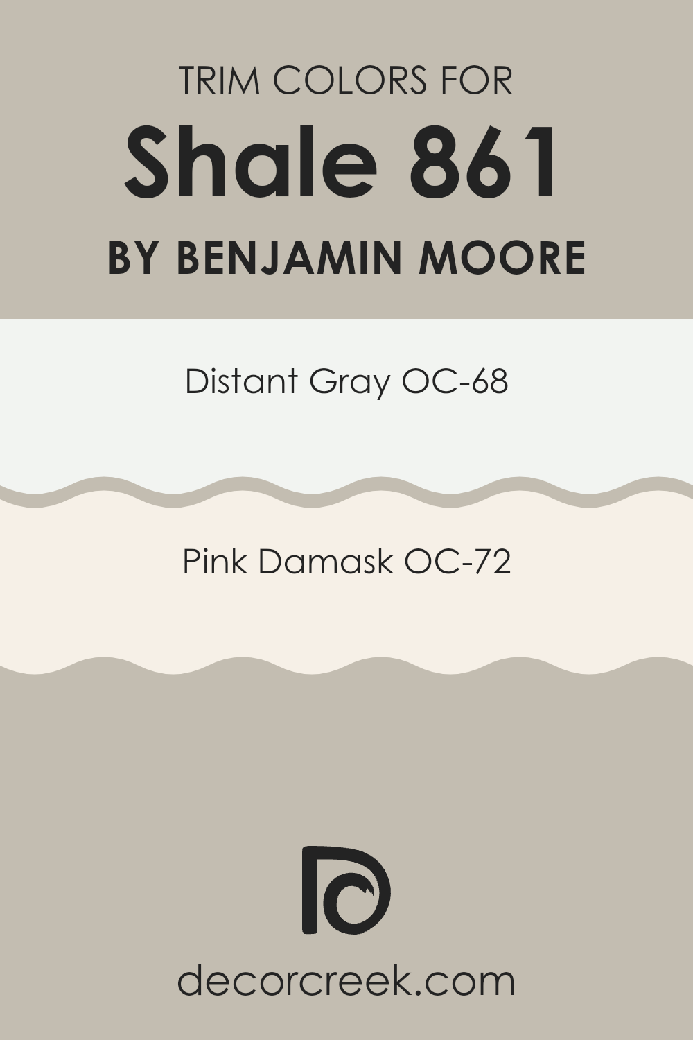
What are the Trim colors of Shale 861 by Benjamin Moore?
Trim colors are used to accentuate the architectural details of a room or exterior, creating a visual framework that complements the primary wall color. When painting Shale 861 by Benjamin Moore, choosing the right trim colors can enhance the softness of the main shade and highlight features like moldings, doors, and window frames.
For instance, trim colors like OC-68 – Distant Gray and OC-72 – Pink Damask offer gentle contrasts that can neatly outline areas without dominating the main color.
OC-68 – Distant Gray is a light and airy gray that provides a crisp, clean look when used as a trim color. It doesn’t compete with the gentle tones of Shale 861, instead giving a fresh boundary to the darker hue. On the other hand, OC-72 – Pink Damask offers a hint of warmth with its pale pink tone, which adds a subtle touch of warmth to the surroundings, providing a soft contrast that fills the room with a welcoming atmosphere.
You can see recommended paint colors below:
- OC-68 Distant Gray
- OC-72 Pink Damask
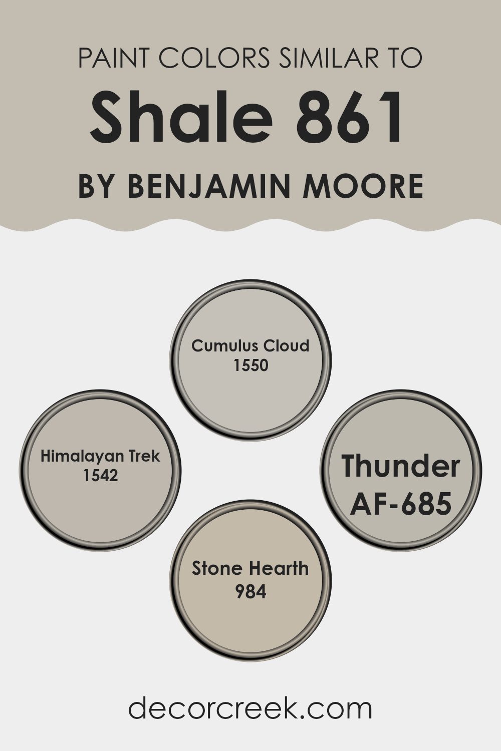
Colors Similar to Shale 861 by Benjamin Moore
Choosing similar colors for a room or a project can be very important as it creates a sense of harmony and continuity that is pleasing to the eye. Colors that are similar to each other like Cumulus Cloud, Himalayan Trek, Thunder, and Stone Hearth, which all share a connection to the gray and taupe families, offer this visual coherence.
This approach can make a room feel well put together and intentional. When using colors that closely resemble each other, the atmosphere of a room can become more cohesive, without stark contrasts that might disrupt the flow of the design.
Each of these colors has its unique charm. Cumulus Cloud is a soft gray that resembles a cloudy sky, offering a calm backdrop that complements more vibrant accents or furniture. Nearby, Himalayan Trek hints at distant mountains with its deeper taupe hue, providing a sturdy and grounding effect perfect for living areas or studies.
Thunder, another gray, offers a slightly stormier feel, which works well in rooms that favor modern aesthetics with a touch of drama. Stone Hearth, finally, is a warm gray with earthy undertones, ideal for creating a cozy and inviting environment, particularly in family rooms or bedrooms. Using these colors together ensures that each room flows into the next with subtle variations in mood and tone.
You can see recommended paint colors below:
- 1550 Cumulus Cloud
- 1542 Himalayan Trek
- AF-685 Thunder
- 984 Stone Hearth
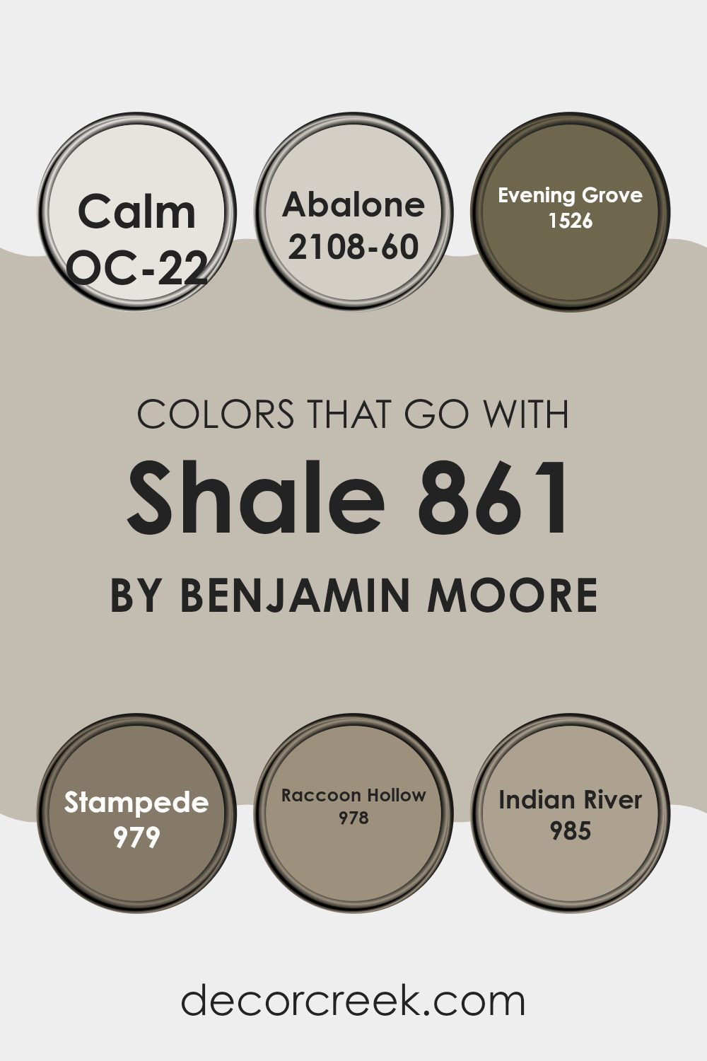
Colors that Go With Shale 861 by Benjamin Moore
Choosing the right colors to complement Shale 861 by Benjamin Moore is crucial because they help create a harmonious and appealing look in any room. The selected colors work together to provide balance and contrast, enhancing the overall aesthetic. By pairing Shale 861 with compatible shades, you can achieve a cohesive design that feels intentional and well thought out.
The color OC-22 – Calm is a soft white with a hint of gray that brings a light and airy feel to a room, making it a perfect backdrop for the deeper tones of Shale 861. Abalone 2108-60 is a gentle blend of beige and gray, which adds a subtle warmth to the environment without overpowering the main shade. Evening Grove 1526 brings a strong and earthy feel to rooms with its deep, forest green, providing a striking contrast to Shale 861.
Stampede 979 is a rich brown hue that echoes natural elements, offering a grounded and comforting feel that pairs beautifully with the softness of Shale. Raccoon Hollow 978 is a medium gray that bridges the gap between light and dark shades in the palette, working well to balance the room’s elements.
Lastly, Indian River 985 is a deeper beige that adds depth to the color scheme, complementing the grays gently while setting a warm atmosphere. Together, these colors enrich the environment by creating layered visual interest that highlights Shale 861’s unique character.
You can see recommended paint colors below:
- OC-22 Calm
- 2108-60 Abalone
- 1526 Evening Grove
- 979 Stampede
- 978 Raccoon Hollow
- 985 Indian River
How to Use Shale 861 by Benjamin Moore In Your Home?
Shale 861 by Benjamin Moore is a flexible paint color that lends a subtle, enduring charm to any room. This gray shade has a hint of warmth, making it an excellent choice for creating a cozy and inviting atmosphere in your home. It works particularly well in living rooms and bedrooms where you want a gentle backdrop that complements various decor styles and colors, from vibrant hues to more muted tones.
Using Shale 861 in your kitchen can also add a fresh and clean look, especially when paired with white cabinets or metallic fixtures. It’s an effective way to update the area without flooding it with color. In bathrooms, this shade can help to create a calm, soothing environment, perfect for relaxing after a long day.
For those who love DIY projects, Shale 861 can be used to refresh furniture or accent walls, providing a modern touch without being too bold. Its adaptability makes it easy to incorporate into existing color schemes, ensuring a seamless integration with your home’s overall look.
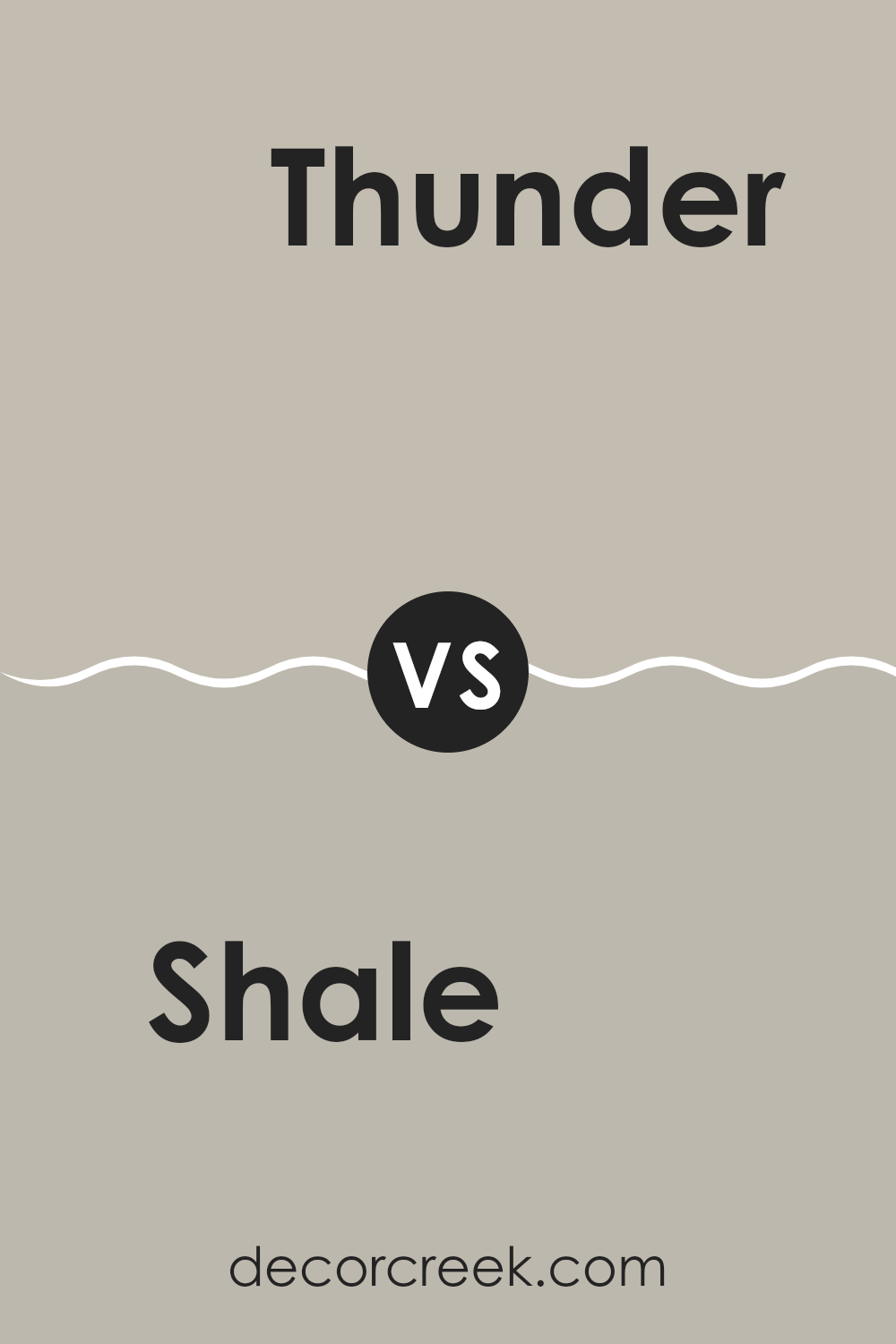
Shale 861 by Benjamin Moore vs Thunder AF-685 by Benjamin Moore
Shale 861 by Benjamin Moore is a soft gray with a hint of warmth, making it cozy and inviting. This adaptable shade works well in various rooms, providing a gentle backdrop that complements both bright and subdued color palettes. It’s perfect for creating a comfortable, low-key environment in your home.
In contrast, Thunder AF-685 by Benjamin Moore is a darker gray with a more pronounced presence. It offers a strong base that can either stand out as a focal point or support bolder colors. Thunder is well suited for those looking to make a more definite statement in their room, yet it still maintains an element of neutrality.
Both colors share a modern feel and offer flexibility in home décor, but their use depends on the desired ambiance and how much you want the walls to take center stage in your design.
You can see recommended paint color below:
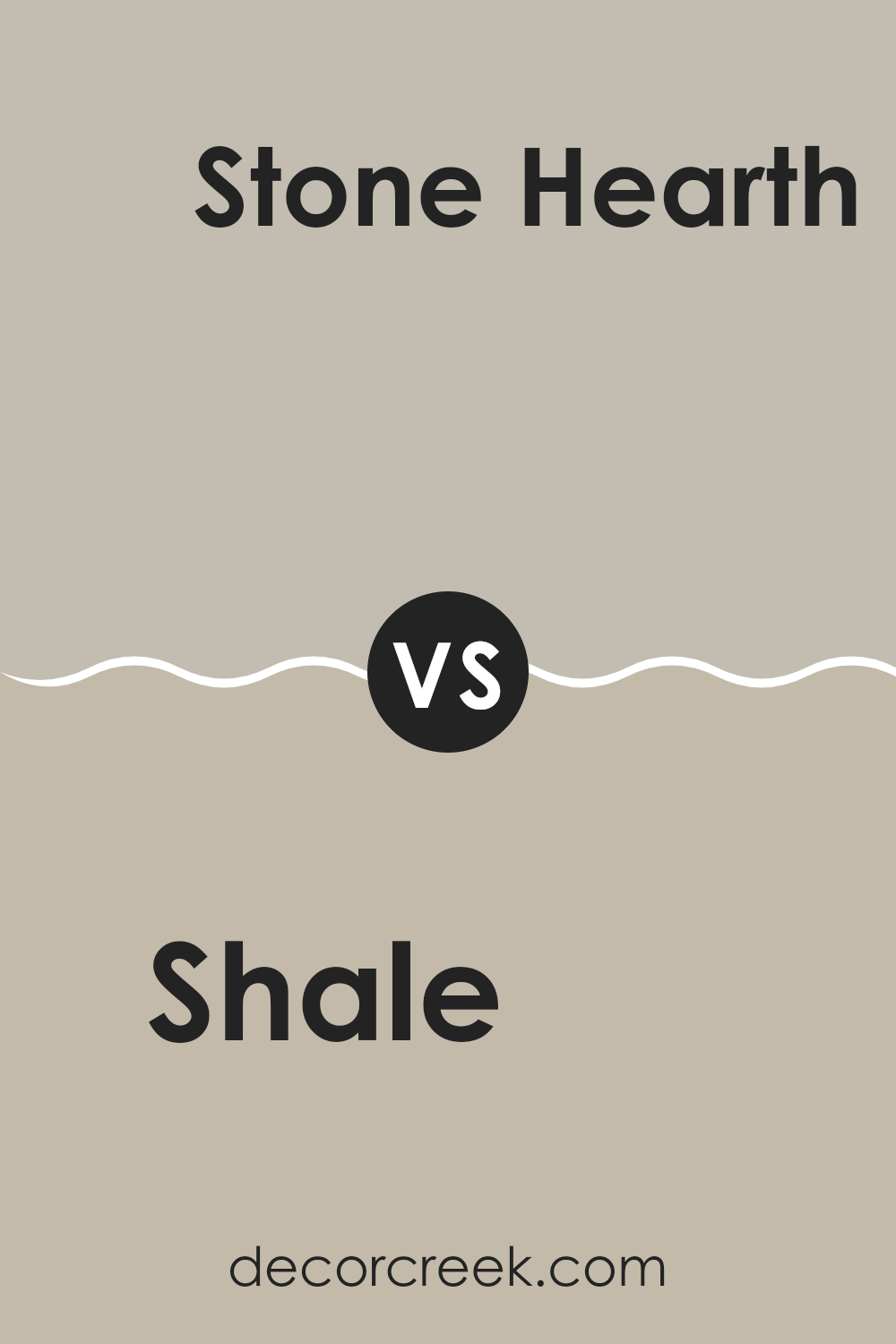
Shale 861 by Benjamin Moore vs Stone Hearth 984 by Benjamin Moore
The main color, Shale, by Benjamin Moore, and the secondary color, Stone Hearth, also by Benjamin Moore, offer subtle yet distinct differences in their hues. Shale has a grayish tone with a hint of blue, giving it a cooler appearance, perfect for creating a calm and modern look in any room. It can pair well with brighter colors or serve as a standalone color for a more muted decor style.
Stone Hearth, on the other hand, is a warmer gray shade with underlying brown tones. This color brings a cozy feel to interiors, making it ideal for areas where a welcoming and comfortable atmosphere is desired. It works beautifully in living rooms, bedrooms, or any room where relaxation is a priority.
Both colors are flexible and can be used in various decorating styles, from contemporary to rustic. Depending on the room’s lighting and the accompanying decor elements, each color can offer a unique feel and can work well together for a cohesive look.
You can see recommended paint color below:
Shale 861 by Benjamin Moore vs Cumulus Cloud 1550 by Benjamin Moore
Shale 861 and Cumulus Cloud 1550 by Benjamin Moore are both neutral colors, but they have distinct tones and feels. Shale 861 is a deeper gray with a touch of brown. This gives it a warm and cozy feel, making it a good choice for rooms where you want a snug, welcoming ambiance like living areas or bedrooms.
On the other hand, Cumulus Cloud 1550 is lighter and leans toward a classic gray. It has the flexibility to work with many decor styles and brings a bright and airy feel to a room. Its lighter shade makes it excellent for smaller rooms or areas you want to appear more open and expansive.
Both colors are muted, which means they can serve as a solid foundation for many color schemes, but their different undertones and depth will influence the mood and feel of the room. Shale 861 works well in a room with rich colors and textures, while Cumulus Cloud 1550 is ideal for a more minimalistic or modern decor.
You can see recommended paint color below:
- 1550 Cumulus Cloud
Shale 861 by Benjamin Moore vs Himalayan Trek 1542 by Benjamin Moore
Shale 861 by Benjamin Moore is a warm gray color with a subtle brown undertone, making it cozy and welcoming. It’s a flexible shade that pairs well with both bright colors and neutral tones, suited for rooms where you want a comforting feel without any starkness.
On the other hand, Himalayan Trek 1542 by Benjamin Moore leans more toward a cooler tone, acting as a light to medium gray with hints of beige. This color creates a calm atmosphere, ideal for areas where you want a peaceful and gentle ambiance. It’s great for a modern look, blending well in rooms that aim for a soft yet airy vibe.
Both colors are quite neutral but bring different elements into a room. Shale 861 offers warmth and a kind of classic feel, making rooms seem cozily enclosed. Himalayan Trek 1542, with its cooler, lighter appearance, gives a more open and fresh perspective. Depending on your room’s needs, either could enhance the decor beautifully.
You can see recommended paint color below:
- 1542 Himalayan Trek
As I finish up writing about the 861 Shale paint color by Benjamin Moore, I can say I’ve learned why it’s a great choice for anyone looking to freshen up their room. It’s a gentle gray that doesn’t shout for attention but adds a cozy feel to any room it’s used in. Whether you paint an entire room or just one wall, it makes the place feel warm and inviting.
What I like most about 861 Shale is how well it goes with other colors. You can pair it with bold colors like blue or soft ones like light pink, and it still looks great. It’s kind of like the quiet kid in class who gets along with everyone.
This color also has a smooth look, making small rooms appear bigger and more open, and it works anywhere, from your bedroom to the living room. It’s like a magic paint that fits in everywhere, making old places look new and fresh without needing a lot of new decorations.
All in all, 861 Shale by Benjamin Moore is a great pick if you want to change up your room without too much fuss. It’s simple, pretty, and does a lot of good in any home. Trying this color could be just what you need to make your favorite spots in your home feel even more special.
Ever wished paint sampling was as easy as sticking a sticker? Guess what? Now it is! Discover Samplize's unique Peel & Stick samples.
Get paint samples

