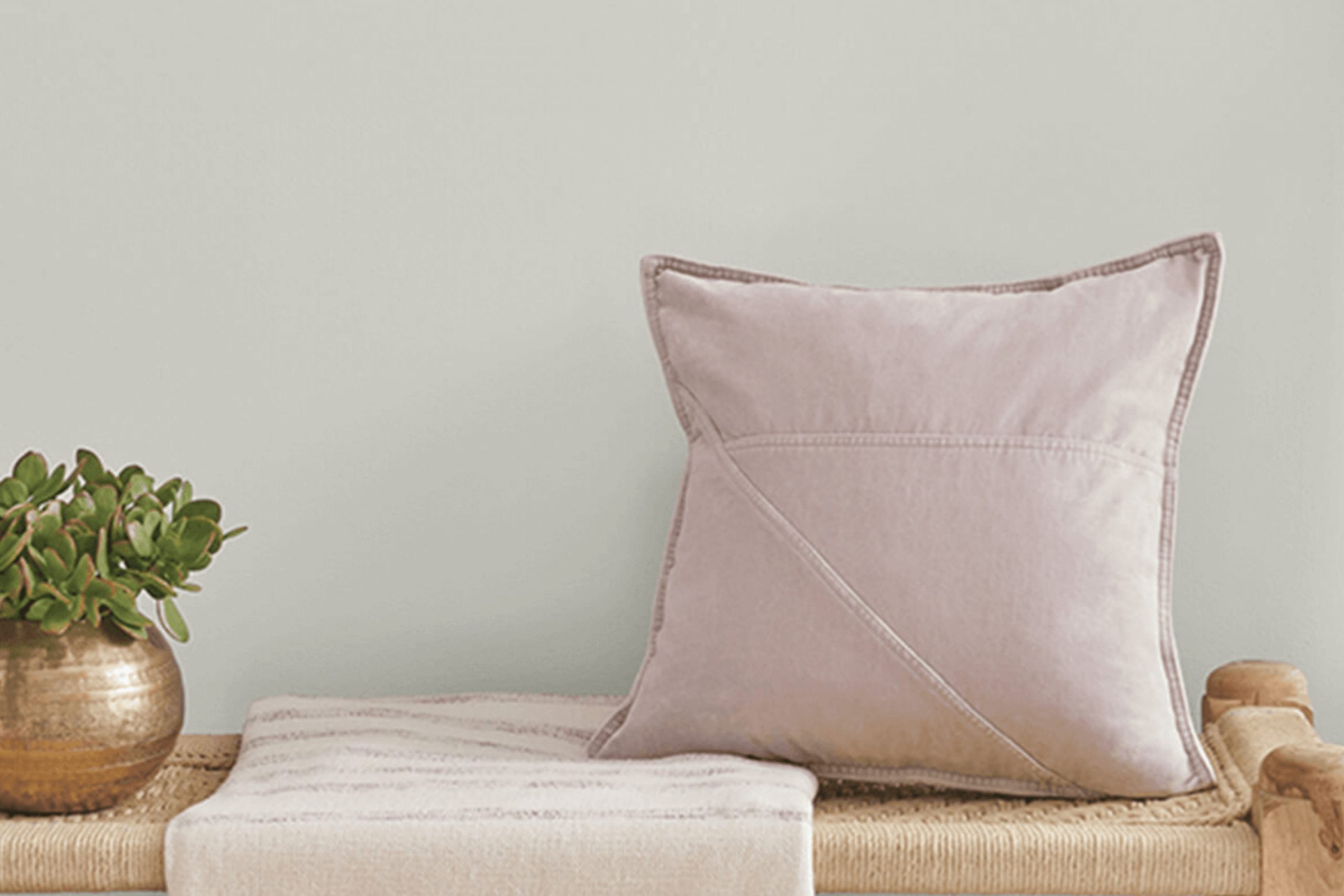
When I first came across SW 7651 Front Porch by Sherwin Williams, I felt as though I had found a shade that truly resonated with the quiet charm of a relaxed afternoon. The gentle hue reminded me of sitting on a cozy front porch, where the world seems to slow down just a bit, and every moment feels a little more at ease.
This color is like a gentle breeze on a warm day, offering just the right blend of subtlety and warmth.
It’s not too bright, yet not too dull, striking the perfect balance. I imagine it would be perfect for creating a calm space in any part of your home.
Whether it’s for the living room walls or an accent in your bedroom, this color has a way of making everything feel more inviting.
Its neutral tone allows it to blend seamlessly with various styles and decors, from modern to traditional.
When I think about how color can affect mood and atmosphere, I believe SW 7651 Front Porch is a perfect choice for those seeking a peaceful, homey vibe. It’s like painting your space with a breath of fresh air.
What Color Is Front Porch SW 7651 by Sherwin Williams?
Front Porch SW 7651 by Sherwin Williams is a soft, neutral gray with cool undertones. It offers a balanced mix of warmth and coolness, making it an adaptable choice for many spaces. This color works well with nearly any design style, but it particularly complements modern, minimalist, and Scandinavian interiors, where simplicity and clean lines are key.
Its subtle tone can act as a soothing backdrop for more vibrant accents, or it can bring harmony to spaces adorned with traditional or rustic décor.
Front Porch pairs beautifully with natural materials like light woods, which emphasize its soft gray hue. It also goes well with metallics such as brushed nickel or stainless steel, offering a sleek, elegant contrast. Texturally, it complements soft fabrics like linen and cotton, creating a cozy and inviting atmosphere.
In spaces where you want a neutral palette, Front Porch can work alongside whites, off-whites, and other neutrals, enhancing a room’s spaciousness and light. For a more dynamic look, consider pairing it with navy blues or soft blush tones.
Its versatility makes it suitable for bedrooms, living rooms, or even kitchens, providing a calm foundation that does not overpower the other elements in the room.
Is Front Porch SW 7651 by Sherwin Williams Warm or Cool color?
Front Porch SW 7651 by Sherwin Williams is a soft, neutral gray paint color. It is versatile and works well in many rooms because it doesn’t overpower a space. Instead, Front Porch creates a calm and comfortable environment, making it a great choice for any living area or bedroom.
Its light tone helps to brighten up a space, especially in rooms with limited natural light, by reflecting available light and making the room appear airy.
This color complements both modern and traditional styles, acting as a background that allows furniture and decorations to stand out. It pairs well with whites, blues, or soft pastels, adding a touch of warmth and making rooms feel inviting.
In addition, Front Porch is a neutral shade that can work with various textures and materials, from wood floors to metal fixtures. It’s a practical choice for those looking to create a cohesive and pleasant atmosphere in their home.
Undertones of Front Porch SW 7651 by Sherwin Williams
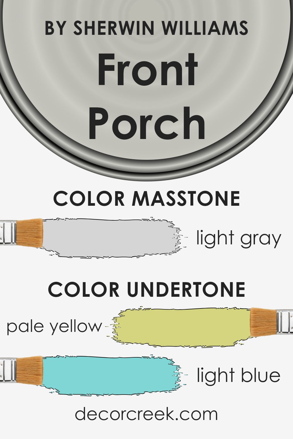
Front Porch by Sherwin Williams is a lovely paint color with a mix of subtle undertones that can affect how we perceive it in a room. These undertones include hints of pale yellow, light blue, light purple, mint, pale pink, lilac, and grey. Such undertones play a significant role in giving depth and complexity to a color. For instance, the grey undertone can create a more neutral and balanced backdrop that adjusts well under different lighting conditions.
The pale yellow and pale pink undertones bring a touch of warmth to the paint, making a room feel cozy and inviting. Meanwhile, the light blue and mint undertones can give a calming effect, which is ideal for creating relaxing spaces such as bedrooms or bathrooms.
The hint of lilac and light purple can add a slight sophistication, lending a delicate and soft atmosphere to the room.
When applied to interior walls, these undertones interact with natural and artificial light, changing the mood and feel of a space. In north-facing rooms, which might be cooler, the warm undertones can make the room feel more welcoming, while in south-facing rooms, the cool undertones help balance out the brightness, providing a pleasing ambiance.
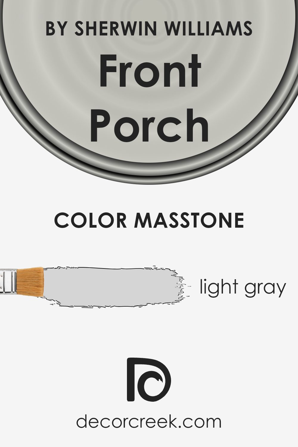
What is the Masstone of the Front Porch SW 7651 by Sherwin Williams?
Front Porch SW 7651 by Sherwin Williams is a light gray color. Its masstone, or the color you see at first glance, is a gentle and soft gray. This makes it a versatile choice for many homes. Light gray is neutral and can complement a variety of styles and décor.
When used in living rooms or bedrooms, it creates a calm and inviting atmosphere. It works well with other colors, making it easy to match with furniture and accessories. Gray also reflects light beautifully, so it can help brighten up a room with limited natural light.
This color works nicely on walls, enhancing both modern and traditional styles. Additionally, it pairs well with both warm and cool tones, offering flexibility in design choices. Homeowners may find it appealing because it provides a sense of freshness without being overwhelming. Overall, light gray is a practical and stylish choice for home interiors.
How Does Lighting Affect Front Porch SW 7651 by Sherwin Williams?
Lighting plays a significant role in how we perceive colors. The same paint color can appear differently depending on the lighting conditions in a room. This is true for the color Front Porch by Sherwin-Williams, a gentle gray that has subtle undertones that can change with the light.
In natural light, Front Porch can show its truest form. When used in a north-facing room, where the light tends to be cooler and more shadowed, the color may appear more blue or even slightly colder than expected. North-facing rooms often look best with colors that have a hint of warmth to balance out the cool light, so Front Porch might seem a bit cooler in these spaces.
In south-facing rooms, which receive plenty of warm, direct sunlight throughout the day, Front Porch will likely appear a bit warmer and lighter. The ample sunlight can highlight the soft warmth in the gray, and the room may feel more inviting as a result.
For east-facing rooms, the light is warm and bright in the morning and becomes more muted as the day progresses.
This morning light can make Front Porch come alive, showing a balanced aspect of its hue. However, as the light fades later in the day, the color may darken slightly, making it appear more muted or neutral.
In west-facing rooms, the light is cooler in the mornings and becomes warmer and more intense in the late afternoon and evening. Front Porch will start the day appearing more subdued, possibly cooler, and will become warmer and more pronounced as the sun sets.
The changing light throughout the day can give a dynamic quality to the space, showcasing different aspects of the color.
In artificial lighting, the tone of the light bulb can influence Front Porch. Warm yellow lights can give it a cozier feel, while cooler white lights may enhance the cooler tones, making it appear more neutral or slightly blue.

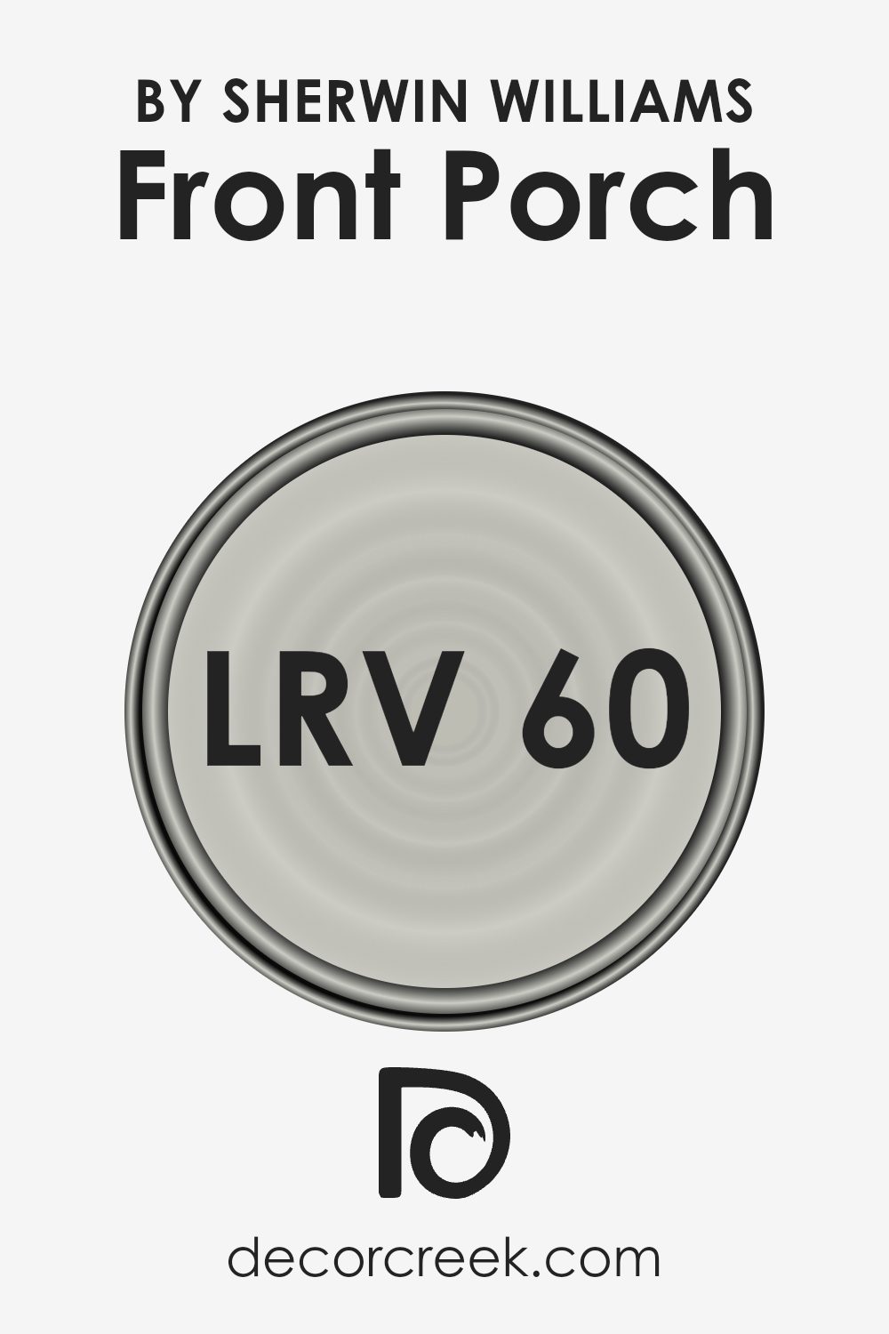
What is the LRV of Front Porch SW 7651 by Sherwin Williams?
LRV, or Light Reflectance Value, is an important number to consider when choosing paint colors. It tells you how much light a color will reflect or absorb when it’s applied to a surface. The scale runs from 0 to 100, with 0 meaning the color absorbs all light (like deep black) and 100 meaning it reflects all light (like pure white).
A higher LRV means the color will reflect more light back into the room, making it feel brighter and more spacious. Conversely, a lower LRV means a color will absorb more light, potentially making a space feel cozier and more intimate.
For the color Front Porch by Sherwin-Williams, which has an LRV of 60.16, it sits comfortably in the middle range of the scale. This means it has a moderate ability to reflect light, making it a reasonably versatile choice for various spaces. With an LRV of 60.16, Front Porch will brighten a room without overpowering it.
This makes it an excellent option for rooms where you want to maintain a light and airy feel, but still provide some warmth and depth. The color won’t make a room feel too stark or washed out, yet it will prevent spaces from feeling too dark or confined. It’s a balanced choice that can work well in many different lighting conditions.
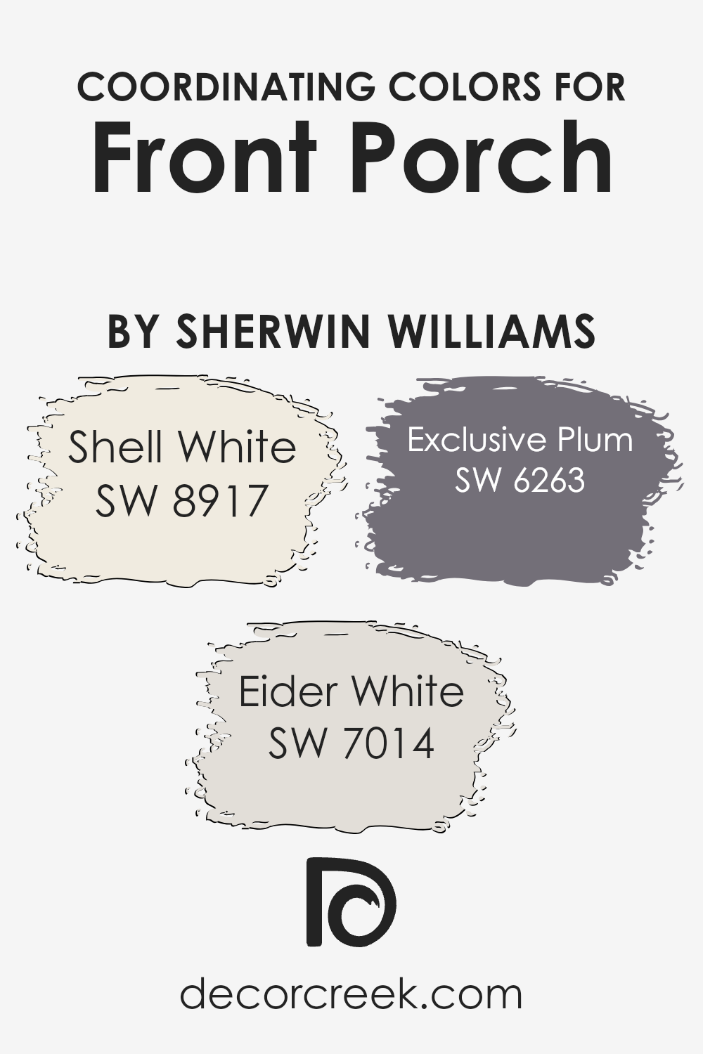
Coordinating Colors of Front Porch SW 7651 by Sherwin Williams
Coordinating colors are hues that complement each other, creating a cohesive and visually appealing palette within a space. They are chosen based on how well they work together to enhance the overall aesthetic. FRONT PORCH by Sherwin Williams serves as a versatile, neutral backdrop.
To create harmony, you might pair it with Shell White, Eider White, and Exclusive Plum. These colors work together to form a balanced and inviting atmosphere.
Shell White is a soft, creamy off-white that adds warmth without overwhelming other colors. It serves as a gentle, understated companion to more vibrant tones. Eider White, on the other hand, is a cool, light gray with a hint of warmth, offering a subtle contrast to brighter accents.
It provides a neutral foundation that’s perfect for creating a calming environment. Exclusive Plum introduces a rich, deep purple that adds depth and a touch of elegance. This dark hue can accentuate certain features in a room, providing an eye-catching contrast to the more subdued tones.
Together, these colors create a harmonious blend that can suit a variety of styles, from modern to traditional, making any space feel both inviting and cohesive.
You can see recommended paint colors below:
- SW 8917 Shell White
- SW 7014 Eider White
- SW 6263 Exclusive Plum
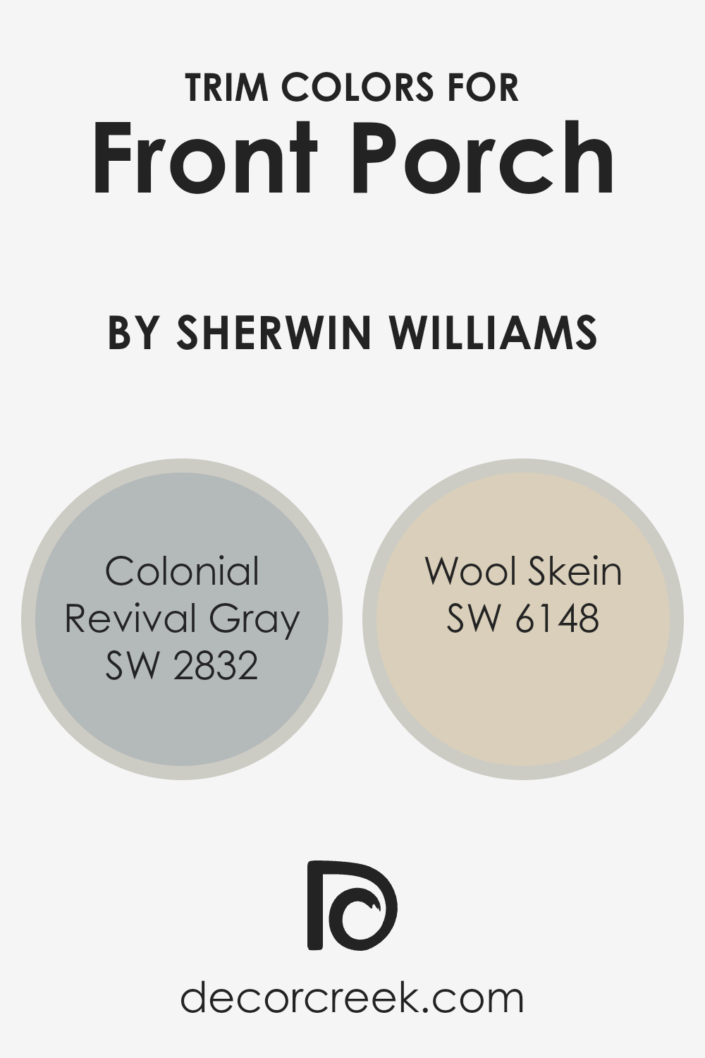
What are the Trim colors of Front Porch SW 7651 by Sherwin Williams?
Trim colors are the shades used on the edges or borders of buildings to frame the primary color and provide contrast or harmony. They’re important for highlighting architectural details. For Front Porch by Sherwin Williams, choosing the right trim colors enhances its subtle blue-gray tone, making it stand out while maintaining a welcoming vibe for your home exterior.
Trim colors can make the overall look cohesive by adding depth. They enhance the character of the exterior and help the primary color shine.
Colonial Revival Gray, with its soft gray hue, brings a touch of traditional elegance and works well to complement Front Porch’s gentle blue-gray. This shade is perfect for adding a historical charm without feeling dated. On the other hand, Wool Skein is a warm and inviting beige, which provides a subtle contrast to the cool tones of Front Porch while keeping the overall look cohesive and welcoming. Both trim colors work seamlessly with Front Porch to create an inviting atmosphere that is both timeless and appealing.
You can see recommended paint colors below:
- SW 2832 Colonial Revival Gray
- SW 6148 Wool Skein
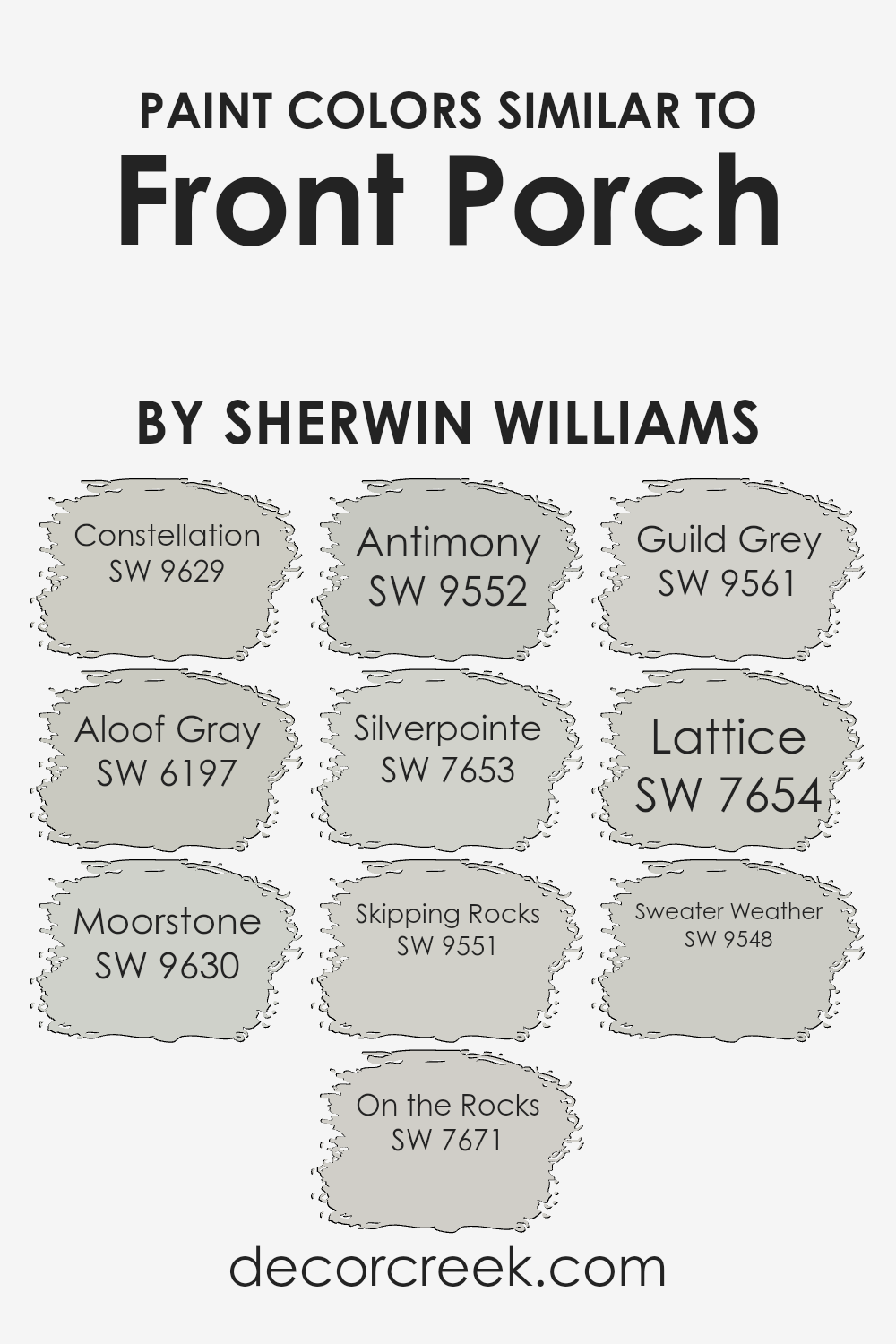
Colors Similar to Front Porch SW 7651 by Sherwin Williams
Choosing similar colors is important for creating a harmonious and balanced space. For example, colors like Constellation, Aloof Gray, and Moorstone share a cool, muted tone with SW 7651 Front Porch. Constellation is a light, airy blue that evokes a peaceful sky, while Aloof Gray offers a warm gray with subtle green undertones, perfect for adding a hint of nature indoors.
Moorstone presents a deeper gray with blue notes, lending a cozy depth to any room. These shades complement each other, providing a seamless transition that maintains unity and flow within your space.
On the Rocks, Silverpointe, and Lattice expand the family with gentle gray hues. On the Rocks is a fresh, soft gray that feels open and inviting. Silverpointe adds a hint of silver, contributing a slight metallic sheen for a modern touch. Skipping Rocks and Guild Grey add layers with earthy grays that bring subtle complexity.
Skipping Rocks carries a warm, earthy undertone, while Guild Grey has a darker, grounded feel. Antimony, with its cool, metallic hint, and Sweater Weather, with its comforting, deep gray, round out this palette. These similar colors work together, creating a calm and cohesive environment while allowing each tone to subtly enhance the space.
You can see recommended paint colors below:
- SW 9629 Constellation
- SW 6197 Aloof Gray
- SW 9630 Moorstone
- SW 7671 On the Rocks
- SW 9552 Antimony
- SW 7653 Silverpointe
- SW 9551 Skipping Rocks
- SW 9561 Guild Grey
- SW 7654 Lattice
- SW 9548 Sweater Weather
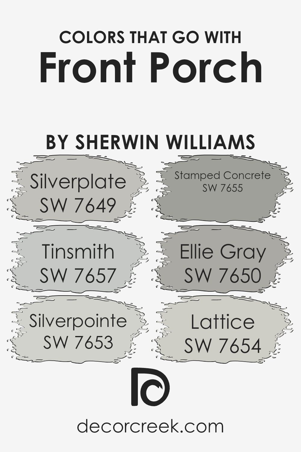
Colors that Go With Front Porch SW 7651 by Sherwin Williams
Colors that match well with Front Porch SW 7651 by Sherwin Williams are important because they create a sense of harmony and balance in a space. These complementary hues work together to enhance the aesthetic appeal of any room.
Front Porch is a light gray with subtle warmth, making it versatile and easy to coordinate with a range of tones. Pairing it with colors like SW 7649 – Silverplate, a cool gray with a silvery touch, and SW 7657 – Tinsmith, a light gray that leans towards blue, can help maintain a clean and refreshing atmosphere.
Meanwhile, SW 7653 – Silverpointe, a soft blend of gray and beige, adds a gentle touch, making spaces feel more inviting.
SW 7655 – Stamped Concrete is a medium gray with a more industrial feel, perfect for adding some depth and strength to an area. On the other hand, SW 7650 – Ellie Gray provides a rich and deeper hue, enhancing the mood by bringing a touch of elegance and grounding to your color scheme.
Finally, SW 7654 – Lattice is a subtle, pale gray that can help lighten and open up a space. By carefully selecting these complementary colors, you can achieve a balanced and cohesive look in any room, enhancing the natural beauty of Front Porch SW 7651.
You can see recommended paint colors below:
- SW 7649 Silverplate
- SW 7657 Tinsmith
- SW 7653 Silverpointe
- SW 7655 Stamped Concrete
- SW 7650 Ellie Gray
- SW 7654 Lattice
How to Use Front Porch SW 7651 by Sherwin Williams In Your Home?
Front Porch SW 7651 by Sherwin Williams is a versatile and calming light gray paint that works well in many parts of the home. Its soft, neutral tone can complement various decor styles, from modern to traditional. This color is ideal for living rooms, bedrooms, or even kitchens, providing a gentle backdrop that lets furniture and decor stand out without overwhelming the space.
In a living room, it can create a peaceful and cozy atmosphere, especially when paired with white or wood accents. In the bedroom, Front Porch can promote relaxation, making it easier to unwind.
Additionally, this color can be used in a dining room to provide a sophisticated backdrop for gatherings without making the space feel too formal. Because of its neutral quality, it can also work well for exterior spaces, offering a timeless look for siding or even a welcoming shade for an actual front porch.
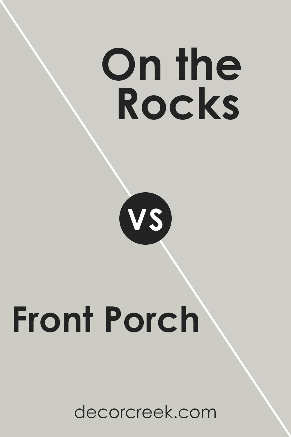
Front Porch SW 7651 by Sherwin Williams vs On the Rocks SW 7671 by Sherwin Williams
Front Porch and On the Rocks are both popular paint colors by Sherwin Williams, but they offer distinct vibes. Front Porch SW 7651 is a soft, warm gray with slight beige undertones. It feels cozy and inviting, making it a great choice for living rooms or bedrooms where you want a gentle, soothing atmosphere.
On the Rocks SW 7671, on the other hand, is a cooler, light gray. It has a crisp, clean feel, which works well in modern spaces or areas where you want a fresh, airy look, like bathrooms or kitchens.
When comparing the two, Front Porch has a bit more warmth, adding a comforting touch. Meanwhile, On the Rocks provides a more neutral and contemporary aesthetic. Both colors are versatile and can be paired with a wide range of accents, but the choice depends on whether you’re aiming for a warmer or cooler mood in your space.
You can see recommended paint color below:
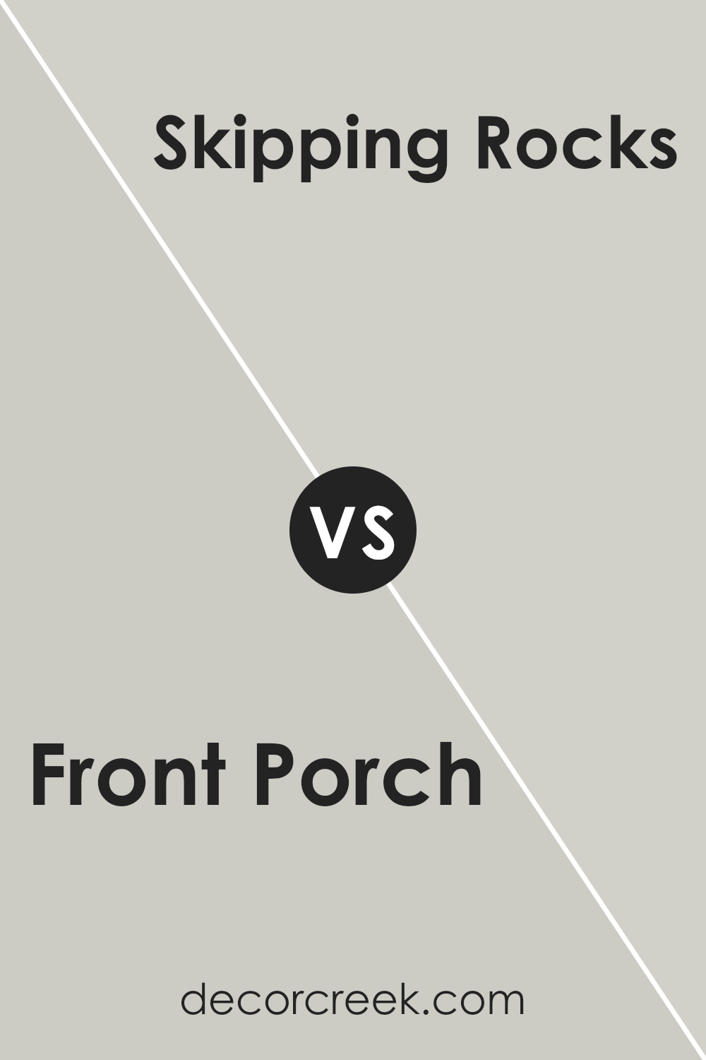
Front Porch SW 7651 by Sherwin Williams vs Skipping Rocks SW 9551 by Sherwin Williams
Front Porch SW 7651 and Skipping Rocks SW 9551 by Sherwin Williams are two soothing, neutral colors that bring a sense of calm to any space. Front Porch is a warm gray with hints of beige, creating a cozy and inviting atmosphere. It works well in living rooms, bedrooms, and spaces where you want a comforting feel.
Skipping Rocks, on the other hand, is a cooler gray with subtle blue undertones. This color brings freshness and a more modern touch to a room. It’s ideal for bathrooms, kitchens, or any area where you want to introduce a light, airy vibe.
While both colors are versatile, Front Porch leans warmer and is perfect for adding warmth to a space, whereas Skipping Rocks is cooler and provides a crisp, clean look. Both colors pair beautifully with whites and natural woods, making them excellent choices for various design styles.
You can see recommended paint color below:
- SW 9551 Skipping Rocks
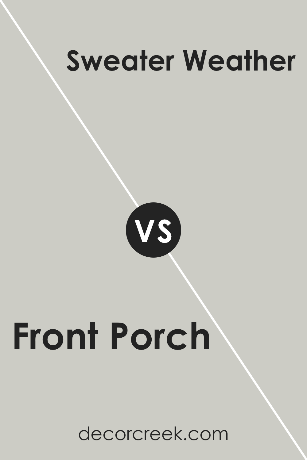
Front Porch SW 7651 by Sherwin Williams vs Sweater Weather SW 9548 by Sherwin Williams
Front Porch SW 7651 is a soft, light gray with warm undertones, giving it a cozy and inviting feel. It’s versatile and works well in many settings, providing a neutral backdrop that blends seamlessly with various décor styles. This color is subtle and understated, making spaces feel calm and comfortable.
Sweater Weather SW 9548, on the other hand, is a deeper, richer gray with cool undertones. It has a stronger presence and can create a more dramatic and cozy atmosphere. This shade is ideal for adding depth and a bit of contrast to a room without being overpowering.
While both colors are gray, Front Porch is lighter and warmer, suitable for creating an airy and open feel. Sweater Weather is darker and cooler, perfect for a more intimate and snug ambiance. Depending on the desired mood, either color can be a great choice to enhance your space.
You can see recommended paint color below:
- SW 9548 Sweater Weather
Front Porch SW 7651 by Sherwin Williams vs Silverpointe SW 7653 by Sherwin Williams
Front Porch SW 7651 by Sherwin Williams is a versatile gray paint with warm undertones. It provides a cozy and inviting atmosphere, making it a great choice for living rooms or bedrooms. The warmth in Front Porch can complement wood accents and gives a comforting, homey feel.
On the other hand, Silverpointe SW 7653 by Sherwin Williams is another shade of gray but with cooler undertones. This paint color has hints of blue, giving it a crisp and refreshing look. Silverpointe works well in spaces where you want a clean and modern vibe, such as kitchens or bathrooms.
Comparing the two, Front Porch feels warm and inviting, while Silverpointe appears more modern and cool. Choosing between them depends on the mood you want to create in your space. Front Porch is ideal for warmth and coziness, whereas Silverpointe suits a fresh and airy atmosphere.
You can see recommended paint color below:
Front Porch SW 7651 by Sherwin Williams vs Antimony SW 9552 by Sherwin Williams
Front Porch (SW 7651) by Sherwin Williams is a soft, muted gray with warm undertones. This color has a cozy and inviting feel, making it perfect for creating a comfortable and relaxing atmosphere in any room. It pairs well with both warm and cool accents, allowing flexibility in design choices.
On the other hand, Antimony (SW 9552) is a deeper shade with a stronger gray tone. It carries a more modern and sophisticated vibe, lending itself well to contemporary spaces. Antimony has a slightly cooler undertone compared to Front Porch, which can add a sleek and polished look to a room.
When comparing the two, Front Porch feels more light and airy, ideal for spaces where you want to maintain openness. Antimony feels more grounded and could be used as an accent or primary color for a bold statement. Both colors are versatile, but Front Porch leans towards warmth, while Antimony has a cooler, more modern edge.
You can see recommended paint color below:
Front Porch SW 7651 by Sherwin Williams vs Guild Grey SW 9561 by Sherwin Williams
Front Porch SW 7651 and Guild Grey SW 9561 by Sherwin Williams are two shades of gray with distinct undertones. Front Porch is a cool gray with subtle hints of blue, which gives it a crisp, clean appearance. It’s versatile and pairs well with both cool and warm tones, making it suitable for various spaces like living rooms or bedrooms.
Guild Grey, on the other hand, leans slightly warmer with soft green undertones. This makes it feel a bit cozier compared to Front Porch. Guild Grey works well in areas like kitchens or bathrooms where you want a bit of warmth without losing the neutral gray feel.
Both colors offer a neutral base that can complement many styles of decor. While Front Porch provides a modern, airy feel, Guild Grey offers a touch of warmth and comfort. Depending on the mood you want to create, either color can be a great choice for your home.
You can see recommended paint color below:

Front Porch SW 7651 by Sherwin Williams vs Constellation SW 9629 by Sherwin Williams
Front Porch SW 7651 and Constellation SW 9629 by Sherwin Williams are two unique colors with their own charm. Front Porch is a soft, warm gray that has a cozy and welcoming feel. It’s versatile and can complement a range of design styles, making spaces feel inviting and comfortable.
On the other hand, Constellation is a cool blue with a slight hint of gray. It evokes a calm and peaceful atmosphere, perfect for areas where relaxation is key. This color brings a touch of elegance and freshness, suitable for bedrooms or bathrooms.
While Front Porch blends warmth with neutrality, giving off a homely vibe, Constellation leans towards a refreshing and airy feel because of its cooler tones. Both colors can work beautifully in different parts of a home, but choosing between them depends on whether you prefer a warm, cozy ambiance or a cool, calming effect.
You can see recommended paint color below:
Front Porch SW 7651 by Sherwin Williams vs Lattice SW 7654 by Sherwin Williams
Front Porch SW 7651 and Lattice SW 7654 are both light and versatile shades by Sherwin Williams, suitable for creating calm spaces. Front Porch is a warm gray with subtle green undertones, giving a cozy and inviting feel, perfect for living rooms or bedrooms. It provides a balanced backdrop that pairs well with both warm and cool colors.
Lattice SW 7654 is slightly cooler compared to Front Porch. It includes blue undertones, making it feel breezy and refreshing.
Lattice is excellent for areas you want to feel open and airy, such as kitchens or bathrooms. Both colors are neutral and can fit into various design styles. Front Porch leans towards a welcoming warmth, while Lattice offers a serene and cool environment. Choosing between them will depend on whether you want a warmer or cooler aesthetic for your space.
You can see recommended paint color below:
- SW 7654 Lattice
Front Porch SW 7651 by Sherwin Williams vs Moorstone SW 9630 by Sherwin Williams
Front Porch SW 7651 and Moorstone SW 9630 by Sherwin Williams are two distinct yet complementary colors. Front Porch is a soft, muted gray with a hint of warmth. It’s versatile and blends well with both cool and warm tones, making it a popular choice for interior and exterior spaces. It provides a calm, neutral backdrop without being overly cool or stark.
Moorstone SW 9630, on the other hand, is a deeper and richer gray. It carries a bolder presence, making it ideal for creating a striking accent or feature wall. The added depth of Moorstone gives it a more commanding feel, which can add contrast when paired with lighter shades like Front Porch.
Together, these two colors can create a balanced and harmonious palette. Front Porch can be used for larger areas to keep spaces light and open, while Moorstone can be used strategically to add depth and interest.
You can see recommended paint color below:
Front Porch SW 7651 by Sherwin Williams vs Aloof Gray SW 6197 by Sherwin Williams
Front Porch SW 7651 by Sherwin Williams is a warm gray with a touch of beige, giving it a cozy and inviting feel. It’s versatile and works well in living spaces where you want a comfortable atmosphere. The subtle warmth makes it suitable for both traditional and modern decor.
On the other hand, Aloof Gray SW 6197 is a cooler gray with a hint of green. This color feels more crisp and modern due to its cooler undertones. It’s a great choice for spaces where you want a clean and fresh look. It can also complement natural elements like wood or stone.
Both colors are neutral, but Front Porch is more warm and inviting, while Aloof Gray offers a cooler, more contemporary vibe. When choosing between the two, consider the mood you want to create: cozy with Front Porch or cool and clean with Aloof Gray.
You can see recommended paint color below:
Conclusion
After learning about SW 7651 Front Porch paint by Sherwin Williams, I feel really enthusiastic about its potential to refresh any home. This color gives off a soft and calming vibe, like standing on a cozy porch on a quiet afternoon. It’s a gentle gray with just a hint of warmth, making it friendly and inviting. It seems perfect for those who want to make their rooms feel brighter and more open without using plain white.
I imagine painting a living room or a bedroom with Front Porch would make those spaces feel welcoming and fresh. It’s a color that pairs well with many others, like blues, whites, or even bolder colors if you want some accents.
This makes Front Porch a safe choice for anyone who’s not sure about picking colors, because it matches nicely with so many different styles.
Overall, SW 7651 Front Porch seems like a smart choice for people who want to update their homes with a calm, clean look. It’s simple yet charming, and it helps create an environment where one could feel relaxed and happy.
I definitely think this color can add a nice touch to any room and can make the home look renewed and cheerful.
Ever wished paint sampling was as easy as sticking a sticker? Guess what? Now it is! Discover Samplize's unique Peel & Stick samples.
Get paint samples

