I want to share some insights about a soothing paint color named SW 6225 Sleepy Blue by Sherwin Williams. When you’re looking to create a calm and relaxed atmosphere in any room, Sleepy Blue is a top choice. This color has a soft, gentle blue hue that can make your space feel more serene and peaceful. It’s perfect for places where you want to unwind, like your bedroom or a cozy reading nook.
The beauty of Sleepy Blue lies in its versatility. It pairs beautifully with crisp whites or soft greys, adding just the right amount of color without overwhelming the space.
Whether you lean towards modern simplicity or a more classic style, Sleepy Blue adapts effortlessly.
If you’re thinking about refreshing your walls or starting a new decorating project, consider how this lovely shade could enhance your home.
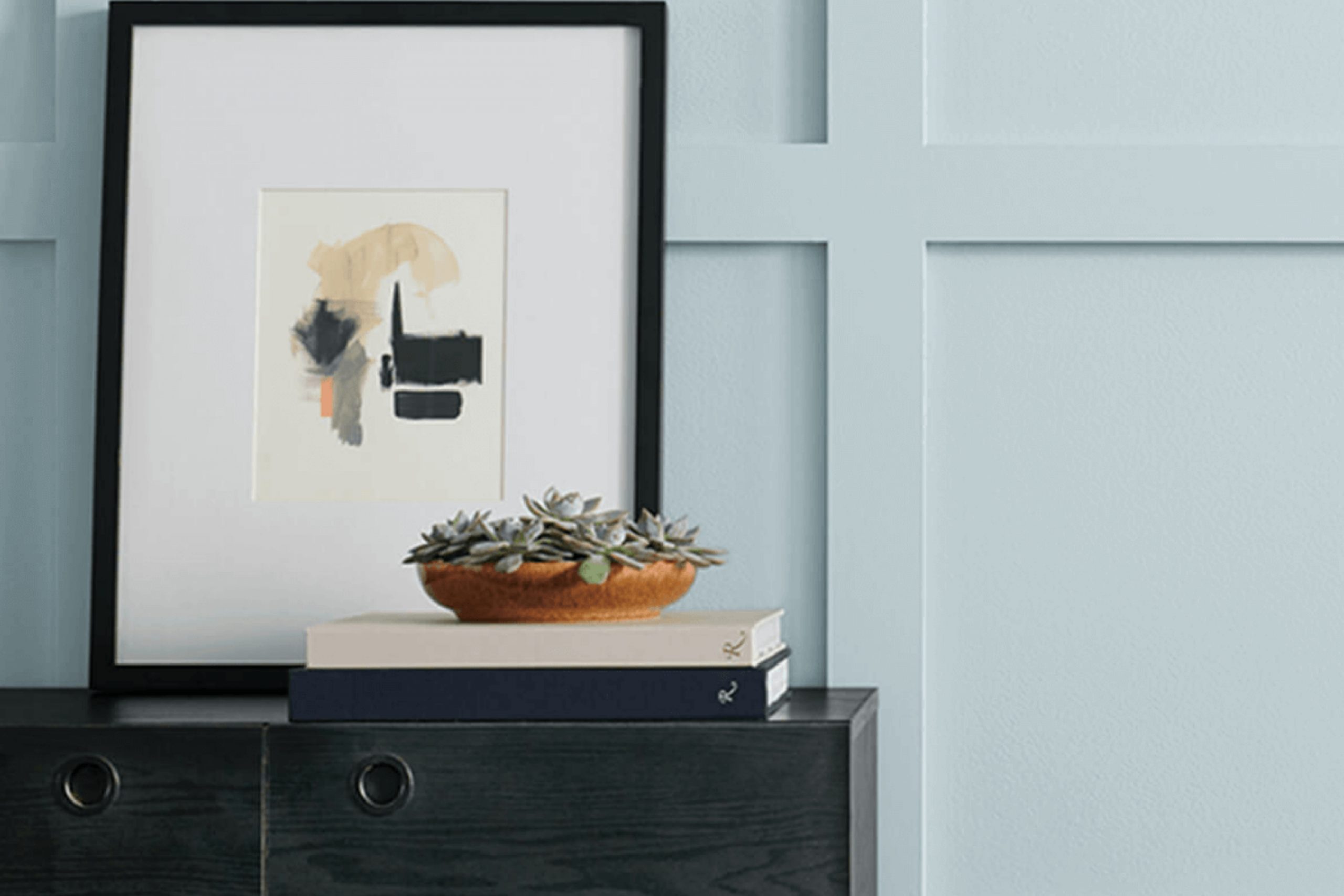
What Color Is Sleepy Blue SW 6225 by Sherwin Williams?
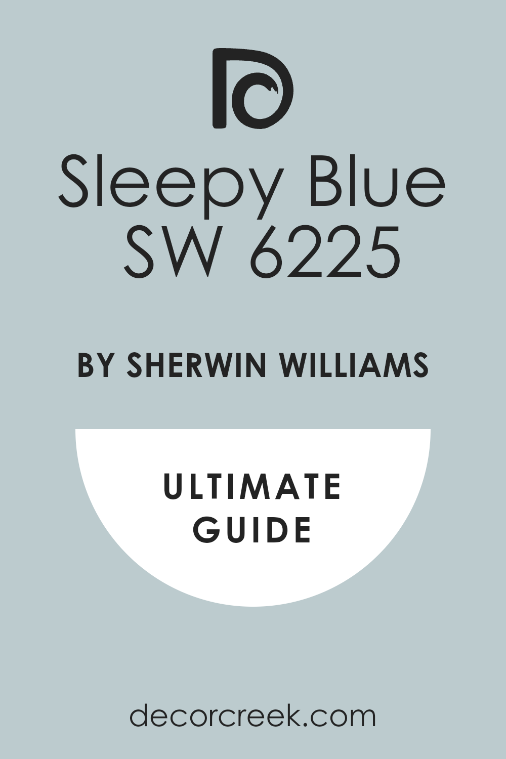
Sleepy Blue by Sherwin Williams is a gentle, soothing color that leans towards a soft, pale blue with a hint of gray. This understated shade mimics the calmness of the early morning sky, providing a refreshing and light feel to any room. Because of its muted tone, it works well in creating a relaxed atmosphere, ideal for bedrooms and bathrooms where a peaceful vibe is often desired.
The color fits beautifully within a variety of interior styles, particularly in coastal, Scandinavian, and modern minimalist designs. Its versatility also allows it to be paired with multiple materials and textures.
For instance, natural wood, whether pale like birch or richer like walnut, complements the coolness of Sleepy Blue, creating an inviting space.
Additionally, metallic accents in silver or brushed nickel can give a clean, crisp finish to the aesthetic.
Textiles also play a significant role when pairing with this color. Soft, plush fabrics like cotton or linen in white or soft pastel colors can maintain the light, airy feel, while adding throw pillows or rugs in darker hues like navy or charcoal can offer a striking contrast that adds depth and interest to the room.
This color is about creating a relaxed, airy space that feels both cozy and fresh.
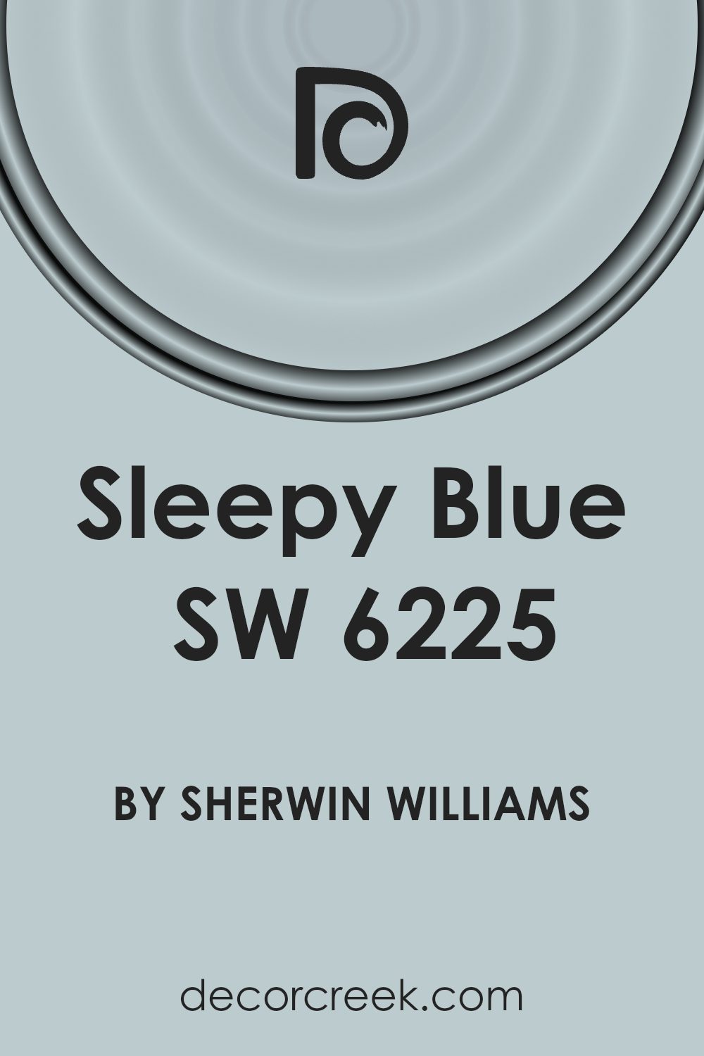
Is Sleepy Blue SW 6225 by Sherwin Williams Warm or Cool color?
Sleepy Blue by Sherwin Williams is a gentle, soothing color that brings a calm and peaceful atmosphere to any room. This soft, subtle shade of blue has a hint of gray, making it incredibly versatile and easy to pair with various decor styles. Ideal for bedrooms and bathrooms, it helps create a relaxing environment that encourages rest and relaxation.
In living areas, Sleepy Blue adds a light and airy feel, brightening up the space without being overpowering. It’s also great for small spaces, as it makes them appear larger and more open. When used in a home office, it helps maintain a calm and focused environment, which is essential for productivity.
Overall, this color is a great choice for anyone looking to add a touch of calmness to their home without dramatic changes.
Undertones of Sleepy Blue SW 6225 by Sherwin Williams
Sleepy Blue is a gentle color often used in home interiors to create a soothing atmosphere. Understanding the undertones of a paint like Sleepy Blue can significantly impact how it is perceived in different settings. Undertones are subtle colors that influence the main color but may not be immediately noticeable.
Sleepy Blue features undertones such as light blue, light purple, pale yellow, lilac, mint, pale pink, and grey, which can make the color appear differently under various lighting conditions and when paired with different decor elements.
For example, the light blue and mint undertones might make the main blue color appear fresher and more vibrant, especially in natural light, while the lilac and light purple undertones add a hint of warmth, making the color feel softer and more inviting, especially in spaces with less natural light.
Undertones like pale yellow can also subtly brighten the color, preventing it from feeling too cold.
When using Sleepy Blue on interior walls, it’s important to consider these undertones. In a room with plenty of sunlight, the cooler undertones (light blue and mint) might be more pronounced, giving the room a more awake and lively feel. In artificial light, the warmer undertones (lilac, light purple) could make the room feel cozy.
The grey and pale pink undertones help to balance the color, ensuring it doesn’t overwhelm the space but instead, imparts a calm, gentle ambiance.
In summary, the underlying colors influence the overall look and feel of the paint and can subtly affect the mood and style of the room, depending on how the light interacts with the paint throughout the day.
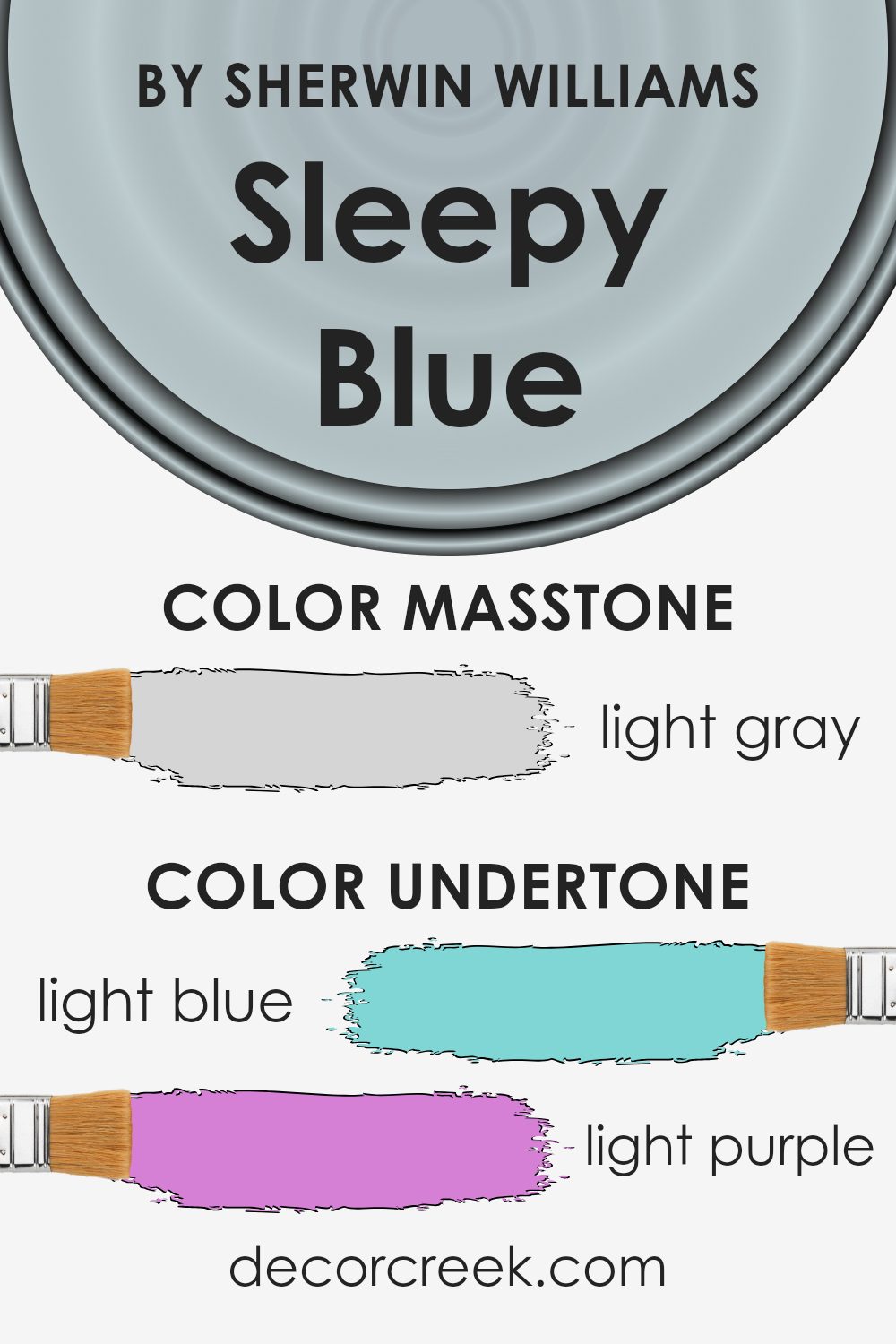
What is the Masstone of the Sleepy Blue SW 6225 by Sherwin Williams?
Sleepy Blue SW 6225 by Sherwin Williams presents a masstone that’s a light gray, resembling the soft light of early morning. When using this color in homes, it serves as a versatile backdrop, easily blending with various decor styles and colors.
Its light gray tone ensures that spaces feel open and airy, making rooms appear more spacious. This color works well in areas that receive a lot of natural light, as it reflects and enhances the light, creating a fresh and inviting environment.
Ideal for bedrooms and living spaces, the subtlety of this light gray hue provides a calm and soft look, which can make a space feel more comfortable and relaxing. Moreover, it pairs beautifully with both bright accents and earthy textures, allowing for flexibility in decorating.
Whether it’s a modern minimalist home or a cozy, traditional setting, Sleepy Blue’s light gray masstone adapts seamlessly, establishing a clean and friendly atmosphere.
How Does Lighting Affect Sleepy Blue SW 6225 by Sherwin Williams?
Lighting plays a crucial role in how we perceive colors because it can significantly alter their appearance. The color in question, a soft, gentle blue, showcases this phenomenon well.
In artificial light, this shade of blue can vary depending on the type of bulb used. With warm lighting, such as that from incandescent bulbs, the blue may appear softer and slightly more muted, giving a cozy feel to the space.
On the other hand, in cooler, fluorescent light, the blue might look sharper and clearer, which can make the space feel more alert and awake.
In natural light, this color will change throughout the day. Morning light, which is typically softer and less intense, will make the blue appear very gentle and soothing. In the bright midday sun, the color can appear much more vibrant and lively.
As the sun sets, the light takes on a golden hue, warming the color once more, drifting it back to a softer tone.
North-facing rooms often get less direct sunlight, which can make colors appear cooler. Therefore, in a north-facing room, the blue might look more muted and shadowy. This can be perfect for a space where you want a sense of calm or subtlety.
South-facing rooms enjoy plenty of light most of the day, which can make this blue look brighter and more cheerful. It’s an excellent choice for spaces that benefit from a vibrant, refreshing feel, especially during the sunny hours.
In east-facing rooms, the morning light can make the blue lively and crisp, ideal for starting the day with an invigorating setting. In the afternoon, as the light diminishes, the color may recede into a cooler, softer hue.
West-facing rooms get the afternoon and evening light, which can bring out the warmth in the blue, making it more profound and intense toward the evening, perfect for relaxing at the end of the day.
Understanding these effects can help in choosing the right room or the suitable lighting to pair with this beautiful blue, ensuring the space always looks its best.
What is the LRV of Sleepy Blue SW 6225 by Sherwin Williams?
LRV stands for Light Reflectance Value, a measure used to describe the percentage of light a paint color reflects when it’s on the wall. A higher LRV means the color reflects more light, making a room feel brighter and larger.
Conversely, a lower LRV indicates the color absorbs more light, which can make a space feel cozier but smaller.
This measurement helps in deciding which paint color will work best based on how much natural or artificial light a room receives. Essentially, understanding LRV can assist in creating the desired atmosphere in a space through color choice.
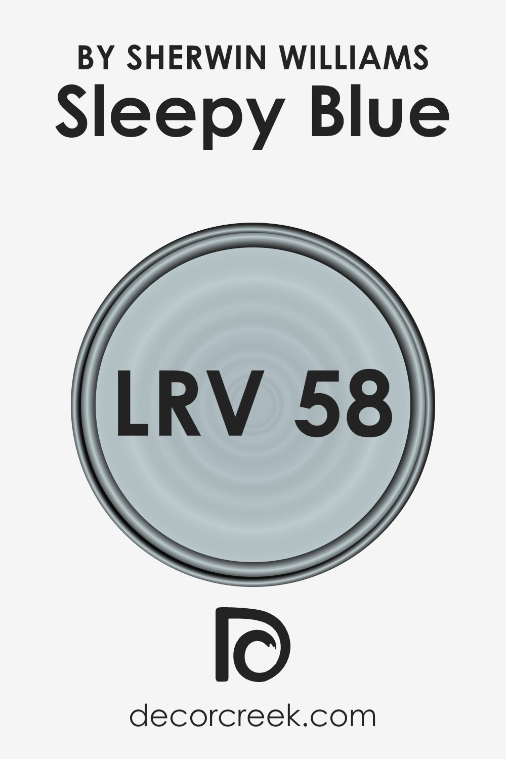
Taking the LRV of Sleepy Blue by Sherwin Williams, which is quite high at 57.753, it means that this paint color is fairly reflective.
This characteristic makes it a good choice for rooms that might not get a lot of sunlight, as it can help make the space appear lighter and more open.
The high LRV also means that the true color of Sleepy Blue is more likely to show under different lighting conditions, providing consistency in its appearance regardless of the time of day or the type of lighting used in the room.
Coordinating Colors of Sleepy Blue SW 6225 by Sherwin Williams
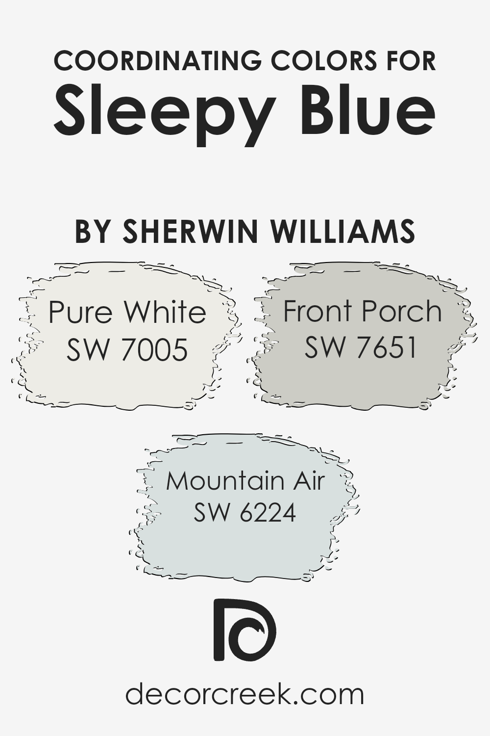
Coordinating colors are chosen to complement a primary hue, creating a harmonious color scheme in a space. For instance, Sleepy Blue can be paired with colors like Pure White, Mountain Air, and Front Porch, which are intended to enhance and balance the look without overwhelming the primary shade.
These coordinating colors work well because they share similar undertones or contrast nicely in a way that adds depth and interest to the decor.
Pure White is a crisp, clean shade that offers a refreshing counterpoint to any richer tone, helping to brighten spaces and bring out the other colors. Mountain Air is a light, subtle blue that echoes the airy feel of Sleepy Blue, providing a gentle addition without stark contrasts.
Front Porch, slightly deeper, has a calming effect and can add a sense of depth to the palette when used appropriately.
These colors are useful in creating a cohesive interior, whether used for wall paints, accents, or furnishings.
You can see recommended paint colors below:
- SW 7005 Pure White (CHECK A SAMPLE)
- SW 6224 Mountain Air (CHECK A SAMPLE)
- SW 7651 Front Porch (CHECK A SAMPLE)
What are the Trim colors of Sleepy Blue SW 6225 by Sherwin Williams?
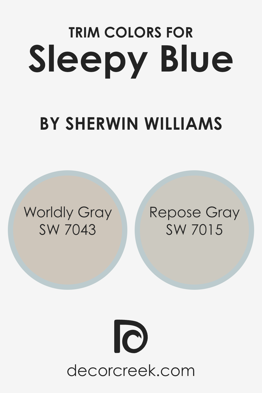
Trim colors are specially chosen shades used to accentuate or complement the primary color on walls, enhancing the look and feel of a room. For a subtle and harmonious palette, using SW 7043 Worldly Gray and SW 7015 Repose Gray as trim colors can beautifully pair with Sleepy Blue by Sherwin Williams.
These trim colors help define architectural details, frame the edges of the walls, and can also influence the room’s perceived size and shape. This can be particularly useful in creating a well-rounded and visually pleasing interior space without overwhelming it.
Worldly Gray is a gentle neutral gray that offers a touch of warmth, making it a versatile choice for trim, particularly with the cool tones of Sleepy Blue. It can help in softening the transitions between walls and other elements like doors and windows.
Repose Gray, on the other hand, is a lighter gray that provides a subtle contrast, which can be effective in highlighting the soothing qualities of Sleepy Blue, making the space feel cohesive.
Using these grays as trim colors ensures a balanced and harmonized aesthetic that complements the quieter, subtle charm of Sleepy Blue.
You can see recommended paint colors below:
Colors Similar to Sleepy Blue SW 6225 by Sherwin Williams
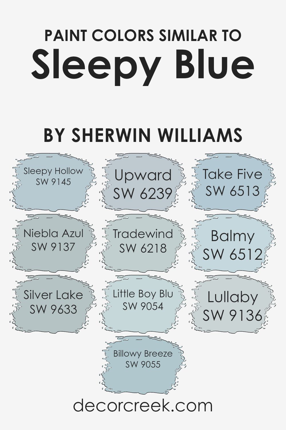
Choosing the right paint colors for your space can be both exciting and a bit overwhelming due to the plethora of options available. However, selecting colors that are similar can create a harmonious and cohesive look, ensuring a smooth transition from room to room.
Colors similar to Sleepy Blue like Sleepy Hollow and Niebla Azul, for instance, offer subtle variations that maintain a consistent theme without being monotonous.
Sleepy Hollow is a darker, more muted shade that adds depth, while Niebla Azul provides a lighter, airier feel, perfect for creating a calm environment.
Also, colors like Silver Lake and Billowy Breeze extend this palette, offering slightly greyer tones which help in achieving a modern look. Silver Lake, as a soft grey-blue, reflects a quiet and understated elegance, whereas Billowy Breeze has a touch of freshness to brighten up the space subtly.
Meanwhile, Upward and Tradewind lean more towards the traditional blue hues, with Upward presenting a sky-like clarity and Tradewind bringing a coastal vibe that is gentle and soothing.
Similarly, Little Boy Blu, Take Five, Balmy, and Lullaby add playful and nurturing elements to spaces with their blissful shades of blue, ensuring the room feels both comfortable and stylish. Using these colors, you can easily create a delightful space that feels cohesive yet distinctly unique from area to area.
You can see recommended paint colors below:
- SW 9145 Sleepy Hollow (CHECK A SAMPLE)
- SW 9137 Niebla Azul (CHECK A SAMPLE)
- SW 9633 Silver Lake (CHECK A SAMPLE)
- SW 9055 Billowy Breeze (CHECK A SAMPLE)
- SW 6239 Upward (CHECK A SAMPLE)
- SW 6218 Tradewind (CHECK A SAMPLE)
- SW 9054 Little Boy Blu (CHECK A SAMPLE)
- SW 6513 Take Five (CHECK A SAMPLE)
- SW 6512 Balmy (CHECK A SAMPLE)
- SW 9136 Lullaby (CHECK A SAMPLE)
Colors that Go With Sleepy Blue SW 6225 by Sherwin Williams
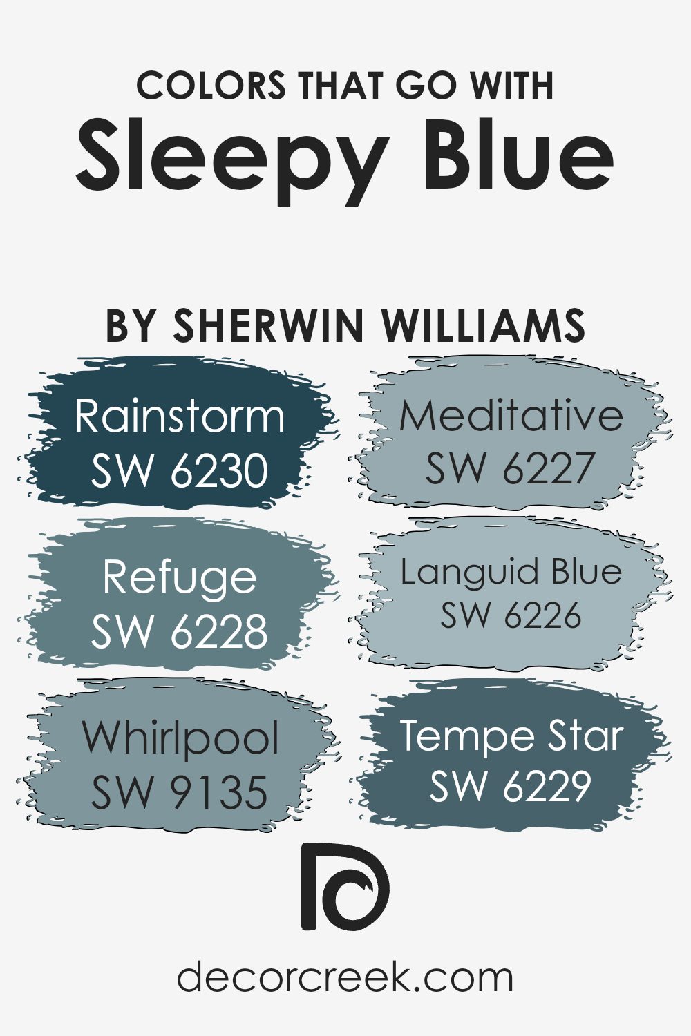
When considering a soothing color like Sleepy Blue SW 6225 by Sherwin Williams, it’s essential to choose coordinating colors wisely to achieve a harmonious look. Colors that pair well with Sleepy Blue can enhance its calming effect in a room, making spaces feel cozier and more inviting.
For instance, pairing it with darker hues like SW 6230 – Rainstorm adds depth and a sense of stability to the space. On the other hand, shades like SW 6228 – Refuge, a slightly lighter blue, can create a subtle but effective contrast that enriches the visual interest of interiors.
Notably, SW 9135 – Whirlpool is a unique color that adds a lively twist to the calm Sleepy Blue, infusing energy into the space without overwhelming it. Meanwhile, SW 6227 – Meditative is another excellent companion for Sleepy Blue, offering a slightly greener tone that suggests a relaxed, nature-inspired vibe.
For a closer shade, SW 6226 – Languid Blue could almost blend seamlessly with Sleepy Blue, providing an effortless match that’s easy on the eyes.
Lastly, SW 6229 – Tempe Star brings a dramatic flair with its deeper, more prominent shade that pairs beautifully for accent walls or furniture, creating a striking visual statement. Overall, the right mix of these colors can completely define the atmosphere in a room, influencing both its aesthetics and the feelings it evokes.
You can see recommended paint colors below:
- SW 6230 Rainstorm (CHECK A SAMPLE)
- SW 6228 Refuge (CHECK A SAMPLE)
- SW 9135 Whirlpool (CHECK A SAMPLE)
- SW 6227 Meditative (CHECK A SAMPLE)
- SW 6226 Languid Blue (CHECK A SAMPLE)
- SW 6229 Tempe Star (CHECK A SAMPLE)
How to Use Sleepy Blue SW 6225 by Sherwin Williams In Your Home?
Sleepy Blue SW 6225 by Sherwin Williams is a soothing light blue paint that brings a calm and peaceful vibe to any room. It’s a versatile color that works beautifully in bedrooms, bathrooms, and living spaces where a relaxed atmosphere is desired.
Because of its gentle tone, Sleepy Blue can help make a small room feel bigger and brighter. It pairs well with white trim, adding a fresh and clean look to the space.
This shade is also an excellent choice for a nursery or children’s room, as the cool blue can help create a comforting environment for sleep and relaxation. You can use Sleepy Blue on all walls for a soft, uniform look or on just one wall to create a subtle accent. It goes well with various decorating styles, whether you’re aiming for a modern or a country feel.
Coordinating this color with soft grays, muted greens, or pale yellows can create a harmonious color scheme that’s pleasant and inviting.
Sleepy Blue SW 6225 by Sherwin Williams vs Niebla Azul SW 9137 by Sherwin Williams
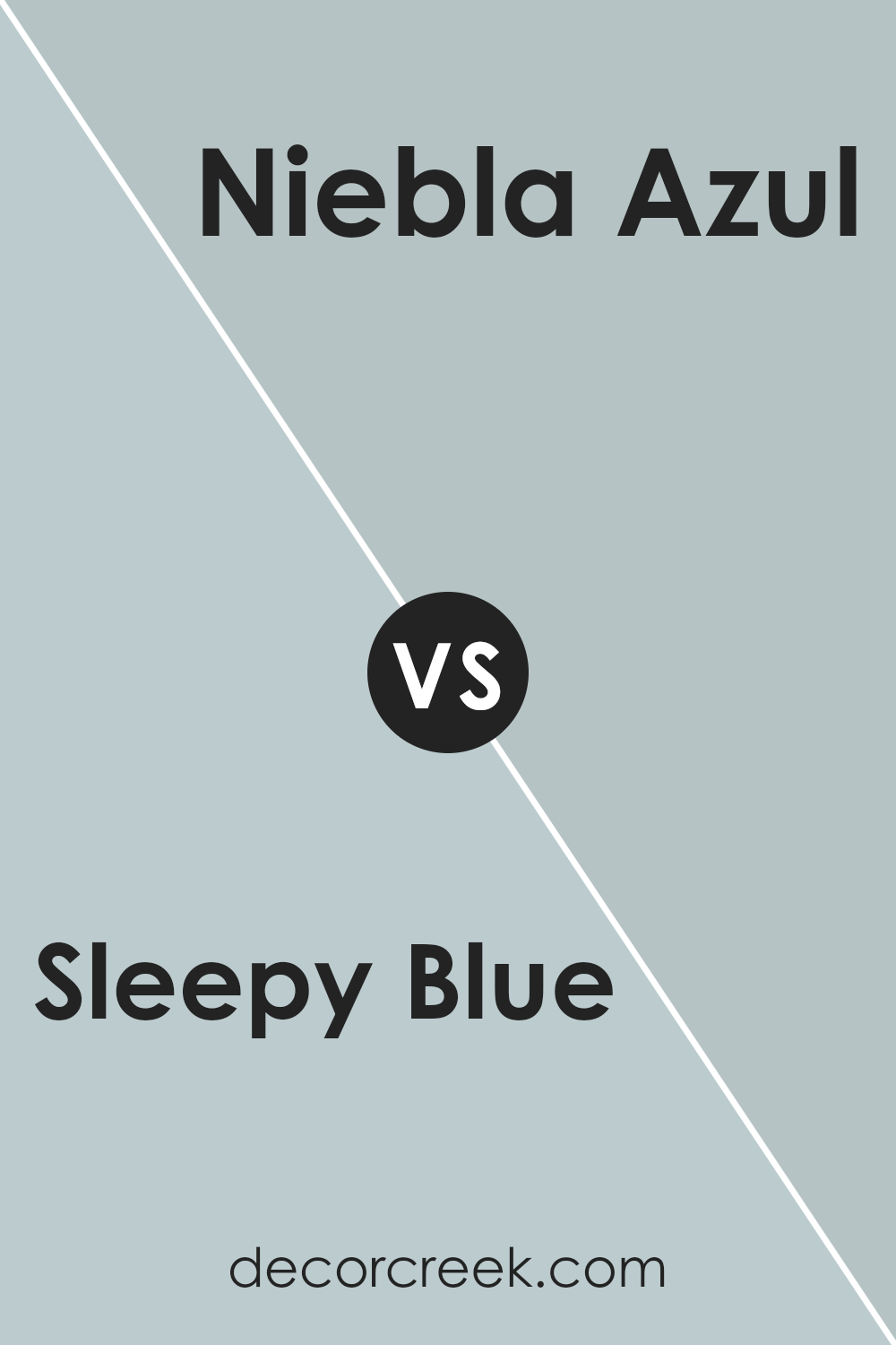
Sleepy Blue and Niebla Azul are both soothing shades from Sherwin Williams, but they have different vibes. Sleepy Blue is a soft, muted blue with a gray undertone that gives it a calm and gentle feel, making it ideal for creating a relaxing environment in rooms like bedrooms or bathrooms.
On the other hand, Niebla Azul is a touch deeper and leans slightly towards a teal or turquoise hue. This color is vibrant enough to add a fresh and lively touch to a space while still maintaining a peaceful atmosphere.
Whether you prefer the lighter, more subdued look of Sleepy Blue or the richer, bolder tone of Niebla Azul, both colors offer a lovely, soothing presence in any room.
You can see recommended paint color below:
- SW 9137 Niebla Azul (CHECK A SAMPLE)
Sleepy Blue SW 6225 by Sherwin Williams vs Billowy Breeze SW 9055 by Sherwin Williams
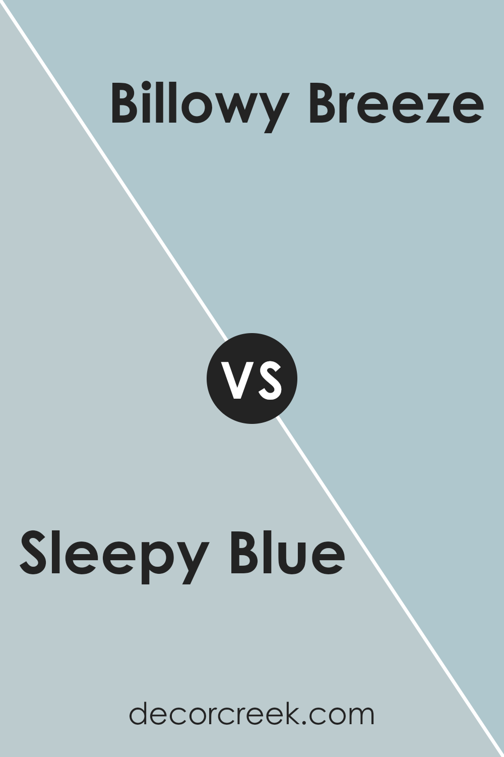
Sleepy Blue and Billowy Breeze by Sherwin Williams are both soothing colors, but they offer subtly different vibes for any space. Sleepy Blue is a soft, muted blue with a hint of gray, giving it a very calm, relaxing feel. It’s perfect for creating a peaceful atmosphere in bedrooms or quiet areas.
On the other hand, Billowy Breeze is a bit lighter and has more of an airy, fresh quality to it, thanks to its blend of blue and green tones. This color works well in bathrooms or kitchens, where a clean and refreshing look is desired.
Both colors are versatile and can be used in various styles of decor, but Sleepy Blue leans towards a more traditional or cozy look while Billowy Breeze fits nicely in slightly more modern and lively settings.
You can see recommended paint color below:
- SW 9055 Billowy Breeze (CHECK A SAMPLE)
Sleepy Blue SW 6225 by Sherwin Williams vs Lullaby SW 9136 by Sherwin Williams
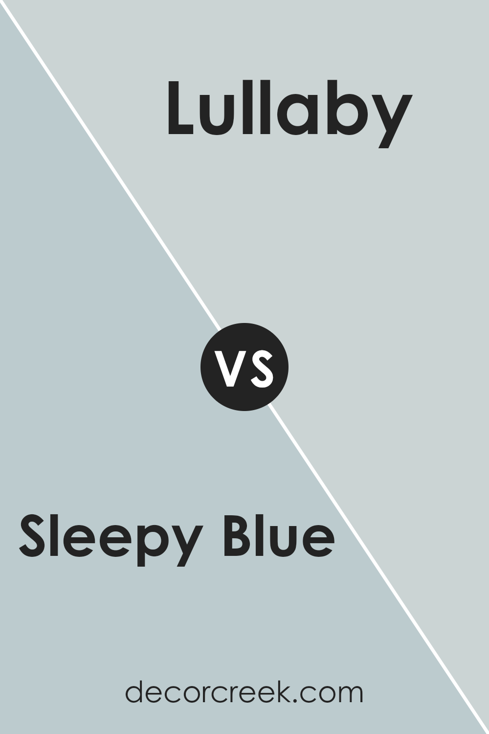
Sleepy Blue and Lullaby are both soothing colors from Sherwin Williams, but they offer distinct vibes due to their different tones. Sleepy Blue has a gentle, muted feel with a hint of gray. This makes it a great choice for creating a calm and relaxed atmosphere in spaces like bedrooms or bathrooms.
On the other hand, Lullaby is a bit lighter and has a soft, welcoming quality that lends itself well to nurseries or cozy reading nooks.
While both colors are muted and subtle, Sleepy Blue leans more towards a subdued, classic look, whereas Lullaby offers a touch of warmth, making spaces feel more nurturing and snug. Both are versatile and can work well in various decor styles, enhancing the overall mood of a room without overwhelming it with color.
You can see recommended paint color below:
- SW 9136 Lullaby (CHECK A SAMPLE)
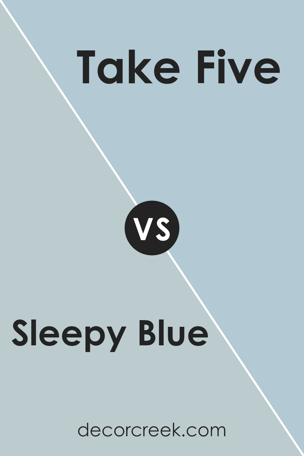
Sleepy Blue SW 6225 by Sherwin Williams vs Take Five SW 6513 by Sherwin Williams
The main color, Sleepy Blue, and the second color, Take Five, both by Sherwin Williams, offer soothing blue tones, but with distinct differences. Sleepy Blue is a soft, gentle blue that brings to mind a peaceful, calm sky. It has a muted, understated quality that makes it ideal for creating a relaxing atmosphere in spaces like bedrooms and bathrooms.
In contrast, Take Five is a slightly brighter blue with a more noticeable vibrancy. This color is still calming, but with a fresher, more lively feel. It works well in spaces where a touch of lightness and refreshment is desired, such as kitchens or living areas.
Both colors are versatile, but the choice between them depends on the desired mood and energy level in a room.
You can see recommended paint color below:
- SW 6513 Take Five (CHECK A SAMPLE)
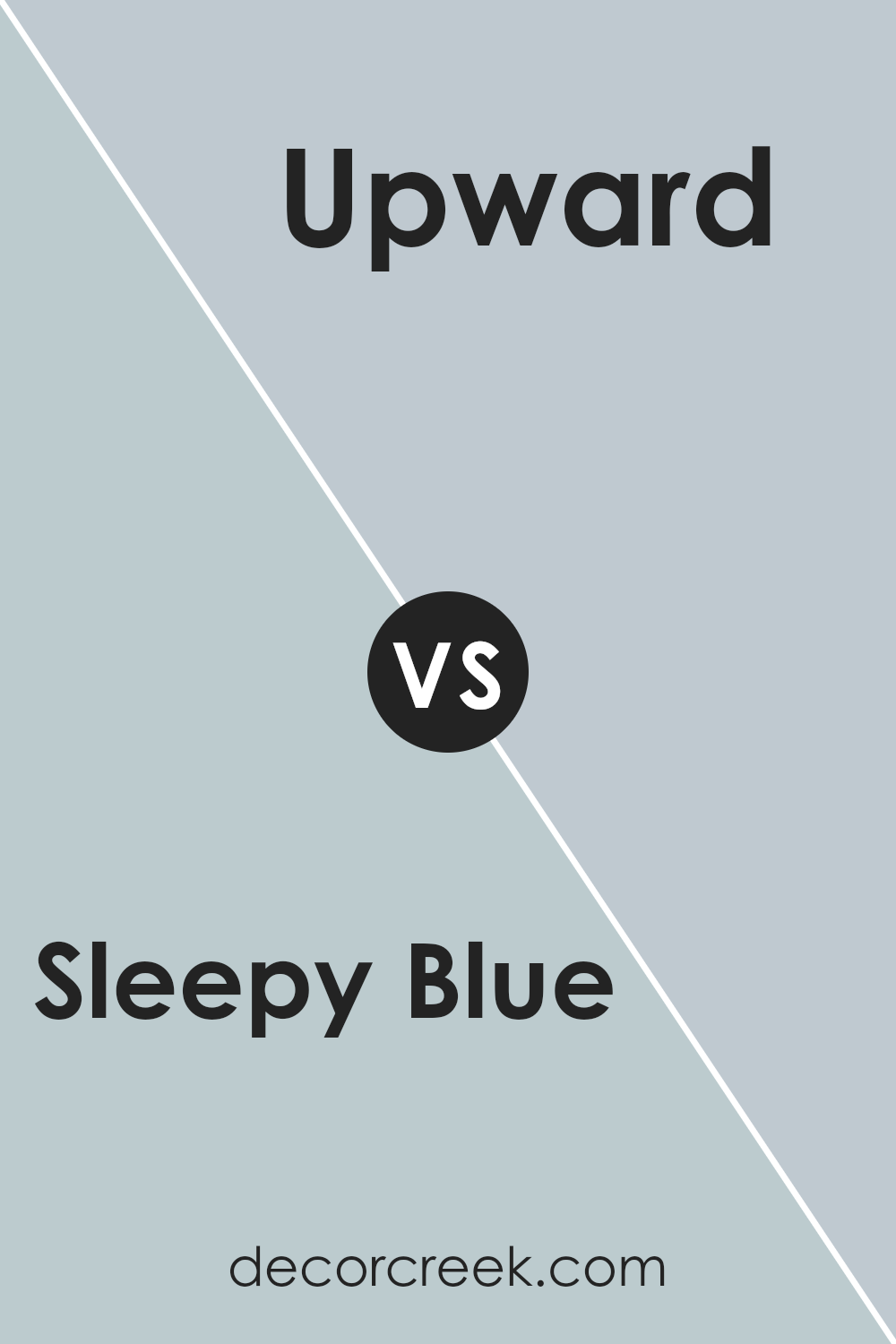
Sleepy Blue SW 6225 by Sherwin Williams vs Upward SW 6239 by Sherwin Williams
Sleepy Blue and Upward, both by Sherwin Williams, are soothing colors that have their unique tones. Sleepy Blue is a soft, muted blue with a hint of gray, giving it a calm and gentle feel. It works well in bedrooms or bathrooms where you want a peaceful atmosphere.
On the other hand, Upward is a lighter blue with more of a sky-blue shade. It’s brighter and gives spaces a fresh and airy feeling.
This makes it great for living rooms or kitchens where a more vibrant, uplifting vibe is preferred. Both colors are versatile and can work well in various home styles, but Sleepy Blue leans towards a quieter, more subdued look, while Upward offers a bit more energy and light.
You can see recommended paint color below:
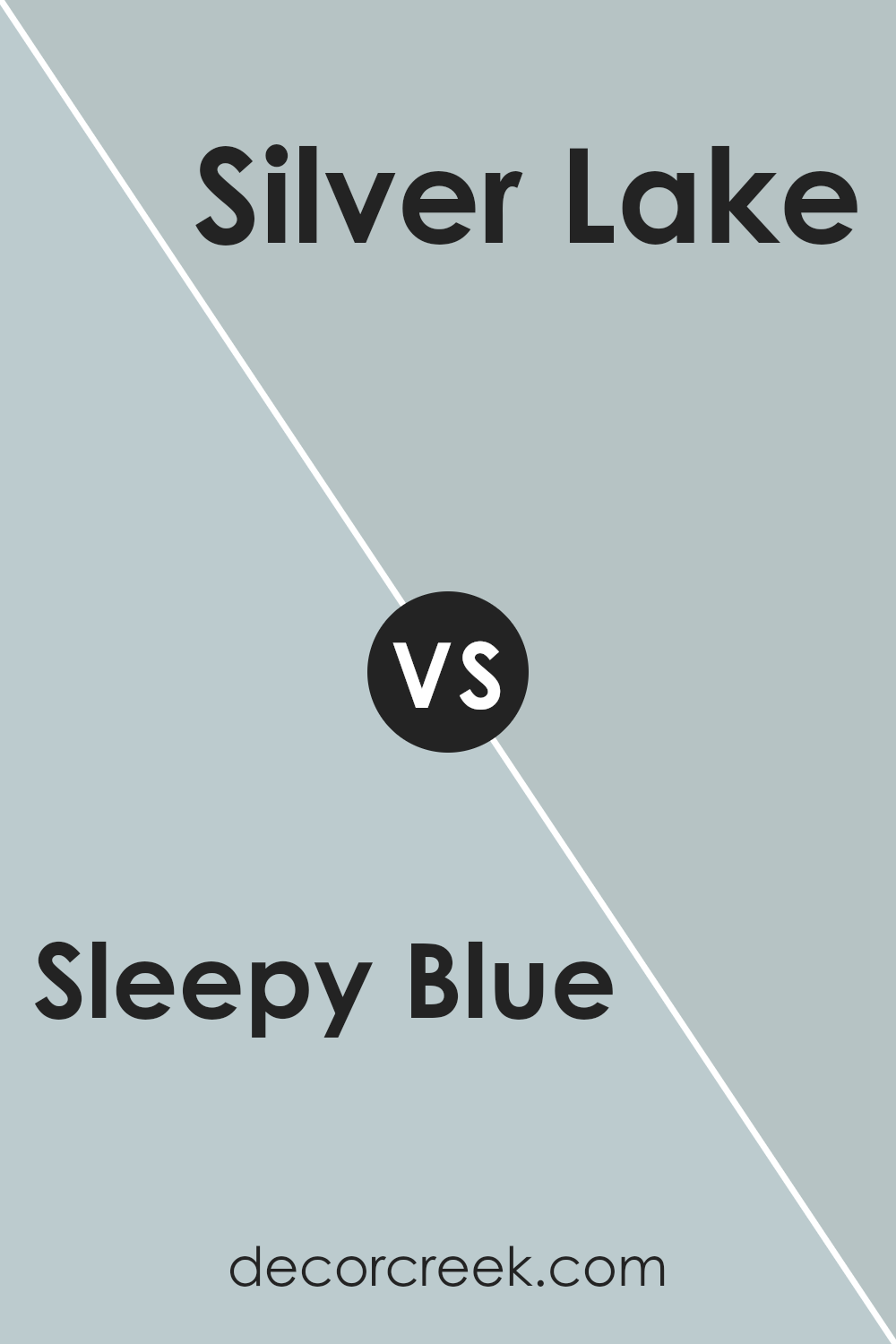
Sleepy Blue SW 6225 by Sherwin Williams vs Silver Lake SW 9633 by Sherwin Williams
Sleepy Blue and Silver Lake, both from Sherwin Williams, offer unique yet subtle tones. Sleepy Blue has a gentle, calming presence with its soft bluish-gray hue. It’s perfect for creating a relaxed atmosphere in spaces like bedrooms or bathrooms. On the other hand, Silver Lake carries a slightly cooler tone, leaning more towards a muted silver-gray.
This color is versatile and works well in both modern and traditional settings, adding a clean, polished look without overpowering the space. Both colors reflect light gently, keeping the spaces bright yet cozy.
While Sleepy Blue adds a touch of warmth making a room feel more inviting, Silver Lake offers a crisper feel, suitable for a more streamlined and neutral look in a home. These colors are great choices for someone looking to add subtle elegance to their home without making a bold statement.
You can see recommended paint color below:
- SW 9633 Silver Lake (CHECK A SAMPLE)
Sleepy Blue SW 6225 by Sherwin Williams vs Sleepy Hollow SW 9145 by Sherwin Williams
The two colors, Sleepy Blue and Sleepy Hollow by Sherwin Williams, offer subtle yet distinct tones. Sleepy Blue presents a gentle, soothing light blue shade that brings a fresh and airy feel to any room. It’s reminiscent of a clear sky on a peaceful morning.
In contrast, Sleepy Hollow leans towards a deeper, dusky blue with a hint of grey. This color gives a stronger, more grounded feeling, making it ideal for creating a cozy and inviting atmosphere.
While both shades are in the blue family, Sleepy Blue is lighter and can make a space feel larger and more open, whereas Sleepy Hollow, with its richer tone, adds depth and warmth, perfect for a snug and comfortable setting.
These differences make Sleepy Blue better suited for spaces aimed at relaxation and calmness, like bedrooms or bathrooms, while Sleepy Hollow works well in areas that benefit from a bit more color impact and coziness.
You can see recommended paint color below:
- SW 9145 Sleepy Hollow (CHECK A SAMPLE)
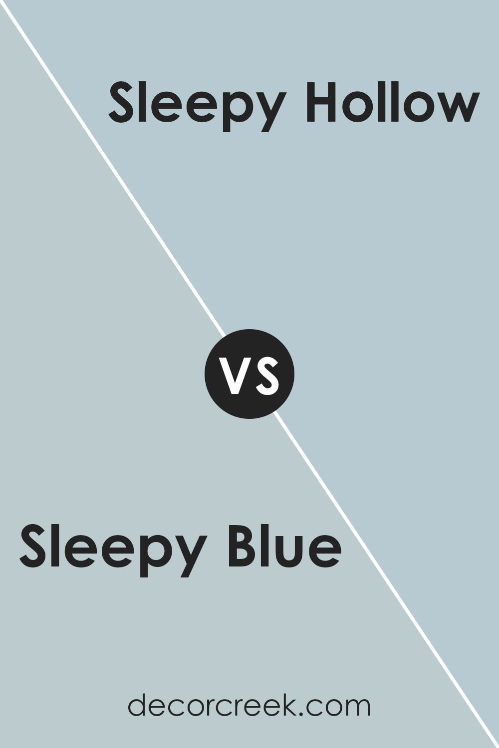
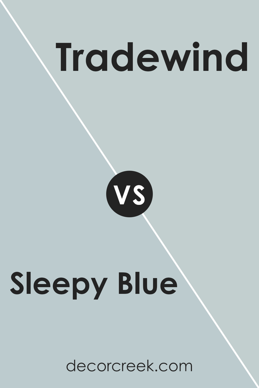
Sleepy Blue SW 6225 by Sherwin Williams vs Tradewind SW 6218 by Sherwin Williams
Sleepy Blue and Tradewind are two soothing shades from Sherwin Williams. Sleepy Blue is a soft, gentle blue with a hint of gray, making it a calming choice for spaces meant for relaxation, like bedrooms. Its subtle gray undertone gives it a muted appearance, perfect for creating a peaceful atmosphere.
On the other hand, Tradewind is a slightly brighter blue with a touch of green. This color brings a fresher and airy feel to rooms, evoking the sense of a gentle breeze or a clear sky. It’s excellent for areas where you want a refreshing yet calm vibe, such as bathrooms or living spaces.
Both colors work well in a modern home, offering a cool palette that’s easy on the eyes and pairs well with neutral colors. While Sleepy Blue leans towards a more understated and muted feel, Tradewind offers a bit more vibrancy without being overwhelming, making each suitable for different tastes and styles.
You can see recommended paint color below:
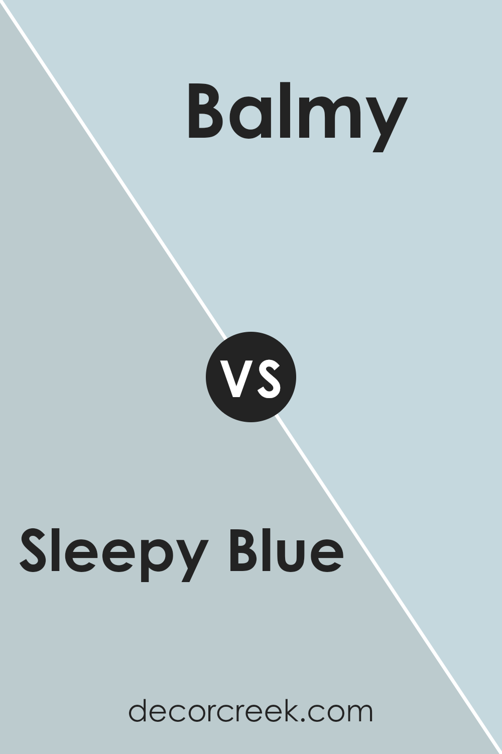
Sleepy Blue SW 6225 by Sherwin Williams vs Balmy SW 6512 by Sherwin Williams
Sleepy Blue and Balmy are two calming shades offered by Sherwin Williams. Sleepy Blue is a gentle, soft shade that carries a hint of gray, making it a quiet and soothing color for any room looking to achieve a peaceful atmosphere. On the other hand, Balmy is slightly brighter and leans more towards a pale teal, offering a fresher, somewhat more vibrant feel while still maintaining a relaxed vibe.
Both colors are fantastic choices for spaces where you want to promote a restful environment, such as bedrooms or bathrooms. Sleepy Blue, with its muted tones, works well in spaces that get a lot of light, softening the brightness without making the room feel dark.
Balmy, with its touch of green, brings a subtle hint of nature indoors, which can be very pleasing and adds a slight cheerfulness to a space.
Overall, while both colors share a common goal of creating a calm setting, Sleepy Blue offers a more understated approach, whereas Balmy provides a bit more energy due to its teal undertones.
You can see recommended paint color below:
- SW 6512 Balmy (CHECK A SAMPLE)
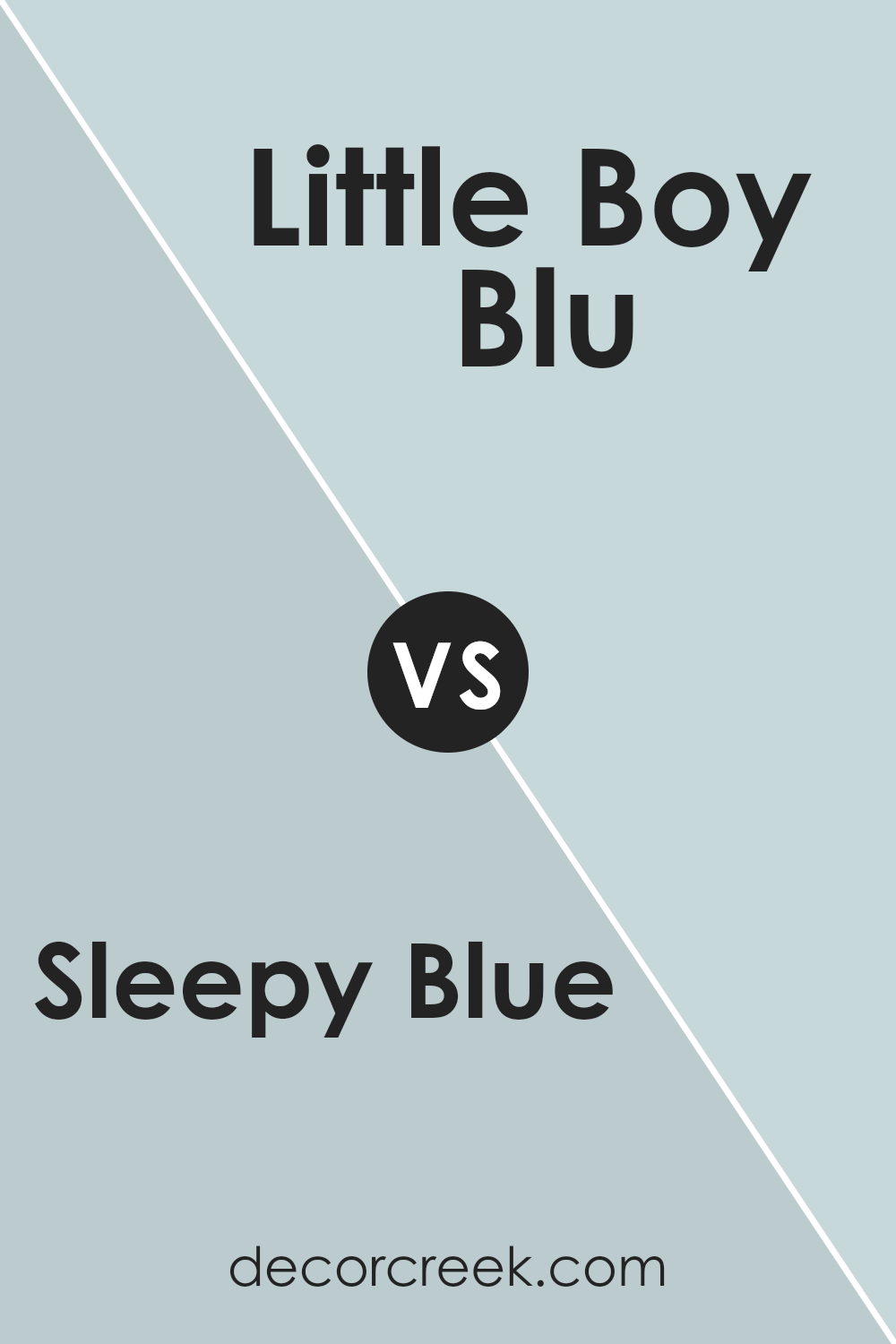
Sleepy Blue SW 6225 by Sherwin Williams vs Little Boy Blu SW 9054 by Sherwin Williams
Sleepy Blue and Little Boy Blu by Sherwin Williams are both subtle and calm colors, but they have distinct differences. Sleepy Blue is a gentle, pale blue with a cloudy gray tint, giving it a muted and soft appearance.
This color is very versatile and works well in rooms where you want to create a relaxed, cozy atmosphere, such as bedrooms or bathrooms.
On the other hand, Little Boy Blu is a brighter, more vibrant shade of blue. It has a cheerful and youthful vibe, making it a great choice for kids’ rooms or other spaces where you want to add a splash of energy and fun. It’s slightly bolder and can bring a fresh and lively feel to a room.
While both shades are beautiful, your choice between them would depend on the mood you want to create in your space.
Sleepy Blue is more subdued and calming, suitable for peaceful settings, while Little Boy Blu is more energetic and fun, perfect for areas that benefit from a pop of color.
You can see recommended paint color below:
- SW 9054 Little Boy Blu (CHECK A SAMPLE)
Conclusion
In conclusion, SW 6225 Sleepy Blue by Sherwin Williams is a gentle and calming blue paint color that can make rooms feel peaceful and happy. It’s a perfect choice for bedrooms where you sleep, or any room where you like to spend quiet time.
Because it looks like the sky on a clear, sunny day, it can make your room feel bigger and brighter.
The color Sleepy Blue works well with other colors. You can pair it with light colors like soft whites and grays to keep things calm and simple, or mix it with bright colors like yellow or red for a bit of fun.
However, it’s important to pick the right colors to go with it, so the room feels just right.
Many people like to use this color because it feels friendly and light, not too strong or bright. Whether you want to make a room perfect for relaxing or need a nice background color that lets other brighter colors stand out, Sleepy Blue is a great choice. It’s easy to understand why so many people like using it in their homes.
Ever wished paint sampling was as easy as sticking a sticker? Guess what? Now it is! Discover Samplize's unique Peel & Stick samples.
Get paint samples


