I recently stumbled upon SW 9571 Solstice by Sherwin Williams, and I must say, it’s a refreshing shift away from the usual palettes. If you’re like me, always trying to find that perfect shade for a cozy room makeover, Solstice might just be your next pick. This color has a subtle charm that suggests the quiet moments right before dawn or as dusk settles. It’s not just another gray or beige; there’s an understated warmth to it that seems to promise a serene atmosphere for any space.
What’s interesting about Solstice is how versatile it is. You can apply it in a busy kitchen or a serene bedroom, and it will adapt, bringing a sense of calm without feeling too cold or impersonal. Moreover, its compatibility with natural light means it shifts subtly throughout the day, almost reflecting the changing light from morning to evening.
Choosing a paint color isn’t always straightforward, and it often takes a few tries to get it right. However, with Solstice, I felt secure from the start that it would enhance the feeling of my home. Whether you pair it with bold contrasts or soft neutrals, it stands out without overwhelming.
If you’re planning a home update, consider how Solstice might not only meet but exceed your expectations.
What Color Is Solstice SW 9571 by Sherwin Williams?
Solstice by Sherwin Williams is a warm, inviting peach shade that brings a cozy and cheerful mood to any space. This color has a soft vibrancy that isn’t overwhelming, making it a great choice for creating a friendly and welcoming atmosphere. It’s especially well-suited for living rooms, kitchens, and bedrooms where you want to add a touch of light-hearted warmth.
In terms of interior styles, Solstice fits beautifully in rustic and bohemian decor because of its earthy undertones. It also looks charming in modern farmhouse settings or any design scheme that leans towards natural simplicity and comfort.
When considering materials and textures to pair with Solstice, think of natural wood, which complements its warmth perfectly. Woven textures like wicker or rattan also harmonize well, adding to the casual, laid-back vibe of the color. For fabrics, linen and soft cotton in neutral colors can balance the peach tones without overpowering them. Metallic accents, particularly in copper or gold, can add a hint of luxury and contrast nicely with the peachy hue.
Overall, Solstice is a versatile color that can help create a lively yet cozy environment, perfect for social spaces and private retreats alike.

Is Solstice SW 9571 by Sherwin Williams Warm or Cool color?
Sherwin Williams’ Solstice is a unique color that can significantly influence the ambiance of any room in the home. When painted on walls, this shade offers a timeless charm, balancing warmth and a cozy vibe.
Ideal for living areas or bedrooms, the versatility of Solstice allows it to blend well with various decor styles and furniture colors. It can make small spaces feel inviting and larger rooms feel more intimate and cozy.
Additionally, the neutral but rich tone helps in creating a welcoming atmosphere, which is crucial for places where families gather and spend time together. In spaces like the kitchen or home office, Solstice can also help create a focused, yet relaxed environment. Overall, using this paint color helps create a warm, and enjoyable home environment.
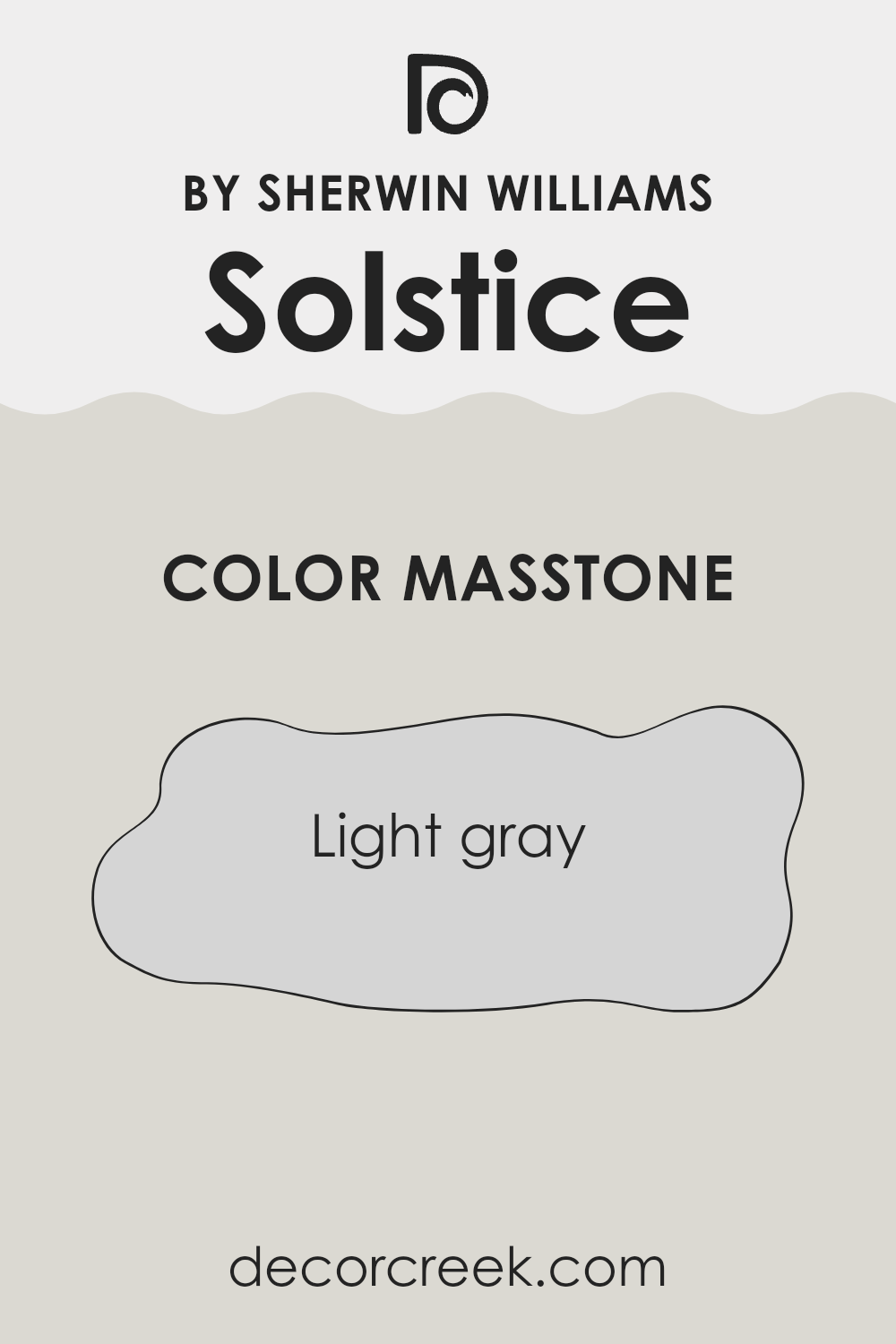
What is the Masstone of the Solstice SW 9571 by Sherwin Williams?
The masstone of SolsticeSW 9571 by Sherwin Williams is a light gray color with the specific shade code #D5D5D5. This particular shade of gray brings a subtle and soft feel to any room it’s used in, making it versatile for various decorating styles.
In homes, this light gray works well because it serves as a neutral backdrop. It doesn’t overpower other colors, so it allows artwork, furniture, and other decor elements to stand out. Additionally, this color can make spaces appear bigger and more open, as light shades tend to give a sense of expansion to an area.
This is especially helpful in smaller rooms or apartments. Moreover, light gray is easy to maintain in terms of cleanliness and touch-ups, as it doesn’t show minor scuffs and dirt as prominently as darker shades might. Overall, this color is practical yet stylish, ideal for creating a calm and inviting home environment.
How Does Lighting Affect Solstice SW 9571 by Sherwin Williams?
Lighting plays a crucial role in how we perceive colors. The color and intensity of light can significantly impact the appearance of paint on walls, affecting mood and ambiance in a room.
Solstice, a color by Sherwin Williams, reacts differently under various lighting conditions. In artificial light, such as that from light bulbs, the color can appear slightly warmer. This makes it cozy and welcoming for evening settings. Depending on the type of bulb used (warm vs. cool), the color may lean more toward a cozy beige or a crisp light tan.
In natural light, Solstice shows its true character, revealing subtle undertones and variations throughout the day. It may look brighter and more vibrant when sunlight is abundant.
The direction a room faces also affects how Solstice appears:
- North-facing rooms: These rooms get less direct sunlight, often casting a cooler, bluer light. Solstice can appear more subdued and slightly cooler in these settings, making the space feel calm but possibly a bit dim if not well-lit with additional lighting.
- South-facing rooms: These rooms benefit from ample sunlight, making Solstice look warmer and brighter. It can bring a cheerful and inviting feel to the room, enhancing the natural light that floods in throughout the day.
- East-facing rooms: With sunlight in the morning, Solstice will look soft and warm early in the day, transitioning to a cooler tone as the sun moves. This variation can make morning rooms lively and refreshing.
- West-facing rooms: Evening light can make Solstice glow warmly in these rooms, ideal for relaxation and winding down in the evening with a cozy, warm atmosphere.
Overall, lighting can make Solstice versatile, adaptable to various settings and moods depending on the natural and artificial light present in a space. Choosing lighting fixtures and bulb temperatures strategically can help achieve the desired feel in a room using this color.

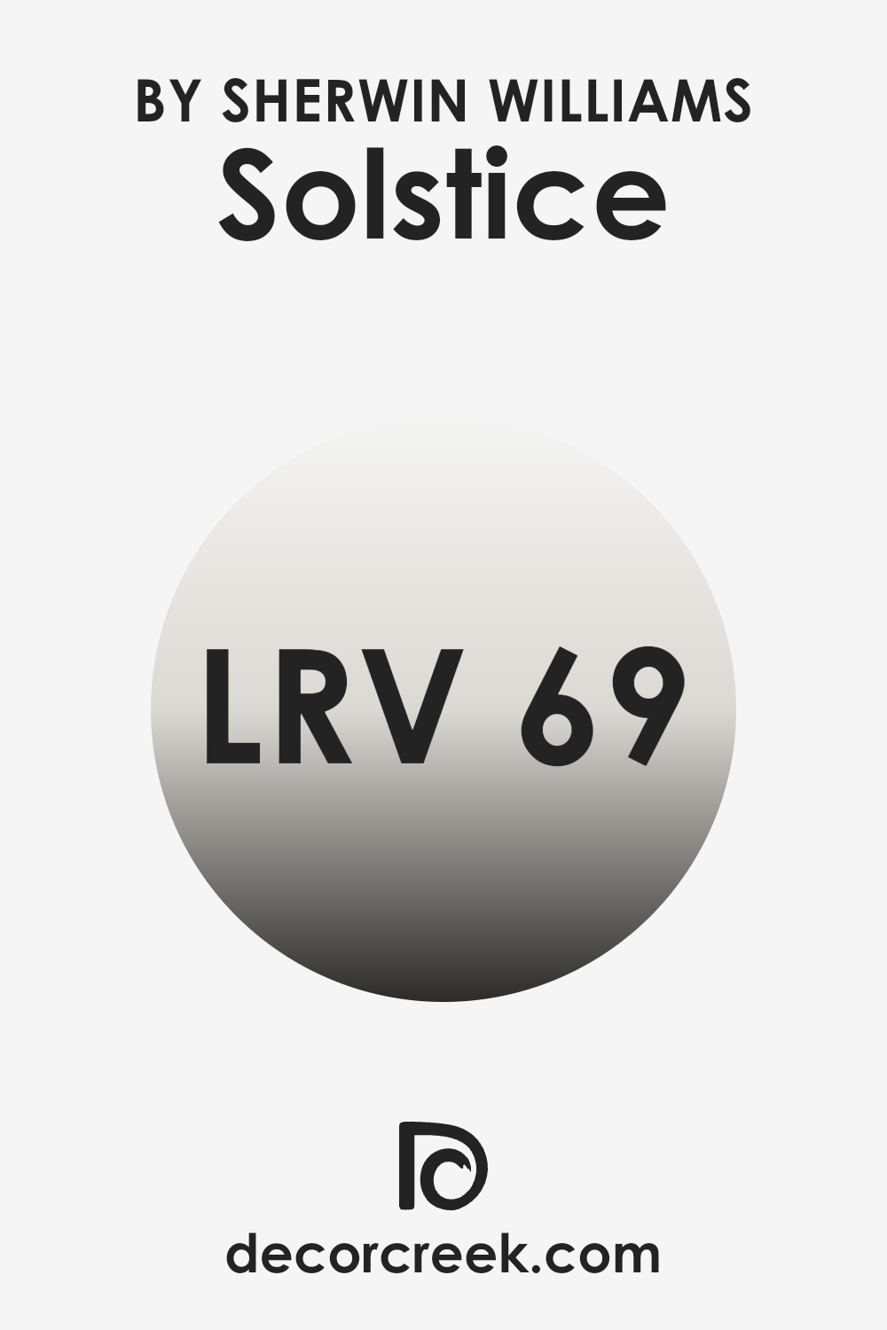
What is the LRV of Solstice SW 9571 by Sherwin Williams?
Light Reflectance Value (LRV) measures the percentage of light a paint color reflects. Think of it this way: when sunlight or your home’s lights hit a wall, some colors bounce a lot of that light back into the room, and others absorb more, making the room feel different.
A higher LRV means the color reflects more light, making spaces appear brighter and larger. On the other hand, a lower LRV can make a room feel cozier and more enclosed because it absorbs more light.
For the color in question, with an LRV of around 69, it falls into the category of colors that reflect quite a bit of light. This means it can make a room feel airy and open, enhancing the natural or artificial light present. Because it doesn’t soak up a lot of light, this kind of LRV can help in making small spaces appear larger.
However, the brightness also depends on lighting conditions; in a very brightly lit room, this color could feel more intense while in a dimmer room, it will help keep the space feeling light.
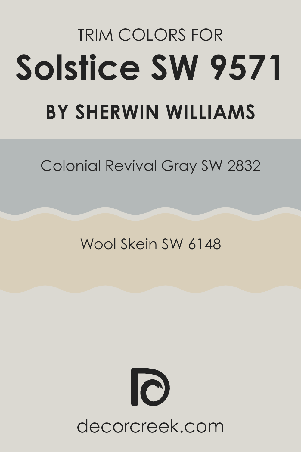
What are the Trim colors of Solstice SW 9571 by Sherwin Williams?
Trim colors, which are typically applied to door frames, moldings, and other accent areas, play a crucial role in complementing the primary wall color of a room. Choosing the right trim color enhances the overall aesthetic of the space, creating a balanced and cohesive look.
For instance, when working with a primary color like Solstice by Sherwin Williams, selecting the right trim colors is essential in achieving a harmonious interior. Specifically, Colonial Revival Gray and Wool Skein are both excellent trim color choices that can subtly highlight and create a pleasing contrast with the warm, earthy tone of Solstice.
Colonial Revival Gray is a muted gray tone that matches well with many colors due to its neutral nature. Its calming gray shade works especially well with the depth of Solstice, providing a refined yet understated boundary that enhances architectural details beautifully. On the other hand, Wool Skein is a soft, creamy beige that offers a lighter touch.
This color adds a gentle warmth to the edges and corners of a room, nicely offsetting the richer hues of Solstice and ensuring that the space feels open and airy. Together, these trim colors enhance the room’s character and highlight its architectural beauty without overwhelming the primary color.
You can see recommended paint colors below:
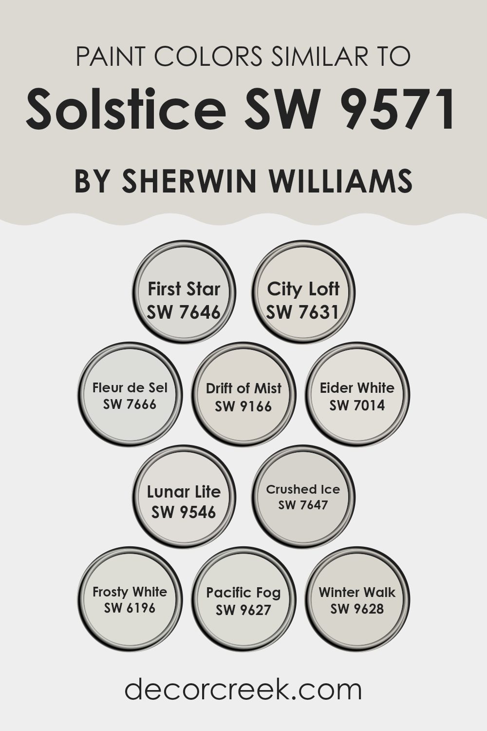
Colors Similar to Solstice SW 9571 by Sherwin Williams
Using similar colors in interior design can create a cohesive and harmonious look, making spaces feel more put-together and pleasant. Colors that complement each other, such as those close to Solstice by Sherwin Williams, can seamlessly blend different design elements, helping the environment feel unified. When similar shades, like the ones mentioned, are used together, they can enhance each other’s beauty without overpowering the space, bringing about a subtle and soothing aesthetic.
For example, First Star is a gentle gray that provides a clean, understated backdrop in any room. City Loft offers a slightly warmer tone, making it ideal for creating a cozy yet light atmosphere. Fleur de Sel is another soft gray with a hint of warmth, perfect for areas that want a touch of sophistication without being too dark.
Drift of Mist and Eider White are both pale grays that work well to brighten up spaces while maintaining an airy feel. Lunar Lite has a barely-there gray tone, great for a minimalist approach. Crushed Ice, a gray with a hint of blue, adds a refreshing touch. Frosty White is excellent for those who prefer a crisp, clean look, reflecting a lot of light and making spaces appear larger.
Meanwhile, Pacific Fog offers a deeper gray, enriching spaces with more depth. Lastly, Winter Walk provides a cool, neutral palette that pairs well with vibrant colors, allowing them to stand out without clashing. These colors help in achieving a balanced and inviting atmosphere in any home or space.
You can see recommended paint colors below:
- SW 7646 First Star
- SW 7631 City Loft
- SW 7666 Fleur de Sel
- SW 9166 Drift of Mist
- SW 7014 Eider White
- SW 9546 Lunar Lite
- SW 7647 Crushed Ice
- SW 6196 Frosty White
- SW 9627 Pacific Fog
- SW 9628 Winter Walk
How to Use Solstice SW 9571 by Sherwin Williams In Your Home?
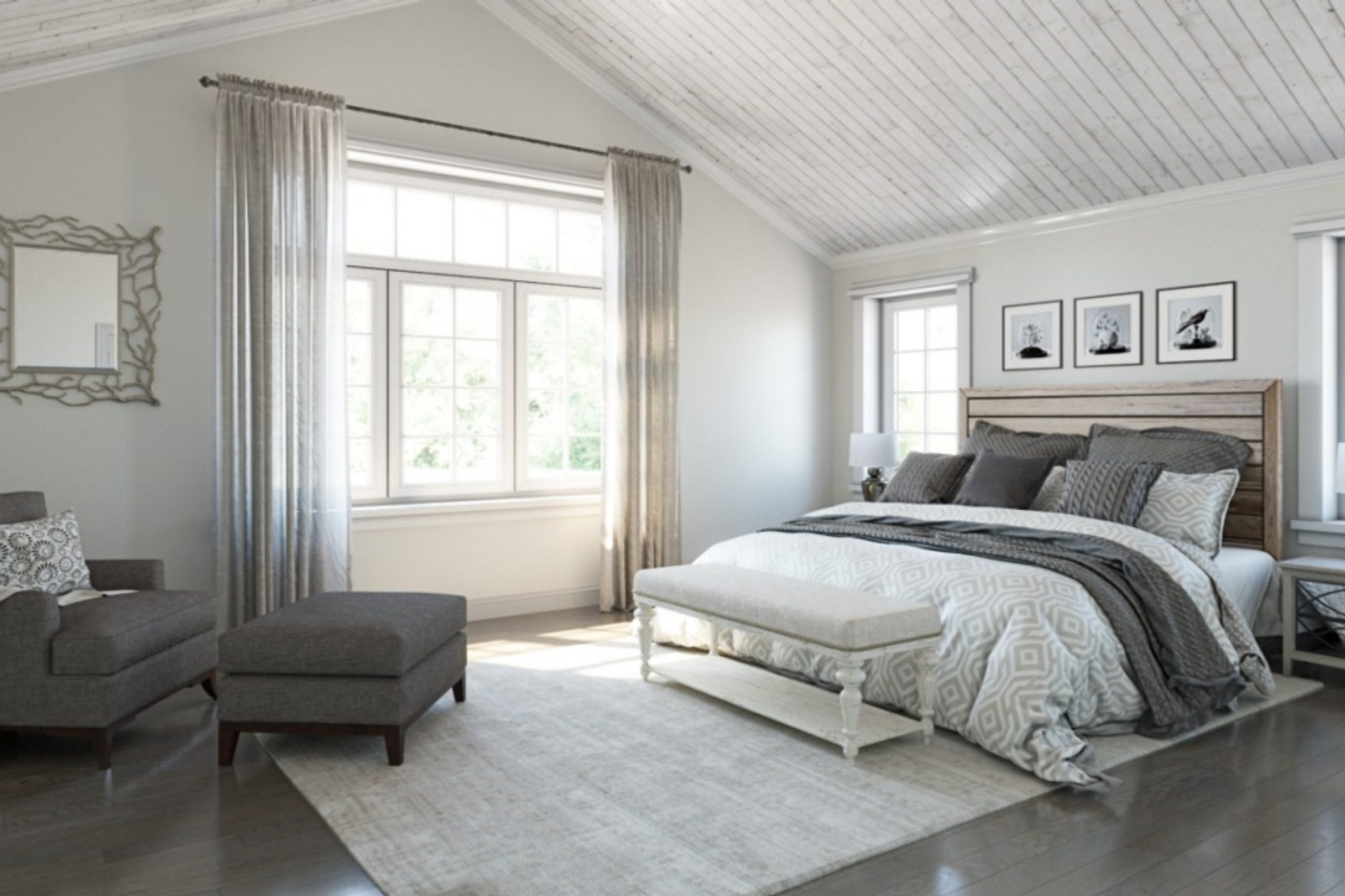
Solstice SW 9571 by Sherwin Williams is a versatile paint color that adds a beautiful touch to any room. Its warm beige tone creates a cozy and welcoming atmosphere, making it perfect for living rooms, bedrooms, or even hallways. This color works well with natural light, enhancing a bright and airy feel during the day while maintaining a soft glow in the evening.
When using Solstice in your home, you can pair it with white trim and moldings to create a clean, fresh look, or match it with darker colors like navy or dark green for a striking contrast. This shade is great for covering walls, and it’s also ideal for cabinets or furniture, giving old pieces a fresh new look.
For those interested in adding some texture, Solstice can be used in combination with wallpapers or fabric decorations, such as curtains and cushions, to add more layers to your design. This color is both lovely on its own and as a background that helps other colors pop, making it a flexible choice for any decorating plan.
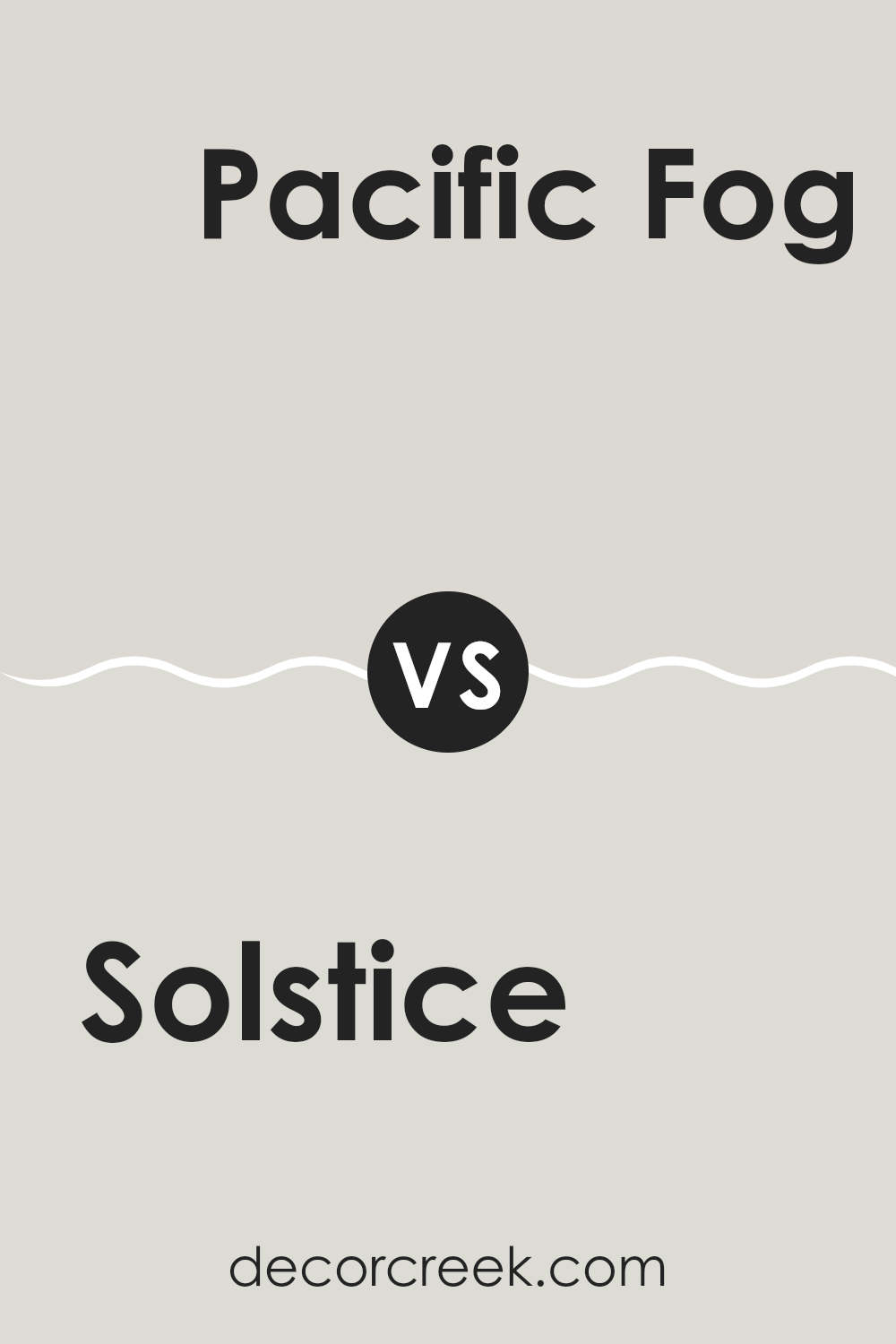
Solstice SW 9571 by Sherwin Williams vs Pacific Fog SW 9627 by Sherwin Williams
Solstice SW 9571 and Pacific Fog SW 9627 are both paint colors by Sherwin Williams, each offering a unique tone for different decorating needs. Solstice is a rich, deep blue that adds a bold pop of color to any space, perfect for making a statement or creating a focal point in a room.
In contrast, Pacific Fog is a soft, gentle gray that provides a subtle and soothing backdrop, ideal for rooms where you want to relax and unwind. While Solstice brings energy and depth with its darker hue, Pacific Fog offers a calm and neutral option that blends easily with various decor styles.
Whether you’re aiming for drama and impact or a gentle, calming atmosphere, these colors provide distinct choices that can dramatically alter the feel of a space.
You can see recommended paint color below:
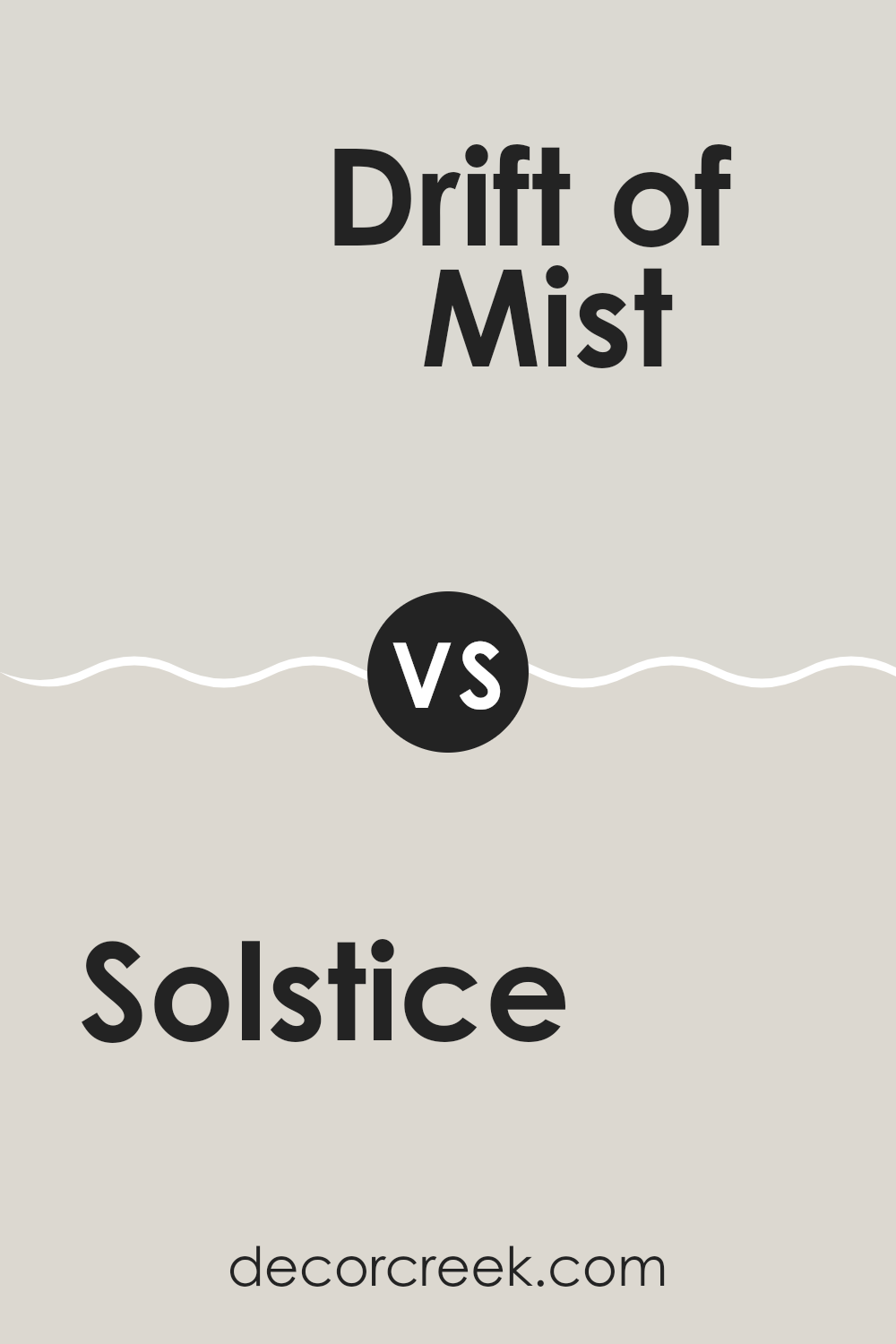
Solstice SW 9571 by Sherwin Williams vs Drift of Mist SW 9166 by Sherwin Williams
Solstice and Drift of Mist are both shades by Sherwin Williams, offering unique tones for different spaces. Solstice is a darker shade that brings warmth to a room. It has a cozy feel and is perfect for creating a welcoming atmosphere.
Drift of Mist, on the other hand, is much lighter, leaning towards a soft gray with cool undertones. This color is great for making small spaces appear larger and brighter. While Solstice may be ideal for accent walls or cozy areas, Drift of Mist works well as a neutral backdrop in various settings.
Both colors are versatile yet serve different purposes depending on the room’s requirements and the mood you want to set. Whether looking for a bold or subtle effect, each has its charm and utility.
You can see recommended paint color below:
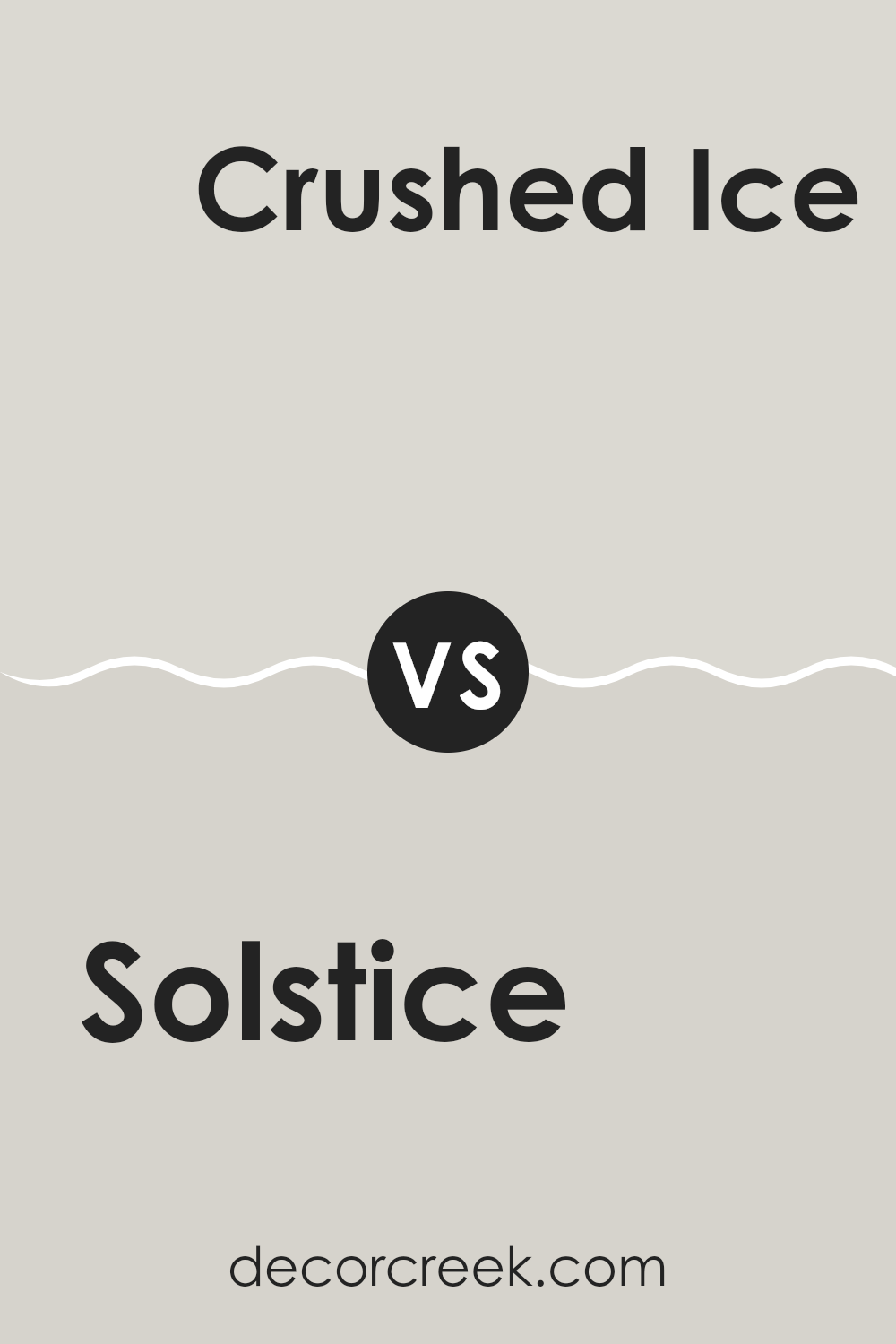
Solstice SW 9571 by Sherwin Williams vs Crushed Ice SW 7647 by Sherwin Williams
Solstice and Crushed Ice, both by Sherwin Williams, present a soothing yet distinct palette. Solstice is a deeper, cooler blue, almost hinting at dusk, providing a calm, reflective vibe to any space. It works well in areas where a touch of calm and concentration is desired, like studies or bedrooms.
In contrast, Crushed Ice is a light gray that leans towards being a neutral backdrop, making it incredibly versatile for various decorating styles. It’s light enough to make small spaces appear larger while providing a clean canvas that can be dressed up with any color.
When these two colors are used together, Crushed Ice can lighten up a room, while Solstice can add a hint of color depth and interest, perfect for creating visually striking yet soothing environments.
You can see recommended paint color below:
Solstice SW 9571 by Sherwin Williams vs Fleur de Sel SW 7666 by Sherwin Williams
Solstice SW 9571 and Fleur de Sel SW 7666, both by Sherwin Williams, offer distinct vibes for different spaces. Solstice is a darker, moody gray with hints of blue, making it perfect for creating a cozy, calm atmosphere in a room.
It pairs well with bright whites or soft creams for a striking contrast. On the other hand, Fleur de Sel is much lighter, almost a pale gray with a touch of warmth. This color is great for opening up a space and making it feel airy and light.
It works beautifully in small rooms or areas without much natural light as it reflects what light there is, creating a more spacious feel. Both colors are versatile but serve different purposes based on the mood or size of the room you’re painting.
You can see recommended paint color below:
Solstice SW 9571 by Sherwin Williams vs City Loft SW 7631 by Sherwin Williams
Solstice and City Loft by Sherwin Williams are two distinct colors with unique qualities. Solstice is a warm, inviting beige that adds a cozy feel to any room. Its deep, rich tone creates a sense of comfort and can make large spaces feel more intimate.
On the other hand, City Loft is a much lighter shade, almost an off-white, with subtle gray undertones. This color is great for making small spaces appear larger and brighter. It brings a clean, fresh look to a room, working especially well in modern settings.
While Solstice offers depth and warmth, City Loft provides an airy, open feel. Both colors are versatile, but the choice between them depends on what atmosphere you want to create in your space.
You can see recommended paint color below:
Solstice SW 9571 by Sherwin Williams vs Eider White SW 7014 by Sherwin Williams
Solstice and Eider White, both by Sherwin Williams, are distinct shades that cater to different tastes and design needs. Solstice, a rich and earthy hue, offers a bold and comforting presence suitable for spaces meant to feel cozy and inviting. It’s a great choice for accent walls or rooms where you want a touch of drama and warmth.
On the other hand, Eider White is a much lighter shade, often considered a soft gray with hints of warm undertones. This color is perfect for creating a bright and airy feel in a room, making spaces seem larger and more open. It works well in almost any part of the home, particularly in areas where natural light is abundant.
In essence, while Solstice provides depth and a sense of enclosure, Eider White opens up a space and brings in lightness. Depending on what you want from a room—cozy and grounded versus spacious and light—either of these colors could be the perfect choice.
You can see recommended paint color below:
Solstice SW 9571 by Sherwin Williams vs Winter Walk SW 9628 by Sherwin Williams
The main color, Solstice, and the second color, Winter Walk, both by Sherwin Williams, offer distinct vibes for any space. Solstice has a deep, rich gray tone that brings a sense of calm and grounding.
It’s a strong color that can make a room feel more secure and enclosed, perfect for creating a cozy, intimate atmosphere. On the other hand, Winter Walk is a much lighter gray with a softer and more open feel.
This color can make a small room seem larger and more airy, providing a neutral backdrop that’s easy to match with a wide range of decor. Both colors are versatile, but while Solstice adds drama and depth, Winter Walk offers a clean and light feeling, making each ideal for different purposes and spaces in a home.
You can see recommended paint color below:

Solstice SW 9571 by Sherwin Williams vs Lunar Lite SW 9546 by Sherwin Williams
Solstice SW 9571 and Lunar Lite SW 9546 from Sherwin Williams are two shades that offer distinctly different vibes for any space. Solstice is a deep, vibrant blue that brings a strong presence into a room. It has an oceanic feel that could anchor a space with its rich hue. This color is perfect for making a bold statement on an accent wall or in areas where you want to draw attention.
On the other hand, Lunar Lite is much lighter, presenting a soft, pale gray that feels airy and light. This color is great for creating a clean, minimalistic look in a space, providing a backdrop that makes other colors pop without overpowering them.
Especially useful in smaller spaces or rooms that need a brighter appearance, it reflects light well, adding a sense of increased space. Both colors have their unique appeals depending on what atmosphere you’re aiming to achieve in your decorating project.
You can see recommended paint color below:
Solstice SW 9571 by Sherwin Williams vs Frosty White SW 6196 by Sherwin Williams
Solstice (SW 9571) and Frosty White (SW 6196) are two paint colors from Sherwin Williams, each bringing its unique charm to a space. Solstice is a deep, moody hue that leans towards a warm gray with subtle undertones. This color is great for creating a cozy and inviting atmosphere, making it an excellent choice for bedrooms or living areas where a comforting vibe is desired.
On the other hand, Frosty White is much lighter, offering a crisp and clean look. It’s a classic white with a slight coolness to it, making it ideal for spaces like kitchens and bathrooms or anywhere you want to achieve a bright, airy feel. This color helps reflect light, making small rooms appear larger and more open.
Together, these colors can work harmoniously in a home. Frosty White could be used on walls to keep spaces feeling open while using Solstice as an accent in furniture or decor items can add depth and interest to a room.
You can see recommended paint color below:
Solstice SW 9571 by Sherwin Williams vs First Star SW 7646 by Sherwin Williams
Solstice SW 9571 and First Star SW 7646 by Sherwin Williams are two distinct shades. Solstice presents itself as a soft, warm gray with a calming quality that makes it a perfect choice for spaces where you want a comforting and inviting vibe.
Its understated warmth can add a cozy feel to any room without overpowering other design elements. On the other hand, First Star is a cooler, lighter gray that offers a fresh and clean look. This color works great in smaller spaces or areas with less natural light, as it helps to make rooms appear brighter and more open.
Comparing the two, Solstice leans towards a slightly warmer tone, making it ideal for living areas or bedrooms, while First Star suits functional spaces like kitchens and bathrooms due to its crisp, clear presence. Both colors support versatile design aesthetics and can be easily integrated into various decor styles.
You can see recommended paint color below:
Conclusion
SW 9571 Solstice is a good choice if you want a room to feel calm and peaceful, like a quiet corner for reading or a space for doing homework. It’s also very pretty to look at and can make old furniture or decorations look new again because it goes well with many other colors.
From everything I’ve read, this paint is easy to use, covers walls well, and lasts a long time, so you don’t have to repaint often. It can be used in many different rooms, like bedrooms, living rooms, and even bathrooms, making it a handy color to have around if you’re thinking of changing up your home.
In conclusion, SW 9571 Solstice by Sherwin Williams sounds like a great choice for anyone looking to refresh their home with a new color that’s easy on the eyes and practical. It can help make any room feel more inviting and comfy, which is wonderful, whether you’re spending time with family or just relaxing by yourself.
Ever wished paint sampling was as easy as sticking a sticker? Guess what? Now it is! Discover Samplize's unique Peel & Stick samples.
Get paint samples

