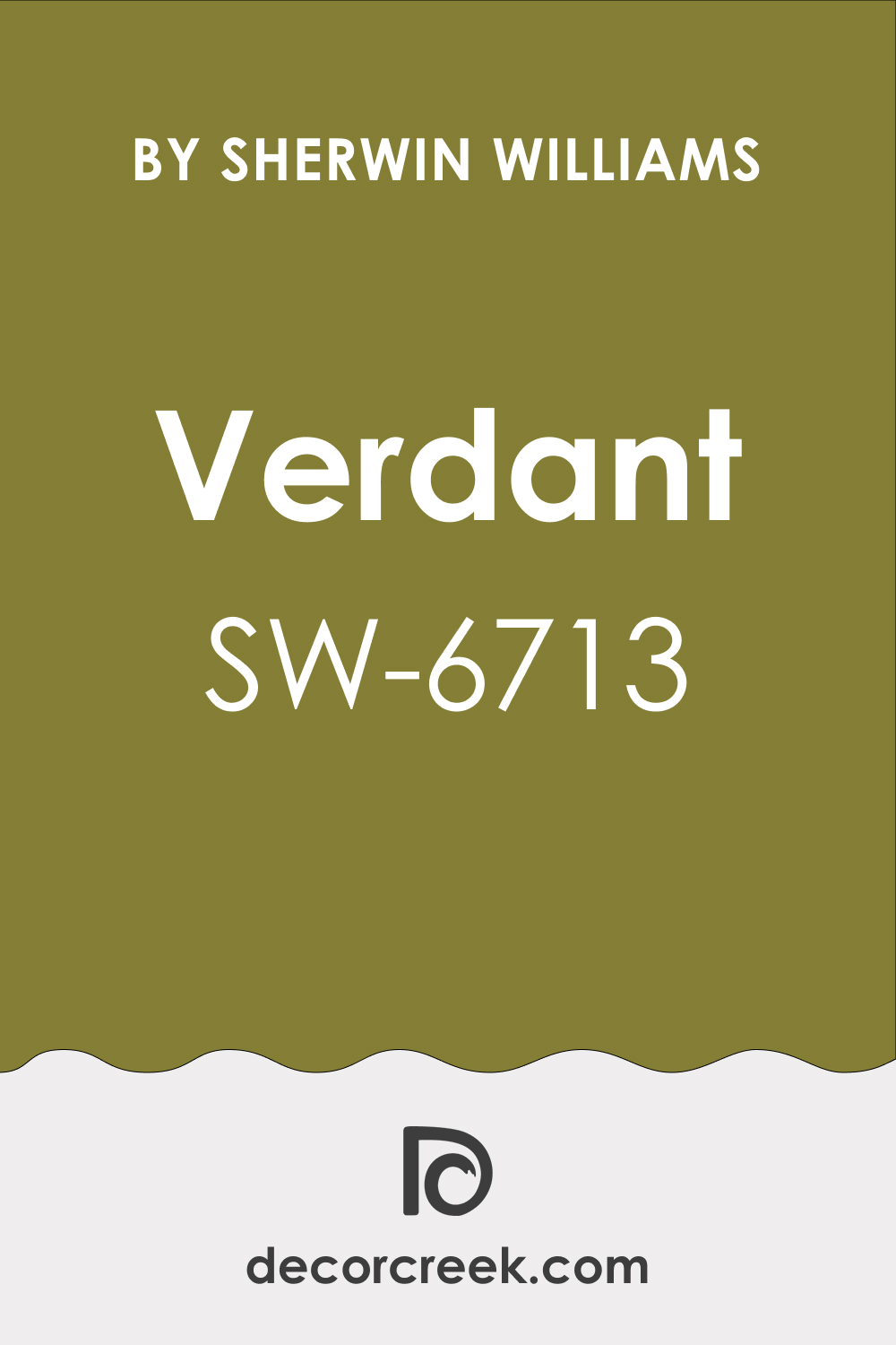
Nature has a way of soothing our senses, and so does the color Verdant from Sherwin-Williams. With the color code SW 6713, Verdant is a beautiful mid-tone green that radiates the energy of the outdoors, embodying the essence of lush landscapes, fertile fields, and the vibrant foliage of spring.
This article dives deep into the characteristics of Verdant, its undertones, coordinating colors, Light Reflectance Values (LRV), and its applications in various parts of your home.
What Color Is SW 6713 Verdant? Is It a Warm Or Cool Color?
SW 6713 Verdant is a leafy green color that leans towards the cool end of the spectrum. As Hextoral says, it resembles the green you’d find on a rich, lush forest floor or in the depths of a summer meadow. Despite its coolness, it is by no means cold or sterile. Instead, SW Verdant radiates a lively freshness, bringing a touch of nature’s vitality indoors.
Ever wished paint sampling was as easy as sticking a sticker? Guess what? Now it is! Discover Samplize's unique Peel & Stick samples.
Get paint samples

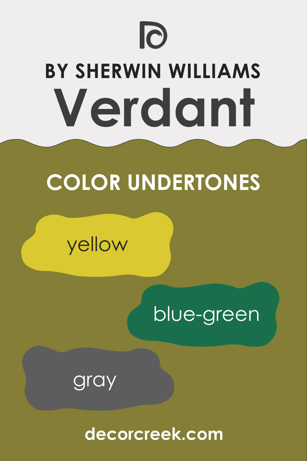
Undertones of SW 6713 Verdant Paint Color
Understanding the undertones of color can help you match them with other colors seamlessly. SW Verdant has the following undertones:
- Blue-green: SW Verdant carries a subtle hint of blue, which adds depth to its overall appearance and enhances its cooling effect.
- Gray: This undertone is what gives SW Verdant its muted, sophisticated quality, making it more versatile than brighter greens.
- Yellow: A slight yellow undertone is present, imparting warmth to SW Verdant and making it feel more organic and natural.
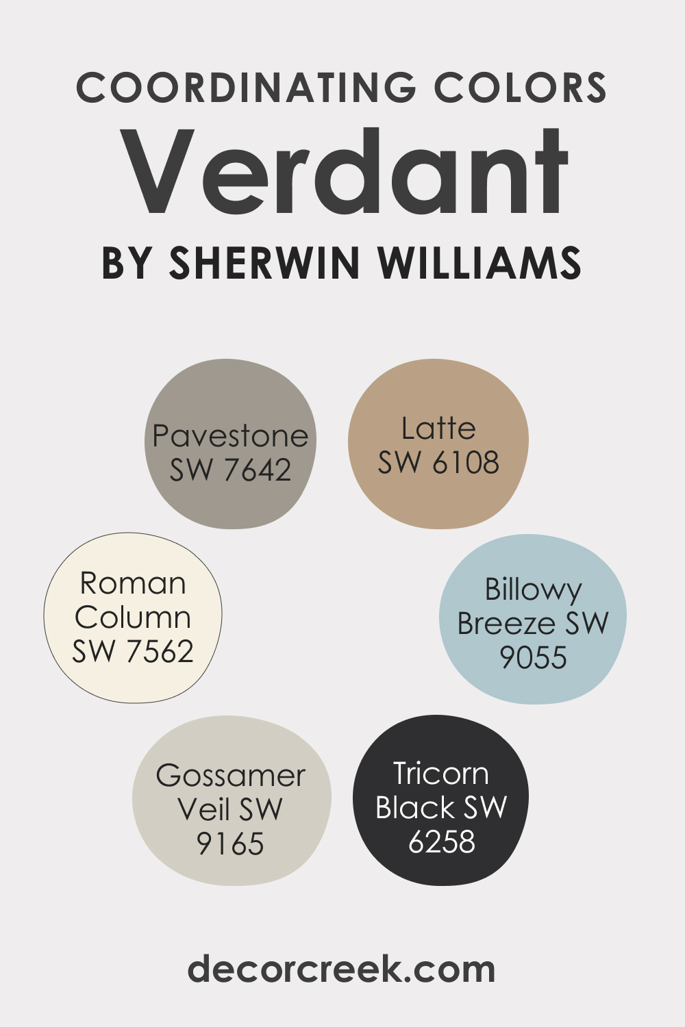
Coordinating Colors of SW 6713 Verdant
Choosing coordinating colors can be fun, but to do so, you should know how to select the correct hues. SW Verdant can be coordinated with various colors to create different moods. For this beautiful green color, we recommend the following coordinating colors to achieve the best effect:
- SW 7562 Roman Column : This is a warm, creamy white that contrasts well with Verdant, enhancing its vibrancy.
- SW 9165 Gossamer Veil : A soft grey-beige, Gossamer Veil can provide a sophisticated, earthy backdrop that allows Verdant to pop.
- SW 7642 Pavestone : This deep, warm gray can create a stunning contrast with Verdant, creating a rich, cozy environment.
Additionally, here are three more compatible colors:
- SW 6108 Latte : A warm, inviting beige, Latte pairs well with Verdant, creating a relaxed, natural atmosphere.
- SW 9055 Billowy Breeze : This light, cool blue-green complements Verdant’s organic feel, creating a tranquil, harmonious palette.
- SW 6258 Tricorn Black : For a bold, dramatic effect, this strong, pure black can contrast strikingly with Verdant.
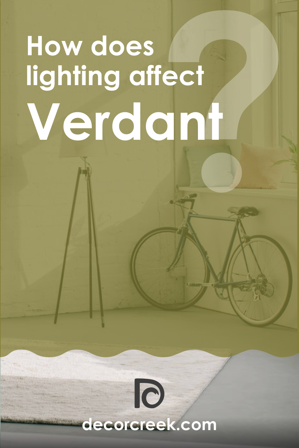
How Does Lighting Affect SW 6713 Verdant Paint Color?
Lighting plays a critical role in how a color is perceived. In abundant natural light, SW Verdant appears brighter and more vibrant, embodying the freshness of a sunny spring day. Under artificial lighting, the color becomes more subdued, with its gray undertones becoming more prominent, lending a calming, muted elegance to the space. It’s essential to test Verdant in your space under various lighting conditions to see how it adapts throughout the day.
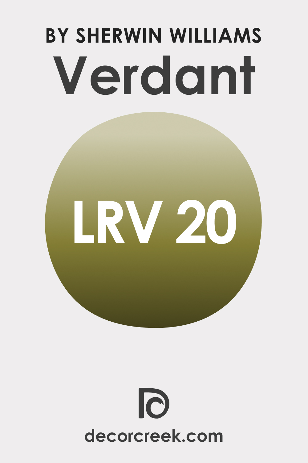
LRV of SW 6713 Verdant Paint Color
The Light Reflectance Value (LRV) measures the amount of light a color reflects. SW Verdant has an LRV of 20, meaning it reflects a moderate amount of light. It’s not as bright as pastels or off-whites, which have higher LRVs, nor as absorbing as dark hues with lower LRVs.
This places SW Verdant in the medium range, making it a balanced choice that can add color to a room without making it feel too dark or too bright. It’s important to note that color with an LRV of 20 can add depth to a room, making it feel more intimate and cozy while still reflecting enough light to maintain a sense of spaciousness.
LRV – what does it mean? Read This Before Finding Your Perfect Paint Color
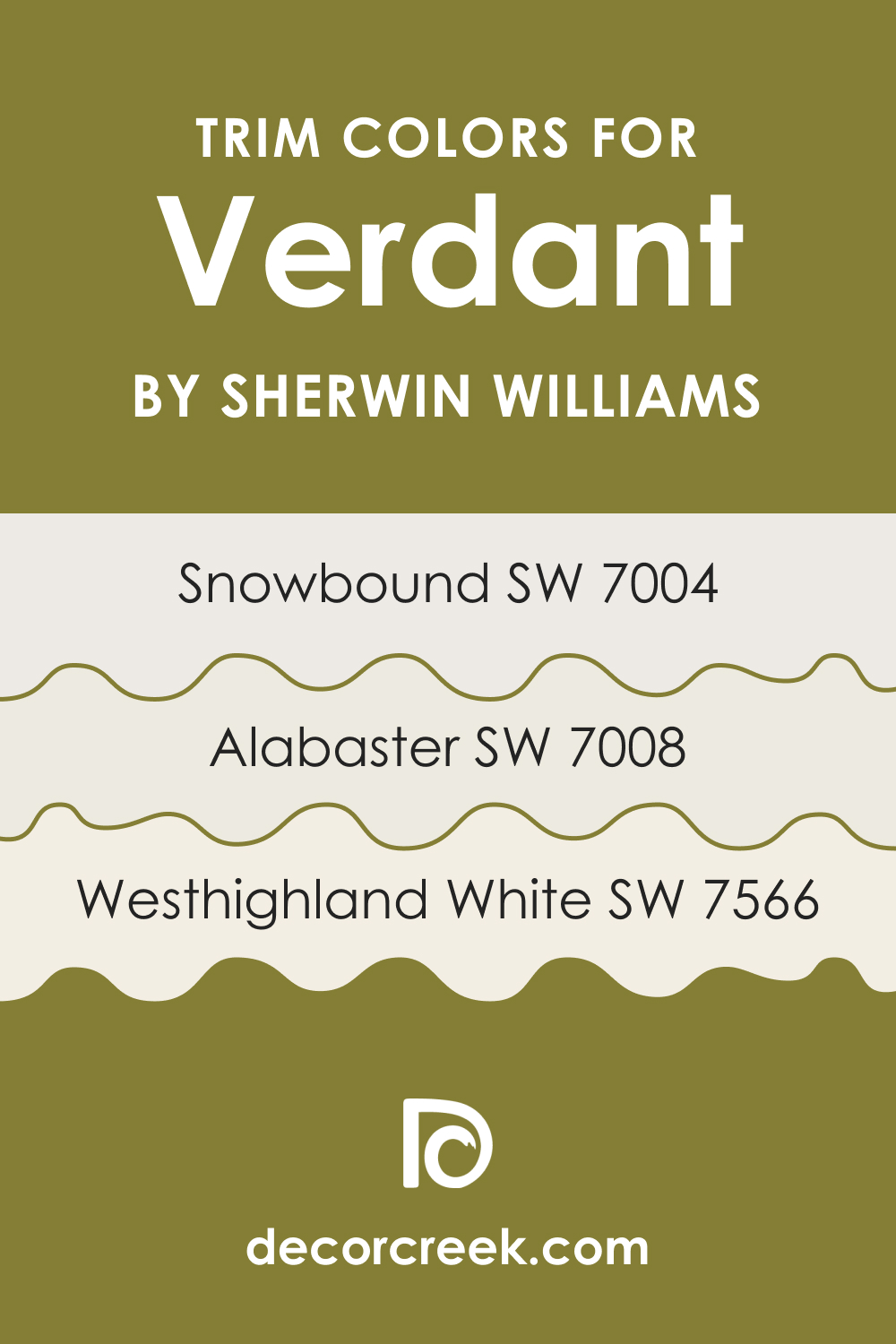
Trim Colors of SW 6713 Verdant
Choosing the right trim color can accentuate SW Verdant beautifully. Here are three color suggestions that will work best:
- SW 7004 Snowbound : This light, slightly cool white can provide a crisp, clean border that allows Verdant to shine.
- SW 7008 Alabaster : A warmer, creamy white, Alabaster offers a soft, harmonious contrast to Verdant.
- SW 7566 Westhighland White : This is a clean, bright white that creates a stark contrast with Verdant, highlighting architectural features.
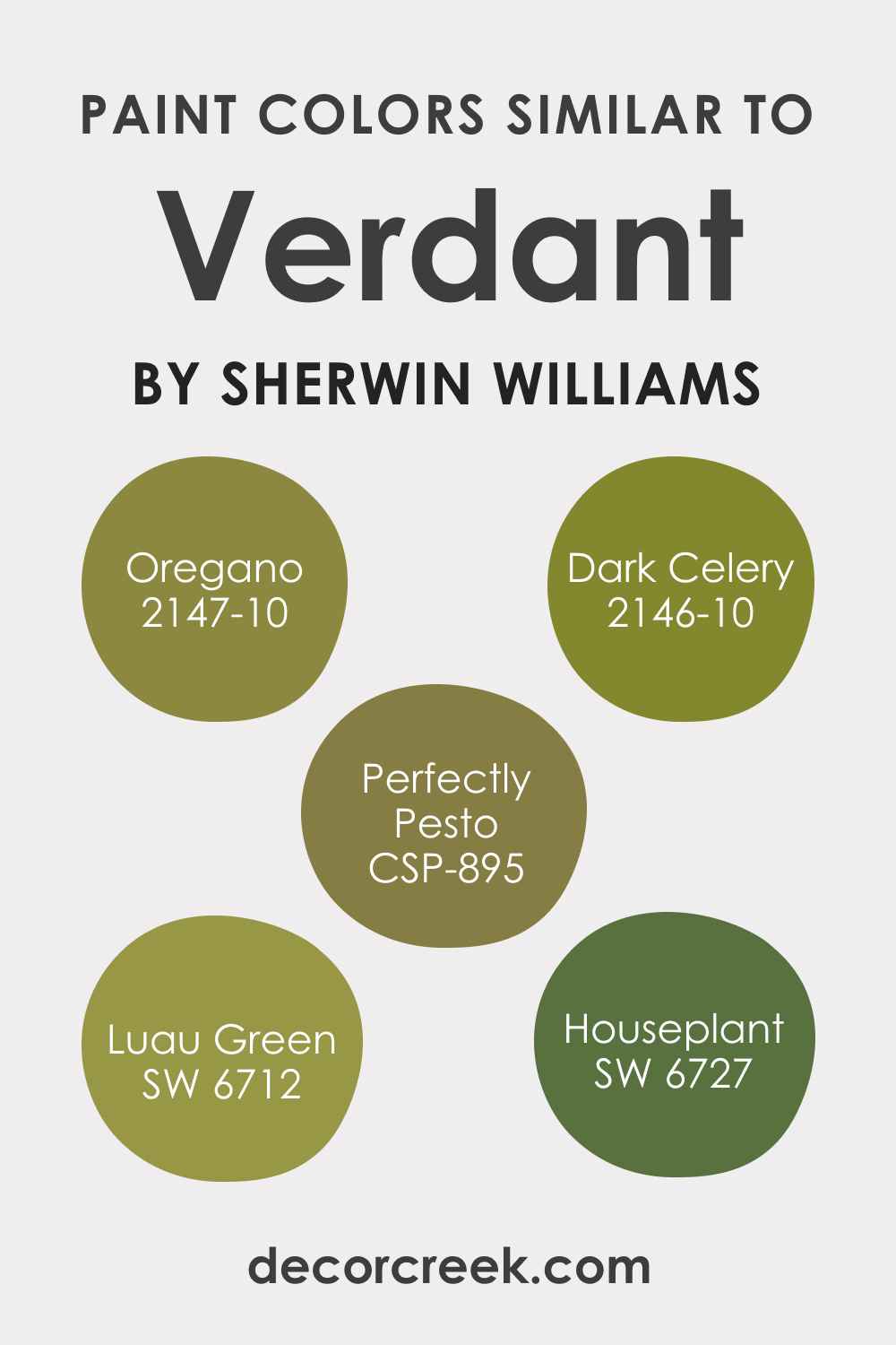
Colors Similar to SW 6713 Verdant
If you love SW Verdant but want to explore other options, consider these similar shades from Sherwin-Williams:
- SW 6712 Luau Green : Slightly more vibrant and brighter.
- SW 6727 Houseplant : A darker, more muted green.
In case you want to try similar colors from other brands, you might want to check out the following options:
- PPG Peas Please (PPG1110-7)
- PPG Frog’s Legs (PPG1116-7)
- BM Perfectly Pesto (CSP-895)
- BM Oregano (2147-10)
- BM Dark Celery (2146-10)
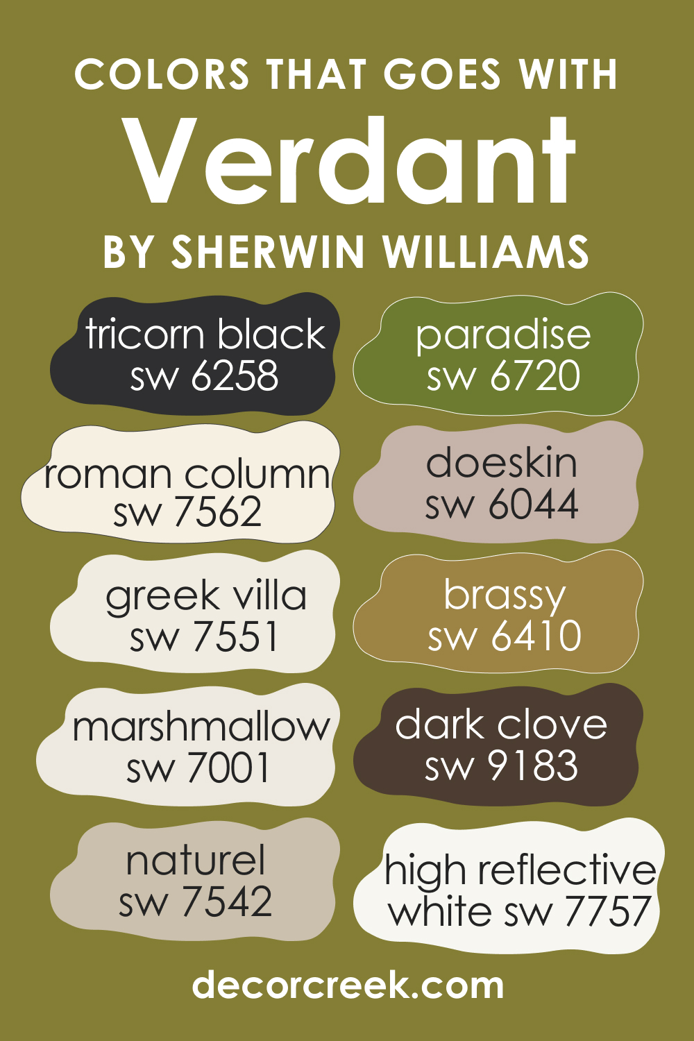
Colors That Go With SW 6713 Verdant
To create a harmonious palette with Verdant, consider these complementary colors:
- SW 7551 Greek Villa : A soft, off-white that creates a fresh, airy contrast with Verdant.
- SW 6258 Tricorn Black : For a bold, dramatic contrast, this strong black pairs well with Verdant.
- SW 7562 Roman Column : This warm, creamy white enhances Verdant’s vibrancy.
- SW 6044 Doeskin : A rich, warm beige that offers a soothing contrast to Verdant.
- SW 7001 Marshmallow : This pure white provides a clean, crisp backdrop that allows Verdant to stand out.
Also, you might want to try the following colors if you prefer a more nature-inspired palette:
- SW 9183 Dark Clove
- SW 6410 Brassy
- SW 6720 Paradise
- SW 7757 High Reflective White
- SW 7542 Naturel
How to Use This Color In Your Home?
SW Verdant may seem to be an uneasy color to incorporate into your interior but believe us, it’s not like that! This cheerful and juicy green can work great in quite many spaces!
How to Use SW 6713 Verdant in the Bedroom?
SW Verdant is a fantastic choice for a bedroom, as its calming, natural hue promotes relaxation and tranquility. Pair it with warm, neutral textiles in shades of cream or beige for a cozy, inviting atmosphere. Dark wood furniture would complement the green nicely, adding an earthy, grounded feel. For a more modern look, use SW Verdant on a feature wall and balance it with lighter shades on the other walls.
In a child’s bedroom, SW Verdant can bring a sense of outdoor adventure. Pair it with white or light-colored furniture for a bright, fresh look. Incorporate fun accents in complementary colors like sunny yellows or bright blues to create an exciting, vibrant space.

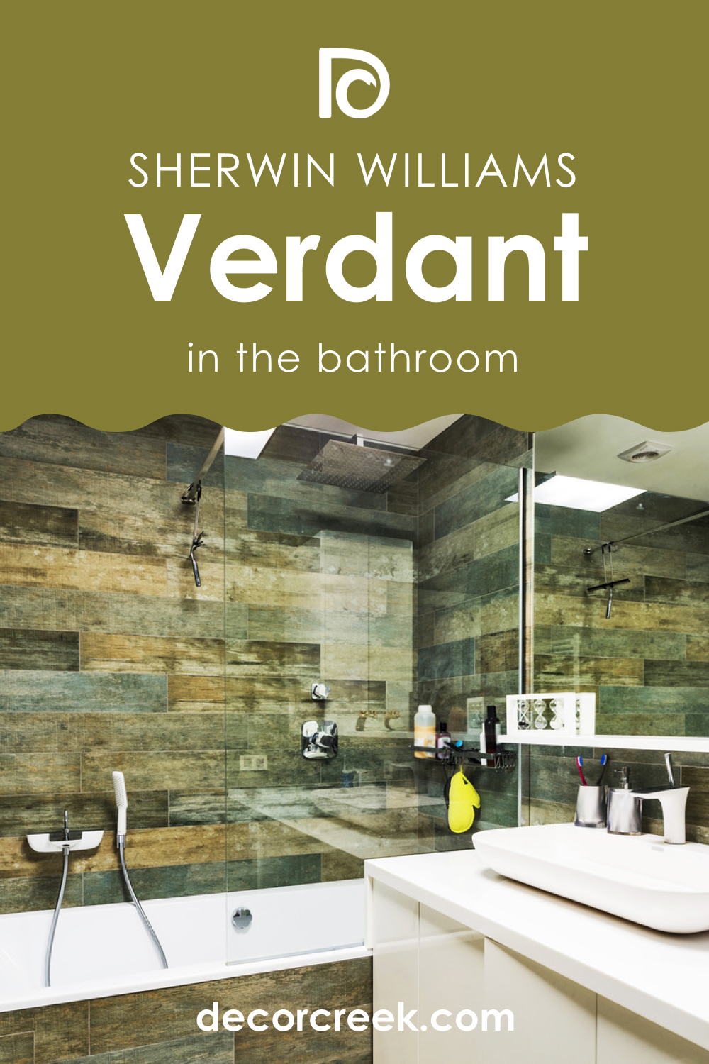
How to Use SW 6713 Verdant in the Bathroom?
SW Verdant can bring a spa-like feel to your bathroom. Pair it with crisp white tiles and fixtures for a clean, fresh look, or choose warm, natural materials like wood or stone for a more earthy vibe. SW Verdant also pairs well with metallics. Gold or brass fixtures would add a touch of luxury, while matte black or chrome would create a more modern look.
In a small bathroom, consider using SW Verdant as an accent color. Paint a single wall, or use it in decorative elements like towels, bath mats, or shower curtains to bring a touch of nature without overwhelming the space.
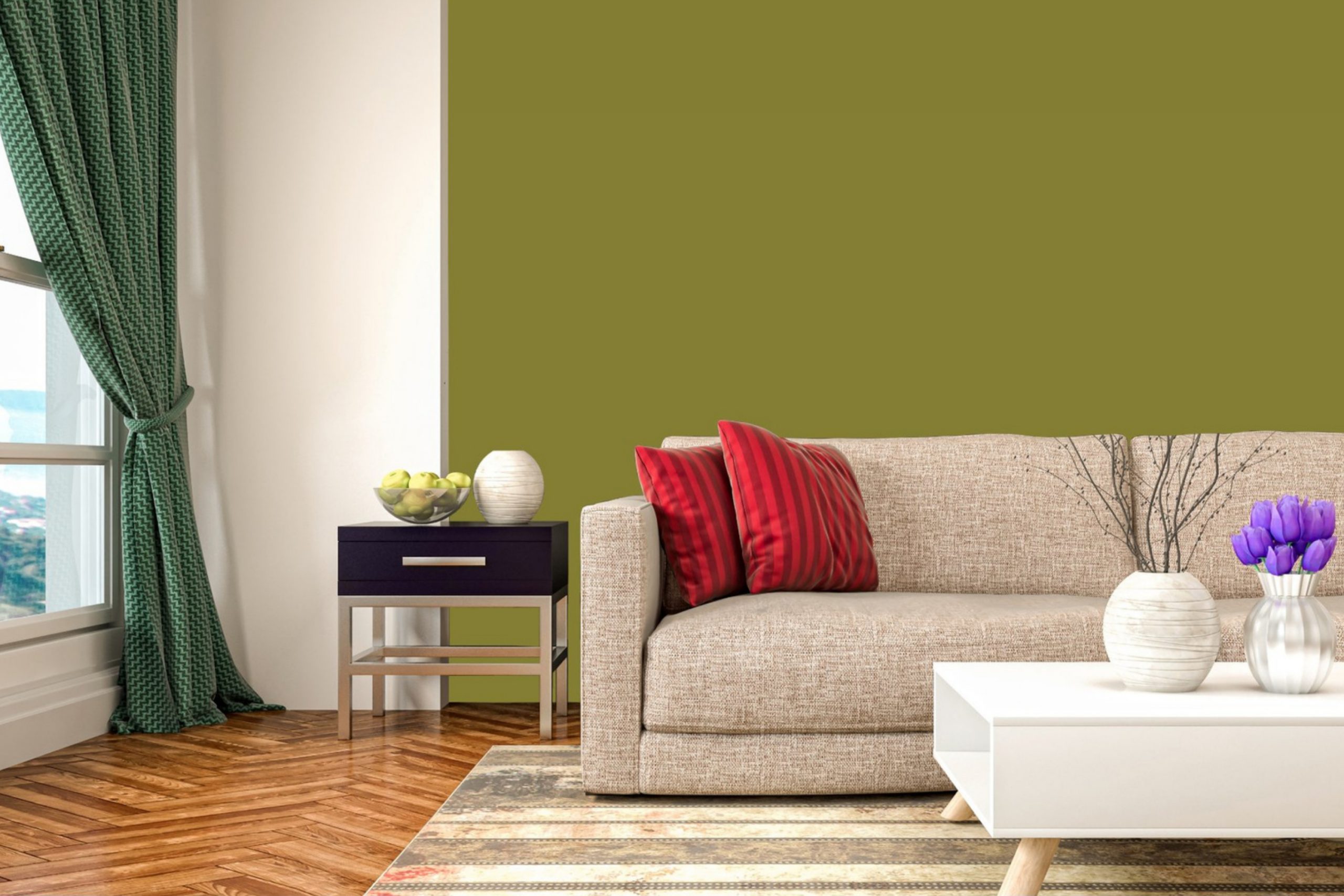
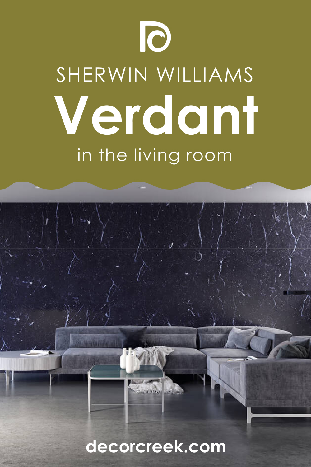
How to Use SW 6713 Verdant in the Living Room?
In the living room, SW Verdant can create a relaxed, welcoming atmosphere. It’s a great color for large walls, as it isn’t overwhelming and provides a calming backdrop. Pair it with warm woods and a mix of textured natural fabrics in earthy colors for a harmonious, grounded look.
For a more contemporary feel, pair SW Verdant with a modern color palette. Greys, whites, and blacks would create a chic, stylish look. A pop of a bright color like magenta or orange in accessories or art would provide a bold contrast and bring the room to life.
How to Use SW 6713 Verdant in the Kitchen?
Using SW Verdant in the kitchen can make the space feel fresh and vibrant. It’s a great color for cabinets or an accent wall. Pair it with white or light wood countertops for a fresh, airy feel. Alternatively, dark countertops would create a more dramatic contrast.
For a country kitchen look, pair SW Verdant with rustic wood finishes and traditional accessories in warm colors. Or, for a more modern look, use sleek, glossy finishes in black or stainless steel.

How to Use SW 6713 Verdant for an Exterior?
Verdant is a great choice for the exterior of a home. It harmonizes well with the outdoors, connecting the house with its surroundings. Pair it with crisp white trim for a classic look, or opt for a deep, warm gray to make the green pop.
For a bold, dramatic look, use SW Verdant on the front door against a lighter house color. This creates a focal point and adds a vibrant touch to your home’s exterior. Alternatively, use Verdant on shutters or trim for a more subtle hint of color.

Comparing SW Verdant With Other Colors
To help you better see the distinctions between the Verdant color and other colors (some of which look nearly the same), we compared SW Verdant with a few other hues.
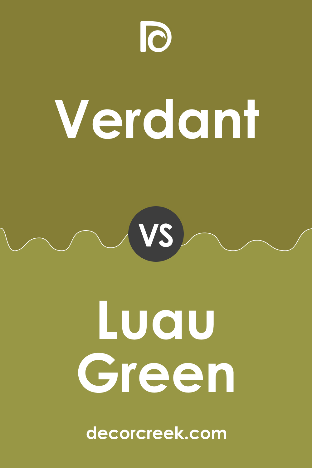
SW 6713 Verdant vs Sherwin-Williams SW 6712 Luau Green
SW Luau Green is a vibrant, tropical green that’s brighter than Verdant. It has a slightly higher LRV, making it a great choice for spaces where you want a more lively, energizing atmosphere. While SW Verdant feels calm and grounding, Luau Green is more energetic and playful.
SW 6713 Verdant vs Sherwin-Williams SW 6714 Citrine
SW Citrine leans towards a yellow-green, making it warmer than SW Verdant. It has a sunny, cheerful quality that makes spaces feel bright and inviting. While SW Verdant brings the calm of a lush forest into a room, Citrine brings in the vibrancy of a sunny meadow.
SW 6713 Verdant vs Sherwin-Williams SW 6727 Houseplant
SW Houseplant is a darker, more muted green compared to SW Verdant. It has a lower LRV, making it a better choice for creating a cozy, intimate atmosphere. While Verdant has a fresh, vibrant quality, Houseplant offers a deeper, more comforting feel.
SW 6713 Verdant vs Sherwin-Williams SW 6739 Eco Green
SW Eco Green is a brighter, more lively green compared to Verdant. It has a higher LRV and a more vibrant feel, making it a great choice for spaces where you want to evoke energy and positivity. SW Verdant, on the other hand, provides a more relaxing, calming atmosphere.
SW 6713 Verdant vs Sherwin-Williams SW 6457 Kind Green
SW Kind Green is softer , more muted green than Verdant. It has a calming, soothing effect and can be a great choice for creating a peaceful, restful space. While Verdant carries a sense of energy and vibrancy, Kind Green offers quiet tranquility.
SW 6713 Verdant vs Sherwin-Williams SW 6728 Rosemary
SW Rosemary is a deeper , more earthy green compared to Verdant. It has a lower LRV, making it a better choice for creating depth and a more dramatic look. While Verdant evokes the feeling of fresh, lush foliage, Rosemary brings in the richness of dense, deep forest.
Conclusion
SW 6713 Verdant is a versatile, vibrant color that can bring the soothing essence of nature into any space. Whether used as a primary wall color or as an accent, its freshness and vitality can breathe life into your décor. Pair it with the right complementary colors, and you can create a variety of moods, from relaxing and cozy to bright and energizing.
So why not welcome nature into your home with Verdant? Your interiors might just thank you for it.
Ever wished paint sampling was as easy as sticking a sticker? Guess what? Now it is! Discover Samplize's unique Peel & Stick samples.
Get paint samples
Frequently Asked Questions
⭐What type of room works best with SW 6713 Verdant?
Verdant is a versatile color that works well in any room. It's especially great in living areas, bedrooms, or kitchens where a calm, natural atmosphere is desired. Its vibrant yet soothing quality can also make a striking impression for exteriors.
⭐What colors coordinate well with SW 6713 Verdant?
Verdant pairs beautifully with a wide range of colors. Neutrals like SW 7562 Roman Column or SW 9165 Gossamer Veil can create a serene balance, while darker hues like SW 7642 Pavestone provide a nice contrast. Other colors that pair well include light yellows, earthy browns, and even soft pinks for a surprising pop of color.
⭐How does lighting affect the appearance of SW 6713 Verdant?
Like any color, Verdant can appear different depending on the lighting. In natural light, it appears vibrant and fresh, while in artificial light it may look slightly darker and more muted. It's always recommended to test a paint sample in the space and observe it at different times of the day before making your final decision.
⭐Is SW 6713 Verdant a cool or a warm color?
Verdant is generally considered a cool color due to its green base. However, it has a certain warmth to it, thanks to its yellow undertones, making it a balanced, neutral option.
⭐What is the Light Reflectance Value (LRV) of SW 6713 Verdant?
The LRV of Verdant is 20. This means it reflects a moderate amount of light and can make a space feel cozy without being too dark. It’s a good choice for rooms that don't receive a lot of natural light, as it can help to brighten the space.


