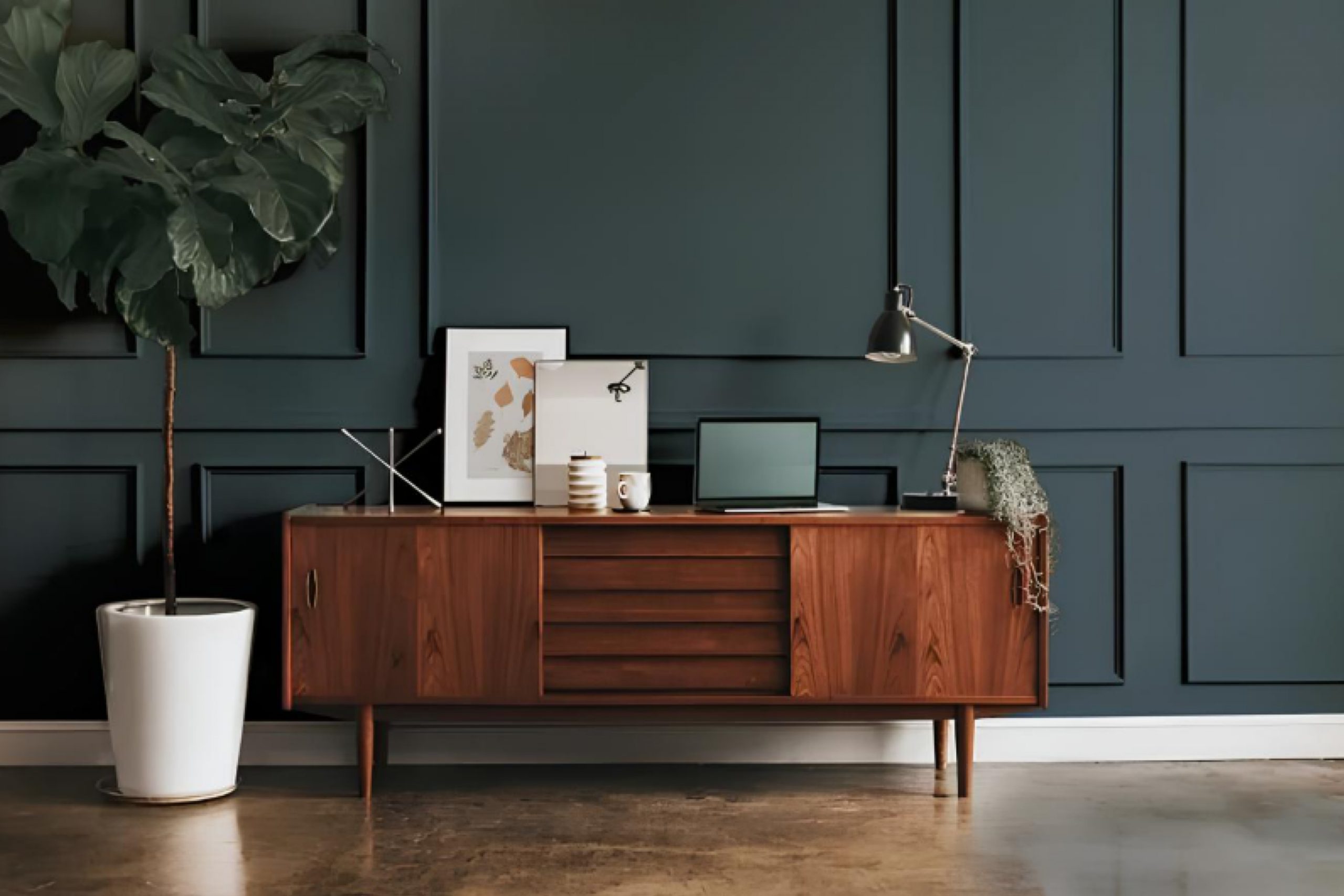
If you’re looking to refresh your space with a new paint color, you might want to consider SW 9660 Tarragon by Sherwin Williams. I recently came across this unique shade while searching for something that could add a bit of freshness without being too overwhelming, and I must say, Tarragon stood out as a perfect choice. It’s a shade that complements various decor styles and brings a soft, herbal vibe to any room.
Often, choosing the right color can be challenging, but Tarragon offers a balance that’s hard to find. It’s neither too bold nor too subtle, striking just the right note of natural elegance. In my experience, it works beautifully in spaces that get plenty of natural light, as this enhances its warm undertones.
Whether you’re updating your living room, bedroom, or even the kitchen, SW 9660 Tarragon provides a versatile backdrop that can be styled with both modern and traditional elements. After seeing it in several lighting conditions and pairing it with different textures, I’m confident in recommending it for a variety of home improvement projects.
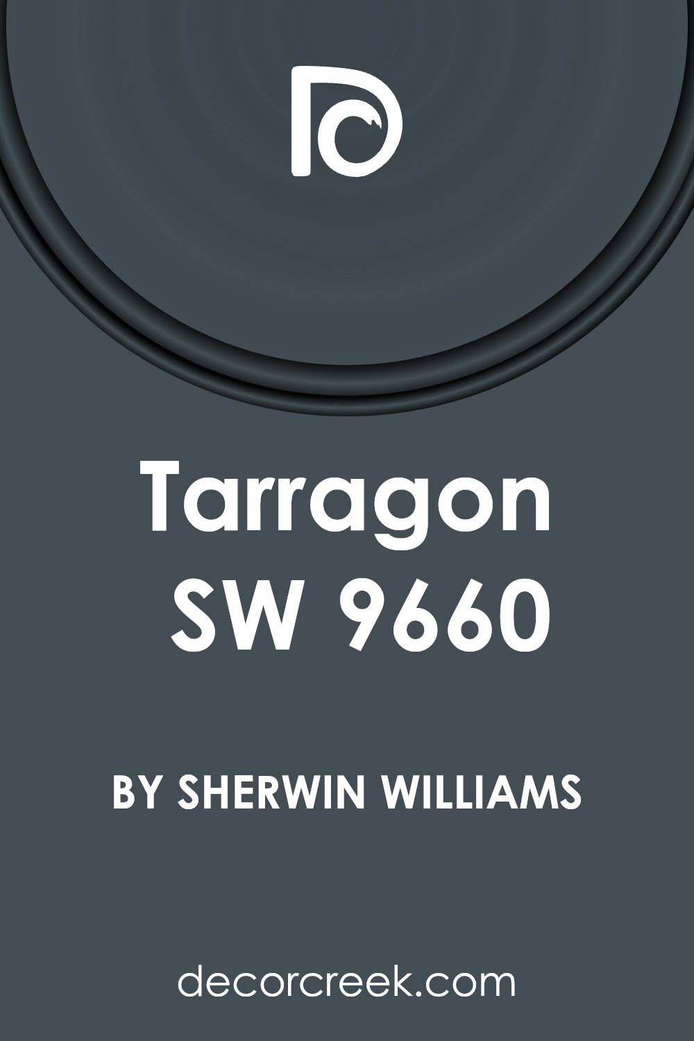
What Color Is Tarragon SW 9660 by Sherwin Williams?
The color Tarragon by Sherwin Williams is a rich, deep green with hints of herbal charm. This lush shade has the ability to make any space feel refreshed and lively, closely resembling the green found in its namesake herb. It’s a versatile color that stands out due to its depth and warmth, making it suitable for creating a cozy yet dynamic ambiance in various interior spaces.
Tarragon works exceptionally well in rooms that aim for a natural, grounding atmosphere. This color is perfect for styles such as rustic, modern farmhouse, and even traditional settings, where it complements wood accents and natural fibers beautifully. It can create a striking contrast when paired with lighter woods like oak or pine and looks equally elegant against darker woods like walnut.
In terms of materials, Tarragon pairs well with leather, linen, and even rougher textures like burlap, which enhances its organic feel. Metallic elements in copper or brass can introduce a touch of warmth, contrasting splendidly with Tarragon’s cooler undertones. In addition to textiles, incorporating elements such as ceramic or terracotta can enrich the color’s earthy quality.
Overall, Tarragon by Sherwin Williams offers a flexible palette that warms up any room and works exceptionally with a variety of materials and textures to create inviting interiors.
Is Tarragon SW 9660 by Sherwin Williams Warm or Cool color?
Tarragon SW 9660 by Sherwin Williams is a unique shade that adds a fresh vibe to any home. This color has a natural, earthy feel like the herb it’s named after, which makes it perfect for spaces where you want to add a touch of nature. It’s especially good for living rooms or kitchens where its gentle green hue can create a cozy and welcoming environment.
Using Tarragon in your home also offers flexibility. It pairs well with both light and dark colors, allowing you to create a balanced look. Light wood furniture or white accents make Tarragon stand out and give your room a clean, lively look. On the other hand, darker colors like deep browns or blacks can give a grounding effect, making the room feel more stable and calm.
Overall, Tarragon is great for people looking to refresh their home’s look with a color that is easy on the eyes and versatile enough to fit various decorating styles. It’s a practical choice if you’re not into very bold colors but still want something that feels different and refreshing.
Undertones of Tarragon SW 9660 by Sherwin Williams
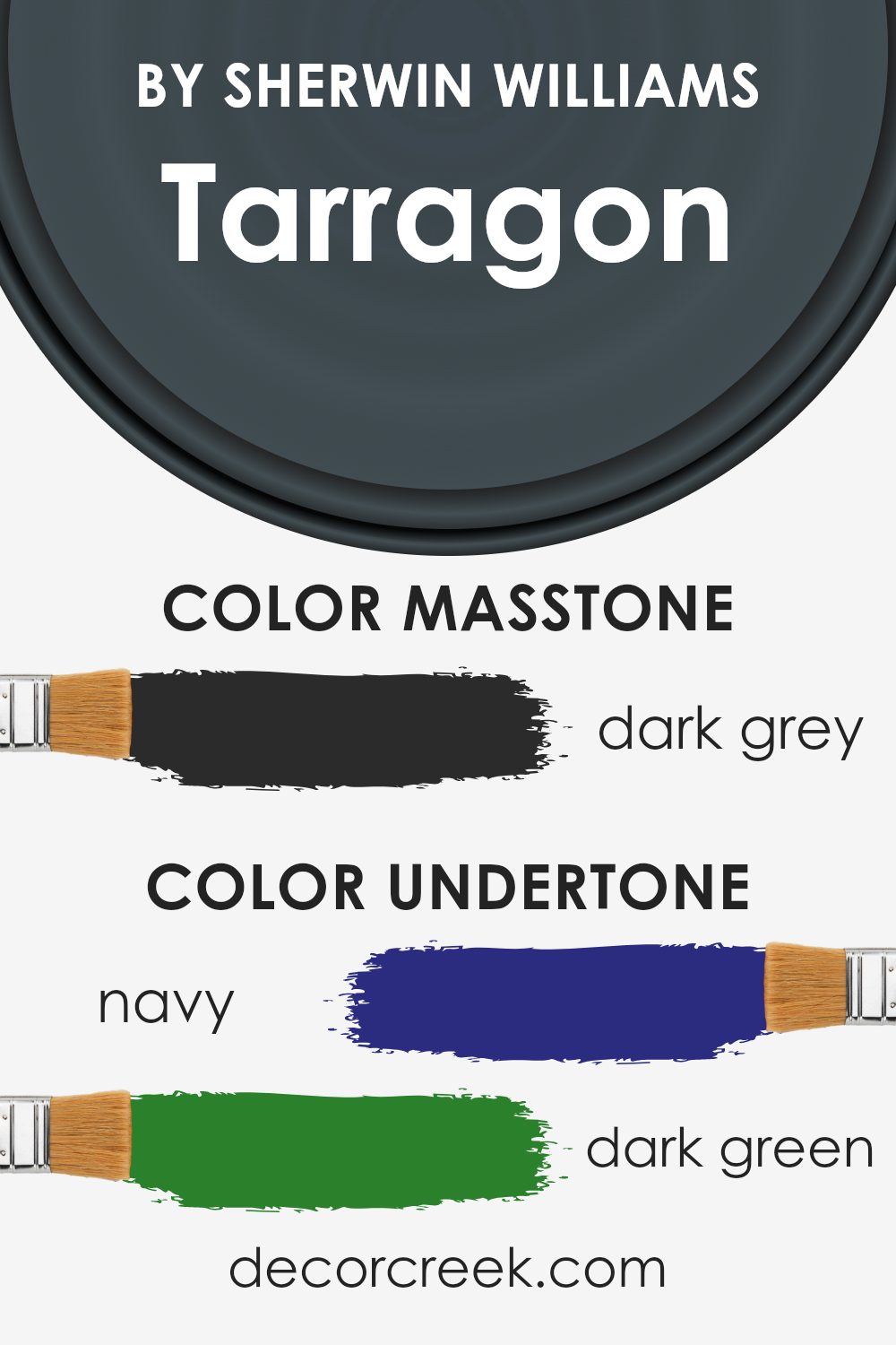
TarragonSW 9660 by Sherwin Williams is a unique color that involves a mixture of subtle undertones, creating a complex shade that changes appearance under different lighting conditions. The undertones in any paint color include the secondary colors that emerge from the main hue. These undertones influence how we perceive the primary color, and they can shift the appearance based on lighting and surrounding elements.
The undertones for TarragonSW 9660 are navy, dark green, dark turquoise, brown, purple, olive, and grey. These diverse undertones make the color versatile and adaptable to various interior settings. On interior walls, the navy and dark green undertones can give a sense of depth and richness, making the space feel more grounded. The dark turquoise can infuse a touch of vibrancy, adding life to the room.
Brown and olive undertones bring warmth to the environment, creating a cozy and welcoming atmosphere. Purple undertones add a slight hint of luxury and mystery, which can enhance the overall aesthetic of a room. Finally, the grey undertone serves as a balancing element, ensuring that the color does not overwhelm the space but rather complements other design elements.
In conclusion, the complex undertones of TarragonSW 9660 affect its perception and impact in interior spaces, making it a dynamic choice that can adapt to various styles and tastes. This adaptability makes it a practical choice for those wanting to add depth and character to their walls without committing to a bold or overwhelming color.
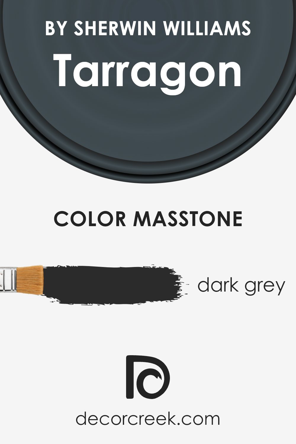
What is the Masstone of the Tarragon SW 9660 by Sherwin Williams?
TarragonSW 9660 by Sherwin Williams has a masstone of dark grey, a deep, solid shade that looks like a storm cloud. This color can have a grounding effect in a home, providing a sense of stability and calmness.
Because it’s such a strong, muted shade, it pairs well with brighter colors or varied textures, which can really stand out against its darkness. In rooms with plenty of natural light, this dark grey helps balance the brightness without making the space feel too stark or cold.
In smaller or less lit areas, using this color might make the space feel a bit more enclosed, so it’s best used carefully, perhaps on one accent wall or in decorative touches.
Additionally, this dark grey works well in modern and minimalistic designs, adding depth while keeping the overall look clean and uncluttered. Overall, TarragonSW 9660 offers versatility while maintaining a sense of calm strength in interior design.
How Does Lighting Affect Tarragon SW 9660 by Sherwin Williams?
Lighting plays a crucial role in how colors appear in different environments. The color in discussion, TarragonSW 9660, is a fine example to illustrate this point. Depending on whether it’s under artificial light or natural sunlight, the perception of the color can significantly differ.
In artificial light, the color might look more subdued and less vibrant. This is because most artificial lighting tends to flatten colors, reducing the depth and subtle undertones that are visible in natural light. In the case of TarragonSW 9660, which has certain depth and richness, artificial lighting might make it appear slightly darker or muted.
Under natural light, however, TarragonSW 9660 will show its true color more effectively. Daylight tends to enhance color vividness, illuminating the subtle undertones. In full sunlight, this color may glow warmly, bringing out its underlying vibrancy.
The direction a room faces also impacts how TarragonSW 9660 looks:
– North-faced rooms generally receive less sunlight, which may make TarragonSW 9660 appear cooler or slightly duller. The natural cool lighting from the north can make the color seem more reserved.
– South-faced rooms, benefitting from more abundant light, could make TarragonSW 9660 look warmer and more inviting. The color is likely to be more pronounced and dynamic in a south-facing room.
– East-faced rooms get most of their light in the morning when the sun is rising. Here, TarragonSW 9660 will start the day with a gentle, warm appearance, becoming more neutral as the day progresses.
– West-faced rooms receive the evening sunlight, which could cast a golden glow on TarragonSW 9660, enhancing its warmth and richness during the sunset hours.
Understanding how lighting affects color can help in making informed decisions about paint choices based on the orientation of the rooms and the type of light they receive. This ensures that the selected color consistently meets expectations throughout the day.
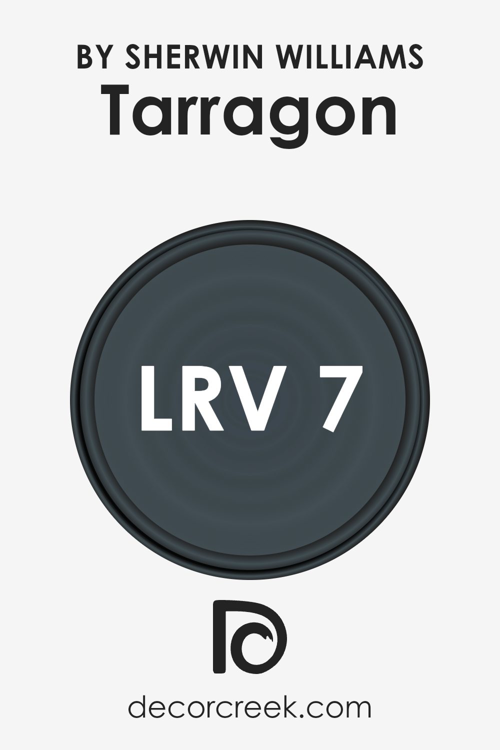
What is the LRV of Tarragon SW 9660 by Sherwin Williams?
LRV, or Light Reflectance Value, is a measure used to express the percentage of light a paint color reflects. The scale used to measure LRV ranges from 0 to 100, where higher numbers indicate that the color reflects more light. Colors with high LRVs make rooms feel brighter because they reflect more light back into the room. On the other hand, colors with low LRVs absorb more light, which can make a space feel smaller or darker.
The LRV of 7.293 for this tarragon shade means it’s quite dark and absorbs a lot of light instead of reflecting it. When used on walls, this color will make the space feel more enclosed and intimate due to its low LRV.
This can be beneficial in larger rooms or areas where a feeling of coziness is desired. However, in a smaller or poorly-lit room, using a color with such a low LRV might make the space appear even smaller and darker. Therefore, lighting and room size should be considered when using darker colors like this.
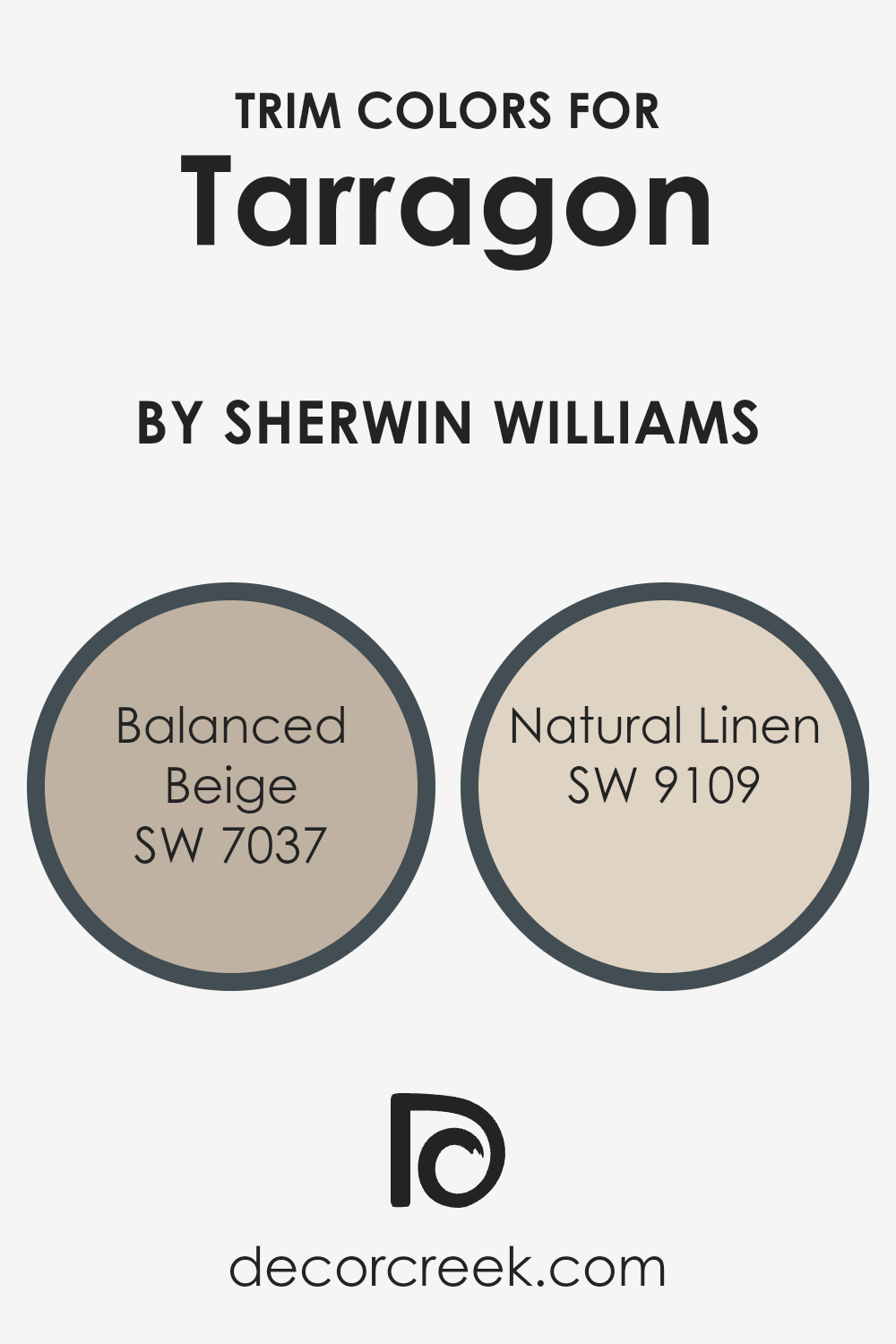
What are the Trim colors of Tarragon SW 9660 by Sherwin Williams?
Trim colors, such as SW 7037 – Balanced Beige and SW 9109 – Natural Linen by Sherwin Williams, play a crucial role in framing and accentuating the visual appeal of a room. These colors are typically used for elements like door frames, moldings, and baseboards, creating a subtle yet effective contrast that can enhance the overall look of a space.
Choosing the right trim color can help in defining the theme and mood of a room, adding depth and drawing attention to the architectural features. For example, when complementing a bold wall color like Tarragon (SW 9660), using a lighter trim color can provide a clean and neat appearance that gently highlights the walls.
Balanced Beige (SW 7037) is a warm and welcoming hue, offering a soft backdrop that complements a variety of decorating styles. This color can subtly stand out against darker shades, providing a calm and collected look that’s pleasing to the eye.
Natural Linen (SW 9109), on the other hand, is a lighter, neutral shade with a hint of warmth, making it ideal for bringing a fresh and airy feel to any space. It works particularly well in areas with plenty of natural light, where it can enhance the brightness of the room without overpowering the main color themes.
You can see recommended paint colors below:
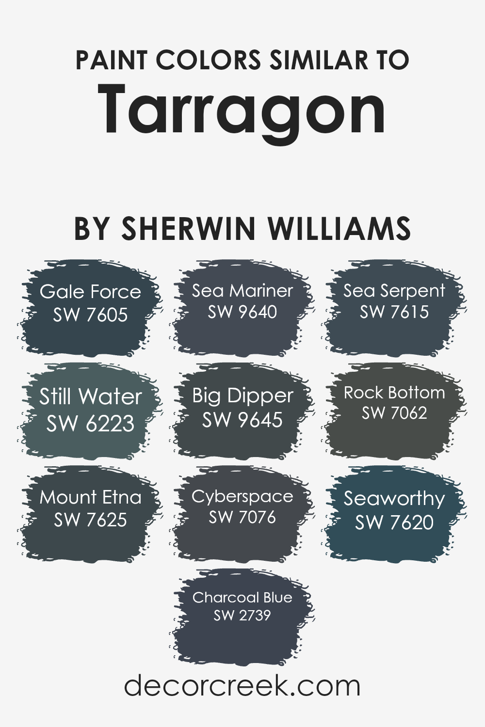
Colors Similar to Tarragon SW 9660 by Sherwin Williams
Choosing similar colors is an effective way to create a harmonious and aesthetically pleasing environment in your home. These shades often share underlying hues, which allows them to blend seamlessly when used together in decor. For example, using colors that relate to Tarragon SW 9660 by Sherwin Williams can enhance the overall visual continuity in a space, making it appear more cohesive. Each shade, while unique, complements the others due to their similar color values and intensities, offering versatility in design choices without causing abrupt transitions.
Gale Force SW 7605 offers a deep, stormy blue that adds drama and depth to any space, while Still Water SW 6223 provides a softer, soothing blue with a hint of gray, ideal for creating a calm setting. Mount Etna SW 7625 presents a rich, dark navy that brings boldness and elegance, and Charcoal Blue SW 2739 has a dusky, smoky blue tone perfect for adding a moody vibe.
Sea Mariner SW 9640 leans towards a vibrant, nautical blue that refreshes a room instantly. Big Dipper SW 9645 leans toward a lively, dynamic blue, great for infusing energy into a space. Moving towards darker tones, Cyberspace SW 7076 is a very dark shade that can ground a room’s color scheme.
Sea Serpent SW 7615 provides a mysterious, deep teal, contributing to a more dramatic flair. Rock Bottom SW 7062 is a strong, charcoal gray that works well as a neutral base or accent. Lastly, Seaworthy SW 7620 offers a rich maritime blue, perfect for creating a focal point or as an accent color. These colors, when used together, support a cohesive theme without overpowering each other, making them ideal for layering in home design.
You can see recommended paint colors below:
- SW 7605 Gale Force
- SW 6223 Still Water
- SW 7625 Mount Etna
- SW 2739 Charcoal Blue
- SW 9640 Sea Mariner
- SW 9645 Big Dipper
- SW 7076 Cyberspace
- SW 7615 Sea Serpent
- SW 7062 Rock Bottom
- SW 7620 Seaworthy
How to Use Tarragon SW 9660 by Sherwin Williams In Your Home?
Tarragon SW 9660, a paint color by Sherwin Williams, is a vibrant green that brings a fresh and natural feel to any room. Ideal for those looking to add a noticeable yet calming presence in their home, this color works great in spaces that benefit from a touch of nature’s tones.
You can use it in various ways. For example, painting an accent wall with Tarragon can give your living room or bedroom a fresh focal point. It’s also perfect for a kitchen or dining area, complementing wood finishes and brightening the space. Additionally, using it in a bathroom can create a clean and refreshing look.
Pair it with neutral tones like whites or soft grays for balance and a few wooden elements for a cozy, grounded environment. Whether you choose it for a small area or an entire room, Tarragon SW 9660 will surely make your space feel lively and welcoming.
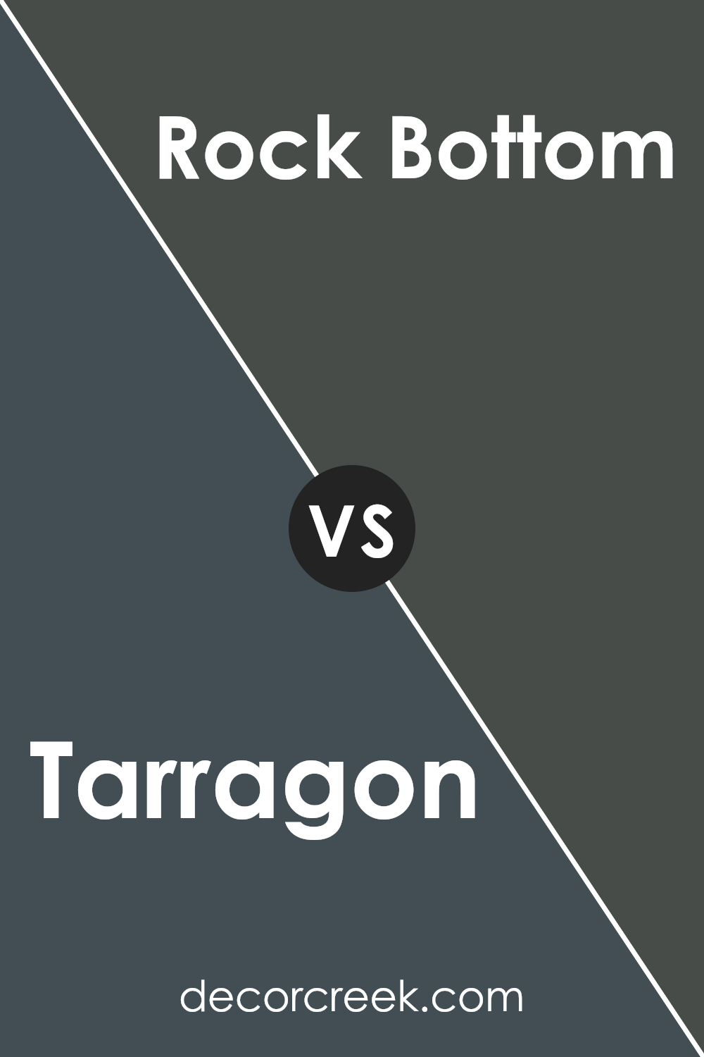
Tarragon SW 9660 by Sherwin Williams vs Rock Bottom SW 7062 by Sherwin Williams
The primary color, Tarragon, is a light and subtle green hue that offers a fresh and calming feel to any space. It’s a versatile color that pairs well with both bright and neutral tones, making it ideal for living rooms or bedrooms wanting a touch of nature.
On the other hand, Rock Bottom is a deep, dark gray that almost borders on black. It provides a strong and grounding effect, perfect for creating a bold statement in spaces like home offices or entertainment areas. Its deep tone works well as a base color, allowing you to effectively highlight other colors or decor elements within the same room.
Both Tarragon and Rock Bottom bring their own unique vibes to interior spaces. Tarragon injects a gentle, airy quality, while Rock Bottom lends a powerful and weighty presence. Depending on what atmosphere you desire, either could be the perfect choice.
You can see recommended paint color below:
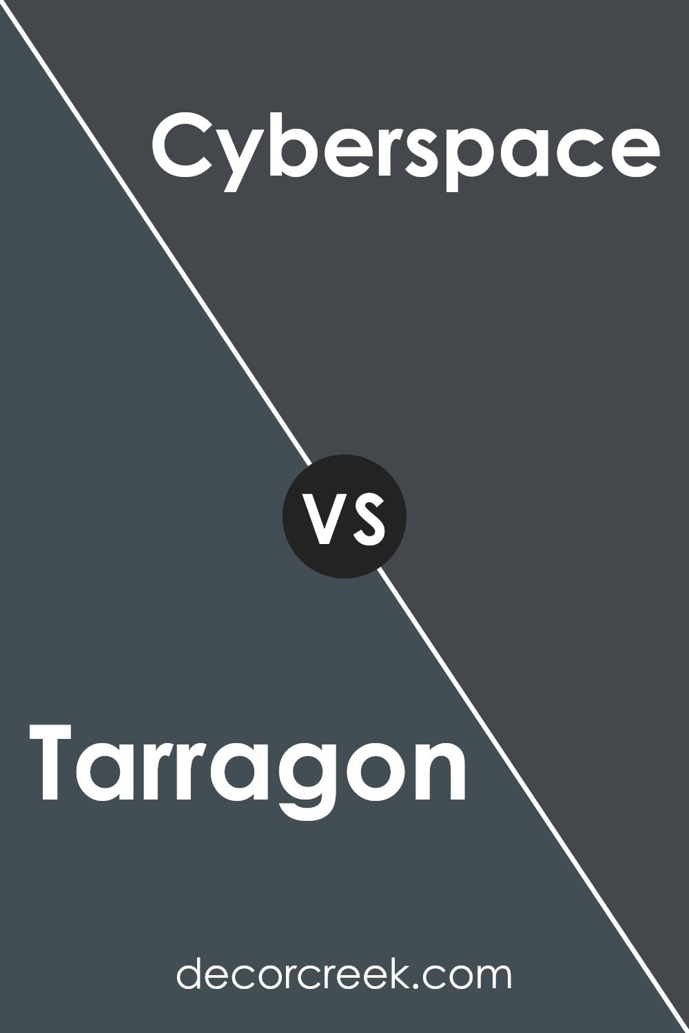
Tarragon SW 9660 by Sherwin Williams vs Cyberspace SW 7076 by Sherwin Williams
The main color, Tarragon, by Sherwin Williams, is a vibrant, leafy green that brings a fresh and lively look to any space. It has a natural feel that can make a room feel more open and airy. On the other hand, Cyberspace is a much darker shade.
It’s a deep gray with a hint of blue, giving it a strong, modern vibe that can make furniture and decor pop when used as an accent wall or main color theme. The contrast between these two colors is significant.
While Tarragon adds brightness and a touch of nature, Cyberspace offers a bold and dramatic feel, perfect for creating striking visuals. Using these colors together could provide a balanced environment where the brightness of Tarragon lightens the mood, and Cyberspace adds depth and a modern twist.
You can see recommended paint color below:
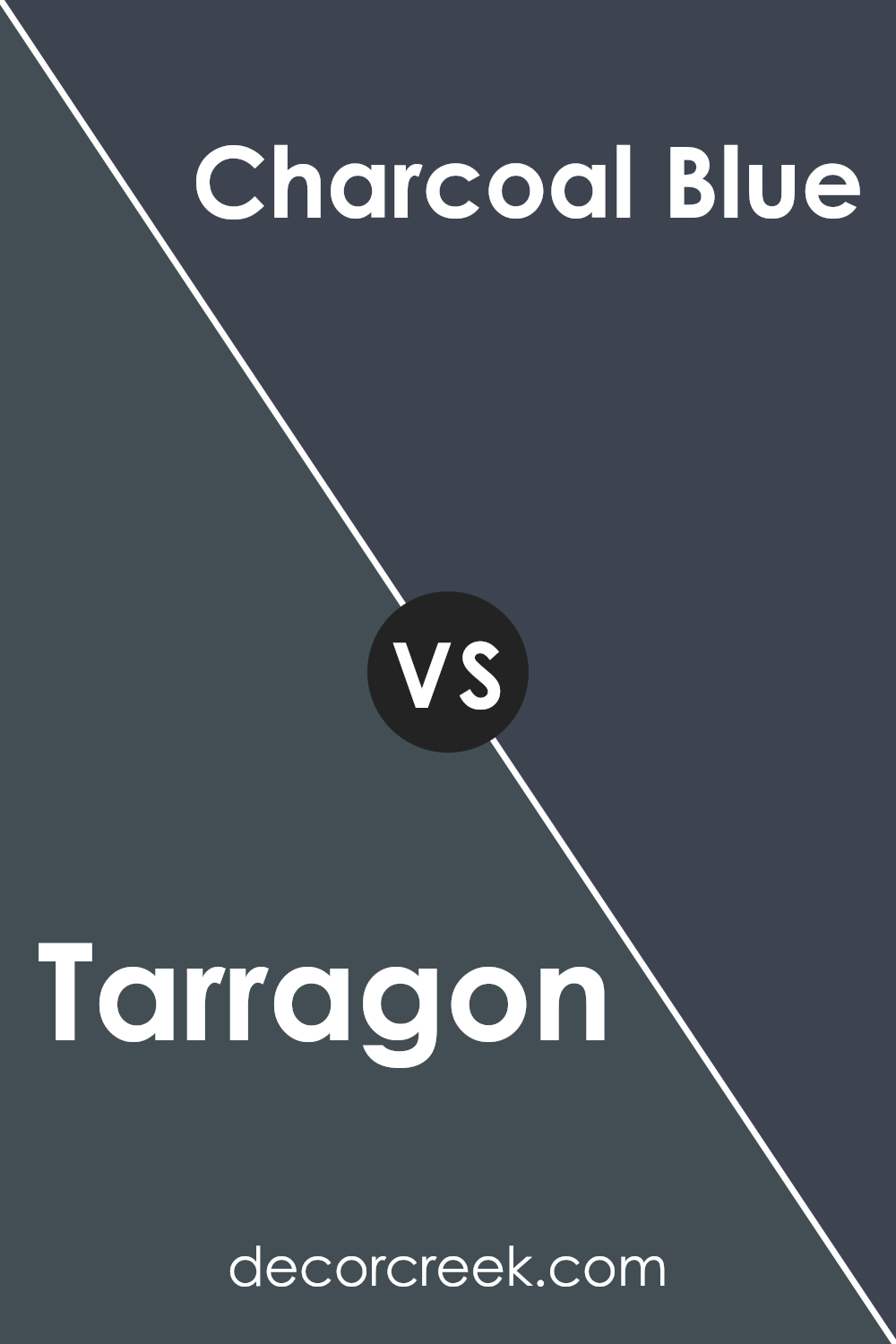
Tarragon SW 9660 by Sherwin Williams vs Charcoal Blue SW 2739 by Sherwin Williams
Tarragon SW 9660 is a refreshing, light green shade with subtle yellow undertones that give it a lively, spring-like feel. It reflects light well, making spaces look brighter and more open. This color works great in kitchens or living rooms where you want to create a cheerful and welcoming environment.
On the other hand, Charcoal Blue SW 2739 is a deep, dark blue with gray undertones that give it a strong, bold presence. This color is more dramatic and can give spaces a more grounded, secure feeling. It’s ideal for accent walls or rooms where you want to create a sense of depth and focus, such as studies or bedrooms.
Both colors offer unique vibes – Tarragon brings in energy and light, while Charcoal Blue adds depth and intensity. Depending on what feeling you want to achieve in a room, either can be a good choice.
You can see recommended paint color below:
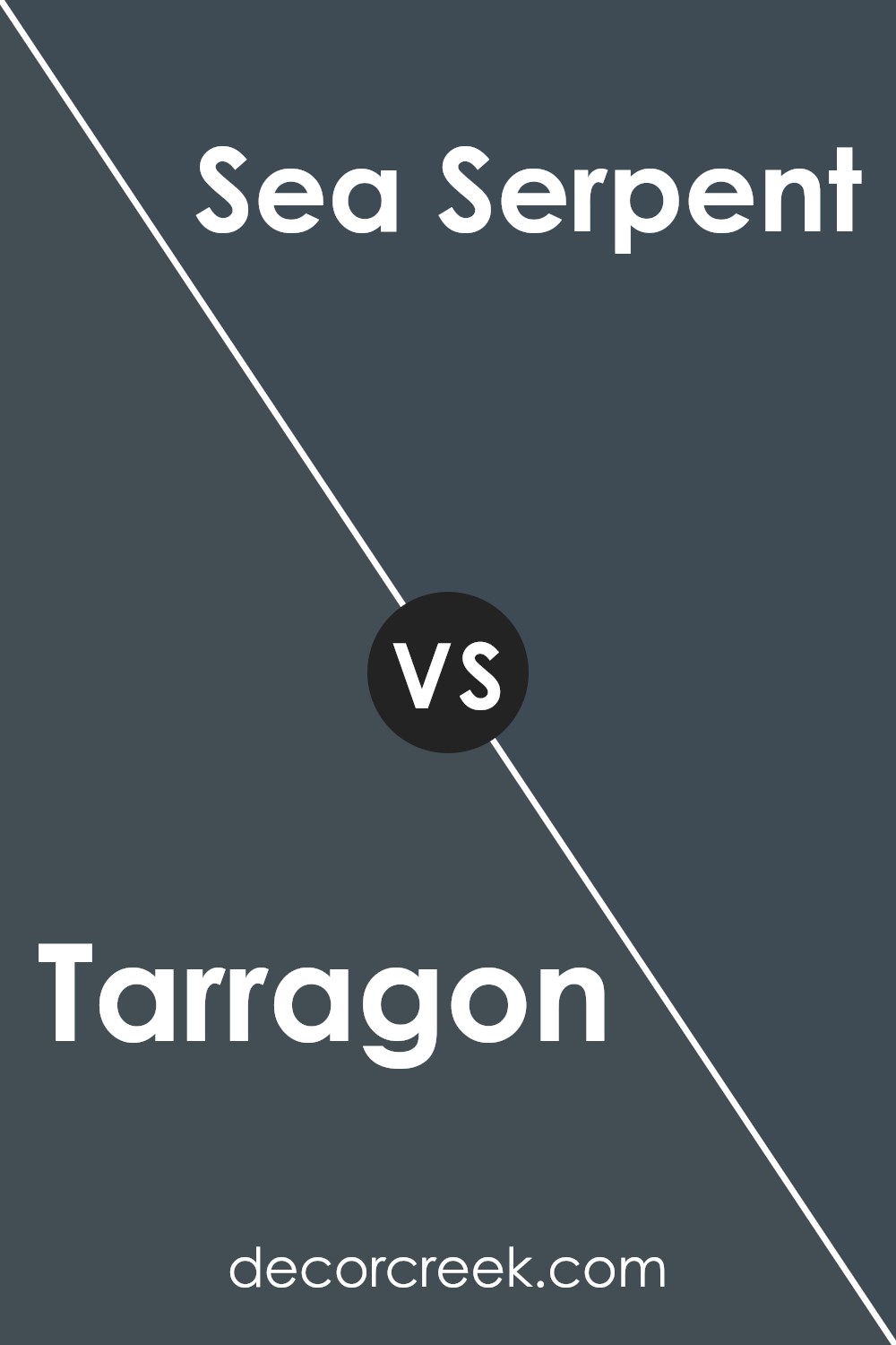
Tarragon SW 9660 by Sherwin Williams vs Sea Serpent SW 7615 by Sherwin Williams
The main color, Tarragon, is a warm green hue that has a natural, earthy feel. It’s a relatively light green, making it suitable for spaces where you want to add a touch of nature’s calm without overwhelming the area. On the other hand, Sea Serpent is a deep, dark navy blue.
This color is bolder and more dramatic, making it ideal for creating a strong statement in a room. While Tarragon offers a more subtle and light atmosphere, Sea Serpent brings depth and intensity. These two colors could work well together in a space where you want to balance light and shade with natural and dramatic elements, like a bedroom or a study.
Tarragon could be used for the walls with Sea Serpent as an accent for furniture or trim, combining for a fresh yet grounded look.
You can see recommended paint color below:
Tarragon SW 9660 by Sherwin Williams vs Seaworthy SW 7620 by Sherwin Williams
The main color, Tarragon, is a warm, earthy green that brings a sense of nature and freshness to any space. Its muted tone makes it easy to pair with brighter colors or other neutral shades, giving it versatility in various decorating styles.
On the other hand, Seaworthy is a darker, more intense shade of blue. It has a nautical vibe to it, which can make a room feel cozy and inviting. This color tends to make a bold statement, whether used on an accent wall or throughout a room.
Both colors add distinct moods to an environment: Tarragon offers a soothing, natural feel, while Seaworthy creates a strong, cozy atmosphere. These colors work well in different settings depending on the look and feel you want to achieve.
You can see recommended paint color below:
- SW 7620 Seaworthy
Tarragon SW 9660 by Sherwin Williams vs Big Dipper SW 9645 by Sherwin Williams
Tarragon SW 9660 and Big Dipper SW 9645, both by Sherwin Williams, present unique shades suitable for different decorating tastes. Tarragon is a soft, muted green with a slightly earthy tone, offering a fresh and calming vibe perfect for spaces where you want a touch of nature without overwhelming brightness. It pairs well with natural materials like wood or stone.
On the other hand, Big Dipper is a darker blue-green hue, closer to teal but with more subtlety. This color is more dramatic and can make a bold statement in a room. It’s excellent for an accent wall or areas where you want to add a bit of depth and interest.
While Tarragon brings a light, airy feel, Big Dipper provides a richer, more intense atmosphere. Both colors work well in modern homes but suit different purposes—Tarragon for a bright and airy feel, and Big Dipper for a striking visual impact.
You can see recommended paint color below:

Tarragon SW 9660 by Sherwin Williams vs Mount Etna SW 7625 by Sherwin Williams
Tarragon SW 9660 and Mount Etna SW 7625 by Sherwin Williams are both unique colors, but they create different moods and atmospheres. Tarragon is a soft, muted green with hints of gray. It gives off a calm and soothing vibe, making it perfect for spaces where you want a touch of nature without overwhelming brightness. It’s especially good in bedrooms or living areas where comfort is key.
On the other hand, Mount Etna is a much darker shade, characterized by its deep, smoky blue-green hue. This color has a strong presence and can add a dramatic flair to any room. It works well in a study or dining room where you might want a more powerful and striking background.
Both colors have their place depending on the feeling you want to create. Tarragon is light and airy, while Mount Etna is bold and impactful. Mixing these two can also create interesting contrasts in a space.
You can see recommended paint color below:
Tarragon SW 9660 by Sherwin Williams vs Sea Mariner SW 9640 by Sherwin Williams
Tarragon is a rich, deep green that takes on an almost olive tone. It’s earthy and has a strong presence, perfect for adding a sense of natural vibrancy to any space. On the other hand, Sea Mariner is a much lighter and brighter color. It leans towards a teal, mixing blue and green to create a refreshing and uplifting hue that can make a room feel airy and lively.
Tarragon suits spaces where you want a cozy, grounded feel, like living rooms or studies, while Sea Mariner is great for areas that could use a bright, cheerful touch, such as bathrooms or kitchens.
When put side by side, Tarragon tends to dominate with its darker, richer tone, whereas Sea Mariner brings a splash of lightness that can open up a space. Both colors can significantly affect the mood and appearance of a room, depending on what you’re aiming for—coziness or cheerfulness.
You can see recommended paint color below:
Tarragon SW 9660 by Sherwin Williams vs Still Water SW 6223 by Sherwin Williams
The main color, Tarragon, is a deep, rich green that brings to mind lush foliage or a dense forest. It has a vibrant quality that adds a lively touch to spaces, making it a perfect choice for areas where a touch of nature is needed. It is dark enough to bring some drama to a room but balanced by a refreshing organic feel.
In contrast, Still Water is a much lighter, subtler color. It resembles the soft, muted blue of a quiet lake under a clear sky. This color has a calming effect, perfect for creating a relaxed environment in places like bedrooms or bathrooms. The lightness of Still Water offers a sharp contrast to the intensity of Tarragon, providing a more understated look.
Together, these two colors can complement each other nicely in a space, combining the earthiness of Tarragon with the airy lightness of Still Water, making them suitable for those who want to mix vibrant and peaceful tones.
You can see recommended paint color below:
Tarragon SW 9660 by Sherwin Williams vs Gale Force SW 7605 by Sherwin Williams
The main color, Tarragon, is a fresh and vibrant green shade that brings a natural, lively feel to a space. It reminds one of green herbs and spring leaves, making it great for areas where you want a touch of nature’s energy. On the other hand, Gale Force is a deep, powerful blue that has the moodiness of stormy seas. This color adds a bold and strong ambiance to any room, making it ideal for creating a dramatic and impactful setting.
Using these colors in different rooms can set quite distinct tones. Tarragon, with its energizing green hue, works well in kitchens, living areas, and places where you want a cheerful and welcoming atmosphere. Gale Force, due to its darker and more intense blue, might be better suited for bedrooms or offices where the goal is to generate a more focused and profound effect.
Combining these two colors can also be effective. The lively green of Tarragon can lighten the deep tones of Gale Force, bringing balance and contrast to the decor.
You can see recommended paint color below:
In conclusion, SW 9660 Tarragon by Sherwin Williams is a great color to use in your home. It’s a deep, greenish-gray shade that looks a bit like the herb tarragon. This color is really interesting because it can make any room look more cozy and welcoming. Whether you paint it on the walls of your living room, bedroom, or even the kitchen, it adds a nice touch that isn’t too bold or too soft.
I tried it in my own home and noticed it works well with different kinds of lights. During the day, it has a fresh look thanks to natural sunlight, and at night, it turns into a calmer, warmer tone under home lighting. I found that it goes well with light furniture and even with some bright colors. It’s cool because it helps blend everything together in the room without making things feel crowded.
If you’re thinking about painting a room or just a wall and want something that isn’t just plain white or a common color, SW 9660 Tarragon could be a perfect choice. It’s different but still easy to like – your friends and family might even ask you about it when they visit!
This color has made me feel really happy with how my room turned out, and I bet you’ll like it too.
Ever wished paint sampling was as easy as sticking a sticker? Guess what? Now it is! Discover Samplize's unique Peel & Stick samples.
Get paint samples

