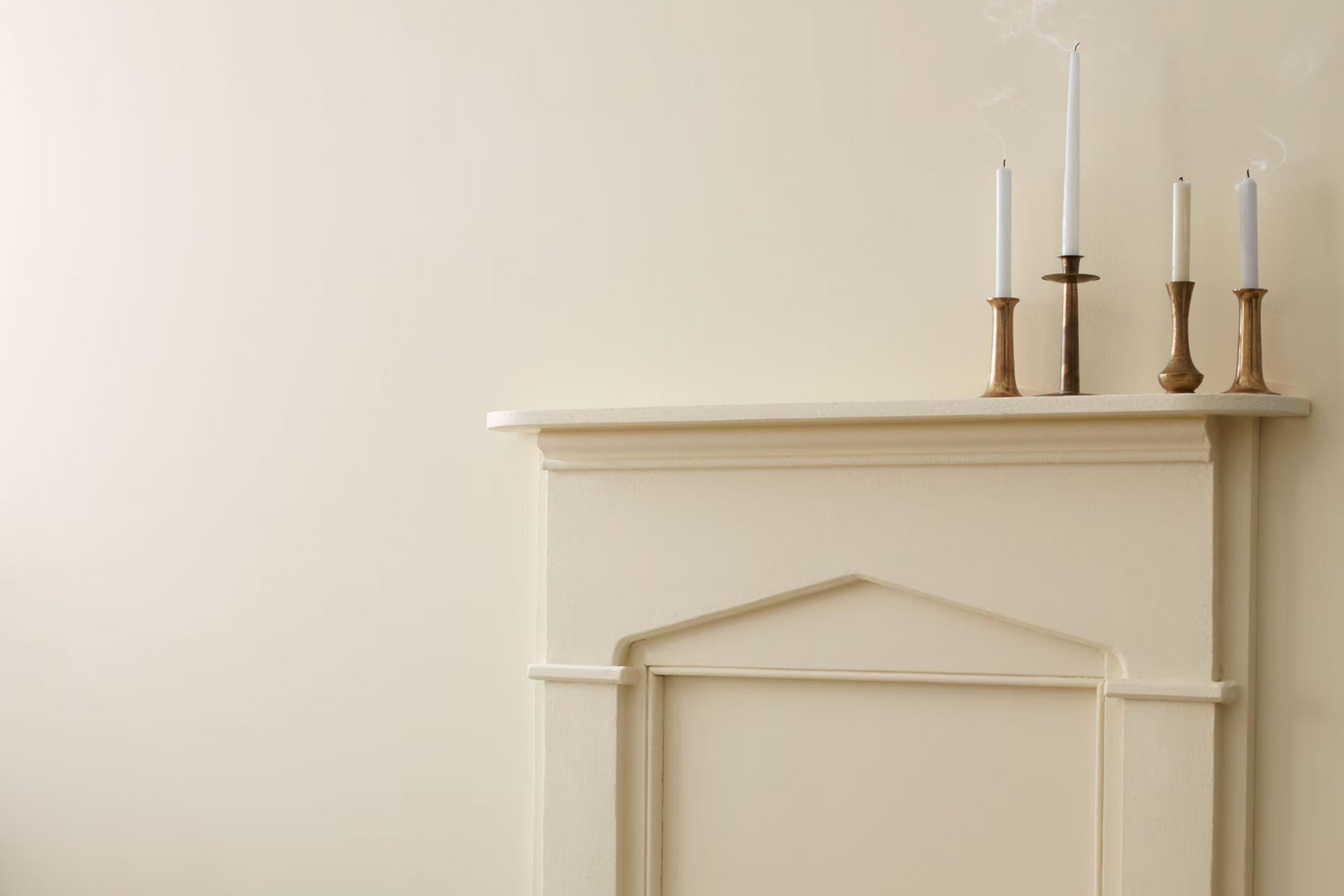
Selecting the right paint color for your home can often feel intense, given the multitude of options available. If you’re considering HC-173 Edgecomb Gray by Benjamin Moore, you are likely looking for a flexible shade that can add a subtle warmth to your living areas. As you read on, I’ll share some valuable insights to help you make an informed decision about this particular color.
Edgecomb Gray stands out as a soft, light gray that has a strong greige (gray + beige) undertone. This characteristic makes it exceptionally adaptable to various lighting conditions and complementary to different types of decor. Whether you are aiming for a cozy, inviting look in your bedroom or a clean, neutral background for your bustling kitchen, Edgecomb Gray could be just the solution you need.
Keep in mind as well that choosing a paint color is not just about the hue itself; it’s about understanding how it will interact with your home’s natural and artificial light, your furniture, and even the room’s orientation. The right color can enhance the mood and functionality of your room, making your home a more enjoyable place to live.
Let’s take a closer look at the specifics of why HC-173 Edgecomb Gray might be the perfect choice for your painting project.
Is Edgecomb Gray HC-173 Right for My Home?
Edgecomb Gray is truly a flexible color. It has a beautiful balance of beige and light gray, creating a soft, warm hue that works magic in almost any room. I find it to be a great choice when aiming for a cozy and inviting atmosphere. It isn’t intense, so it pairs nicely with brighter or bolder colors to create a bit of contrast.
In terms of interior styles, Edgecomb Gray shines in modern farmhouse, Scandinavian, and even traditional settings. Its understated elegance allows it to remain classic in these decor styles. I especially love using it in living rooms and bedrooms where its calming nature enhances relaxation.
As for materials, this color goes well with natural wood, which helps bring out its warm tones. Whether it’s a dark walnut or a light pine, the combination creates a grounded, earthy vibe. Textures like linen or wool also complement this paint color beautifully, adding to the sense of calm. I’ve also paired it with metallic finishes like brass or copper, which add a lovely hint of luxury without being too flashy.
Overall, Edgecomb Gray is a go-to for me when I want a room that feels both stylish and welcoming. Whether with plush carpets, slubby fabrics, or sleek furnishings, it manages to hold its own while pairing well with others.
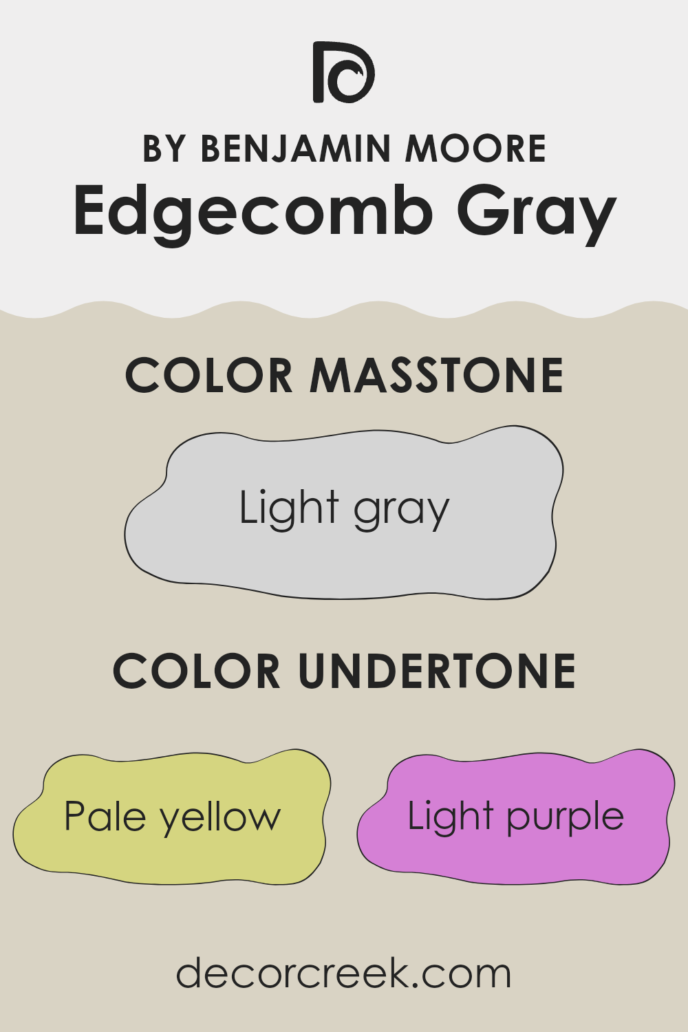
What are the right undertones of Edgecomb Gray HC-173 ?
Edgecomb Gray is a flexible paint shade known for its ability to adapt to different lighting and decor styles, making it a favorite among homeowners. This particular color is complex because it includes a mix of subtle undertones that can influence its overall appearance.
Undertones are secondary colors that are present within a main color but aren’t always immediately obvious. They play a crucial role in how we perceive the color once it’s applied, especially under varying lighting conditions. For Edgecomb Gray, its undertones include pale yellow, light purple, light blue, pale pink, mint, lilac, and grey, each contributing to its unique character.
These undertones can slightly shift the paint’s main gray hue toward warmer or cooler tones depending on the surrounding light and decor. For example, in a room with abundant natural light, the pale yellow and light blue undertones might make the walls seem more lively and fresh. In artificial light, the pink or purple undertones could become more noticeable, giving the room a softer, more layered look.
When used on interior walls, the mix of undertones in Edgecomb Gray allows it to harmonize with a wide variety of color palettes and furnishing styles. This makes the paint highly adaptable for rooms that serve multiple purposes or need to complement a mix of textures and finishes. The ability to respond to different undertones ensures that Edgecomb Gray provides a steady yet flexible backdrop for any interior room.
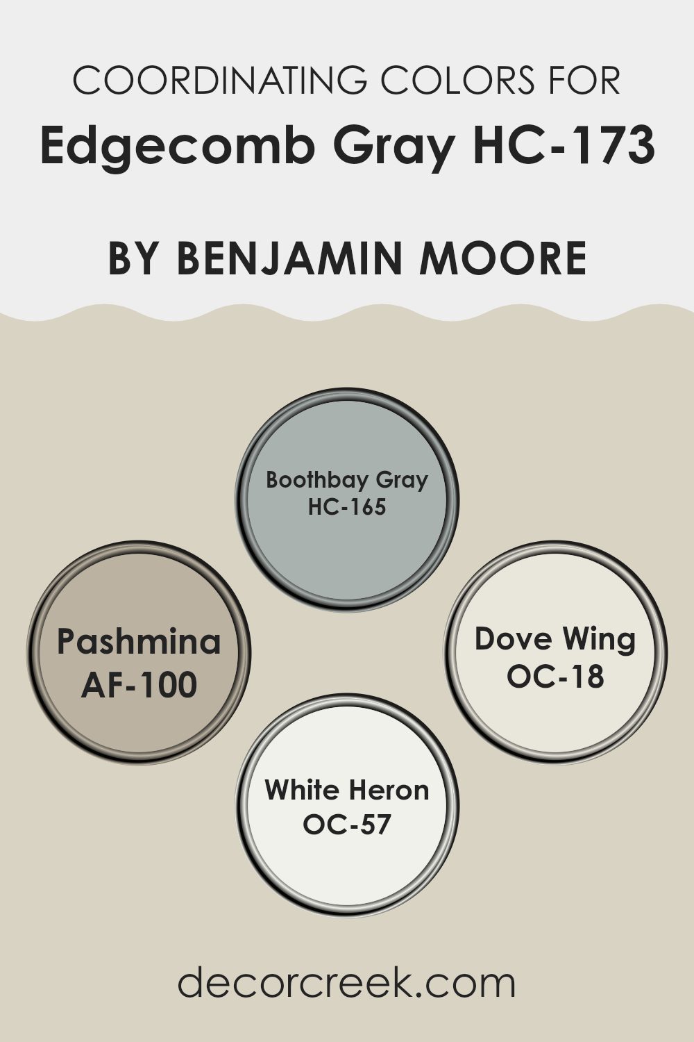
Best Coordinating Colors to use with Edgecomb Gray HC-173 by Benjamin Moore this year.
Coordinating colors are shades that complement each other and work well together when used in a single design scheme, enhancing the overall look without feeling intense. These selections usually share similar undertones or contrast in a way that’s pleasing to the eye, making them ideal for creating a harmonious look in any room. Edgecomb Gray by Benjamin Moore can be beautifully paired with a variety of coordinating colors that draw out its warm, inviting qualities.
Boothbay Gray is a subtle shade that mirrors the calm feel of a stormy sea. Its cool undertone acts as a soft contrast to the warmth of Edgecomb Gray, providing a balanced backdrop suitable for living rooms or bedrooms. Pashmina offers a richer, deeper taupe that feels cozy and grounding. It is perfect for adding depth in a room that needs a bit of weight.
Dove Wing, on the other hand, is a lighter, almost airy off-white, providing a fresh touch and a gentle lift to the denser tones of the palette. Finally, White Heron stands out as a crisp, clean white with a bright feel that can instantly refresh any room it touches, making it excellent for trim, ceilings, or a contrasting focal wall. By using these coordinating colors, any room can achieve a balanced and pleasing look.
You can see recommended paint colors below:
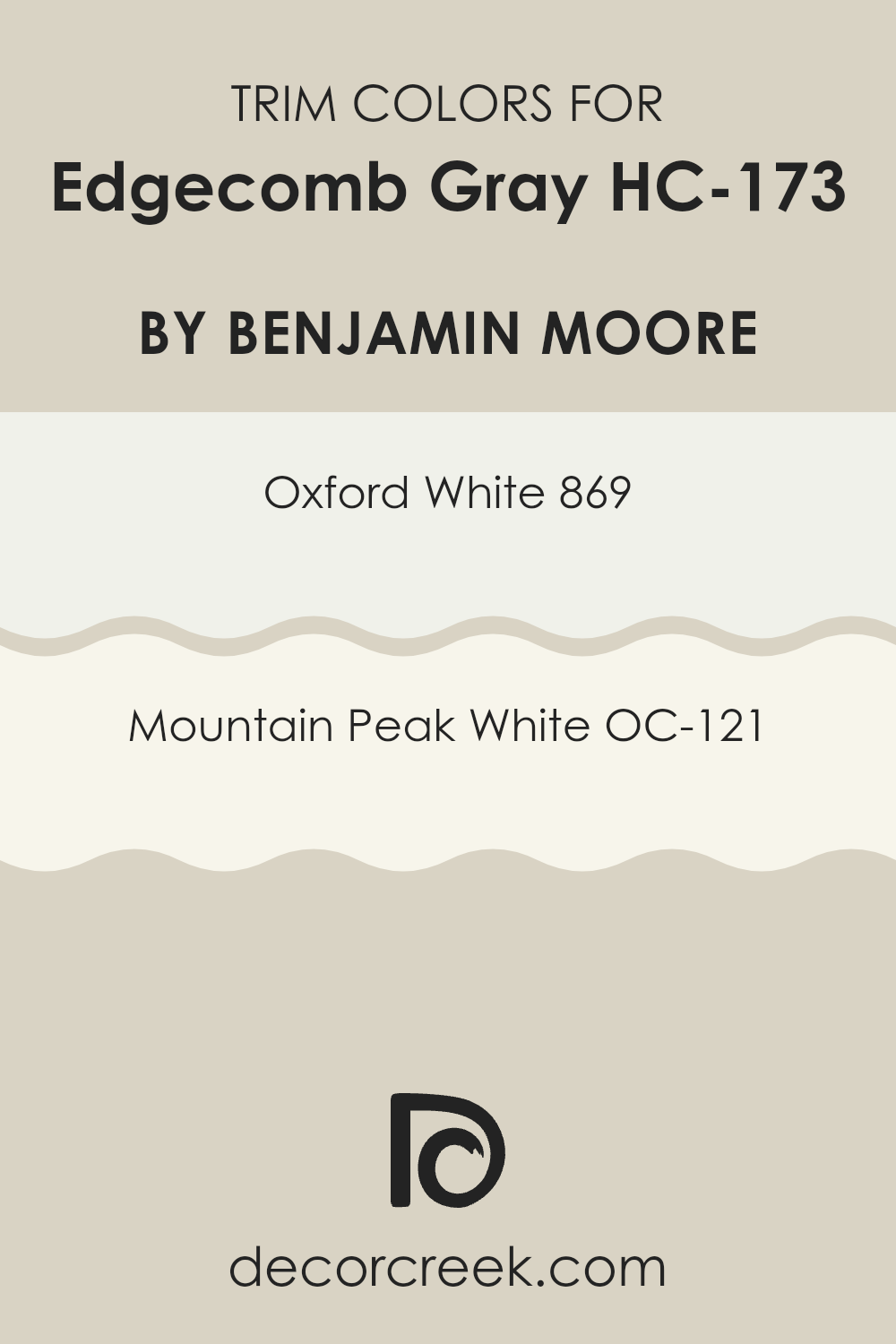
Trendy Trim Colors of Edgecomb Gray HC-173 by Benjamin Moore to use this year.
Trim colors are specific shades used to highlight and define the key features of walls, such as door frames, moldings, windowsills, and baseboards, enhancing the architectural elements of a room. Choosing the right trim color can greatly impact the aesthetic cohesion and perceived spaciousness of a room.
When paired with a flexible and subtle shade like Edgecomb Gray by Benjamin Moore, trim colors such as Oxford White and Mountain Peak White can really make the neutral tones of the wall stand out, ensuring a crisp and clean look. These whites are particularly useful in adding depth and contrast, which can help in making a room appear larger and more inviting.
Oxford White (869) is a pure, bright white that offers a strong yet appealing contrast against softer hues like Edgecomb Gray, creating a fresh and clean appearance that can help other colors in the room stand out. Mountain Peak White (OC-121), on the other hand, has a slightly warmer undertone, which provides a softer transition between the gray of the walls and the brightness of the trims, making it an excellent choice for a seamless look that still maintains depth and definition. Both colors work beautifully as trim options, ensuring the main color, such as Edgecomb Gray, remains the focal point while the trims support the overall color balance of the room.
You can see recommended paint colors below:
- 869 Oxford White
- OC-121 Mountain Peak White
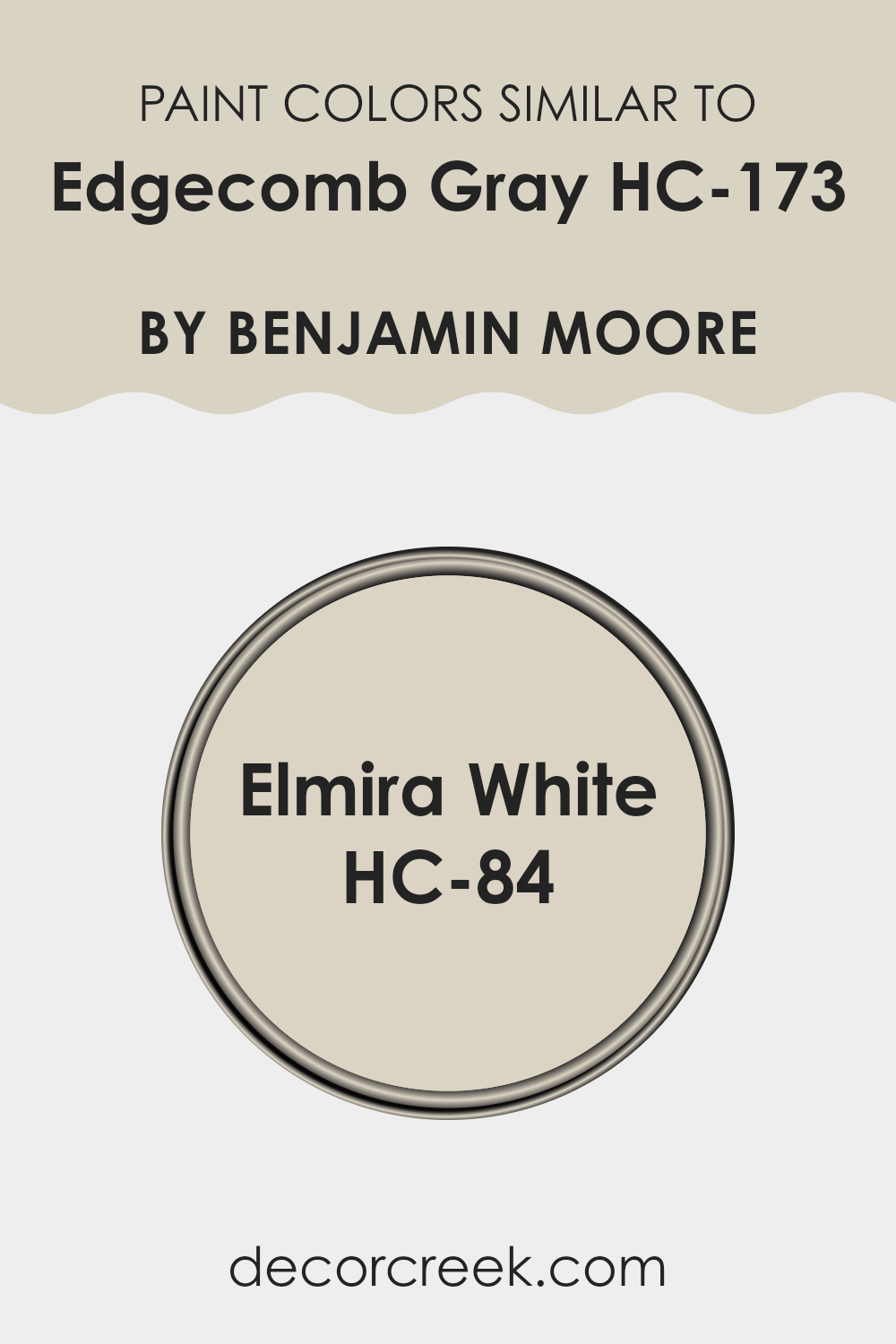
Evergreen Colors Similar to Edgecomb Gray HC-173 by Benjamin Moore
Choosing colors that are similar to a specific shade like Edgecomb Gray HC-173 by Benjamin Moore is important for creating a cohesive and harmonious look in your interior design. Similar colors work well together because they share the same undertones, which means they complement each other without clashing, bringing a smooth visual flow to your room.
For example, when colors from the same family are used together, they help in enhancing the overall look by subtly blending into each other rather than standing out, ensuring the room feels connected and pleasantly uniform. This approach is particularly useful in open-plan rooms where different functional areas share the same color palette to maintain a unified look.
One similar color to Edgecomb Gray HC-173 is Elmira White HC-84, also by Benjamin Moore. This shade is a gentle off-white with a touch of gray that gives it a warm yet light appearance, making it flexible for walls, trims, and ceilings. Elmira White works particularly well in rooms that require a light, airy feel but still benefit from a hint of warmth to avoid feeling too stark.
It pairs beautifully with deeper and contrasting hues, acting as a neutral backdrop that allows other elements in the room to stand out. In application, Elmira White provides a subtle distinction when used in combination with shades like Edgecomb Gray, maintaining a fluid visual transition without harsh contrasts. Such coordination ensures that the color scheme of a room is visually appealing and feels naturally balanced.
You can see recommended paint color below:
- HC-84 Elmira White
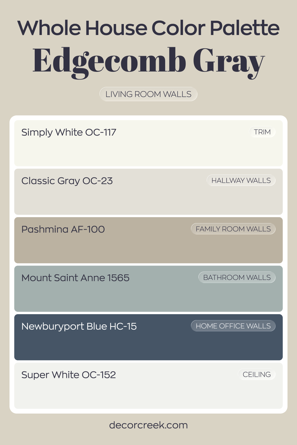
Whole House Paint Color Palette Crafted Around Edgecomb Gray HC-173
Edgecomb Gray HC-173 warms the living room with a soft greige glow. Simply White trim and Super White on the ceiling frame the color with crisp contrast. The effect feels bright yet grounded.
Classic Gray in the hallway and Pashmina in the family room continue the neutral layering. Mount Saint Anne in the bathroom introduces a soft blue accent that complements the warm base.
The shifts between tones feel smooth and cohesive.
Newburyport Blue in the house office adds richness and focus. The deep blue balances the lighter grays, giving the house a confident finish.
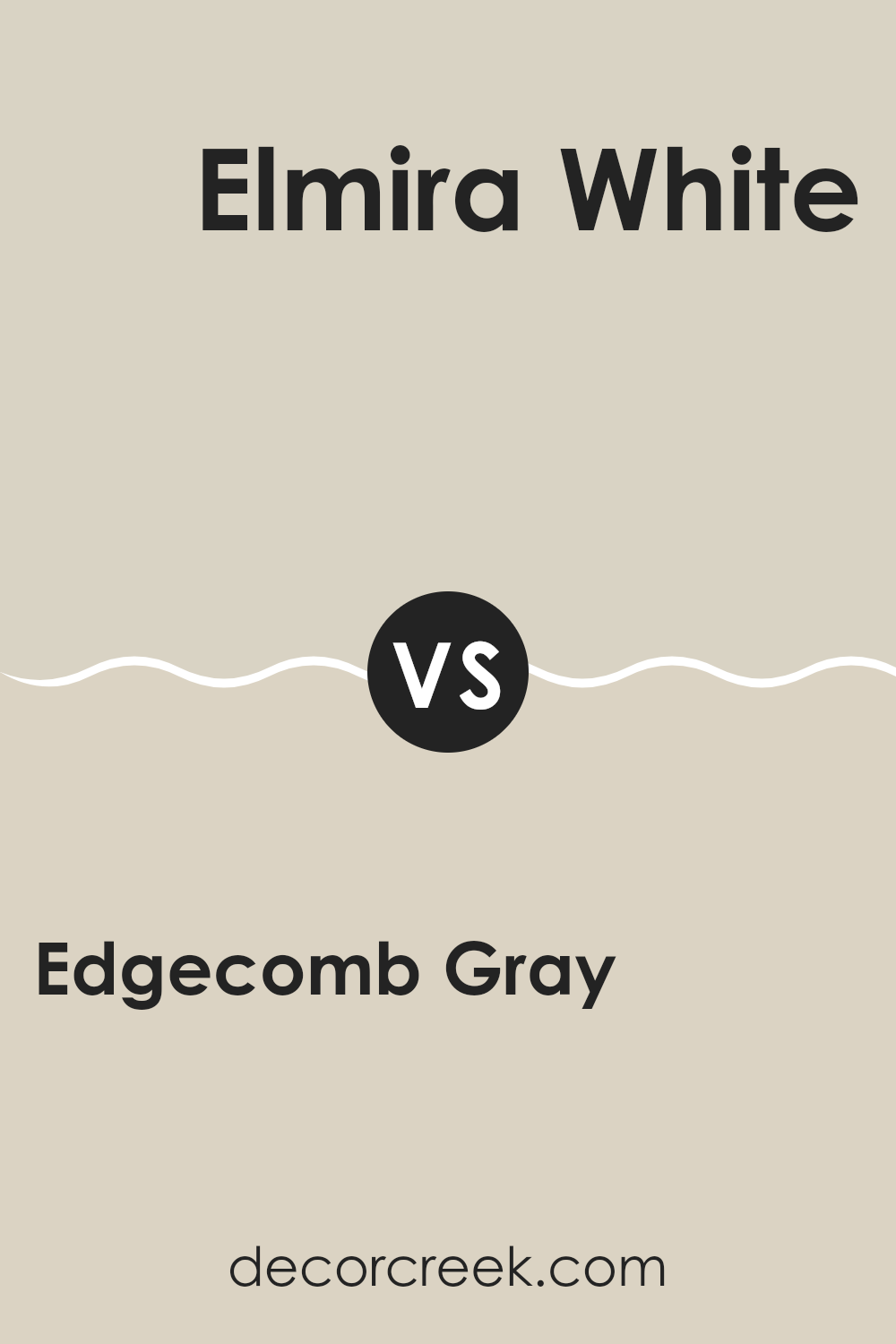
Edgecomb Gray HC-173 by Benjamin Moore vs Elmira White HC-84 by Benjamin Moore
Edgecomb Gray and Elmira White, both by Benjamin Moore, offer subtle and neutral hues for any room. Edgecomb Gray has a warm, soft tone, making it very flexible. It’s perfect if you’re looking for a color that’s not too bold but still adds a cozy feel to a room. On the other hand, Elmira White is lighter and has a touch of beige, giving it a calm and welcoming feeling, ideal for creating a bright and airy room.
While both colors are great for achieving a relaxed atmosphere, Edgecomb Gray provides a slightly deeper and warmer backdrop, making it easier to pair with a variety of furniture and decor styles. Elmira White, being lighter, can help small rooms appear more spacious and is fantastic at reflecting natural light, which can enhance the overall brightness of a room.
So, if you’re deciding between the two, consider the amount of natural light your room gets and the mood you want to set. Edgecomb Gray works well in rooms that need a bit of warmth, whereas Elmira White is excellent for creating a clean, open feel.
You can see recommended paint color below:
- HC-84 Elmira White
In wrapping up my thoughts on HC-173 Edgecomb Gray by Benjamin Moore, it’s clear that this paint color is a fantastic choice for anyone looking to refresh their room without making it feel too flashy. Edgecomb Gray stands out because it’s so calm and friendly. It’s not just gray; it has touches of beige that make it warm and welcoming, like a cozy blanket.
This shade is so easy to match with almost any decor style, whether you have modern furniture or more classic pieces. It also works in different rooms, from your kitchen to your bedroom. What’s great about it is that it shifts a bit with the light, looking lighter during the day and a bit deeper when it gets dark outside.
Overall, if you’re thinking about giving your room a new look, HC-173 Edgecomb Gray is a solid choice. It’s simple, pretty, and makes every room feel just right. No wonder it’s a favorite for many homeowners looking to strike that perfect balance in their homes. Definitely consider it if you’re planning a little makeover for your room!

Ever wished paint sampling was as easy as sticking a sticker? Guess what? Now it is! Discover Samplize's unique Peel & Stick samples.
Get paint samples

