Choosing the right paint color for your home can sometimes feel daunting, but picking SW 9579 Timeless Taupe by Sherwin Williams can be a great choice. Before you decide, let me walk you through some key points to consider. Timeless Taupe is a flexible shade that complements a variety of decor styles and rooms, offering a neutral backdrop that’s both soothing and polished.
You might want to think about the lighting in your room. Natural light brings out the soft, warm undertones of Timeless Taupe, making rooms feel inviting. In artificial light, this color takes on a slightly richer tone, providing depth and warmth even on the darkest days. It’s important to sample this color in different areas of your room at different times of the day to really get a sense of how it changes.
Another thing to consider is the existing elements in your room. Timeless Taupe pairs beautifully with natural materials like wood and stone, enhancing their natural beauty without taking over. Whether you’re planning to use it in a busy family kitchen or a quiet study, this color maintains a balance of warmth and neutrality, adjusting well to both vibrant and subdued decorating schemes.
As you prepare to refresh your room, keep these thoughts in mind to see if SW 9579 Timeless Taupe aligns with your vision for your home.
Is Timeless Taupe SW 9579 Right for My Home?
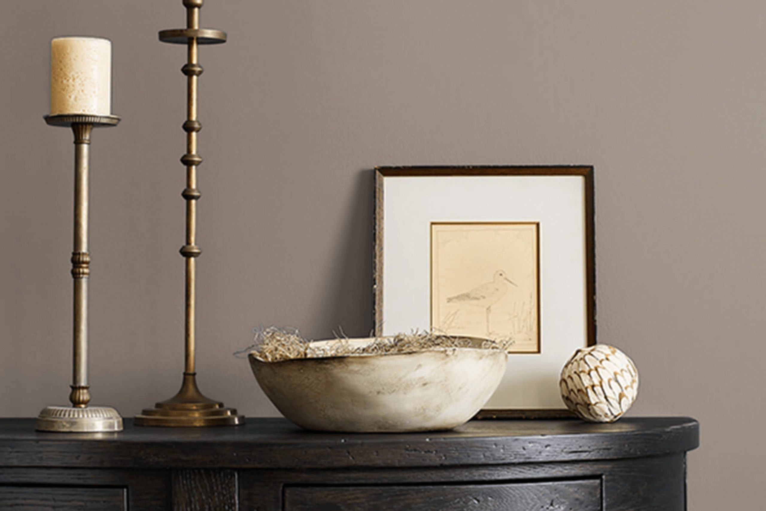
As I was browsing for the perfect neutral paint for my living room, I came across Timeless Taupe, a beautiful hue that truly lives up to its name. It’s a warm, welcoming color that blends beige and gray, creating an inviting atmosphere without being too bold or too strong.
I find that Timeless Taupe works exceptionally well in many interior styles, especially in modern farmhouse, Scandinavian, and minimalist designs. Its flexibility also makes it a fantastic choice for transitional rooms that combine both modern and traditional elements.
When it comes to pairing it with materials and textures, Timeless Taupe is quite accommodating. I love how it looks with natural wood, adding warmth and depth to the room. It also pairs beautifully with soft textiles like wool or cotton in lighter shades, which help keep the room feeling light and airy. For a more dramatic look, I could mix it with darker metals like iron or bronze, which contrast nicely against its subtle nature.
Overall, Timeless Taupe provides a neutral backdrop that allows other elements in the room to stand out, yet it still holds its own as a key part of the overall design look. Whether I’m aiming for a cozy, rustic vibe or a clean, crisp modern style, it adjusts smoothly, ensuring my home looks stylish and well coordinated.
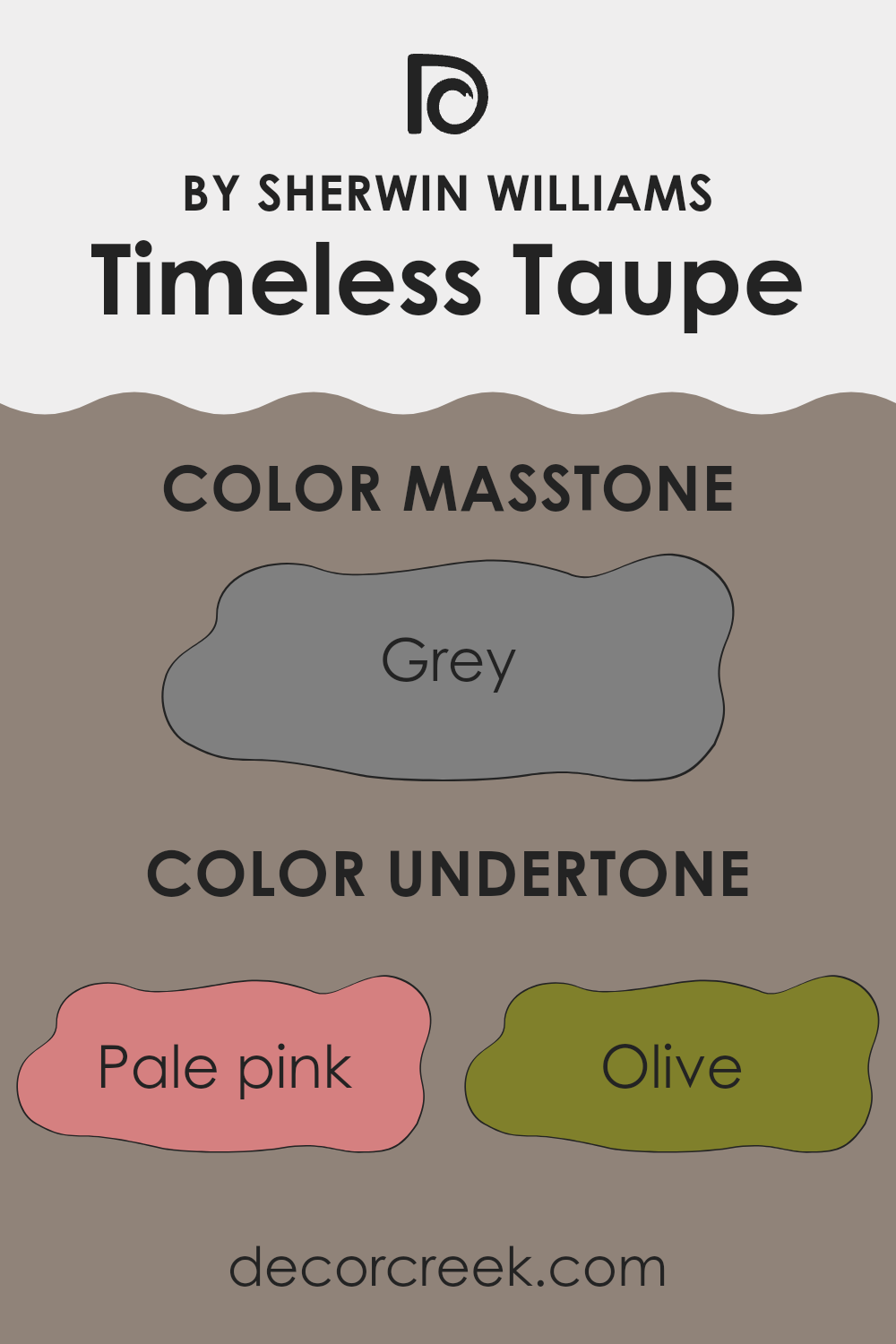
What are the right undertones of Timeless Taupe SW 9579 ?
Timeless Taupe is a flexible color often chosen for its neutral base, which can subtly influence a room depending on its undertones. Various undertones like pale pink, olive, or light blue add hidden depth, making the color appear different under changing lighting conditions or when paired with different decor elements.
For instance, if Timeless Taupe shows hints of pale pink when applied on interior walls, it adds a slightly warm and welcoming feel, ideal for living rooms or bedrooms. On the other hand, undertones like light blue can bring a fresh and calm atmosphere, making it great for bathrooms or kitchens.
The mix of potential undertones like mint or lilac can also affect the way Timeless Taupe interacts with other colors within a room. In a room with ample natural light, mint undertones might make the walls seem brighter and more lively. In contrast, lilac undertones can add a subtle touch of softness and refinement.
Olive or dark green undertones give Timeless Taupe an earthy feel, which works beautifully for rooms that aim for a natural, grounded atmosphere. On the flip side, orange or red undertones can make the room feel cozier and warmer, perfect for creating a welcoming dining area.
Understanding these undertones helps in choosing the right furnishings and accessories to complement the walls, ensuring that the overall look of the room feels cohesive and appealing. When chosen thoughtfully, Timeless Taupe can improve the mood and style of the room, reflecting both function and beauty.
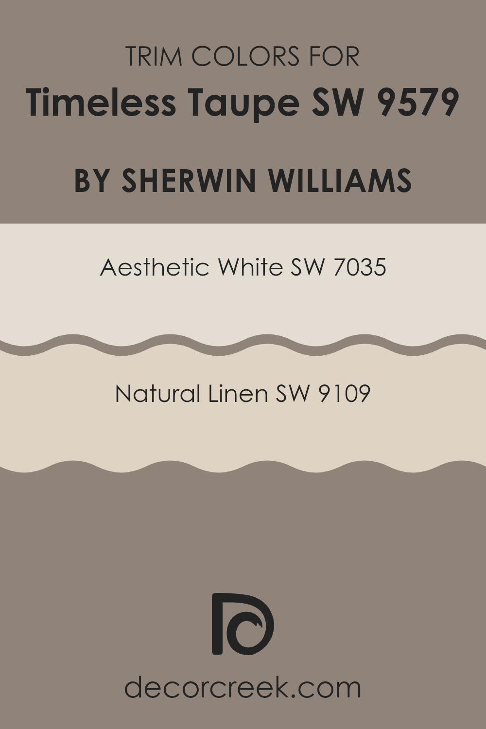
Trendy Trim Colors of Timeless Taupe SW 9579 by Sherwin Williams to use this year.
Trim colors are the shades used on features like door frames, baseboards, moldings, and sometimes ceiling edges to accentuate and define the architectural elements of a room. When paired with a neutral wall color like Timeless Taupe, selecting the right trim color is crucial because it can influence the mood and style of the room.
Aesthetic White and Natural Linen are both trim color options that complement Timeless Taupe as they help create a welcoming and warm feel without feeling too strong against the main color.
Aesthetic White is a light, soft white with a touch of warmth that prevents it from feeling stark or cold, making it an ideal trim color to gently contrast with Timeless Taupe’s earthy undertone. On the other hand, Natural Linen offers a hint of beige, providing a slightly deeper color contrast while still maintaining harmony with the room’s overall look. Both colors are flexible enough to blend smoothly with many decor styles and support the refined, yet cozy atmosphere created by Timeless Taupe.
You can see recommended paint colors below:
Evergreen Colors Similar to Timeless Taupe SW 9579 by Sherwin Williams
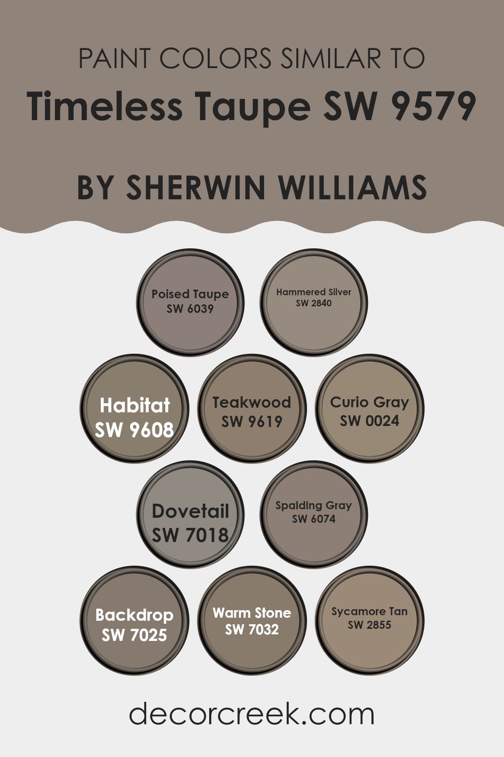
Similar colors can play a critical role in design by creating a cohesive and harmonious atmosphere. Using shades that are close on the color spectrum can enhance the aesthetic continuity in a room, making it feel more unified and visually appealing. For instance, when colors like Poised Taupe and Timeless Taupe are used together, they form a subtle variety that keeps a consistent theme without appearing dull. This is particularly effective in areas where a calm and unified interior is desired.
Poised Taupe brings a balanced blend of warm and cool tones, making it flexible for combining with other hues. Hammered Silver adds a slightly metallic sheen, offering a reflective quality that can gently brighten rooms. Habitat introduces a deeper, earthier quality, inspired by natural surroundings, while Teakwood deepens the palette with its rich, wood-inspired tones.
Curio Gray brings in a lighter, almost airy gray that can brighten darker corners. Dovetail offers a stronger, more pronounced gray that stands out against lighter tones. Spalding Gray is muted yet distinct, adding depth without feeling too strong. Backdrop, a deeper shade, anchors lighter tones and adds dramatic interest. Warm Stone enriches rooms with its dusty, warm presence, and Sycamore Tan introduces a golden hue that echoes the soft, warm colors of autumn. Using these shades together creates a layered yet cohesive color scheme that adds depth and interest to interior designs.
You can see recommended paint colors below:
- SW 6039 Poised Taupe (CHECK A SAMPLE)
- SW 2840 Hammered Silver
- SW 9608 Habitat (CHECK A SAMPLE)
- SW 9619 Teakwood (CHECK A SAMPLE)
- SW 0024 Curio Gray (CHECK A SAMPLE)
- SW 7018 Dovetail (CHECK A SAMPLE)
- SW 6074 Spalding Gray (CHECK A SAMPLE)
- SW 7025 Backdrop (CHECK A SAMPLE)
- SW 7032 Warm Stone (CHECK A SAMPLE)
- SW 2855 Sycamore Tan
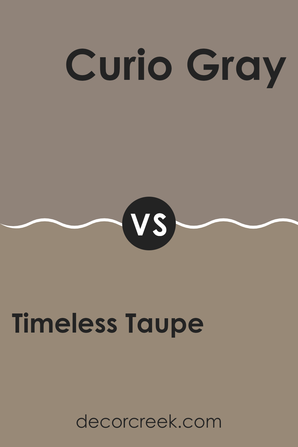
Timeless Taupe SW 9579 by Sherwin Williams vs Curio Gray SW 0024 by Sherwin Williams
Timeless Taupe and Curio Gray, both by Sherwin Williams, are popular choices for adding a neutral backdrop to any room. Timeless Taupe leans toward a warm beige, with a cozy feel that makes it great for rooms where you want a welcoming atmosphere. It fits well in areas like living rooms or bedrooms where a soft, friendly vibe is desired.
On the other hand, Curio Gray has a cooler tone, which gives it a more formal touch. It’s a true gray that looks sharp and clean, making it ideal for modern settings or rooms that aim for a more professional or polished look, such as offices or minimalist living areas.
Both colors work well under various lighting conditions and pair nicely with a wide range of decor styles. However, the choice between them often depends on whether you prefer a warmer, inviting feel with Timeless Taupe or a cooler, more refined atmosphere with Curio Gray.
You can see recommended paint color below:
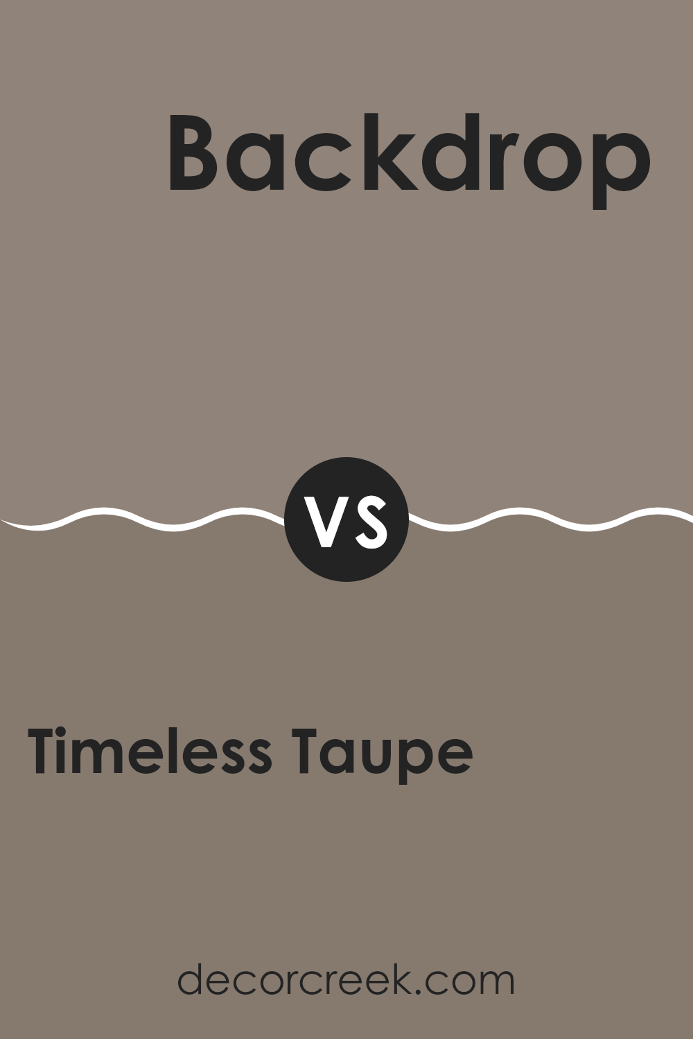
Timeless Taupe SW 9579 by Sherwin Williams vs Backdrop SW 7025 by Sherwin Williams
The Timeless Taupe shade leans toward a light brown with soft grey undertones, offering a warm and cozy feel, perfect for creating inviting rooms in your home. Its subtle hue works well with both bright colors and other neutrals, providing flexibility in decorating.
On the other hand, Backdrop is a darker gray that tends toward the cooler side, giving it a more neutral and adaptable appeal. It pairs beautifully with a wide range of colors, making it ideal for both modern and traditional interiors. This tone can help anchor a room while giving off a refined yet understated vibe.
When comparing both, Timeless Taupe brings a warmth that feels very welcoming, which makes it great for living areas and bedrooms where comfort is key. Backdrop, with its cooler tones, is excellent for areas that call for a sleek look, like kitchens and bathrooms. Each offers unique advantages depending on the atmosphere you want to create.
You can see recommended paint color below:
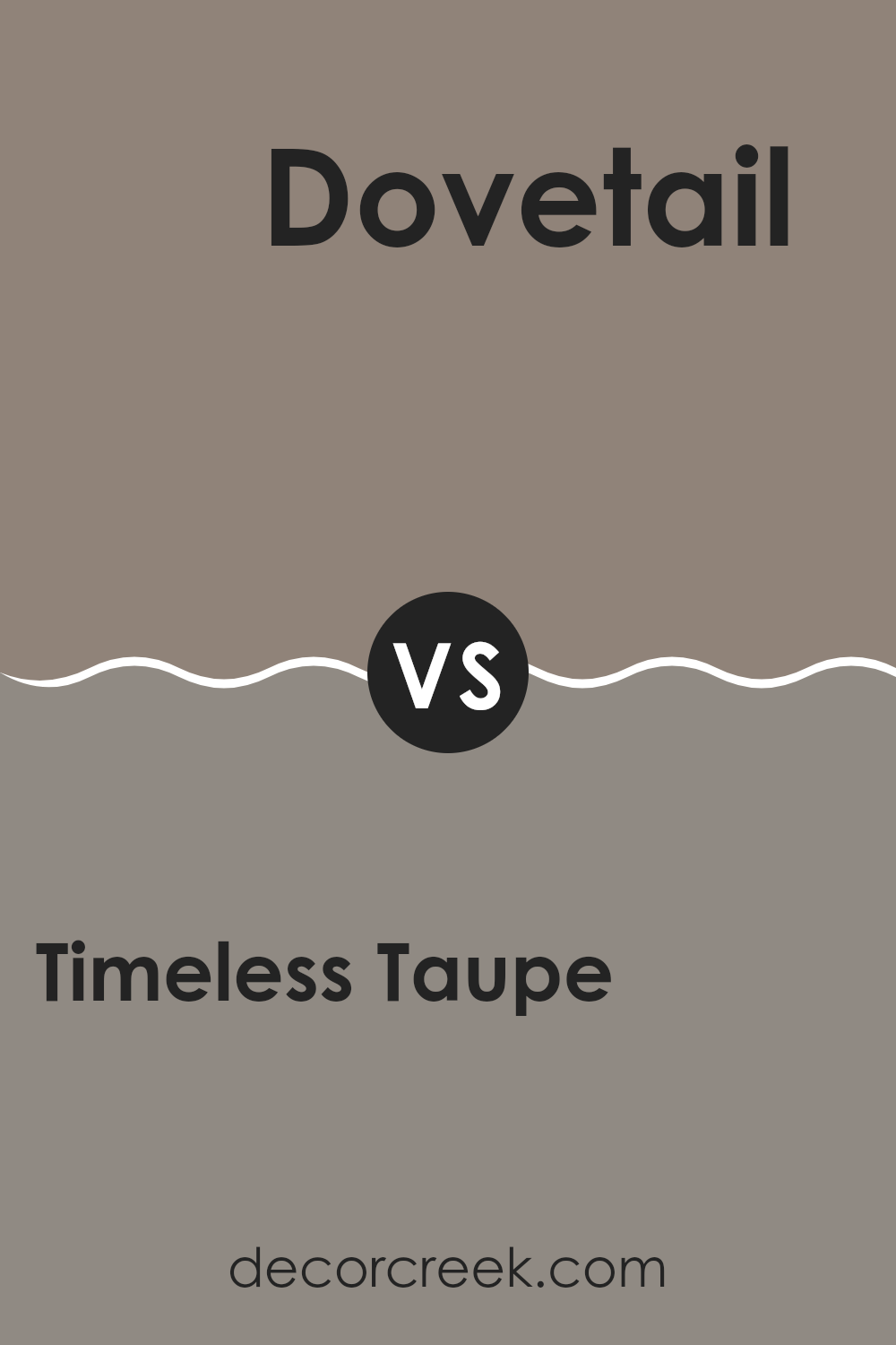
Timeless Taupe SW 9579 by Sherwin Williams vs Dovetail SW 7018 by Sherwin Williams
Timeless Taupe and Dovetail are both neutral colors by Sherwin Williams, but they have distinct differences. Timeless Taupe is a lighter, warmer hue that brings a gentle, soft vibe to any room.
It’s very adaptable and can work well in different rooms, providing a cozy, welcoming feel. On the other hand, Dovetail is a darker shade with a cooler, grayer undertone. It adds a stronger, more defined look to rooms, making it a great choice for accent walls or cabinetry when you want a bolder statement.
While Timeless Taupe reflects more light, making a room look airy and larger, Dovetail offers depth and contrast, perfect for creating a focal point in a design. Both colors can work beautifully together to create a balanced and harmonious look.
You can see recommended paint color below:
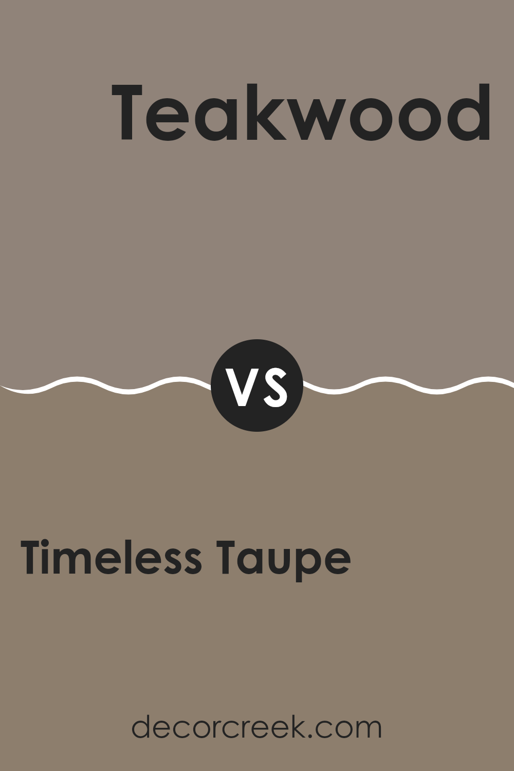
Timeless Taupe SW 9579 by Sherwin Williams vs Teakwood SW 9619 by Sherwin Williams
Timeless Taupe and Teakwood are two distinct colors from Sherwin Williams that each bring their own unique style to a room. Timeless Taupe is a soft, warm beige with a welcoming and comfortable feel. It’s great for creating a cozy and inviting atmosphere in any room.
On the other hand, Teakwood is a darker, richer brown that offers a bit more drama and intensity. It tends to make rooms feel more grounded and substantial. Timeless Taupe is flexible and works well in many settings, providing a gentle and neutral background.
Teakwood, with its deeper tone, is excellent for adding depth and can be a standout feature in a design. Choosing between them depends on the mood you’re aiming for—light and airy with Timeless Taupe, or more bold and anchored with Teakwood. Both colors support a range of complementary shades, making them practical choices for interior design.
You can see recommended paint color below:
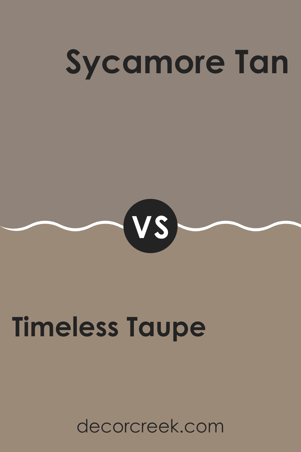
Timeless Taupe SW 9579 by Sherwin Williams vs Sycamore Tan SW 2855 by Sherwin Williams
Timeless Taupe and Sycamore Tan are two appealing colors by Sherwin Williams that offer subtle differences suitable for various decor needs. Timeless Taupe is a balanced, soft beige with a warm essence, making it a perfect neutral base for any room. It reflects light well, adding a sense of airiness and openness.
On the other hand, Sycamore Tan features a darker, earthier tone resembling the natural color of sycamore bark. This color creates a cozy, inviting atmosphere, ideal for places where you want a more grounded, homely feel. It’s great for accent walls or rooms that benefit from a richer shade to add depth and warmth.
Both shades work well in multiple settings and pair nicely with a wide range of other colors. While Timeless Taupe is lighter and tends to make rooms look larger, Sycamore Tan offers a warm, comforting feel, perfect for more intimate settings.
You can see recommended paint color below:
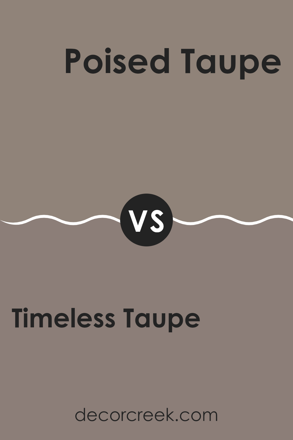
Timeless Taupe SW 9579 by Sherwin Williams vs Poised Taupe SW 6039 by Sherwin Williams
Timeless Taupe and Poised Taupe by Sherwin Williams are both shades of taupe, but they have clear differences. Timeless Taupe has a warmer, softer appearance, making it an excellent choice for creating a cozy and welcoming atmosphere in rooms such as living rooms or bedrooms. It pairs beautifully with soft whites and rich, dark woods.
On the other hand, Poised Taupe is slightly darker and has gray undertones, giving it a more grounded, stable feel. This color works well in rooms where you want to add a bit of drama or depth, such as an accent wall or a formal dining area. It complements metallic accents and modern furnishings well, making it ideal for contemporary rooms.
Both colors are flexible and can help establish a calm, neutral backdrop in your home. However, the choice between them depends on the mood and style you want to achieve in your room.
You can see recommended paint color below:
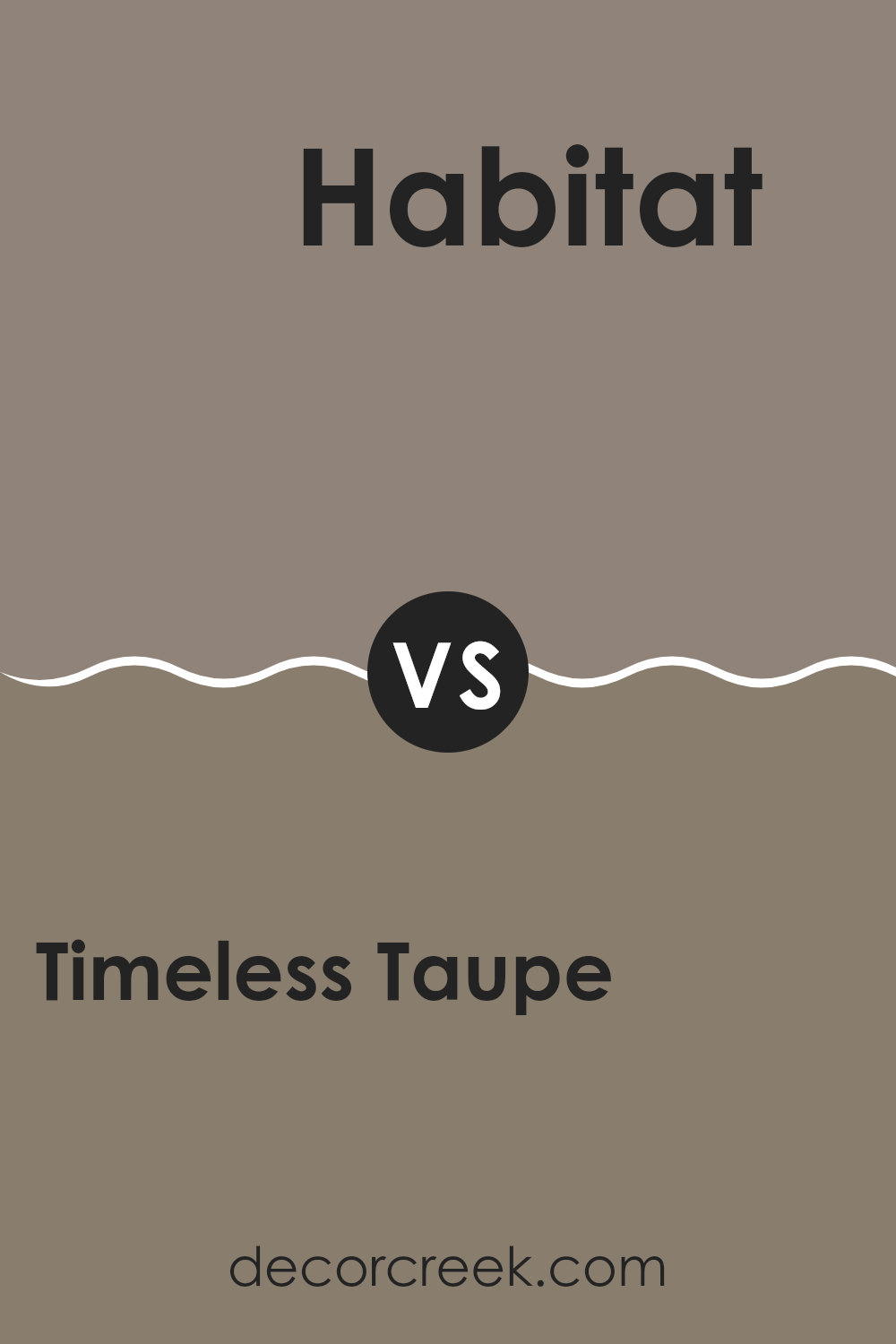
Timeless Taupe SW 9579 by Sherwin Williams vs Habitat SW 9608 by Sherwin Williams
Timeless Taupe and Habitat, both by Sherwin Williams, are neutral colors, but they have distinct tones that set them apart. Timeless Taupe is a soft, warm beige with a comforting, cozy vibe that makes it flexible for any room. It’s a neutral shade that pairs well with a wide range of colors, contributing to a gentle and inviting atmosphere.
On the other hand, Habitat has a deeper, earthier tone compared to Timeless Taupe. It leans toward a richer, darker brown, giving it a more pronounced presence in a room. This color is ideal for adding warmth and depth, providing a strong but neutral background that works well with natural elements and materials.
While both colors share their neutrality, Timeless Taupe is lighter and softer, helping rooms feel more open. Habitat, with its deeper tone, offers a grounding effect, suitable for creating a cozy, secure feeling in a room.
You can see recommended paint color below:
Timeless Taupe SW 9579 by Sherwin Williams vs Hammered Silver SW 2840 by Sherwin Williams
Timeless Taupe and Hammered Silver are two distinct paint colors by Sherwin Williams. Timeless Taupe is a soft, warm beige that offers a cozy and inviting feeling to any room. It’s a neutral color that pairs well with many other hues, making it a flexible choice for decorating. This color is particularly effective in living areas and bedrooms where a calm, gentle atmosphere is desired.
Hammered Silver, on the other hand, is a deeper gray that mimics the look of metallic silver. This color has a modern vibe and provides a bold contrast when used alongside lighter colors. It’s perfect for rooms you want to give a sleek and contemporary feel, such as kitchens or home offices.
Together, these two colors can work beautifully in a home, with Timeless Taupe bringing warmth and Hammered Silver adding a dash of modern style. The balance between the cozy beige and the striking gray can create visually appealing and harmonious rooms.
You can see recommended paint color below:
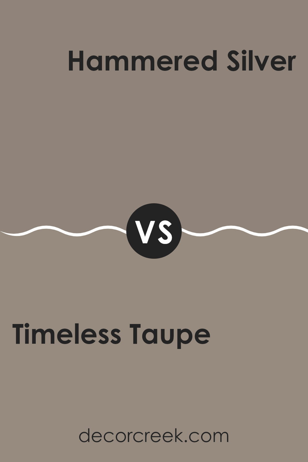
Timeless Taupe SW 9579 by Sherwin Williams vs Spalding Gray SW 6074 by Sherwin Williams
Timeless Taupe and Spalding Gray are both neutral colors by Sherwin Williams, suitable for creating cozy and inviting rooms. Timeless Taupe has a warm, beige undertone that makes it very adaptable for pairing with various decor styles. It’s particularly good for living rooms and bedrooms where a soft, comforting atmosphere is desired.
On the other hand, Spalding Gray is darker and carries a more defined gray shade. It offers a stronger statement but remains neutral, making it excellent for areas that need a bit more character without feeling too intense. This color works well in rooms that benefit from a darker tone, such as accent walls or cabinetry.
Both colors are flexible and can be used in many settings, from modern to traditional, depending on what they’re combined with. Timeless Taupe tends to add warmth to a room, while Spalding Gray brings a cooler tone, offering a slight contrast that can add depth and dimension.
You can see recommended paint color below:
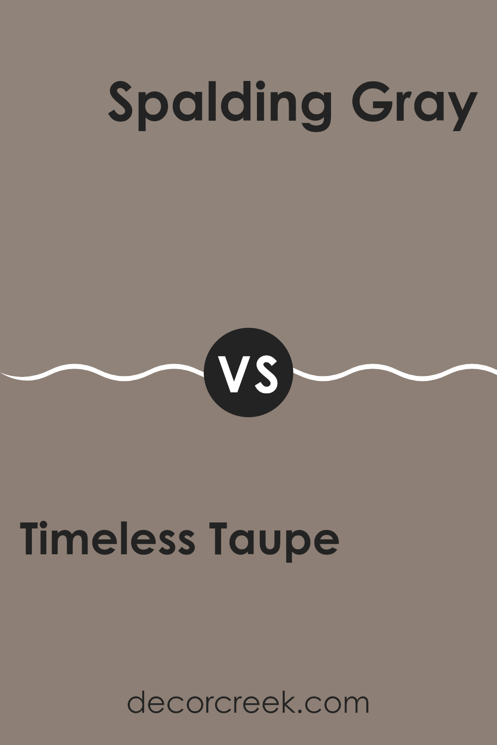
Timeless Taupe SW 9579 by Sherwin Williams vs Warm Stone SW 7032 by Sherwin Williams
Timeless Taupe and Warm Stone, both by Sherwin Williams, are popular choices for their warm and inviting tones, which work well in a range of rooms. Timeless Taupe has a gentle, soft presence that brings a cozy feel to any room. It is a classic taupe that balances between a light brown and a warm gray, giving it a flexible backdrop for both bold and subtle decor.
On the other hand, Warm Stone leans more toward a heavier, richer look. This color features a deeper blend of gray and brown, resulting in a stronger color presence that stands out more prominently against other decor elements. Compared to Timeless Taupe, Warm Stone works well in areas where a bolder, more defined color is needed to either complement larger rooms or contrast with light furnishings.
Both colors offer a warm atmosphere, but where Timeless Taupe provides subtlety and a calm feel, Warm Stone offers depth and definition, making them suitable for different tastes and room uses.
You can see recommended paint color below:
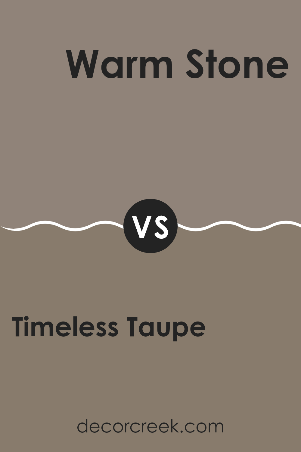
After looking at SW 9579 Timeless Taupe by Sherwin Williams, I can really say that this paint color is just great if you want your room to look calm and cozy. It’s a kind of brownish-gray that can go nicely with many different colors you might want to use in your room. This means it’s pretty easy to match it with the furniture and decorations you already have. It’s also a good color if you don’t want something too bright or too dark, just something nice in between that feels soft and relaxed.
I found that whether you put it in your living room, bedroom, or even your kitchen, it helps make the room look more welcoming. This color doesn’t feel dull over time, and it’s great for showing off a simple yet beautiful style in your home. It works well in different lighting, which means it can look slightly different and interesting at various times of the day.
All in all, if you’re trying to decide on a new paint color, SW 9579 Timeless Taupe might be a great choice. It’s easy to live with and keeps everything looking clean and neat. It surely made picking a paint color a lot easier and more fun for me.
Ever wished paint sampling was as easy as sticking a sticker? Guess what? Now it is! Discover Samplize's unique Peel & Stick samples.
Get paint samples


