I’ve always been drawn to colors that add a touch of elegance without overwhelming a space, and SW 6039 Poised Taupe by Sherwin Williams does just that. This unique shade strikes a beautiful balance between warm and cool, making it incredibly versatile for any room in your home.
Whether you’re looking to refresh your living room or spruce up your bedroom, Poised Taupe offers a subtle depth that complements various decor styles, from modern to traditional.
It has a way of bringing a cozy, soothing atmosphere into a space, making it feel welcoming and put-together.
Join me as I share how this color can transform your home with its understated elegance.

What Color Is Poised Taupe SW 6039 by Sherwin Williams?
Poised Taupe is a unique blend of brown and gray, giving it a warm yet balanced appearance. This neutral shade is versatile, easily fitting into a variety of interior styles. It’s especially effective in contemporary and minimalist designs, where its subtlety complements clean lines and simple forms. Traditional spaces also benefit from Poised Taupe, as it adds a timeless elegance without overpowering other elements.
This color works particularly well with natural materials such as wood, leather, and linen, enhancing their organic beauty. In rooms with wooden flooring or furniture, Poised Taupe creates a harmonious link, pulling the natural textures into a cohesive look. When paired with metallic accents like brass or copper, it brings out a richer, more luxurious feel.
In terms of textures, Poised Taupe aligns nicely with soft fabrics like velvet or wool. These combinations can make a space feel warm and inviting. It’s also an excellent backdrop for bolder colors, allowing them to stand out without clashing.
Overall, Poised Taupe is a practical and appealing choice for anyone looking to create a calm, welcoming environment in their home, complementing a variety of styles and materials.
Is Poised Taupe SW 6039 by Sherwin Williams Warm or Cool color?
Poised Taupe is a unique neutral paint color by Sherwin Williams that balances between brown and gray. This warm yet grayish taupe is adaptable and works well in various spaces throughout the home. It’s particularly effective in living rooms or bedrooms where a calm, cozy atmosphere is desired.
Because it sits in the middle of warm and cool, it pairs well with a wide range of colors, from soft pastels to vibrant blues and greens. This versatility allows it to act either as a calming backdrop or as a statement color, depending on the room’s lighting and decor. Poised
Taupe also works well in homes with natural materials like wood, adding a modern but earthy element. It complements both traditional and contemporary styles, making it a go-to choice for those looking to refresh their space without leaning too heavily on trends. Its ability to adapt to different settings and styles makes it a practical choice for any home.
Undertones of Poised Taupe SW 6039 by Sherwin Williams
Poised Taupe is a unique and versatile paint color that can bring a calming presence to any room. This color’s complexity lies in its array of subtle undertones, including shades of purple, brown, and gray. These undertones play a significant role in how the color is perceived and can affect the mood and style of a space.
Undertones are like hidden colors that emerge under different lighting conditions or when placed next to other colors. They can either enhance or mute certain aspects of the main color. For example, the purple undertone in Poised Taupe can create a slightly cooler feel, making it a great choice for a space where you want a touch of elegance without using a stark, cold gray.
The brown undertone adds a sense of warmth, making the space feel more inviting and cozy.
When you paint a room with Poised Taupe, these undertones can influence what type of furniture and decor look best.
The neutral character of this color means it works well with a wide range of other colors, from soft pastels to vibrant tones. The subtle nuances of Poised Taupe provide a backdrop that can suit both modern minimalism and more classic, rich decors.
Knowing about these undertones can help you make informed decisions about lighting and furnishings, ensuring everything works together to create the desired ambiance. Overall, Poised Taupe is more than just a simple gray or brown; it’s a dynamic blend that offers depth and sophistication to interior walls.
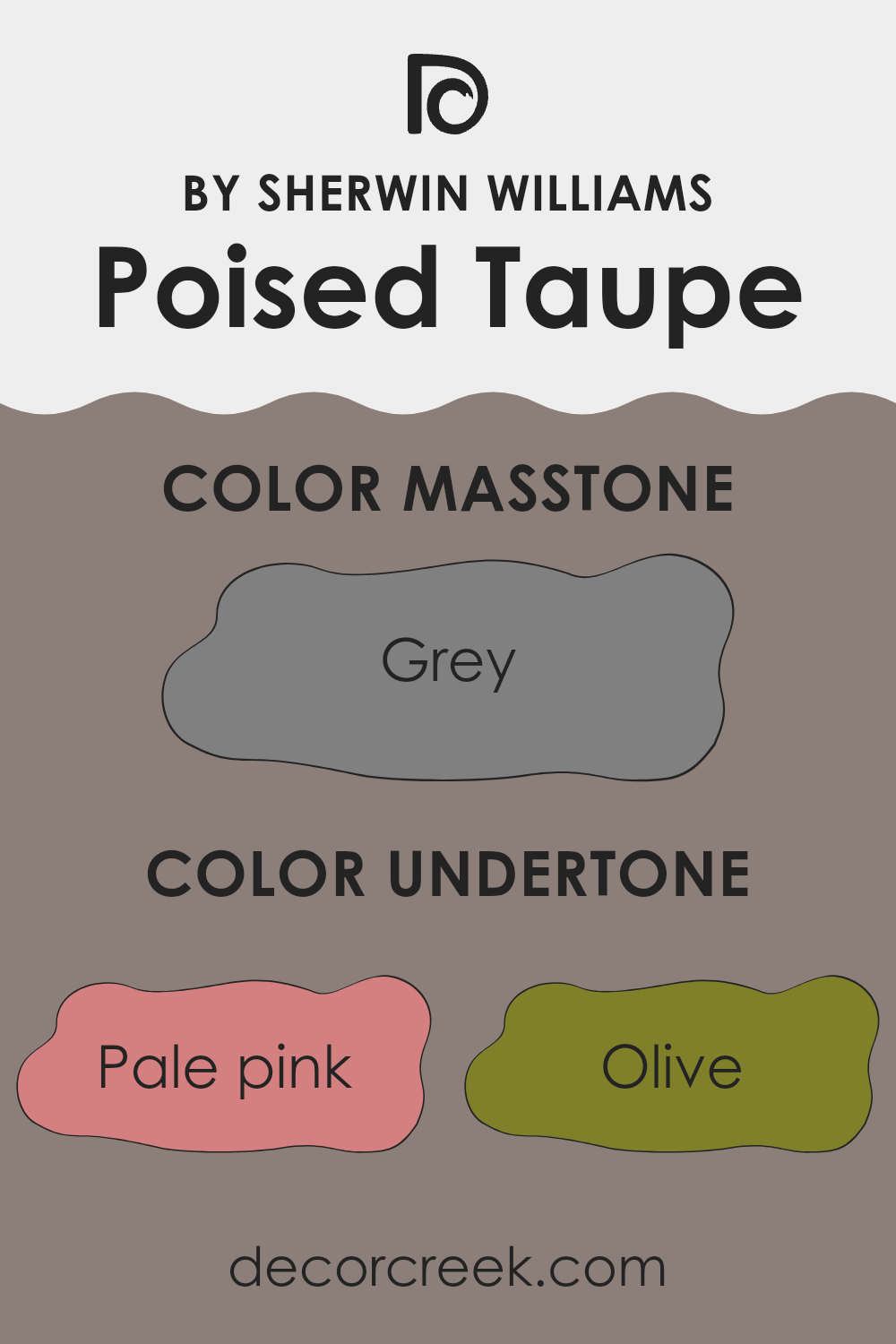
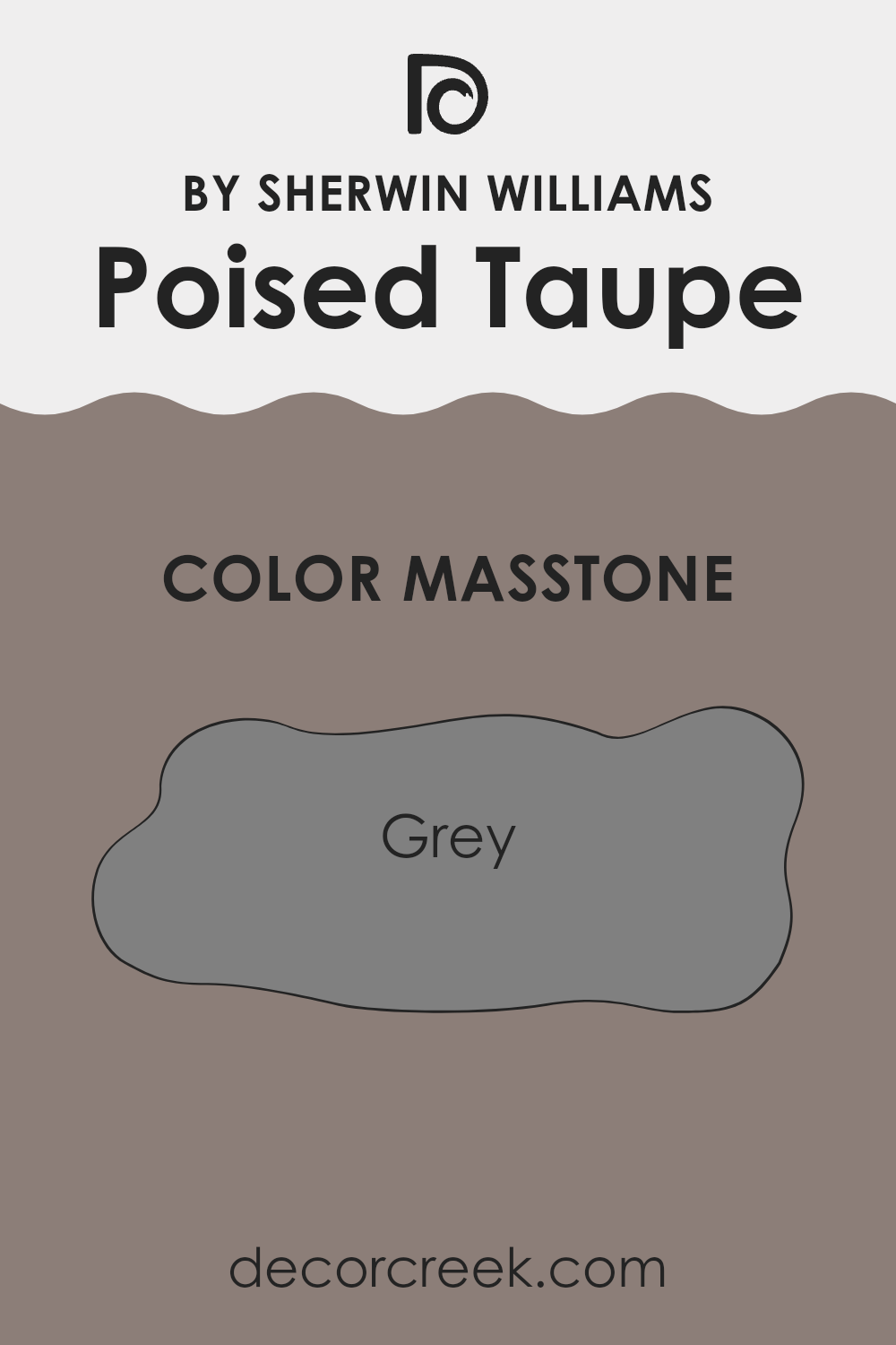
What is the Masstone of the Poised Taupe SW 6039 by Sherwin Williams?
Poised Taupe, represented as Grey in its masstone (#808080), is a versatile color often used in homes due to its soothing yet neutral tone. This shade provides a balanced backdrop that merges both warm and cool elements, making it a great choice for various decorating styles.
It works well in busy areas like living rooms or kitchens because it hides dirt and smudges better than lighter colors, reducing the time spent on cleaning. Additionally, this shade can make a room feel cozier, drawing in walls slightly with its depth of color, and thus is ideal for creating a comfy, inviting space.
It pairs nicely with a wide range of colors, allowing for flexibility in decor changes over time without the need for repainting. Therefore, its practicality and aesthetic appeal make it a go-to color for many homeowners looking to add a touch of class and warmth to their spaces.
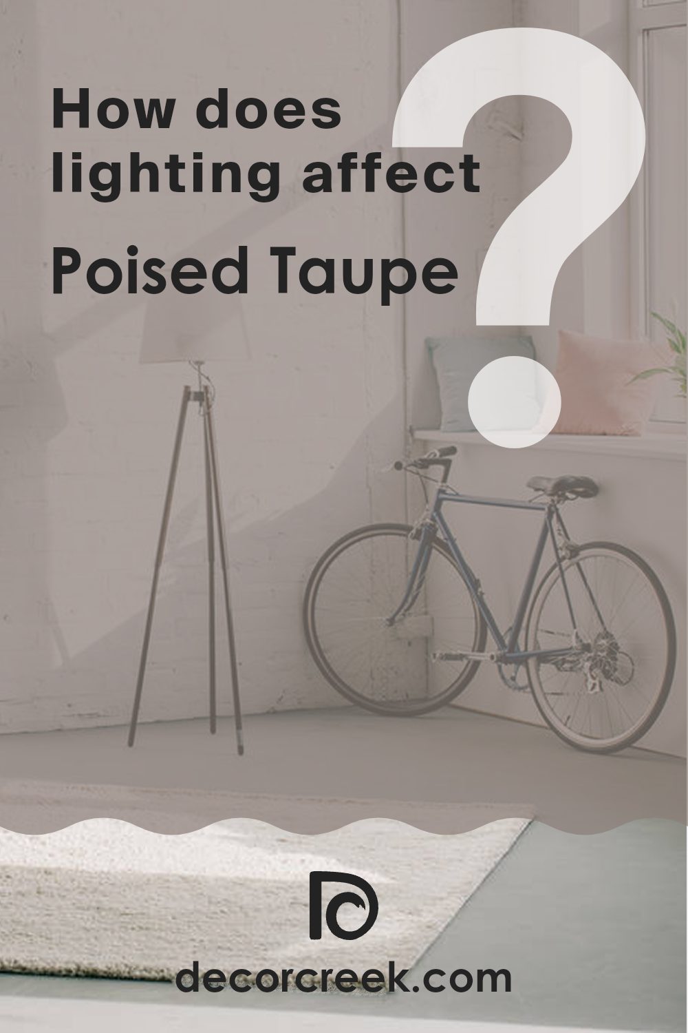
How Does Lighting Affect Poised Taupe SW 6039 by Sherwin Williams?
Lighting has a significant impact on how colors appear in different environments. It can change the way we perceive a color, making it seem lighter, darker, or even shifting the hue entirely.
Take Poised Taupe, for example, a warm blend of gray and brown. Under artificial light, such as LED or fluorescent lighting, Poised Taupe often appears warmer, highlighting its brown tones more than the gray. This happens because artificial lights tend to have different color temperatures and intensities, which can emphasize certain tones in a paint color.
In natural light, the appearance of Poised Taupe can vary greatly depending on the direction of the room and the time of day. In a north-facing room, which receives less direct sunlight and tends to have cooler light, Poised Taupe can appear slightly more gray, giving a calm and steady look to the space. The cooler light emphasizes the gray tones over the brown, so the color might look a bit more subdued.
Conversely, in a south-facing room that gets a lot of bright, warm sunlight throughout the day, Poised Taupe will reveal its warmer brown tones, making the room feel cozy and inviting. The ample natural light brings out the richness of the color and softens the gray undertones.
In east-facing rooms, Poised Taupe looks different in the morning when the light is golden and warm, making the color appear softer and lighter. As the day progresses and the natural light diminishes, the color might pull more of its gray tones.
West-facing rooms highlight Poised Taupe in a somewhat reverse fashion compared to east-facing rooms. The color may start the day showing more of its muted, gray characteristics, and as the sun sets, it warms up, picking up the fuller, richer tones of brown in the late afternoon and evening light.
Understanding these nuances helps in choosing the right paint color keeping in mind the room’s lighting conditions.
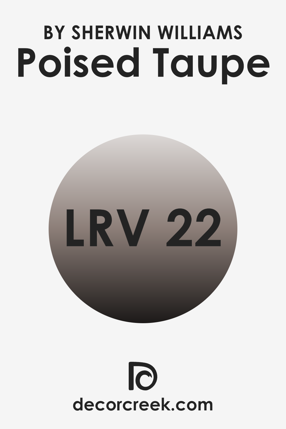
What is the LRV of Poised Taupe SW 6039 by Sherwin Williams?
LRV stands for Light Reflectance Value, which is a measure of the amount of visible and usable light that a paint color reflects. Colors with higher LRV reflect more light, making spaces feel brighter and larger, while those with lower values absorb more light, resulting in a cozier and more enclosed feeling.
This measurement helps in deciding how a color might influence the mood and visual size of a room depending on its natural light levels, as well as its compatibility with artificial lighting arrangements.
Considering Poised Taupe has an LRV of 21.956, it is on the darker side of the scale. This means it tends to absorb more light rather than reflecting it, making it a good choice for adding depth and warmth to a space. In rooms with limited natural light, this color might make the space appear smaller and more intimate, which can be ideal for areas meant for relaxation like bedrooms or living rooms. In well-lit spaces, on the other hand, it can offer a rich backdrop, enhancing other colors and decor elements.
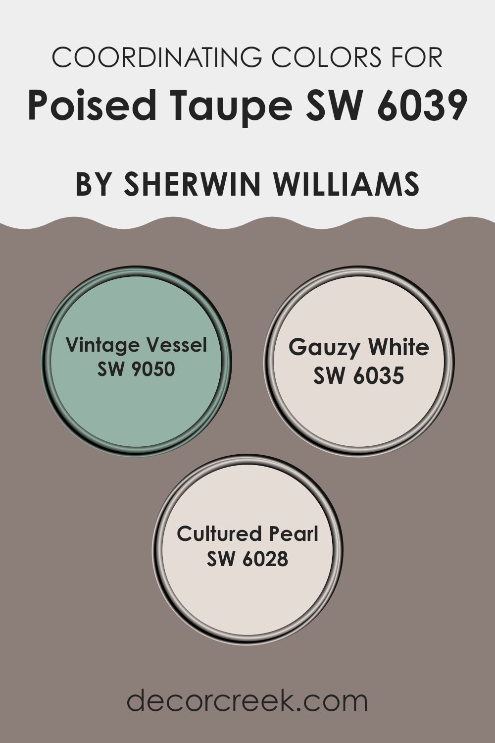
Coordinating Colors of Poised Taupe SW 6039 by Sherwin Williams
Coordinating colors are shades that complement or enhance each other while contributing to a harmonious overall design. They typically share similar undertones or contrast in a way that creates visual interest without clashing. Choosing the right coordinating colors can bring balance and unity to a space, making it feel more cohesive.
Among the coordinating colors for Poised Taupe, Vintage Vessel is a rich, deep blue-gray that adds a touch of refinement and depth to the muted tone of Poised Taupe. This color is excellent for adding some drama and focus in a room, especially in well-lit or larger spaces.
On the lighter side, Gauzy White presents a soft, airy white with a hint of warmth, perfect for creating a breathy and light feel in any area, pairing wonderfully with a grounded color like Poised Taupe. Cultured Pearl, another option, offers a subtly elegant off-white shade that leans towards a soft gray, providing a gentle contrast that’s not too stark but still noticeable, ideal for creating a relaxed yet pulled together look.
You can see recommended paint colors below:
- SW 9050 Vintage Vessel
- SW 6035 Gauzy White
- SW 6028 Cultured Pearl
What are the Trim colors of Poised Taupe SW 6039 by Sherwin Williams?
Trim colors are paint selections used to highlight the architectural details of a room, such as baseboards, moldings, doors, and window frames. Choosing the right trim color can greatly enhance the overall look and feel of the space by providing a crisp, clean finish that complements the main wall color. In the case of Poised Taupe, a balanced, warm taupe hue, pairing it with the right trim colors enhances its welcoming and comfortable vibe.
Greek Villa SW 7551 and Moderate White SW 6140 are excellent trim color choices for rooms painted with Poised Taupe. Greek Villa is a soft, off-white with a warm undertone that harmonizes with Poised Taupe to create a cozy atmosphere without causing a stark contrast, allowing for a smooth visual transition.
On the other hand, Moderate White is a gentle beige with just enough depth to outline and define the architectural features effectively, accentuating the elegant neutral tone of Poised Taupe without overpowering it. These trim colors ensure the architectural details are highlighted beautifully, making the room appear more polished and put-together.
You can see recommended paint colors below:

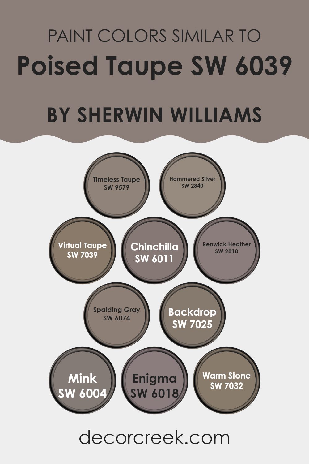
Colors Similar to Poised Taupe SW 6039 by Sherwin Williams
Choosing similar paint colors is essential for creating a harmonious and coherent atmosphere in any space. Colors close in tone to Poised Taupe, such as Timeless Taupe, provide a timeless appeal with their soft gray-brown nuances, enhancing the warmth of the room. Hammered Silver offers a metallic flair that subtly reflects light, lending a unique yet understated elegance to interiors. Virtual Taupe deepens the hue slightly, adding a sturdier, earthier touch that anchors the decor without overpowering.
Chinchilla and Renwick Heather introduce slight variances in intensity and undertone, both adding depth and texture to the palette. Chinchilla leans towards a softer, dustier gray, perfect for soothing bedroom walls, while Renwick Heather brings a richer, woodsy feel, ideal for areas demanding a dash of formality.
Gray, meanwhile, serves as a pivot between the lighter and darker tones, offering flexibility in blending different furnishings and accents. Backdrop and Mink are excellent for those looking to infuse their spaces with a more profound, almost elusive quality—Backdrop with its cooler gray tones, and Mink with its deep, dark warmth.
Enigma presents an interesting twist with a gray that whispers hints of purple, creating a mysterious mood ideal for dramatic focal points or intimate corners. Warm Stone rounds out the options with a comforting, nurturing earth tone that works beautifully with a wide range of decorating styles, ensuring that each room feels both connected and comfortably unique.
Each of these colors complements its neighbors, allowing for a smooth visual transition throughout the home, proving that a well-considered color scheme can indeed unify and enhance the environment.
You can see recommended paint colors below:
- SW 9579 Timeless Taupe
- SW 2840 Hammered Silver
- SW 7039 Virtual Taupe
- SW 6011 Chinchilla
- SW 2818 Renwick Heather
- SW 6074 Spalding Gray
- SW 7025 Backdrop
- SW 6004 Mink
- SW 6018 Enigma
- SW 7032 Warm Stone
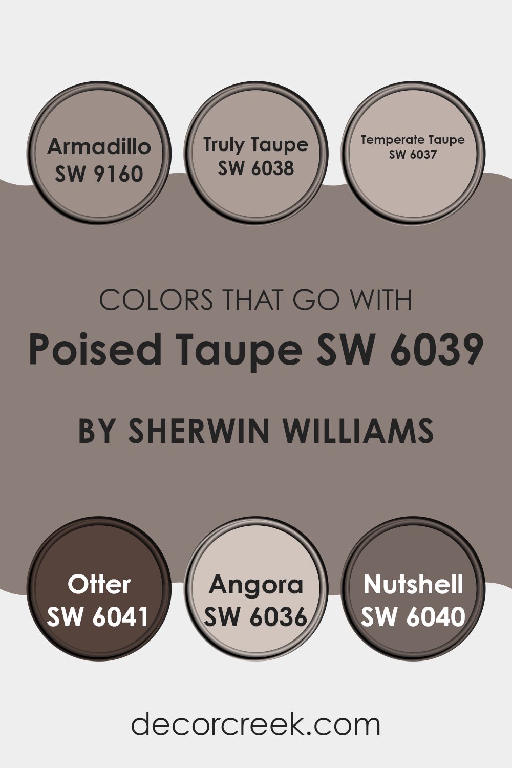
Colors that Go With Poised Taupe SW 6039 by Sherwin Williams
Choosing the right colors that coordinate with Poised Taupe SW 6039 by Sherwin Williams can greatly enhance the aesthetic and mood of any space. These colors, such as Armadillo, Truly Taupe, Temperate Taupe, Otter, Angora, and Nutshell, were selected to complement Poised Taupe due to their ability to balance warmth and stability, adding depth and cohesion to a room’s design.
By selecting shades that harmonize well together, you create a balanced and inviting environment. Adding the right colors affects not only the look but also the feel of the room, potentially making it feel more cozy, vibrant, or calm, depending on the hues chosen.
Armadillo is a darker, earthier tone that provides a strong foundation when used with Poised Taupe, great for creating a sense of grounding. Truly Taupe is slightly lighter and brings a subtle, understated elegance to the combination, perfect for understated refinement. Temperate Taupe offers a cooler counterpart, introducing a mild, refreshing contrast to the warmth of Poised Taupe.
Otter introduces a unique richness with its deeper, brownish-grey hue, ideal for adding a touch of mystery and depth. Angora is softer and lighter, providing a gentle lift to spaces, and can help in softening any harsh lines or features in a decor scheme. Lastly, Nutshell has a warming, inviting quality that works beautifully to create welcoming spaces, perfect for areas where comfort is key. Each of these colors contributes in its own way to create versatile, appealing, and harmonious spaces.
You can see recommended paint colors below:
- SW 9160 Armadillo
- SW 6038 Truly Taupe
- SW 6037 Temperate Taupe
- SW 6041 Otter
- SW 6036 Angora
- SW 6040 Nutshell
How to Use Poised Taupe SW 6039 by Sherwin Williams In Your Home?
Poised Taupe by Sherwin Williams is a versatile neutral paint color that blends the warmth of brown with the softness of gray. This unique shade creates a cozy and inviting atmosphere in any room. Ideal for both modern and traditional homes, Poised Taupe offers a refreshing alternative to common neutrals like pure gray or beige.
You can use Poised Taupe in various ways around your home. It works well as a main color for living rooms, providing a calm base that complements various decor styles and colors. In bedrooms, it adds a subtle warmth that can make the space more relaxing and cozy.
For a striking effect, pair it with brighter or darker colors to accent walls or furniture. In bathrooms, it pairs beautifully with white trim or cabinetry for a clean, balanced look.
Poised Taupe is also great for exterior use, giving your home a stylish yet understated curb appeal.
Whether you’re painting walls, doors, or trim, this color can help freshen up your space without overwhelming it.
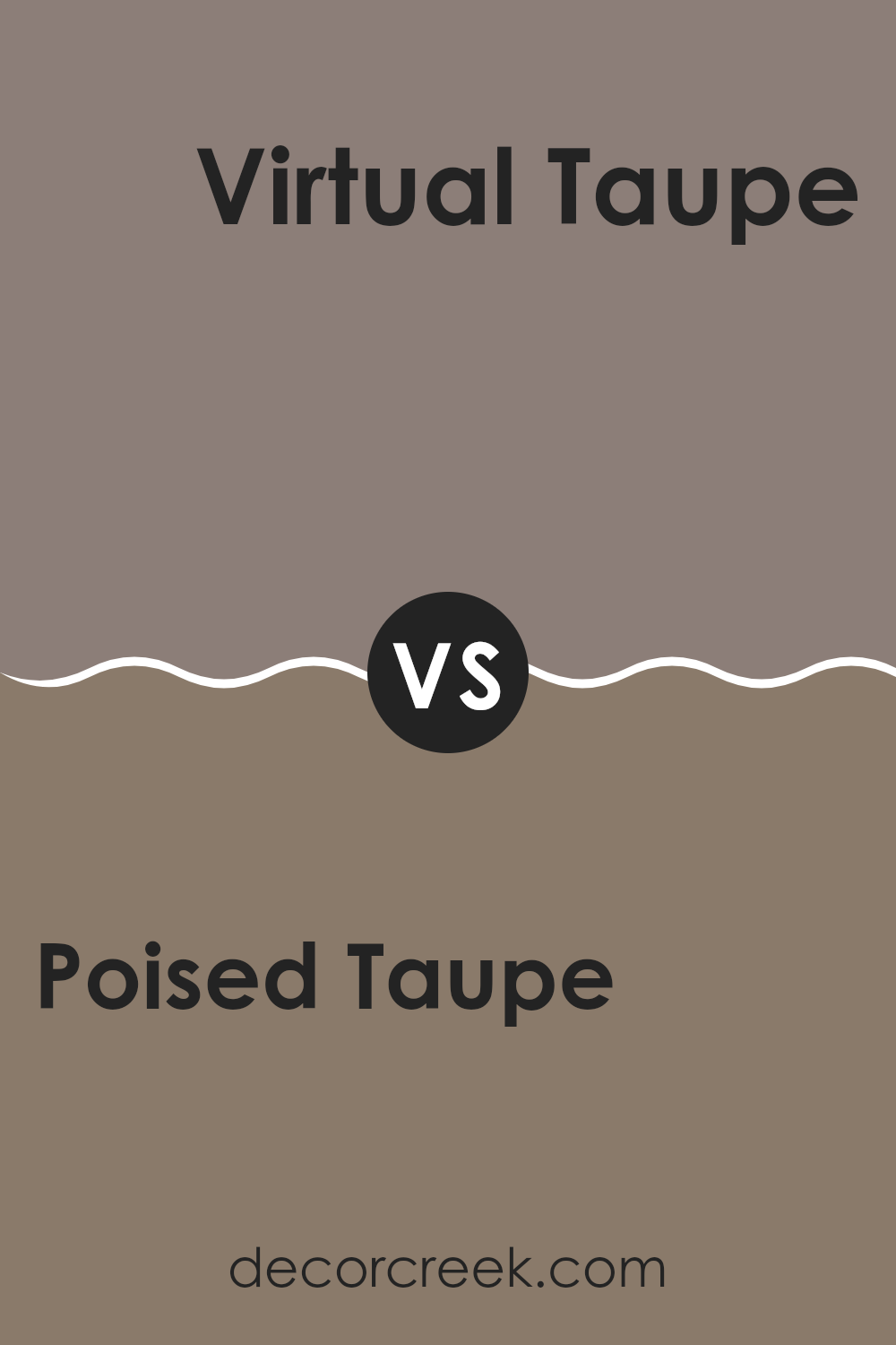
Poised Taupe SW 6039 by Sherwin Williams vs Virtual Taupe SW 7039 by Sherwin Williams
When comparing Poised Taupe by Sherwin Williams and Virtual Taupe by Sherwin Williams, it’s clear that both share a taupe base, but they present distinct personalities. Poised Taupe has a slightly cooler tone, leaning more towards a balanced gray with hints of brown. This gives it a fresh and modern feel, making it a versatile choice for various spaces.
On the other hand, Virtual Taupe is warmer and richer. This shade is darker than Poised Taupe and incorporates more brown, creating a cozy and inviting atmosphere. It works well in spaces where warmth and comfort are priorities.
While Poised Taupe offers more of a muted and minimalistic appeal, which can help in making a room appear larger and more open, Virtual Taupe brings a sense of warmth and depth, ideal for creating more intimate and snug environments. Both colors are flexible and elegant, suitable for different tastes and room functions.
You can see recommended paint color below:
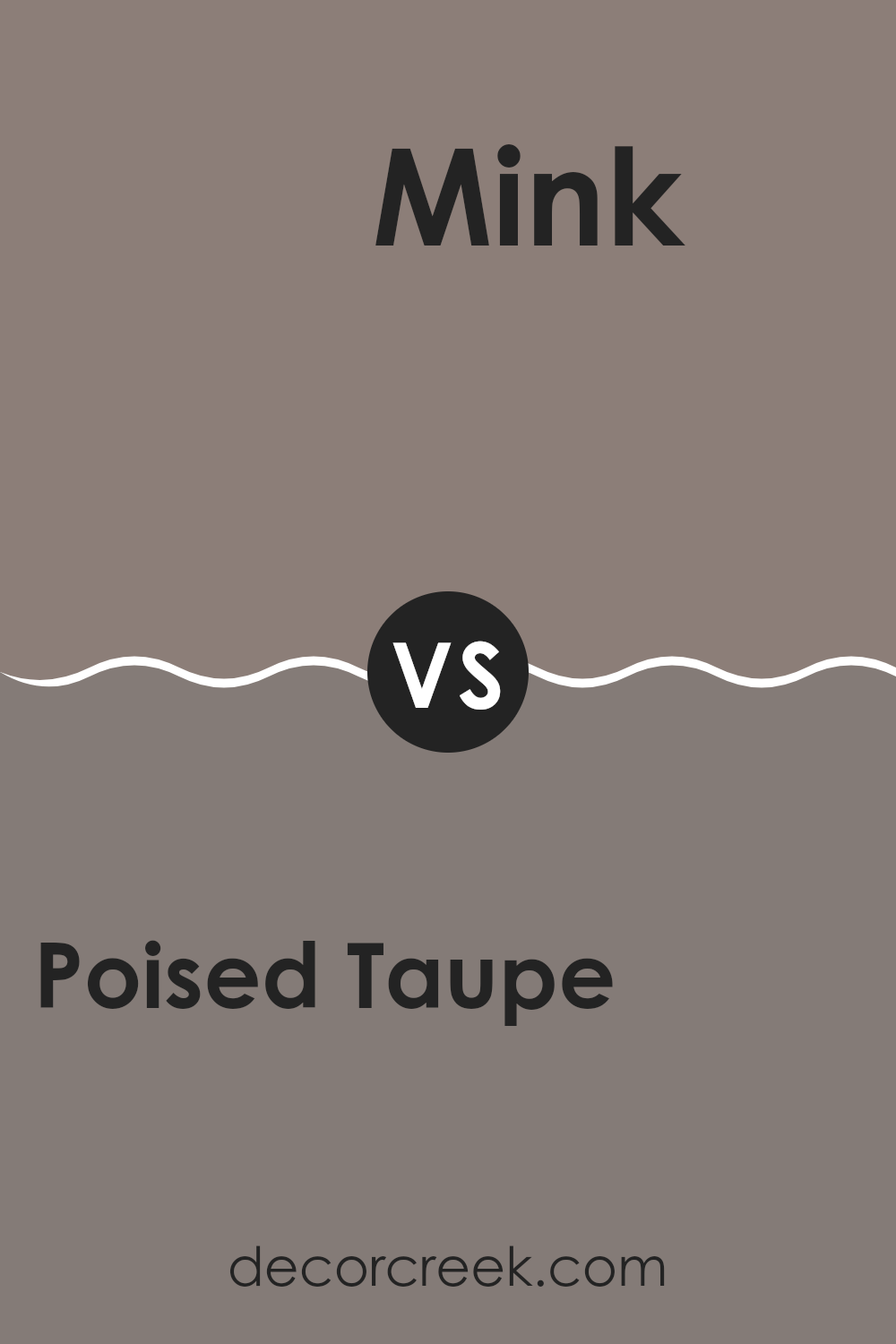
Poised Taupe SW 6039 by Sherwin Williams vs Mink SW 6004 by Sherwin Williams
Poised Taupe and Mink, both from Sherwin Williams, are two neutral shades that bring their unique flair to interiors. Poised Taupe has a balanced mix of warm and cool tones, making it incredibly versatile for any space. It leans towards a gray-brown hue that feels welcoming and cozy, ideal for living rooms or bedrooms seeking a gentle yet inviting atmosphere.
On the other hand, Mink is deeper and more intense. This color is closer to a traditional dark brown but with a hint of gray, which gives it a more muted appearance than a pure brown. Mink works well in areas where you want to add depth or highlight a more formal or moody vibe. It can help make large rooms feel more intimate and is great for accent walls or cabinetry.
Together, these colors can complement each other well in a space that aims for a warm, neutral palette with layers of depth.
You can see recommended paint color below:
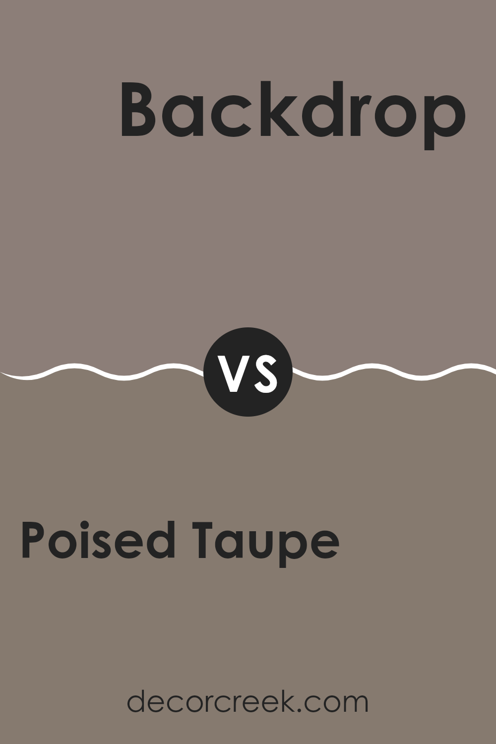
Poised Taupe SW 6039 by Sherwin Williams vs Backdrop SW 7025 by Sherwin Williams
Poised Taupe and Backdrop are two paints by Sherwin Williams that offer subtle yet distinct tones for interior spaces. Poised Taupe has a balanced blend of warm brown and soft gray, creating a cozy, inviting vibe in any room. This shade is perfect if you’re looking for a neutral color with some warmth.
On the other hand, Backdrop is a darker shade of gray that can give a room a more striking look without being overpowering. It’s excellent for spaces where you want to make a statement or add contrast to bright décor elements.
While both colors are versatile, Poised Taupe tends to create a softer, more welcoming atmosphere, whereas Backdrop offers more drama and depth, making it ideal for accent walls or larger areas where you want to draw attention. Each color provides a unique feel and can be used in various decorative styles to enhance your home’s appeal.
You can see recommended paint color below:
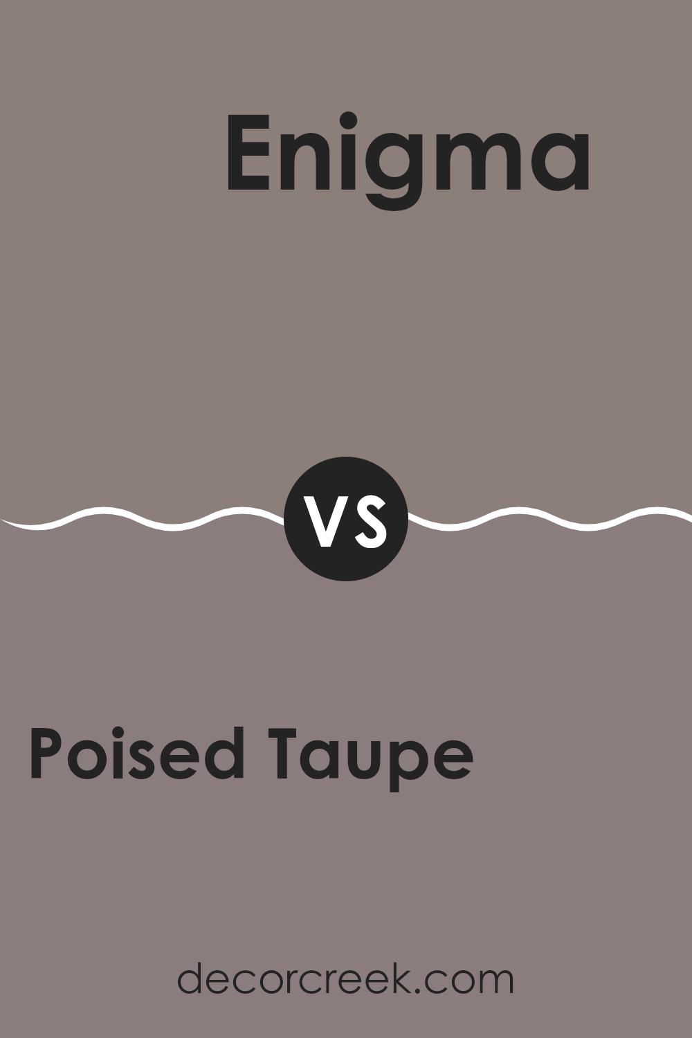
Poised Taupe SW 6039 by Sherwin Williams vs Enigma SW 6018 by Sherwin Williams
Poised Taupe and Enigma, both from Sherwin Williams, offer unique color options for home decorating, but they have distinct moods. Poised Taupe is a neutral shade, combining brown and gray tones to create a warm and welcoming atmosphere. It’s versatile, fitting well in various settings like living rooms or bedrooms to make them feel cozy.
On the other hand, Enigma is a darker, more mysterious color with a blend of blue and gray. This color tends to add a touch of elegance and depth to spaces, making it an excellent choice for accents or features walls in spaces that could use a dramatic touch.
While these colors could theoretically complement each other in a color scheme, the contrast between Poised Taupe’s warmth and Enigma’s depth enables them to stand out individually. Each color has its character – Poised Taupe brings comfort and easiness, whereas Enigma adds a layer of intrigue and intensity.
You can see recommended paint color below:
- SW 6018 Enigma
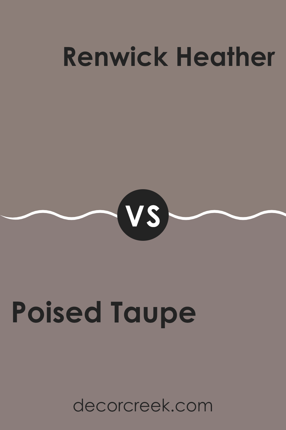
Poised Taupe SW 6039 by Sherwin Williams vs Renwick Heather SW 2818 by Sherwin Williams
Poised Taupe and Renwick Heather are two unique shades offered by Sherwin Williams that bring their distinct personality to spaces. Poised Taupe is a balanced mix of warm brown and soft grey, creating a cozy yet not overly dark atmosphere. It’s versatile, fitting well in many areas of a home, from living rooms to bedrooms, adding a gentle, inviting vibe.
On the other hand, Renwick Heather leans more towards a dusty purple with grey undertones. This color is excellent for adding a touch of subtle character without overwhelming a space. It works well in areas where you want a hint of color while keeping the overall feel neutral and calming.
Both colors are excellent at providing a base that pairs easily with a wide range of decor, from traditional to modern. While Poised Taupe offers a classic warmth, Renwick Heather introduces a slight, distinctive flair, standing out due to its unique purple touch.
You can see recommended paint color below:
- SW 2818 Renwick Heather
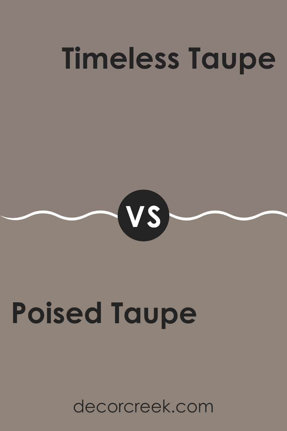
Poised Taupe SW 6039 by Sherwin Williams vs Timeless Taupe SW 9579 by Sherwin Williams
Poised Taupe and Timeless Taupe are two shades by Sherwin Williams that offer subtle yet distinct differences. Poised Taupe has a balanced mix of warm brown and gray tones, giving it a cozy, welcoming feel. It pairs well with a variety of decor styles, making it incredibly versatile for any room.
On the other hand, Timeless Taupe leans slightly more towards a lighter, softer gray with subtle brown undertones. This color is excellent for brightening up spaces while still adding warmth. It’s particularly useful in areas where you want to create a gentle, soothing atmosphere without going too dark or overwhelming.
Though both colors share the ‘taupe’ name, their individual hues bring unique moods to environments. Poised Taupe, with its depth, works well where you might want a touch of sophistication without going too bold. Timeless Taupe, offering a lighter approach, is ideal for creating a sense of space and lightness. Both are flexible and stylish, fitting well within most color schemes.
You can see recommended paint color below:
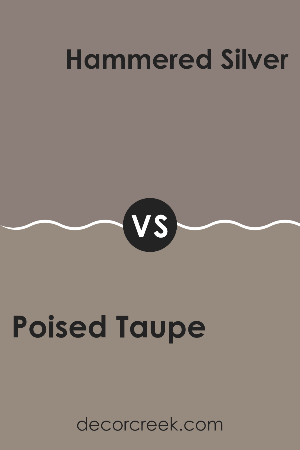
Poised Taupe SW 6039 by Sherwin Williams vs Hammered Silver SW 2840 by Sherwin Williams
Poised Taupe and Hammered Silver are both stylish colors from Sherwin Williams but have different vibes. Poised Taupe is a warm gray with a hint of brown. This cozy shade can create a welcoming atmosphere in any room, making it feel homely and relaxed. It’s versatile, blending well with a diverse array of furniture and decors.
On the other hand, Hammered Silver is a much cooler color, resembling the smooth finish of a metal surface. It’s a darker gray that leans slightly towards the blue spectrum, giving off a modern and sharp look. This color is great for adding a touch of sleekness to spaces that need a more contemporary edge.
Together, these colors could work well in the same space, with Poised Taupe softening the area and Hammered Silver bringing in a modern, clean-cut charm. Pairing them can balance warmth and cool sophistication nicely.
You can see recommended paint color below:
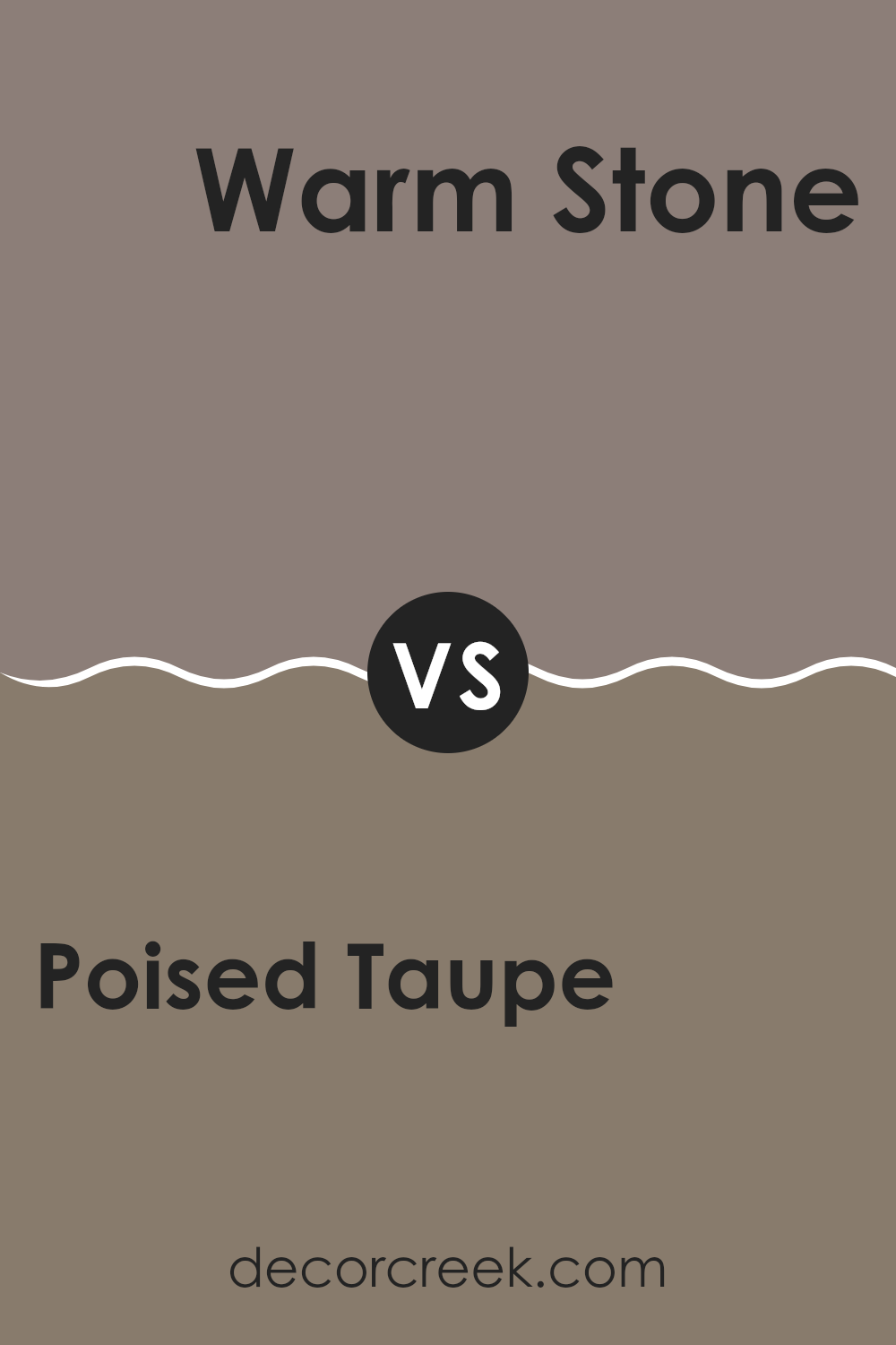
Poised Taupe SW 6039 by Sherwin Williams vs Warm Stone SW 7032 by Sherwin Williams
Poised Taupe and Warm Stone are two beautiful colors from Sherwin Williams that serve different moods and styles in interior design. Poised Taupe is a soft, earthy neutral with a mix of gray and brown, giving it a balanced, cozy feel. It’s quite versatile, working well in almost any room to create a warm and inviting atmosphere.
On the other hand, Warm Stone carries a slightly richer, deeper tone, leaning more towards a beige-brown with subtle gray undertones. This color is excellent for spaces where you want to add a bit more warmth and depth, making rooms feel grounded and more defined.
When comparing them, Poised Taupe is lighter and can help make small spaces appear larger, while Warm Stone, being deeper, is ideal for creating a strong, welcoming statement. Each color works well with a variety of decor styles and can complement a range of accent colors from soft blues to vibrant greens. Whether choosing between the two for painting a room or adding decorative elements, both colors offer lovely possibilities for enhancing your home.
You can see recommended paint color below:
Poised Taupe SW 6039 by Sherwin Williams vs Chinchilla SW 6011 by Sherwin Williams
Poised Taupe and Chinchilla by Sherwin Williams are both unique, yet distinctly different shades. Poised Taupe is a balanced blend of brown and grey, giving a warm and welcoming feel to any space. It’s a versatile color that works well in many areas of a home, creating a cozy atmosphere without feeling too dark.
Chinchilla, on the other hand, leans more towards a deeper, darker grey with subtle hints of brown. This color provides a stronger statement and can give a room a more anchored and grounded appearance. It’s perfect for spaces where you want to add some drama or define an area with a bold backdrop.
When choosing between these two, consider the mood and function of the room. Poised Taupe is great for living areas and bedrooms where a softer touch is preferred, while Chinchilla fits well in formal spaces or as an accent wall, where it can make furniture and artwork pop. Both colors offer a warm, neutral base that pairs easily with a wide range of decor styles.
You can see recommended paint color below:
- SW 6011 Chinchilla
Poised Taupe SW 6039 by Sherwin Williams vs Spalding Gray SW 6074 by Sherwin Williams
Poised Taupe and Spalding Gray are two distinctive colors from Sherwin Williams that each bring their own unique vibe to a space. Poised Taupe is a warm, welcoming neutral with a perfect balance of brown and gray tones. It creates a cozy feel in any room, making it ideal for living areas and bedrooms where comfort is key.
On the other hand, Spalding Gray is a deeper gray that leans towards a cool tone. It is excellent for modern spaces and works well when you need a color that provides a strong backdrop for brighter colors or various decor elements.
While Poised Taupe adds warmth to a room, Spalding Gray offers more of a bold statement, standing out more strikingly against other colors. Whether you prefer the subtle warmth of taupe or the cool depth of gray, both colors offer a versatile base for decorating, just with different undercurrents and mood setting potentials.
You can see recommended paint color below:
In conclusion, SW 6039 Poised Taupe by Sherwin Williams is a really unique color that can make any room look more interesting and cozy. It’s sort of like a mix between brown and gray, kind of like the color of a hot chocolate that has a little bit of milk added. This makes it super cool because it can go well with lots of different colors that you might already have in your room.
I used this paint in our living room and it made the whole area feel warmer and more inviting. It was like the room got a cozy blanket wrapped around it! What’s great about Poised Taupe is that it worked perfectly with our old sofa and our new curtains. This shows that this color is a good choice if you don’t want to change everything but just want a fresh look.
So, if you or your family are thinking about giving a room a new look, Poised Taupe is a smart pick.
It’s not too dark or too light, so it’s just right for making your room look neat without making everything too bright or too dull. It’s like picking the perfect outfit that looks good no matter where you go!
Ever wished paint sampling was as easy as sticking a sticker? Guess what? Now it is! Discover Samplize's unique Peel & Stick samples.
Get paint samples

