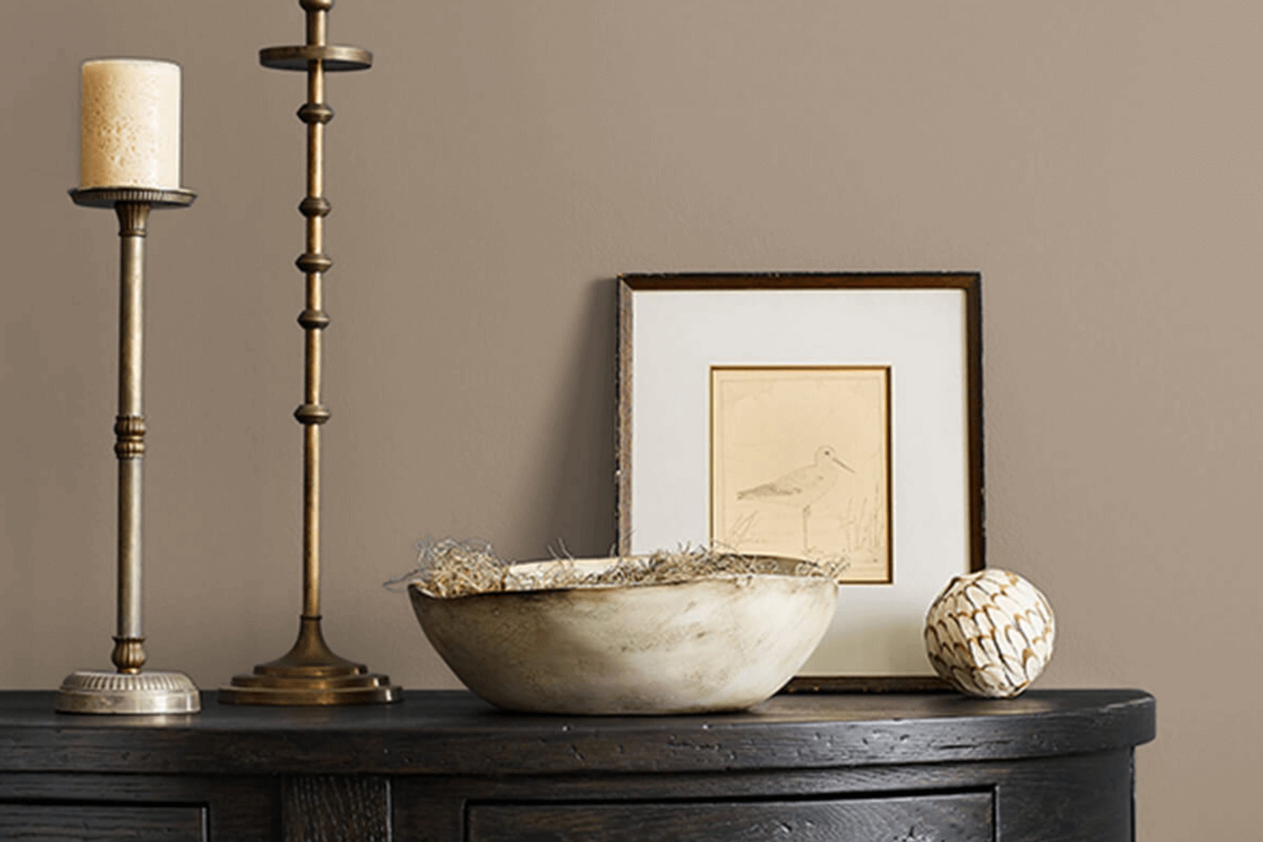
Think about standing beneath the calming shade of a large sycamore tree on a sunny afternoon. That is the natural, grounded feeling you get when you see SW 2855 Sycamore Tan by Sherwin Williams. If you’re considering a new look for your home, you might want to think about this unique color. It’s a versatile shade that goes beyond just aesthetics; it can also affect your mood and the ambiance of your space.
Sycamore Tan isn’t just another beige; it has a creamy warmth that makes any room feel instantly welcoming and cozy. This paint color fits well in spaces where you want to unwind and relax, such as living rooms or bedrooms.
It pairs beautifully with rich, dark furniture or can be a soft backdrop to a brighter, eclectic decor. So, if you’re planning to refresh your walls, Sycamore Tan might be the ideal choice.
It’s like bringing a piece of serene nature into your home, creating a peaceful retreat from the busyness of life outside.
What Color Is Sycamore Tan SW 2855 by Sherwin Williams?
Sycamore Tan is a warm and inviting earthy shade that offers a cozy and comforting atmosphere in any room. Its natural richness allows it to blend beautifully with a variety of interior styles, especially rustic, farmhouse, and traditional designs. This versatile hue works exceptionally well with materials like natural wood, enhancing its grain and texture. It pairs wonderfully with soft textures like wool or chunky knits, creating a homey and welcoming vibe.
This color is also great for spaces that aim to foster a sense of calm and collectedness without feeling too dark. It provides a solid background for both bold and muted accents, supporting vibrant colors as well as soothing pastels. In materials, aside from wood, Sycamore Tan pairs well with leather and linen, adding an organic touch when combined with these elements.
Stone accents or terracotta pots also complement this shade, reinforcing an earthy palette that’s timeless and durable. Given its adaptability, Sycamore Tan works well in living rooms, dining areas, and bedrooms, adding warmth and depth. Whether you’re looking to create a space that feels like a cozy retreat or a welcoming area for gatherings, this color ensures a stylish yet home-like atmosphere.
Is Sycamore Tan SW 2855 by Sherwin Williams Warm or Cool color?
Sycamore Tan SW 2855 by Sherwin Williams is a warm, versatile paint color that brings a cozy vibe to any room. This shade is a muted, earthy tan that feels very natural, making it easy to match with different types of furniture and decor. Whether you’re painting a bedroom, living room, or even a kitchen, Sycamore Tan creates a welcoming atmosphere.
This color works well in homes because it acts as a neutral backdrop. It won’t clash with bold colors, which means you can use vibrant accessories or artwork to add splashes of color. At the same time, it pairs nicely with other subtle tones for a more understated look. The warmth of Sycamore Tan also makes spaces feel more inviting, which is perfect for areas where you want to relax or have guests over.
Overall, its flexibility and natural feel make Sycamore Tan a great choice for anyone looking to give their home a warm and friendly touch. It’s especially good for creating a comfortable, lived-in look that feels like home.
Undertones of Sycamore Tan SW 2855 by Sherwin Williams
Sycamore Tan is a subtle and complex paint color that can look different depending on the lighting and the colors it’s paired with, due to its varied undertones. Undertones are the underlying hues that influence the main shade, albeit subtly. For instance, a color with a pink undertone might lean towards a warmer spectrum, making it feel cozy in a sunlit room, whereas one with gray undertones might appear more muted.
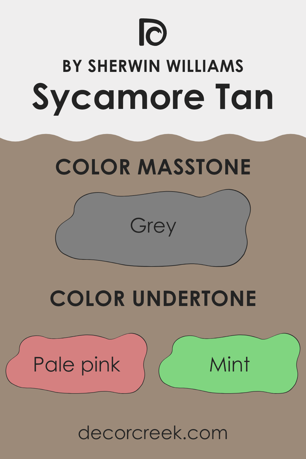
When considering Sycamore Tan for your walls, knowing its undertones can help predict how it will interact with your home’s natural and artificial light, as well as your décor. This color’s undertones include shades of pale pink, mint, olive, and many others, ranging from pale yellow to dark blue.
These undertones contribute to a dynamic appearance on the walls—it can shift from appearing mostly warm and inviting to having a cooler touch, based on the light accentuating different hints in the undertone spectrum. In a room with ample daylight, the lighter undertones like mint and pale yellow might make Sycamore Tan appear brighter and slightly airy.
In contrast, in a room with less natural light or during the evening under artificial lights, darker undertones like navy or dark green might become more prominent, giving the walls a more grounded and cozy feel.
Understanding these undertones allows for more informed choices in selecting complementary furniture and decor, ensuring everything in the room comes together harmoniously. It can also impact the perceived space and ambiance of the room—lighter undertones can make the space feel more open, while darker tones might make it feel more enclosed. By considering these factors, you can use Sycamore Tan to create the desired mood and style in your space.
What is the Masstone of the Sycamore Tan SW 2855 by Sherwin Williams?
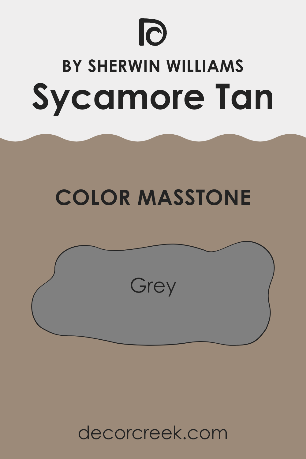
Sycamore Tan SW 2855 by Sherwin Williams features a masstone of grey, which gives it a neutral base. This characteristic makes it an adaptable color that works well in many different home settings.
Because the gray undertones are subtle, it allows the color to blend seamlessly with a variety of decor styles and other colors. Whether you’re looking to create a warm, inviting atmosphere or simply want a versatile backdrop, this shade of grey can achieve these effects without overwhelming the space.
In rooms with limited natural light, the grey masstone can help in reflecting artificial lighting, making the area appear brighter. Additionally, its neutrality means that it’s easy to pair with bold or muted accessories, making it a great choice for someone looking to update their space without committing to a drastic color change. Overall, Sycamore Tan’s grey masstone offers a practical and flexible option for home interiors.
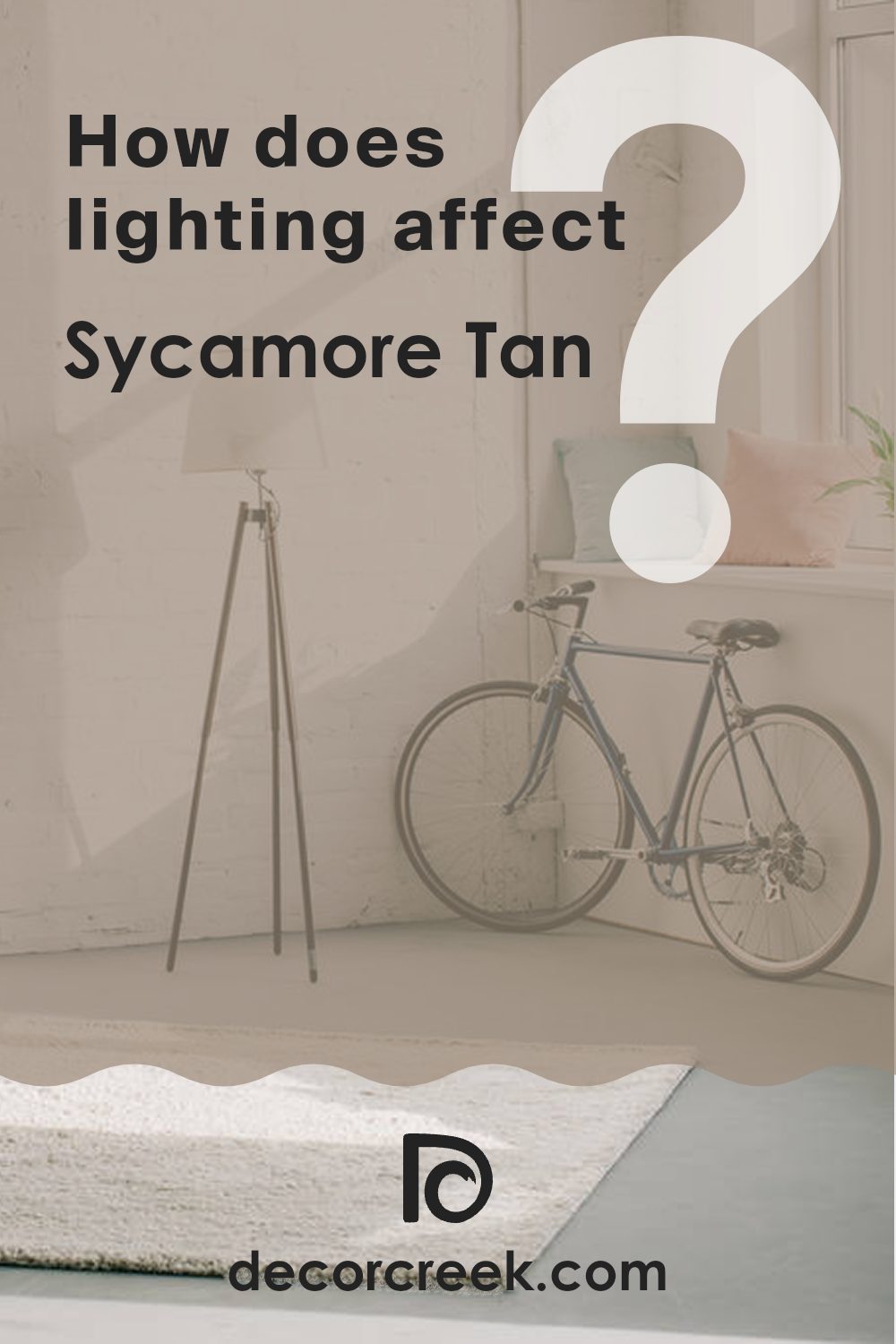
How Does Lighting Affect Sycamore Tan SW 2855 by Sherwin Williams?
Light plays a crucial role in how we perceive colors, as the quality and type of light can change the way a color appears. When evaluating a color like Sycamore Tan, it’s important to consider how different lighting conditions affect its appearance.
In artificial light, the hue of Sycamore Tan might appear slightly different depending on the type of bulbs used. Incandescent lights, which have a warm glow, tend to enhance warm tones, making Sycamore Tan look cozier and richer. Fluorescent lighting, however, emits a cooler tone, potentially making the color look slightly more muted and less warm.
In natural light, Sycamore Tan will also vary in appearance throughout the day. The rising and setting sun provides a warmer light, which can bring out the warm, inviting qualities of the color, while the midday sun offers a brighter, cooler light that might make the color appear lighter or less warm.
The direction of natural light coming into a room also affects how Sycamore Tan is perceived:
– North-facing rooms: These rooms get less direct sunlight, which can make the color appear cooler and more shadowed, particularly during the winter when natural light tends to be bluer.
– South-facing rooms: These rooms benefit from abundant natural light most of the day, which can make the color appear brighter and more vibrant. The warmth of the color is enhanced by the typically stronger, warmer light.
– East-facing rooms: Morning light is warm and bright in these rooms, making the color look warm and lively in the mornings but cooler in the afternoons as the sunlight fades.
– West-facing rooms: Evening light in these rooms is warm and golden, making the color appear warm and inviting in the late afternoon and evenings, but potentially dull and shaded in the morning when the light is less intense.
Overall, Sycamore Tan’s true character shows best under natural light conditions, where its warm tones can be fully appreciated. However, regardless of lighting, its inherent warmth lends a cozy feel, adapting subtly to different lighting environments.
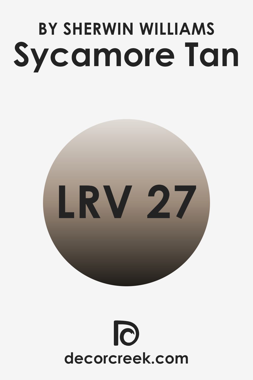
What is the LRV of Sycamore Tan SW 2855 by Sherwin Williams?
LRV stands for Light Reflectance Value, which is a measurement indicating how much light a paint color reflects back into a room. Measured on a scale where higher numbers mean more light is reflected and lower numbers mean less light is reflected, this value helps determine how light or dark a color will appear when painted on a wall.
It’s especially useful for understanding how a color will change in appearance under different lighting conditions. For example, paints with a higher LRV will generally appear lighter and can help make a small room feel more open and airy. Conversely, paints with lower LRV will absorb more light, which can make a room feel cozier but also smaller.
The LRV for the color Sycamore Tan, which is 26.74, indicates it is on the darker side. This lower value means it will absorb more light than it reflects, which can dramatically affect the mood and size perception of a room.
In small spaces, using a color like this might make the space feel smaller and more enclosed. However, it can work beautifully in larger or well-lit areas, adding a sense of warmth and depth to the space. When planning interior decoration, consider the size of the room and the amount of natural or artificial light it receives to ensure this color enhances the space optimally.
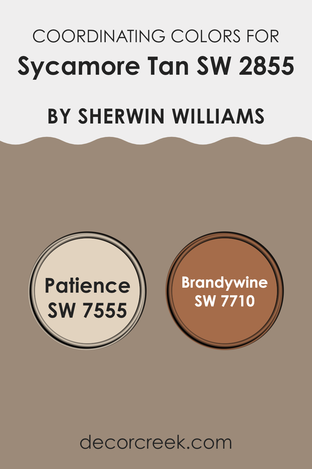
Coordinating Colors of Sycamore Tan SW 2855 by Sherwin Williams
Coordinating colors are selected to complement a primary paint color, enhancing the overall aesthetic of a room. When you use coordinating colors, you create a harmonious atmosphere where the colors support one another without competing for attention. For example, when decorating with a base color like Sycamore Tan, you might choose additional shades that bring out its warmth and subtlety.
Patience (SW 7555) is a soft, neutral beige that pairs beautifully with the earthy tones of Sycamore Tan. It’s a gentle color that adds a calm and light touch, making it perfect for creating a relaxed and welcoming environment. On the other hand, Brandywine (SW 7710) offers a bolder contrast.
This deep, rich red infuses a room with warmth and drama, providing a striking complement to the muted tan. Both Patience and Brandywine work together with Sycamore Tan to create a cohesive yet dynamic color palette, suitable for any room looking to evoke warmth and style.
You can see recommended paint colors below:
- SW 7555 Patience
- SW 7710 Brandywine
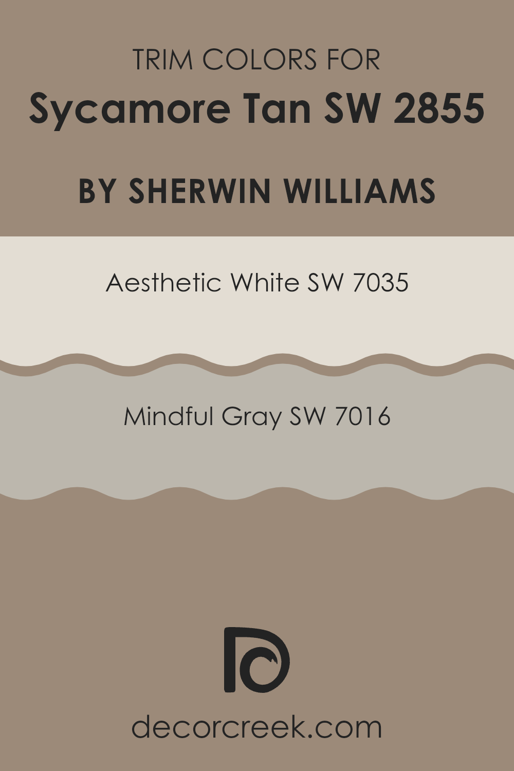
What are the Trim colors of Sycamore Tan SW 2855 by Sherwin Williams?
Trim colors are essentially accent hues used to highlight or define the lines and architectural details of a room, contrasting with or complementing the main wall color. For example, when Sycamore Tan, a warm and inviting neutral, is used on the walls, selecting the right trim color can greatly enhance the aesthetic appeal and ambiance of the space.
Aesthetic White and Mindful Gray are two such colors that pair well with Sycamore Tan, as they offer a subtle contrast that defines spaces gracefully without overwhelming the primary hue. Aesthetic White is a soft white shade that brings a light and airy feel wherever it’s applied.
This color works beautifully as trim with Sycamore Tan because it provides a clean and bright border that makes the tan pop and feel more distinct. On the other hand, Mindful Gray offers a more pronounced contrast. It’s a gentle medium gray that adds a touch of depth and definition to the edges and corners of a room. This combination is perfect for those looking to highlight architectural features while maintaining an inviting and cohesive look.
You can see recommended paint colors below:
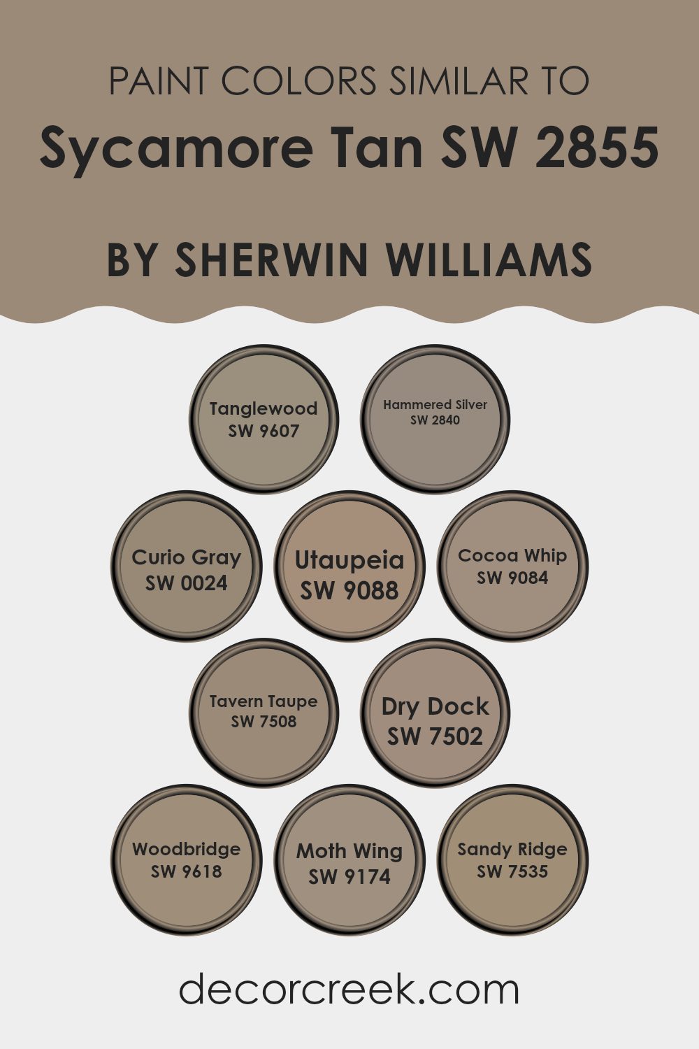
Colors Similar to Sycamore Tan SW 2855 by Sherwin Williams
Choosing similar colors to Sycamore Tan can significantly improve the aesthetic coherence and balance of a room’s décor by creating a subtle yet effective visual flow. It’s interesting to see how various hues can highlight the primary color’s base tones and undertones, enhancing the overall atmosphere without overpowering it.
For instance, Tanglewood offers a relaxing earthy vibe, leaning towards a soothing nature-like feel, whereas Hammered Silver introduces a hint of metallic, acting as a cool counterpart that’s both muted and slightly reflective. Curio Gray, on the other hand, is a soft grey that works well to provide a stable, neutral background.
Colors like Utaupeia and Cocoa Whip lean more towards a warm creamy palette, infusing a soft, welcoming energy into spaces. Tavern Taupe has that deeper, richer hue that aligns closely with a traditional look, perfect for spaces that favor a more grounded, comforting feel. Dry Dock and Woodbridge also support the warmth, each contributing slightly ashy undertones that create a dignified but homely atmosphere.
Lastly, Moth Wing and Sandy Ridge stand out for their ability to mingle subtly with other shades; Moth Wing offers a duskier touch, while Sandy Ridge is perfect for those looking for an earth-toned neutral with a whisper of softness. These colors together ensure a harmonious environment that reflects both comfort and style.
You can see recommended paint colors below:
- SW 9607 Tanglewood
- SW 2840 Hammered Silver
- SW 0024 Curio Gray
- SW 9088 Utaupeia
- SW 9084 Cocoa Whip
- SW 7508 Tavern Taupe
- SW 7502 Dry Dock
- SW 9618 Woodbridge
- SW 9174 Moth Wing
- SW 7535 Sandy Ridge
How to Use Sycamore Tan SW 2855 by Sherwin Williams In Your Home?
Sycamore Tan SW 2855 by Sherwin Williams is a warm and welcoming color that gives a cozy and comfortable feel to any room. This shade of tan works exceptionally well in living rooms and bedrooms where creating a relaxed atmosphere is key. Its earthy tone pairs beautifully with natural materials like wood, bringing out their rich textures.
You can use Sycamore Tan in areas with a lot of sunlight as it maintains its soothing warmth without becoming too bright. It’s also great for smaller spaces, like a reading nook or a hallway, because its light hue helps open up the area, making it appear larger. If you want to add a little contrast, consider pairing it with darker furnishings or bold-colored accessories to create a balanced look.
In the kitchen, Sycamore Tan can help achieve a cozy, inviting vibe, especially when matched with white cabinets or contrasting dark counters. This color is versatile, easy to apply, and offers a fresh yet timeless appeal to your home.
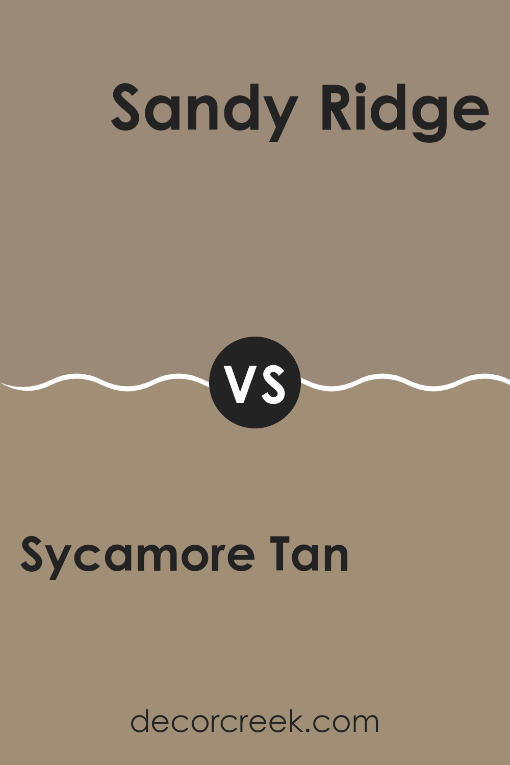
Sycamore Tan SW 2855 by Sherwin Williams vs Sandy Ridge SW 7535 by Sherwin Williams
Sycamore Tan and Sandy Ridge, both from Sherwin Williams, present warm, inviting shades, ideal for creating a cozy atmosphere in any room. Sycamore Tan has a richer, deeper brown tone that offers a sense of sturdiness and grounding.
It’s perfect for someone looking to add a bit of earthiness to their space. On the other hand, Sandy Ridge is lighter, leaning more towards a beige with subtle hints of pink and gray.
This color is softer and more versatile, making it easy to match with various decor styles and colors. Overall, if you want a more robust, earthy feel, Sycamore Tan is the go-to, while Sandy Ridge provides a gentle, lighter backdrop that’s great for smaller spaces or areas that get less light.
You can see recommended paint color below:
- SW 7535 Sandy Ridge
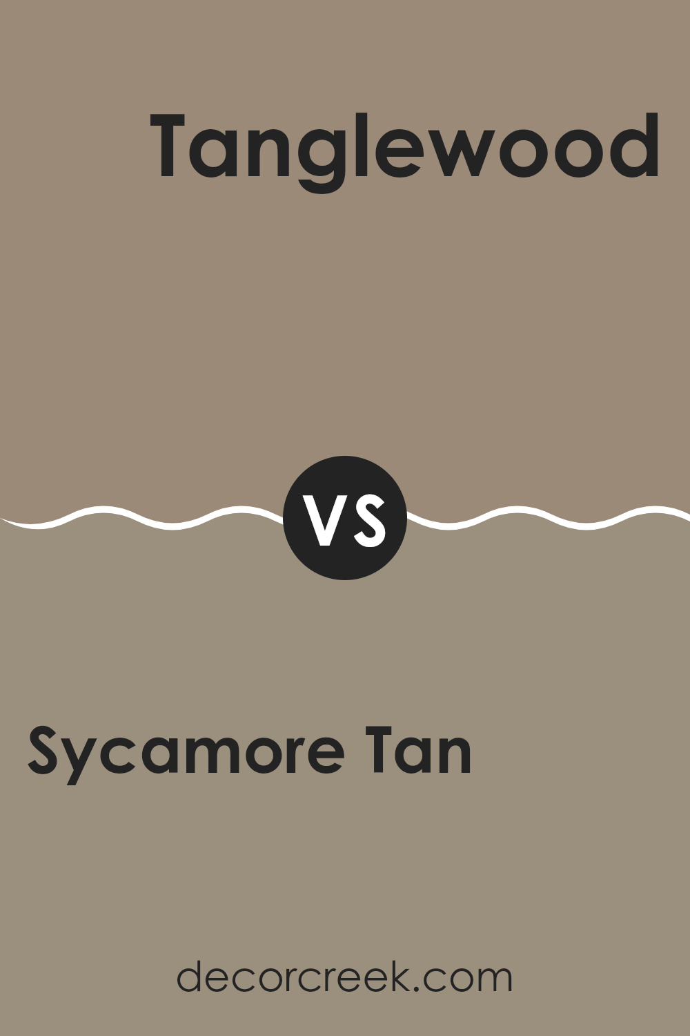
Sycamore Tan SW 2855 by Sherwin Williams vs Tanglewood SW 9607 by Sherwin Williams
Sycamore Tan is a warm, sandy beige with an inviting feel. It offers a comforting presence, making it a versatile color for many spaces, from living rooms to bedrooms. Its natural tone pairs well with a variety of decor, enhancing spaces with a subtle, cozy vibe.
On the other hand, Tanglewood is a deeper, more muted color with gray undertones. This shade leans toward the cooler side compared to Sycamore Tan, providing a more understated, calm look. Tanglewood is excellent for creating a grounded, peaceful atmosphere, suitable for spaces where you want a touch of sophistication without overwhelming the senses.
When comparing both, Sycamore Tan is lighter and warmer, ideal for adding lightness to a room. Tanglewood, being cooler and deeper, works well in areas where a more reserved, yet inviting color is desired. Together, these colors could complement each other well in a space that aims for balance and warmth.
You can see recommended paint color below:
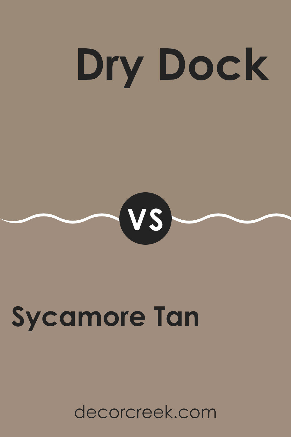
Sycamore Tan SW 2855 by Sherwin Williams vs Dry Dock SW 7502 by Sherwin Williams
Sycamore Tan and Dry Dock, both from Sherwin Williams, offer unique shades for varied decorative styles. Sycamore Tan presents a warmer, more golden hue that resembles the look of natural clay or a subtle autumn sunset. This color is great for rooms where a cozy, comforting atmosphere is desired, such as living rooms or bedrooms.
On the other hand, Dry Dock has a cooler, grayer tone, mimicking the color of weathered wood found on seaside docks. It suits spaces that aim for a more neutral, calm decor, providing a subtle backdrop that easily matches with a wide range of furnishings and accents.
Both colors can brighten a space while remaining unobtrusive, blending well with natural materials and offering a solid foundation for various design elements. Choosing between them depends on the temperature of the color palette desired and the specific mood you want to create in your space.
You can see recommended paint color below:
Sycamore Tan SW 2855 by Sherwin Williams vs Tavern Taupe SW 7508 by Sherwin Williams
Sycamore Tan and Tavern Taupe are two warm, welcoming colors from Sherwin Williams, each with its distinct character. Sycamore Tan is a lighter, soft beige that gives a room a fresh and airy feel. Its gentle hue reflects light beautifully, making a space seem more open and spacious.
On the other hand, Tavern Taupe is a deeper, richer shade that closely resembles a classic taupe. This color offers a cozy, more enclosed feel, perfect for creating a snug and comfortable environment.
While both colors provide warmth, their intensity and tone vary slightly, allowing them to serve different decorative purposes. Sycamore Tan works well in spaces aimed at feeling more expansive and lively, whereas Tavern Taupe is ideal for settings where a more grounded, soothing atmosphere is desired. Together or separately, these colors can help you make various rooms in your home more inviting.
You can see recommended paint color below:
Sycamore Tan SW 2855 by Sherwin Williams vs Cocoa Whip SW 9084 by Sherwin Williams
Sycamore Tan and Cocoa Whip are both warm, welcoming colors, but they offer different vibes for your space. Sycamore Tan has a gentle, sandy appearance that feels light and airy, making it a great choice for creating a relaxed, friendly atmosphere in rooms.
It reflects more natural light, which can help smaller spaces appear larger. On the other hand, Cocoa Whip is a darker, creamier brown. It has a richer presence, providing a cozy, comforting feeling that is ideal for spaces where you want a bit more warmth and depth, such as a study room or a snug.
While both colors are neutrals and highly versatile, Sycamore Tan leans towards a more subdued look, whereas Cocoa Whip brings a bit more character and warmth to interiors. They can also complement each other well when used in the same space, linking areas together with their shared warmth.
You can see recommended paint color below:
- SW 9084 Cocoa Whip
Sycamore Tan SW 2855 by Sherwin Williams vs Hammered Silver SW 2840 by Sherwin Williams
Sycamore Tan is a warm, earthy color that offers a cozy vibe suitable for areas where you want a comforting and inviting atmosphere, such as living rooms or bedrooms. It’s a medium shade that balances well between light and dark, making it pretty versatile for different design styles, from rustic to modern.
On the other hand, Hammered Silver is a deeper, cool-toned gray with a slight metallic undertone that gives it a unique character. It’s an excellent choice for more modern or industrial design schemes, especially in spaces like kitchens or bathrooms, where its distinct shade can make fixtures and fittings stand out.
While both colors have their unique appeal, Sycamore Tan leans towards a traditional, warm palette, fostering a homely feel. Hammered Silver, with its cooler, metallic-like tone, lends itself to a sleeker, more contemporary look. Thus, your choice between them could depend largely on the overall feel you want for your space.
You can see recommended paint color below:
Sycamore Tan SW 2855 by Sherwin Williams vs Utaupeia SW 9088 by Sherwin Williams
Sure! When comparing Sycamore Tan and Utaupeia, both by Sherwin Williams, you’ll first notice that they belong to a similar color family but with distinct differences. Sycamore Tan has a warm, earthy essence, much like a beige with hints of chestnut. This color is very natural and could remind you of fall leaves or unbleached linen, providing a cozy and inviting feel to any room.
On the other hand, Utaupeia leans more towards a greyish taupe. It’s a subtle and muted hue that pairs well with both warm and cool colors, making it incredibly versatile. Utaupeia has an understated elegance to it and could be seen as a backdrop that allows other colors or decor items to stand out, offering a modern yet timeless look.
In design, Sycamore Tan might work better in spaces where you want to add warmth and a sense of homeliness, like living rooms or bedrooms. Utaupeia could be a great choice for areas where you prefer a sleek, neutral look, such as in a kitchen or office. Both colors offer unique possibilities and can create distinct moods in a space depending on what you pair them with and your desired effect.
You can see recommended paint color below:
- SW 9088 Utaupeia
Sycamore Tan SW 2855 by Sherwin Williams vs Moth Wing SW 9174 by Sherwin Williams
Sycamore Tan and Moth Wing from Sherwin Williams are two distinct shades that each offer a unique feel to a room. Sycamore Tan is a lighter, warm beige color that has the softness of sandy shores. This color makes rooms feel cozy and is flexible for various decorating styles, perfect for living spaces or bedrooms where a relaxing backdrop is essential.
On the other hand, Moth Wing is a shade darker and leans towards a muted taupe. It offers a slightly more grounded feel due to its richer, earthier tone. Moth Wing works well in areas that require a touch of warmth without overwhelming the space, ideal for an office or a den.
Both colors are versatile and work well with many decor styles, but Sycamore Tan tends to add a bit more light and open feel, whereas Moth Wing brings a sense of subtle depth. When choosing between them, consider the amount of natural light a room receives and the atmosphere you’re aiming to create.
You can see recommended paint color below:
Sycamore Tan SW 2855 by Sherwin Williams vs Woodbridge SW 9618 by Sherwin Williams
The color Sycamore Tan is a warm and soft beige with a hint of yellowness, making it cozy and welcoming. It reflects light well, which can make small spaces feel larger and more open. This shade works beautifully in living rooms or bedrooms where a calm, gentle feel is desired.
On the other hand, Woodbridge is a deeper, richer tone. It leans towards a taupe-like color, blending grey and brown, which offers a more grounded and stable look. This makes it perfect for areas that require a bit of warmth without the brightness, such as dens or home libraries.
Both colors have their unique appeal and set different moods in a space. While Sycamore Tan adds brightness and a sense of airiness, Woodbridge offers depth and a feeling of solidity. Each could be the better choice depending on what atmosphere you want to achieve in a room.
You can see recommended paint color below:

Sycamore Tan SW 2855 by Sherwin Williams vs Curio Gray SW 0024 by Sherwin Williams
Main color – Sycamore Tan is a warm and cozy shade, closely resembling a light brown or beige with yellow undertones. This color gives off a homey and comforting vibe, making spaces feel welcoming and familiar. It’s great for living areas or any room where you want a soft, nurturing atmosphere.
Second color – Curio Gray, on the other hand, is a deeper, medium gray that provides a more muted and neutral backdrop. This shade is versatile, working well in various settings without dominating the space. It pairs nicely with both bright accents and other neutrals, adapting easily to different decor styles.
Overall, Sycamore Tan is warmer and more inviting, excellent for a relaxed, cozy feel. Curio Gray is cooler and more understated, ideal for creating a subtle, sophisticated look without using deep or bold colors. Both colors offer unique advantages depending on the mood and style you want to achieve in your space.
You can see recommended paint color below:
Conclusion
What I love most about this paint is how well it goes with other colors. Whether you pair it with bright colors like blue or green, or keep it calm with creams and browns, it looks wonderful. It’s also great if you have a house with lots of fun decorations because it doesn’t clash; it fits right in!
Using Sycamore Tan can also help in making a small room seem a bit bigger and more open, thanks to its light and warm shade. It does a great job of reflecting light, which can make your room not only look brighter but also feel bigger.
So, if you’re thinking of giving your room a new look, Sycamore Tan is a solid choice. It’s easy on the eyes, works well with many different styles and decorations, and brings a warm, cozy feeling to any space. Choosing this color can really make your room feel like new without too much fuss!
Ever wished paint sampling was as easy as sticking a sticker? Guess what? Now it is! Discover Samplize's unique Peel & Stick samples.
Get paint samples

