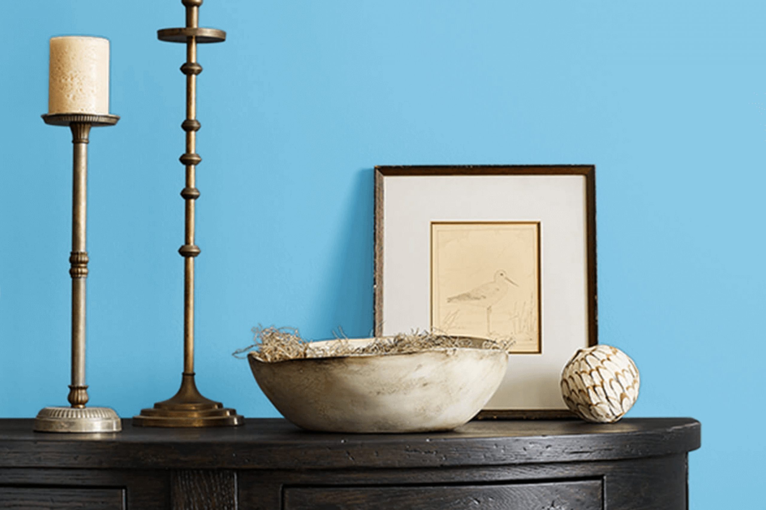
When I think of SW 6957 Undercool by Sherwin Williams, I’m drawn to its unique character that feels both refreshing and peaceful. This shade offers a blend of blue and green, creating a cool and calming atmosphere. It feels like a gentle breeze on a warm day, providing a sense of ease and relaxation.
What I love about Undercool is its versatility. It works beautifully in a variety of areas, whether you’re looking to create a soothing bedroom retreat or a lively kitchen. The balance of tones in Undercool can complement different design styles, from modern to coastal, and it pairs well with neutral shades or bolder accents.
In a busy world, Undercool offers a little oasis of calm. It is not overly bright or flashy, but rather understated and elegant. The color brings a sense of freshness to any room, akin to bringing a piece of the peaceful outdoors inside.
If you are seeking a paint color that infuses a room with calmness and refinement, Undercool may be your choice.
What Color Is Undercool SW 6957 by Sherwin Williams?
Undercool (SW 6957) by Sherwin Williams is a soft, muted blue-gray color that brings a sense of calmness to any room. The color has cool undertones, making it an excellent choice for rooms where you want to create a relaxed and refreshing atmosphere.
This shade works well in various interior styles, especially contemporary, coastal, and minimalistic designs. In contemporary areas, it can be paired with crisp whites and darker grays for a sleek look. In coastal interiors, Undercool is a perfect addition, complementing sandy beiges and whites, echoing the soothing colors of the sea and sky. For minimalistic styles, this color provides a subtle touch that keeps the aesthetic clean and simple.
Undercool pairs beautifully with natural materials like light woods, linen, and rattan, enhancing its calming effect. Adding textures like soft cotton or woolens in throws and cushions can give warmth to room, making it feel more inviting. Metal accents in silver or chrome work well against this backdrop, providing a touch of modern elegance.
Undercool SW 6957 is flexible enough to be used in bedrooms, bathrooms, and living rooms, creating areas that feel both welcoming and peaceful.
Is Undercool SW 6957 by Sherwin Williams Warm or Cool color?
Undercool SW 6957 by Sherwin Williams is a cool shade of blue that brings a calm and refreshing feel to any room. It works well in homes where a sense of relaxation is desired. When used on walls, it can make a room feel open and airy, perfect for bedrooms or living areas where you want to unwind.
This color pairs nicely with white trim or light-colored furniture, creating a clean and modern look. It can also complement other cool hues or serve as a contrast to warmer tones, adding balance to your decor.
Undercool SW 6957 reflects light beautifully, which can help brighten rooms that lack natural sunlight. It’s a flexible choice that works in many different rooms, from kitchens to bathrooms, helping create a soothing environment. Whether used as a main wall color or as an accent, it brings a touch of calm to the home.
Undertones of Undercool SW 6957 by Sherwin Williams
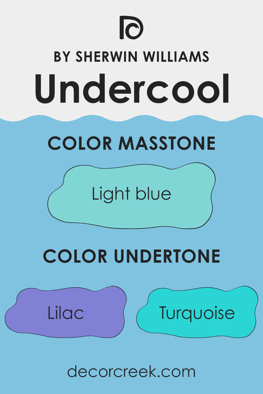
The color Undercool SW 6957 by Sherwin Williams carries several undertones that affect how it looks when used on walls. Its mix of colors like lilac, turquoise, light gray, mint, blue, light purple, and others give it a unique appearance. These undertones can change the way we perceive this color based on different lighting and surrounding colors.
For example, the presence of lilac and light purple adds softness, which makes the color feel gentle and calming. Meanwhile, the turquoise and mint undertones can offer a refreshing and lively feel. The light gray and grey components bring subtlety, giving the color a balanced and neutral aspect.
When you paint walls with this color, the undertones play a big part in how it appears. In a room with lots of natural light, the turquoise and mint tones might become more pronounced, creating a fresh and vibrant atmosphere. In dimmer settings, the gray and pale yellow might help the color appear warmer and more inviting. The combination of these undertones ensures that the color remains flexible, allowing it to complement a wide range of styles and furnishings.
Overall, the undertones in this paint color make it adaptable, allowing different moods to emerge in various areas.
What is the Masstone of the Undercool SW 6957 by Sherwin Williams?
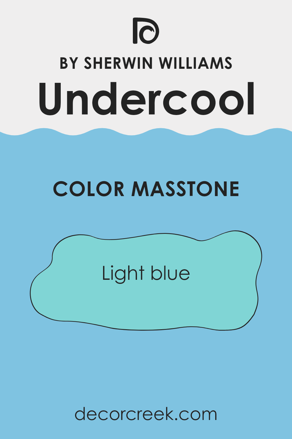
Undercool SW 6957 by Sherwin Williams is a light blue color that can enhance the look and feel of a home. This shade brings a cool, refreshing vibe to any room. Its lightness makes it an excellent choice for making rooms feel more open and airy. This color works well in smaller rooms, helping them seem larger and more inviting.
In living areas, the light blue can create a calm and relaxed atmosphere, making it ideal for areas where people gather to unwind. It pairs nicely with whites and neutrals for a soft and soothing look but can also be matched with darker shades or bright accents for a bit of contrast.
Because of its versatility, this color can be used in various rooms, from bedrooms to bathrooms, to create a cohesive feel throughout the home. Its calming effect is perfect for areas where you unwind and relax.
How Does Lighting Affect Undercool SW 6957 by Sherwin Williams?
Lighting plays a crucial role in how we perceive colors. The color “Undercool” SW 6957 by Sherwin Williams can look quite different depending on the type of light it is exposed to. This color is generally considered a cool tone, and its appearance can change significantly with lighting variations.
In natural light, such as sunlight streaming through windows, colors often appear more vibrant and true to how they would look on a color chart. Natural light tends to be more balanced, bringing out the best in many shades, including “Undercool.” However, the direction from which natural light comes can dramatically alter its perception.
In artificial light, the situation changes. Incandescent or warm LED lights can introduce a yellow or warm tone to colors, making “Undercool” appear slightly muted or altering its coolness to seem warmer. On the other hand, fluorescent or cool LED lighting can enhance the cooler tones of “Undercool,” highlighting its inherent chilliness. The type of artificial light in a room can thus influence how the color feels within a room.
Looking at different room orientations:
- In north-facing rooms, which receive less direct sunlight, colors can appear darker and cooler. “Undercool” may appear more subdued and hint at a gray-blue tone in this light.
- South-facing rooms, bathed in bright, warm light for most of the day, might make “Undercool” seem softer and somewhat lighter, with its cooler aspects more balanced by the warm light.
- East-facing rooms enjoy bright morning light that is cooler and softer evening light. In the morning, “Undercool” might look fresh and bright, while later it could take on deeper tones.
- West-facing rooms experience the opposite, with warmer, more intense light in the afternoon and early evening. This light can make “Undercool” appear warmer than in the morning, adding a richer depth to its hue.
Understanding how lighting affects this color can help choose the right shade for a room based on its orientation and lighting conditions.
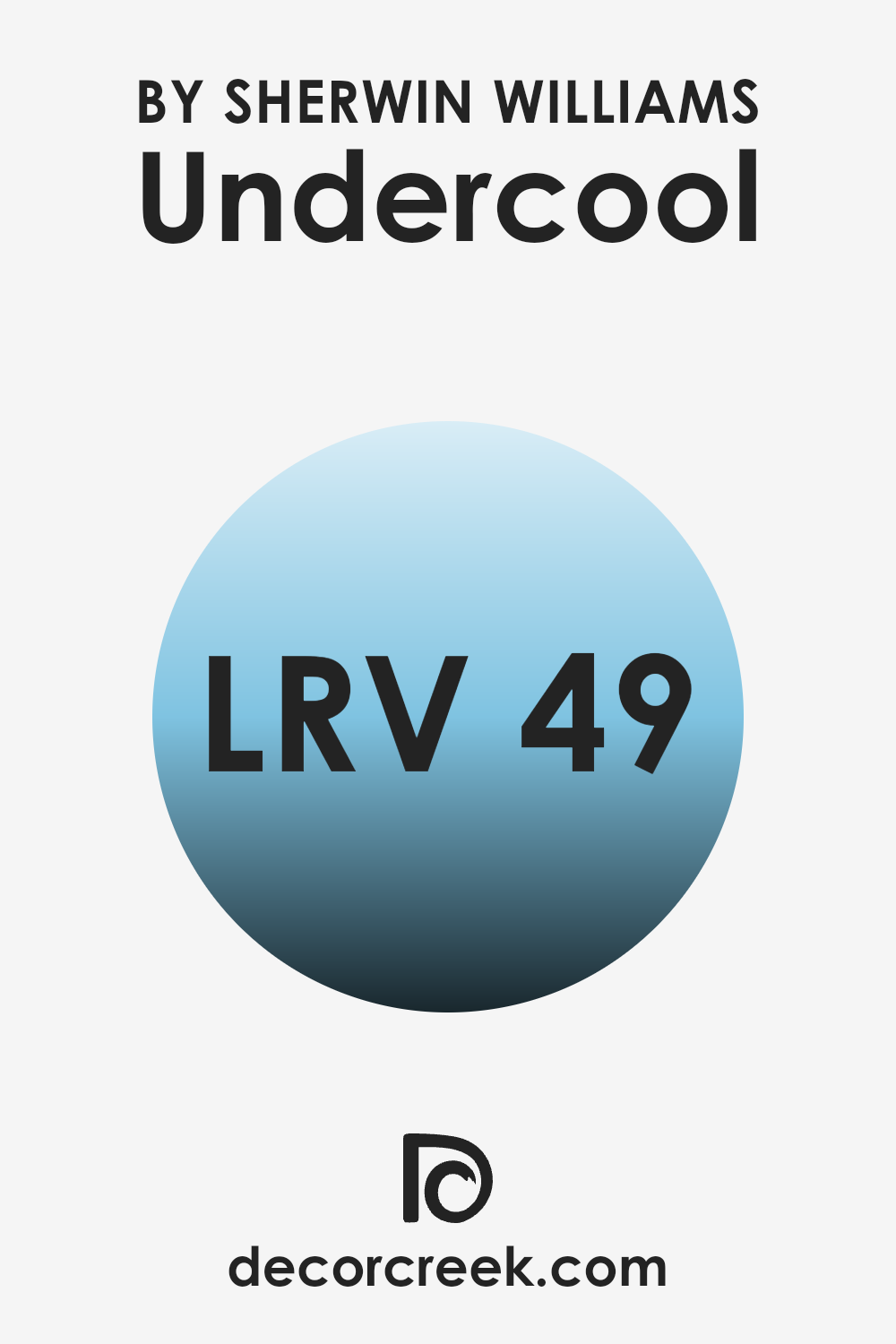
What is the LRV of Undercool SW 6957 by Sherwin Williams?
Light Reflectance Value, or LRV, is a measure that specifies how much light a paint color reflects. It is measured on a scale from 0 to 100, where 0 means no light is reflected (completely dark), and 100 means all light is reflected (completely white). LRV is important because it impacts how a color will appear in a room, how light or dark it feels, and how it interacts with artificial and natural lighting.
A higher LRV means the color reflects more light, making the room feel brighter and larger. Conversely, a lower LRV means the color absorbs more light, resulting in a cozier and more intimate feel. For the color SW 6957, also known as Undercool, the LRV is 49.103. This value is roughly in the middle of the scale and means that the color reflects a moderate amount of light.
In a room, this color won’t be too dark or too light, making it flexible for various rooms. It provides a balance that doesn’t overpower a room with brightness, yet it doesn’t make it feel too dim either. The color will generally maintain its look throughout the day, with minor changes in appearance depending on the lighting. So, relying on the LRV, SW 6957 can be a good choice if you wish for a balanced visual feel on the walls without the extremes of being too light or too dark.
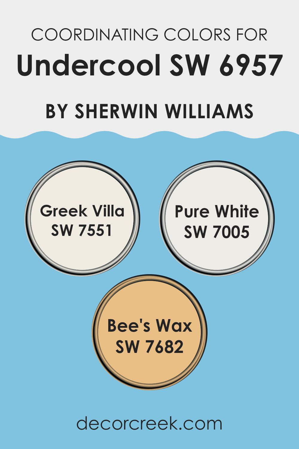
Coordinating Colors of Undercool SW 6957 by Sherwin Williams
Coordinating colors are hues that work well together in a room, creating a pleasing and balanced visual appeal. When you choose a main color for a room, coordinating colors can support and enhance the primary shade without overpowering it. For the gentle and flexible color like Undercool by Sherwin Williams, you can pair it with tones that either complement its subtle blue undertones or provide a warm contrast. This approach helps in crafting a cohesive and inviting environment in any part of the home.
Greek Villa (SW 7551) is a soft, off-white shade with a warm undertone, offering a gentle contrast to Undercool’s cooler tone. It serves as an excellent choice for ceilings and trim, helping to create a clean and harmonious transition between walls and other surfaces.
Pure White (SW 7005) is crisp and neutral, providing a fresh and bright balance that enhances Undercool’s cool freshness. It’s ideal for areas where a feel of openness is desired.
Meanwhile, Bee’s Wax (SW 7682) adds a touch of warmth with its golden yellow tint, making it a lively accent that brings energy and a sense of coziness, perfectly complementing the cooler base of Undercool and adding visual interest.
You can see recommended paint colors below:
- SW 7551 Greek Villa
- SW 7005 Pure White
- SW 7682 Bee’s Wax
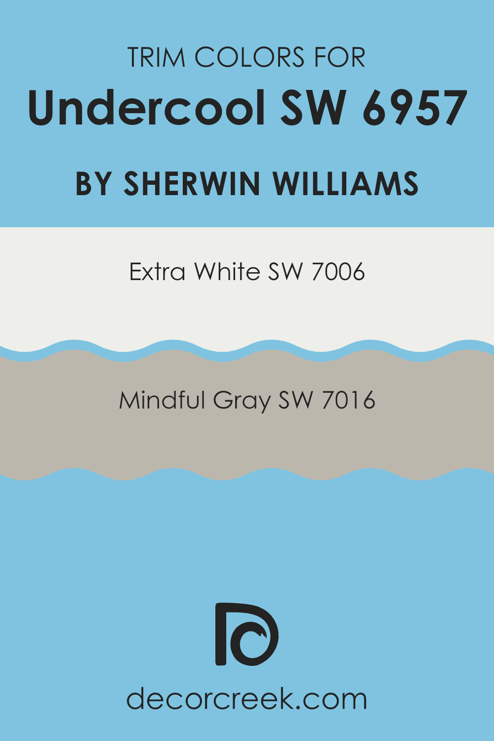
What are the Trim colors of Undercool SW 6957 by Sherwin Williams?
Trim colors are crucial in painting as they highlight the architectural details of a room and create a visual contrast or complement to the main wall color. For a paint choice like Undercool (SW 6957) by Sherwin Williams, trim colors can add a unique touch that enhances the whole room’s look. Using SW 7006 – Extra White as a trim color can provide a bright and clean edge, making the walls pop and giving the room a fresh and modern feel.
Extra White is crisp and pure, bringing a sense of cleanliness and light to any room it graces. On the other hand, SW 7016 – Mindful Gray offers a subtler and warmer contrast. This gray has a balanced tone that isn’t too cool or too warm, letting it blend well with a wide range of colors while providing a gentle definition.
Trim colors like Extra White and Mindful Gray are important because they can balance out the brightness or intensity of the main wall color while adding depth and interest to the room. When paired with Undercool, these trim colors play a crucial role in either enhancing the vibrant feel with Extra White or calming it down a bit with Mindful Gray. Mindful Gray is a flexible gray with taupe undertones that can harmonize with various color schemes, making it a practical choice for a stylish and tailored finish.
Meanwhile, Extra White stands out with its classic elegance, providing a sleek, defined border that can make architectural features shine. These carefully chosen trim colors help in defining areas, creating aesthetics that fit personal preferences, and achieving the desired look and feel of home interiors.
You can see recommended paint colors below:
Colors Similar to Undercool SW 6957 by Sherwin Williams
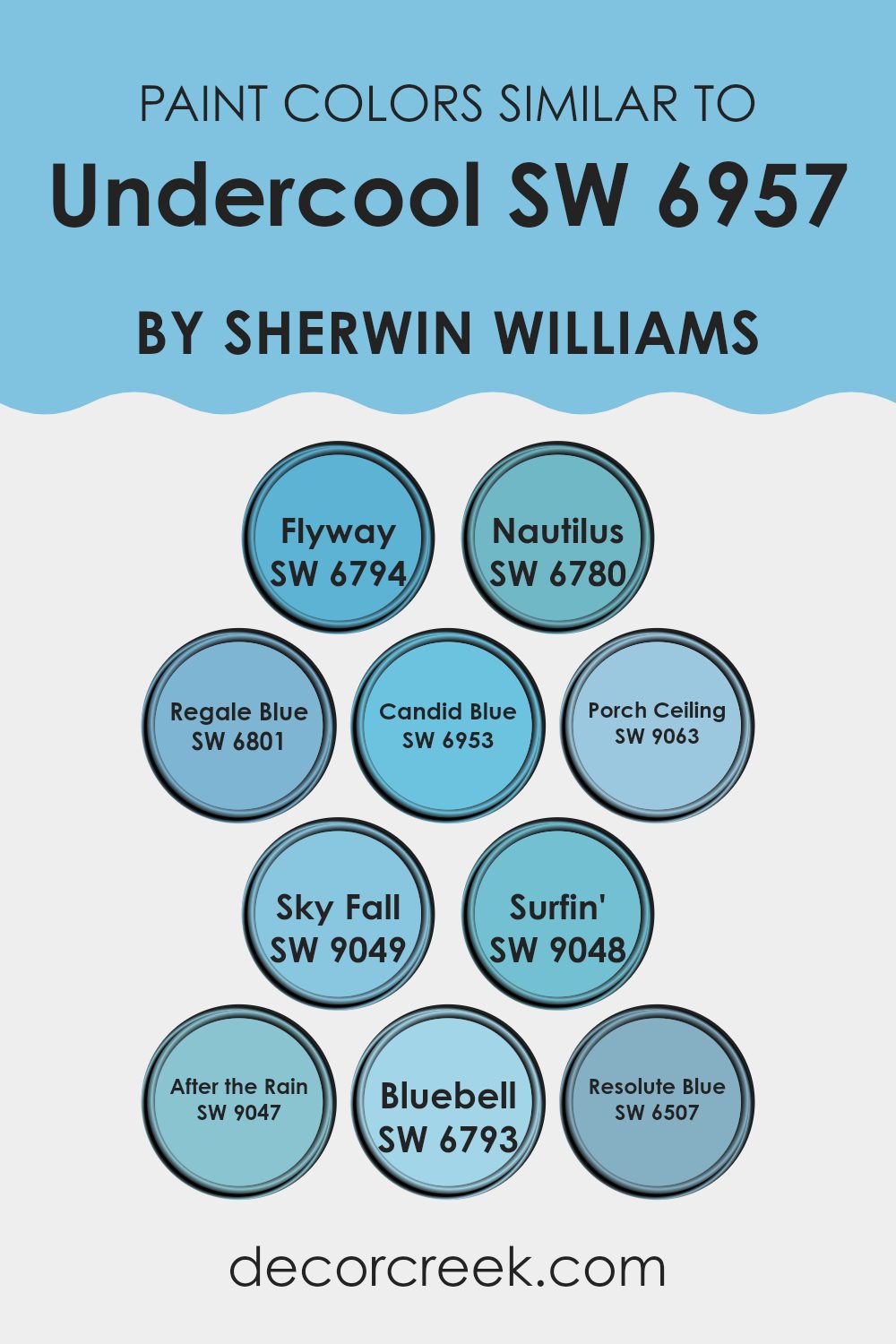
Similar colors are important because they allow for the creation of a visually cohesive and harmonious room. Using shades that are close to each other on the color spectrum can bring a sense of balance and unity to a room, making it feel well-thought-out and relaxing.
The colors SW 6794 Flyway and SW 6780 Nautilus, for instance, offer gentle and soothing blue hues reminiscent of clear skies and cool waters. SW 6801 Regale Blue and SW 6953 Candid Blue add a touch of richness and depth, making areas feel more complete. Similarly, SW 9063 Porch Ceiling brings a friendly and inviting atmosphere, ideal for welcoming areas.
The color SW 9049 Sky Fall provides a soft, muted blue that evokes a sense of calm. Alongside, SW 9048 Surfin’ and SW 9047 After the Rain introduce playful yet calming elements, perfect for adding a fresh burst to a room. SW 6793 Bluebell carries a delicate tone, bringing in a hint of floral lightness, while SW 6507 Resolute Blue offers a deeper, more defined blue that grounds the palette. These colors work beautifully together to create an environment that is cohesive and pleasant to live in, each adding its unique touch in harmony with the others.
You can see recommended paint colors below:
- SW 6794 Flyway
- SW 6780 Nautilus
- SW 6801 Regale Blue
- SW 6953 Candid Blue
- SW 9063 Porch Ceiling
- SW 9049 Sky Fall
- SW 9048 Surfin’
- SW 9047 After the Rain
- SW 6793 Bluebell
- SW 6507 Resolute Blue
Colors that Go With Undercool SW 6957 by Sherwin Williams
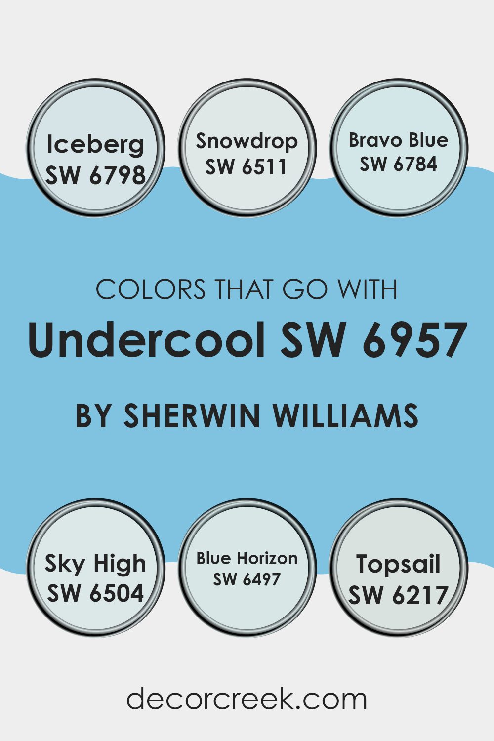
When decorating with paint colors like SW 6957 Undercool from Sherwin Williams, it’s essential to choose complementary shades that enhance the overall aesthetic. Colors such as SW 6798 Iceberg and SW 6511 Snowdrop offer a balance. Iceberg has a gentle, icy blue hue that’s refreshing and clean, making it an ideal pairing with Undercool to create a light, airy feel. Snowdrop, on the other hand, is a soft white with a hint of blue, perfect for adding brightness and maintaining a cool undertone.
Adding color with SW 6784 Bravo Blue and SW 6504 Sky High can bring depth to your room. Bravo Blue is an uplifting sky blue that can make a room feel more open and interesting. Meanwhile, Sky High offers a slightly darker tone with a calming presence that complements the crispness of Undercool.
SW 6497 Blue Horizon and SW 6217 Topsail provide additional layering options. Blue Horizon carries a smooth, deep blue that adds a touch of coziness, while Topsail is a delicate greenish-blue with a fresh vibe, bringing an earthy, harmonious touch to your color scheme. The combination of these hues helps create areas that are visually pleasing and harmonious, providing a cohesive look that feels inviting.
You can see recommended paint colors below:
- SW 6798 Iceberg
- SW 6511 Snowdrop
- SW 6784 Bravo Blue
- SW 6504 Sky High
- SW 6497 Blue Horizon
- SW 6217 Topsail
How to Use Undercool SW 6957 by Sherwin Williams In Your Home?
Undercool SW 6957 by Sherwin Williams is a light, refreshing blue-green color that can brighten up any room in your home. This flexible shade works well in a variety of rooms. In a bedroom, it creates a calming atmosphere that promotes restfulness, making it a great choice for walls or accent pieces, like bedding or curtains.
In the bathroom, Undercool gives a fresh spa-like feel, pairing nicely with white or gray fixtures. For a kitchen or dining area, this color adds a touch of coolness, especially when combined with natural wood furnishings or white cabinets.
It can also serve as a great backdrop for a living room, enhancing natural light and complementing both modern and traditional furniture. Accents of white, cream, or gray go well with Undercool, completing the look without overpowering the room. This hue is a simple way to refresh a room and create a welcoming environment.
Undercool SW 6957 by Sherwin Williams vs Porch Ceiling SW 9063 by Sherwin Williams
“Undercool” SW 6957 and “Porch Ceiling” SW 9063 are two paint colors by Sherwin Williams, each with distinct characteristics. “Undercool” is a soft, muted blue with gray undertones. It gives a room a calm and modern look without overpowering the room. This color fits well in areas that need a soothing backdrop, such as bedrooms or living rooms.
On the other hand, “Porch Ceiling” SW 9063 is a lighter and slightly brighter shade of blue. Traditionally, lighter blues like this are used for porch ceilings, as they mimic the sky and bring a touch of the outdoors inside. This color has more warmth compared to the cool gray-toned “Undercool.”
When placed side by side, “Undercool” appears more subdued due to its gray base, whereas “Porch Ceiling” feels airy and open. They both offer a calm vibe but are suited for different uses based on their undertones and brightness.
You can see recommended paint color below:
- SW 9063 Porch Ceiling
Undercool SW 6957 by Sherwin Williams vs After the Rain SW 9047 by Sherwin Williams
Undercool SW 6957 and After the Rain SW 9047 by Sherwin Williams are two distinct colors, each offering a different feel for a room. Undercool is a soft, muted shade with gray undertones, creating a calming and neutral backdrop. It’s flexible and pairs well with various styles, offering a subtle, modern touch.
On the other hand, After the Rain SW 9047 is a vibrant, fresh hue reminiscent of a misty morning. It has an energizing blue-green tone that adds a lively touch to any room. While Undercool provides a more understated and cooler atmosphere, After the Rain brings a pop of color and freshness, making it ideal for areas where you want to create a more cheerful and inviting ambiance.
Together, these colors can be paired to balance and complement each other, with Undercool grounding the vividness of After the Rain for a harmonious look.
You can see recommended paint color below:
- SW 9047 After the Rain
Undercool SW 6957 by Sherwin Williams vs Regale Blue SW 6801 by Sherwin Williams
Undercool SW 6957 by Sherwin Williams is a cool-toned shade that tends towards a soft, bluish-gray hue. It has a calming effect and can make a room feel open and airy. This color pairs well with whites and neutrals, creating a clean and refreshing ambiance.
Regale Blue SW 6801, on the other hand, is a richer and deeper blue. It has a more dramatic presence compared to Undercool. Regale Blue brings a sense of depth and can make a statement in any room. It works well in areas where you want to add intensity and boldness.
When compared, Undercool is more subtle and light, making it a good choice for open, relaxed room. Regale Blue is more vibrant and stands out, perfect for accent walls or areas where you want to create a focal point. Both colors can make a room feel different, each offering its unique mood and effect.
You can see recommended paint color below:
- SW 6801 Regale Blue
Undercool SW 6957 by Sherwin Williams vs Surfin’ SW 9048 by Sherwin Williams
Undercool SW 6957 by Sherwin Williams is a soothing shade of blue-gray that feels calm and subtle. It’s a flexible color that can work well in various settings, providing a cool, relaxed atmosphere. This hue is a great choice for people who want a gentle and understated look in a room.
On the other hand, Surfin’ SW 9048 by Sherwin Williams is a more vibrant, lively shade of turquoise. It brings a splash of energy and excitement, reminiscent of a bright, sunny beach day. This color can make a bold statement and add a refreshing pop of brightness to any room.
When comparing the two, Undercool is more muted and quiet, while Surfin’ is vivid and eye-catching. Use Undercool for a subtle backdrop that feels calm, or choose Surfin’ if you want to make a fun and dynamic impact. Both colors have their unique charm and can be used to create different moods in a room.
You can see recommended paint color below:
- SW 9048 Surfin’
Undercool SW 6957 by Sherwin Williams vs Candid Blue SW 6953 by Sherwin Williams
Undercool SW 6957 by Sherwin Williams is a subdued and muted shade of blue, invoking a sense of calmness and subtlety. It’s a flexible color that can serve as a neutral backdrop in both contemporary and traditional rooms. Its cool undertones make it a soothing choice for areas where relaxation is key.
Candid Blue SW 6953, on the other hand, is more vibrant and lively. It’s a bright blue that adds energy and freshness to a room. While Undercool is more understated, Candid Blue demands attention with its clear, cheerful vibe.
When comparing the two, Undercool is more reserved and can blend effortlessly into various color schemes, making it suitable for a more understated look. Candid Blue stands out, creating a focal point in a room and injecting life and brightness. Both colors have their unique appeal, with Undercool offering subtle elegance and Candid Blue providing a punch of color.
You can see recommended paint color below:
- SW 6953 Candid Blue
Undercool SW 6957 by Sherwin Williams vs Nautilus SW 6780 by Sherwin Williams
Undercool SW 6957 by Sherwin Williams is a subtle and soothing shade with a hint of blue-grey, creating a calm and elegant atmosphere. This color works well in areas where a relaxing vibe is desired, like bedrooms or living rooms. Its understated nature allows it to blend seamlessly with other colors and decor styles, providing a flexible backdrop.
On the other hand, Nautilus SW 6780 by Sherwin Williams is a vibrant, fresh aqua that makes a bold statement. This color is perfect for adding energy and cheerfulness to a room, making it ideal for areas where activity and dynamism are welcome, like a bathroom or a kitchen. It’s lively and fun, offering a pop of color that can invigorate a room.
While both colors have blue tones, Undercool is more subdued and calming, whereas Nautilus is bright and lively, offering two distinct moods depending on the atmosphere you wish to create.
You can see recommended paint color below:
- SW 6780 Nautilus
Undercool SW 6957 by Sherwin Williams vs Flyway SW 6794 by Sherwin Williams
Undercool SW 6957 and Flyway SW 6794 by Sherwin Williams are two distinct colors with unique characteristics. Undercool is a subtle, muted shade of blue with gray undertones, giving it a cool, calming appearance. It’s flexible and works well in various settings, offering a neutral yet modern vibe.
On the other hand, Flyway is a vibrant, light blue with a hint of green. It’s lively and brings a refreshing pop of color to any room. While Undercool leans towards sophistication and subtlety, Flyway is more playful and bright.
When using these colors together, Undercool provides a solid, calm backdrop against which Flyway can stand out as an accent, adding a touch of energy. This pairing can create a balanced look, blending the soothing qualities of a muted tone with the cheerful nature of a brighter hue. Both colors have their own charm, fitting different moods and styles.
You can see recommended paint color below:
Undercool SW 6957 by Sherwin Williams vs Resolute Blue SW 6507 by Sherwin Williams
Undercool SW 6957 by Sherwin Williams is a soft, muted green that feels calming and earthy. It’s a subtle color that works well in areas where you want a gentle, natural look. It has cool undertones that give it a fresh feel without being too overpowering.
On the other hand, Resolute Blue SW 6507 is a medium-toned blue with a bold, decisive energy. It’s a bit more vibrant and can make a statement in any room. It has a crisp and clean quality that can brighten up areas.
When comparing the two, Undercool offers a more understated and muted vibe, perfect for creating a relaxed atmosphere. Resolute Blue, however, stands out more and adds a lively touch to your room. Both colors can work together or separately, depending on the mood you want to achieve, with Undercool providing subtlety and Resolute Blue bringing vibrant energy.
You can see recommended paint color below:
Undercool SW 6957 by Sherwin Williams vs Bluebell SW 6793 by Sherwin Williams
Undercool SW 6957 by Sherwin Williams is a calm, muted blue with subtle gray undertones. It feels cool and soothing, like a gentle breeze. It’s perfect for creating a relaxed atmosphere in a room, making areas feel open and airy. The gray hints make it flexible, allowing it to pair well with both warm and cool colors.
On the other hand, Bluebell SW 6793 is a more vibrant and bold blue. It has a crisp, cheerful vibe that brings energy into a room. This color can brighten up a room and make it feel lively and inviting. It’s ideal for areas where you want to add a splash of color or make a statement.
While Undercool is more subdued and refined, Bluebell is playful and dynamic. Both have their unique appeal, with Undercool offering calm and Bluebell providing vibrancy. Depending on your room’s purpose, either can be a great choice.
You can see recommended paint color below:
- SW 6793 Bluebell
Undercool SW 6957 by Sherwin Williams vs Sky Fall SW 9049 by Sherwin Williams
Undercool (SW 6957) and Sky Fall (SW 9049) are two distinct colors by Sherwin Williams that offer unique vibes and settings for areas. Undercool is a cool, soft blue with gray undertones, creating a calm and soothing environment. It’s flexible and pairs well with neutral colors, making it suitable for modern and minimalist designs.
On the other hand, Sky Fall is a deeper, more intense blue-green hue that brings a touch of luxury and depth to a room. It’s bold and can make a statement in any room, ideal for accent walls or larger areas where you want to create an impactful atmosphere.
While Undercool leans towards a more subtle and relaxed feel, Sky Fall is expressive and rich, suitable for anyone looking to add a dramatic touch to their homes. Both colors can be combined with whites or lighter shades for contrast, but their effects on the mood of a room are quite different.
You can see recommended paint color below:
After looking into SW 6957 Undercool by Sherwin Williams, I’ve come to appreciate its unique charm. This cool, calming shade of blue brings a refreshing vibe to any room. It reminds me of a peaceful day at the beach or a clear sky, making it perfect for creating a soothing atmosphere at home.
What I find fascinating about Undercool is how it can fit in different rooms. In a bedroom, it helps to make the room feel restful. In a bathroom, it can evoke a clean, fresh feeling. In the living room, it pairs beautifully with other colors, adding a touch of freshness without being too loud.
Undercool also seems to work well with various styles. Whether your home is full of modern furniture or more traditional pieces, this color can be a great match. It’s not too bold or too plain, just a nice balance that adds life to the walls without taking over.
I also noticed that Undercool looks different depending on the light. In bright daylight, it might feel more cheerful and energetic. In softer evening light, it becomes more gentle and soothing, which I find really interesting. Overall, I think SW 6957 Undercool is a lovely shade that can make a room look fresh and inviting.
Ever wished paint sampling was as easy as sticking a sticker? Guess what? Now it is! Discover Samplize's unique Peel & Stick samples.
Get paint samples

