In the world of color and design, Sherwin-Williams is a name that echoes with reverence. They offer a rich palette of hues that harmonize with diverse interior and exterior styles. Among this vast array, SW 6507 Resolute Blue has emerged as a popular choice, impressing designers with its depth and versatility.
This article unfolds the many facets of this distinctive hue and reveals how it can redefine the aesthetics of your living space.
What Color Is SW 6507 Resolute Blue?
At first glance, SW 6507 Resolute Blue projects a striking image of a deep, almost oceanic blue. It carries an undeniable depth, conjuring images of calm, reflective bodies of water under moonlit skies. There’s an allure to this shade that draws in observers, a serene yet compelling charm that’s both intense and relaxing.
Subtle yet bold, SW 6507 Resolute Blue dances between the lines of softness and richness. It’s a shade that carries an undertone of sophistication, resembling the royal blue of old but with a mellower touch. It’s not as vivid or bright as sky blue nor as dark or imposing as navy. Instead, it situates itself comfortably, offering a balanced, mature shade of blue that’s soothing to the eyes and the soul.
Is It a Warm Or Cool Color?
SW Resolute Blue is decidedly a cool color. Its essence is reminiscent of the quiet coolness of deep, tranquil waters, carrying an air of serenity and depth that’s synonymous with cool hues. Its refreshing vibe promotes a sense of calm and relaxation, perfect for creating a peaceful ambiance in any room.
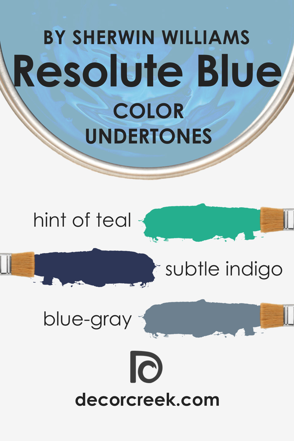
Undertones of SW 6507 Resolute Blue
The perception of color can often be swayed by its undertones, the subtle hues that lie beneath the dominant color. They are the secret ingredients that add depth, richness, and personality to a color. SW Resolute Blue has complex undertones:
- Blue-gray undertone: A slight gray undertone mutes the intensity of Resolute Blue, lending it an air of sophistication and restraint. This undertone makes the color versatile, enabling it to pair well with a variety of other shades.
- Subtle indigo undertone: Under certain lighting conditions, you might notice a hint of indigo, which gives Resolute Blue a sense of depth and mystery.
- A hint of teal: Lastly, there’s a soft whisper of teal that adds a layer of complexity to this color, making it even more dynamic and captivating.
Undertones are crucial as they affect the overall appearance of the color, influencing how it interacts with other colors and how it appears under different lighting conditions.
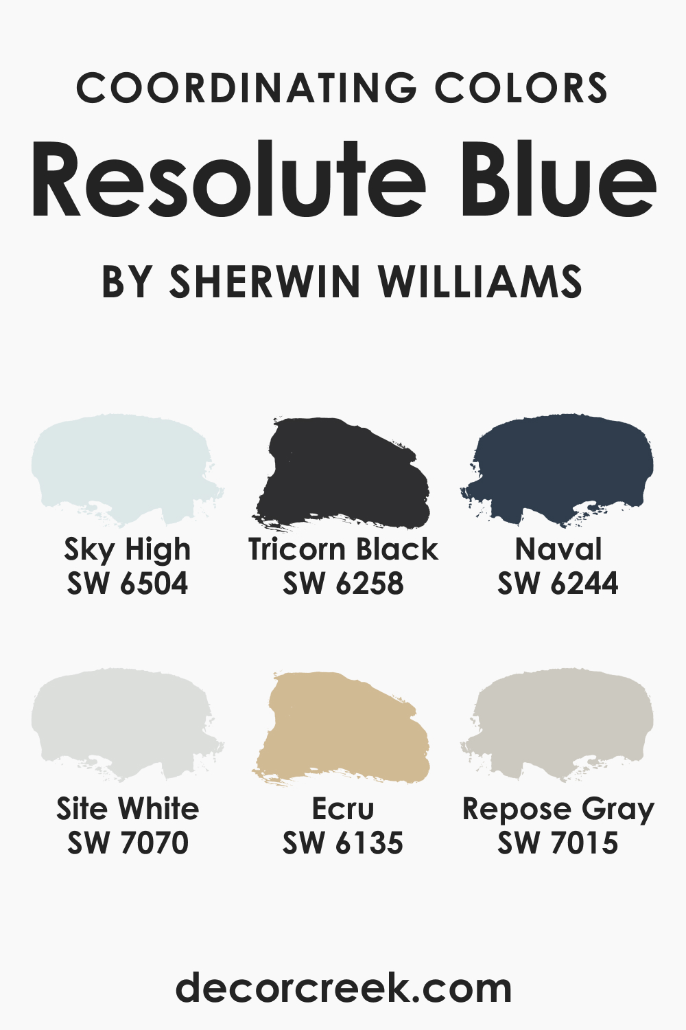
Coordinating Colors of SW 6507 Resolute Blue
Coordinating colors are those that harmonize well with a particular color, creating a balanced and visually appealing color scheme. For SW 6507 Resolute Blue, the coordinating colors are:
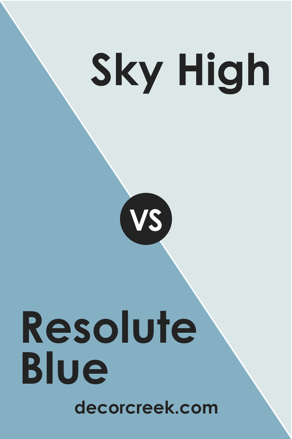
- SW 6504 Sky High : A much lighter shade of blue, Sky High provides a pleasant contrast to Resolute Blue, creating a refreshing and airy color scheme.
- SW 7070 Site White : Site White is a neutral color that beautifully complements the depth of Resolute Blue, providing a balance that’s crisp and visually appealing.
- SW 6135 Ecru : This warm, earthy shade adds a comforting touch to the coolness of Resolute Blue, creating a balanced and inviting atmosphere.
Additionally, you might consider:
- SW 7015 Repose Gray : This light gray color has a cool undertone that pairs beautifully with Resolute Blue, providing a tranquil and modern palette.
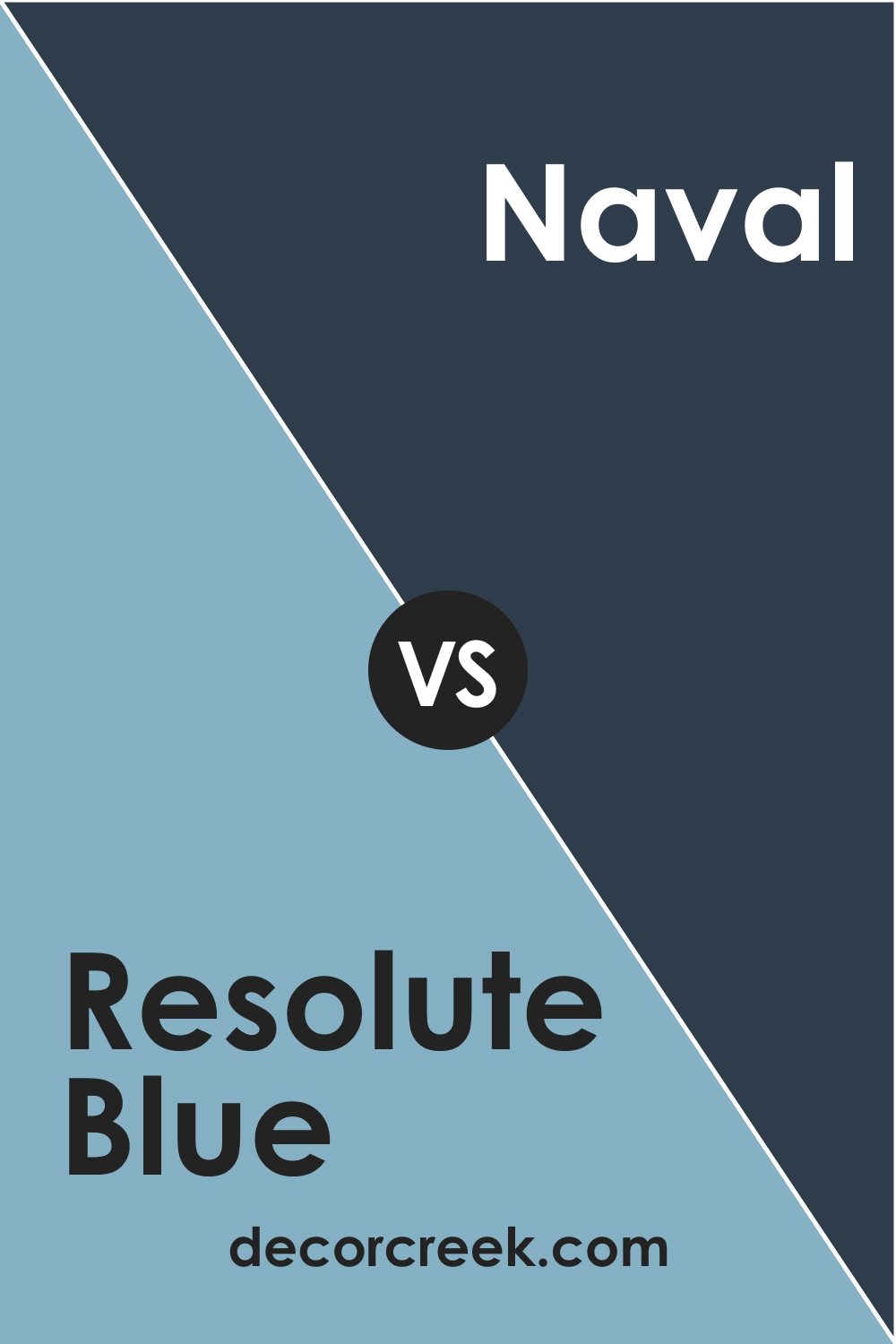
- SW 6244 Naval : Naval is a darker shade of blue that adds depth and richness when paired with Resolute Blue, perfect for a monochromatic scheme.
- SW 6258 Tricorn Black : For a bold contrast, Tricorn Black can accentuate the elegance and sophistication of Resolute Blue.
How Does Lighting Affect SW 6507 Resolute Blue?
Lighting plays a significant role in how we perceive colors. Under natural daylight, Resolute Blue appears brighter and more vivid, accentuating its blue-gray undertone. It radiates a serene coolness reminiscent of tranquil waters under a clear sky.
Artificial light, on the other hand, can bring out its indigo and teal undertones, adding a sense of depth and warmth. In low-light conditions, Resolute Blue can appear much deeper, almost navy, bringing a sense of coziness and sophistication to the space.
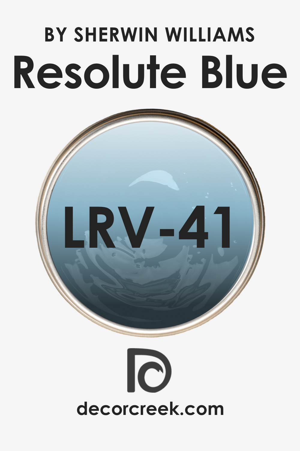
LRV of SW 6507 Resolute Blue
Light Reflectance Value (LRV) measures how much light a color reflects. SW 6507 Resolute Blue has an LRV of 41. This means it falls into the medium-dark range, reflecting a moderate amount of light.
This LRV is perfect for spaces where you want a balance between absorption and reflection of light. It’s neither too bright, which can be overwhelming in large doses, nor too dark, which could make a space feel smaller or less inviting. The balance achieved with an LRV of 41 allows for a cozy, inviting atmosphere without sacrificing the perception of space.
An LRV of 41 also offers versatility. It means Resolute Blue can serve as either an accent color or a main color in a room, depending on the ambiance you want to create. This flexibility can be beneficial when designing a space, providing more room for creativity.
LRV – what does it mean? Read This Before Finding Your Perfect Paint Color
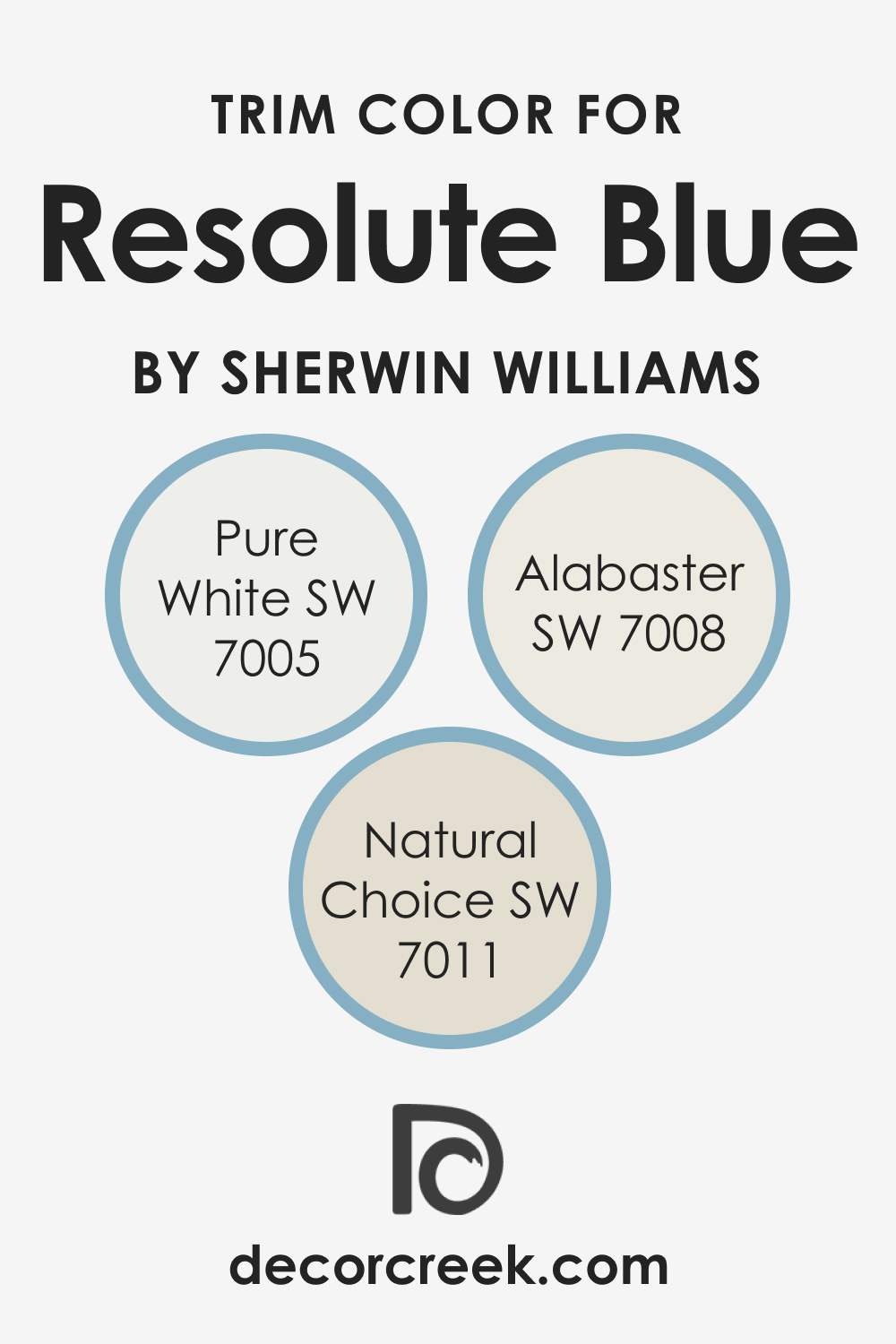
Trim Colors of SW 6507 Resolute Blue
Trim colors are used on the trim, moldings, and doors in a room and should complement the main wall color. For Resolute Blue, consider these Sherwin-Williams shades of white:
- SW 7005 Pure White : A versatile and bright white that provides a crisp contrast against Resolute Blue.
- SW 7008 Alabaster : A softer, creamier white that offers a subtle contrast and a hint of warmth.
- SW 7011 Natural Choice : A light, neutral white with a touch of beige, bringing an earthy element to the coolness of Resolute Blue.
Trim colors add a finishing touch to the room, outlining and enhancing the features. They also provide an aesthetic transition between different colors and materials.
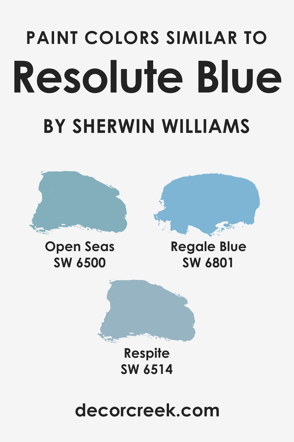
Colors Similar to SW 6507 Resolute Blue
Knowing similar colors to Resolute Blue can give you more options when designing a space. It’s important as it allows you to experiment with different hues with the same vibe and ambiance but offer slight variations that might better suit your style or the room’s function. For SW Resolute Blue, consider the following similar colors:
- Open Seas (SW 6500)
- Regale Blue (SW 6801)
- Respite (SW 6514)
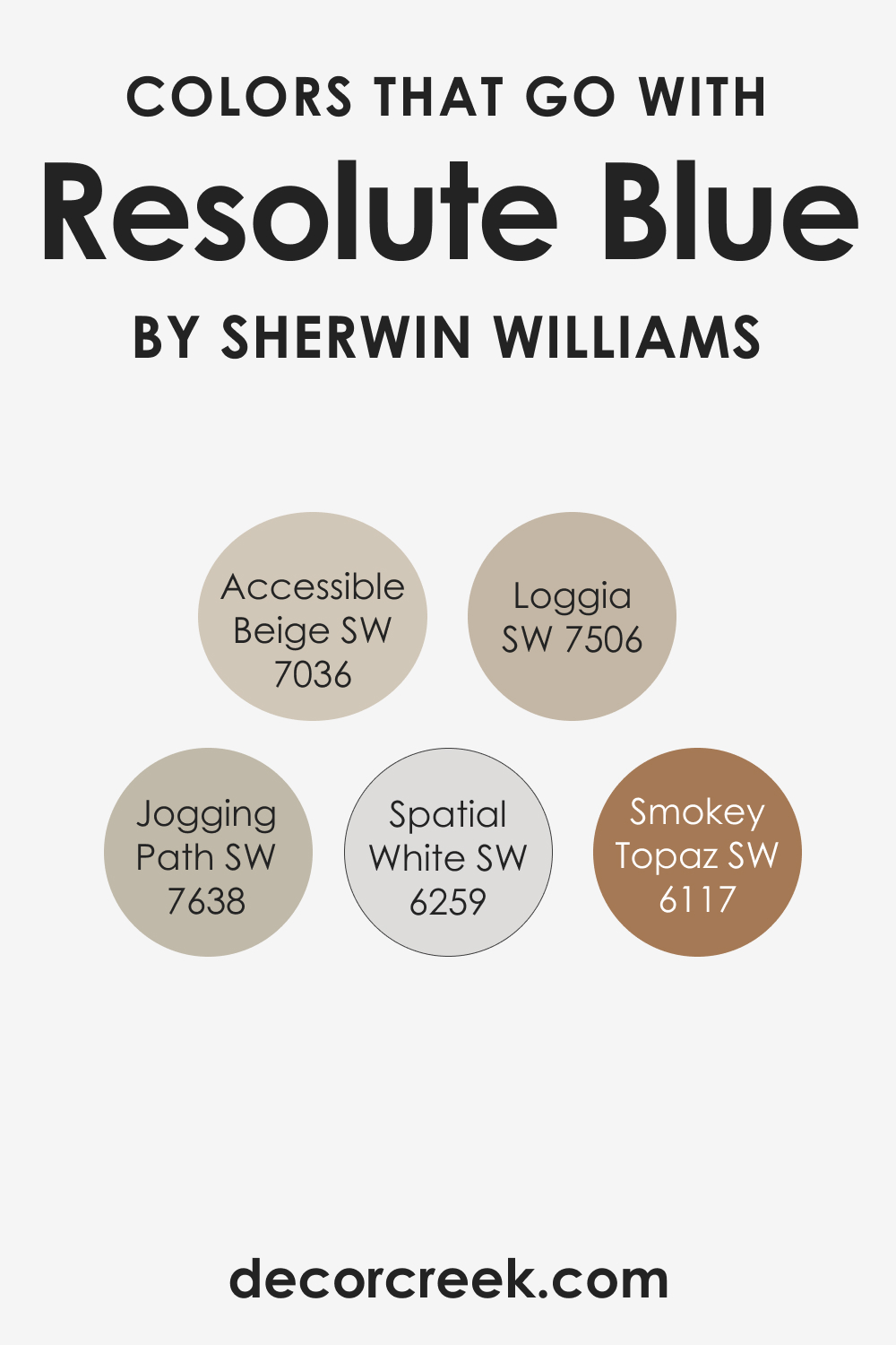
Colors That Go With SW 6507 Resolute Blue
Creating a color scheme is not just about choosing colors that you like but also about how well they work together. Here are six colors that go well with Resolute Blue:
- SW 6259 Spatial White – A slightly cooler and more neutral white, this color is another nice choice to pair with Resolute Blue.
- SW 6117 Smokey Topaz – As a warm, rich beige, Smokey Topaz can provide a nice balance to the coolness of Resolute Blue.
- SW 7036 Accessible Beige – This neutral beige color is a versatile companion to many colors, including Resolute Blue. It’s perfect if you’re looking for a balanced, calming color scheme.
- SW 7638 Jogging Path – This muted, warm gray can provide an interesting contrast to Resolute Blue, providing a subdued, sophisticated look.
- SW 7506 Loggia – Another warm neutral, Loggia can work well with Resolute Blue, providing a warm counterbalance and maintaining a cozy atmosphere.
These colors, when paired with Resolute Blue, can create various aesthetics, from calm and serene to bold and dramatic.
How to Use SW 6507 Resolute Blue In Your Home?
SW 6507 Resolute Blue is versatile and can adapt to various interior design styles. Its coolness works perfectly in minimalist or coastal themes. In contemporary or eclectic styles, it can serve as an exciting, vibrant backdrop.
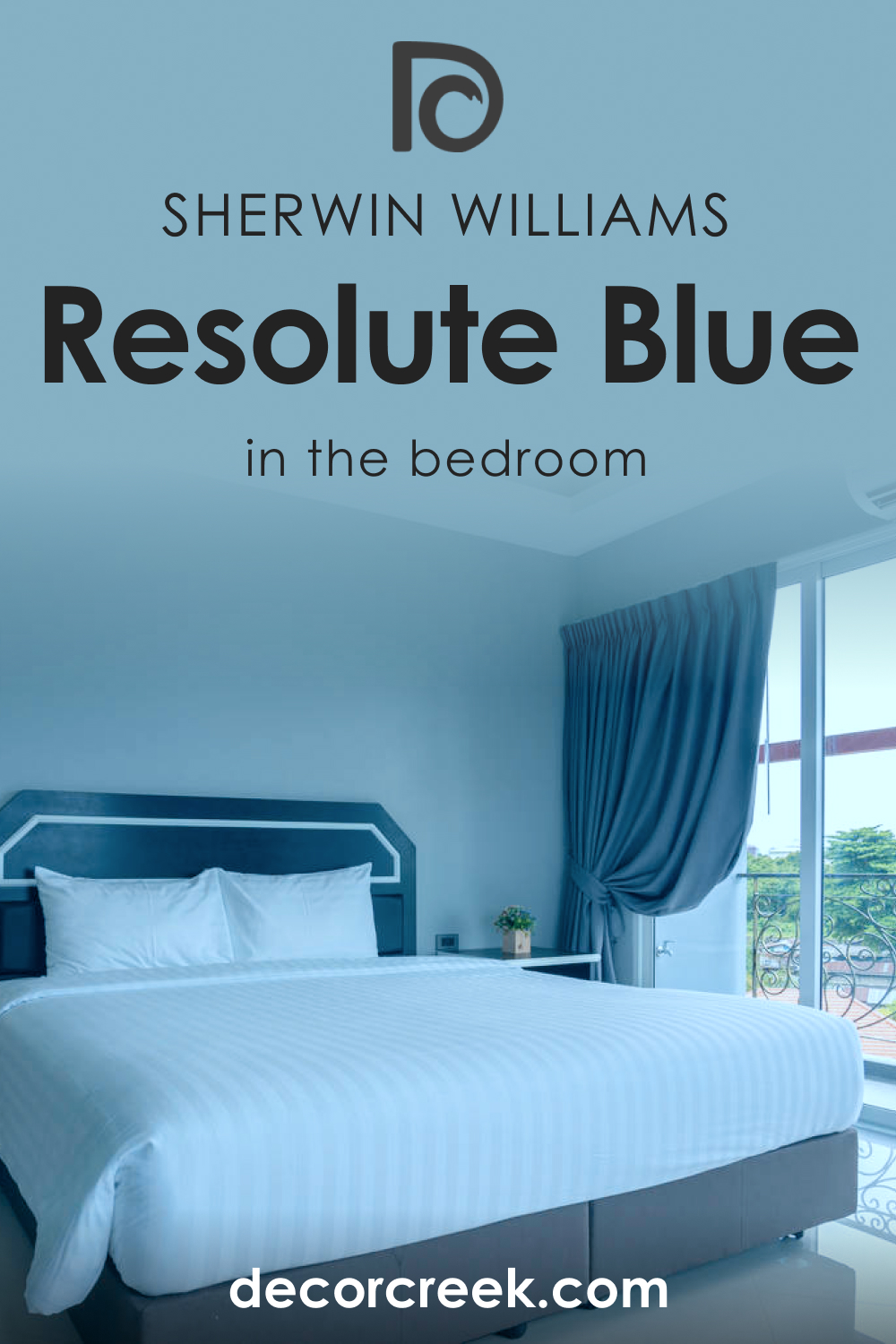
How to Use SW 6507 Resolute Blue in the Bedroom?
The calming undertones of Resolute Blue make it perfect for bedrooms. It creates a tranquil, soothing ambiance that promotes relaxation and sleep. Pair it with light-colored furniture for a refreshing look or with darker elements for a touch of drama.
For a serene, beach-like vibe, combine Resolute Blue with light, sandy colors and natural elements like wood or wicker. The result is a relaxing, resort-like atmosphere that can turn your bedroom into a calming retreat.
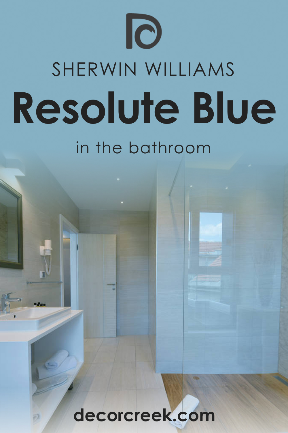
How to Use SW 6507 Resolute Blue in the Bathroom?
In bathrooms, Resolute Blue can bring a spa-like quality, especially when paired with whites or light grays. Consider using it on a feature wall for a burst of color or on cabinets for a more subtle effect.
Alternatively, for a nautical-themed bathroom, pair Resolute Blue with shades of white and elements of gold or brass. This combination can create an elegant, maritime-inspired space that feels luxurious and relaxing.
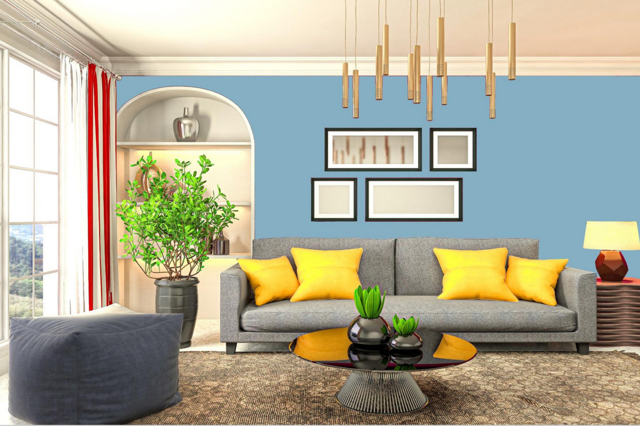
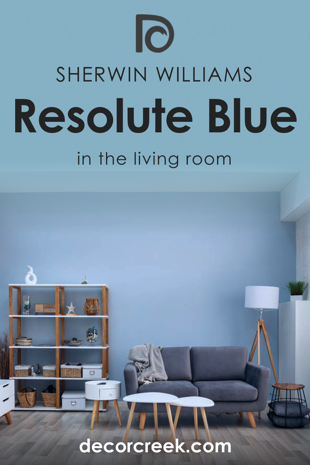
How to Use SW 6507 Resolute Blue in the Living Room?
In a living room, Resolute Blue can make a stunning statement. Whether you use it on all walls or as an accent wall, this shade can lend a sense of depth and sophistication to the space.
Pair Resolute Blue with neutral furnishings for a classic, clean look, or create a vibrant, energetic space with pops of brighter colors like yellows or oranges.
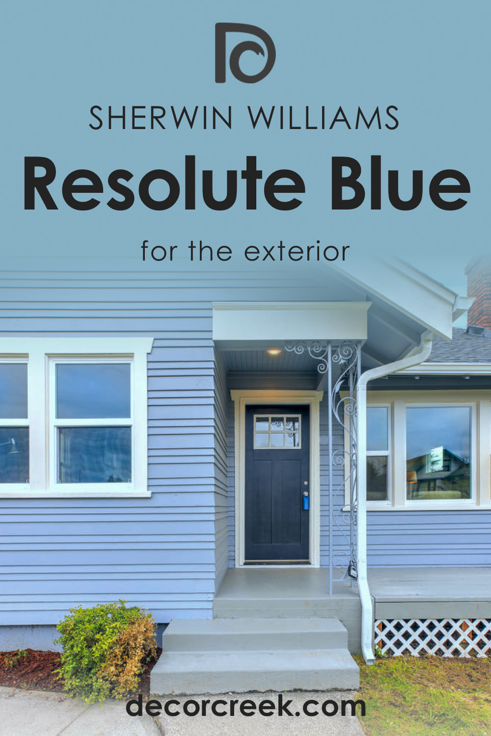
How to Use SW 6507 Resolute Blue for an Exterior?
Resolute Blue can give your home exterior a touch of elegance and drama. It stands out beautifully against green landscaping, and when paired with crisp white trims, it creates a classic yet striking appearance.
For a more modern look, pair Resolute Blue with gray or black accents. The resulting contrast is eye-catching and gives your home a unique, contemporary edge.
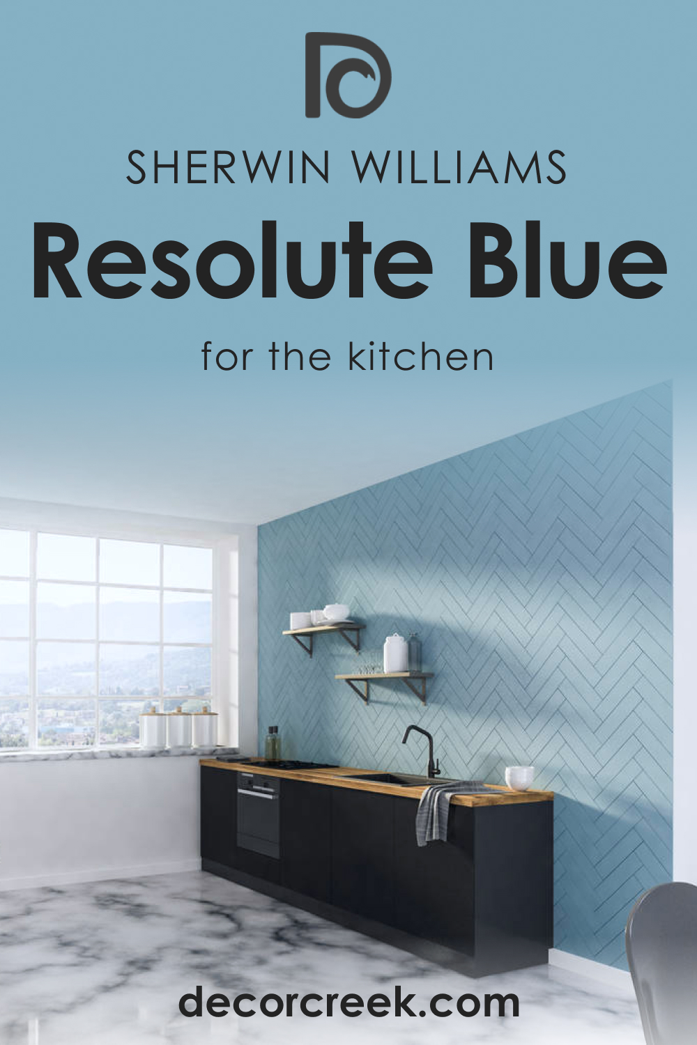
How to Use SW 6507 Resolute Blue for the Kitchen?
In the kitchen, Resolute Blue can serve as a vibrant backdrop against which white cabinets and stainless-steel appliances can pop. Its depth of color adds a touch of sophistication and drama, giving the space a rich, luxurious feel.
If you want a more subtle look, consider using Resolute Blue on a kitchen island or lower cabinets, with lighter colors on the upper cabinets and walls.
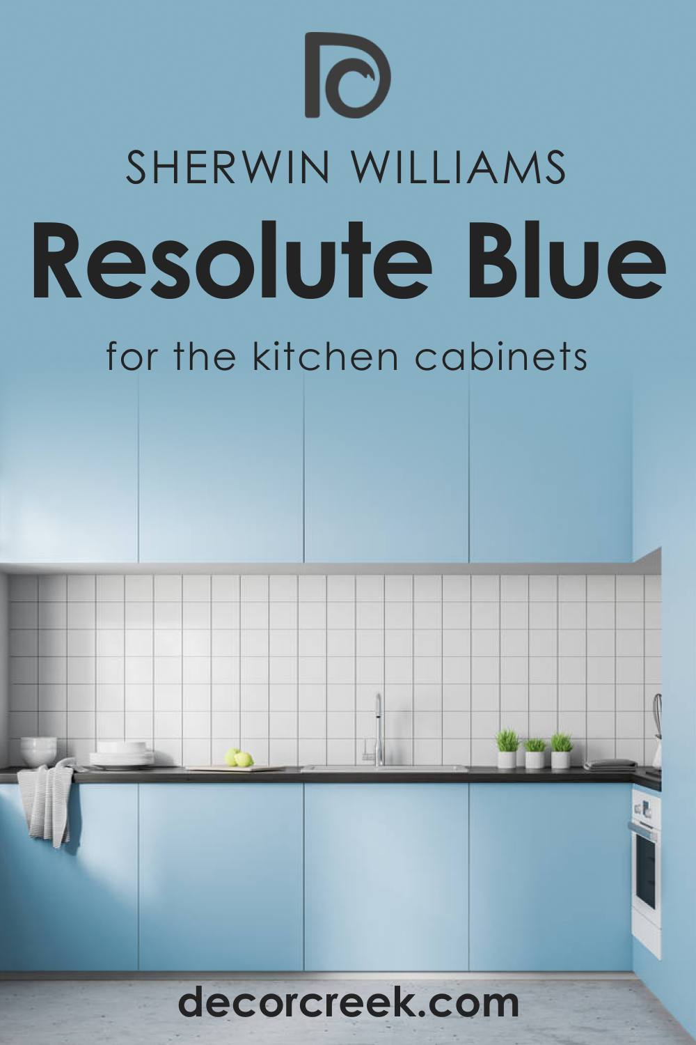
How to Use SW 6507 Resolute Blue for the Kitchen Cabinets?
Resolute Blue on kitchen cabinets can create a stunning focal point in your kitchen. Paired with light walls, these cabinets can stand out, adding depth and interest to the room.
Alternatively, for a monochromatic scheme, consider painting the walls and cabinets in the same shade of Resolute Blue, then breaking up the color with a white or light-colored backsplash.
Comparing SW 6507 Resolute Blue With Other Colors
While comparing Resolute Blue with other colors, it’s essential to consider both the dominant hue and the undertones. For instance, compared to lighter blues like SW 6504 Sky High, Resolute Blue is more subdued and mature, thanks to its blue-gray undertone. Against darker blues like SW 6244 Naval, Resolute Blue offers a softer, more soothing aesthetic. Below, you can read how SW Resolute Blue compares with other colors.
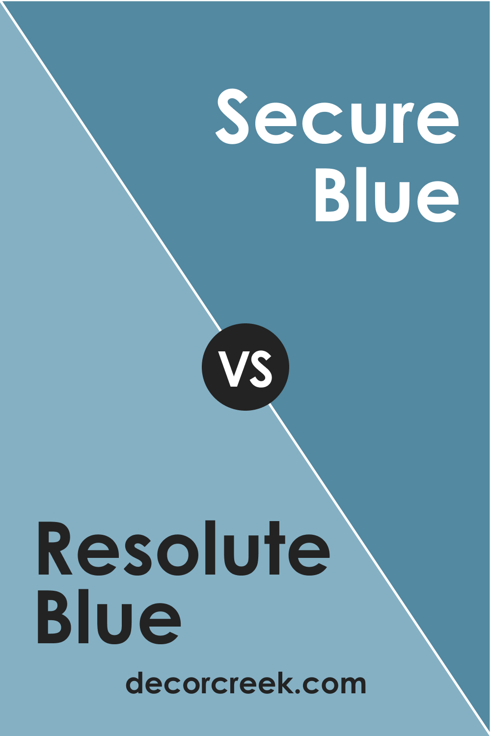
SW 6507 Resolute Blue vs. SW 6508 Secure Blue
A sibling color in the Sherwin-Williams palette, SW 6508 Secure Blue , is a darker, more saturated shade of blue. It exudes an aura of confidence and sophistication that’s richer than Resolute Blue. Comparing these two, Resolute Blue feels lighter and more serene, making it ideal for rooms where a calming vibe is desired, while Secure Blue, with its depth, is suitable for areas where a bold statement is needed.
SW 6507 Resolute Blue and SW 6504 Sky High
SW Sky High is a soft, airy blue that evokes a sense of open skies and peaceful days. It’s a stark contrast to Resolute Blue’s depth and intensity, embodying the lighter end of the blue spectrum. Comparing these two is like contrasting the ocean’s depth with the sky’s lightness, providing a spectrum of possibilities for creating layered, blue-themed interiors.
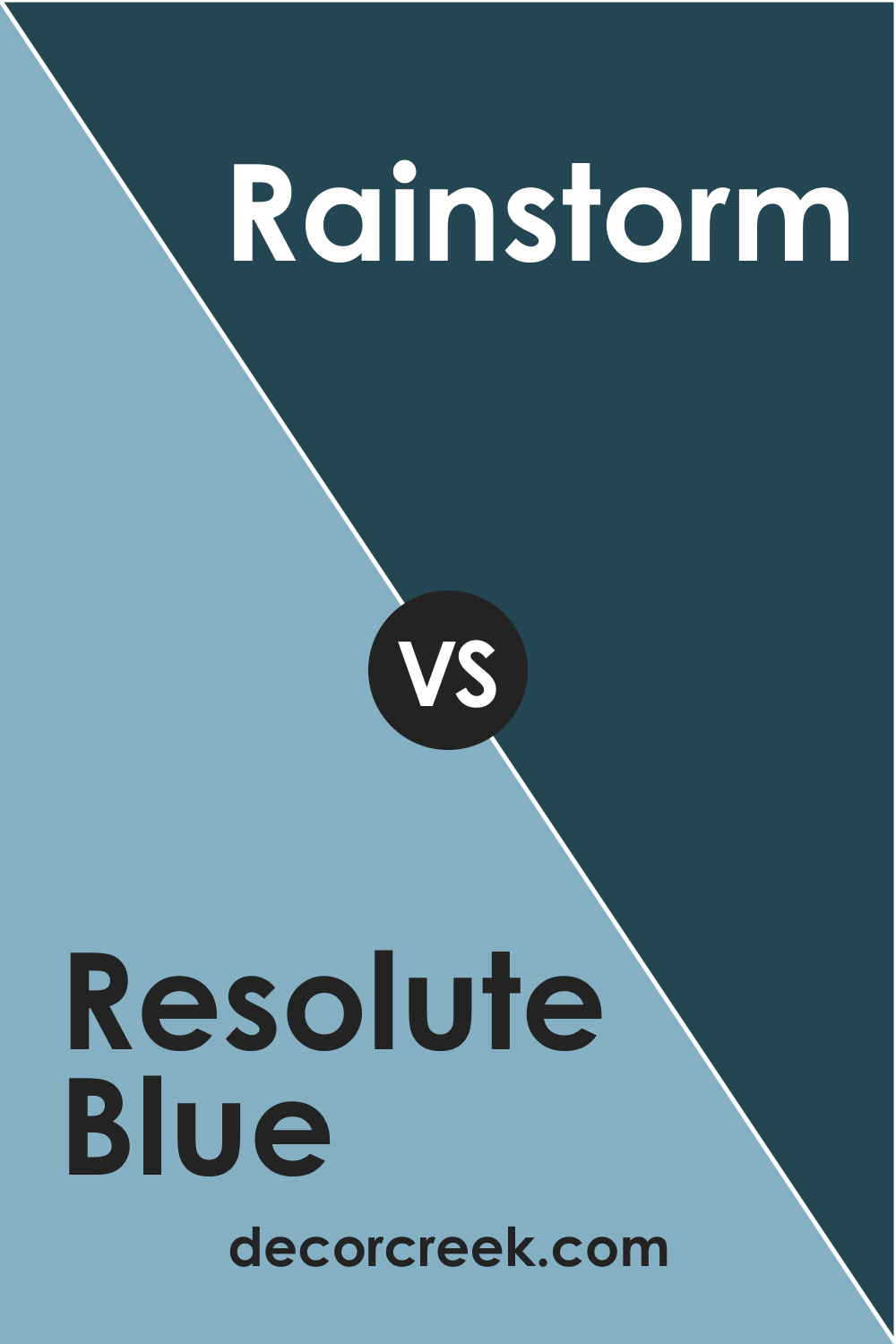
SW 6507 Resolute Blue and SW 6230 Rainstorm
SW Rainstorm is a deep, dramatic blue with green undertones that can almost appear teal or navy, depending on the lighting. When compared to Resolute Blue, Rainstorm presents a more dramatic, attention-grabbing presence. Meanwhile, Resolute Blue’s balanced depth and serenity come forward, making it a more versatile choice for a wide range of interior spaces.
SW 6507 Resolute Blue and SW 6244 Naval
SW Naval is another deep , rich blue, but it leans closer to navy, reminiscent of the ocean’s depths. Compared to Resolute Blue, Naval stands out with its strong, bold persona. It’s a great contrast to Resolute Blue’s calm and soothing demeanor, illustrating how different shades of blue can create dramatically different moods in interior spaces.
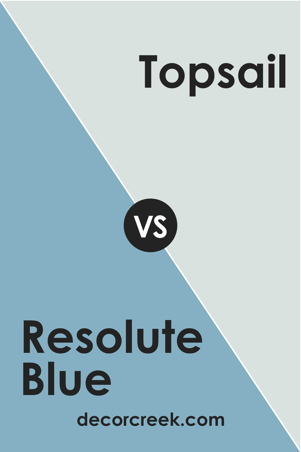
SW 6507 Resolute Blue and SW 6217 Topsail
SW Topsail is a light, aqua-infused blue that exudes a fresh, beachy feel. Its softness contrasts beautifully with Resolute Blue’s depth, showing how different blues can evoke distinctly different atmospheres. Where Topsail might be perfect for a breezy, coastal-themed room, Resolute Blue would fit well in a space requiring a touch of elegance and sophistication.
SW 6507 Resolute Blue and SW 6246 North Star
SW North Star is a soft, muted blue with a subtle touch of gray. This color is soothing and serene and significantly lighter than Resolute Blue. North Star’s softer presence highlights the boldness and depth of Resolute Blue, and the comparison between these two shades exemplifies the breadth of the blue color spectrum and its versatile applications in interior design.
Conclusion
SW 6507 Resolute Blue is a stunning, versatile hue that can transform any space with its depth and serenity. It offers a balance between cool tranquility and vibrant intensity, making it suitable for various applications and design styles. Whether used as a dominant color or an accent, Resolute Blue always makes a striking statement.
With the right coordinating colors and lighting, this color can truly shine, bringing a unique charm and sophistication to your home.
Ever wished paint sampling was as easy as sticking a sticker? Guess what? Now it is! Discover Samplize's unique Peel & Stick samples.
Get paint samples

Frequently Asked Questions
✅What type of color is SW 6507 Resolute Blue?
SW 6507 Resolute Blue is a deep, serene, and sophisticated blue that exhibits undertones of indigo and teal. It has a Light Reflectance Value (LRV) of 41, making it a medium-dark color that offers a balance between brightness and depth.
✅What are the coordinating colors for SW 6507 Resolute Blue?
Coordinating colors for Resolute Blue include SW 6504 Sky High, SW 7070 Site White, and SW 6135 Ecru. Additionally, similar hues like SW 6244 Naval, SW 6258 Tricorn Black, and SW 6246 North Star complement Resolute Blue very well.
✅Does the lighting affect the appearance of SW 6507 Resolute Blue?
Yes, like all paint colors, lighting significantly affects how Resolute Blue appears. In natural daylight, it may appear brighter and more vivid, while artificial light can emphasize its indigo and teal undertones, making the color appear warmer and deeper.
✅What are the recommended trim colors for SW 6507 Resolute Blue?
SW 7005 Pure White, SW 7008 Alabaster, and SW 7011 Natural Choice are excellent choices for trim colors when using Resolute Blue. These shades of white provide a clean, crisp contrast to the cool, sophisticated tones of Resolute Blue.
✅Where can I use SW 6507 Resolute Blue in my home?
Resolute Blue is a versatile color that can be used in a variety of spaces, from the living room to the kitchen, to the bedroom. Its calming nature makes it perfect for bedrooms, while its depth and sophistication can make a striking statement in living rooms or on kitchen cabinets. It's also a popular choice for exterior house paint because of its elegant appeal.


