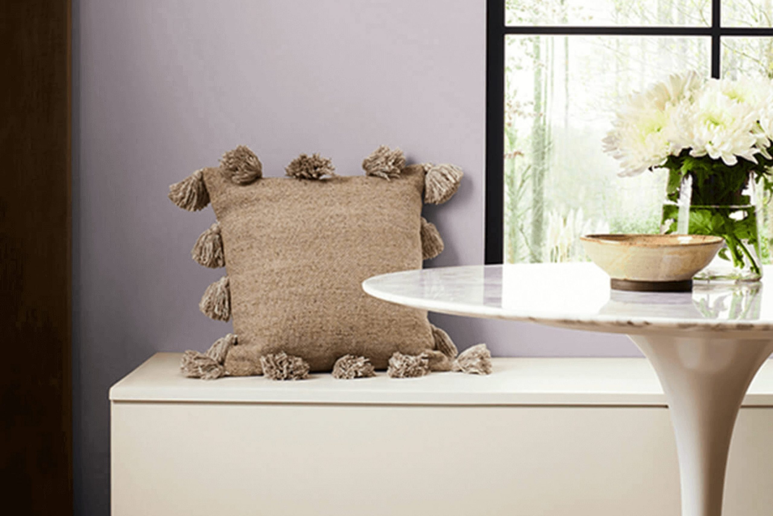
As you consider updating your room, you might be looking for a color that brings a sense of subtle depth and refinement. Let’s talk about a unique shade: SW 6268 Veiled Violet by Sherwin Williams. This color is not your typical violet; it is a muted version that appears almost neutral, making it highly adaptable for any room in your home.
What stands out about Veiled Violet is how it pairs gracefully with both light and dark furnishings, offering you the flexibility to maintain existing decor or vary it without the walls clashing. It’s equally effective in creating a calm environment in bedrooms as it is in adding a touch of elegance to your living room.
Using this shade can refresh your room subtly without feeling overpowering with color, making it ideal if you prefer designs that are both elegant and understated. The paint’s quality also ensures vibrant longevity, so you can enjoy the fresh look for years to come.
So, if you’re looking to update the feel of your home while keeping things stylish and minimal, Veiled Violet might just be the color you’re looking for.
What Color Is Veiled Violet SW 6268 by Sherwin Williams?
Veiled Violet is a subtle and gentle purple hue that adds a touch of uniqueness without feeling overpowering in a room. This color has a dusky quality, slightly muted, making it flexible for use in different interior design themes. It’s a great choice for creating a cozy and inviting atmosphere in rooms like bedrooms or living areas.
This color pairs beautifully with neutral tones such as soft whites, grays, and even light browns, helping to maintain a balanced look. When it comes to materials, Veiled Violet works well with natural wood, which complements its warmth, and with metallic finishes like brushed silver or gold for a touch of refinement. Textures such as velvet or silk also go well with this color, enhancing its plush feel.
Veiled Violet is particularly effective in interior styles such as contemporary, where its modern vibe shines, and in shabby chic settings, where its softness helps to create a relaxed, worn-in feel. It can also be a good choice for a Scandinavian style, paired with minimalist furnishings and organic textures to emphasize a light and airy feel in the room. Overall, this color helps create a comfortable, stylish, and cohesive look in any home.
Is Veiled Violet SW 6268 by Sherwin Williams Warm or Cool color?
Veiled Violet is a unique paint color offered by Sherwin Williams that brings a subtle hint of violet to any room. With its soft and muted tone, it works well in rooms where you want a touch of personality without feeling overpowering with bright colors.
This shade is ideal for bedrooms, bathrooms, or any area where a peaceful and calming ambiance is desired. Since it’s not a vibrant purple, it can blend easily with other colors, making it adaptable for various decor styles, from modern to classic.
Additionally, its softness allows for easy pairing with both lighter hues, like whites or creams, for a gentle look, or with darker shades for a bit more drama. Veiled Violet is great for those looking to add a bit of color to their home in a subdued yet appealing way. It can also make small rooms feel bigger and more open due to its light reflecting qualities.
Undertones of Veiled Violet SW 6268 by Sherwin Williams
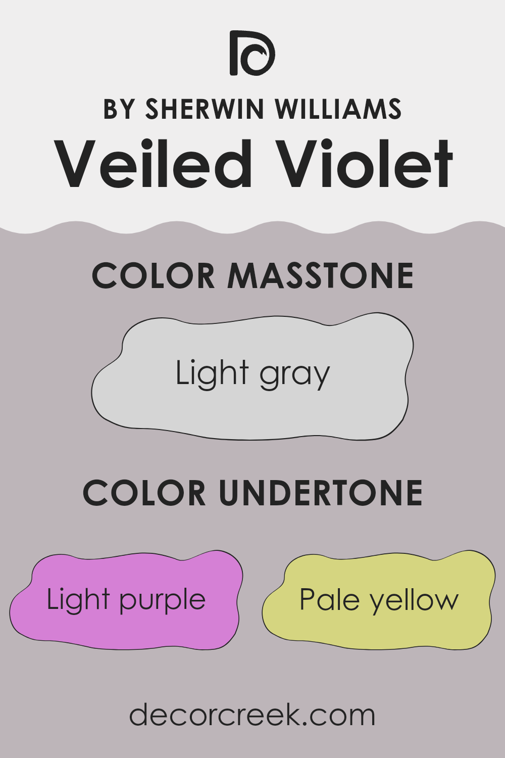
The color Veiled Violet has a fascinating mix of undertones that can subtly influence the perception and mood of any room. Undertones are secondary colors that emerge from the main hue under different lighting conditions, and they can significantly affect how a color looks on walls. Veiled Violet has undertones of light purple, pale yellow, light blue, pale pink, lilac, mint, and grey. Each undertone can bring out different feelings and change how the main color is perceived.
For example, the light purple and lilac undertones add a gentle and cozy feel, making the environment feel more welcoming. The pale pink undertone provides a soft, warm touch, which can make a room seem more comforting. Light blue and mint undertones introduce a subtle freshness, potentially making a room feel more airy and open.
Meanwhile, pale yellow can brighten the area subtly, adding a hint of sunshine and cheerfulness. The grey undertone serves as a balancing element, ensuring that the color doesn’t become too overpowering and maintains a neutral base that is flexible and easy to incorporate with various decor styles.
When you use Veiled Violet on interior walls, these undertones interact with both natural and artificial light, shifting in visibility throughout the day. Rooms with plenty of natural light may bring out the cooler blues and mints, while artificial lighting can enhance warmer tones like pink and yellow.
This shift can make Veiled Violet an adaptable choice, adjusting to different settings and complementing a wide range of furniture and accents. Understanding these undertones can help you choose the right decoration elements to achieve the desired atmosphere in your room.
What is the Masstone of the Veiled Violet SW 6268 by Sherwin Williams?
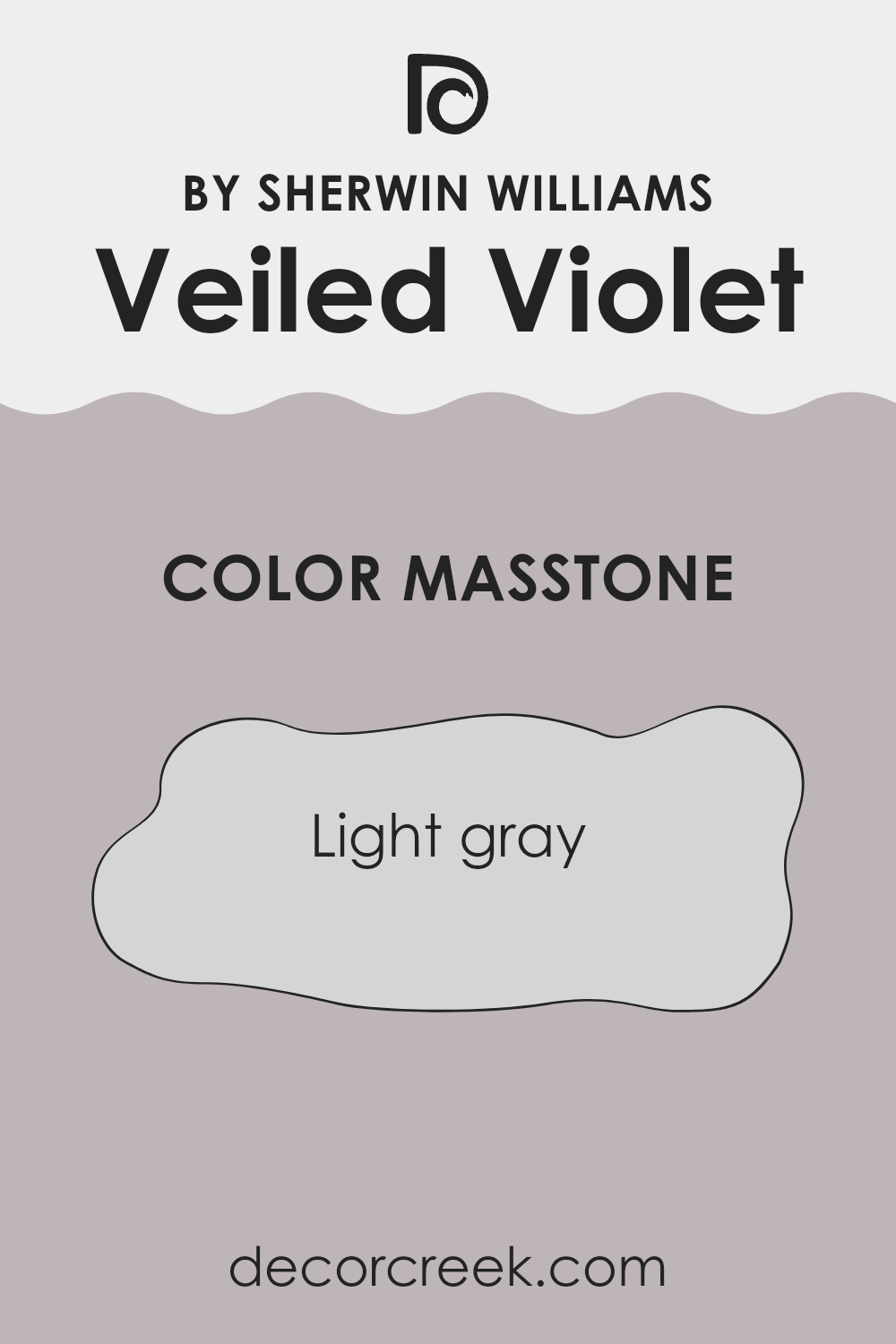
Veiled Violet, with a masstone of light gray, is an adaptable color for home interiors. This light gray shade provides a neutral base that can easily blend with various decor styles and colors without overpowering them.
Its subtle gray tone gives rooms a fresh and clean look, making rooms appear larger and more open—perfect for small rooms or areas with limited natural light. Additionally, the neutral nature of light gray allows for flexibility in changing accessories or accents without the need for a complete repaint.
Consequently, homeowners can update their room seasonally or as trends change, simply by adjusting smaller decor elements like cushions, artworks, or rugs. This adaptable color is practical for those who enjoy refreshing their living environment without extensive renovations, making it a popular choice for both living areas and bedrooms.
How Does Lighting Affect Veiled Violet SW 6268 by Sherwin Williams?
Lighting plays a crucial role in how we perceive colors, and different types of light can significantly influence the appearance of a paint color on walls. The color in question, Veiled Violet, can look quite different depending on the lighting situation.
In artificial light, such as LED or incandescent bulbs, Veiled Violet tends to appear warmer and deeper. The purple tones become more pronounced, making the color more cozy and welcoming. This makes it a great choice for rooms where you want to create a comfortable, inviting atmosphere, especially in living areas or bedrooms where artificial light is often used in the evenings.
In natural light, Veiled Violet can change throughout the day. In a room with lots of sunlight, the color might look lighter and show more of its gray undertones, giving it a more subtle and soft appearance. This can make a room feel airy during the day when illuminated by natural light.
The orientation of the room also affects how this color is seen:
- North-facing rooms: These rooms get less direct sunlight, which can make Veiled Violet look more muted and shadowy. The cooler, bluish light can enhance the gray qualities of the color, making it appear more subdued.
- South-facing rooms: These rooms are flooded with warm, bright light for most of the day, which can make Veiled Violet look lighter and more vibrant. The warmth of the light brings out the purple hues beautifully.
- East-facing rooms: Morning light in these rooms is usually bright and warm, making Veiled Violet look vibrant and soft in the mornings but potentially darker and cooler as the day progresses.
- West-facing rooms: Evening light in these rooms is warm and golden, which can make Veiled Violet appear richer and more dynamic toward the end of the day.
Therefore, when choosing where to paint this color, consider how the lighting changes throughout the day and how it might affect the mood you want to create in each room.
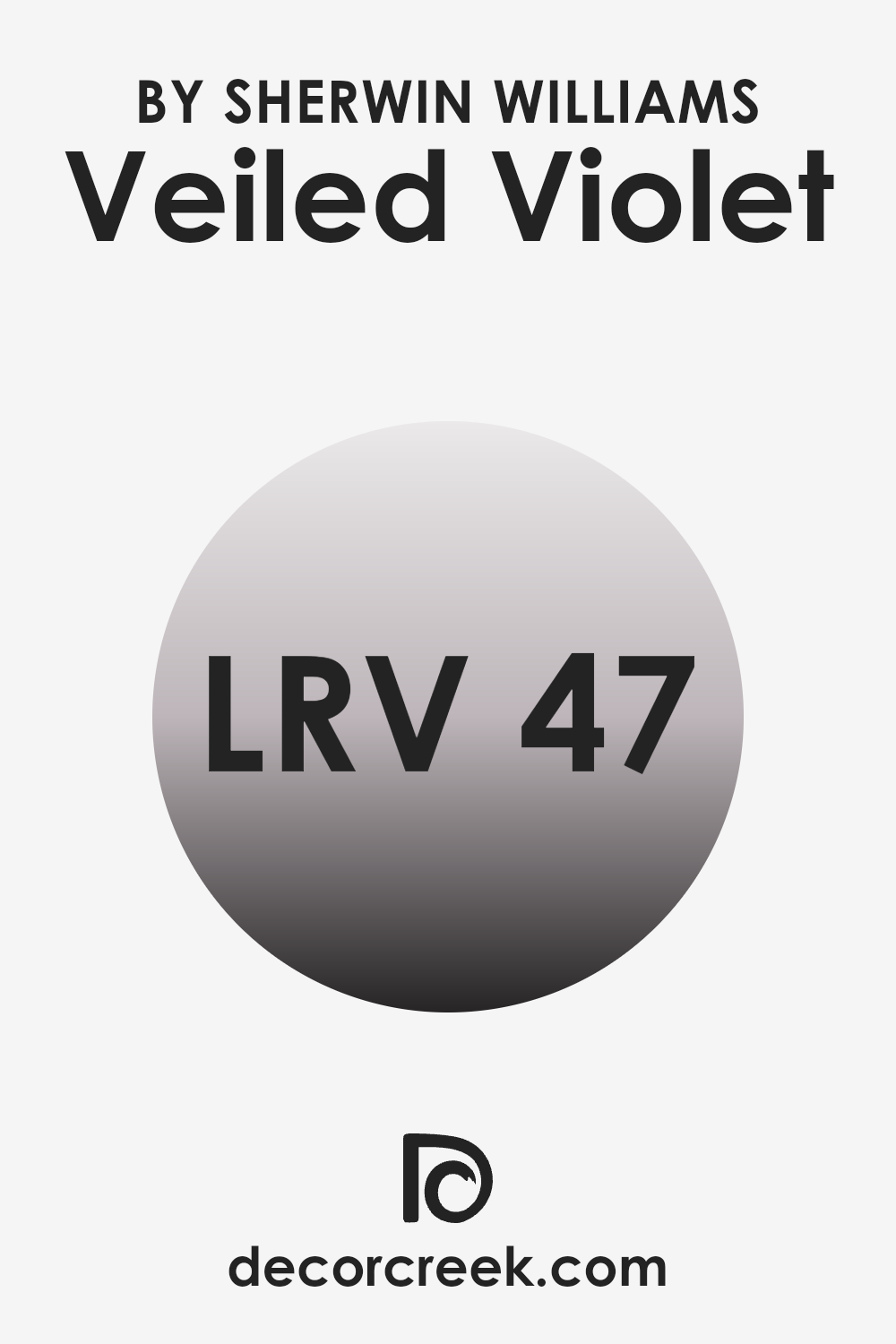
What is the LRV of Veiled Violet SW 6268 by Sherwin Williams?
LRV stands for Light Reflectance Value, which is a measure used to show how much light a color will reflect when it’s painted on a wall. It’s a scale used in decorating to help choose the right shade for a room. A higher LRV means the color reflects more light, making it appear lighter and can make a room feel airy and bigger. Conversely, a lower LRV means the color reflects less light, appearing darker and can make a room feel cozier or smaller.
The LRV of Veiled Violet is 47.126, which places it in the medium range of light reflectance. This means it doesn’t reflect too much light nor does it absorb too much, making it an adaptable color choice for rooms that don’t have a lot of natural light or are of average size.
In rooms with moderate light, Veiled Violet will offer a balanced appearance, not too bright and not too dark, thus maintaining a steady ambiance without feeling overpowering. This makes it a good choice for living rooms, bedrooms, or any room where a neutral, calming presence is needed on the walls.
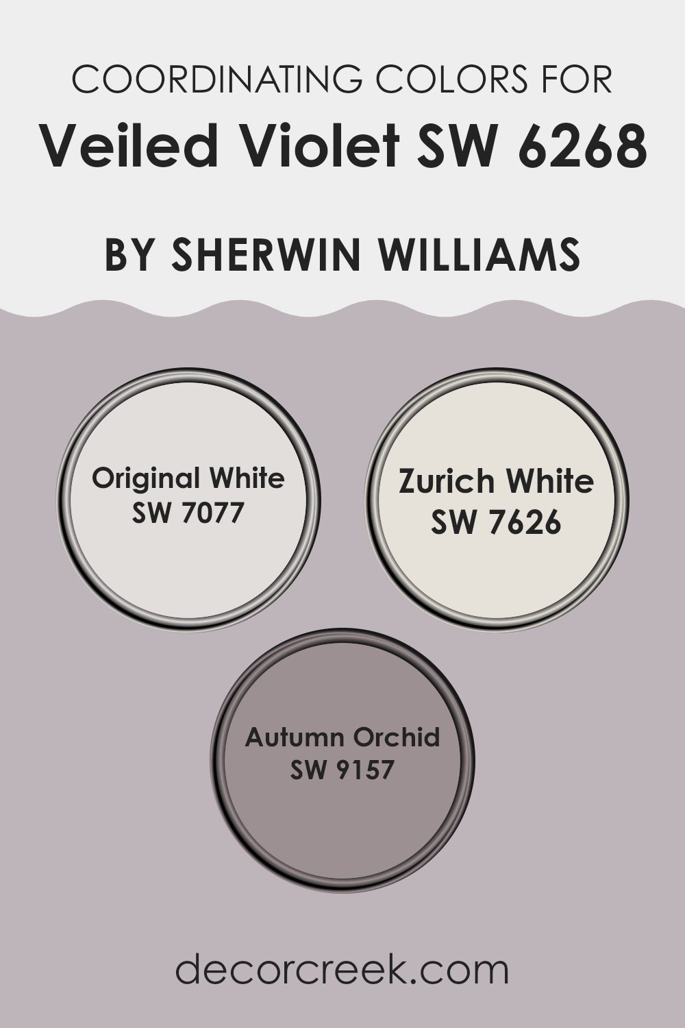
Coordinating Colors of Veiled Violet SW 6268 by Sherwin Williams
Coordinating colors are those that complement each other well and create a visually appealing palette when used together in decor. They are chosen based on their ability to support and enhance the main color, providing balance and harmony to a room. For instance, Veiled Violet by Sherwin Williams, a soft and subtle shade, pairs beautifully with specific coordinating colors that accent or contrast with its unique tone effectively.
Original White (SW 7077) is a clean and refreshing white that provides a crisp contrast to Veiled Violet, making it ideal for trim or ceilings to give a fresh and airy feel to any room. Zurich White (SW 7626) has a slightly warmer tone that offers a smooth transition between the bolder hues and the more understated accents in a room, acting as an adaptable backdrop for various design elements.
Autumn Orchid (SW 9157) is another coordinating color which leans toward a gentle pink, providing a soft complement to the deeper violet, adding a touch of warmth and subtle color to enhance the overall look of the decor. These colors work together to create an inviting room that is both cohesive and stylish.
You can see recommended paint colors below:
- SW 7077 Original White
- SW 7626 Zurich White
- SW 9157 Autumn Orchid
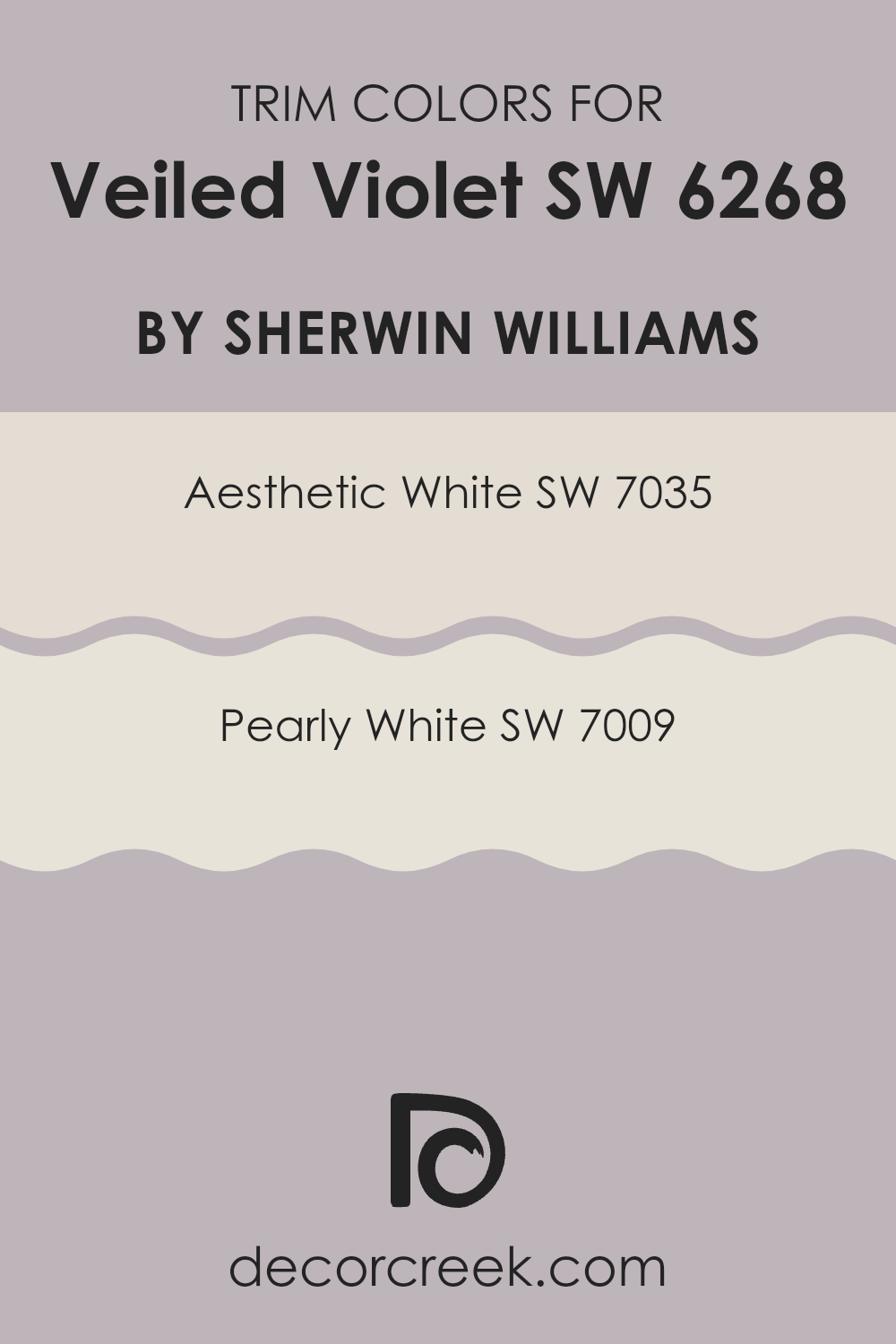
What are the Trim colors of Veiled Violet SW 6268 by Sherwin Williams?
Trim colors are used to highlight and define the edges, frames, and transitional areas of a room, such as door frames, window sills, and baseboards. They create visual boundaries that can either subtly complement or strikingly contrast the main wall colors, thereby enhancing the overall appearance of a room.
For a wall color like Veiled Violet, choosing the right trim color is key to achieving a balanced look. Trim colors like Aesthetic White and Pearly White are excellent choices as they provide a clean, crisp border that can make the rich tones of the violet stand out while keeping the room feeling light and well-coordinated.
Aesthetic White SW 7035 is a soft, off-white with a slight undertone of beige that provides a gentle contrast without overpowering the gentle purple hues of Veiled Violet. It offers a warm and inviting feel, which makes the room comfortable and appealing.
On the other hand, Pearly White SW 7009 has a subtle pearl-like finish that gives it a lustrous quality, adding a touch of brightness around the windows and doors that can enhance natural light reflections, giving the room a fresh, airy feel. Both colors support the primary hue in different but complementary ways, contributing to a harmonious interior palette that is pleasing to the eye.
You can see recommended paint colors below:
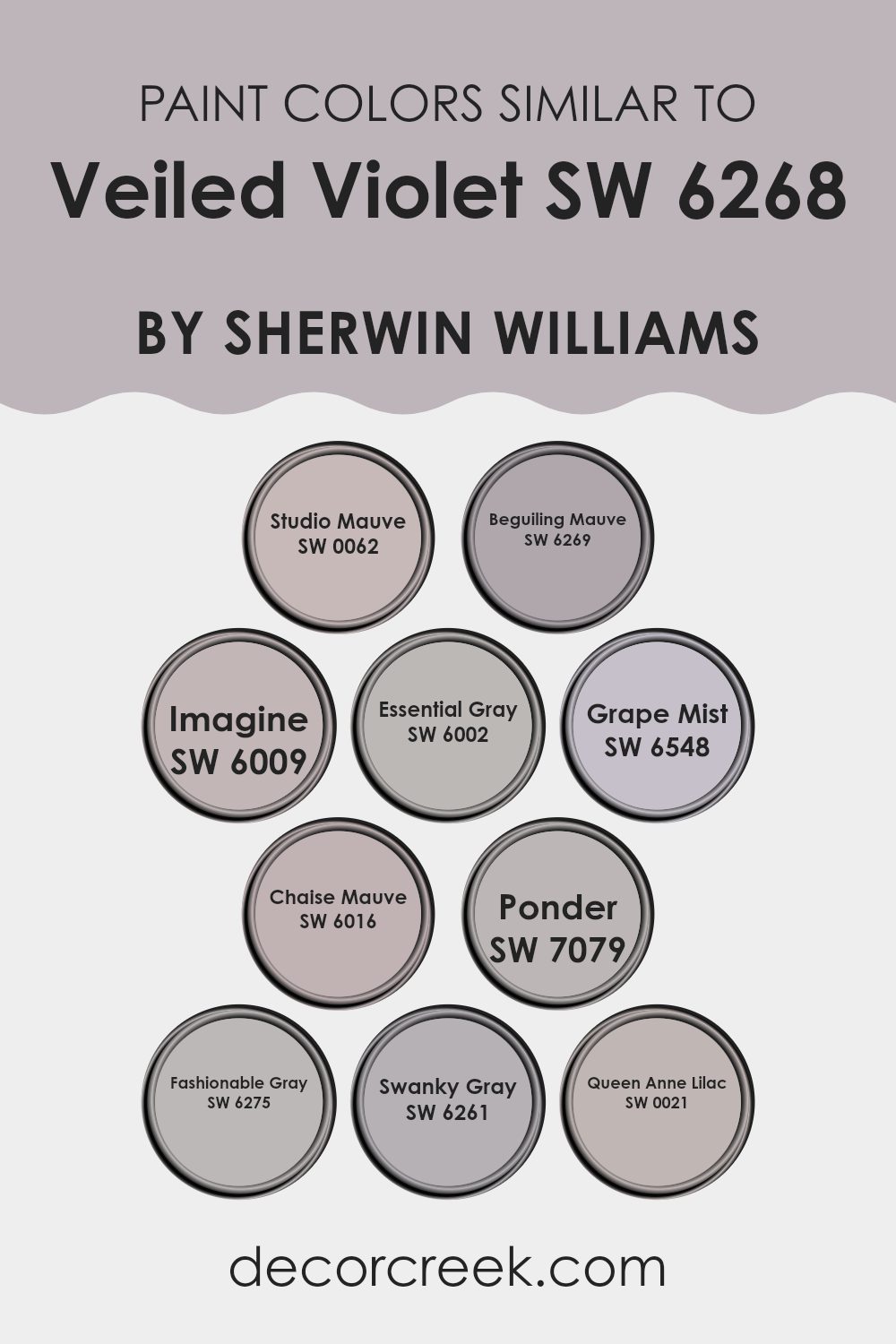
Colors Similar to Veiled Violet SW 6268 by Sherwin Williams
Similar colors are important in design as they create a cohesive and harmonious look, making rooms feel more connected and pleasing to the eye. When used effectively, similar colors can add depth and interest without feeling overpowering. For example, colors around Veiled Violet like Studio Mauve have a gentle, muted quality that works beautifully in rooms aiming for a subtle yet inviting atmosphere.
Beguiling Mauve and Imagine follow this theme, providing slightly different hues that maintain the softness and warmth essential for creating a cozy environment. Essential Gray and Grape Mist offer a slight shift toward a cooler palette, introducing a refreshing contrast while staying close to the base color family. This subtle variation can help in defining different areas within the same room while keeping the overall look unified.
Moving into deeper tones, Chaise Mauve presents a richer, more pronounced mauve that draws the eye and adds a touch of refinement. Ponder and Fashionable Gray push toward a more grounded, earthy feel, suitable for those looking to add a bit of mystery and depth to their interiors.
Swanky Gray and Queen Anne Lilac provide neutral options with a hint of underlying complexity, perfect for pairing with more vibrant accents or for use in a monochromatic scheme. These colors collectively show the power of using similar hues to create a visually cohesive room that feels both integrated and interesting. Such selections make it possible to achieve a balanced, visually appealing environment without the need for dramatic color contrasts.
You can see recommended paint colors below:
- SW 0062 Studio Mauve
- SW 6269 Beguiling Mauve
- SW 6009 Imagine
- SW 6002 Essential Gray
- SW 6548 Grape Mist
- SW 6016 Chaise Mauve
- SW 7079 Ponder
- SW 6275 Fashionable Gray
- SW 6261 Swanky Gray
- SW 0021 Queen Anne Lilac
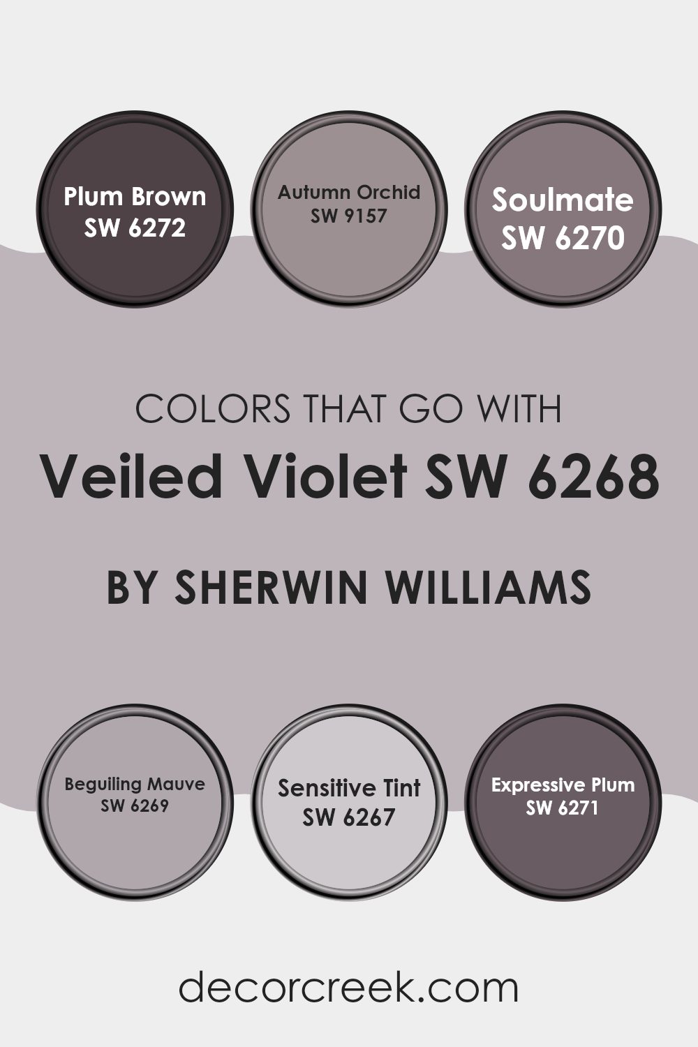
Colors that Go With Veiled Violet SW 6268 by Sherwin Williams
Choosing the right accompanying colors for Veiled Violet SW 6268 by Sherwin Williams is crucial because they help create a cohesive and appealing color scheme in any room. Colors that harmonize with Veiled Violet can set a mood, highlight architectural features, and improve the overall look of a room.
Veiled Violet is a distinctive shade, and pairing it with colors like Plum Brown, Autumn Orchid, Soulmate, Beguiling Mauve, Sensitive Tint, and Expressive Plum can produce a range of effects, from calming to dramatic, depending on the desired ambiance of the room.
For instance, pairing Veiled Violet with Plum Brown, a deep, rich color, brings in a strong sense of depth and warmth, making it ideal for a cozy, inviting area. Autumn Orchid, a lighter, dustier hue, provides a soft contrast that can help rooms feel light and airy yet grounded. Soulmate and Beguiling Mauve are close companions in tone to Veiled Violet, offering a subtle differentiation that can help create an elegant layered look without feeling overpowering.
Meanwhile, Sensitive Tint is a much lighter, almost ethereal color, great for adding a bright, soothing touch that can make smaller rooms appear larger. Finally, Expressive Plum has a vibrant intensity that can act as a focal point in a room or add vibrant flair to an otherwise muted palette. Together, these colors work in harmony with Veiled Violet to create rooms that are both engaging and comfortable.
You can see recommended paint colors below:
- SW 6272 Plum Brown
- SW 9157 Autumn Orchid
- SW 6270 Soulmate
- SW 6269 Beguiling Mauve
- SW 6267 Sensitive Tint
- SW 6271 Expressive Plum
How to Use Veiled Violet SW 6268 by Sherwin Williams In Your Home?
Veiled Violet by Sherwin Williams is a subtle shade of purple that offers a touch of elegance without feeling too overpowering. It’s a flexible color that can work well in different parts of a home.
For instance, using Veiled Violet in a bedroom can create a cozy and inviting atmosphere, helping to promote relaxation and rest. If you’re looking to add some color to your living room, you might consider one accent wall in this shade, which can add a focal point without dominating the room.
In bathrooms or smaller rooms, Veiled Violet can make the area feel warm and welcoming without making it feel smaller. It pairs beautifully with lighter colors like soft whites or grays, allowing for a balanced look. You can also use this color in accessories, such as cushions, curtains, or rugs, to add a subtle pop of color to rooms without the commitment of painting. Overall, Veiled Violet can add a touch of personality to your home in a very accessible and pleasant way.
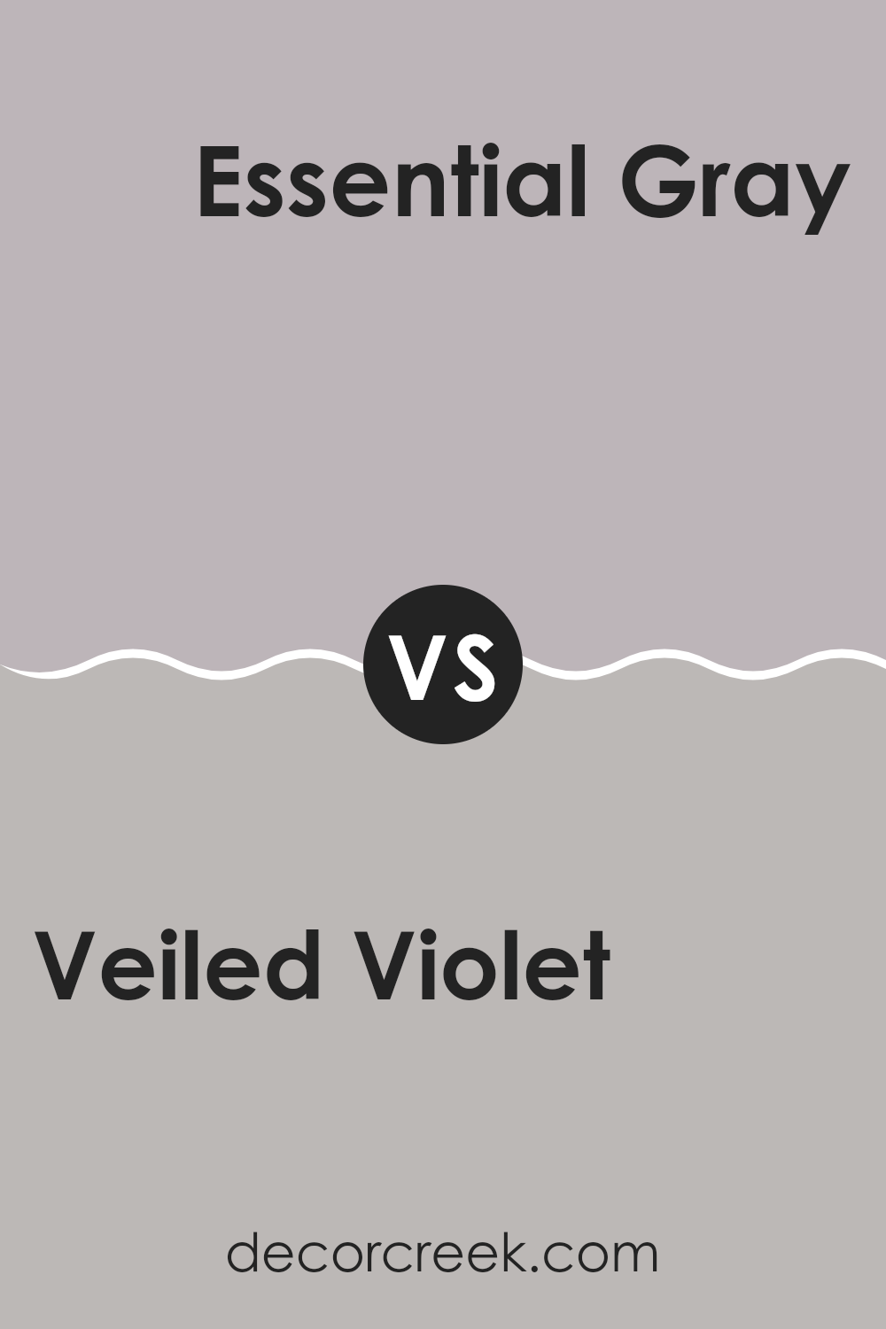
Veiled Violet SW 6268 by Sherwin Williams vs Essential Gray SW 6002 by Sherwin Williams
Veiled Violet by Sherwin Williams is a soft, muted purple with hints of gray, making it a gentle and soothing color. It has a low-key vibrancy that adds a touch of personality without feeling too overpowering, perfect for creating a peaceful and cozy atmosphere in a room.
In contrast, Essential Gray is a neutral gray that offers a clean and classic look. This shade lends a sense of steadiness and subtlety to rooms, acting as a solid foundation for any color scheme. While Veiled Violet brings a warmer, more inviting feel with its subtle purple tones, Essential Gray provides a cooler ambiance that pairs well with a wide range of decorative styles.
Both colors work well for creating calm and relaxed environments, but Veiled Violet adds a hint of color warmth, whereas Essential Gray gives a more straightforward, classic backdrop.
You can see recommended paint color below:
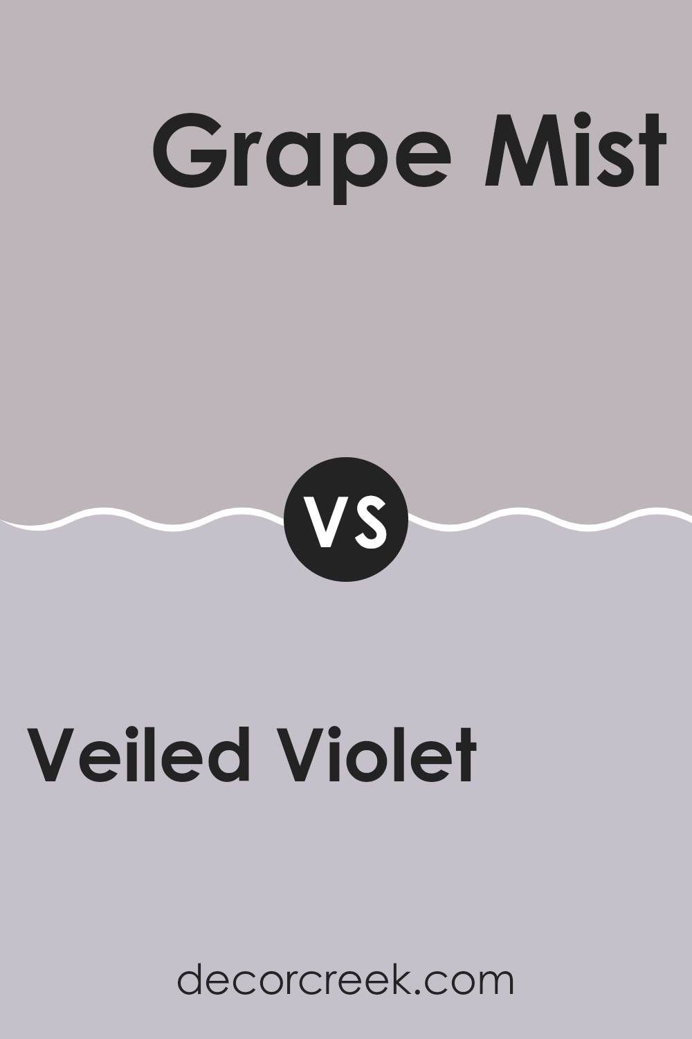
Veiled Violet SW 6268 by Sherwin Williams vs Grape Mist SW 6548 by Sherwin Williams
Veiled Violet and Grape Mist are two unique paint colors from Sherwin Williams. Veiled Violet has a subtle, muted tone that brings a quiet, soothing feel to any room. It’s almost like a soft lavender but with more grey undertones, making it less bright and more calming.
On the other hand, Grape Mist is a livelier color with a stronger presence. It’s closer to a true purple, with hints of blue giving it a fresher, more vibrant look.
While Veiled Violet creates a gentle and reserved ambiance, Grape Mist is more energetic and can make a room feel more lively and cheerful. Both colors are great choices but serve different moods and decor depending on what feel you want in your room.
You can see recommended paint color below:
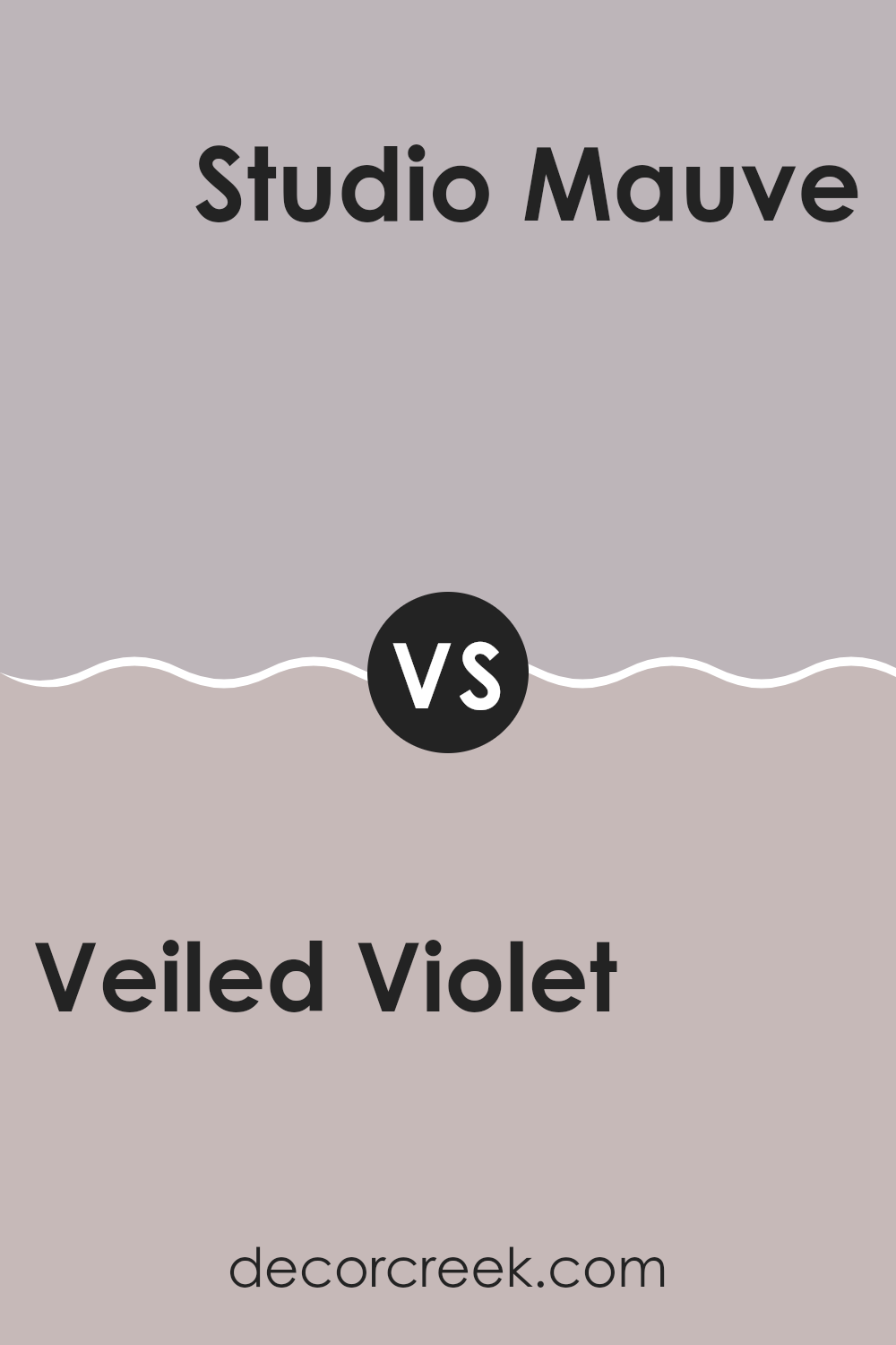
Veiled Violet SW 6268 by Sherwin Williams vs Studio Mauve SW 0062 by Sherwin Williams
Veiled Violet and Studio Mauve, both from Sherwin Williams, offer subtle and soft hues that bring a calm and inviting atmosphere to any room. Veiled Violet is a gentle purple with a slight gray undertone that gives off a very light and airy feeling.
It’s perfect for rooms where you want a hint of color without feeling overpowering. On the other hand, Studio Mauve leans more toward a dusky pink with deeper purple influences, creating a warmer presence that’s cozy and comforting.
While both colors share adaptability fitting for various decor styles, Veiled Violet works well in areas needing a light touch of color, like a nursery or a bathroom. Studio Mauve, however, is excellent for more intimate rooms, such as bedrooms or reading nooks, where its richer hue can make the room feel more enclosed and personal. Depending on the lighting and accompanying decor, each color can offer a unique look to your home.
You can see recommended paint color below:
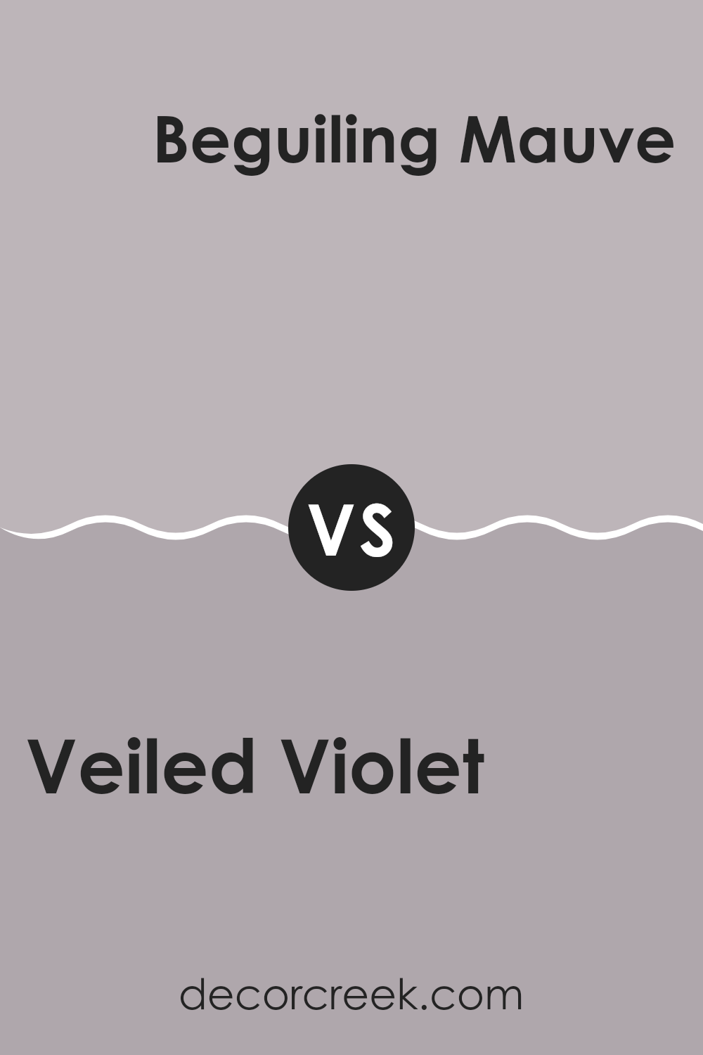
Veiled Violet SW 6268 by Sherwin Williams vs Beguiling Mauve SW 6269 by Sherwin Williams
Veiled Violet and Beguiling Mauve, both by Sherwin Williams, are subtle yet distinct from each other. Veiled Violet has a soft, muted lavender tone that is gentle and refined. It’s an adaptable color, great for creating a calm atmosphere in a room without being too bright or overpowering.
On the other hand, Beguiling Mauve has a warmer undertone, leaning slightly more toward a pinkish hue. This warmth makes it feel inviting and cozy, ideal for rooms where comfort is a priority.
While both colors share a similar lightness and subdued quality, the cooler hints in Veiled Violet suggest a more reserved look, whereas Beguiling Mauve offers a touch of warmth, potentially making a room feel more welcoming. Choosing between them depends on whether you prefer cooler or warmer tones in your decor.
You can see recommended paint color below:
- SW 6269 Beguiling Mauve
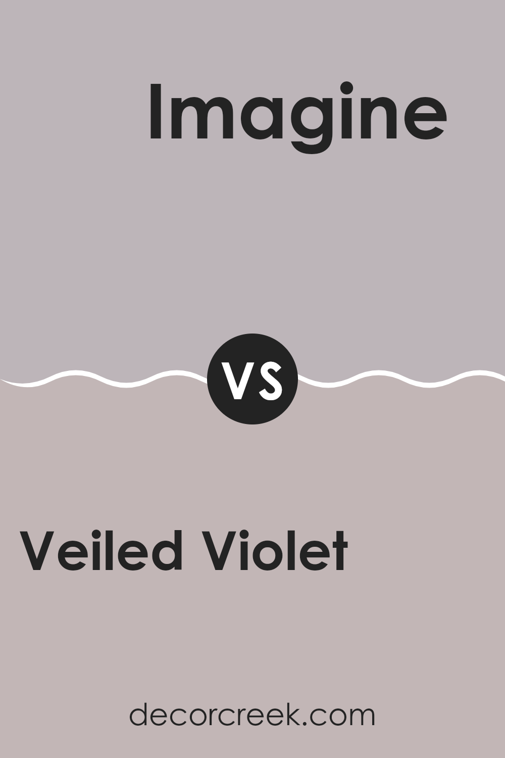
Veiled Violet SW 6268 by Sherwin Williams vs Imagine SW 6009 by Sherwin Williams
Veiled Violet and Imagine are two distinct colors from Sherwin Williams. Veiled Violet is a subtle and gentle shade resembling a soft lavender. This color is light and airy, making it a good choice for a calming atmosphere in rooms like bedrooms or bathrooms.
On the other hand, Imagine is a deeper, dusty gray tone with a hint of green. It’s a more muted color that works well in rooms where you want a touch of neutrality but with a unique twist. Compared to the lightness of Veiled Violet, Imagine offers more weight and can serve as a grounding color in various settings.
Both colors are adaptable but serve different purposes based on their depth and tone. Veiled Violet creates a more open, soft feel, while Imagine sets a more solid, understated mood. Depending on the room and the overall desired effect, either could be a good choice for painting interior walls.
You can see recommended paint color below:
- SW 6009 Imagine
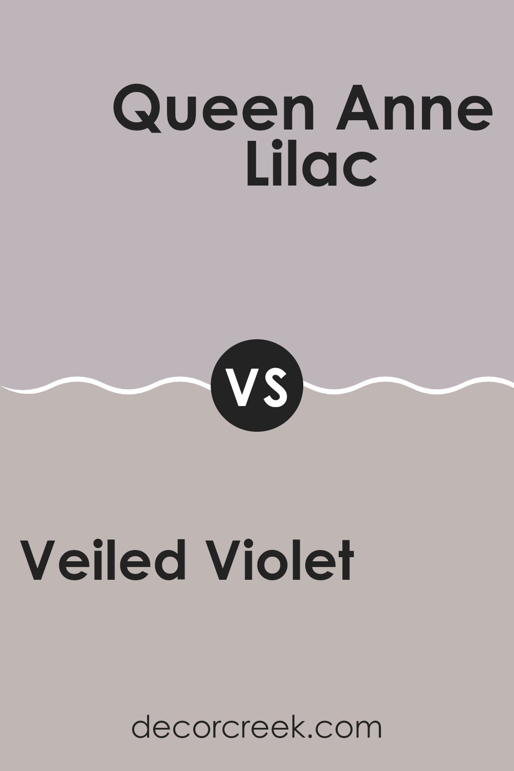
Veiled Violet SW 6268 by Sherwin Williams vs Queen Anne Lilac SW 0021 by Sherwin Williams
Veiled Violet is a subtle and gentle purple that offers a soft, neutral backdrop. It’s not overly bold but has enough depth to add character to a room without feeling overpowering. This hue works well in rooms where you want a touch of color while maintaining a peaceful and understated atmosphere.
On the other hand, Queen Anne Lilac is a brighter and more vivid purple. It leans toward a slightly warmer tone compared to Veiled Violet, making it more striking when used in interior rooms. This color is perfect for areas where you want to make a more noticeable impact or add a cheerful pop of color.
Both colors are forms of purple, but each brings a different mood and energy to a room. Veiled Violet is more reserved and blends effortlessly with other colors, whereas Queen Anne Lilac stands out more and can become a focal point in a design scheme.
You can see recommended paint color below:
- SW 0021 Queen Anne Lilac
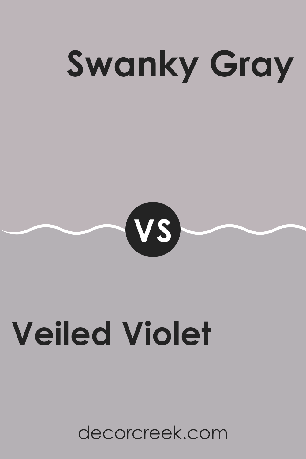
Veiled Violet SW 6268 by Sherwin Williams vs Swanky Gray SW 6261 by Sherwin Williams
Veiled Violet and Swanky Gray are two distinct colors from Sherwin Williams. Veiled Violet has a gentle, understated purple tone with a hint of gray. It’s ideal for creating a soft, calming look in a room, offering a touch of warmth without being too bright.
On the other hand, Swanky Gray presents a darker, more muted gray color. This shade brings a stronger, bolder look but still maintains a neutral and easily adaptable palette for various rooms and styles. While Veiled Violet leans toward a more comforting and mild appearance, Swanky Gray gives a more grounded and steady feel to interiors.
Both colors work well in different settings: Veiled Violet is perfect for relaxed, cozy rooms, and Swanky Gray suits areas that benefit from a sturdier, more pronounced color impact. Regardless of the choice, both hues provide unique possibilities to improve the interior decor.
You can see recommended paint color below:
- SW 6261 Swanky Gray
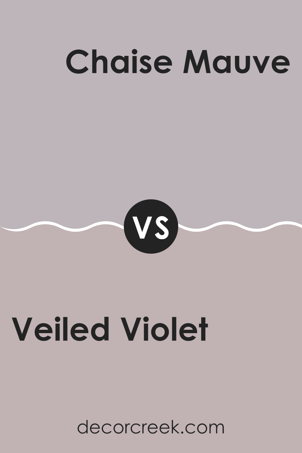
Veiled Violet SW 6268 by Sherwin Williams vs Chaise Mauve SW 6016 by Sherwin Williams
Veiled Violet and Chaise Mauve are both paint colors from Sherwin Williams, but they have different hues and feelings. Veiled Violet is a subtle purple with a gray undertone that gives it a muted, soft look.
It’s gentle and works well in rooms where you want a hint of color without feeling overpowering. On the other hand, Chaise Mauve has a deeper, more distinct mauve tone that feels a bit warmer and richer compared to Veiled Violet.
This makes it a good choice for adding a touch of warmth and color to a room. Both colors are adaptable and can blend nicely with various decor styles, but Veiled Violet leans toward a cooler, more understated look while Chaise Mauve offers a bit more warmth and presence.
You can see recommended paint color below:
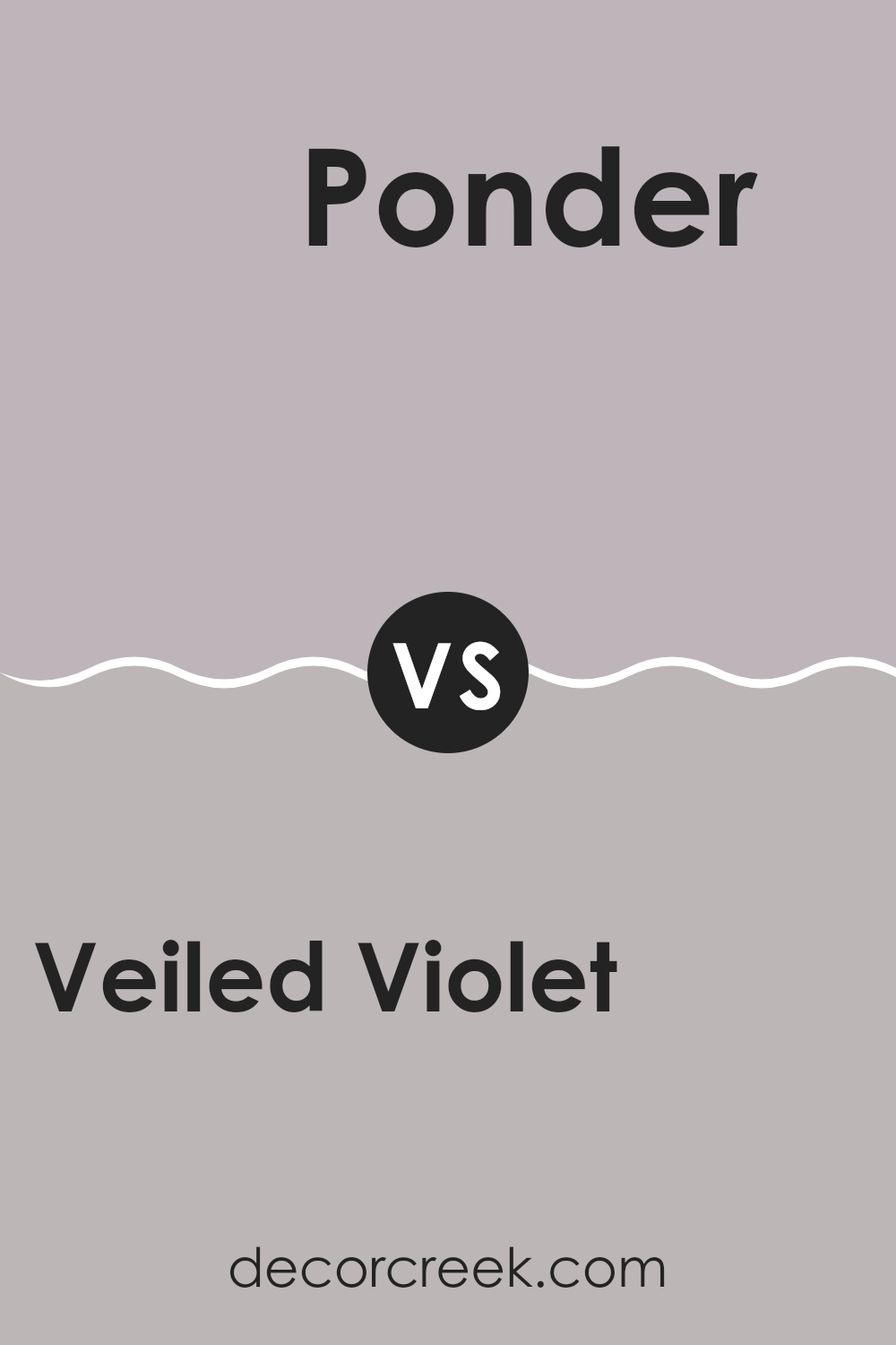
Veiled Violet SW 6268 by Sherwin Williams vs Ponder SW 7079 by Sherwin Williams
Veiled Violet and Ponder, both by Sherwin Williams, present unique hues for various decorating needs. Veiled Violet is a gentle, dusky purple with a subtle, soft quality that can make any room feel cozy and inviting. It works well in bedrooms or lounges where a touch of calm is desired without overpowering the room with color.
On the other hand, Ponder is a deep, smoky gray that offers a strong, neutral base for rooms. This makes it a good choice for areas that need a grounded or balanced feel, like kitchens and offices. While it is dark, it doesn’t feel heavy; rather, it adds a neutral, almost soothing presence that pairs well with brighter colors or works effectively as a standalone shade for a minimalist look.
Both colors add unique vibes to a room: Veiled Violet adds a whisper of color, while Ponder provides a solid, calming gray foundation.
You can see recommended paint color below:
- SW 7079 Ponder
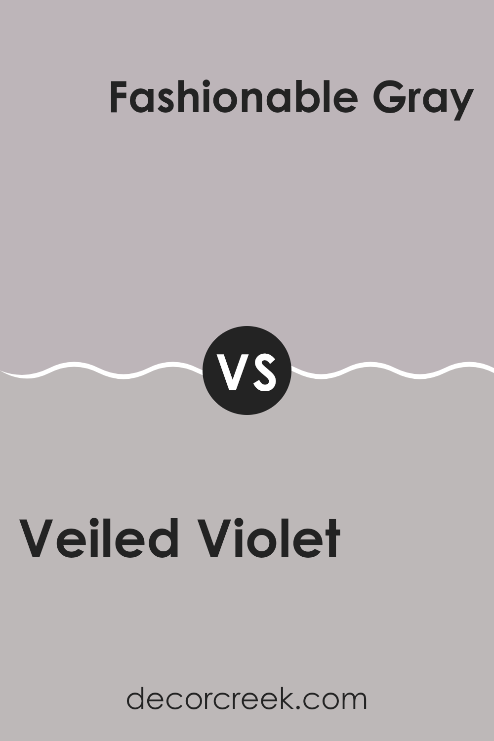
Veiled Violet SW 6268 by Sherwin Williams vs Fashionable Gray SW 6275 by Sherwin Williams
Veiled Violet and Fashionable Gray are two distinct paint colors from Sherwin Williams. Veiled Violet has a gentle, muted tone with a blend of lavender and gray, giving it a soft and subtle appearance. This color is perfect for creating a calm and soothing atmosphere in rooms like bedrooms or quiet study areas. It offers a hint of color while still being understated and adaptable.
On the other hand, Fashionable Gray is a deeper and warmer shade than Veiled Violet. It leans toward a taupe-like gray with subtle brown undertones. This color is great for adding a touch of warmth to a room and pairs well with a wide range of decor styles. It’s excellent for common areas and living rooms as it provides a cozy, welcoming vibe.
Both colors have their unique appeal and can work beautifully in different settings depending on what kind of mood or style you want to achieve. Veiled Violet is lighter and cooler, while Fashionable Gray is darker and warmer.
You can see recommended paint color below:
- SW 6275 Fashionable Gray
After studying SW 6268 Veiled Violet by Sherwin Williams, I’ve gotten to know a lot about this paint color. It isn’t just any purple; it has a special softness that makes rooms feel warm and cozy. Veiled Violet works really well in bedrooms where you want a peaceful feeling, or even in living rooms where it adds a gentle, welcoming vibe.
I found that this color is easy to match with other colors. You can pair it with light yellows, creams, or even grays, and it still looks great. It doesn’t shout for attention but has a calm presence that can make any room look pretty without trying too hard.
Adding this color to a room could be a fun way to change it up without making everything look too bright or too dull. It’s just right. Also, I think it’s a color that can stay on the walls for a long time and you wouldn’t get bored of it because it has such a gentle and nice look.
In conclusion, if you want to paint a room and are looking for a color that’s not too loud but still adds something special, Veiled Violet might be perfect. It makes the room feel cozy and can work with many other colors to create a room that feels just right for chilling out or having friends over.
Ever wished paint sampling was as easy as sticking a sticker? Guess what? Now it is! Discover Samplize's unique Peel & Stick samples.
Get paint samples

