When you are searching for that perfect neutral shade for your home, you might want to consider SW 6002 Essential Gray by Sherwin Williams. I stumbled upon this color during my quest for a subtle yet sophisticated backdrop that could complement any space.
Essential Gray strikes a harmonious balance between warm and cool tones, making it incredibly versatile for any decorating style. Whether you’re looking to refresh your living room, bedroom, or even your kitchen, this color provides a soft, elegant canvas without overwhelming the space.
Decorating with Essential Gray allows you a lot of flexibility; it pairs beautifully with vibrant colors for a lively atmosphere or can be combined with other neutrals for a more serene setting. It’s a reliable choice for those of you seeking a color that seamlessly adapts to different lighting and accompanying décor.
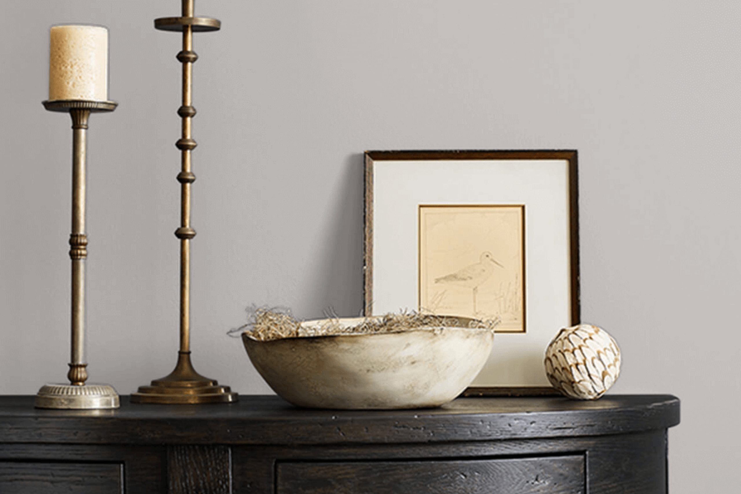
This gray has a gentle depth that can enhance your furniture and art pieces, ensuring they stand out in your space. Let me share more about how Essential Gray can transform your home into a visually delightful and cozy environment.
What Color Is Essential Gray SW 6002 by Sherwin Williams?
Essential Gray is a versatile shade that falls comfortably between a true gray and a subtle beige, making it a perfect neutral background for various interior designs. This warm hue can enhance the coziness of a space while keeping the feel light and airy. It’s an ideal color to create a welcoming ambiance in rooms like living areas, bedrooms, and even in bathrooms to add a gentle, calming atmosphere without being too bold or overpowering.
This color works exceptionally well in minimalistic and Scandinavian style interiors, where the focus is on clean lines and simplicity. It also suits modern farmhouse and transitional decors, serving as an excellent base that complements natural materials such as wood, leather, and linen.
These materials pair seamlessly with Essential Gray by adding earthy and rustic textures that contrast beautifully with its smooth and understated tone. Additionally, metallic accents like brass or chrome can add a touch of luxury to this color, creating a chic, modern look in any space.
In terms of enhancing the aesthetic of a room, Essential Gray pairs well with soft furnishings, such as plush rugs and curtains, to introduce depth and interest. It also matches well with stone elements, like granite or marble, reinforcing a natural yet polished vibe in the interior environment.
Is Essential Gray SW 6002 by Sherwin Williams Warm or Cool color?
Essential Gray is a versatile paint color from Sherwin Williams, perfect for any room in your home. This shade is a soft, light gray that offers a clean and simple look, making it easy to match with different decors and styles. It’s particularly effective in areas where you want to create a calm and inviting atmosphere without using stark whites.
Unlike darker grays, Essential Gray doesn’t make rooms feel smaller or darker. In fact, it can help brighten up spaces that don’t get a lot of natural light. It’s also a great background color that allows furniture and art to really stand out.
Because of its neutral nature, you can pair it with almost any color, from bold and bright hues to more muted tones. Whether you’re painting a bedroom, living room, or even a kitchen, Essential Gray provides a clean, fresh look that adapts well to any setting.
Undertones of Essential Gray SW 6002 by Sherwin Williams
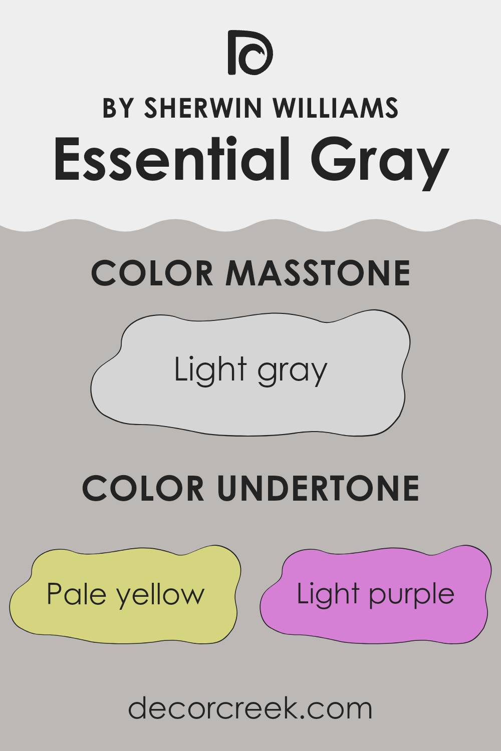
Essential Gray is a versatile paint color celebrated for its adaptability in various home settings. This color intriguingly carries a mix of subtle undertones which significantly influence how it appears under different lighting conditions. These undertones—pale yellow, light purple, light blue, pale pink, mint, lilac, and grey—act like hidden shades that can subtly shift the main color’s appearance.
When light hits Essential Gray, these undertones may become more noticeable. For instance, in a brightly lit room with plenty of natural sunlight, the pale yellow or light blue undertones might make the wall look slightly cooler or warmer. In a room with less natural light or during different times of the day, the cooler undertones like light purple or lilac might become more dominant, giving the walls a distinctively different feel.
Using this paint on interior walls offers a unique experience because of its undertone complexity. In a living room, the pale pink or mint undertones could add a soft welcoming feel, whereas in a study or office, the grey and lilac undertones might help create a calm, focused ambiance. Essential Gray’s ability to reflect these subtle tones makes it a smart choice for those looking to add depth and interest to their walls without employing a heavily saturated color.
Understanding how these undertones interact and affect our perception of the color helps in making informed decisions when choosing the right paint for different rooms. This knowledge ensures the color complements the space and lighting, fitting the atmosphere you want to achieve.
What is the Masstone of the Essential Gray SW 6002 by Sherwin Williams?
Essential Gray, represented by the masstone Light Gray (#D5D5D5), is a versatile color that works well in many types of home settings. Because of its light gray shade, it helps create a clean and subtle backdrop for rooms. This color can make small spaces appear bigger and brighter, as it naturally reflects more light compared to darker hues.
Moreover, the neutrality of Light Gray allows it to blend seamlessly with various decor styles and color schemes. Whether paired with bold colors or soft tones, it maintains balance without overpowering other elements in the room. Homeowners often prefer this color in areas like living rooms, bedrooms, and kitchens where it provides a calm and unobtrusive foundation.
Furthermore, Light Gray is easy to maintain, hiding minor imperfections and smudges better than stark white walls. It’s a practical choice for active spaces, providing a soothing visual comfort and making it a favorable option for a modern, minimalistic home aesthetic.

How Does Lighting Affect Essential Gray SW 6002 by Sherwin Williams?
Lighting significantly influences how colors appear in a space. It can alter the perception of color tones. Essential Gray is a unique neutral hue that reacts differently under various lighting conditions, changing the feel of a room.
Artificial Light vs. Natural Light:In artificial lighting, Essential Gray tends to look slightly warmer. The yellow or warm tones in most indoor lighting can make it appear softer and more inviting. This makes it a good choice for living spaces and bedrooms where a cozy atmosphere is appreciated.
In contrast, natural light brings out the true color of Essential Gray, revealing more of its cool tones. Under the bright, clear light of day, this color can look more crisp and defined. In a room with plenty of sunlight, Essential Gray maintains a more consistent appearance throughout the day.
Room Orientation:
-North-Faced Rooms: These rooms get less direct sunlight, which can make colors appear cooler and sometimes, slightly darker. Here, Essential Gray might seem more muted and shadowy, giving a calm, understated look.
– South-Faced Rooms: This orientation benefits from abundant light for most of the day, which can make Essential Gray look lighter and brighter. It’s an excellent choice for south-facing rooms to keep the space feeling airy and fresh.
– East-Faced Rooms: With sunlight in the morning, Essential Gray will start the day looking lively and warm, then transition to cooler tones as natural light decreases. This dynamic change can add an interesting aspect to a room used mainly in the morning.
– West-Faced Rooms: Evening light in these rooms means Essential Gray will display its cooler tones during the day and become warmer and more welcoming by sunset. This makes west-facing rooms feel vibrant in the evenings.
Understanding these lighting effects can help in deciding where to apply this versatile shade of gray to achieve the desired ambiance in different spaces within a home.
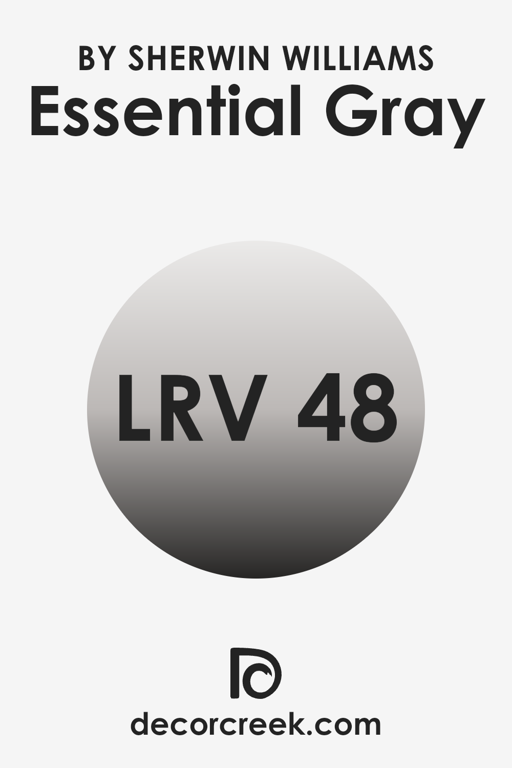
What is the LRV of Essential Gray SW 6002 by Sherwin Williams?
LRV stands for Light Reflectance Value, which is a measurement used to determine how much light a paint color reflects when it is applied to a wall. This scale measures the percentage of light a color will reflect back into a room, helping to understand how bright or dark a space might feel once painted. Essentially, higher LRV values mean the color reflects more light, making the room appear brighter, while lower LRV values mean the color absorbs more light, making the space appear darker.
With an LRV of 48.386, Essential Gray falls roughly in the middle range. It is neither too dark nor too light, making it a versatile choice for interior spaces.
This level of LRV suggests that it can add a moderate amount of brightness to a room but will also provide a certain depth and warmth. The effectiveness of this LRV in changing the perception of the space can vary based on the size of the room, lighting sources, and other colors used in the decor, offering a balanced backdrop for various design styles.
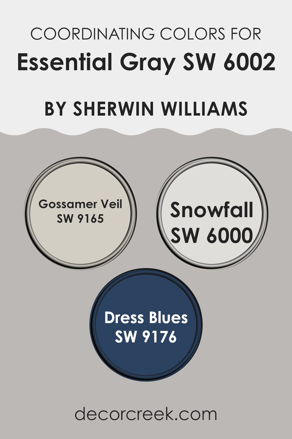
Coordinating Colors of Essential Gray SW 6002 by Sherwin Williams
Coordinating colors are shades that complement a main color, enhancing the overall aesthetic of a space without overpowering the central hue. In the case of a versatile neutral like Essential Gray, coordinating colors are selected to bring balance and subtle variation that enriches the visual appeal. These harmonious colors can vary in tone and saturation but are chosen for their ability to work seamlessly alongside the primary color.
For instance, Gossamer Veil, a soft and airy gray, offers a lighter contrast to Essential Gray, providing a gentle and relaxing feel to any room. It’s like a breath of fresh air in a color palette, perfect for walls in a space where you want a calm and collected atmosphere. Snowfall, another coordinating color, is an almost white, minimalistic shade that brings a crisp and clean look.
It’s excellent for creating a bright and open feel, especially in smaller or darker rooms. Dress Blues, on the other hand, introduces a striking navy blue that adds a dash of boldness and depth, ideal for accent walls or decor elements to inject a bit of drama and freshness without overwhelming the senses. Together, these colors create a balanced and visually pleasant palette when paired with Essential Gray.
You can see recommended paint colors below:
- SW 9165 Gossamer Veil
- SW 6000 Snowfall
- SW 9176 Dress Blues
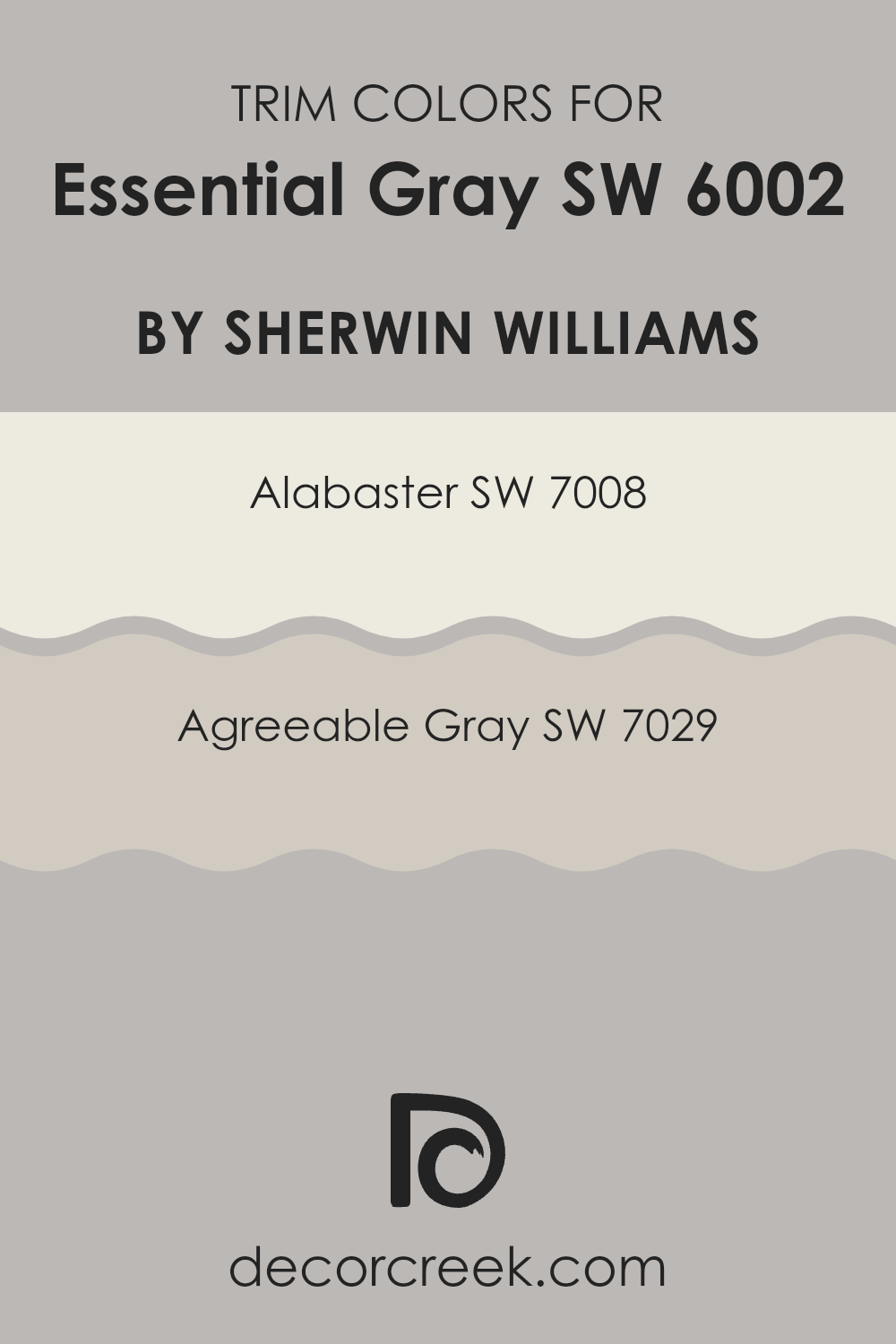
What are the Trim colors of Essential Gray SW 6002 by Sherwin Williams?
Trim colors are complementary or contrasting shades used on the edges and frames around walls, doors, and windows that highlight and define the features of a room. Selecting the right trim color can enhance the appearance of the wall color, creating a clean and finished look.
For example, using trim colors with Essential Gray, a soft and versatile neutral shade, can subtly define the space without overpowering the main color theme. Properly chosen trim colors can also unite various elements within a room, ensuring everything works together harmoniously.
Alabaster SW 7008 is a warm and creamy white that offers a gentle contrast against Essential Gray, making it excellent for trims to create a soft yet effective highlight around doors and ceilings. On the other hand, Agreeable Gray SW 7029 is a warm gray that is slightly deeper than Essential Gray, providing a subtle differentiation that is both pleasing and harmonious.
This color can be used on trim to add depth and complexity to the spaces, making architectural details stand out with a quiet elegance. Together, these trim colors can enhance the main wall color by adding layers and interest to the décor without overwhelming the primary palette.
You can see recommended paint colors below:
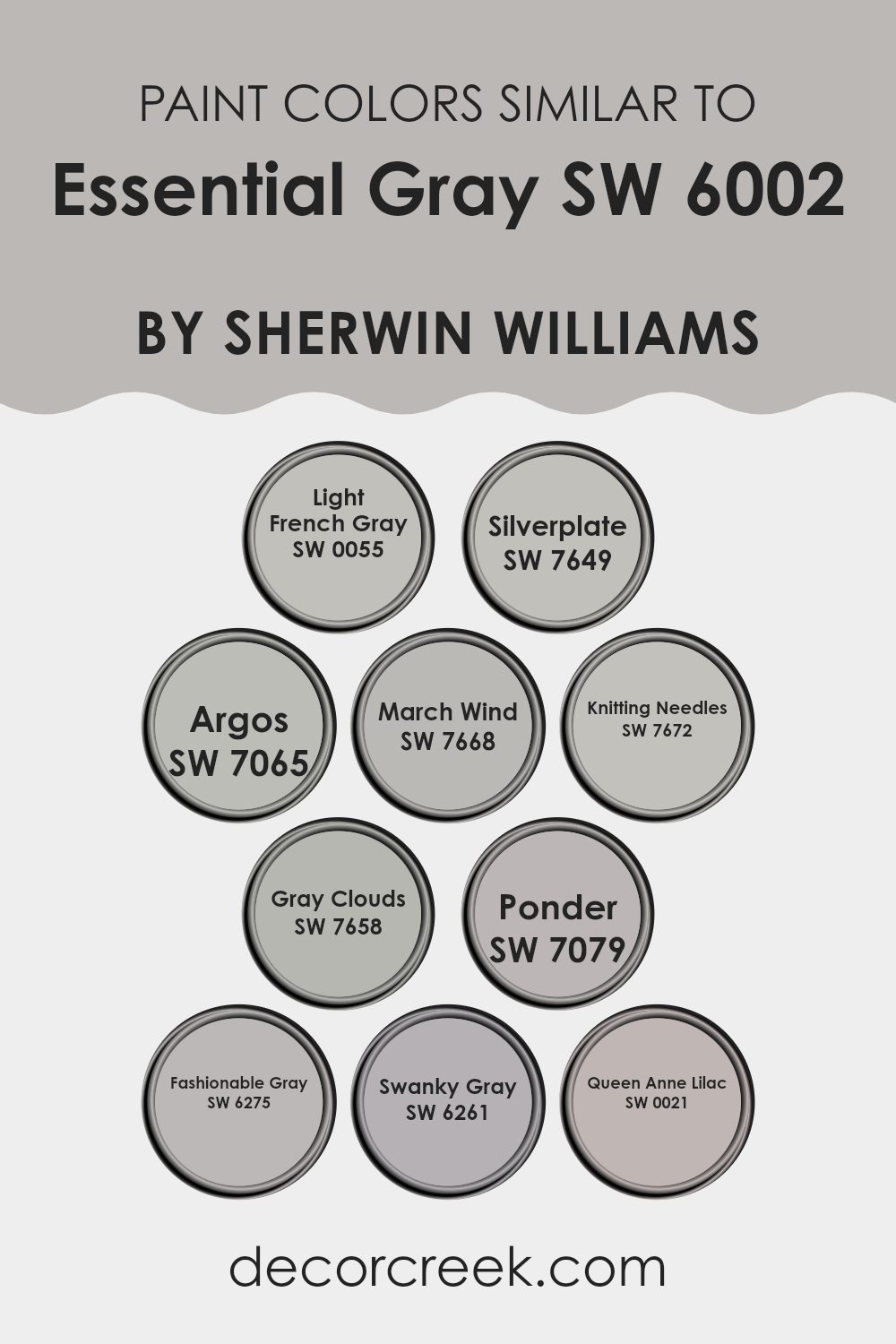
Colors Similar to Essential Gray SW 6002 by Sherwin Williams
Similar colors are crucial in design because they help create a sense of harmony and balance. When colors such as those similar to Essential Gray by Sherwin Williams are used together, they provide a subtle variation that can make spaces feel more cohesive and pleasing to the eye. These shades, which range from lighter to darker tones, work together by blending seamlessly. This is especially important in spaces where you want a neutral backdrop that still offers some depth and interest.
Light French Gray offers a soft, airy vibe that gently complements the sturdier Essential Gray, creating a soothing palette. Silverplate is a subtly sophisticated grey that gives a clean and understated look to any space.
Argos presents a deeper tone, perfect for adding a bit of drama without overwhelming a room. March Wind has a slightly bluish tint, lending cool undertones that are ideal for a calm, collected atmosphere. Knitting Needles is another cool grey that bridges the gap between light and shadow, perfect for nuanced visual spaces.
Gray Clouds lives up to its name with a light, nimble presence that refreshes a space. Ponder is a deeper gray that offers a strong anchor within a palette of lighter hues. Fashionable Gray strikes a balance between bold and discreet, making it versatile for various applications.
Swanky Gray leans towards a slick, modern look that can enhance contemporary designs. Lastly, Queen Anne Lilac is an unexpected twist with its dusky lilac undertones, providing a unique yet harmonious complement to the gray spectrum. Together, these colors provide a spectrum that can enhance any design project with grace and fluidity.
You can see recommended paint colors below:
- SW 0055 Light French Gray
- SW 7649 Silverplate
- SW 7065 Argos
- SW 7668 March Wind
- SW 7672 Knitting Needles
- SW 7658 Gray Clouds
- SW 7079 Ponder
- SW 6275 Fashionable Gray
- SW 6261 Swanky Gray
- SW 0021 Queen Anne Lilac
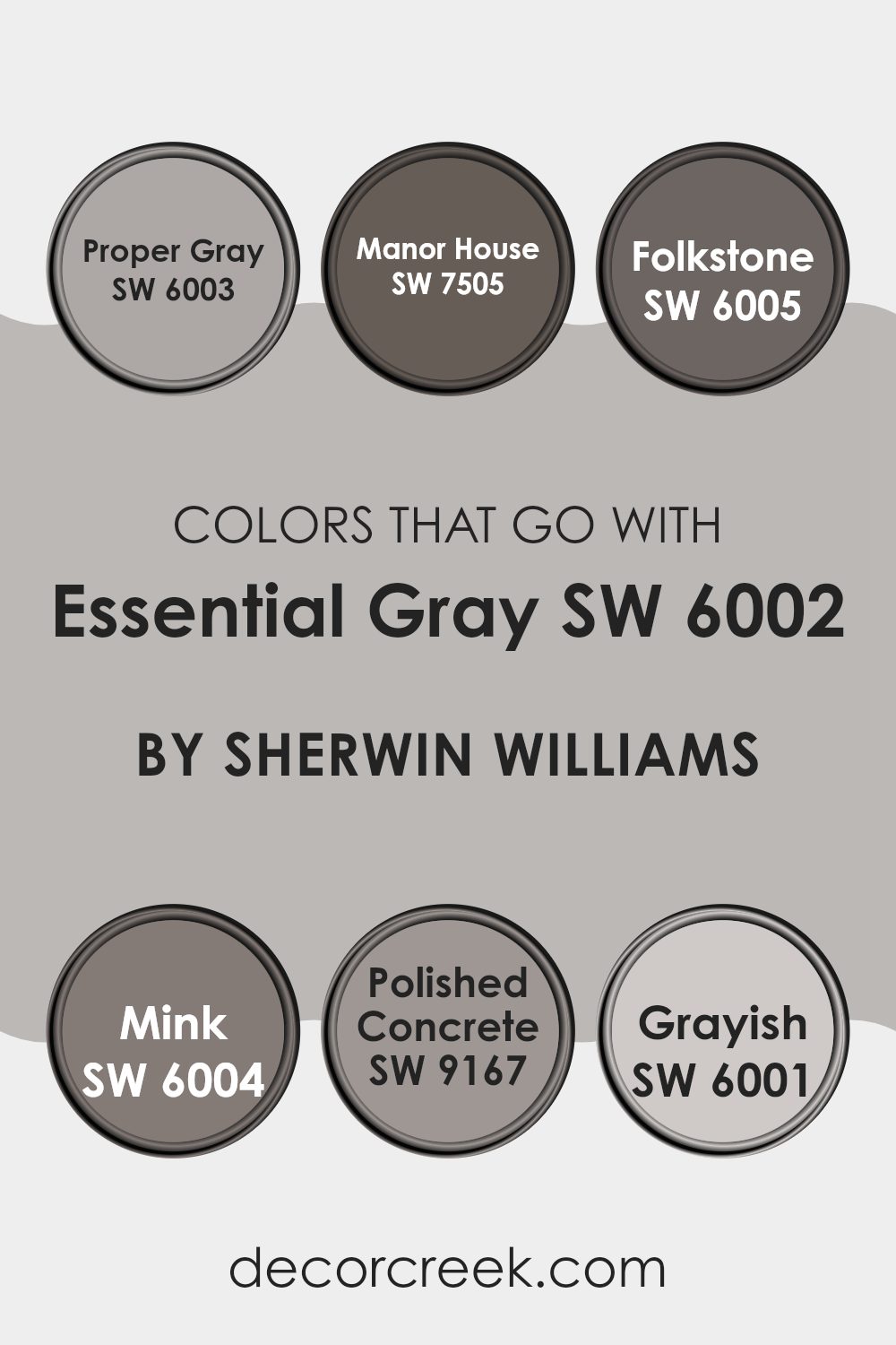
Colors that Go With Essential Gray SW 6002 by Sherwin Williams
Choosing the right colors to pair with Essential Gray SW 6002 by Sherwin Williams is crucial for creating a harmonious and aesthetically pleasing environment. Essential Gray is a versatile neutral that serves as a perfect backdrop for a variety of hues, allowing for a cohesive look in any space. Different complementary colors can manipulate the perception of space and light, accentuating architectural details, or creating desired moods.
Proper Gray SW 6003 is a slightly cooler shade of gray that enhances the neutrality of Essential Gray, making it ideal for a subtle contrast that maintains a calm setting. Manor House SW 7505 has a deeper, more defined tone, bringing a sense of depth and richness to spaces that pair with the lighter Essential Gray.
Folkstone SW 6005, a mid-tone gray, provides a smooth transition between light and dark shades, ensuring that the area feels put-together and balanced. Mink SW 6004 adds a hint of warmth with its deeper, richer tone, making it great for adding dimension.
Polished Concrete SW 9167 matches the modern vibe, offering a clean and contemporary look, while Grayish SW 6001 offers a lighter, almost off-white hue that brightens spaces beautifully when combined with Essential Gray. Together, these colors work seamlessly to create stylish, cohesive, and inviting environments.
You can see recommended paint colors below:
- SW 6003 Proper Gray
- SW 7505 Manor House
- SW 6005 Folkstone
- SW 6004 Mink
- SW 9167 Polished Concrete
- SW 6001 Grayish
How to Use Essential Gray SW 6002 by Sherwin Williams In Your Home?
Essential Gray by Sherwin Williams is a beautiful neutral shade that offers flexibility in home decoration. This light gray color is soft enough not to overpower a room but still adds a touch of character. It’s perfect for a variety of spaces, whether you’re painting a busy living room or a quiet bedroom.
One way to use Essential Gray is by painting all the walls in a room to create a neutral backdrop. This calm tone pairs well with both bright colors and darker hues, allowing for easy matching with your furniture and decor. Alternatively, you could use it on an accent wall to highlight a particular area of your room, like behind a bed or a sofa.
The color also works well in a bathroom or kitchen, giving these spaces a fresh and clean look. Because of its subdued nature, Essential Gray can make small rooms appear bigger and more open. Consider using it in well-lit areas to maximize its light-reflecting properties, making your home feel airy and pleasant.
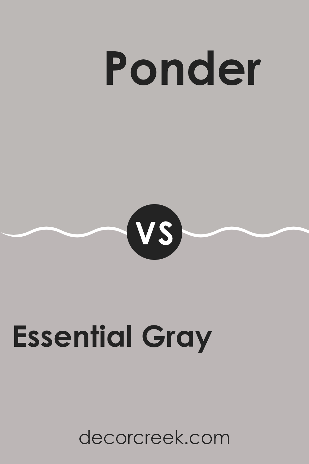
Essential Gray SW 6002 by Sherwin Williams vs Ponder SW 7079 by Sherwin Williams
Essential Gray and Ponder are both intriguing shades from Sherwin Williams. Essential Gray, though named “gray,” has subtle beige undertones, creating a warm and welcoming feel. It’s a versatile color that fits well in spaces designed for calmness and simplicity.
On the other hand, Ponder is a deeper gray that leans towards the cooler side, presenting a more defined and slightly moodier atmosphere. This color can add a touch of drama without overwhelming a room, making it suitable for areas where a bit of depth is desired.
Both colors work beautifully in modern home decor styles but serve different purposes based on the mood you want to achieve. Essential Gray is excellent for creating a light, airy feel, while Ponder is ideal for adding a stronger, more defined presence in a space.
You can see recommended paint color below:
- SW 7079 Ponder
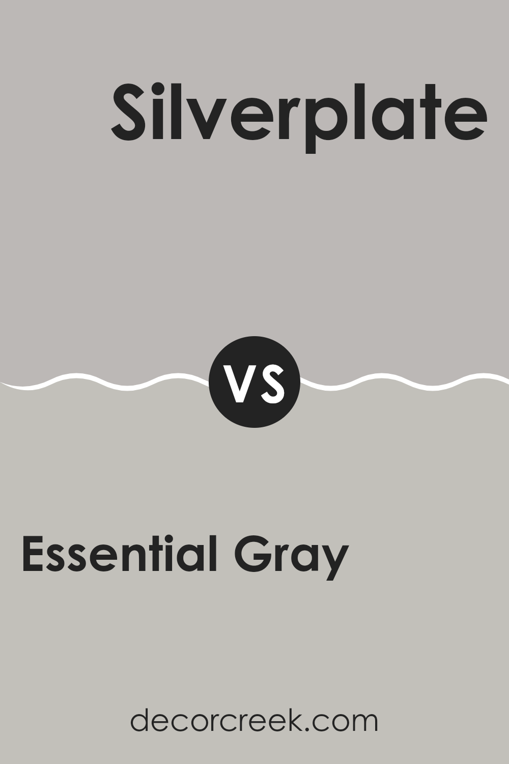
Essential Gray SW 6002 by Sherwin Williams vs Silverplate SW 7649 by Sherwin Williams
Essential Gray and Silverplate by Sherwin Williams are two versatile paint colors that make it easy to create a modern and stylish space. Essential Gray offers a soft, warm tone that can make any room feel cozy and inviting. It’s slightly taupe, providing a perfect backdrop whether you’re looking to achieve a subtle, relaxed environment or wanting to display artwork that needs a calm background.
On the other hand, Silverplate presents a cooler shade, leaning more toward a true, sleek gray. This color is ideal for a contemporary setting, reflecting more light and giving spaces a fresh, clean look. It works exceptionally well in areas that receive a lot of natural light or in rooms where a sense of openness is desired.
Both colors are neutral, allowing for easy matching with a variety of decor styles and colors. Whether you choose the warmth of Essential Gray or the cooler tones of Silverplate depends on the mood you wish to create in your space.
You can see recommended paint color below:
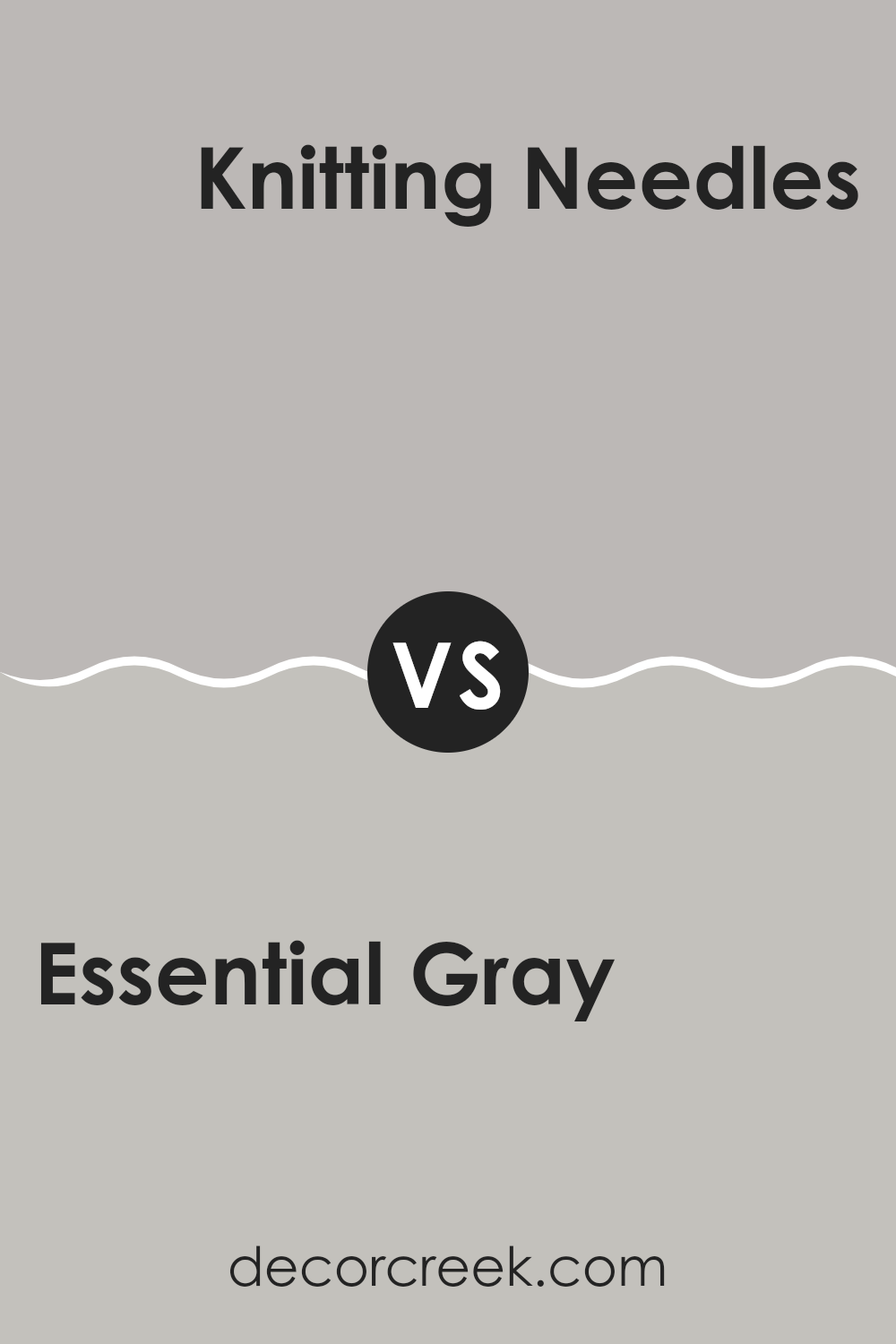
Essential Gray SW 6002 by Sherwin Williams vs Knitting Needles SW 7672 by Sherwin Williams
Essential Gray and Knitting Needles by Sherwin Williams are two neutral colors, but they hold distinct tones and vibes for any space. Essential Gray is a warm gray shade that leans towards creamy when matched with brighter tones. It provides a soft, welcoming feel to a room, making it cozy and comfortable. This color works well in areas where you want a light, airy feel without going too stark or cold.
On the other hand, Knitting Needles has a cooler hue, appearing almost like a grayish silver. It’s perfect for modern spaces that aim for a minimalist, clean look. This shade pairs well with bold or vibrant colors, providing a balanced backdrop that allows other colors to stand out.
Both these shades are versatile but serve different aesthetic purposes. Essential Gray is better for a softer, warmer atmosphere, while Knitting Needles fits a cooler, more contemporary space.
You can see recommended paint color below:
Essential Gray SW 6002 by Sherwin Williams vs Gray Clouds SW 7658 by Sherwin Williams
Essential Gray and Gray Clouds are both gray colors from Sherwin Williams but have different tones and feels. Essential Gray has a warm undertone, making it cozy and inviting, perfect for living spaces or bedrooms where comfort is key. This color pairs well with a variety of decor styles, adding a subtle warmth to the room.
On the other hand, Gray Clouds is a lighter gray that appears fresh and airy, making it excellent for smaller or less brightly lit spaces to make them feel more open and spacious. It works well in bathrooms or kitchens where a clean, crisp look is desired.
Both colors are versatile and can help to create a calm, neutral backdrop for any room. However, your choice between them would depend on the amount of natural light in your space and whether you prefer a warmer or cooler hue. Essential Gray adds a touch of warmth, while Gray Clouds keeps things cool and refreshing.
You can see recommended paint color below:
Essential Gray SW 6002 by Sherwin Williams vs Light French Gray SW 0055 by Sherwin Williams
Essential Gray and Light French Gray are two popular gray shades from Sherwin Williams, but they have distinct tones and vibes. Essential Gray is a warmer gray, giving off a cozy and inviting feel, which makes it perfect for living rooms or bedrooms.
It has a slightly earthy undertone that adds a gentle richness to the space. On the other hand, Light French Gray stands out as a cooler shade, which looks more modern and crisp. This color is great for creating a clean and airy atmosphere, ideal for bathrooms or kitchens.
It can also make small spaces appear larger. When deciding between the two, think about the mood you want to set and the amount of natural light your room gets. Warmer tones like Essential Gray work well in naturally dim areas, while cooler tones like Light French Gray can brighten up a space.
You can see recommended paint color below:
Essential Gray SW 6002 by Sherwin Williams vs Queen Anne Lilac SW 0021 by Sherwin Williams
Essential Gray and Queen Anne Lilac by Sherwin Williams are quite different in tone and mood. Essential Gray is a soft, neutral gray that offers a muted backdrop suitable for any room, making spaces feel open and calm without being overpowering.
It’s versatile, working well in various settings from modern to traditional. On the other hand, Queen Anne Lilac is a gentle lilac shade that adds a touch of subtle color to a space. It’s light enough to be soothing but provides a distinct hue that gives a room personality and a slightly playful vibe.
This color works beautifully in bedrooms or anywhere you want a hint of soft color. While Essential Gray is more about blending in, Queen Anne Lilac stands out in a delicate way, making it ideal for those looking to incorporate a bit of softness and color into their decor.
You can see recommended paint color below:
- SW 0021 Queen Anne Lilac
Essential Gray SW 6002 by Sherwin Williams vs Fashionable Gray SW 6275 by Sherwin Williams
Essential Gray and Fashionable Gray by Sherwin Williams are two interesting choices when picking neutral shades for any space. Essential Gray is a softer, lighter gray that provides a fresh and airy feel to any room. It’s quite versatile, easily blending with a variety of decor styles and colors, making it perfect for living areas or bedrooms that get plenty of natural light.
On the other hand, Fashionable Gray is a bolder, deeper gray with a stronger presence. It brings a more defined and distinct look, ideal for creating a focal point in a space or when used in larger, open areas like a main living room or dining area. The richness of Fashionable Gray offers a compelling contrast, especially when paired with brighter or softer hues.
While both grays maintain a neutral palette, Essential Gray lends a lighter, more subtle touch, whereas Fashionable Gray gives a stronger statement. This gives you flexibility depending on the mood and the functional use of the space where you are considering applying these colors.
You can see recommended paint color below:
- SW 6275 Fashionable Gray
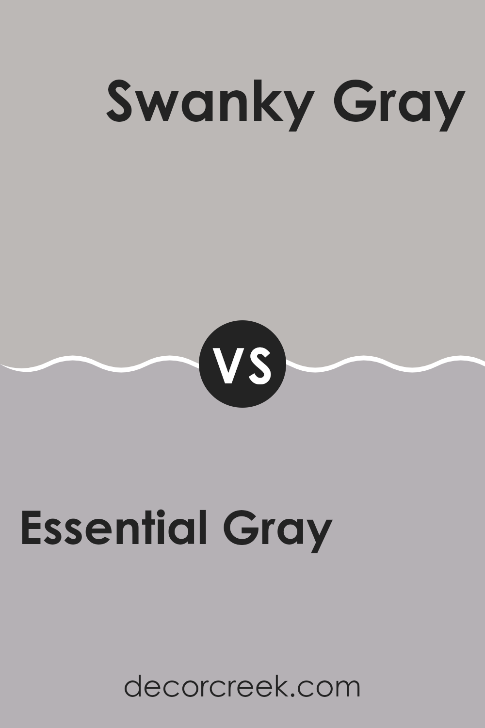
Essential Gray SW 6002 by Sherwin Williams vs Swanky Gray SW 6261 by Sherwin Williams
Essential Gray and Swanky Gray by Sherwin Williams are two unique gray shades, each setting its own distinct mood. Essential Gray is lighter and has a soft, subtle quality, making it perfect for creating a calm and welcoming atmosphere in spaces like living rooms or bedrooms.
It pairs well with a wide variety of decor, adding a gentle, neutral backdrop. On the other hand, Swanky Gray is notably darker and bolder. This color brings a strong presence to a room, ideal for accent walls or for adding depth to a space.
It works well in areas that benefit from a dramatic touch, like dining rooms or home offices. While both colors share a gray base, Essential Gray offers a lighter, airier feel, whereas Swanky Gray provides depth and boldness, making them suitable for different interior styles and preferences.
You can see recommended paint color below:
- SW 6261 Swanky Gray
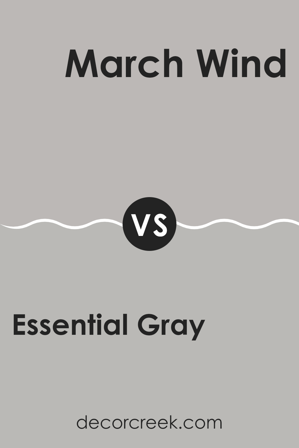
Essential Gray SW 6002 by Sherwin Williams vs March Wind SW 7668 by Sherwin Williams
Essential Gray and March Wind, both by Sherwin Williams, have distinct tones that cater to different aesthetic preferences. Essential Gray carries a soft, gentle gray hue that offers a neutral backdrop for any room, making it highly versatile for various decor styles. It’s light enough to make spaces feel larger but retains enough depth to provide warmth and coziness.
March Wind, in contrast, is a deeper gray that verges on the cooler side, giving it a more pronounced presence in a space. This color is perfect for creating a strong, visual impact and works well in areas that demand more drama or focus.
Both colors can be used together effectively, as their varying intensities complement each other; Essential Gray can lighten up a space while March Wind can act as an excellent accent for features like walls or cabinetry. Ultimately, the choice between these two depends on the desired mood and functional needs of the space.
You can see recommended paint color below:
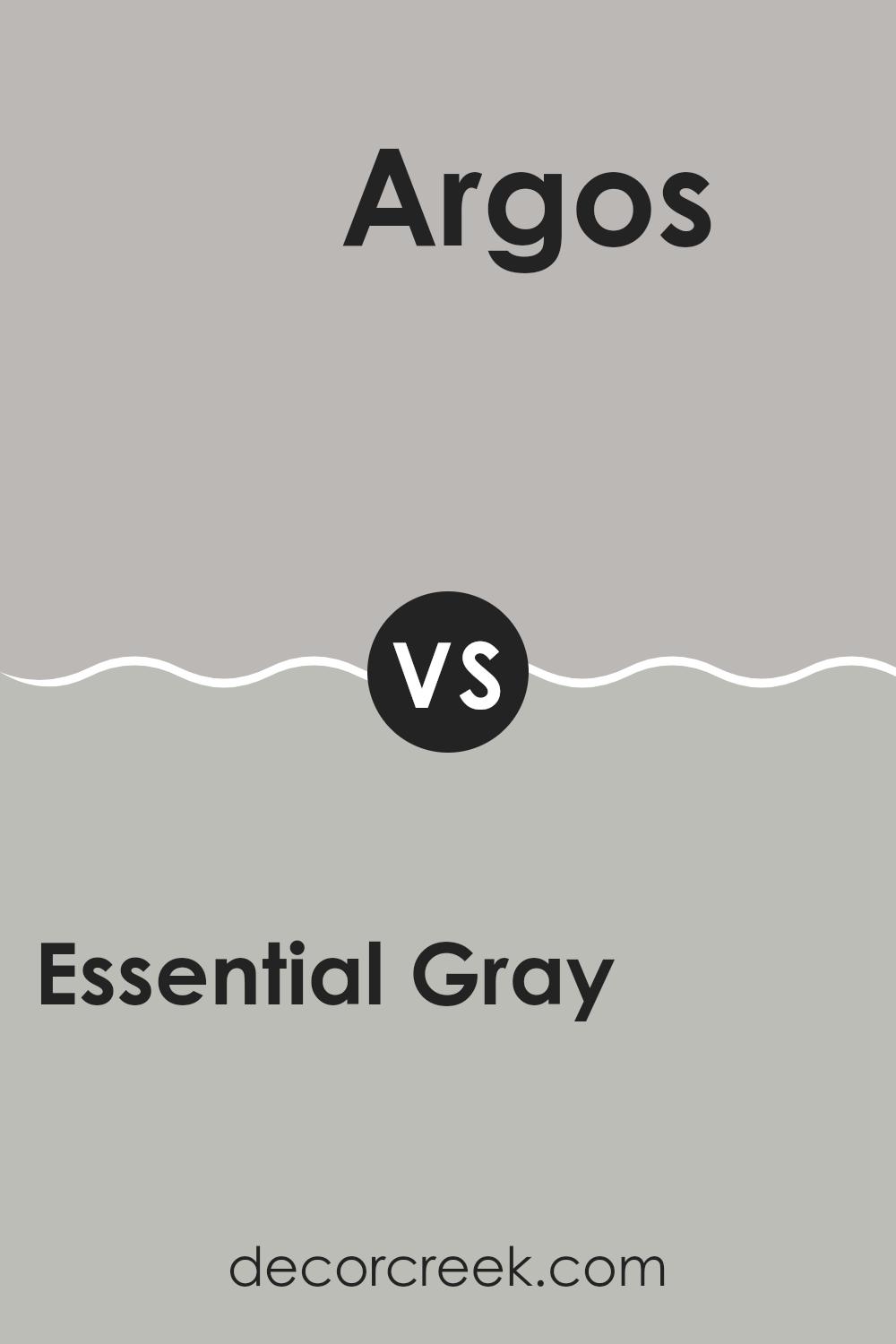
Essential Gray SW 6002 by Sherwin Williams vs Argos SW 7065 by Sherwin Williams
Essential Gray and Argos are both refined shades offered by Sherwin Williams, but they have distinct undertones that set them apart. Essential Gray is a light gray with a warm undertone that makes it very versatile and welcoming. It is perfect for creating a cozy atmosphere in any room, reflecting a subtle, soothing vibe without feeling too cold.
On the other hand, Argos is a cooler shade of gray with a slight blue undertone. This makes it feel more modern and fresh. It’s great for spaces that aim for a more contemporary look, adding a clean and crisp backdrop that pairs well with a wide range of décor styles.
While both colors provide a neutral palette, the warmth of Essential Gray offers a softer, more inviting feel, whereas the cooler, sharper tones of Argos bring a sleek, modern touch to interiors. Depending on your style and the mood you want to set, both choices offer unique benefits for interior spaces.
You can see recommended paint color below:
In conclusion, SW 6002 Essential Gray by Sherwin Williams is a really cool gray paint color that can make any room look nice and stylish. It’s not too dark or too light, so it works well in big living rooms and small bathrooms alike. People like using this color because it doesn’t take attention away from the other colors or decorations in a room. It’s like the best kind of teammate for all the other colors you want to use.
This gray can also help make a room feel cozy and welcoming, which is great if you want your home to feel like a warm, cozy place to relax. It goes well with lots of other colors, whether they’re bright like yellows or soft like blues. That means you can use it all over your house and it will always look good.
So, if you’re thinking about giving a room a new look, Essential Gray is a smart choice. It’s simple, pretty, and makes everything else in the room look even nicer.
Plus, it’s a color that won’t go out of style, so your room will look fantastic for a long time!

Ever wished paint sampling was as easy as sticking a sticker? Guess what? Now it is! Discover Samplize's unique Peel & Stick samples.
Get paint samples

